The Brazilian Creative Club (Clube de Criação) - Re-reborn

Advertising lecturer, Guy Lawrence, has recently seen this piece of work for sharing here on The Disciples. A winner at Cannes Lions, Clio and London International Awards; the project promoted the Brazilian Creative Club Festival – the biggest event in Brazilian advertising – in a way that is truly new.


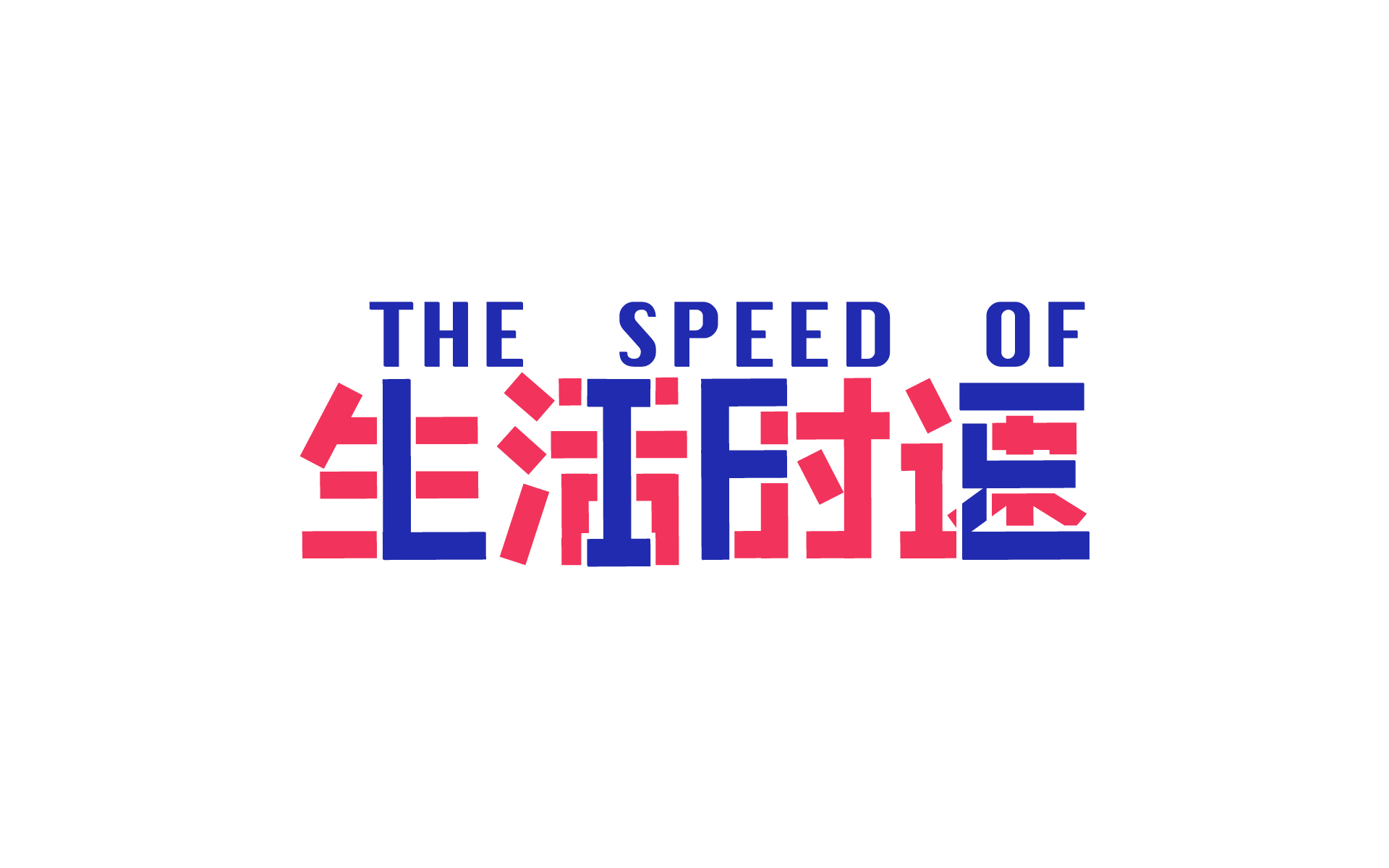
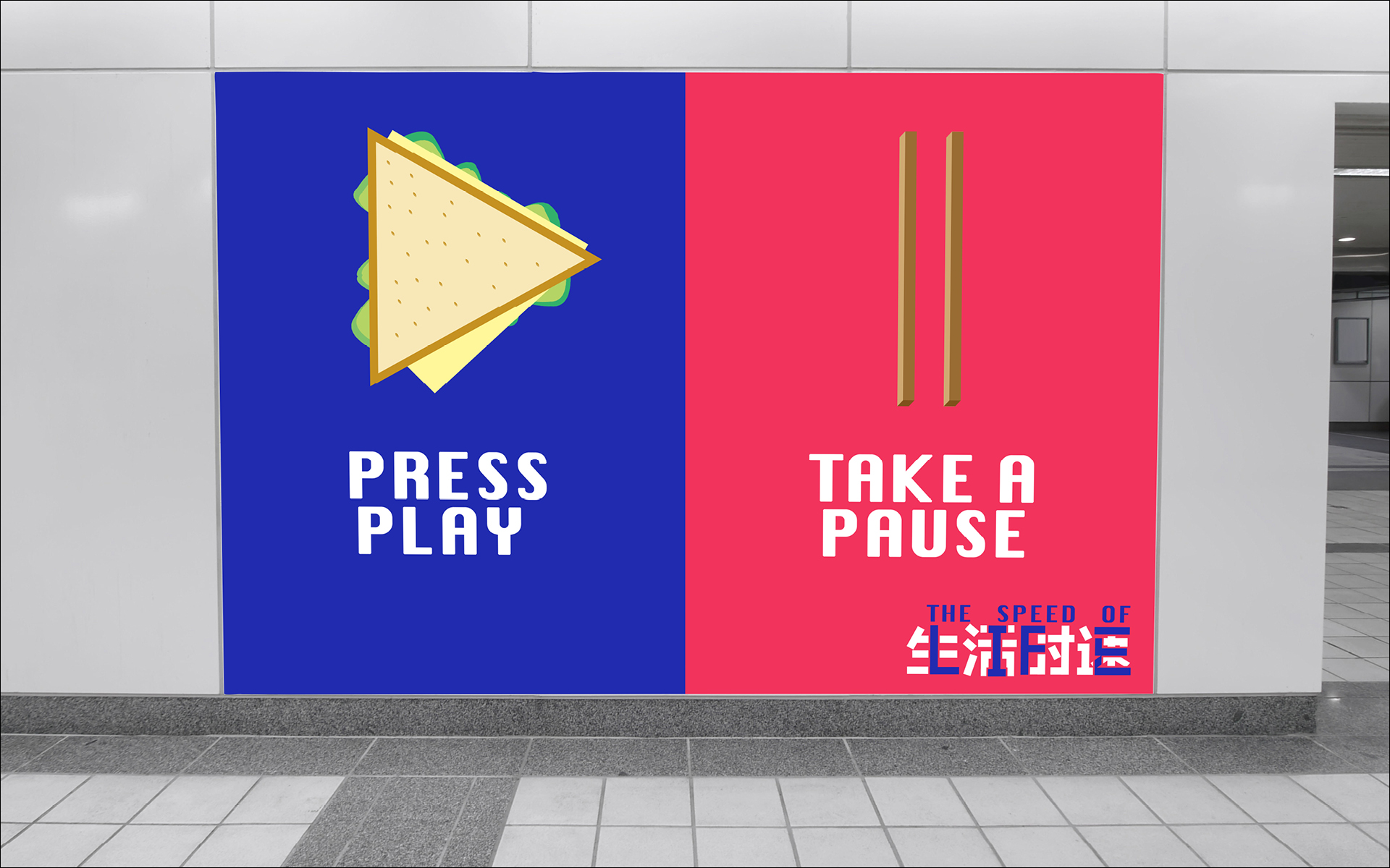
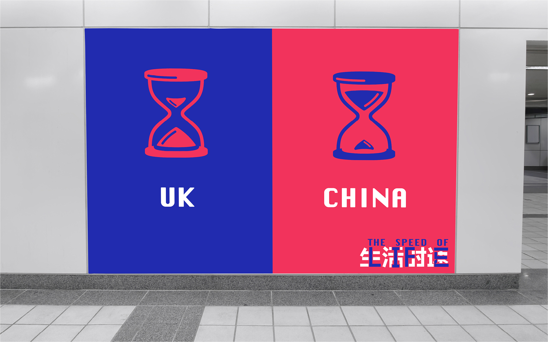
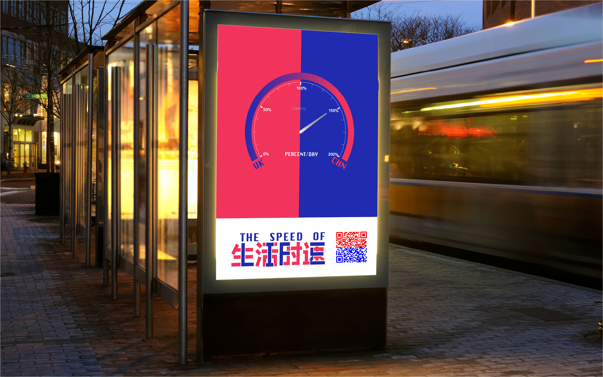
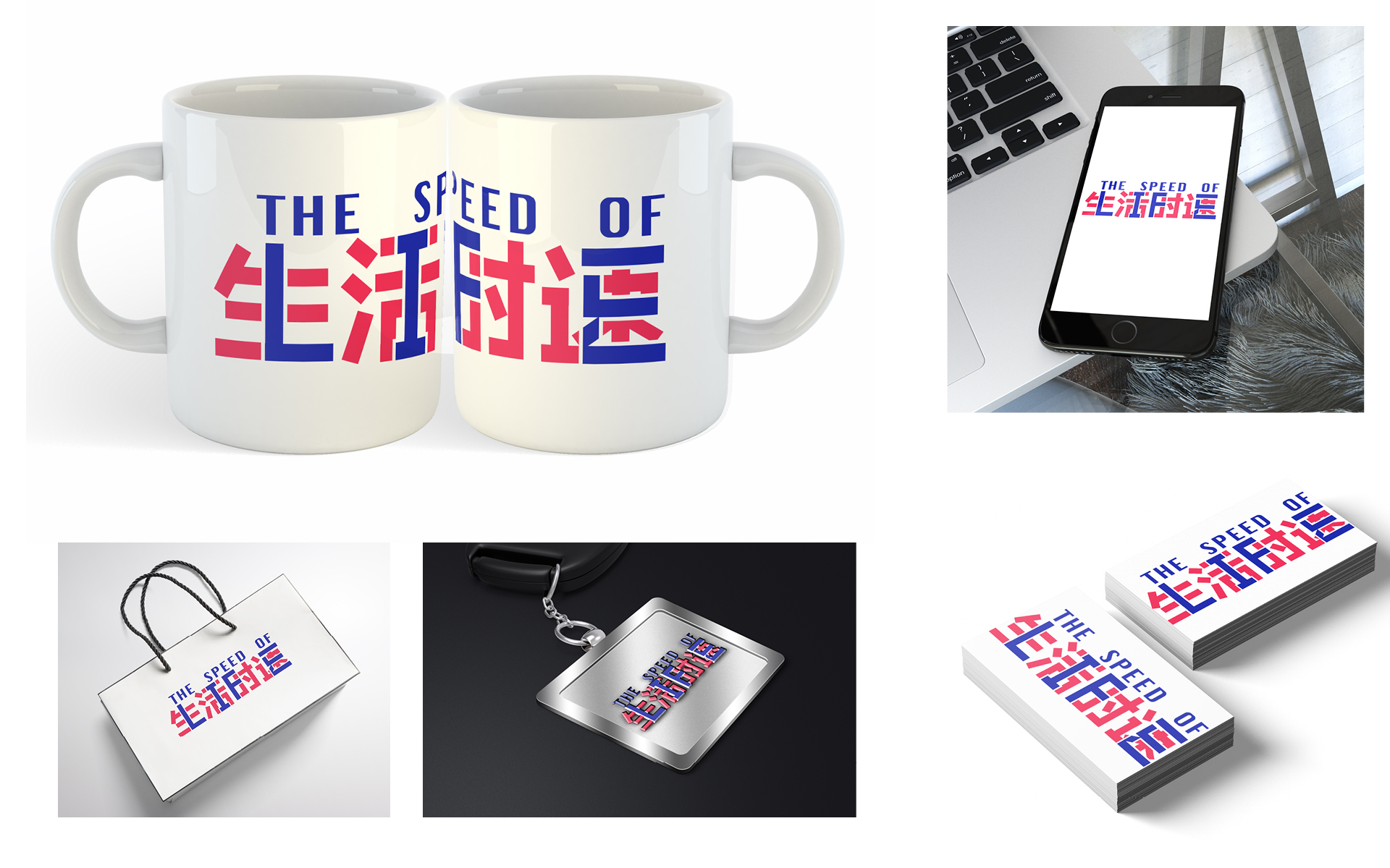
Technology and creativity evolve at a dizzying pace. So how to promote the Brazilian Creative Club Festival – the biggest event in Brazilian advertising – in a way that is truly new? With an idea that changes like the world: every second. Using an exclusive algorithm, we created a campaign that was mutable in all its aspects: logo, tagline, colors and typography. A campaign that never repeated itself. The result was 9 different posters: each version of them could be seen only once. As they were living and mutating, the posters were digital-only: they were never printed or shown in a static way to the audience. Each one had its individual link, so the algorithm could work in real time. And we also replaced traditional media by an innovative one. The mutating posters were turned into guerrilla projections in dozens of different sizes on places that are often visited by our target audience: agency professionals, producers, students, and artists.


Design Week – Exhibition Posters

Over the last four weeks graphic design first years have been tackling what staff thought might be a designer's dream brief…

  • Client: Design Museum

  • Brief: Name an upcoming exhibition and design the accompanying poster

  • Production: Two colour screen print only

The students chose a designer from outside the world of graphic design, and researched them through new channels such as Netflix and iPlayer, as well as the traditional channels of books and print. Distilling their gathered knowledge, the first task was based in copywriting and naming the exhibiton. Using the name(s) as a starting point, the second task was to create an image to counterbalance the copywriting and make a creative connection. The restriction of colours amplified the focus on the idea, and consideration to the overall layout and its impact.

Below are example colour proofs from the final crit which are yet to be screen printed, but are built around a strong proposition.


Alessi - Three Generations of Alessi

Alessi - Three Generations of Alessi


Robin Day - pioneer of the modern day

Robin Day - pioneer of the modern day


Dieter Rams - Less is Better

Dieter Rams - Less is Better


Ferrari - Rosso Corsa, celebrating the colour of Ferrari

Ferrari - Rosso Corsa, celebrating the colour of Ferrari


Habitat - Lighting up designer living

Habitat - Lighting up designer living


Jonathan Ive - iVe

Jonathan Ive - iVe


Christian Louboutin - A Closer Look

Christian Louboutin - A Closer Look


Paul Smith - One Man Brand

Paul Smith - One Man Brand


Platon - Faces of Power

Platon - Faces of Power


Platon - Shot in Black & White

Platon - Shot in Black & White

The Sainbury's Design Archive

The Sainsbury Archive is an online repository of the supermarket chain’s history containing everything from photographs to examples of advertising from the company’s 100+ years. Particularly fascinating for designers is the wealth of packaging material on here, with hundreds of examples of Sainsbury’s own brand designs.

SA-PKC-PRO-1-11-4-a1-4hr.jpg

What we have here is no less than the story of UK consumer communication, where the timeline interface can be used to discover the changing design trends and impact of new production process right through the 20th century. The work of Peter Dixon’s in-house team is particularly fascinating, each 1000’s of new product packaging was introduced or re-designed, each with their own distinct graphic approach. As well as pictures, much of the packaging is shown as flat artwork proofs which will be of interests to students of 3D design. Aside from packaging, the photographs of store fronts, press and poster ads an even old editions of the Sainbury’s in-house packaging allow from the trace the evolution of how one of the countries biggest retail brands have communicated with it’s audience. This is a fantastic resource for research into any design project.

SA-PKC-PRO-1-4-2-2-6-1-1.1hr.jpg
SA-PKC-PRO-1-11-2-2-30-1hr.jpg
SA-MARK-ADV-1-1-1-1-2-24.1hr.jpg

Half Rice / Half Chips

Capture.PNG

A HBU-UCLan project.

Last week 16 UCLan students from Animation, Advertising, Graphic Design and Interior Design headed over to China to visit our joint school HBU-UCLan.

This joint project has been running during the years of our partnership, yielding some fascinating creative outcomes to varying briefs. UCLan's 16 students were paired up with nearly 100 of their Chinese peers, and divided up into four separate groups.

The brief was simply titled Half Rice / Half Chips. Creatively open, it required the four groups of students to create a response to the similarities and differences between the cultures of the UK and China. The soul requirement of the brief was to produce a digital presentation, the content of which could be absolutely anything.

After initial meet and greets on the Monday morning, the students set about discussing the many themes that could be explored, but most importantly talking to each other and working out the gaps between their perceived views, and the actual realities of our two cultures. With five days to go from start to finish, there was a requirement to get going, but also a need to figure out what was actually going to happen. The ideas were cemented in place by the Wednesday morning, after which production mode was engaged!

IMG_8828.JPG
IMG_8711.JPG

Group 2 (pictured above) were fascinated by the difference in pace of the UK versus China. In China, if something needs doing, it gets done. If something needs building, it'll be built next the time you look. China has the bullet train, the UK has Transpennine Express. On a deeper level, the Chinese students told of their lives growing up. School started before most people have woken up, often not getting home until 10.30pm at night. Each and every hour is precious and the maximum is gleaned from the resource that is time.

THE IDEA

Group 2 married the concept of the pace of life and named their project The Speed of Life. Working together creatively, the Chinese students were able to translate The Speed of Life into four Chinese characters.

the speed of life, in chinese

the speed of life, in chinese

The UK students then saw an opportunity to merge the Chinese characters with the Roman alphabet.

the speed of life, in english

the speed of life, in english

Before fusing the two pieces of typography together to create one identity.

In China, Piano Tiles has become a super popular game for smartphones. The game was shown to us by Ruby (advertising); as it is played the game gets quicker and quicker - thus harder and harder. It formed a neat metaphor for communicating the pace of life.

With the game in place as inspiration, MA animator extraordinaire Rosie took on the task of creating a demo of The Speed of Life game. In essence, the concept had a UK version of the game which was at a pace you could cope with, and had infinite lives to complete. The Chinese juxtapostion being much more intense, and also the lives tick away as it gets harder and harder.

The students also created advertising concepts, tackling the contrast in pace and cultures, chop sticks juxtaposed with a cucumber sandwich for example. The identity was also applied to various mockups.

This was just one of four projects completed during the week. We will post the others here when we can as some beautiful, witty and thought-provoking work was created.

Big thanks to Guy and Steve for organising a great trip, and our man in China, Nathan, for taking us round.  

The curious case of QR codes

Remember when QR codes tried to be a thing in England? I think the main reasons they never took off was because they required you to have your own scanning app and just didn't seem to scan quick enough. It was far more easy to just use Google.

Now ask yourself, how many times have you ever scanned a QR code? A few? A lot? I’m guessing the answer for a lot of people will be a big fat zero. If this is the case you can change that right here, right now. Scan the image below, and it'll take you to a mobile version...of my blog. How meta.

code.png

I certainly can’t remember ever scanning a single QR code. I always thought they were useless and a bit of a gimmick. Not anymore.

In China, QR codes are everywhere. They’ve moved away from being a joke and are an integral part of everyday life. Major retailers, street markets, restaurants, transport services, even beggars, and buskers. They all have and use QR codes. You can use these codes as ID badges. You can connect to Wi-Fi hotspots with them. You can use them to send parcels, reply to job adverts, you can even have them as tattoos.

The main reason why QR codes are so popular in China is down to an app called WeChat. It’s a multi-purpose app that has nearly 1 billion daily users and has been described as China’s “app for everything”. One of WeChat’s main features is WeChat pay. It’s basically the same thing as contactless or Apple payment. And because WeChat has a built-in QR scanner, it makes paying for things effortless. You take your items to the till, scan the code, type in what everything costs, show the receipt to the cashier and away you go. 

Because QR codes are used so much, they work so much better than what I remember. They’re quicker, more accurate and don’t require you to stand directly in front of one for it to work. I once saw someone scan a code from about 5 feet away.

The Chinese have also managed to implement QR codes into their advertising. I’ve seen QR codes on leaflets, press ads, billboards, TV commercials, even 20-foot ones on the sides of buildings. The codes on the adverts work the same way as they do anywhere else. Scan it and get taken to a web page. I’m yet to find any that have done something a bit more creative, but I’m definitely going to keep looking. Can you imagine seeing a QR code appear on an ad in the UK now? There’d probably be a social media frenzy with people ripping it apart and saying things like ‘creativity is going backward.’ 

I don't think QR codes will ever be as important as they are in China, but it’s nice to know that if they did make a comeback, they might have a bit more use.

This post also appears on Nathan Harper's blog.

ADvent

ADvent is the latest project from third year UCLan advertising students Gail McFadzean and Olivia Hampson. A series of clips and quotes featuring advice from members of the design and advertising industry - useful for students and peers alike. 

Running every day throughout December, the videos features tips for students on how to enter the industry along with opinions on where the advertising and design industry is heading.

Follow @uclanadvent on Instagram and Twitter for daily instalments, starting this Friday.

ADvent.png