Short Moving Image - Examples

Here we feature a selection of moving image and brand animations from the past two final year shows.

Wiston Juniors FC by Dylan Carr

Film Theatre branding by Conner Maxwell

Rum Branding by Holly McNicholas

Trinidad & Tobago Promotion by Sara Esat

Male contraceptive branding by Emma Barber

Rum Branding by Rob Barton & Nikhil Soni

Gin Branding by Ellie Spickett

Snapshot

Here we feature a selection of year 2 and 3 moving image pieces, some are short stings and some show the project in their entirety. However one thing that they all have in common is their craft and attention to detail, plus the detailed story boarding and visual narrative.

Please click on image to play the film

Please click on image to play the film

Please click on image to play the film

Please click on image to play the film

Please click on image to play the film

Please click on image to play the film

Please click on image to play the film


60 Years of Letraset

Here we feature an animated short film by Neil Bennison created to celebrate the 60th anniversary of the launch of Letraset.

Title

Title

All the character portraits were created using sheets of A3 discarded Letraset found on a rubbish tip. They were damp and very distressed when first found but once we had dried them out in the studio we were able to begin to play around with them.

A sample of one of the sheets

A sample of one of the sheets

The following is a selection of some of the characters that we created using the discarded type.

The following is a selection of some of the characters that we created using the discarded type.

head 12.jpg
head 6.jpg
head 1.jpg
head 10.jpg
LE CHAT.jpg

Click to play the film.

WORN OUT.jpg

Beautifully crafted animation and a great example of creative happenstance.

Half Rice / Half Chips continued

Here we feature the other projects completed during the China study trip to HBU-UCLan. The projects were a creative response to Half Rice / Half Chips, with four groups of students creating a response to the similarities and differences between the cultures of the UK and China. Continuing from the previous article, there were two animations and an educational app also prototyped.

Group 1

Group 3

Group 4

Half Rice / Half Chips

Capture.PNG

A HBU-UCLan project.

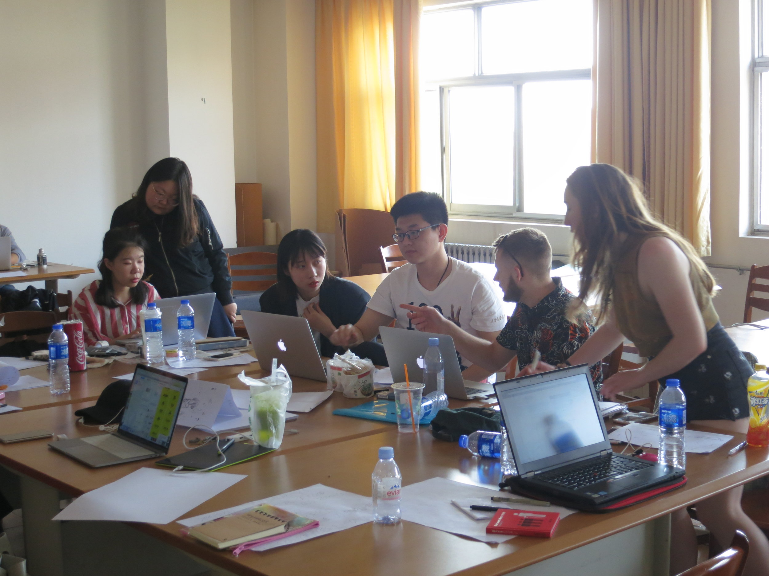
Last week 16 UCLan students from Animation, Advertising, Graphic Design and Interior Design headed over to China to visit our joint school HBU-UCLan.

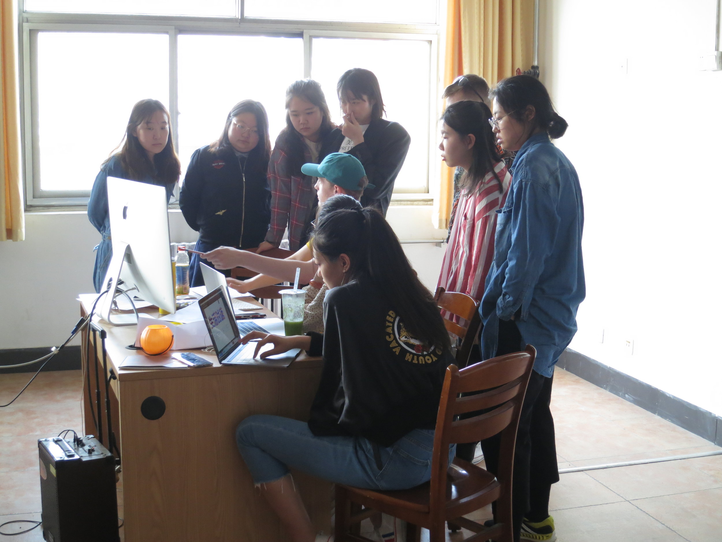
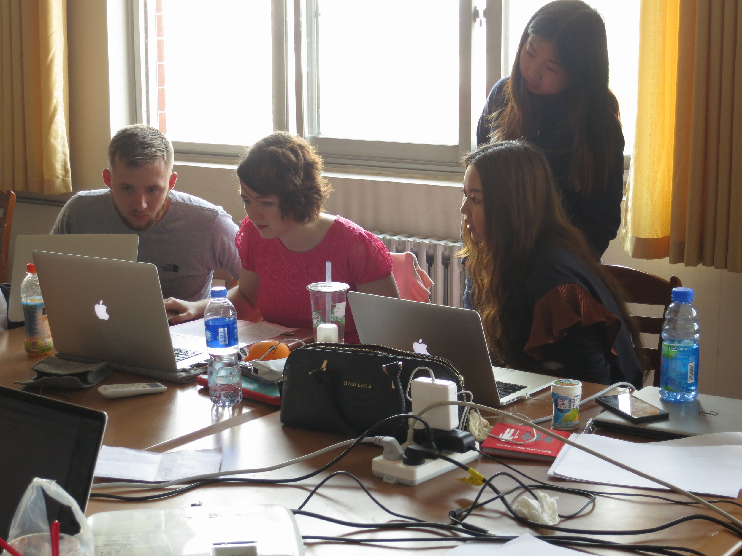
This joint project has been running during the years of our partnership, yielding some fascinating creative outcomes to varying briefs. UCLan's 16 students were paired up with nearly 100 of their Chinese peers, and divided up into four separate groups.

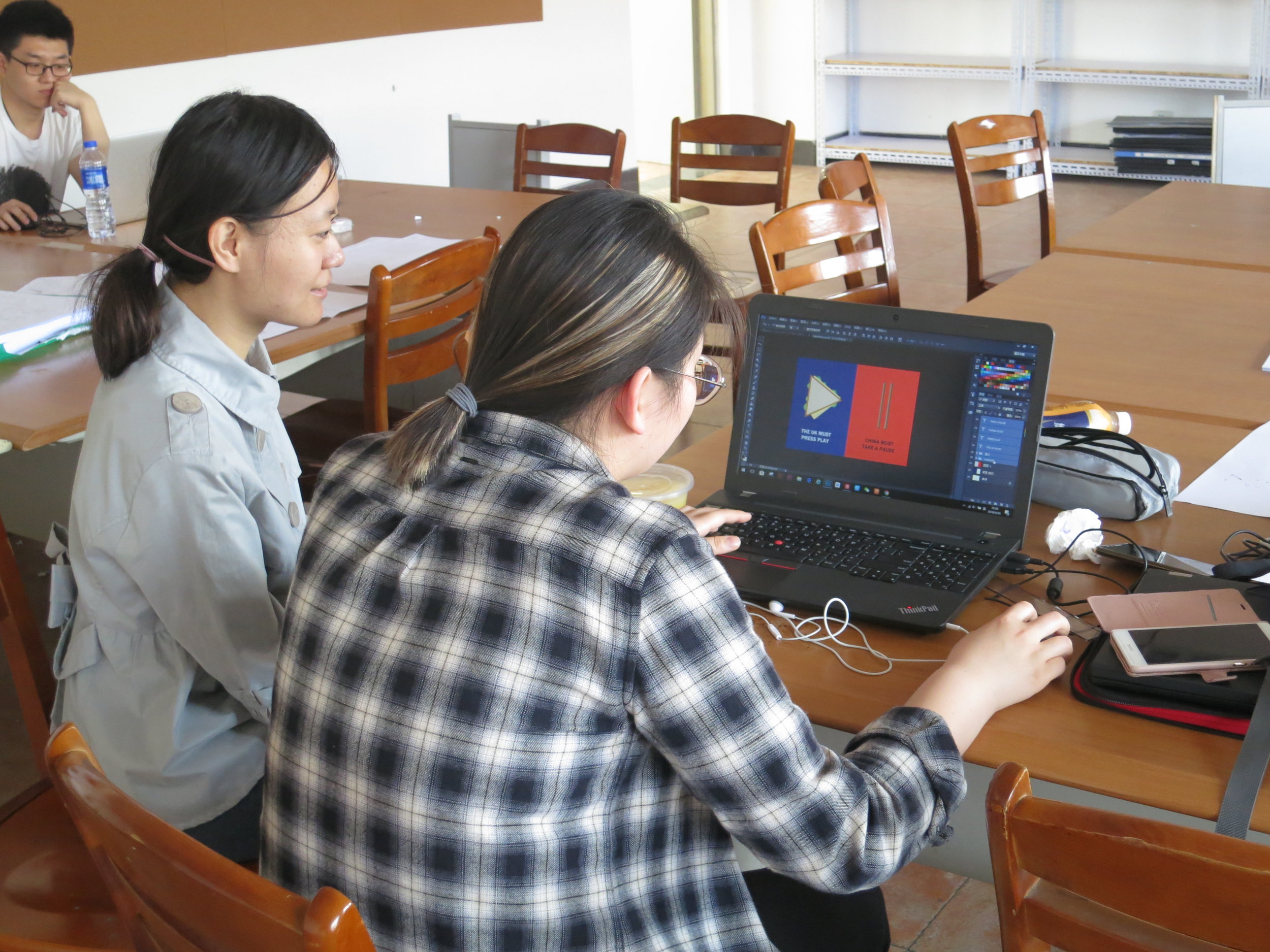
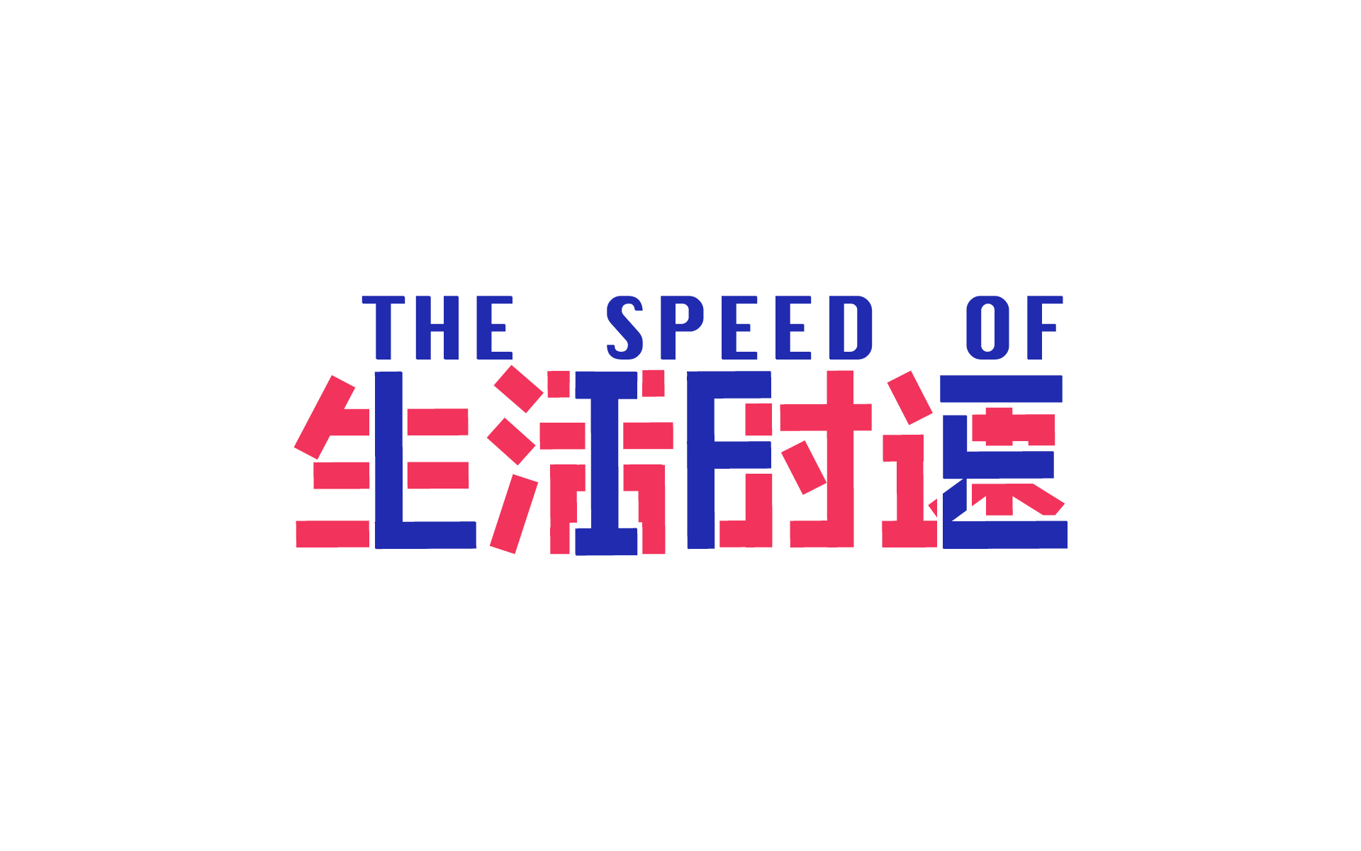
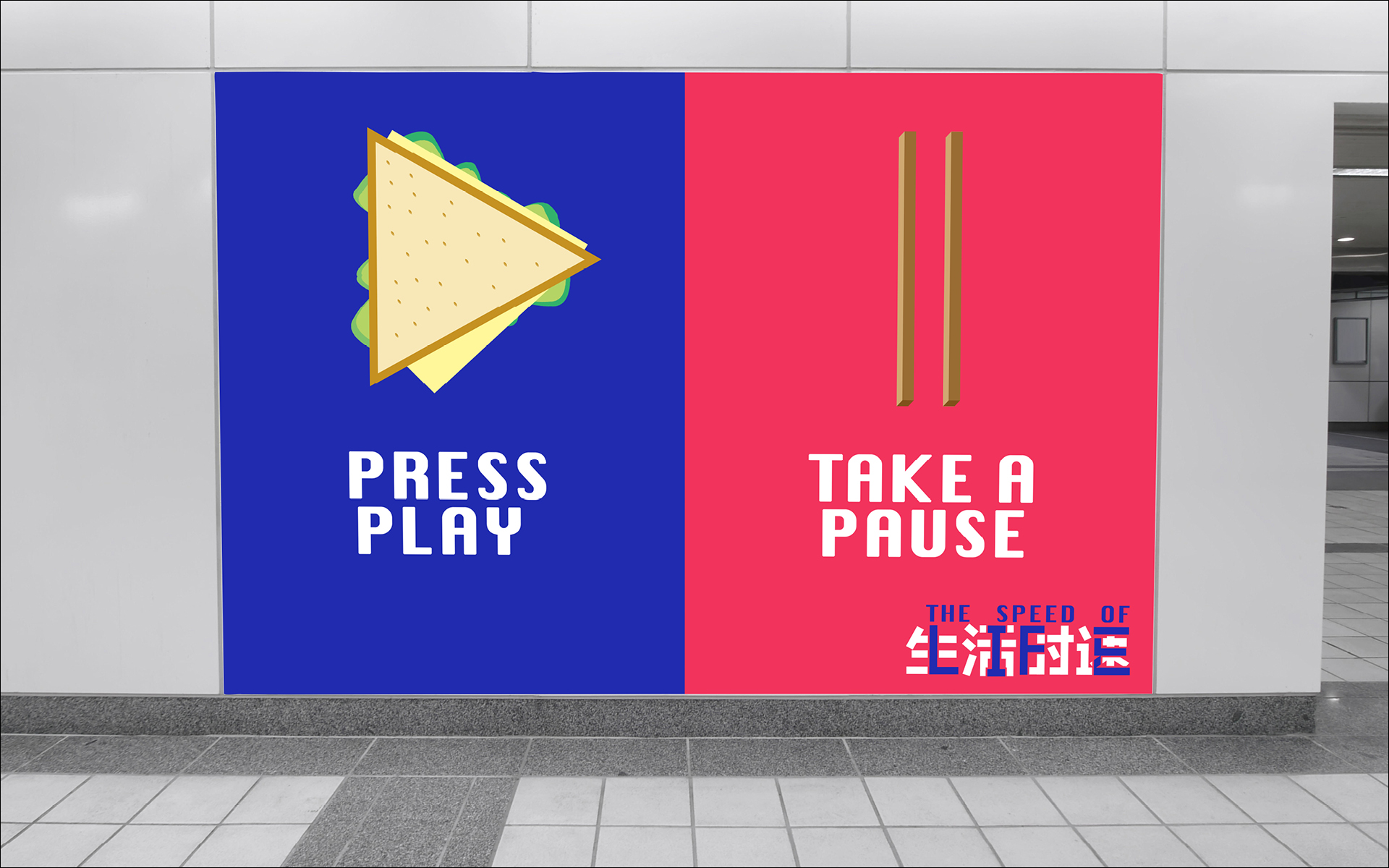
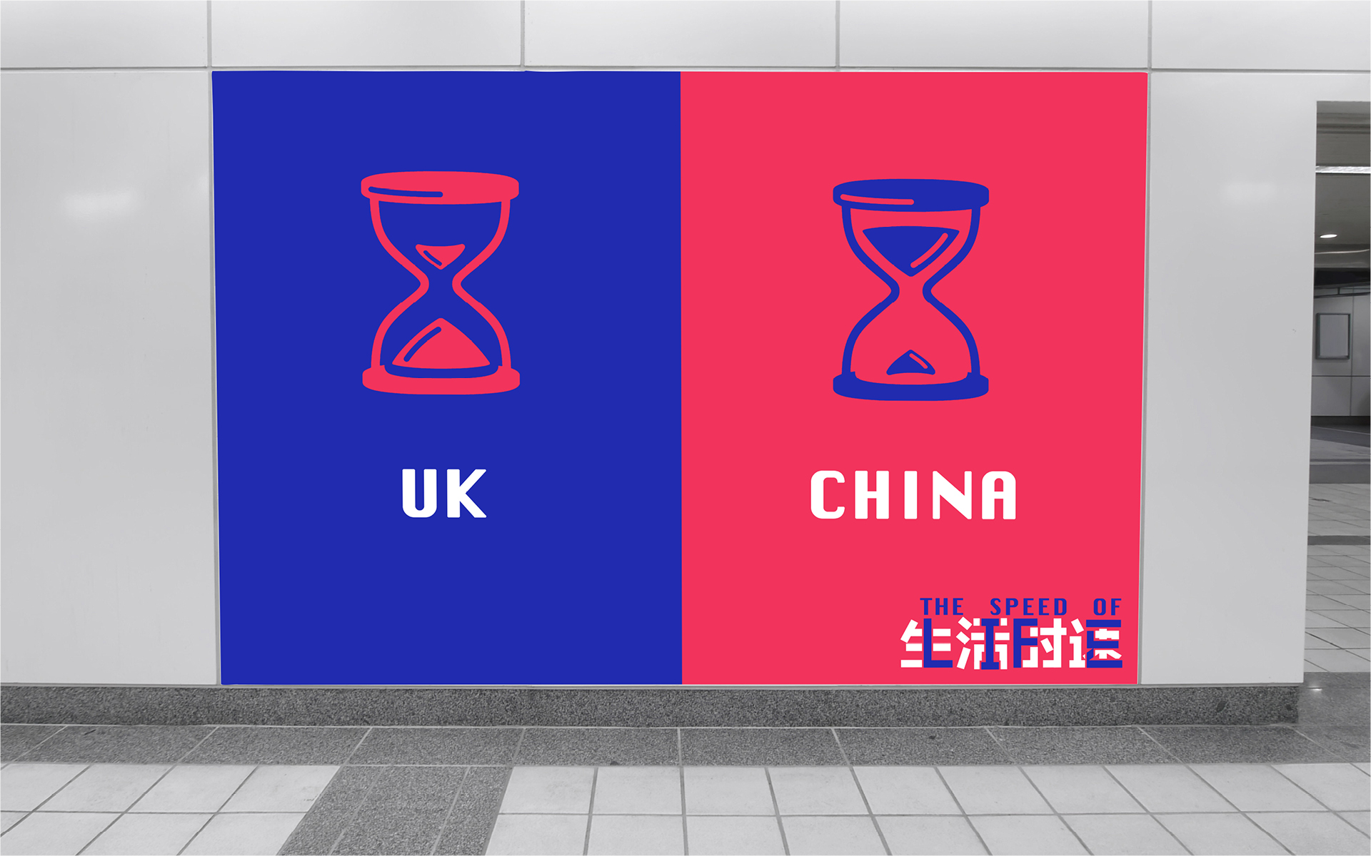
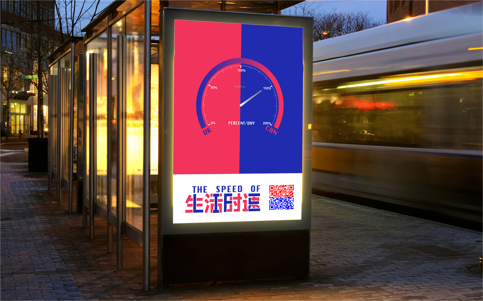
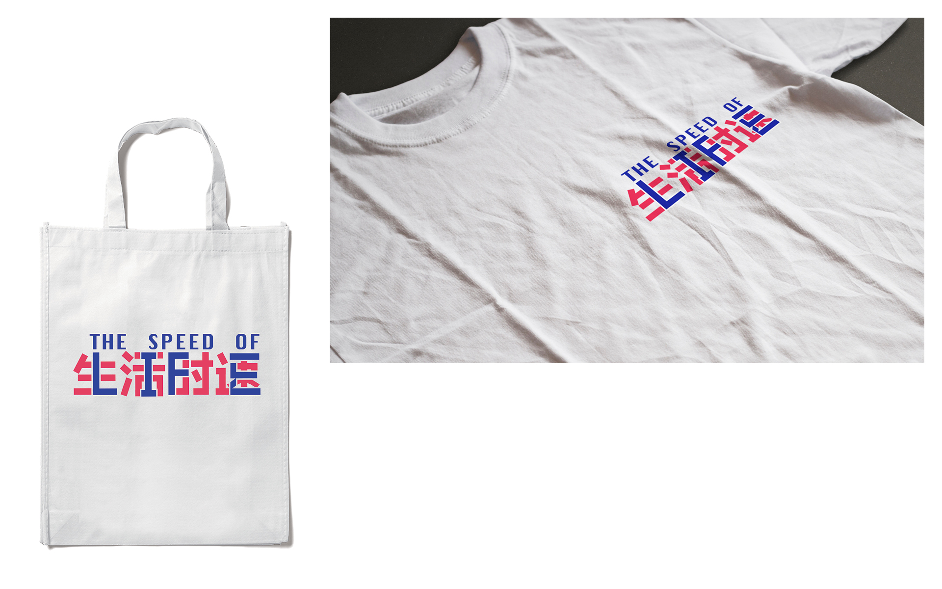
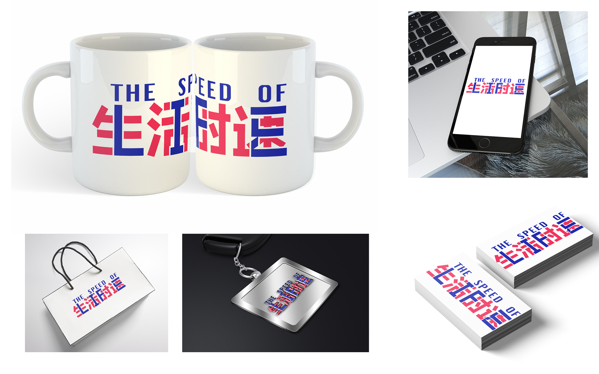
The brief was simply titled Half Rice / Half Chips. Creatively open, it required the four groups of students to create a response to the similarities and differences between the cultures of the UK and China. The soul requirement of the brief was to produce a digital presentation, the content of which could be absolutely anything.

After initial meet and greets on the Monday morning, the students set about discussing the many themes that could be explored, but most importantly talking to each other and working out the gaps between their perceived views, and the actual realities of our two cultures. With five days to go from start to finish, there was a requirement to get going, but also a need to figure out what was actually going to happen. The ideas were cemented in place by the Wednesday morning, after which production mode was engaged!

IMG_8828.JPG
IMG_8711.JPG

Group 2 (pictured above) were fascinated by the difference in pace of the UK versus China. In China, if something needs doing, it gets done. If something needs building, it'll be built next the time you look. China has the bullet train, the UK has Transpennine Express. On a deeper level, the Chinese students told of their lives growing up. School started before most people have woken up, often not getting home until 10.30pm at night. Each and every hour is precious and the maximum is gleaned from the resource that is time.

THE IDEA

Group 2 married the concept of the pace of life and named their project The Speed of Life. Working together creatively, the Chinese students were able to translate The Speed of Life into four Chinese characters.

the speed of life, in chinese

the speed of life, in chinese

The UK students then saw an opportunity to merge the Chinese characters with the Roman alphabet.

the speed of life, in english

the speed of life, in english

Before fusing the two pieces of typography together to create one identity.

In China, Piano Tiles has become a super popular game for smartphones. The game was shown to us by Ruby (advertising); as it is played the game gets quicker and quicker - thus harder and harder. It formed a neat metaphor for communicating the pace of life.

With the game in place as inspiration, MA animator extraordinaire Rosie took on the task of creating a demo of The Speed of Life game. In essence, the concept had a UK version of the game which was at a pace you could cope with, and had infinite lives to complete. The Chinese juxtapostion being much more intense, and also the lives tick away as it gets harder and harder.

The students also created advertising concepts, tackling the contrast in pace and cultures, chop sticks juxtaposed with a cucumber sandwich for example. The identity was also applied to various mockups.

This was just one of four projects completed during the week. We will post the others here when we can as some beautiful, witty and thought-provoking work was created.

Big thanks to Guy and Steve for organising a great trip, and our man in China, Nathan, for taking us round.