A blast from the past

Here we feature a couple of projects from way back in 2006. If our memories serve us well, we think they are solutions to a D&AD typographic brief - Create a series of posters to advertise a Horror Film Festival in a town or city of your choice.

hannabil.jpg
jason .jpg
mask 1.jpg
shock 1.jpg
shock 3 .jpg
shock 3.jpg

It’s that long ago we can’t actually remember who did the first solution? The second one was created by Rachel Simpson

Thaipography

Here we feature a great typography project that has recently been sent to our offices by x Preston Graphics student Tim Sumner. This self published book was inspired by the typography that Tim encountered in Thailand on his globe trotting adventures.

Card board wraparound case

Card board wraparound case

Front & back cover designs

Front & back cover designs

Forward

Forward

Slideshow

The typeface

The typeface

For more on this project follow Tim here.

Words Of Wisdom – The Long(ish) Read

remember, the pencil is mightier than the mouse

remember, the pencil is mightier than the mouse

Earlier this year (2020), Words Of Wisdom was finally brought into existence. It is a compendium of the thoughts, experience and advice from fifty graduates of the Graphic Design course of what is now UCLan in Preston. 

The idea of interviewing and collecting the work of fifty graduates who are now dispersed across the world was conceived and brought to life by senior lecturer Andy Bainbridge and graduate Mike Rigby. The process took years, and dedication.

The book features graduates from 1980 onwards spanning three decades, and through a series of questions, affords each graduate of the course the opportunity to bestow their own ‘words of wisdom’. Coupled with this is a snapshot of the designers’ portfolios.

Whilst the information and content was being brought together, another graduate (then student) – Mike Kirkpatrick – was involved with the project and took on the design of the book itself as a final year project. So, Mike started to apply a design sensibility to the content which at the time was drip feeding in from across the UK and beyond.


A Piece of Advice

With all the contributions received, the initial phase of the project included sending out bespoke ‘thank you’ packs to each contributor. As part of his final year project, Mike screen printed a salient quote taken from each individual and this was packaged along with a letter and sent back out to them by way of thanks. This was back in 2013...

Each piece of advice was individually typeset and then screen printed by hand. Photographs of this project have recently been pulled from the archive and they’ll soon be on our Instagram channel. The gallery below shows Mike’s screen printing process. This really highlights the value in thoroughly documenting a project.

Once printed, the quotes were packed up and sent with a bespoke designed letter to the recipient.

Samples of the finished cards:


The Cover

Having worked with Mike at Detail, I was well aware of Words Of Wisdom. When I was invited to join the world of academia in 2017, Andy and our course leader Jon Harker asked me to have a think about the cover. Andy had designed various versions at the project’s inception, but they were now out of step with Mike’s layouts.

Andy’s first iterations, from the archive:

Also from the archive, early spread designs by Billy Harkcom.

Spread1.jpg
Spread2.jpg
Spread3.jpg

Taking on the cover was a sizeable task as I knew the scale of work already put in, and Mike had already created and set the design language for the book. Though I believe typographic design must be learnt through understanding the principals of moveable type and grid systems, some designers have a natural propensity for putting type in just the right place. And Mike, who has a great sense of page and space, is one of them.

Have a look at the grid, and how it underpins everything:

Untitled-24.jpg

With 15 years of designing under my belt, it’s worth sharing that when coming up with ideas for the cover, I still fell into all the pitfalls as I did at the beginning of my career. For any designer worth their salt this is simply through trying too hard out of a desire to have the big idea. To assuage your doubts: the designers who we believe to simply happen on great ideas have either had the idea previously and recycled it, enjoyed some serendipity (very occasionally), or are simply lying. Design and thinking takes time, it always will. However, the more you design and the more you think, the better (and faster) you will get at it. Lateral thinking is a choice of mindset which requires constant work and dedication. 

Getting back to the cover, the traps that were fell into are classics. The have-a-go-at copywriting trap. The have-a-go-at-illustration trap. The try-far-too-hard trap. Happily, traps are part of the process. They allow you to develop other thoughts and concepts in the background whilst you make efforts to connect (or force) two separate entities together when chasing an idea.

Samples of those categories are below.

The have-a-go-at copywriting trap:

The have-a-go-at-illustration trap:

An owl is a visual cliché for wisdom, a solid enough starting point. Then combining an owl with speech marks or type connects 'words’ with ‘wisdom’. But, after labouring fruitlessly on the above, I then realised Andy had already created an owl out of type (with much better results) before, so it was time to move on:

The try-far-too-hard trap. Again making connections. Albeit connections that make no sense in hindsight. A sage is a wise person, venerated for the possession of wisdom, judgment, and experience. Hence a lovely photo of a sprig of sage. This to me is a result of looking at the problem too closely and losing sight of what the brief actually is. (Caveat: if commissioned for a cooking advice & wisdom book then it’s in the bag.)

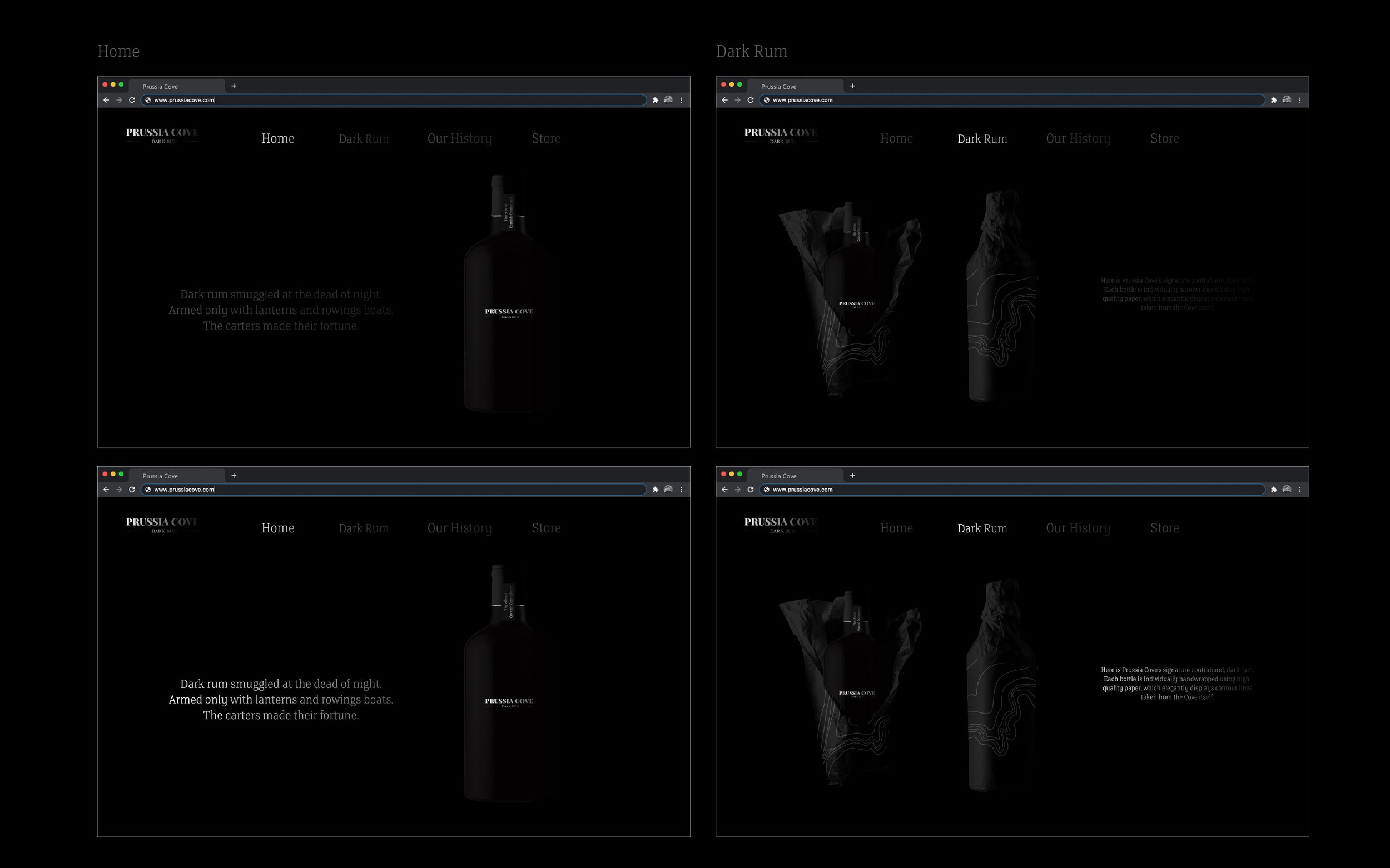
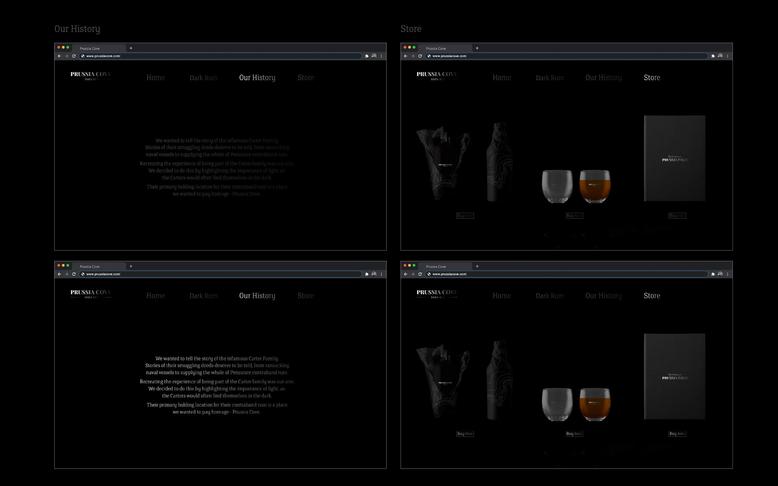
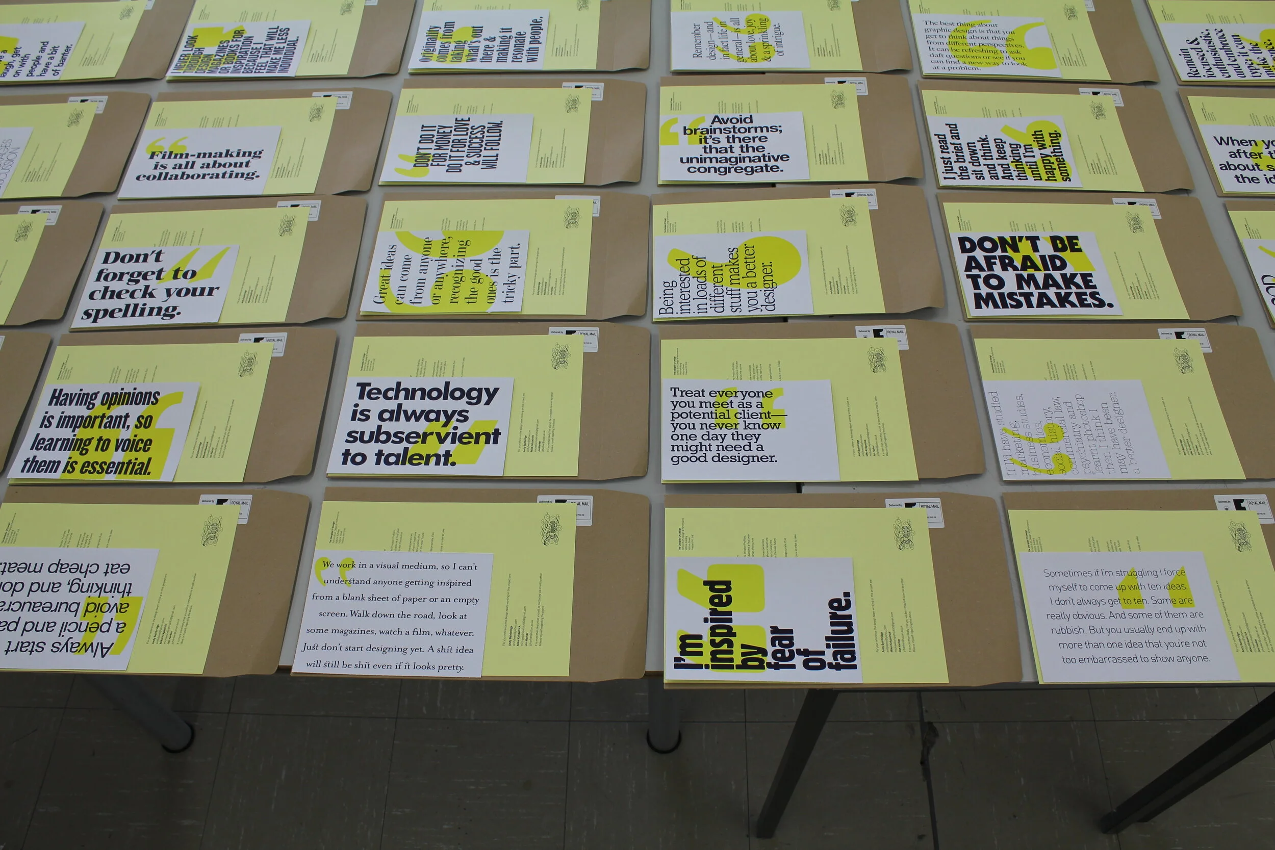
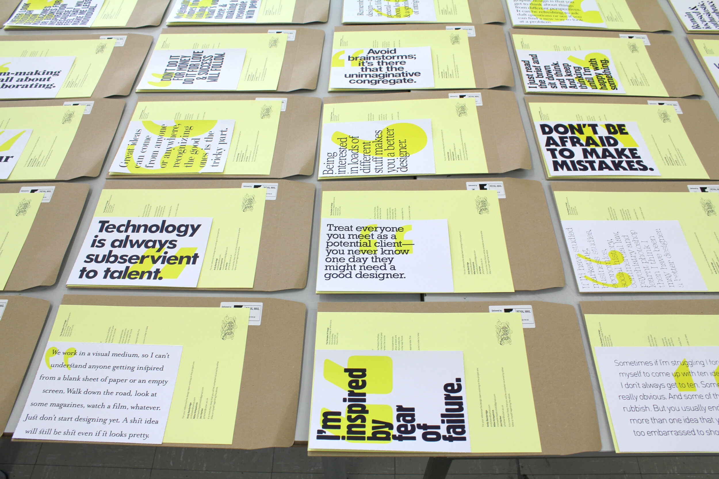
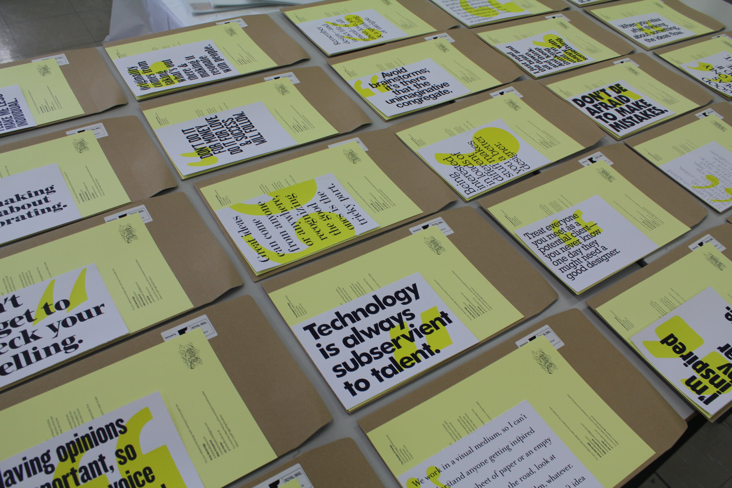
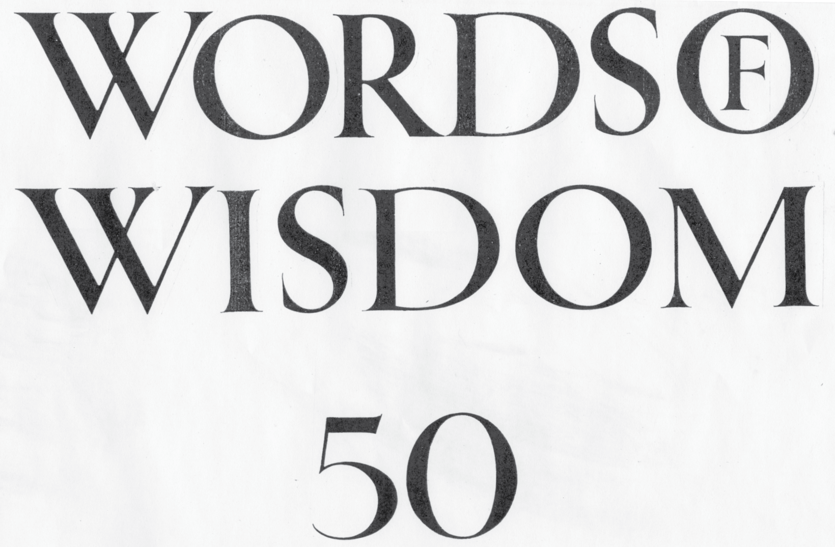
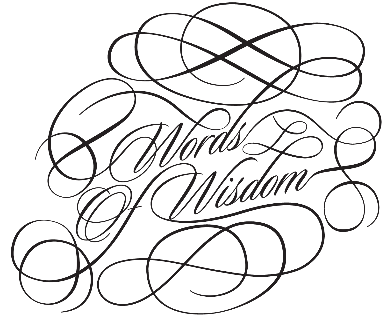
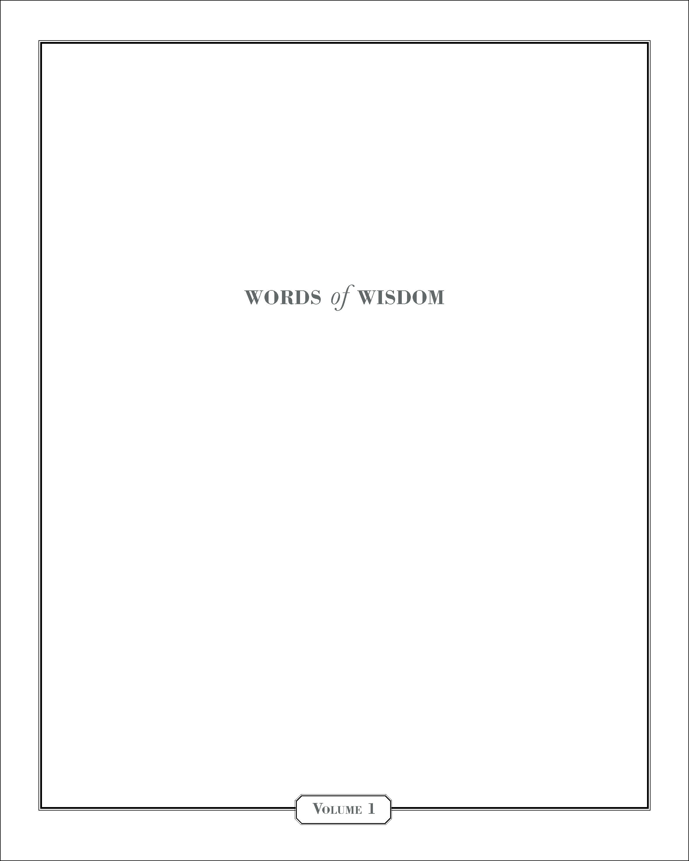
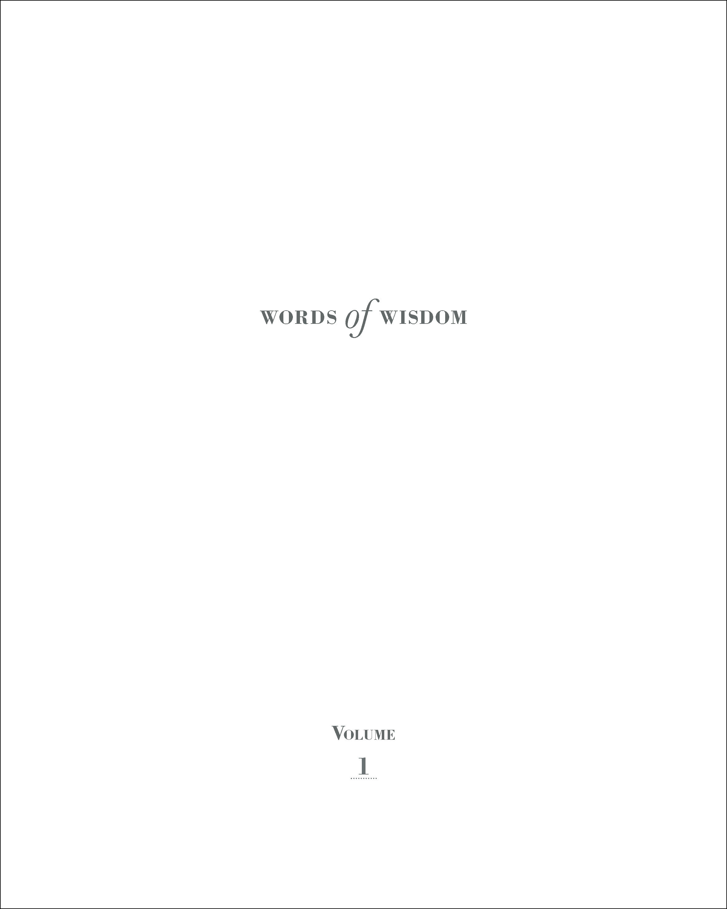
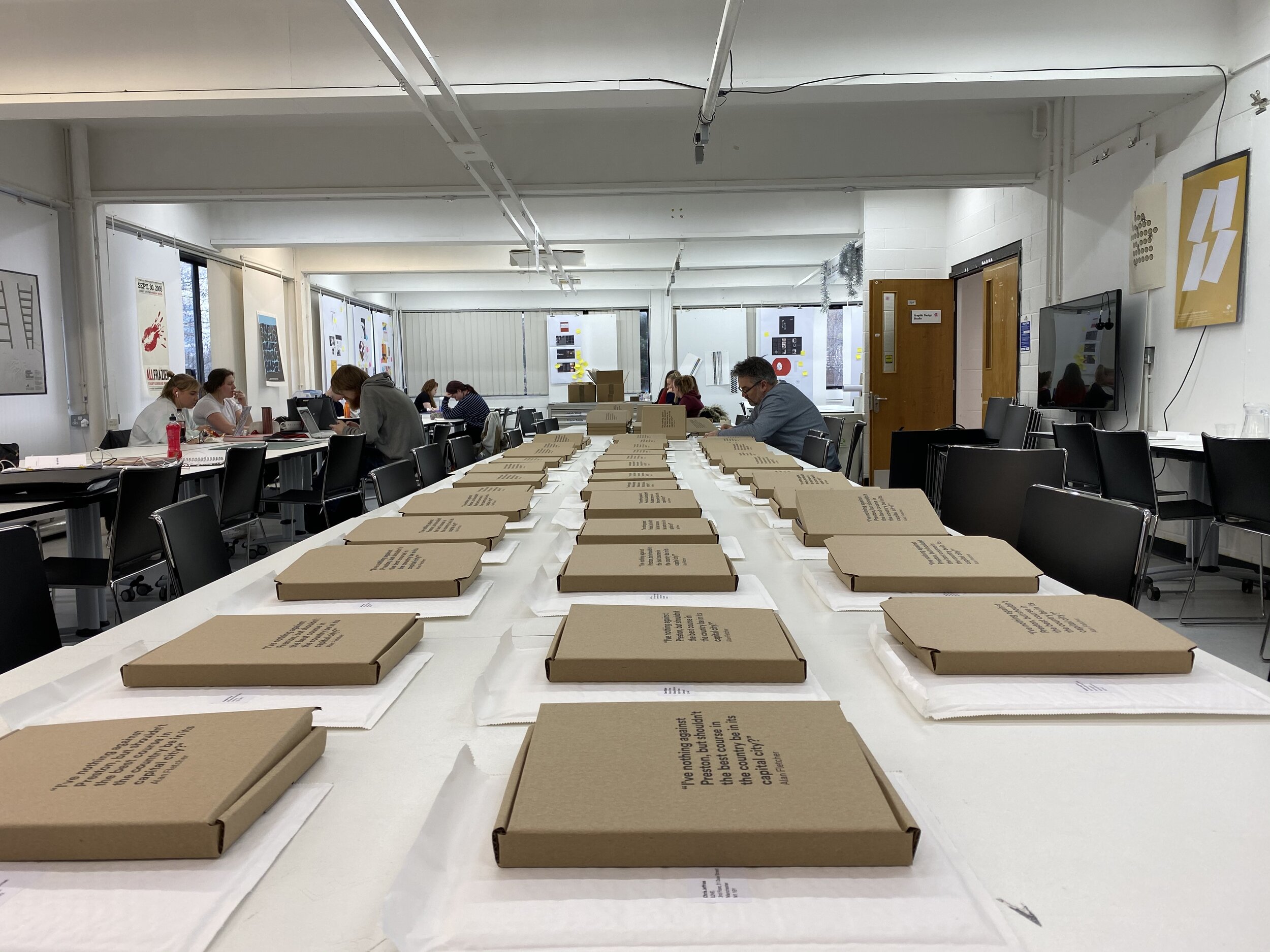
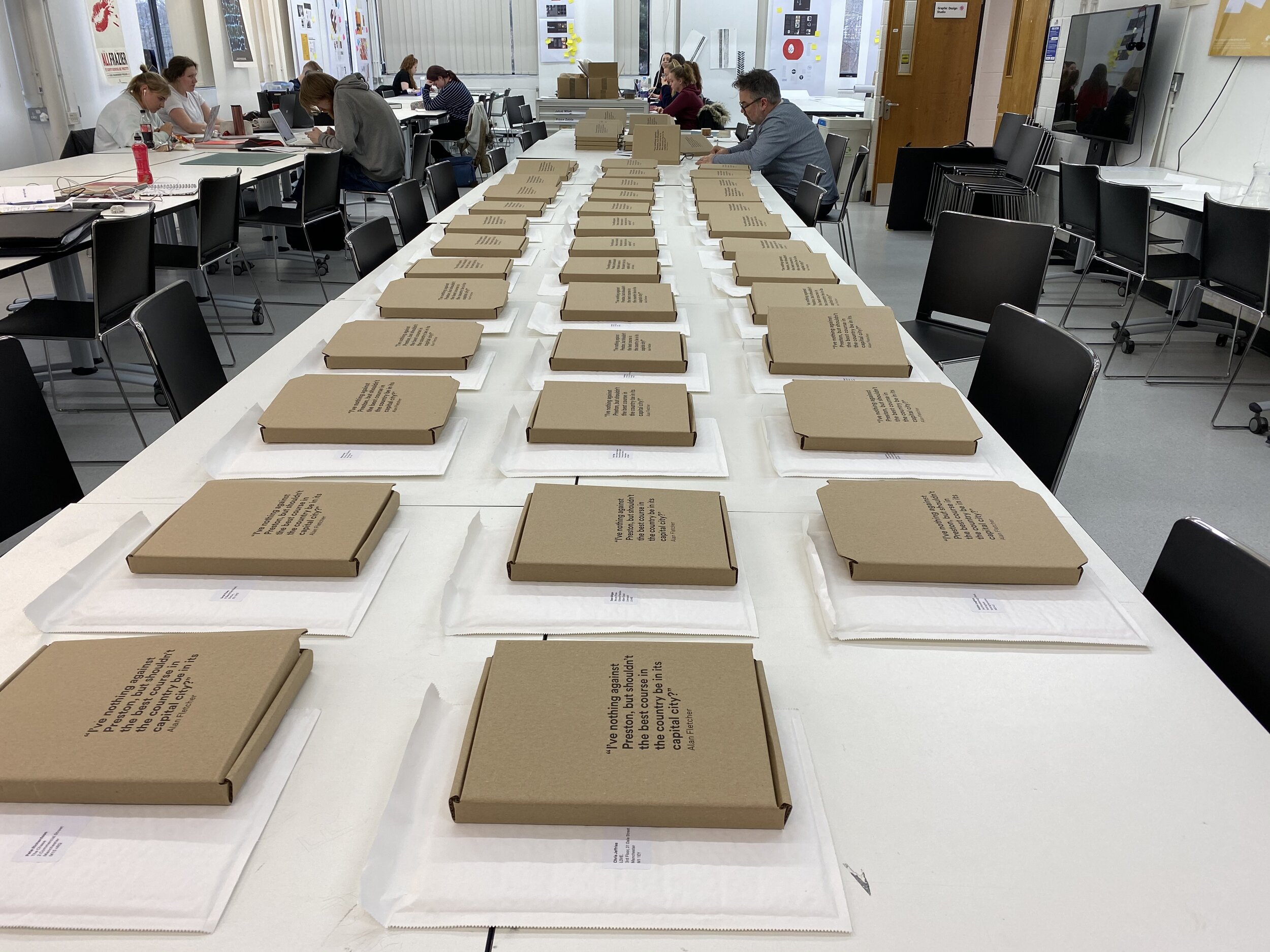
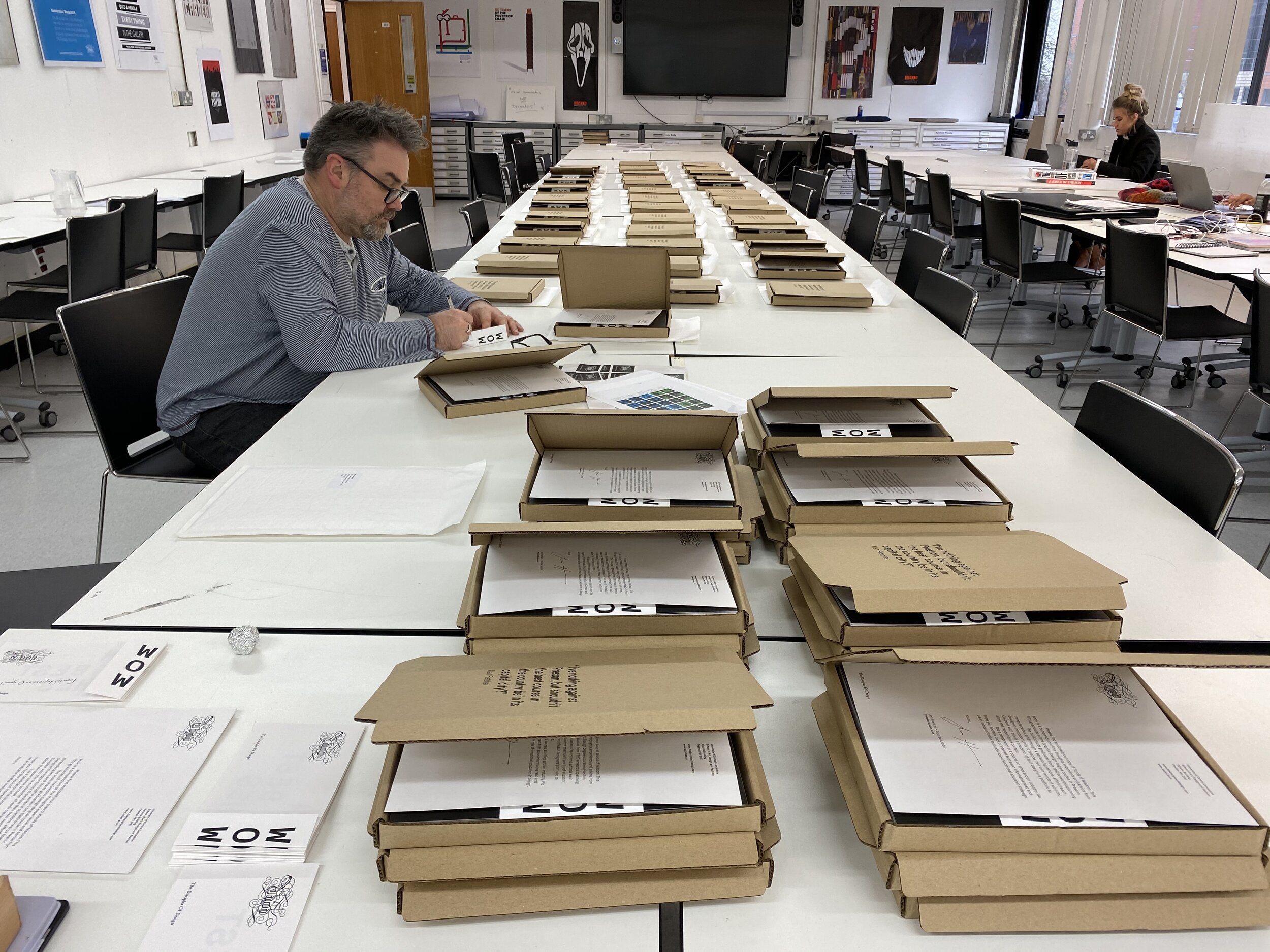
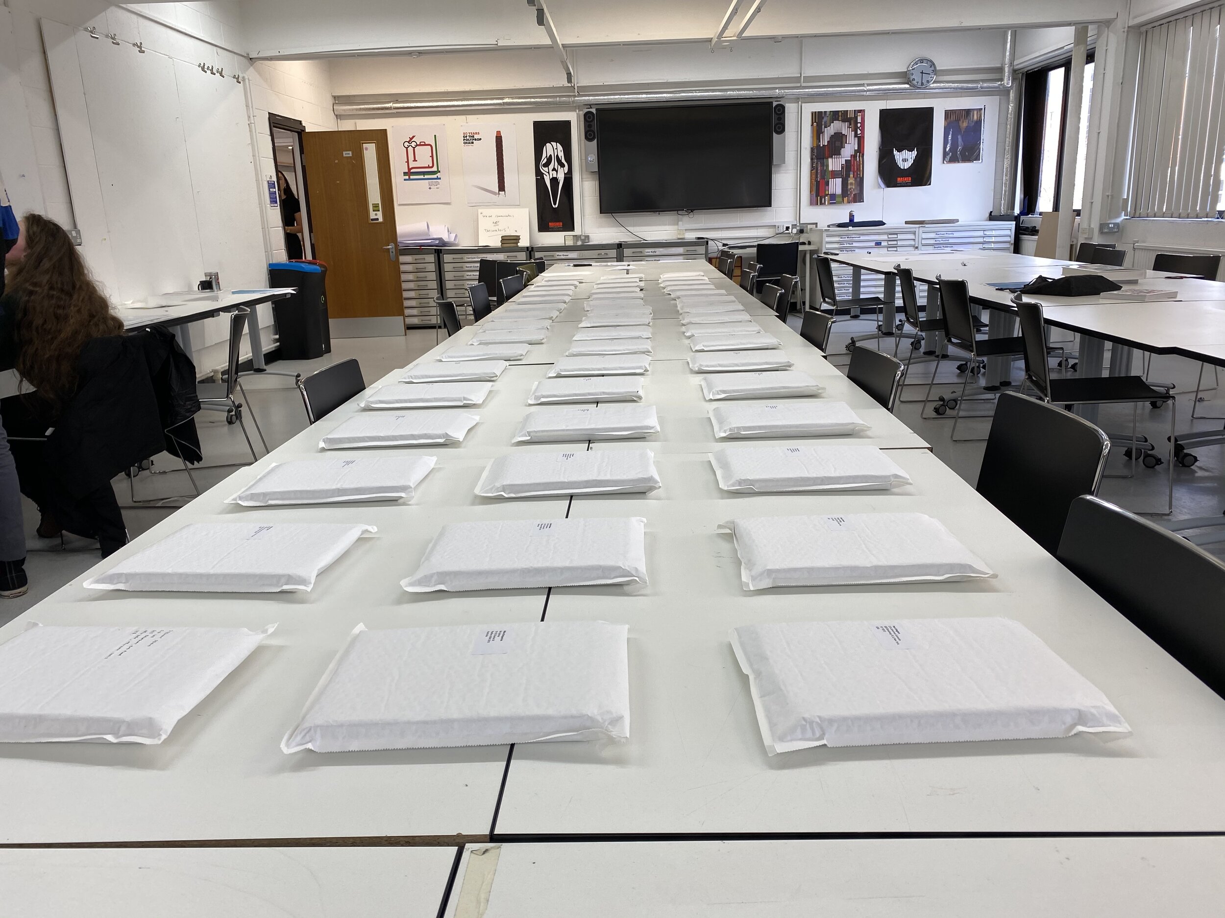
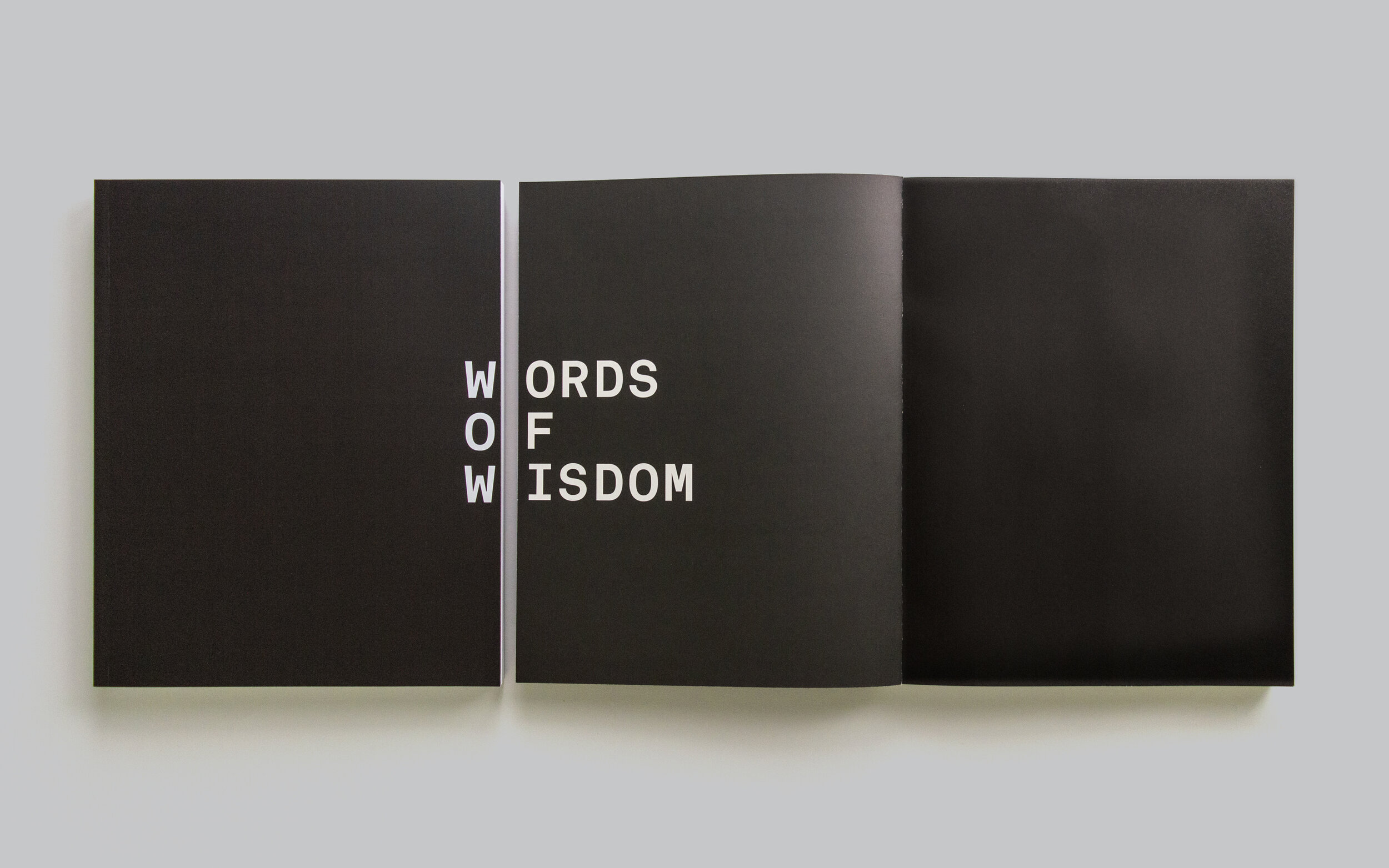
Having gotten back out of the various pits I’d fallen back into, I reviewed where I was up to. Looking again, with fresh eyes, I was able to see the file names Mike had given all his InDesign documents. The shorthand title in which the book was referred to by staff and the contributors. The project was known as WOW. No more. No less.

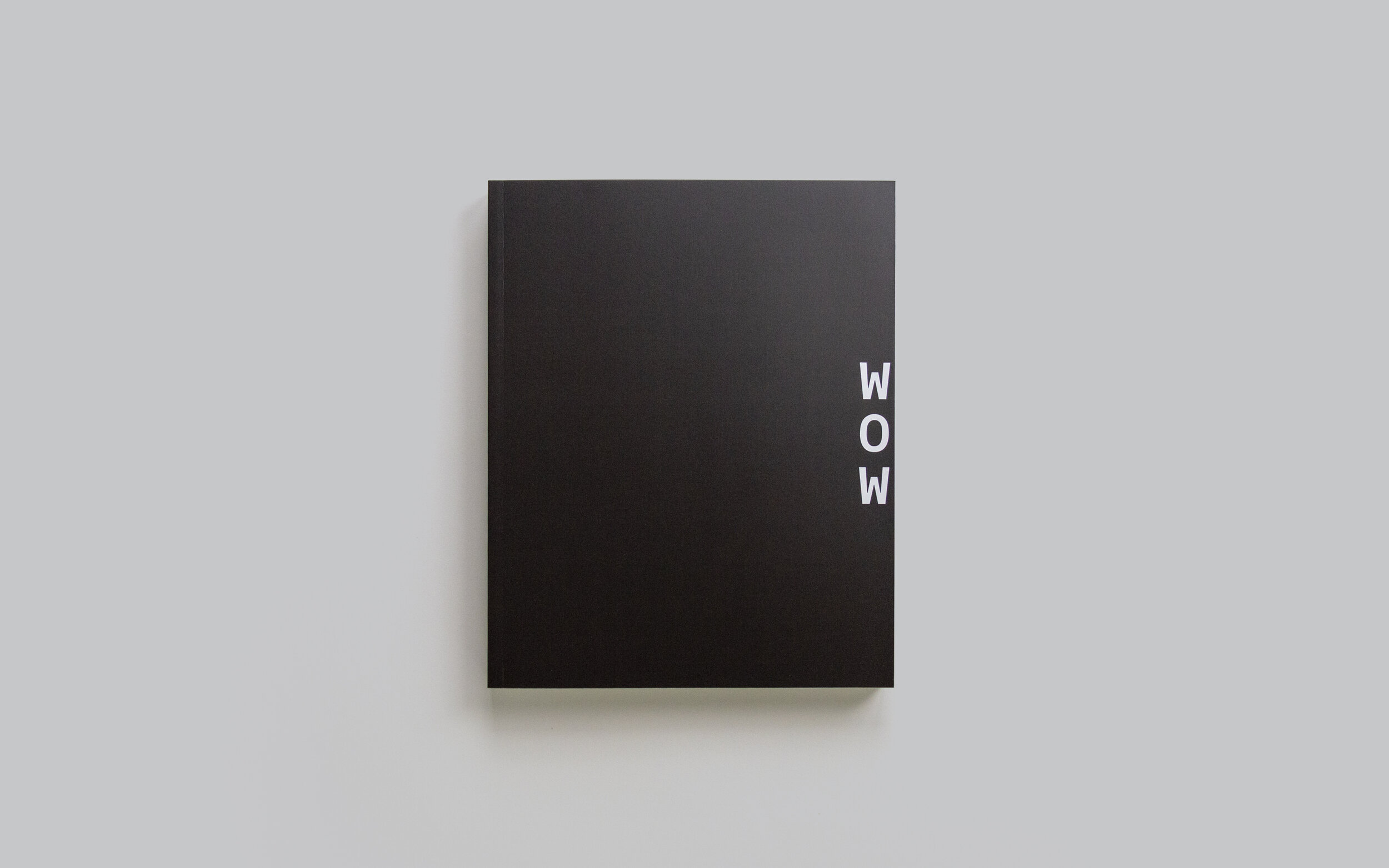
On a visual communication course that embraces simplicity, it seemed we had an answer. And if we could isolate WOW from the title within the cover design we’d have the added bonus of being able to show the pride we have for the contents within.

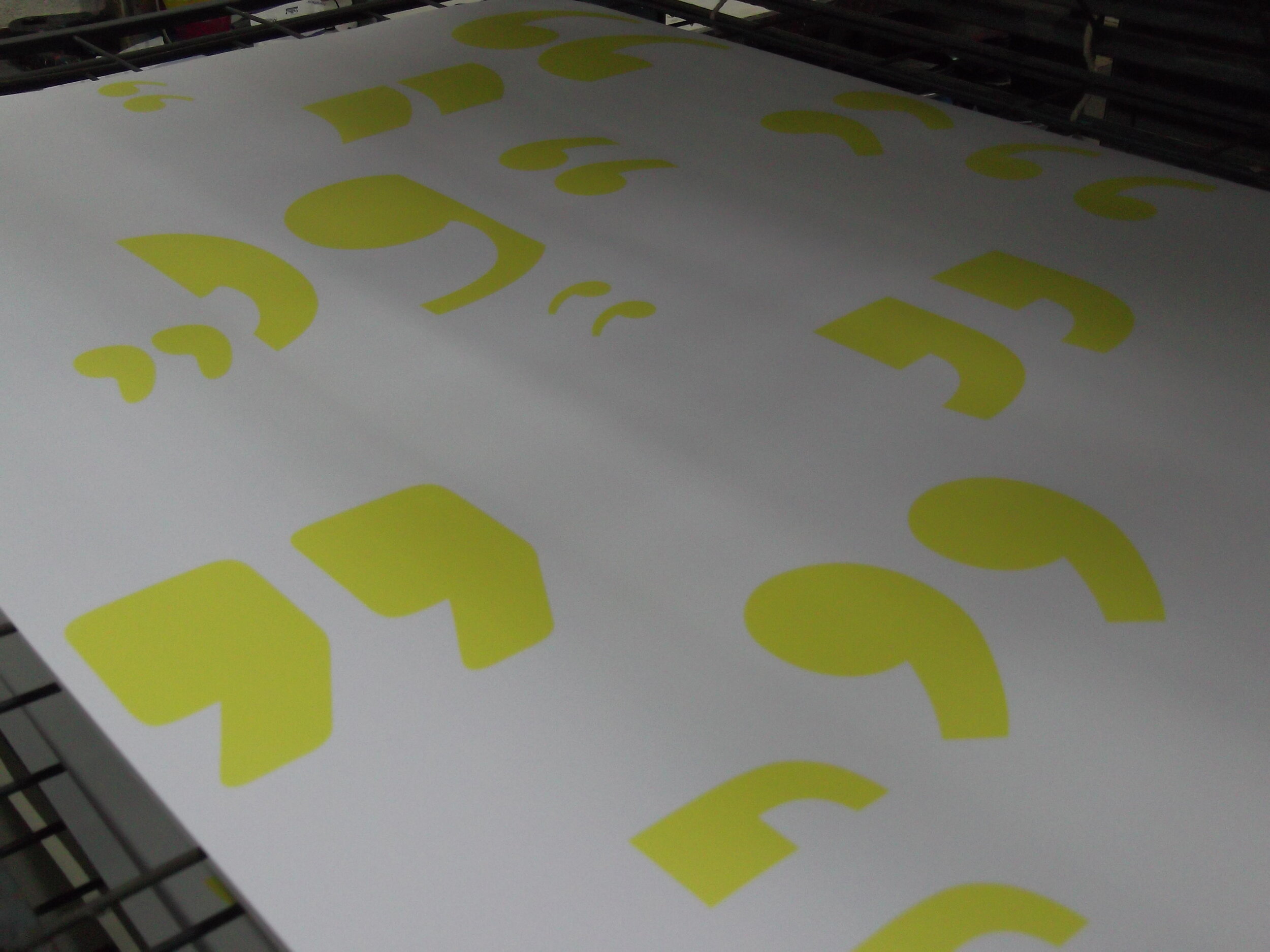
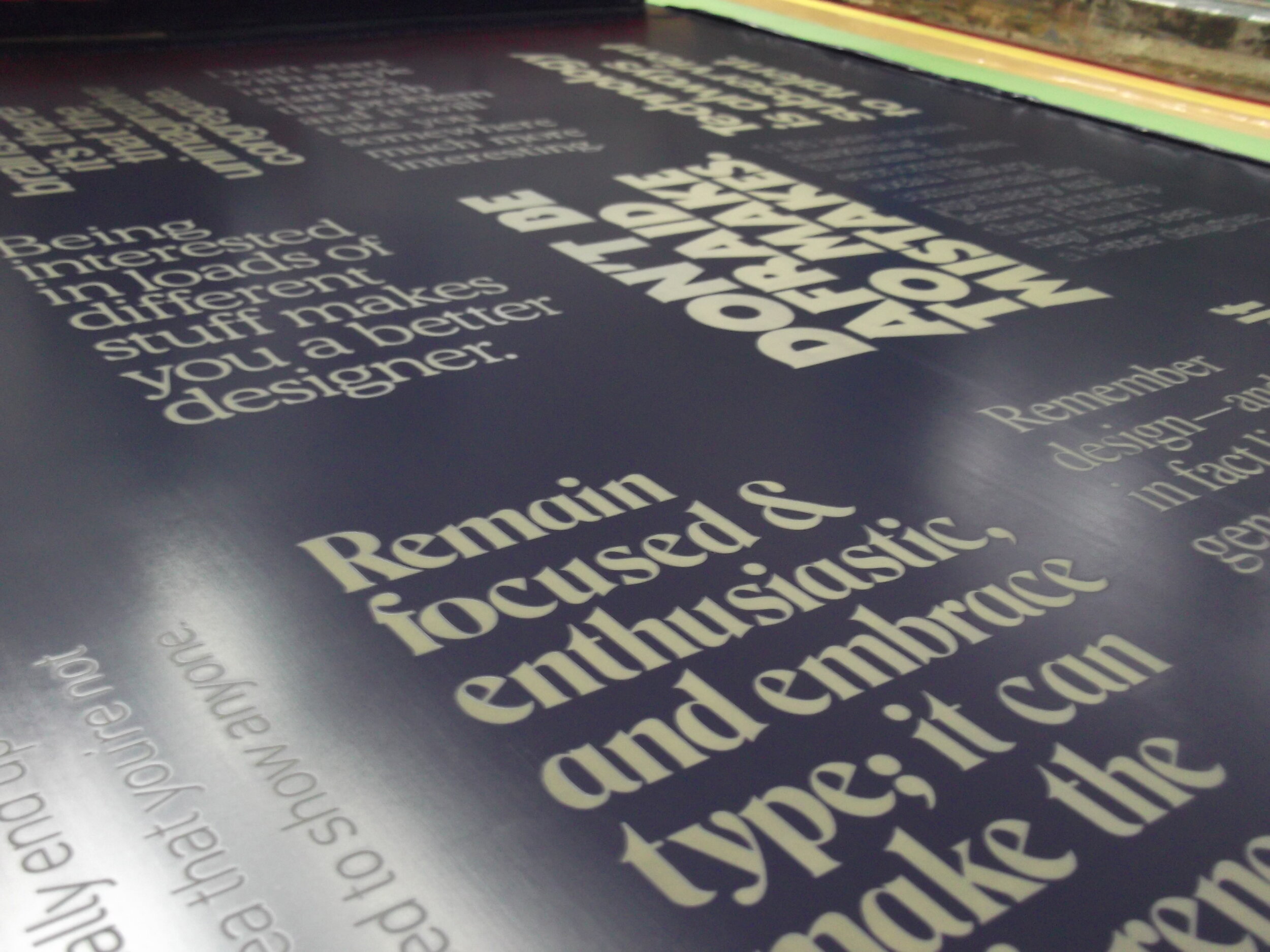
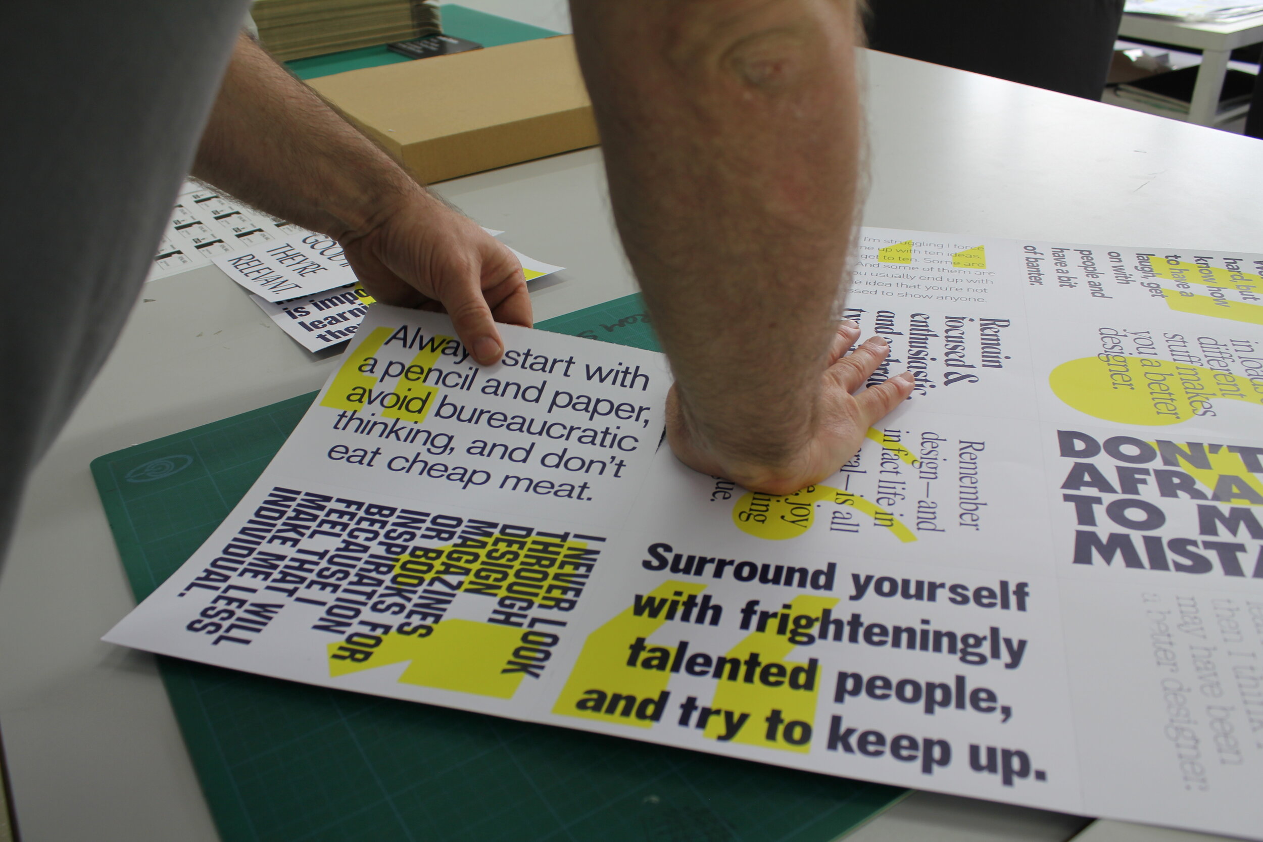
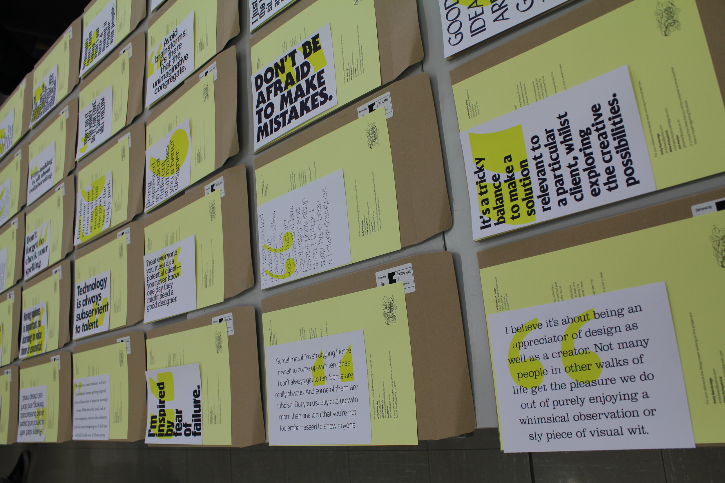
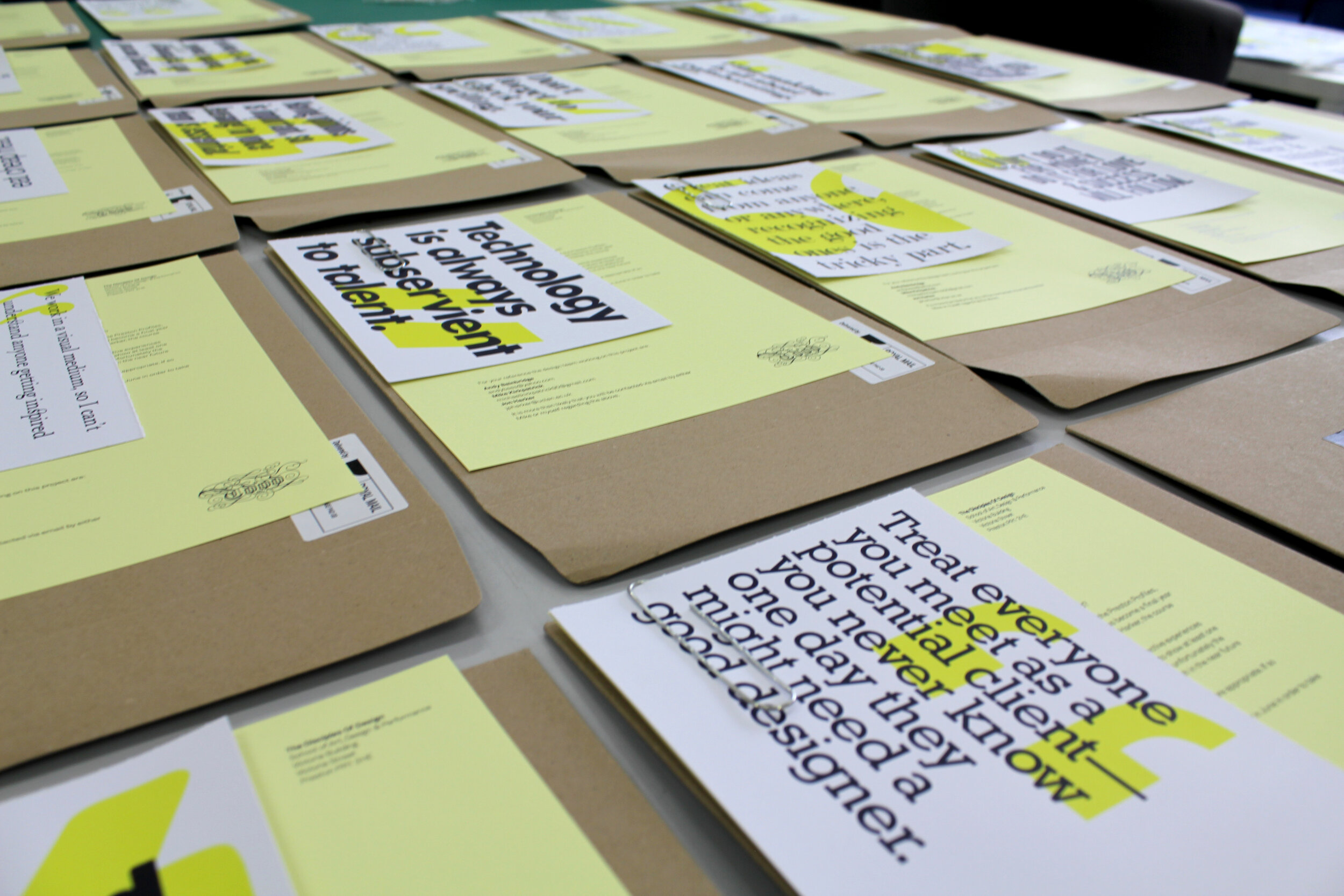
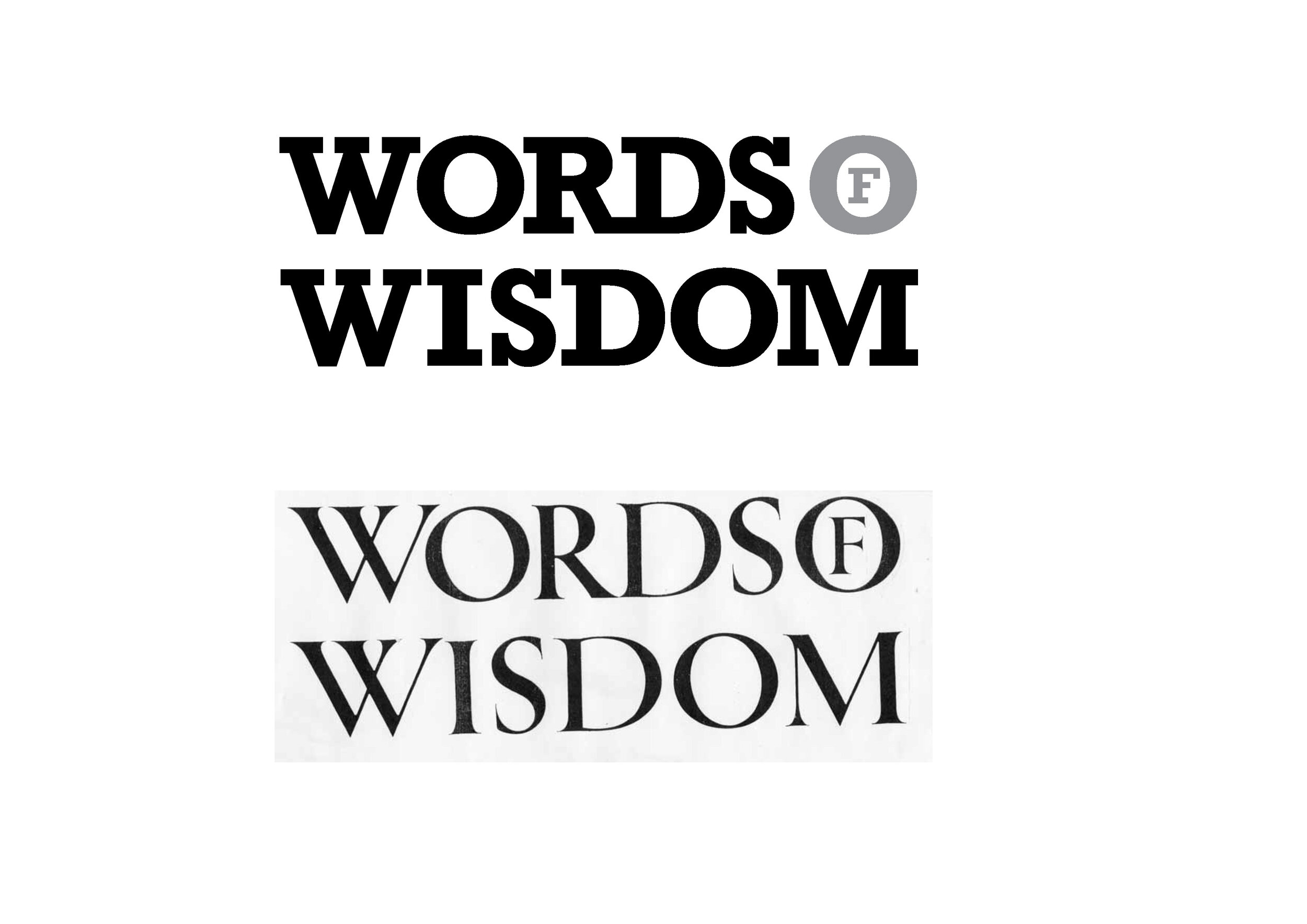
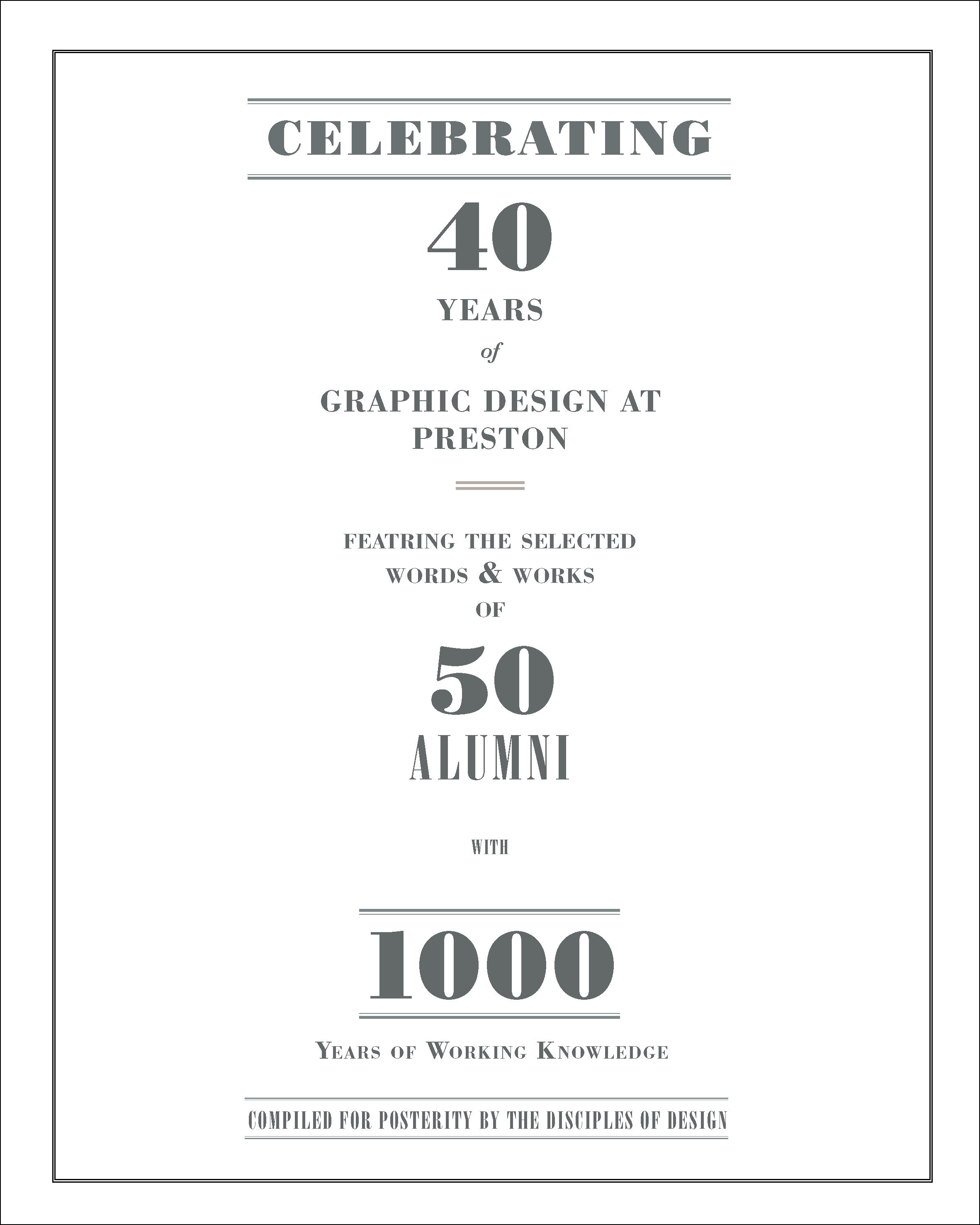
Thus began a process of typographic exploration: layout, sizing, leading, kerning. Two font families had been selected by Mike for the book’s design: Akkurat and Circular. In order to align with the rest of the design we felt one of those two would ideally needed to be used. When setting the type WORDS OF WISDOM on three lines, the WOW was created but immediately caused other typesetting issues. The W, O and W were not of a consistent width, so when left aligned the O was too short. Centreing the three letters was not an option either as the O then looked misaligned. This led us to an unusual member of the typographic family, the monospaced font.

Monospaced fonts were introduced by font foundries alongside the invention of the typewriter. Specifically designed for typewriters, they are what you may now think of as “typewriter fonts” (eg American Typewriter or Courier) and are essentially slab serifs. But, the key difference with monospaced fonts is that every letter, number or punctuation takes up the same amount of space on the line. This means that any character will always sit directly above the character from the line below. Though typewriters are now little used, the font style is still hugely useful especially when dealing with data, coding and technical language.

In terms of the design for WOW, this resolved our main problems. It meant we could set our words over three lines of type with all the characters being pre-designed to fall in line. We were fortunate that the Akkurat family had a mono version within it, otherwise we would’ve had to look elsewhere, or perhaps even go back to the drawing board as we didn’t want the cover to feel isolated from the contents in terms of design.

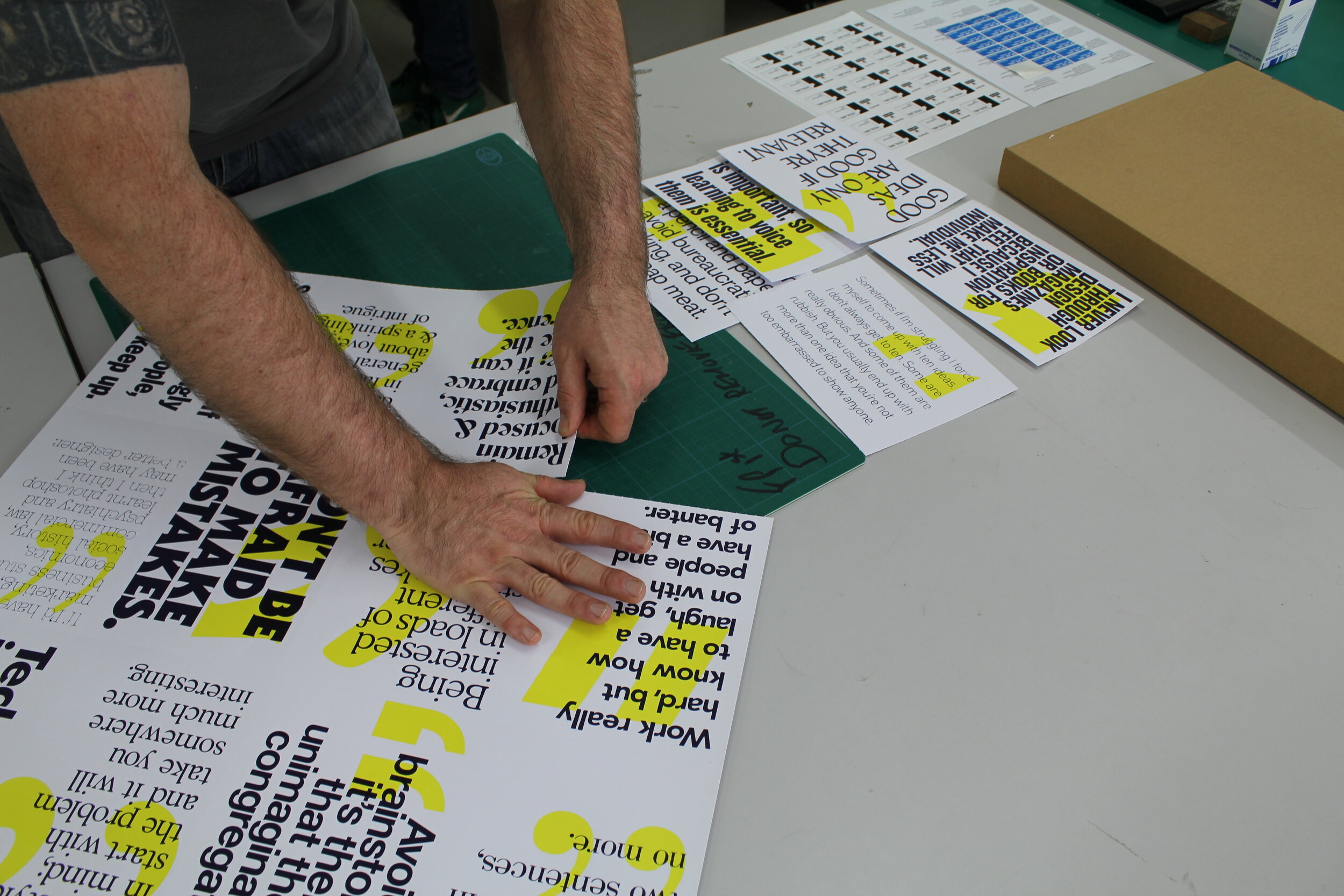
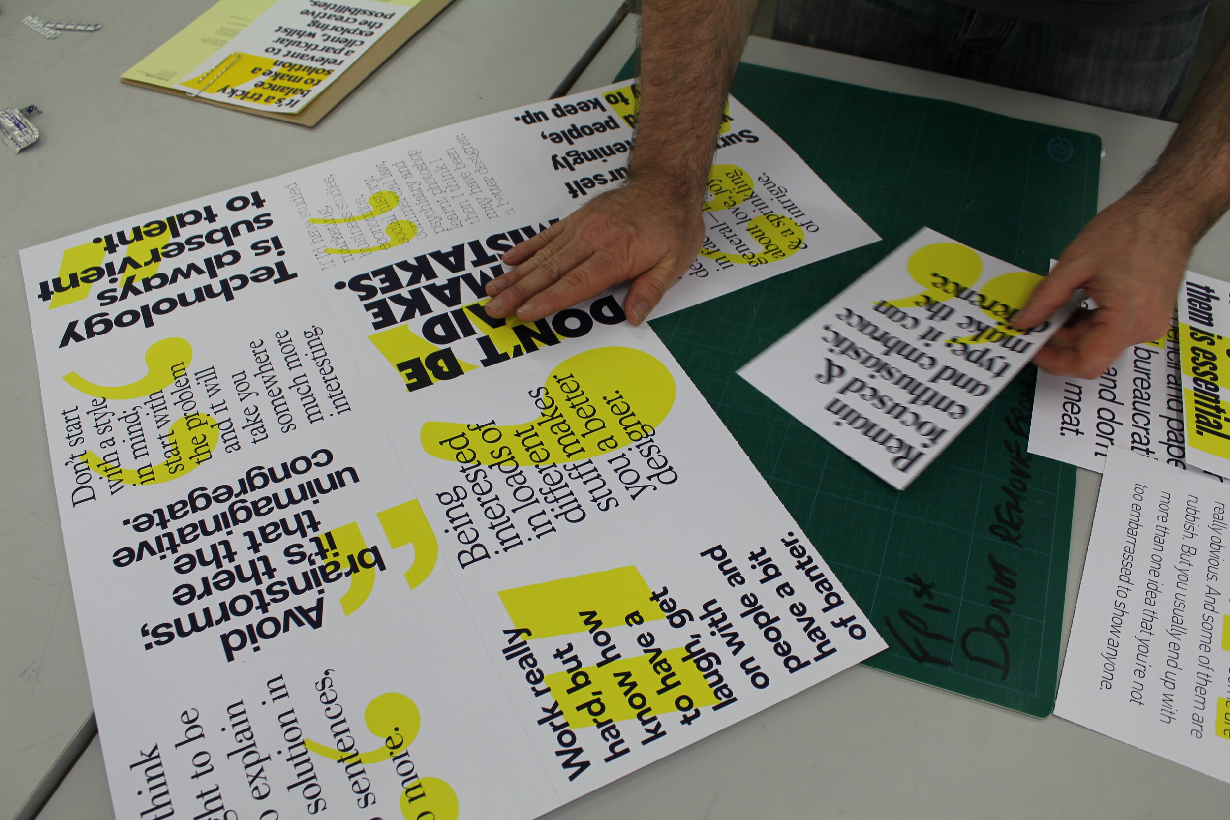
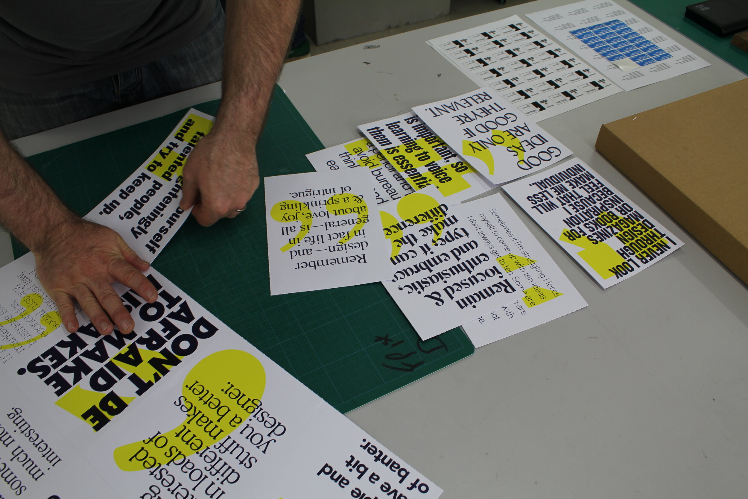
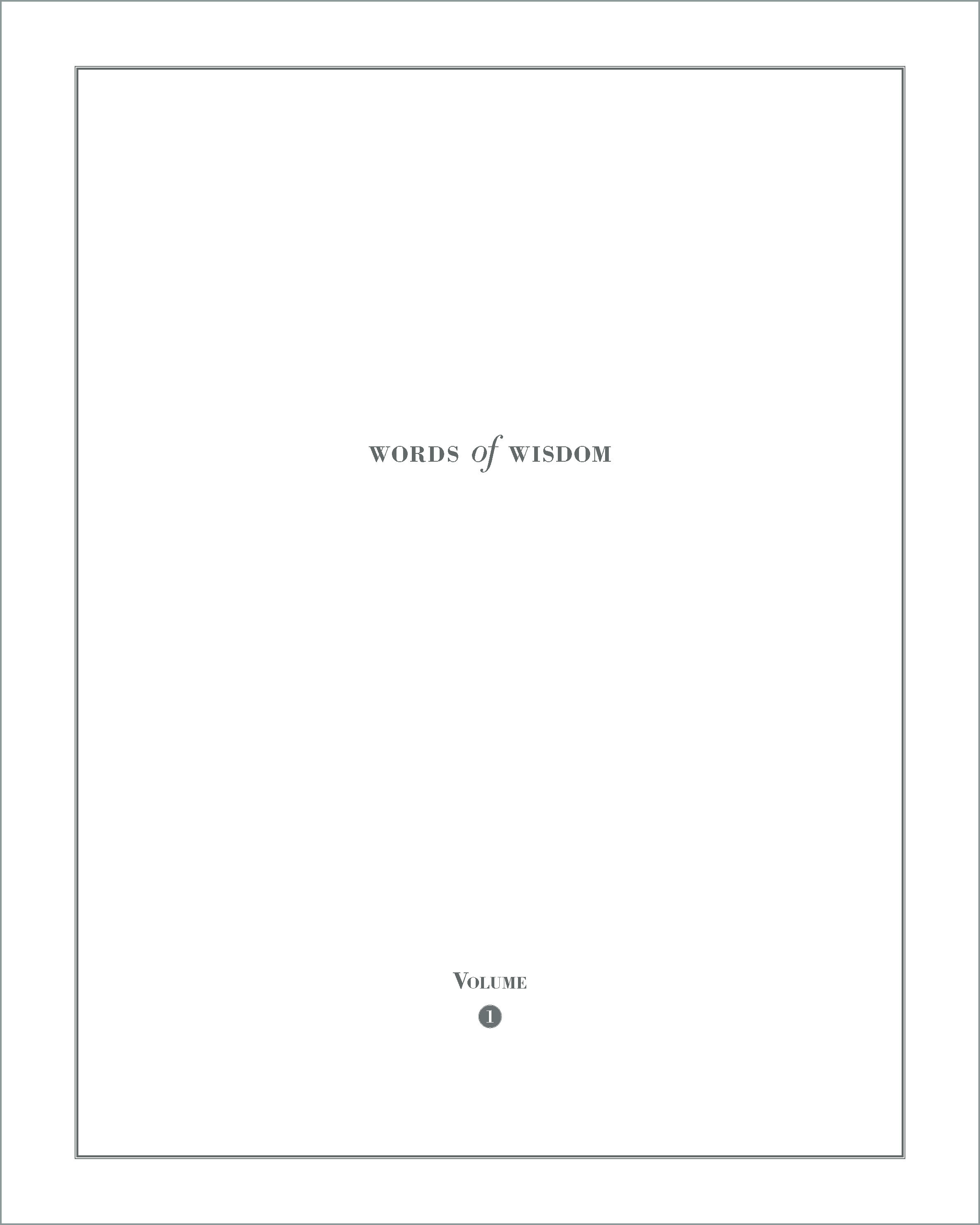
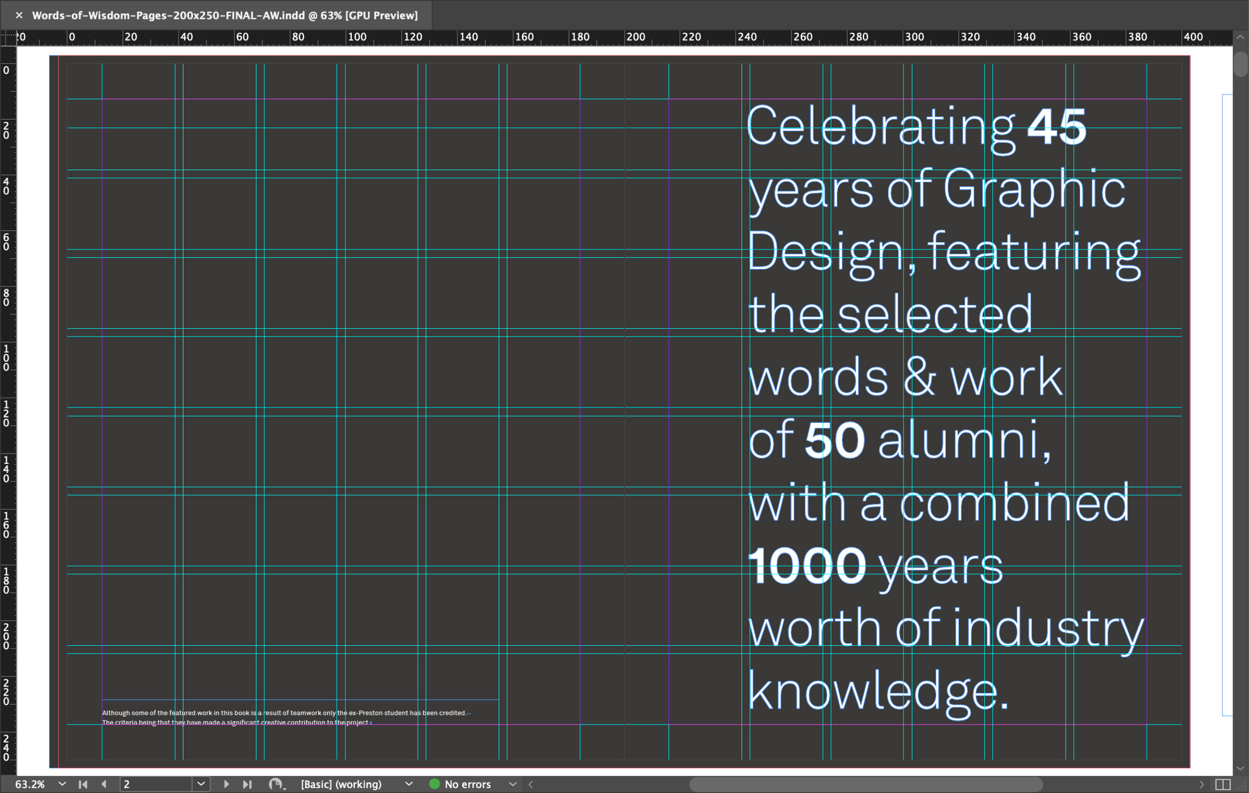
With this issue resolved we could experiment with how to isolate the WOW from the rest of the wording. Initially it was tried across the front and back covers, but crits between the staff and friends of the course felt new readers would simply see WOW and perhaps never make the connection. So having the rest of the wording on the inside cover created the reveal and allowed the reader to make the connection. 

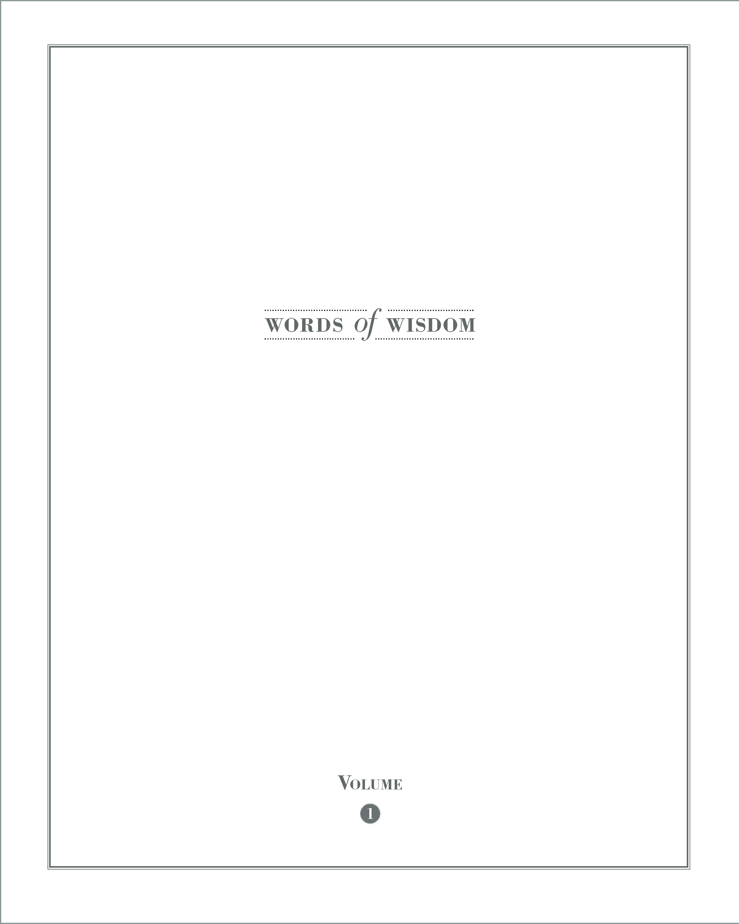
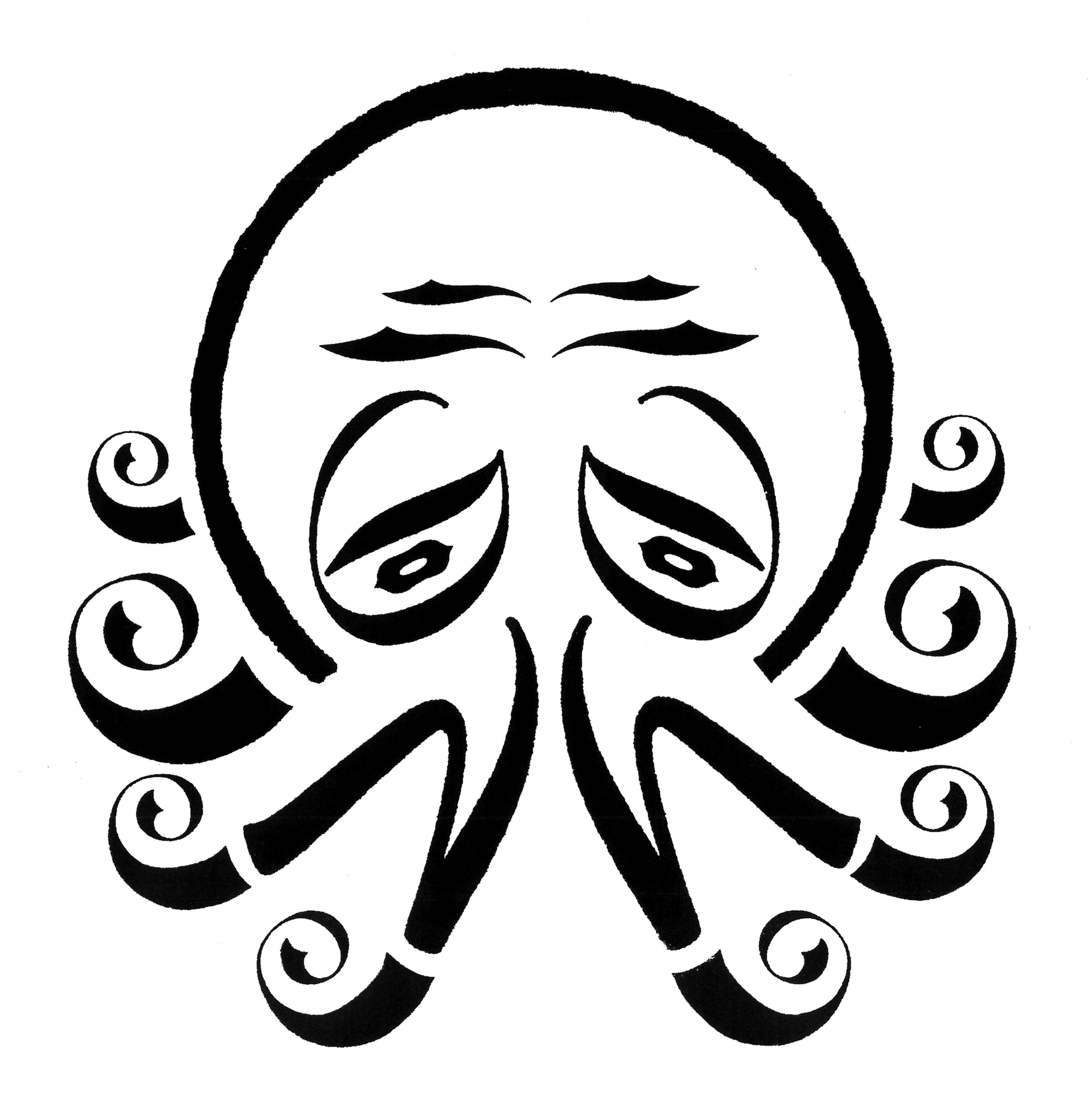
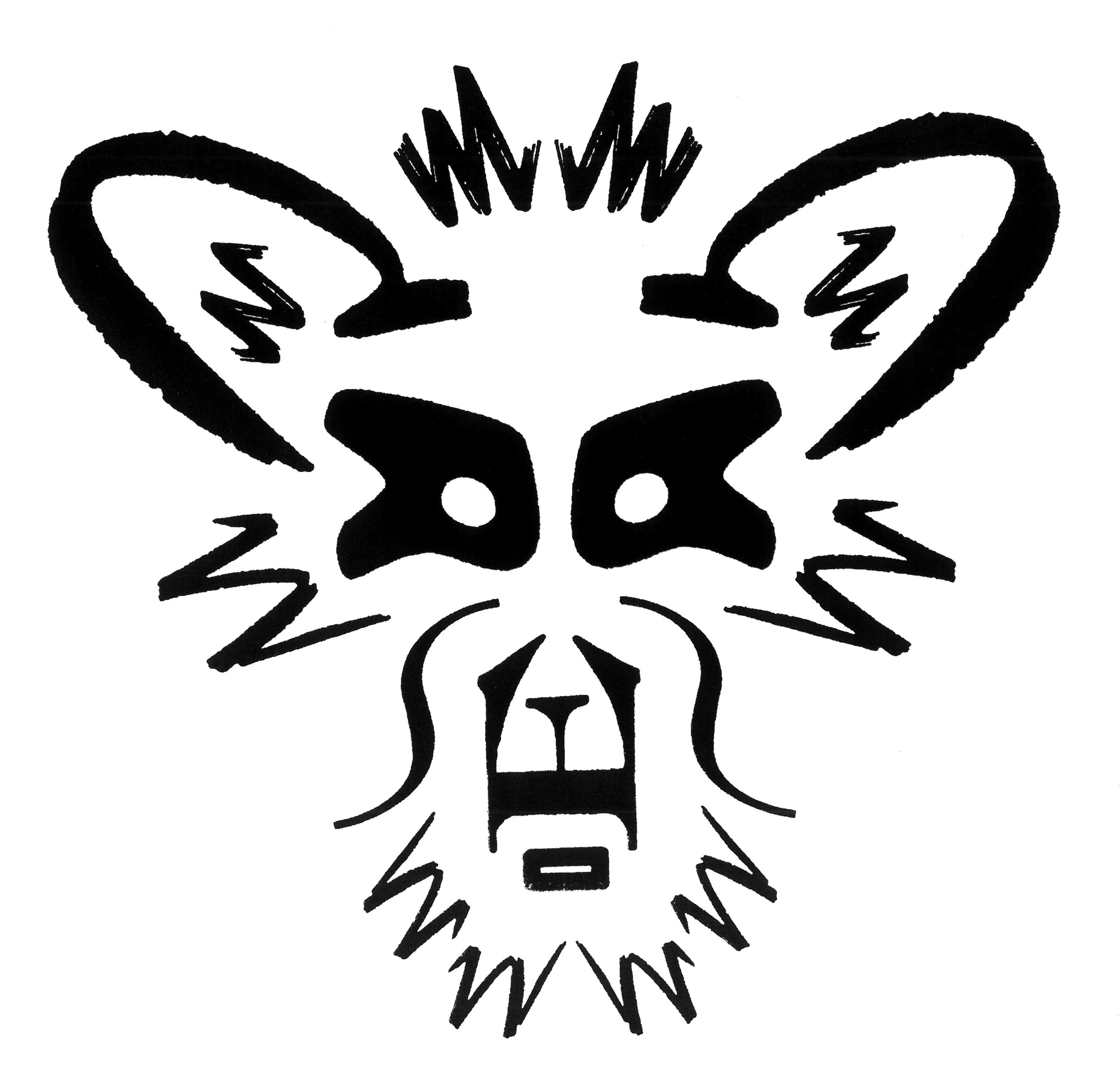
Initial trials for the WOW concept. Note the hour glass shape the WOW takes on the front cover.

The above prototype used Akkurat, the below used Circular. Again the hour glass shape was apparent.

The below versions are using Akkurat Mono. The second image has grid lines added to highlight the formatting of a monospaced font.

Bar seemingly infinite tweaks to size and spacing, the concept was agreed. The next phase was production. Similarly to the design pitfalls experienced earlier, production can bring about similarly deflating experiences. However, they are not related to brains, but rather budget and how much you can afford. The dream was to foil white text into luscious, thick, uncoated, dark grey card which would make up the cover. Luscious, thick, uncoated, dark grey card carries a price though – and one we could not afford. Hanging onto the white foil, it was decided the card would lose some weight, and be printed dark grey and finally have a coating applied to make it more hardwearing. 

Compromise is a part of a production, especially with a university budget. Though the all-singing-all-dancing vision of production would not have added to the idea, it would definitely have iced the cake.

Signed off by staff, the book finally went into production after its first draft back in 2013.


A launch that never was (but might still be)

“Does it have legs?”

This phrase is surely heard in studio crits the world over. Can you run with this idea? Will it excite the client when you present it? Will it make your audience smile? Does it tell a story? It’s a great way to test a concept. Does it have the flexibility and simplicity to be used in different ways, that always enhance the original idea?

So, with our WOW we began thinking about how and where we could extend the idea. 

Ways Of Working
World Of Work
With Or Without (You)
Work On Weekends
Walks On Water
Who Offers What
Ways Of Work
Words Of Wine
Water Or Wine
Walk Our Way
Words On Work
Wild On Wednesday
Watch Our Words
Why Oh Why
Words Of Winners
With Our Wishes

This is just play, and good ideas allow you to play. So when we sent the book out to the contributors, With Our Wishes was enhanced to With Our best Wishes for the compliments slip. The invite for the book launch in London will be Water Or Wine (spoiler alert). And when planning Volume 2, we’ll congratulate Preston graduates on winning at D&AD by requesting the Words Of Winners. And when it takes another seven years to get the next one finished we’ll wear t-shirts in the studio asking Why Oh Why.

The compliments slip in position:

There’s an Alan Fletcher quote about the course here in Preston that is now quite well known.

“I’ve nothing against Preston, but shouldn’t the best course in the country be in its capital city?” – Alan Fletcher

Using the quote we designed and screen printed a bespoke box to post the books out in. This was all done in Victoria Building with the infinite help of our colleagues in the digital and print studios. And it was all done just before March 23rd, seven years in the making and just as it arrived the wind was taken from its sails. We hope to get more books shared out as soon as we can.

Packed and ready to go:


In all its glory

Always remember to photograph your work. These were taken in the studio on a simple background with the course tripod and lights.

Here’s the bespoke box:

The white on the cover, spine and back cover is foil blocked:

And finally, printed spreads demonstrating Mike’s grid in action:


Words of Wisdom In numbers

  • 45 years of teaching

  • 7 years in the making

  • 50 interviews

  • 1000 combined years of knowledge

  • 402 images

  • 240 pages

  • 300 grams per square metre (cover)

  • 120 grams per square metre (pages)

It is on such tiny details doth history turn

We are delighted to announce the upcoming launch of Andy's book - Typographic Specimens. There will be much more to come about this over the coming months. Keep your eyes peeled.

The Rev. Jackson Whitehead served as the ship's chaplain aboard the H.M.S Pica, sister ship to the H.M.S Beagle, which accompanied the Beagle on its second survey expedition in 1831. As well as being a highly visually perceptive man of the cloth, Whitehead was also a very keen amateur collector of fauna as well as a typography enthusiast. 

Upon realising that the majority of both ships crews were either committed atheists or budding evolutionists, he embarked on entertaining himself between landfall by creating a whole series of creatures made up out of typographical characters. Some of these were based on the animals that they discovered and some were mere flights of fancy. 

Only recently, after the restoration of Whitehead's ancestral Jacobean manor house, has the manuscript of his work set out before you come to light.

Rev. Jackson Whitehead – circa 1850

Rev. Jackson Whitehead – circa 1850