D&AD – New Blood Winners

Big, big congratulations to Olivia Kelly and Phil White who both won a wooden pencil at this year’s D&AD New Blood Awards!


Olivia and Phil


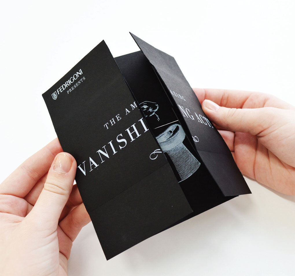
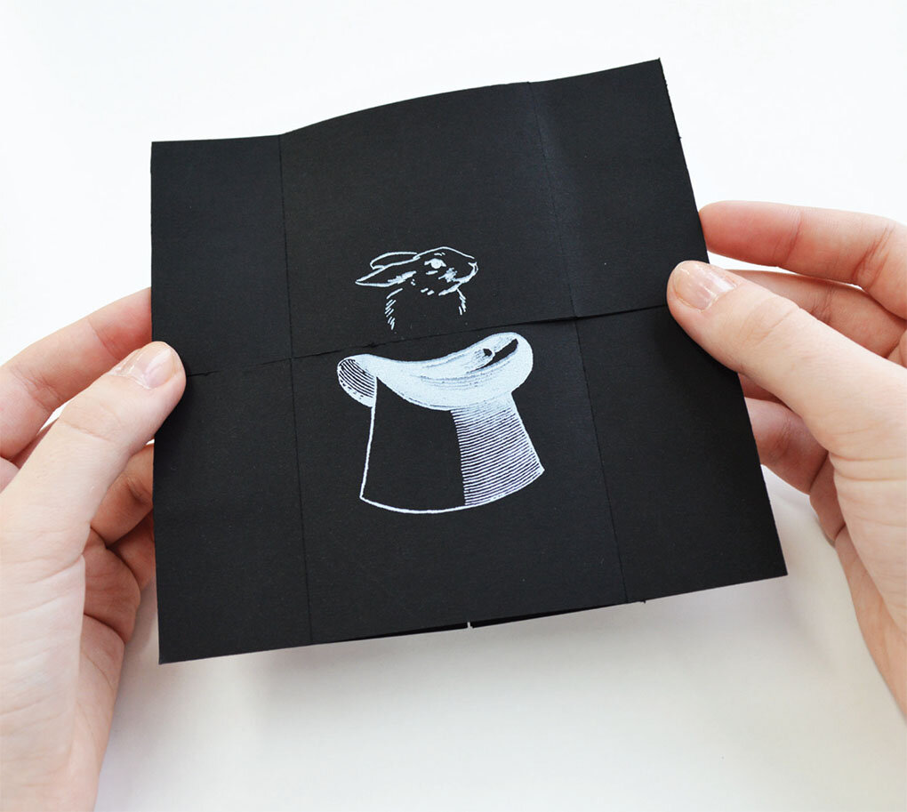
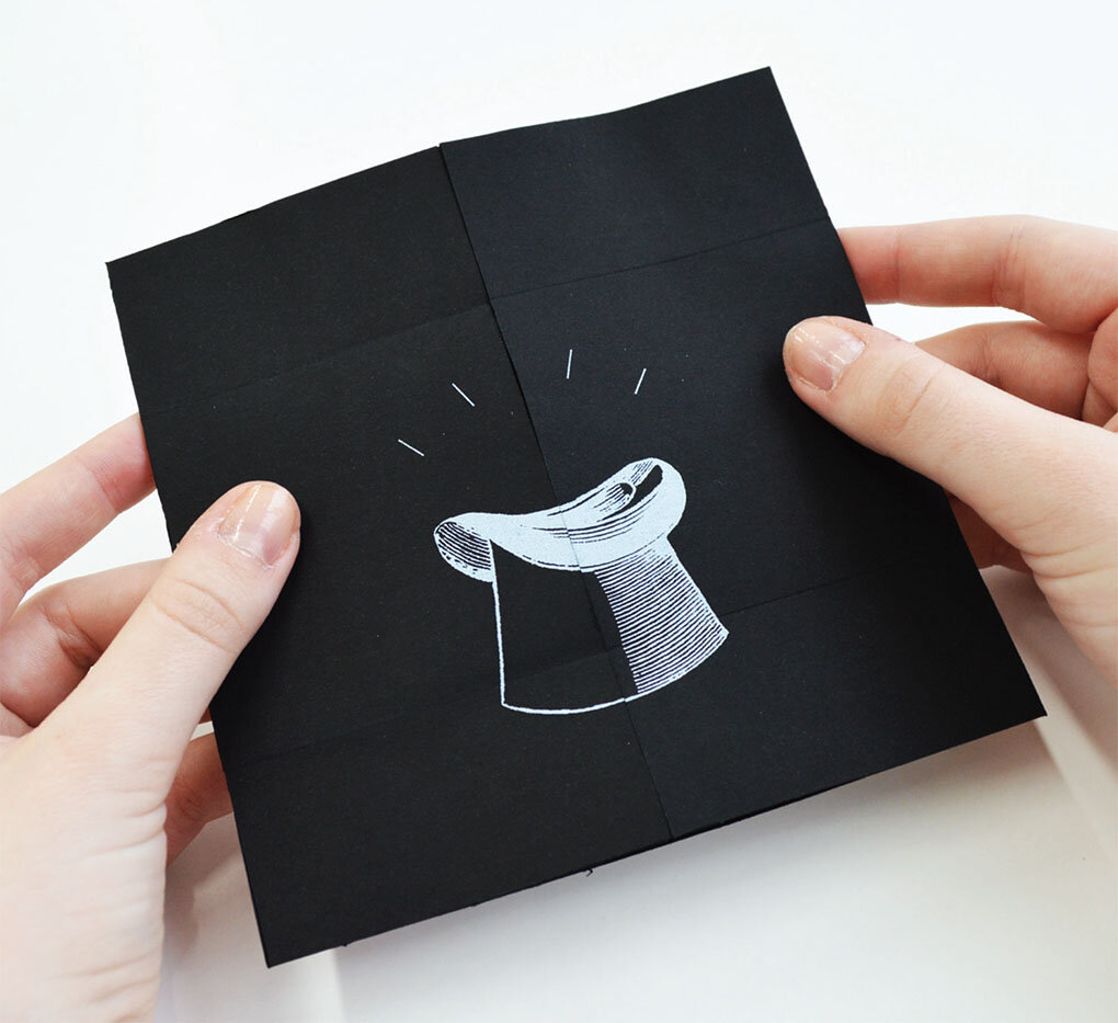
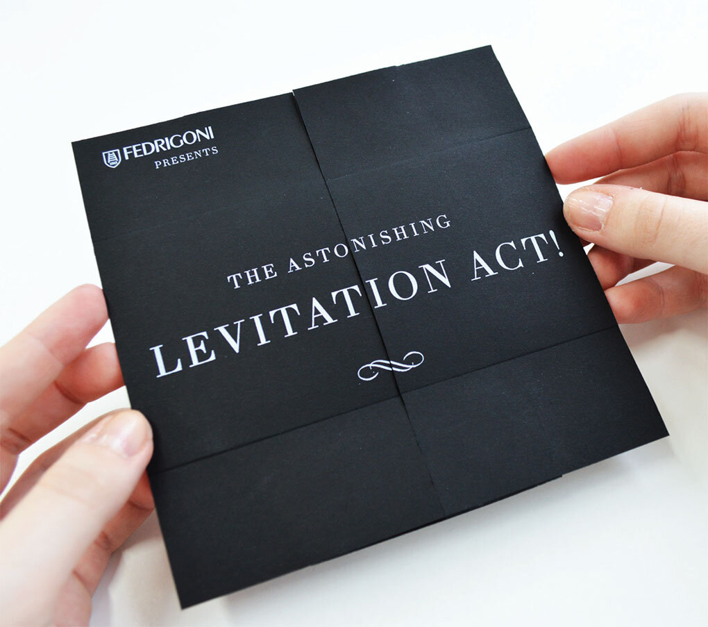
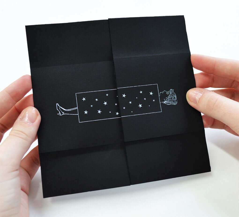
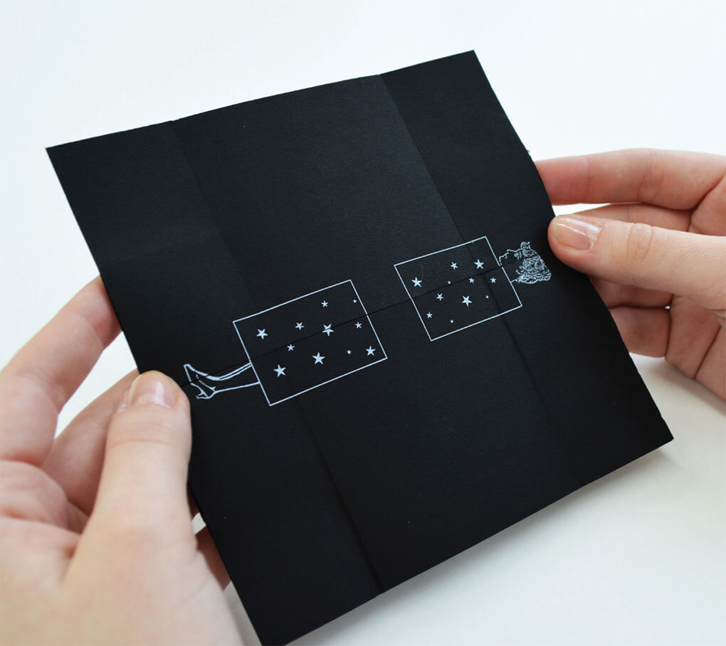
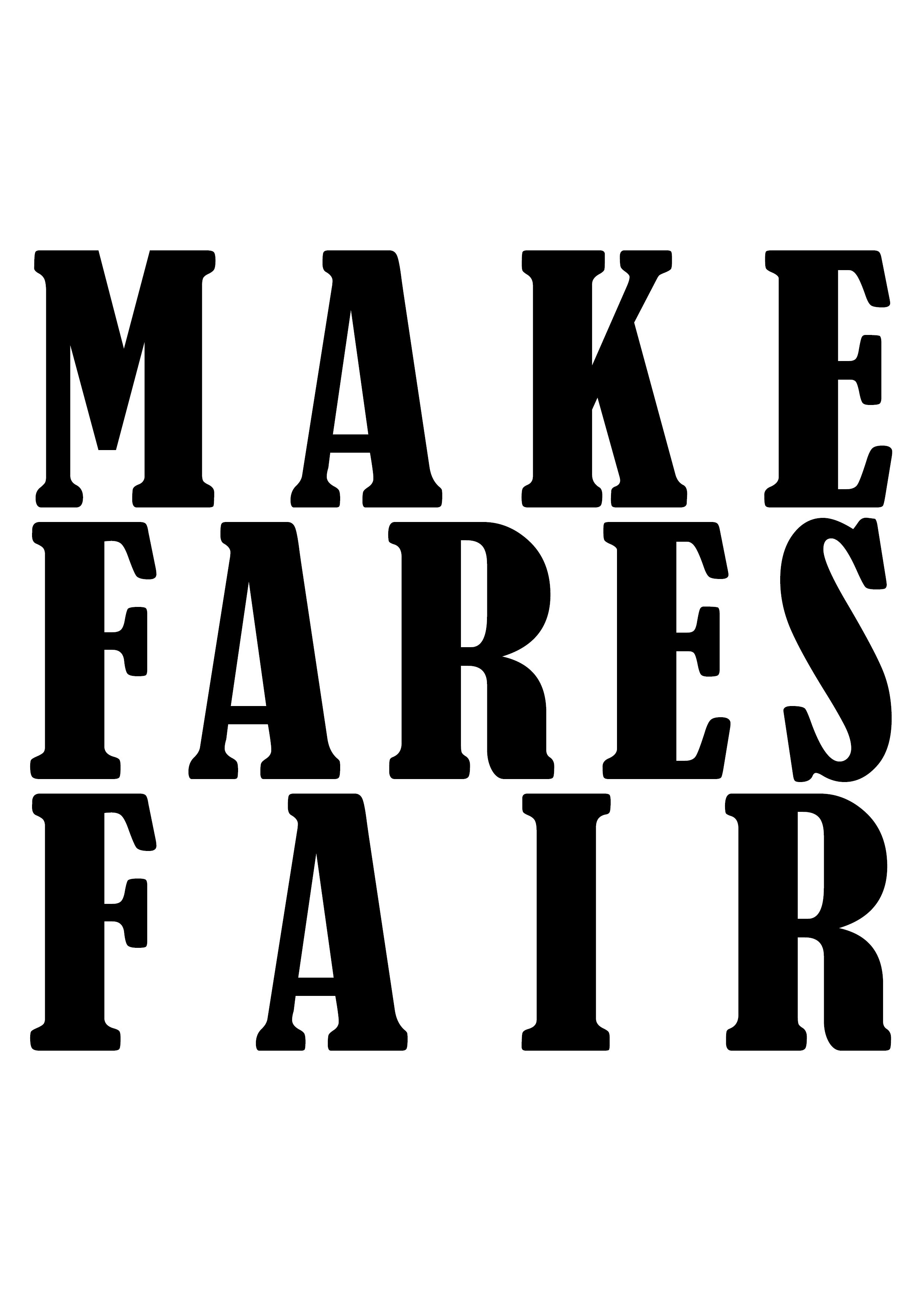
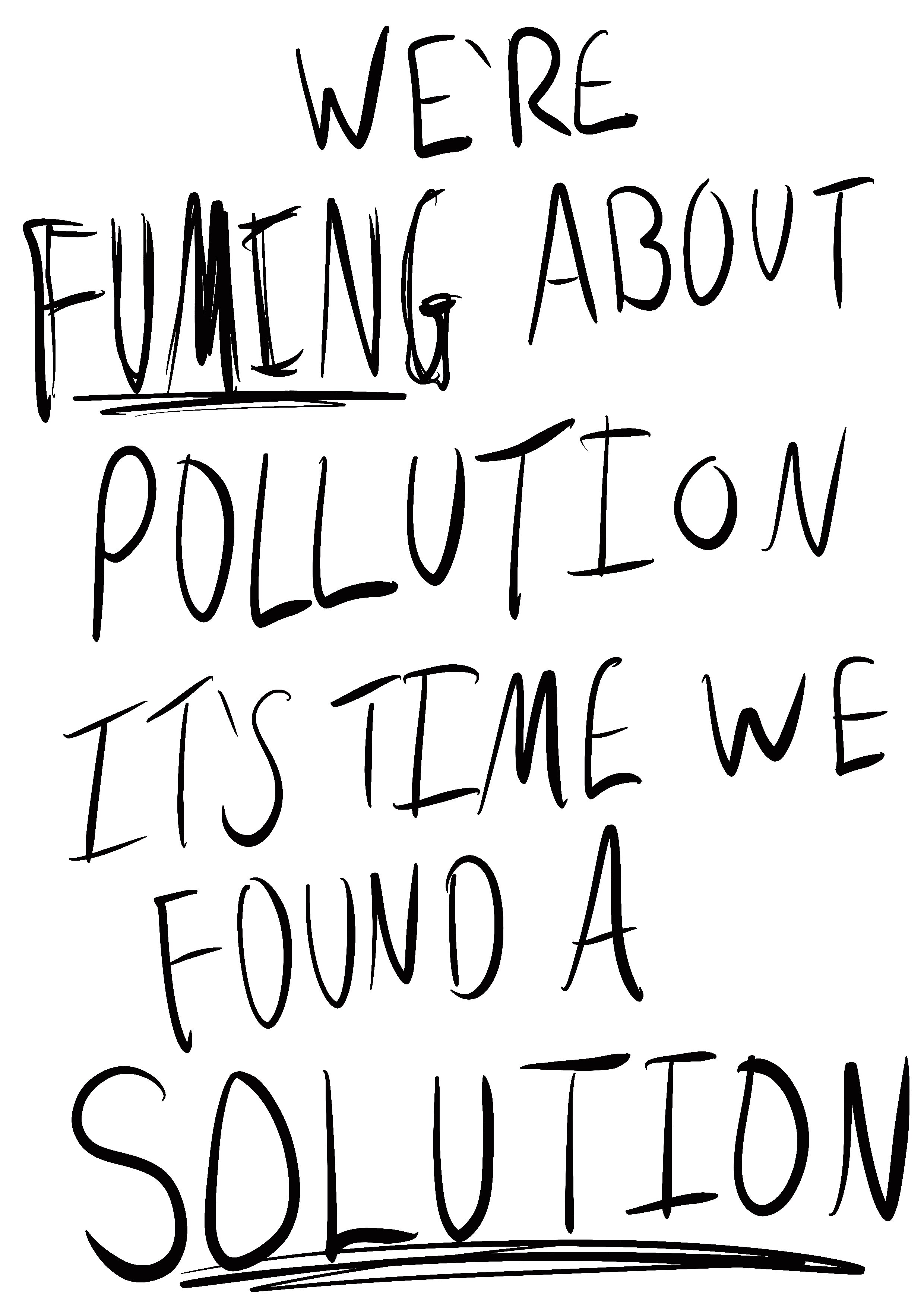
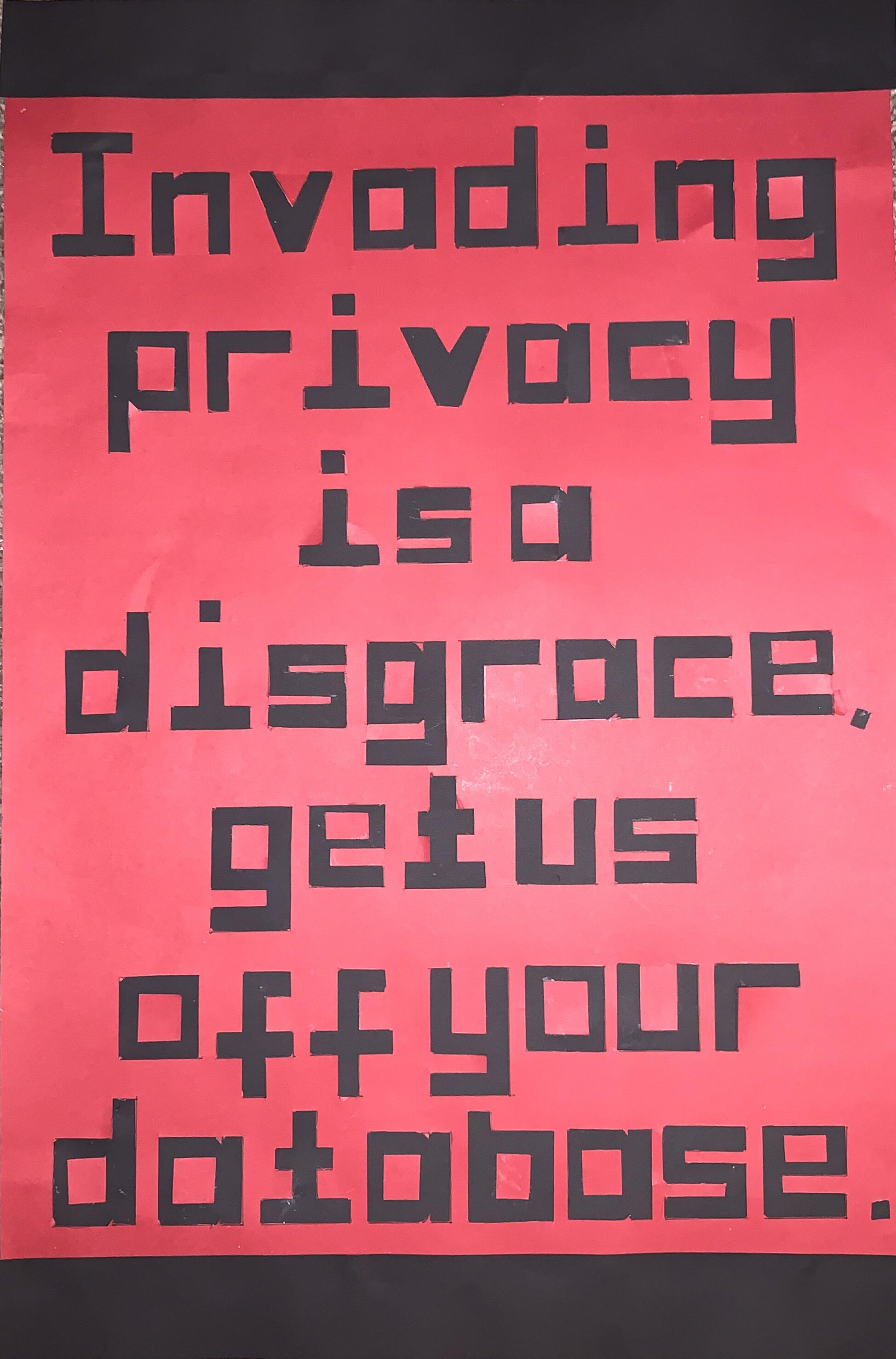
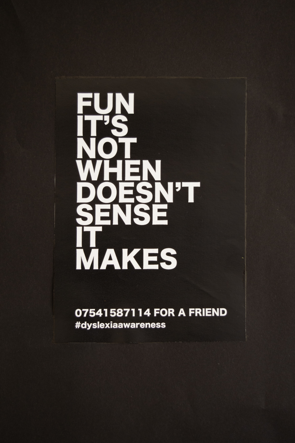
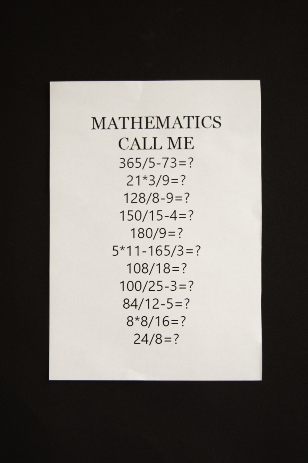
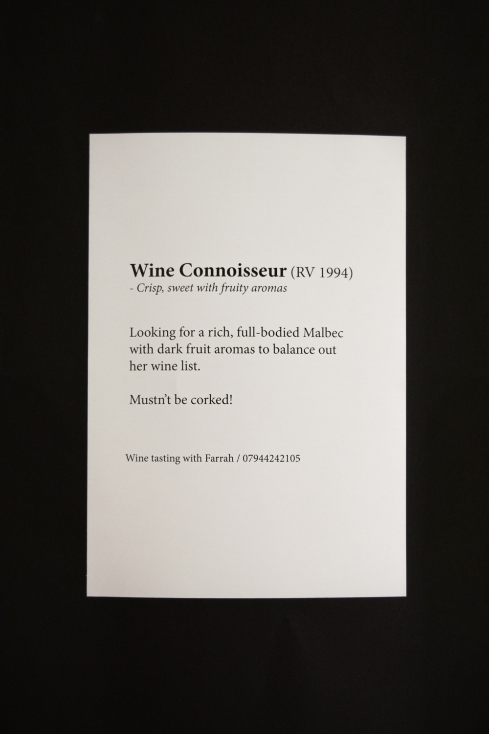
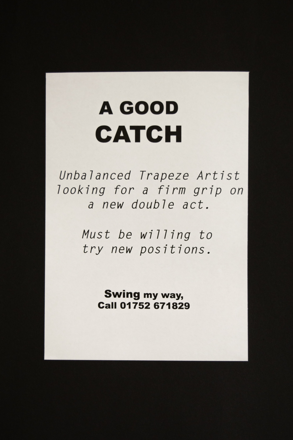
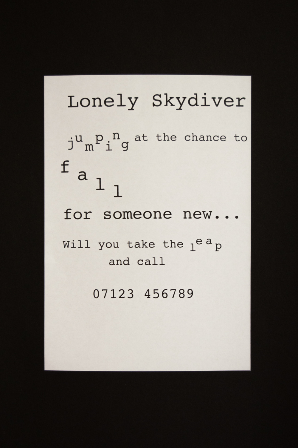
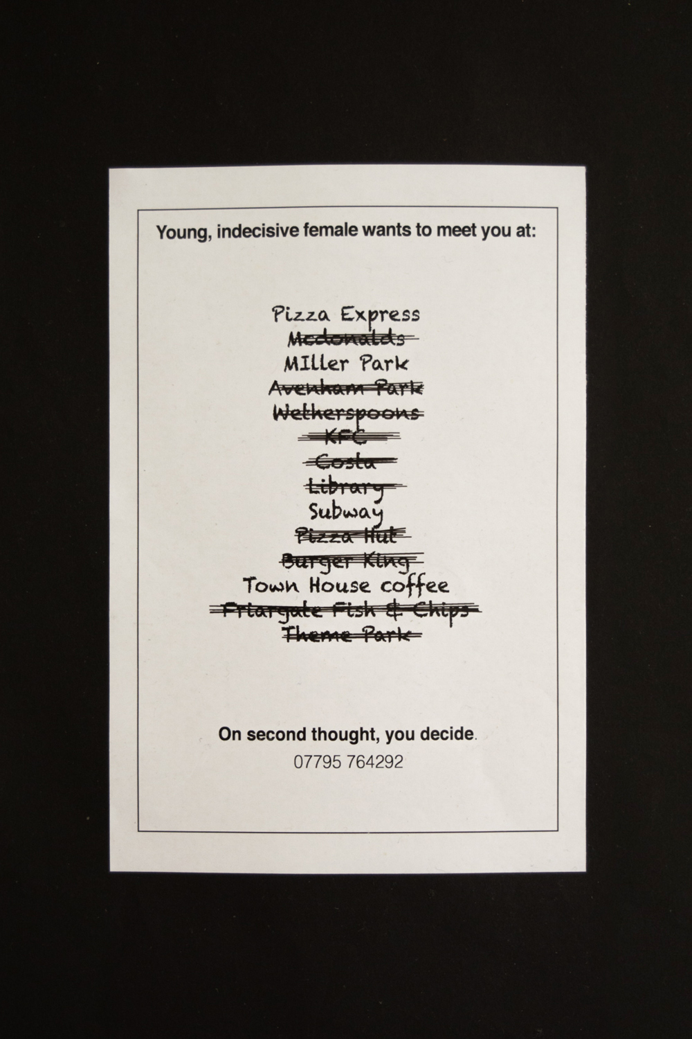
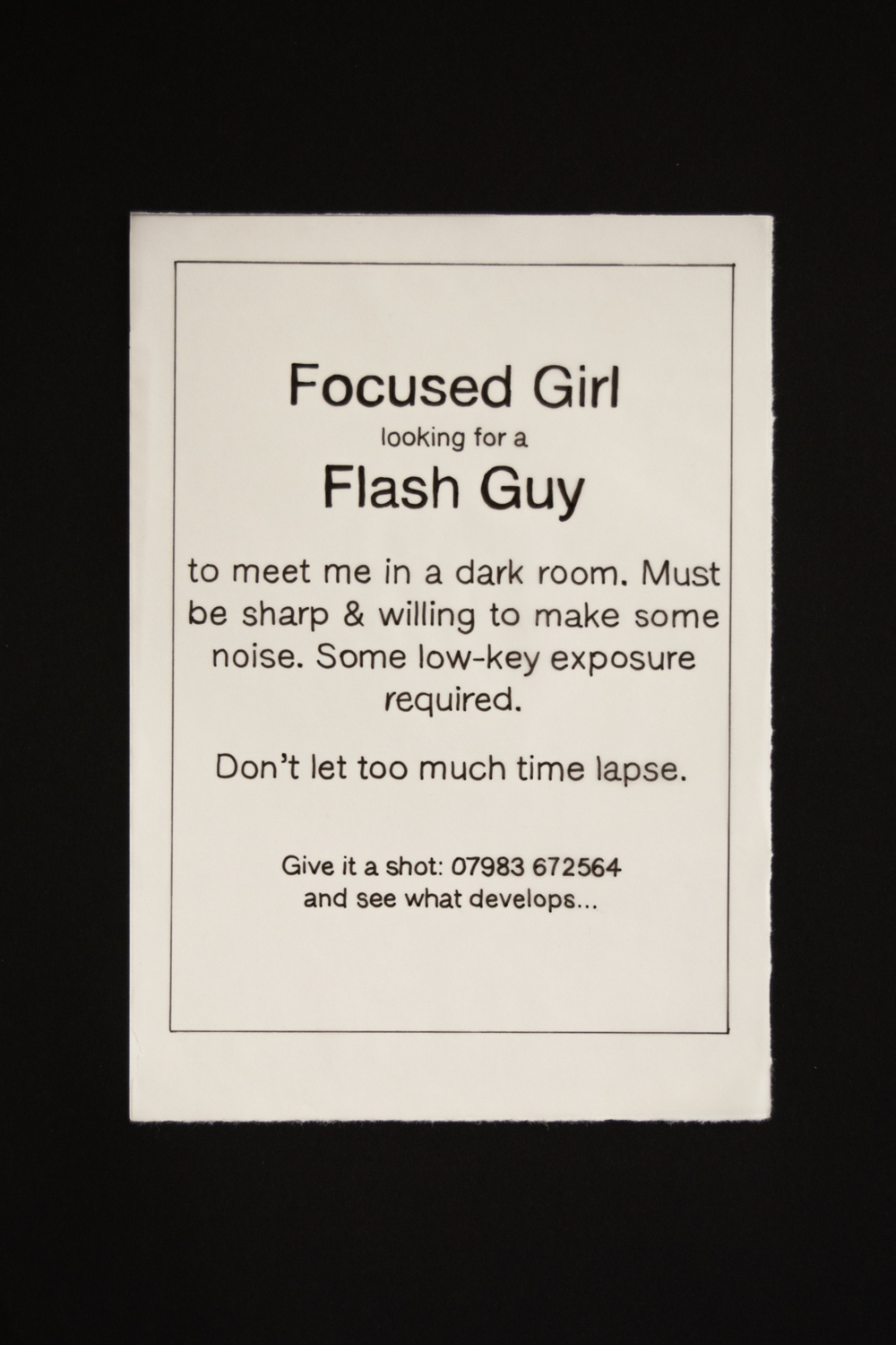
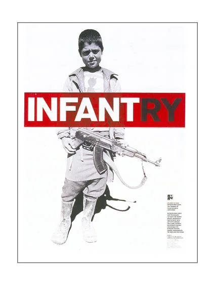
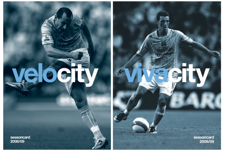
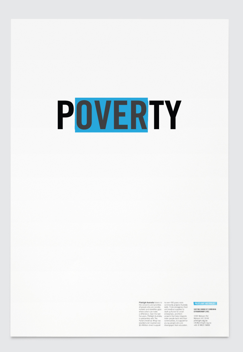
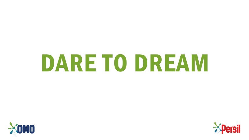
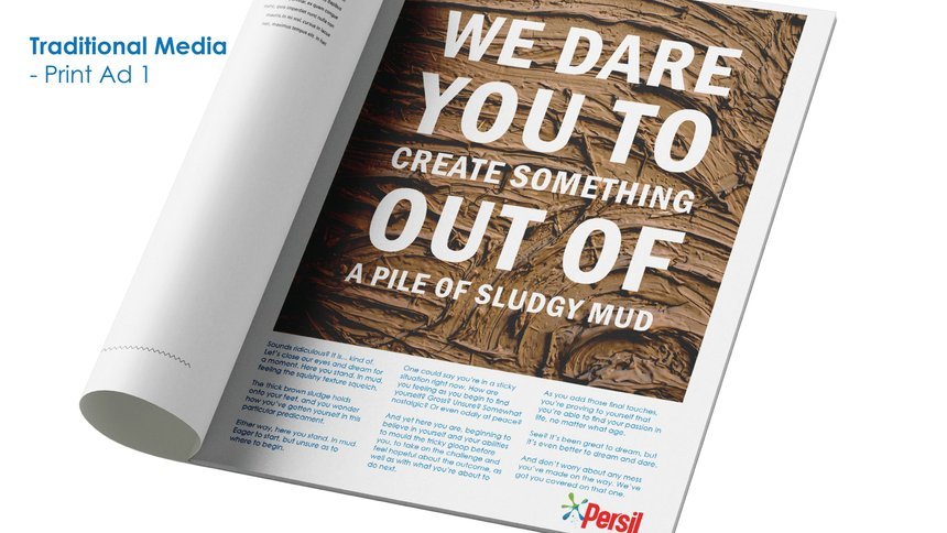
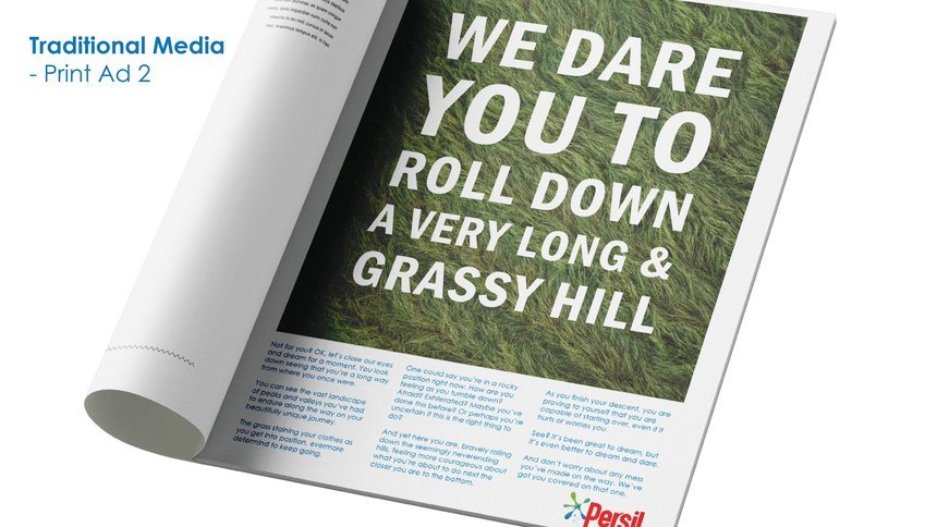
Olivia answered the OMO, Unilever Persil copywriting brief.

The problem set was to encourage a new generation to dream and dare, because you don’t achieve your dreams by playing it safe.

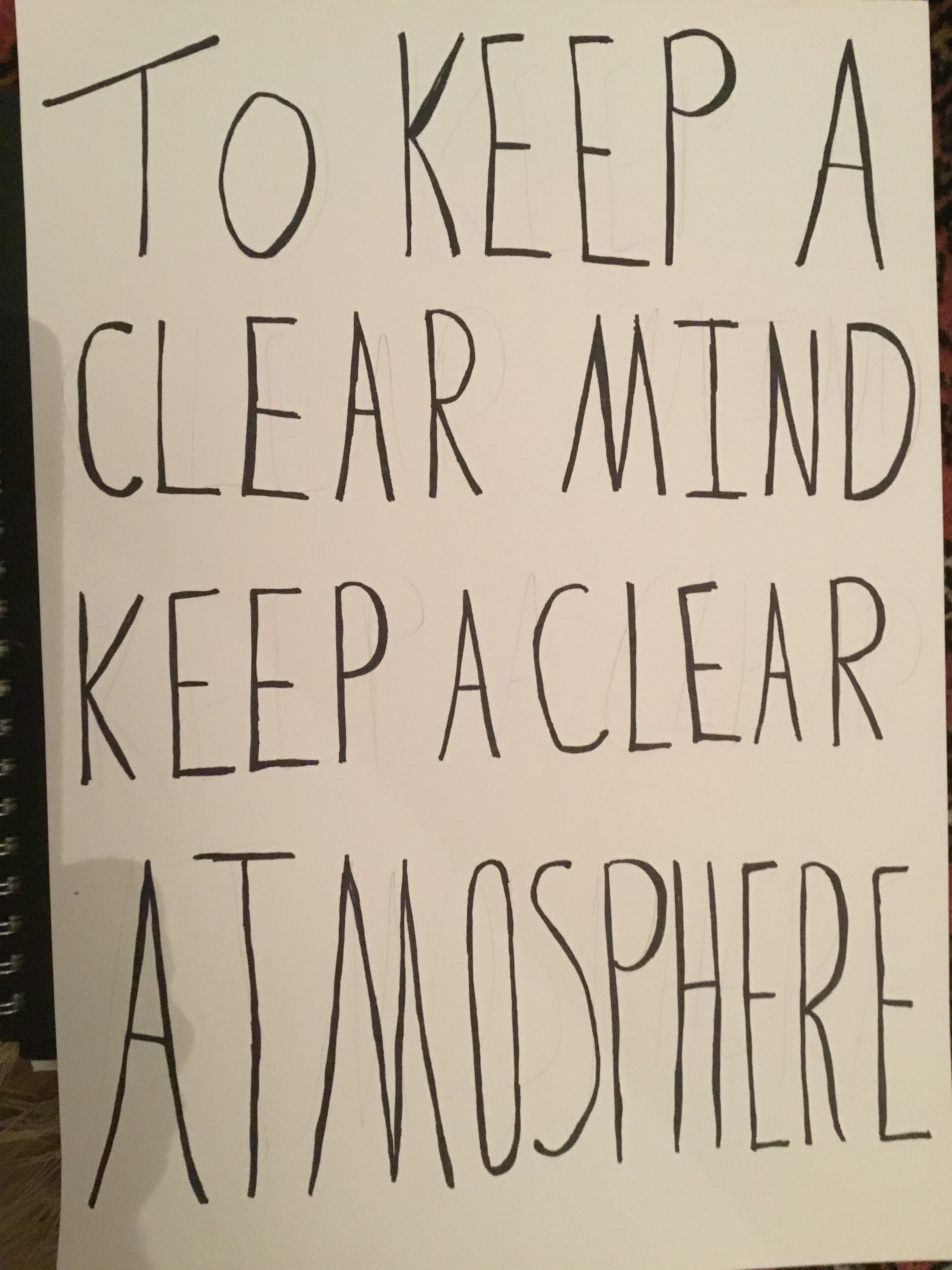
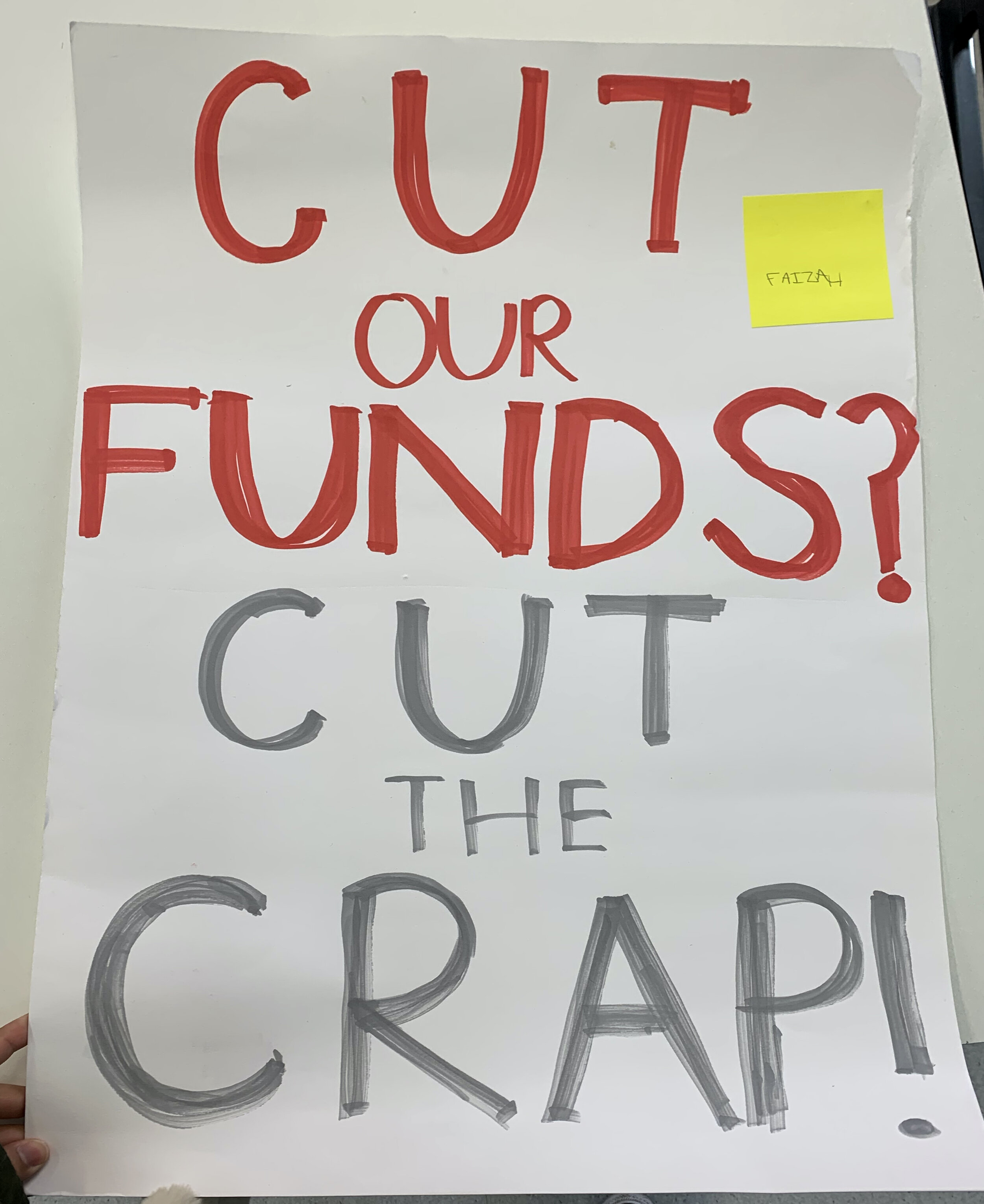
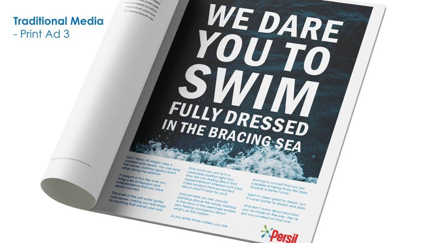
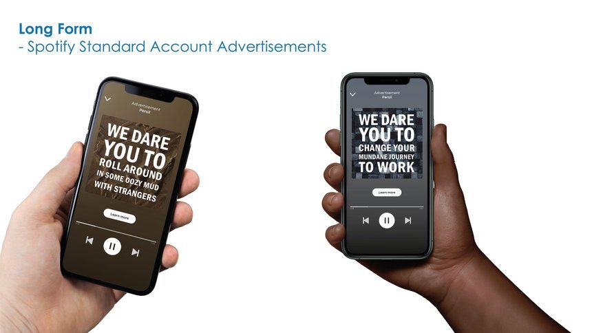
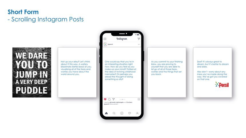
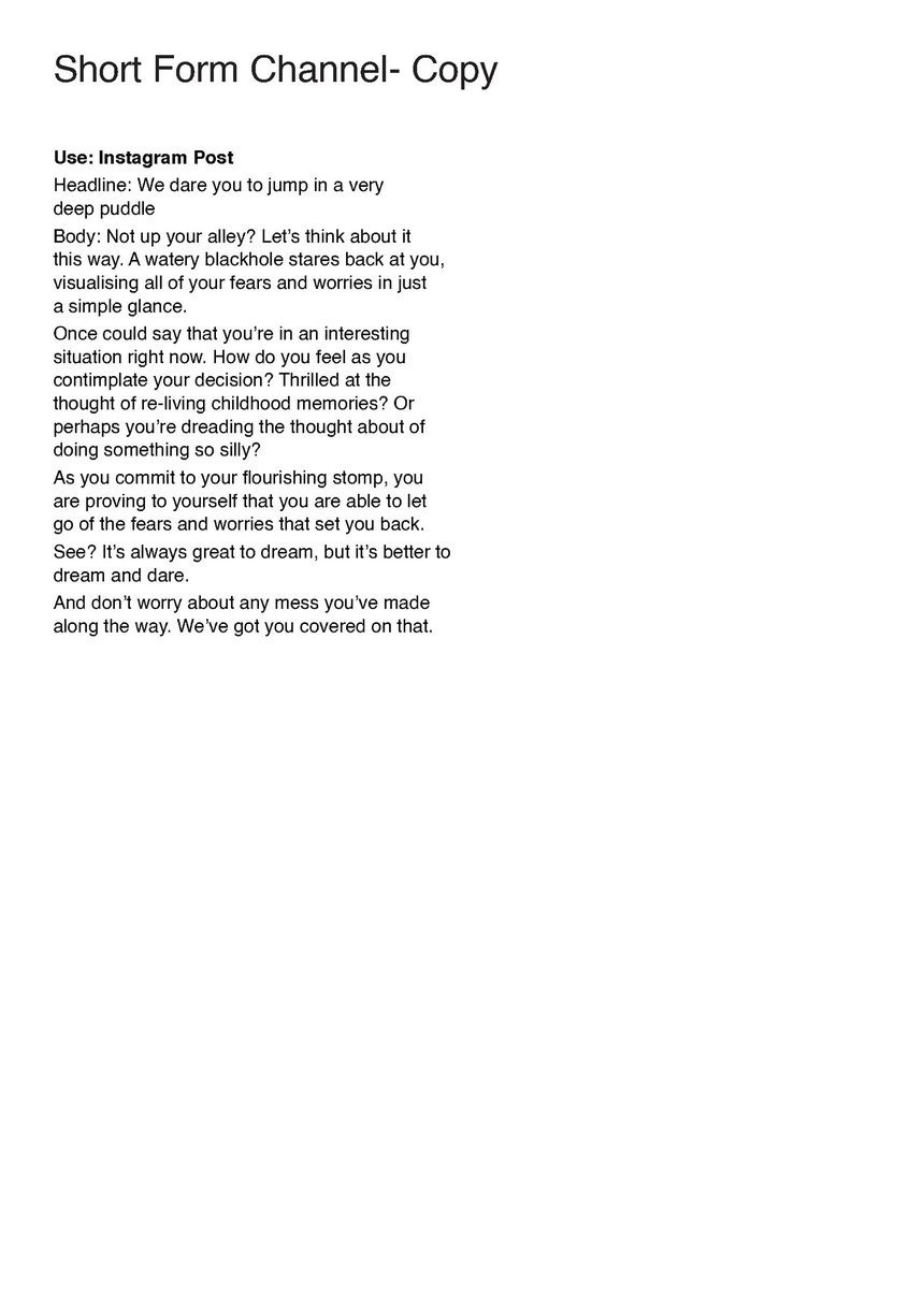
Olivia took the insight ‘6 out of 10 British adults are afraid of taking risks. With Persil wanting to bring their ‘Dirt is Good’ message to a new audience of young people who don’t have families, it is time for Persil to encourage their new audience to dream, even if it's only for a minute’ and flipped the proposition on its head and asked the audience to dare to dream instead.

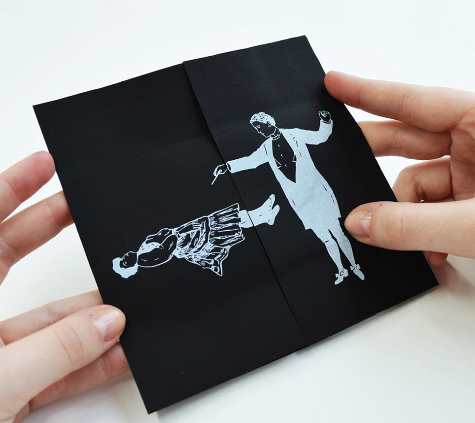
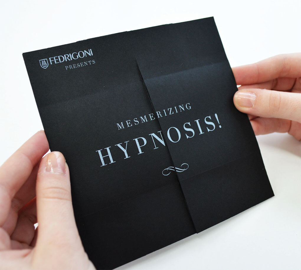
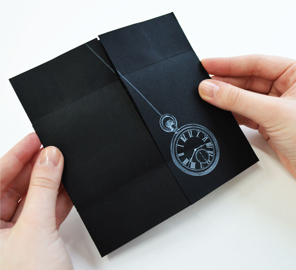
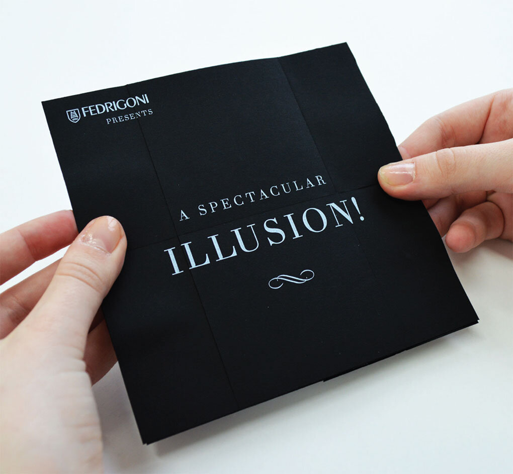
This new angle led to the copy based solutions below.


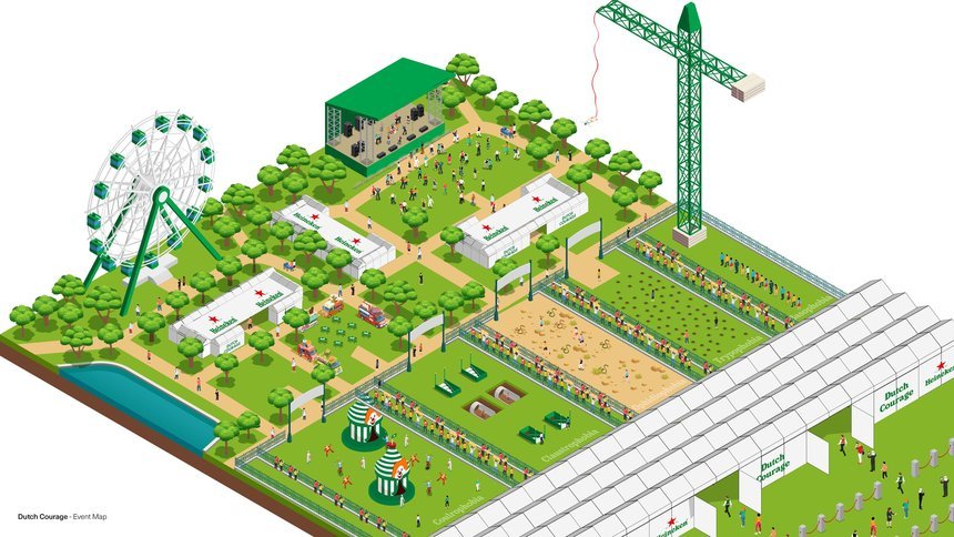
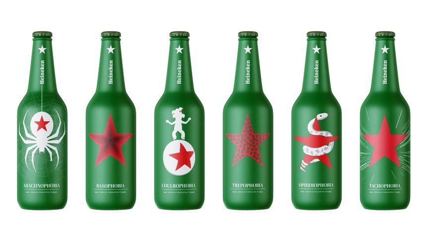
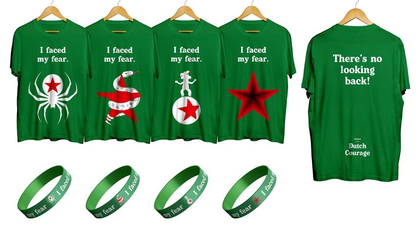
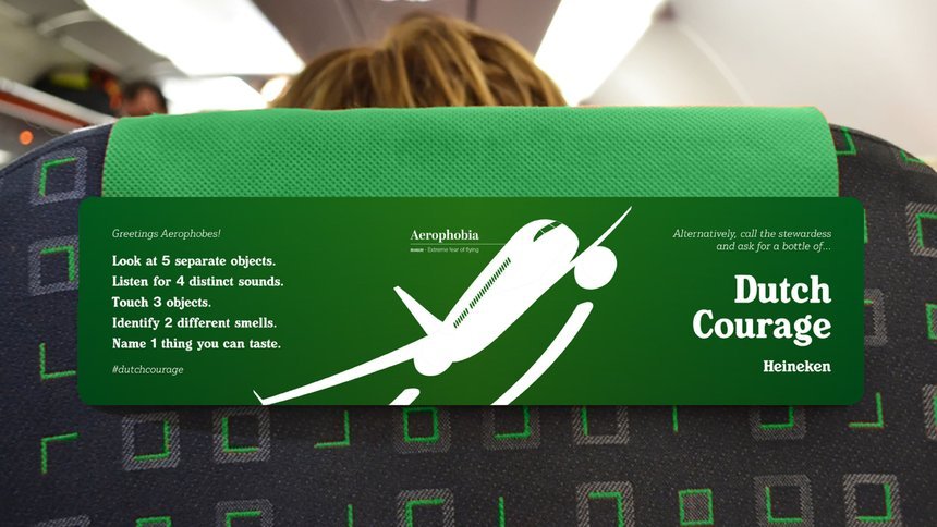
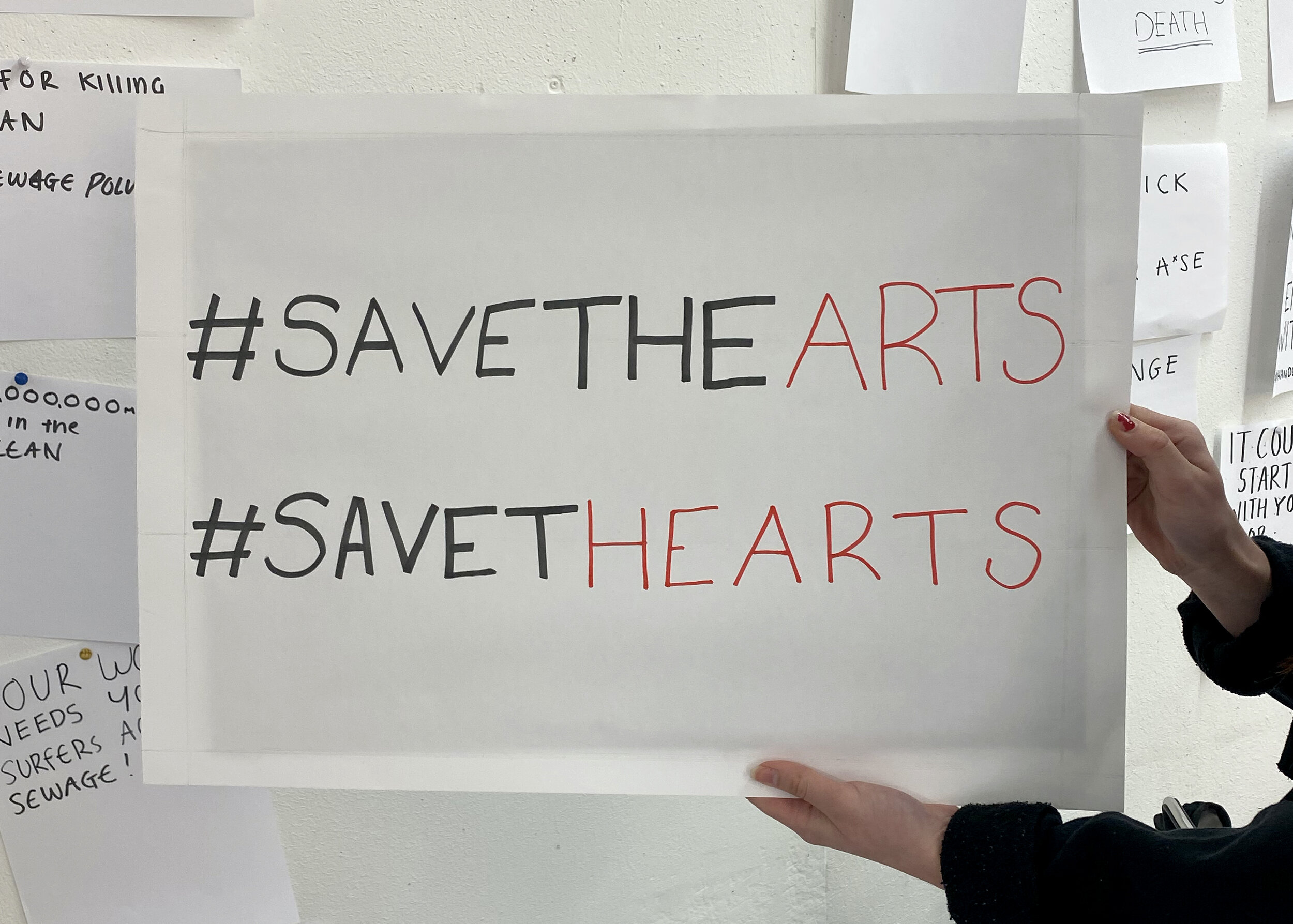
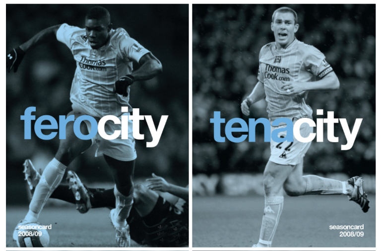
Phil answered the Heineken brief. The problem set was to reposition Heineken as the catalyst for making a fresh connection. Phil’s response was inspired by the notion of Dutch Courage:

Fear has no cultural or geographical restraints. There are so many different phobias but the affects they have on us are the same emotionally and physically. Fear can inhibit us from achieving goals or strive to make a positive change.

Heineken Dutch Courage is a festival based event, where people are challenged to reinvent themselves and come face their fears head on. The goal is for people to meet, support, share and bond over their fears through a fresh and rewarding experience.

A MAGIC IDEA!

Here we feature a year 2 project by Harriet Richardson from back in 2014 for Fedrigoni Fine Papers.

Fedrigoni were launching their new Sirio Ultra Black range of papers and needed an eye catching direct mail to send out to designers and agencies that introduced the range plus highlighted some of it’s unique features.

Harriet’s solution highlighted the magic properties of Fedrigoni’s new Sirio paper range by appropriating the visual language of 19th Century magicians and illusionists.

The series of 4 direct mail shots, were silk screened onto Sirio Ultra Black paper stock and inventively utilised an ‘infinity fold’ to reveal a series of stories and insights into the papers unique qualities.

Introducing

Introducing

The range of 4 magic mailers

The range of 4 magic mailers

Trick 1 - The Vanishing Rabbit!

hat 5.jpg

Trick 2 - The Levitation Illusion

lev 4.jpg

Trick 3 - The Hypnotic Illusion

hyoe 4.jpg

Trick 4 - The Cutting in Two Illusion

cut 4.jpg

A great piece of work that highlights how you can write a project into existence, inventive copy cleverly highlights the papers properties and at the same time ties them into the magic theme. Now that’s MAGIC!

Haunted House

Here we feature recent graduate Dave Shorrock’s Halloween inspired Habito 'Demon Cleansing Ritual' kit feature in The Drum

The concept was created by recent graduate David Shorrock, after he pitched via You Can Now’s network of universities, colleges and art and design schools, as part of Habito’s Halloween challenge.

The brief asked graduates to come up with a creative concept that would be bold, clever and bring Habito’s mission (to save people from mortgage hell) to life.

Inspired by research that showed that 55% of people in the UK would be put off buying a property if they thought it was haunted, Shorrock created Habito’s eight-step home exorcism ritual to banish any ghouls back to the other side this Halloween.

Insight

Insight

Word mark

Word mark

Cleansing Kit

Cleansing Kit

Instructions

Instructions

Detail

Detail

Mailer

Mailer

Ambient - Vue cinema hook up

Ambient - Vue cinema hook up

Nice work Dave, a great fun appropriate idea well crafted!

The Male Pill - Industry Briefs - 2020

Here we feature Emma Barber’s solution to the recent industry brief set by Chris Mason .

The back story

The back story

we 1.jpg

Please click on the image above to play film

The brand mark

The brand mark

Please click on the image above to play film

The Language & tone of voice

The Language & tone of voice

Copywriting

Copywriting

Alternative copy styling

Alternative copy styling

Assets - Shapes and photography styles

Assets - Shapes and photography styles

The outer packaging & content designs

The outer packaging & content designs

The pill packaging

The pill packaging

Outdoor - Posters

Outdoor - Posters

Print - Brochure

Print - Brochure

Digital - Mobile look & feel

Digital - Mobile look & feel

Please click on the image above to play the film.

App designs

App designs

we 17.jpg

A very strong, well thought through and deceptively simple design solution to what was a sensitive and challenging subject and brief.

One week project: Copywriting

Recently, the first years were briefed to be angry! Their job was to write a placard on behalf of an organisation they are passionate about. Using wit, humour, straight talk, brevity; their placard had to get the point across and ultimately be memorable.

As we have said before: we write words everyday, but this brief always challenges as it brings a supposedly simple task back into conscious thought. Thinking about what you’re actually writing requires thought, concentration and time. But, the more we write, and the more we read, the better we get.

One week project: Copywriting

Last week, the first years were briefed with writing a ‘lonely hearts’ advert, with the task to look for a friend (or more). Imagining being airdropped into Preston with no money, no contacts, no nothing, the brief called for a creative response using only words to attract the attention of another. Using the classic structure of act one, two and three; plus brevity and wit, the best examples raised a smile but also incited a response.

We write words everyday, but this brief always challenges as it brings a supposedly simple task back into conscious thought. Thinking about what you’re actually writing requires thought, concentration and time. But, the more we write, and the more we read, the better we get.

Words within Words


Here we explore a visual communication technique
The following presentation highlights examples of how the designer has primarily used the written word to illustrate an idea or concept. What sets the following examples apart is the economy and restraint that has been employed by the designer. By merely finding a solution within the word(s) or language that surround each subject.

There also appears to be an effortless feel to these design solutions that belies the fact that each and every designer has had to work hard, striving to find that solution. However at some point on their creative journey they have had a ‘eureka moment'! They have made a creative connection or series of connections and when analysed, in order to achieve this, they have employed one or more of the following techniques:-

They have consistently kept an open mind.
They have visually interrogating the surrounding word(s) & language.
They have exploited the incidental.
They have embraced serendipity (a happy accident) and happen-stance (chance occurrence).
They have approached the problem both laterally & from 360 degrees.
They have applied a relevant or appropriate technique to enhances the concept... 

...but most importantly they have looked and looked, and looked again.

brains better.jpg

“Brains A one Ale” - Brewing cask ale in Cardiff for over 125 years.

earh art good.jpg

Logotype for the Earth Art Institute - 1992.
One powerful word is hidden within another.

sassoon new.jpg

Vidal Sassoon 50th Anniversary Logotype - 1992.
Stylishly combines both name & number.

african final.jpg

Apartheid succinctly illustrated - Designer - Bryn Jones

The designers actually found four directions.

Personal Christmas card - Designed by Rita Kinsella - 1995

infanrty new.jpg

Poster for New York based human rights charity Witness.
Designed by Lippa Pearce Design

Claire is marrying Dave - Wedding invite
Designed by The Chase Creative Consultants

shit.jpg

Great use of an anagram amongst Friends!

arse.jpg

Course language.

fasting.jpg

Book cover for a Pan Paperbacks on the ultimate diet.
When given the word fasting as the title the designer saw greater possibilities.
From - Smile in the mind 1.

The co-operative Bank Calendar - 1991.
Designed to raise money for 6 special niche charities.
The introduction above contains a hidden message.

men.jpg

Manchester Evening News are expanding & moving office
Designed by The Chase

Is Ikea a good Idea...discus.

ha ha.jpg

Year 1 creative thinking type solution.
Designed by Jennie Potts 

yours is ours.jpg

Designed by Matt Johnson - 2007

new cropped asa randall copy.jpg

Advertising Standards Authority press campaign.
 D&AD runner up 2002

bitch.jpg

‘The difference a letter can make’
Advertising Standards Authority press campaign - D&AD winner 2002

compendium of letters make.jpg
fine art poster.jpg

Fine Art Degree show Poster - 1994 - Designed by Mark Hurst.
University of Central Lancashire

Fcuk mark.jpg

French Connection UK - Trevor Beattie in 1997. 
French Connection used the abbreviation FCUK on an internal memo.
The idea evolved into one of the highest profile and most controversial
British ad campaigns of the 90's.

electricity.jpg

Brand marketing campaign for Manchester City.
2008/09 season - by Mark Studio

new Kenyon 1.jpg

Proposed identity for The Mitchell & Kenyon Cinema - by The Chase - 2006

new kenyon 3.jpg
new kenyon 2.jpg
2 examples.jpg
ioplight logo.jpg

Pilotlight Australia
Pilotlight’s aim was to spark ideas, turn heads & make people think.
Seeing something good or unexpected, in something bad.

SF1.jpg
sf2.jpg

Cystic Fibrosis - Johnson Banks
“In discussions and research, it became apparent pretty quickly
that the condition is widely misunderstood.
Most people don’t understand what it is, or what it does,
until someone close to them is affected by it”.

main logo.jpg

Alzheimer’s Australia - Interbrand Australia - 2012
The following brand features a flexible logo that changes & evolves
to communicate different messages. 
Using two colours and often just four words the idea communicates
the name of the organisation, highlights a problem and features
a strong call to action.

combo.jpg
even newer words in words pres52.jpg
back of words fail me copy.jpg

A great little book, highly recommended.

words fail me cover.jpg

...and finally the Scunthorpe problem

scunthorpe.jpg

The Scunthorpe problem is the blocking of e-mails,
forum posts or search results by a spam filter or search
engine because their text contains a string of letters
that are shared with an obscene word. 

While computers can easily identify strings of text
within a document, broad blocking rules may result
in false positives, causing innocent
phrases to be blocked.