Resource Klaxon: SearchSystem
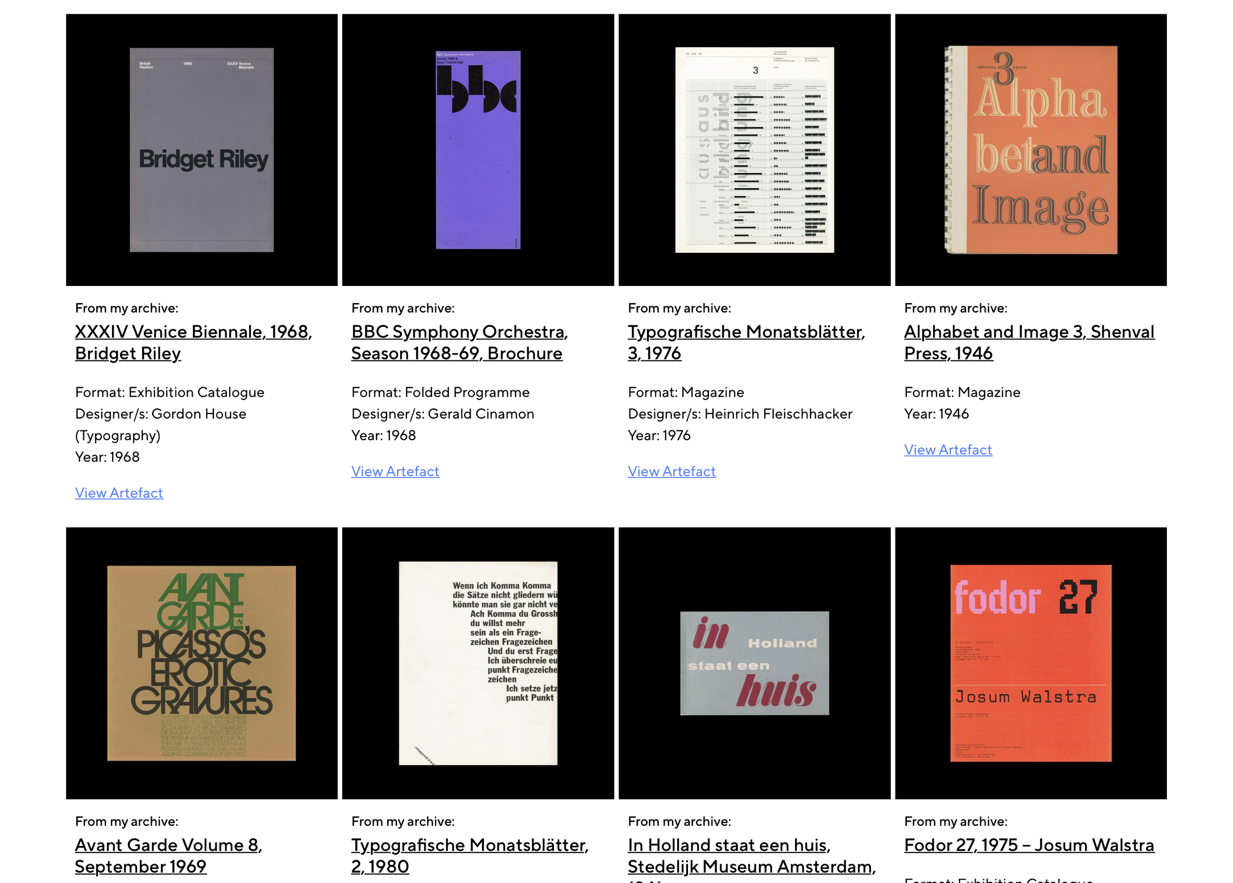
Here we feature SearchSystem, the latest addition to our Archives list. It does exactly what it says on the tin and is another fantastic resource available to anyone, for free. It is Julian Van Havere’s curated collection and can be easily searched using the index by selecting tags such as ‘graphics’, ‘guidelines’, etc.

It was brought to our attention via our subscription to David Airey’s Identity Designed newsletter, another useful tip for the design magpie.

Enjoy.

Modern Illustration

Unsure how we originally came across this website, but Modern Illustration is an excellent archive we’ve been spending some time on.

Its content is specifically of print circa 1950-1975, and is the work of Zara Picken.

It is vast, brilliantly curated, and well worth a chunk of your time.

Modern Illustration


Resource Klaxon: Design Reviewed – Online Archive

A quick nota bene regarding the latest addition to our list of archives.

Design Reviewed, recently featured on Print’s weekly roundup by Steven Heller is the collection of Matt Lamont – a fellow northerner.

In Matt’s words:

Design Reviewed is a personal project dedicated to digitally preserving graphic design history and documenting the vast visual culture from the last century.

His collection features some absolute gems, but is also thoughtfully (and no doubt pain stakingly) edited into categories and themes. Any designer would be delighted to have a percentage of his collection to learn from!

Soak it up…

A snapshot of the collection

Alan Fletcher – Work and Play

Another great online archive. There’s nothing we can say about Alan and his work that hasn’t been said already. So we say simply this: soak it up, and enjoy.

Visit here: Alan Fletcher – Archive

John Elliot Cellars Limited  |  1977John Elliott Wine Cellars, were importers of fine French wines. The symbol is a typographic design of a wine glass. This was adapted from an early nineteenth century ideogram of a French drinking song.

John Elliot Cellars Limited | 1977

John Elliott Wine Cellars, were importers of fine French wines. The symbol is a typographic design of a wine glass. This was adapted from an early nineteenth century ideogram of a French drinking song.

Resource Klaxon: The People's Graphic Design Archive

Here we feature a recent find – The People’s Graphic Design Archive – uncovered by Dylan Carr. In its own words here’s an overview of the website and its intentions:


The People’s Graphic Design Archive is a crowd-sourced virtual archive that includes everything from finished projects to process, photos, letters, oral histories, anecdotes, published and unpublished articles, essays, and other supporting material in the form of documents, videos, audio, as well as links to other relevant archives and websites.

Our goal is to enable new and expanded stories about a graphic design history— one that represents diverse cultures and a broad range of interests! The archive exists in Notion now, but will eventually move to a purpose-built, public website.


We’ve had a brief peruse and it is clearly an absolute warren of resource. Below is just a very small snippet of a quick journey over a coffee. So, from The People’s Graphic Design Archive, we went to The School of Visual Arts Archive, which took us to an archive of Chermayeff & Geismar

This is along with our other featured archives is a free, seemingly infinite resource of graphic design from across history. Incredibly important. Incredibly useful. Thanks Dylan.


SVA Subway Poster – 1990

SVA Subway Poster – 1990


Examples from the Chermayeff & Geismar archive

Norman Ives

Norman Ives: Constructions & Reconstructions

Norman Ives: Constructions & Reconstructions

Recently we’ve made aware of a designer who wasn’t on our radar, by a designer who is on our radar. Jim Sutherland’s instagram post shared the recently published book ‘Constructions & Reconstructions’.

The book is dedicated to Norman Ives, 1923-78, who was acclaimed as both a fine artist and seminal graphic designer. He was also a teacher and publisher of fine art portfolios.

The website and accompany instagram also has a fantastic archive of his work. A gem of a find, and thanks to Jim for sharing.

RDInsights

RDInsights is a series of lively and informal interviews conducted by graphic designer Mike Dempsey RDI with fellow Royal Designers. These memorable conversations and inspiring stories span a wide range of design disciplines.


Below we’ve highlighted the graphic designers:

Derek Birdsall RDI
Graphic Designer Derek BirdSall became an RDI in 1993.
Listen to the interview

Margaret Calvert RDI
Graphic designer Margaret Calvert became an RDI in 2011
Listen to the interview

Michael Wolff
Graphic designer Michael Wolff became an RDI in 2011.
Listen to the interview

Mark Farrow
Graphic designer Mark Farrow became an RDI in 2009.
Listen to the interview

Roger Law
Graphic design & caricature designer Roger Law became an RDI in 1999.
Listen to the interview

Peter Brookes
Graphic designer, Peter Brookes became an RDI in 2002.
Listen to the interview

Ivan Chermayeff
Graphic designer, Ivan Chermayeff became an HonRDI in 1991.
Listen to the interview

Pearce Marchbank
Graphic designer, Pearce Marchbank became an RDI in 2004.
Listen to the interview

Paul Rand – The Work

Unsure how we’ve not shared this before, but this website dedicated to Paul Rand, his work, his writings and more is a mine of information – and inspiration – for any designer, at any point in their career.

Paul Rand was an American art director and graphic designer, best known for his corporate logo designs, including the logos for IBM, UPS, Enron, Morningstar, Inc., Westinghouse, ABC, and NeXT. He was one of the first American commercial artists to embrace and practice the Swiss Style of graphic design.

His work can be searched by category, or by client. This includes the heralded (but never implemented) identity designed for Ford. Another personal is the identity designed for Yale University, shown below along with some others from his greatest hits. But these merely scratch the surface, so delve in when you have time. There is a lifetime to be learned from the Modernist Master.

Yale University Press (1985)

Yale University Press (1985)

Eye Bee M (1981)

Eye Bee M (1981)

Alfred A. Knopf (1945)

Alfred A. Knopf (1945)

IBM (1956)

IBM (1956)

Type Foundries

Among the many behind-the-scenes / below-the-water-line / beneath-the-surface activities undertaken as part of The Disciples; we are continuously adding, editing and refining our links to external resources.

Having been recently contacted by Fontwerk, about the launch of their new type foundry in Berlin; we thought we’d re-share the list of independent type foundries we’ve built up over the years below.

Type specimen of fontwerk’s NIKOLAI

Type specimen of fontwerk’s NIKOLAI

Think of these foundries as the equivalent of the best branding or packaging studios. Absolute masters of their art. They might not all have free trials (who’d work for free?), but you can at least take influence from them and feed it into your own practice. Can you defy Helvetica?

And a final note, Dafont and the like are absolutely not included.

>>> Here’s the list, a veritable rabbit hole of typographic treats <<<


may these screenshots whet your appetite