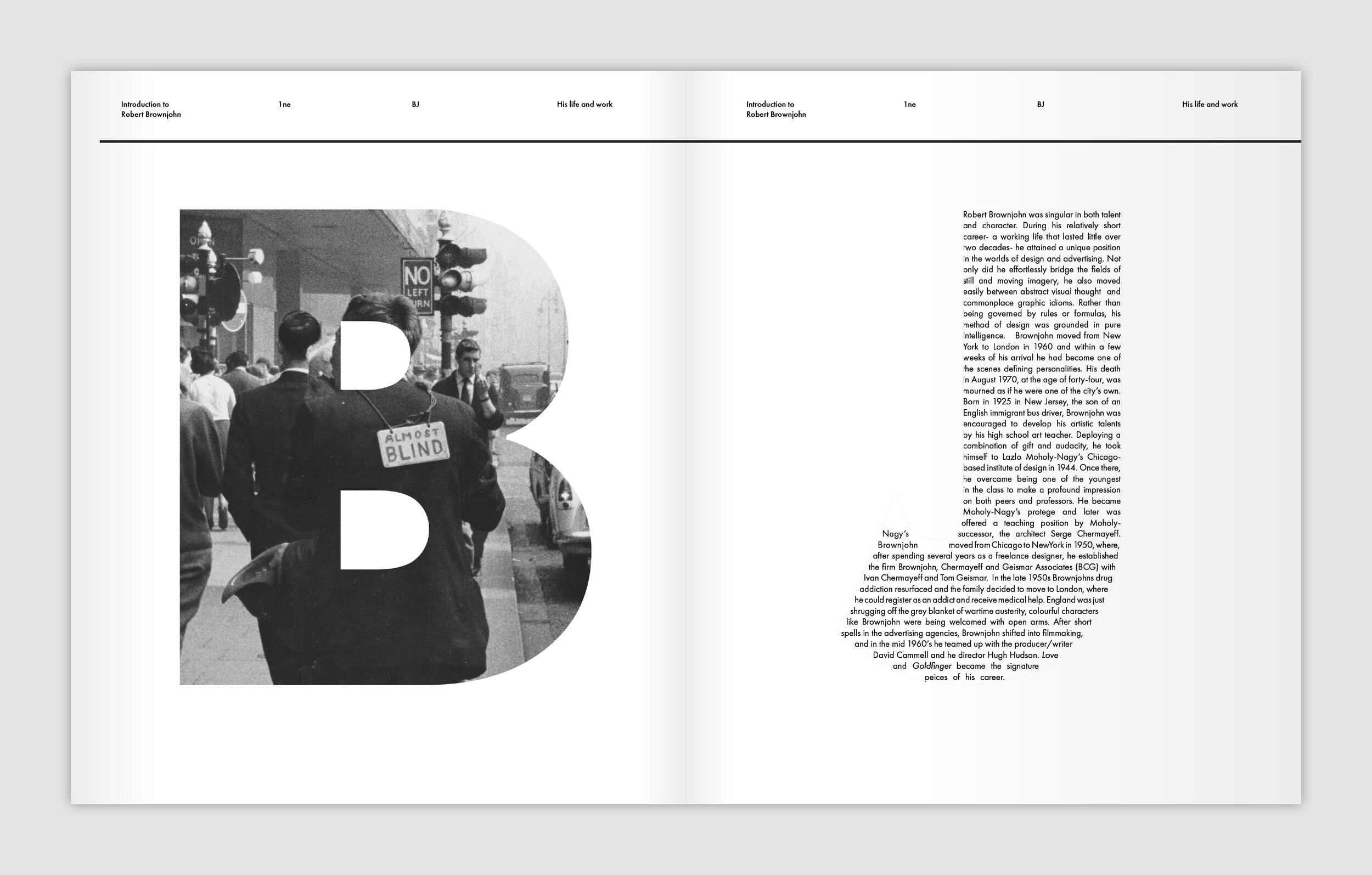
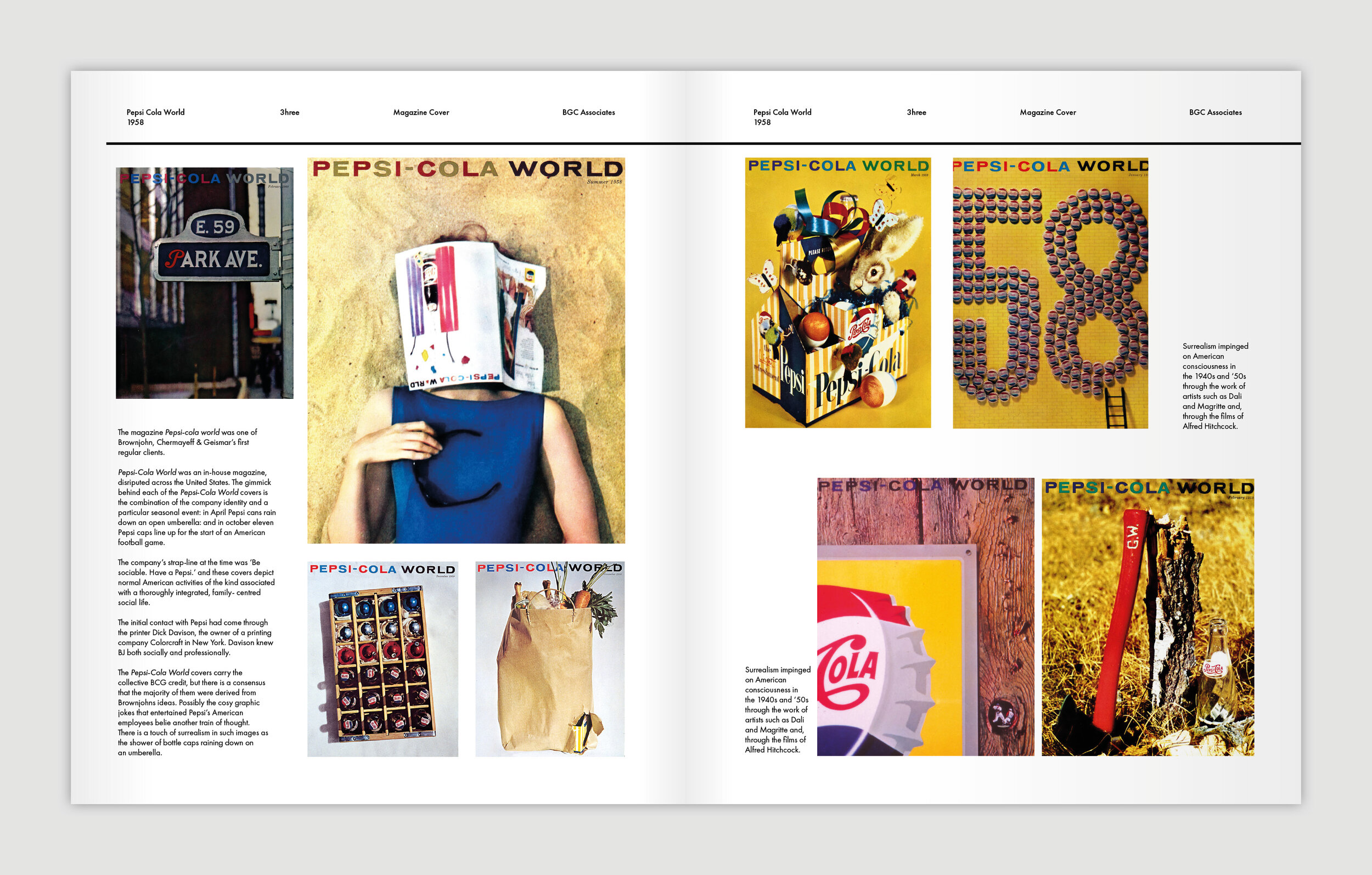
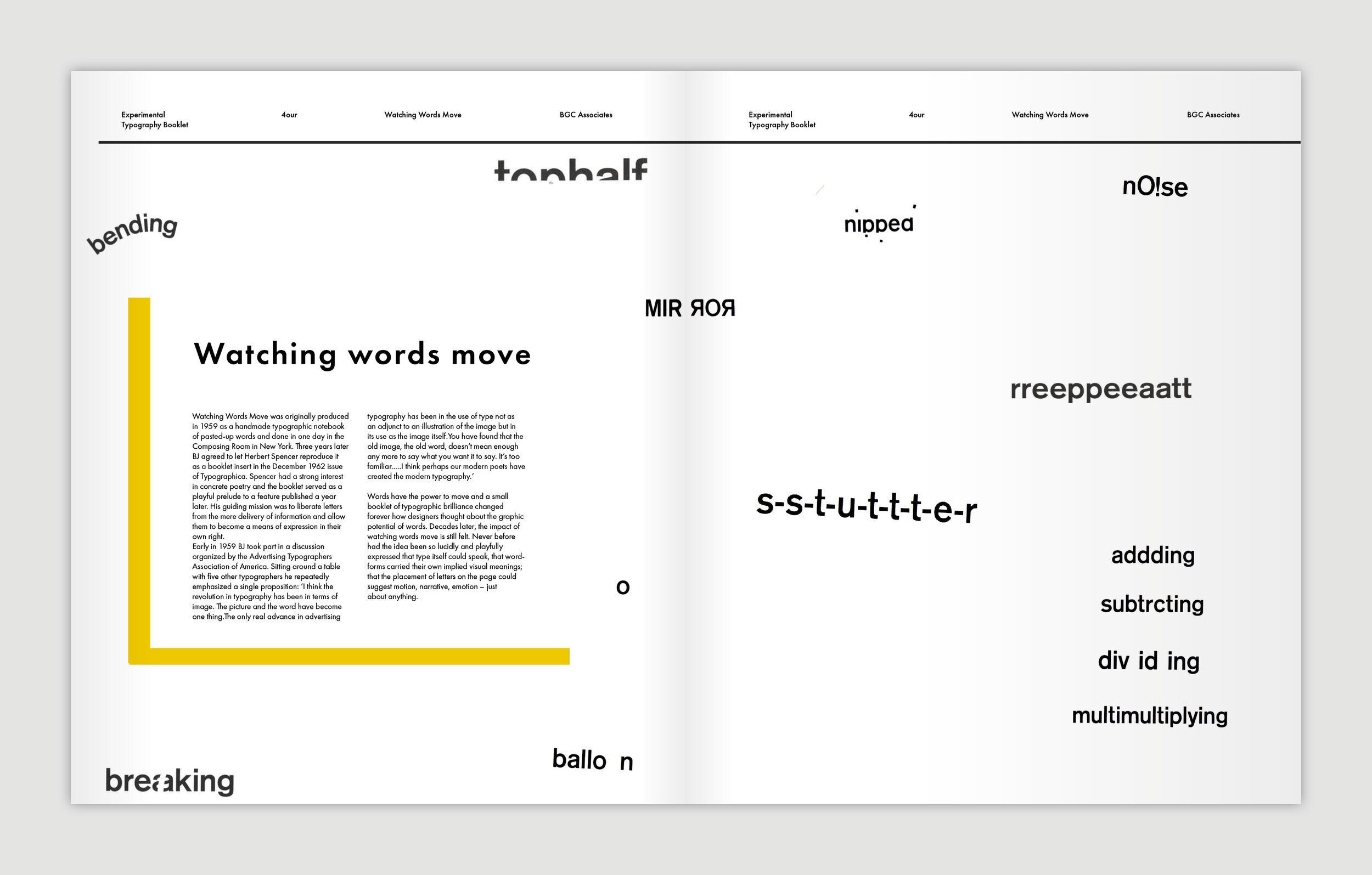
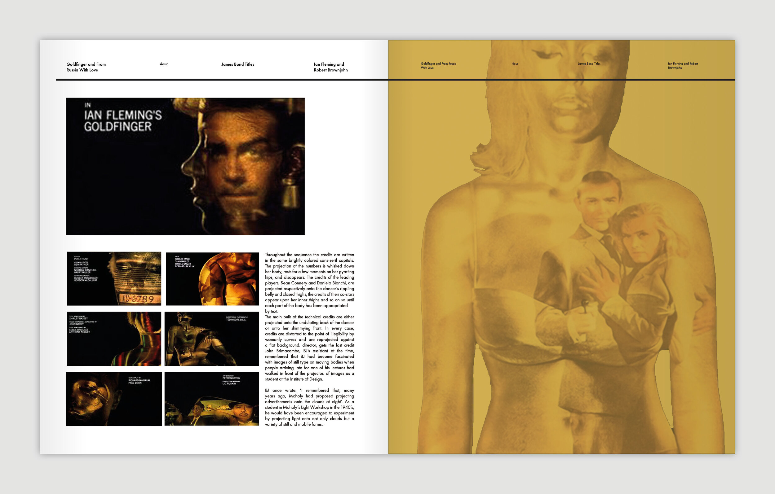
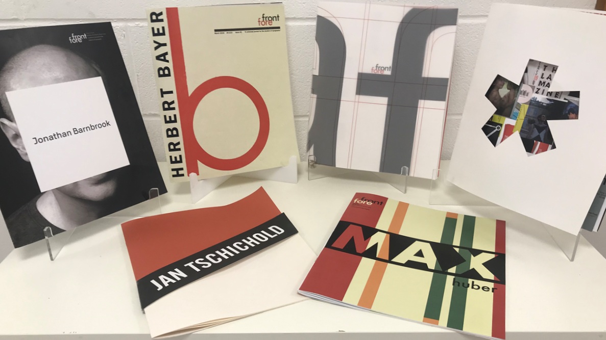
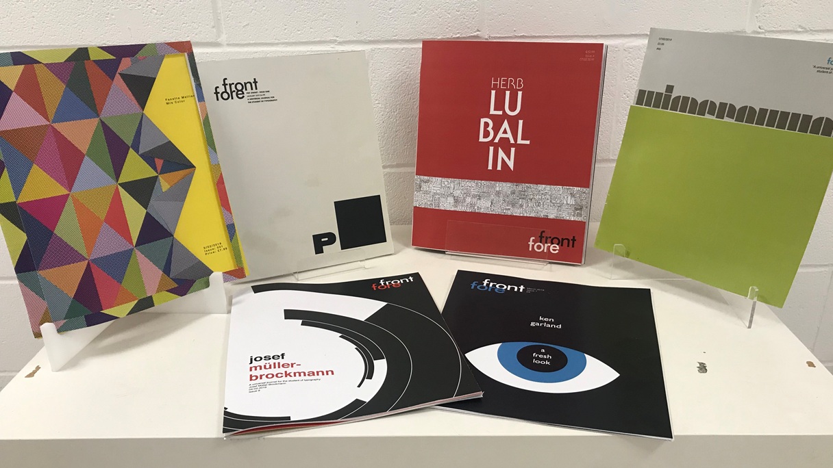
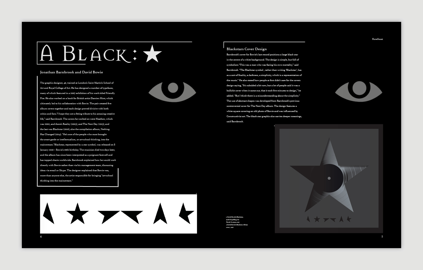
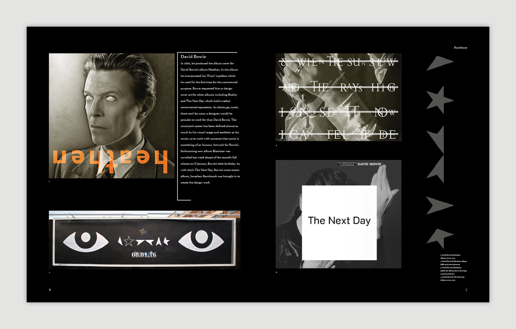
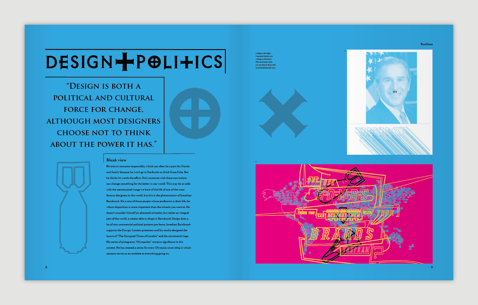
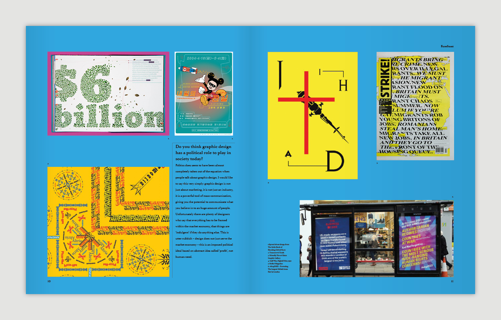
Type & Grids – 2020
/The first year graphic design students have recently completed their primer project in typography and the art of layout, simply known to Preston tutors and alumni as Type & Grids. The project is an opportunity for students to immerse themselves in the work of typographers and designers from the late 1800’s up to present day, and offers a starting point for the young designer to start to comprehend the craft and rigour that typography of the highest order demands.
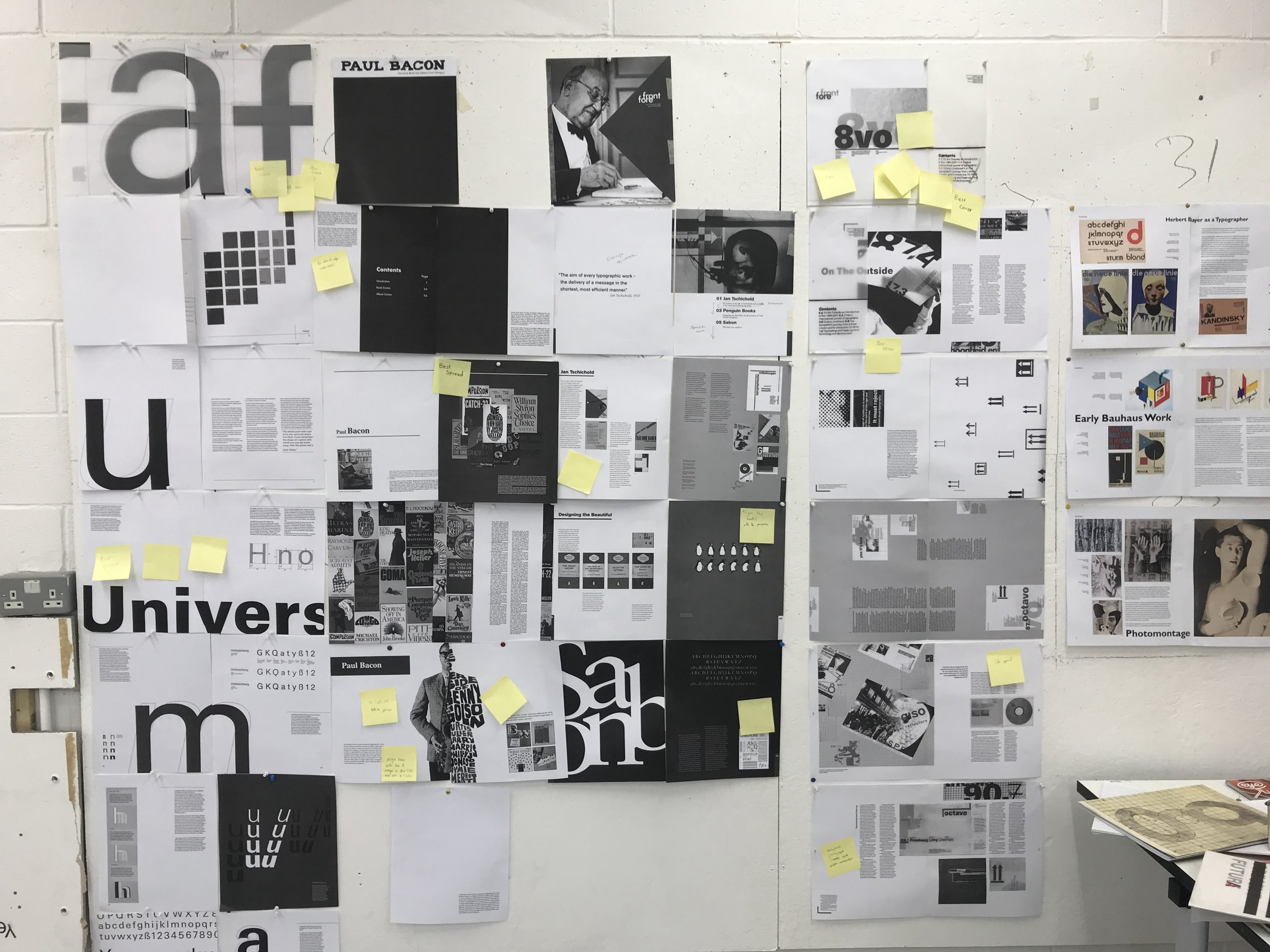
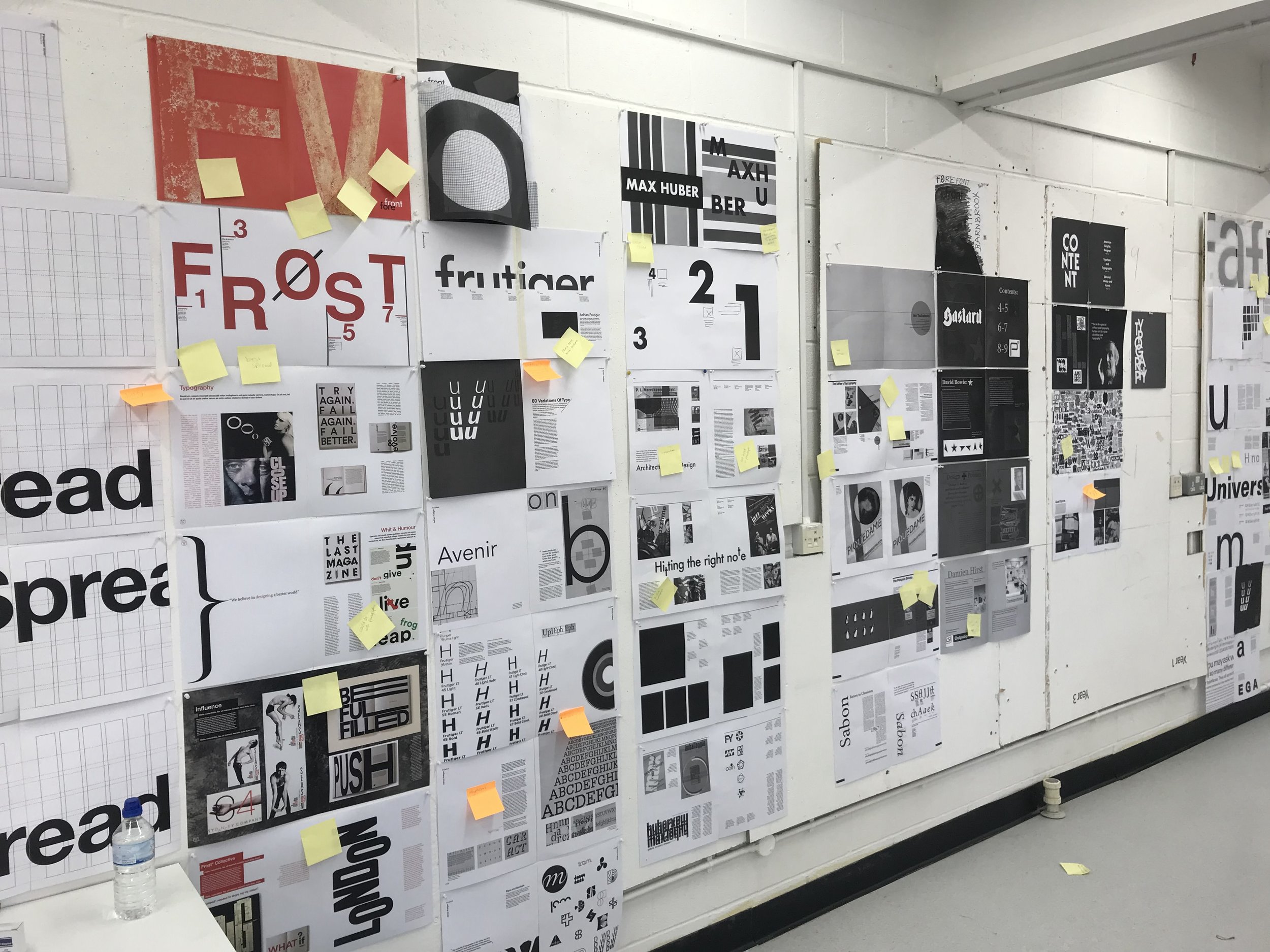
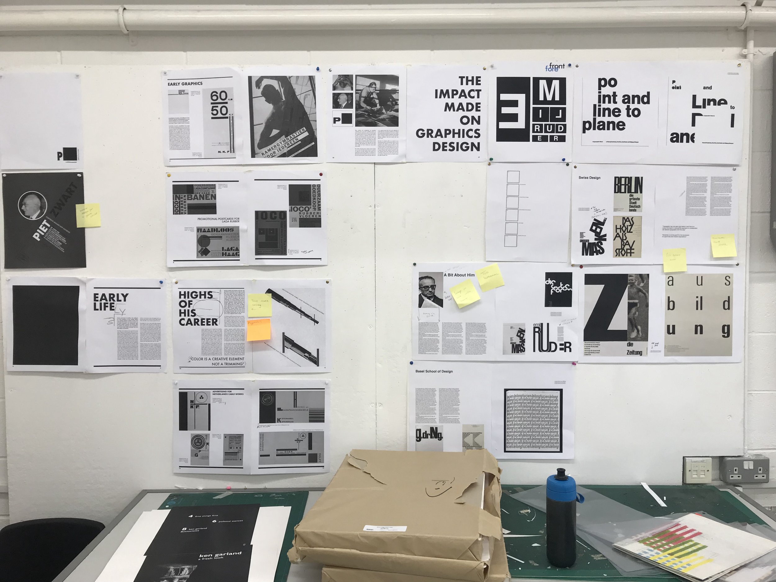
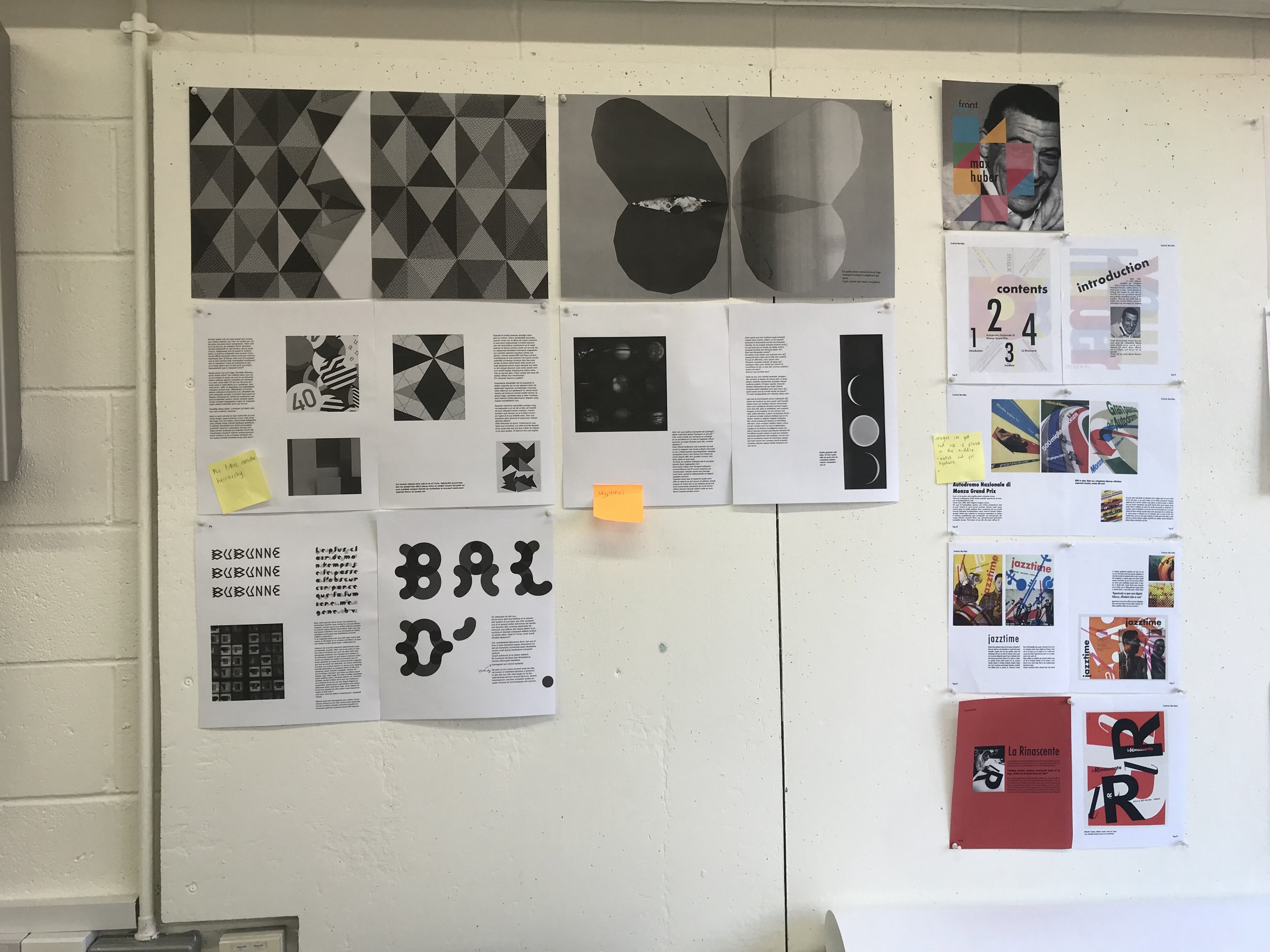
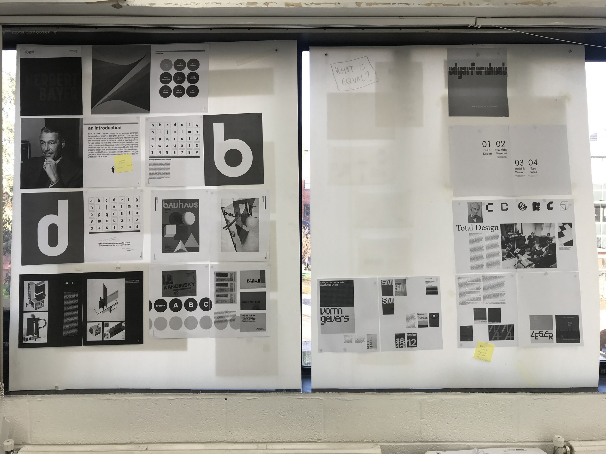
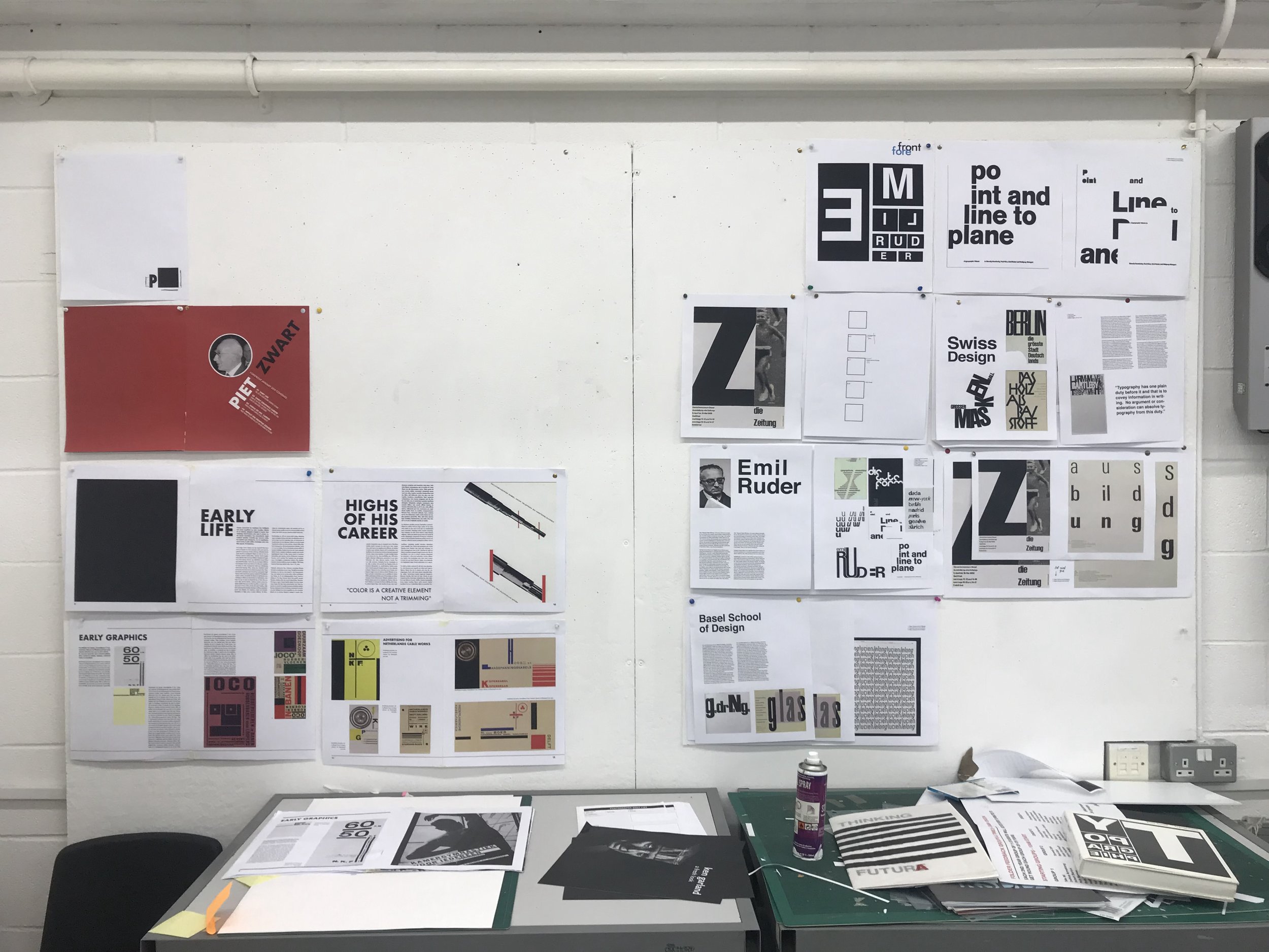
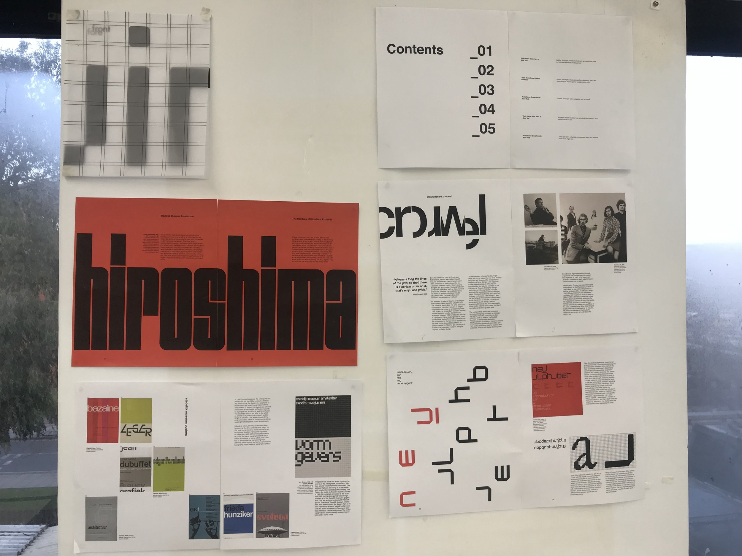
It is a particularly pleasing project as the leaps in design ability can be registered throughout the timeline of the project and seen visually from the initial pencil sketches to initial layouts to finished artwork. Simply, the innate ability of the young designer could not produce the standard of work at the final crit on day one.
It is also a project of no shortcuts; the main component is time, time taken to understand, collate, design, redesign, redesign, edit and amend.
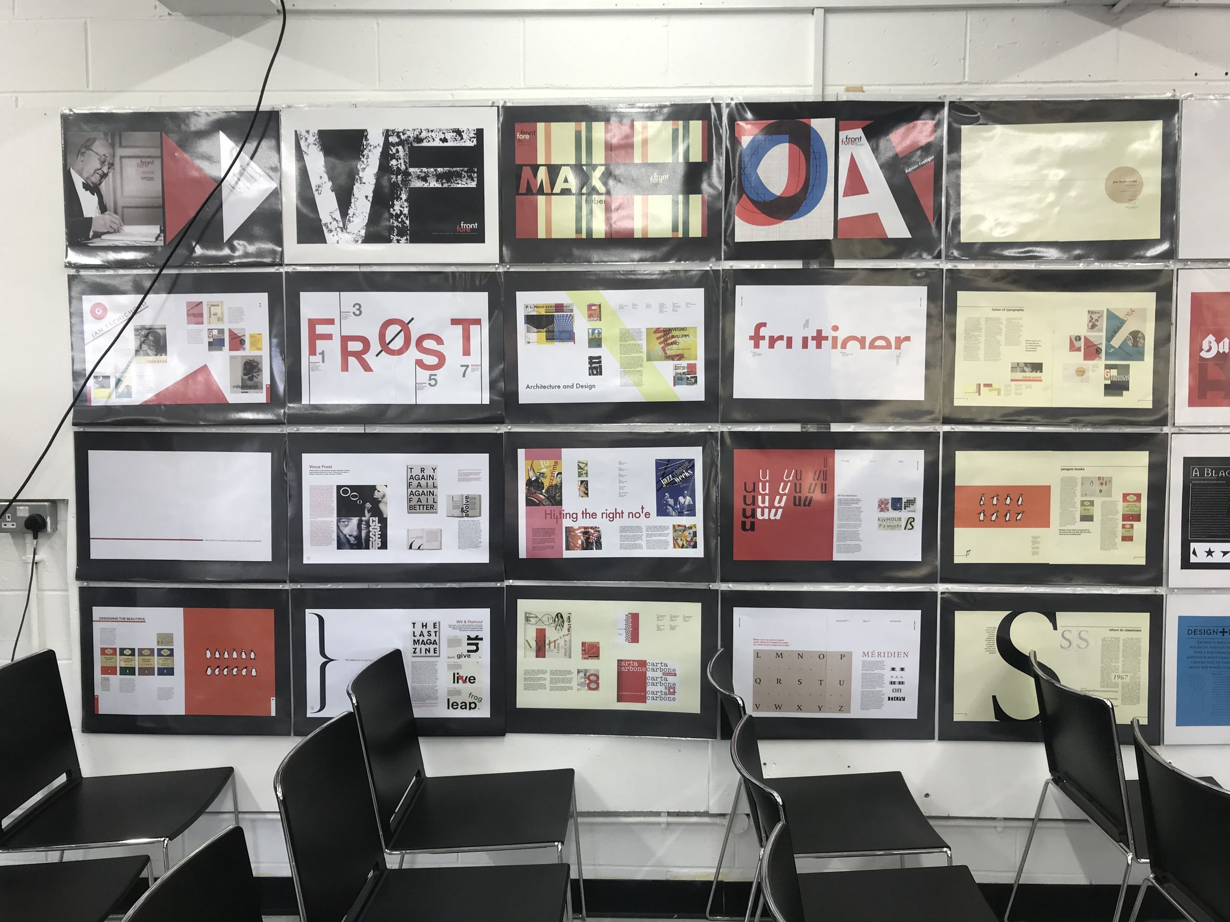
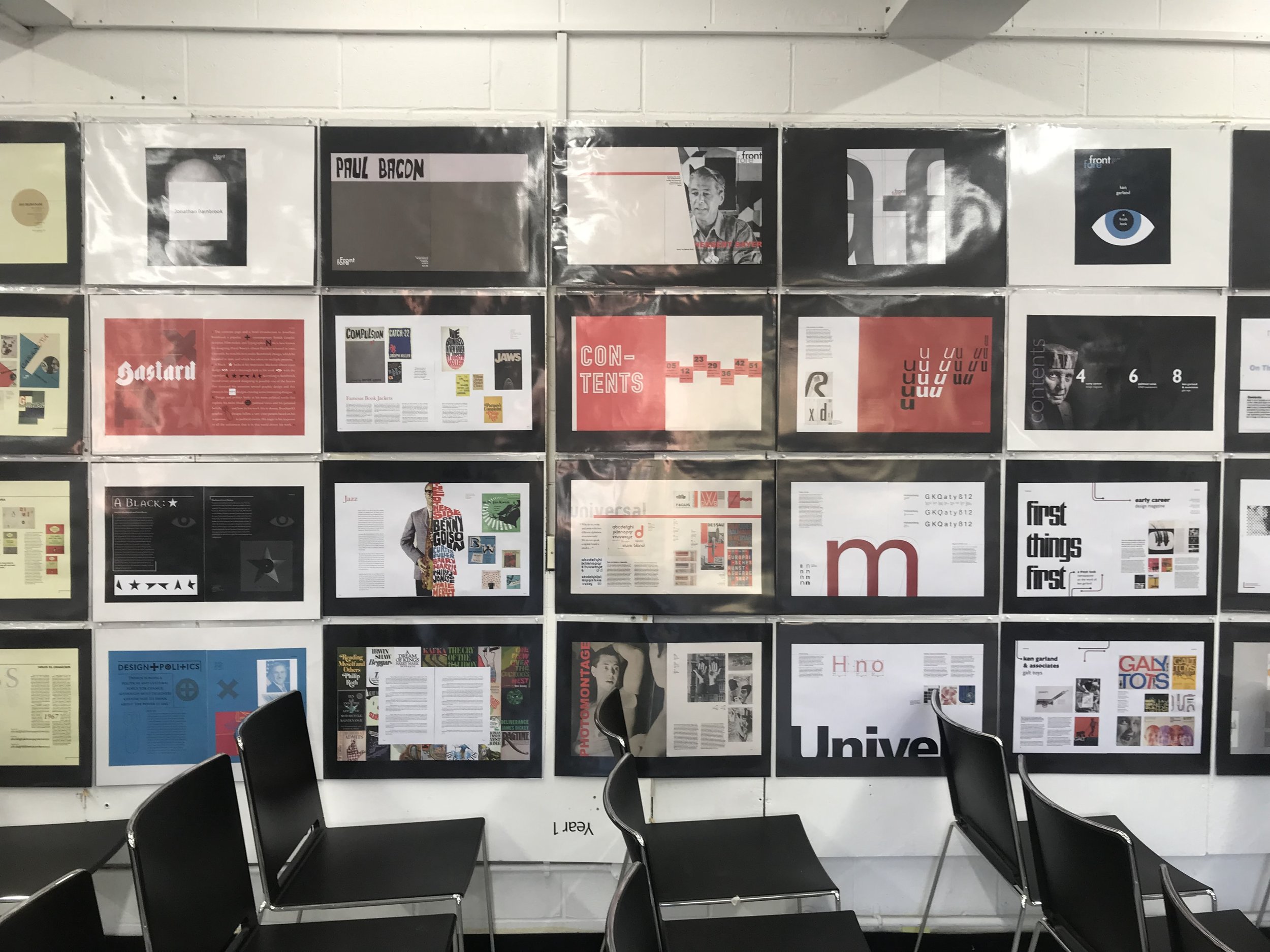
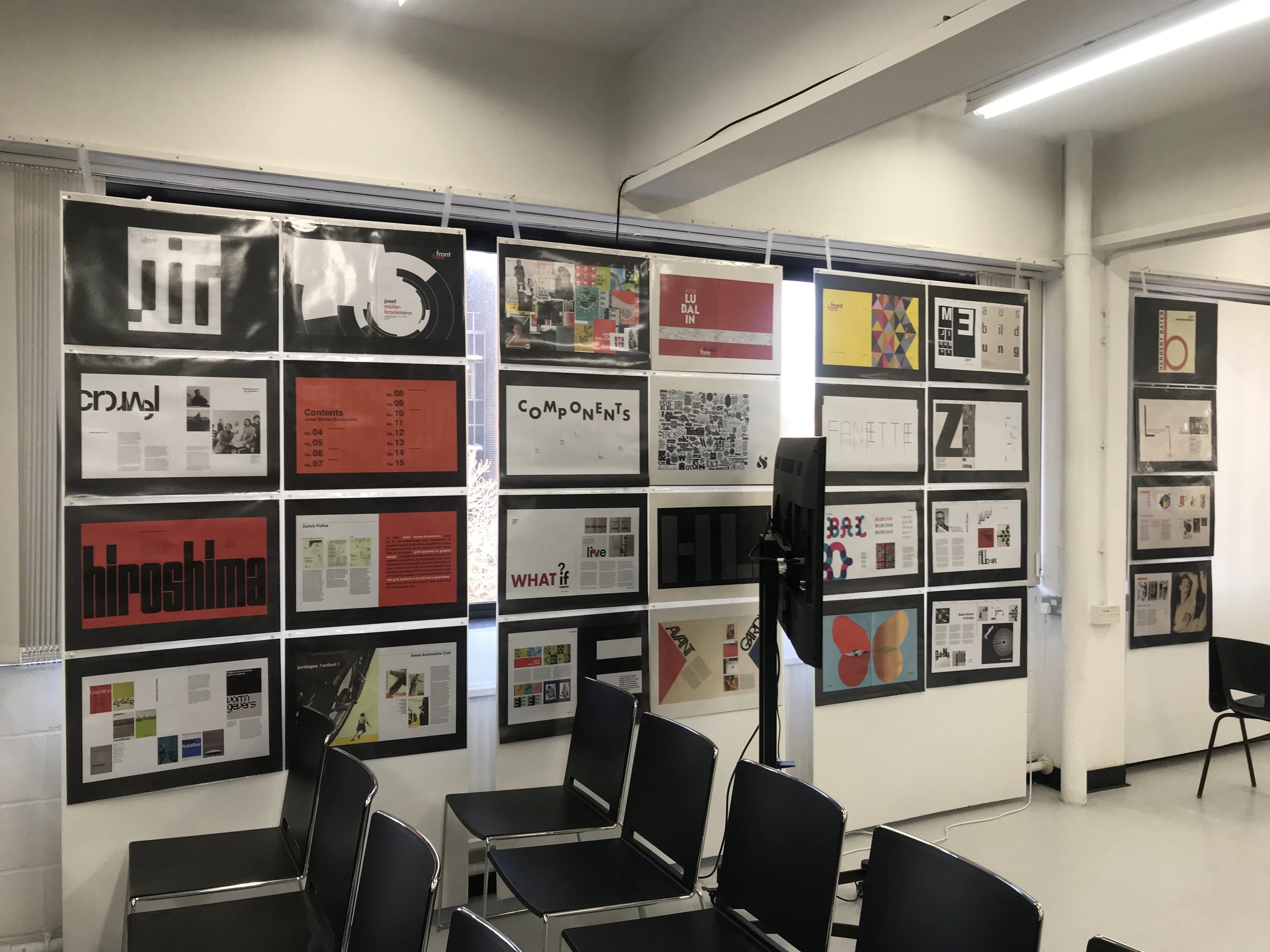
A final highlight to the project was the introduction to the banner printer and updated presentation format.
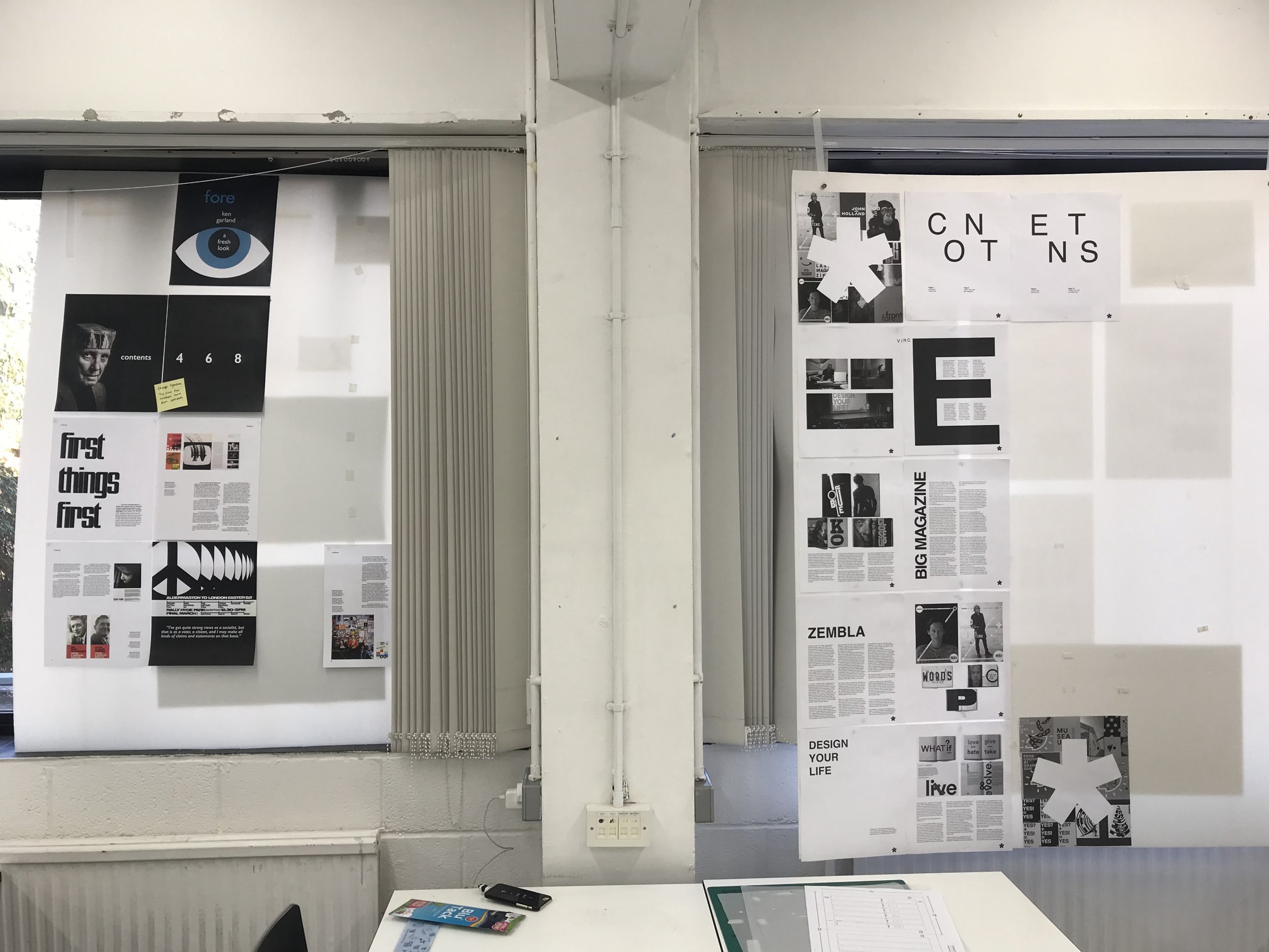
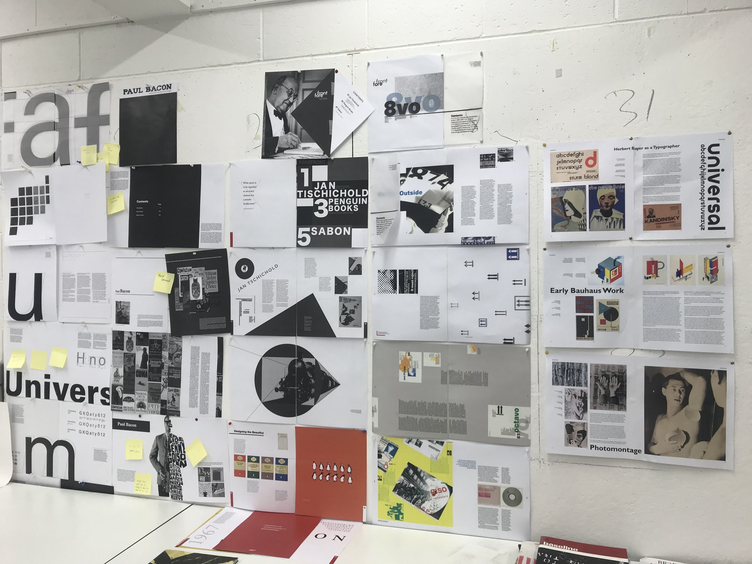
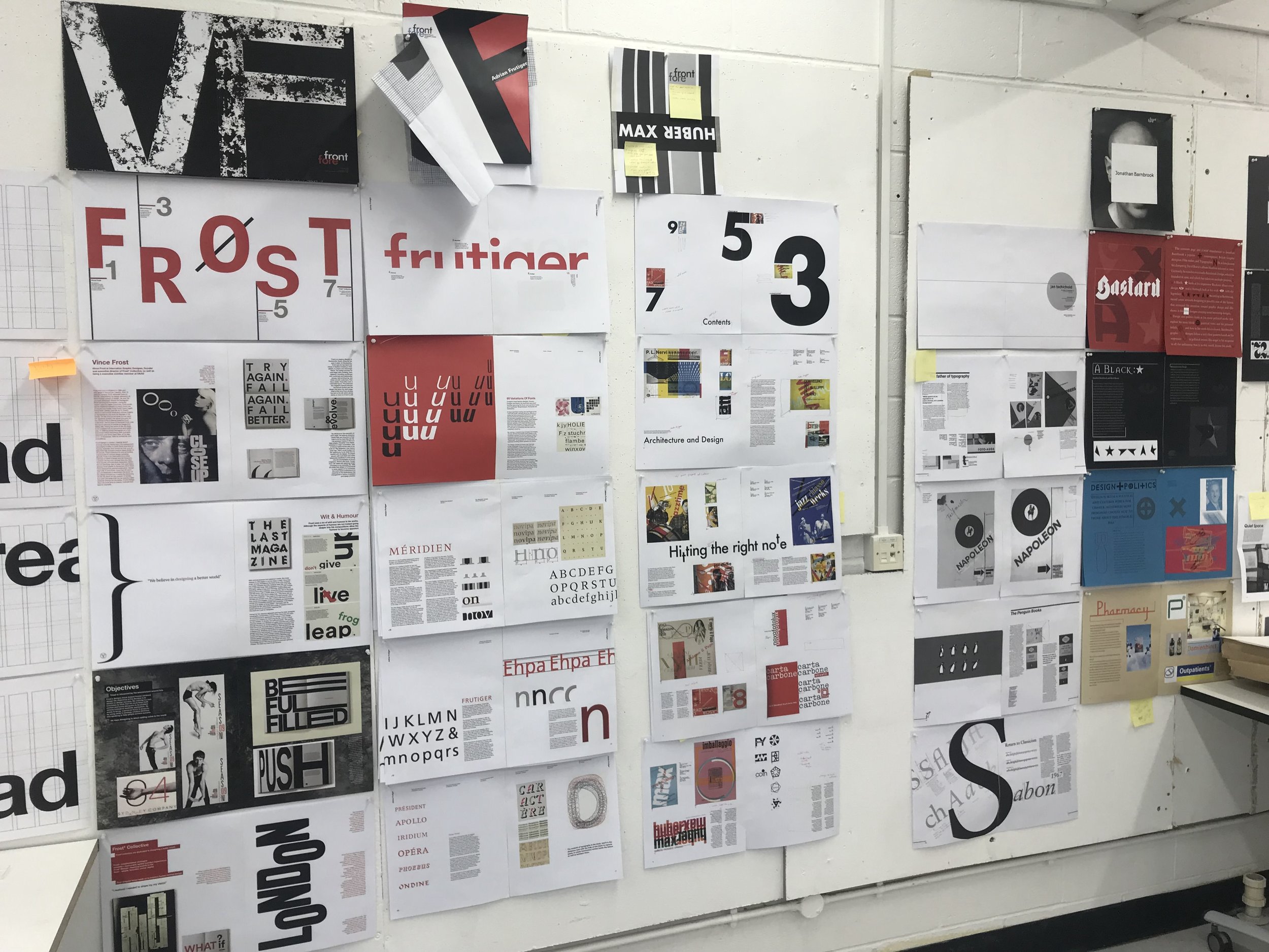
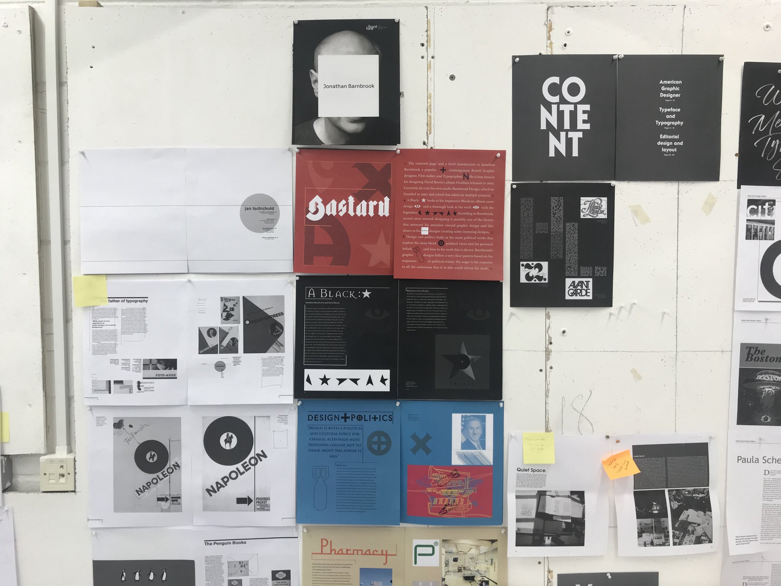
final crit:
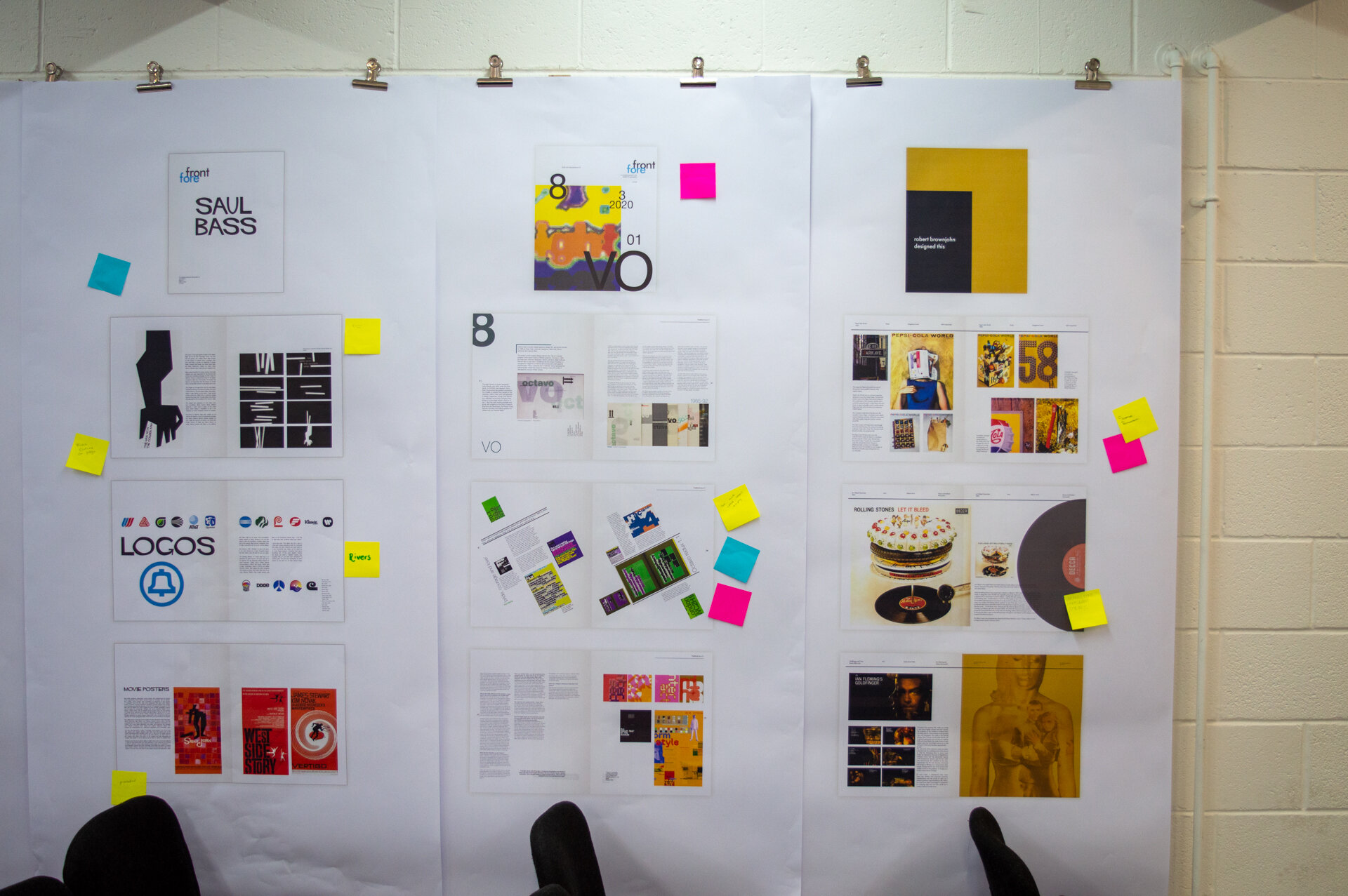

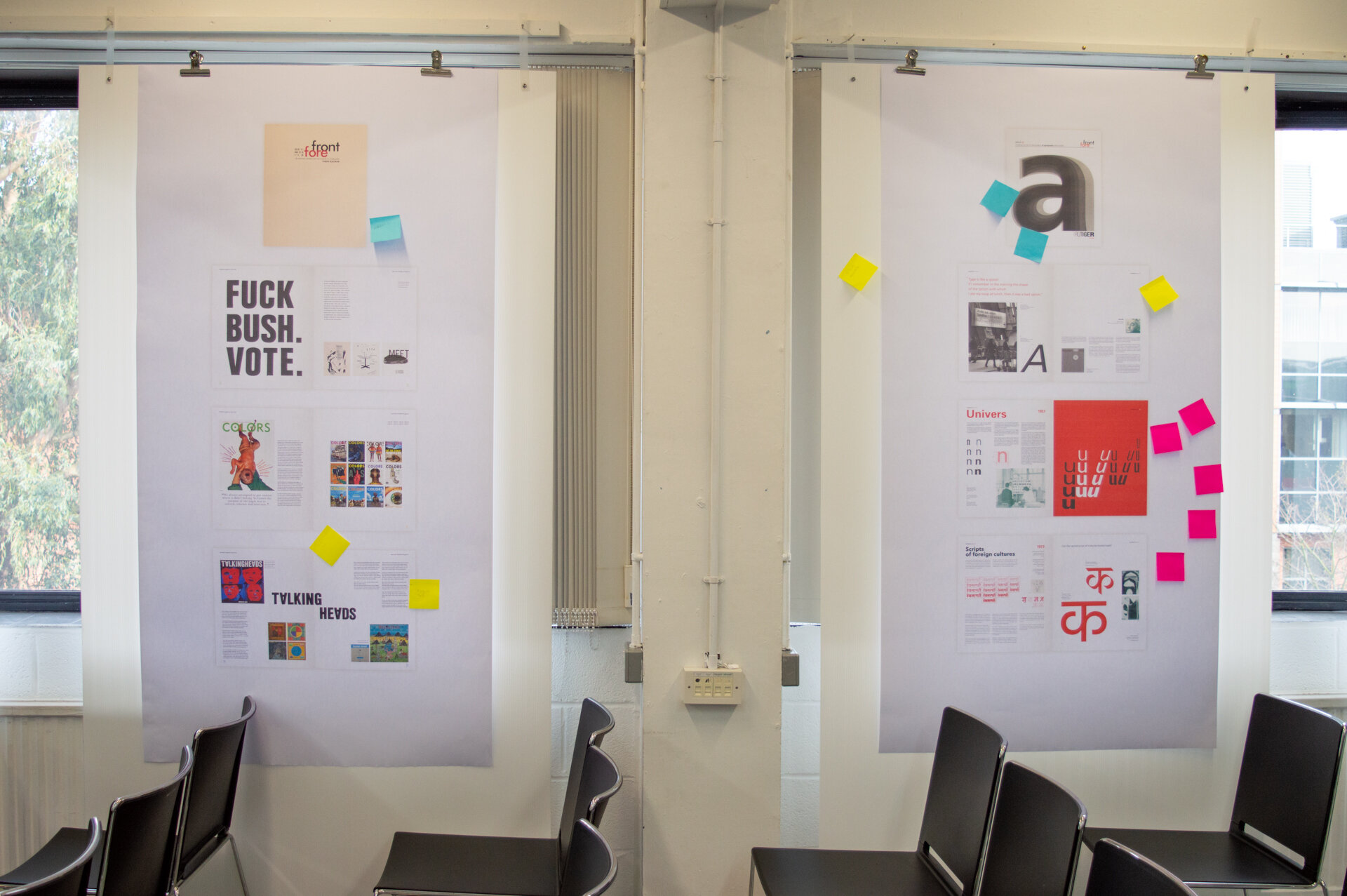
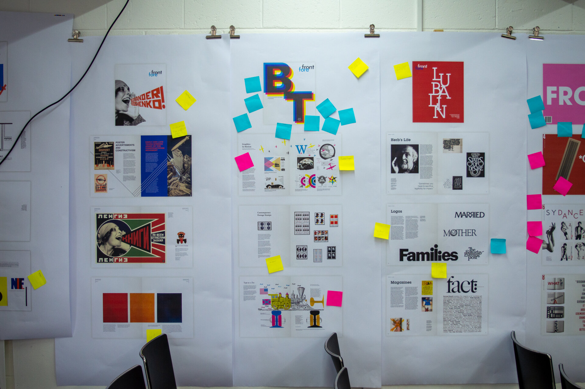
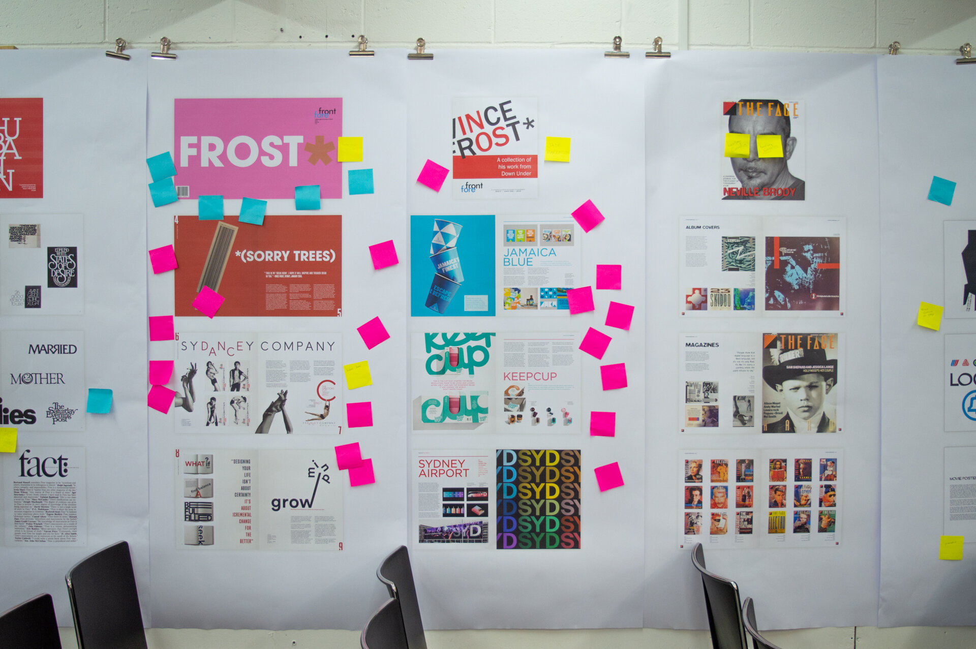
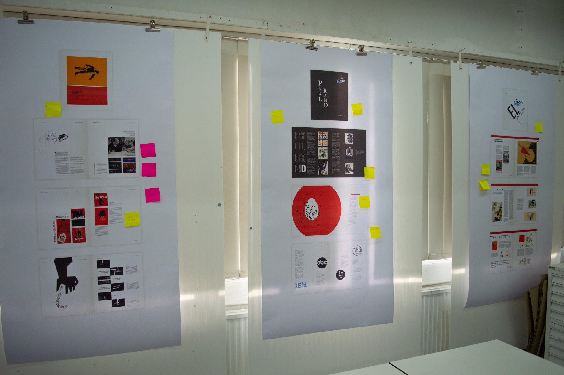
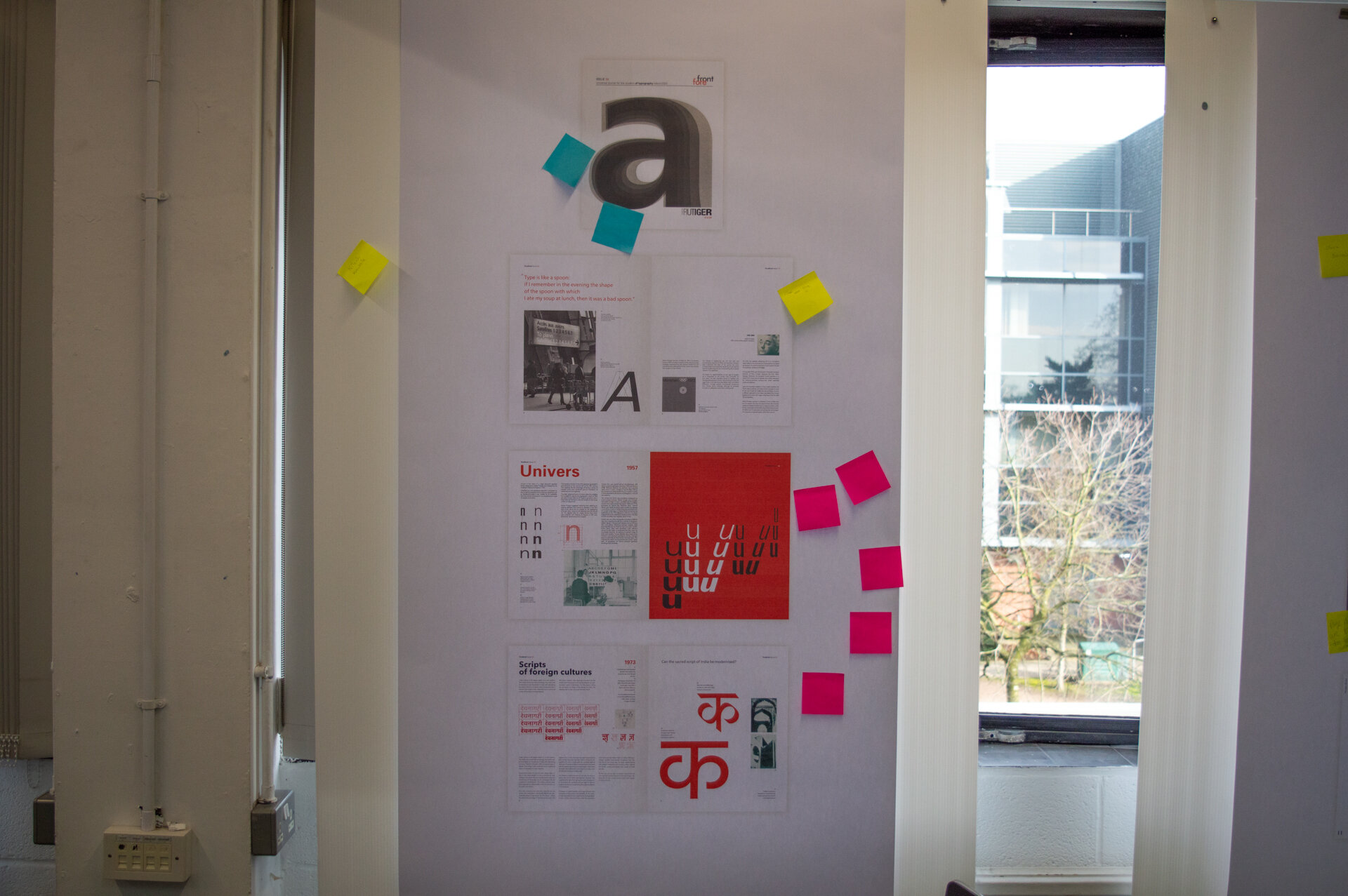
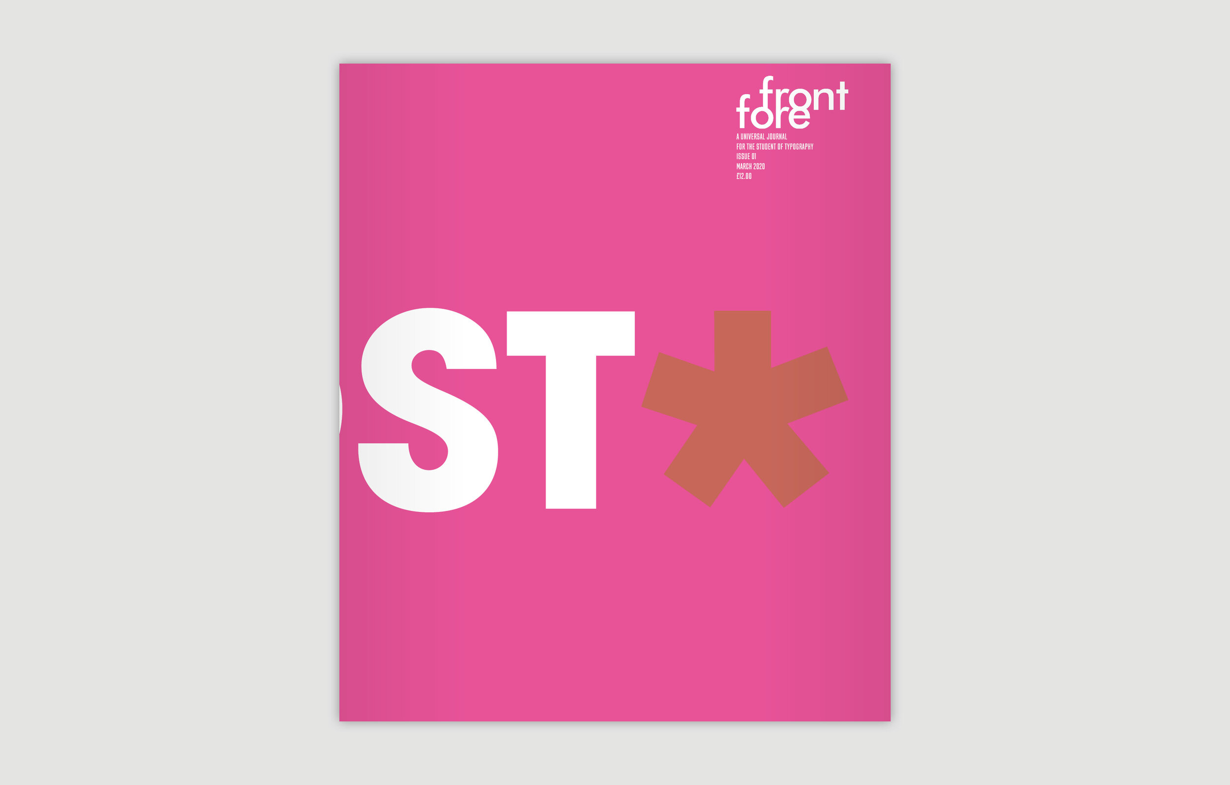
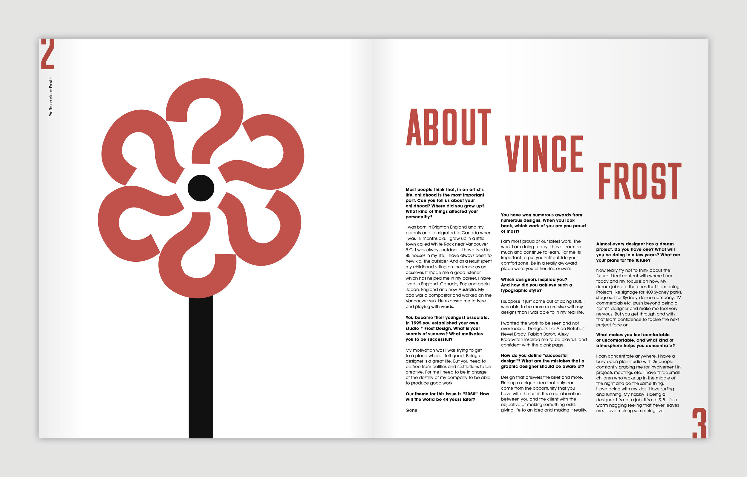
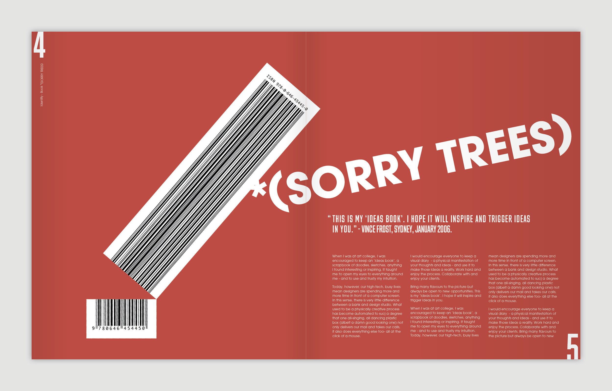
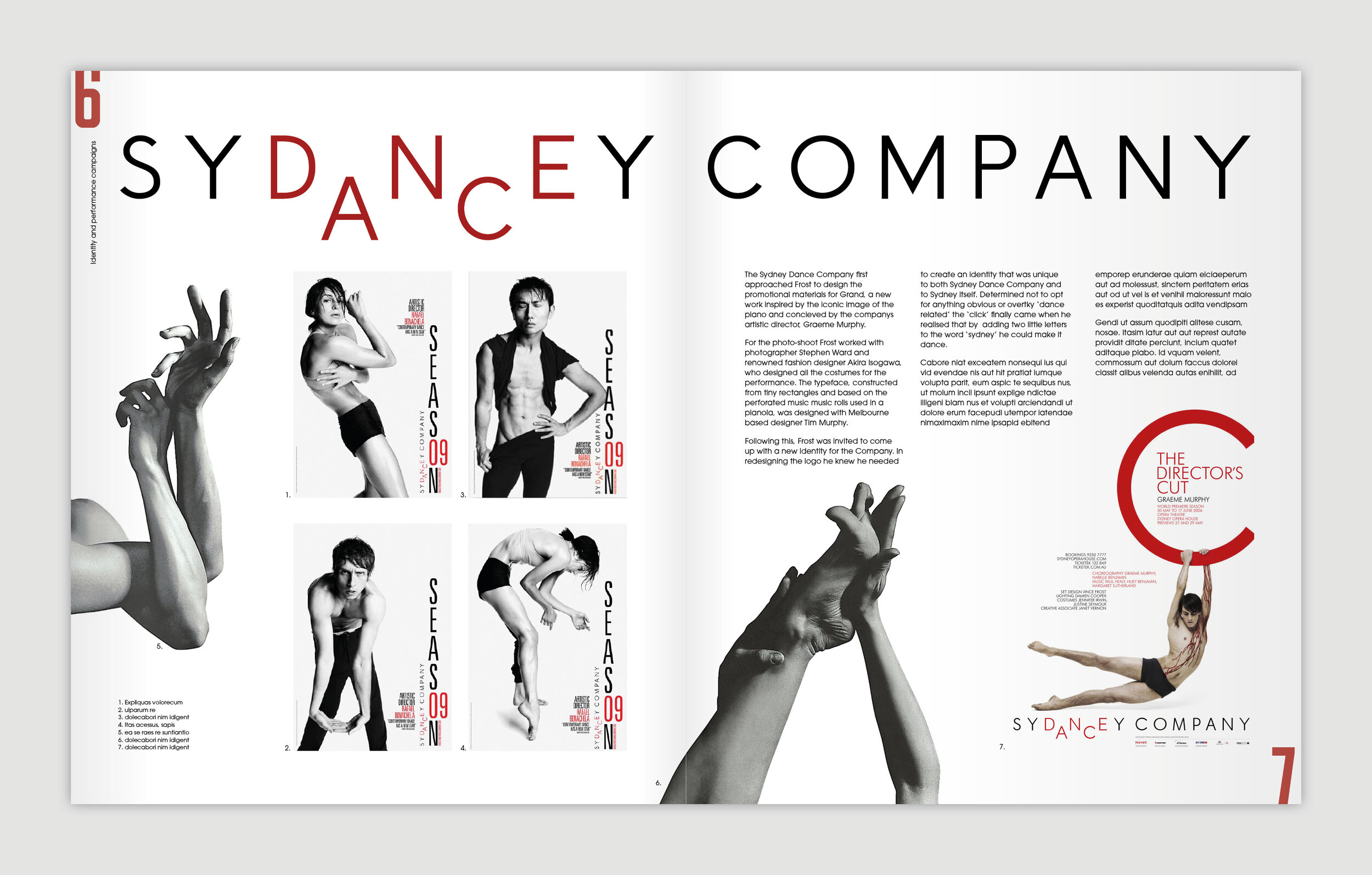
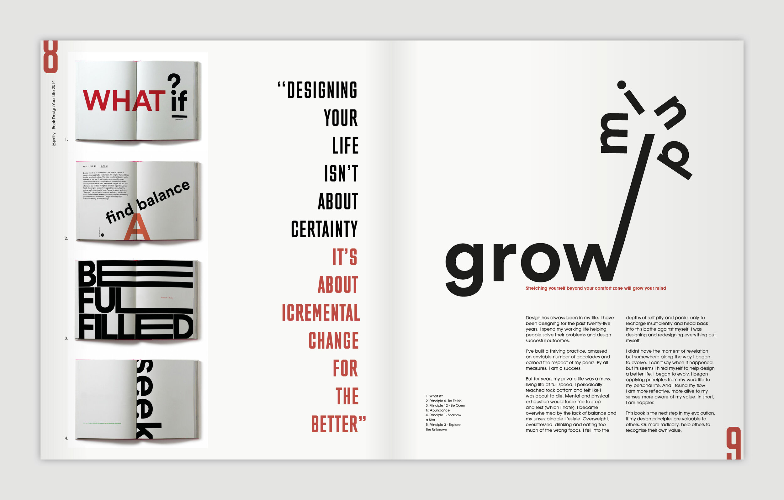
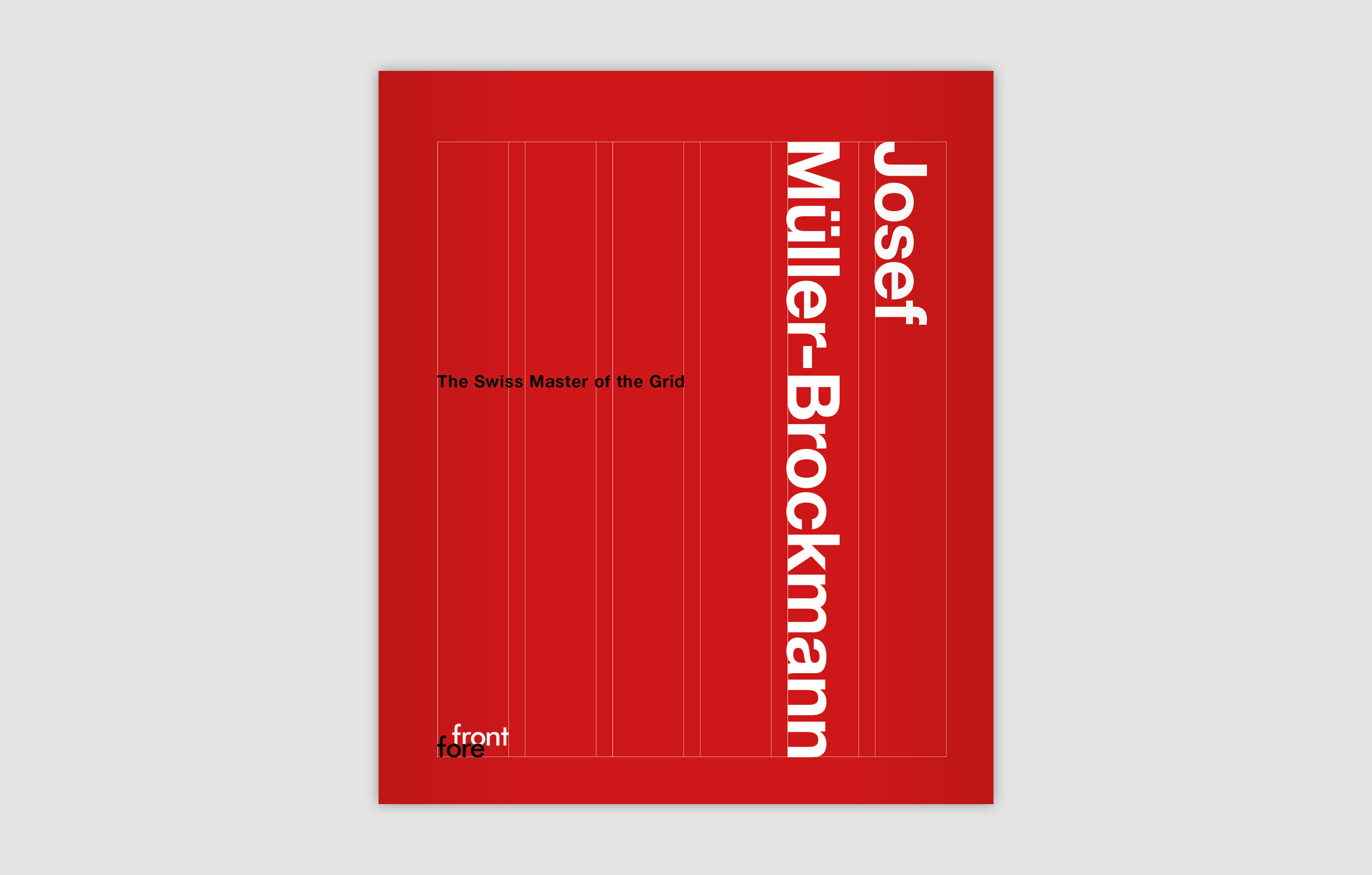
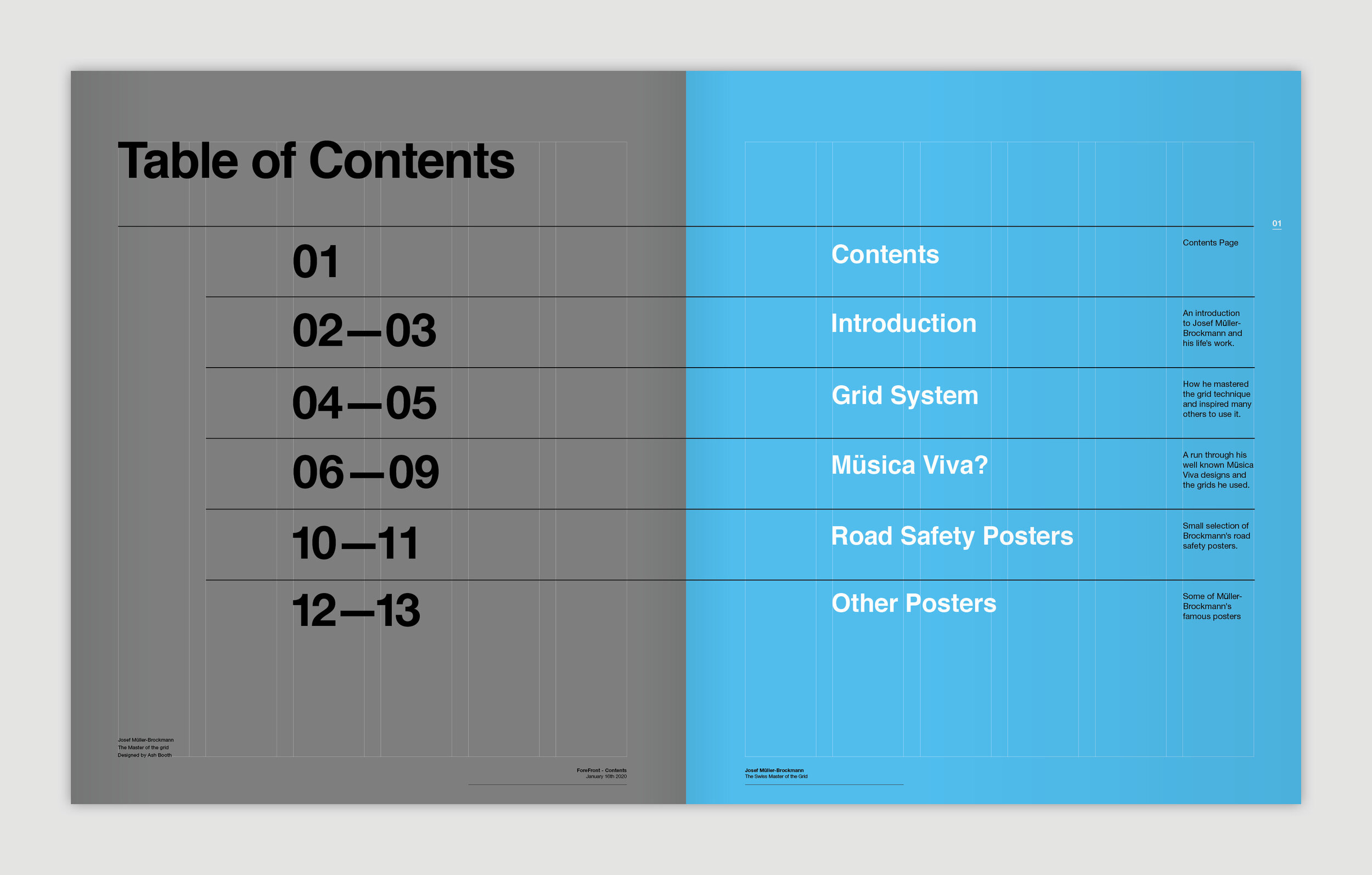
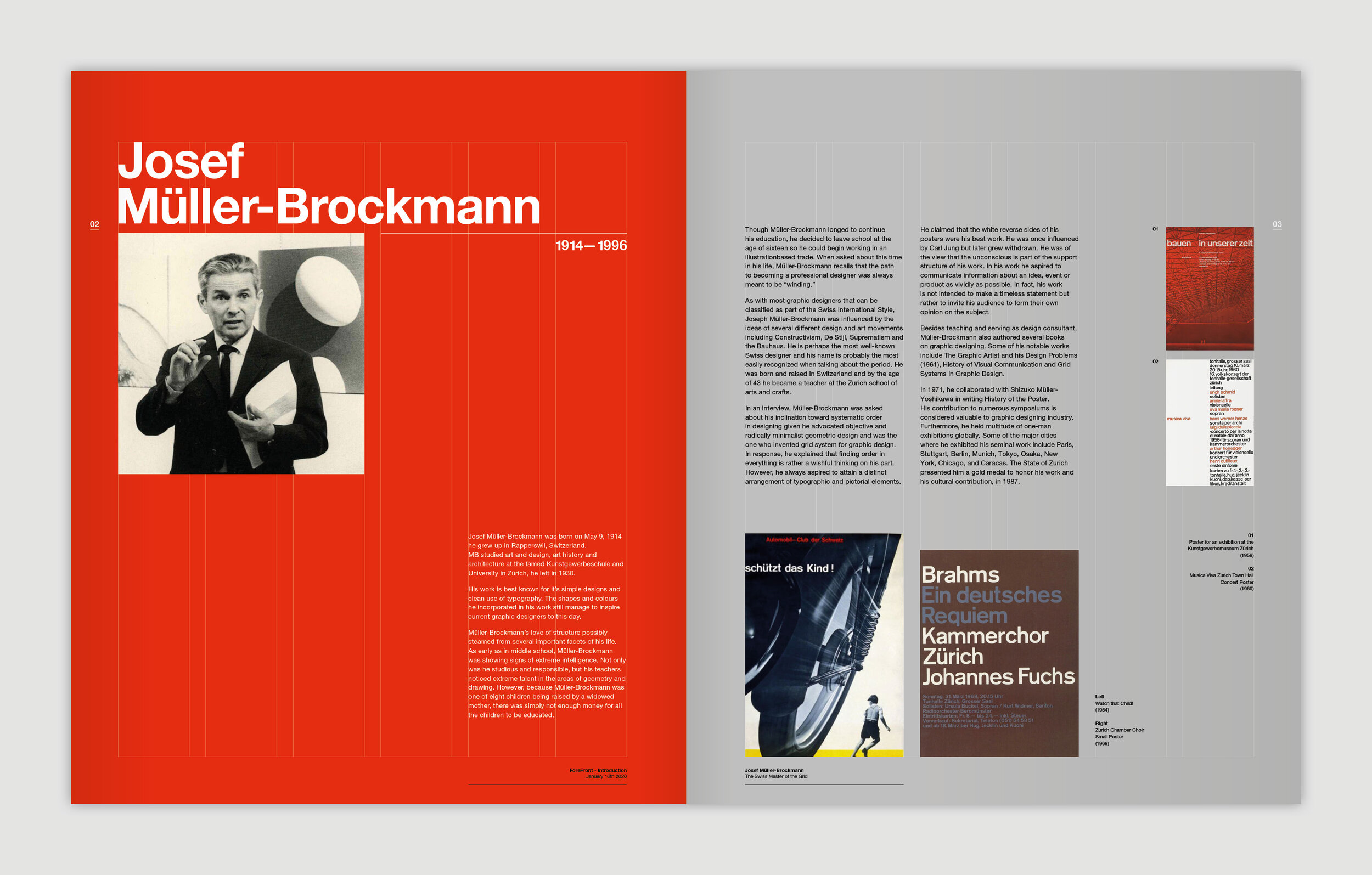
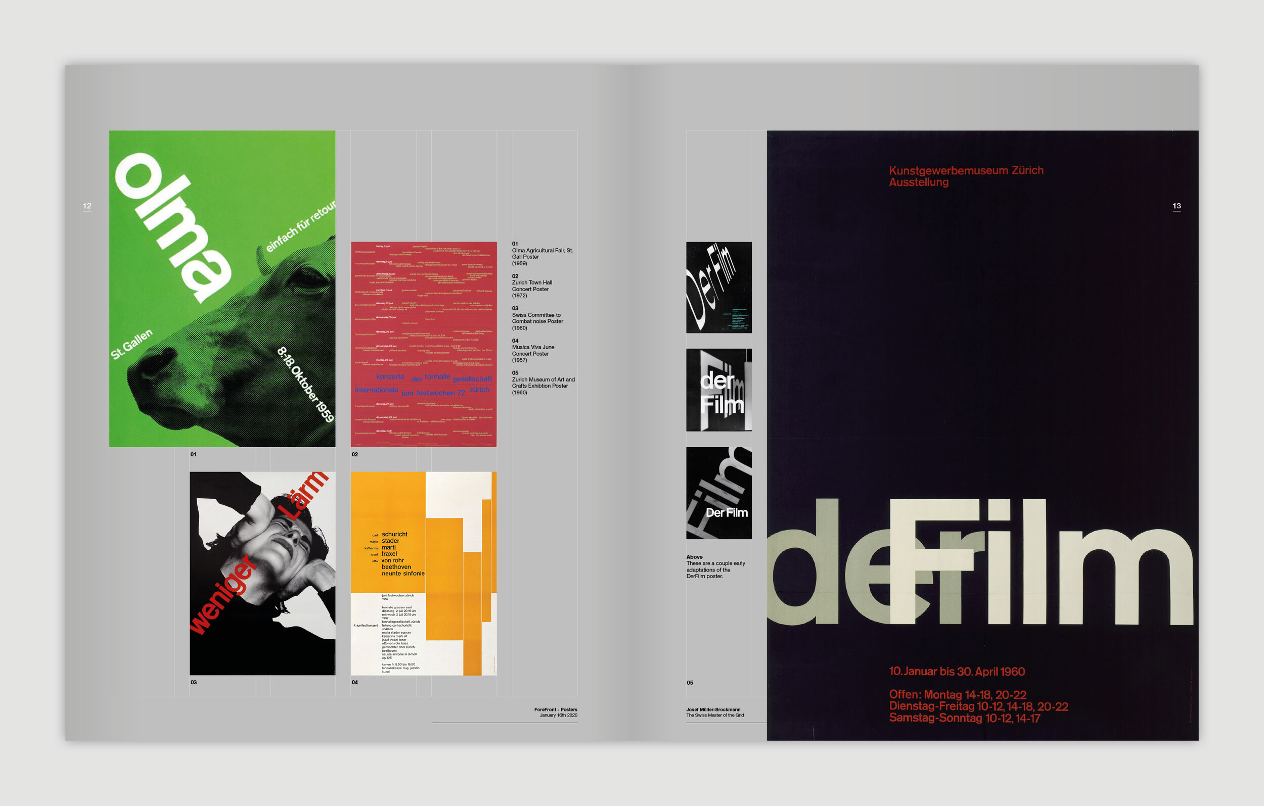
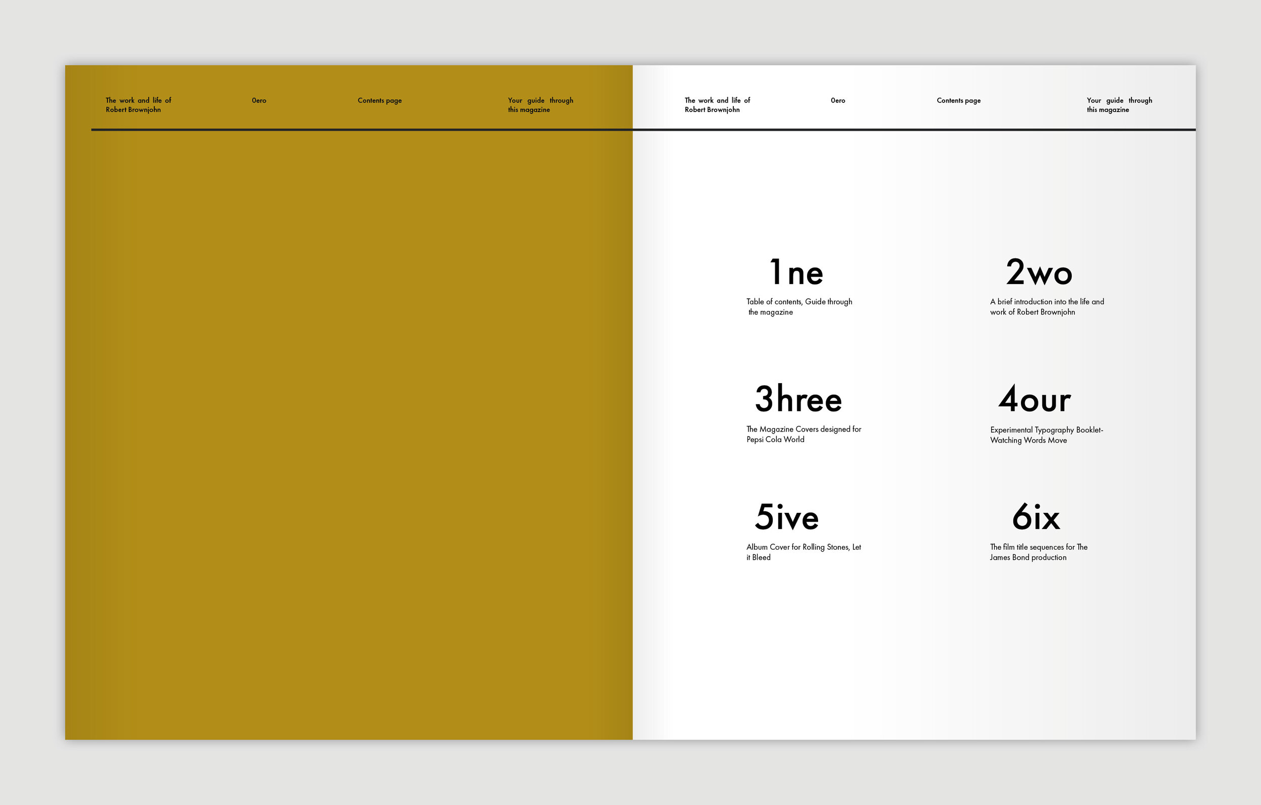
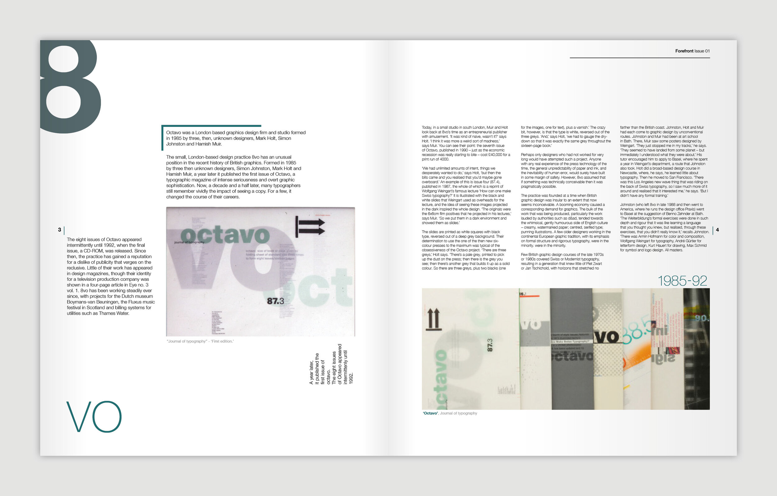
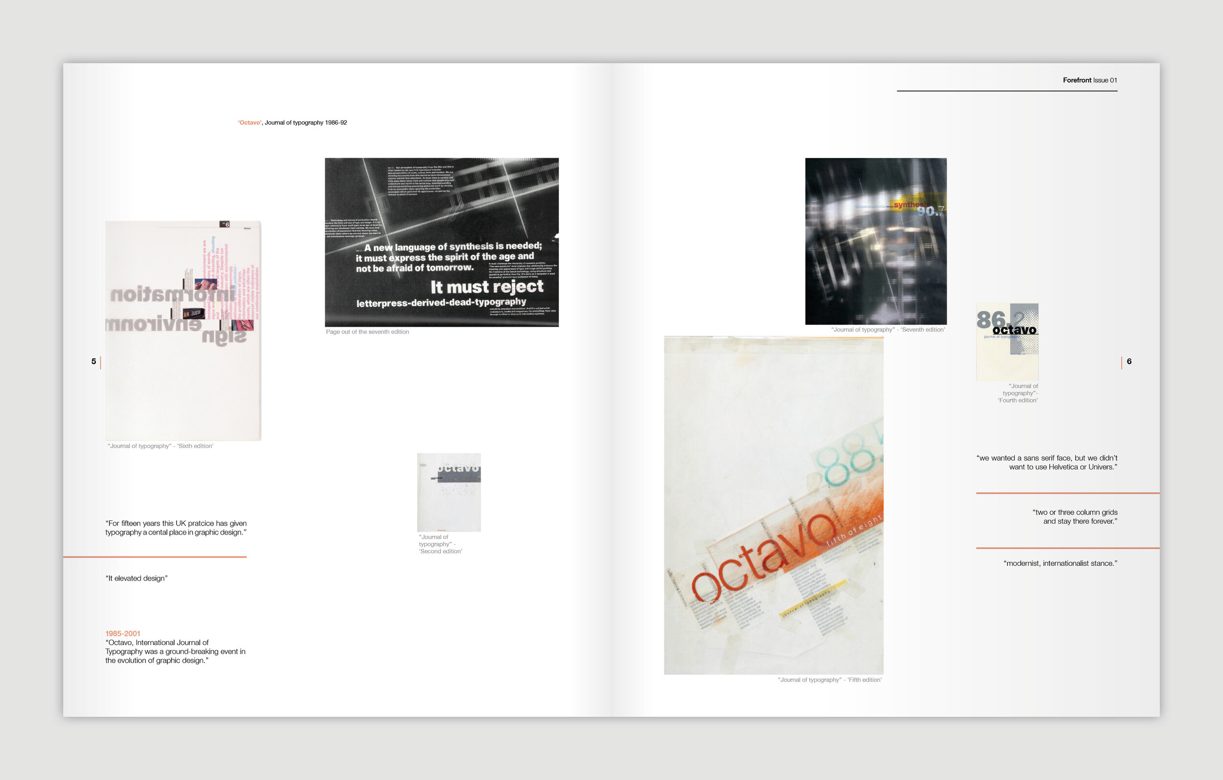
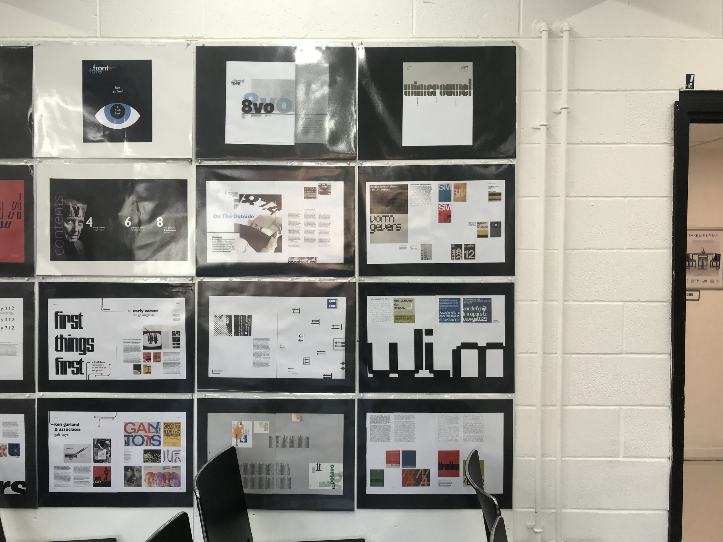
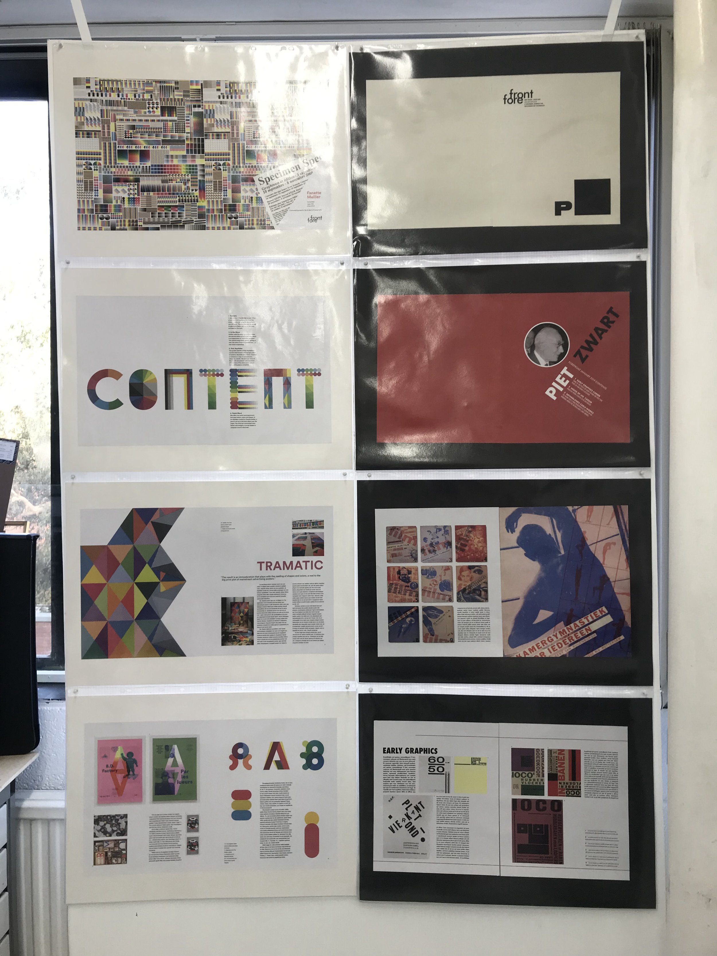
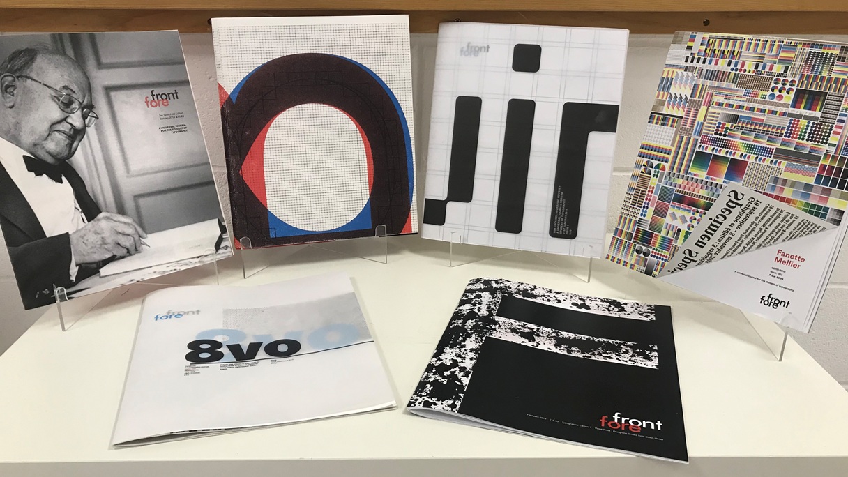
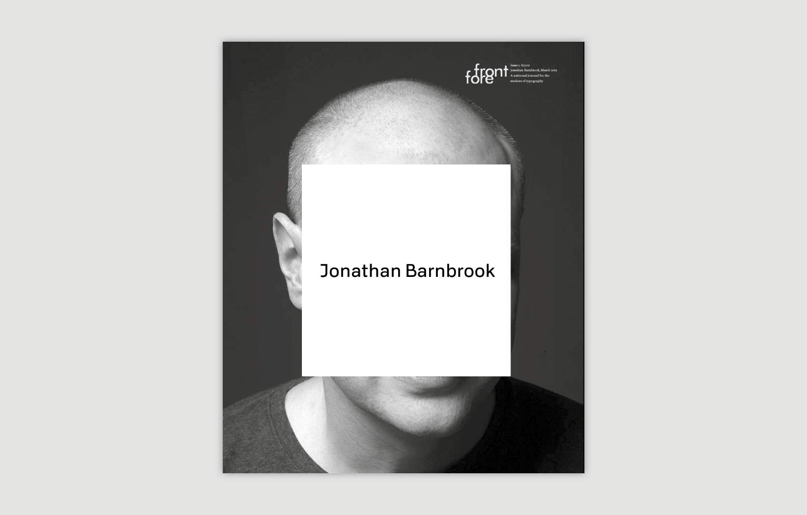
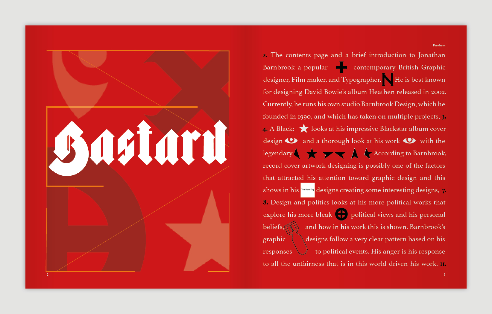
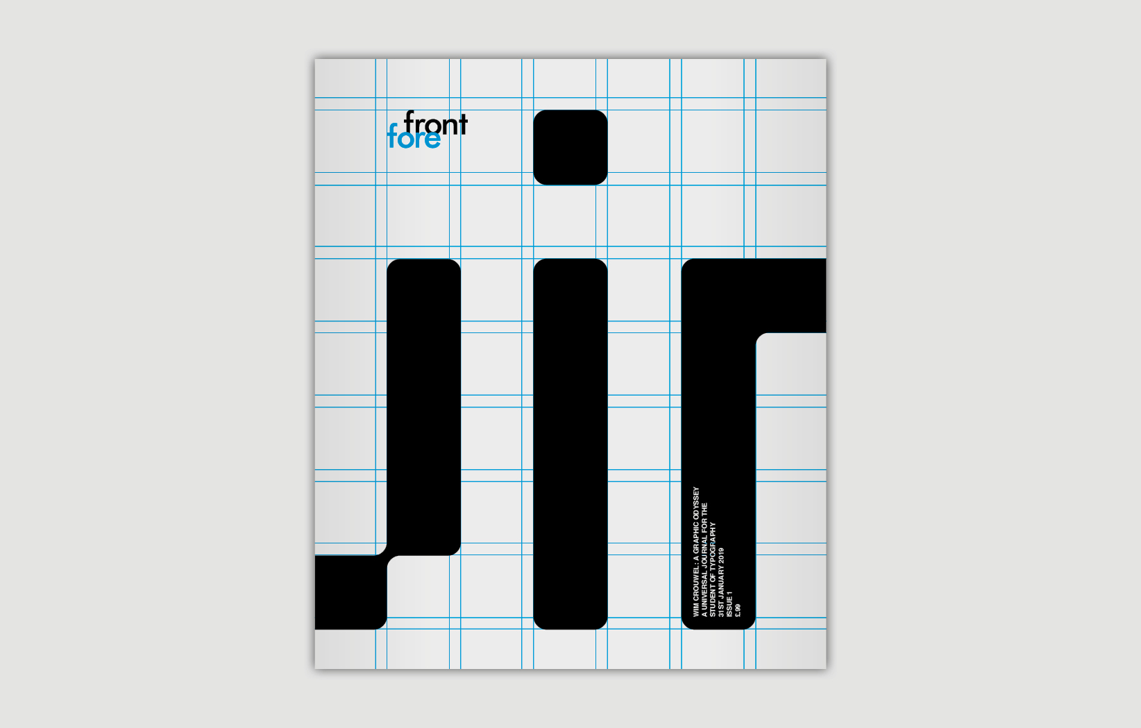
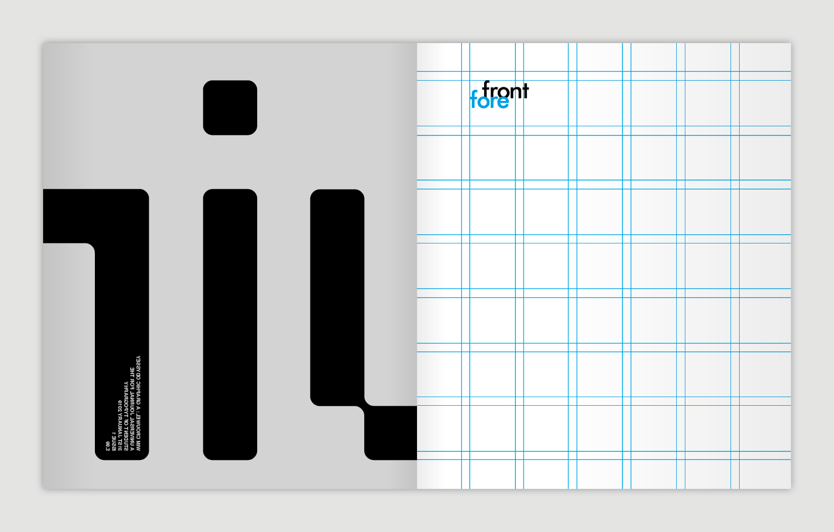
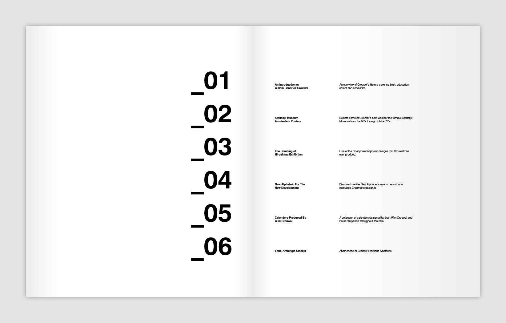
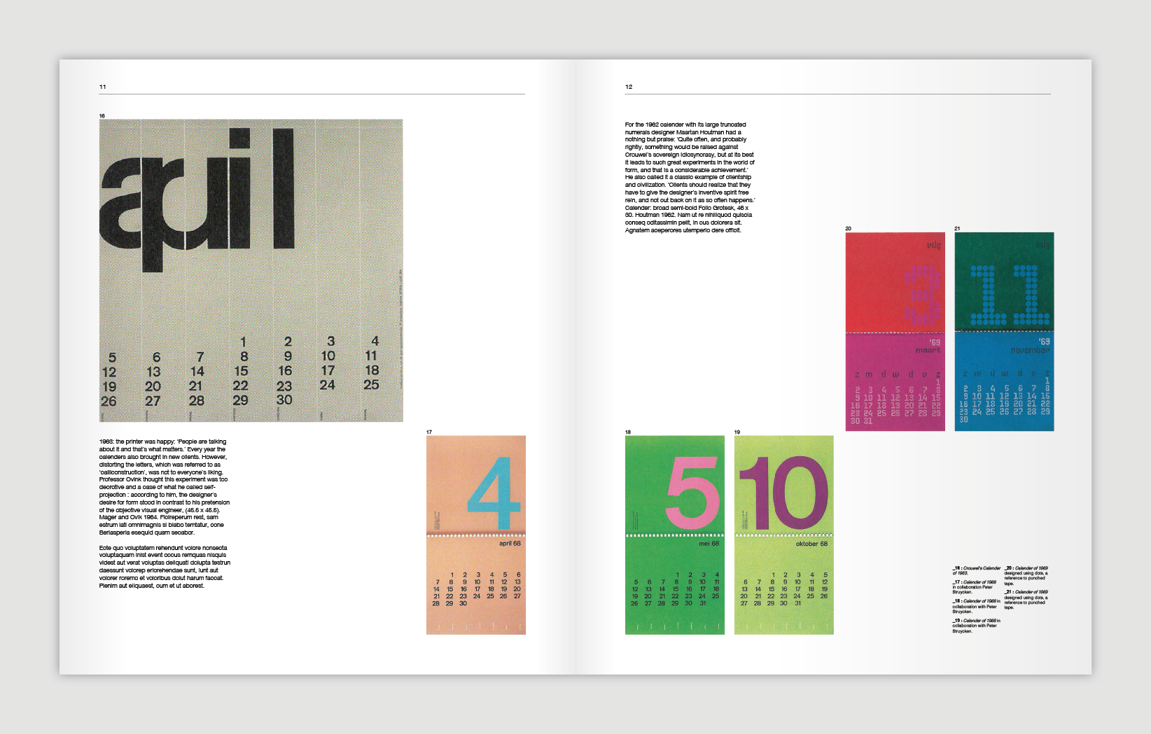
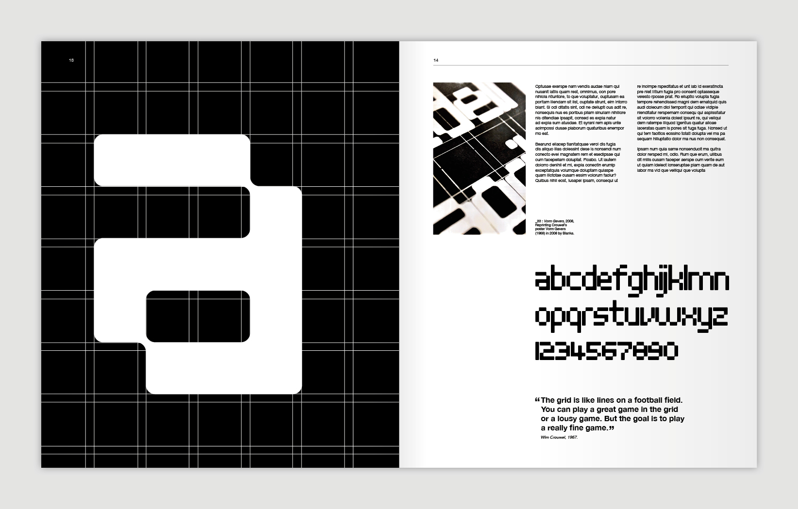
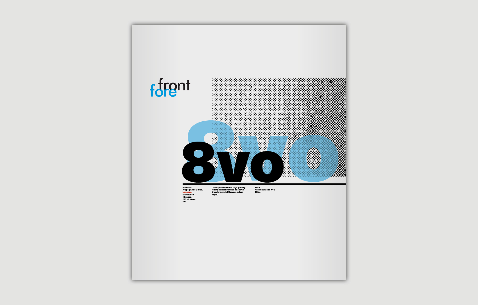
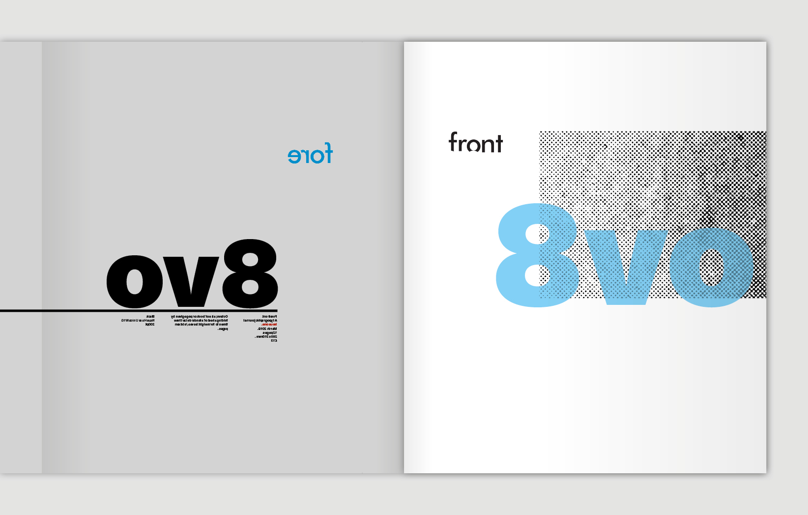
STUDENT EXAMPLES: