Paula Scher - Life Lessons from the Field
/A couple of weeks back, Kev, Ted and a group of students headed over the Pennines to Sheffield Hallam where design legend Paula Scher was giving a talk: Life Lessons from the Field. In her early design career Paula worked as an art director at CBS Records where she designed many record sleeves (literally hundreds), in all styles and in all ways. Paula became a partner of Pentagram in 1991. In her time there, Paula has created an amazing amount of work, both for her clients but also as a practising artist. With such a career behind (and still in frront of) her, showing everything would be an impossibility.
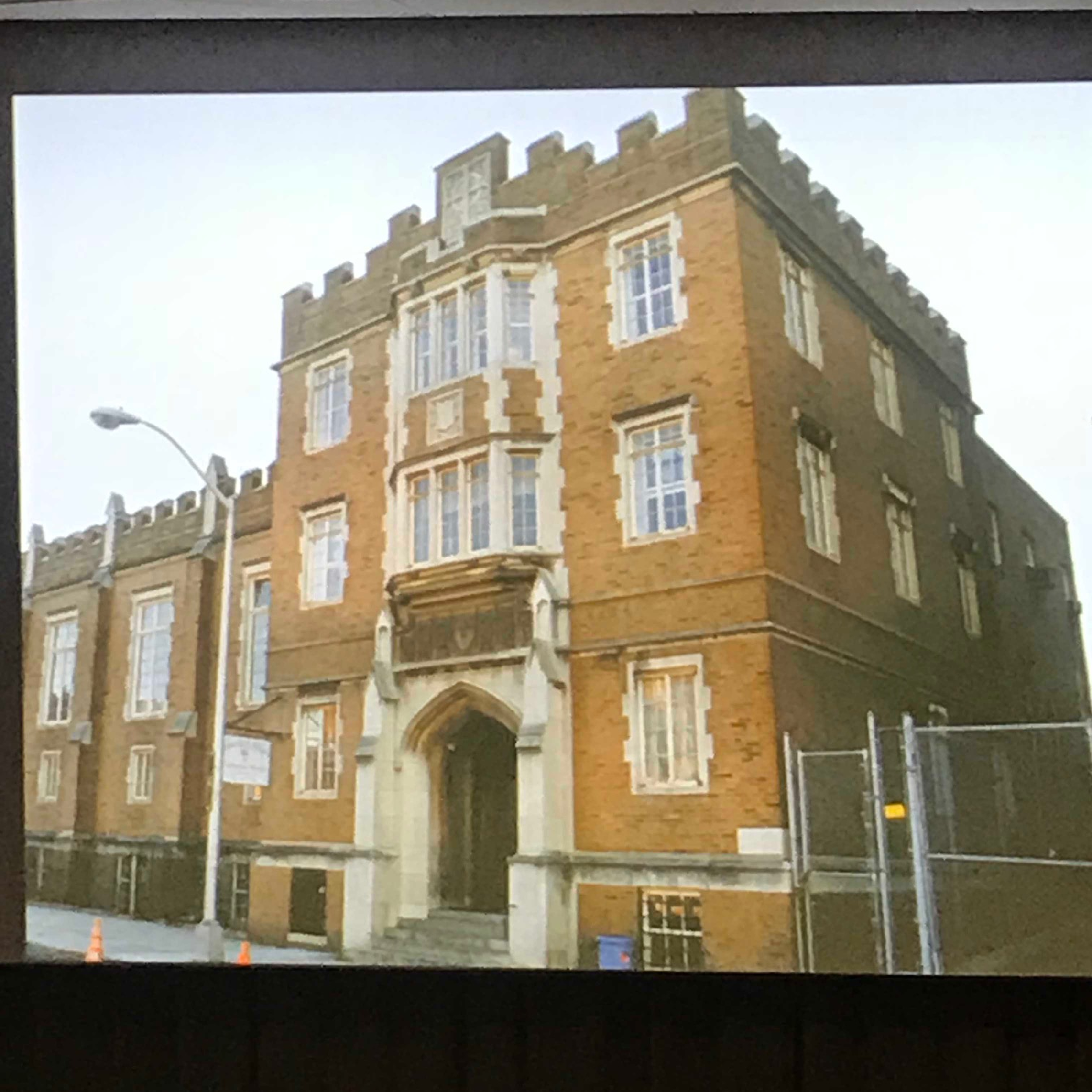
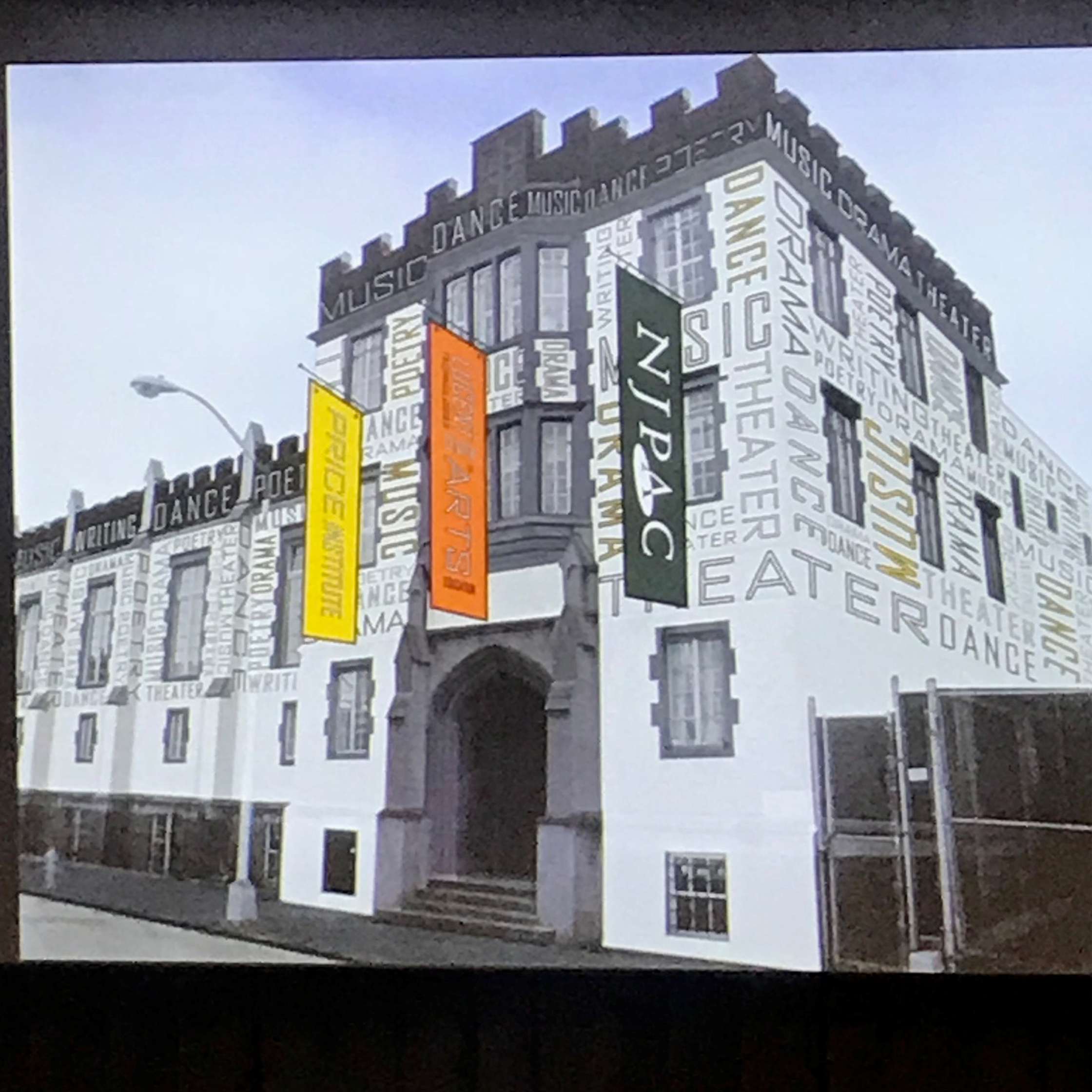
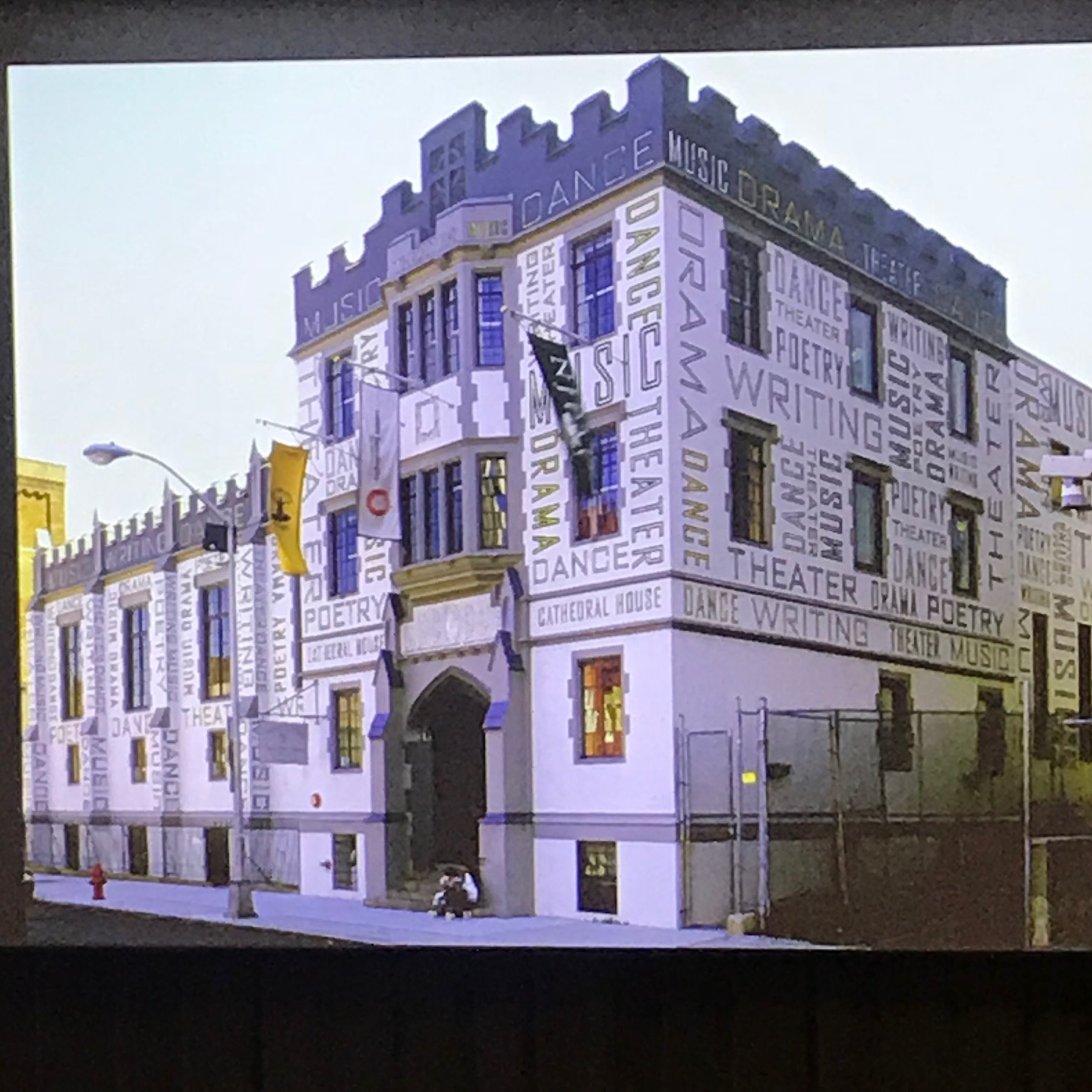
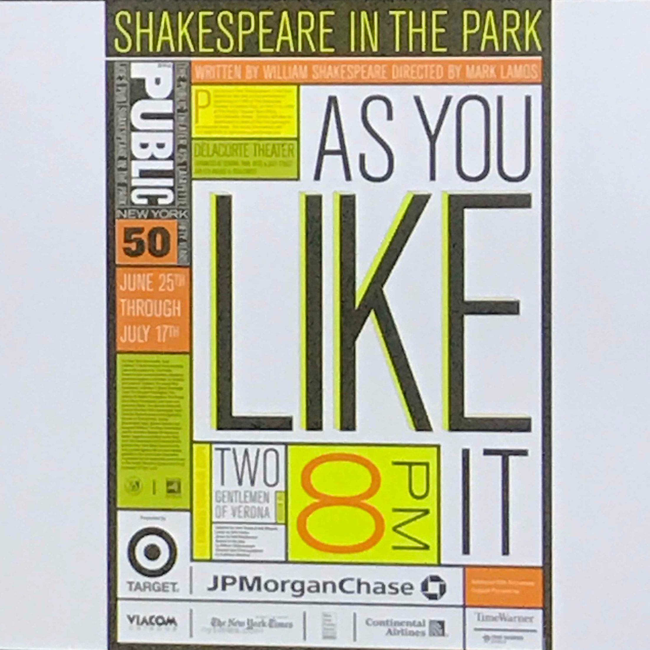
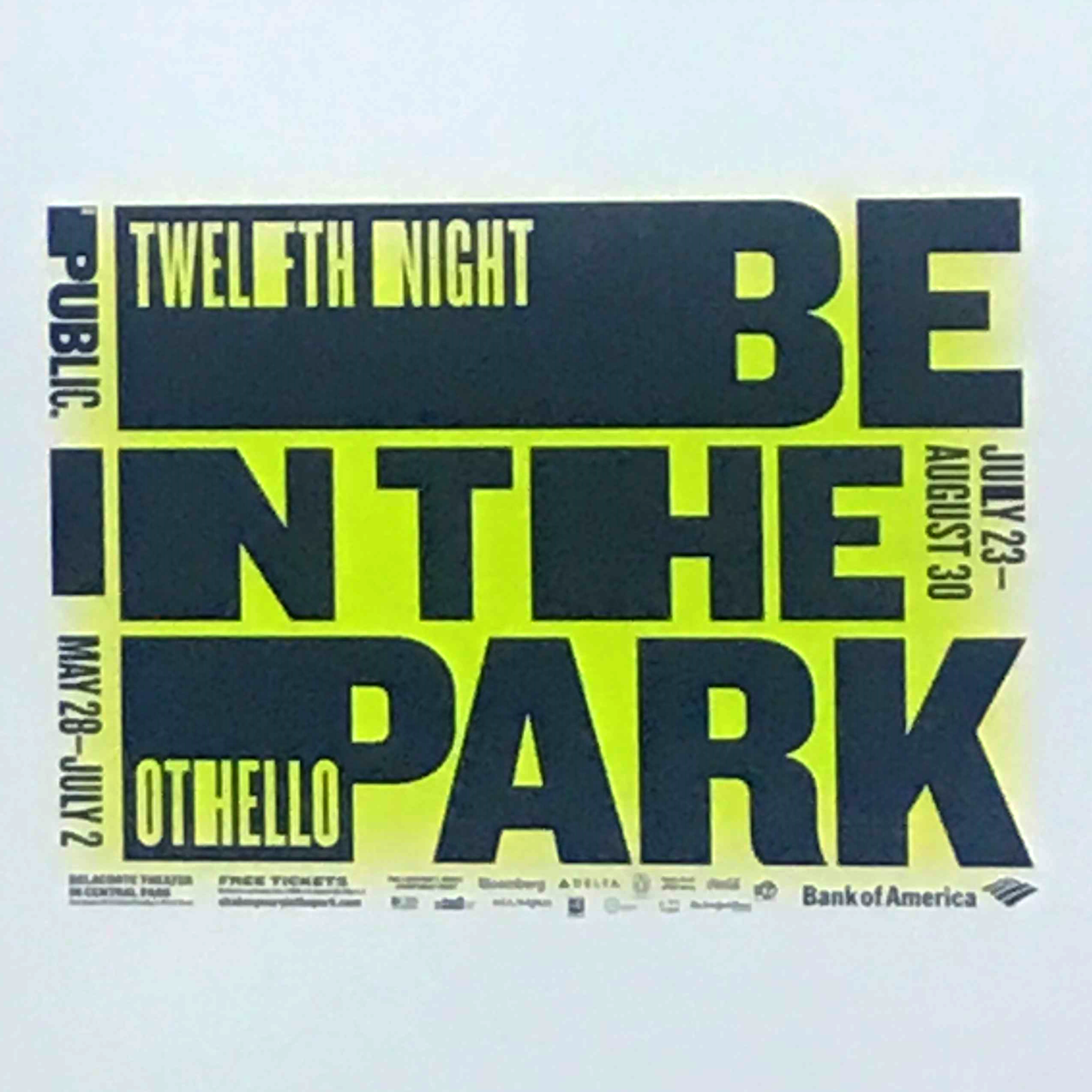
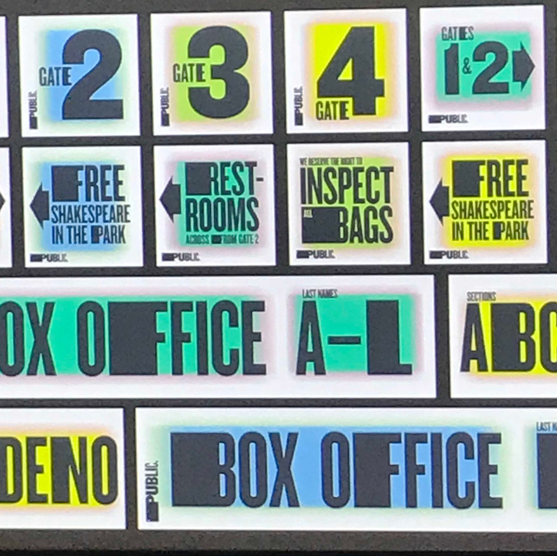
More recent work in Pentagram has taken her down a path of creating environmental graphics, the exterior of Lucent Technologies Centre being particularly recognisable (and now almost 20 years old). This has led to newer projects, the Quad Cinema being a personal favourite.
The talk broke down through ten salient points:
Fall in love with something that’s been designed
Have heroes and/or mentors
Push back against something
Defy the career staircase
Go the distance
Be a neophyte
Find a personal expression
Work for free
Hang around with smart people
Do what you do best but change with the times
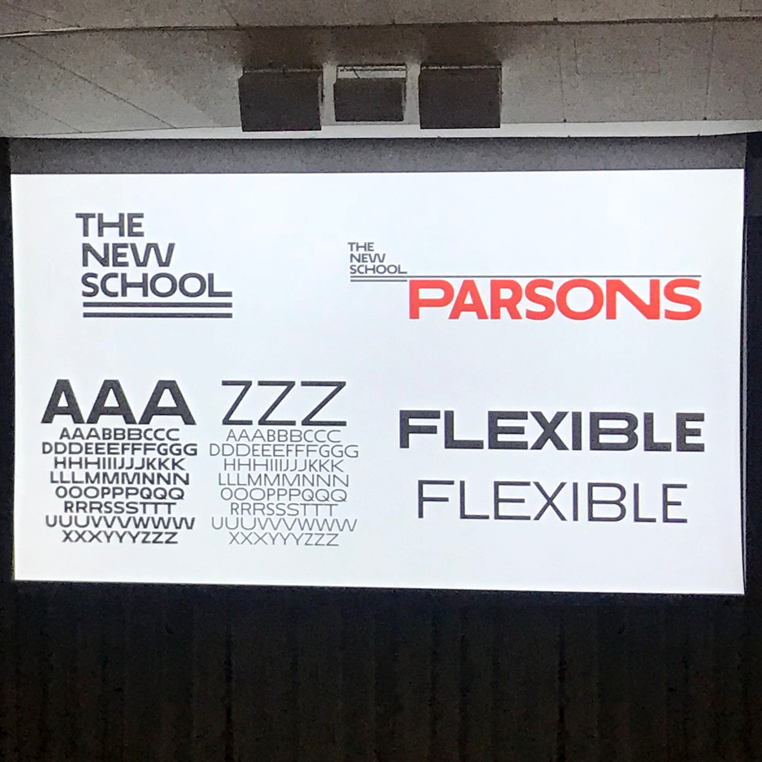
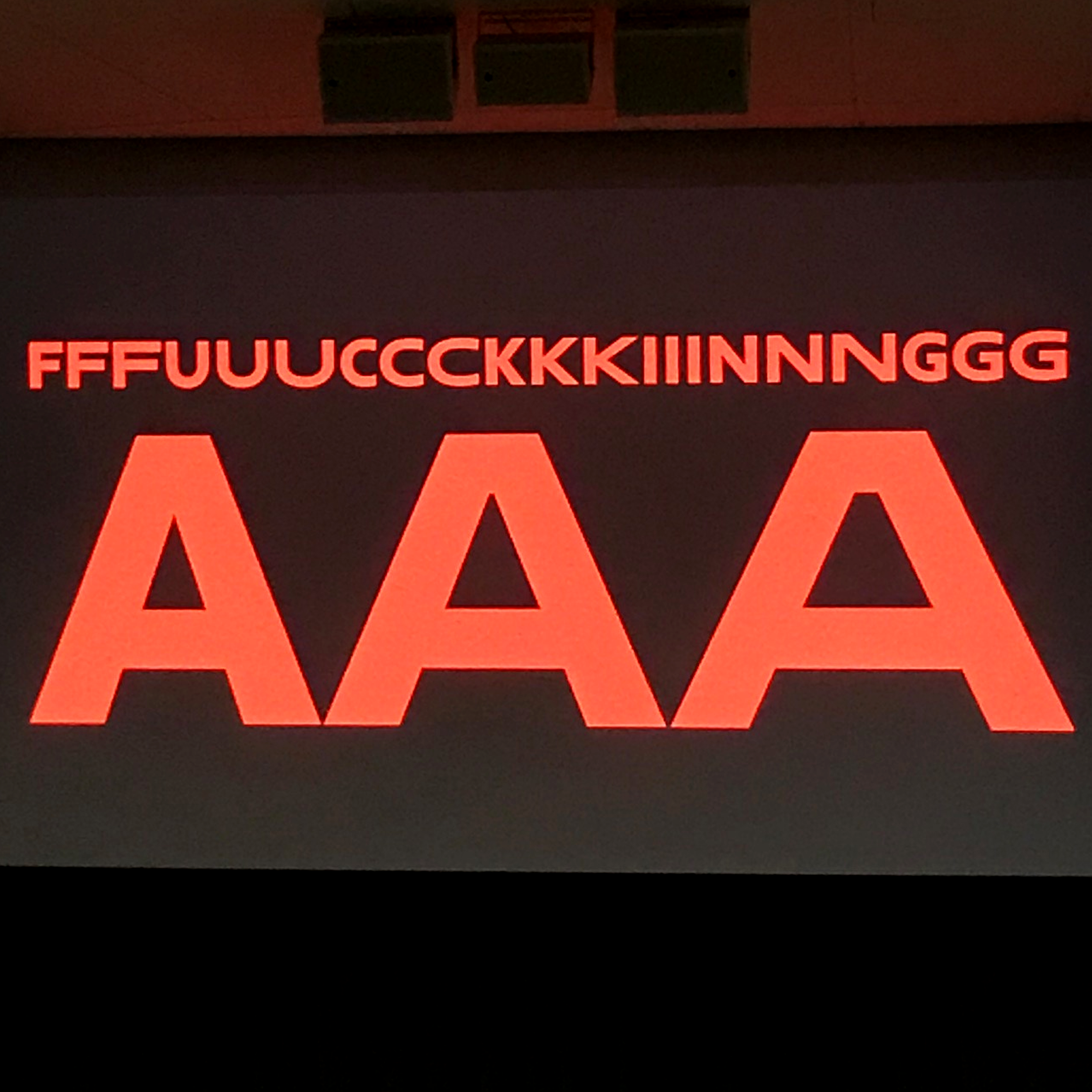
Now I shan’t try and explain those points here. Luckily enough, they are self-explanatory to a point. But - for example - with point 3, Paula chose to push back against Helvetica. She developed a passion for scavenging and resurrecting old type in an era when digitisation was threatening to erase historical wooden type from history. Then using the type in an expressive manner, directly opposite to the teachings of Swiss typography. In fact this was a direct lesson she took from her teacher at art school - Stanislaw Zagorski - he told her three words to “illustrate with type”. See type as an illustration, and that letters have form.
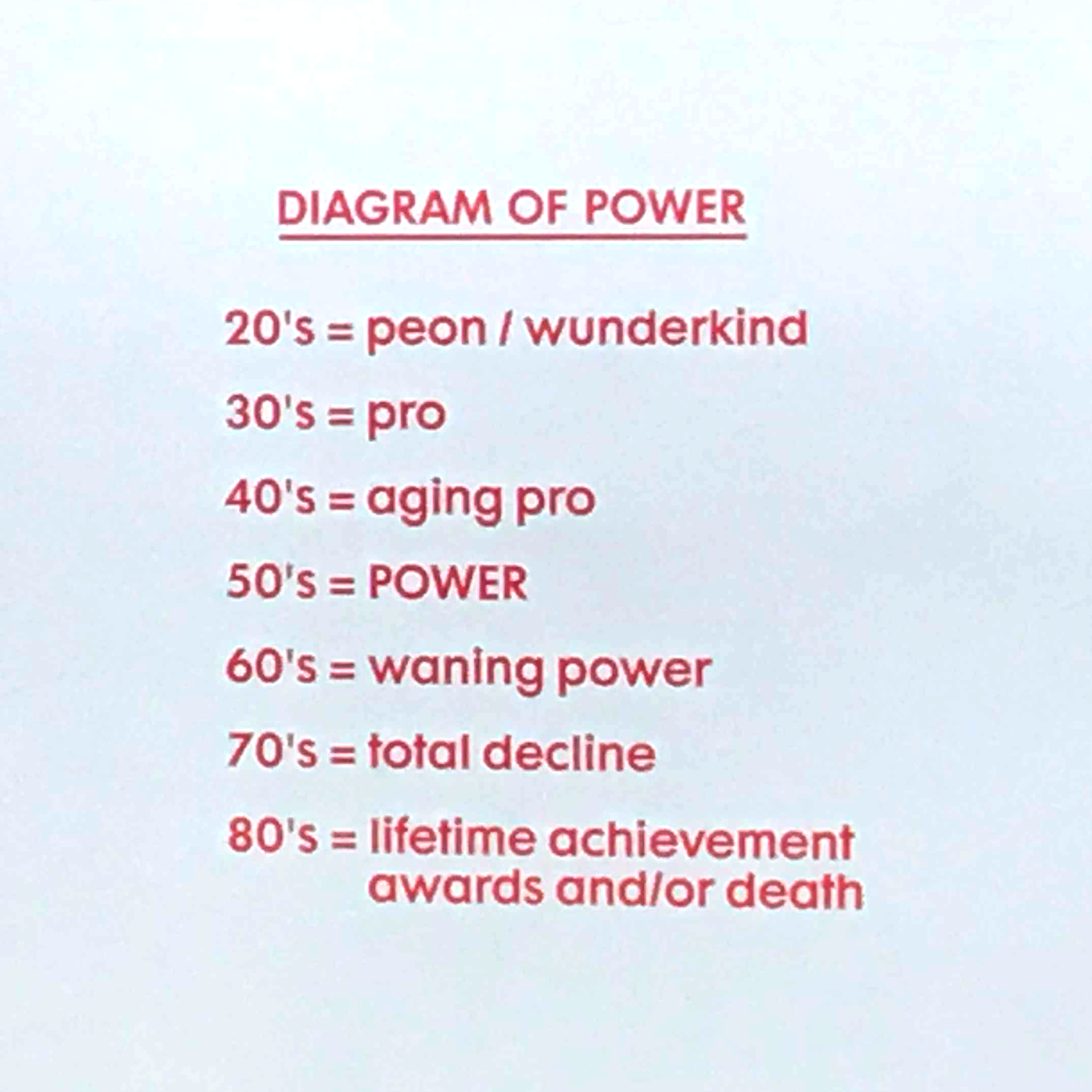
I attach some photographs below, apologies for the quality, but they were taken from the rear quarters of a sizeable lecture theatre.
One of the things I also took from the talk was in a response to a question after the presentation. Regarding the shear quantity of work outputted, how does she find the time to actually do it all to which Paula simply answered “I work fast, not long”.
Record sleeve designs: art directed type, stained glass typography, pure typography
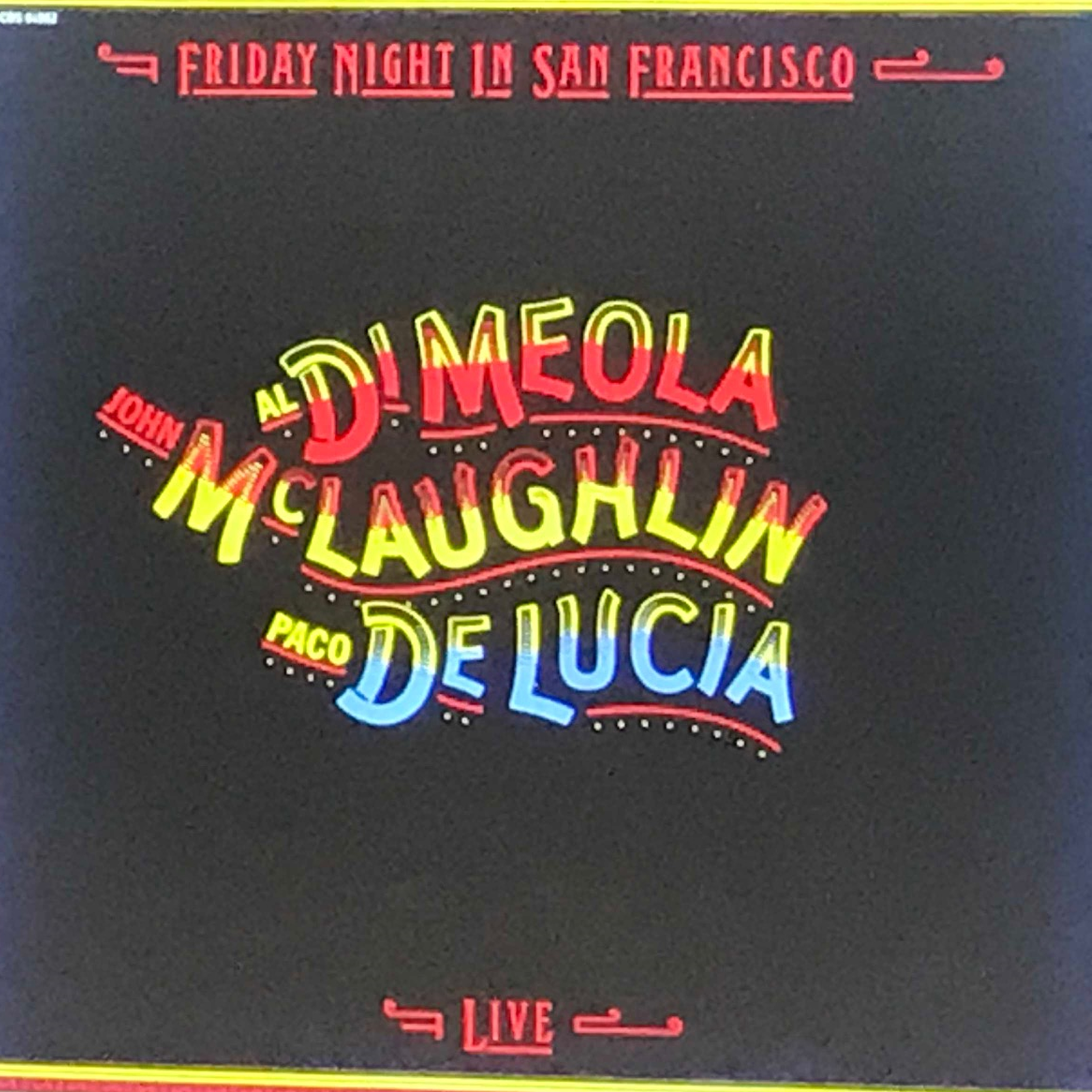
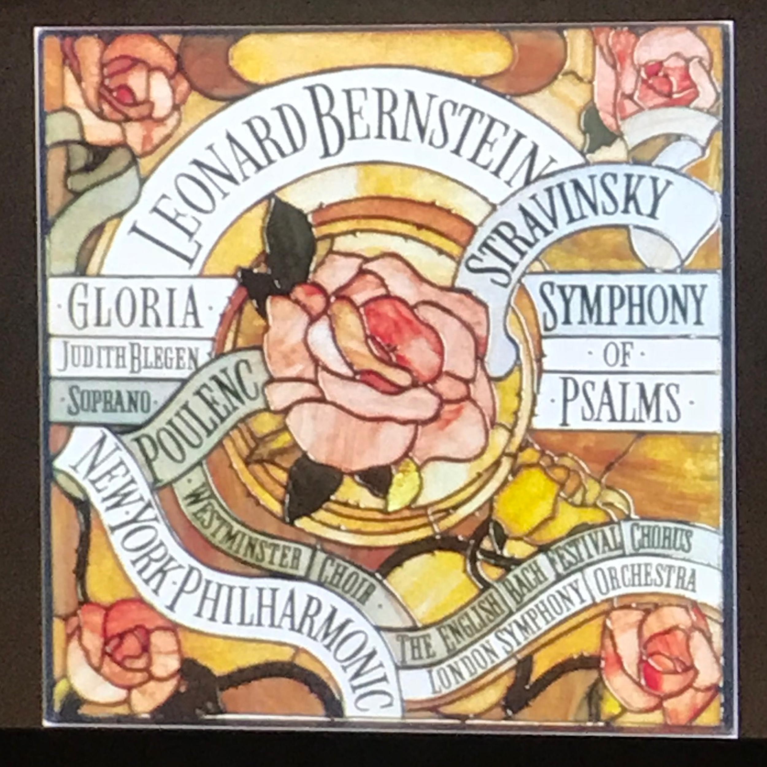
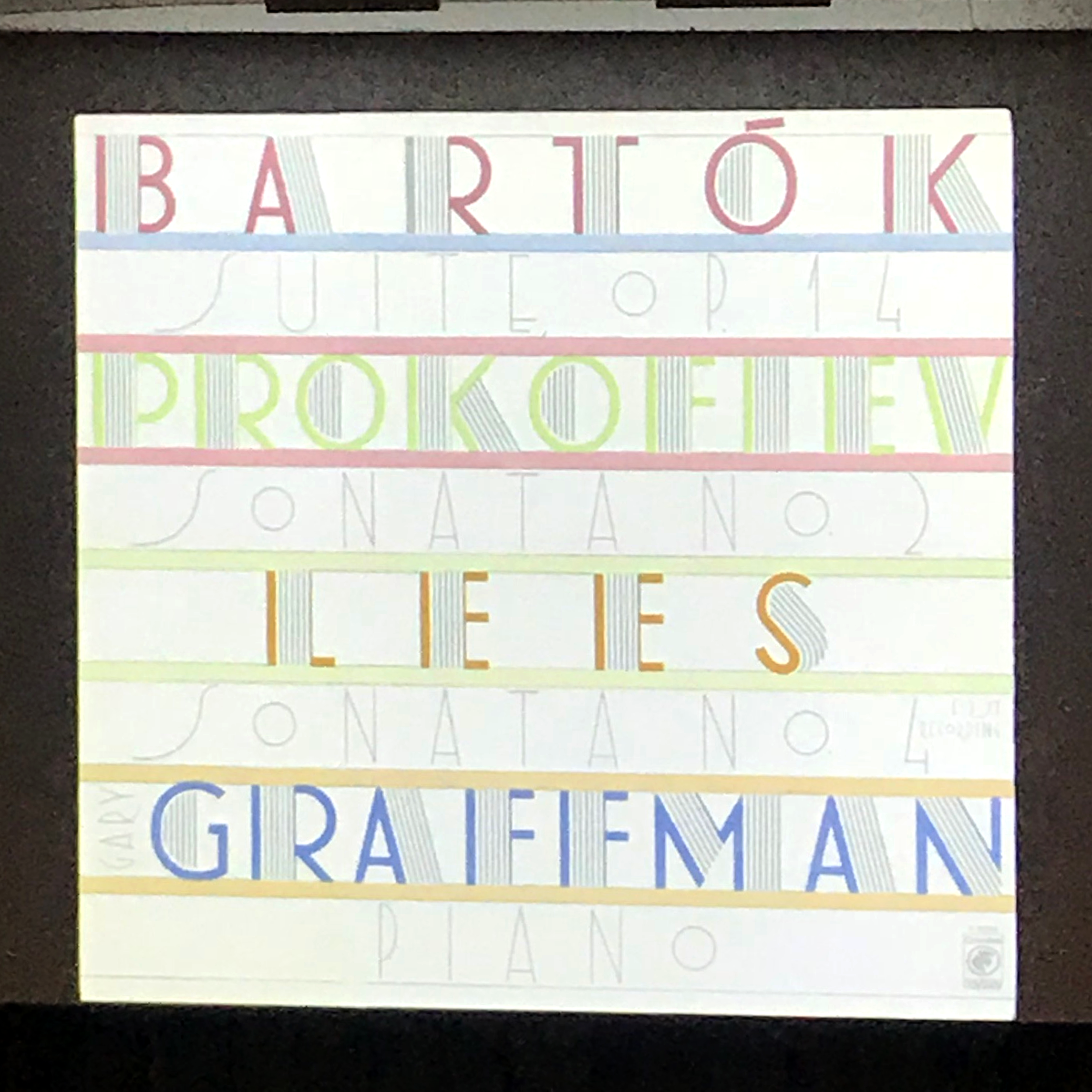
Diagram of power
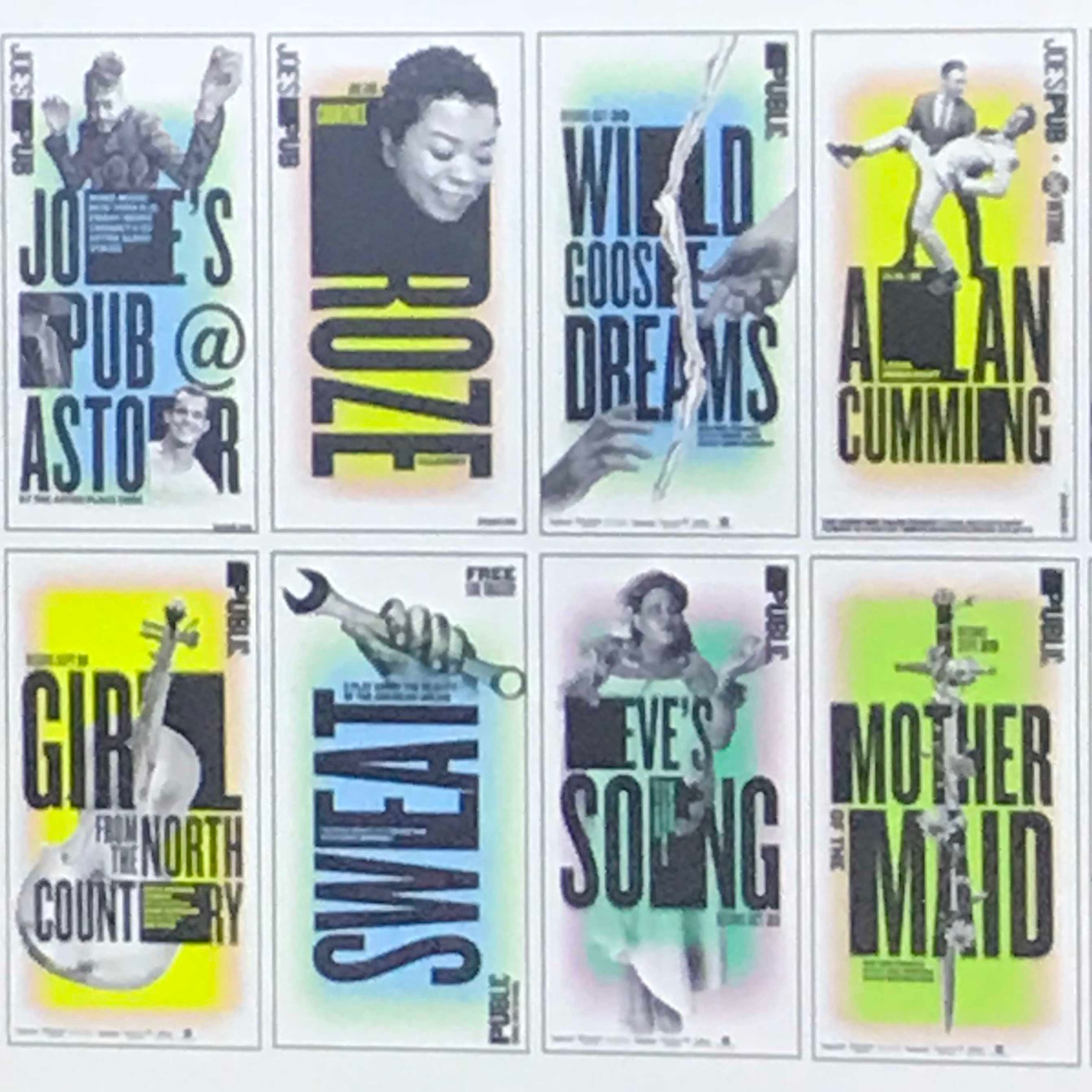
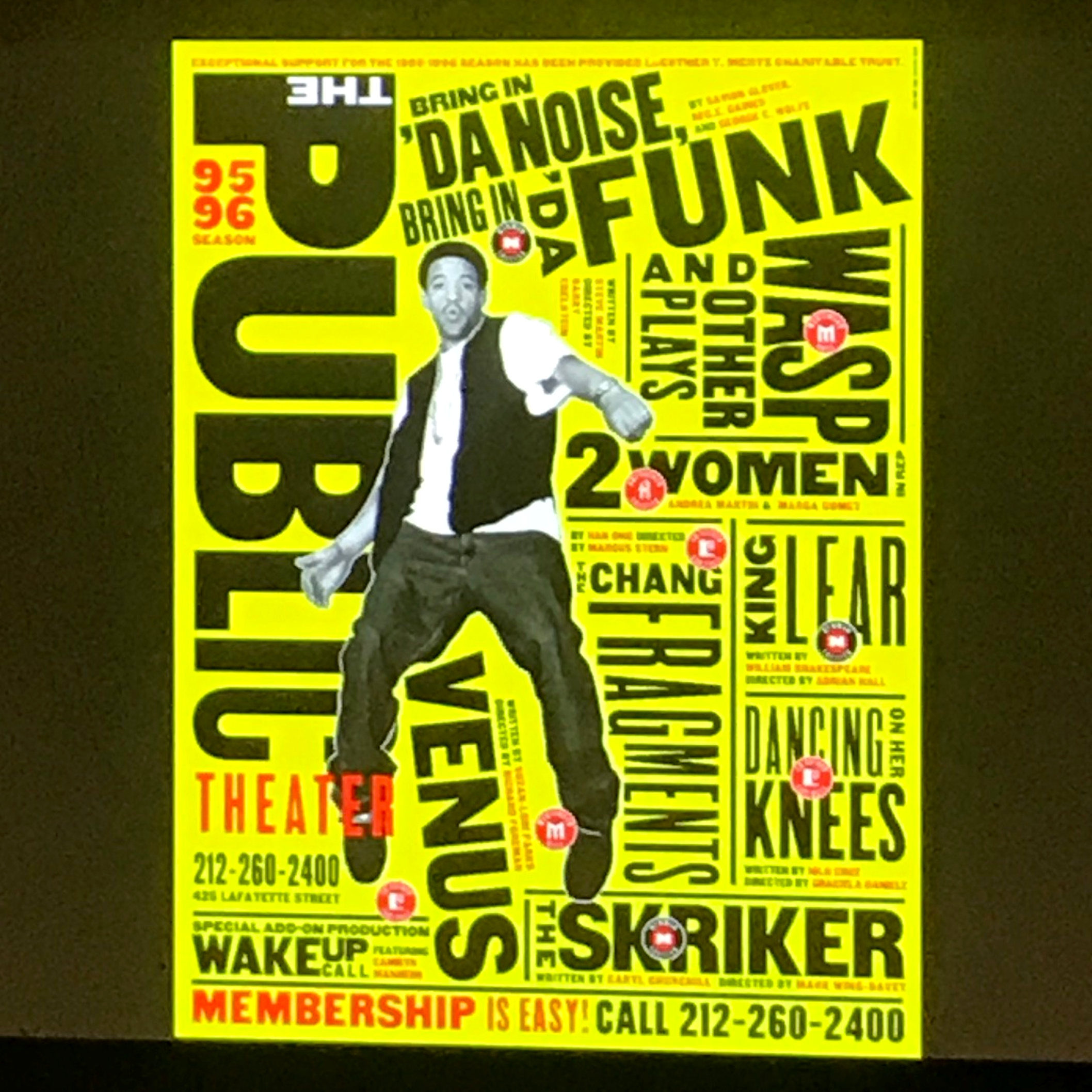
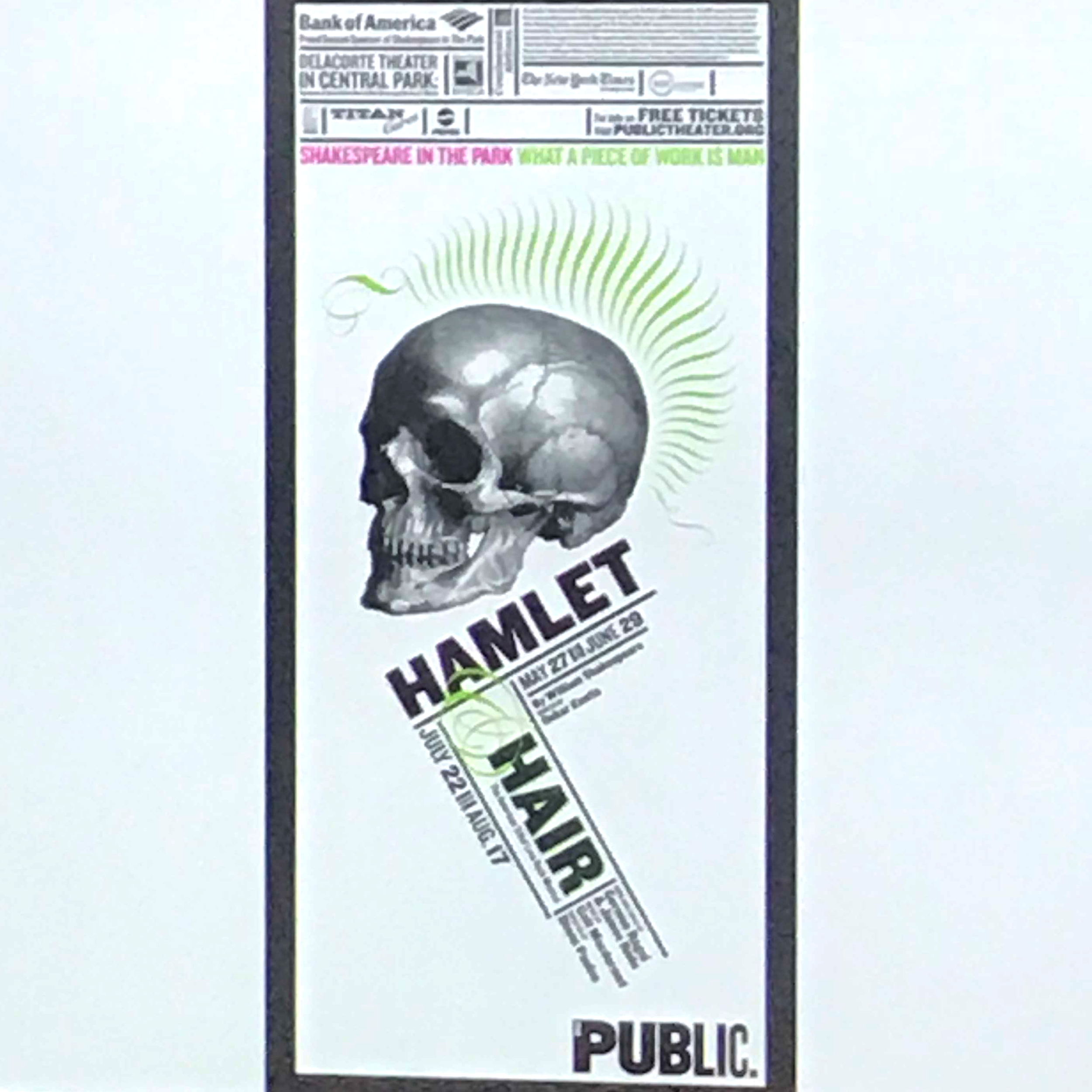
Snippets from The Public Theater
The New school typeface and aaa