One week project: Image
/The first years have recently finished their one week image brief, and some of the better solutions are shown below. Overall this has been the least well received of the three briefs. As the projects come thick and fast, and each new one requires slightly more input than the last, the intervening days between the briefing and the workshop offer a chance for students to get ahead.
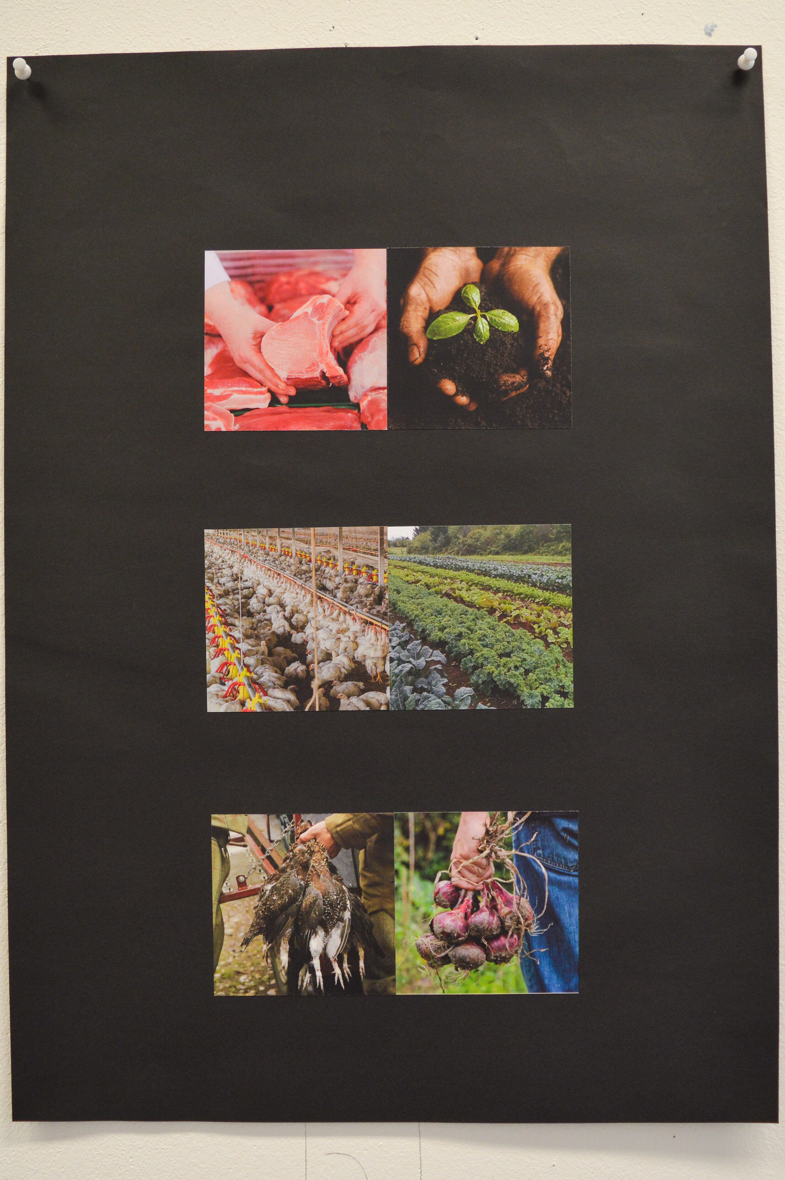
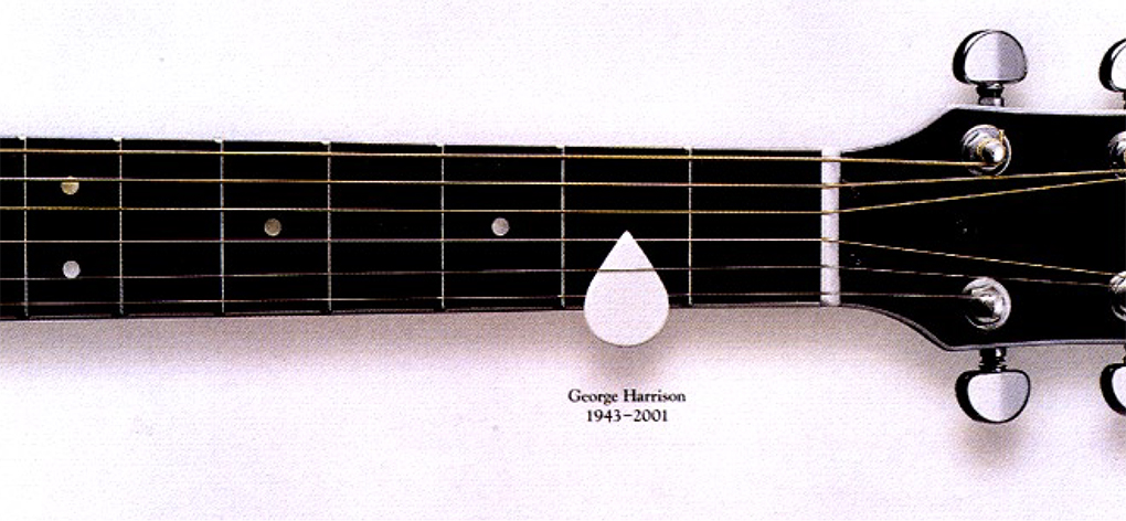
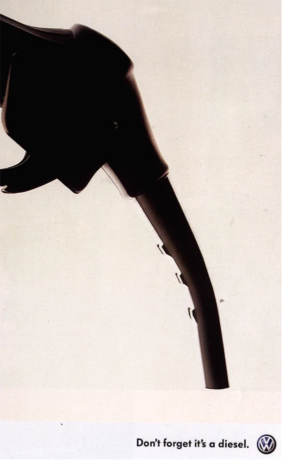
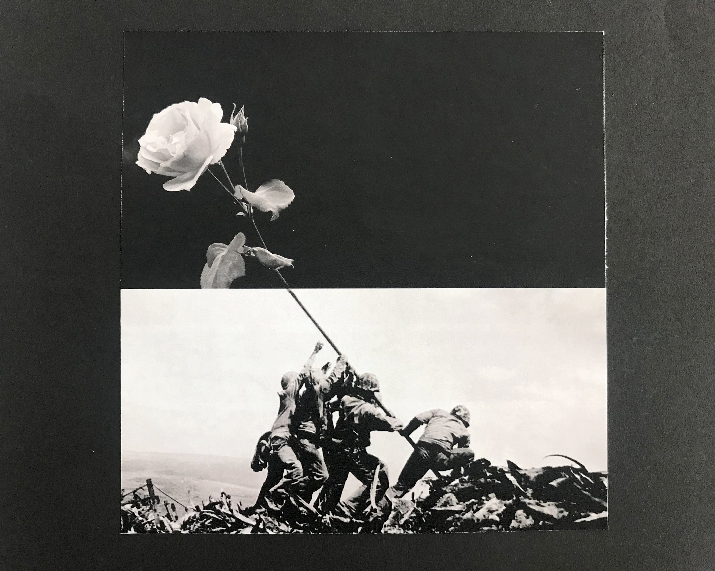
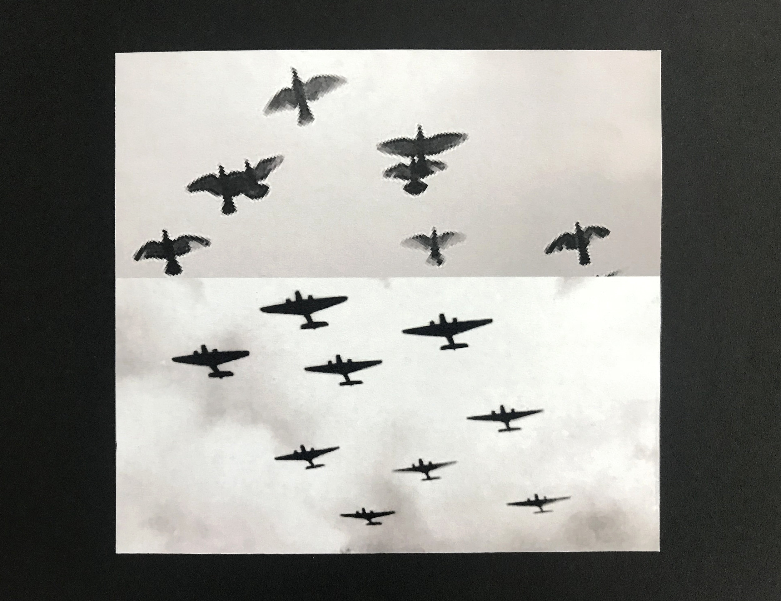
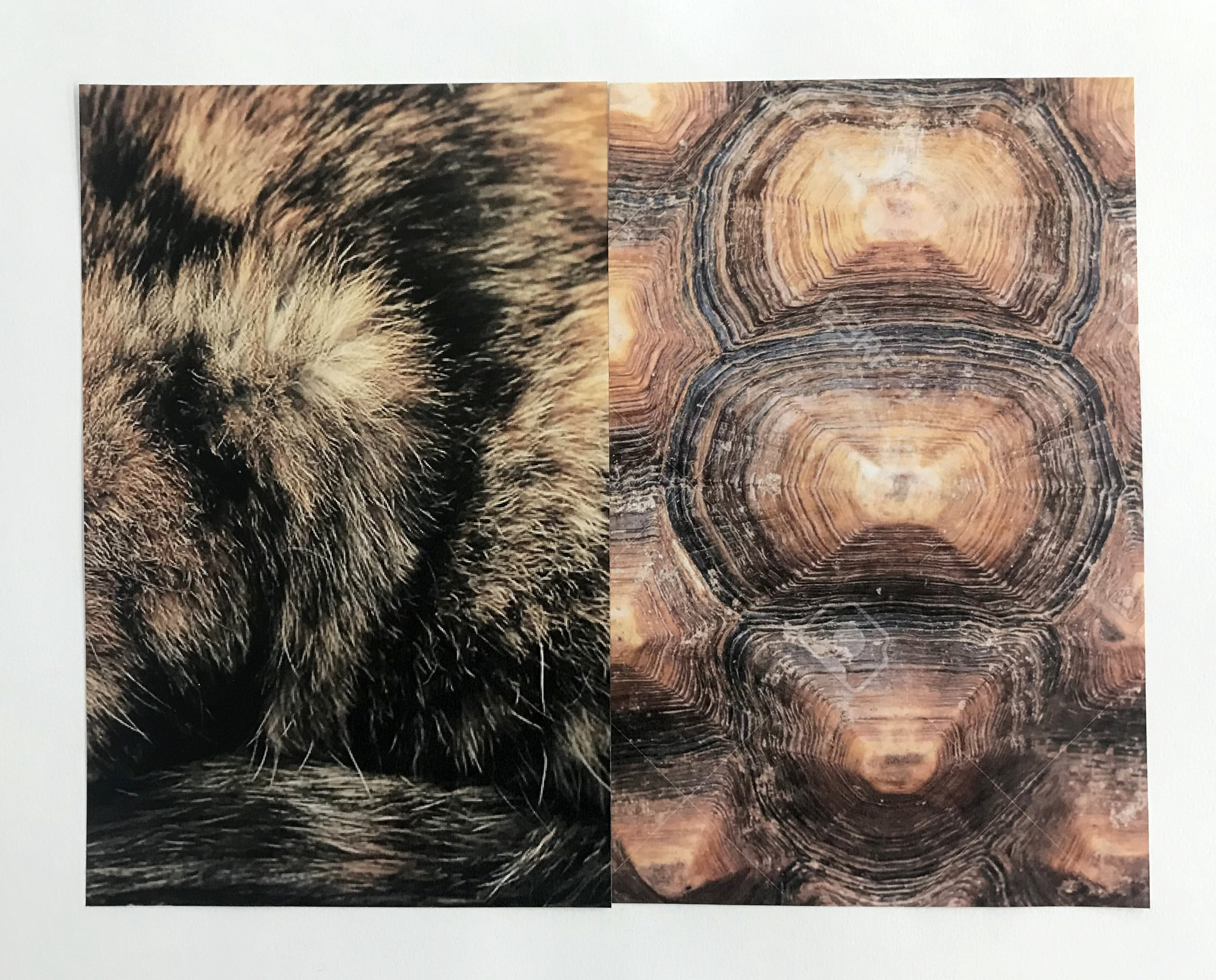
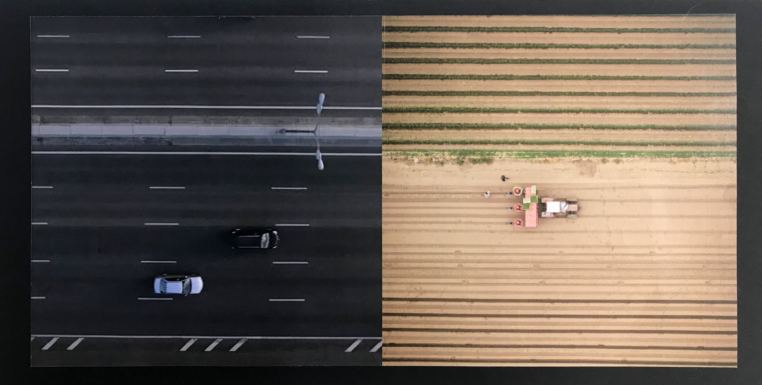
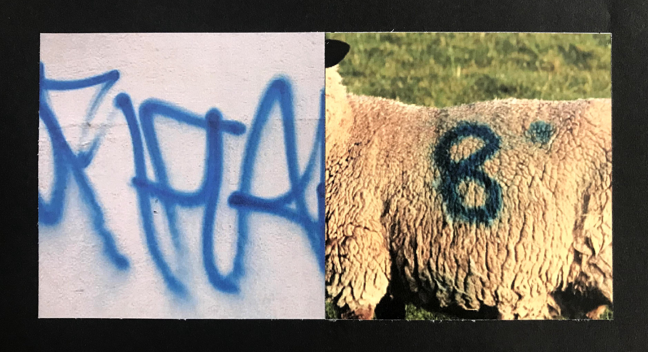
Each student was given a pair of words which they explored through the process of juxtaposing interesting and pertinent images. Not all students managed three pairs, or even two or one of a good standard. The above is a good example though. Note the balance of crops, the interplay between contrasting images where appropriate, and simply the choice of good quality photography.
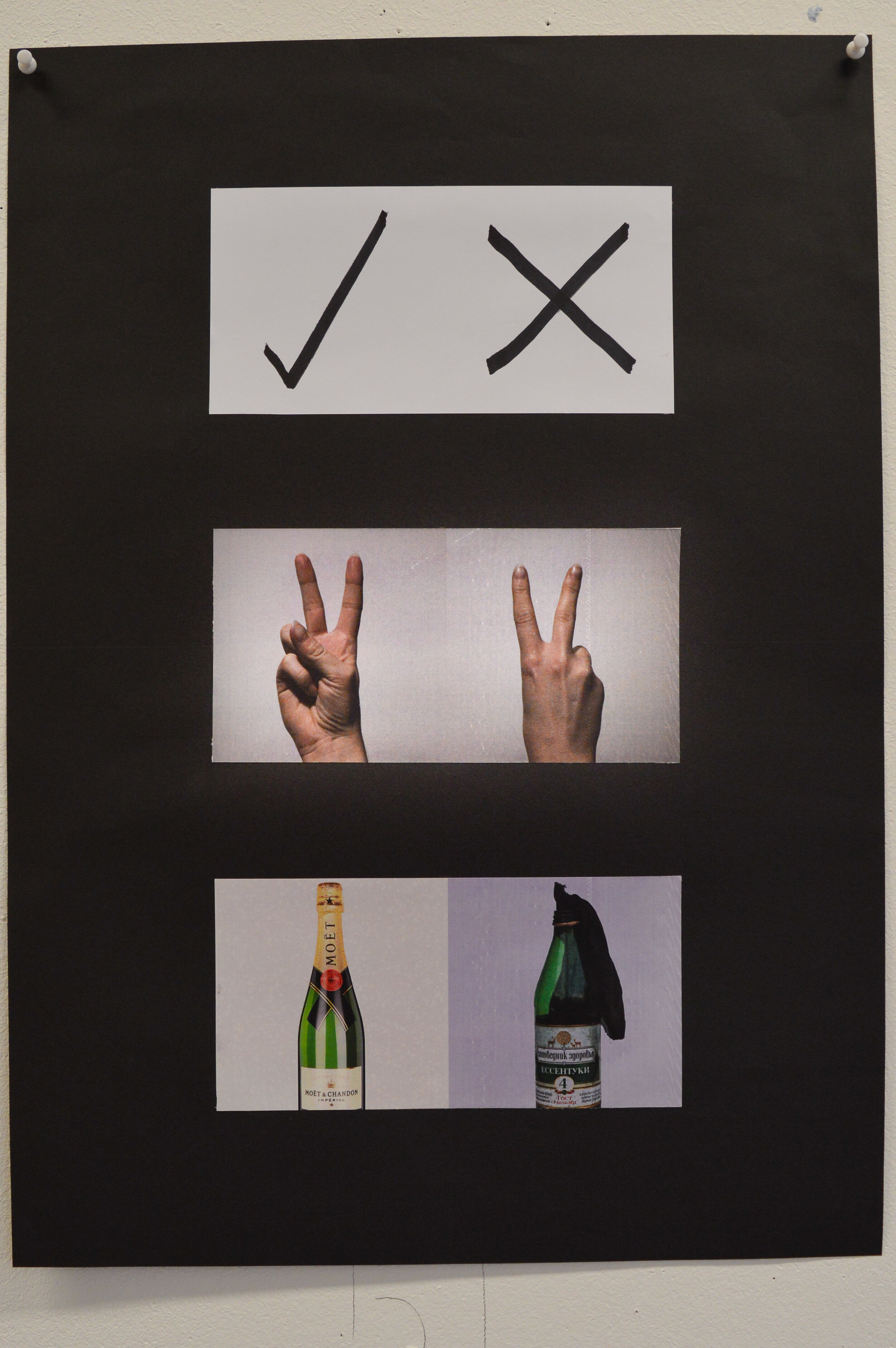
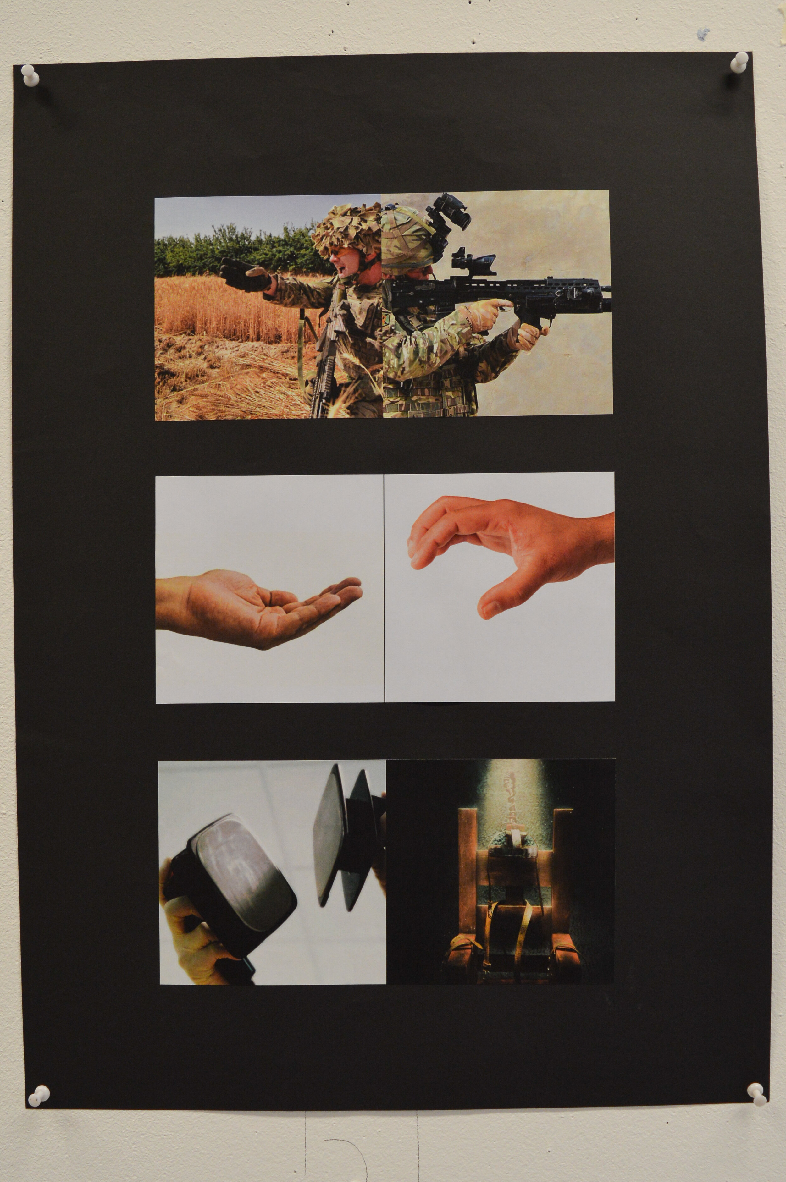
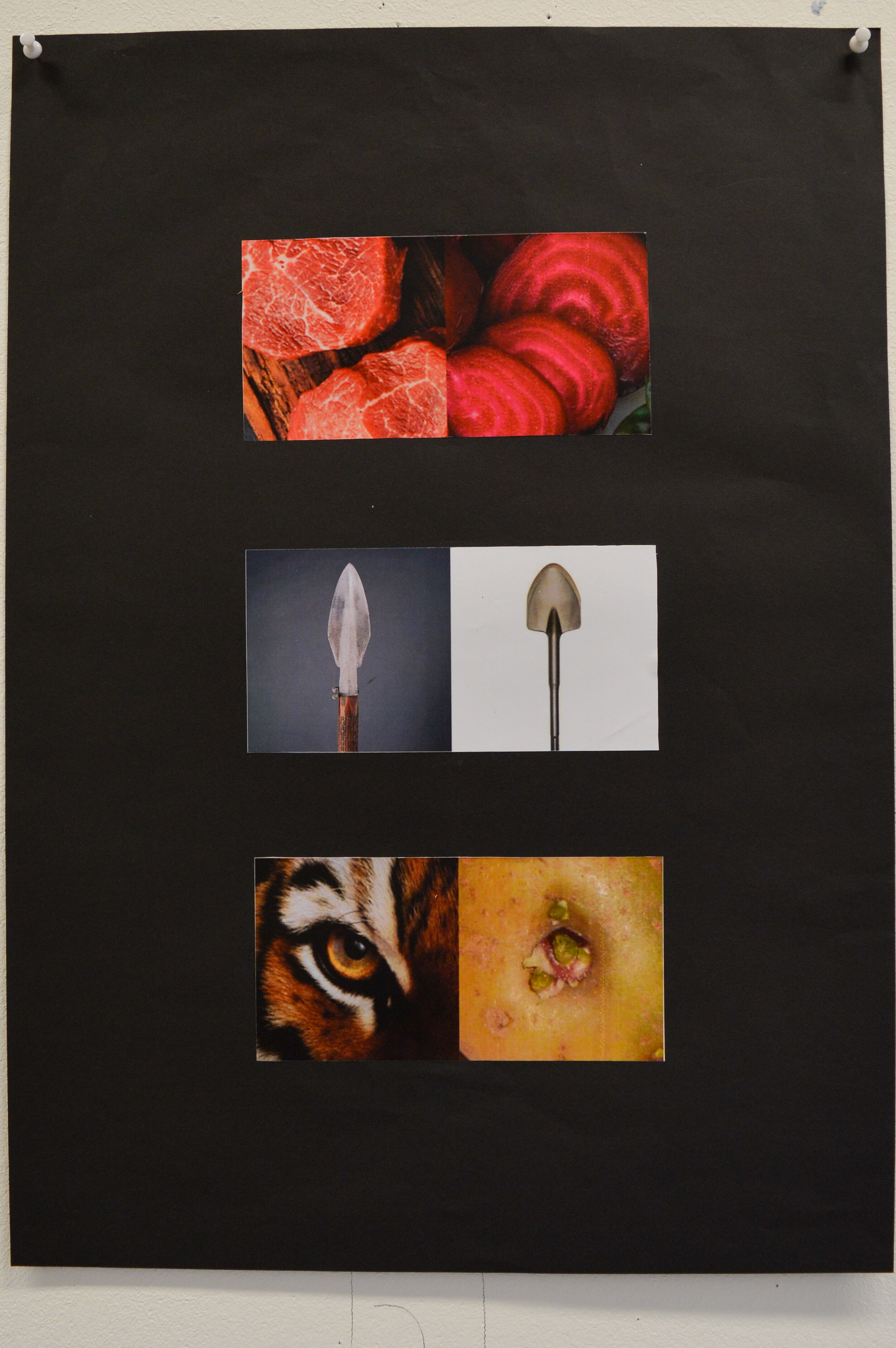
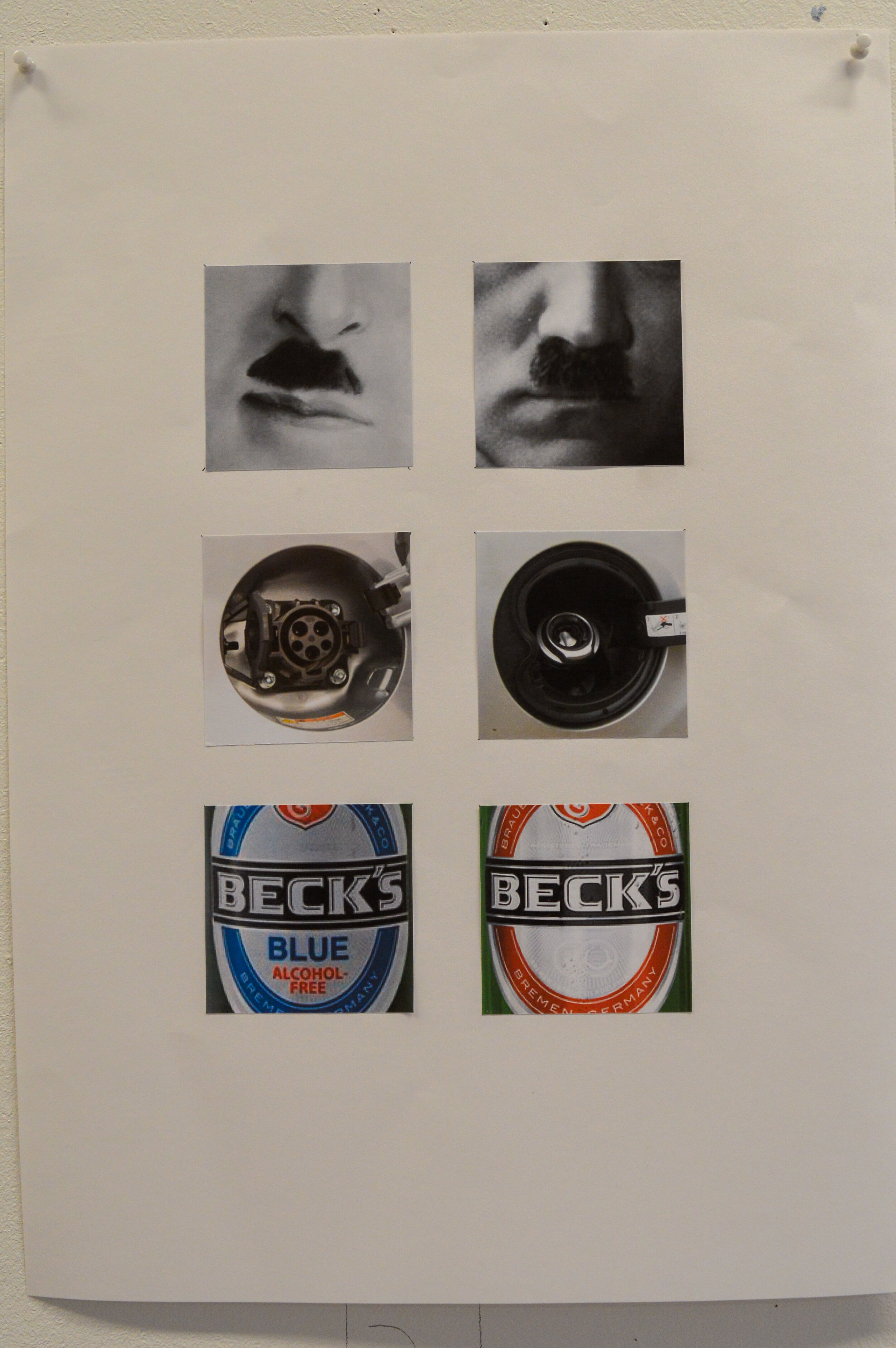
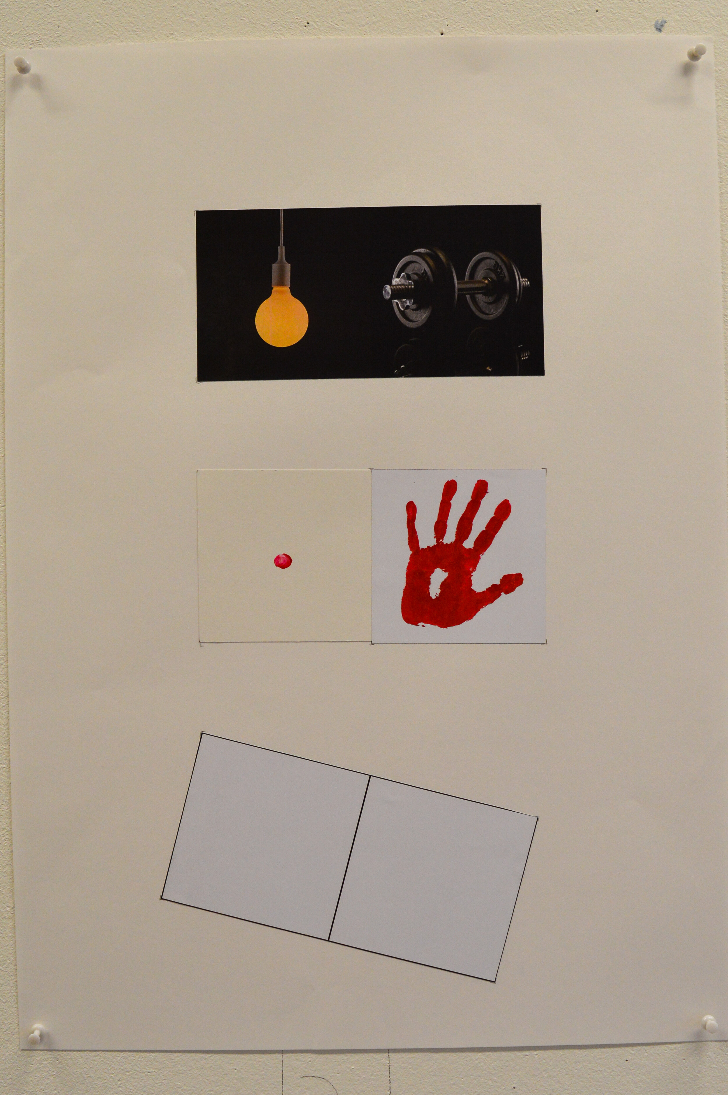
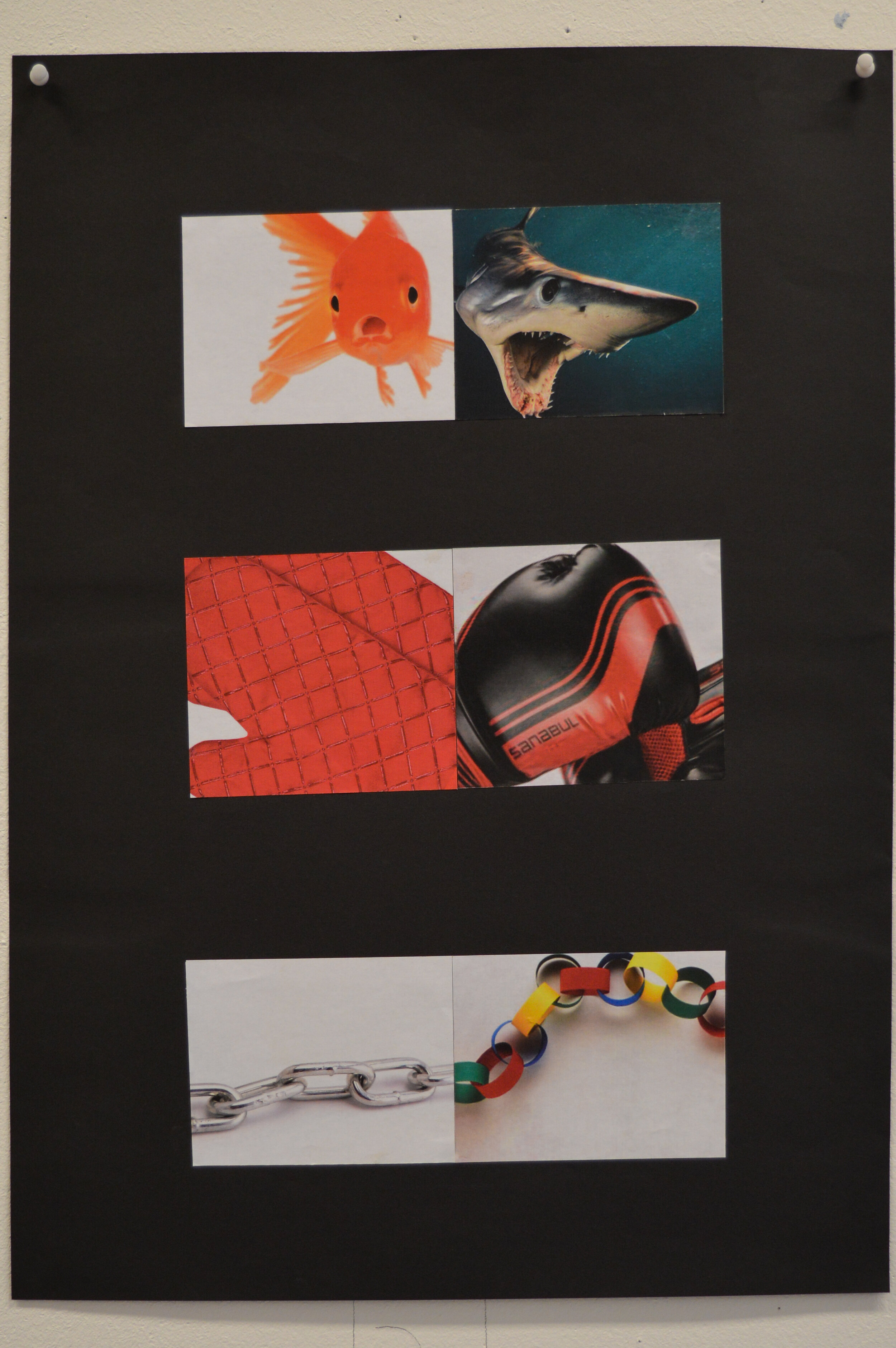
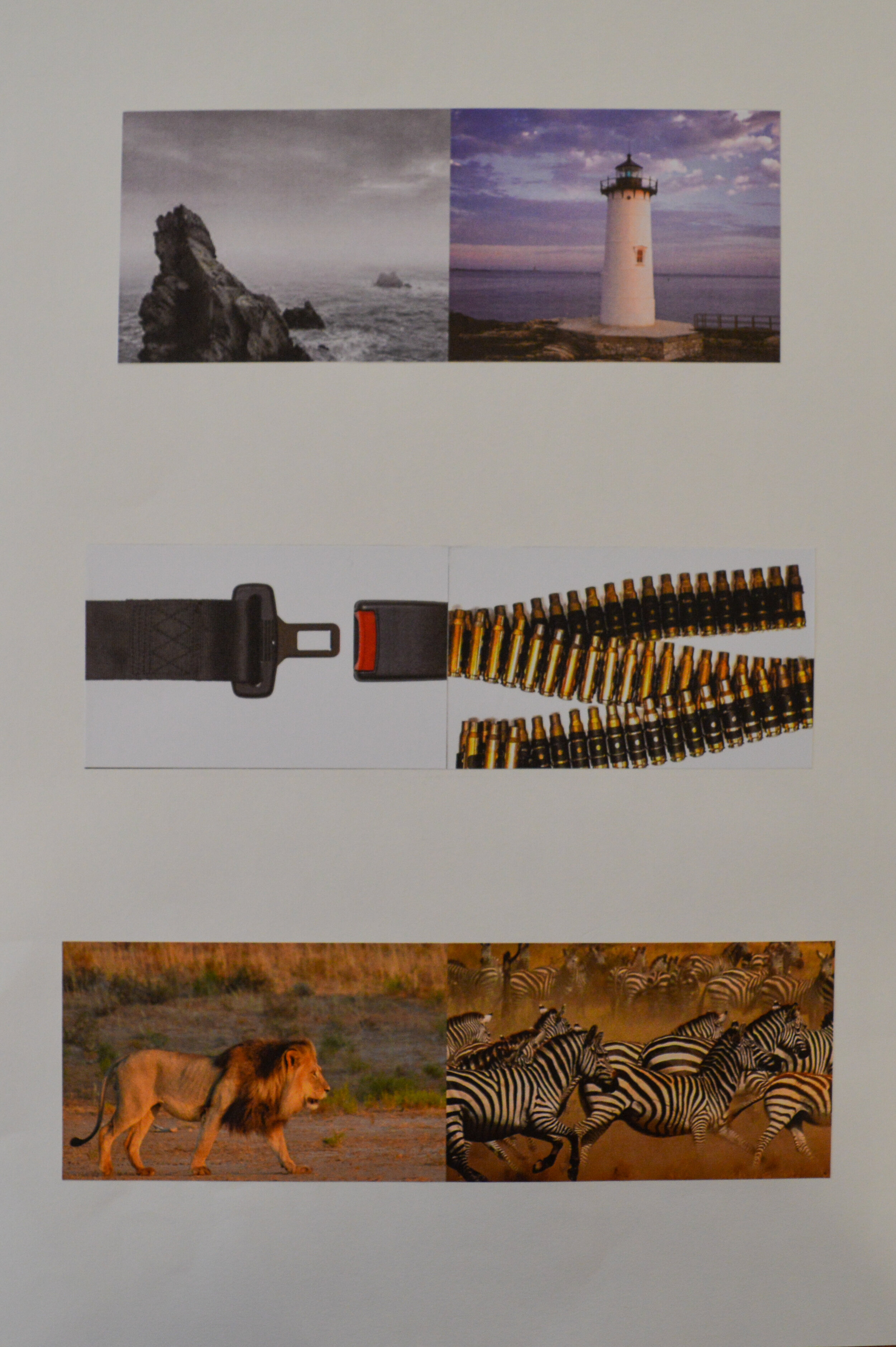
This is not an easy brief, and tutors were agreed that a large proportion of the cohort had not cracked it, yet. Most of the ideas were valid, but unfortunately image selection (and cropping) was not supporting the idea…thus leaving the viewer unmoved.
It was noticeable that a lot of solutions were the direct result of Google images and consequently suffered.
Some of the images presented were not shown as three pairs, but rather six individual crops which made any idea even harder to decipher.
As ever, staff look forward to seeing how these juxtapositions develop for final assessment.


![8893f566846719.5b2420c56ec47[1].jpg](https://images.squarespace-cdn.com/content/v1/5963451dff7c50bac099fda9/1530191720789-45LN4DXCAD2TRTR7WQ88/8893f566846719.5b2420c56ec47%5B1%5D.jpg)
![49538763951133.5ac271850113e[1].jpg](https://images.squarespace-cdn.com/content/v1/5963451dff7c50bac099fda9/1530191720703-B9WCUUELECXDU3J5YVFR/49538763951133.5ac271850113e%5B1%5D.jpg)
![a5631864865621.5ae0cd41e7c54[1].jpg](https://images.squarespace-cdn.com/content/v1/5963451dff7c50bac099fda9/1530191724481-I5VPMYAZBRVBDFDTH8HC/a5631864865621.5ae0cd41e7c54%5B1%5D.jpg)
![e6140063240721.5aaa1fd920427[1].jpg](https://images.squarespace-cdn.com/content/v1/5963451dff7c50bac099fda9/1530191722291-0EQFGIO4MV5SHAG4EHB1/e6140063240721.5aaa1fd920427%5B1%5D.jpg)
![bike4s-498x498[1].jpg](https://images.squarespace-cdn.com/content/v1/5963451dff7c50bac099fda9/1530190888766-ERDQGTKVGWOCQMSIE9ZX/bike4s-498x498%5B1%5D.jpg)
![brushgirl2sm-498x498[1].jpg](https://images.squarespace-cdn.com/content/v1/5963451dff7c50bac099fda9/1530190888964-6MFZ83G7NA7UQIKO2KA7/brushgirl2sm-498x498%5B1%5D.jpg)
![SABER007-498x498[1].jpg](https://images.squarespace-cdn.com/content/v1/5963451dff7c50bac099fda9/1530190890030-4XTB2I23ACL32ORGLG23/SABER007-498x498%5B1%5D.jpg)
![tea05sm-498x498[1].jpg](https://images.squarespace-cdn.com/content/v1/5963451dff7c50bac099fda9/1530190890284-RUH8GQSZTGEH01WOEDQW/tea05sm-498x498%5B1%5D.jpg)
