Tower of London – Christmas Crackers
/
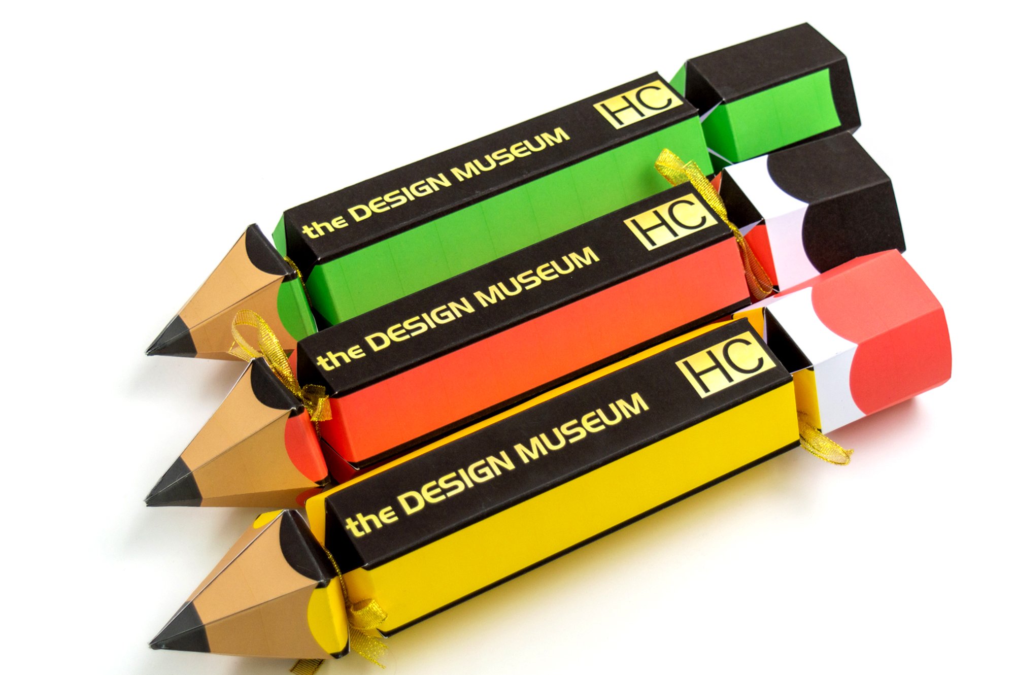
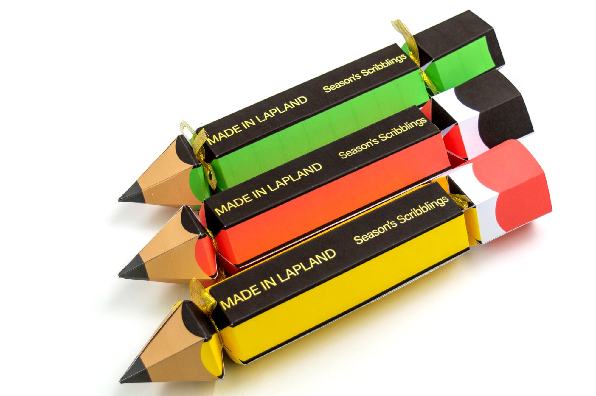
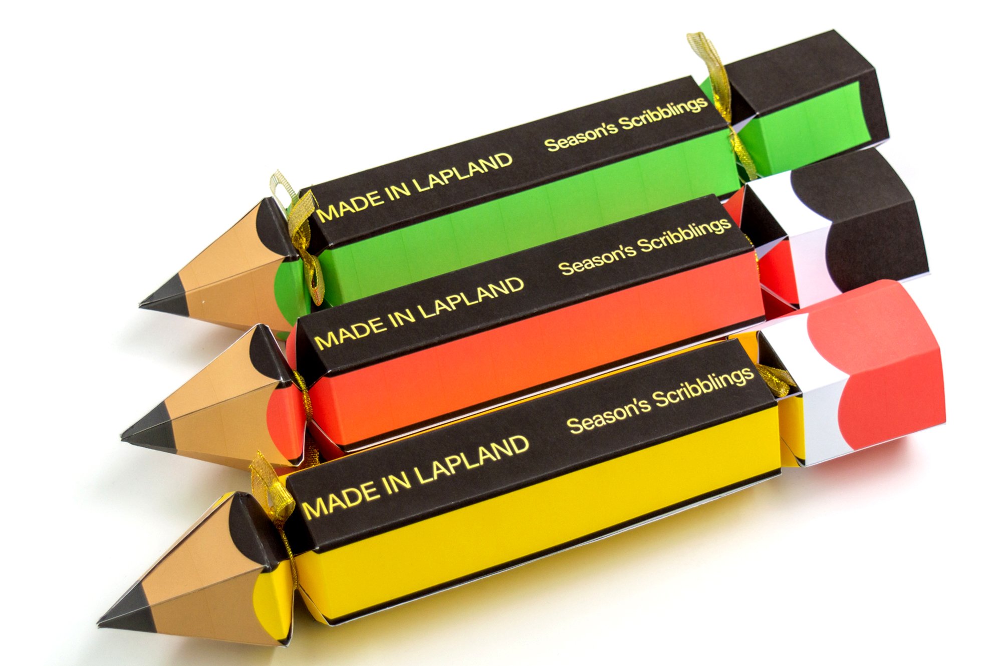
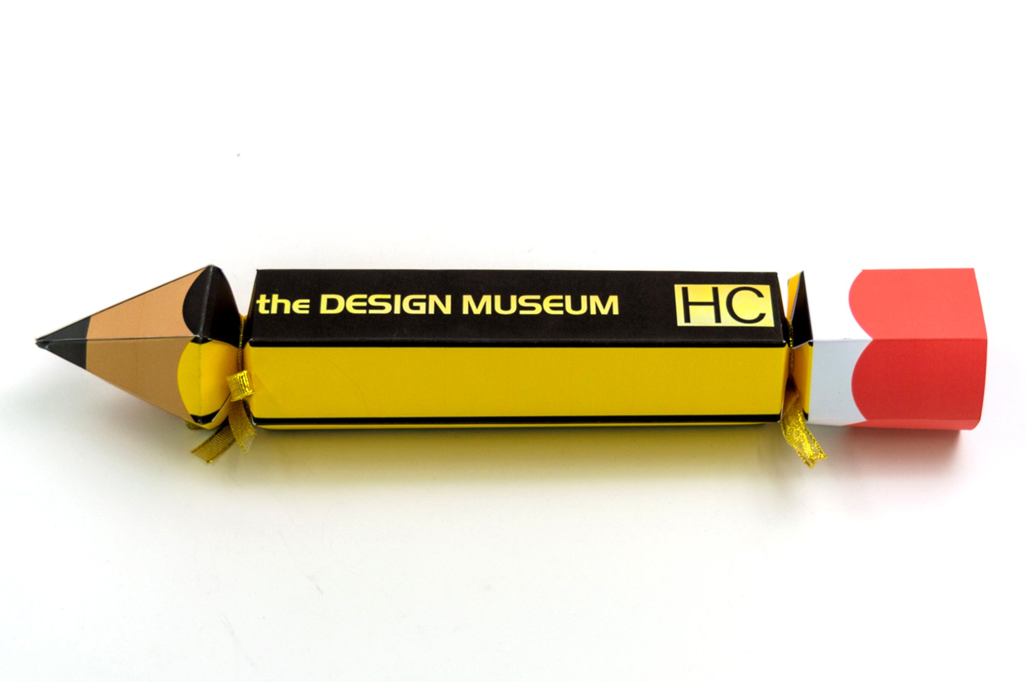
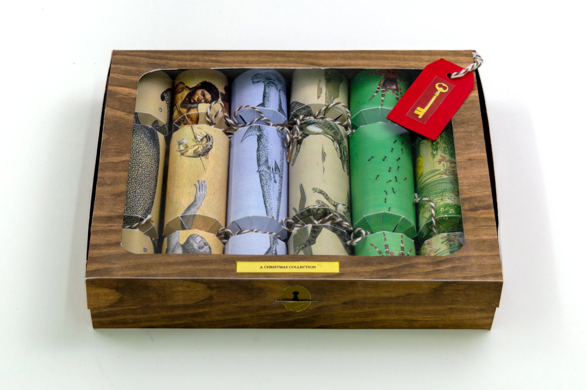
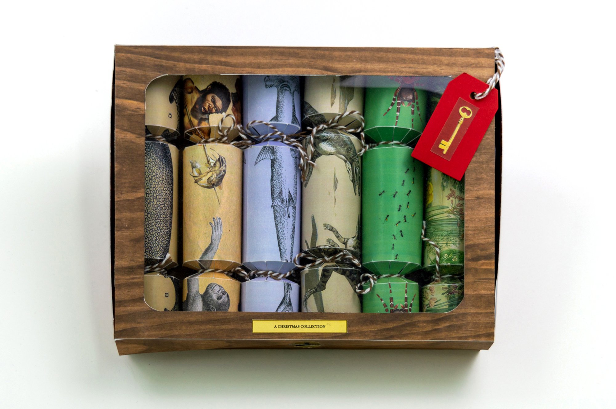
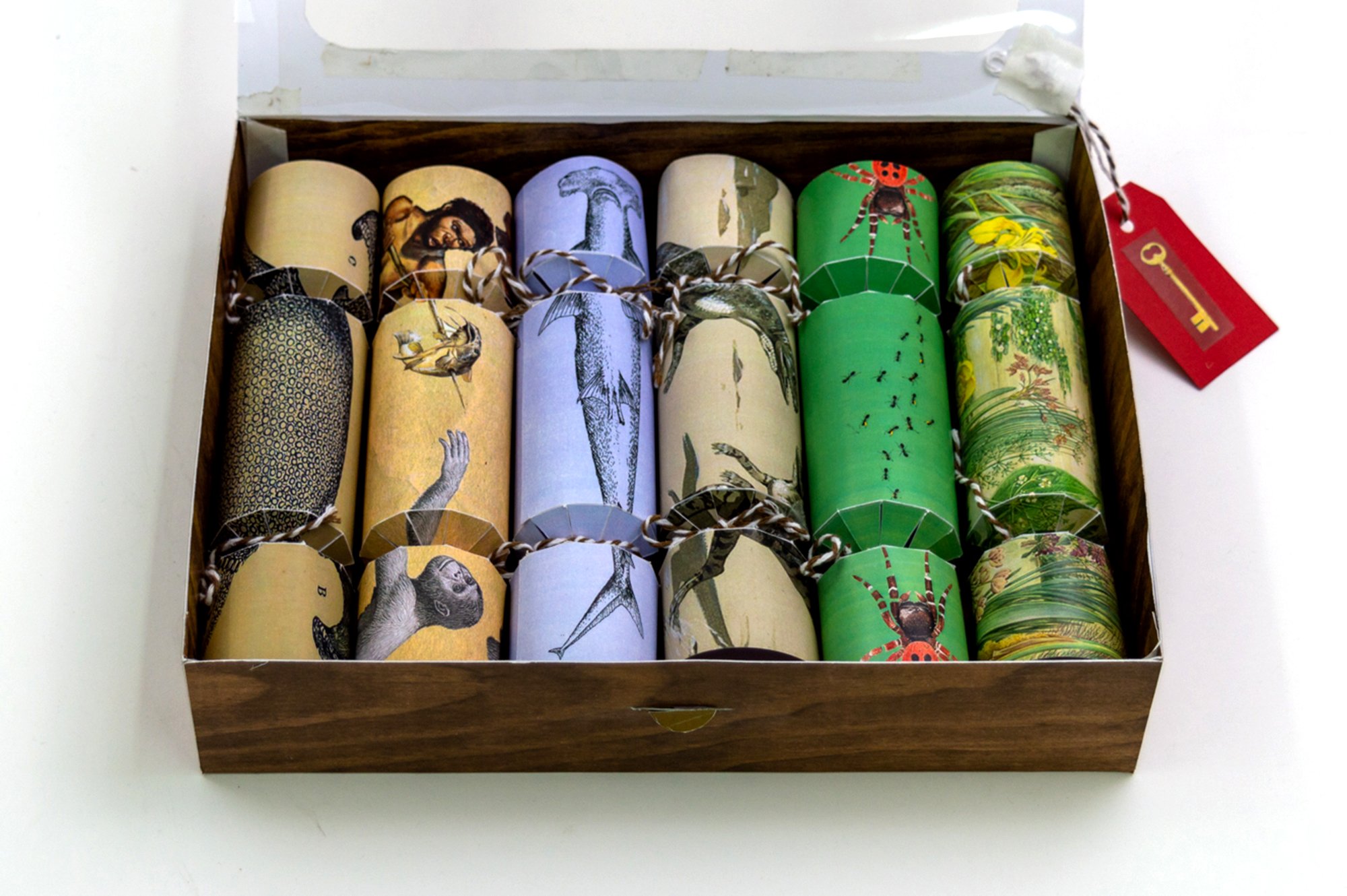
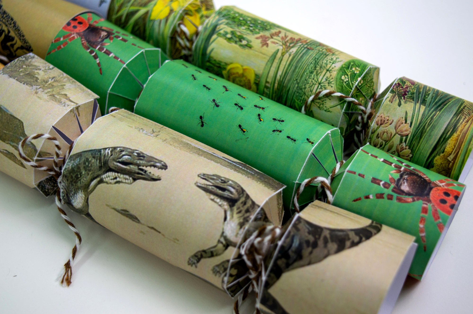
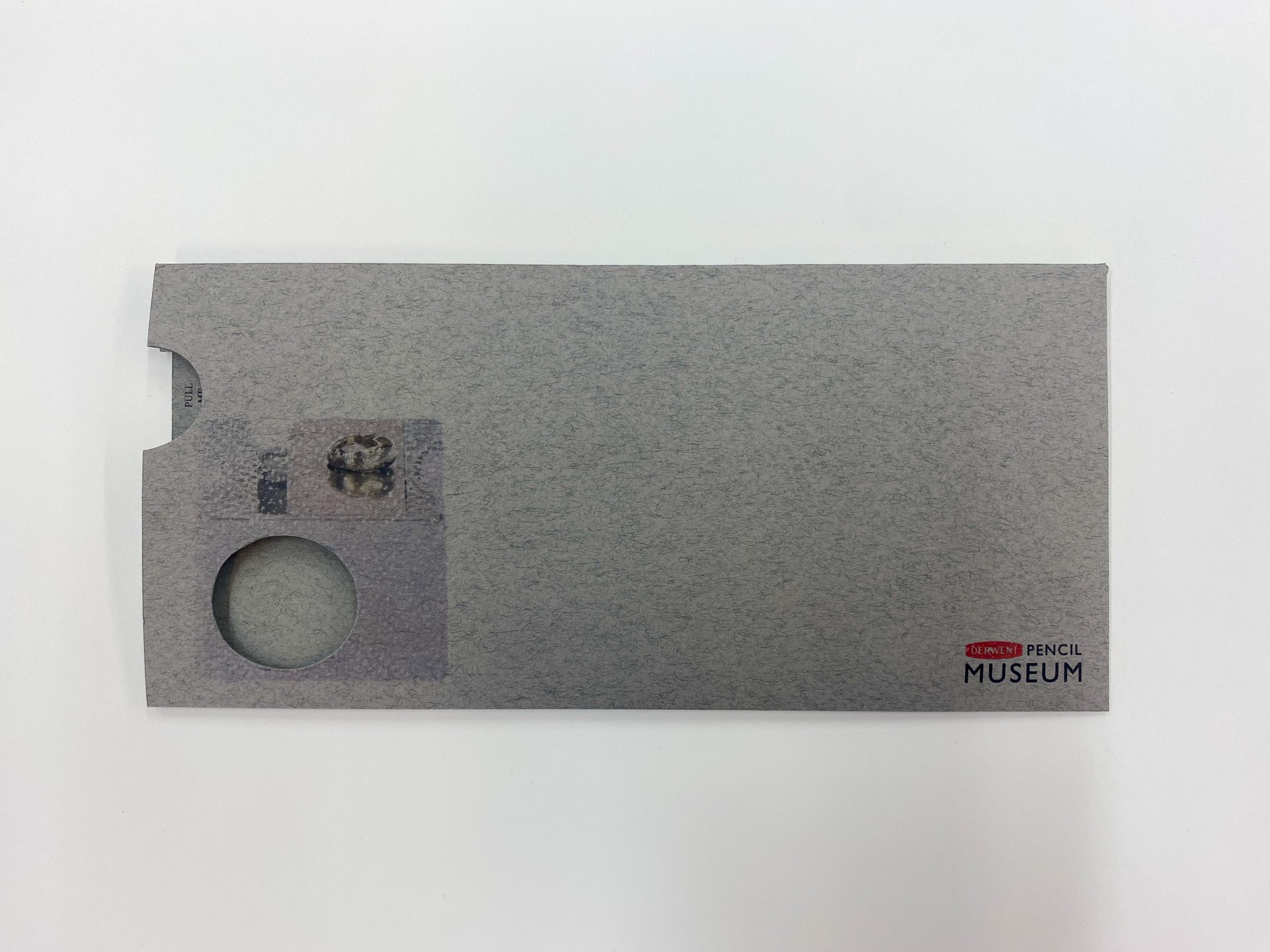
Here we feature a Year 1 project by Pete Morgan and Joey Cheetham. The renown Year 1 Christmas cracker project often serves up some great ideas. In this case, the crackers were designed for the Tower of London giftshop; and having been sharpened up in Year 2 bootcamp and then re-photographed, they have recently been accepted into Packaging of the World. Congratulations!
In Pete and Joey’s words:
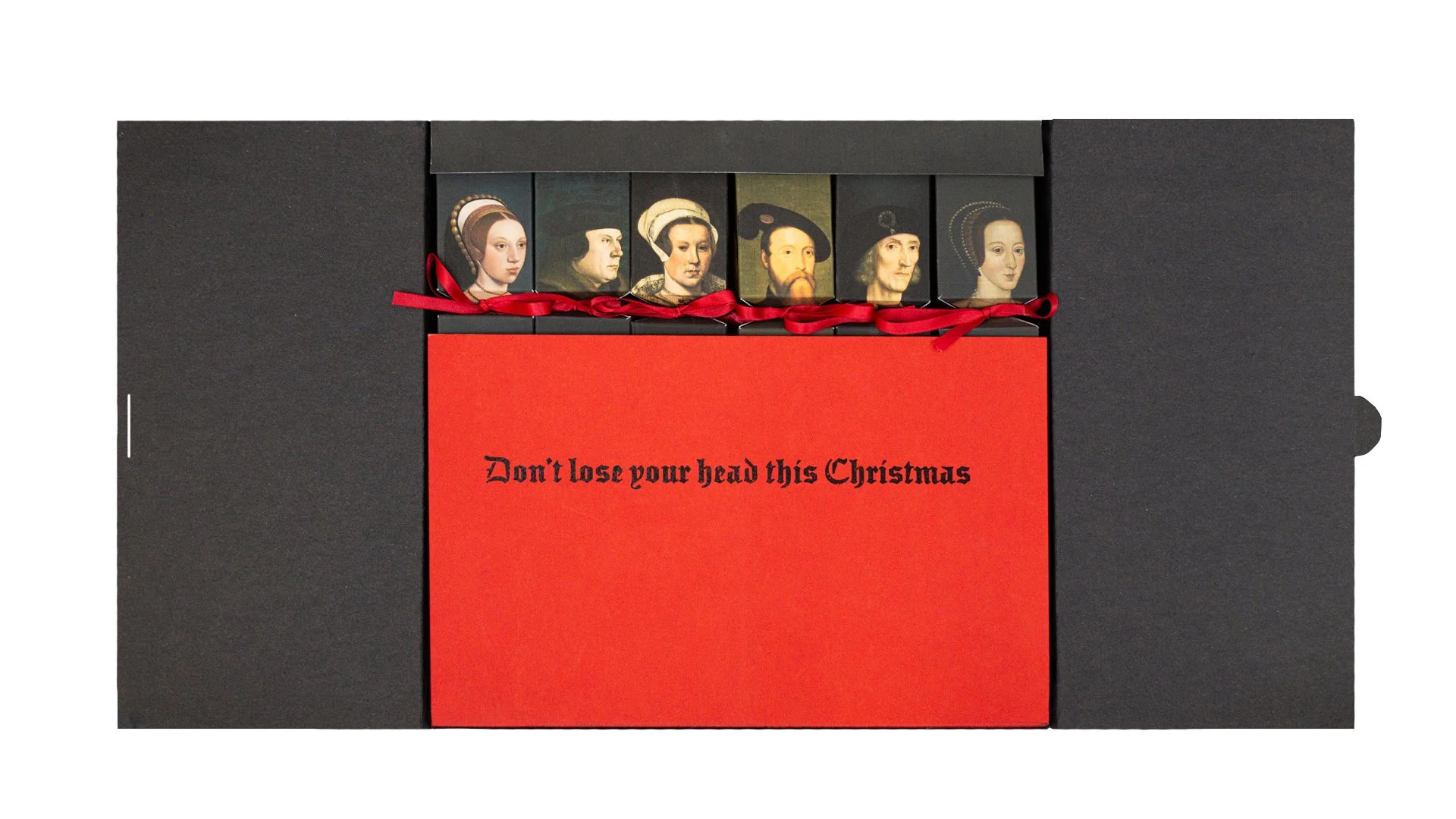
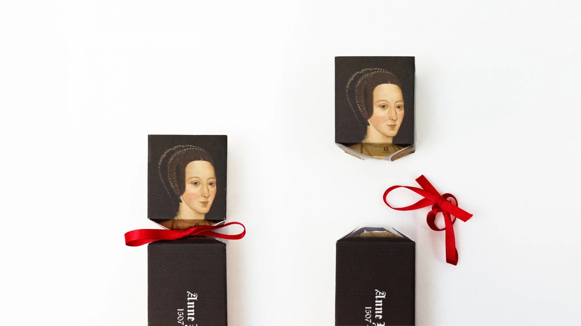
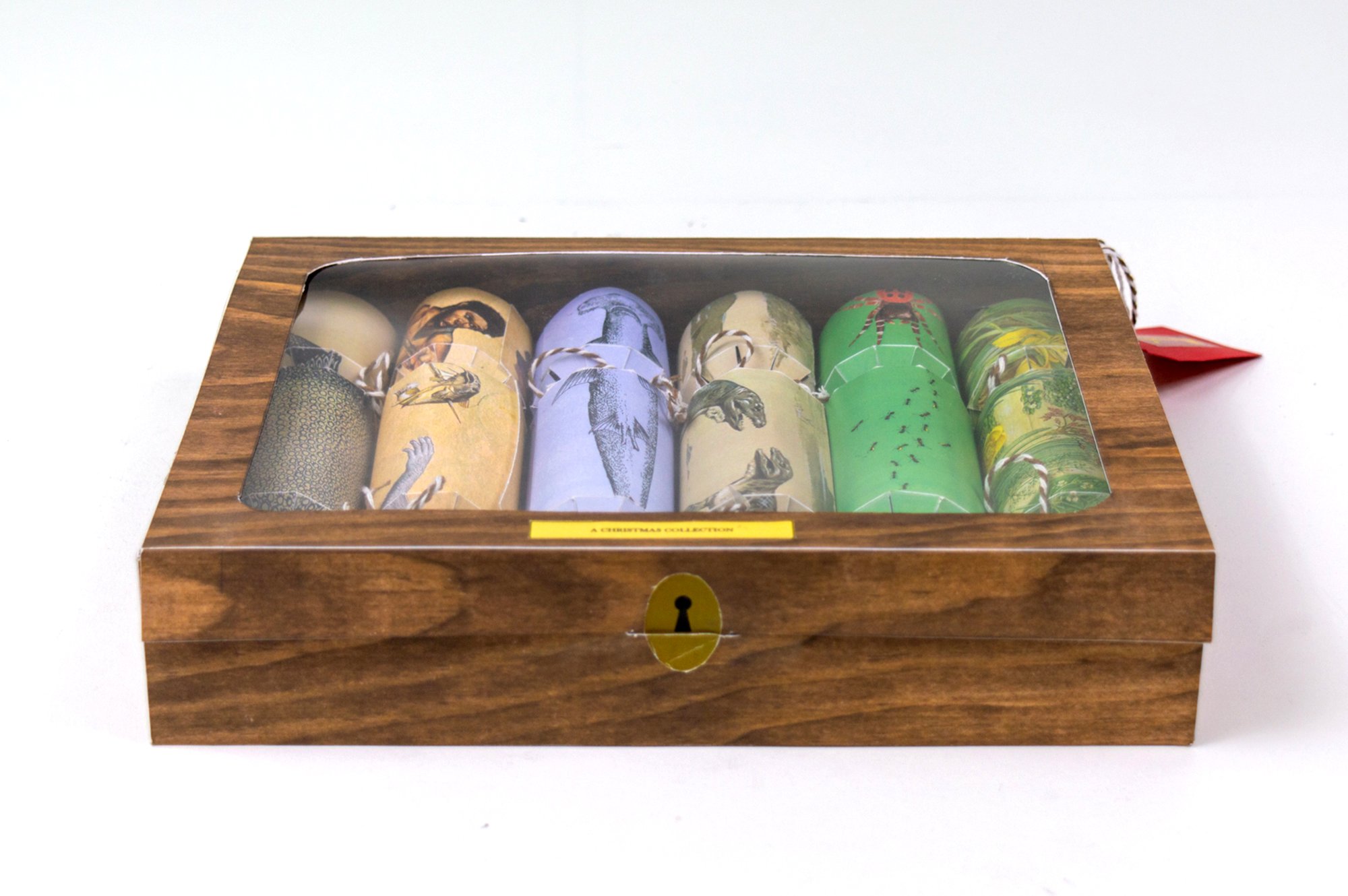
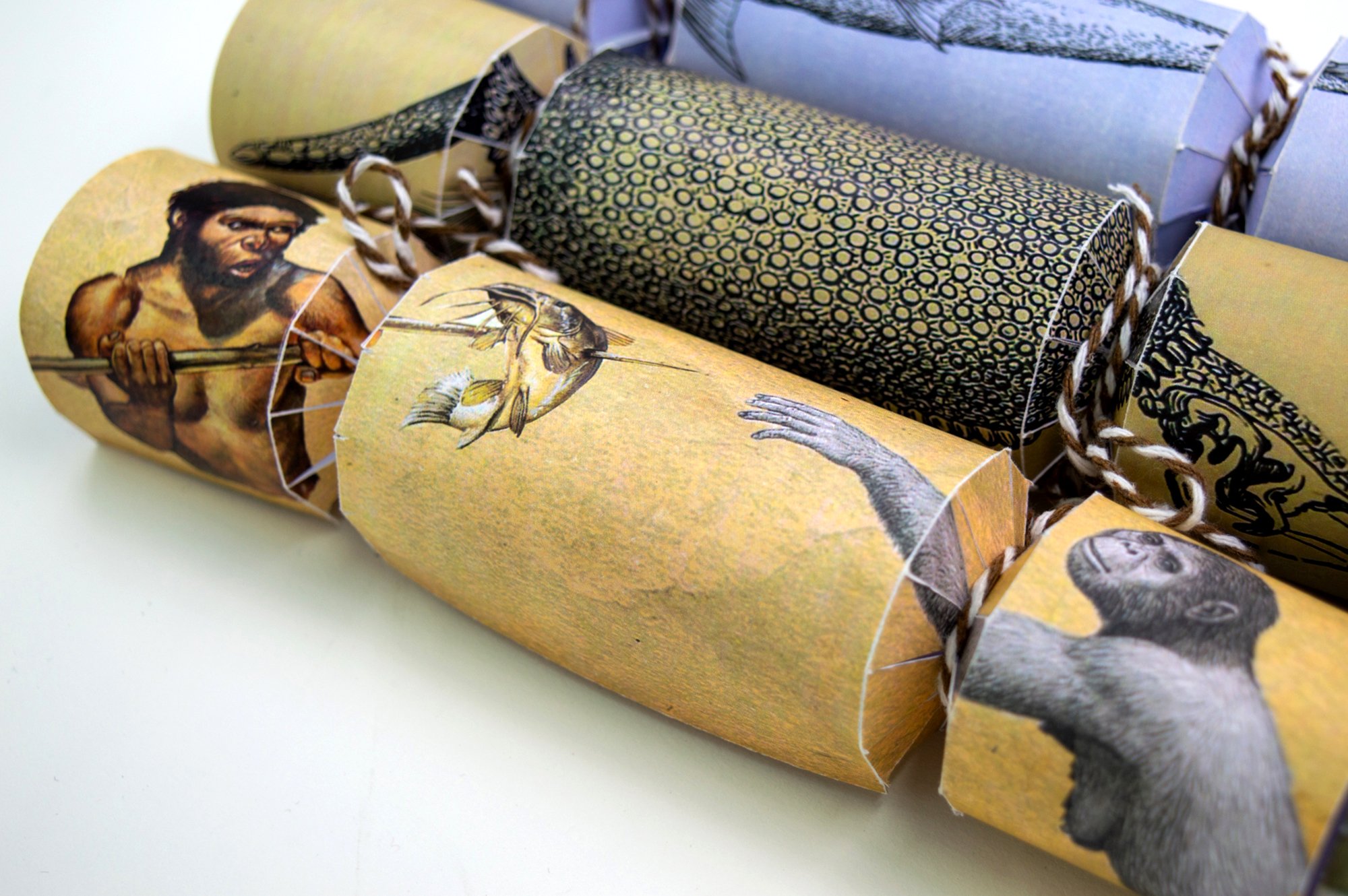
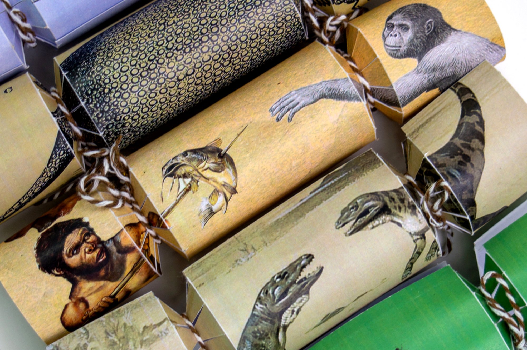
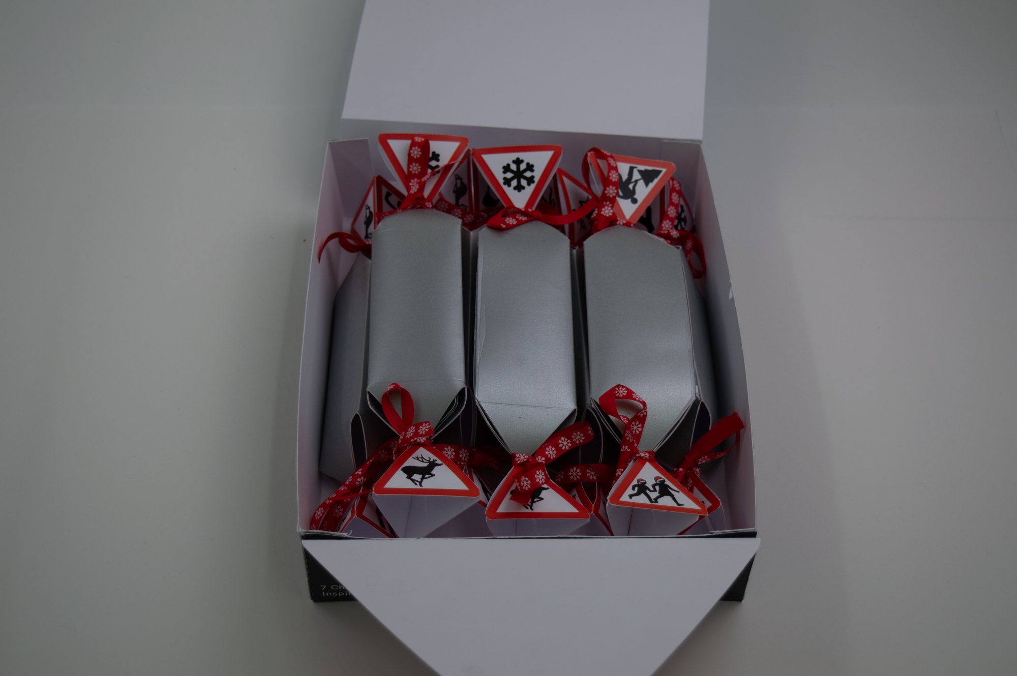
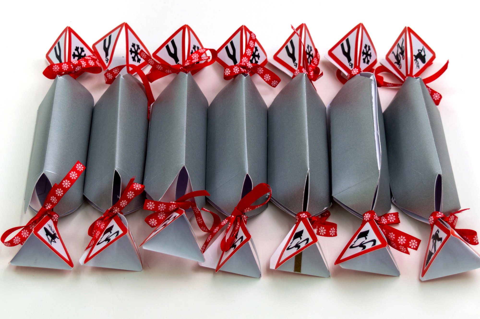
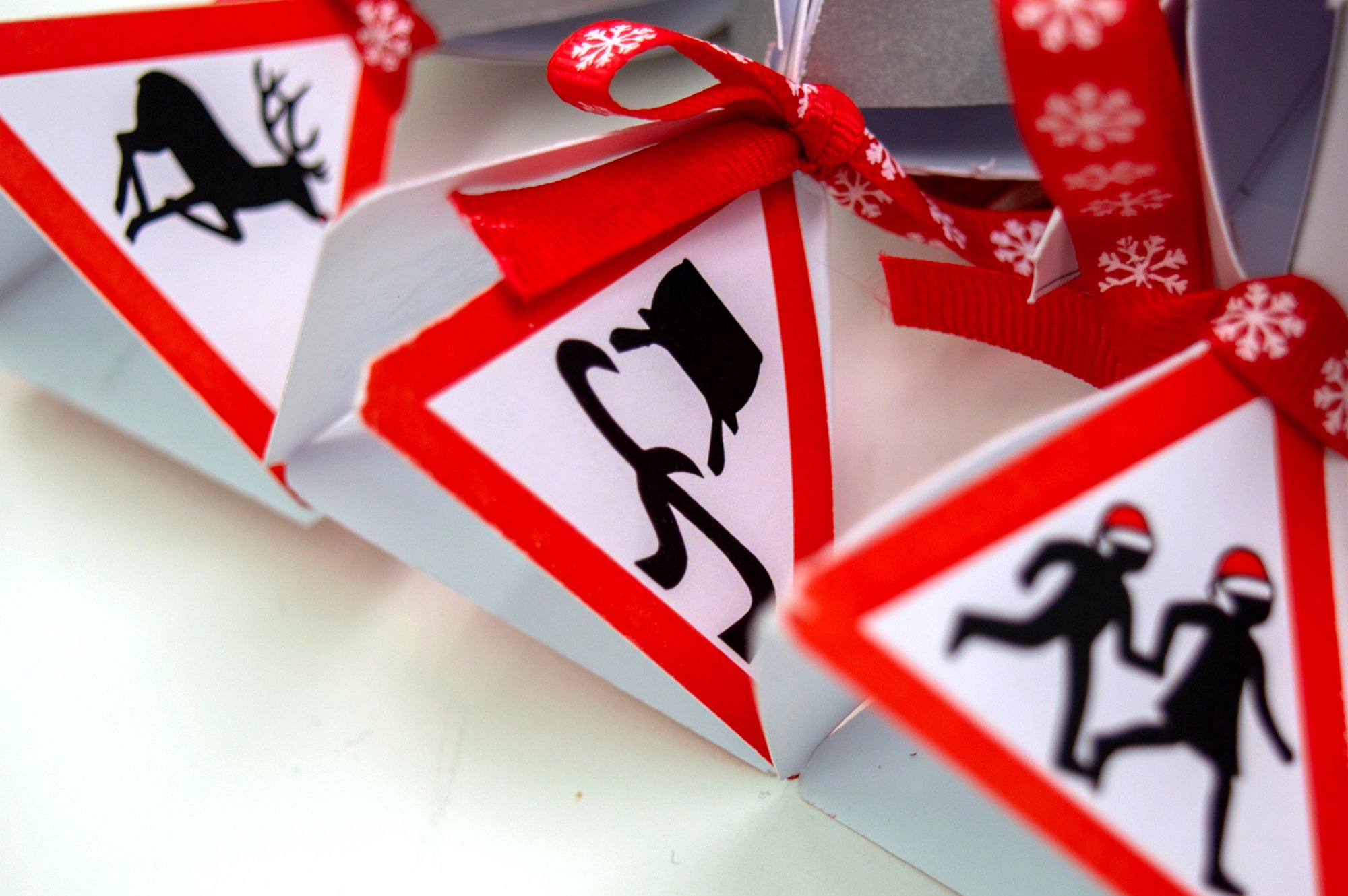
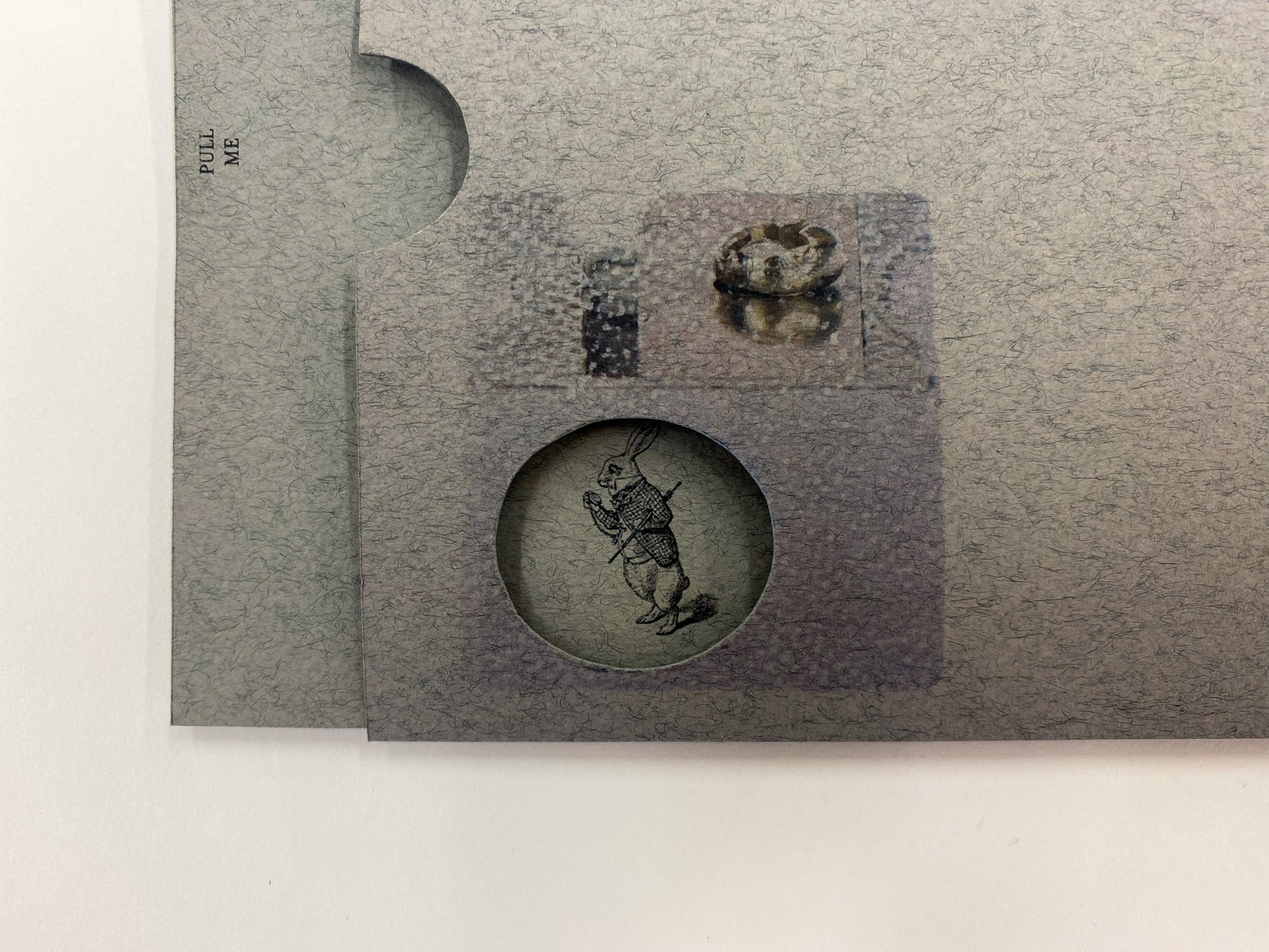
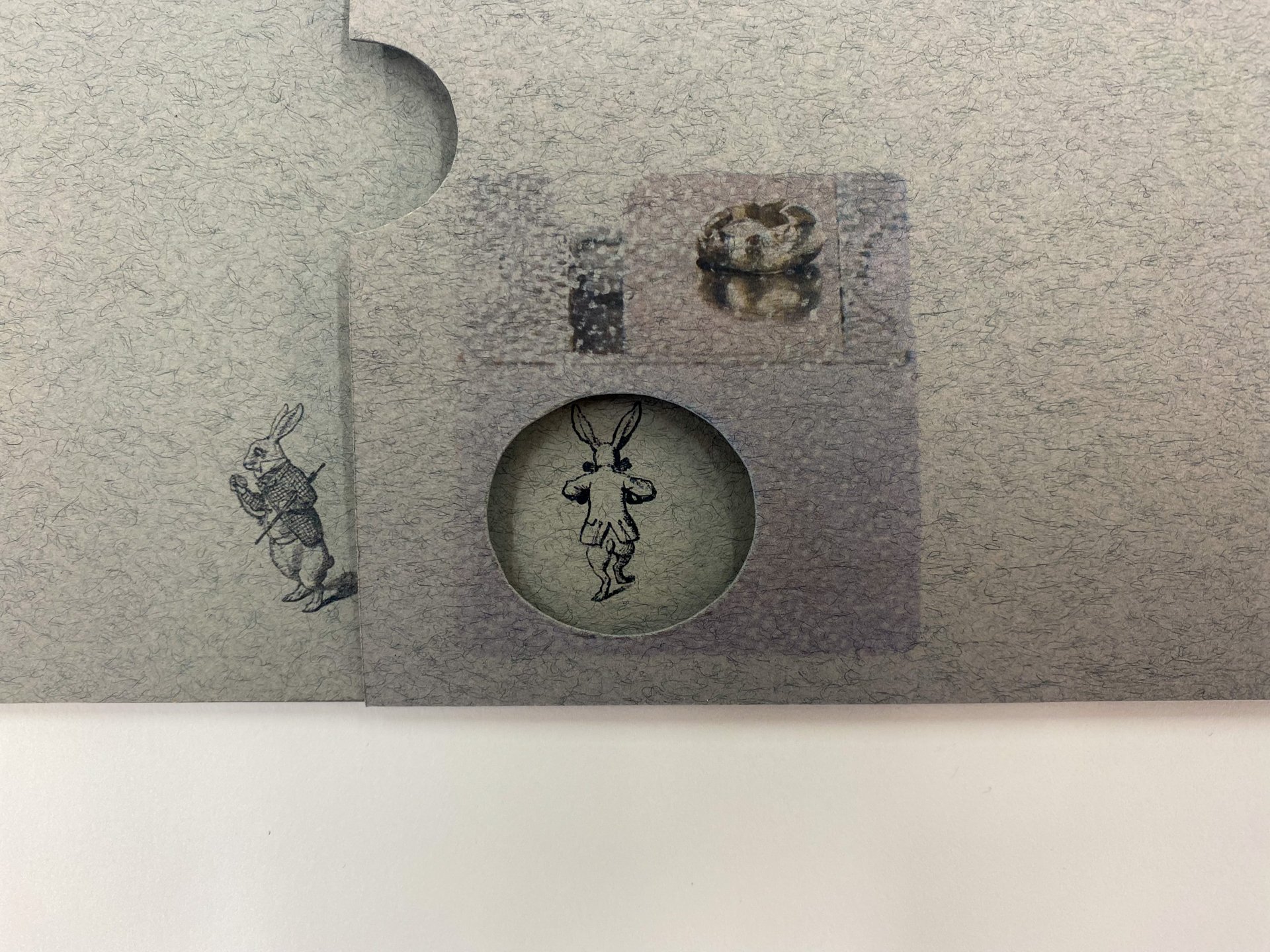
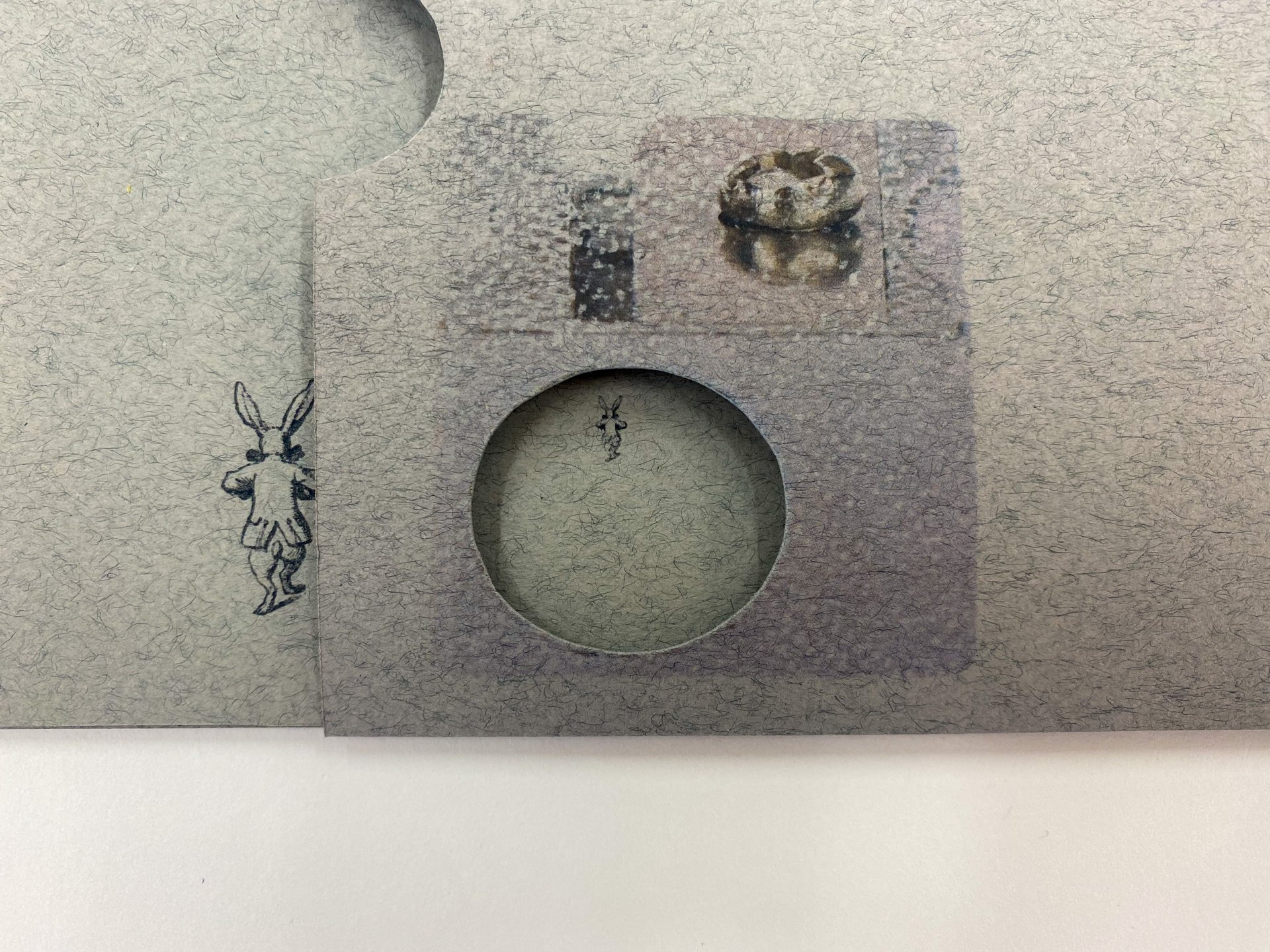
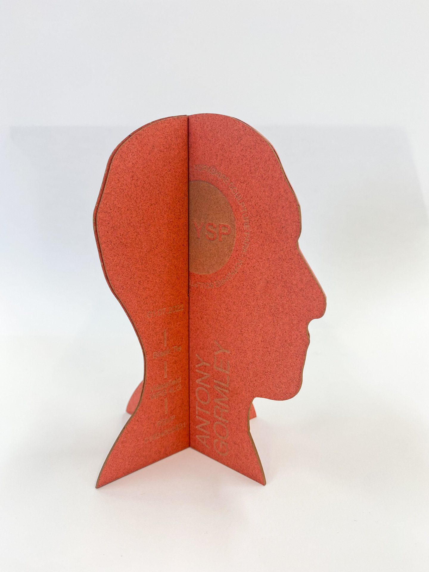
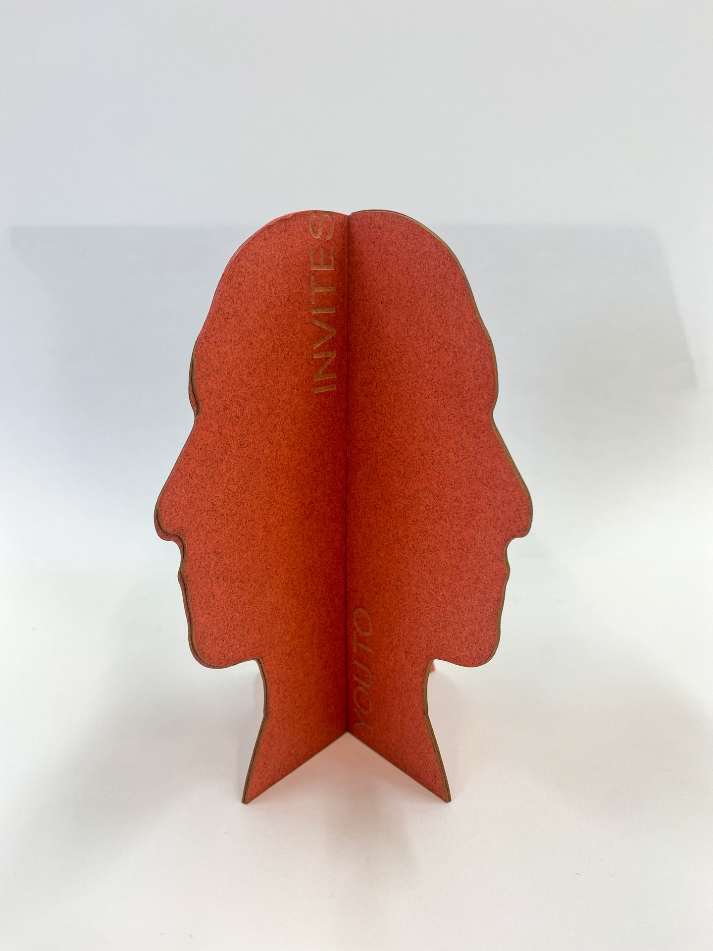
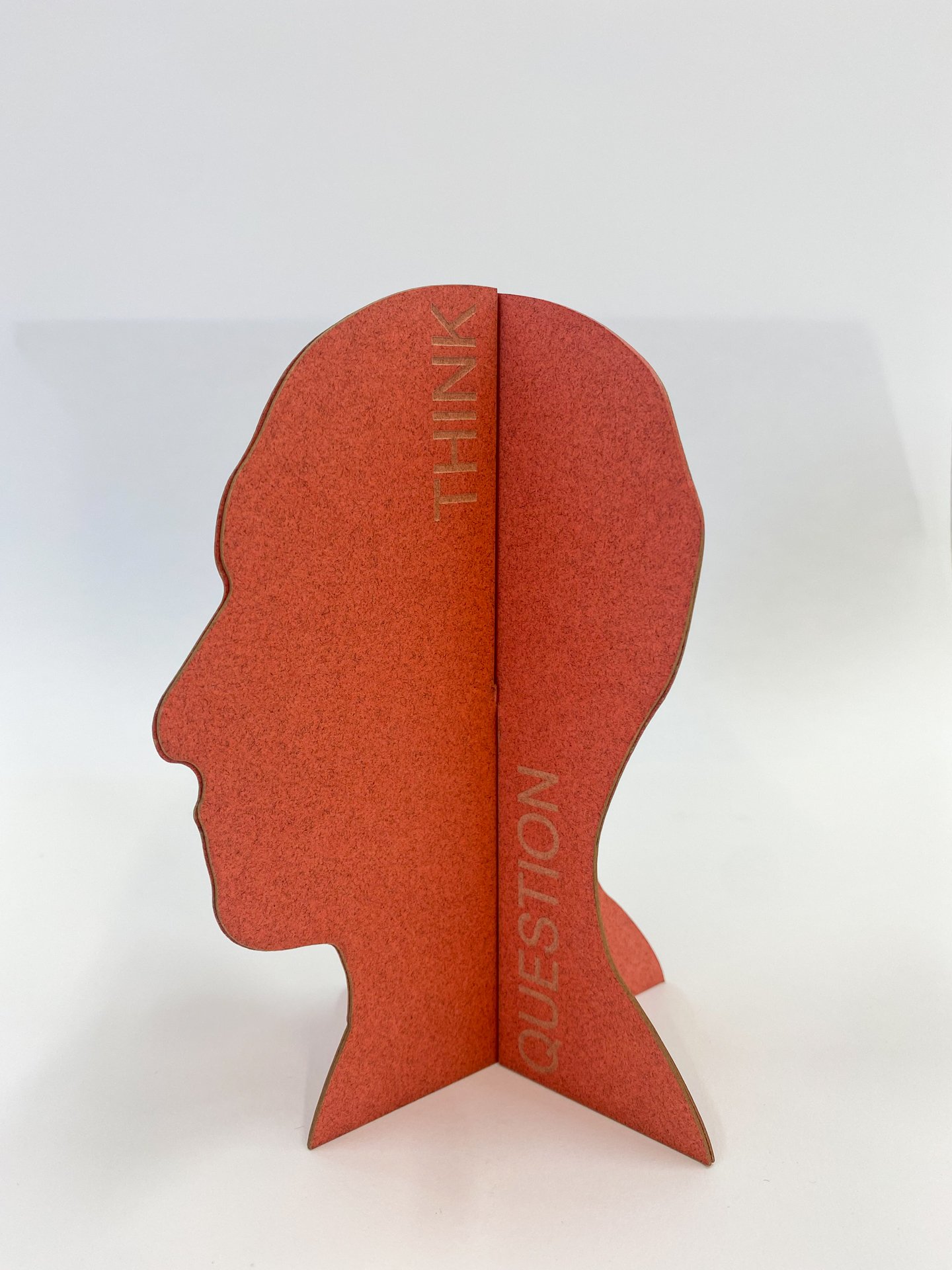
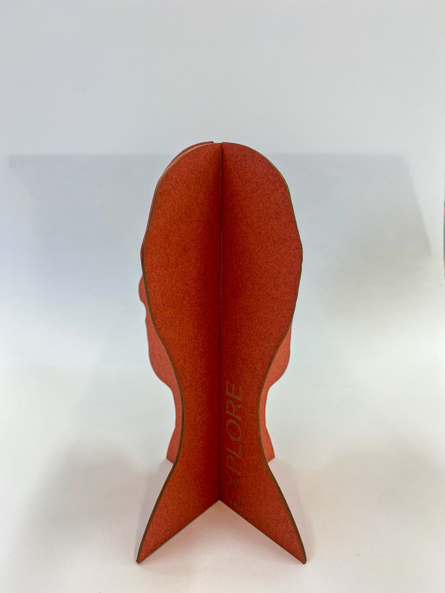
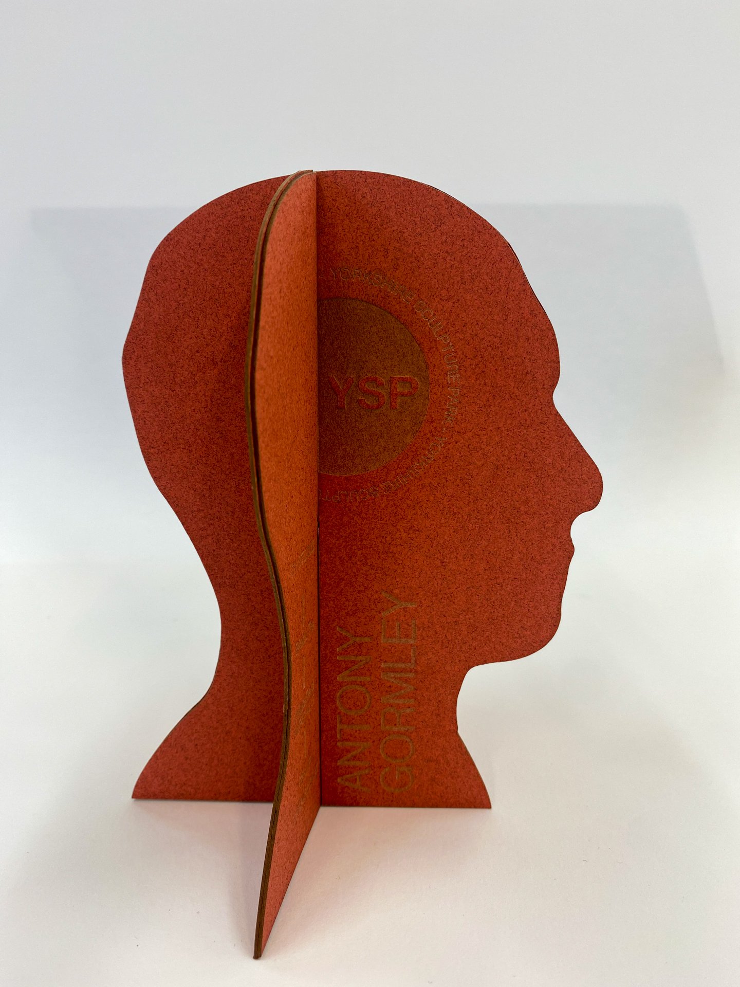
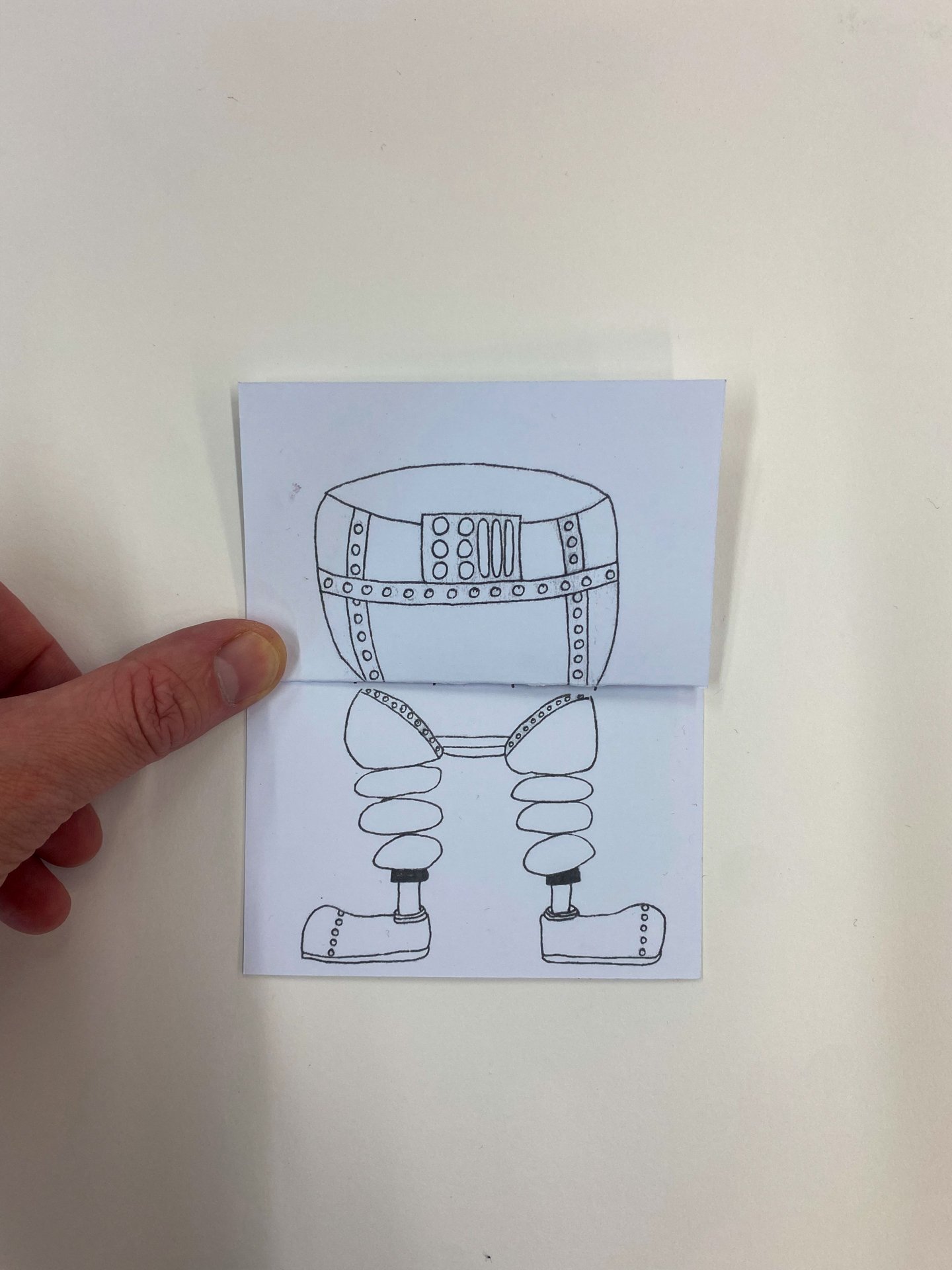
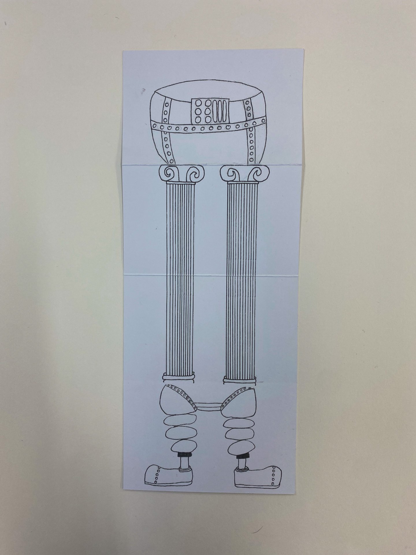
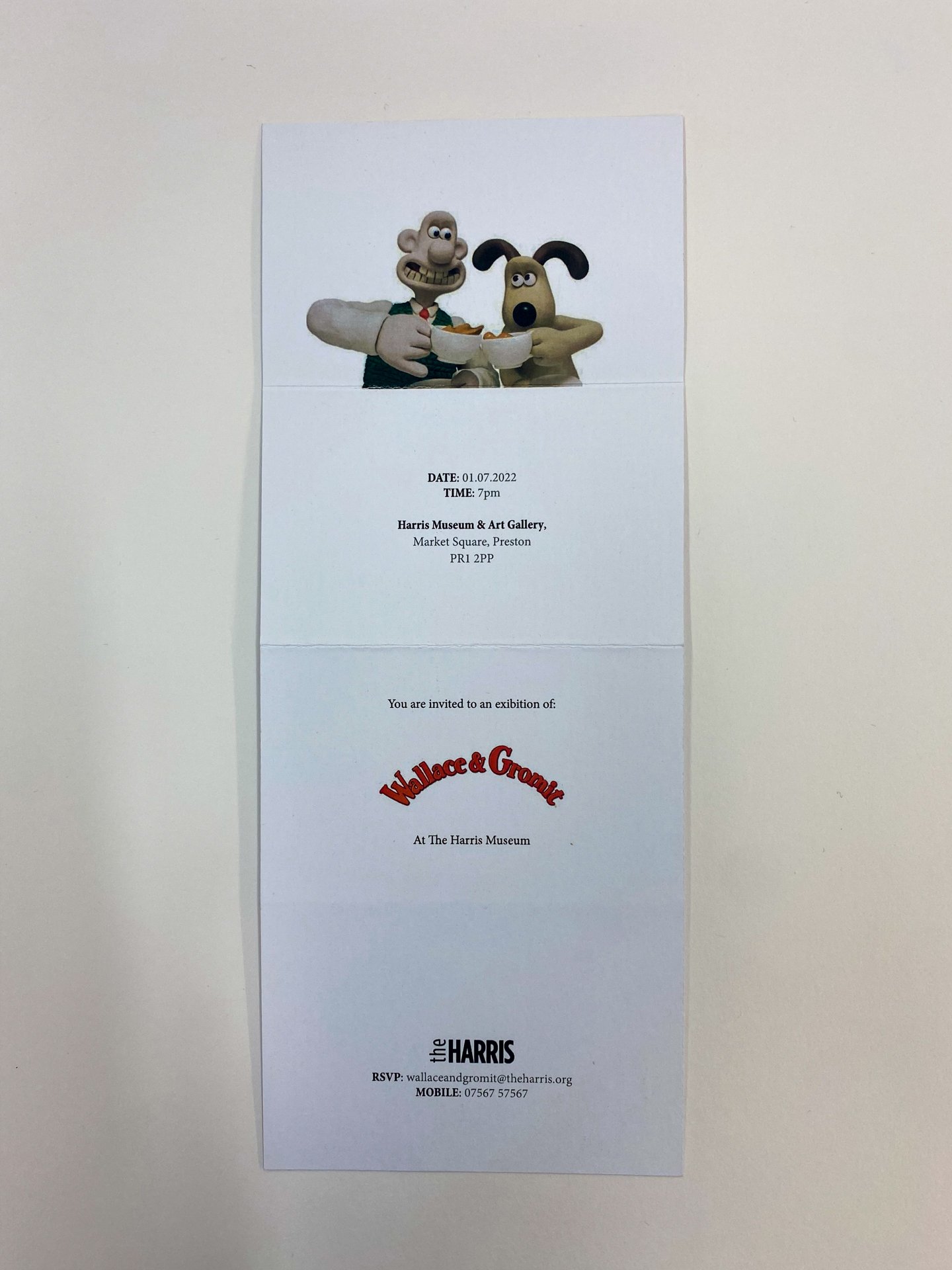
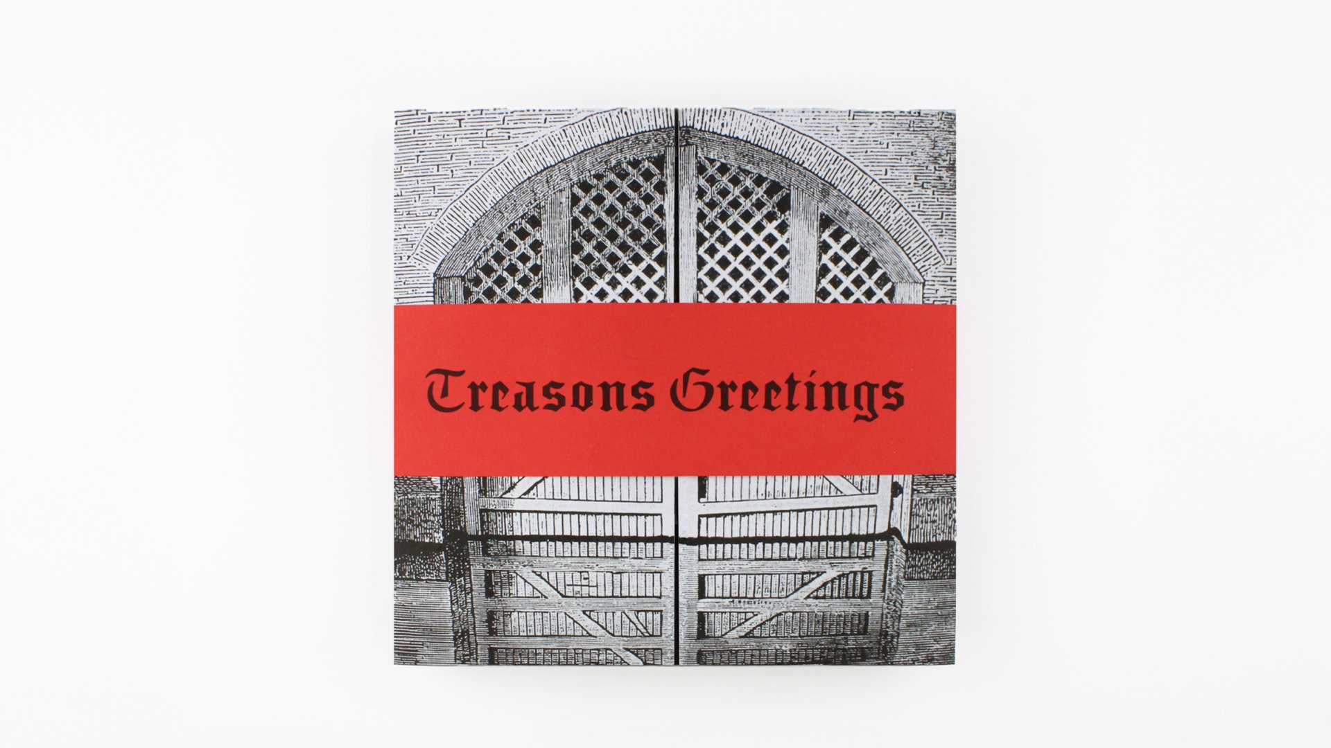
This project is a set of Christmas crackers for the tower of London, using the theme of beheading as the main vehicle. The front of the box features a belly band bearing the line “Treason’s Greetings,” which, once removed, reveals an etching of Traitors’ Gate, the original entrance to the Tower. Opening the gate unveils six historical figures, all executed at the Tower, alongside the copy line, “Don’t lose your head this Christmas.” This cleverly connects to the cracker itself: when pulled, the head detaches, a nod to the method of execution. A rich touchpoints are used throughout, serving as a dual reference to the festive season and the darker history of bloodshed associated with the Tower, reinforcing the concept’s tonal contrast.
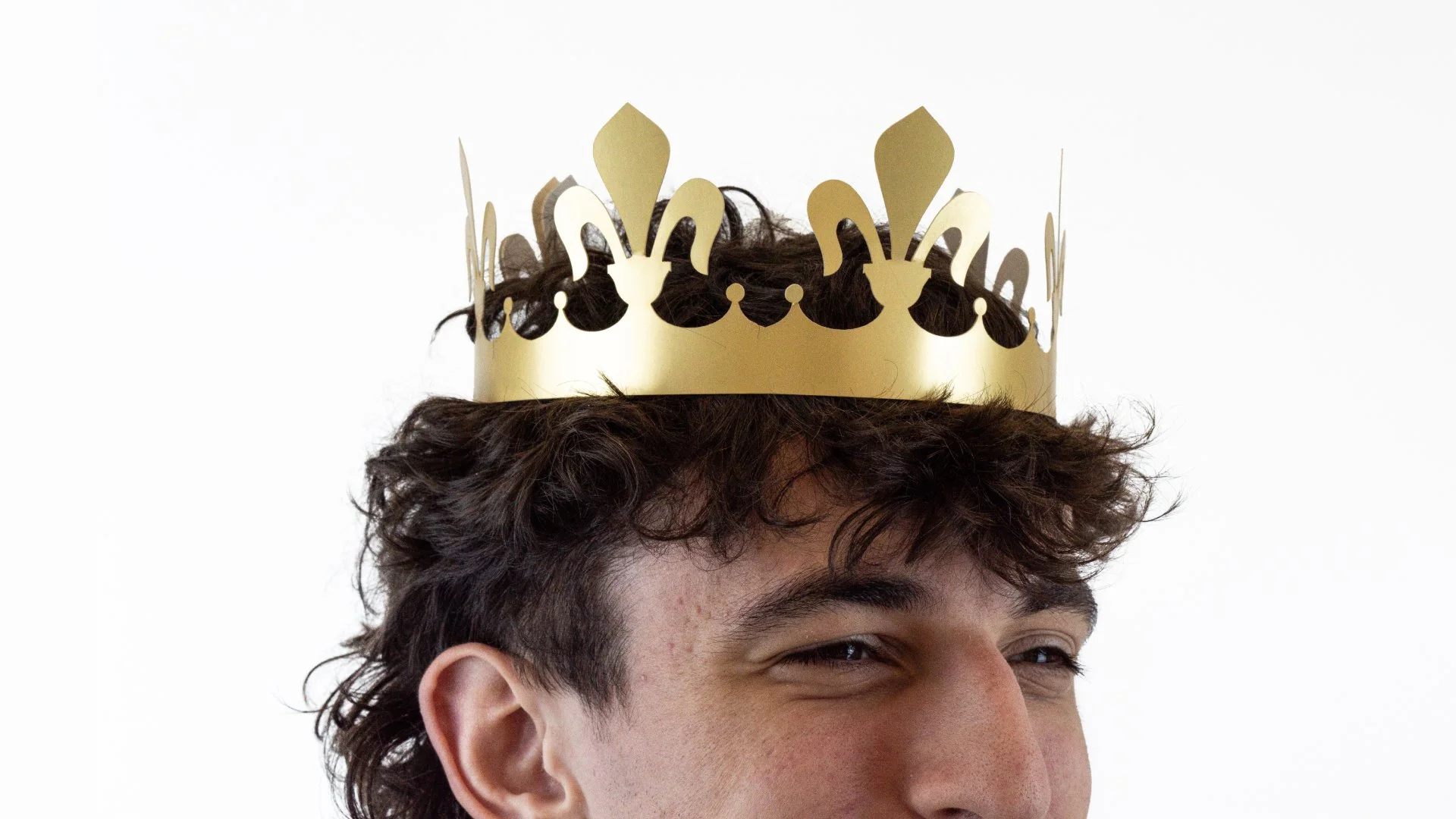
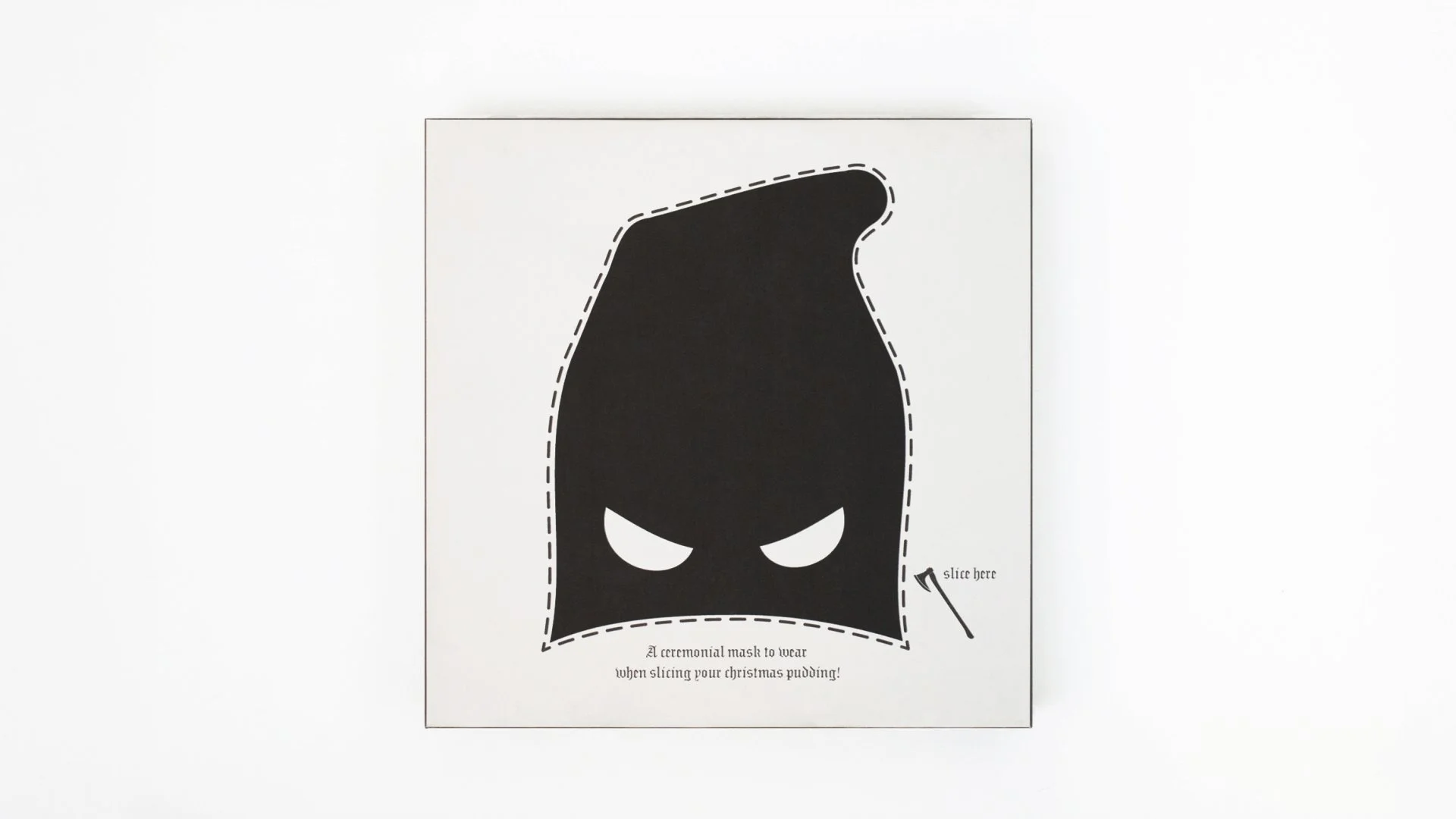
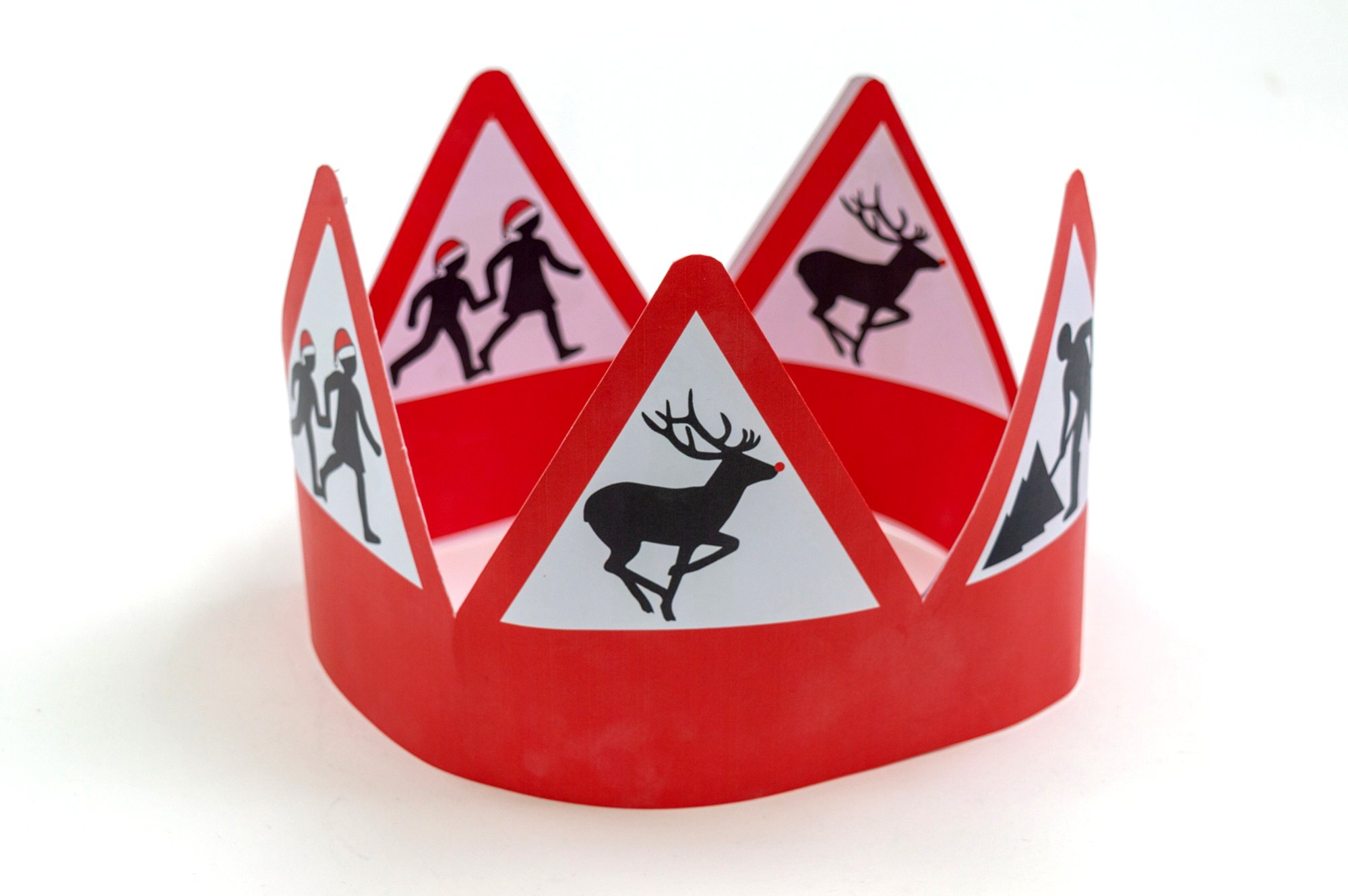
Inside, the cracker contains a wearable, ornate crown inspired by Tudor design. The reverse of the box features a cut-out executioner’s mask, adding a playful touch to the festivities perfect for wearing while slicing the Christmas pudding.