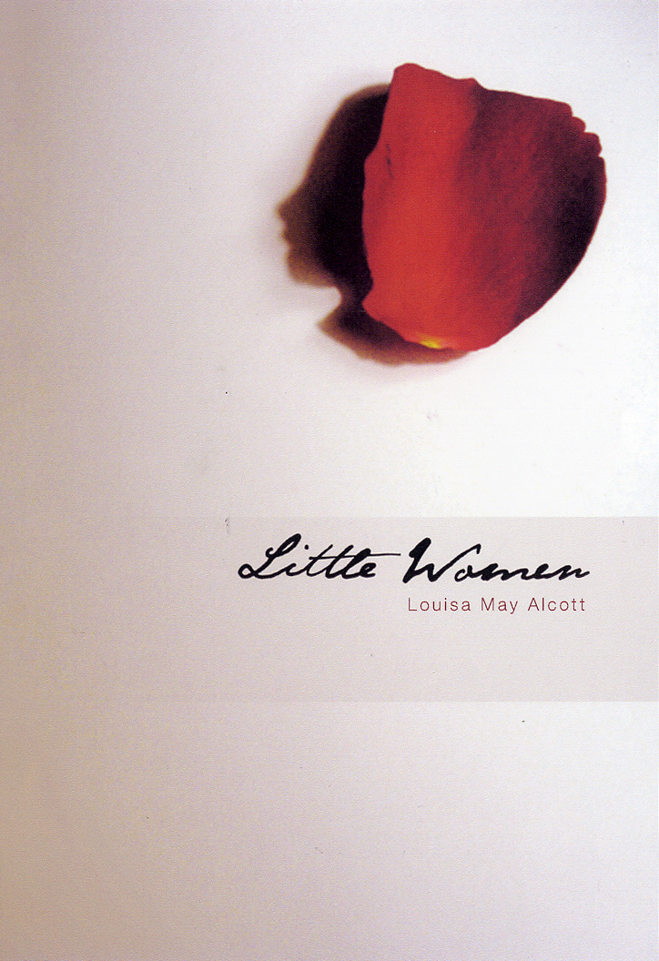
Cropping a photograph or image is one of the most powerful tools in a designer's skillset. It allows the designer to draw focus to a particular area of the subject in the image, in essence strengthening the communication and creating clarity of meaning for the viewer. The example above from the Guardian shows us Gareth Southgate, without actually showing us Gareth Southgate. But we know who it is, instantly. The designer has recognised the minimum amount of information required from the image for the viewer to process its meaning, and has had the gumption to crop it such a way. It is unusual and unexpected, so therefore visually rewarding.
Further to that very tight crop demonstrated above, a keen eye can enhance balance, contrast, scale, and even the dramatic effect of an image through cropping it in the most effective way.
Cropping can be done on a Mac, but if you have a hard copy of the image it is so much easier (and quicker) to crop it using two pieces of card. This is the best way to learn the art of the crop as it gives you instant feedback in the power of the image as it changes. Make your cropping tool with one sheet of paper.
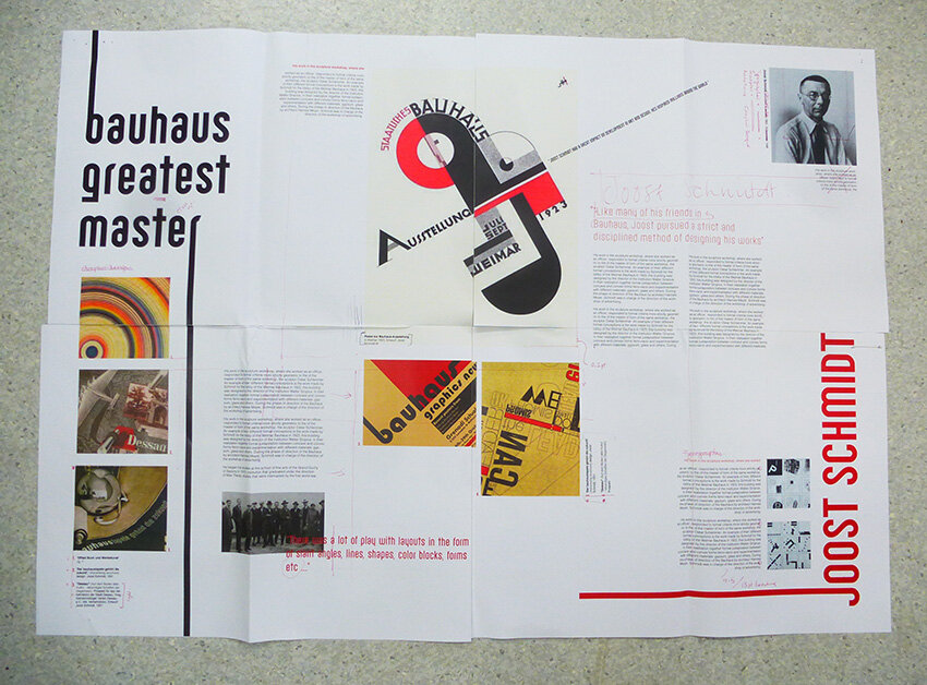
The further examples below are taken from the Guardian's beautiful World Cup colour chart, which portrays the 2018 World Cup through a rainbow of colour. It is an excellent example of cropping, enjoy.