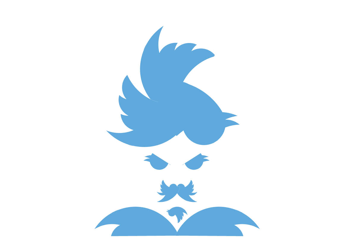
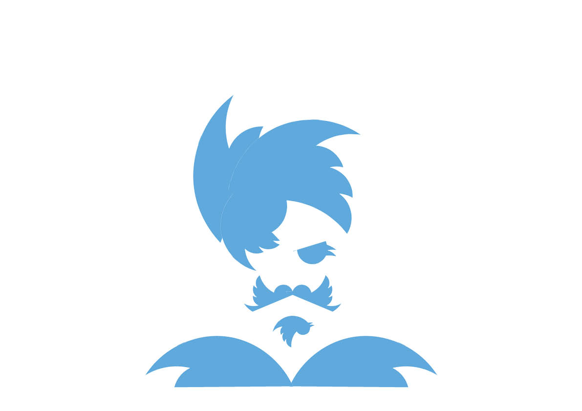
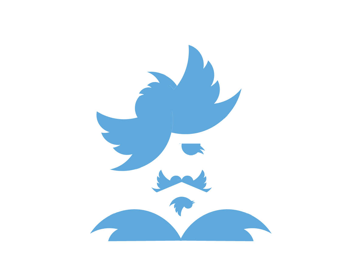
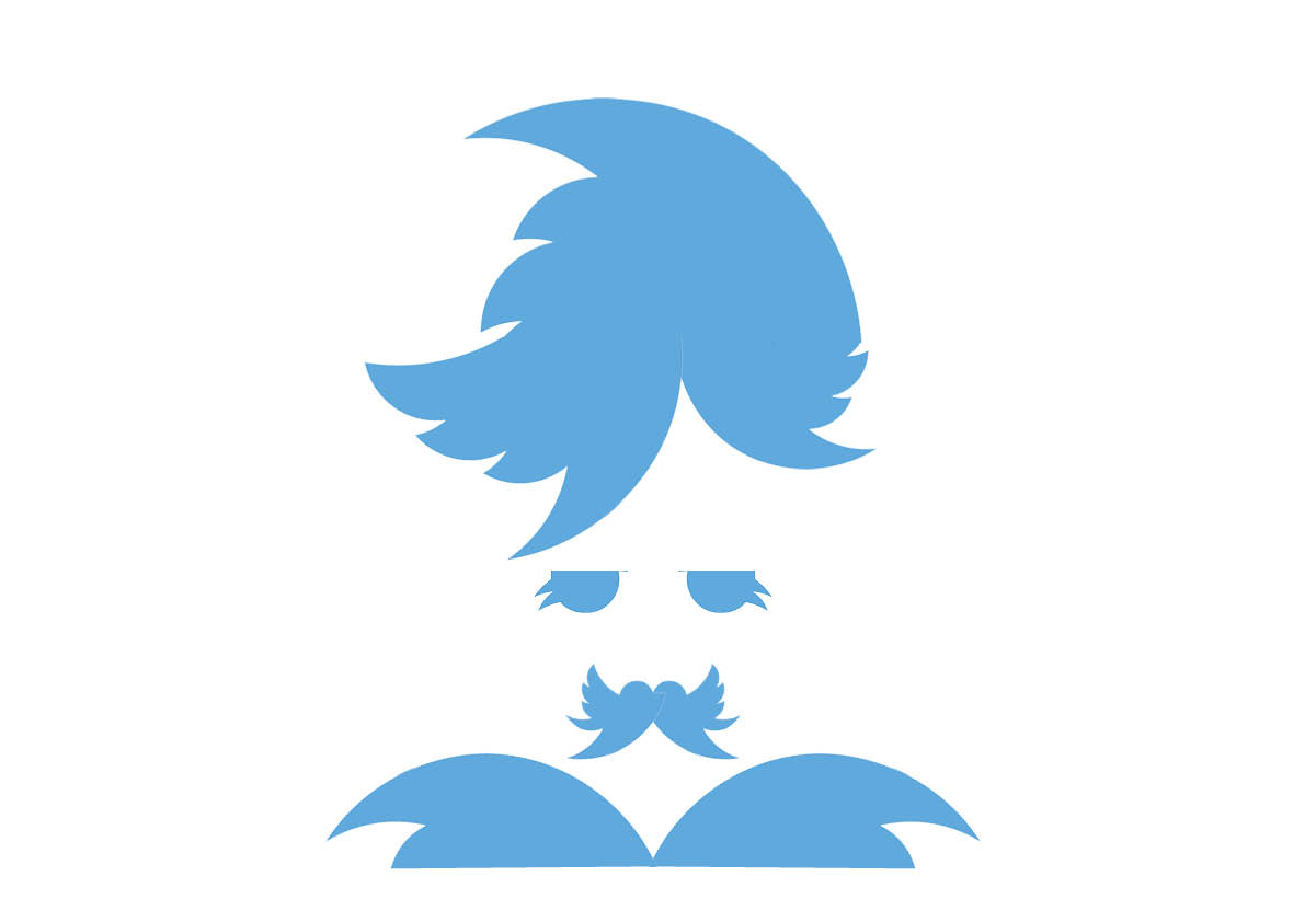
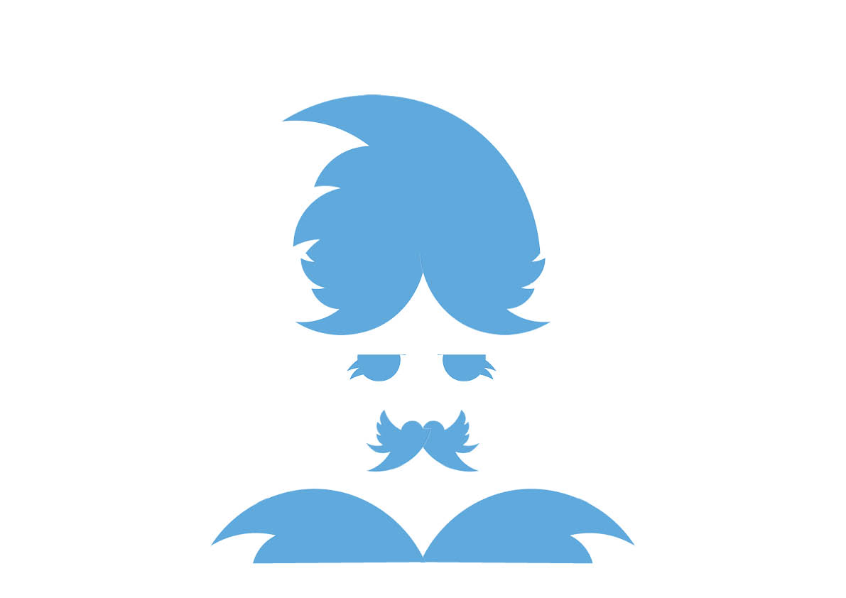
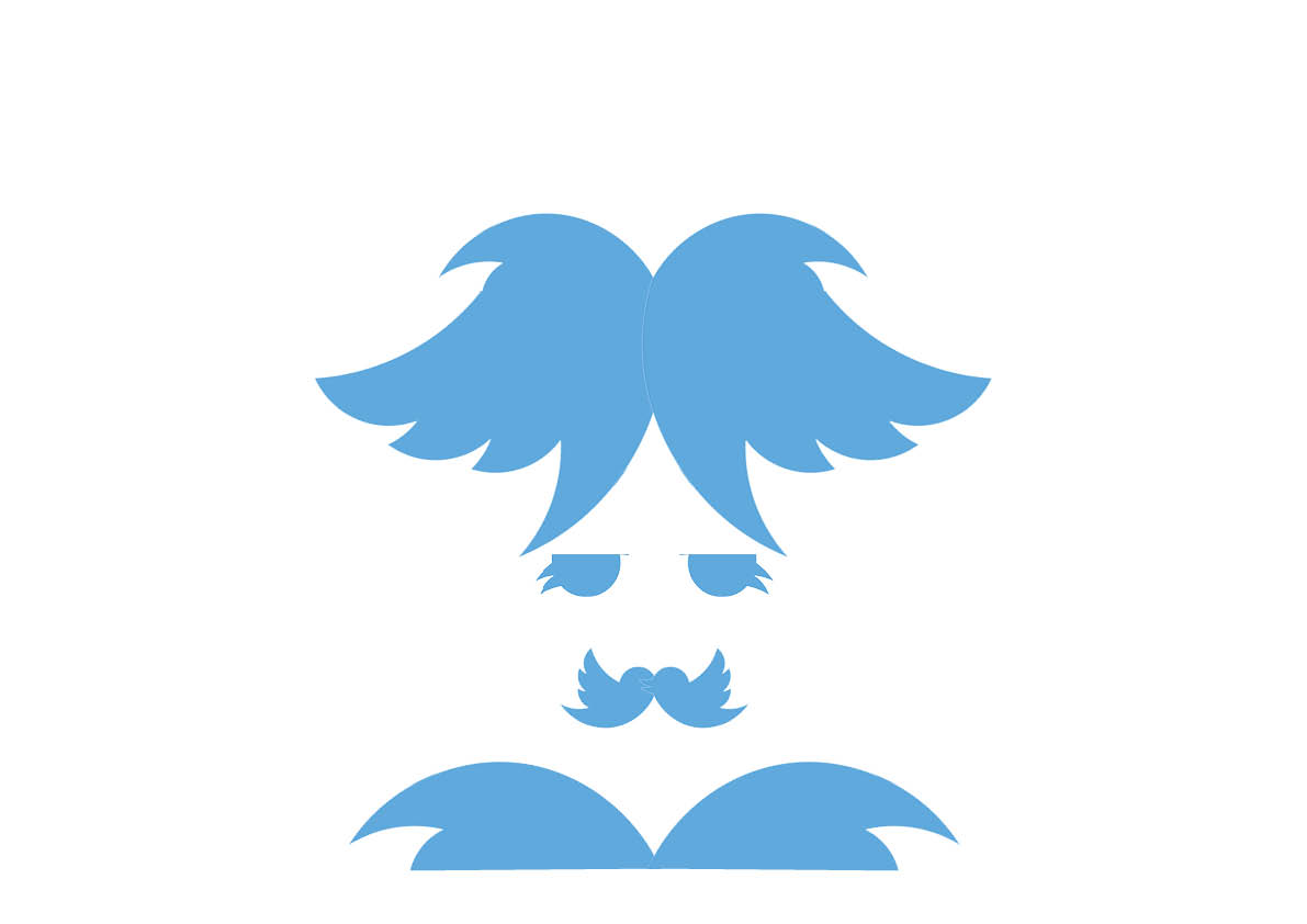
140 Twitter Characters
/ andy BainbridgeThese hipster mash ups were created out of cutting and rotating the twitter logotype.

For no reason at all apart from the challenge.
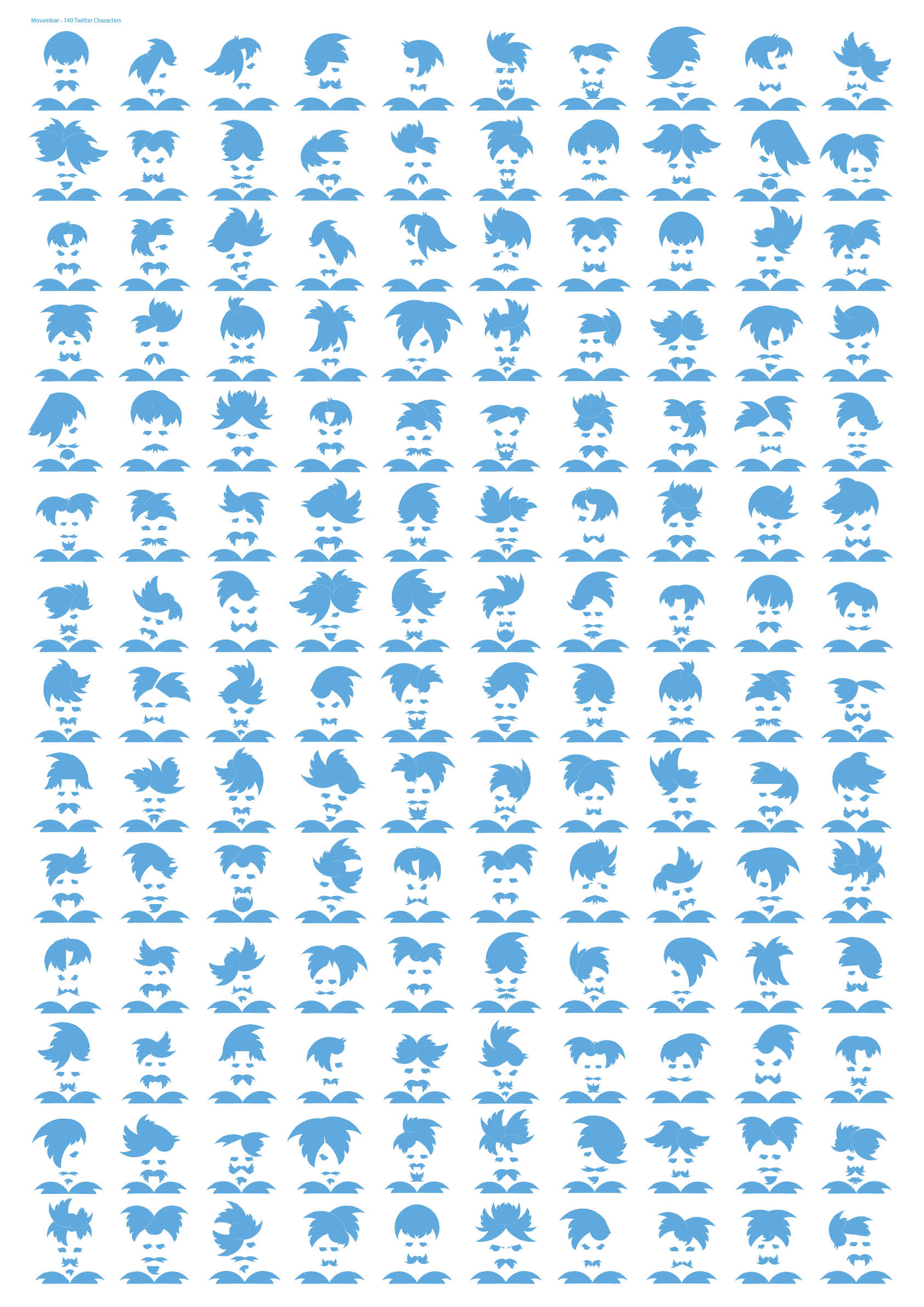
These hipster mash ups were created out of cutting and rotating the twitter logotype.
For no reason at all apart from the challenge.
Working with limited means and within strict limits can be a liberating experience. Here we feature a range of digital sketches and designs based around one simple needle.
A haystack
An insightful summation by illustrator Tom Gauld.
We can only surmise as to just what the initial sign spelt out?
Blackpool South shore.
Last week one our 3rd Year Advertising students, Jemma Redpath, attended the 5th annual Design Manchester all-day conference. She's kindly sent through some of her thoughts for Disciples...
The Design City Reframed conference was an experience full of diverse speeches and presentations that have certainly left an impression on me. The conference covered all sorts of topics including branding, architecture, film and modern art that were very refreshing. However, some were a little more random. One designer (not to mention names) spent his whole allotted time talking about writing songs for his LP- which would have been fantastic if we had seen some of the actual process. Half way through the talk he revealed, “by the way, you’re not actually going to hear any of my songs.” Not the best start to the event I must say!
There were however some really great speeches that made up for the disappointing start of the conference. Louis Mikolay from North gave a fantastic talk all about the rebranding of the Science Museum. As we know there was a lot of public backlash about ditching the existing brand image, but he represented his agency well and stood by North’s decisions and final work. I took away 3 main lessons from his talk… Number one: research is important. Number two: making visual observations of a brand will help you to identify ways to develop it further. Number three: be brave and stand up for what you creatively believe in, even when other people’s opinions might differ.
Tash Wilcox who is currently working with Hyper Island and Jane Murison, from the BCC, talked about very similar topics. Murison talked about how a lot of the time, we don’t make informed decisions due to our tendency to wait to be given information, and how social media has emotional consequences if we use it too much or too less. Wilcox relatedly discussed how we often seek the approvals of others on social media and how that can stop us from exercising our brain. Both talks were slightly anti-tech but amongst the humour and jokes they both highlighted some important advice. Firstly, we can make our own choices by making the good popular and the popular good. Secondly, we can put technology aside and strengthen our mind by developing our physically talents such as drawing and painting.
Overall, I would definitely attend the conference again. It was full of creativity and I genuinely left feeling motivated and more excited about my own projects. The general atmosphere was great to be in and it was reassuring to know that some of my own student creative worries were echoed amongst such successful and accomplished people. I look forward to attending similar events in the upcoming months and I most certainly am looking forward to attending the next Design City Reframed.
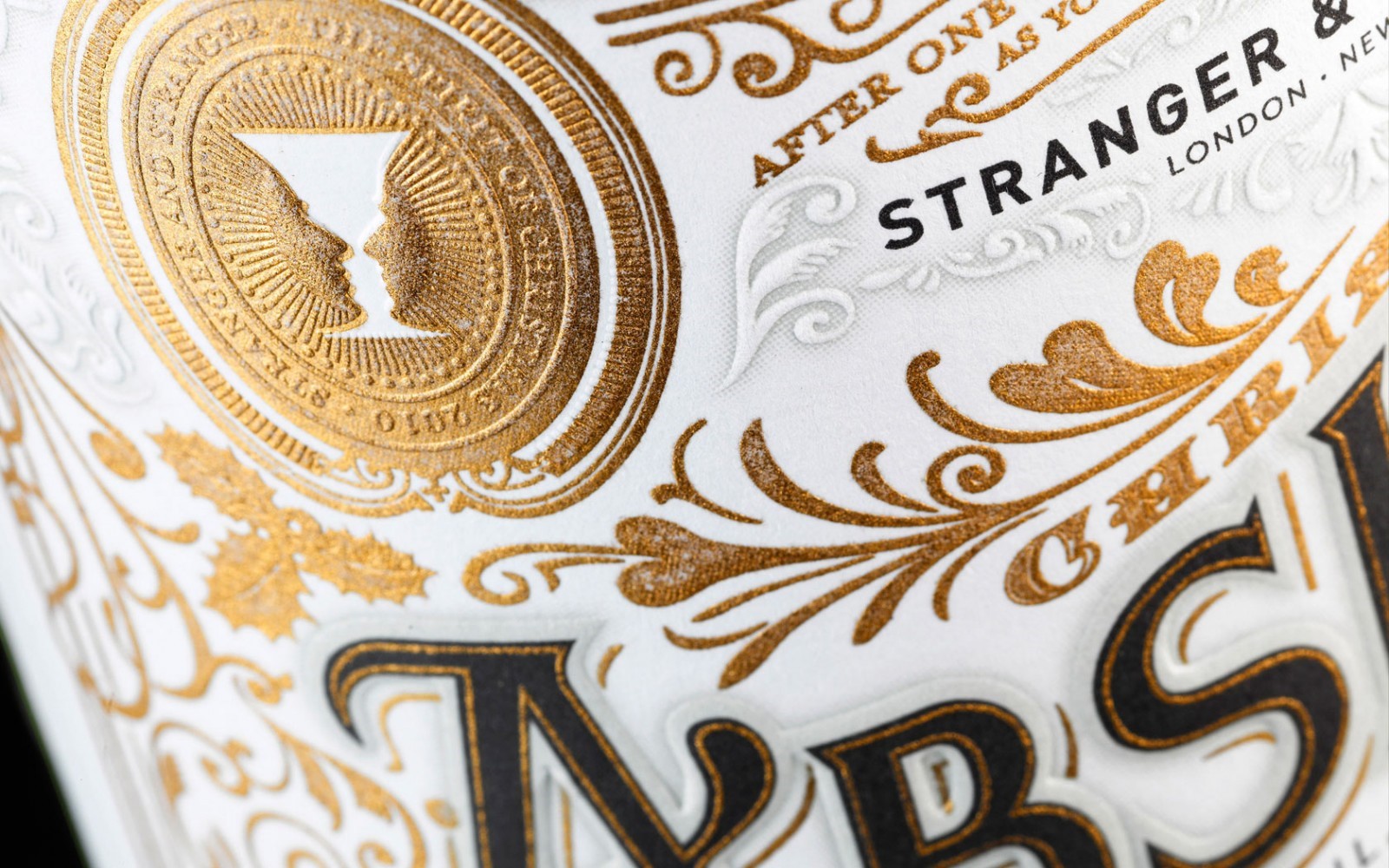
Tom Shaughnessy, Design Director at Glorious and also friend of the course has shared with us an agency called Stranger & Stranger. They're an agency who somehow slipped through the net on my radar, but are definitely worth sharing with you. Specialising in packaging and branding they are an agency who create - rather, craft - exceptional and exquisite pieces of design.
Mainly for the alcoholic drinks industry, they design the labels, bottles, packs and everything that falls under their client's brand. It's worth spending some time understanding and appreciating the level of craft and detail through typeface selection, illustration style through the idea and the actual end product itself. They also have an interesting design mantra:
DON’T FIT IN, STAND OUT ™
They've also designed and printed a beautiful book featuring a few hundred of the four and half thousand jobs they’ve done over the past 20 years. It is expensive but quite a few blogs give you a sneek peek.
For the guests who had travelled from across the land, and in accordance with the Reverend's good wishes, a temperance dispensary was established with the upstanding advice:
"Hold ye fast to sobriety."
Sage words indeed, though there were murmurings some tipples had a particularly gratifying warming effect. Such notions have been noted before and are considered to be the way when in close quarters of the Reverend and his works.
A gratifying time was had by all and we wish Andy and the Reverend all the best for Typographic Specimens.
The reverend in modern day garb
A time lapse of visitors enjoying the findings
the fantastic lantern show
A time lapse of the signings
The Disciples Of Design are a global collective of design academics, practitioners, artists and students. We have one common thread – University of Lancashire in Preston, UK; and one common aim – the creation of an ever evolving visual hub for the sharing of ideas and thoughts.