One week project: Typography
/A selection from 2024’s first year.
A selection from 2024’s first year.
A quick nota bene regarding the latest addition to our list of archives.
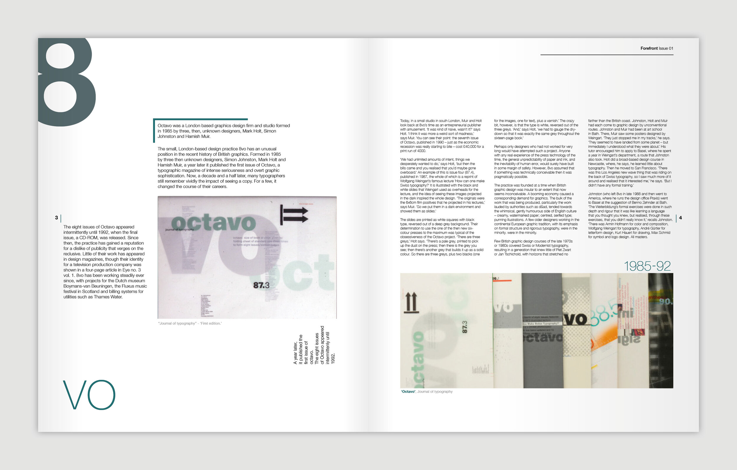
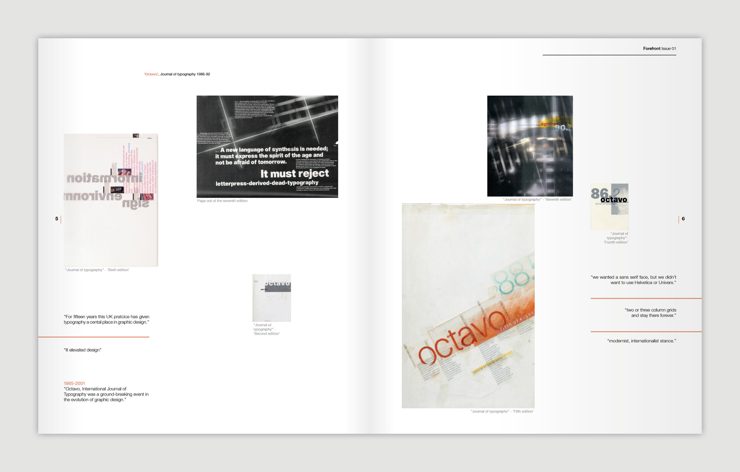
Design Reviewed, recently featured on Print’s weekly roundup by Steven Heller is the collection of Matt Lamont – a fellow northerner.
In Matt’s words:
Design Reviewed is a personal project dedicated to digitally preserving graphic design history and documenting the vast visual culture from the last century.
His collection features some absolute gems, but is also thoughtfully (and no doubt pain stakingly) edited into categories and themes. Any designer would be delighted to have a percentage of his collection to learn from!
Soak it up…
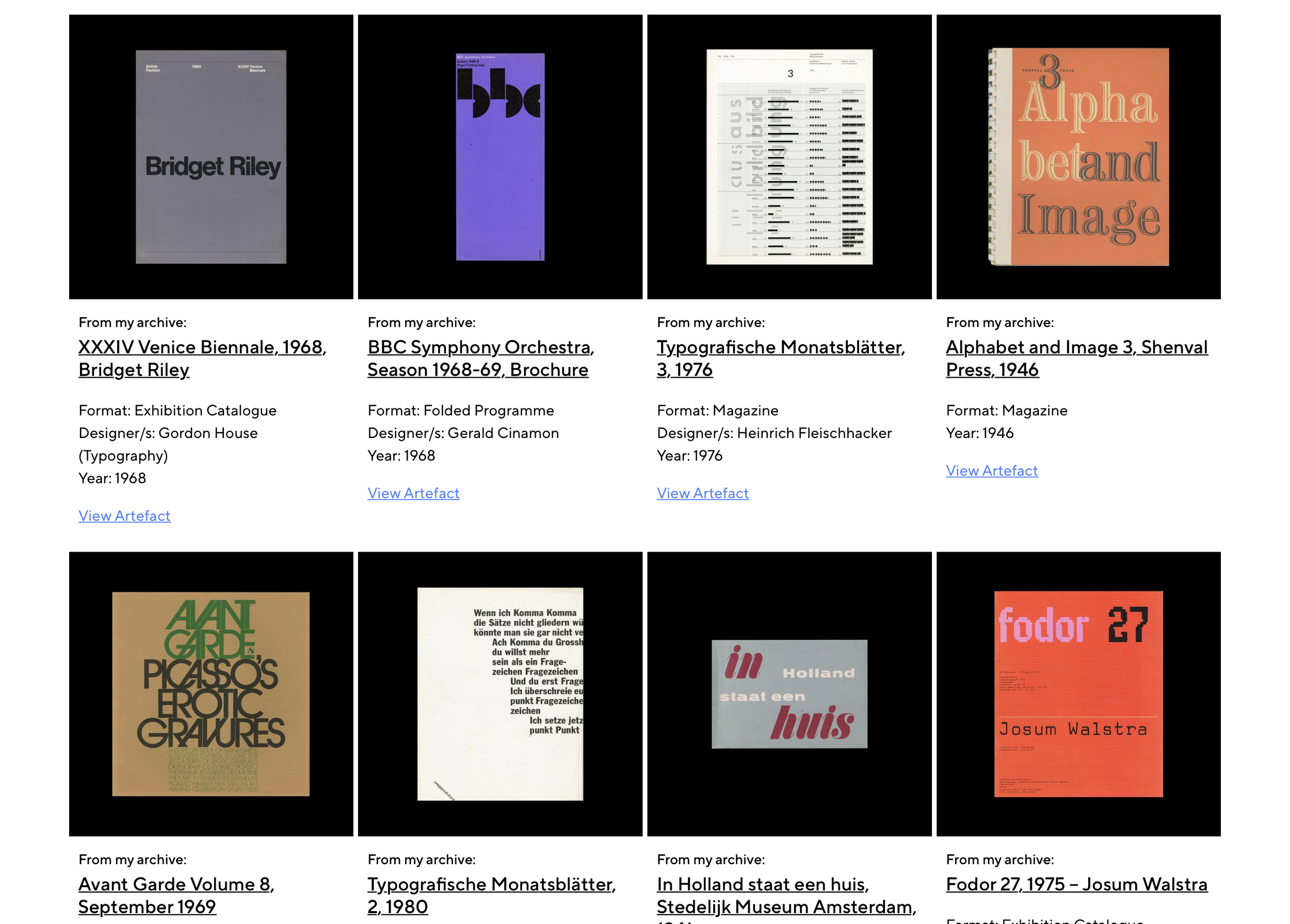
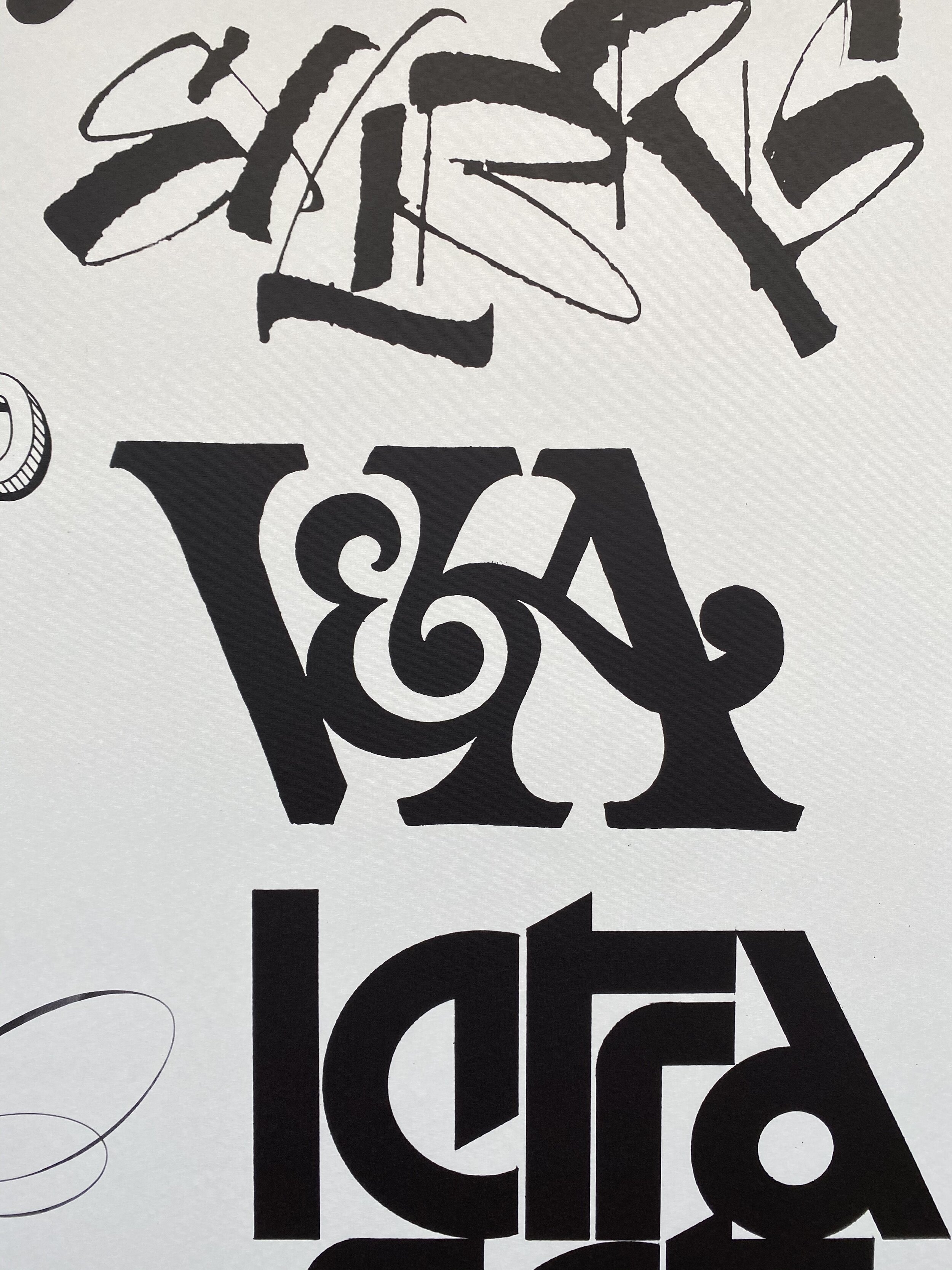
A snapshot of the collection
Advertising lecturer, Guy Lawrence, has recently seen this piece of work for sharing here on The Disciples. A winner at Cannes Lions, Clio and London International Awards; the project promoted the Brazilian Creative Club Festival – the biggest event in Brazilian advertising – in a way that is truly new.
Technology and creativity evolve at a dizzying pace. So how to promote the Brazilian Creative Club Festival – the biggest event in Brazilian advertising – in a way that is truly new? With an idea that changes like the world: every second. Using an exclusive algorithm, we created a campaign that was mutable in all its aspects: logo, tagline, colors and typography. A campaign that never repeated itself. The result was 9 different posters: each version of them could be seen only once. As they were living and mutating, the posters were digital-only: they were never printed or shown in a static way to the audience. Each one had its individual link, so the algorithm could work in real time. And we also replaced traditional media by an innovative one. The mutating posters were turned into guerrilla projections in dozens of different sizes on places that are often visited by our target audience: agency professionals, producers, students, and artists.
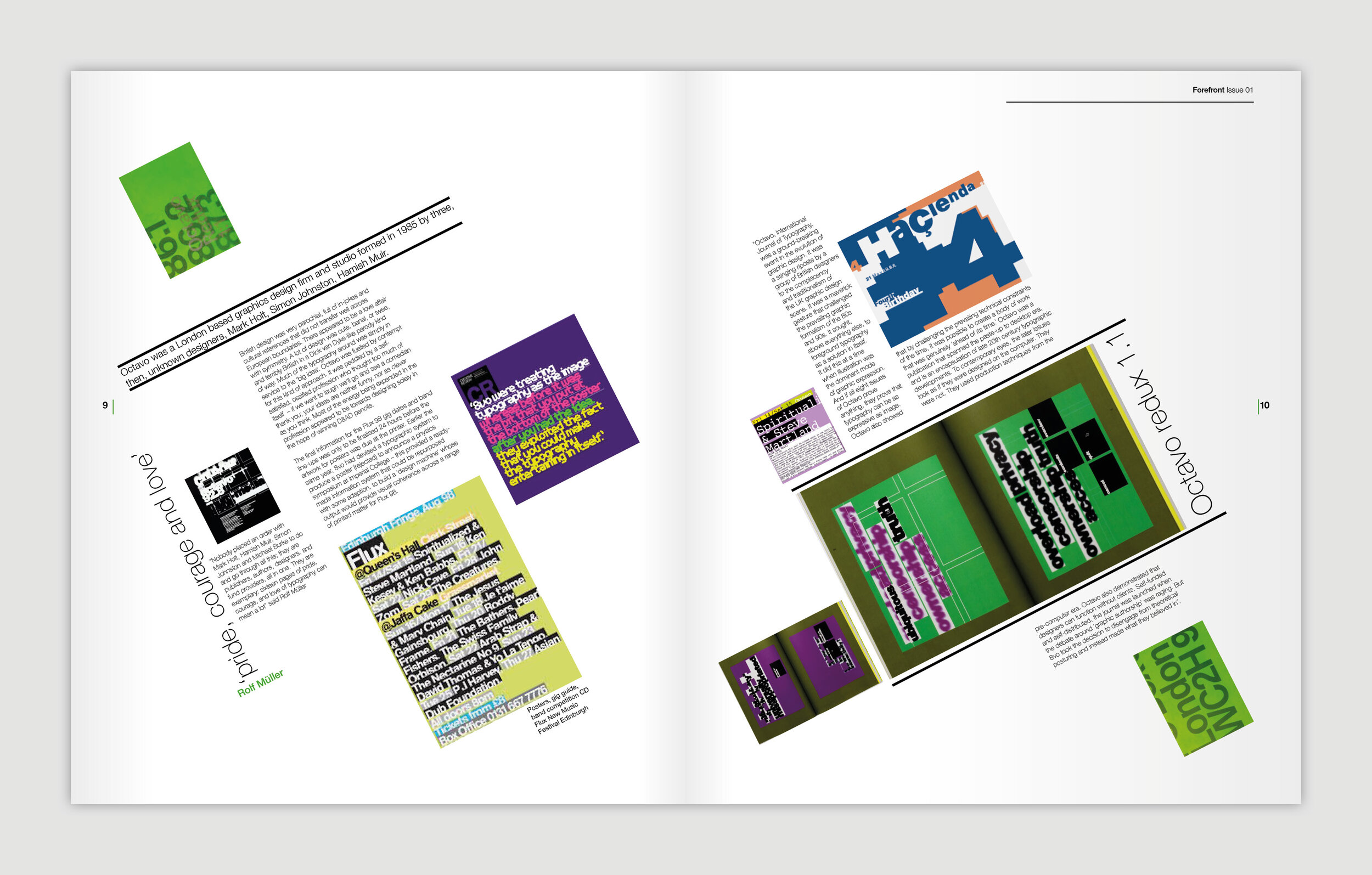
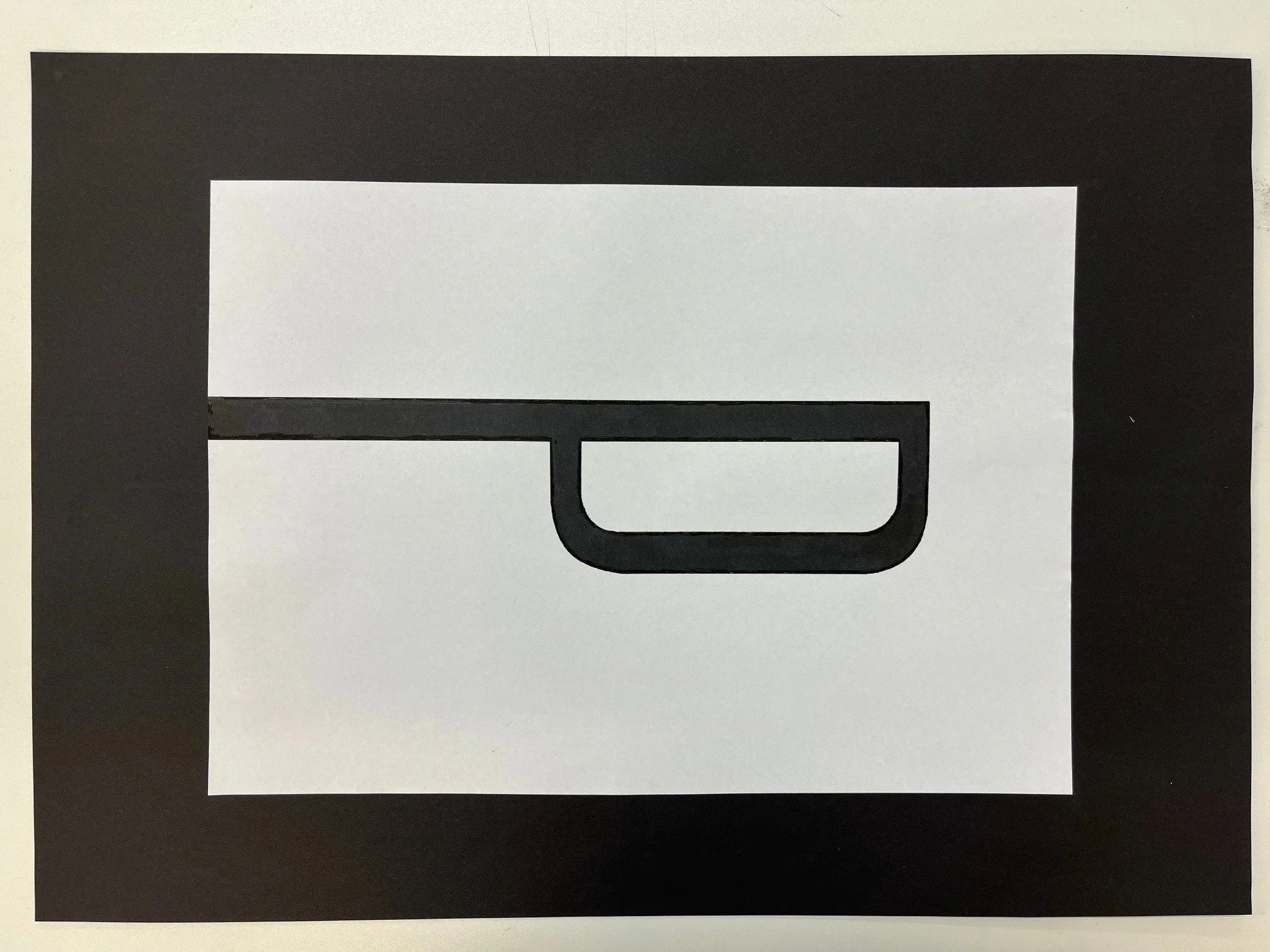
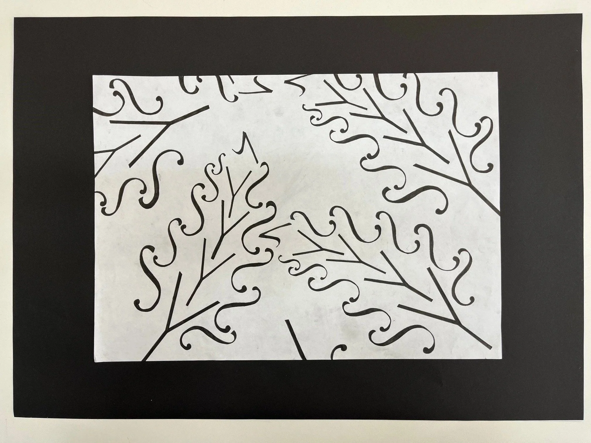
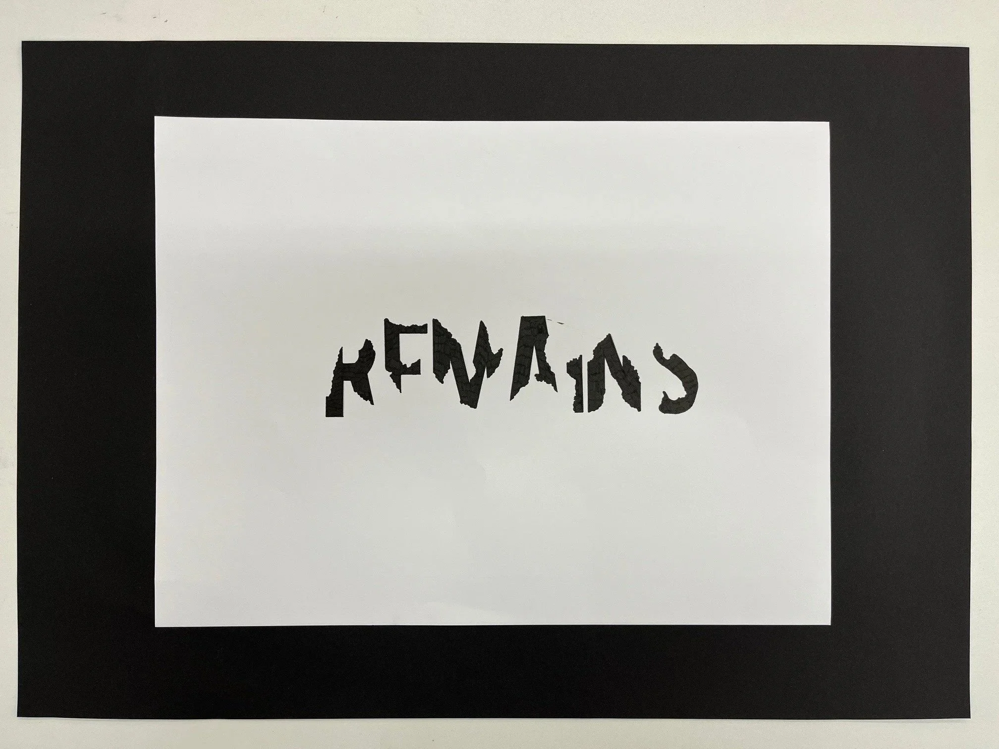
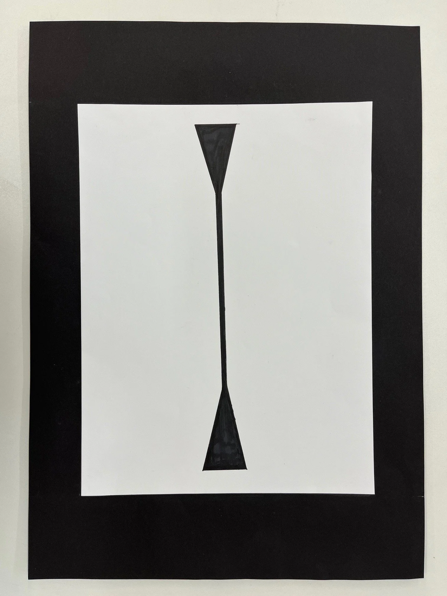
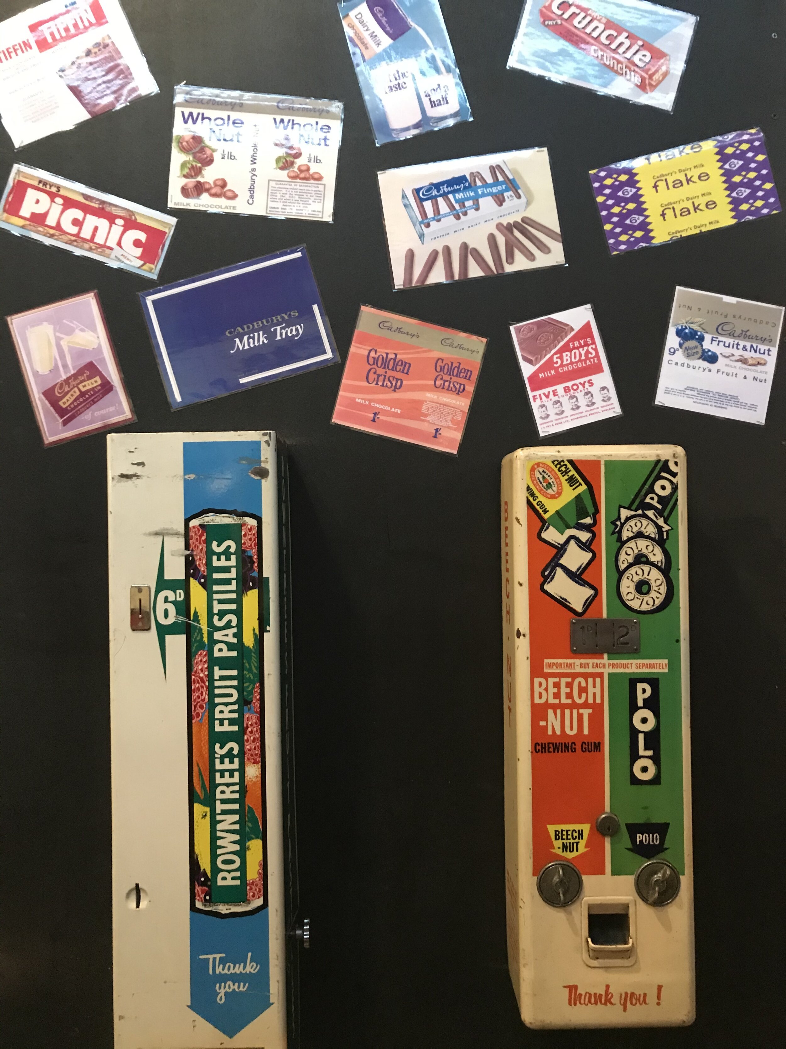
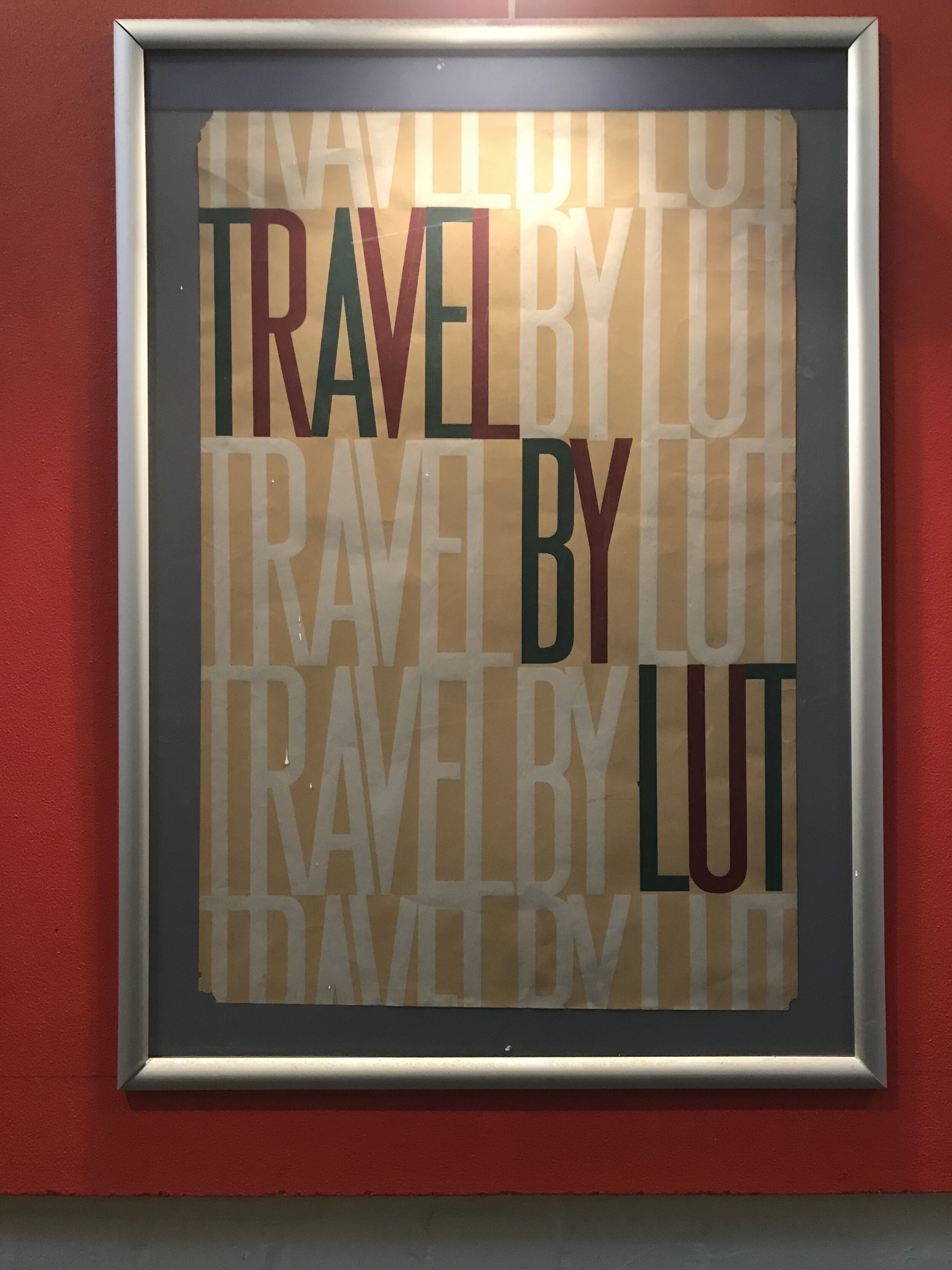
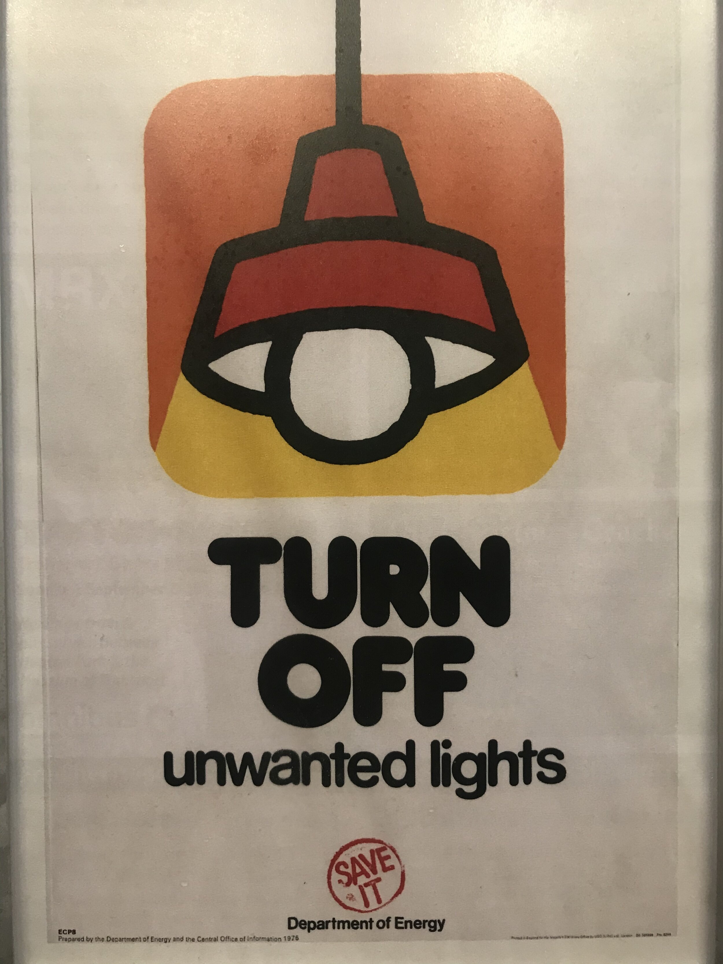
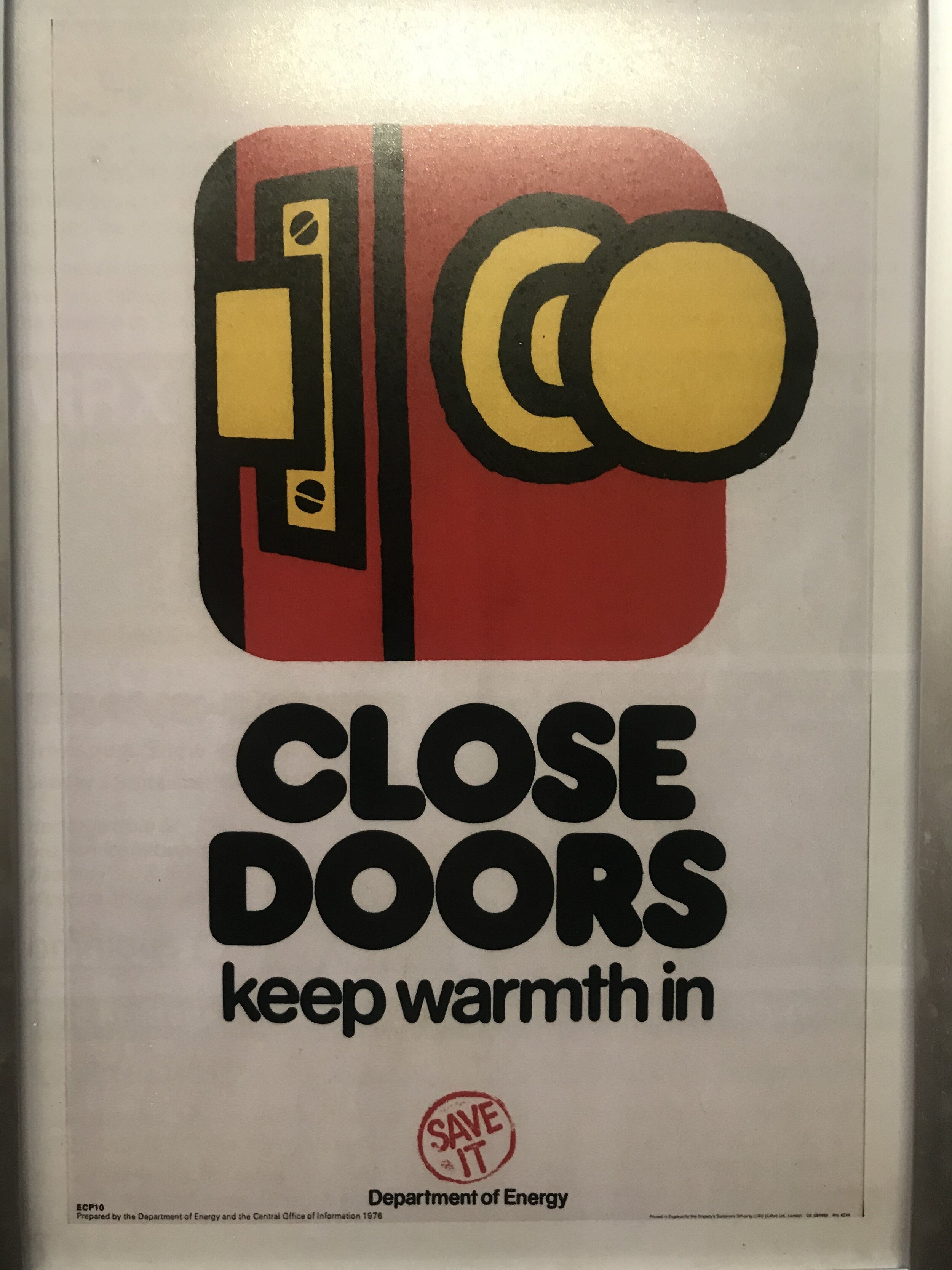
An excellent find by Andy in his archives of Preston-past, this beautiful little book (and the tutors behind it) gave genesis to the typography projects we run today. Each example elegantly demonstrates the two pillars of Preston design: ideas and craft. The brief was to extract maximum meaning with limited means.
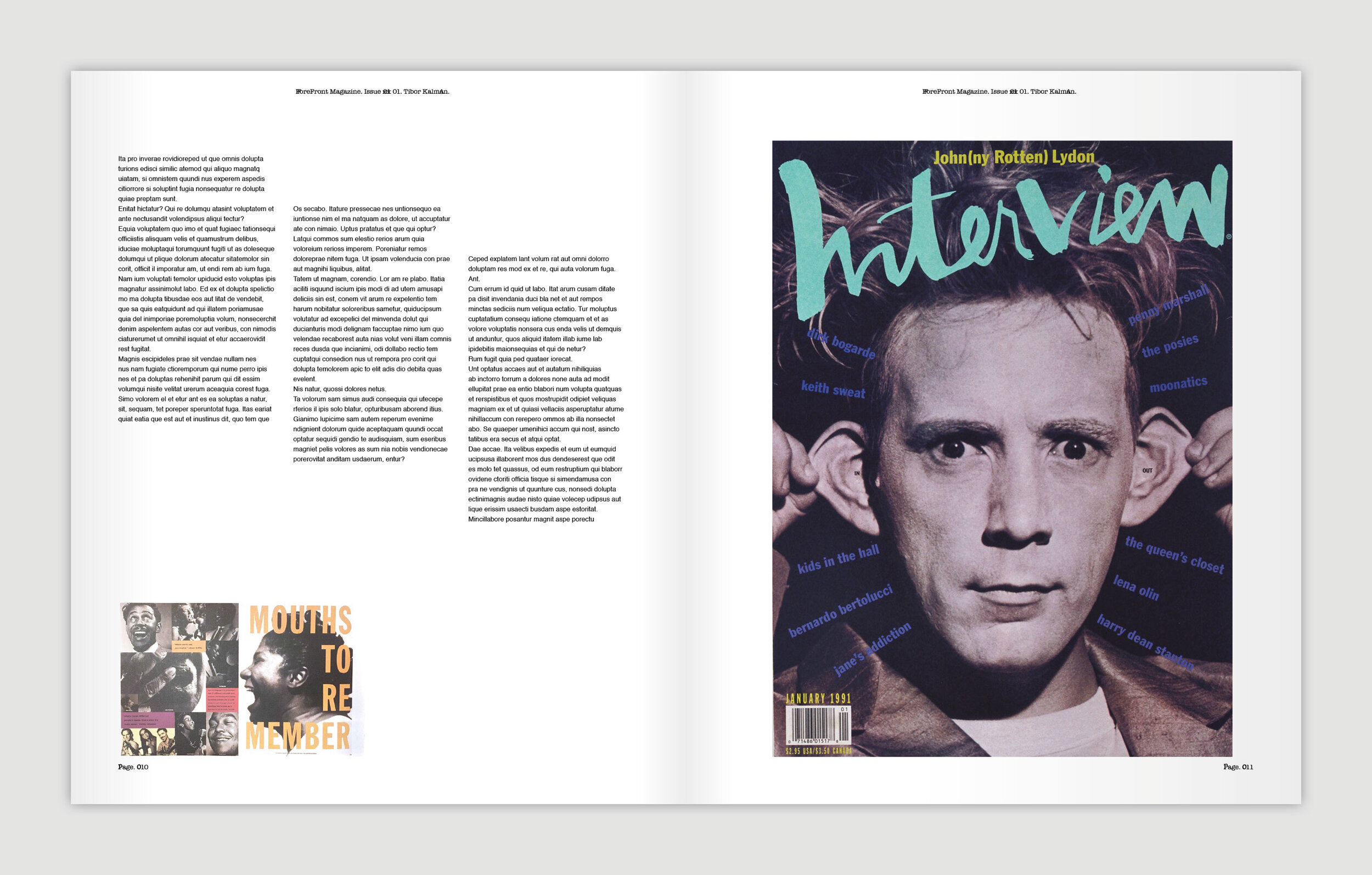
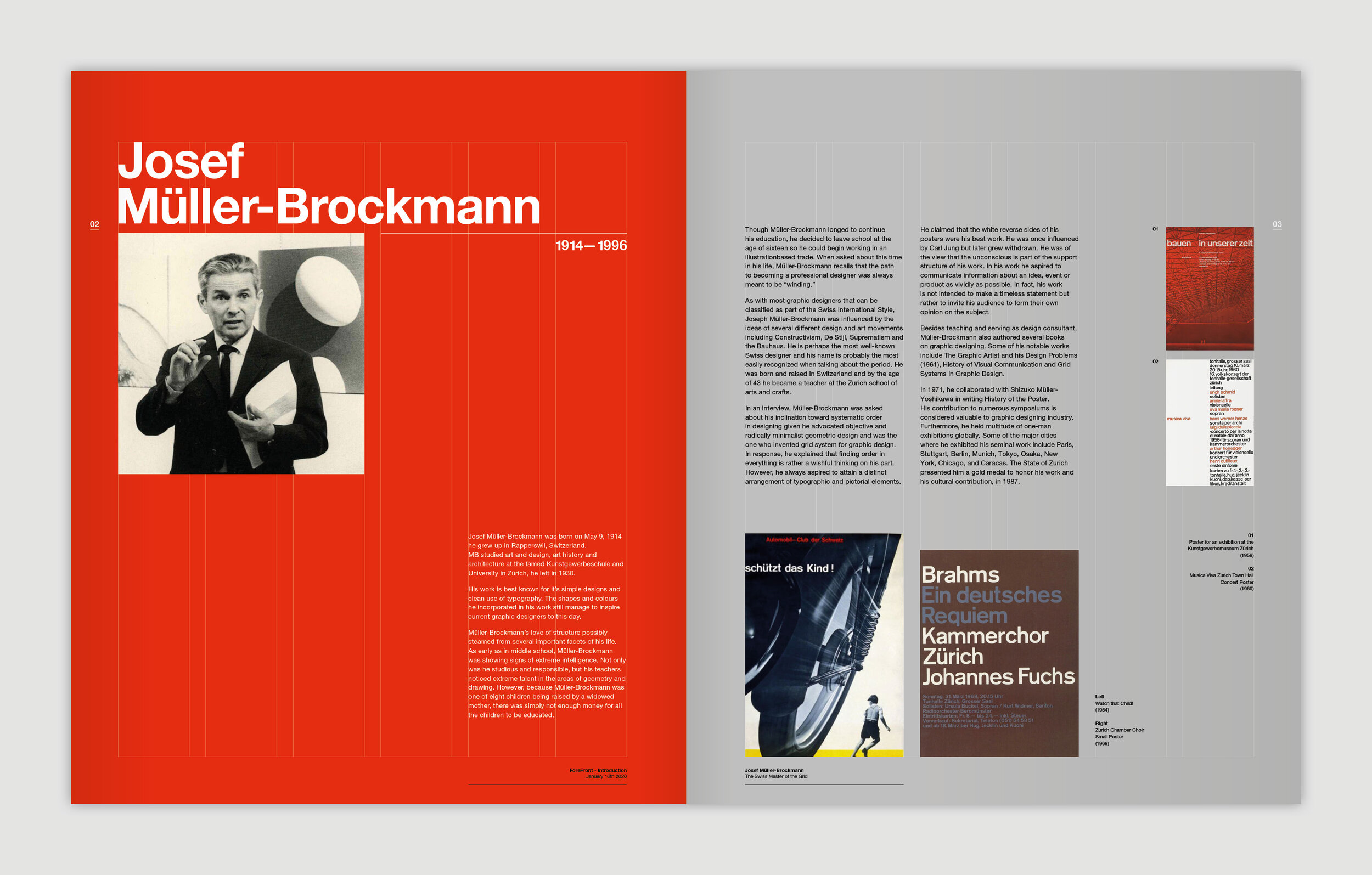
At first glance, you’d assume it to be a contemporary publication; either due to it being ahead of its time, or indeed timeless in its design. The last slide details the table of contents and the student designers included, note a young John Rushworth.
Cover
Inside cover
Winter
Movement | Escape
Flow | Ego
Conversation | Reproduction
Guilt | Birth
Cows | Sharp
Slice | Death
Corpse | Love
Affection | Truency
Digestion | Security
Gravity | Zipper
Porridge | End
Tiers | Weight
Lift | Friction
Claustrophobia | Impact
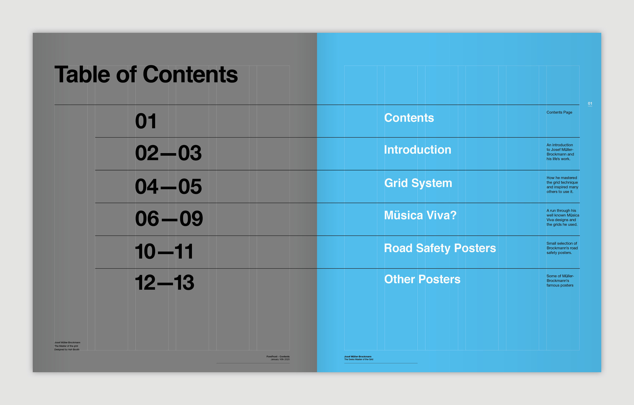
Contents
Among the many behind-the-scenes / below-the-water-line / beneath-the-surface activities undertaken as part of The Disciples; we are continuously adding, editing and refining our links to external resources.
Having been recently contacted by Fontwerk, about the launch of their new type foundry in Berlin; we thought we’d re-share the list of independent type foundries we’ve built up over the years below.

Type specimen of fontwerk’s NIKOLAI
Think of these foundries as the equivalent of the best branding or packaging studios. Absolute masters of their art. They might not all have free trials (who’d work for free?), but you can at least take influence from them and feed it into your own practice. Can you defy Helvetica?
And a final note, Dafont and the like are absolutely not included.
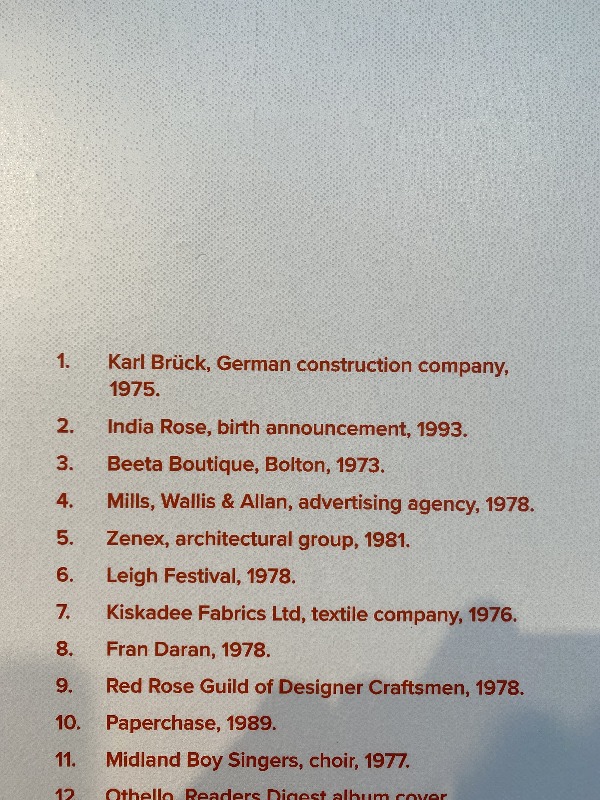
>>> Here’s the list, a veritable rabbit hole of typographic treats <<<
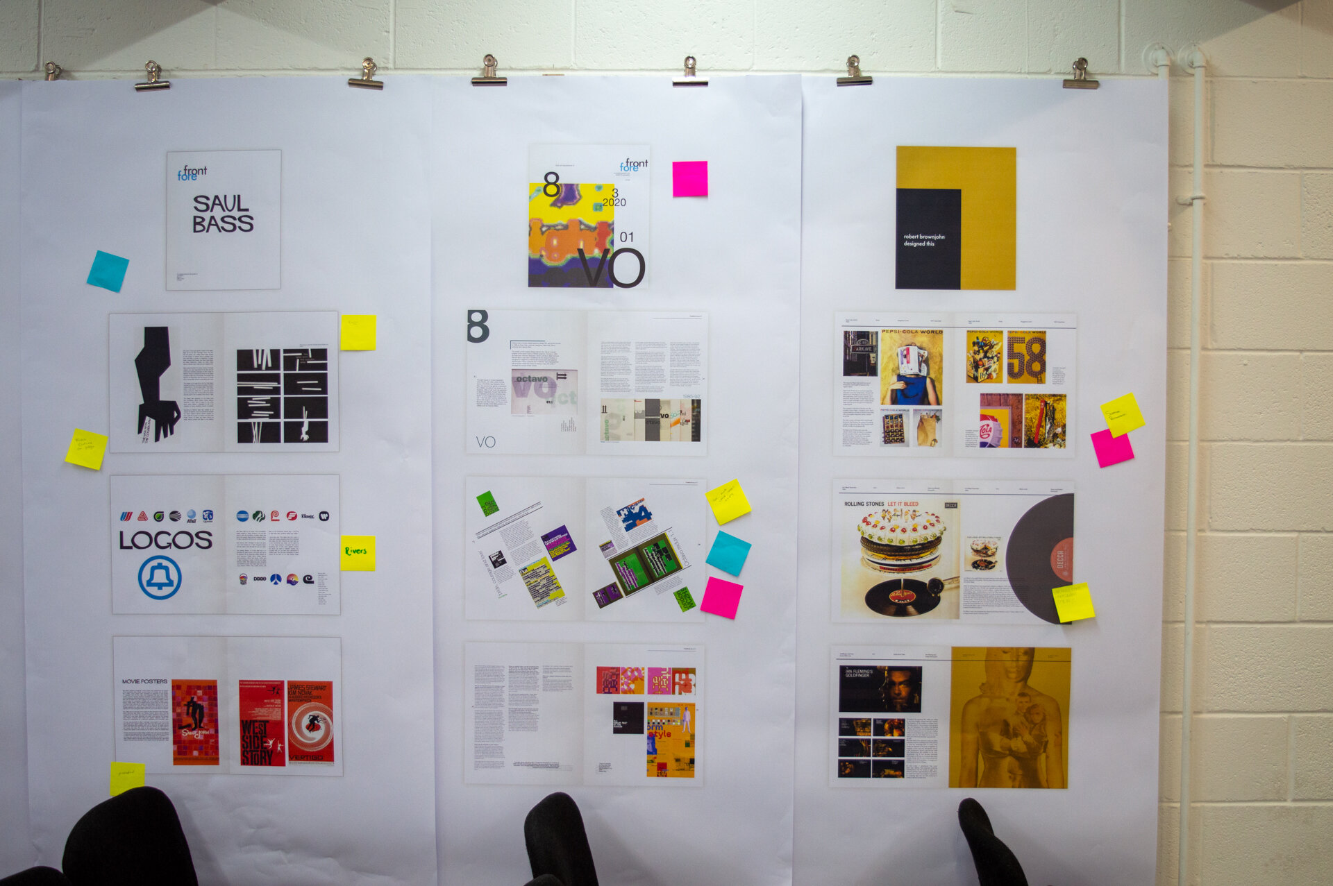
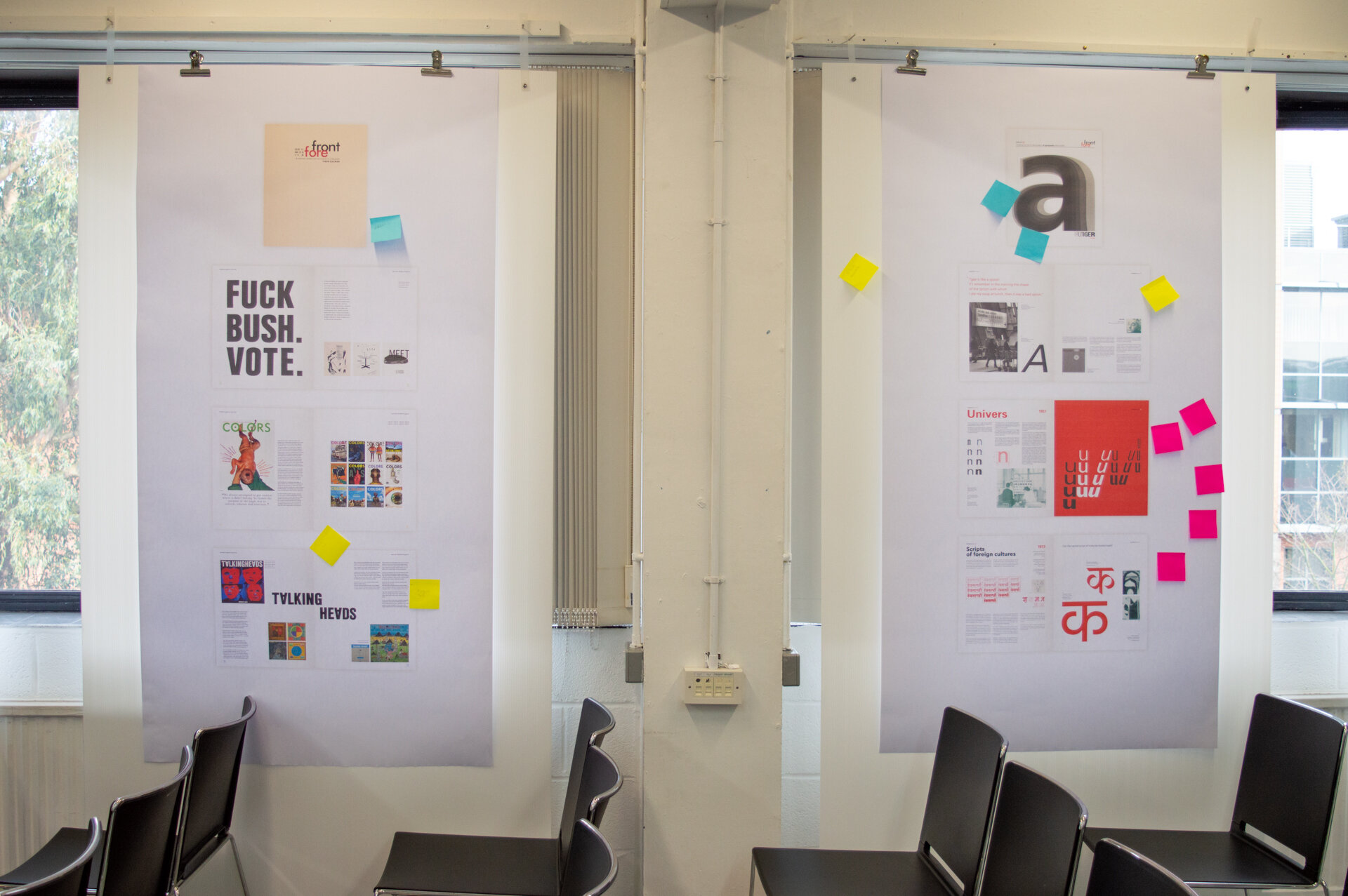
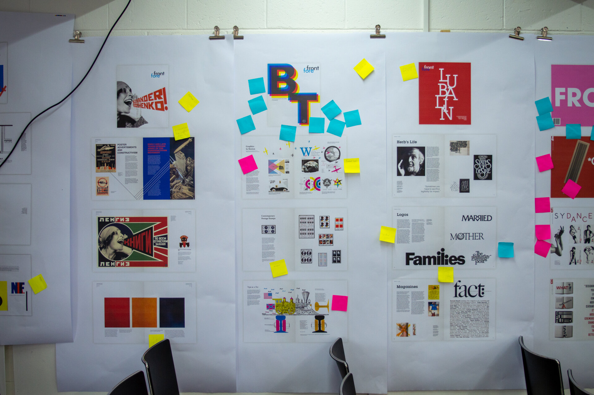
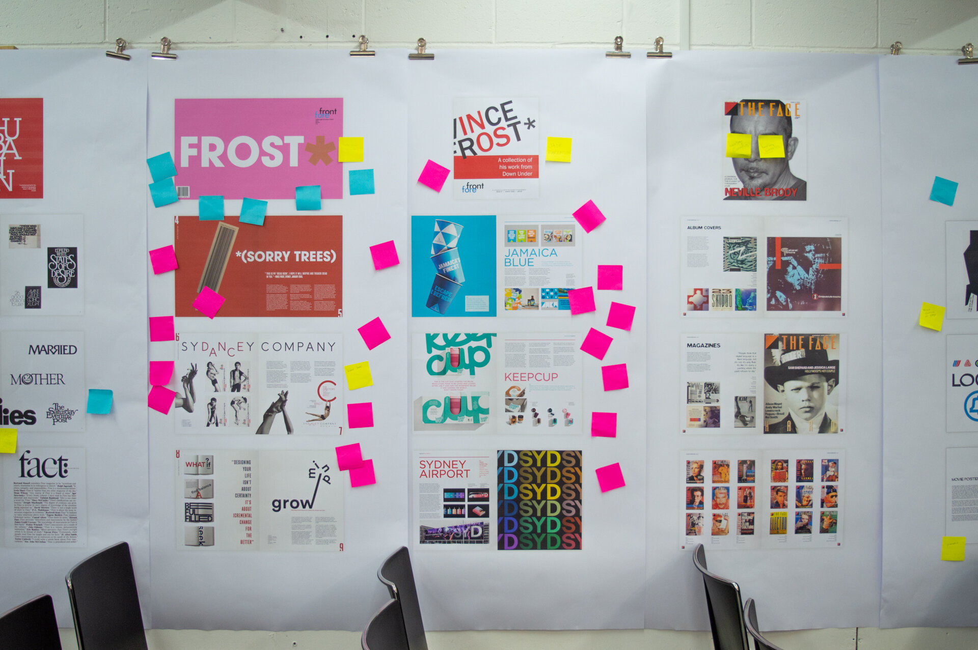
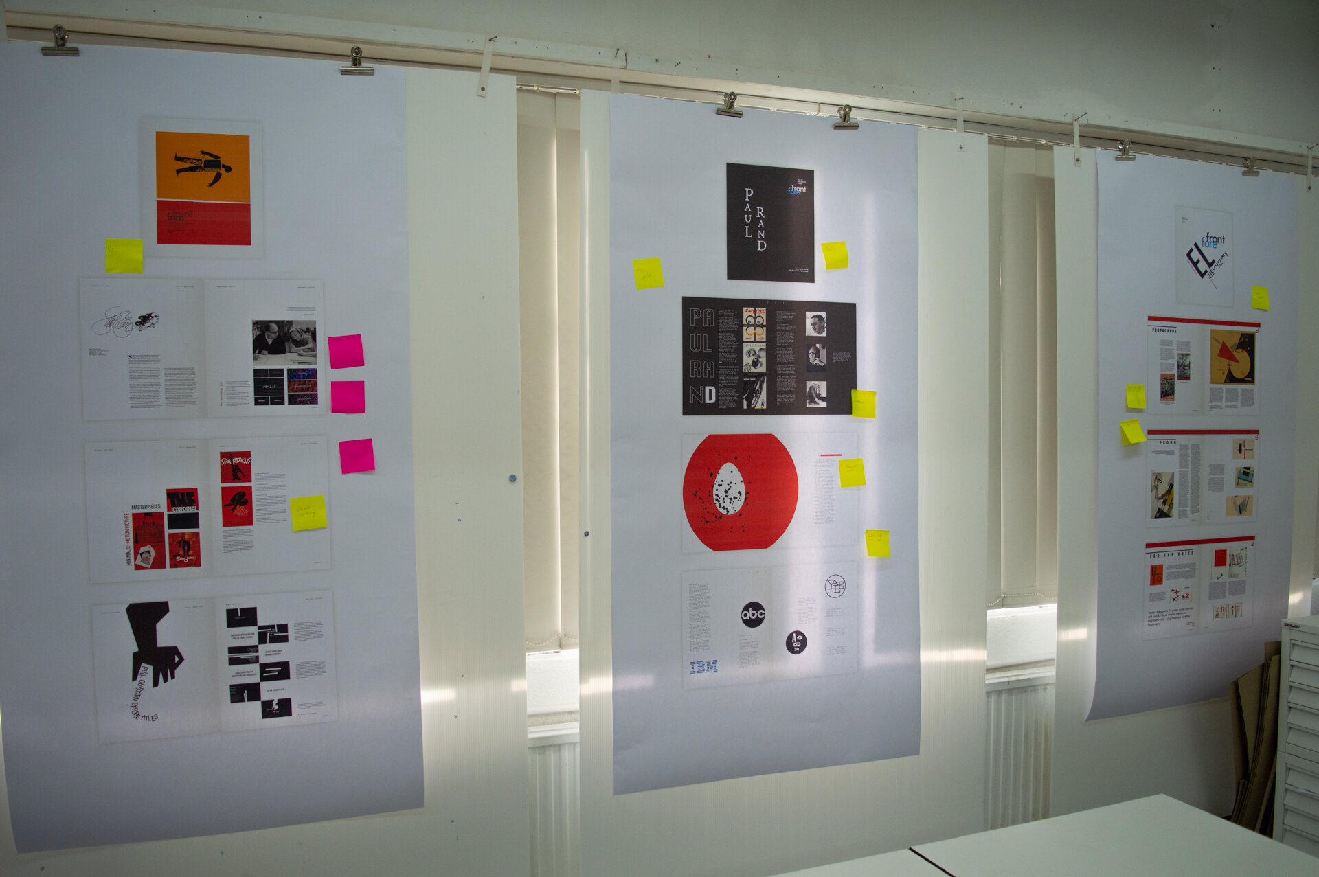
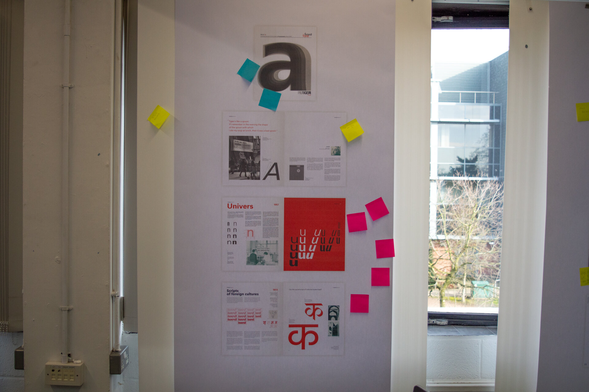
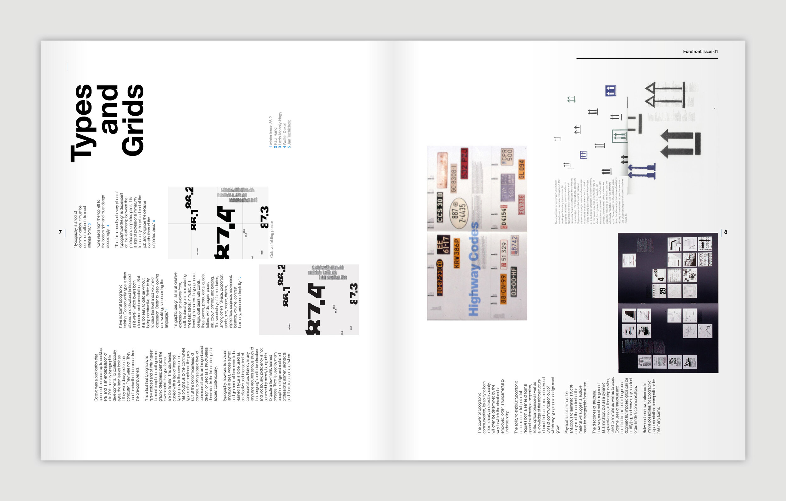
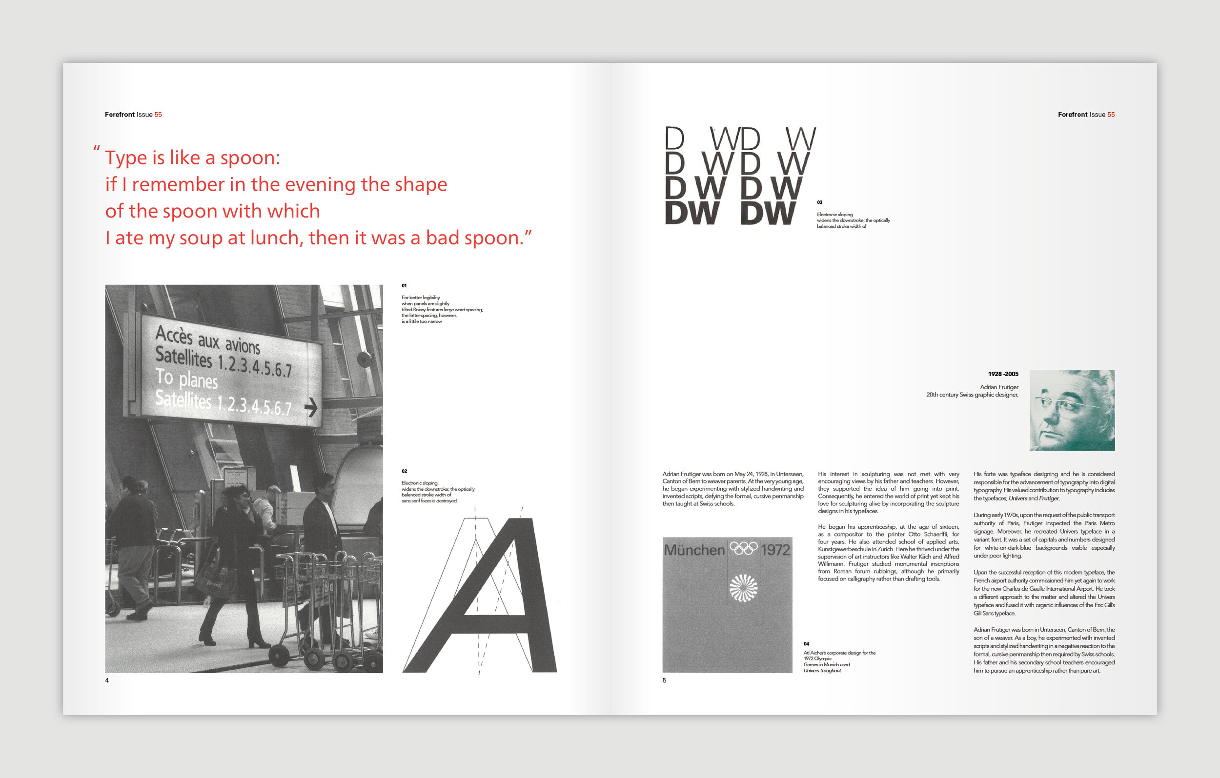
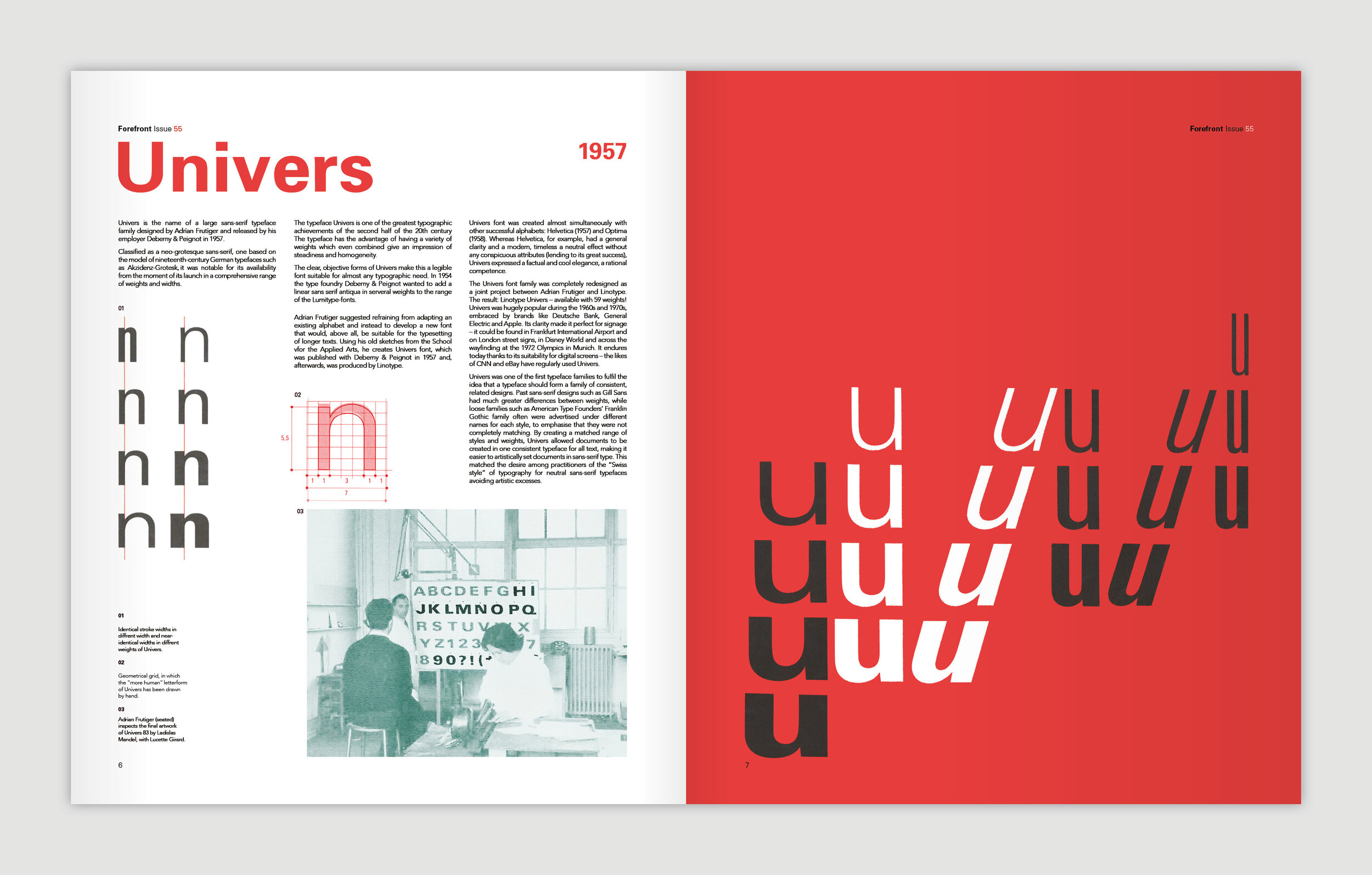
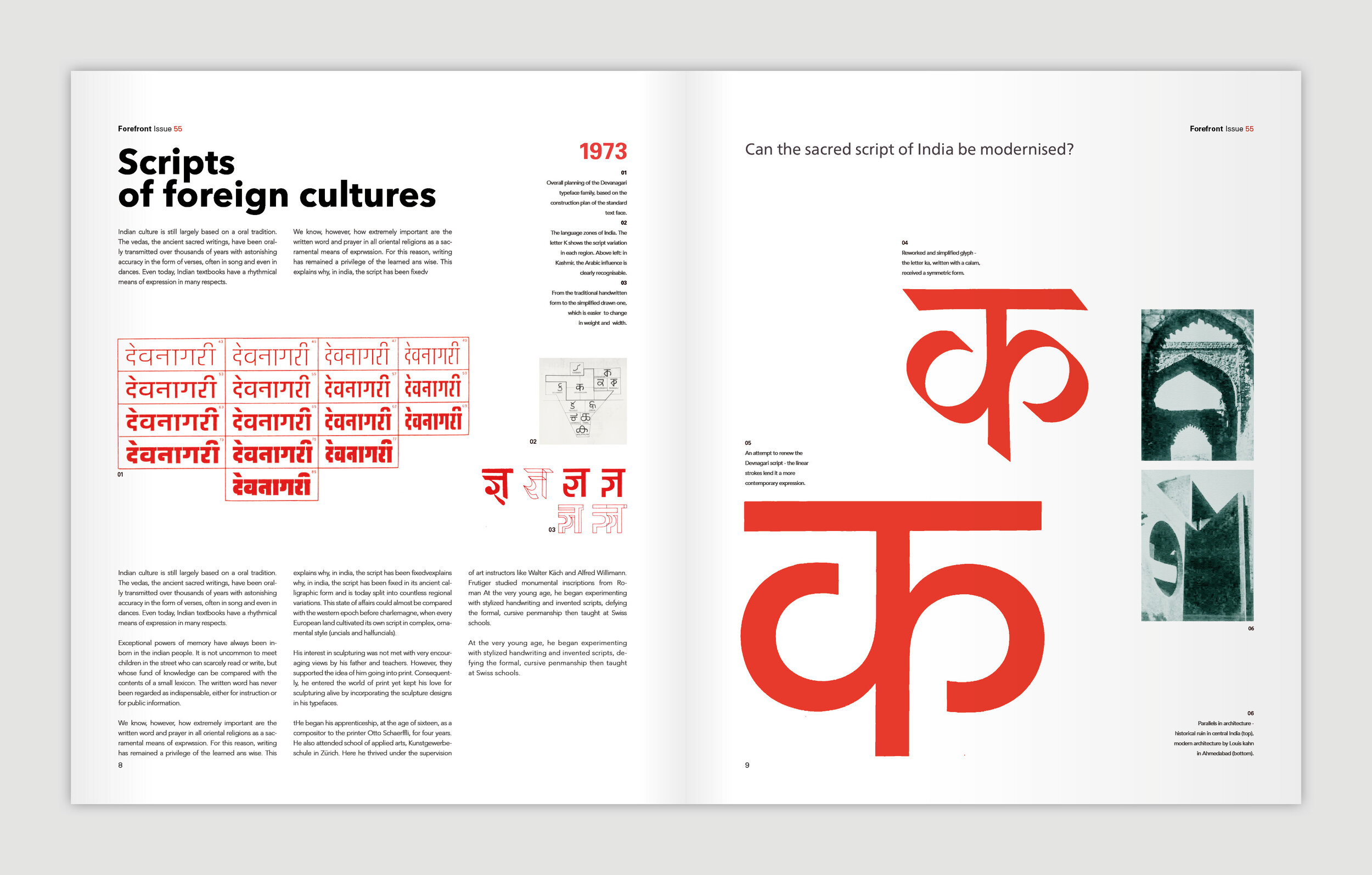
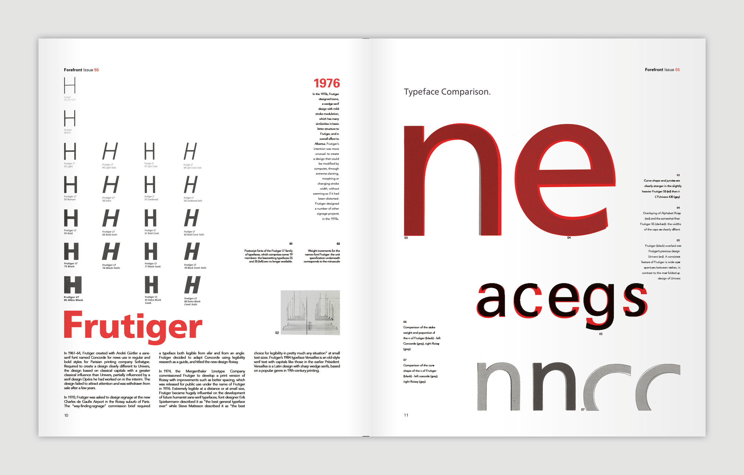
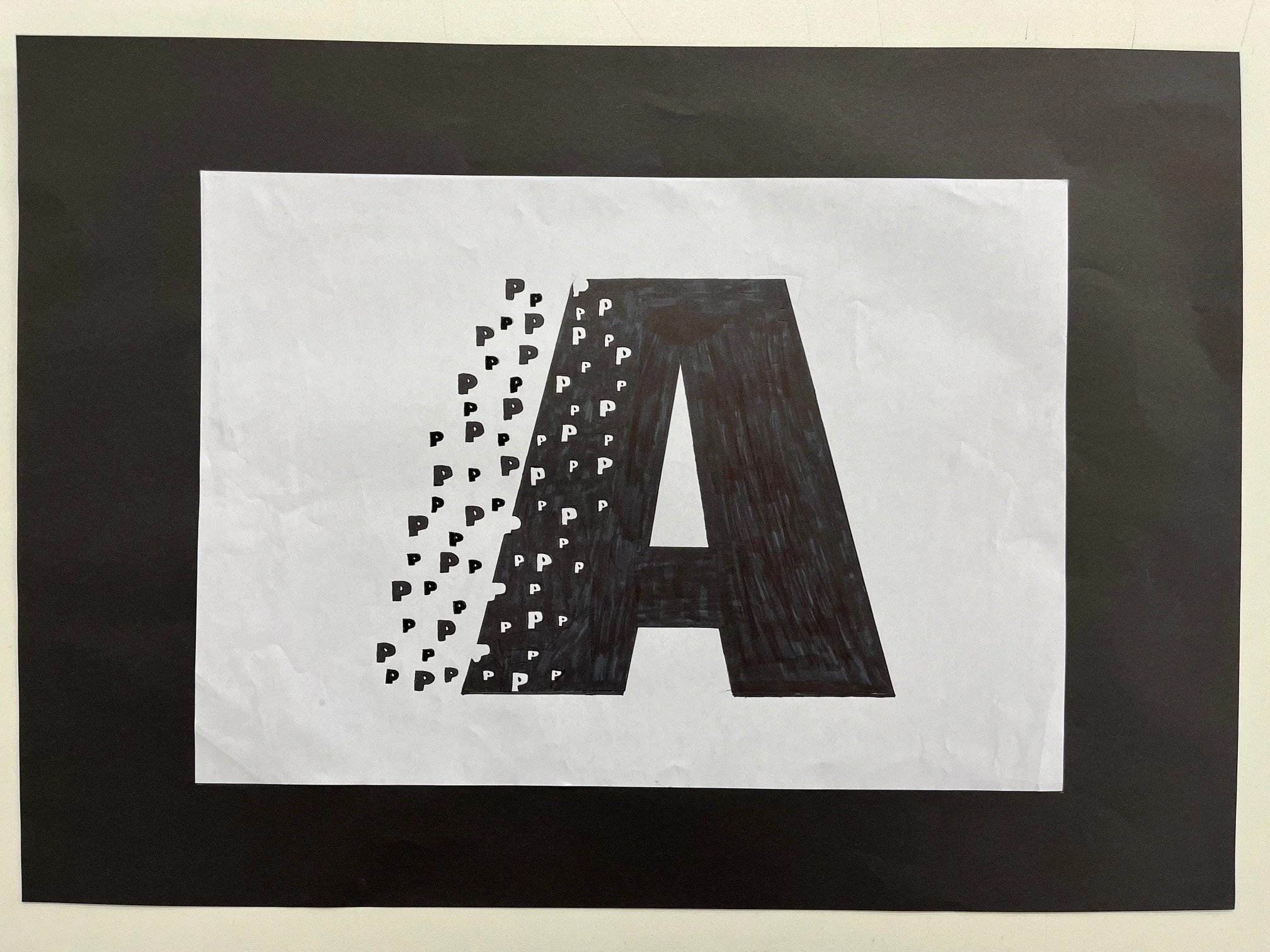
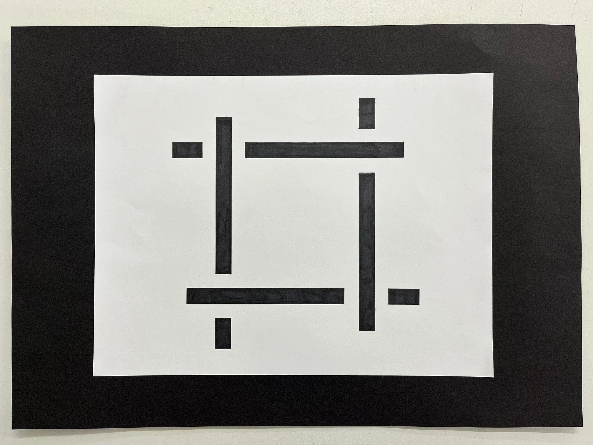
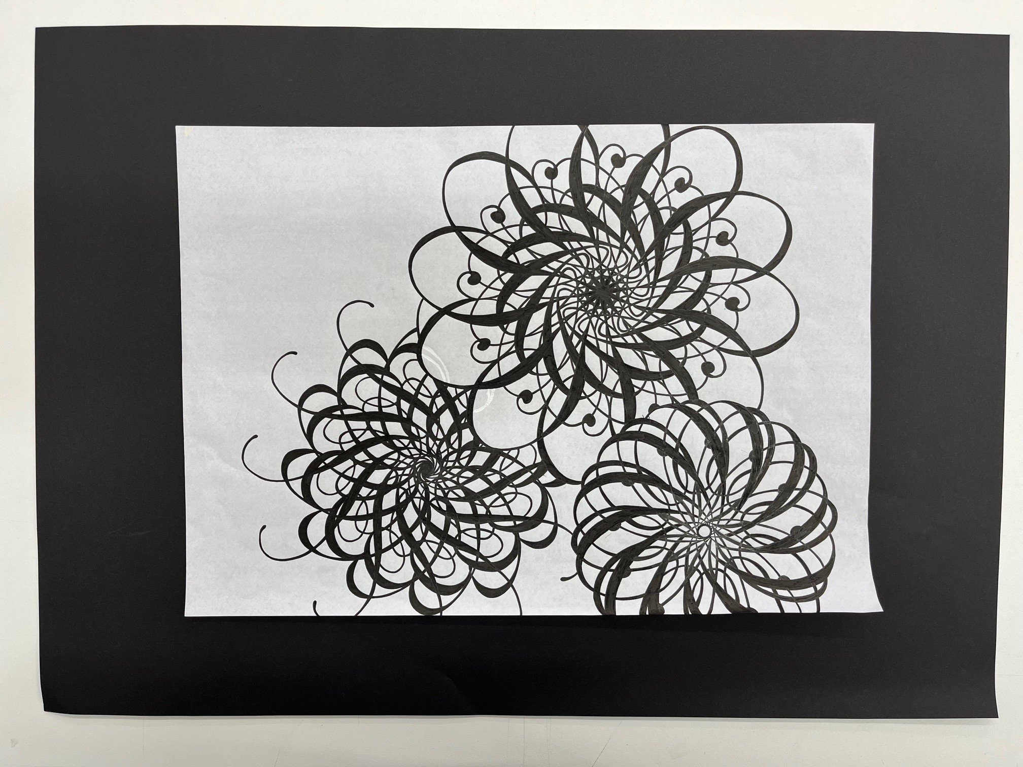
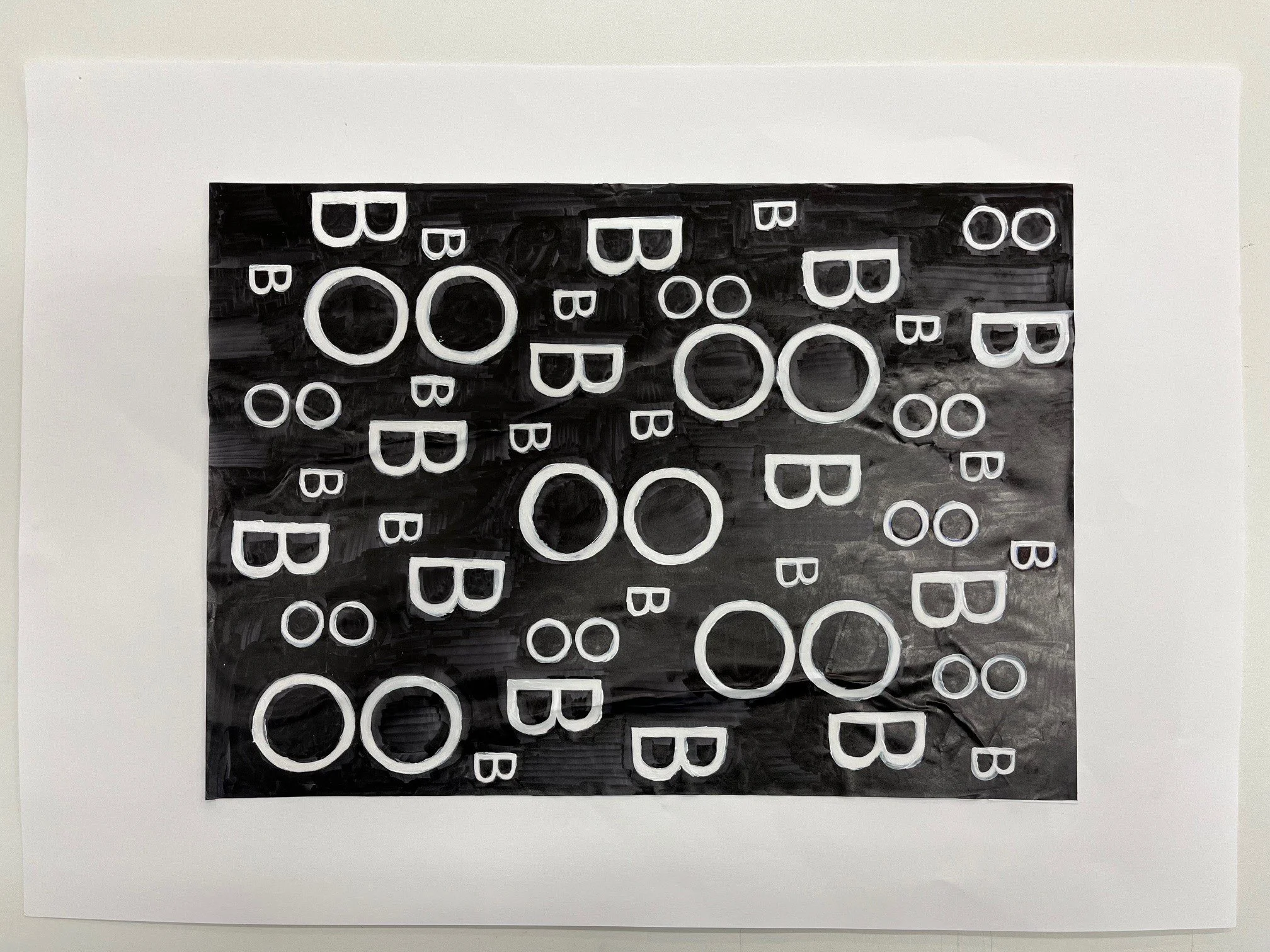
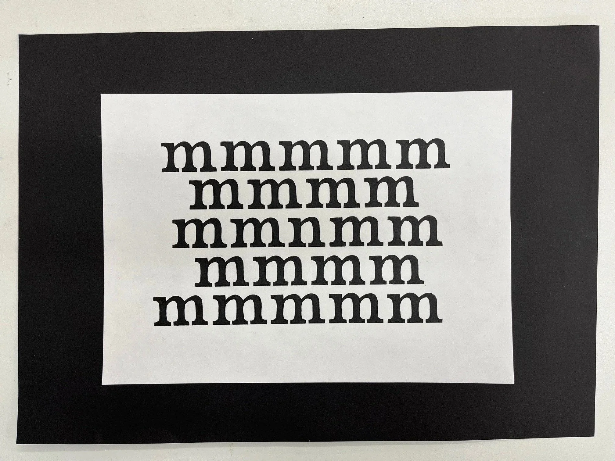
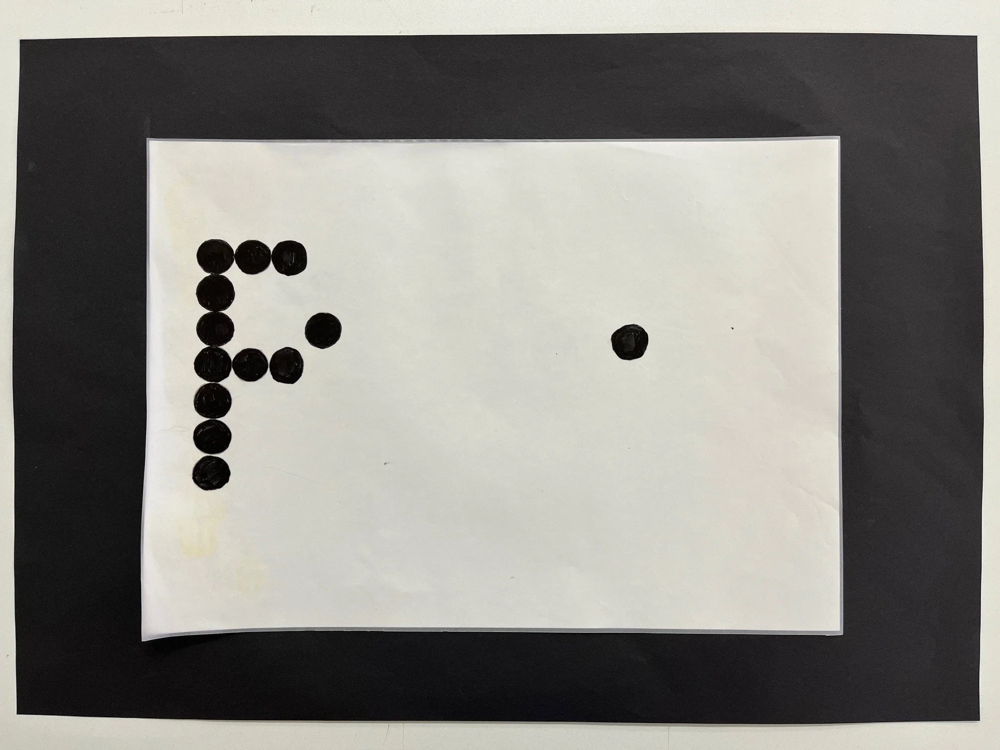
The first year graphic design students have recently completed their primer project in typography and the art of layout, simply known to Preston tutors and alumni as Type & Grids. The project is an opportunity for students to immerse themselves in the work of typographers and designers from the late 1800’s up to present day, and offers a starting point for the young designer to start to comprehend the craft and rigour that typography of the highest order demands.
It is a particularly pleasing project as the leaps in design ability can be registered throughout the timeline of the project and seen visually from the initial pencil sketches to initial layouts to finished artwork. Simply, the innate ability of the young designer could not produce the standard of work at the final crit on day one.
It is also a project of no shortcuts; the main component is time, time taken to understand, collate, design, redesign, redesign, edit and amend.
A final highlight to the project was the introduction to the banner printer and updated presentation format.
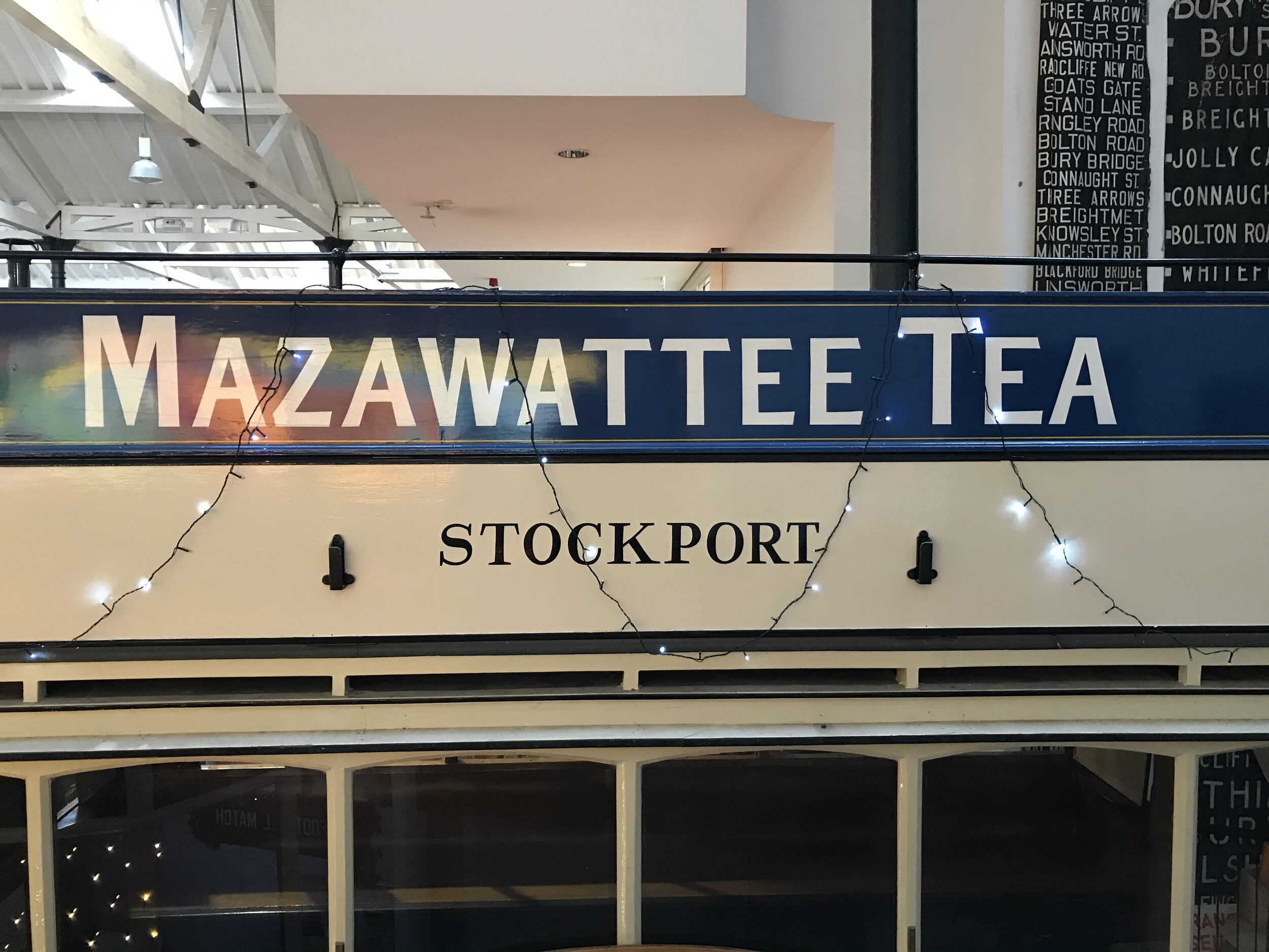
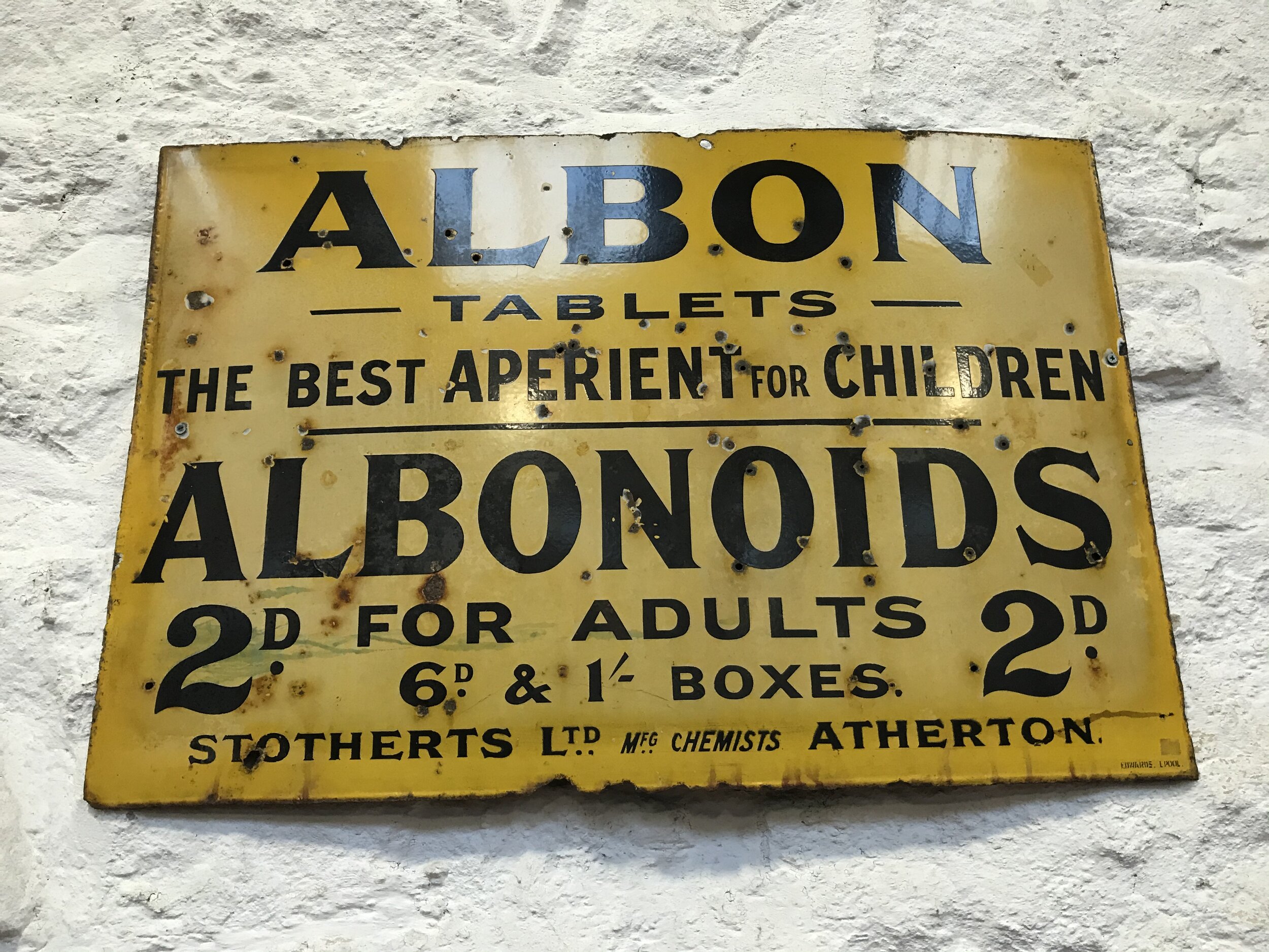
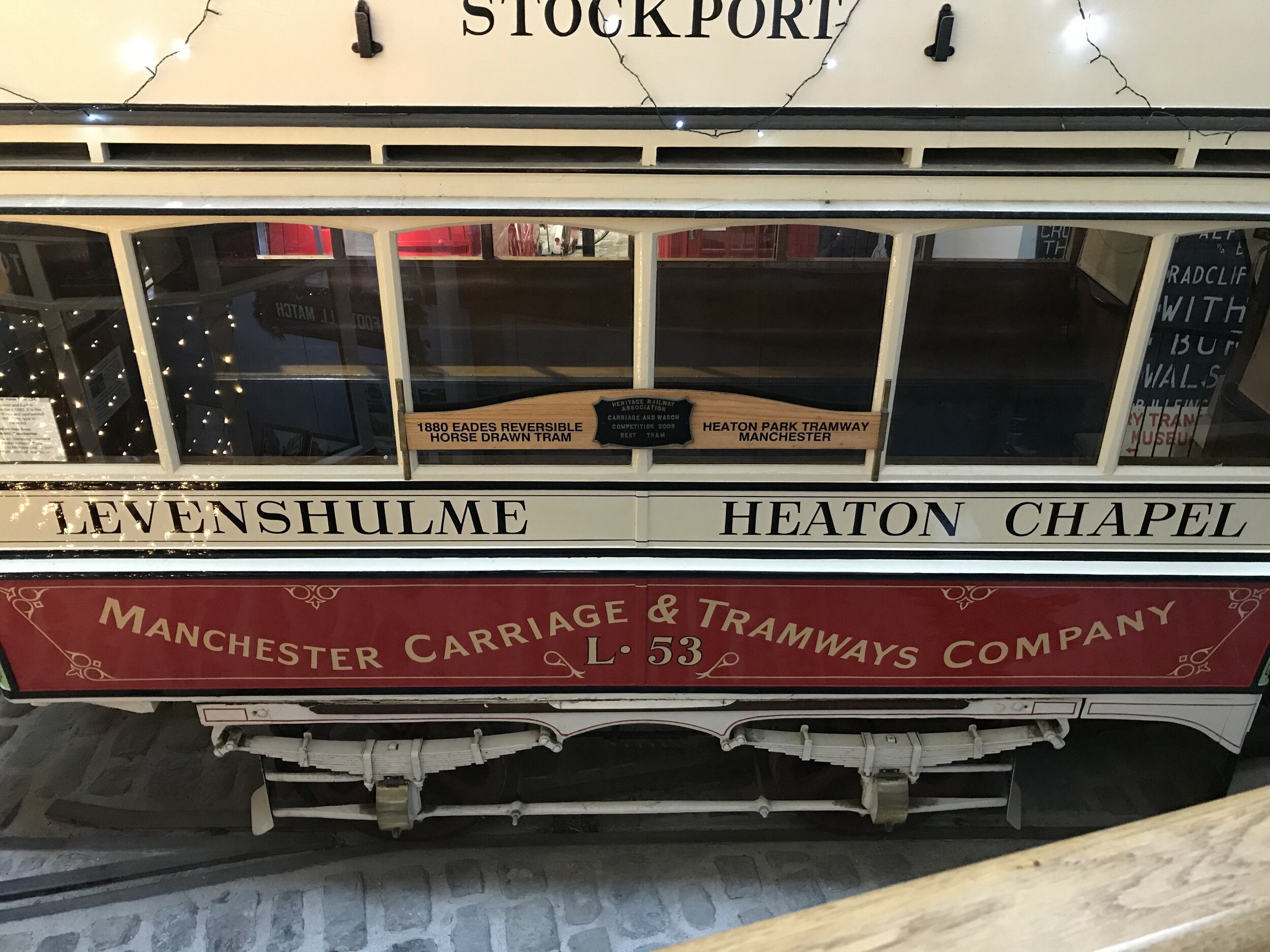
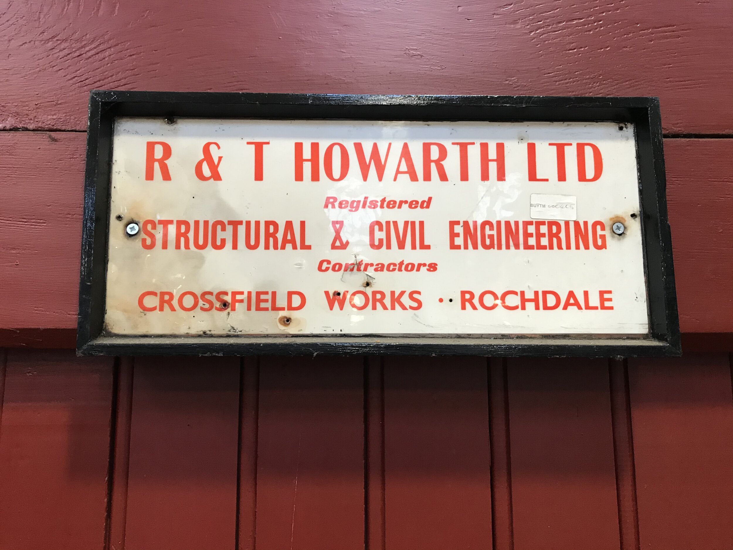
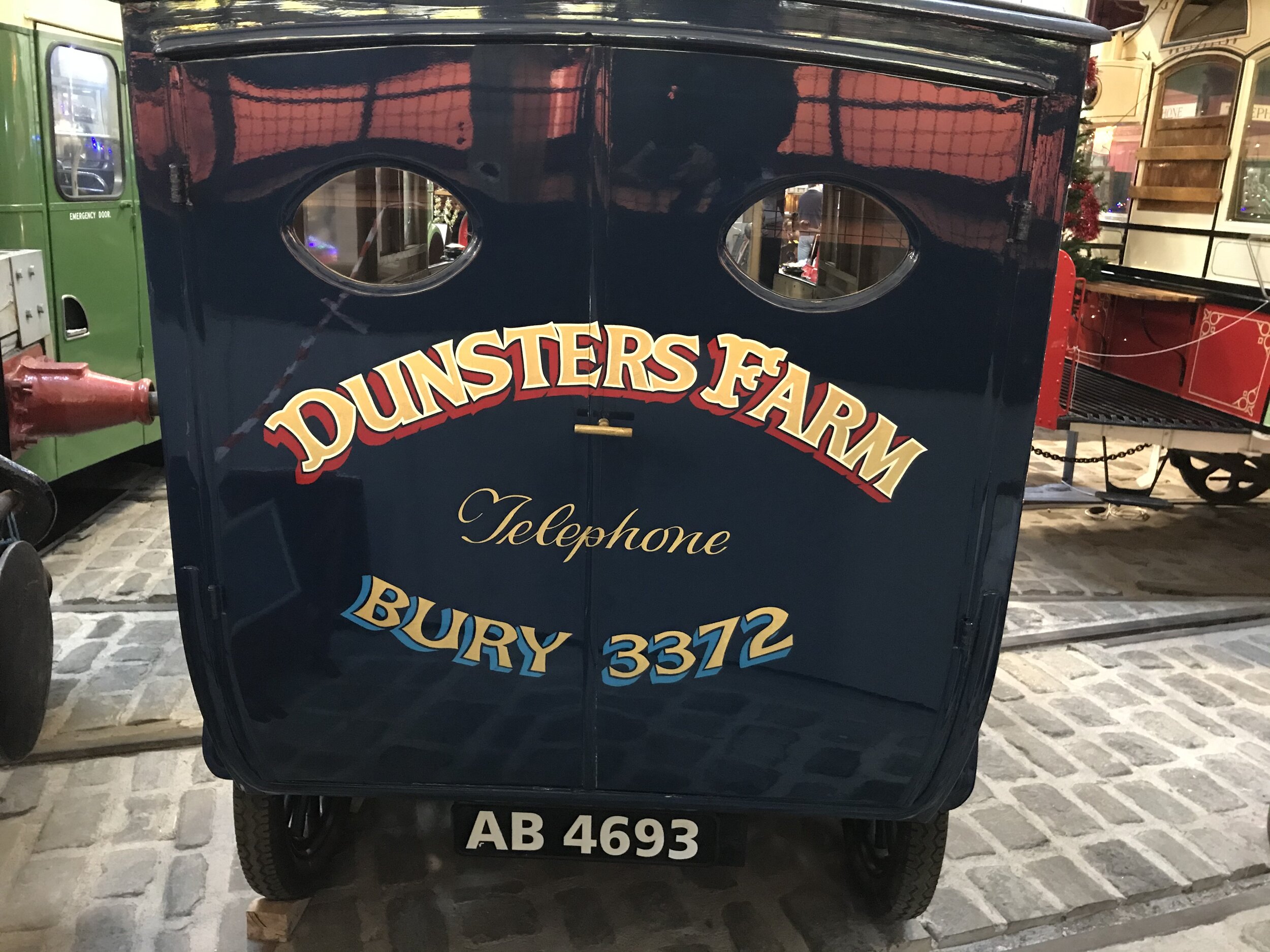
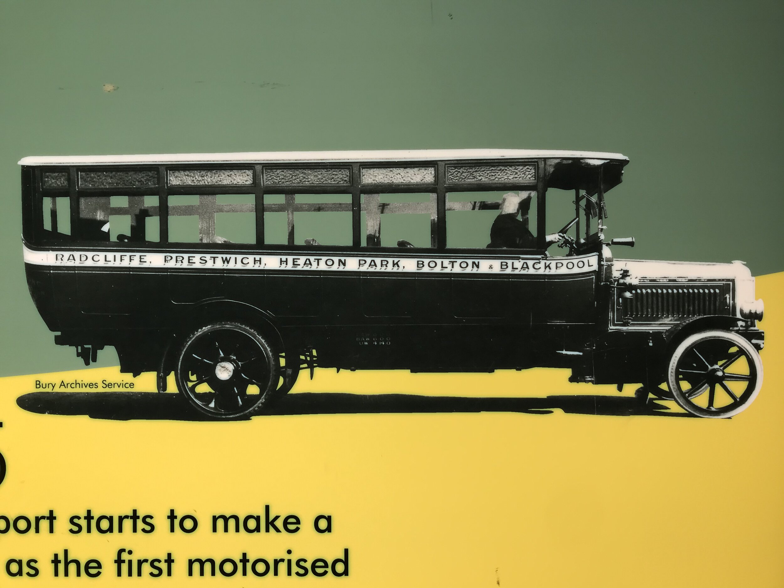
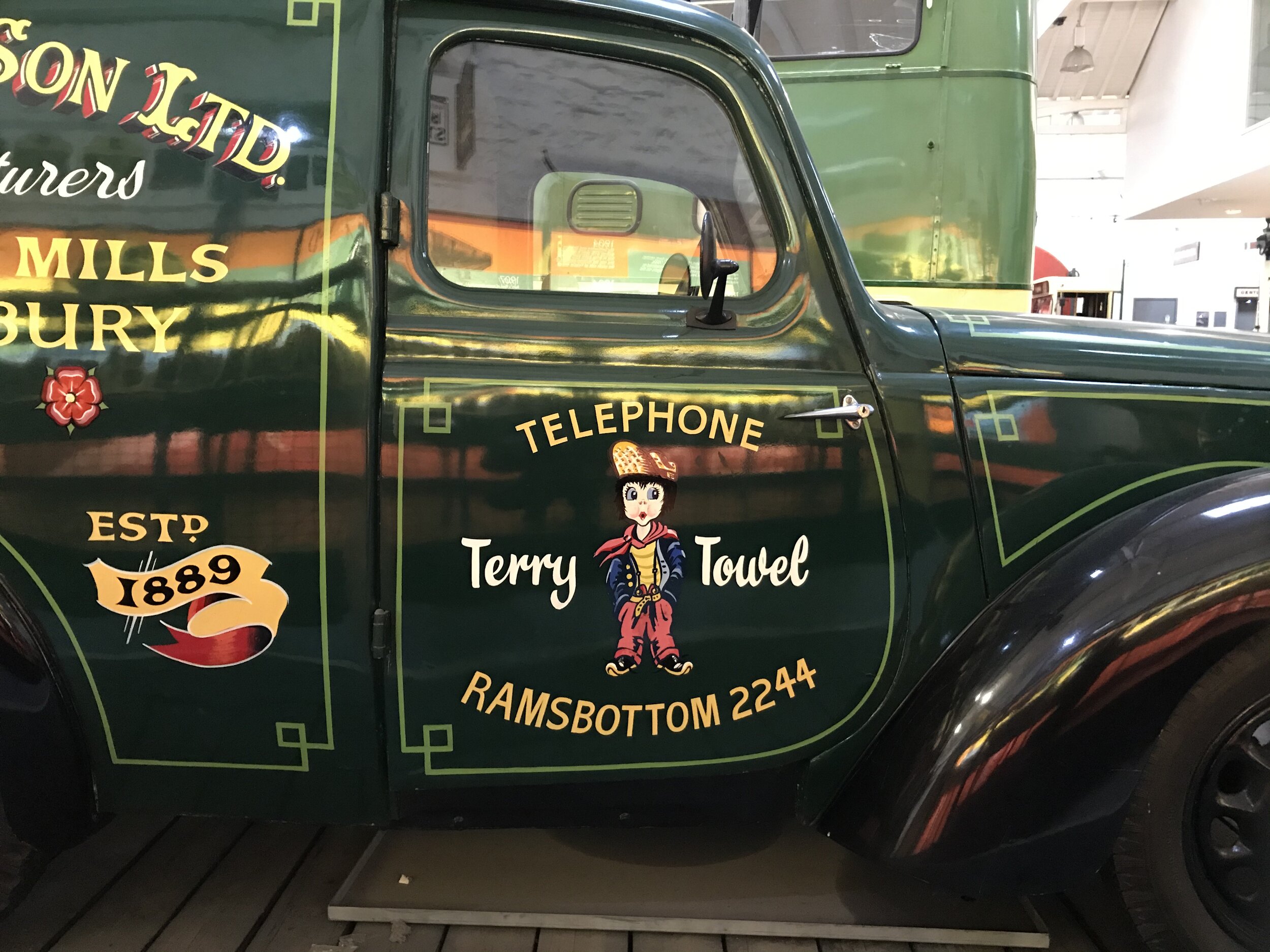
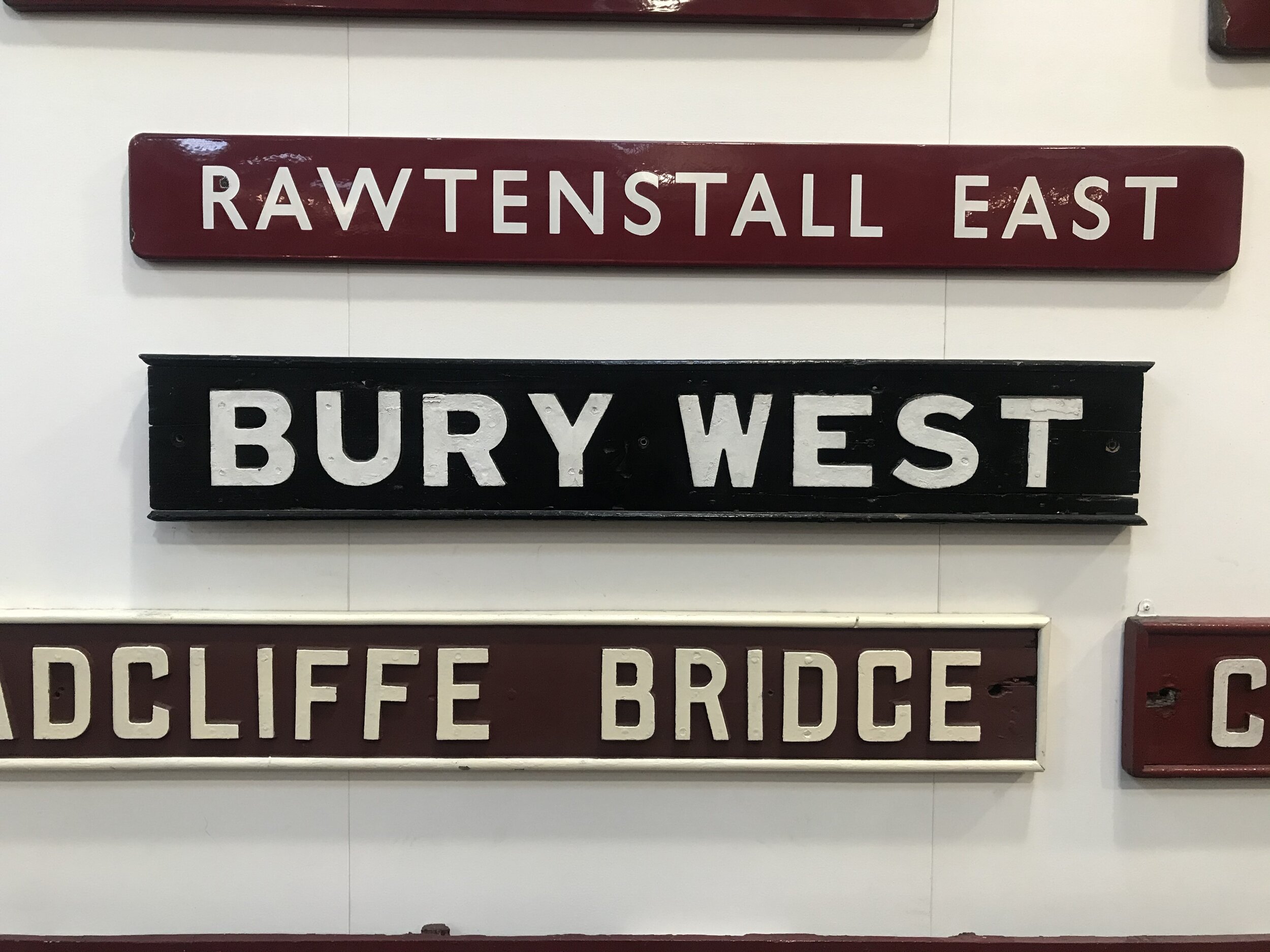
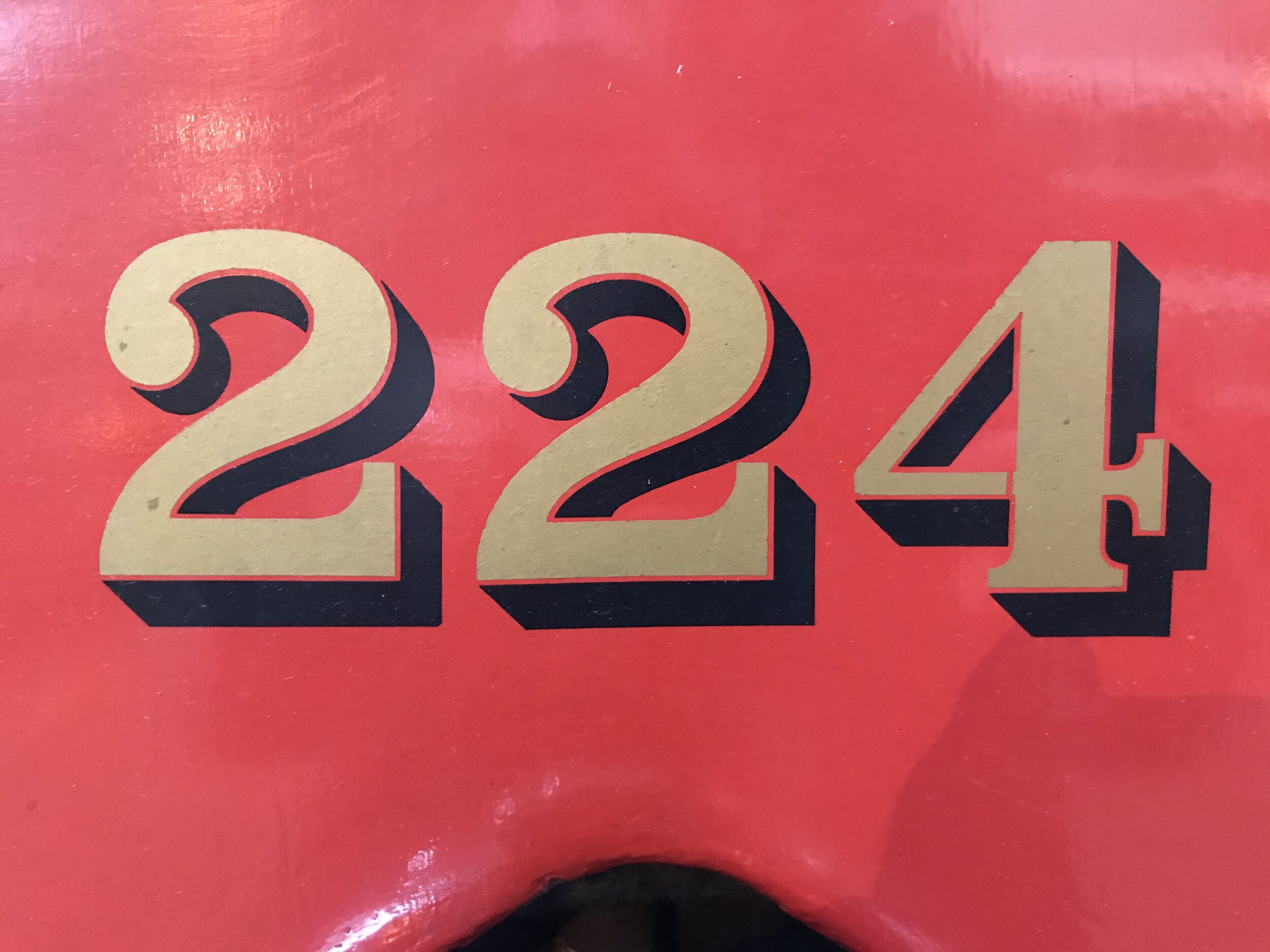
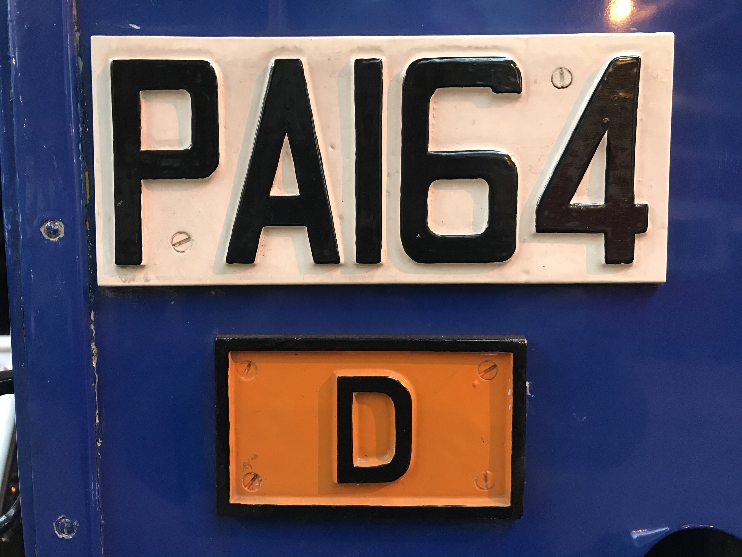
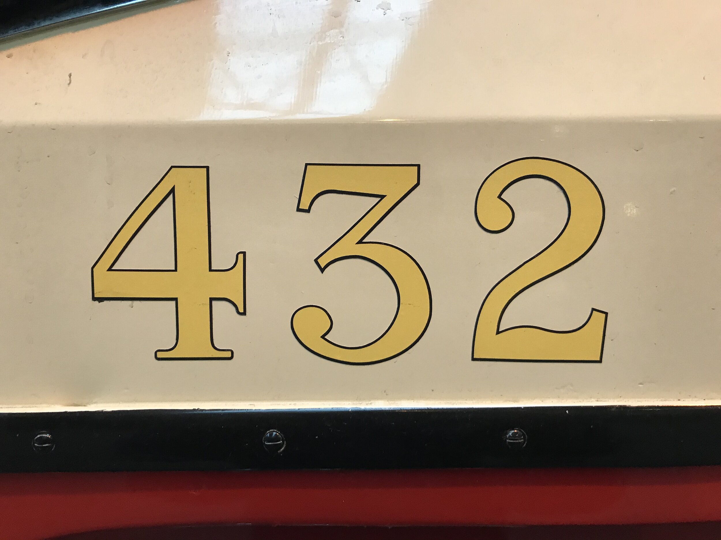
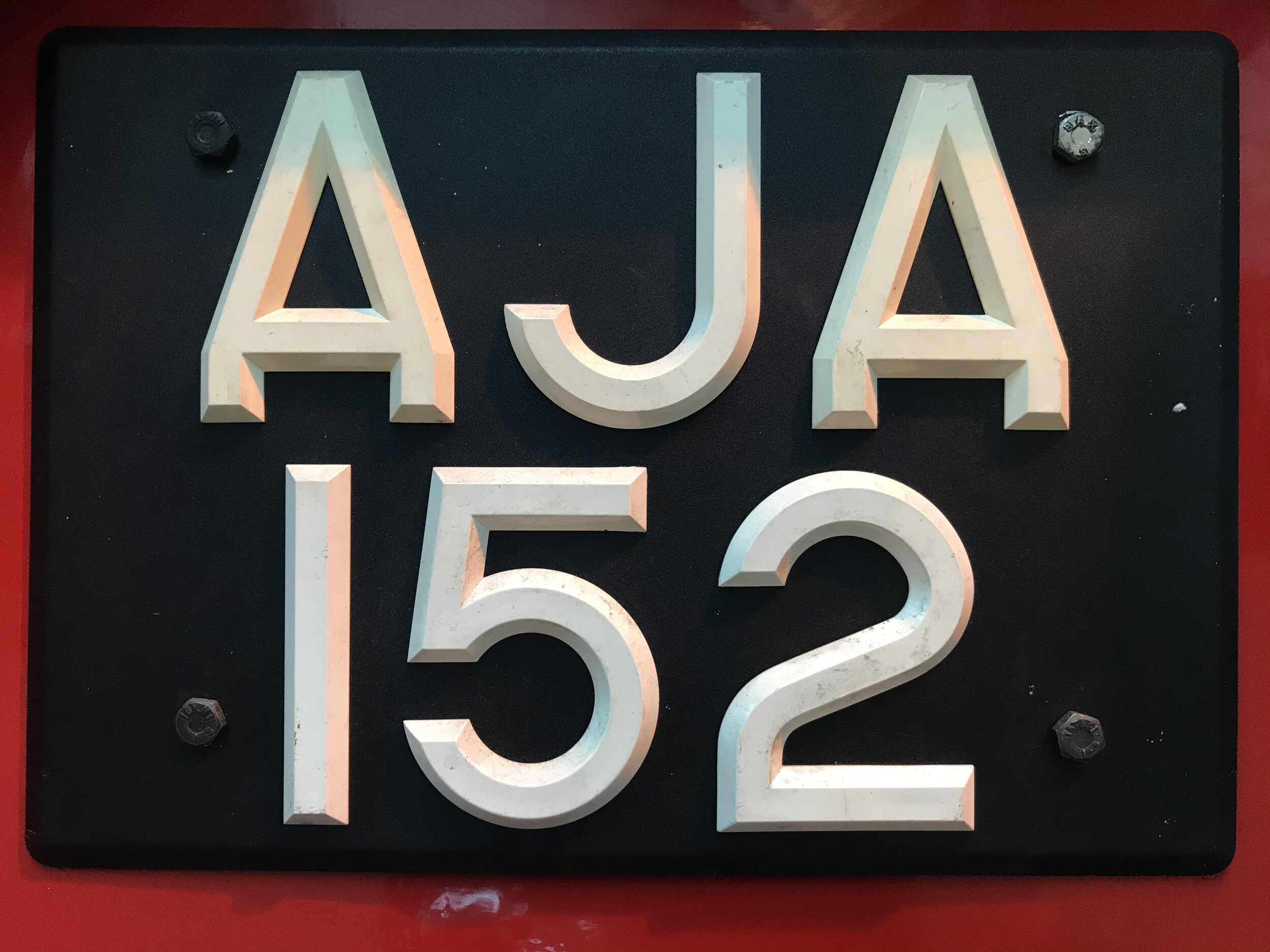
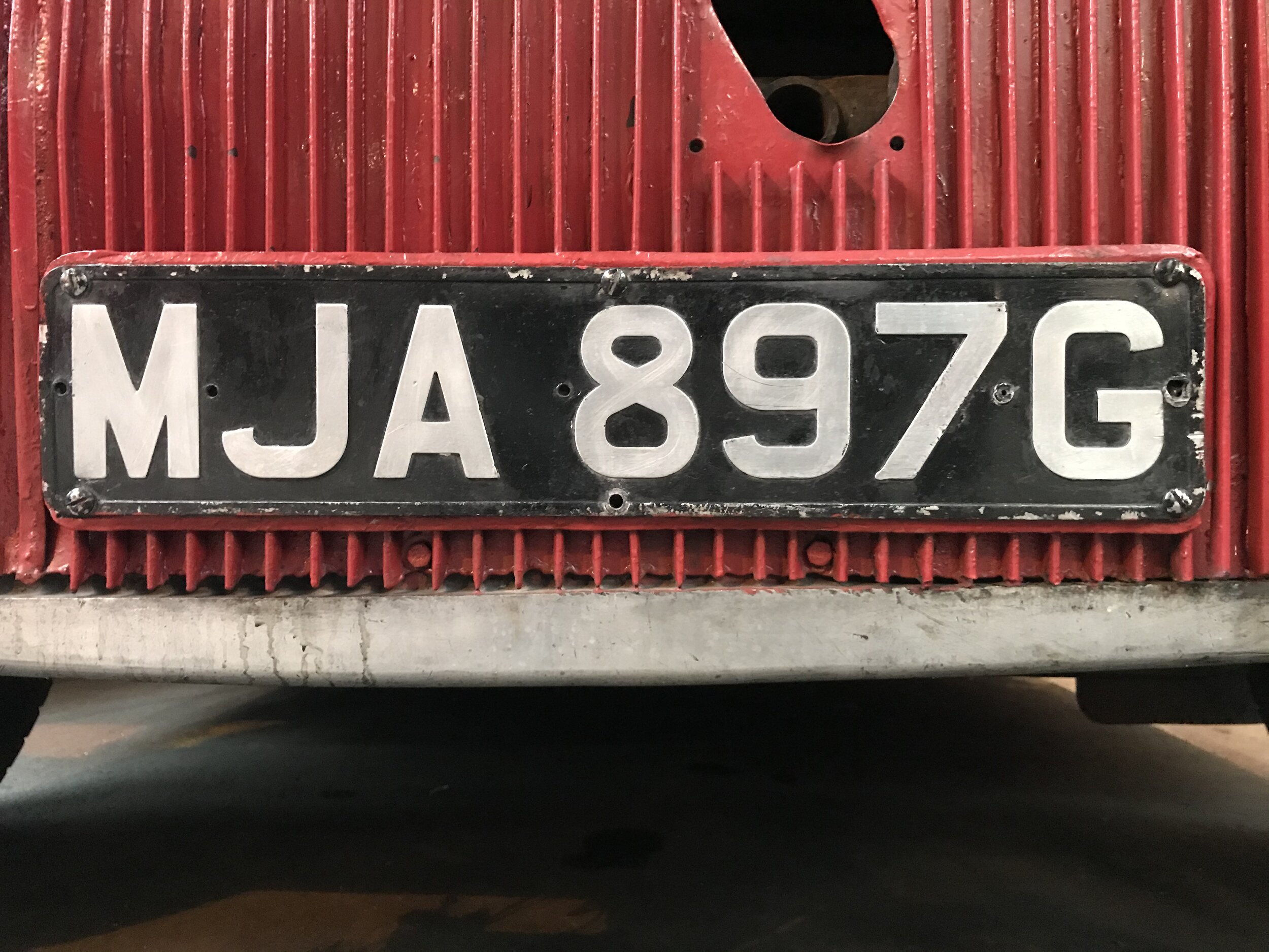
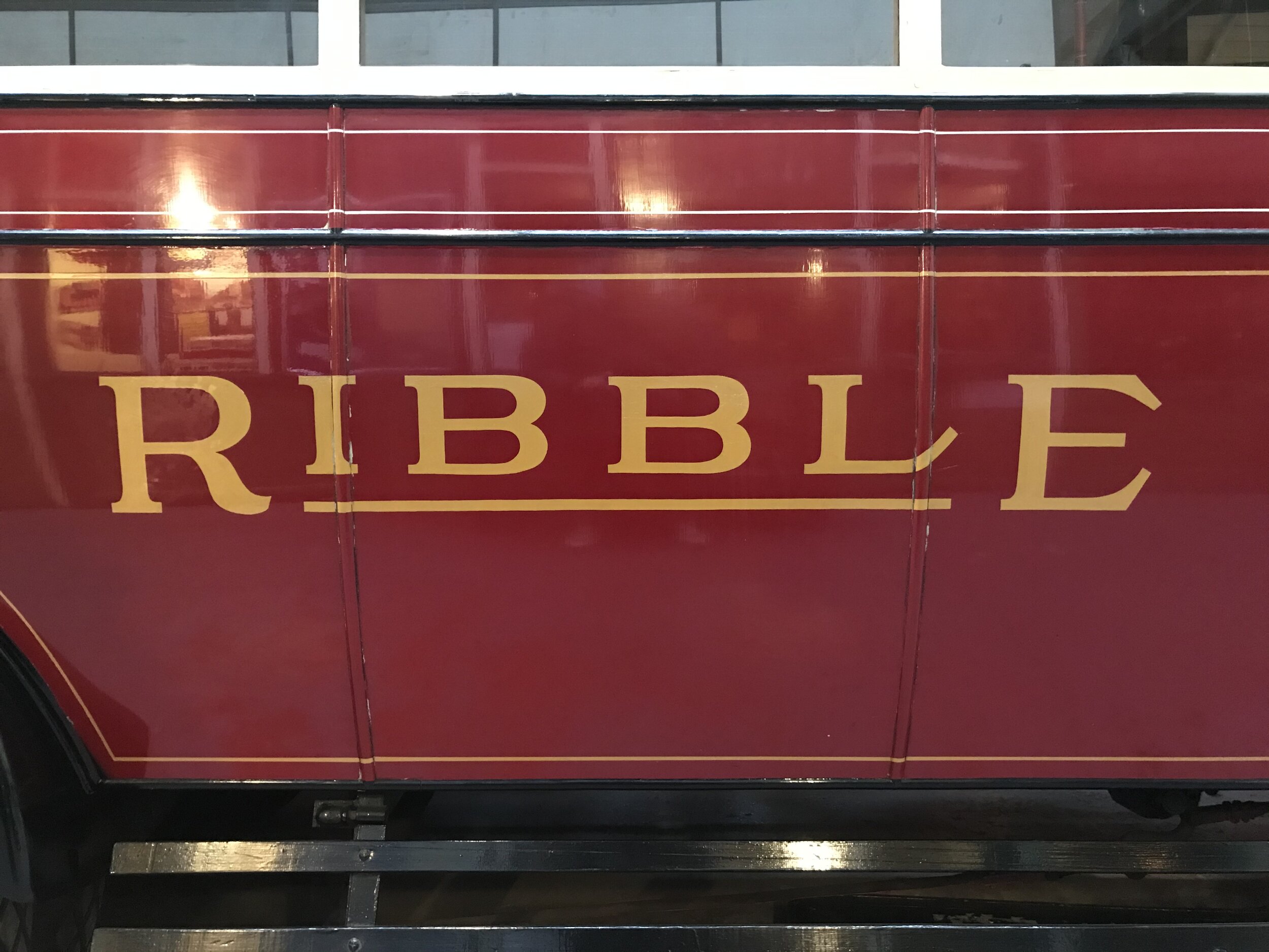
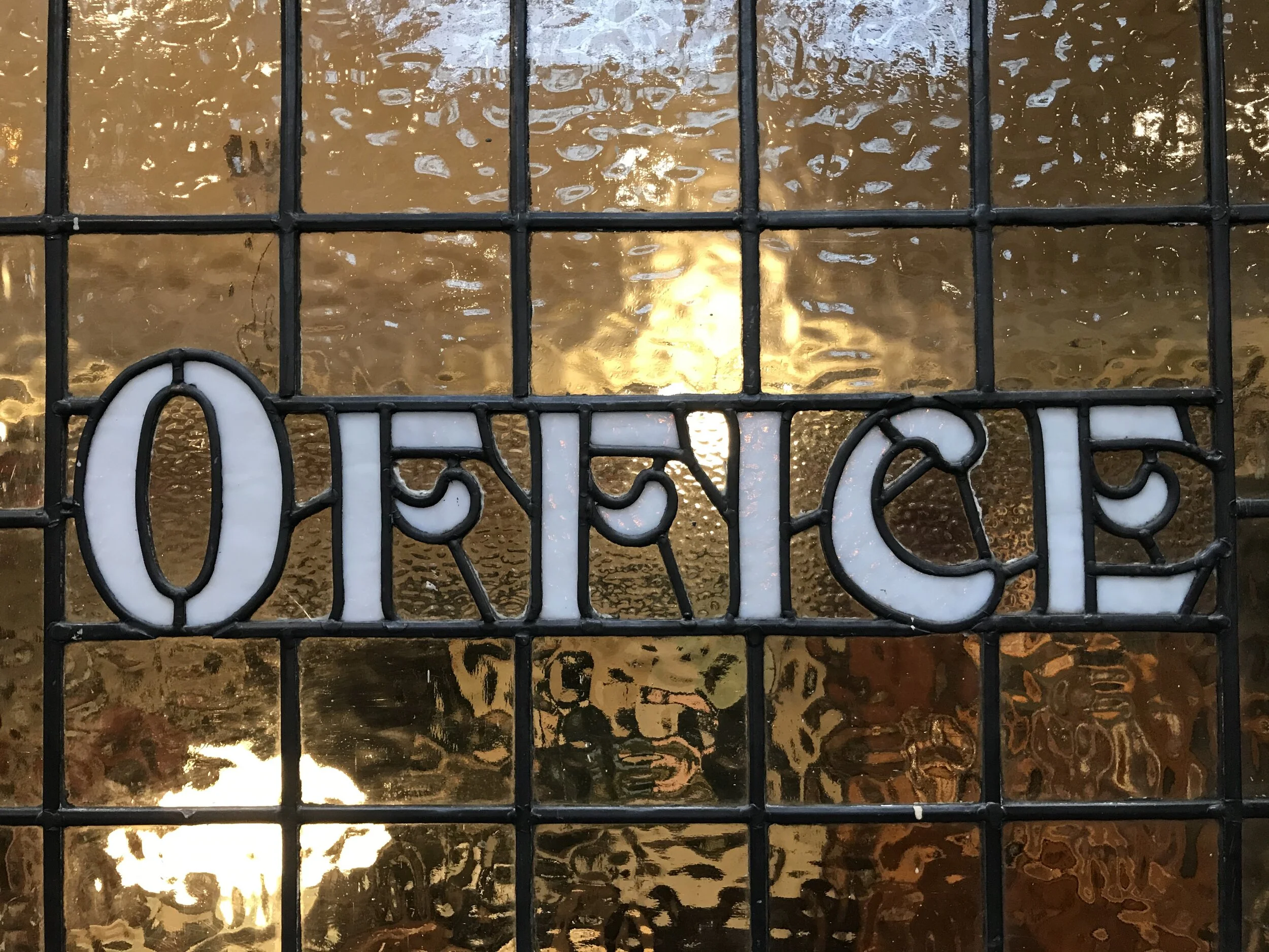
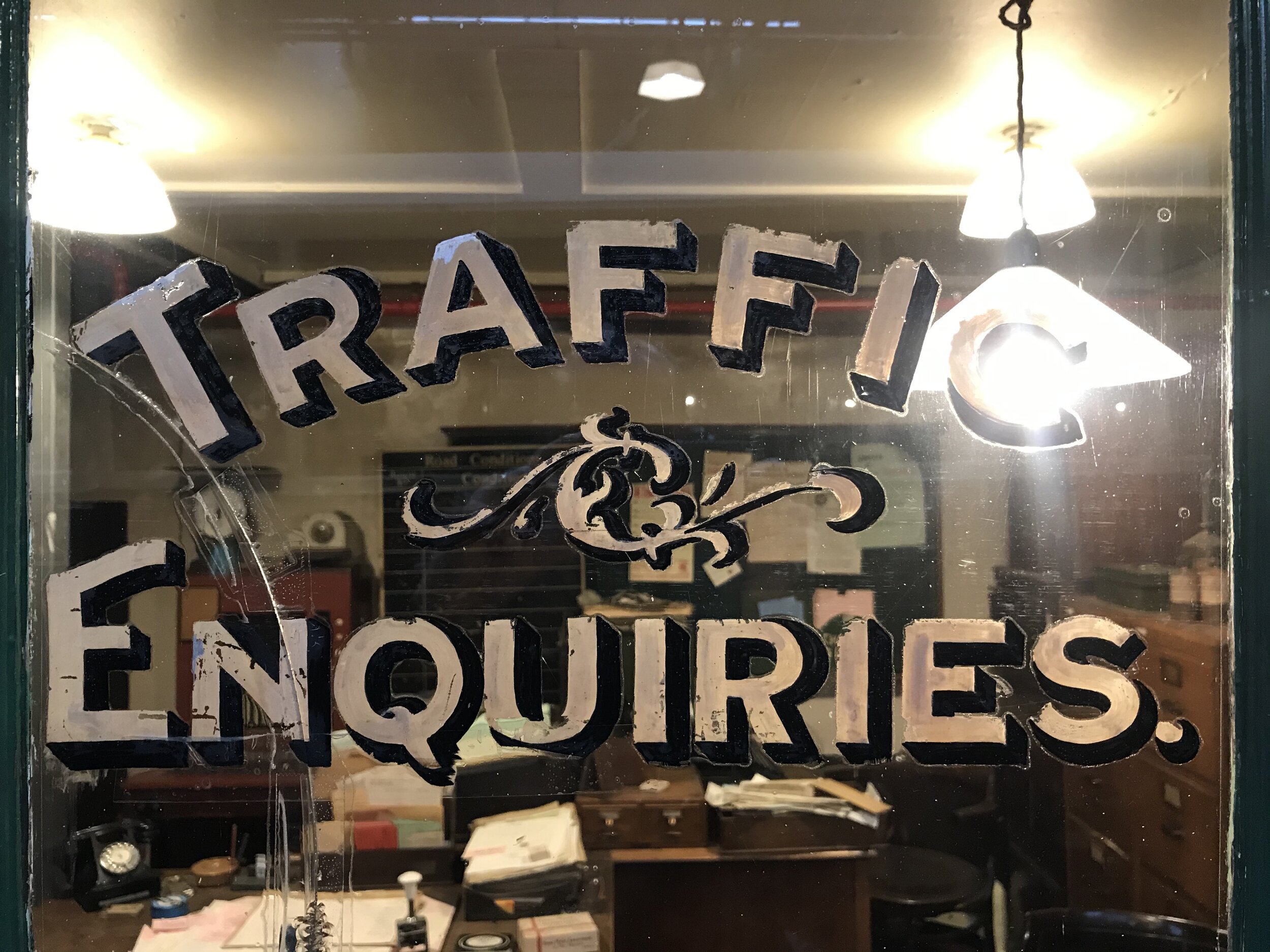
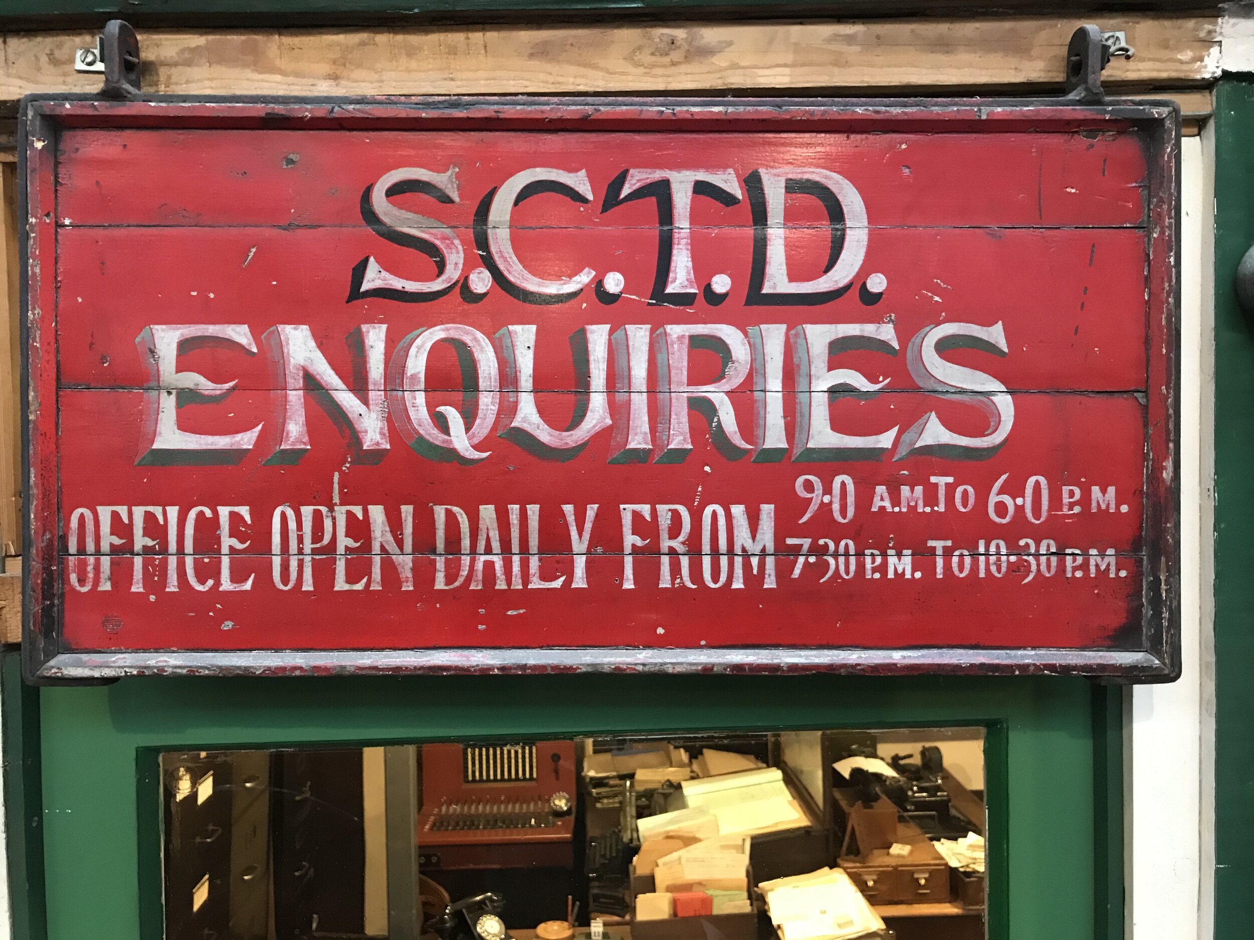
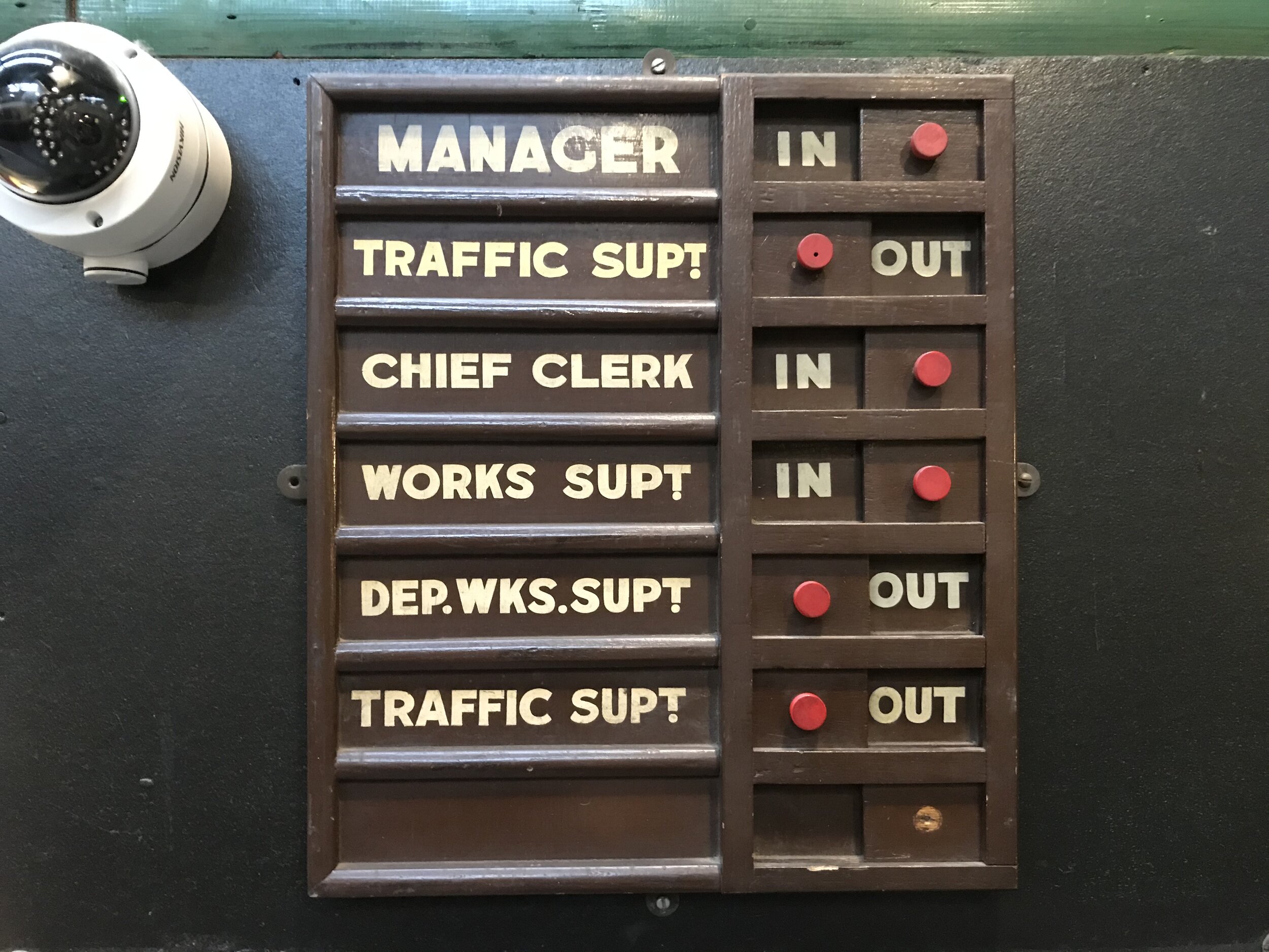
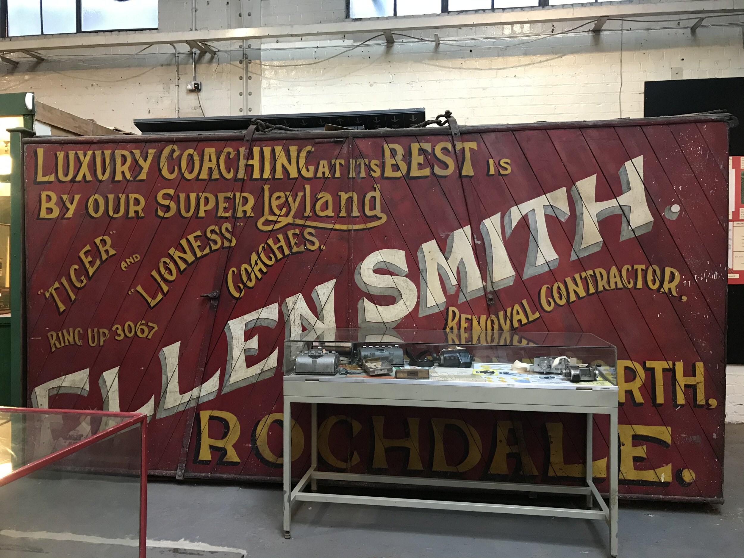
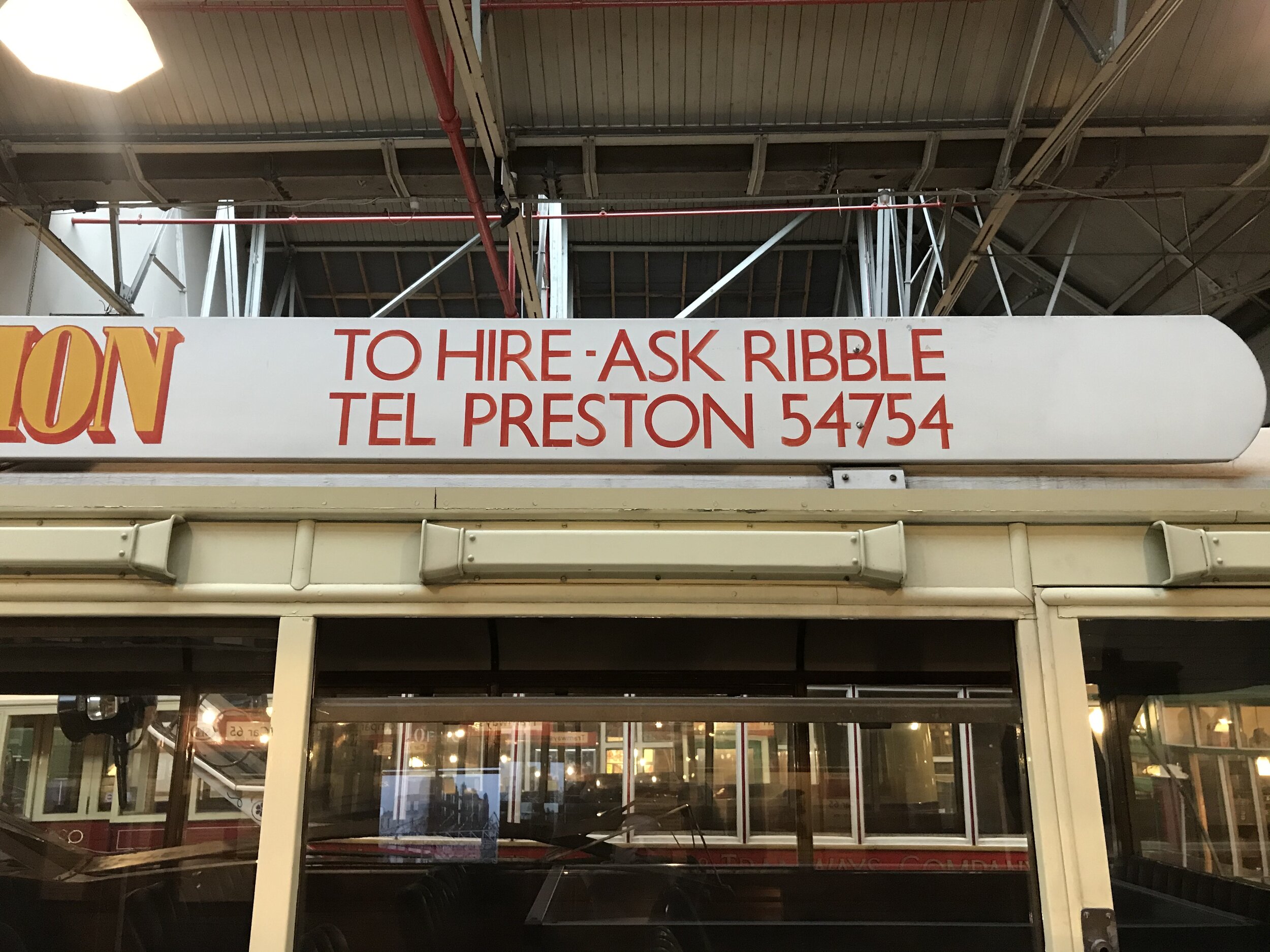
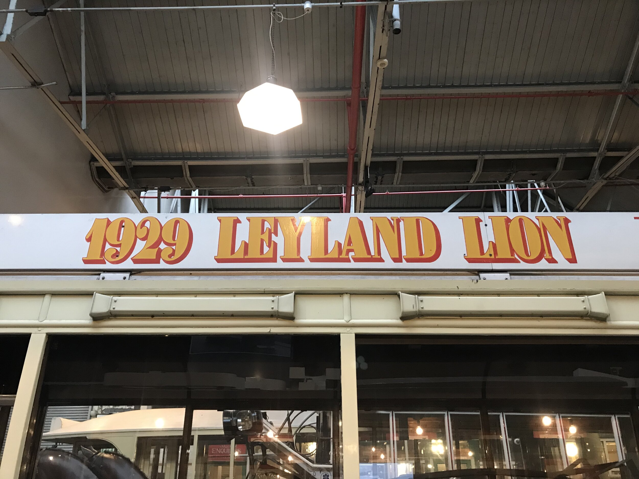
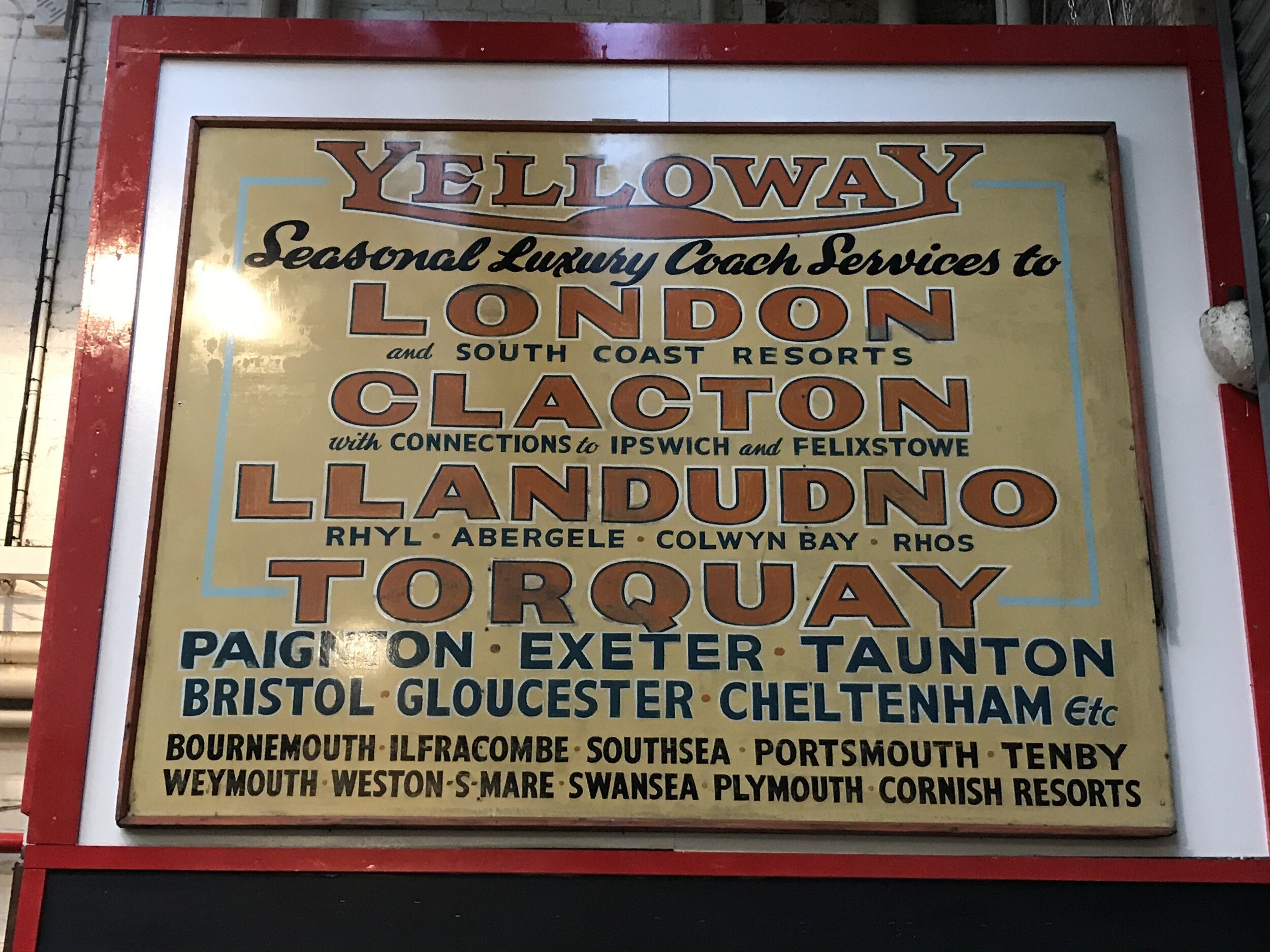
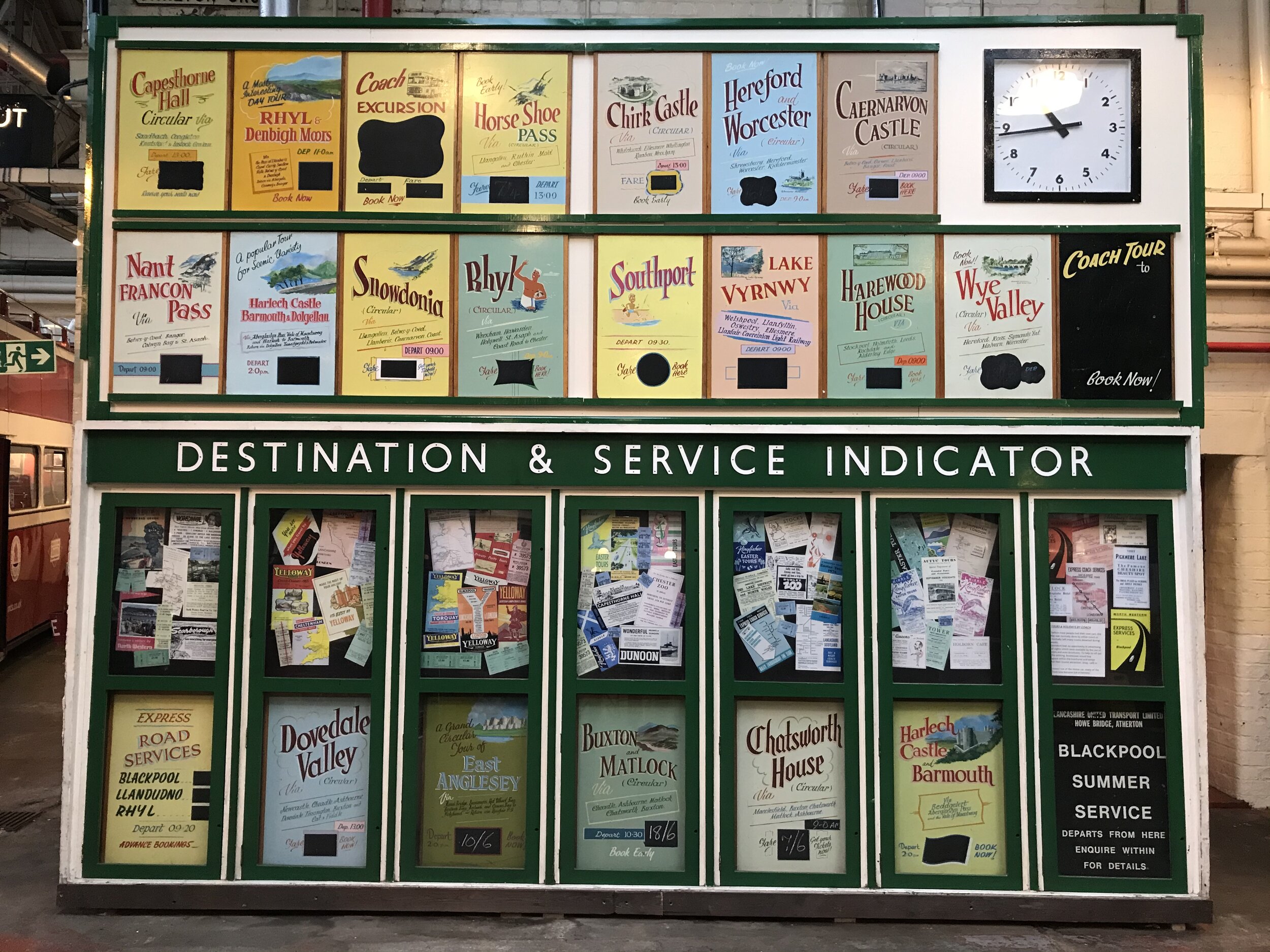
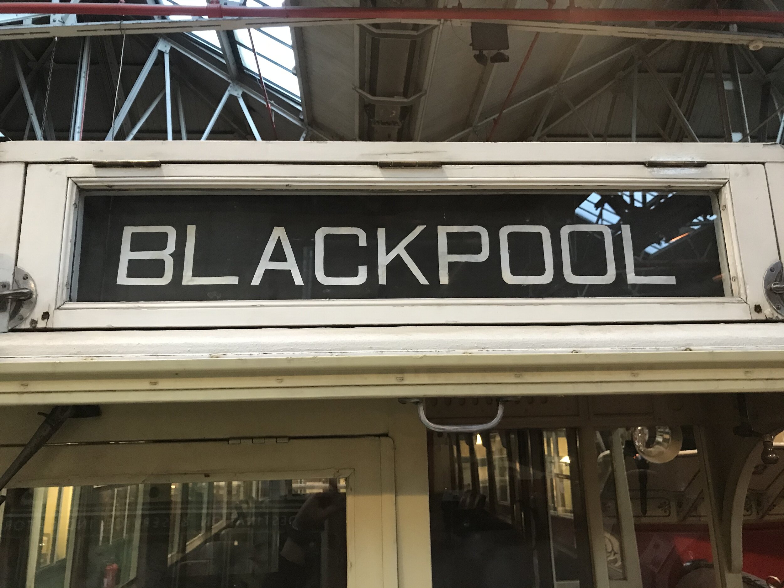
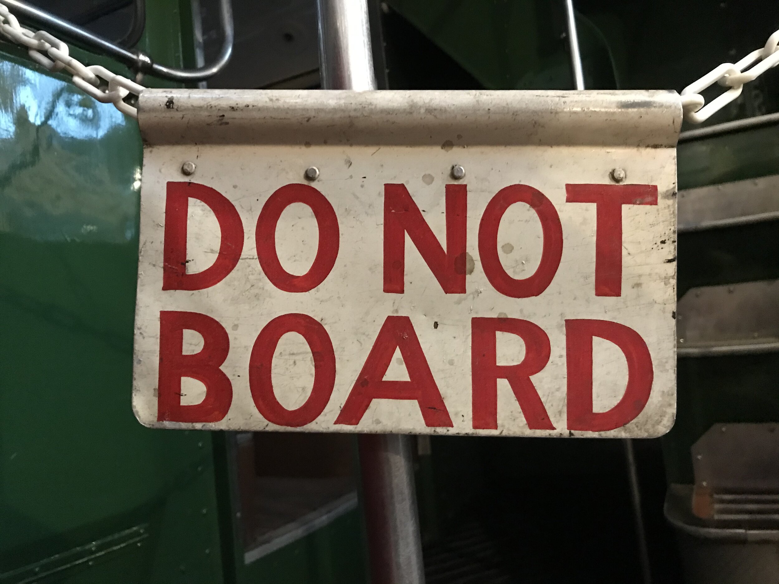
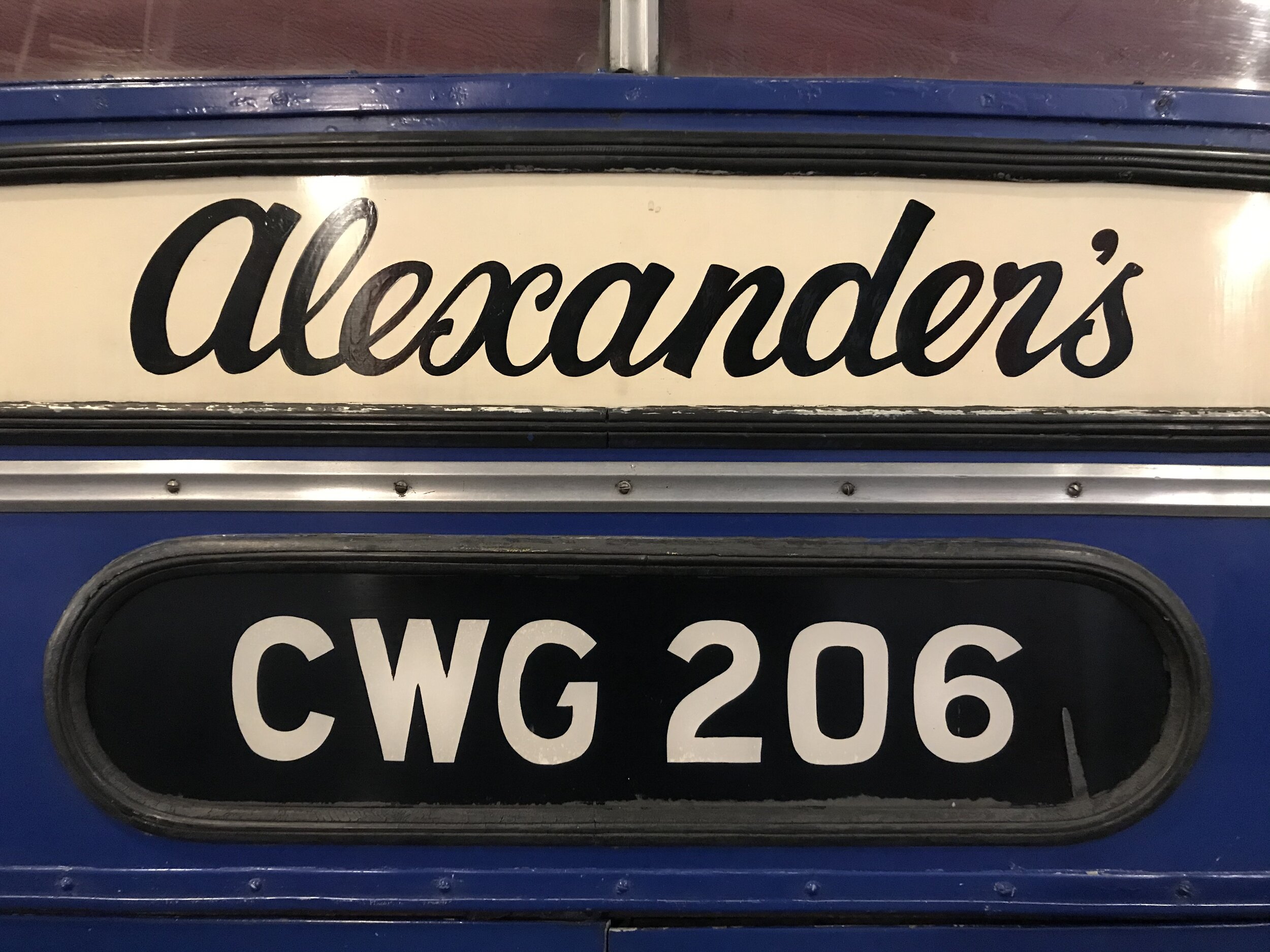
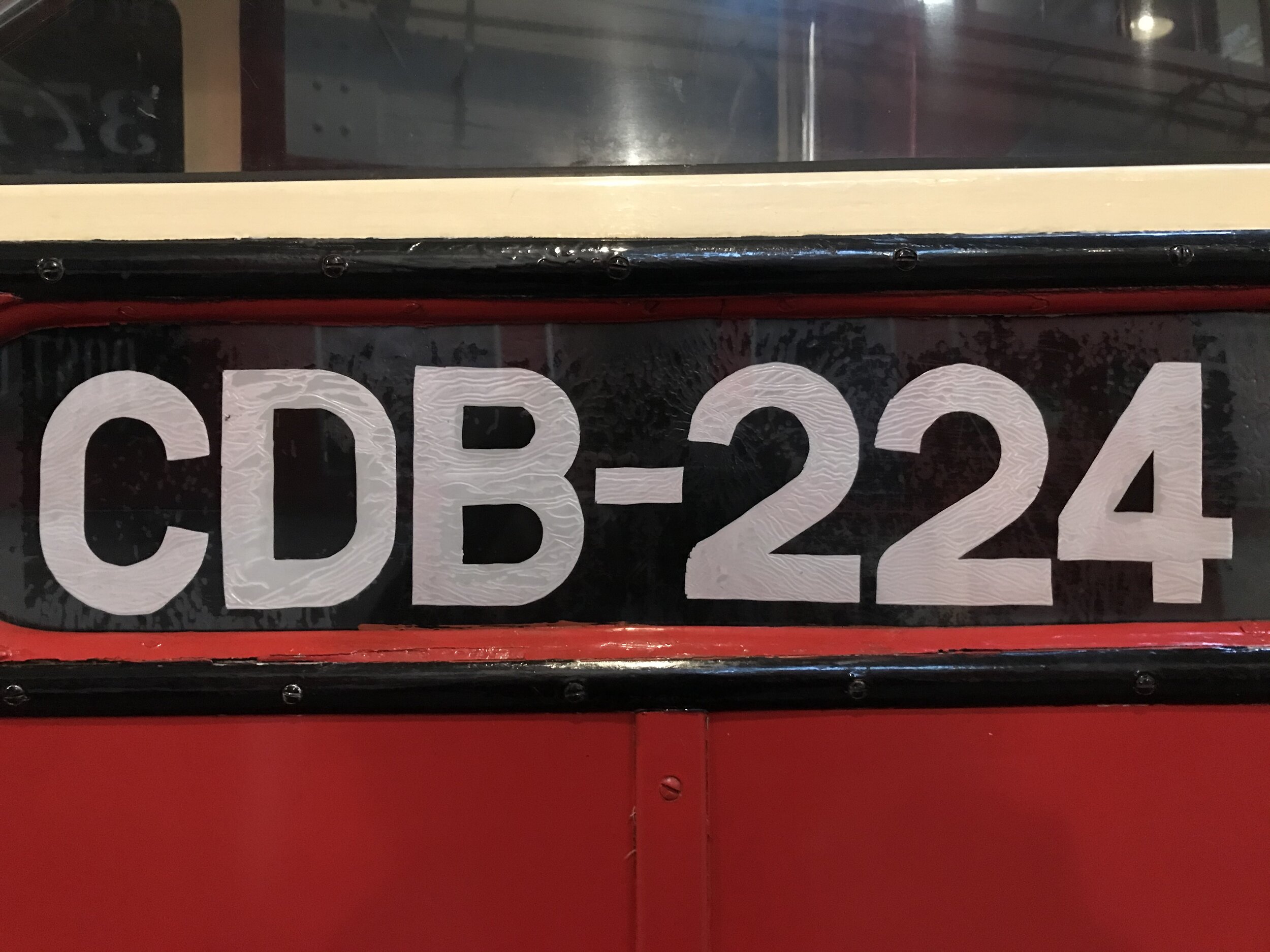
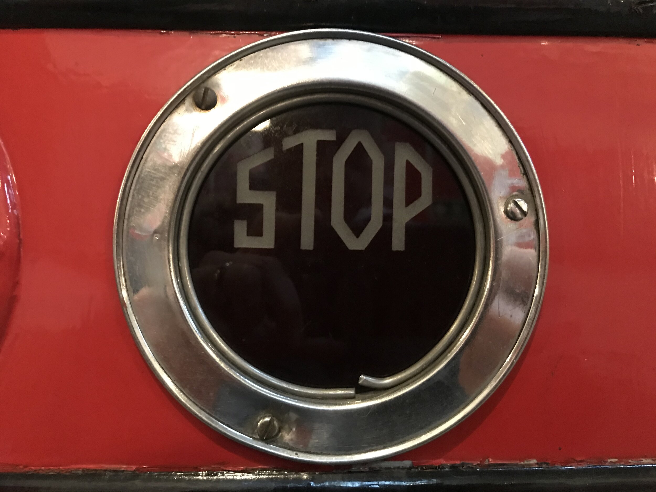
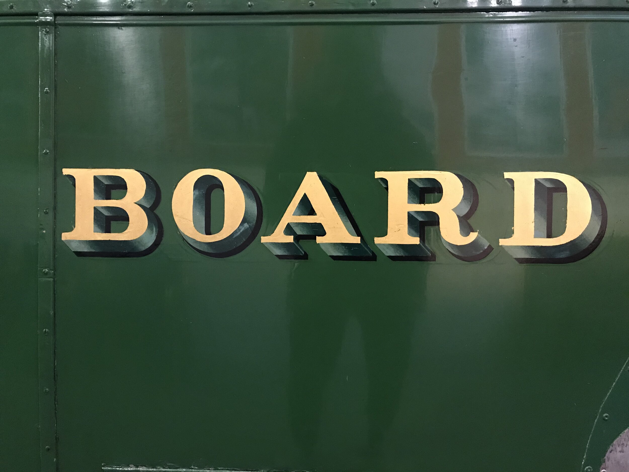
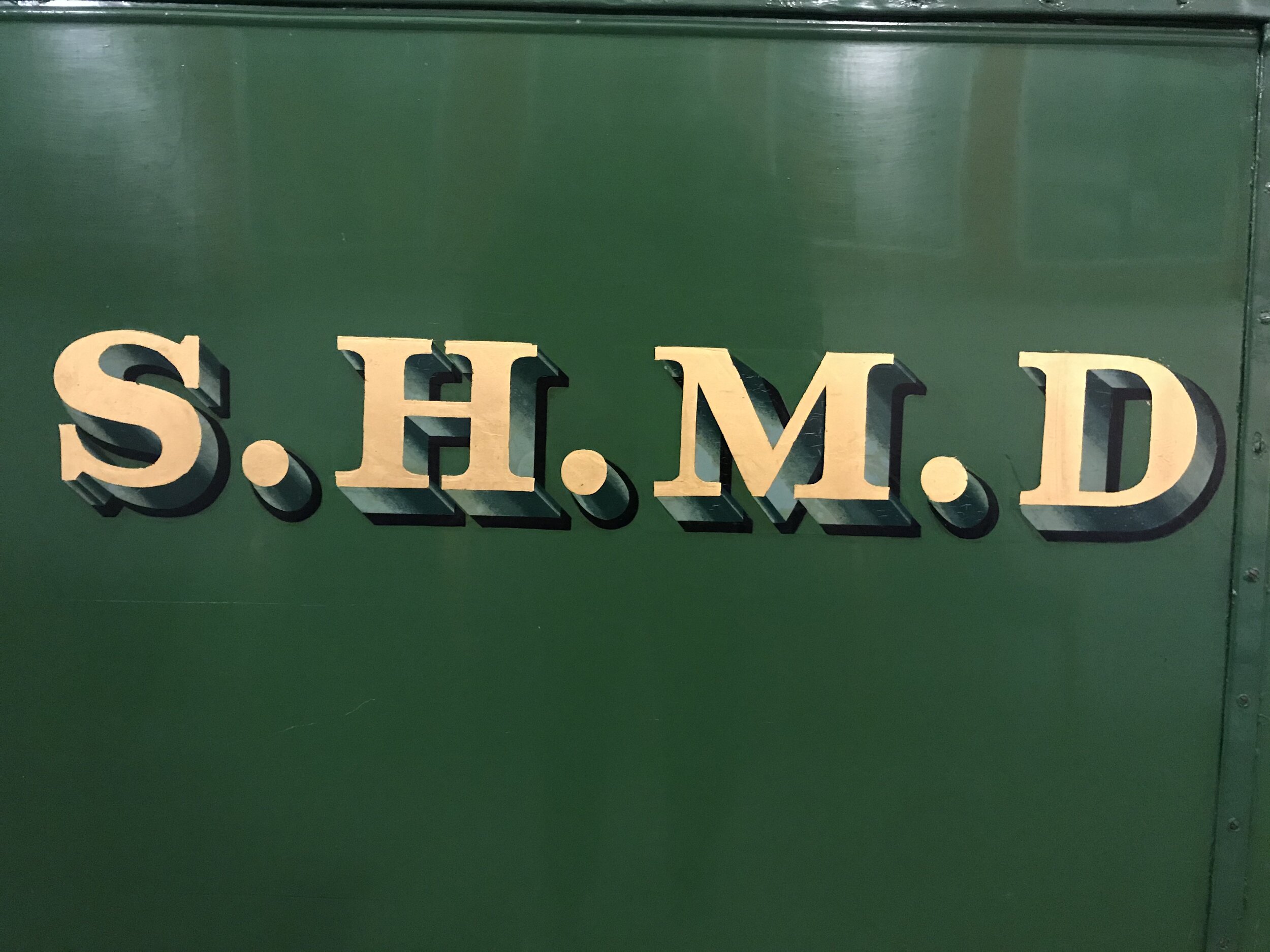
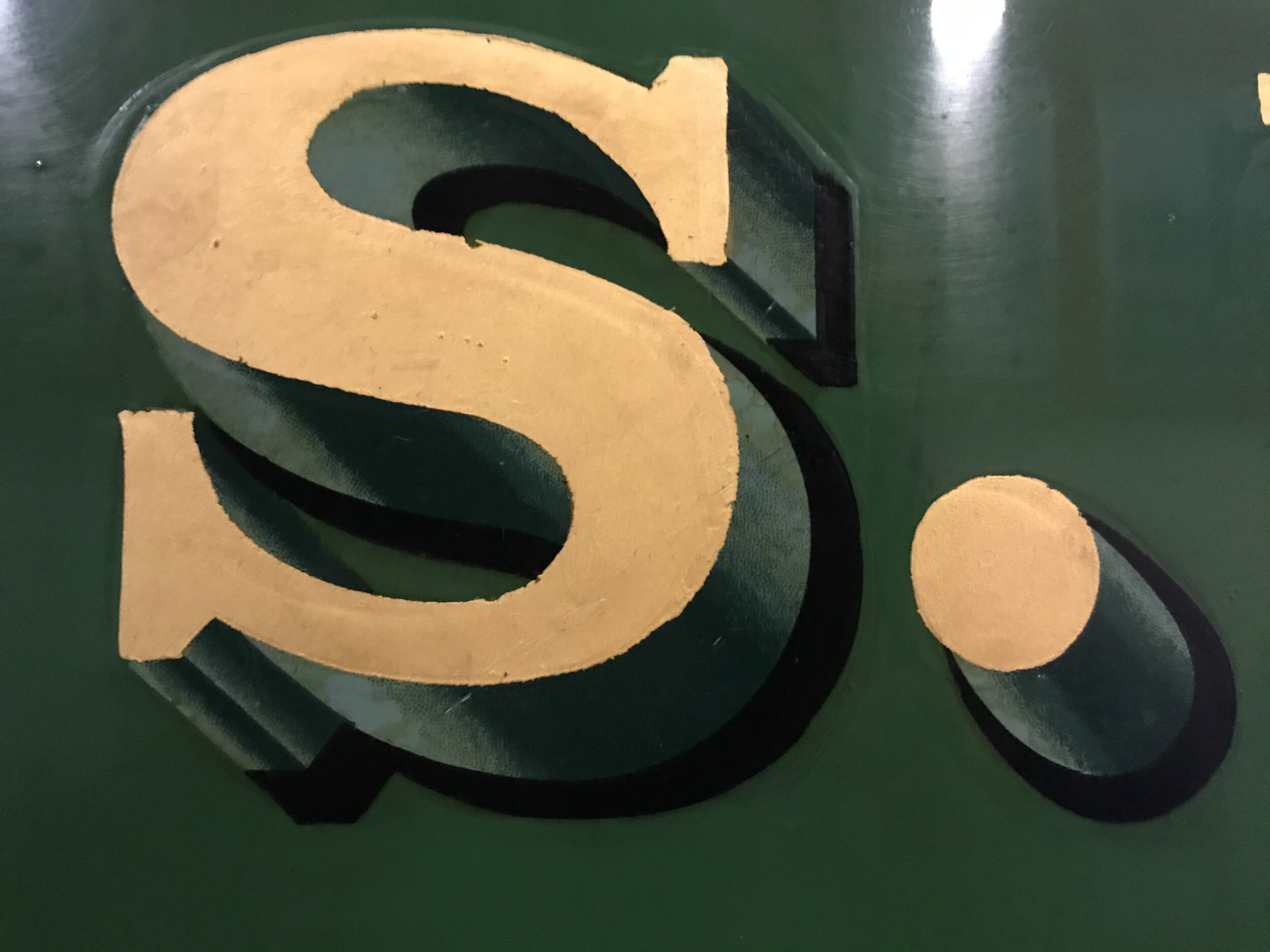
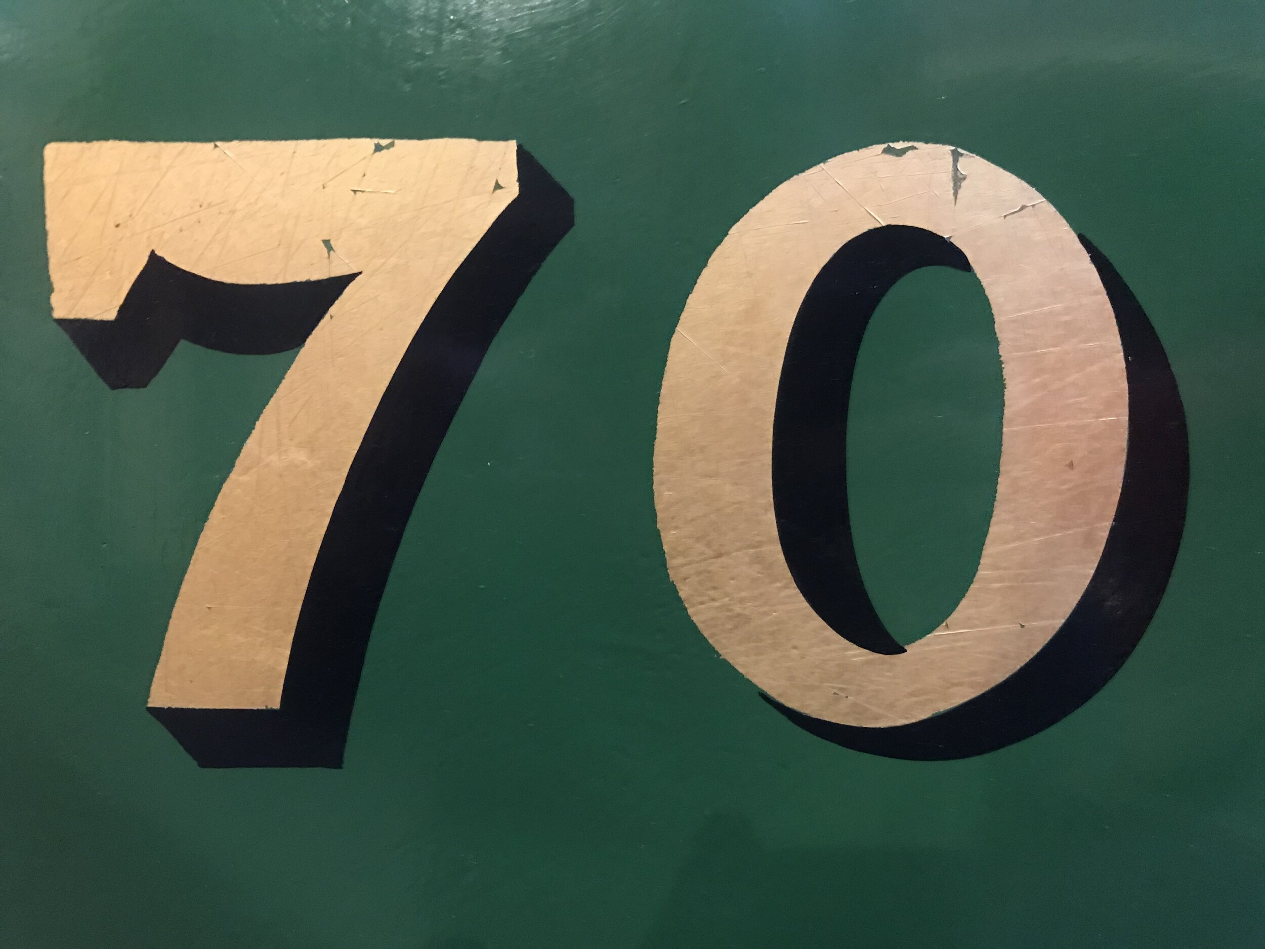
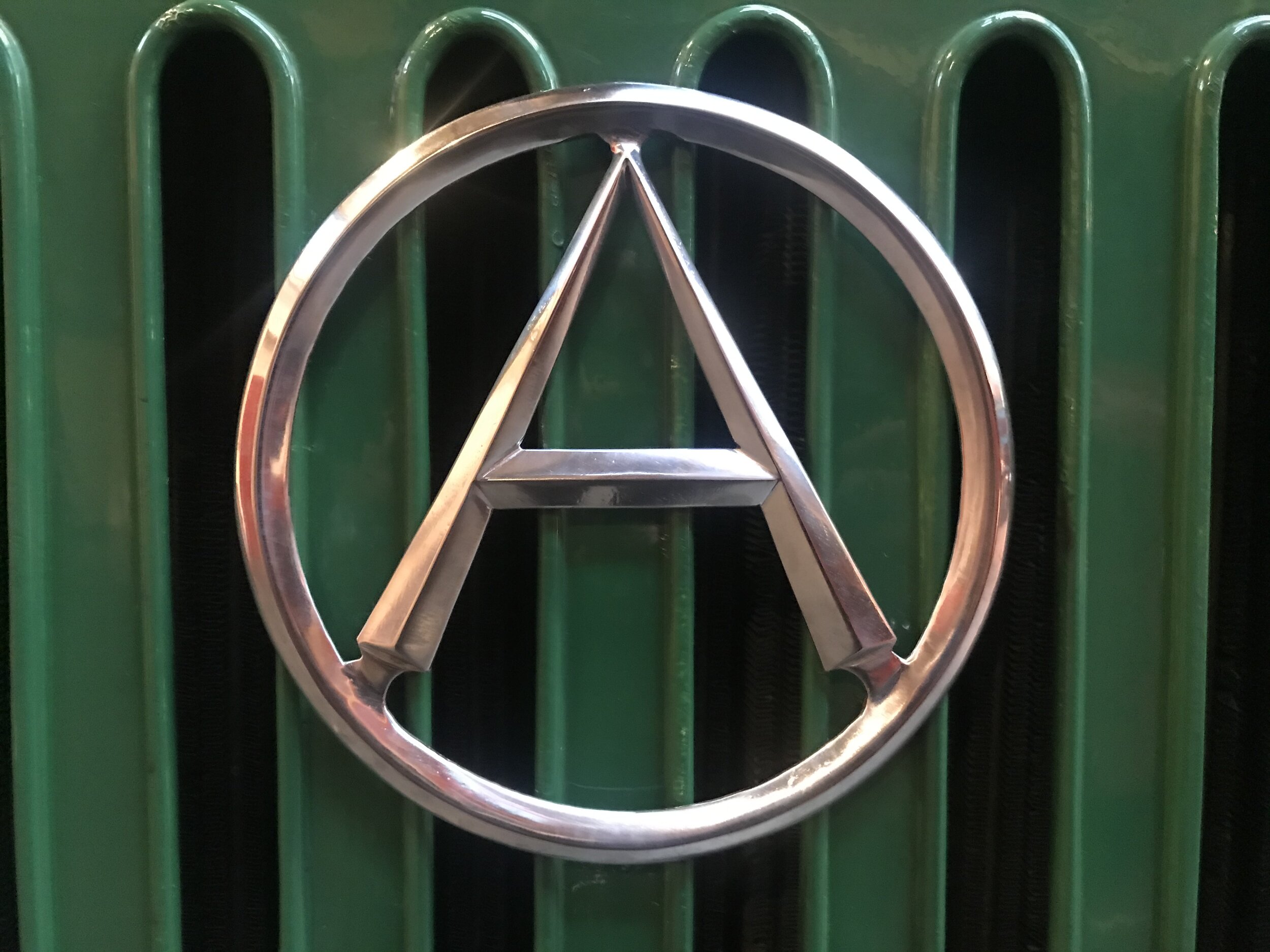
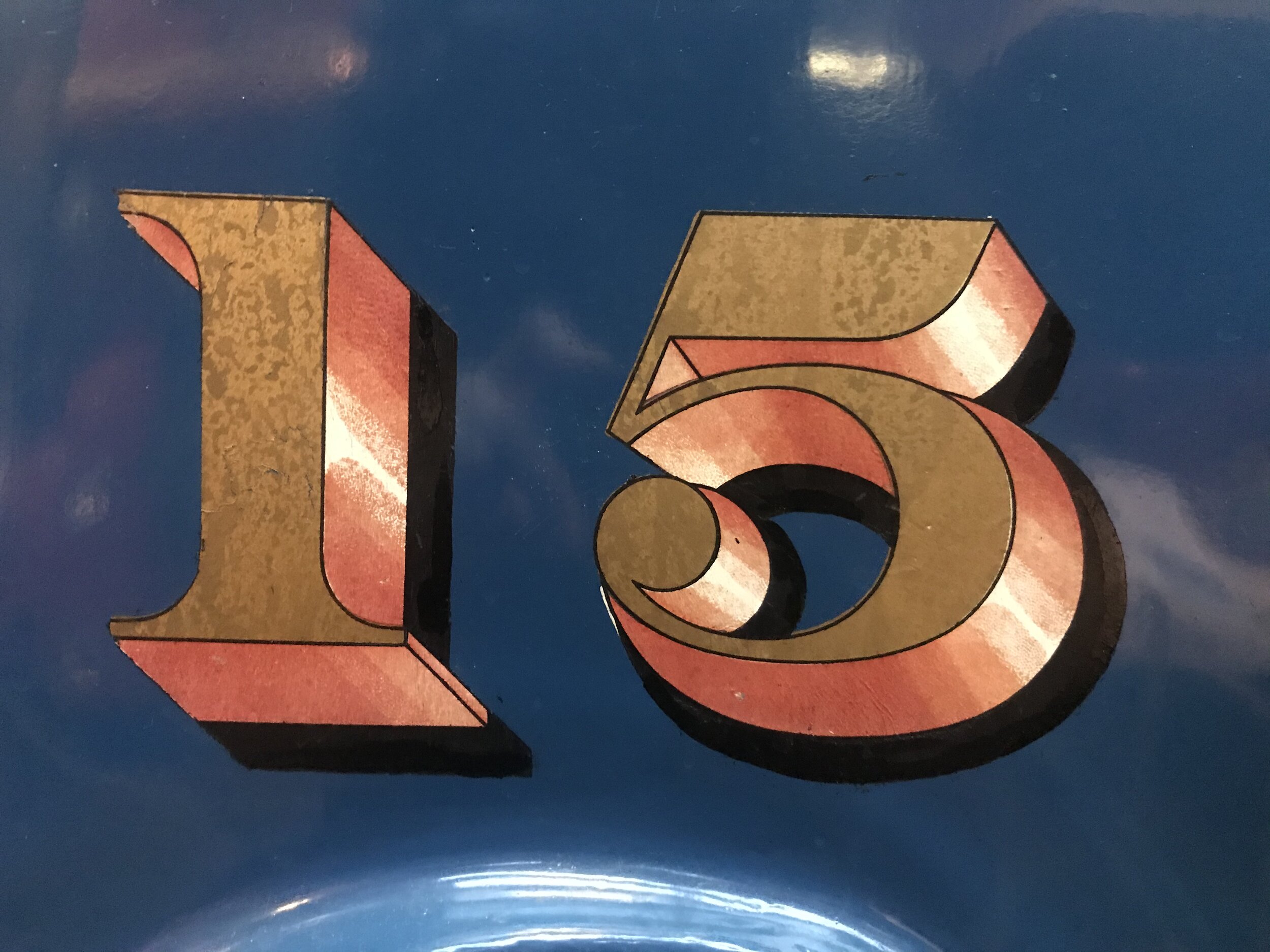
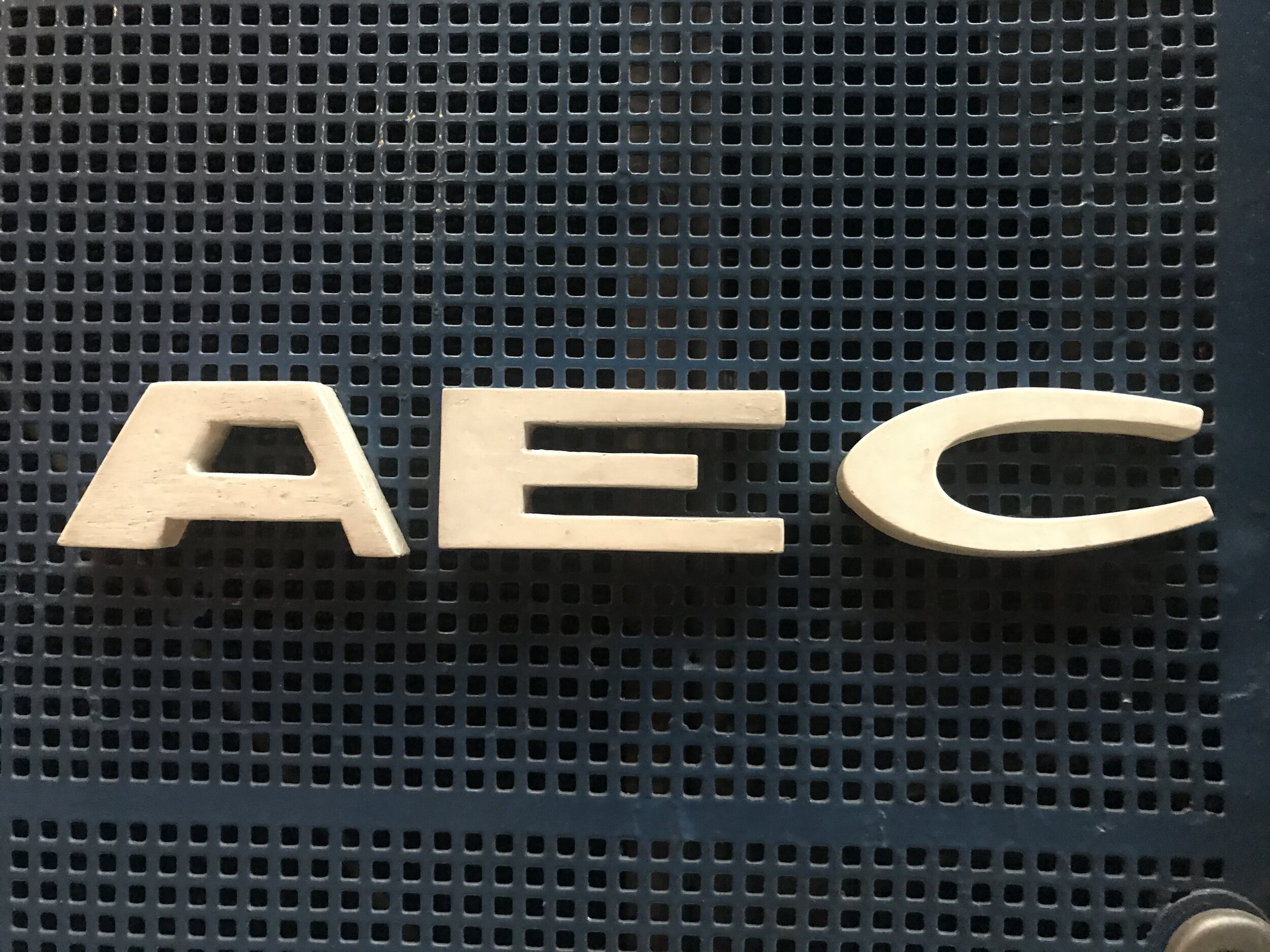
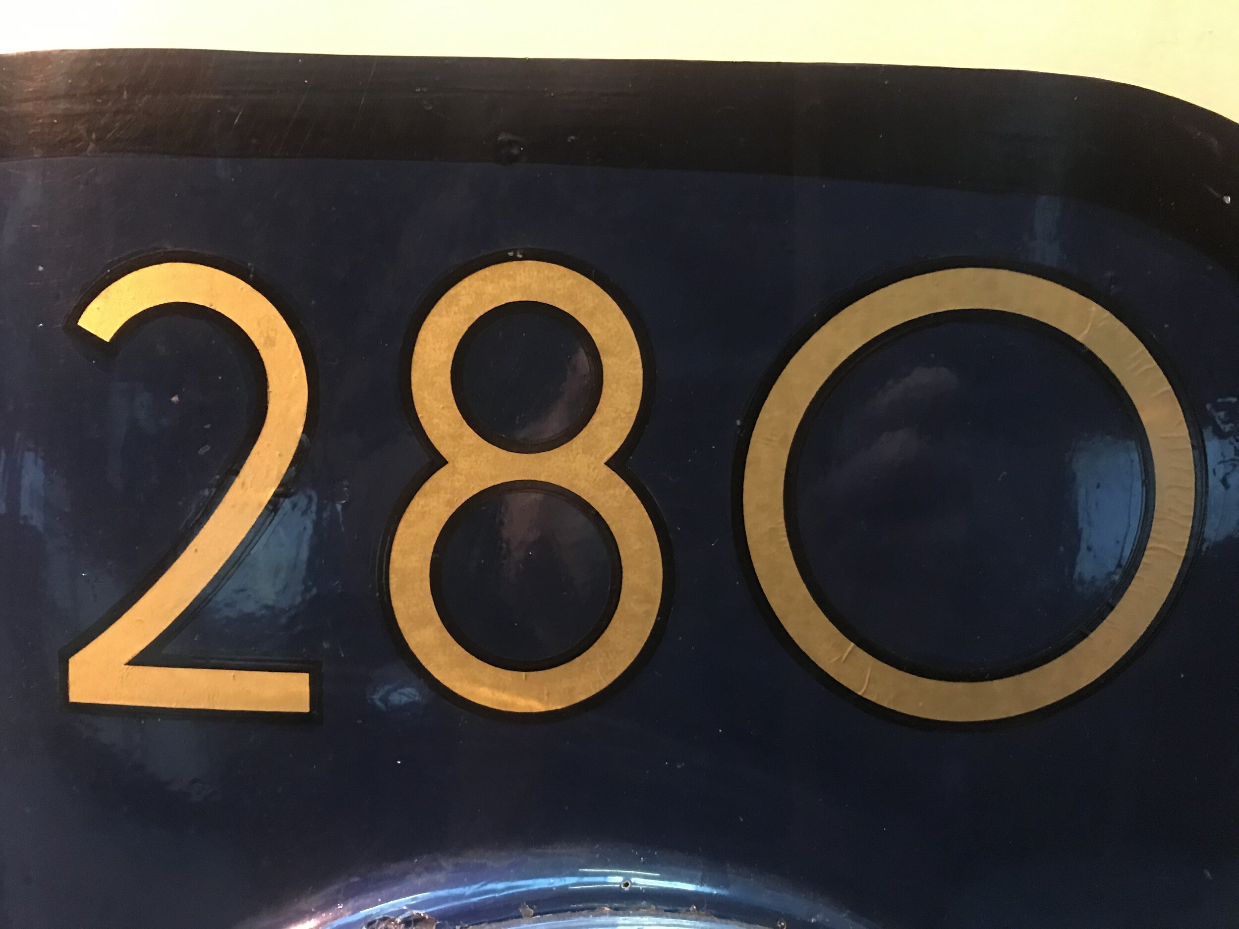
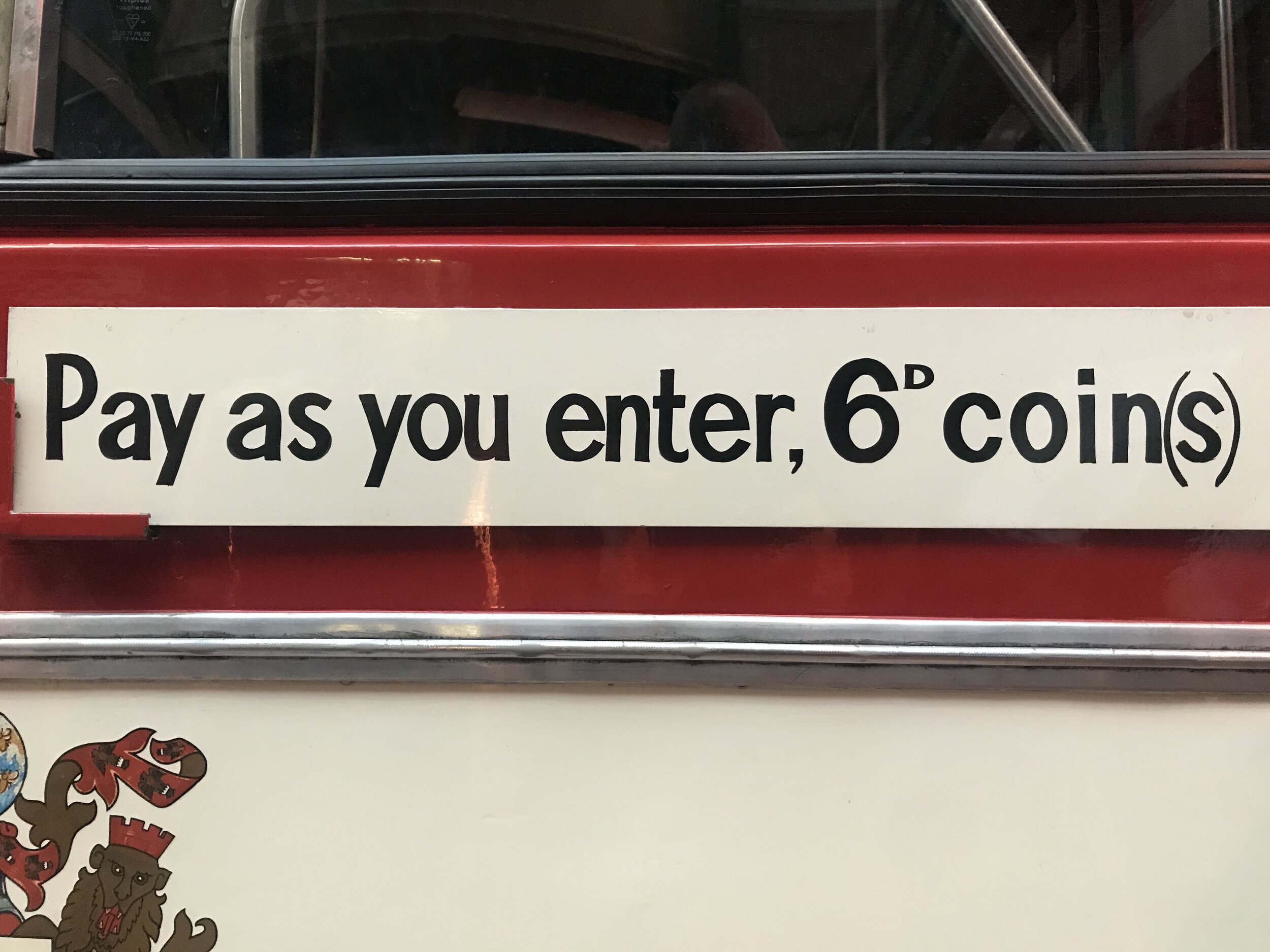
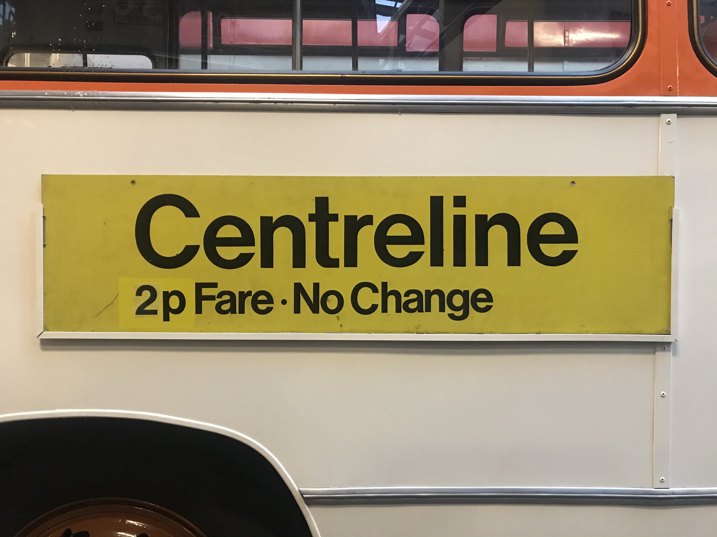
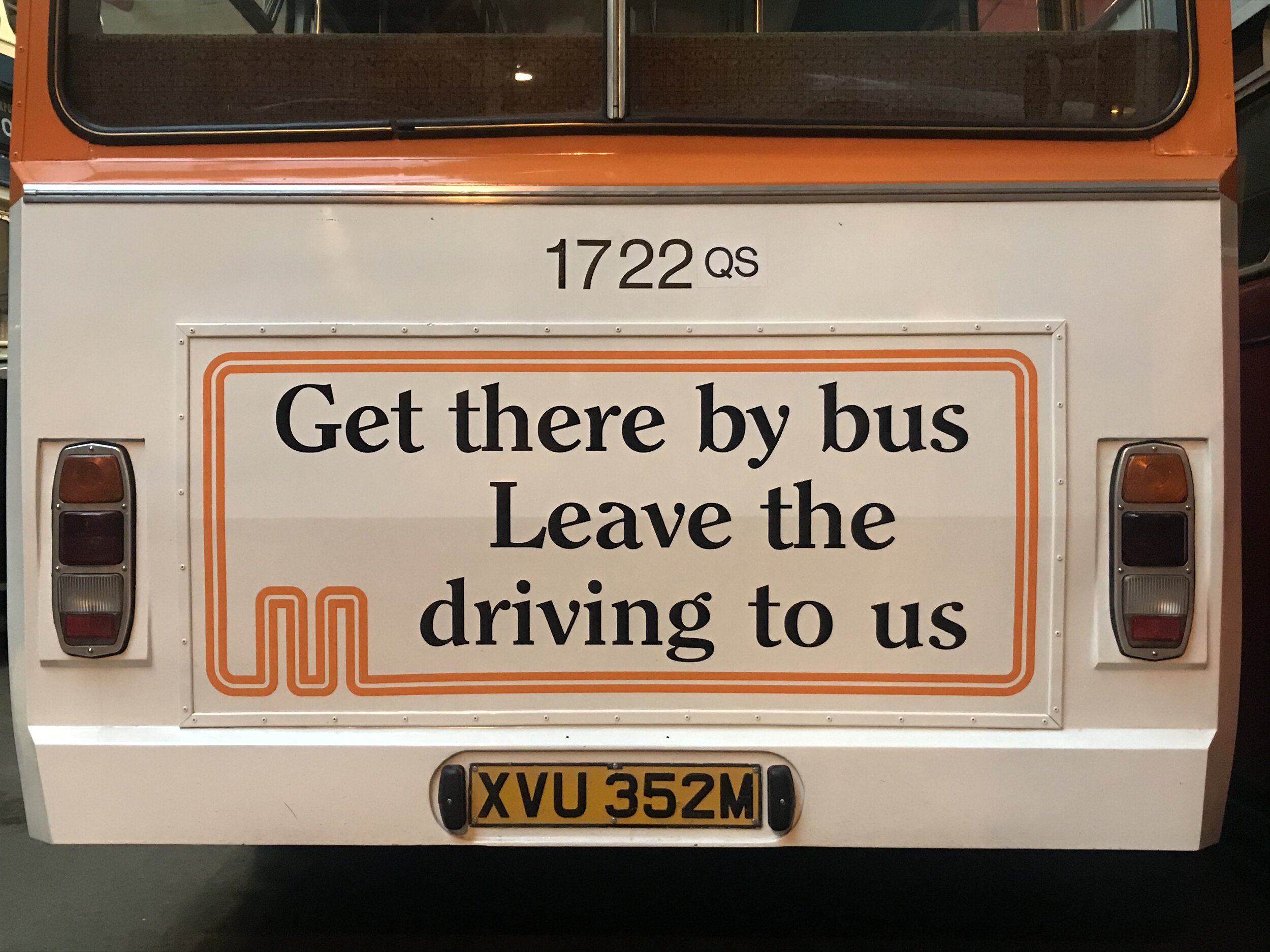
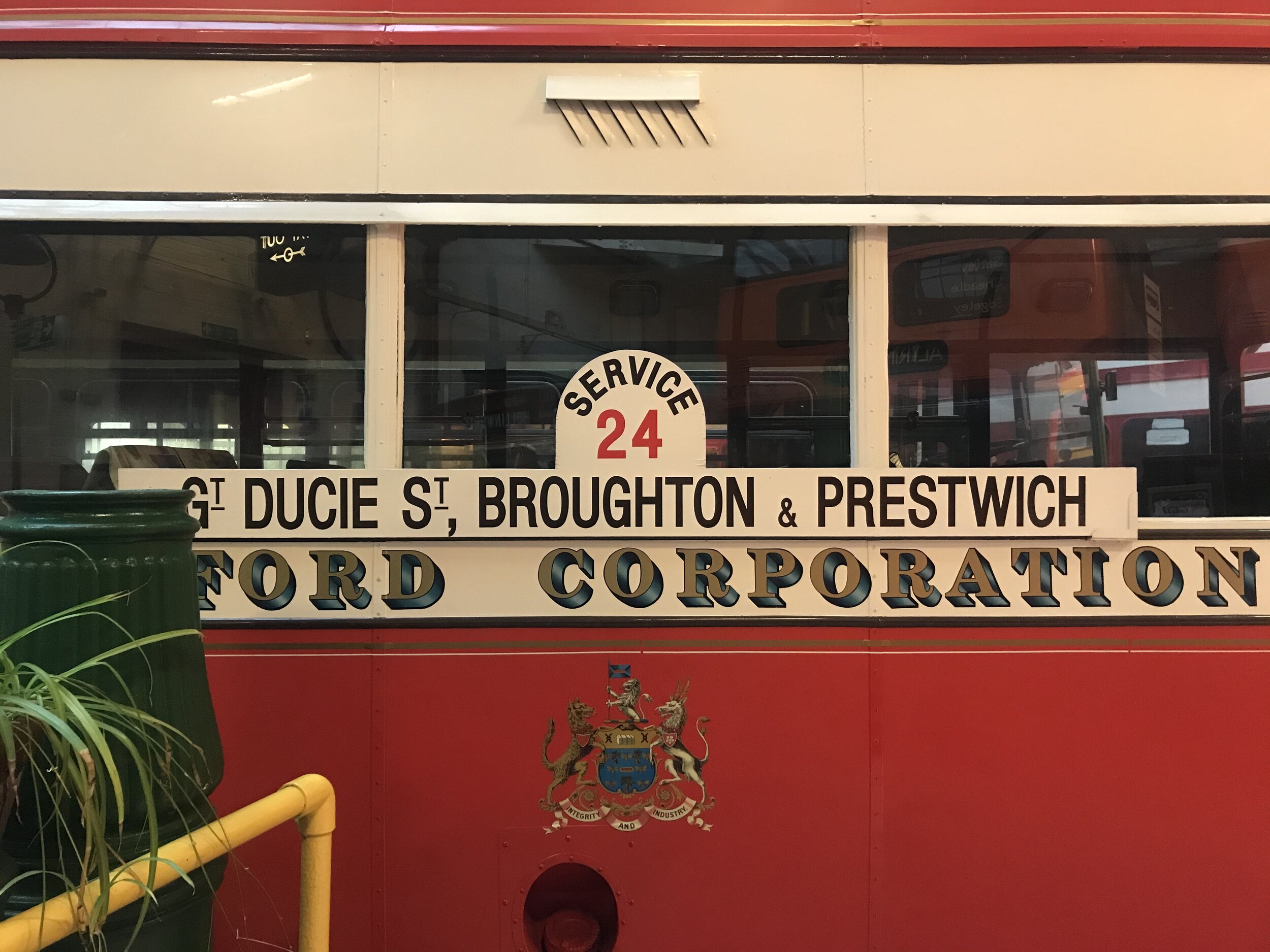
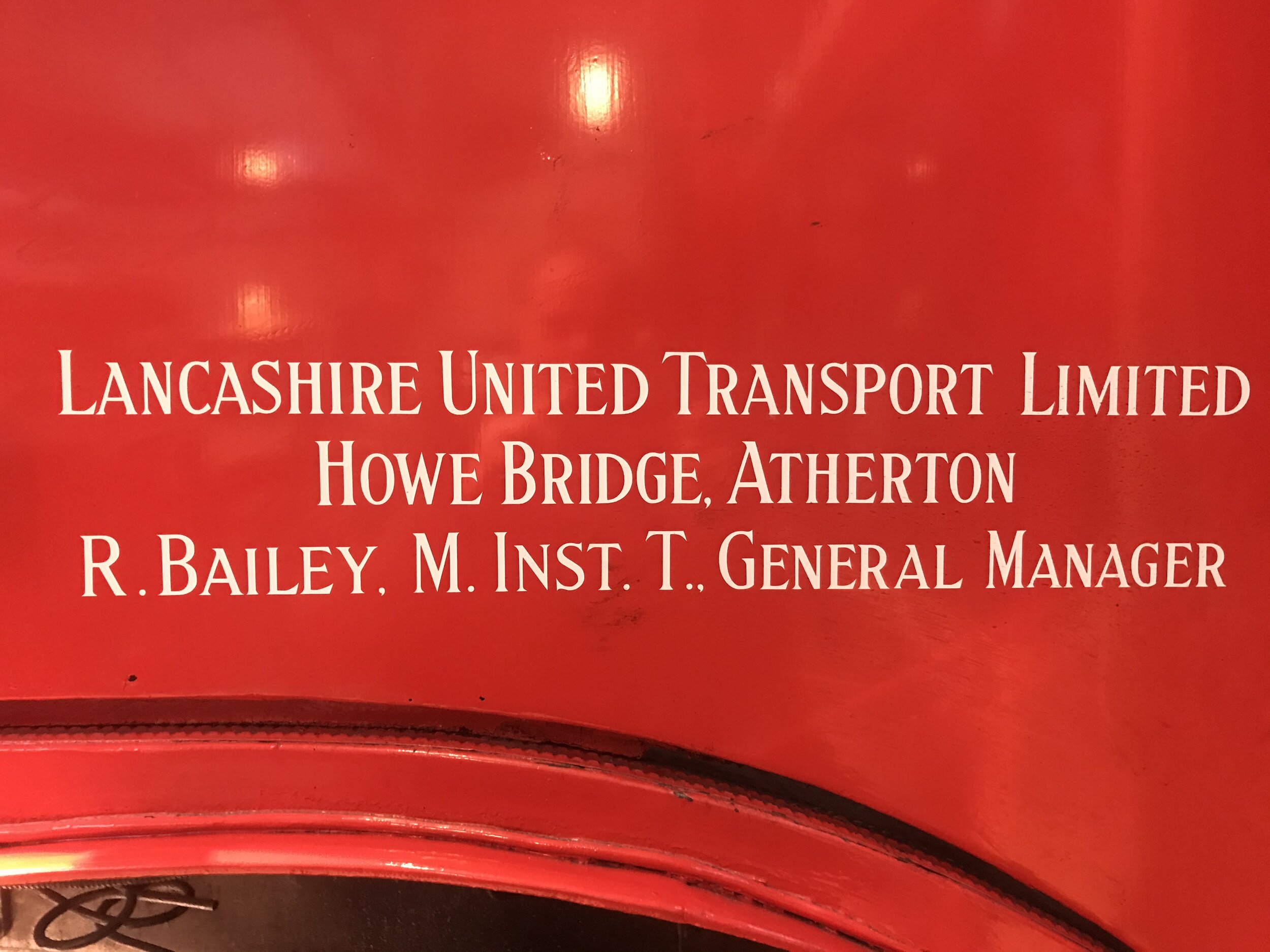
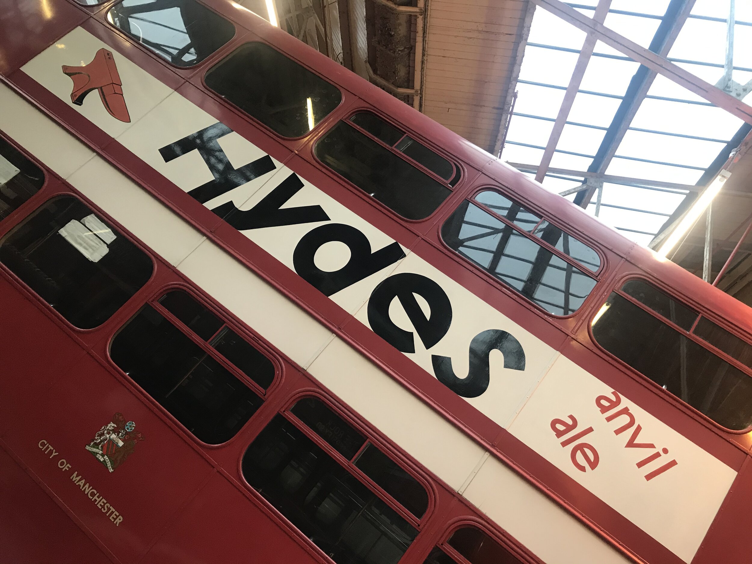
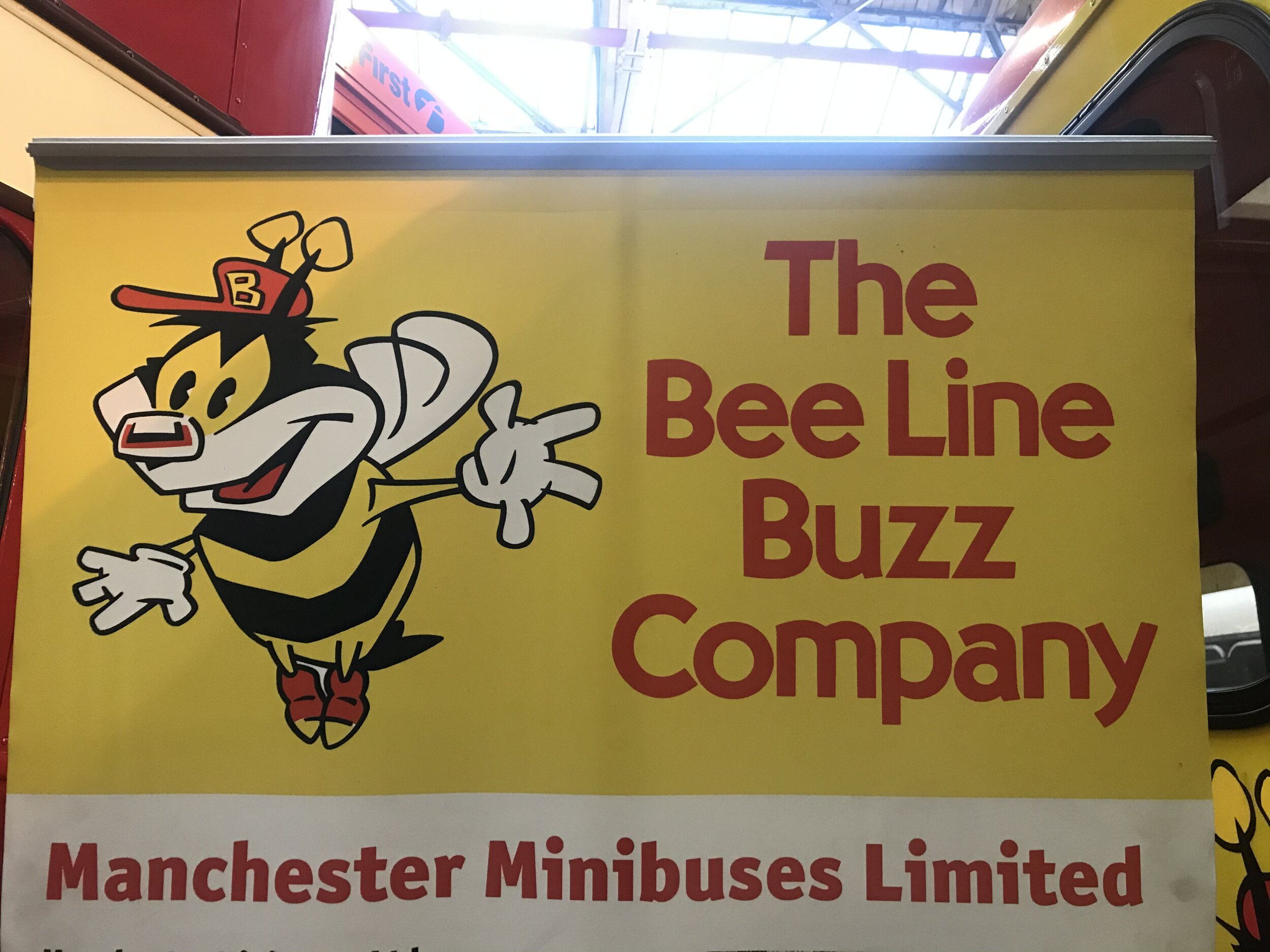
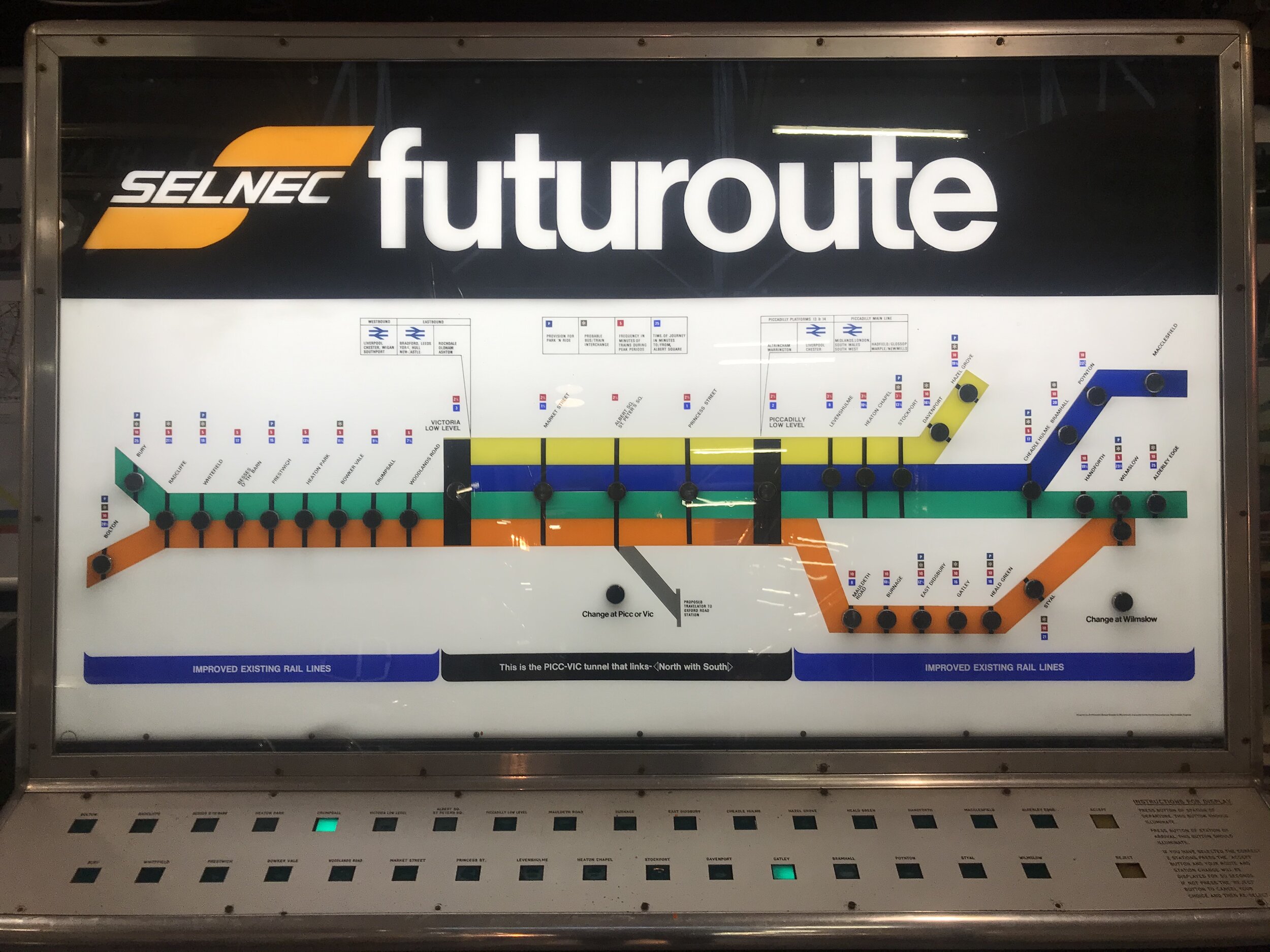
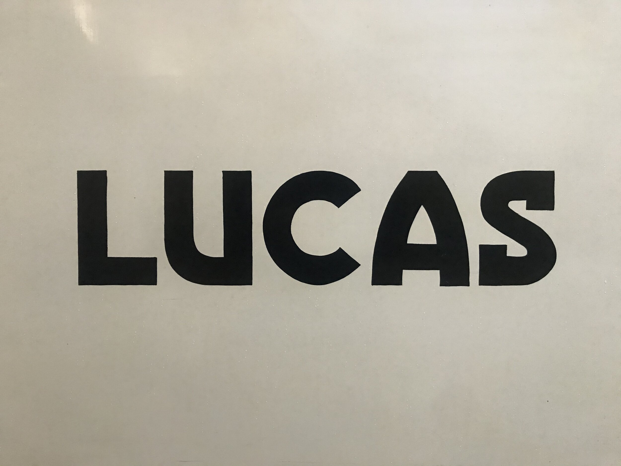
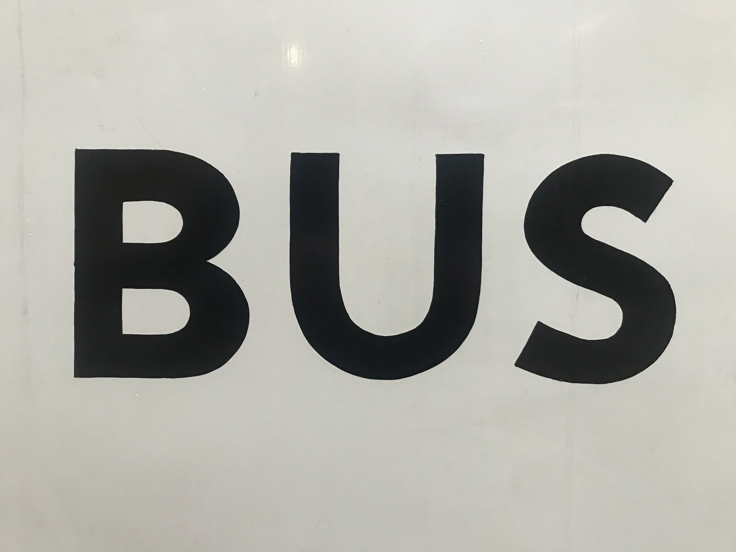
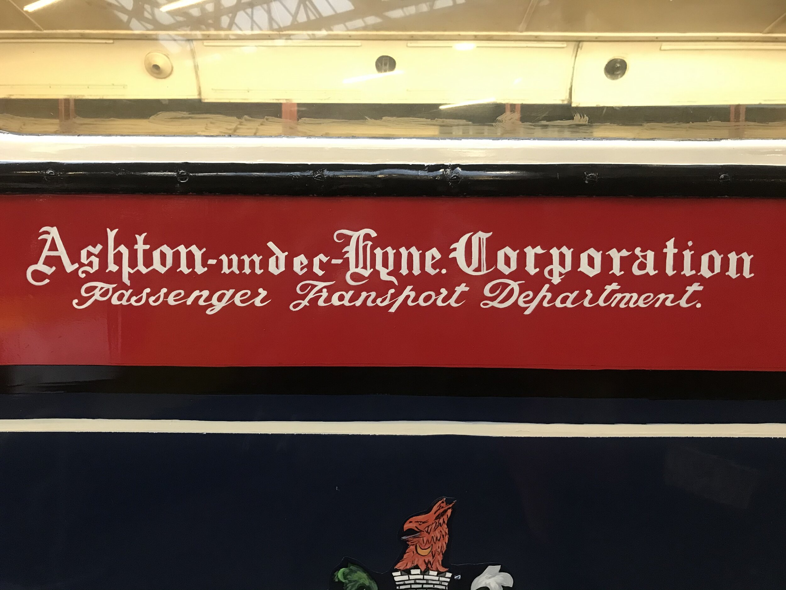
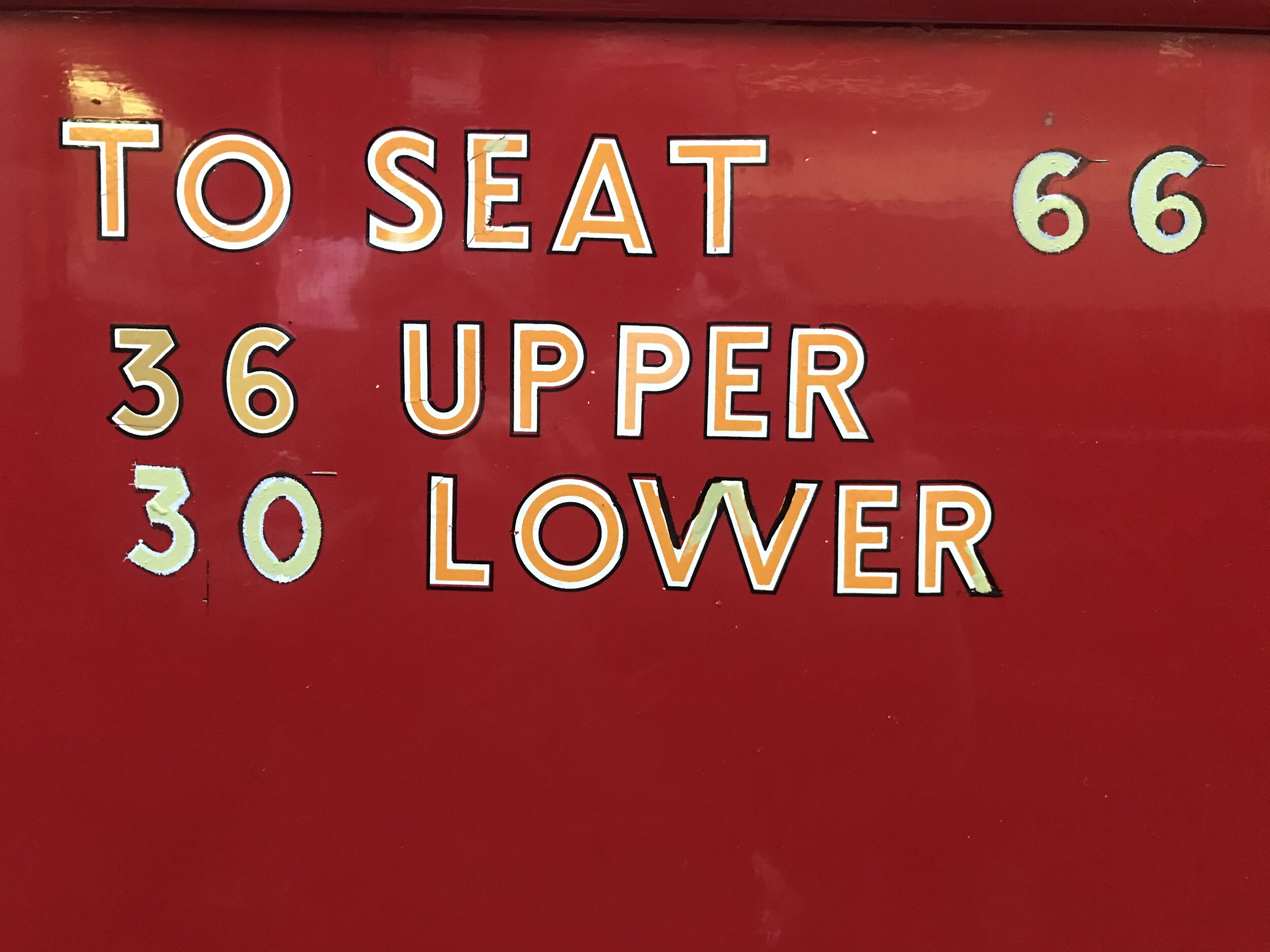
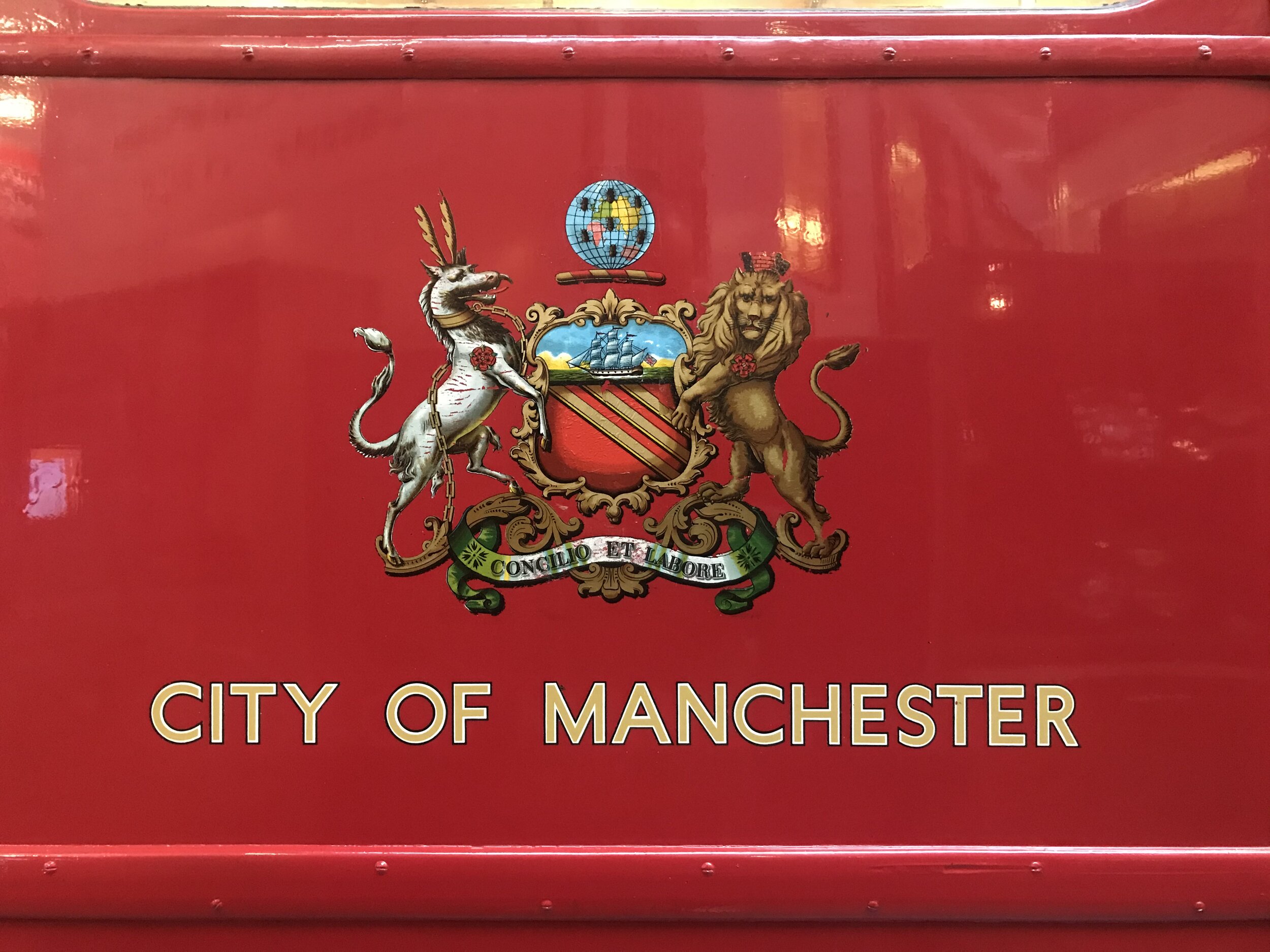
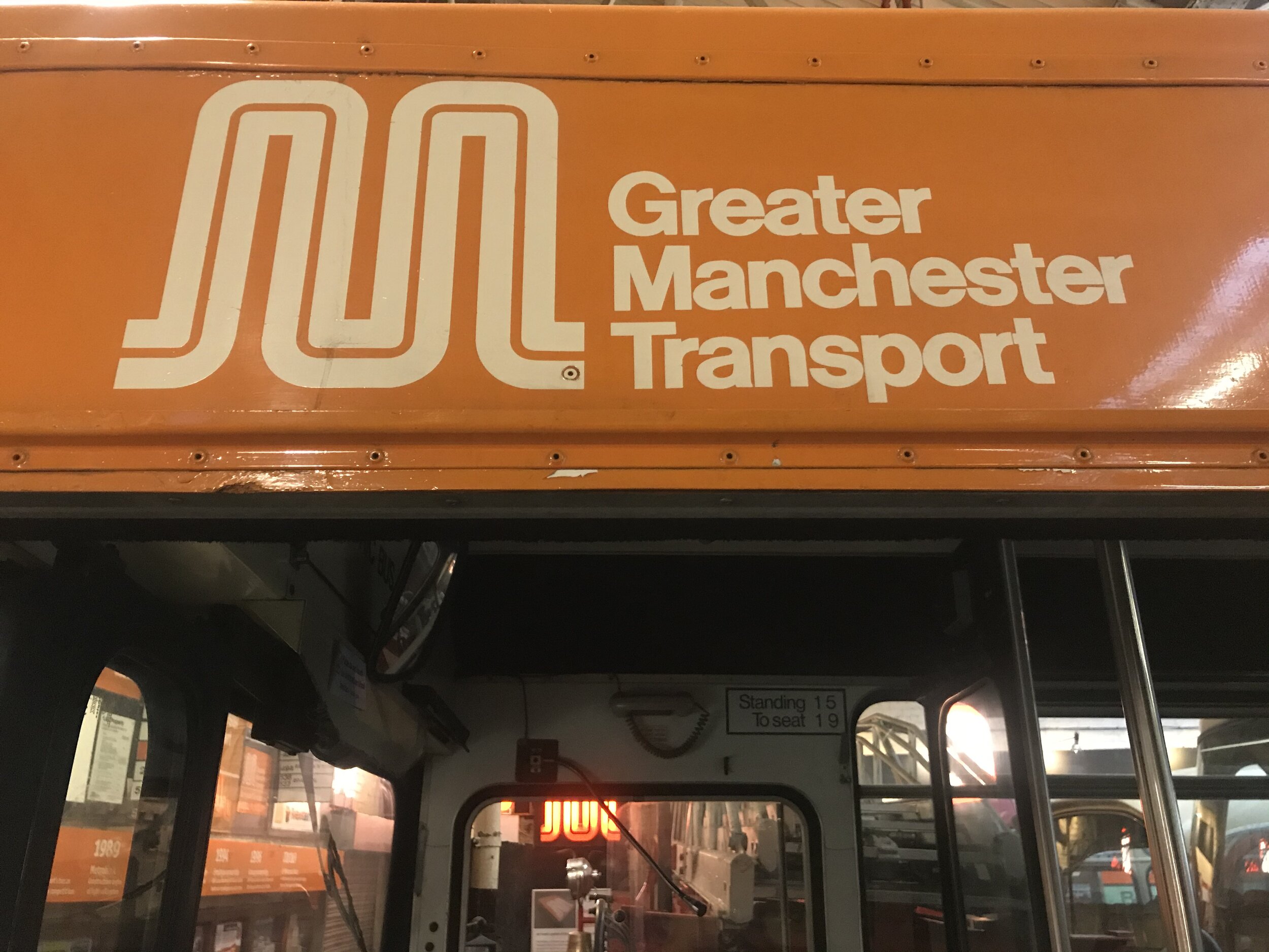
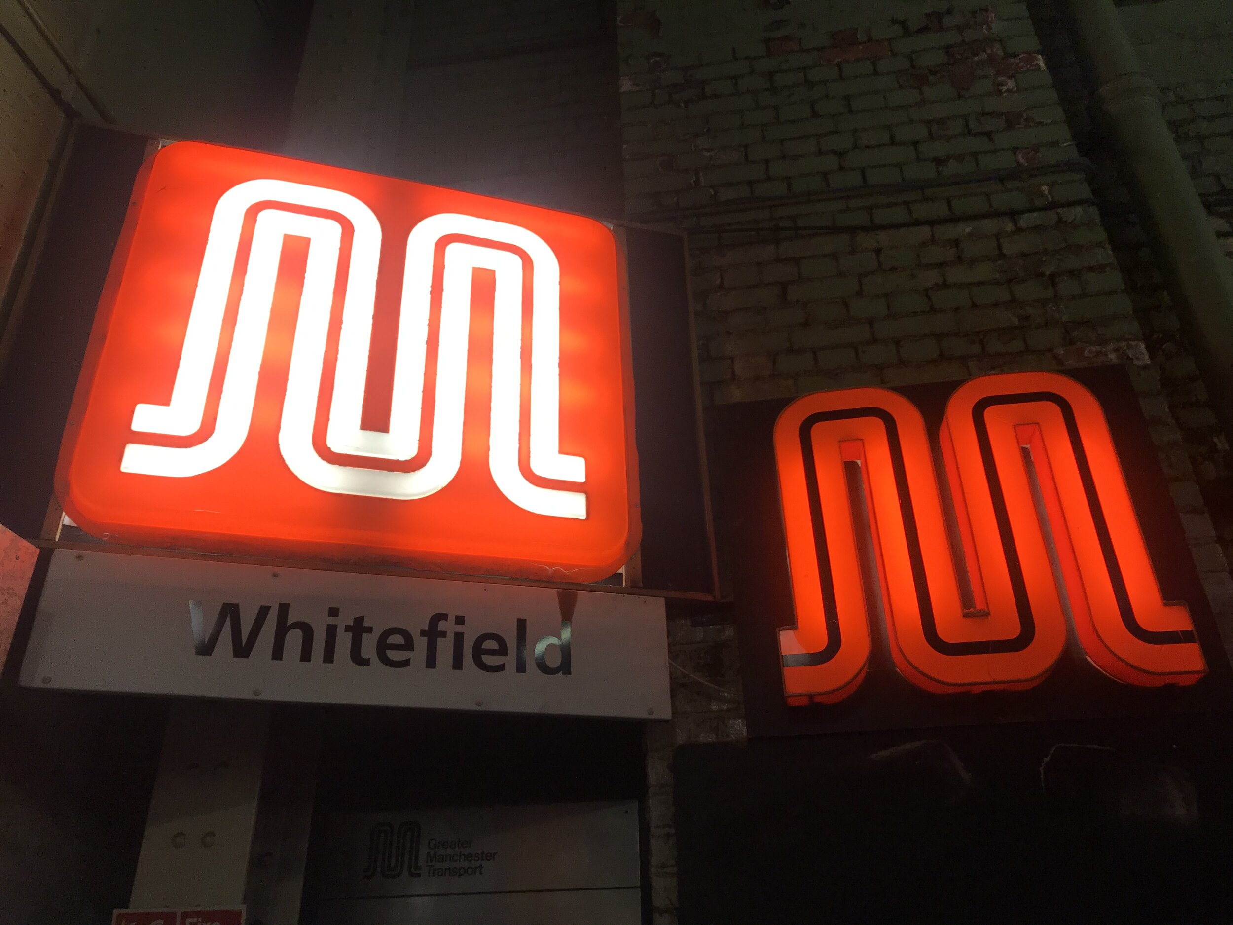
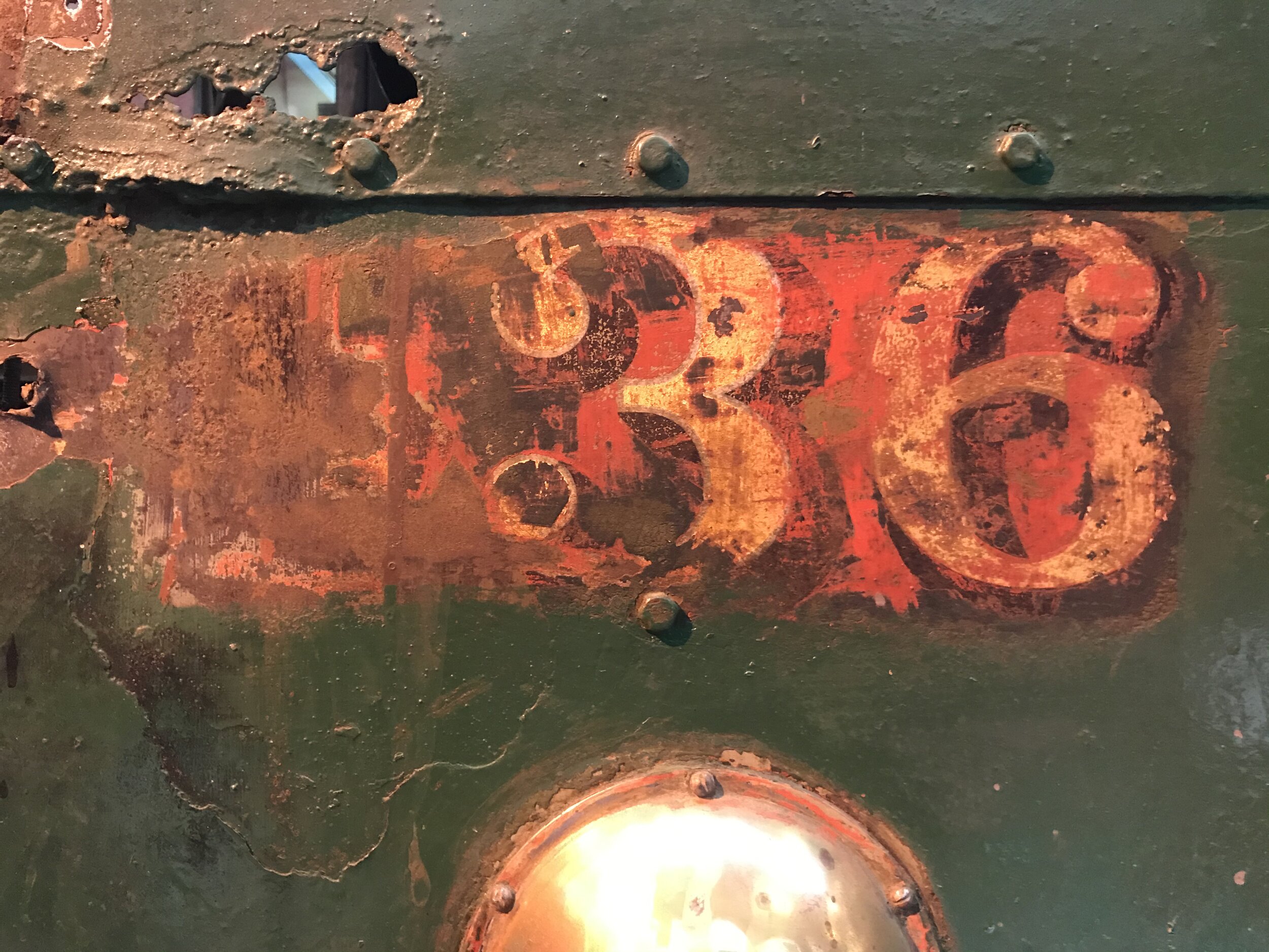
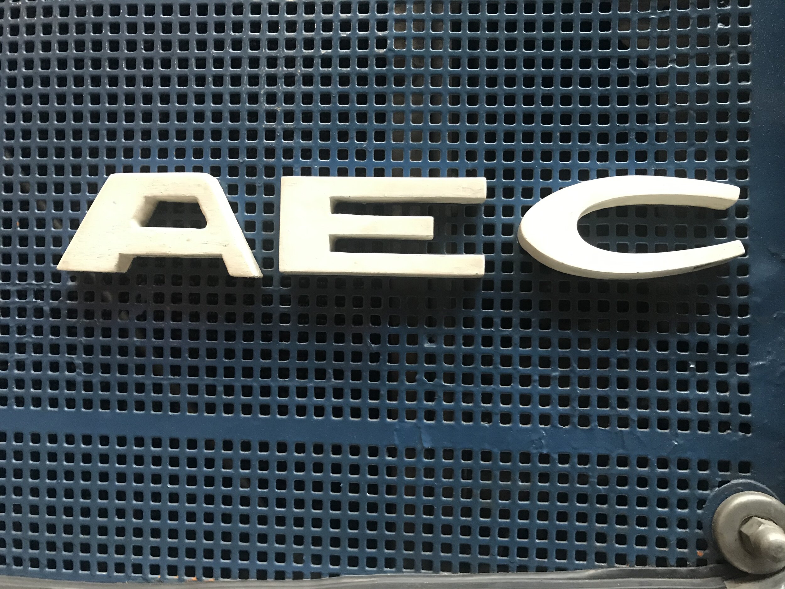
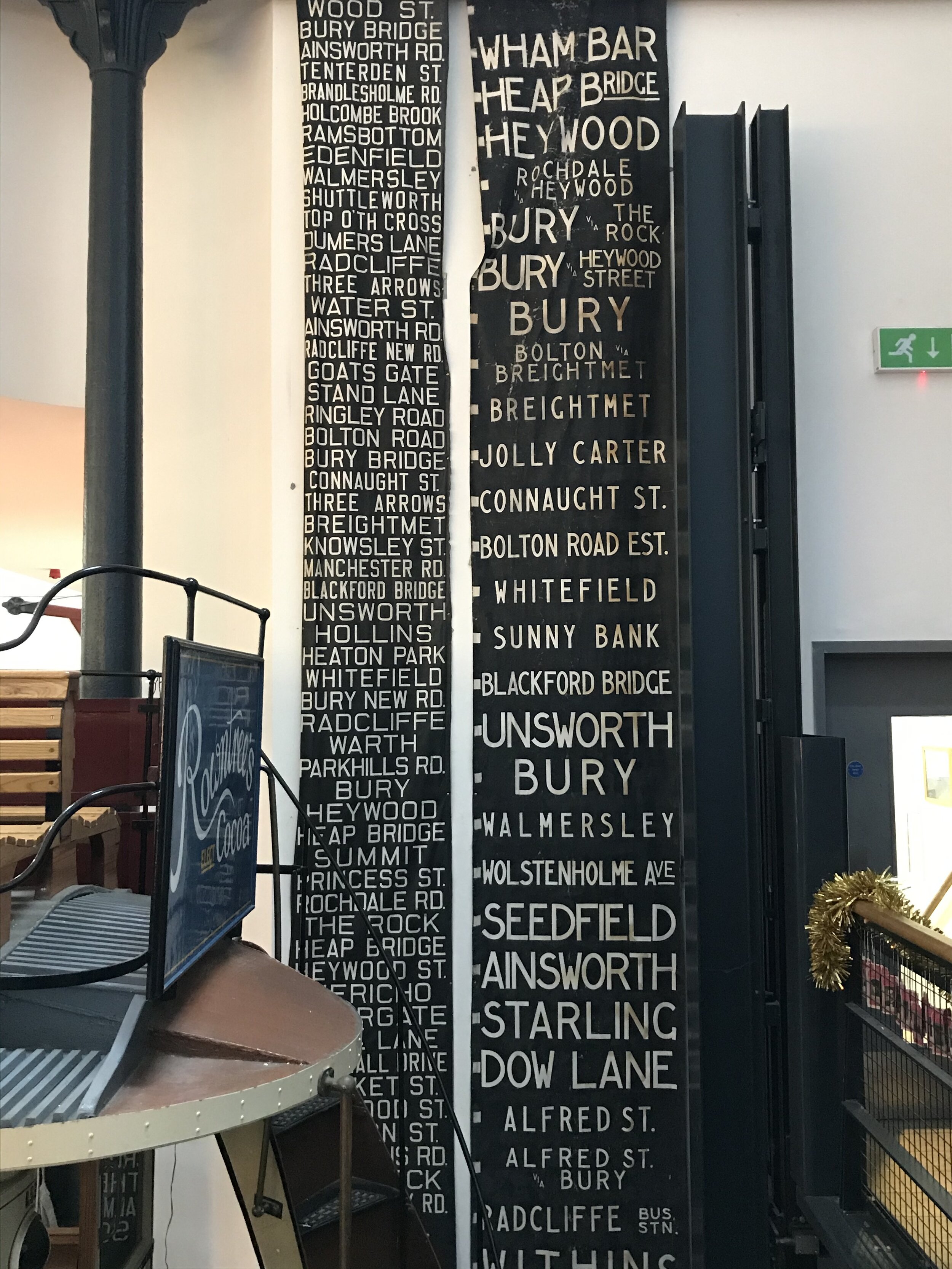
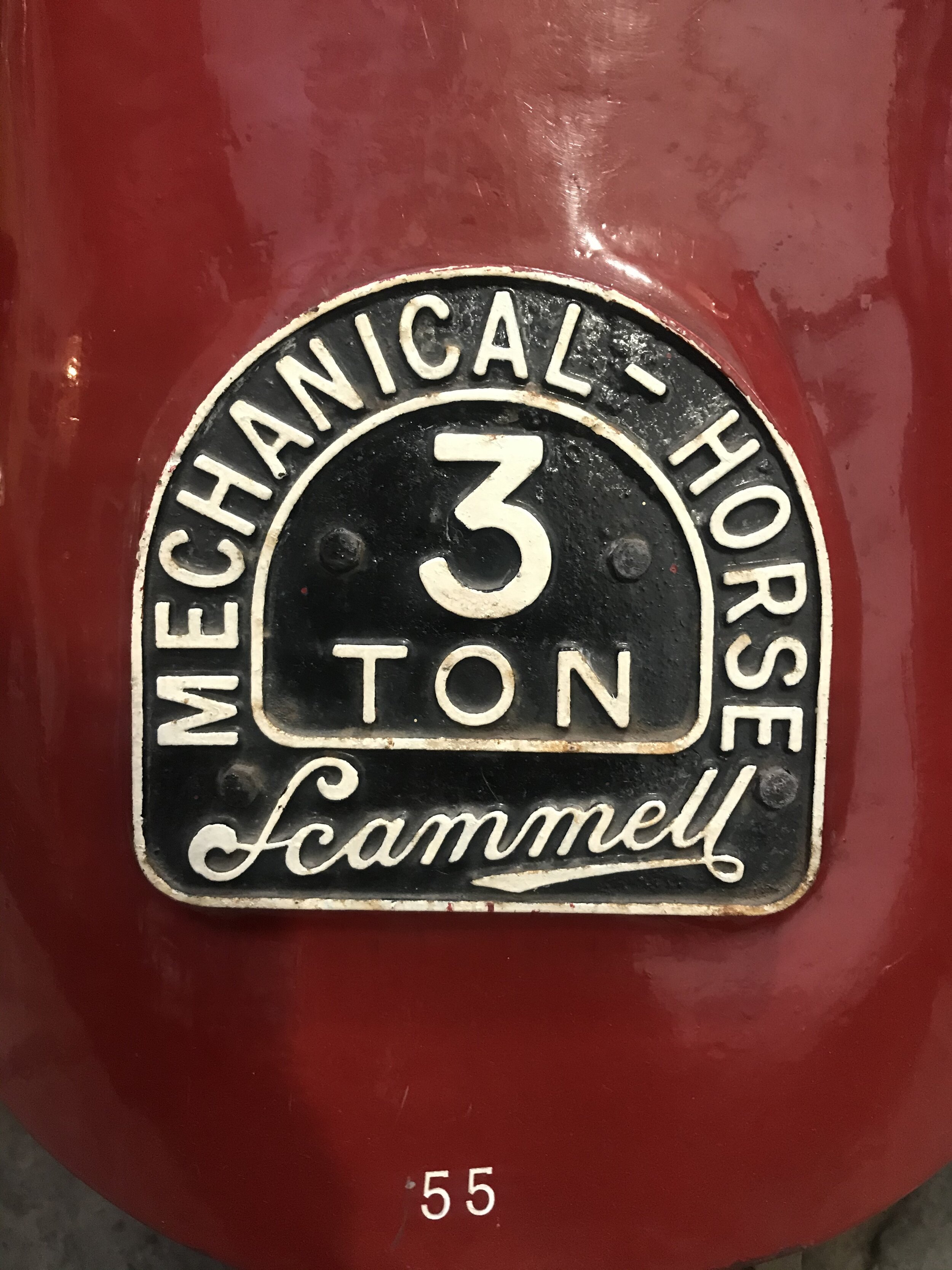
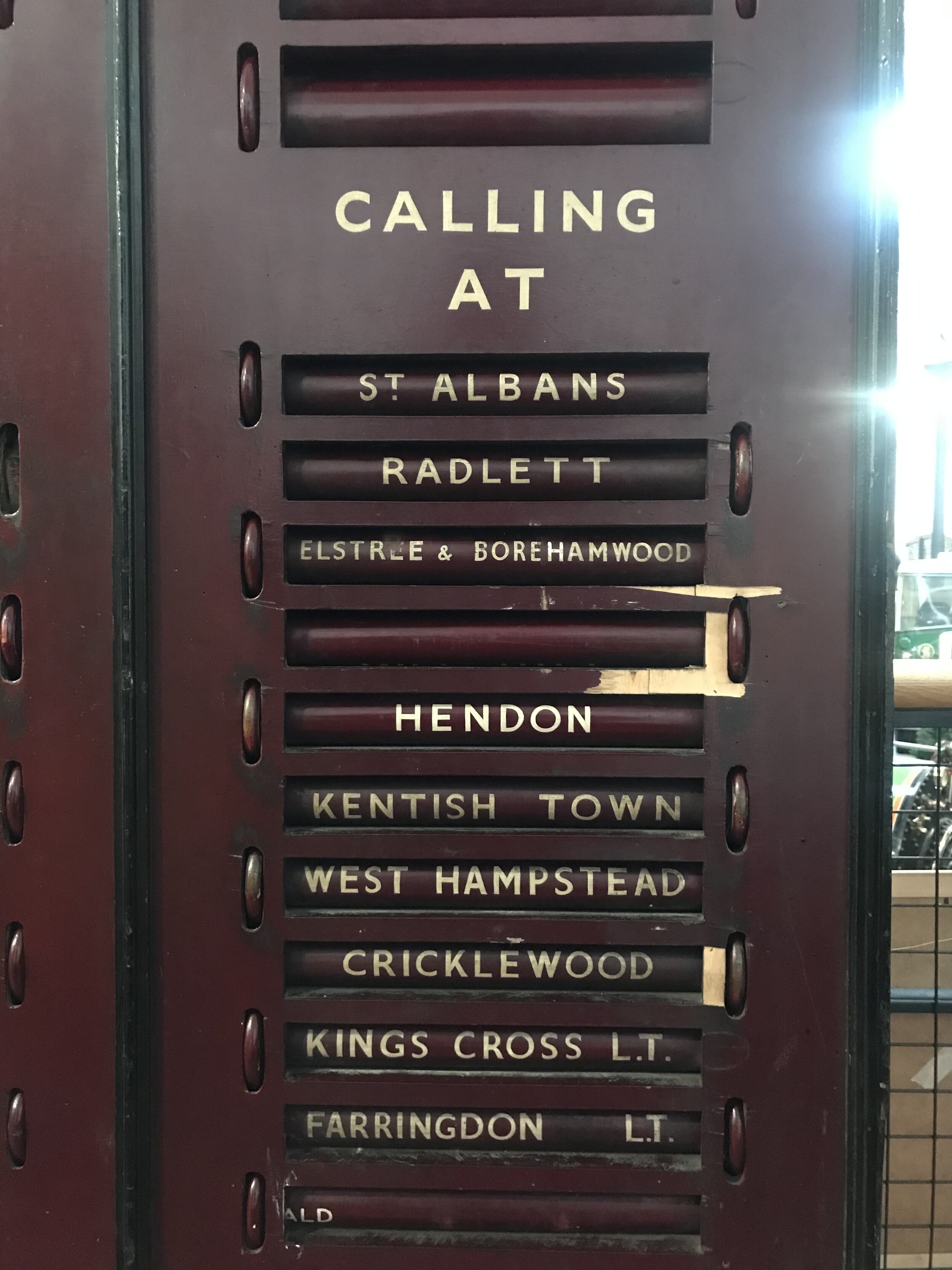
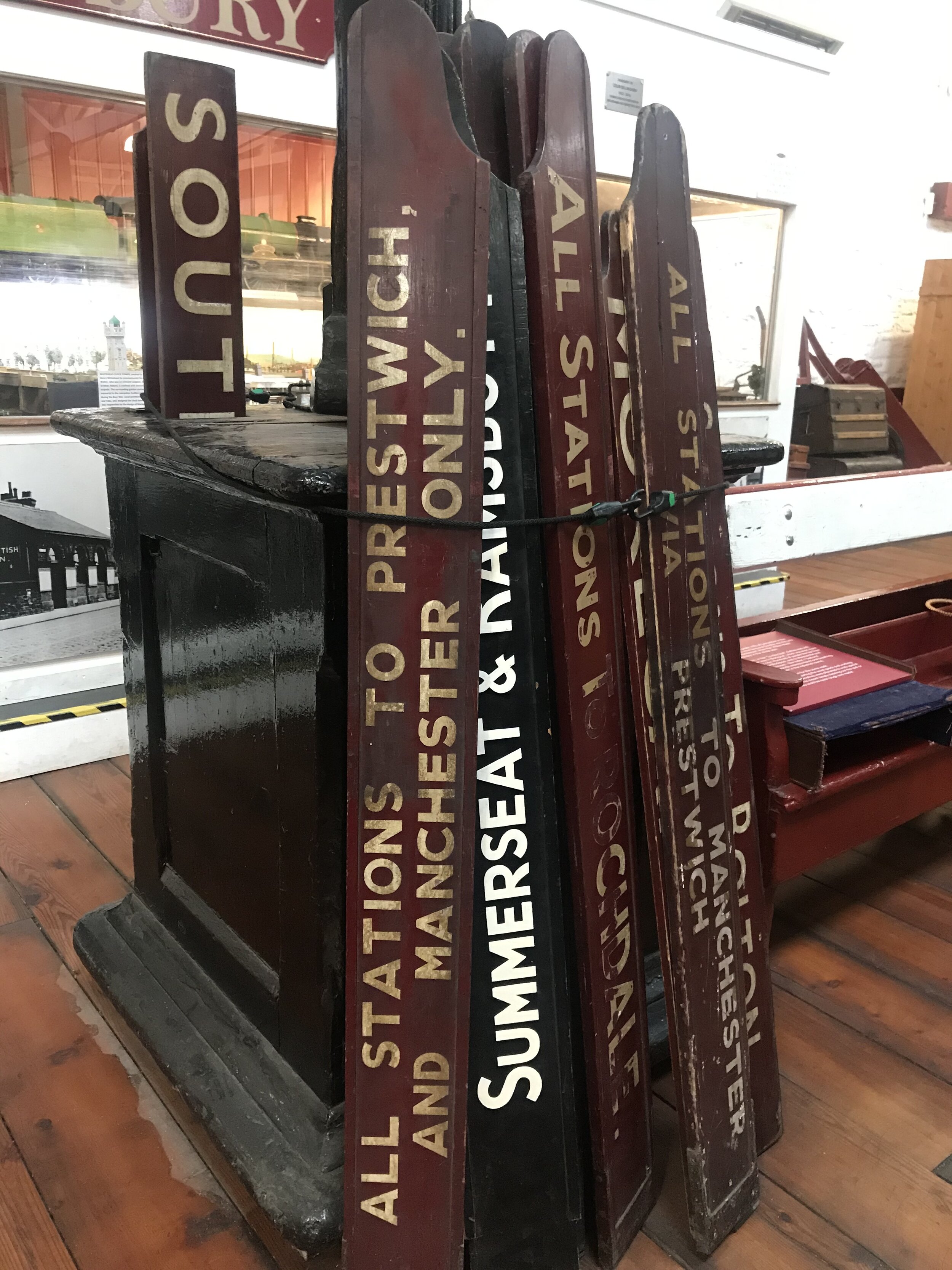
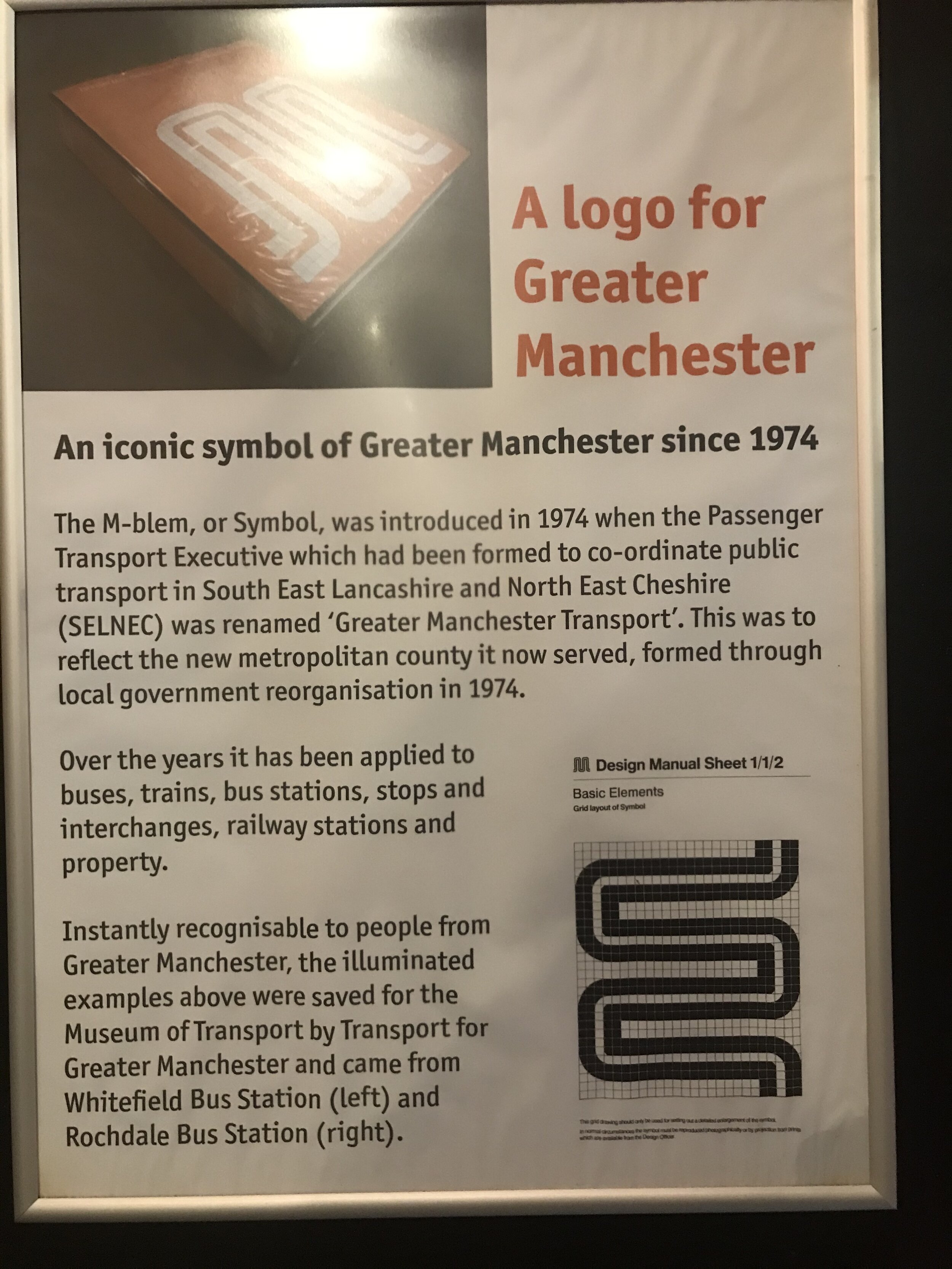
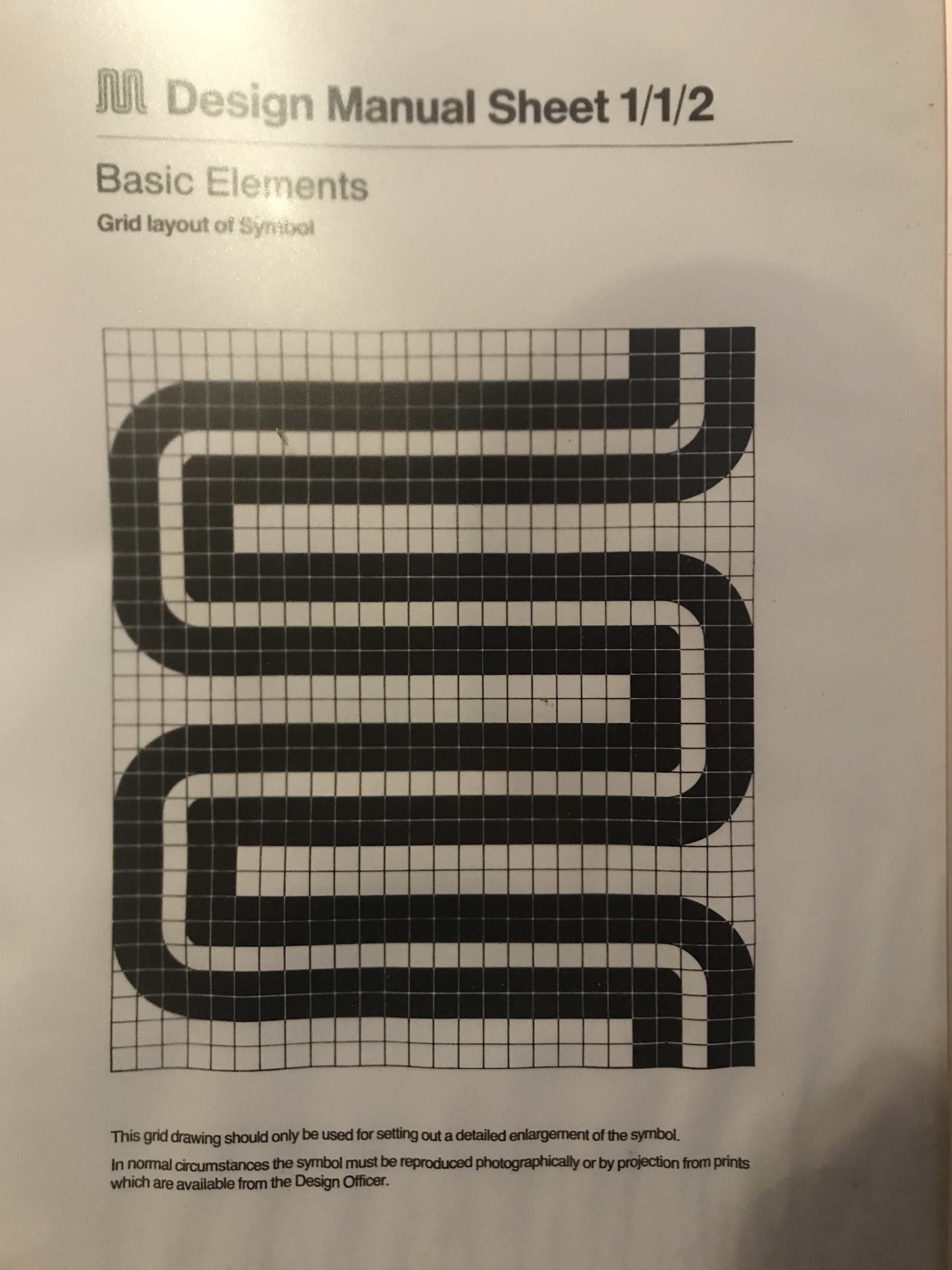
Recent wet-weekend visits to Bury Transport Museum and Manchester’s Museum of Transport faced off the grim weather with their own deluge, albeit this downpour was one of hand-lettered type.
Both institutions are clearly run by teams of enthusiasts, and the love for the treasures within is clear for all to see. Perhaps though, there is an opportunity for a final year student to take the resources and package them for the next generation.


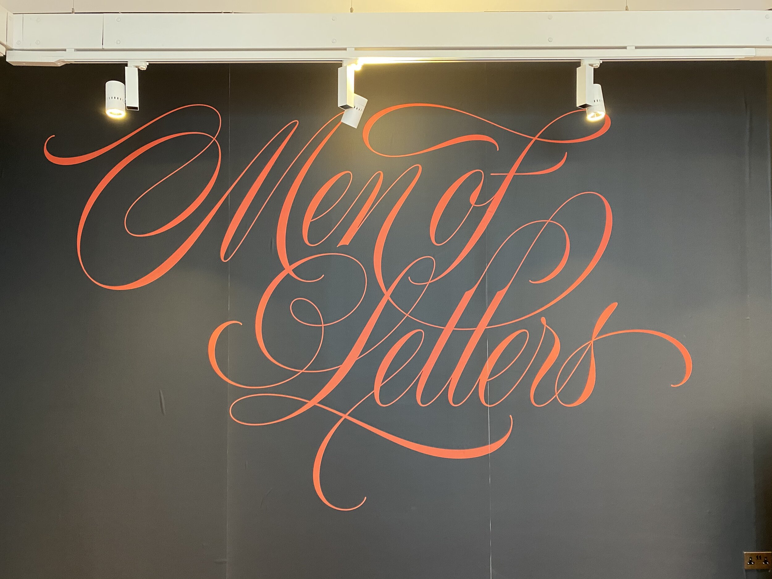
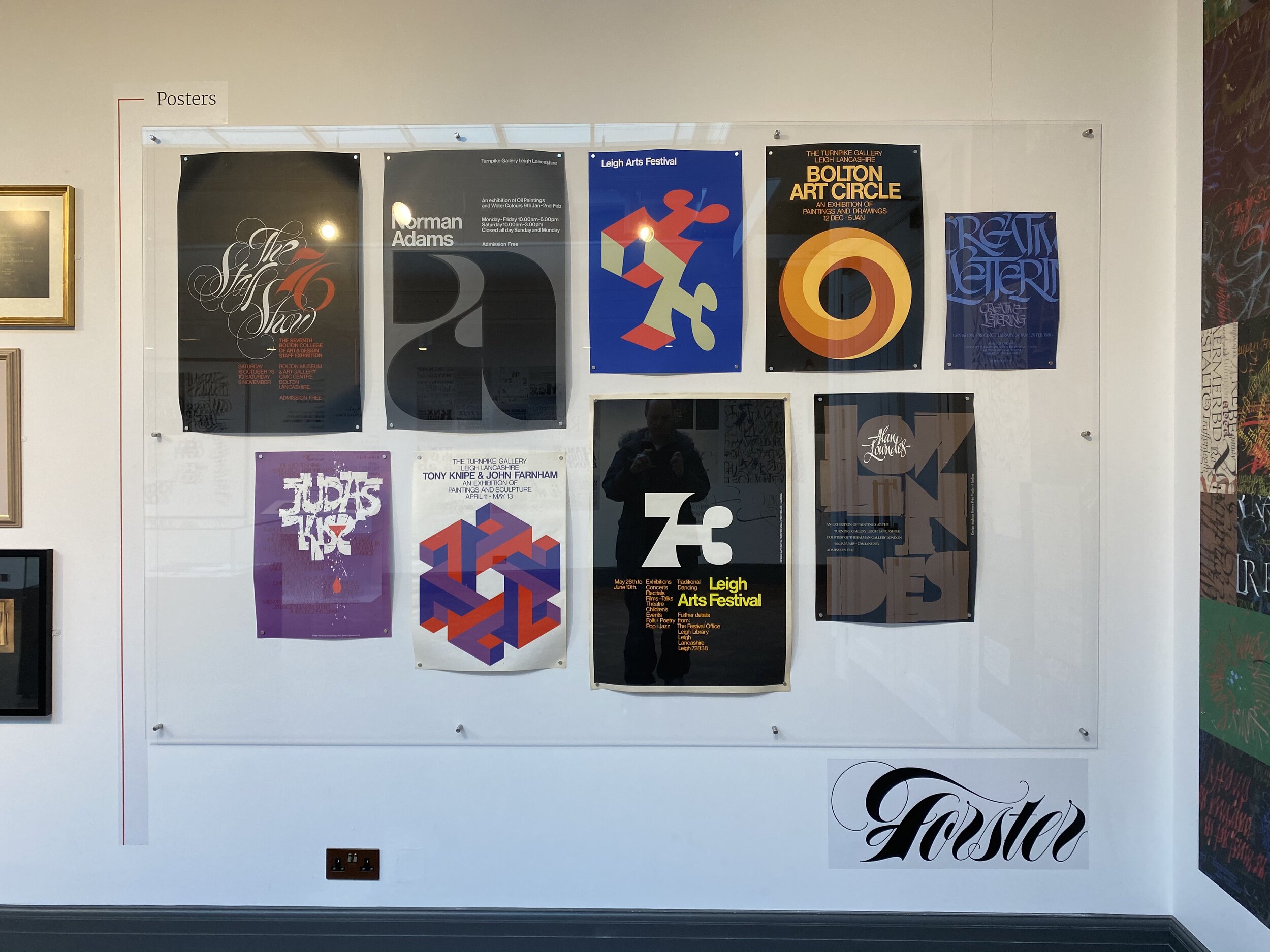
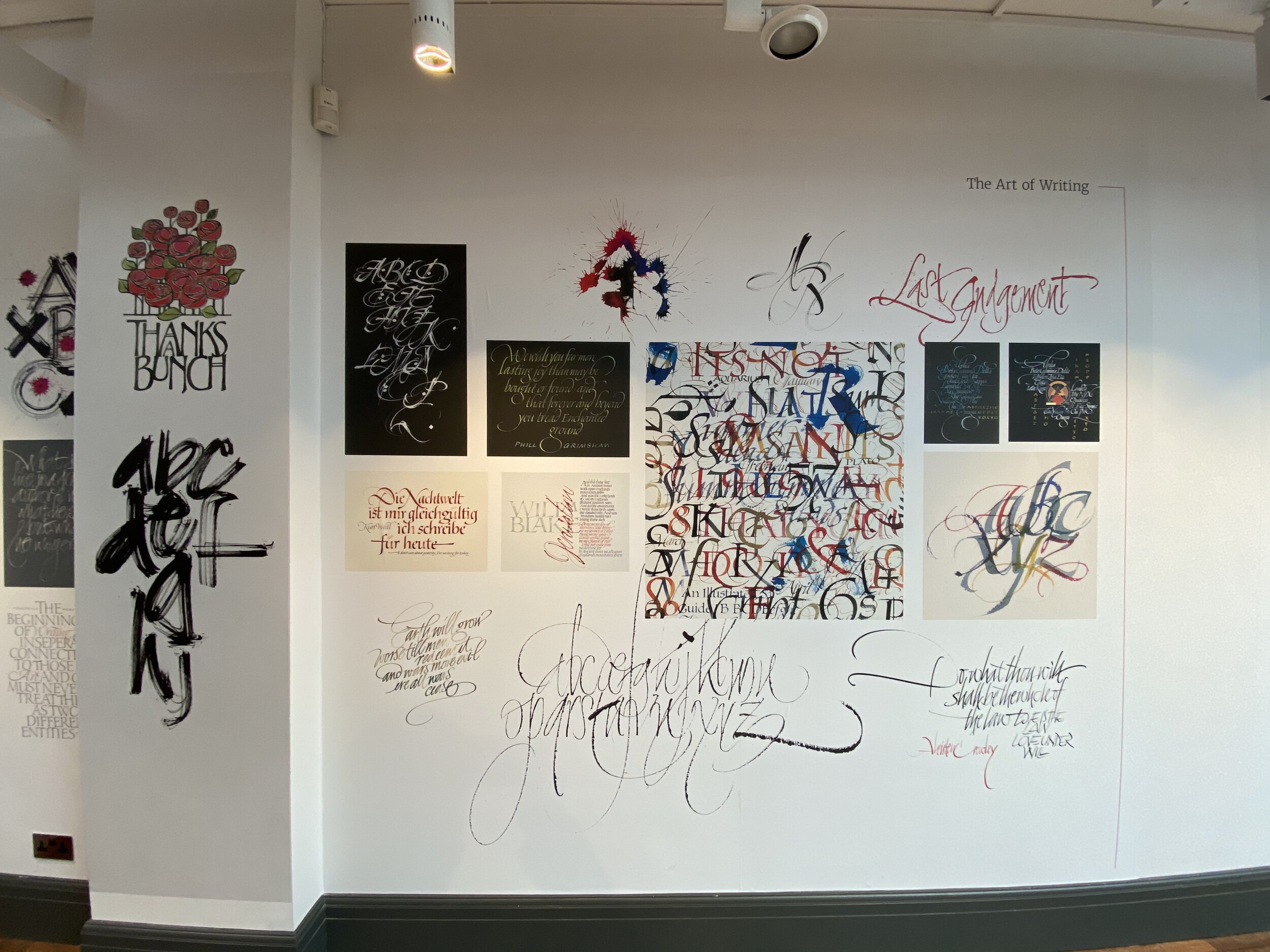
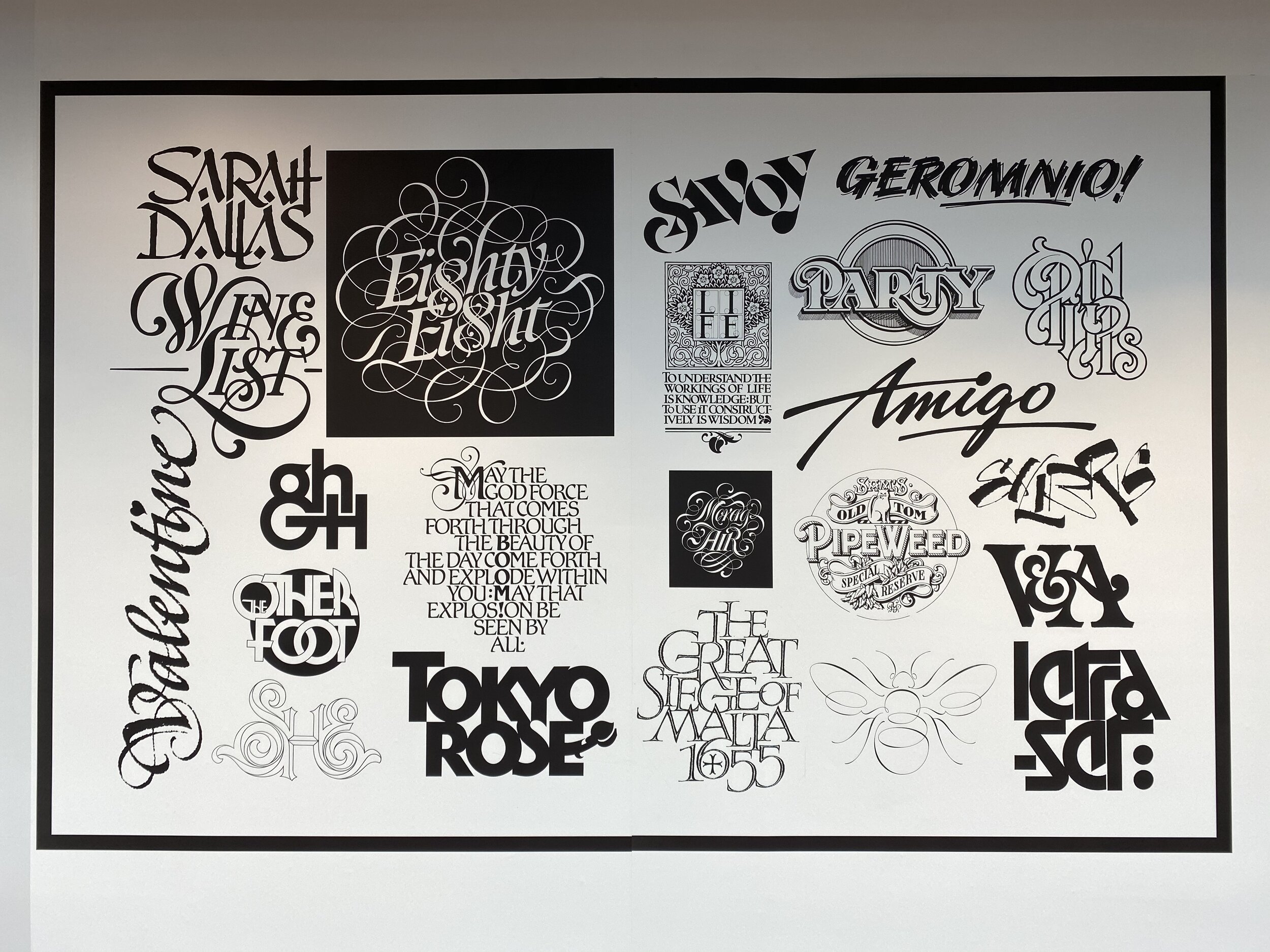
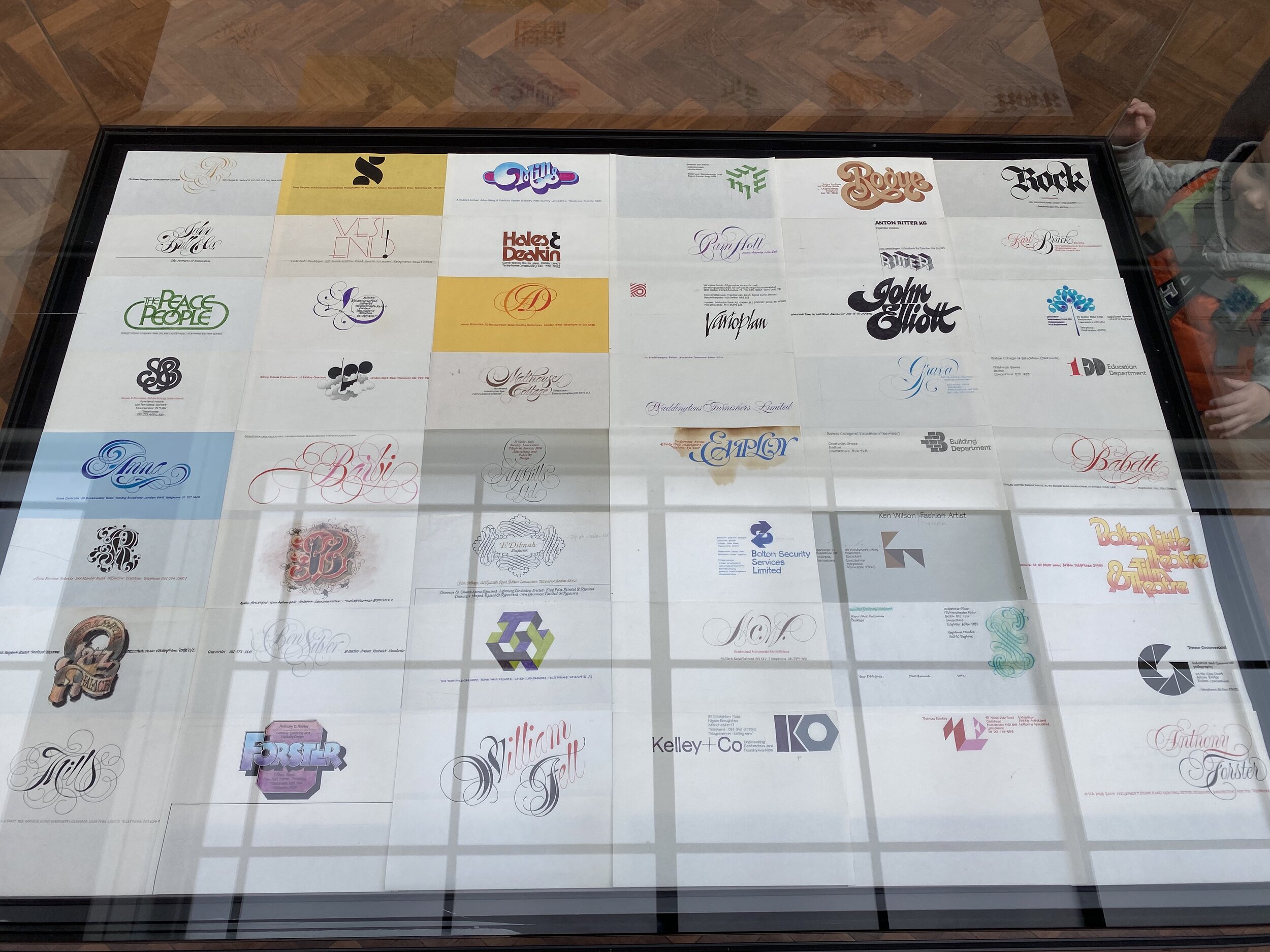
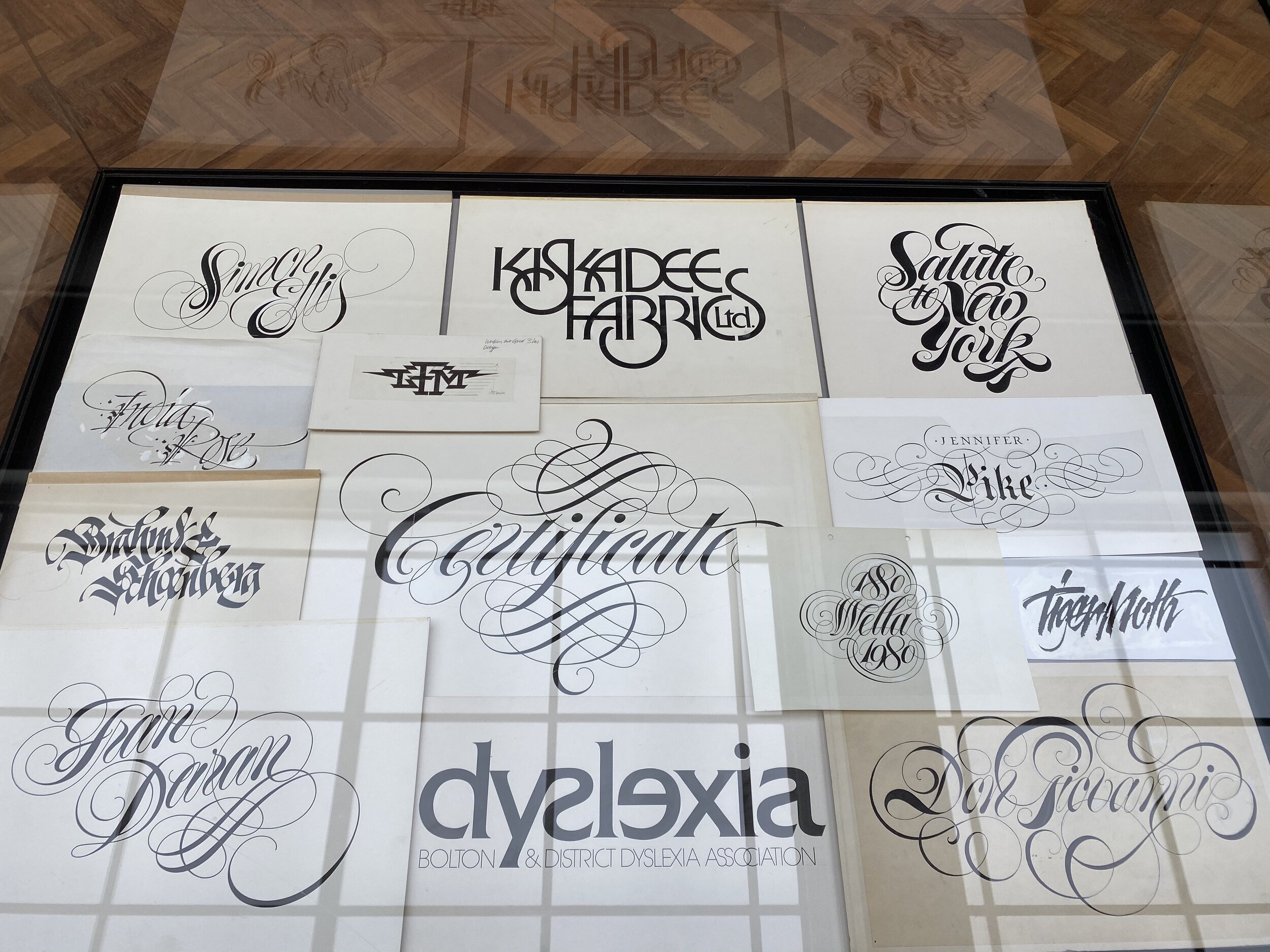
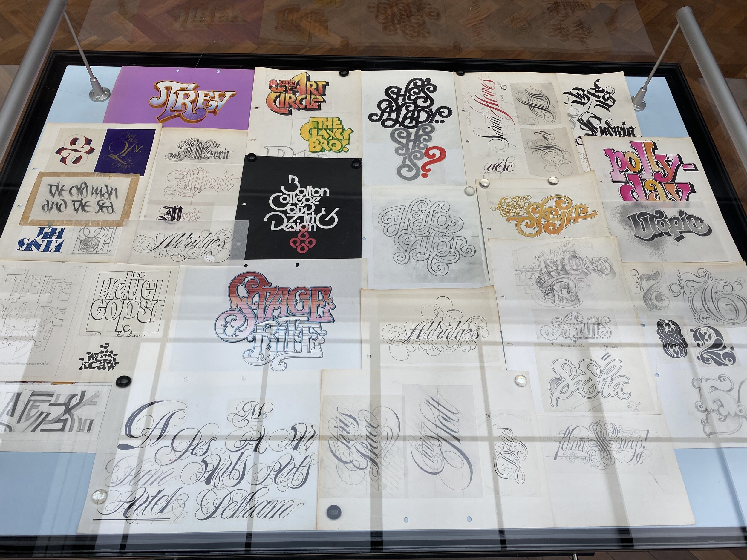
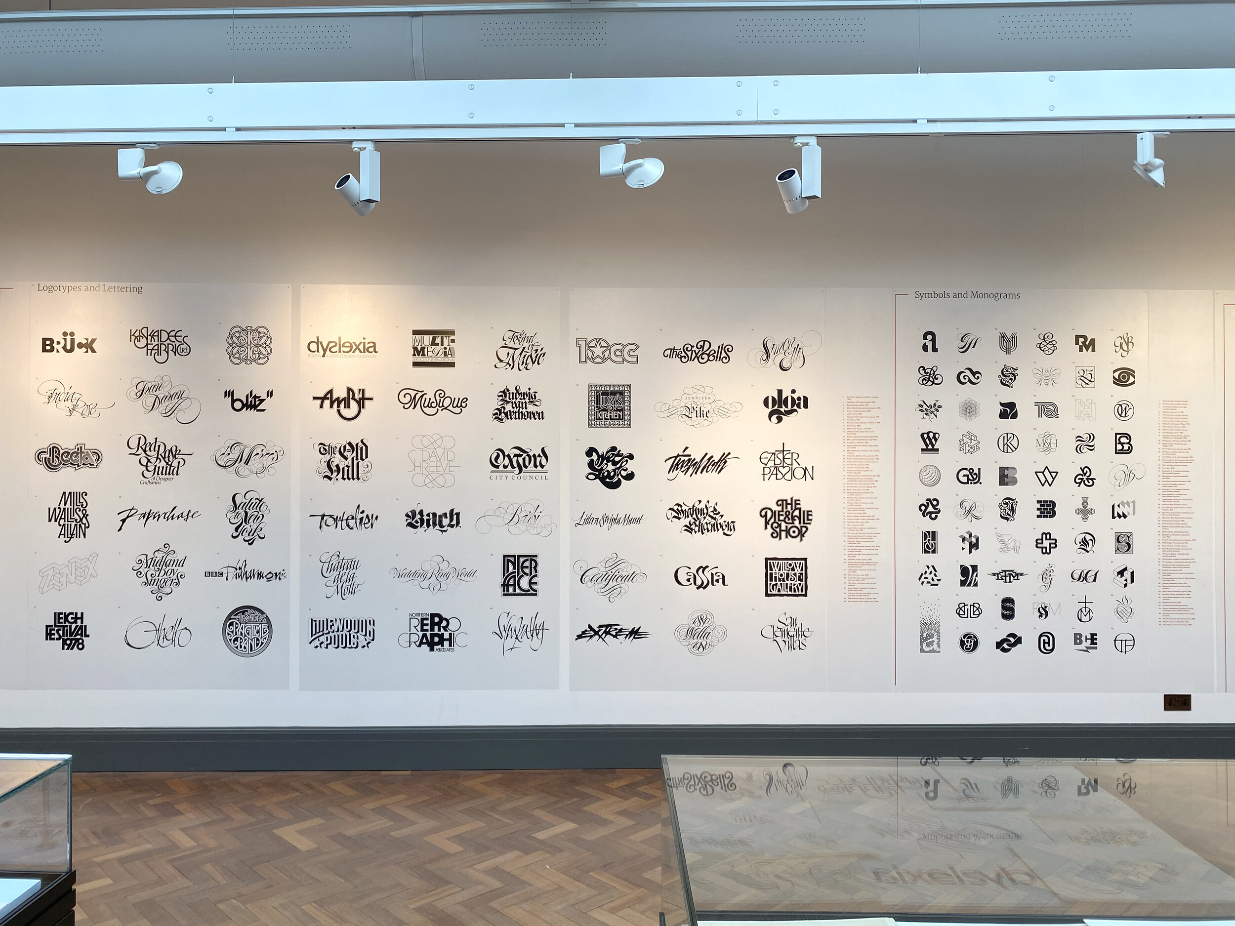
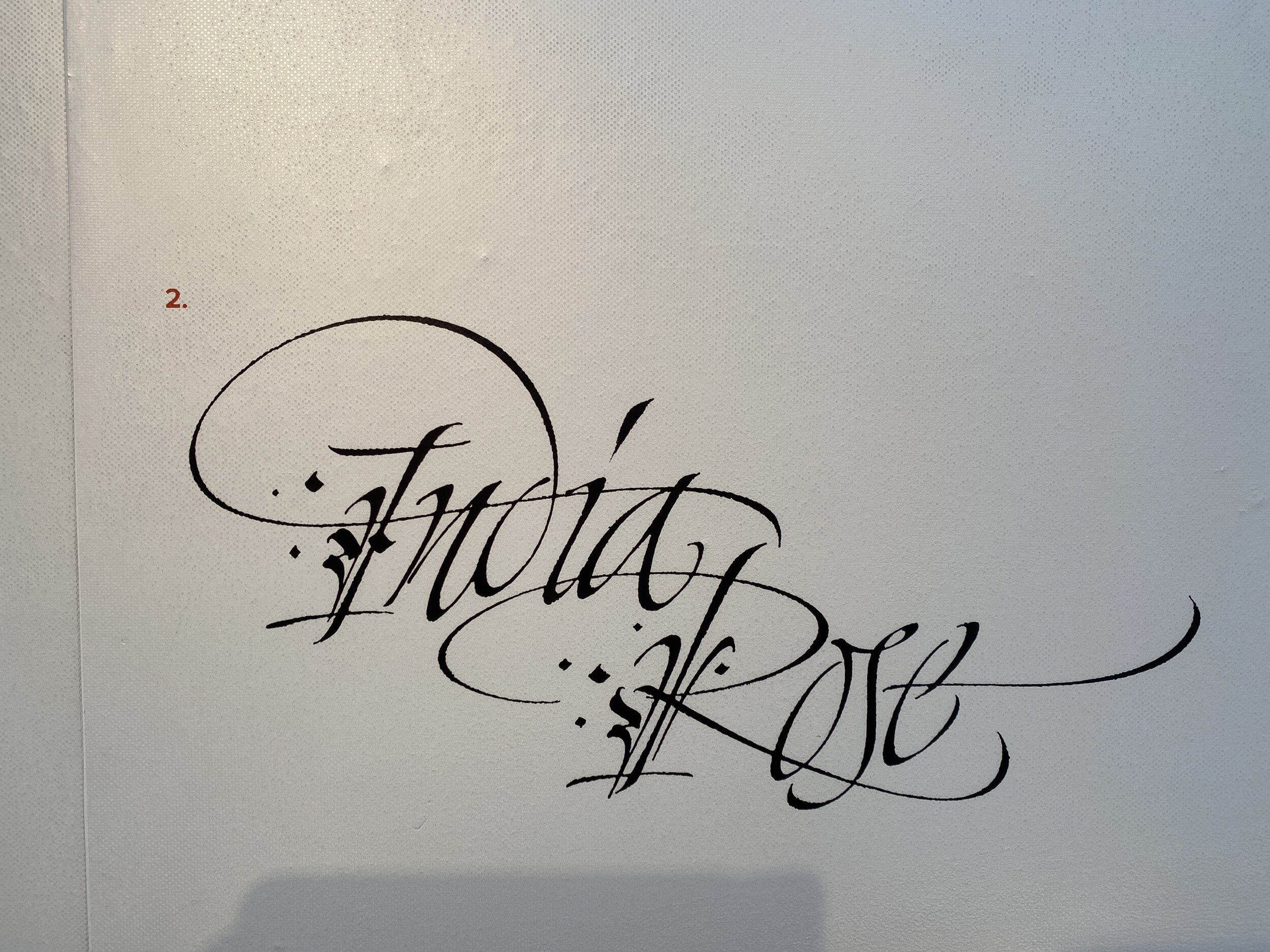
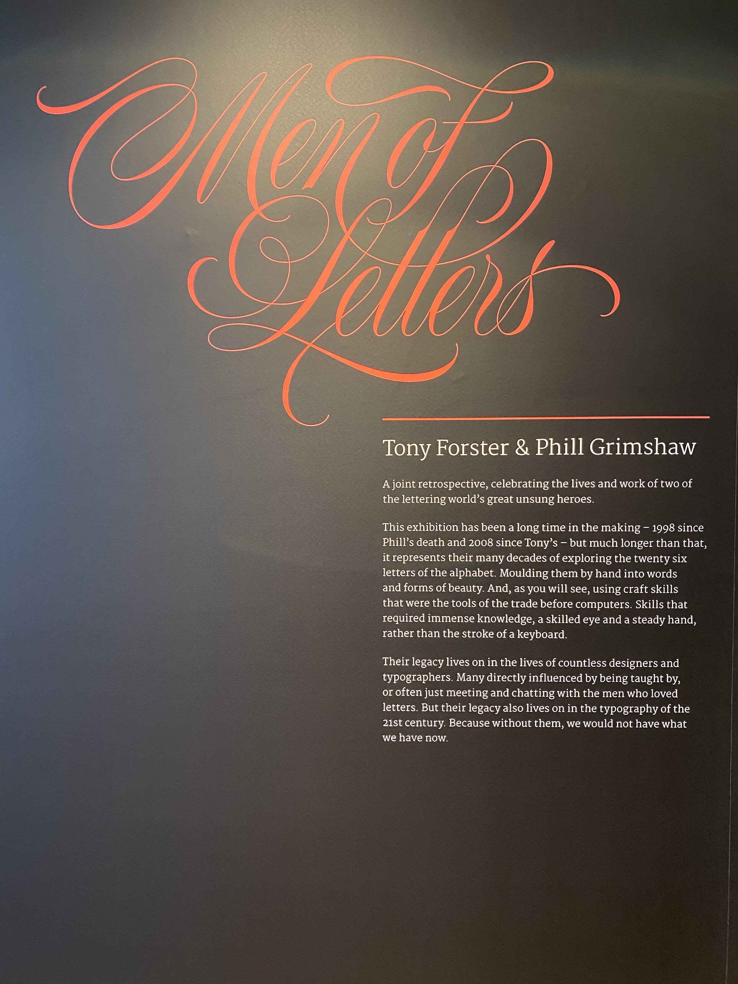
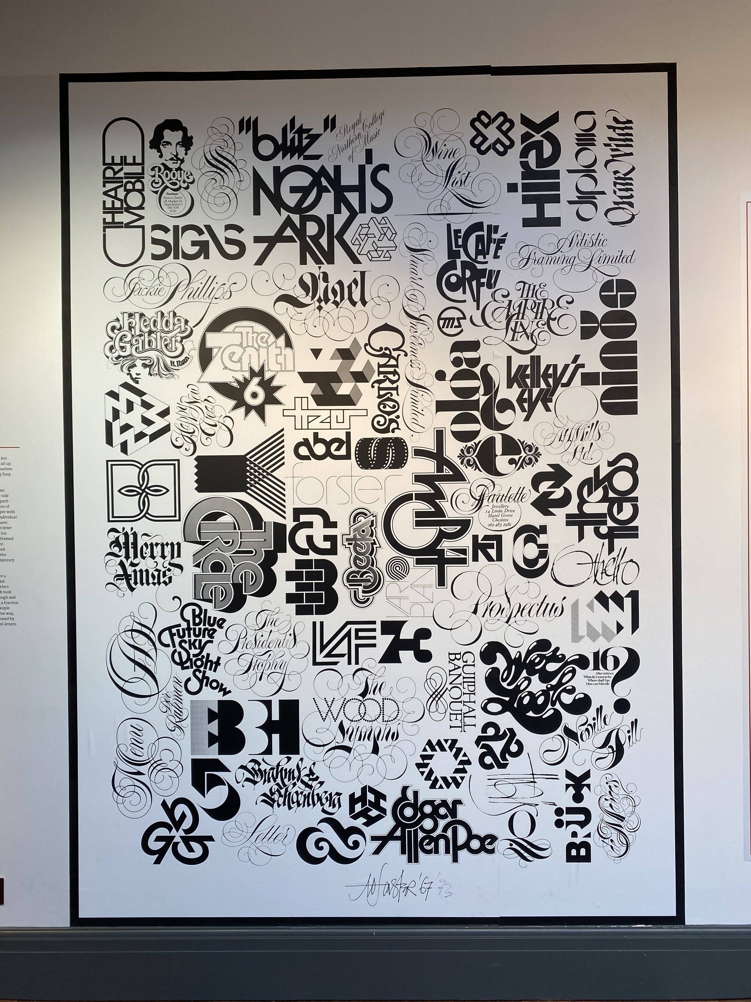
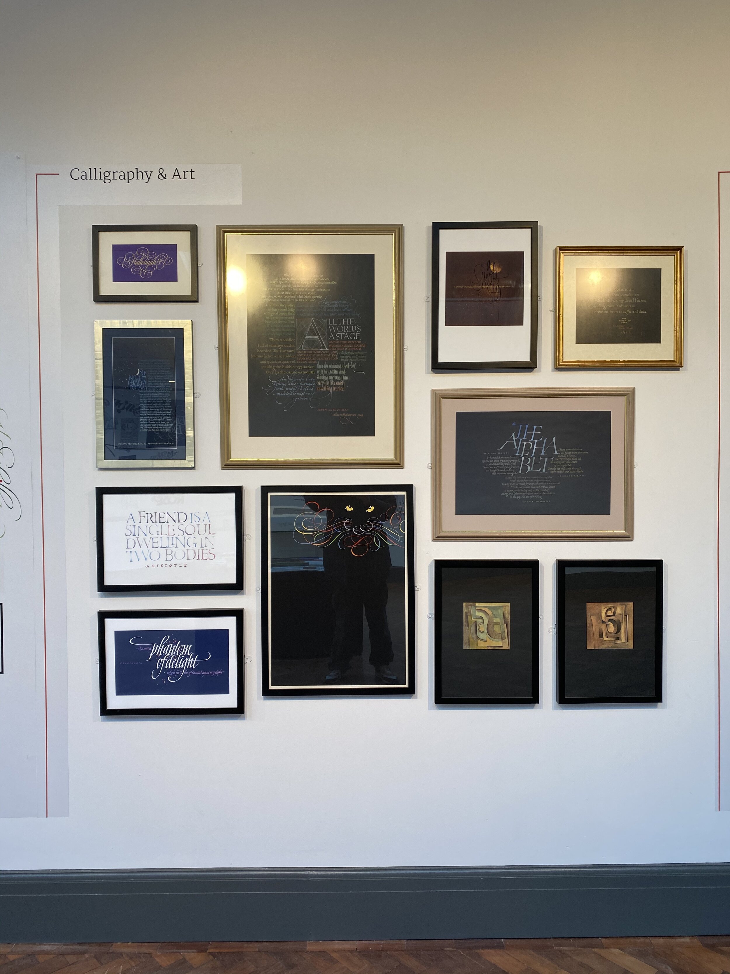
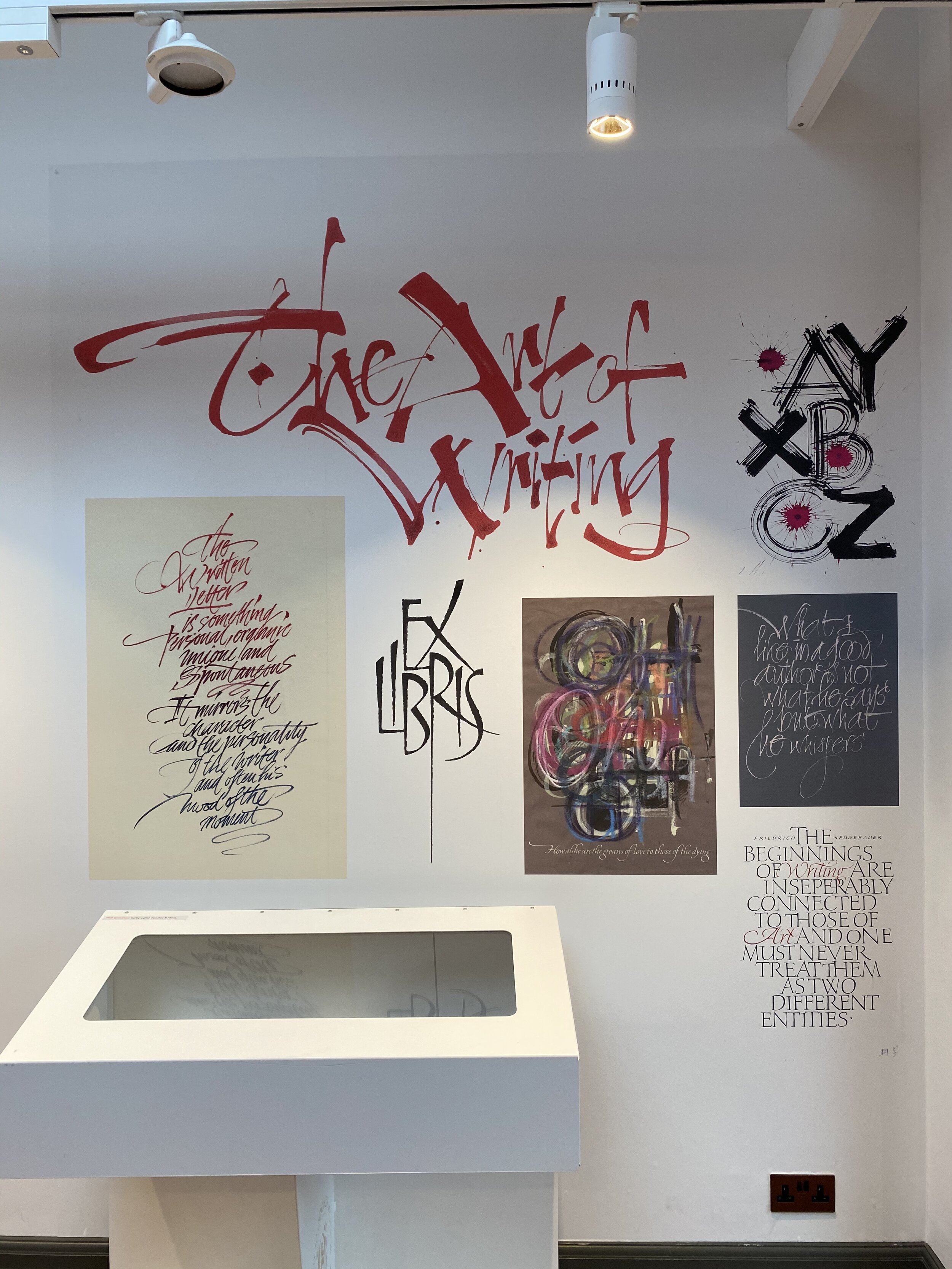
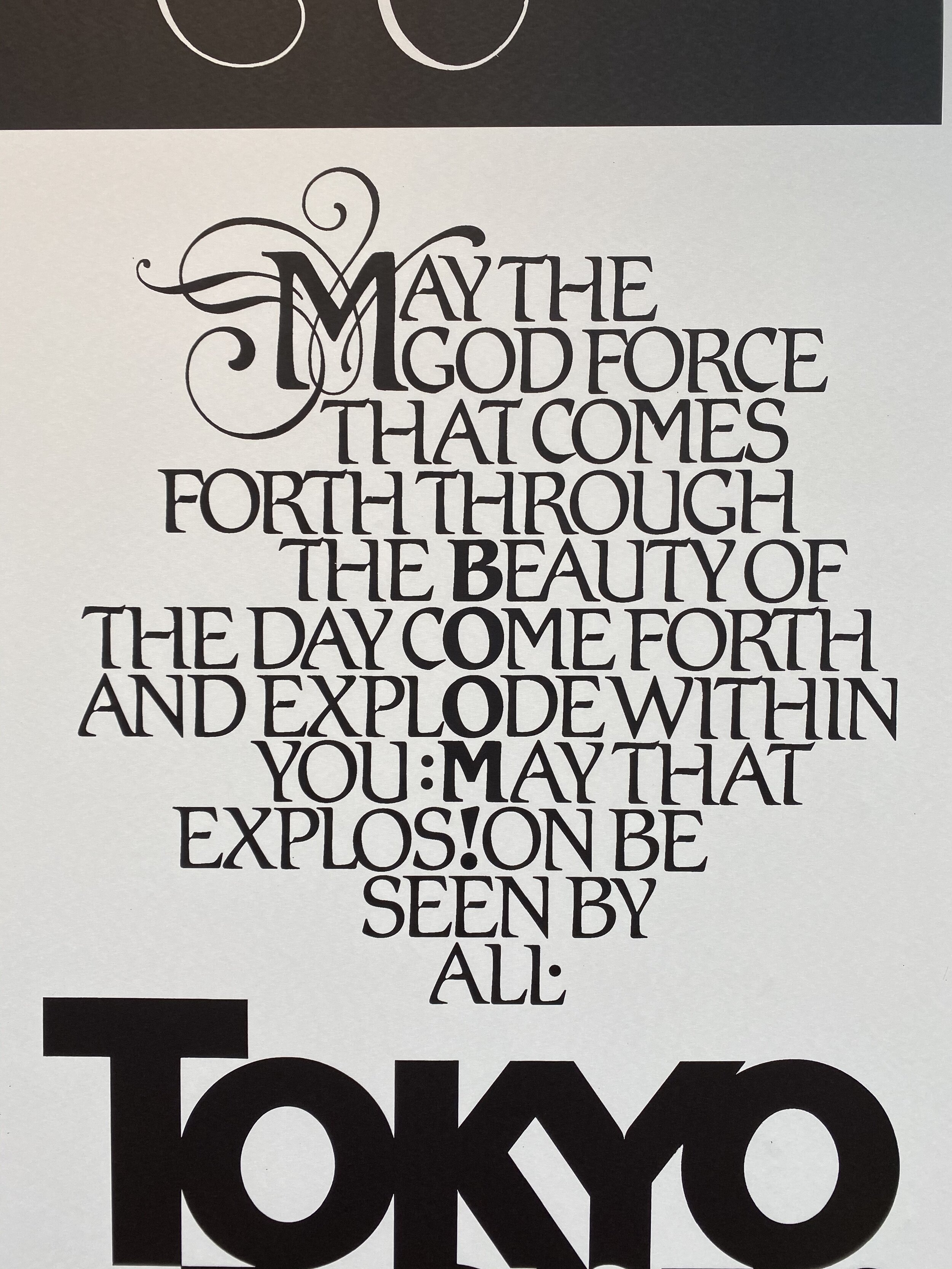
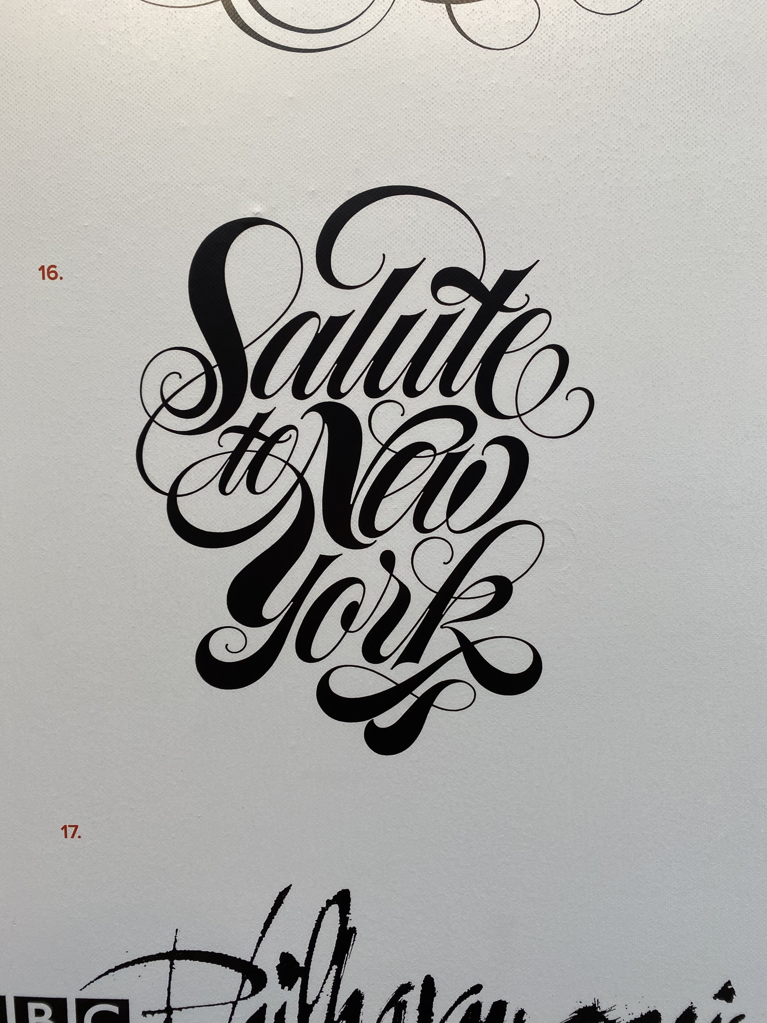
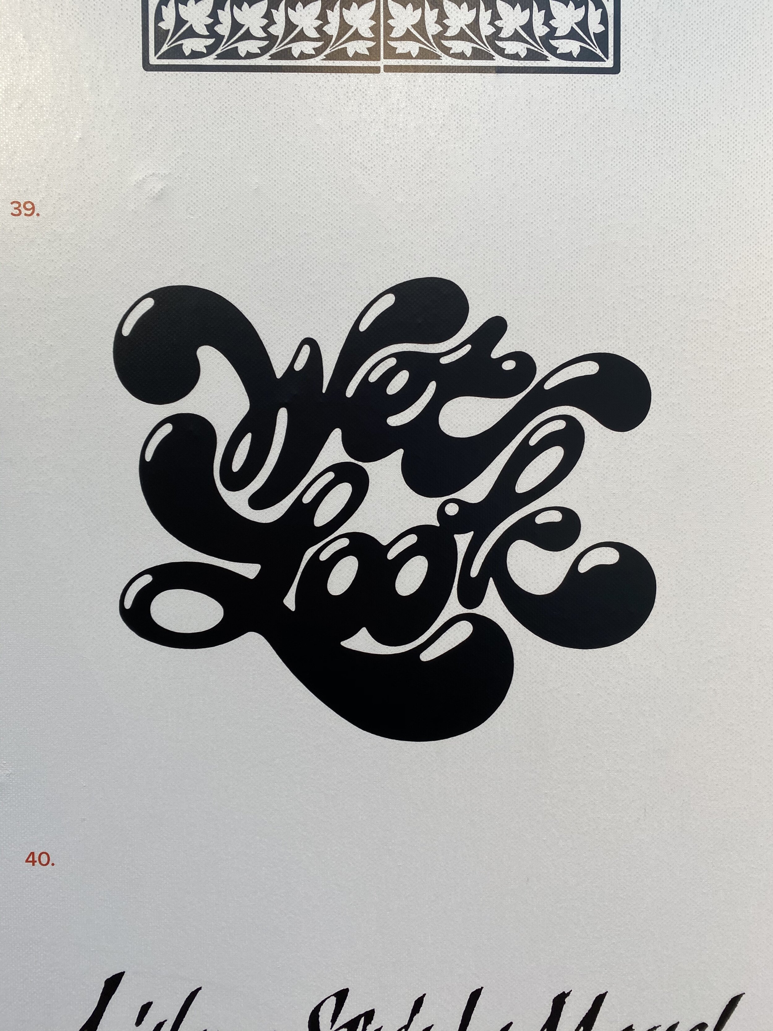
Men of Letters is a joint retrospective celebrating the lives and work of late lettering artists Tony Forster (1941–2008) and Phill Grimshaw (1950–1998).
The show has been organised by lettering artist Dan Forster (Tony's son), presenting "what is possibly the most extensive exhibition of hand lettering and calligraphy ever displayed in the UK," as Forster puts it.
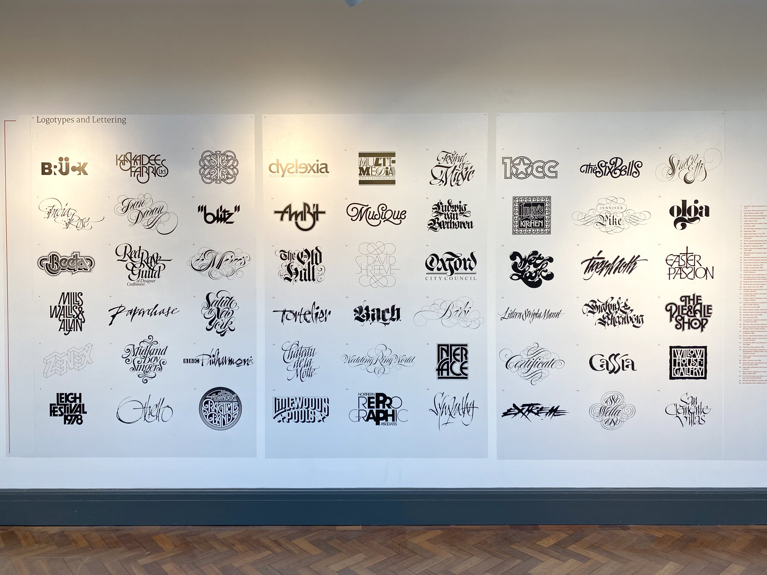
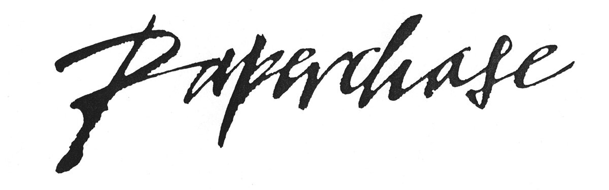
Alongside teaching at Bolton School of the Arts, Tony was a prominent figure in the Manchester design scene from the early 1960s; creating lettering work including the iconic logos for Paperchase, 1970s Rock Band 10cc and the BBC Philharmonic Orchestra.
After his death, designer Tony Di Spigna described Forster as "The Herb Lubalin of England".
A great piece by Richard Morris on Tony can be read here. It includes the fantastic quote:
“It has always fascinated me that we only have 26 letters. Arranged in the right order they can make you laugh or cry, make you happy or sad, angry or elated.”
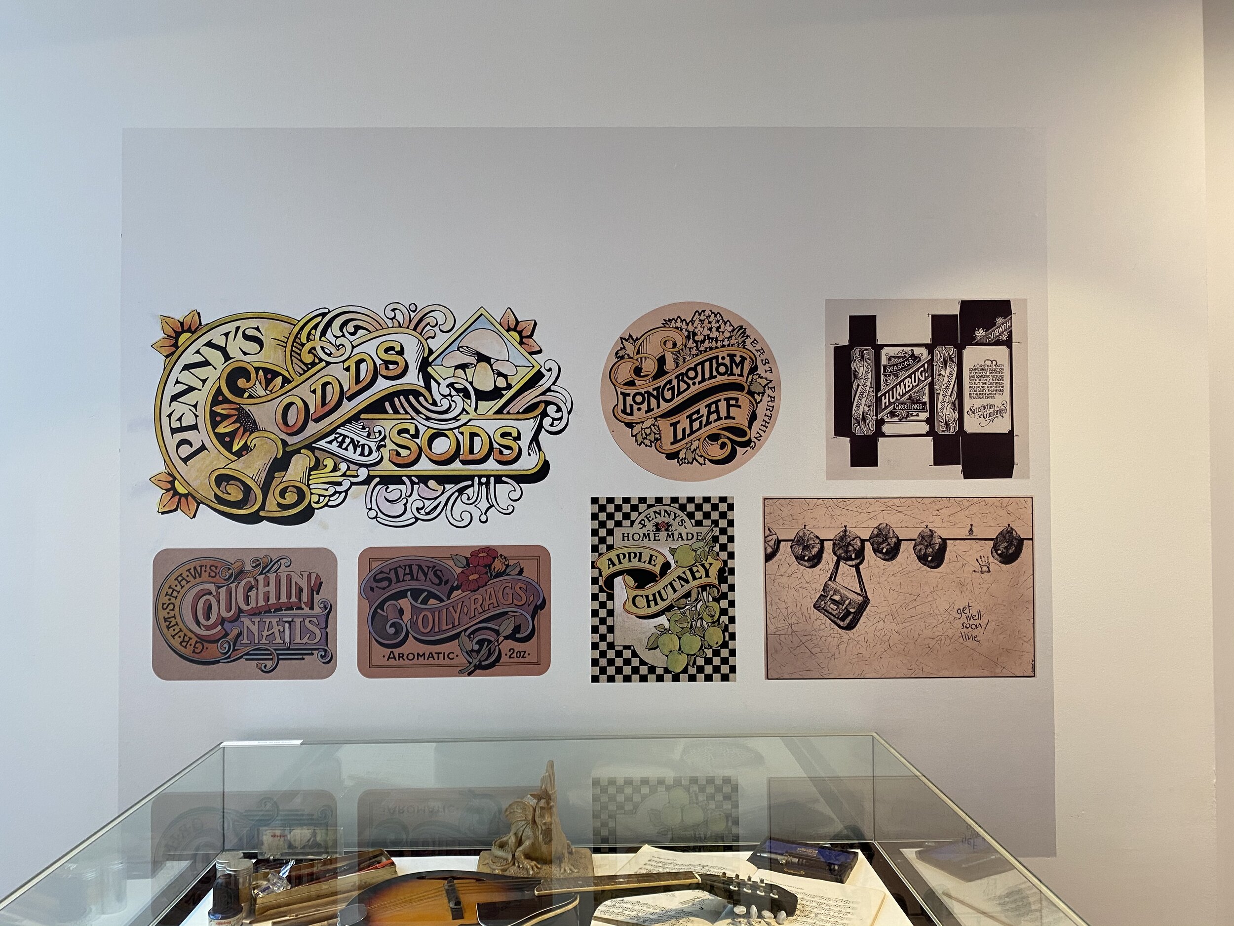
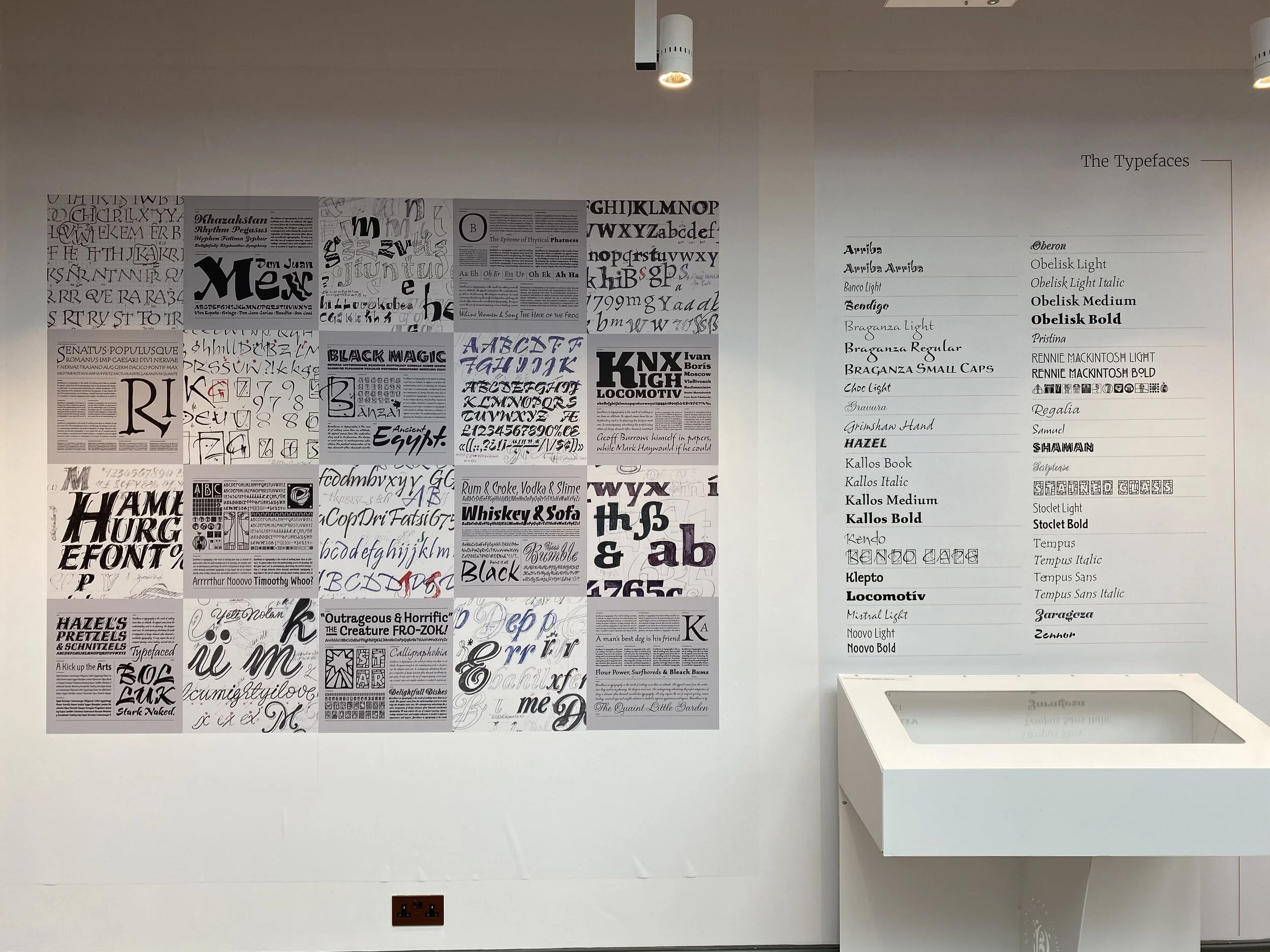
Grimshaw, (who was taught by Tony) went on to become an internationally renowned typeface designer, creating 44 typefaces for ITC and Letraset. He was described by Colin Brignall – himself a recipient of a Type Directors Club medal – as "One of the best display typeface designers of recent times".
Most of the work displayed in the exhibition has remained mostly unseen. This is because it was not produced digitally, and most of it has remained filed away in plan chest drawers and storage boxes for many years. This exhibition reveals their hand-created sketches, mock-ups, final artworks, original calligraphy pieces, typeface designs and original posters.
The free exhibition runs from 8 February until 8 March 2020 at Bolton Library & Museum.
Last week, Year 1 Graphics student Max Greer headed to Amsterdam. Amongst the many pleasures the city has to offer, Max visited one of my favourite places in the world - the Stedelijk Museum - which houses vast collections of the world’s best art and design. He kindly took the time out to write us the following blog. Thanks Max!
A city of Tulips and Type
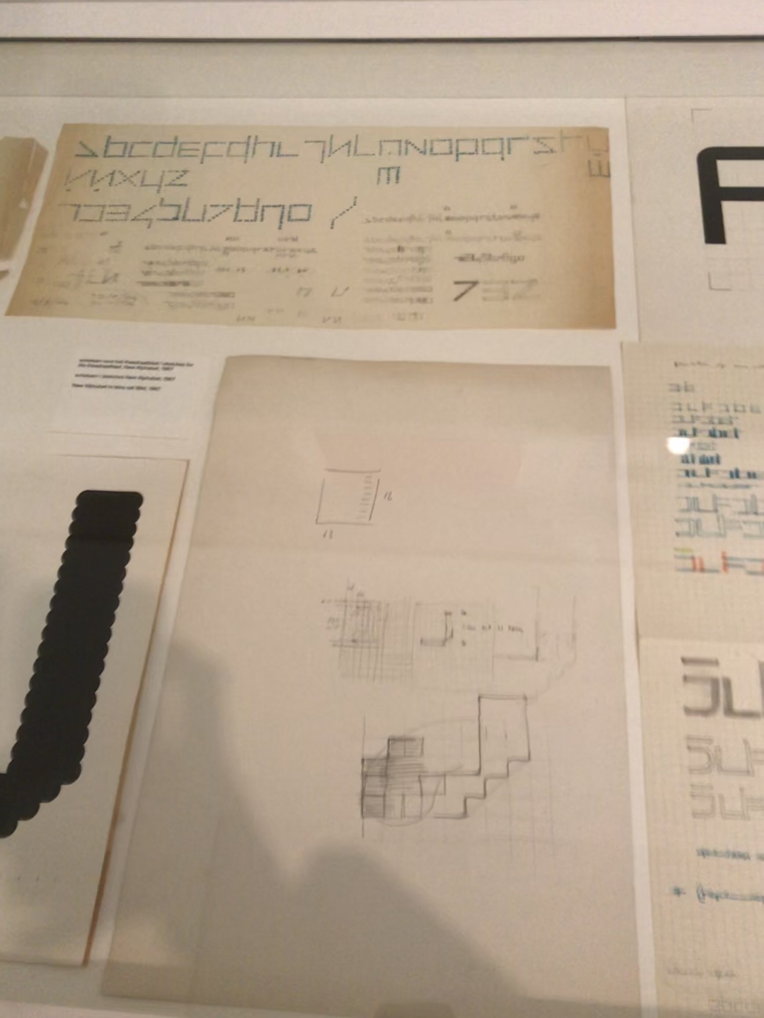
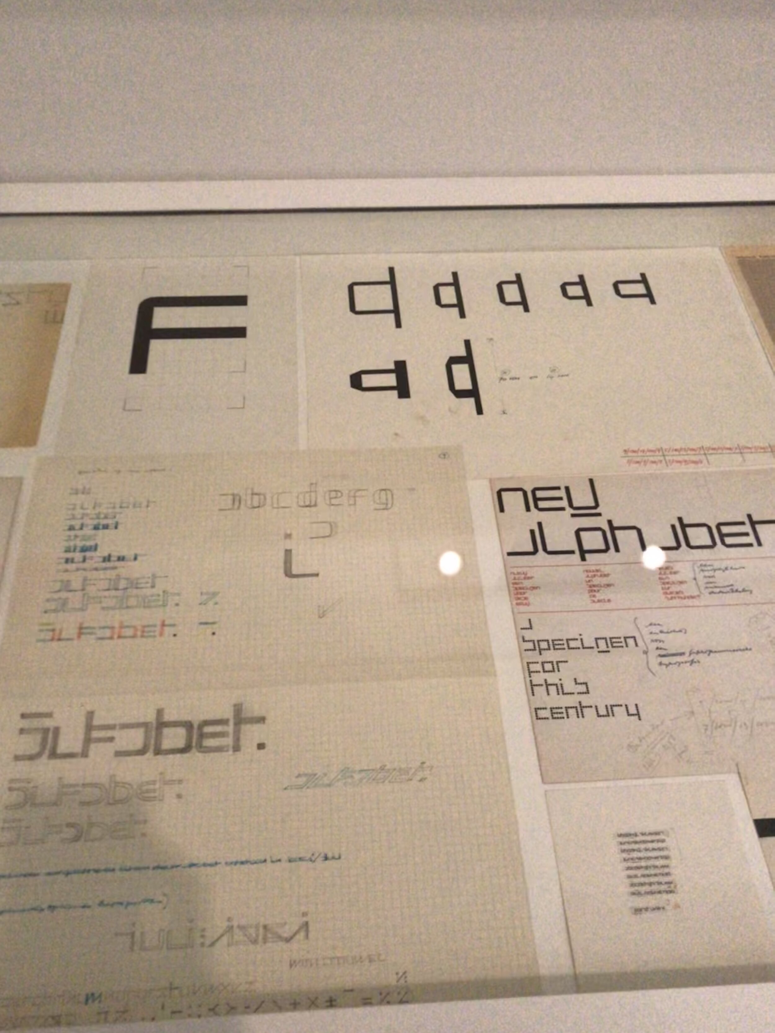
The Stedelijk Museum is an architectural spectacle located in the heart of the museum district in Amsterdam. It features modern artists and graphic designers of the highest level, both up-and-coming and giants of the industry. I was fortunate enough to visit it and see the art for myself and there was one exhibition that stood out. Wim Crouwel (1928-2019), was a Dutch graphic designer and typographer whose practice was that of a master level. There was a whole section dedicated to his work, which featured original posters, catalogues, designs and in-depth videos on all aspects of his career. In the images you can see the way he created his font ‘New Alphabet’ using grids and carefully measuring each piece of type to perfection. Though these images don’t justify the sheer wonder of his work. To all graphic designers, typographers and type designers this a must visit, you shall not be disappointed and will leave inspired!
If you’re in Amsterdam and you’d like to check the exhibition out, all the information is here.

On a recent weekend visit to Llandudno (North Wales) I came across a range of typographic signatures made out of Limestone. They were located on the summit of the Great Orm headland by tourist, visitors and walkers.

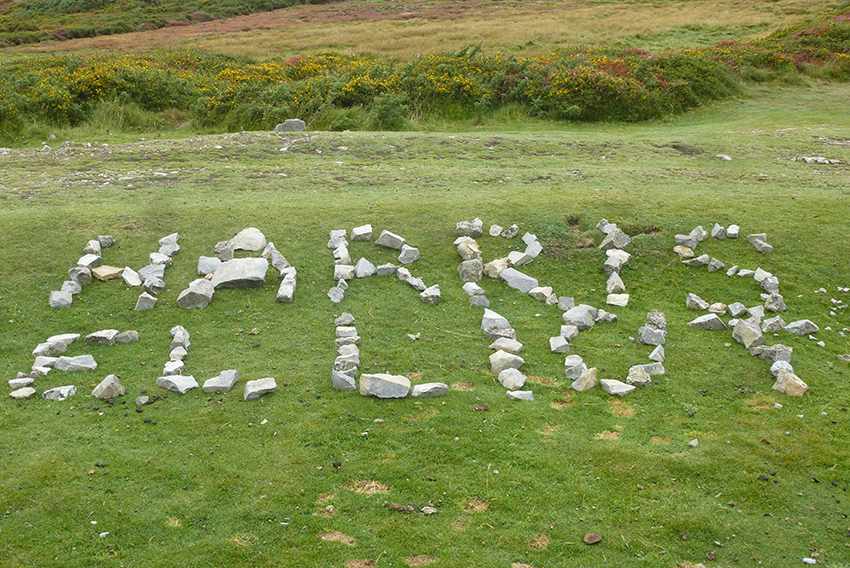
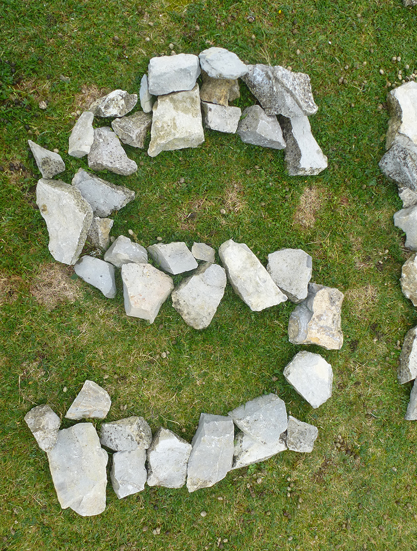
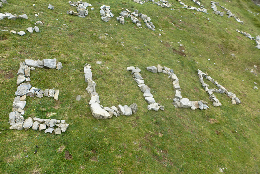
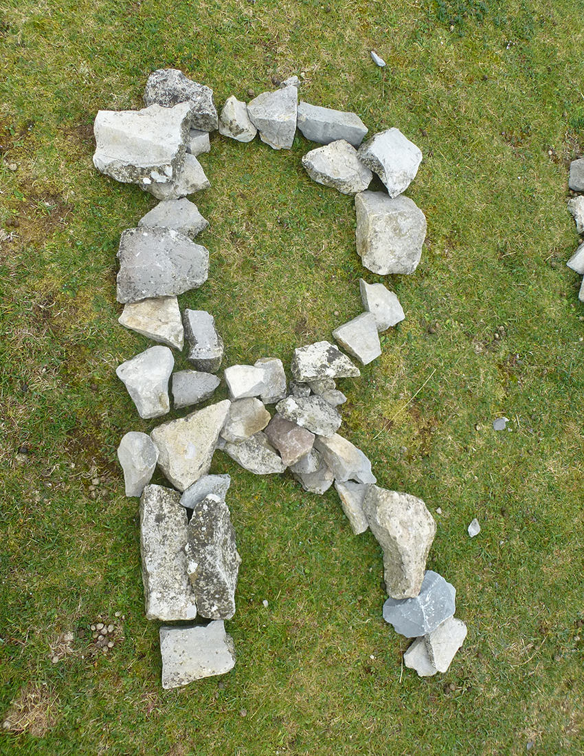


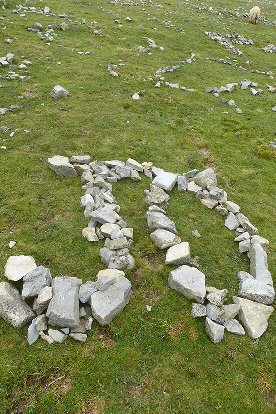
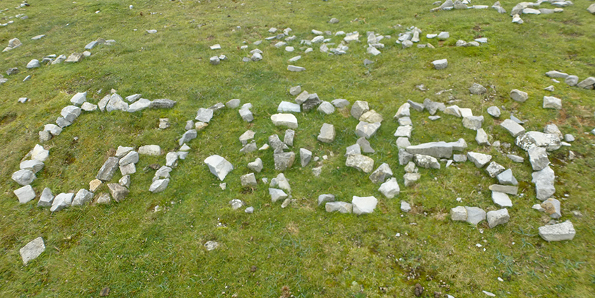
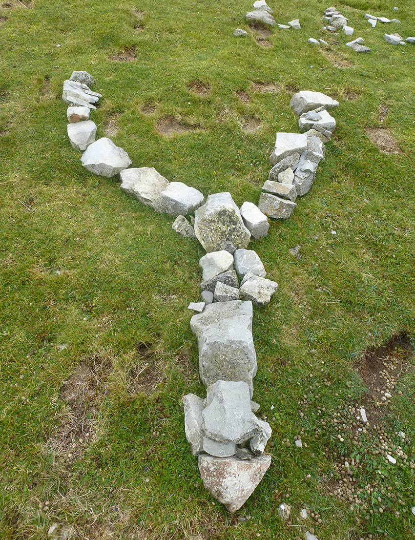
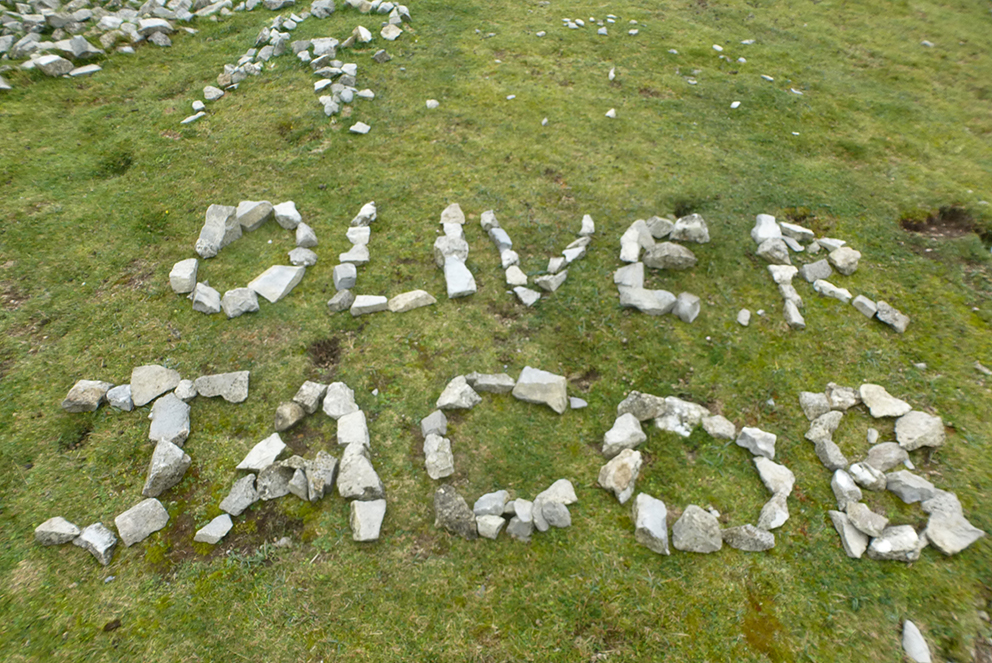
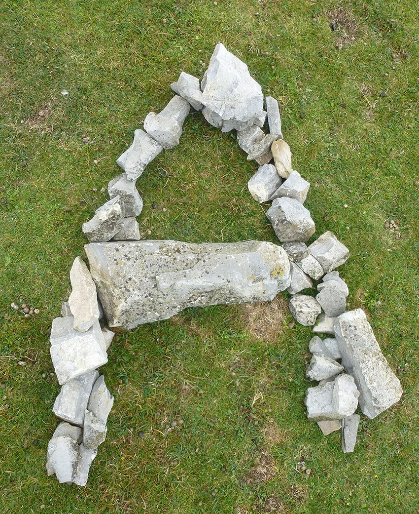

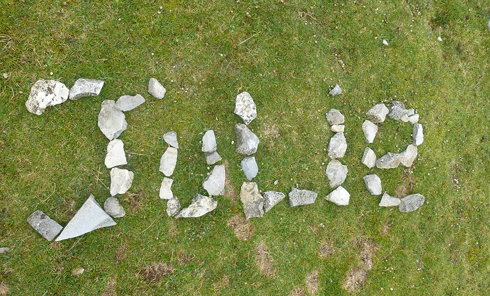
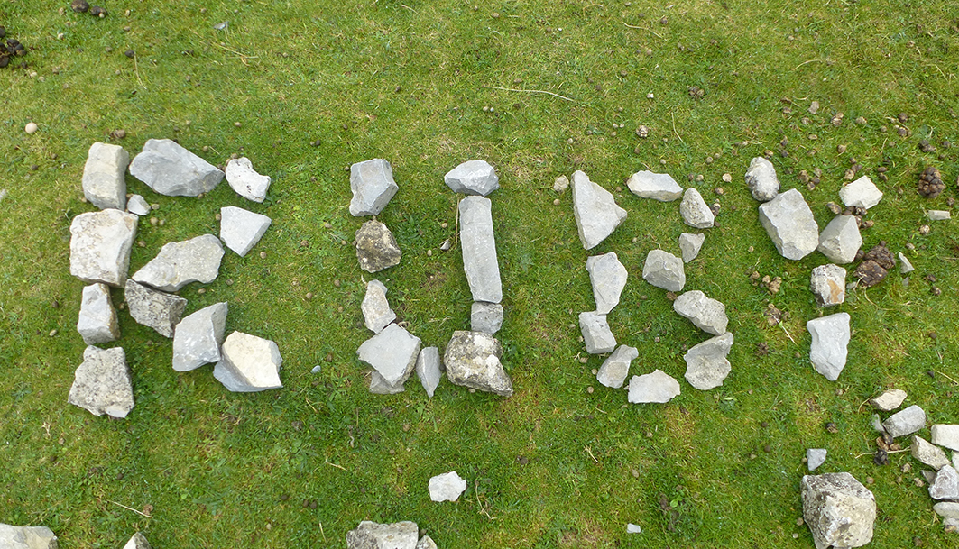
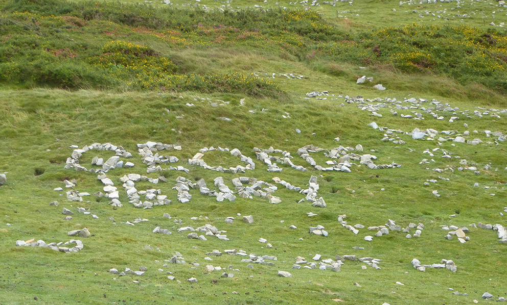

Some of the names had slowly been moved over the years probably due to the sheep that graze on the Orm.

Here is an example that is almost unreadable.

The Disciples Of Design are a global collective of design academics, practitioners, artists and students. We have one common thread – University of Lancashire in Preston, UK; and one common aim – the creation of an ever evolving visual hub for the sharing of ideas and thoughts.