Hope
/Hope is an upcoming event in October 2026 which is being developed by Paul and Sharon O’Gara. They are founders of the Mary O’Gara Foundation, a non-profit organisation dedicated to increasing awareness around mental health and suicide prevention for young people.
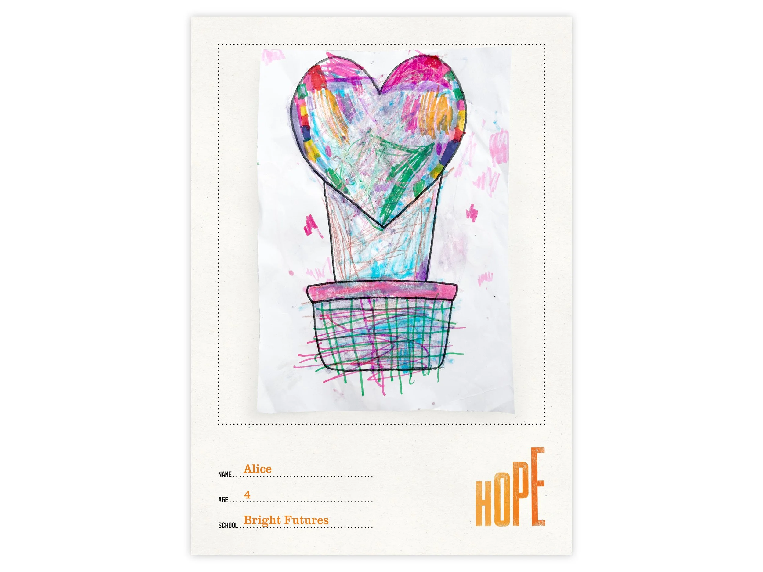
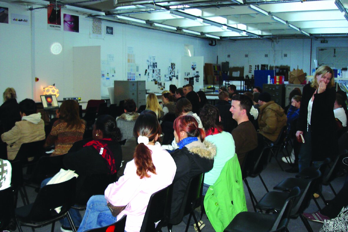
The event itself will begin with the third edition of The Hope Walk and culminate in an exhibition to be held in Victoria Building’s PR1 Gallery. The artwork at the exhibition will be provided by pupils and students from local schools and colleges, who are contemplating creative responses to one question:
“What does hope look like for you?”
Whether those responses are drawn, modelled, painted, animated, spoken, recorded or…wherever creativity takes them, the responses will be exhibited in PR1 Gallery from 13th to the 30th October.
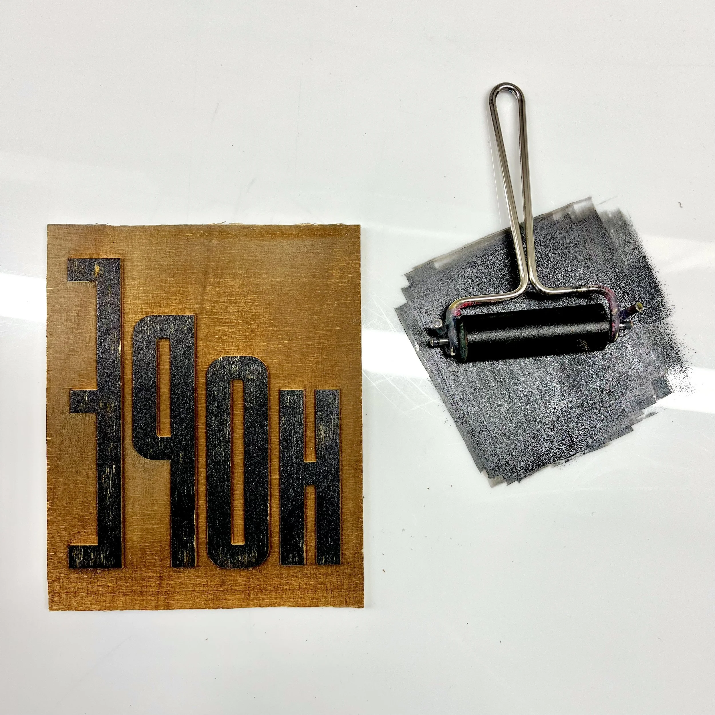
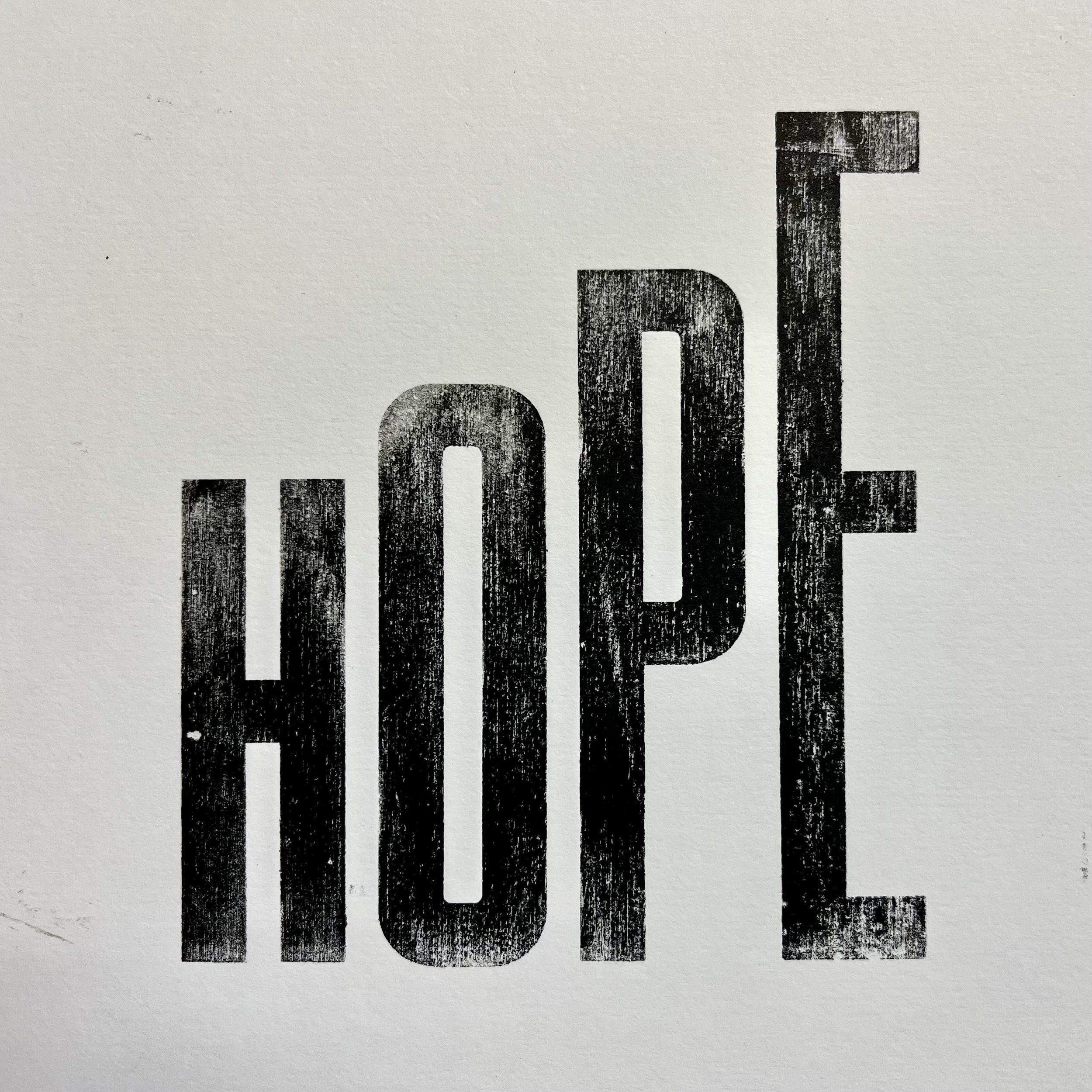
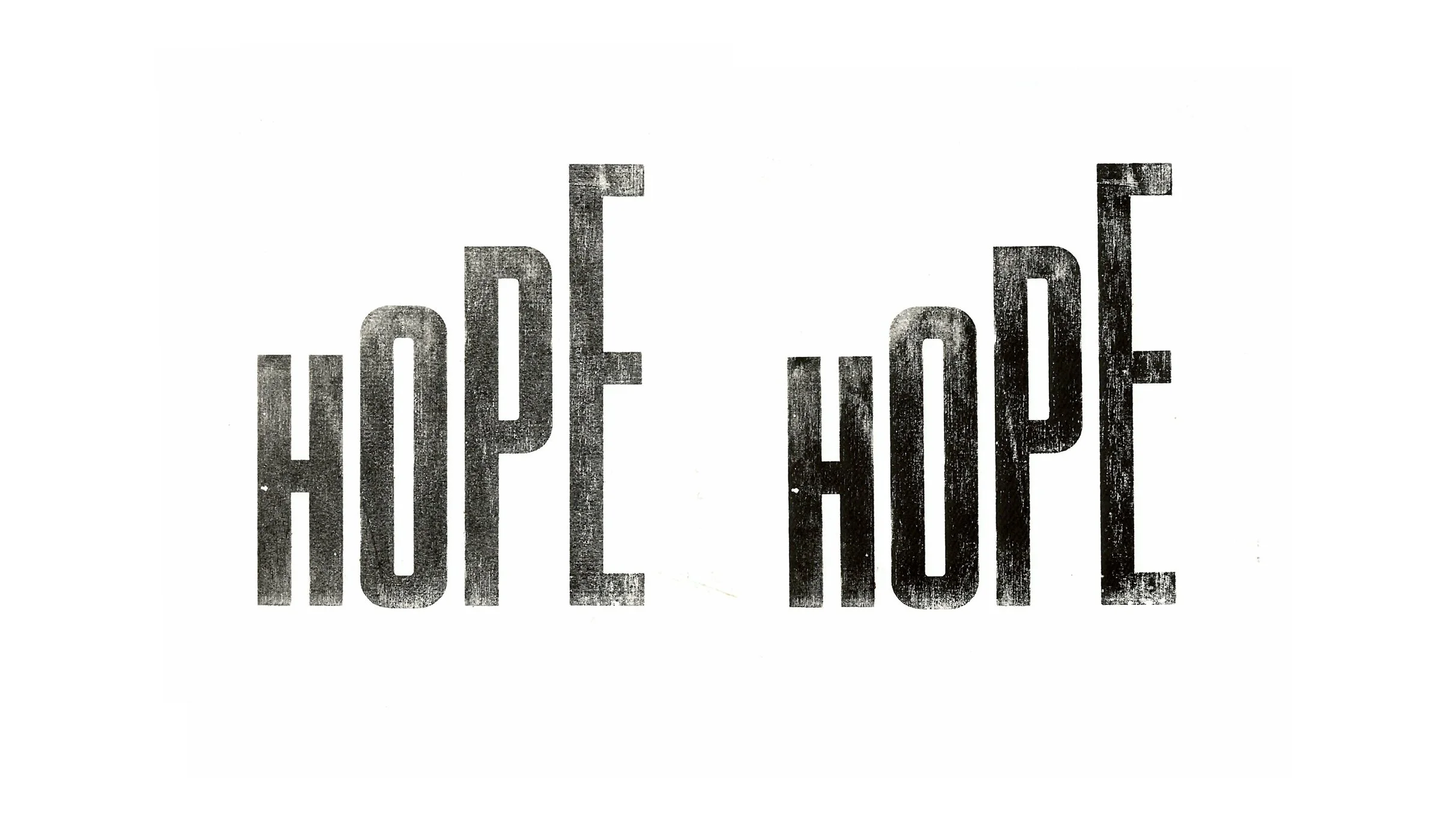
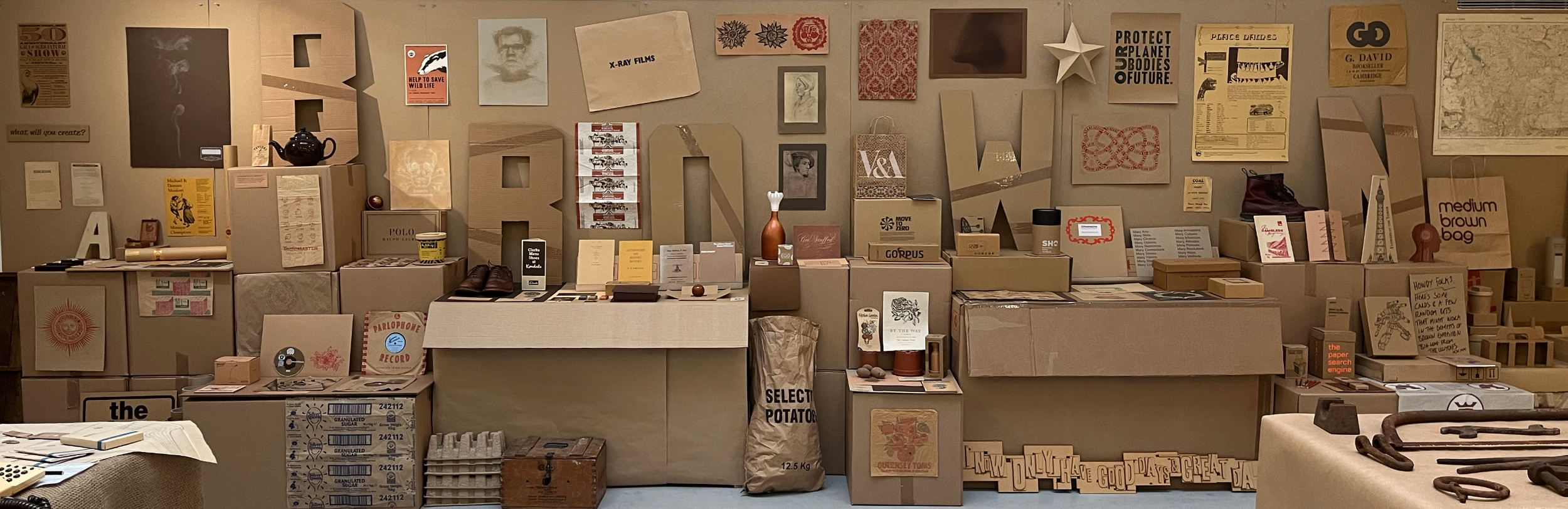
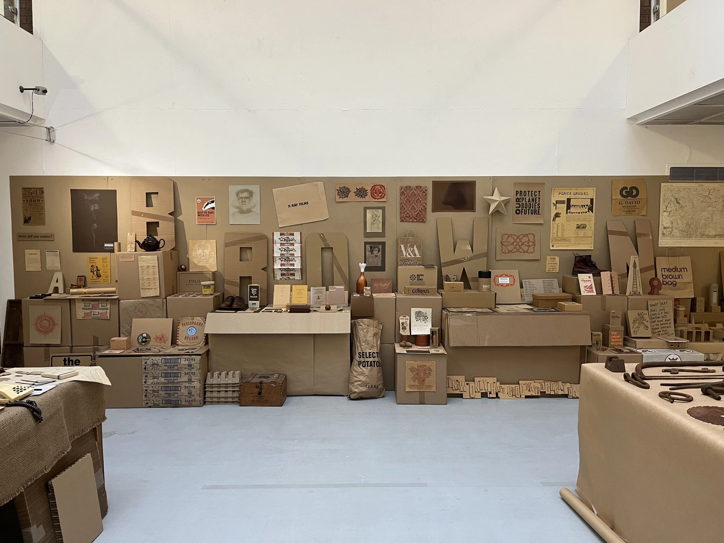
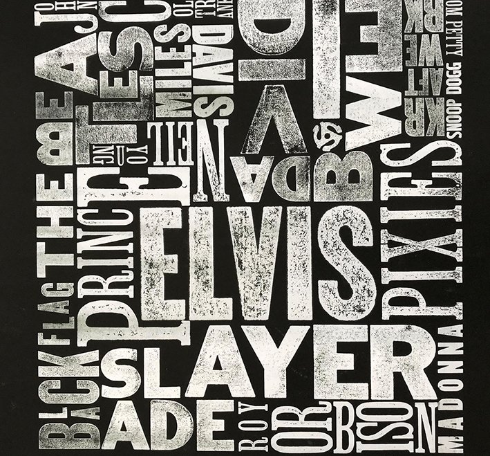
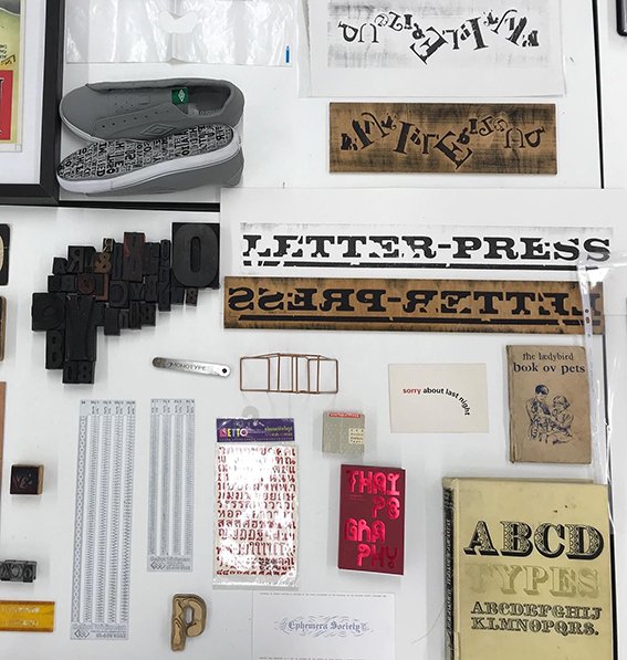
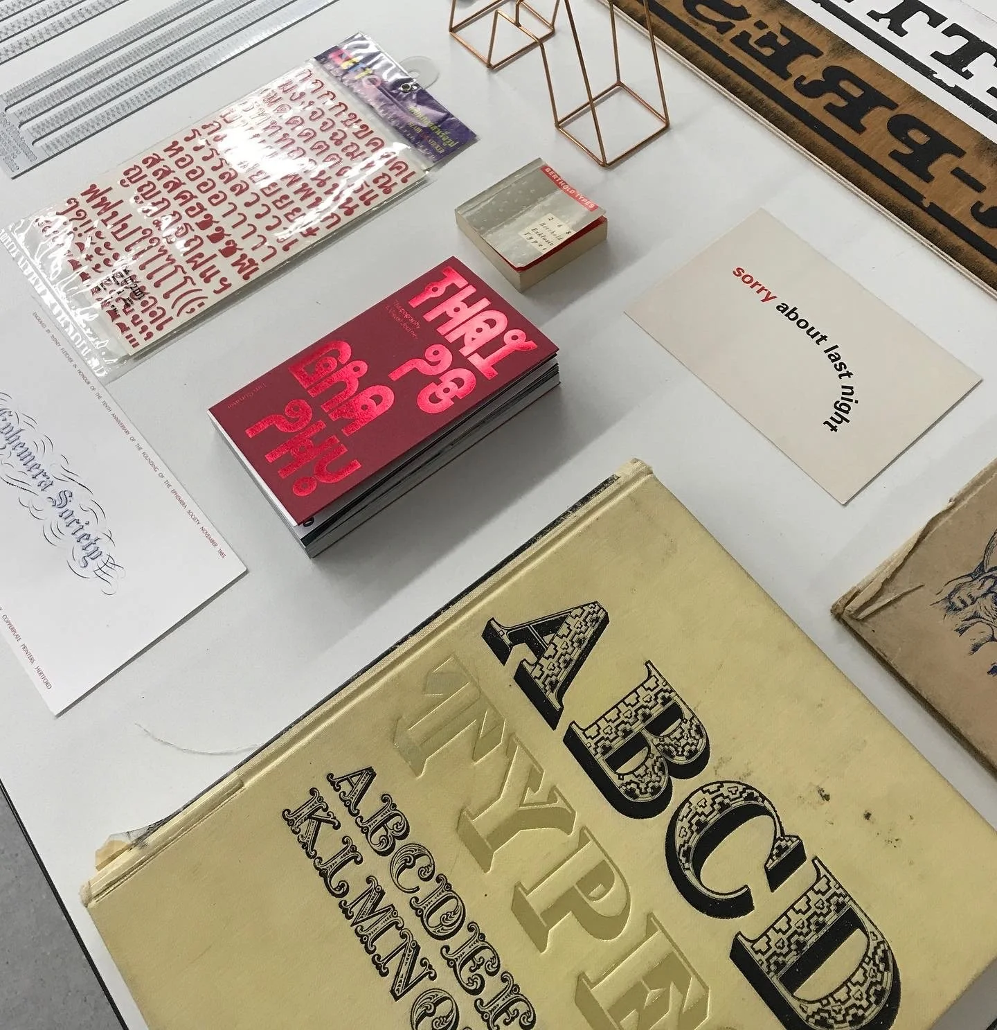
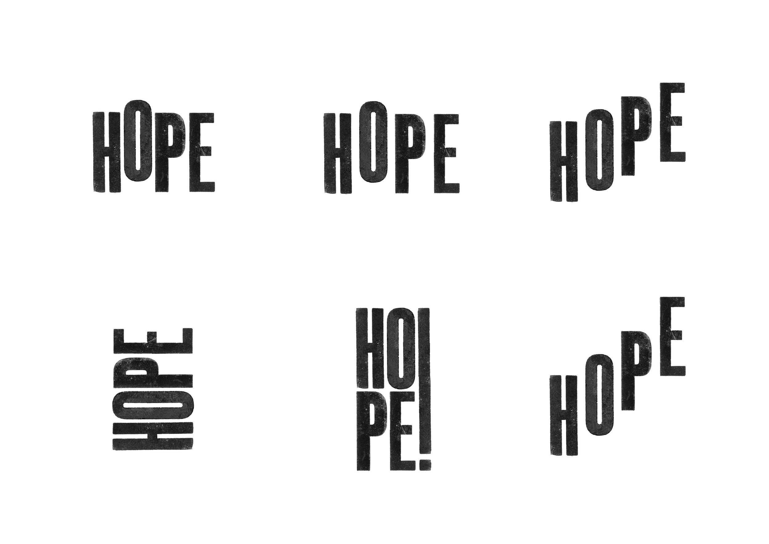
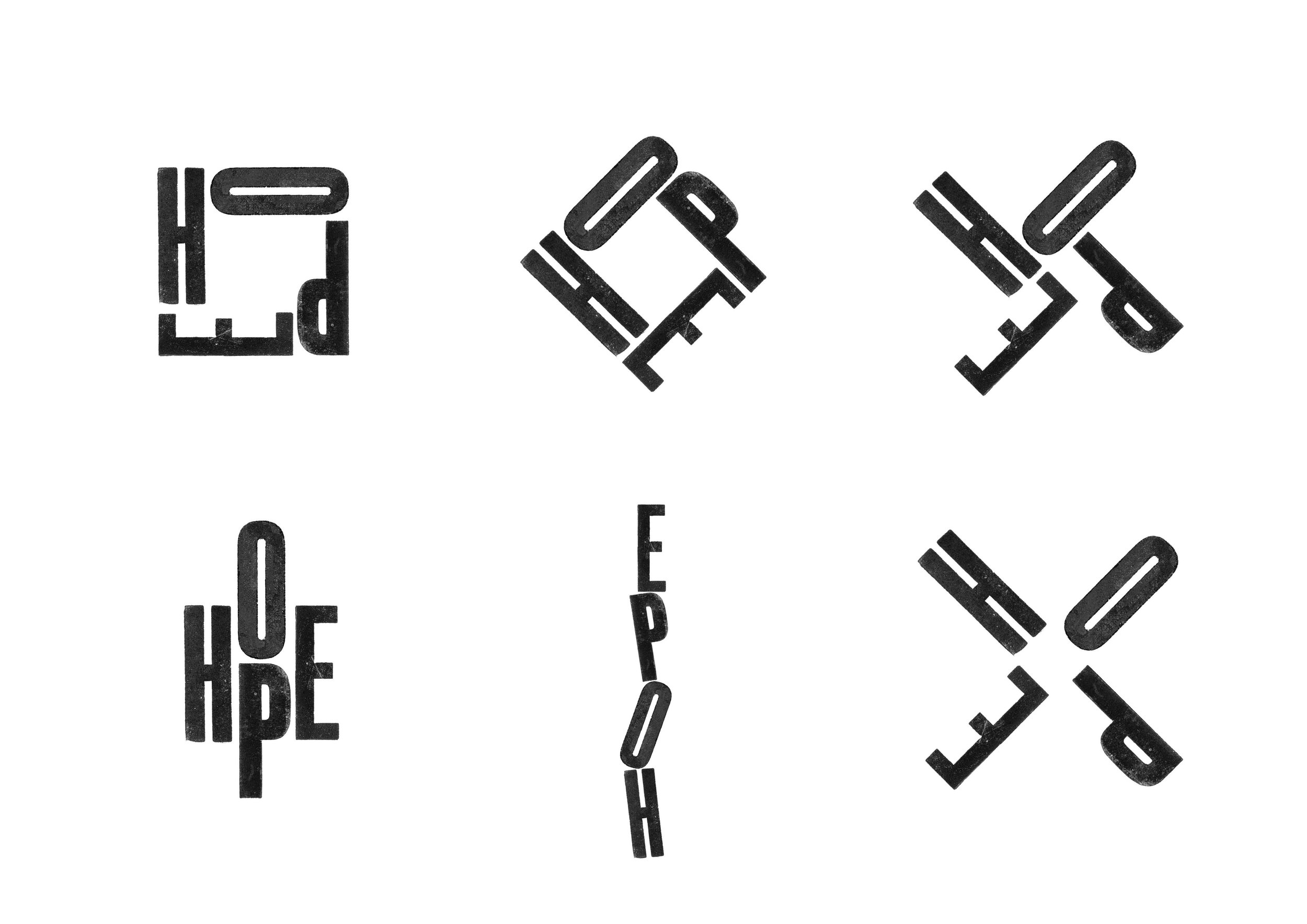
To help promote the exhibition, university staff are developing a supporting graphic identity. Early iterations and development of which are shown below. Wooden type is being utilised: it is appropriate for the identity to be created by hand, to allow for imperfection and to communicate a human touch.
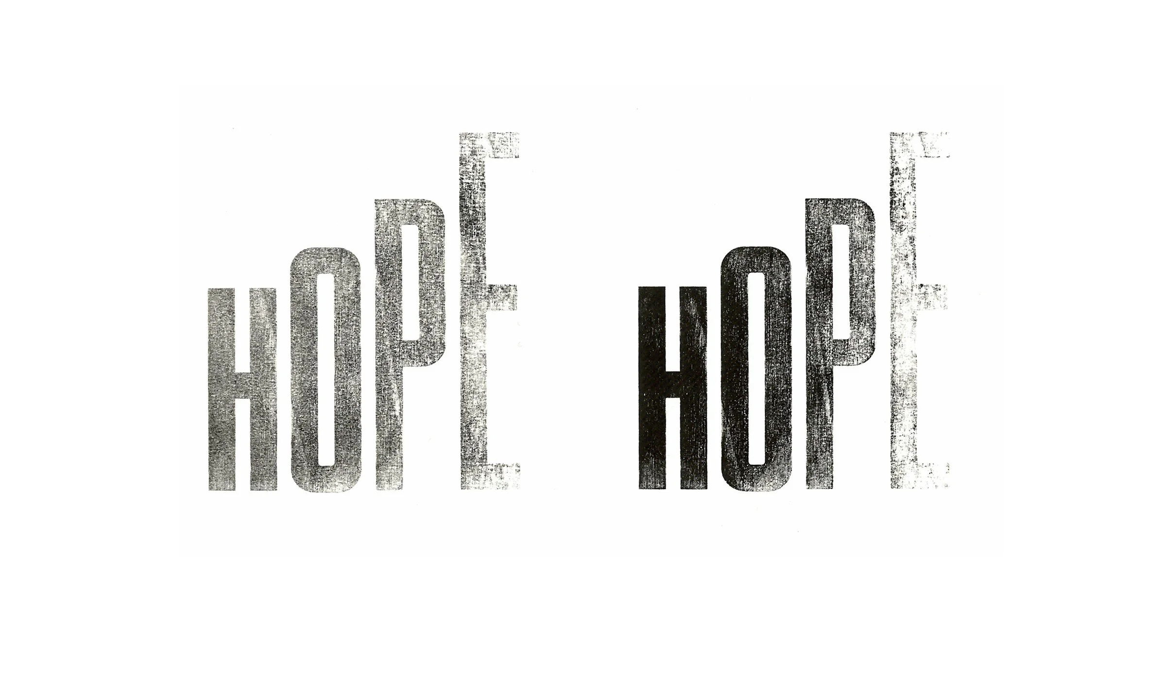
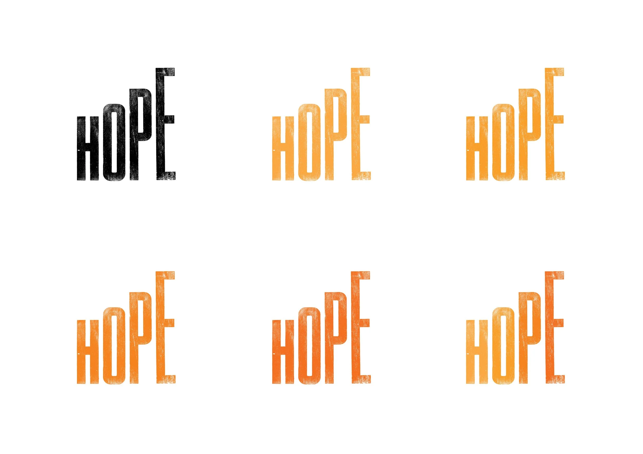
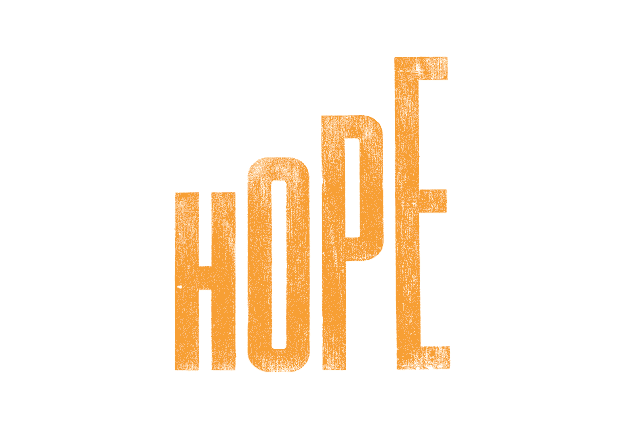
The idea is a simple one: each letter of the word grows in height, with each letter growing slightly more than the letter before it. The latest iteration utilises Matt Willey’s MFred (2.0) typeface, which is available at the link in support of Cancer Research UK and Macmillan.
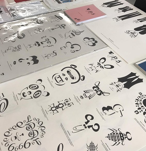
Initial ideas & iterations using wooden type
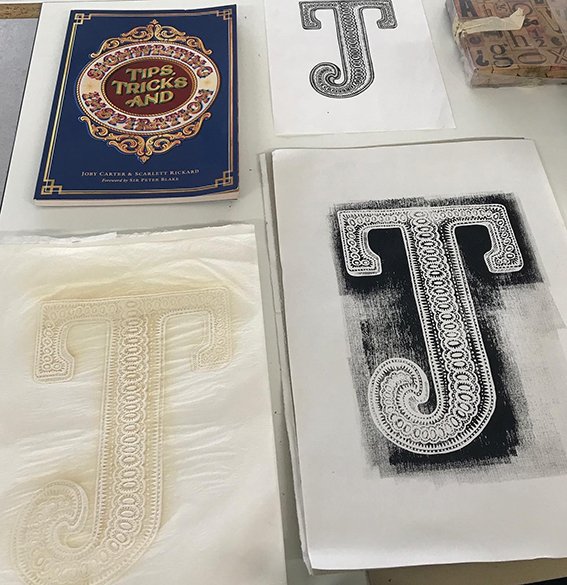
DEVELOPING THE IDEA

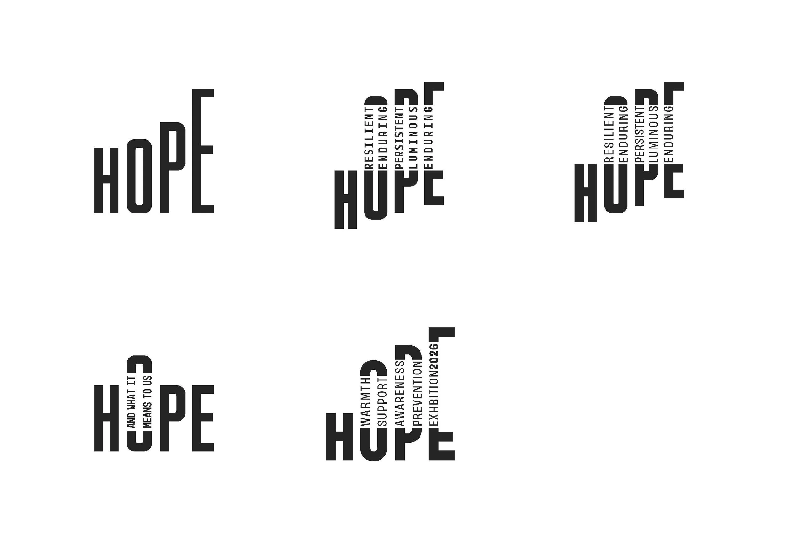
CRAFTING THE typography WITH MFRED (2.0)
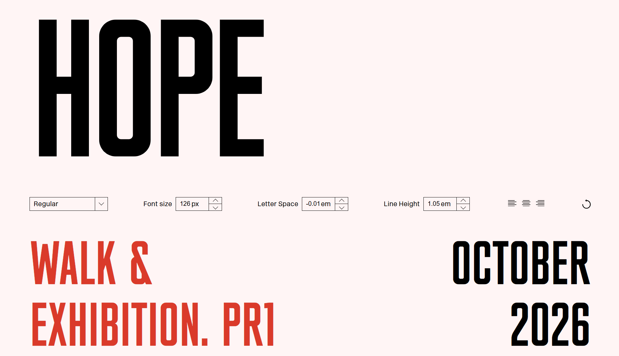

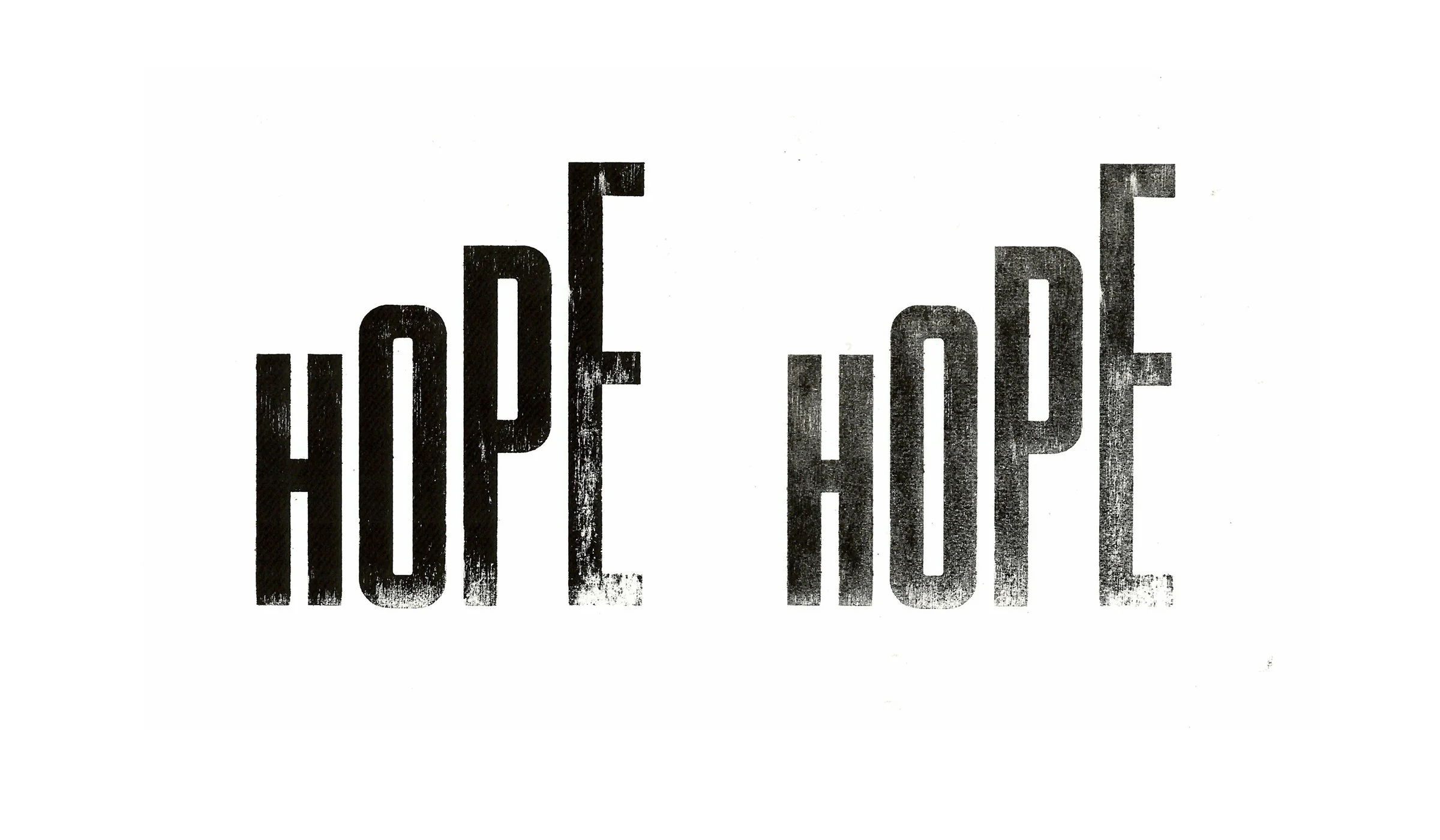
Inking up & Printing with the developed typography