Blackpool – A photographic essay
/Building on last week’s post, here we share some more photography from Blackpool. The aim was simply to capture the essence and sense of the town.
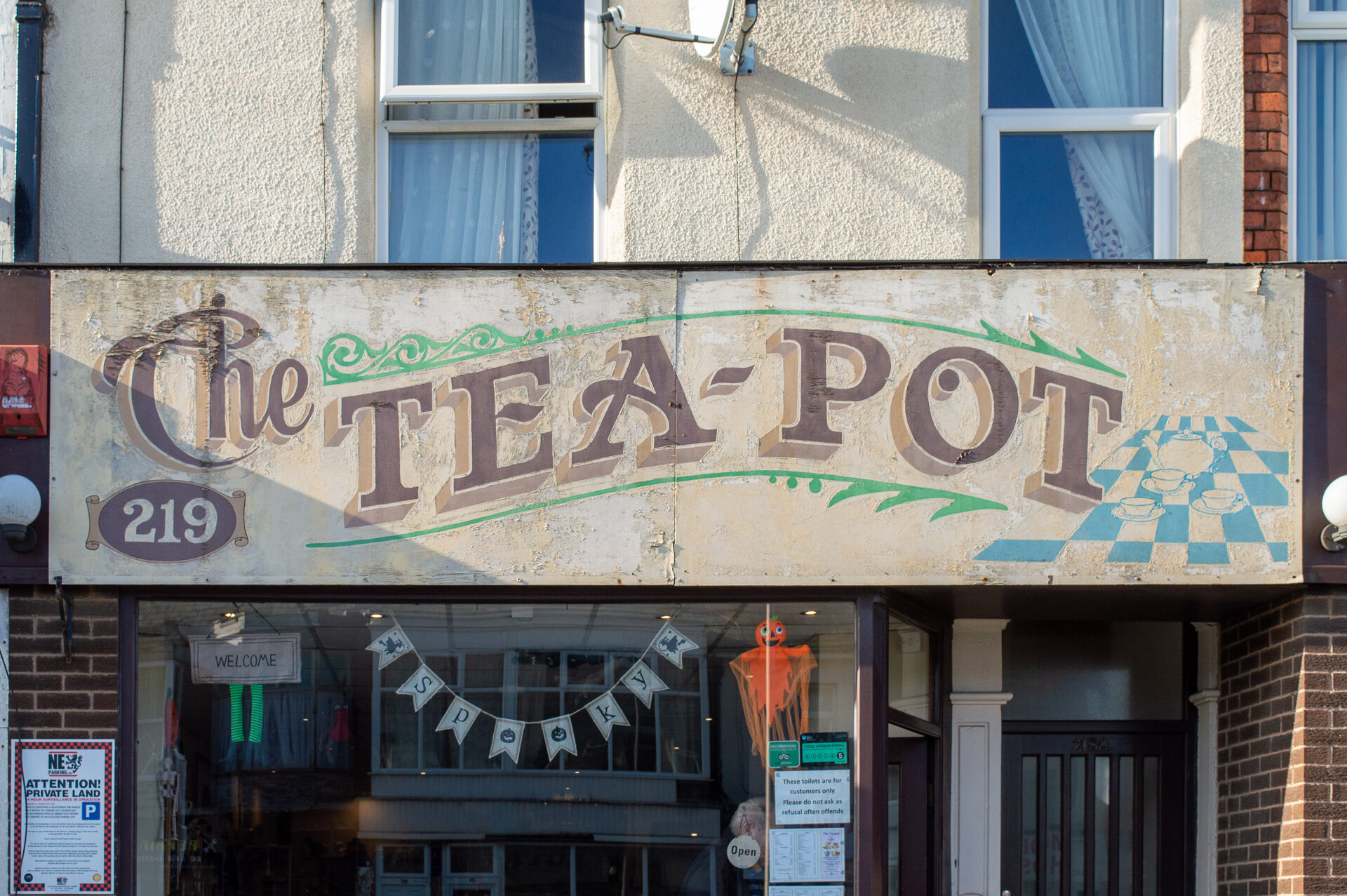
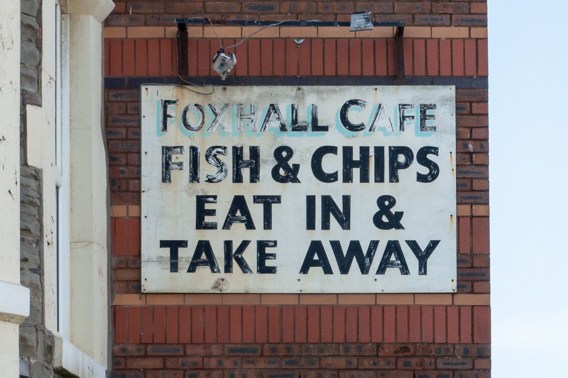
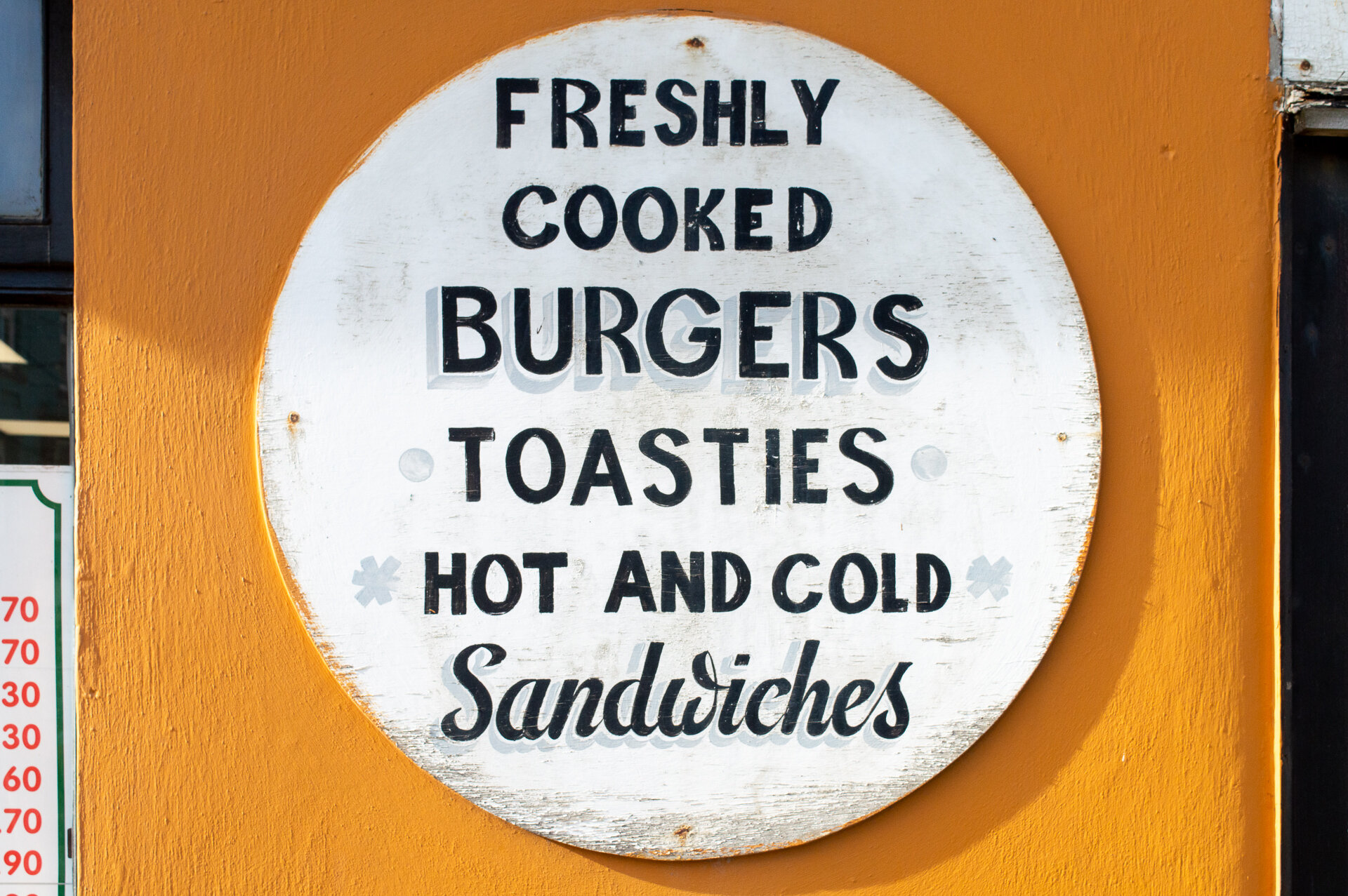
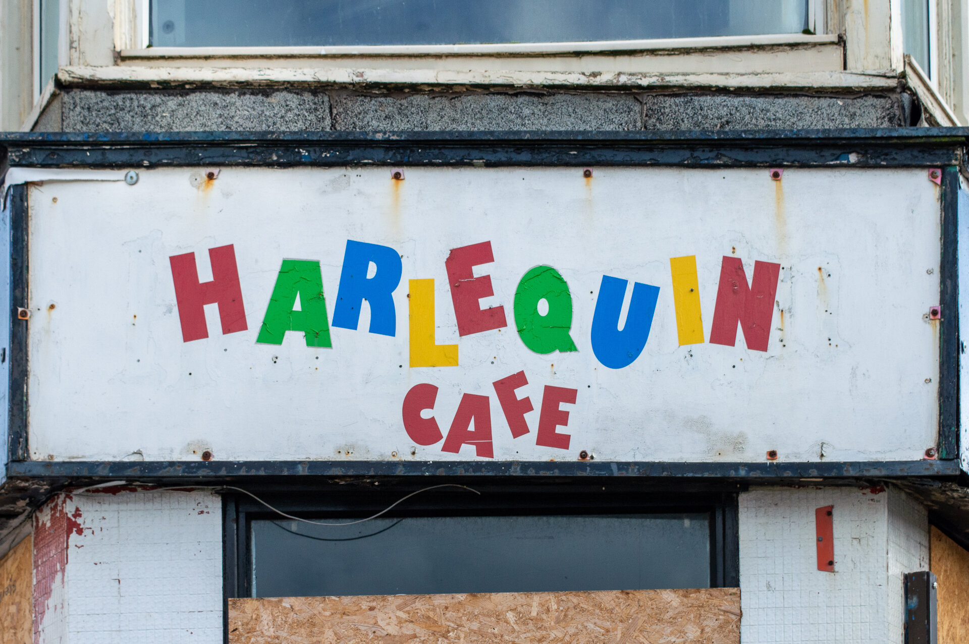
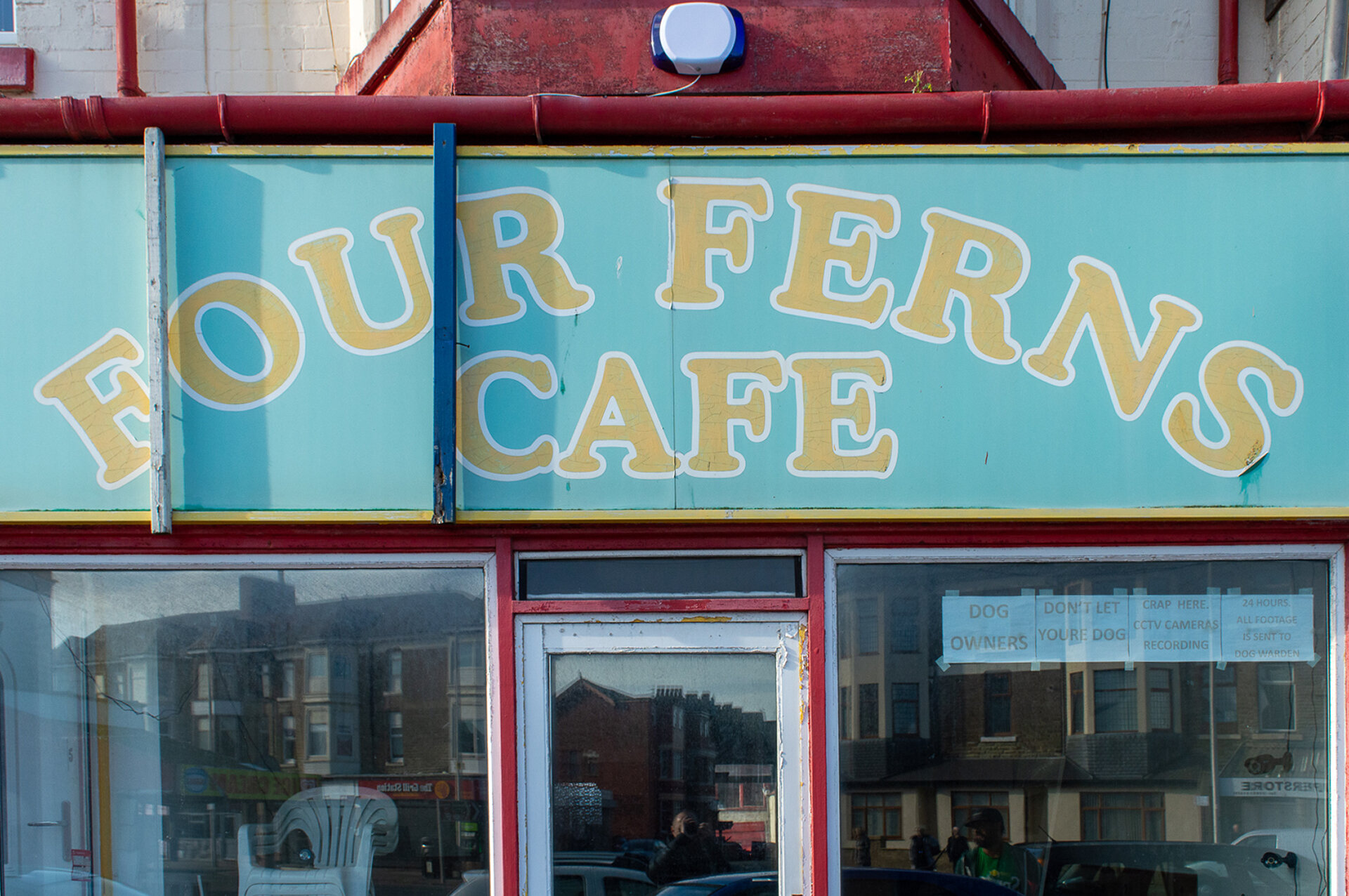
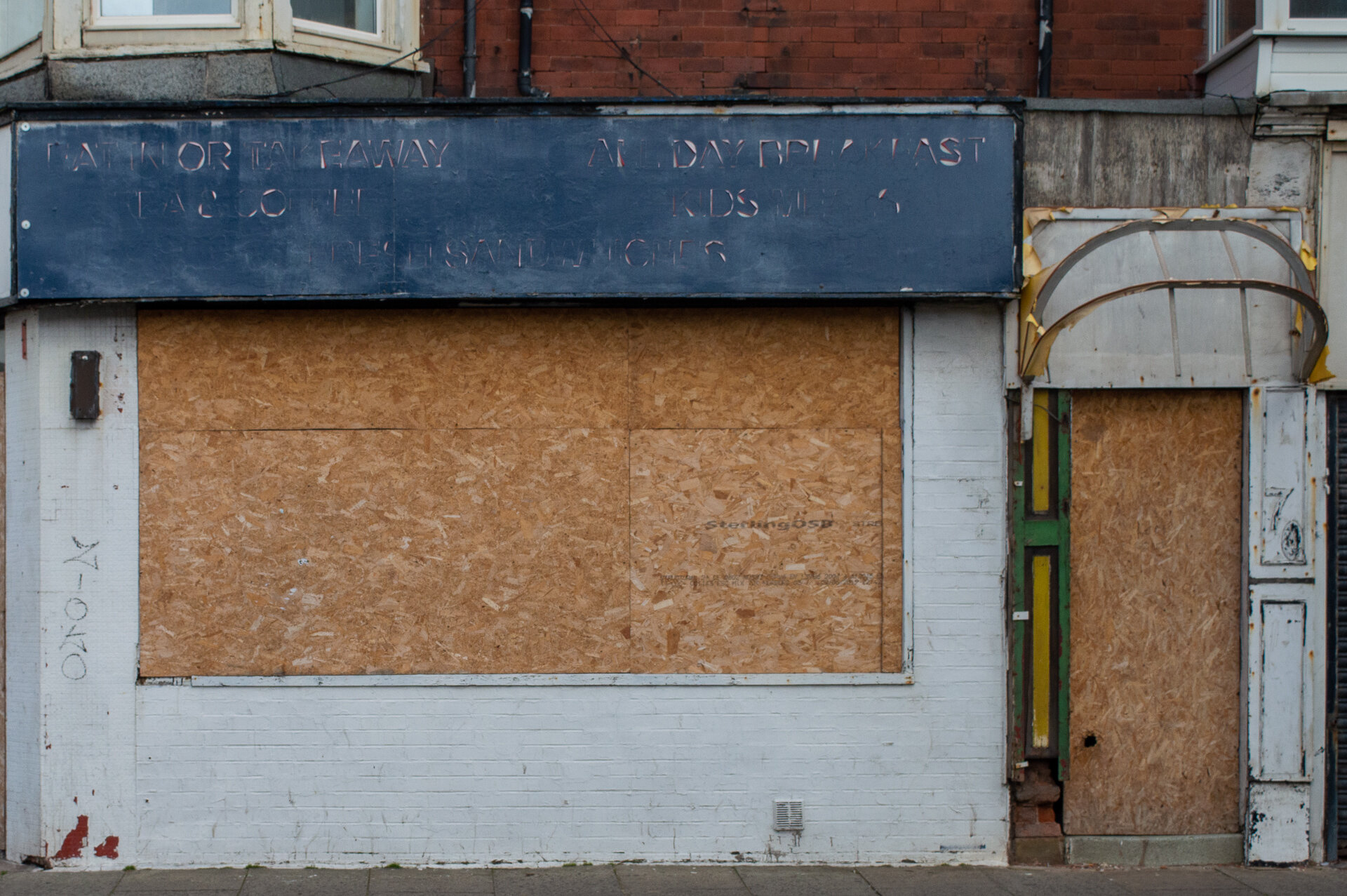
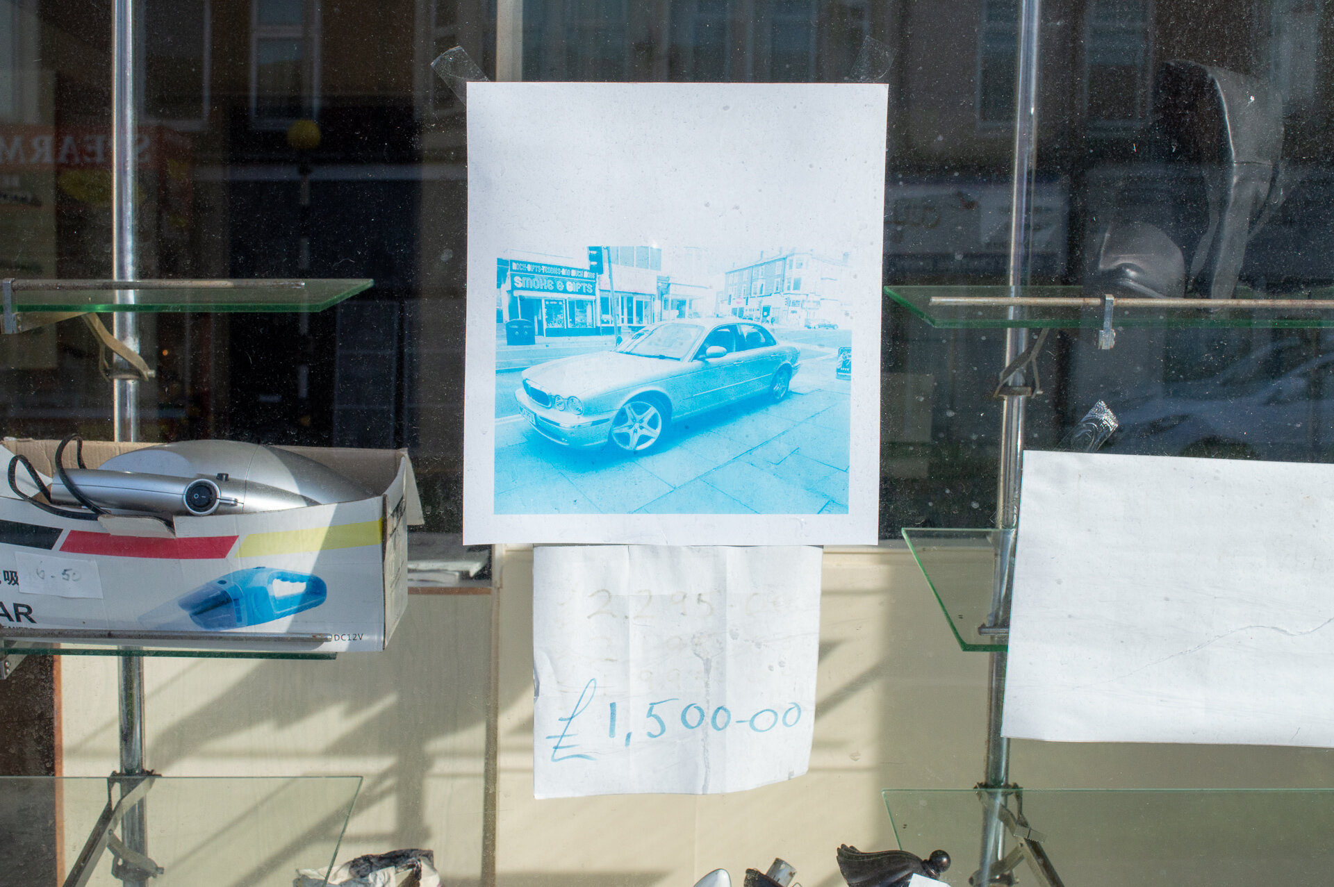
CAFES


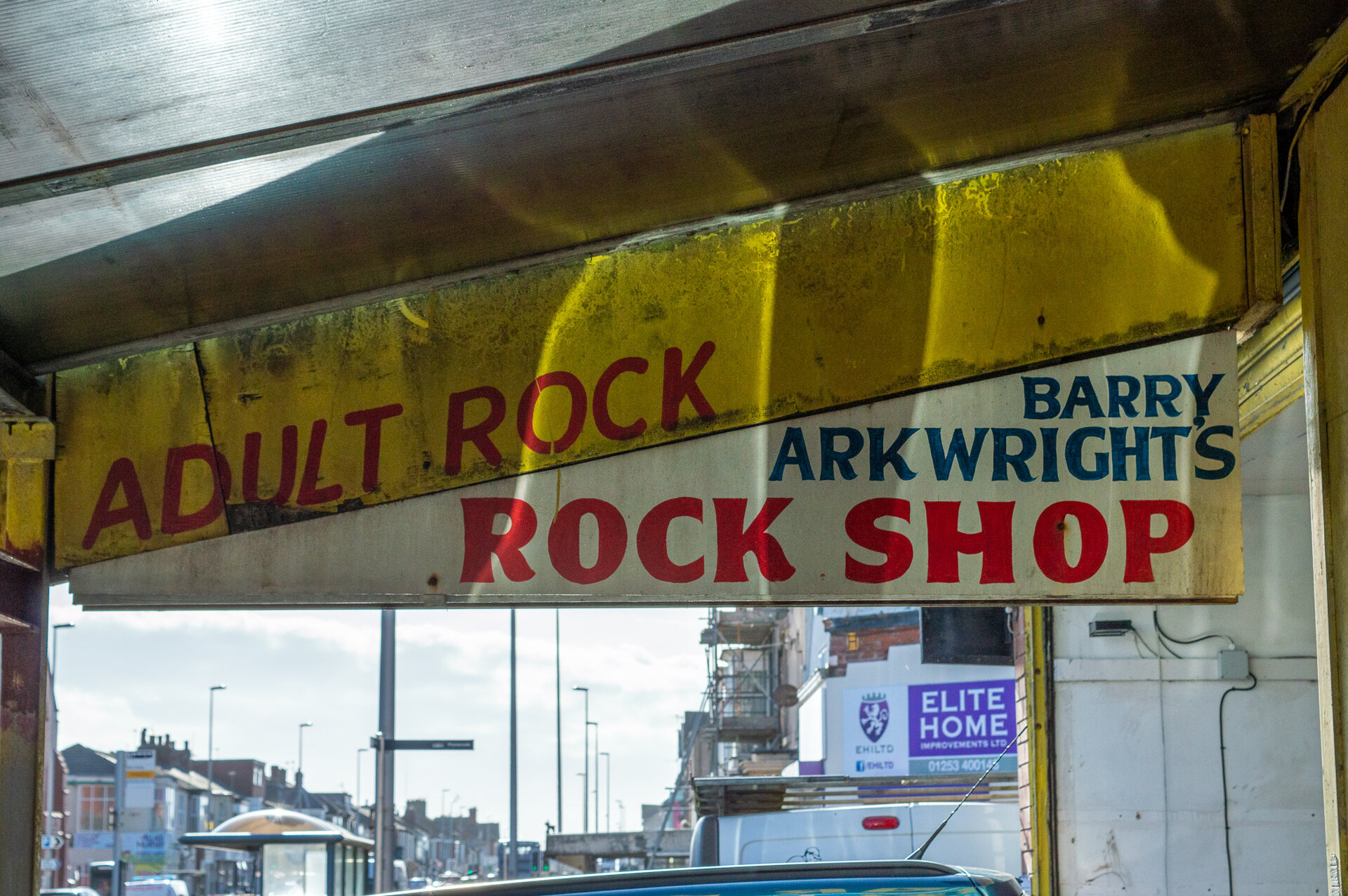
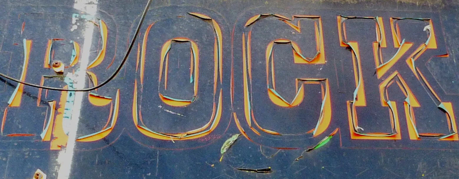
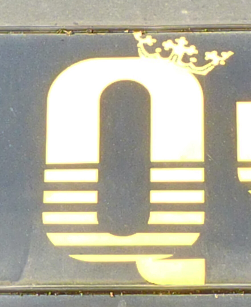
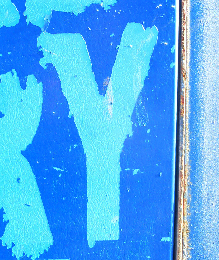
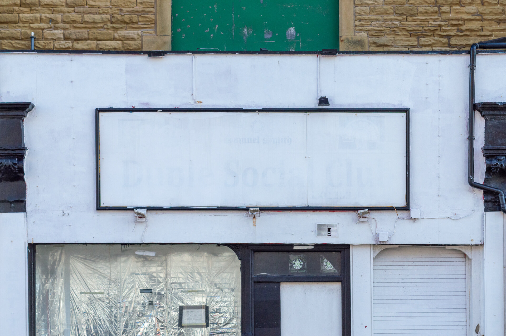
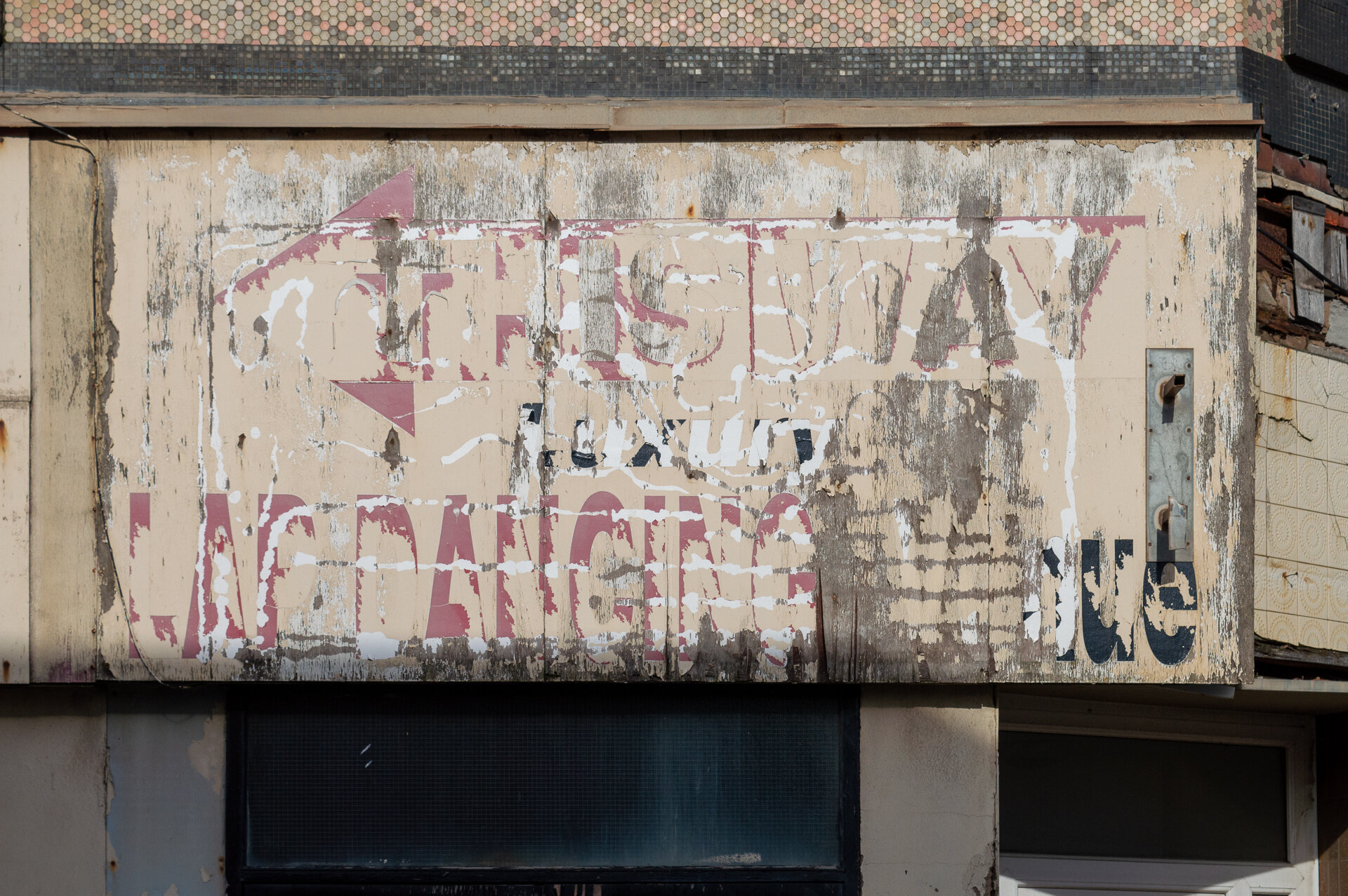
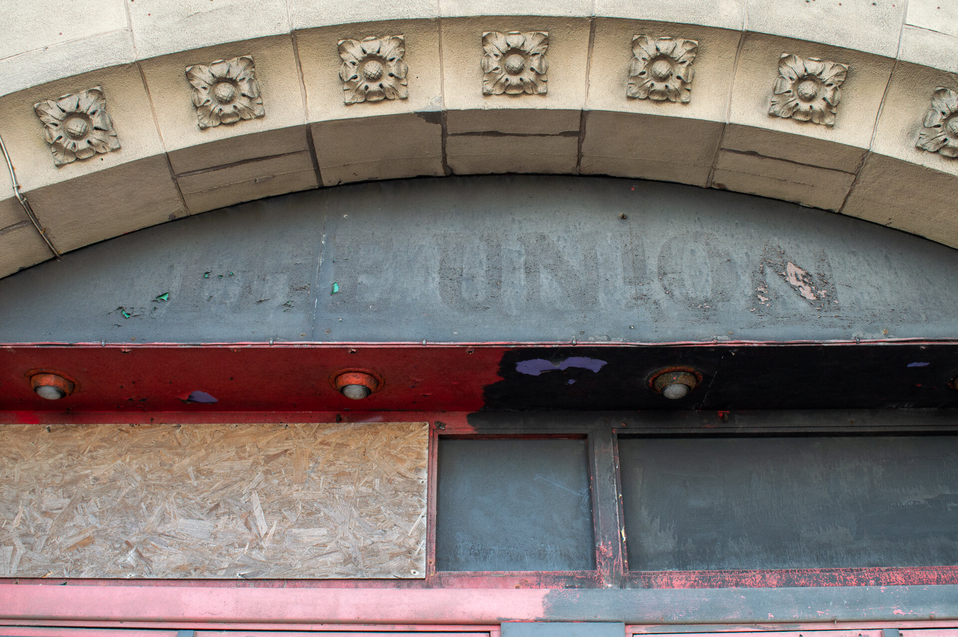
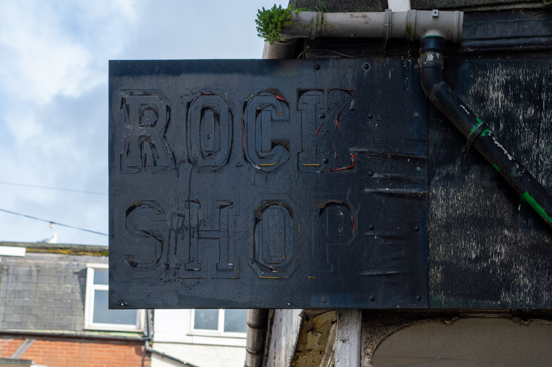
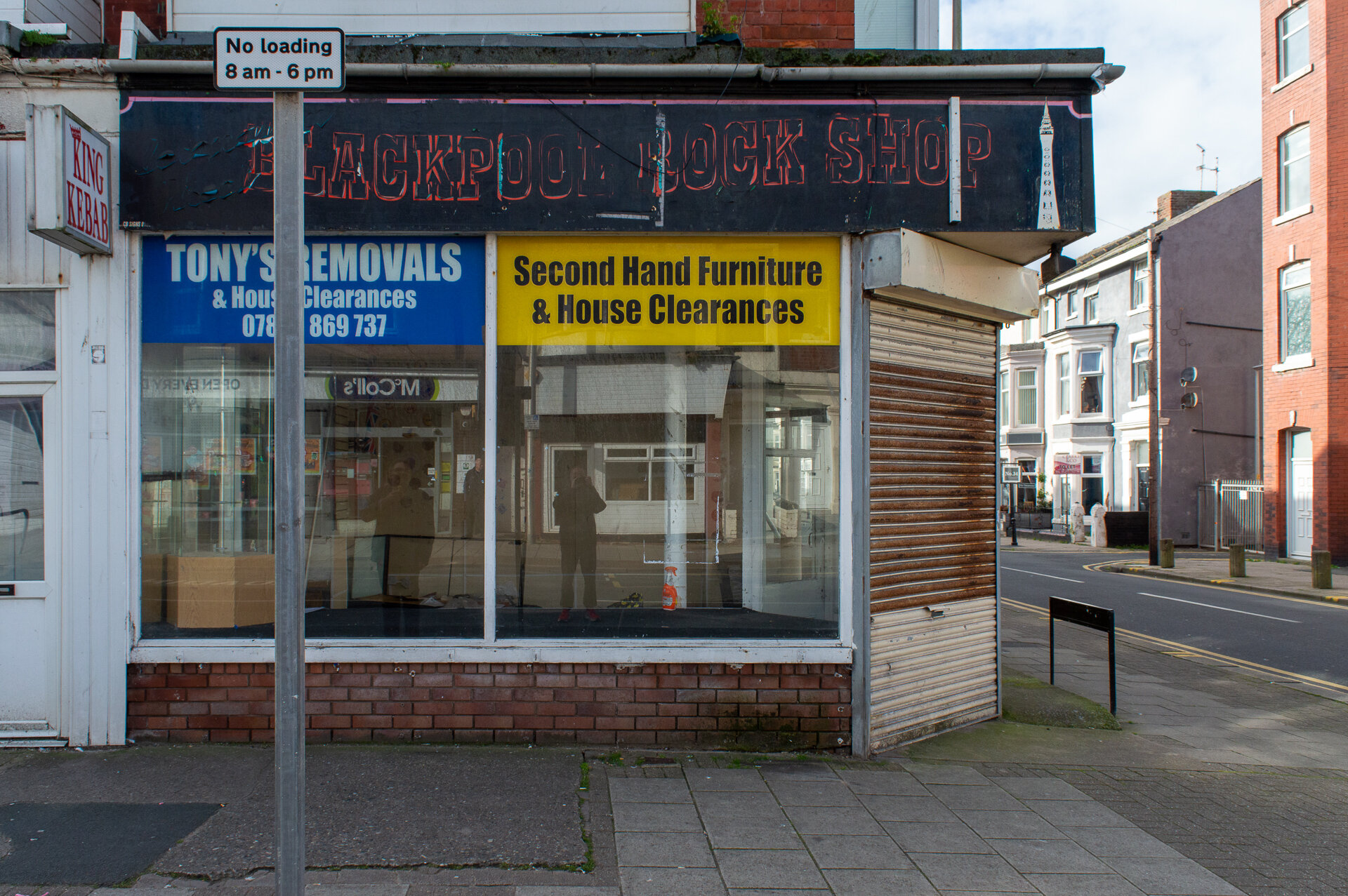
GHOST SIGNS
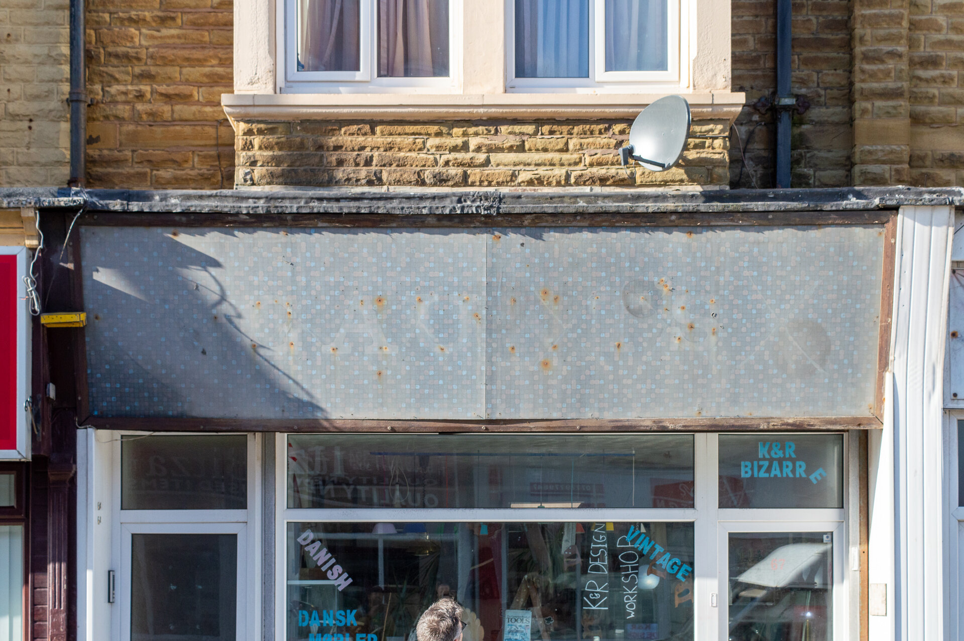


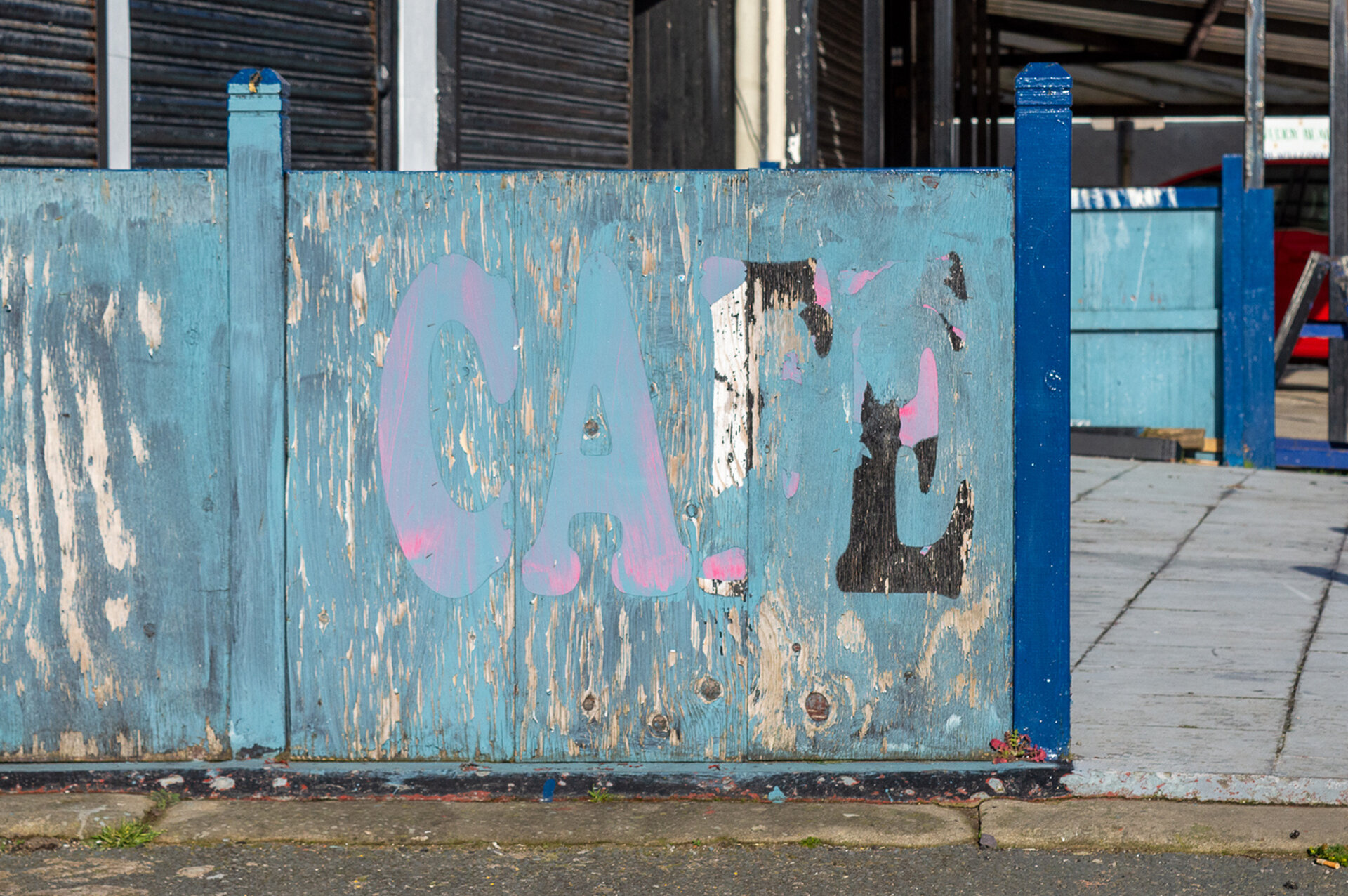
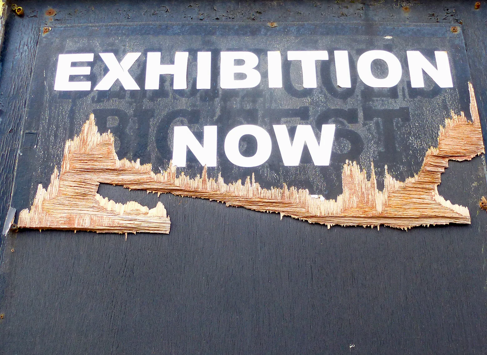
FADES


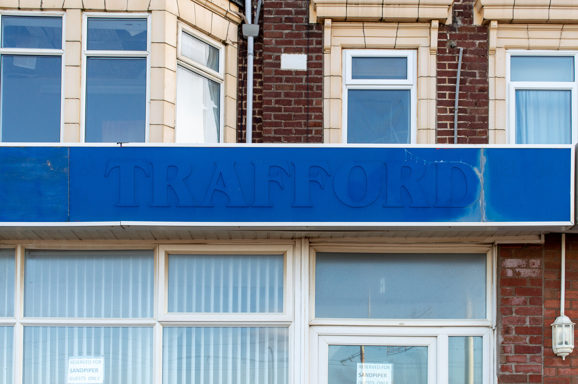
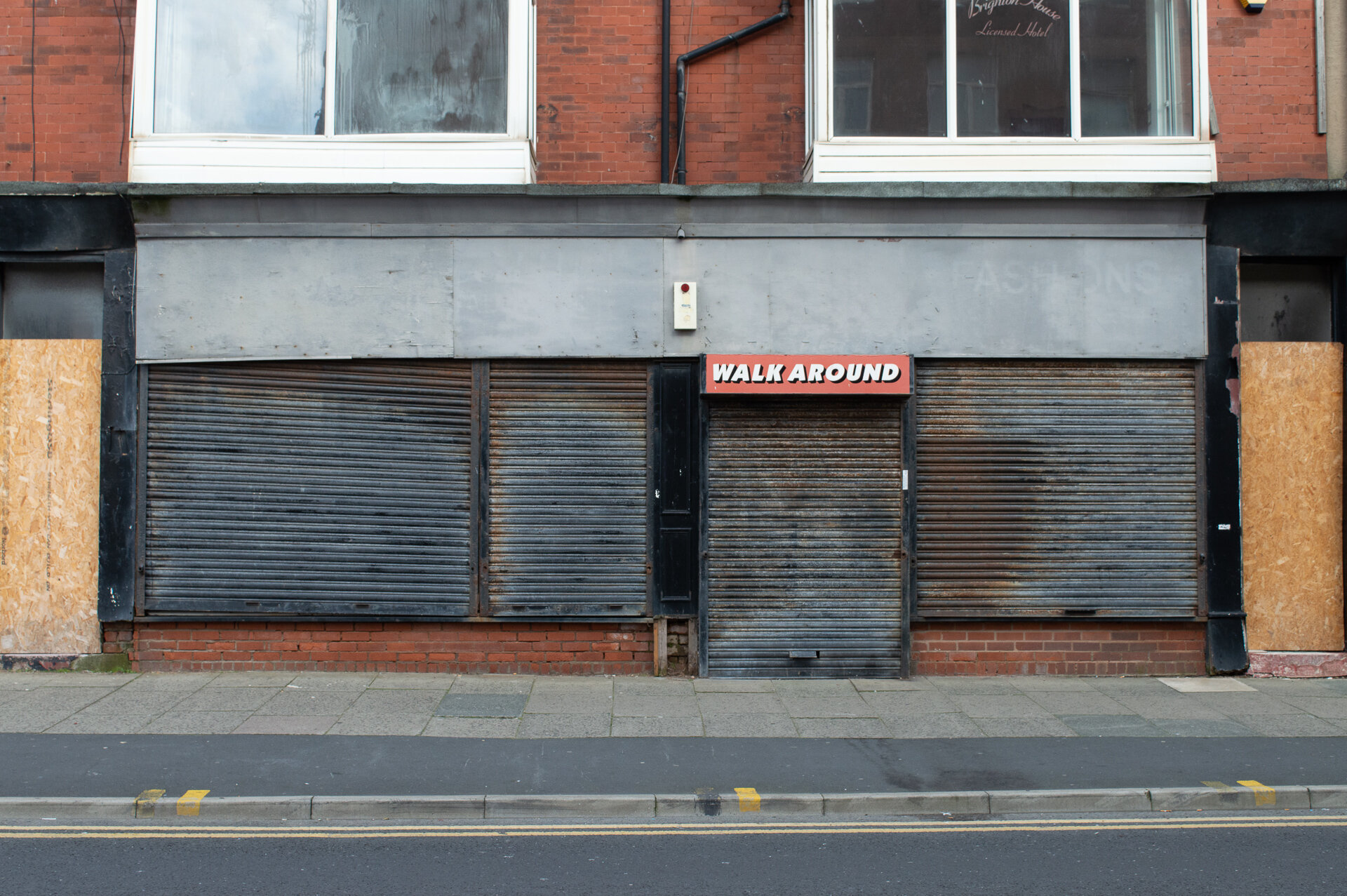
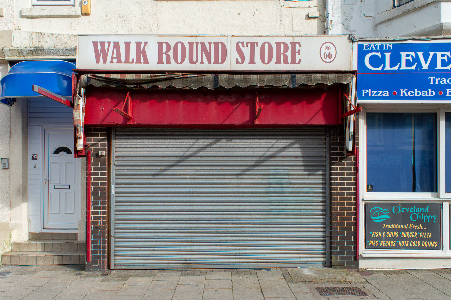
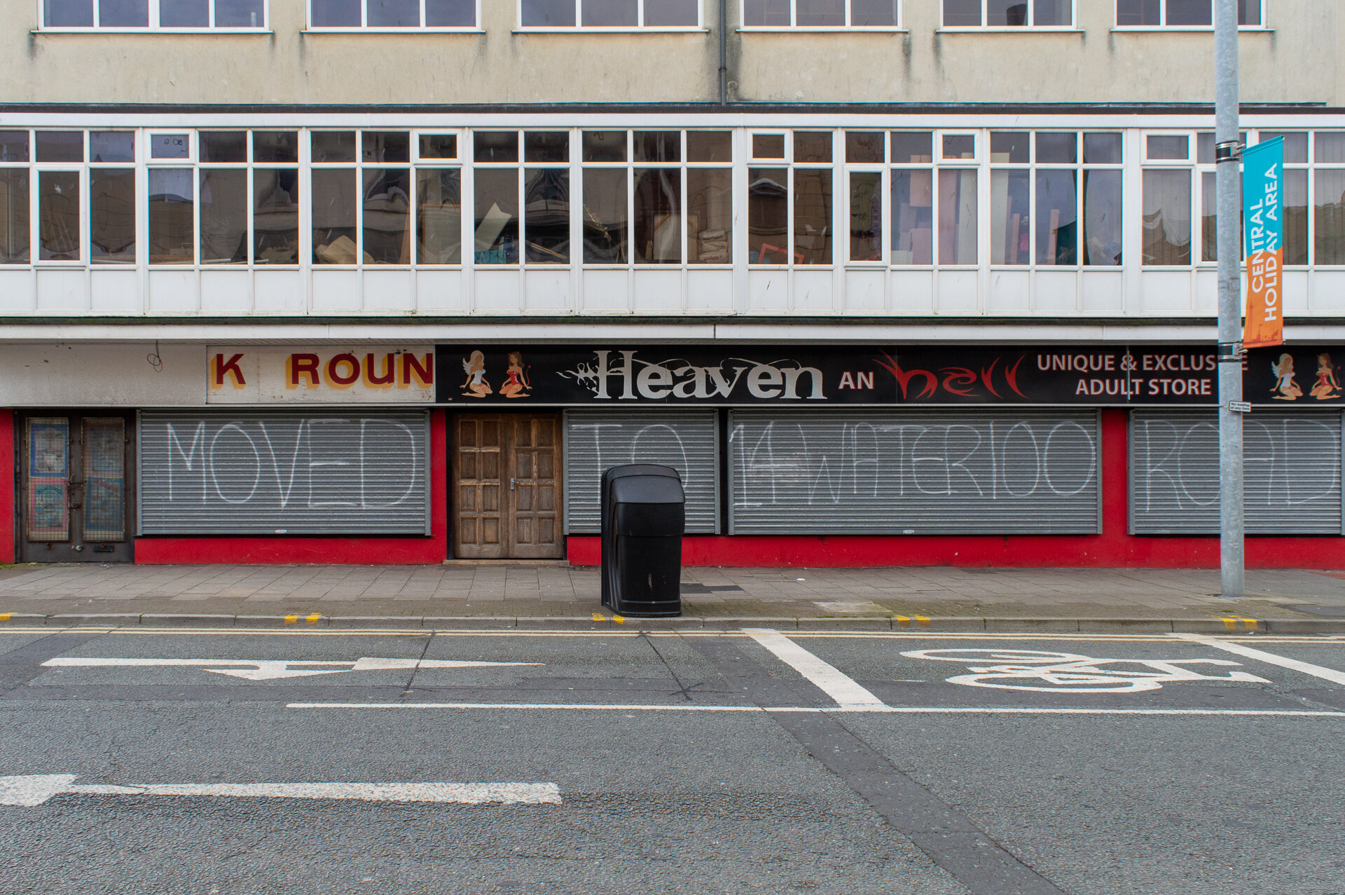
WALK AROUNDS
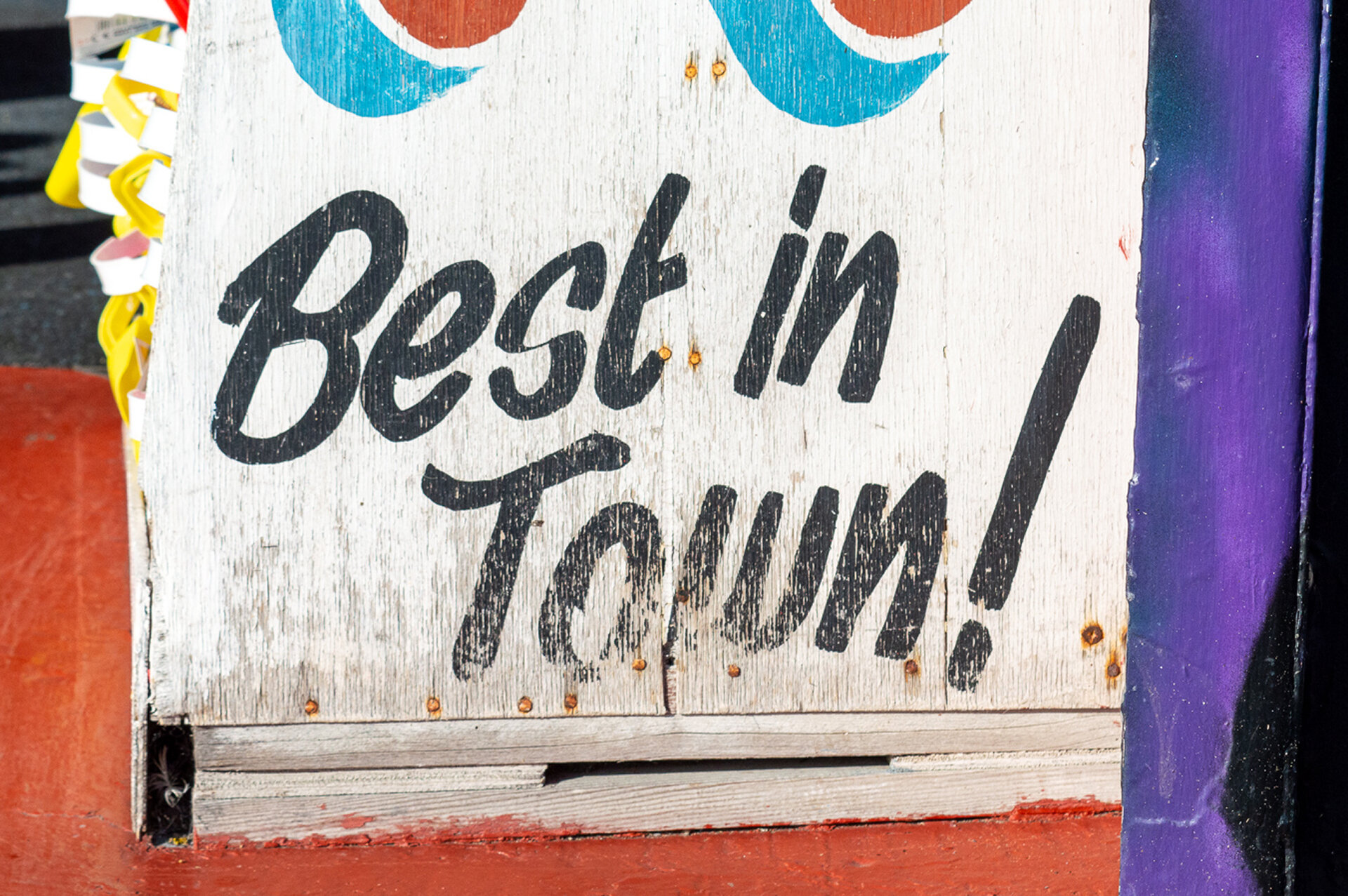
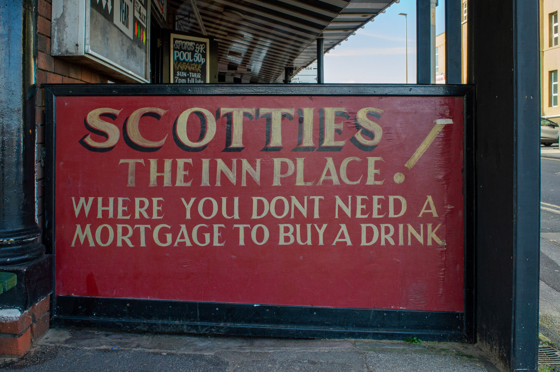
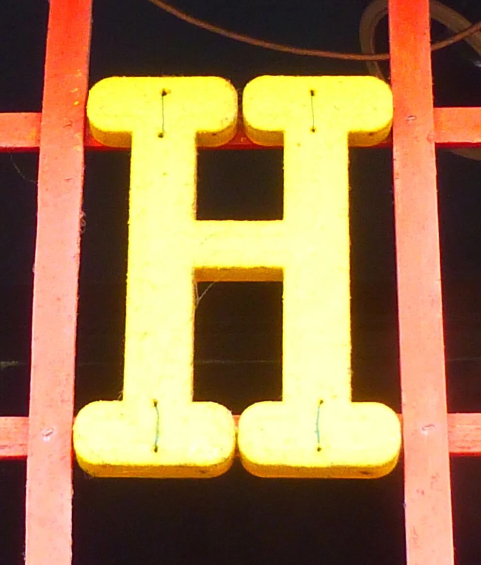
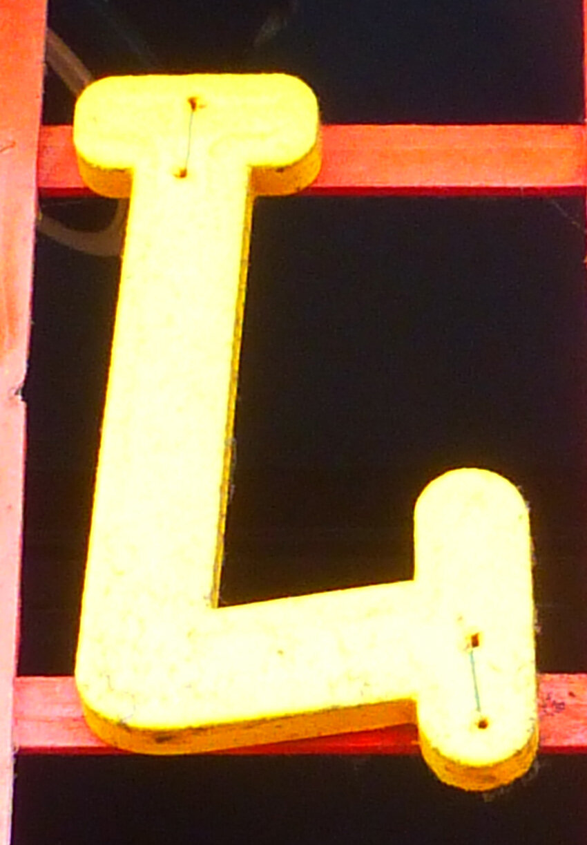
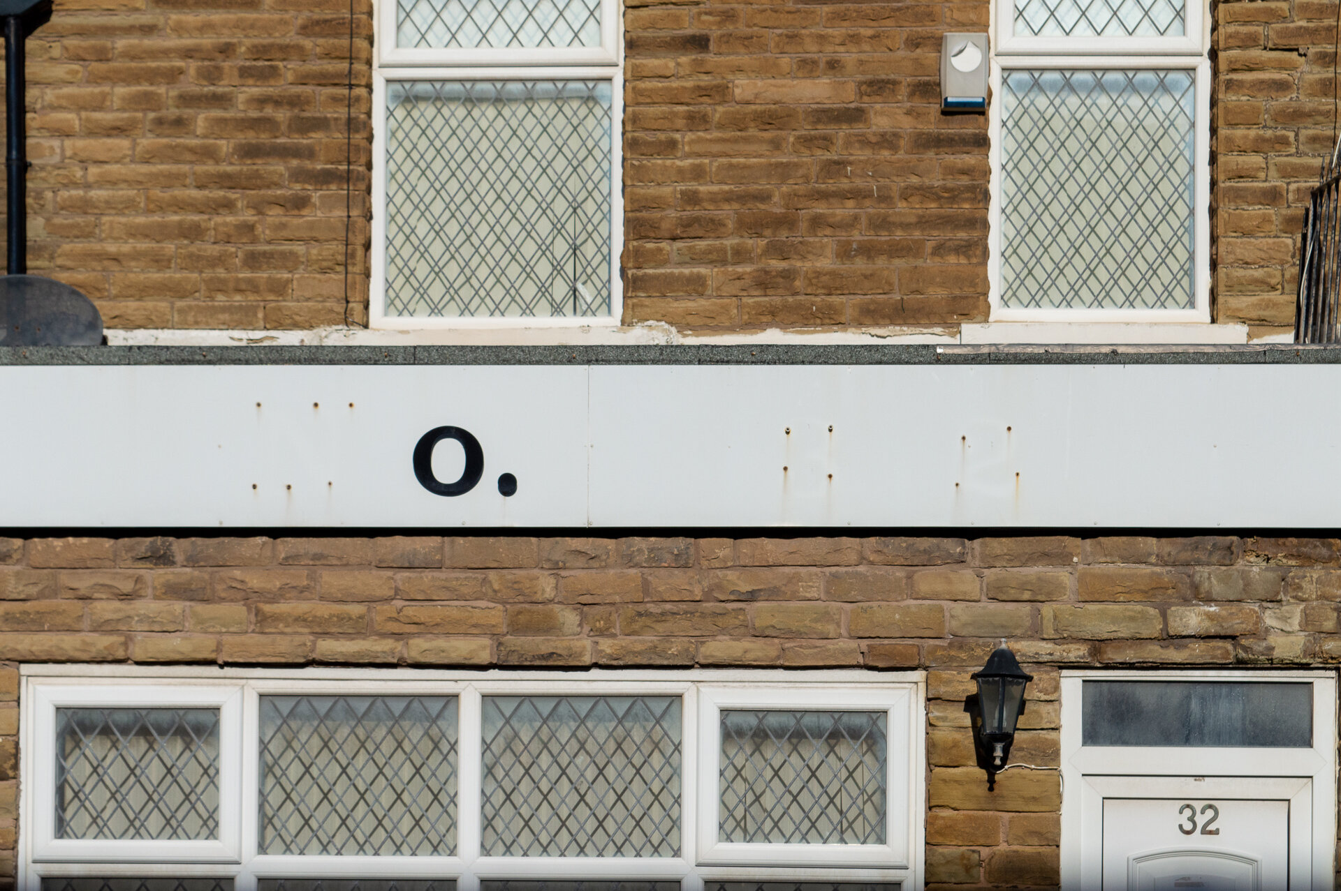
signwriting