Tower of London – Christmas Crackers

Here we feature a Year 1 project by Pete Morgan and Joey Cheetham. The renown Year 1 Christmas cracker project often serves up some great ideas. In this case, the crackers were designed for the Tower of London giftshop; and having been sharpened up in Year 2 bootcamp and then re-photographed, they have recently been accepted into Packaging of the World. Congratulations!

In Pete and Joey’s words:

This project is a set of Christmas crackers for the tower of London, using the theme of beheading as the main vehicle. The front of the box features a belly band bearing the line “Treason’s Greetings,” which, once removed, reveals an etching of Traitors’ Gate, the original entrance to the Tower. Opening the gate unveils six historical figures, all executed at the Tower, alongside the copy line, “Don’t lose your head this Christmas.” This cleverly connects to the cracker itself: when pulled, the head detaches, a nod to the method of execution.

A rich touchpoints are used throughout, serving as a dual reference to the festive season and the darker history of bloodshed associated with the Tower, reinforcing the concept’s tonal contrast.

Inside, the cracker contains a wearable, ornate crown inspired by Tudor design. The reverse of the box features a cut-out executioner’s mask, adding a playful touch to the festivities perfect for wearing while slicing the Christmas pudding.

D&AD New Blood entries 2026


A roundup of submissions to the New Blood Awards, 2026.


Carrefour

Celebrate the 45th Anniversary of Tex

by Emily Dainty


by Joey Cheetham


by Libby Kenyon


by Szymon Zalewski


giffgaff and Big Issue

Using the power of connection to build pathways out of poverty

by Hamza Malik


HSBC

HSBC Red: Owning a Pantone

by Nicole Grealis


Kahf

Redefine masculinity for men in 2026

by Humera Naeem & Umai Shah


L'Oréal

Giving new life to “I'm worth it” in today's age

by Olivia Peet


Monotype x Penguin Random House

Shape how the world reads

by Aiysha Begum


Tuborg

Create experiences that release negative pressure

by Emma Noble & Liv Hayward


by Grace Gorton


Twix

Twix gives people a good thing, twice

by Emma Noble & Joey Cheetham


by Liv Hayward & Pete Morgan


Wise

Get parents to grant their kids their travel wings with Wise

by Callum Ogden


by Shahzad Ansar

Hope

Hope is an upcoming event in October 2026 which is being developed by Paul and Sharon O’Gara. They are founders of the Mary O’Gara Foundation, a non-profit organisation dedicated to increasing awareness around mental health and suicide prevention for young people.

The event itself will begin with the third edition of The Hope Walk and culminate in an exhibition to be held in Victoria Building’s PR1 Gallery. The artwork at the exhibition will be provided by pupils and students from local schools and colleges, who are contemplating creative responses to one question:

“What does hope look like for you?”

Whether those responses are drawn, modelled, painted, animated, spoken, recorded or…wherever creativity takes them, the responses will be exhibited in PR1 Gallery from 13th to the 30th October.

To help promote the exhibition, university staff are developing a supporting graphic identity. Early iterations and development of which are shown below. Wooden type is being utilised: it is appropriate for the identity to be created by hand, to allow for imperfection and to communicate a human touch.

The idea is a simple one: each letter of the word grows in height, with each letter growing slightly more than the letter before it. The latest iteration utilises Matt Willey’s MFred (2.0) typeface, which is available at the link in support of Cancer Research UK and Macmillan.


Initial ideas & iterations using wooden type


DEVELOPING THE IDEA


CRAFTING THE typography WITH MFRED (2.0)


Inking up & Printing with the developed typography


PRINTING IN COLOUR

EXPERIMENTING WITH OVERLAYING THE PRINTS


mockup of exhibition artwork

The Benefits of Brown

This post serves to archive the recent exhibition in Victoria Building’s PR1 Gallery: The Benefits of Brown. Conceived, curated and created by Graphic Design tutor Andy Bainbridge, the collection of items came together to champion this previously uncelebrated shade. Below is a minutiae of the magnitude of items collected over several years, brought together with charm, storytelling and no little historical context. Thank you, Andy.


Why have an exhibition dedicated solely to brown, you may well ask? Well our answer would be why not? From our digging it would appear no one has ever attempted one before, so if nothing else that is reason enough in our (brown bound) book.

So with that question out of the way, we can get on with the content.

Brown is a colour that pervades all our daily lives, whether we are conscious of it or not and the collection of items presented here were all collected, ostensibly by one person over the past 2 years. In the main most items were collected within their daily sphere but some were sought out and a few were kindly donated.

We have tried to compile, order and curate some of the collection but some items are simply placed and presented at random for your perusal..

We encourage, no insist, upon your physical engagement with the exhibition. So with that in mind please feel free to examine and handle the items, inspect them and feel free to flick through the print.

The one thing we do insist upon is that you place them back how you found them and resist the temptation to purloin them, as that would really leave us browned off!

Thank you and enjoy!

– Andy Bainbridge


With thanks to the exhibition sponsor Preston Board & Packaging.

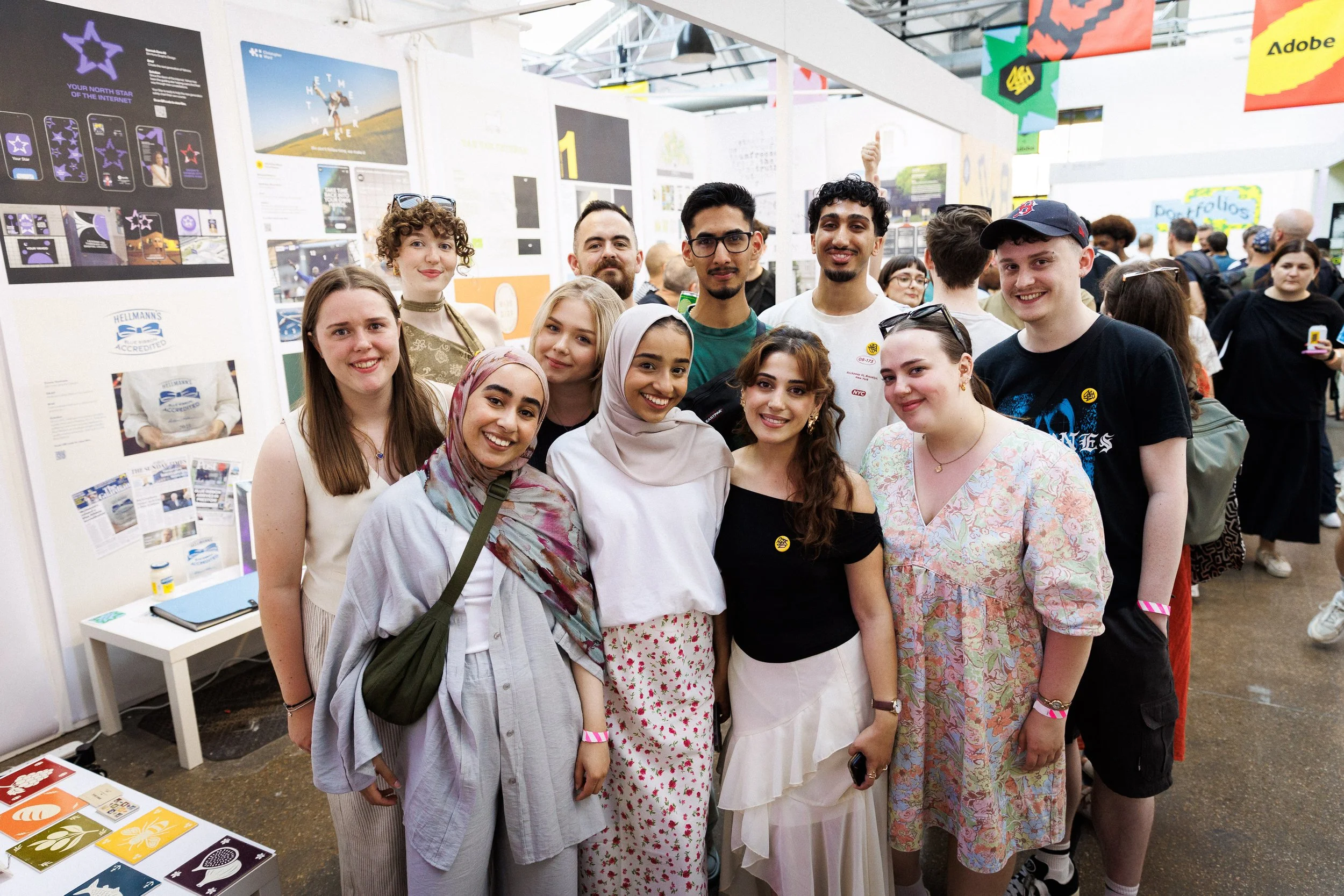
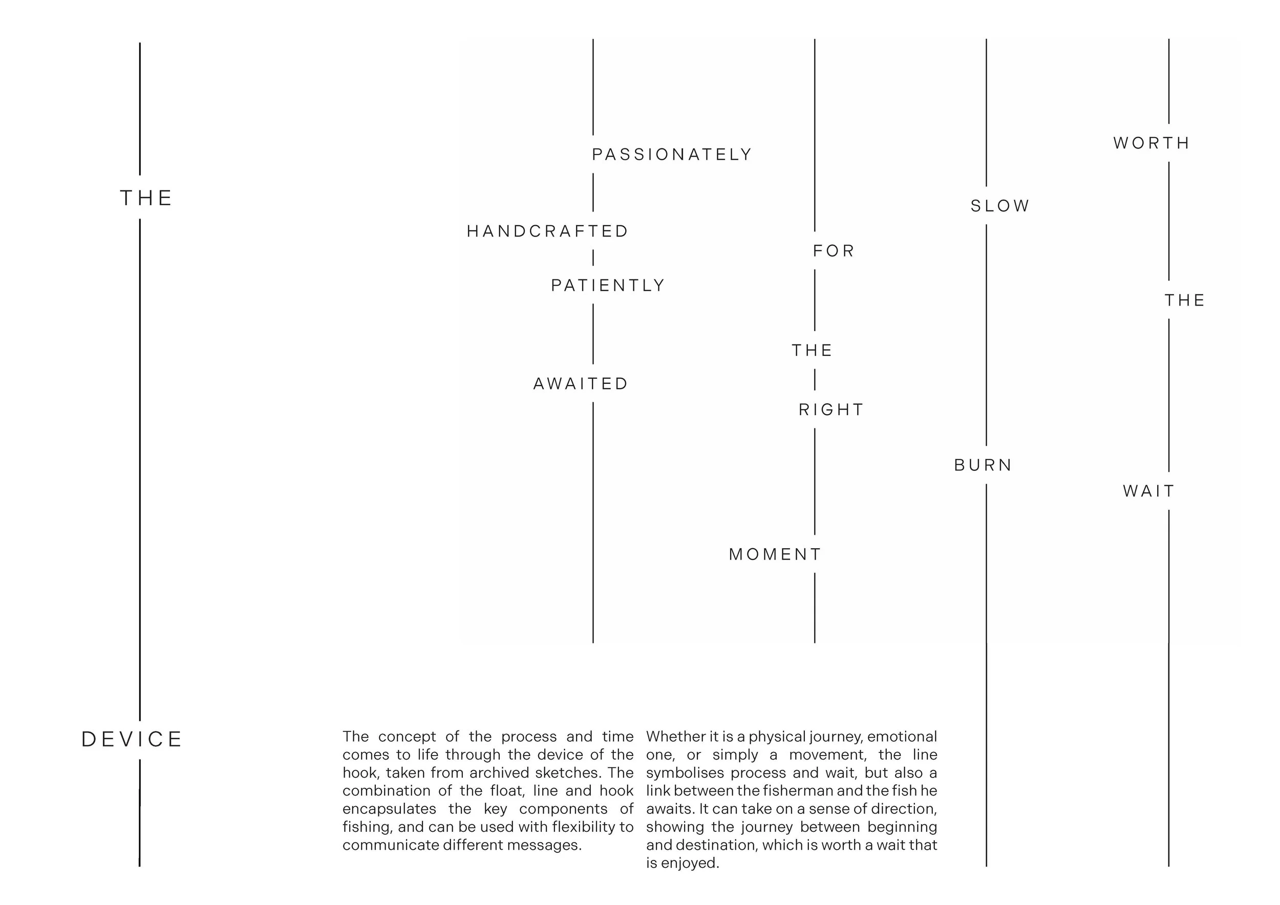
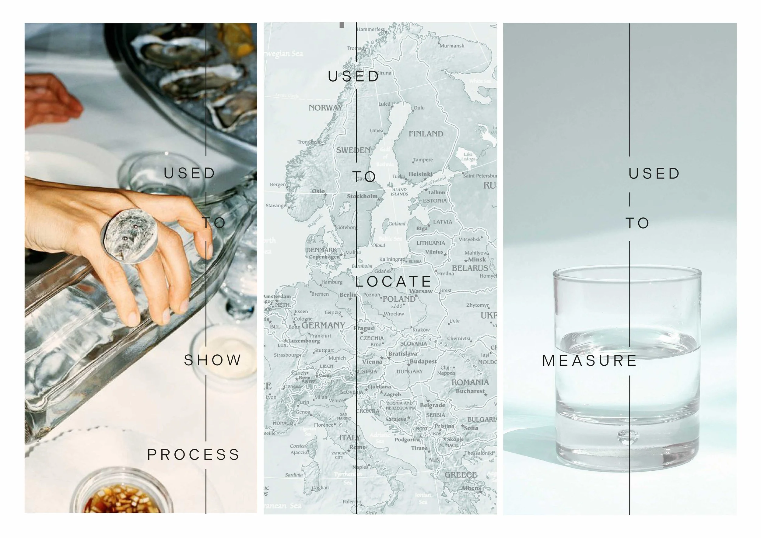
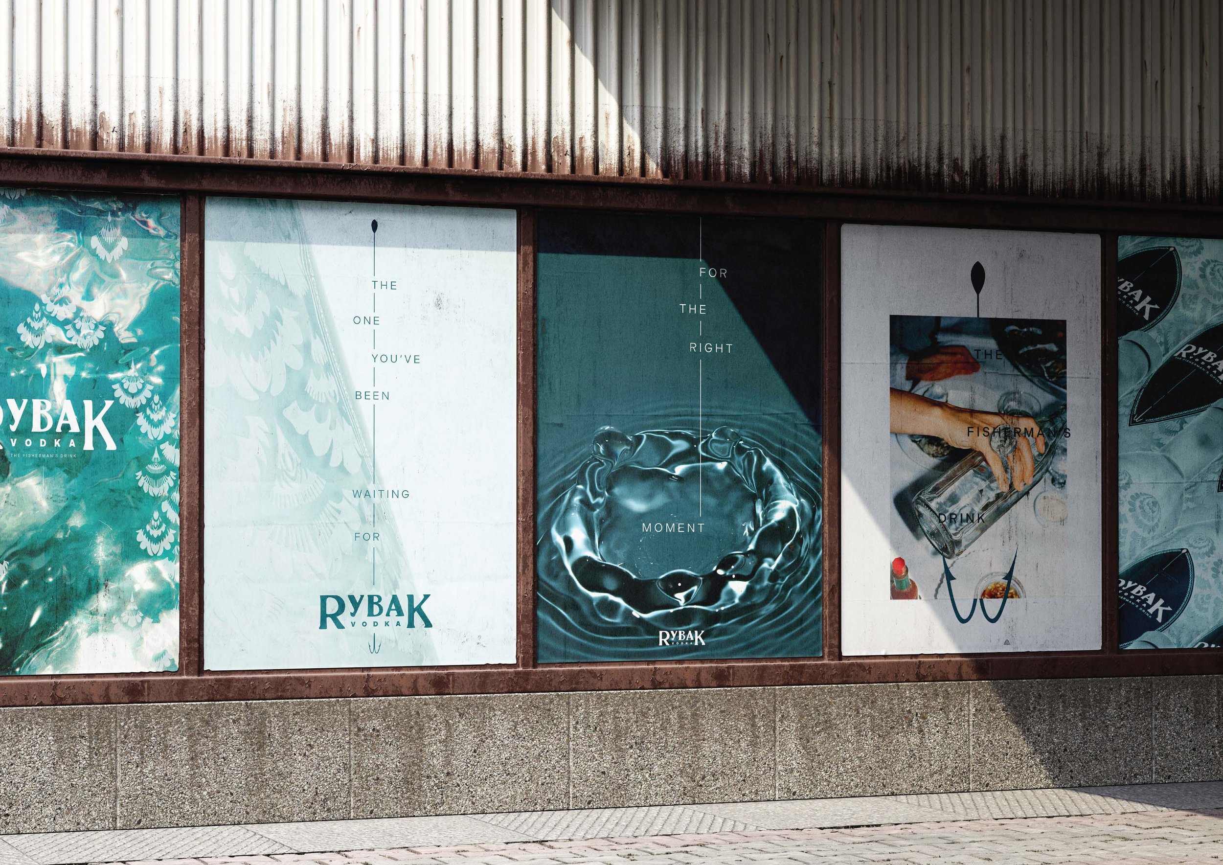
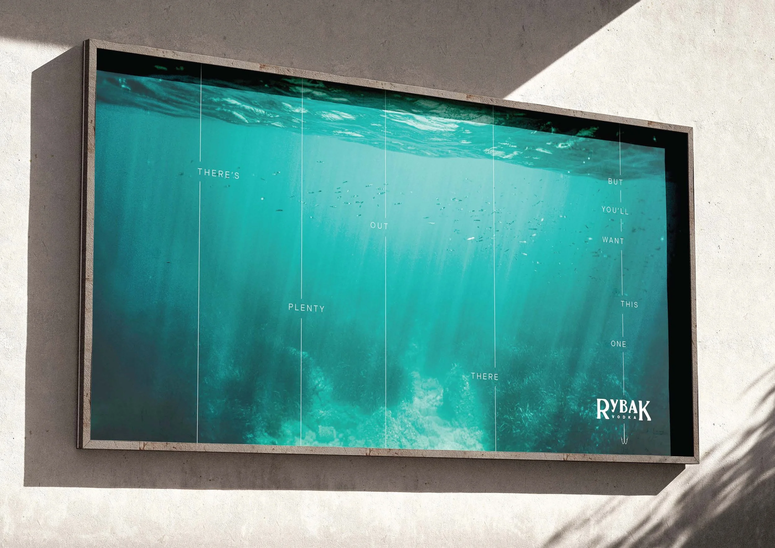
D&AD – New Blood Winners

We’re happy to share our annual D&AD New Blood Awards update:

This year, we have two more pencils to be proud of. Mohamed Makkan (aka Jibby!) brough home the much coveted yellow for his response to the Christopher Ward brief. And Chris Dempsey took away a wood pencil for his work on the Morris & Co. brief; both awards were picked up at this year’s D&AD New Blood ceremony in London.

The New Blood Festival provided a great opportunity for students and staff to reconnect with our friends in London. It was pleasing to hear industry feedback on all students’ work, with a particular nod to sharp ideas which cut through the noise of a visually noisy environment.

We were also chuffed to receive three ‘ones to watch’ prizes, awarded to Sannah Ali, Connie Dickinson and Emma Yeomans.

For staff, all work on display was true to Preston thinking and craft, work we are proud to show; and the above prizes just ice the cake. See all the class of 2025 here.

Soak up the work below, look at other entries; and enjoy a few snaps from the Festival.


ThE TIME MAKERS
BRIEF: CHRISTOPHER WARD
– by MOHAMED MAKKAN


yellow Pencil Winner


bringing the outside in
brief: morris & Co.
– by christopher dempsey

wood Pencil Winner


Awards night!


The Festival

The ClASS OF 2025, some old friends below:

V&A East Storehouse

VAST&ABSORBING

Whilst in London for 2025’s D&AD New Blood Festival, staff took a trip to the recently opened V&A East Storehouse. The £65m warehouse boasts a mind-boggling 250,000 artefacts. Providing a home to the biggest Picasso in the world, a 15th century dome, a two-storey facade of the Robin Hood Gardens housing estate as well as kitchens, countless David Bowie ephemera and more, it is the museum of everything.

Entry is free, and you can stay as long as you like. There’s a lot to take in, and the experience of seeing the workings of a museum, plus seeing the conservators in action is worth the trip in itself. I heard it described as an Amazon warehouse, only stuffed with all the world’s treasures, which sums it up better than I ever could. When in London, make sure you have a look.


museum branding

if you’re into it, it’s in the V&A.


A sample of delights