A Time & Place

With only 42 shopping days left until Christmas, we thought it only right to look back at a seasonal design classic from 1993. The Chase Creative Consultants' D&AD winning Christmas card. Brutal in its simplicity and a product of its time (as a few months into 1994 the price of a 1st class stamp increased to 26p).

Serendipity and teamwork were at the heart of this solution, the colour combination of the two denominations coupled with the pyramid structure and bingo! The medium is the message.

stamp x mas copy copy.jpg


As one who witnessed the design's development, from a rejected linear idea, where a series of different denominations worked together to make up the full price of a first class stamp (for a company who specialised in team building). It spent several days being discussed and passed around the office morphing through several incarnations and designs, until someone suggested a pyramid then another person spotted the colour combination. Eureka! From that point on it was a 'no brainer', it just required a little 'icing on the cake' in the form of the red franked baubles and the design was complete. 

Virtual Reality: Worth the Risk?

A VR video has recently been released on YouTube by Network Rail as part of their campaign level crossing safety campaign.

It is interesting in that it enables the viewer to interact with the scenes through a 360-degree experience (just click your mouse on the video to move around the scenes). Even though the characters are digitised it is surprisingly immersing, and then the story is given a human underscoring at the end of the video.

Advertising All-Dayer #1

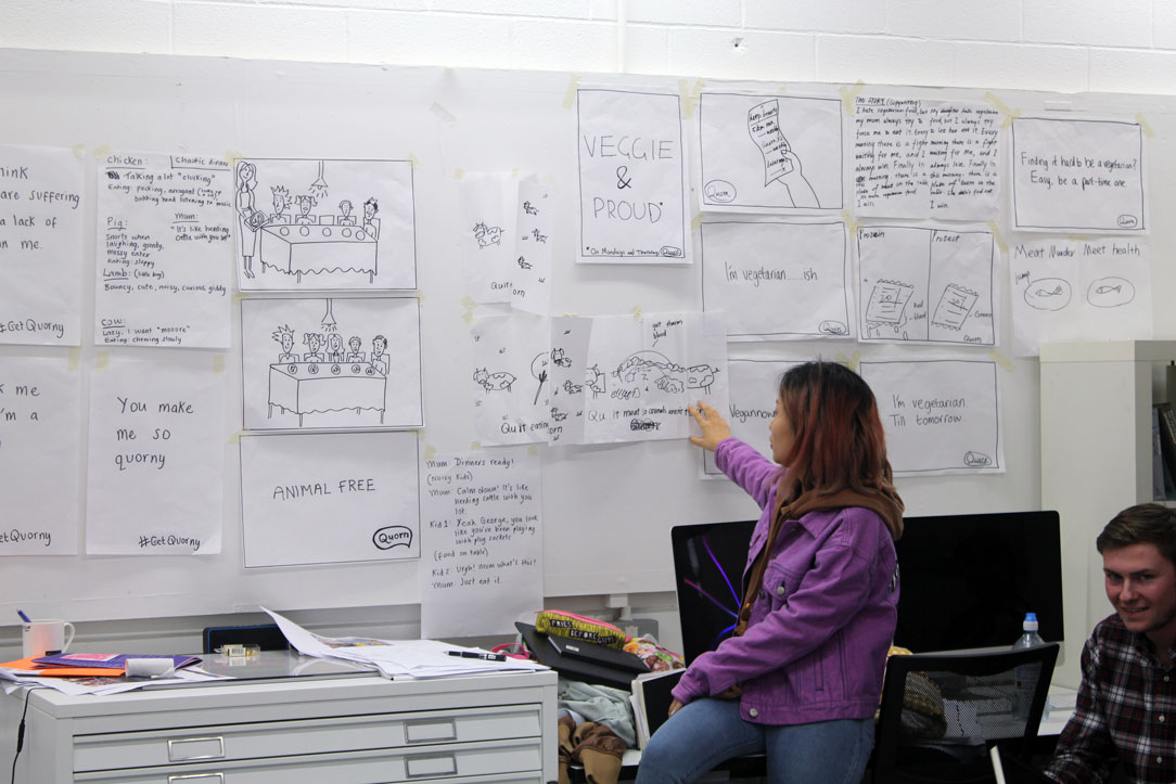
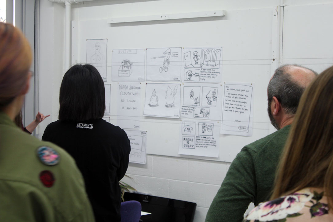
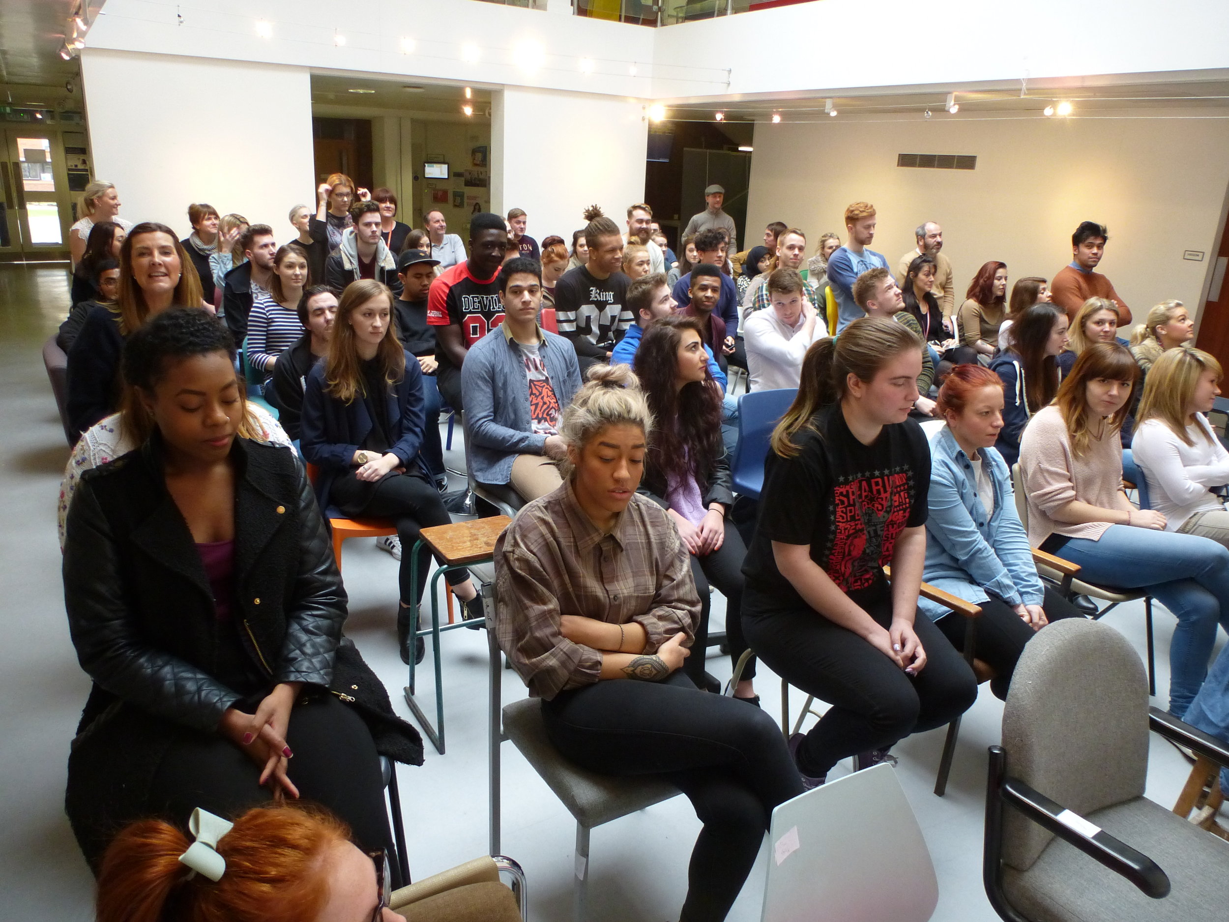
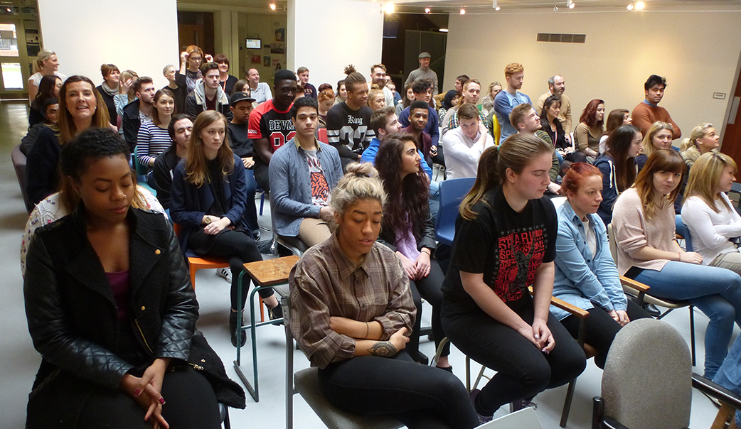
This week we hosted our first Advertising All-Dayer – where we bring all three year groups together and giving them a brief  by visitors from industry. The students are then split into teams and given 6 hours to solve it before coming back together for a group crit led by the professional creative team.

It’s something we’ve been wanting to do on the course for a while after a very successful project last year in the offices of BJL. Our advertising course is a specialism and one of the benefits of having smaller year groups is the ability to bring the years together for a bit of peer learning. It gives students who wouldn’t ordinarily mix the chance to work together and learn from each other, as well as giving them the opportunity to work directly with professionals in an environment very similar to a working advertising practice. Also, coming as it does about six weeks into the term it was good time for the students to do something a little different and was a welcome change of pace – though I’m not sure many expected that pace to be far faster and intense than anything they’ve done so far!

IMG_0040.jpg

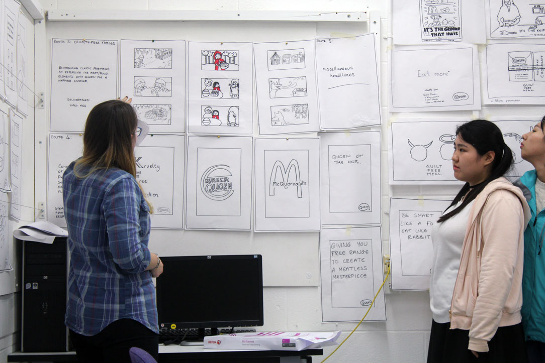
The day began at 10am with the briefing and was led by the award-winning freelance creative team Hayley Parle and Amy Berriman. They set a challenge based on one of their previous projects for Quorn that aimed to encourage families to go meat-free twice a week. The brief was brilliant in that it had a broad scope that encouraged students to think across media platforms and strategic approaches, yet was concerned with an unfashionable brand for which the students were not the target audience and without a heritage of great ads behind it – giving them a clean slate to explore things like the tone of voice, persuasion and brand positioning. They then had till 3.30pm to produce as many scamped ideas as possible with the help of Hayley & Amy and the teaching staff, who floated between teams all day to advise and discuss their ideas as they happened.
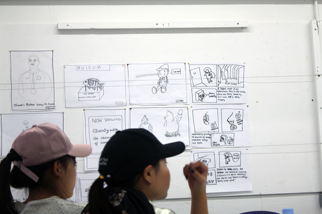
So how did it go? Well, our visitors were very impressed with the work ethic on show during the day, and with the quantity and quality of solutions pinned up when we all came together for the group critique. In six hours the teams were able to pretty much wallpaper the studio in layout scamps (which at least been a they can probably make a living as decorators if advertising doesn’t work out). Each team was able to talk through their solutions eloquently and with confidence and it was very evident that they’d taken advantage of the different interests, experience levels and skills within each team. The sheer variety of work on show was also impressive, with campaign and one-shot ideas ranging from poster and press elections to scripts and storyboards for TV and radio. It was also interesting to observe the students during the day and to see that the smaller groups were more efficient in producing the larger quantity of ideas than the larger ones, illustrating that while there are a huge benefits to working in teams, too many cooks can have a detrimental effect.

The real benefit for me though was the students learning that working at this sort of pace and intensity is not only possible, but also a great way to kickstart the thought process. Often they can spend weeks on a project to get to this stage but outside of academia this kind of time is a luxury and sometimes even a curse – we’ve all had that job that we probably spent too much time on). This is especially important for th final year. With the D&AD new blood briefs just around the corner and the degree show coming into view on the horizon it’s important to realise you have the ability to analyse a brief quickly and in just six hours can create a LOT of ideas that are ripe for development into well considered, high quality campaigns. Indeed, those taking part are now encouraged to take what they’ve done and progress it into fully formed portfolio pieces if they wish - I for one am really looking forward to see what these starting points become.

A big thank you to Hayley and Amy for running the project. See their work at hayleyandamy.co.uk

A Seat of Learning


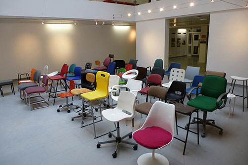
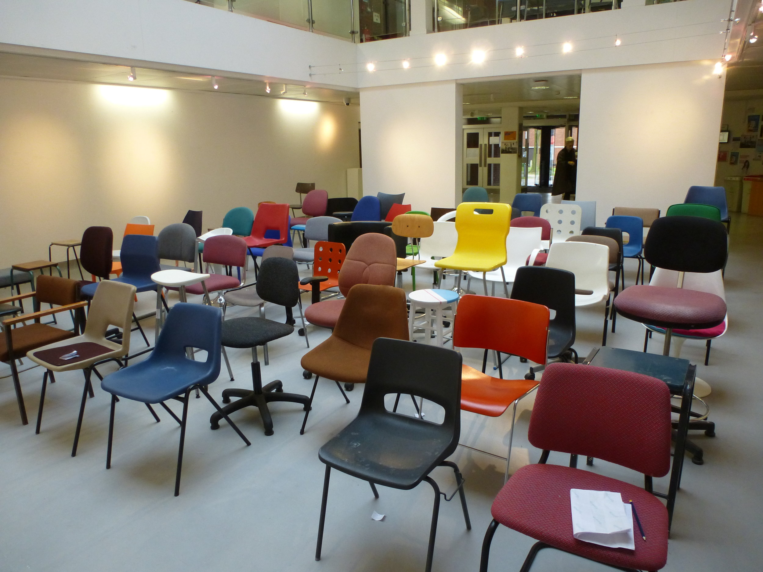
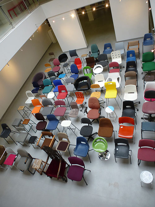
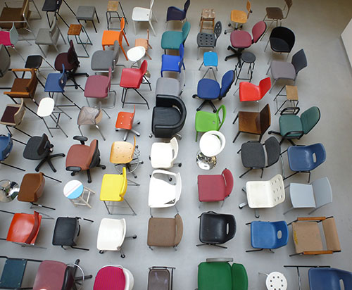
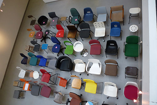
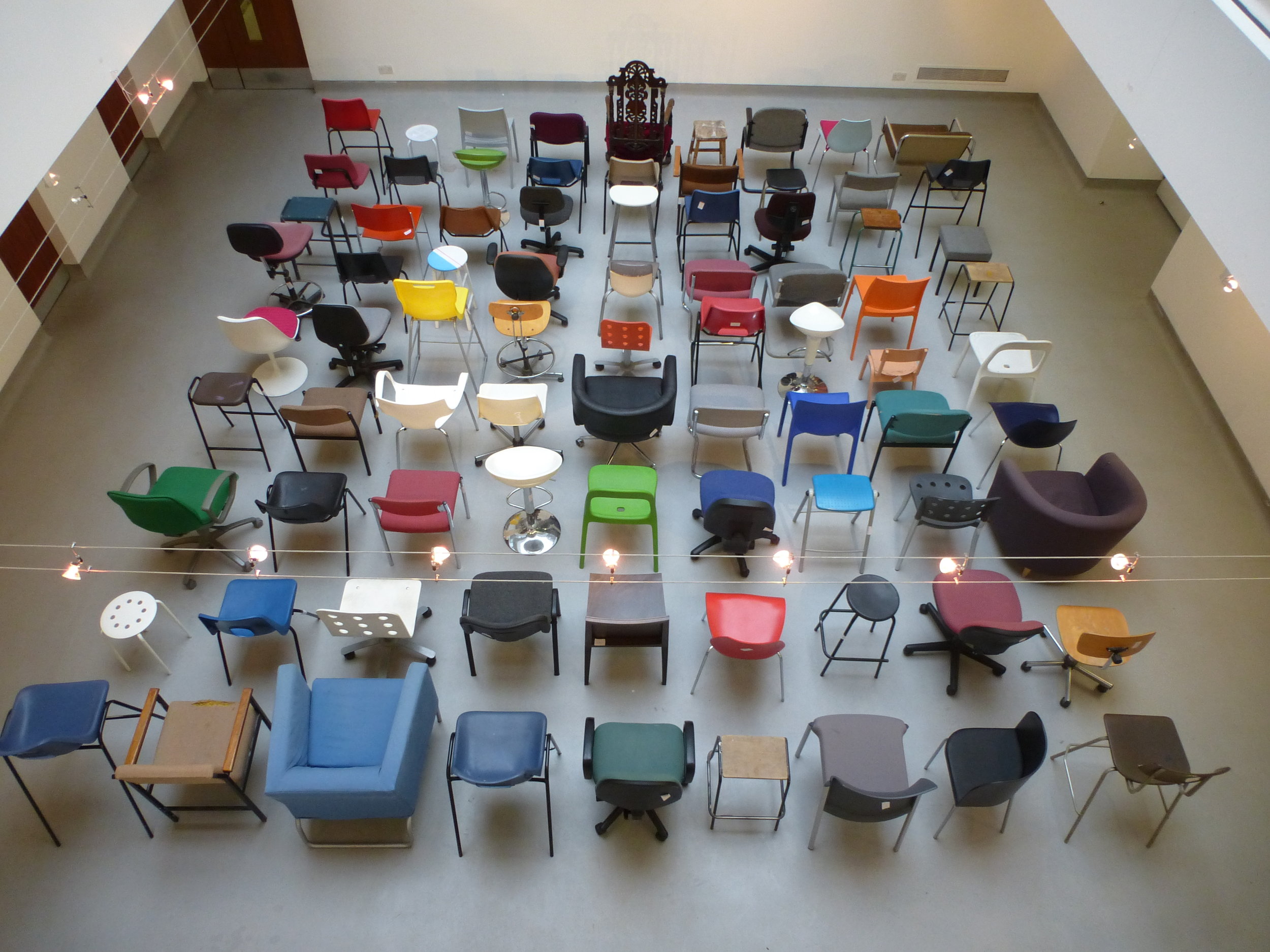
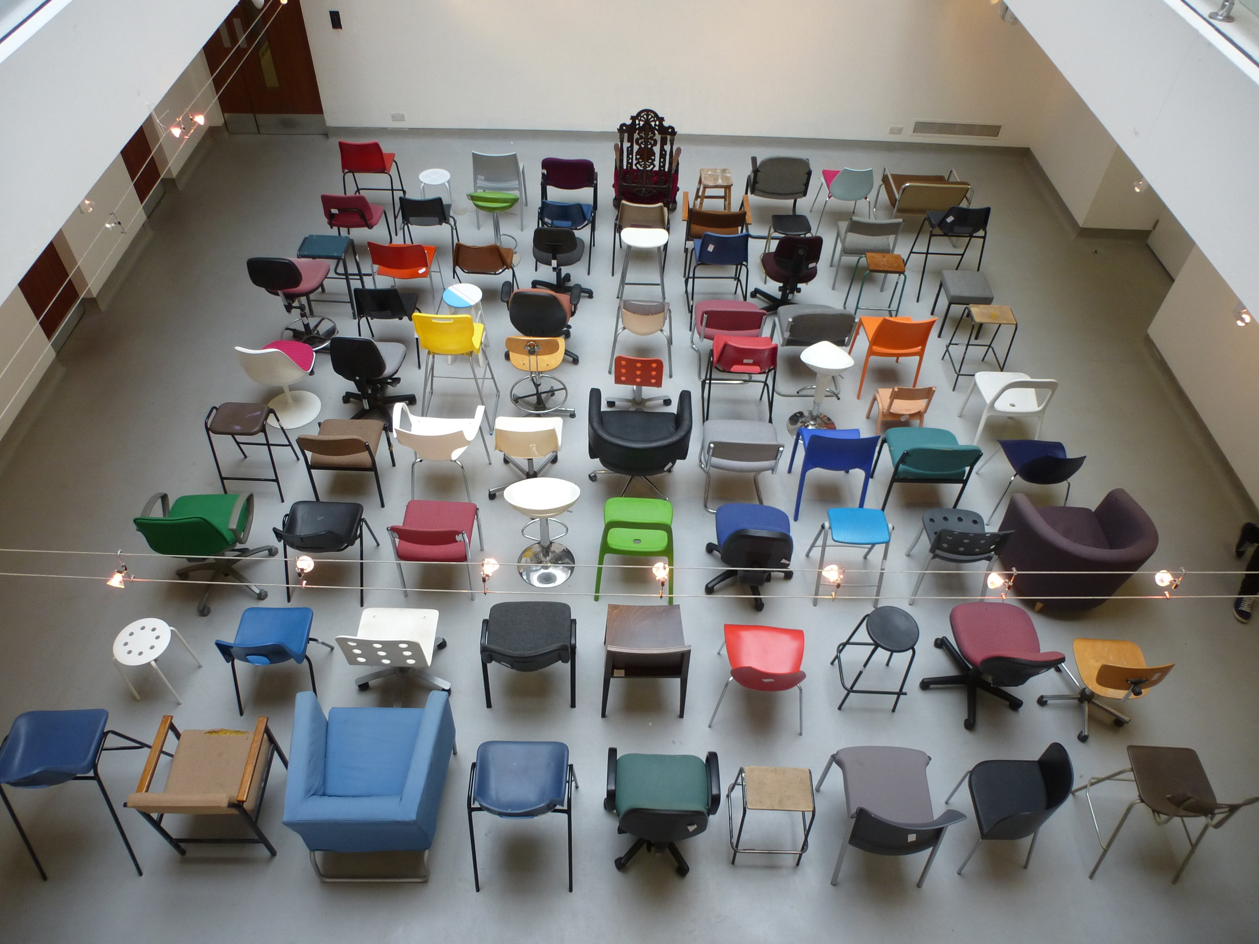
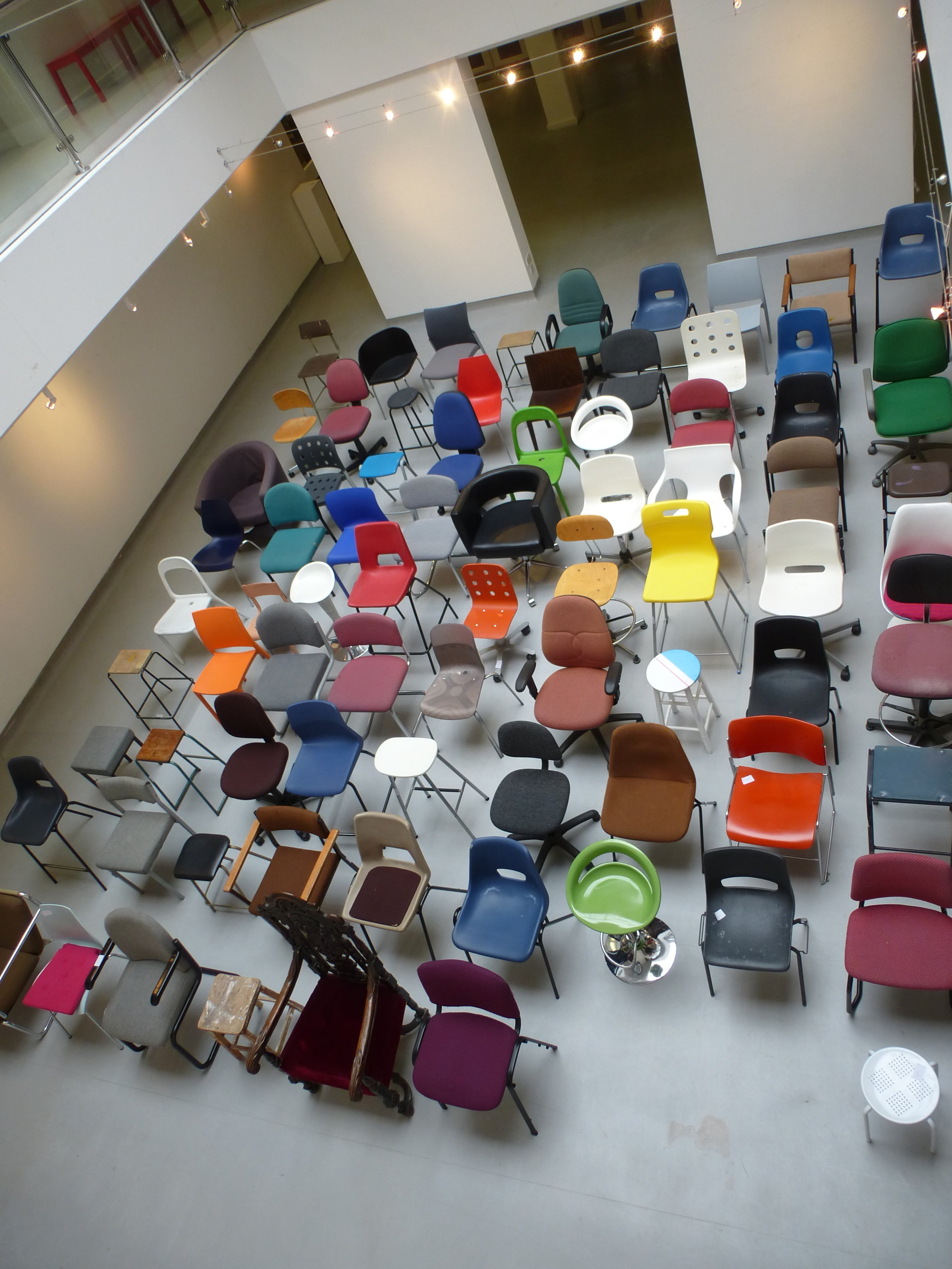
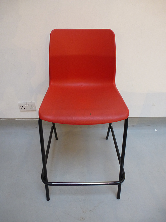
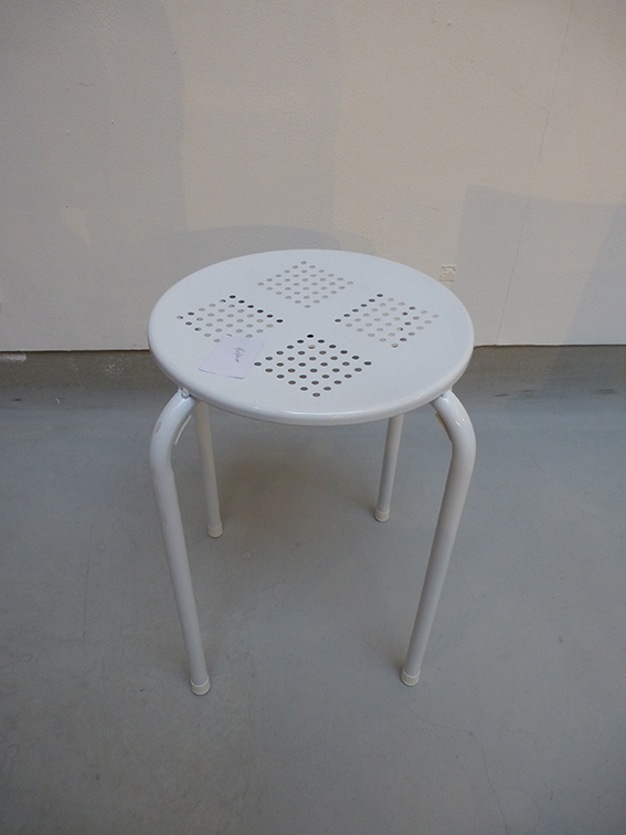
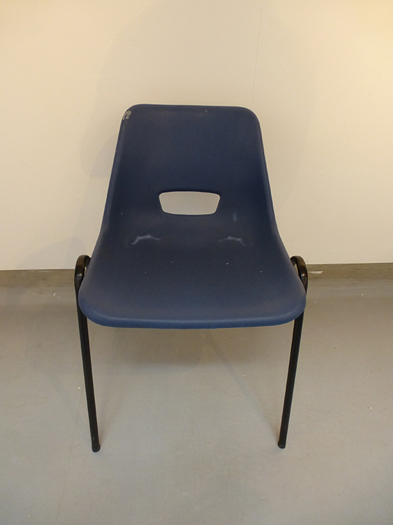
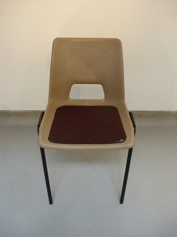
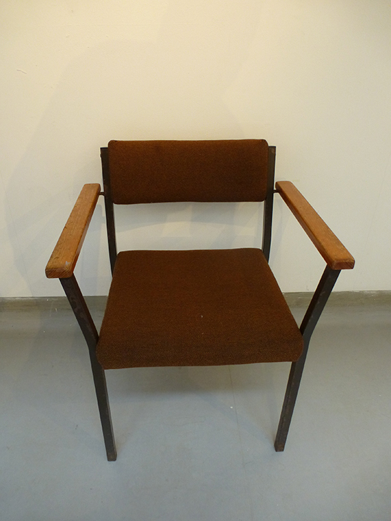
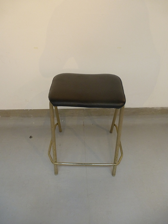
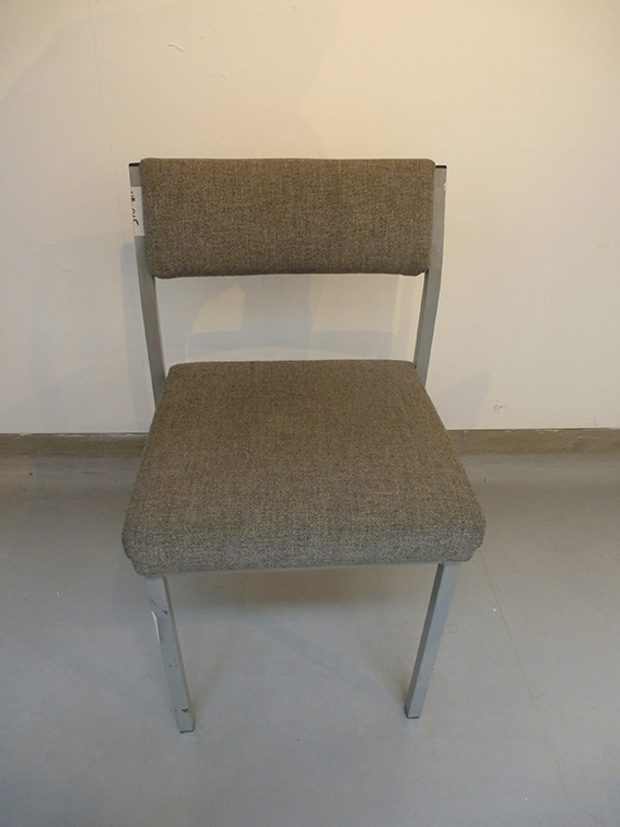
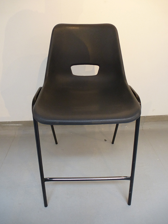
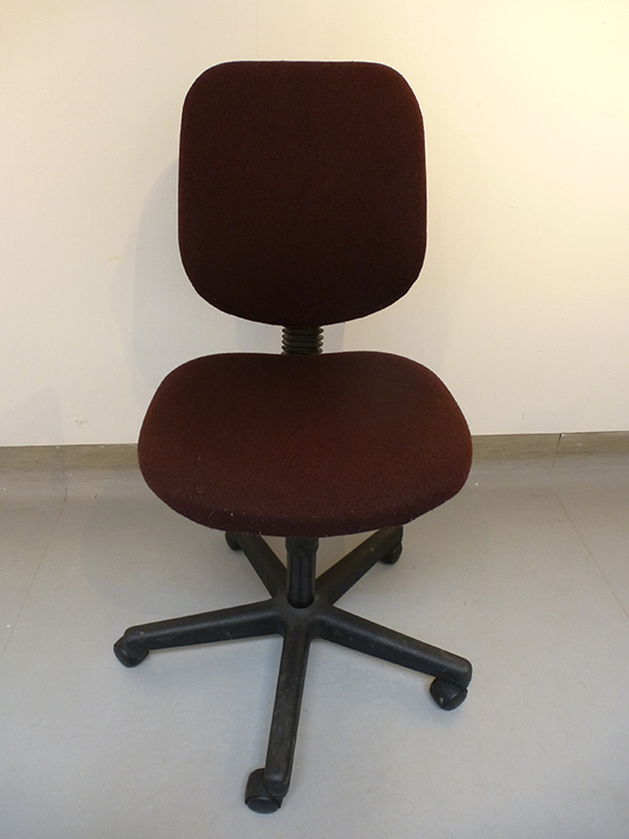
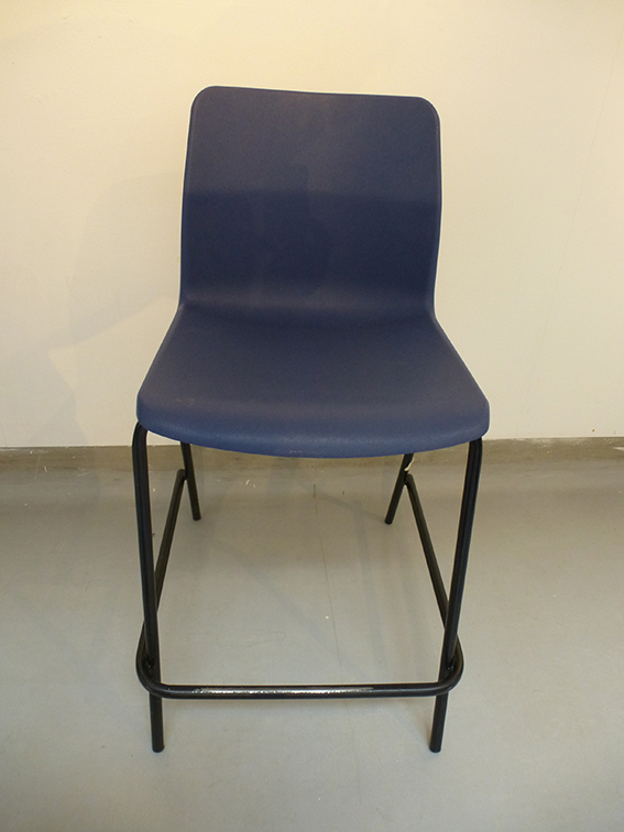
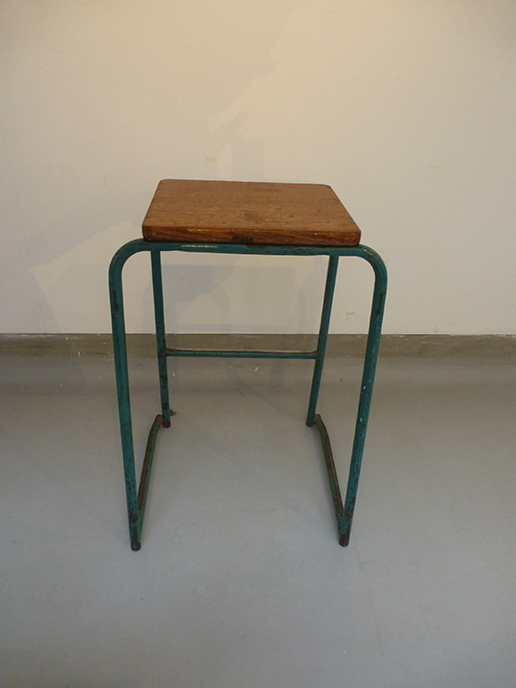
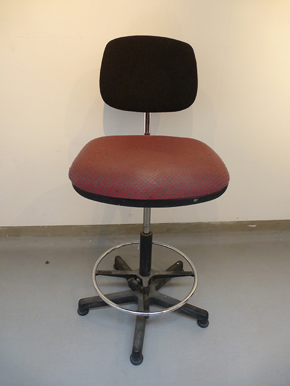
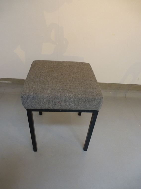
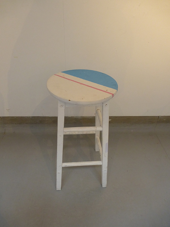
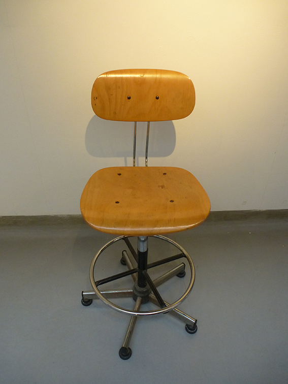
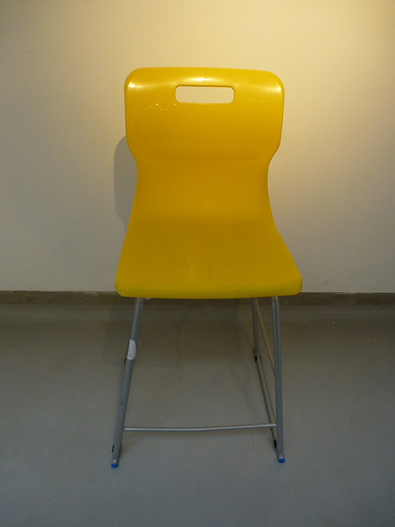
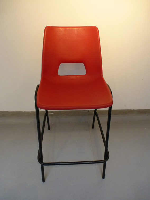
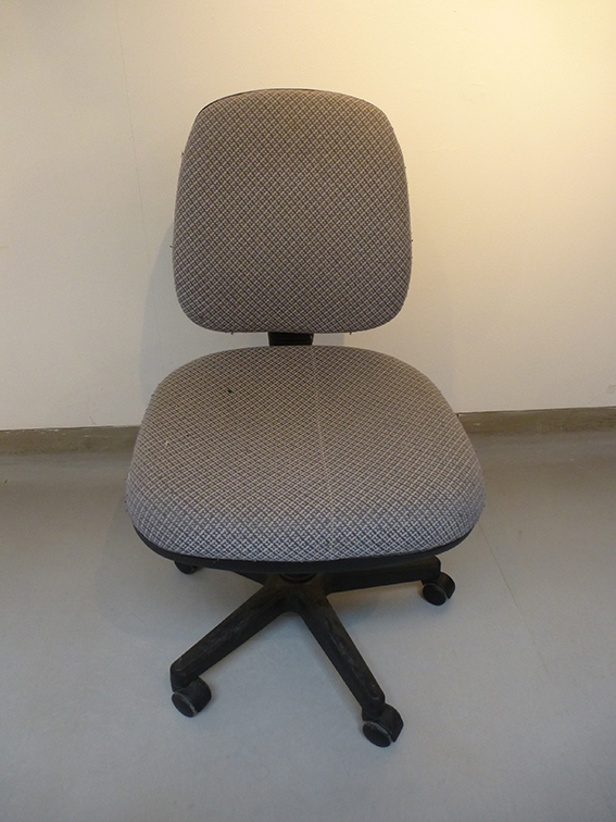
'A Seat of Learning' - Sight specific installation - 2015

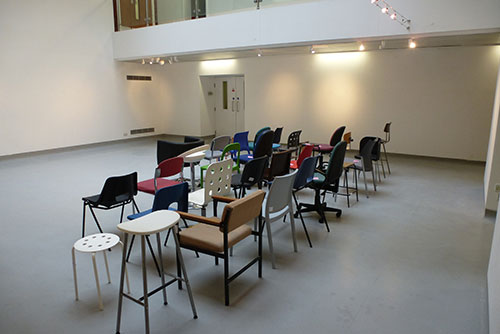
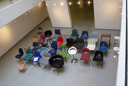
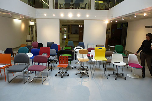
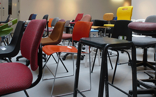
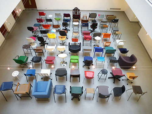
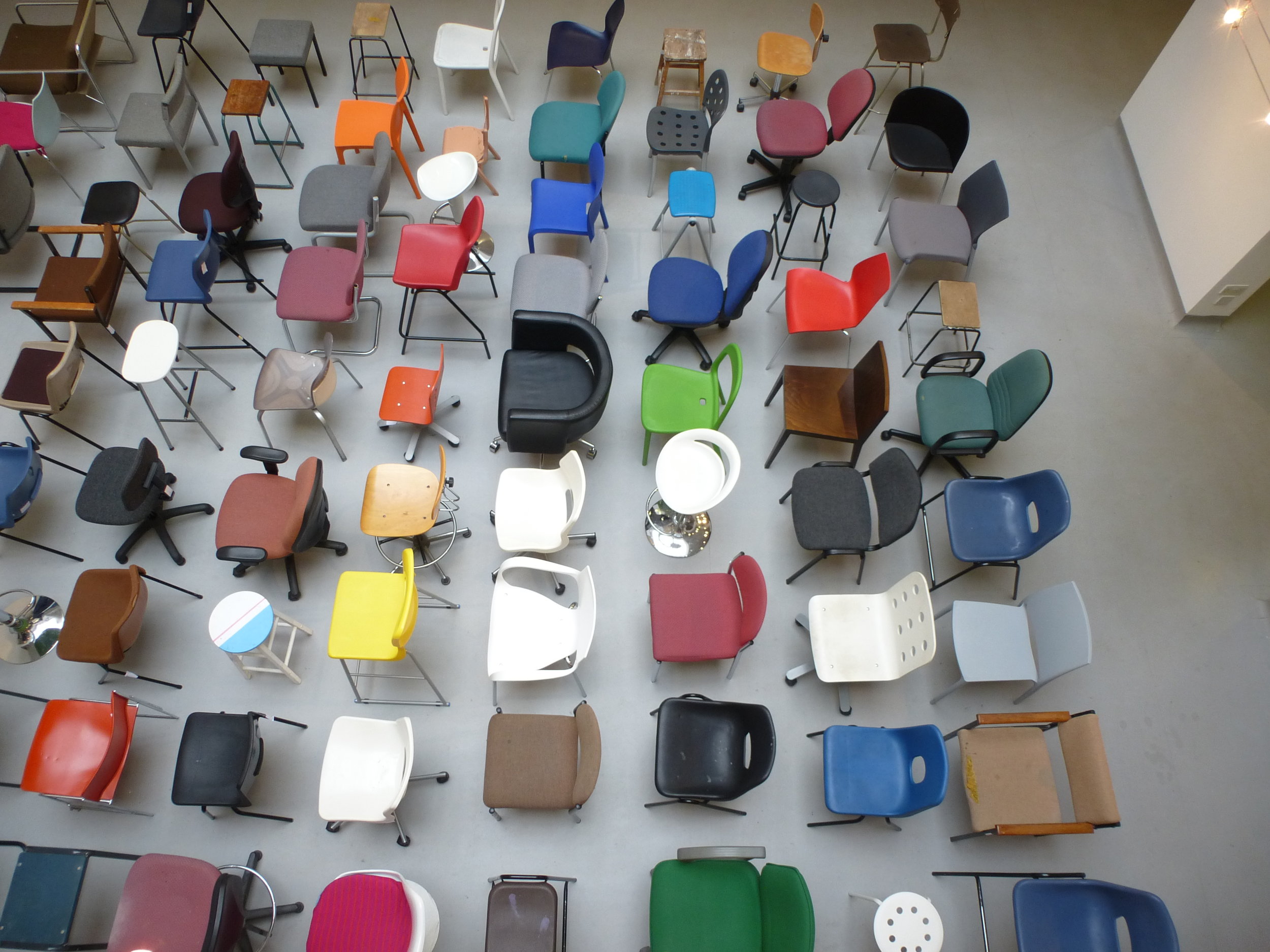
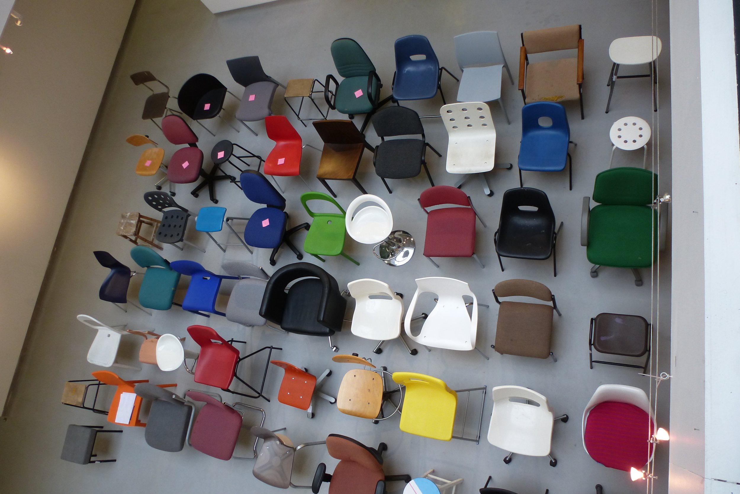
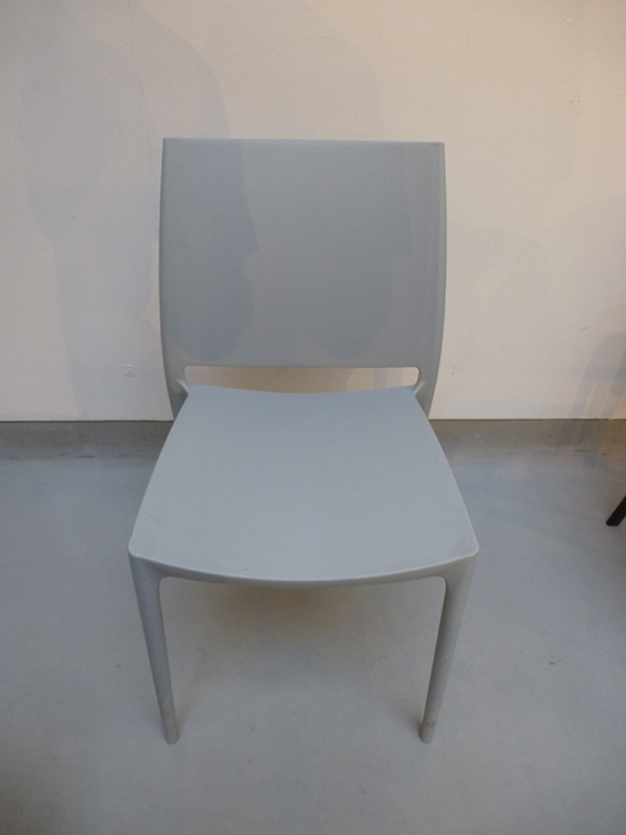
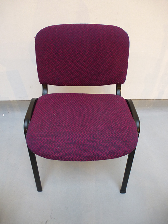
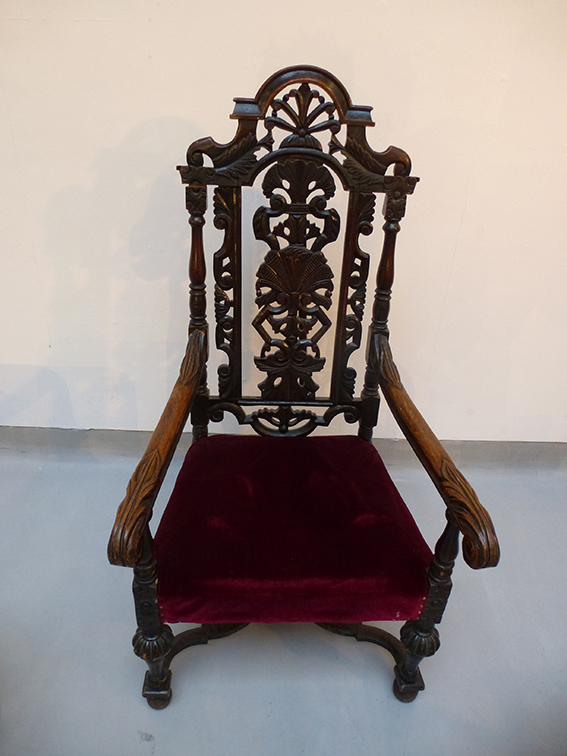
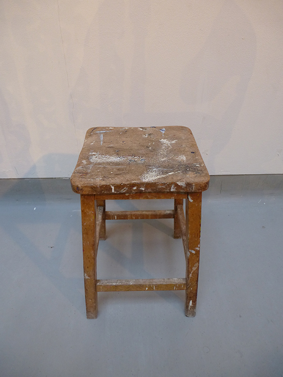
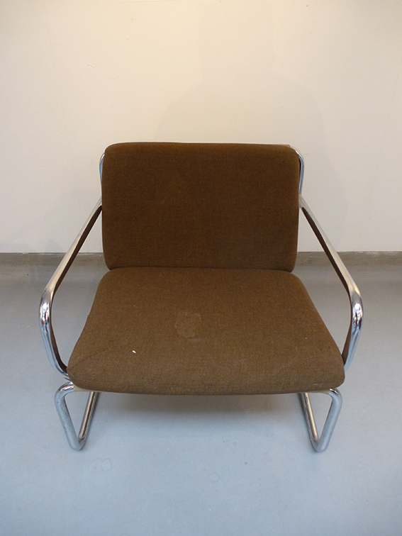
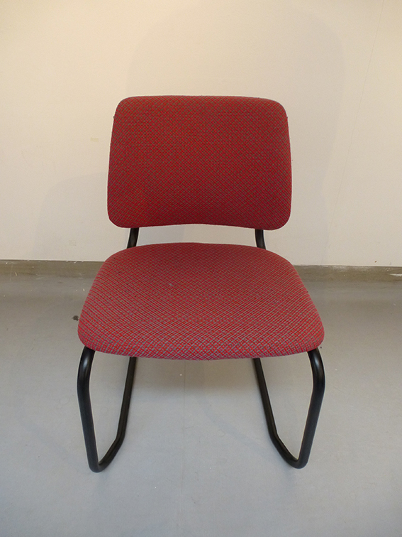
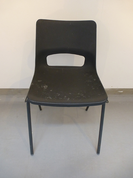
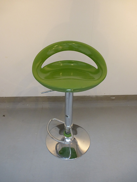
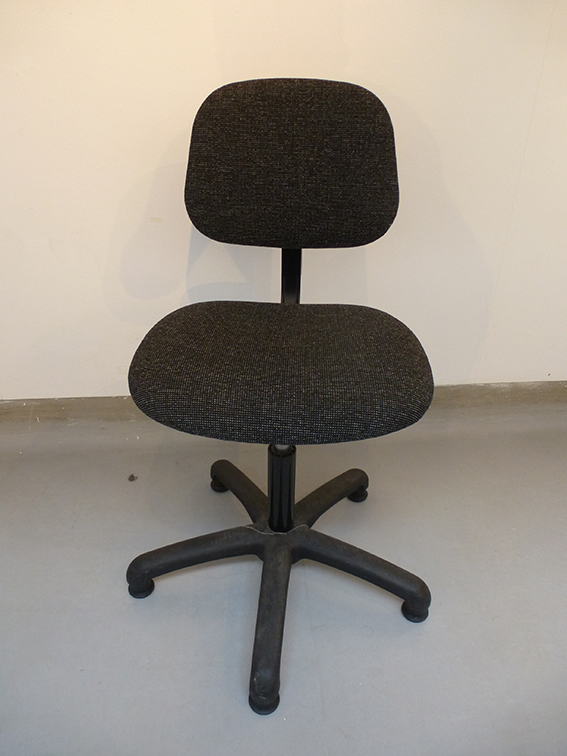
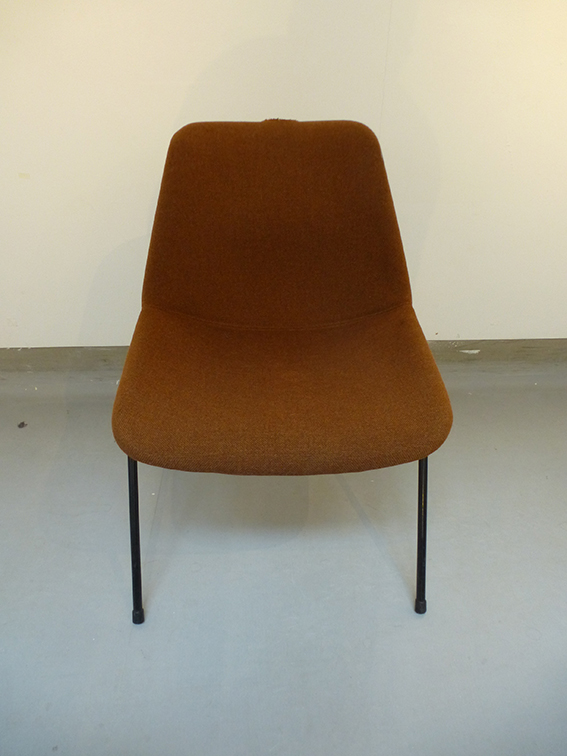
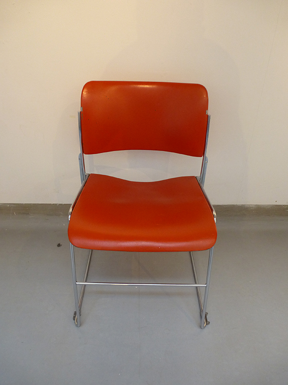
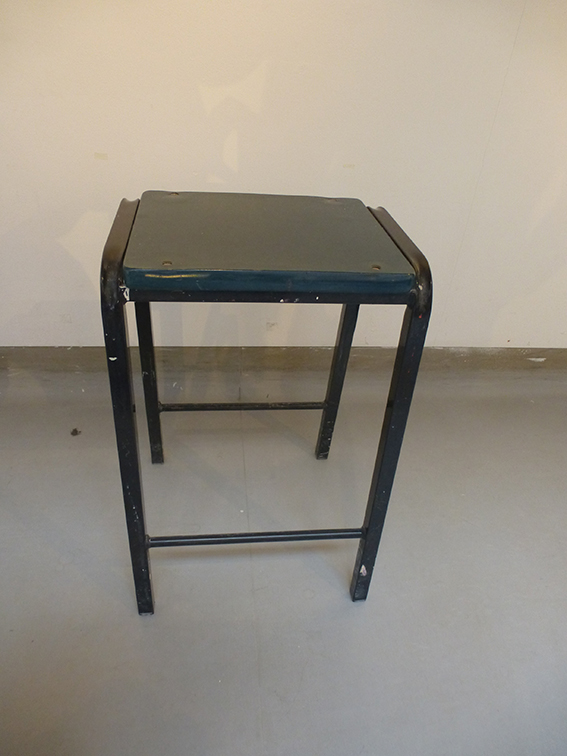
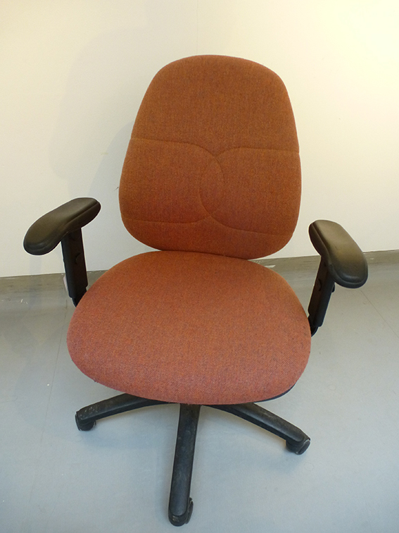
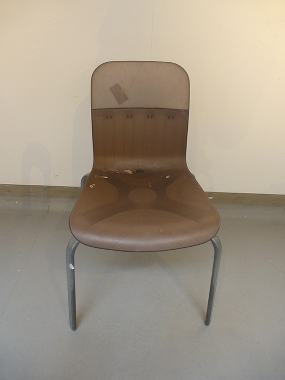
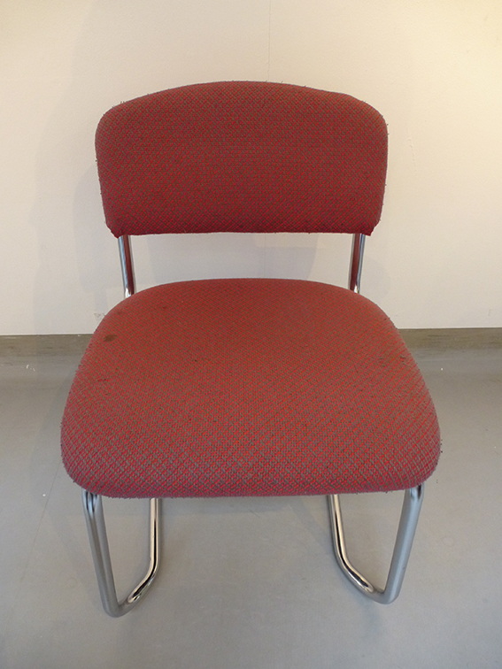
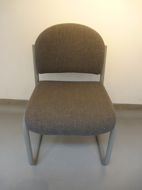
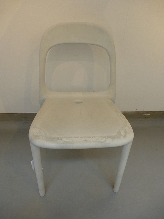
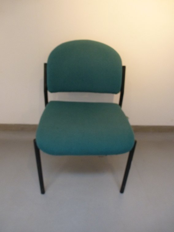
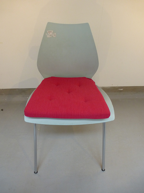
Every unique style of chair that the curator could find in the Victoria building over a period of 4 hours was extracted from the studios and base rooms from all 3 floors. These chairs were then placed at random, in the PR1 Gallery, to form a square - nine chairs by nine.

What people read into this sight specific artwork at the time was very much up to the viewer. However the curator would like to think that one aspect of the piece was how it reflected the unique nature of all those creative individuals who practiced within the School of Art, Design & Performance. Both students & staff.

In the two years since this piece was first shown the building has undergone a furniture standardisation and refit. Sadly the majority of these chairs have now left the building. Therefore this piece could never be recreated again. Let us also hope that the individuality and creativity didn't leave with them!

9x9

9x9

Time lapse of the installation.

A portrait of every individual chair.

From the Archive

Here we feature some very rare images of the early student D&AD awards circa 1980. The students & staff on the Graphics course had a clean sweep in the competitions first year, with Preston Polytechnic winning all 4 categories!

The Judges deliberate, Alan Fletcher being one of them.

The Judges deliberate, Alan Fletcher being one of them.

Some of the winners from the class of 1980.

Some of the winners from the class of 1980.

Student s & staff receiving their award.

Student s & staff receiving their award.

Here we feature some of the award winning work.

What the judges thought of the winners work.

What the judges thought of the winners work.

Words within Words


Here we explore a visual communication technique
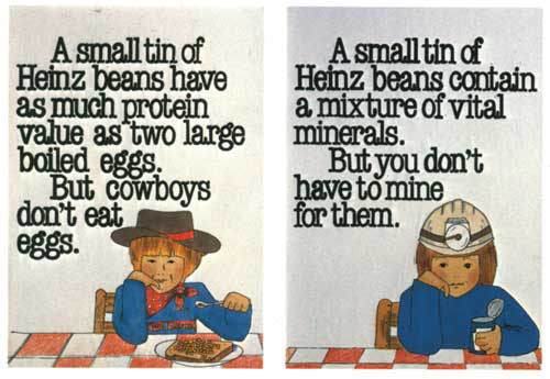
The following presentation highlights examples of how the designer has primarily used the written word to illustrate an idea or concept. What sets the following examples apart is the economy and restraint that has been employed by the designer. By merely finding a solution within the word(s) or language that surround each subject.

There also appears to be an effortless feel to these design solutions that belies the fact that each and every designer has had to work hard, striving to find that solution. However at some point on their creative journey they have had a ‘eureka moment'! They have made a creative connection or series of connections and when analysed, in order to achieve this, they have employed one or more of the following techniques:-

They have consistently kept an open mind.
They have visually interrogating the surrounding word(s) & language.
They have exploited the incidental.
They have embraced serendipity (a happy accident) and happen-stance (chance occurrence).
They have approached the problem both laterally & from 360 degrees.
They have applied a relevant or appropriate technique to enhances the concept... 

...but most importantly they have looked and looked, and looked again.

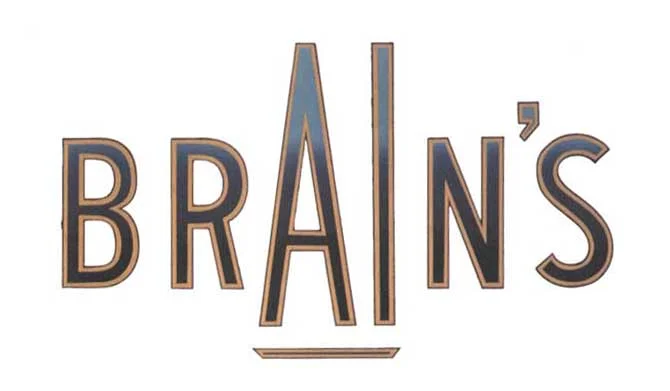
brains better.jpg

“Brains A one Ale” - Brewing cask ale in Cardiff for over 125 years.

earh art good.jpg

Logotype for the Earth Art Institute - 1992.
One powerful word is hidden within another.

sassoon new.jpg

Vidal Sassoon 50th Anniversary Logotype - 1992.
Stylishly combines both name & number.

african final.jpg

Apartheid succinctly illustrated - Designer - Bryn Jones

The designers actually found four directions.

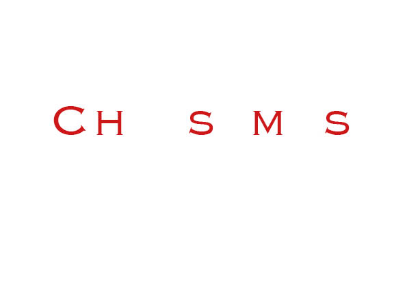
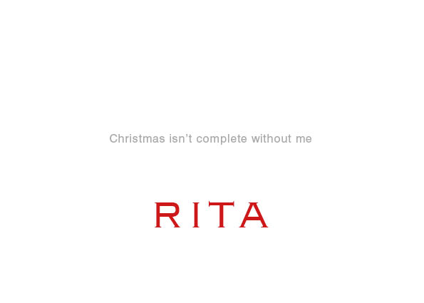
Personal Christmas card - Designed by Rita Kinsella - 1995

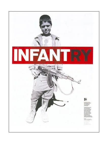
infanrty new.jpg

Poster for New York based human rights charity Witness.
Designed by Lippa Pearce Design

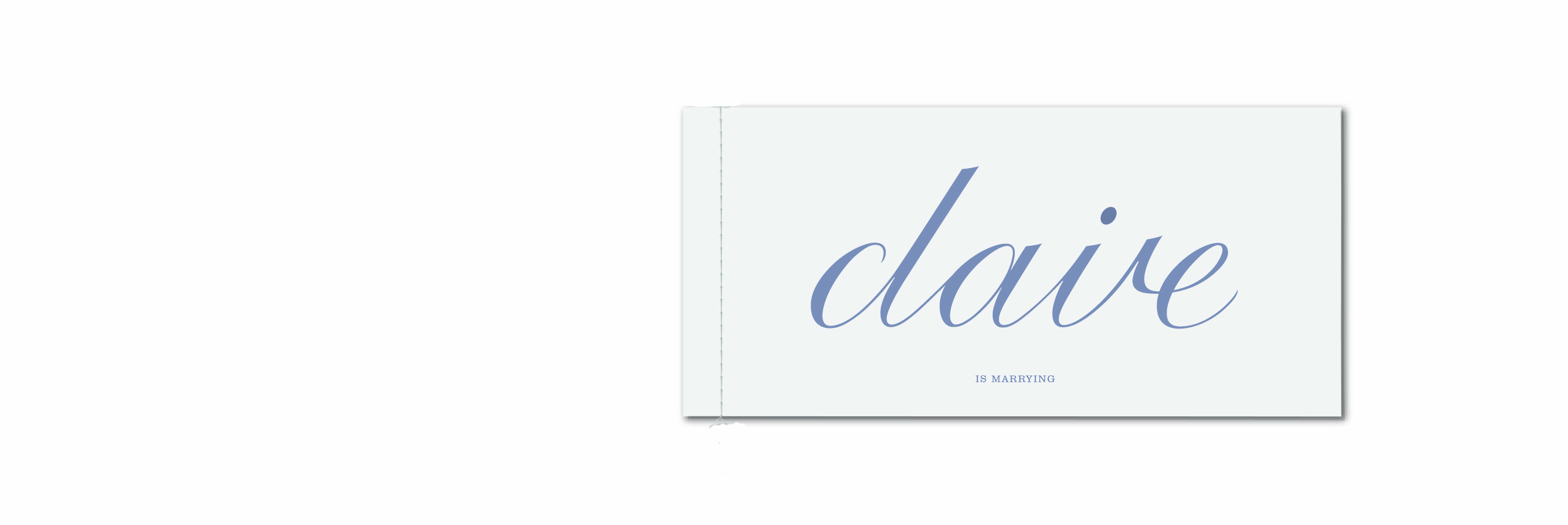
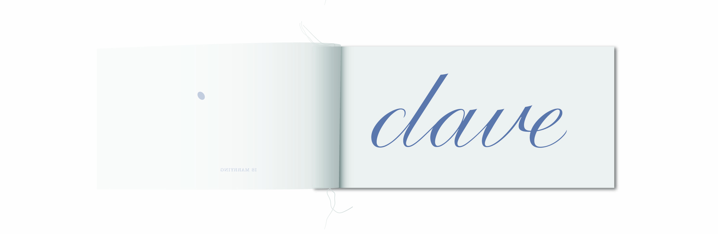
Claire is marrying Dave - Wedding invite
Designed by The Chase Creative Consultants

shit.jpg

Great use of an anagram amongst Friends!

arse.jpg

Course language.

fasting.jpg

Book cover for a Pan Paperbacks on the ultimate diet.
When given the word fasting as the title the designer saw greater possibilities.
From - Smile in the mind 1.

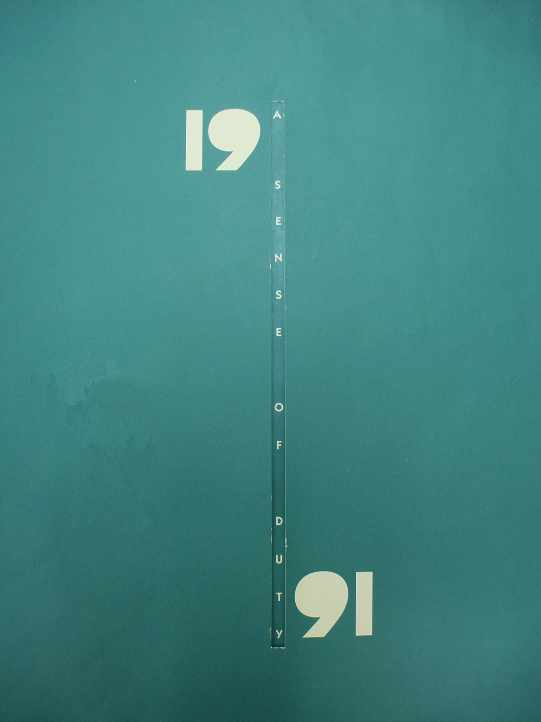
The co-operative Bank Calendar - 1991.
Designed to raise money for 6 special niche charities.
The introduction above contains a hidden message.

men.jpg

Manchester Evening News are expanding & moving office
Designed by The Chase

Is Ikea a good Idea...discus.

ha ha.jpg

Year 1 creative thinking type solution.
Designed by Jennie Potts 

yours is ours.jpg

Designed by Matt Johnson - 2007

new cropped asa randall copy.jpg

Advertising Standards Authority press campaign.
 D&AD runner up 2002

bitch.jpg

‘The difference a letter can make’
Advertising Standards Authority press campaign - D&AD winner 2002

compendium of letters make.jpg
fine art poster.jpg

Fine Art Degree show Poster - 1994 - Designed by Mark Hurst.
University of Central Lancashire

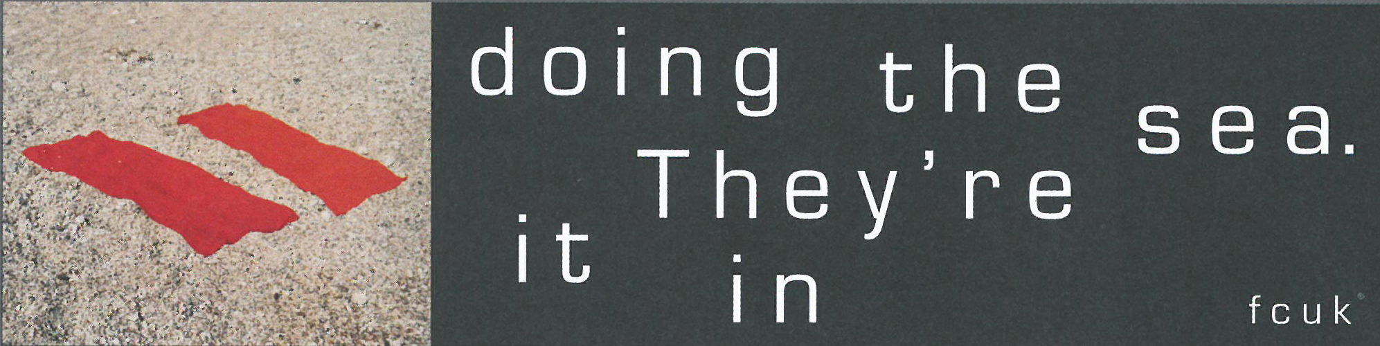
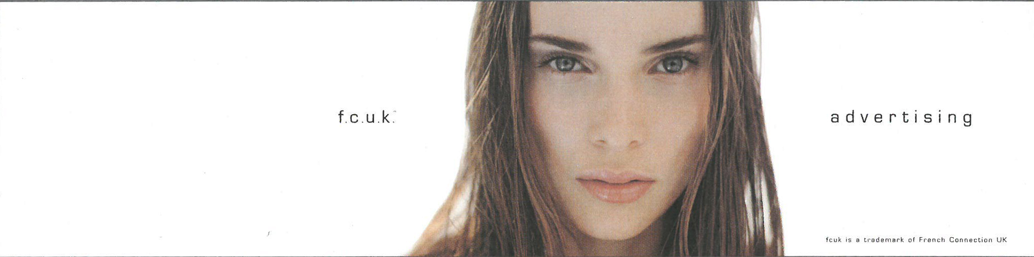
Fcuk mark.jpg

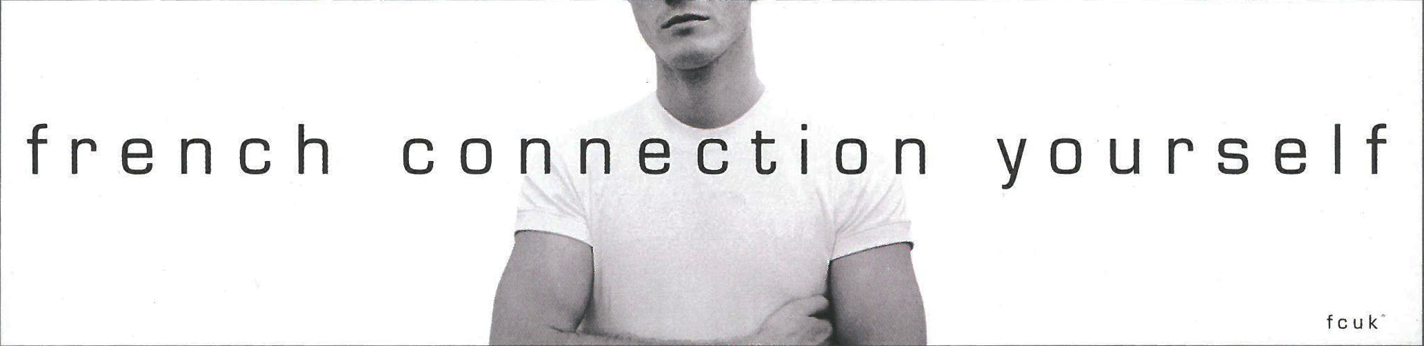
French Connection UK - Trevor Beattie in 1997. 
French Connection used the abbreviation FCUK on an internal memo.
The idea evolved into one of the highest profile and most controversial
British ad campaigns of the 90's.

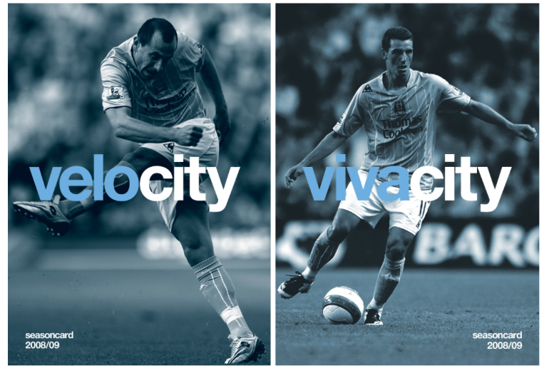
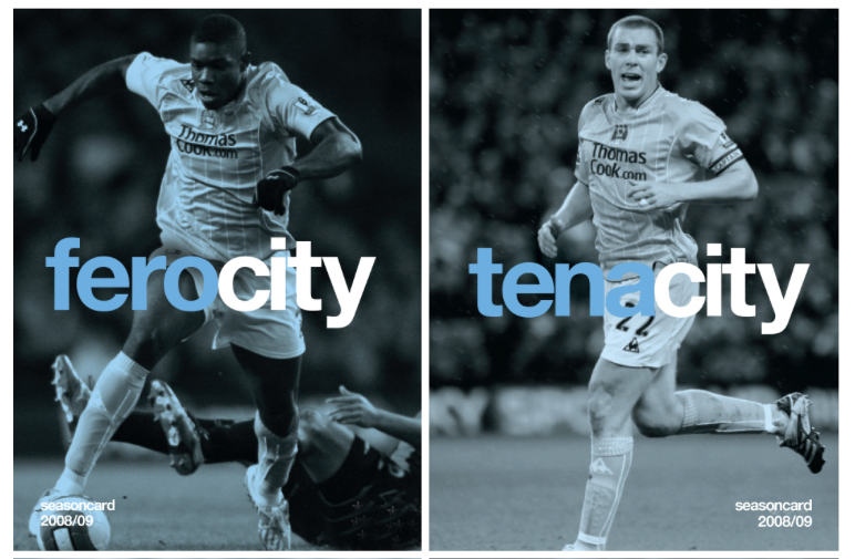
electricity.jpg

Brand marketing campaign for Manchester City.
2008/09 season - by Mark Studio

new Kenyon 1.jpg

Proposed identity for The Mitchell & Kenyon Cinema - by The Chase - 2006

new kenyon 3.jpg
new kenyon 2.jpg
2 examples.jpg
ioplight logo.jpg

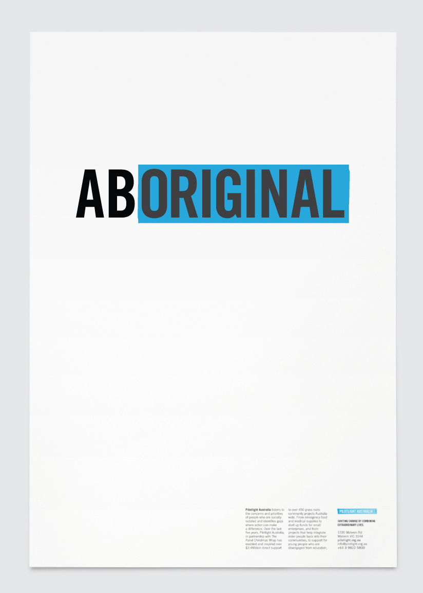
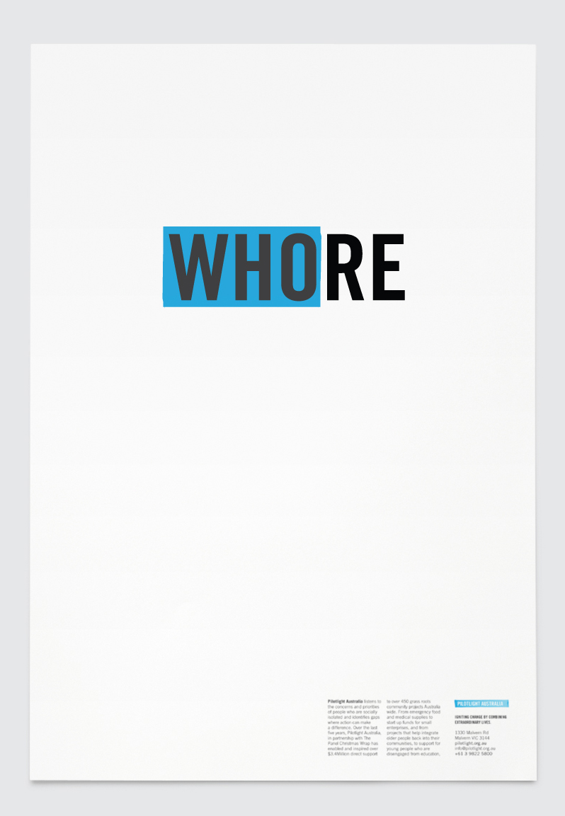
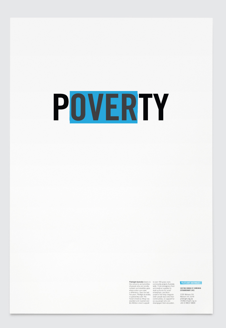
Pilotlight Australia
Pilotlight’s aim was to spark ideas, turn heads & make people think.
Seeing something good or unexpected, in something bad.

SF1.jpg
sf2.jpg

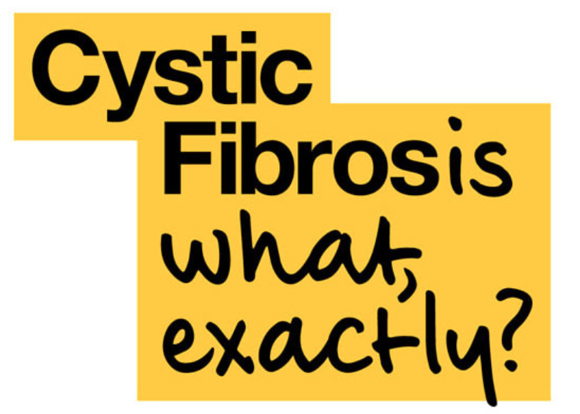
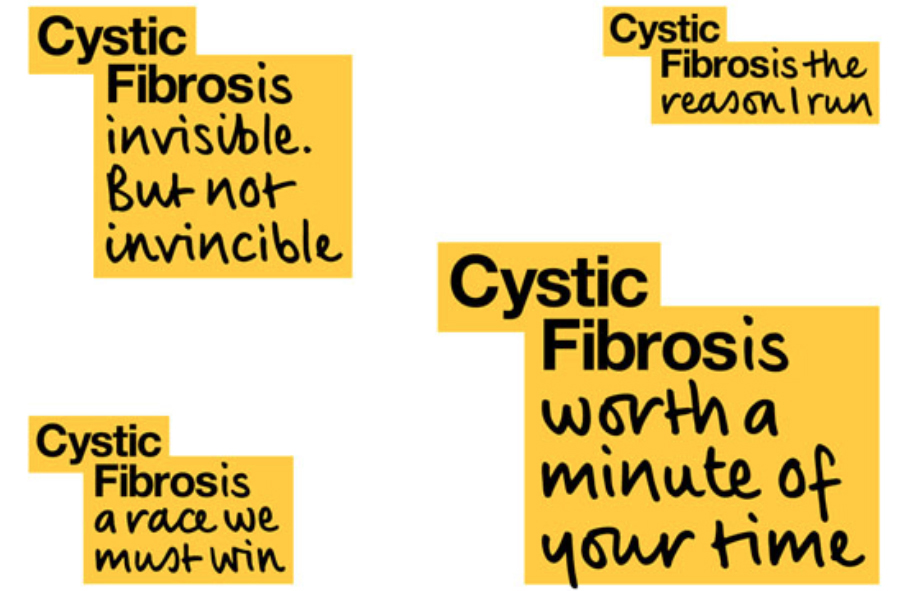
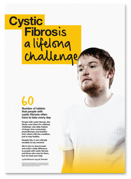
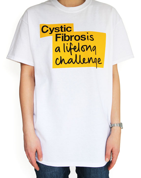
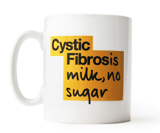
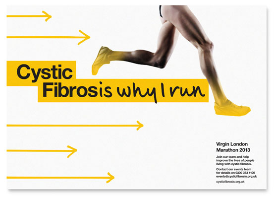
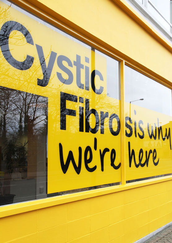
Cystic Fibrosis - Johnson Banks
“In discussions and research, it became apparent pretty quickly
that the condition is widely misunderstood.
Most people don’t understand what it is, or what it does,
until someone close to them is affected by it”.

main logo.jpg

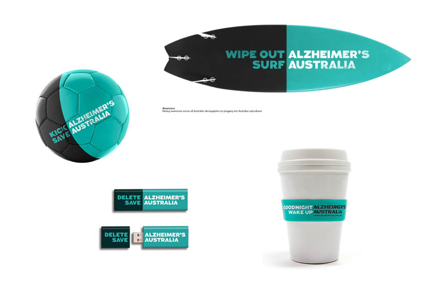
Alzheimer’s Australia - Interbrand Australia - 2012
The following brand features a flexible logo that changes & evolves
to communicate different messages. 
Using two colours and often just four words the idea communicates
the name of the organisation, highlights a problem and features
a strong call to action.

combo.jpg
even newer words in words pres52.jpg
back of words fail me copy.jpg

A great little book, highly recommended.

words fail me cover.jpg

...and finally the Scunthorpe problem

scunthorpe.jpg

The Scunthorpe problem is the blocking of e-mails,
forum posts or search results by a spam filter or search
engine because their text contains a string of letters
that are shared with an obscene word. 

While computers can easily identify strings of text
within a document, broad blocking rules may result
in false positives, causing innocent
phrases to be blocked.