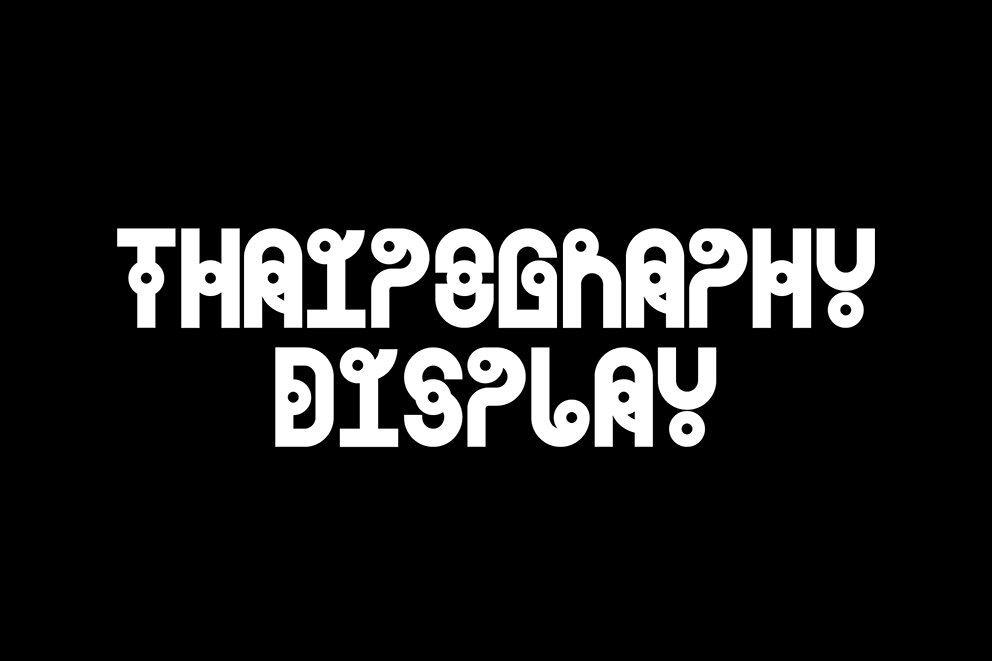
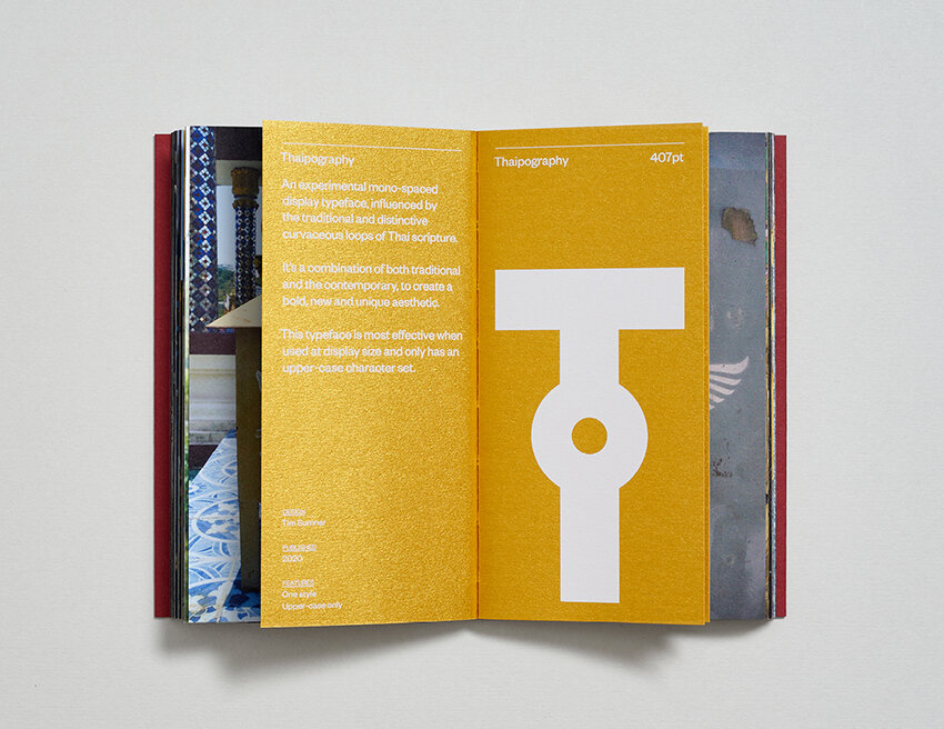
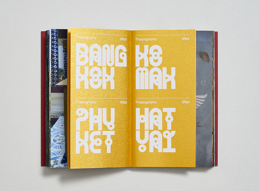
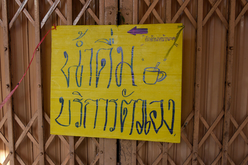
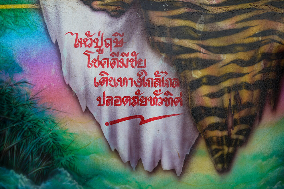
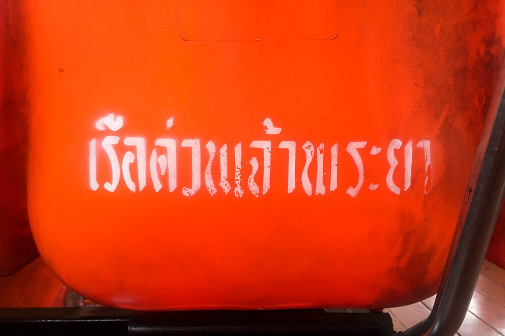
Thaipography
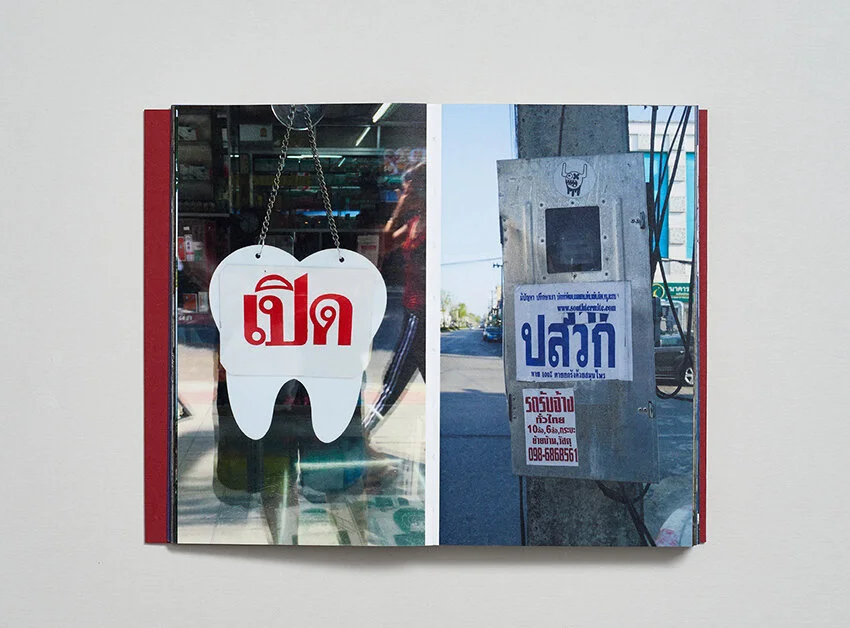
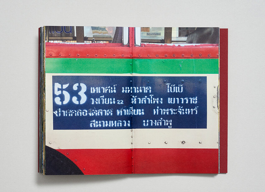
/Here we feature a great typography project that has recently been sent to our offices by x Preston Graphics student Tim Sumner. This self published book was inspired by the typography that Tim encountered in Thailand on his globe trotting adventures.


Card board wraparound case

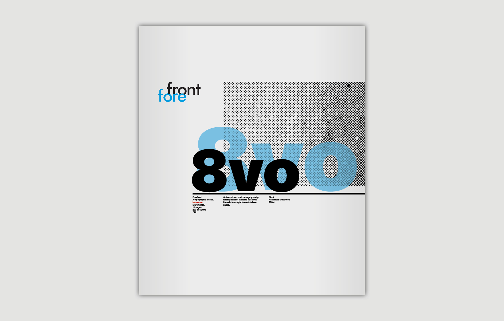
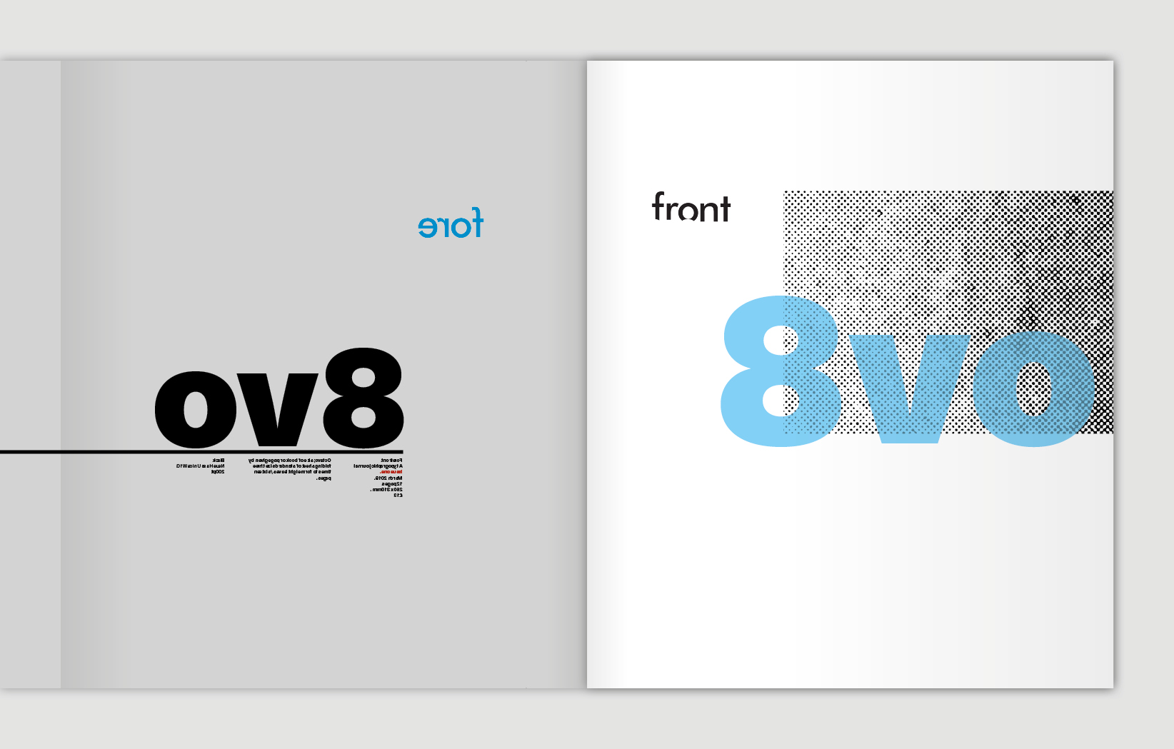
Front & back cover designs

Forward
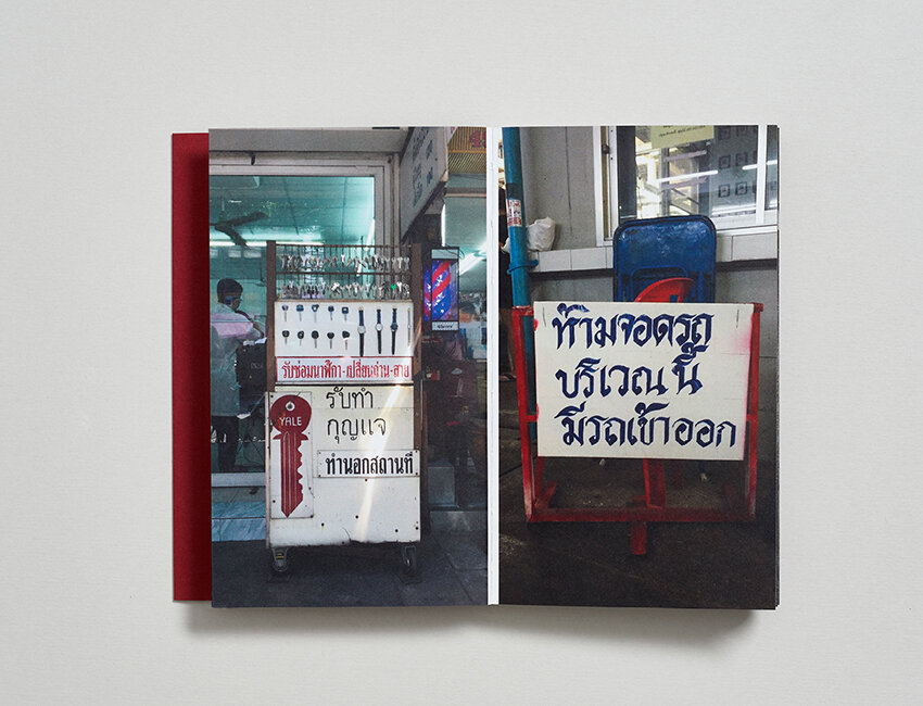
Slideshow

The typeface
For more on this project follow Tim here.