Piano Tuner's App
/A nice concept for an app from second year Dom D for his current branding project.

A nice concept for an app from second year Dom D for his current branding project.
![7[1].jpg](https://images.squarespace-cdn.com/content/v1/5963451dff7c50bac099fda9/1553691558596-HPDN6R5PMM7P2TKI9YZT/7%5B1%5D.jpg)
Found on Design Week by Pete, Grooveschool is a super simple, playful and beautifully crafted identity. Created by Manchester agency Mark Studio, it shows how typography can be used to portray an idea (in this case mimicking volume faders. Well worth a look for anyone working through a branding project currently…
Here we feature Harriet Richardsons commended D&AD entry for the Arjo Wiggins paper brief 2017.
'Samples' by Sony is a revolutionary way of creating new experimental sounds like never before, combining the tactile medium of paper with digital sound technology. 'Samples' allows both music artists and Sony customers to turn paper samples into audio samples, whilst also exploring the unique and beautiful medium of paper.

Concept


Click the arrow to play the film


A great example of a project built upon a clever verbal connection which combines both the digital and physical to create a unique concept.- Paper Samples & Music Samples or BPM meets GSM.
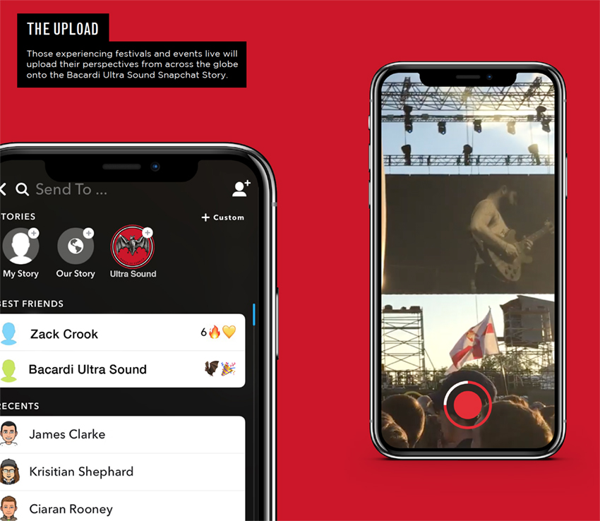
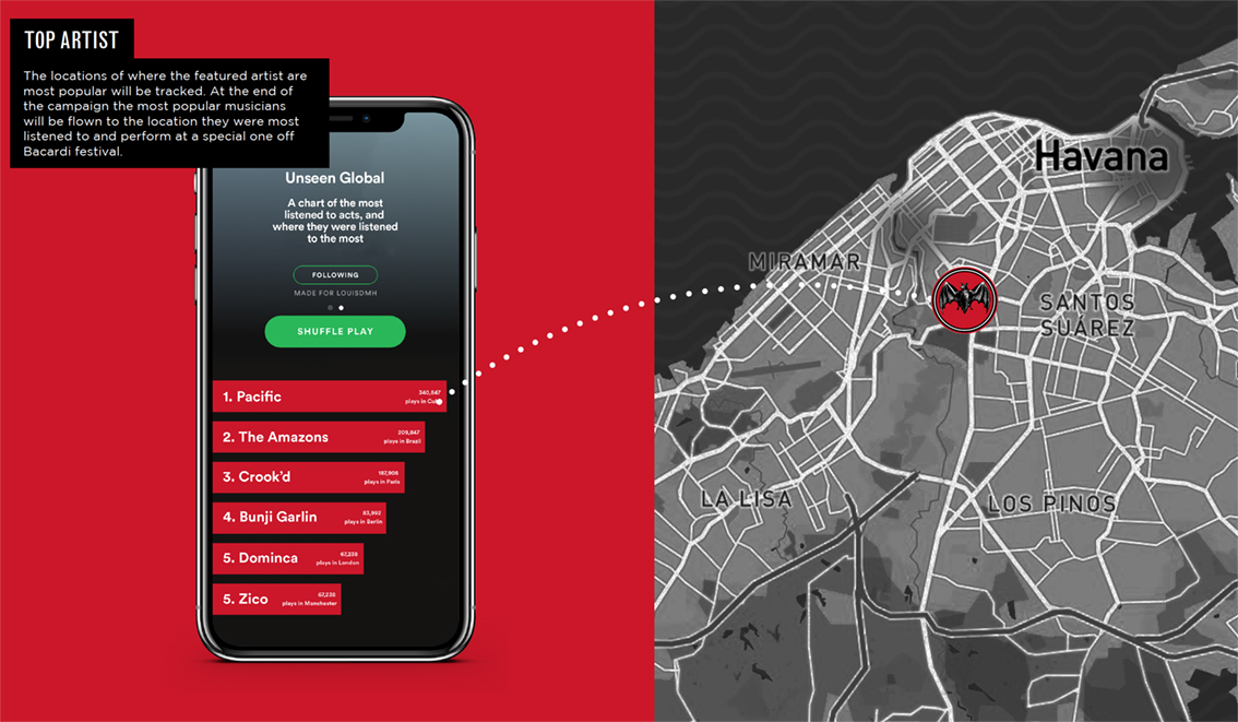
Here we feature Louis Hancock & James Clarke’s D&AD entry from 2018.


Click white arrow to play

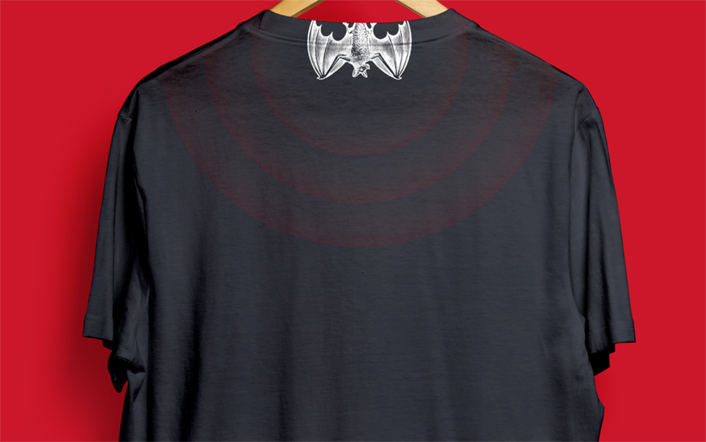
Merchandise - T Shirt

Glow in the dark entry stamps

Ultra Violet bottle concept
A strong and simple connection between a bats natural senses and the Bacardi brand bought to life with some great connected thinking. Deserved to get further than it did in the competition?
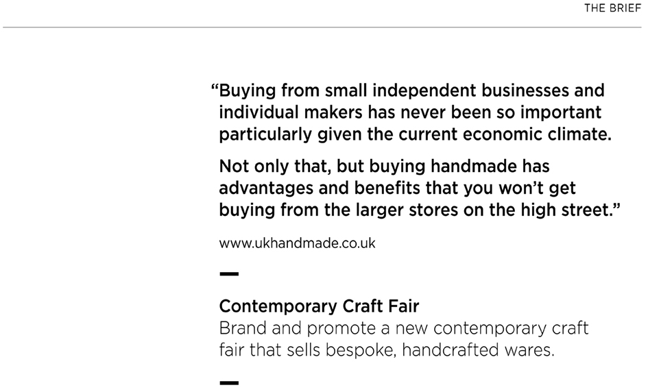
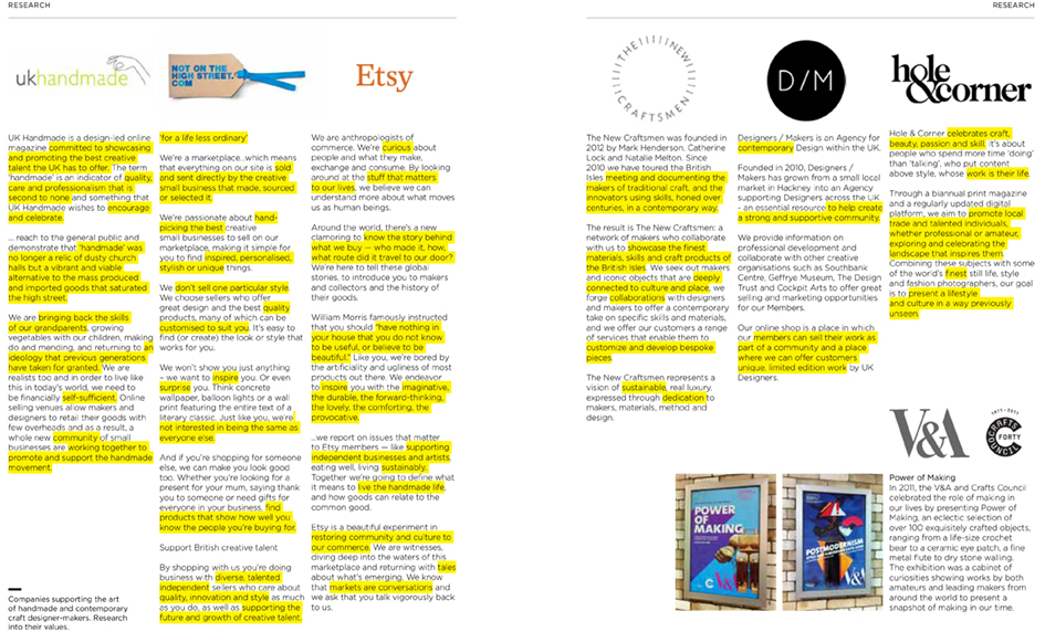
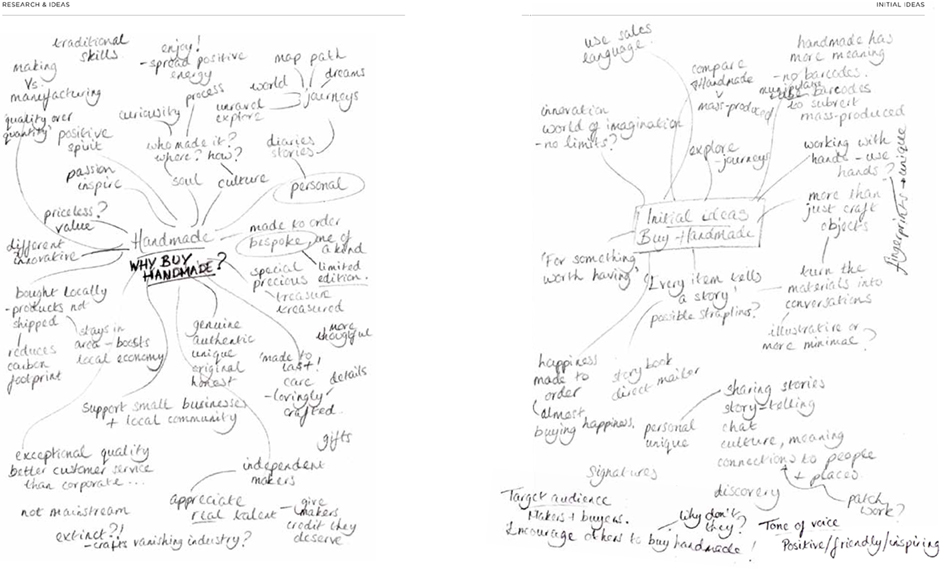
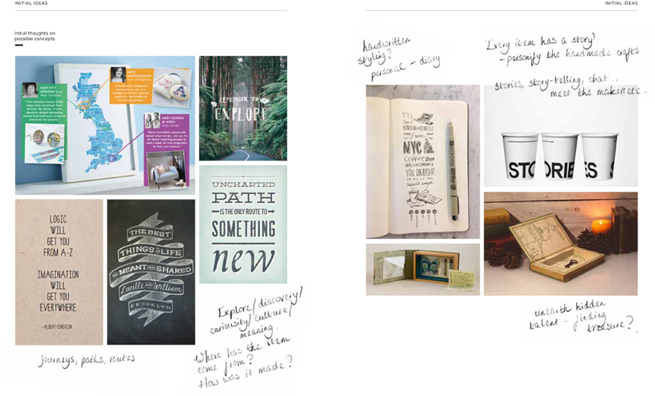
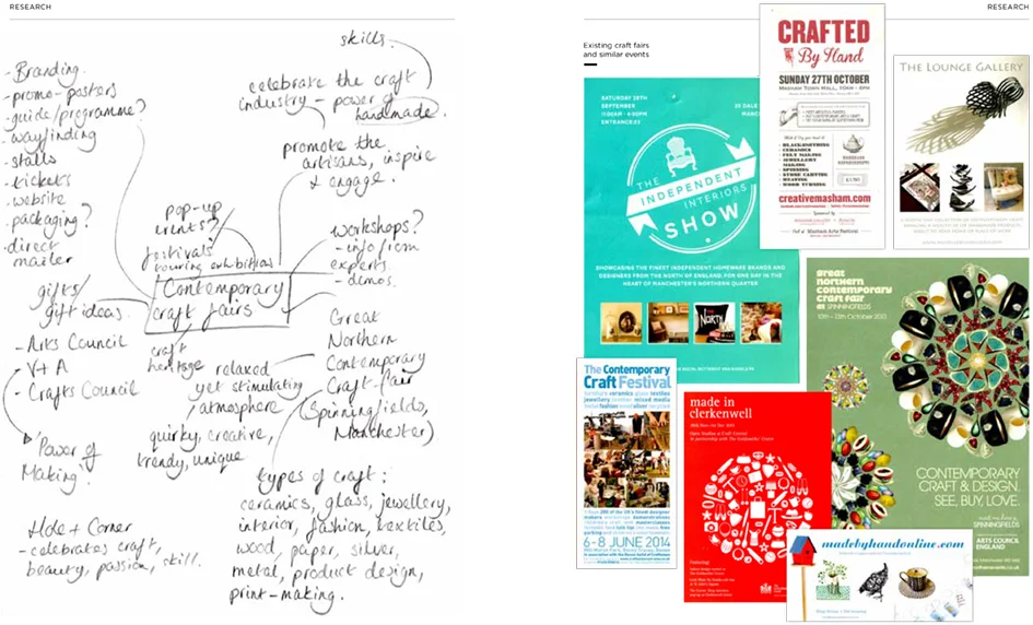
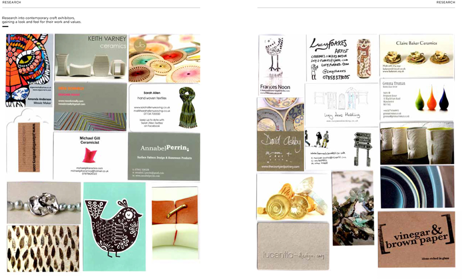
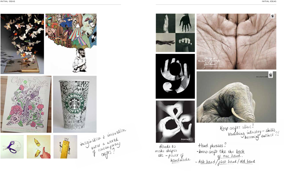
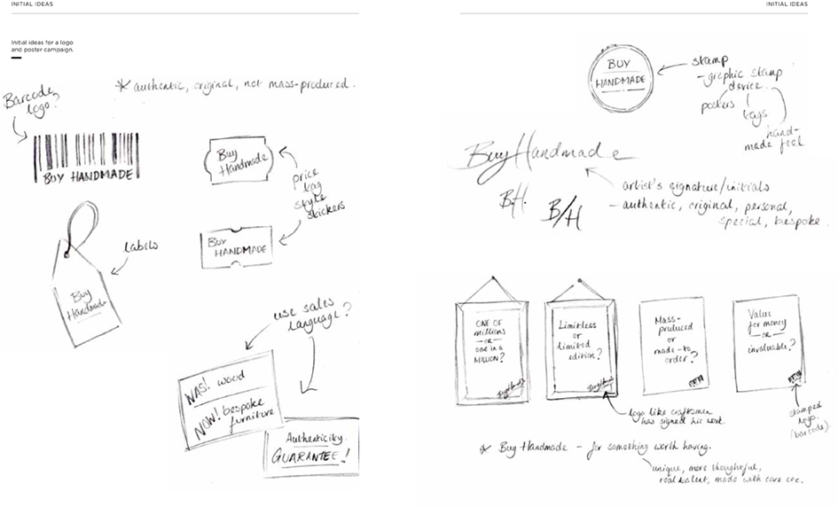
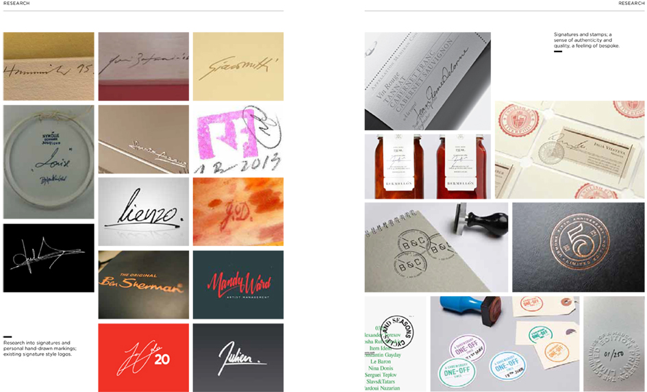
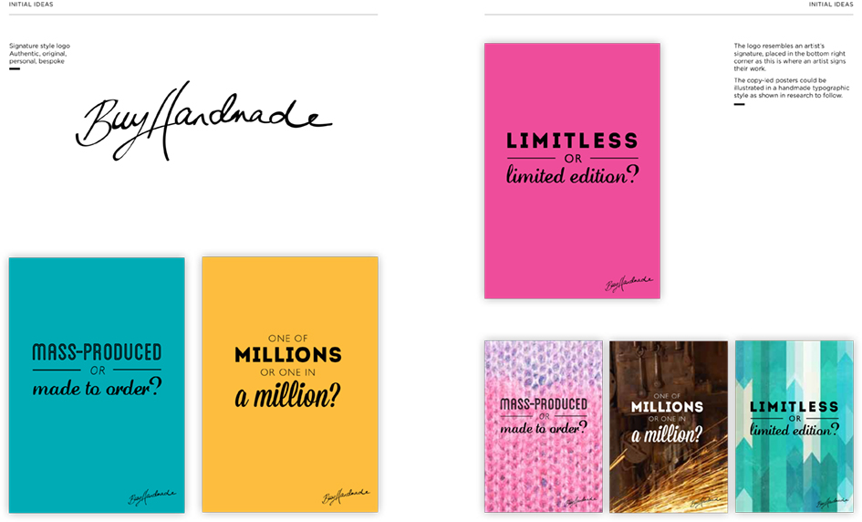
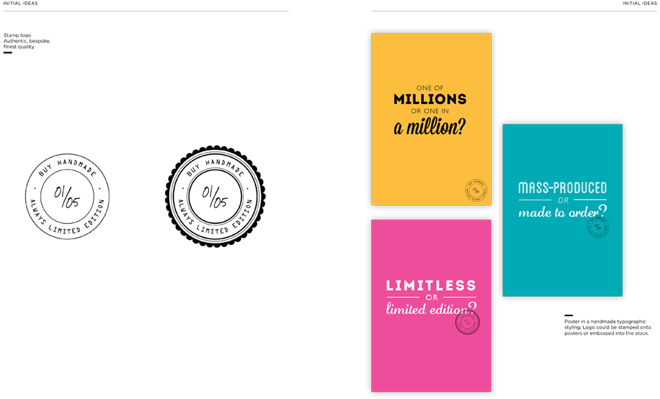
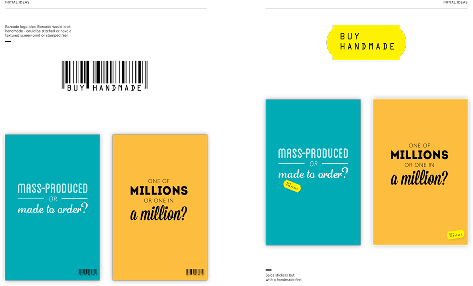
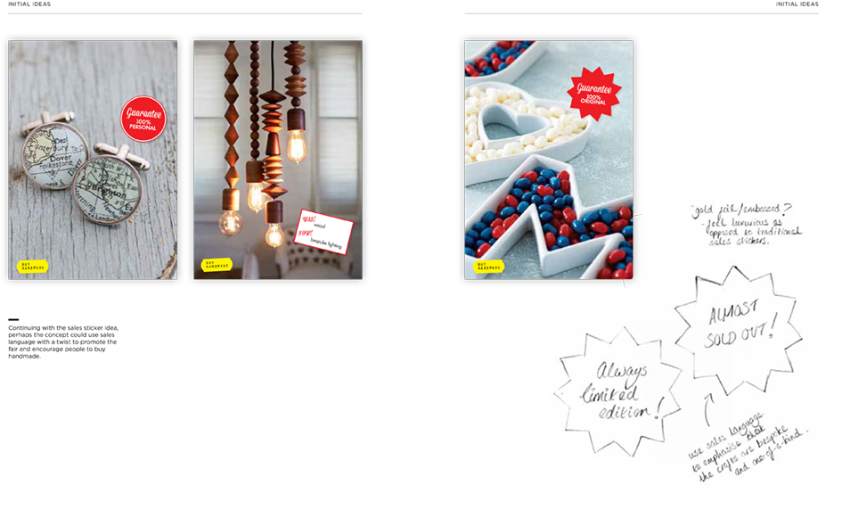
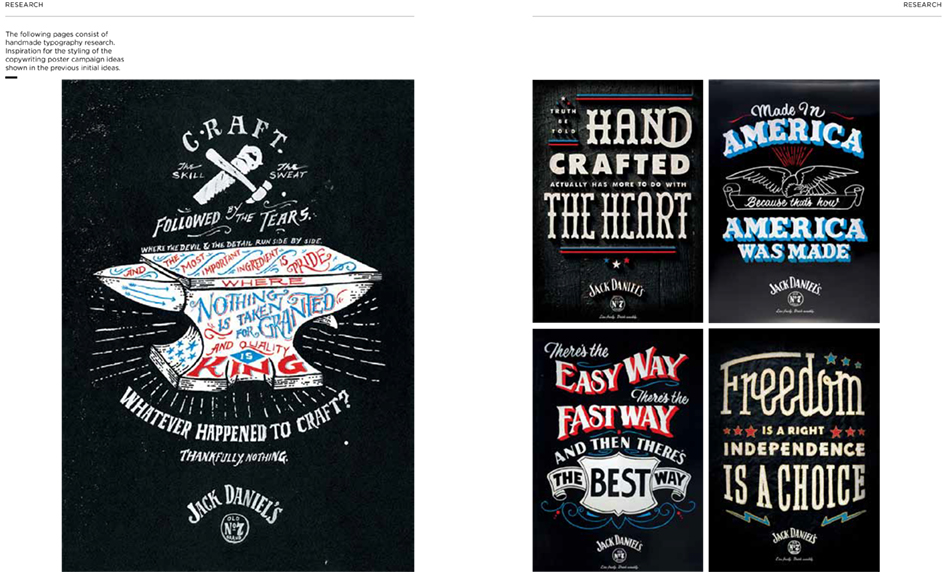
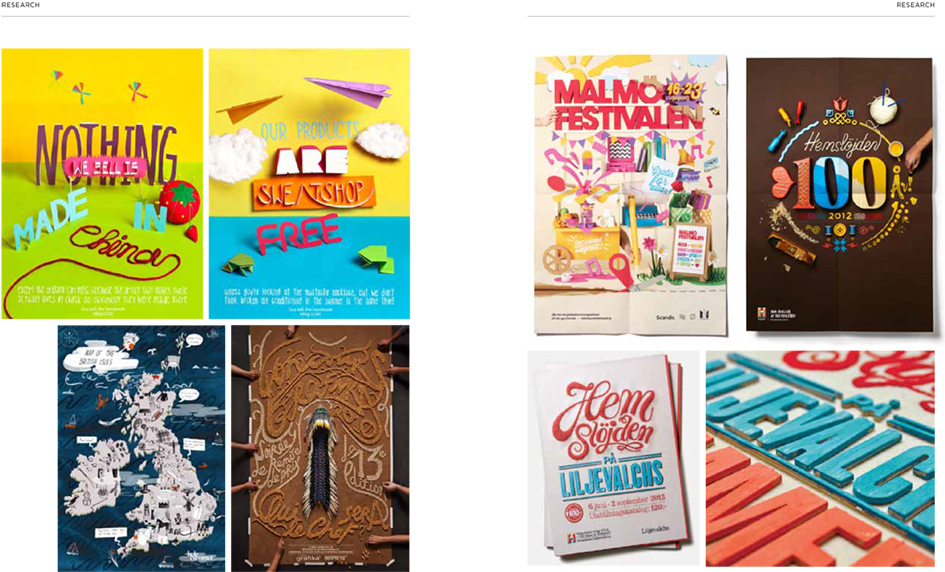
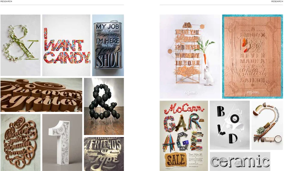
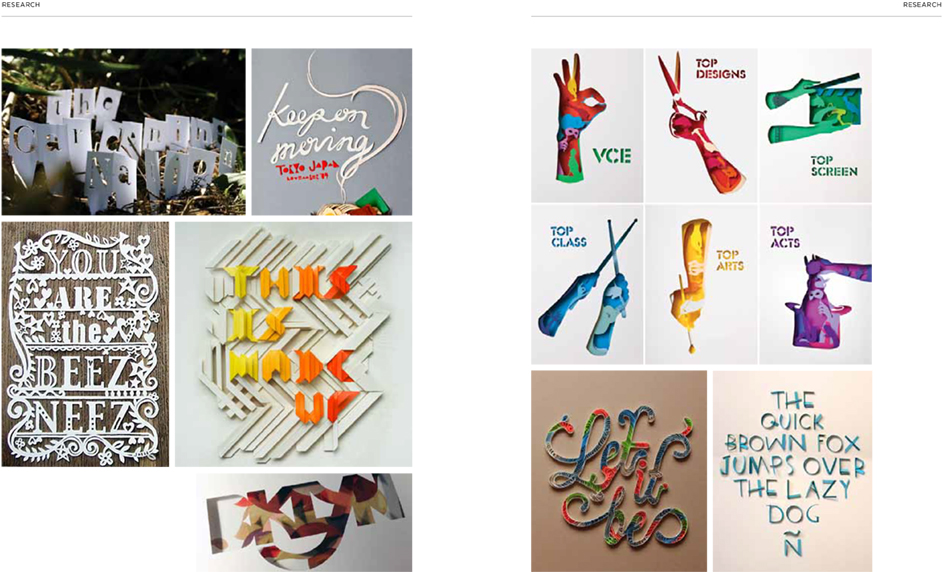
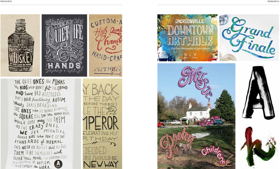
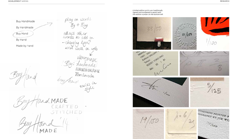
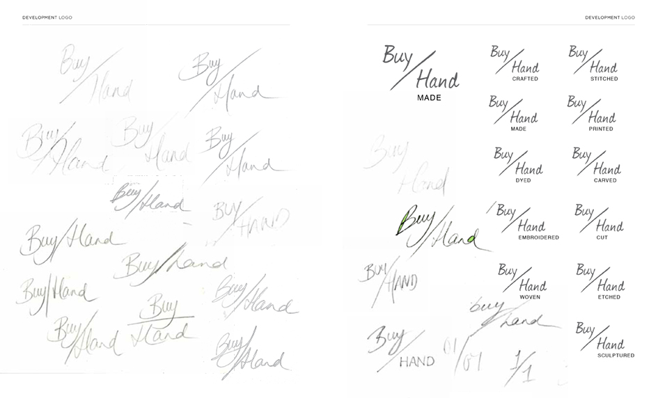
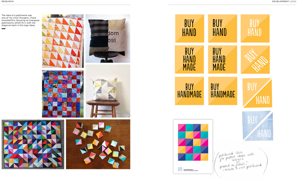
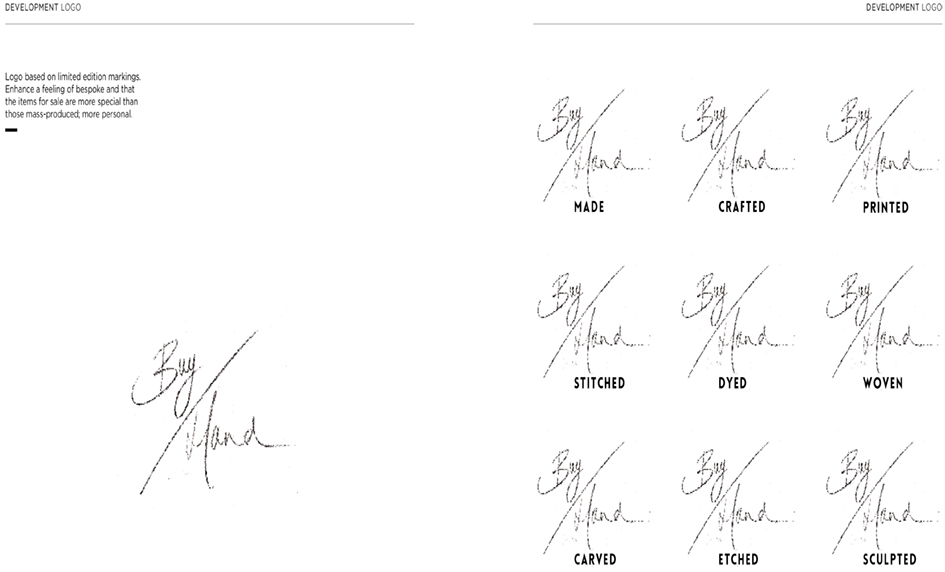
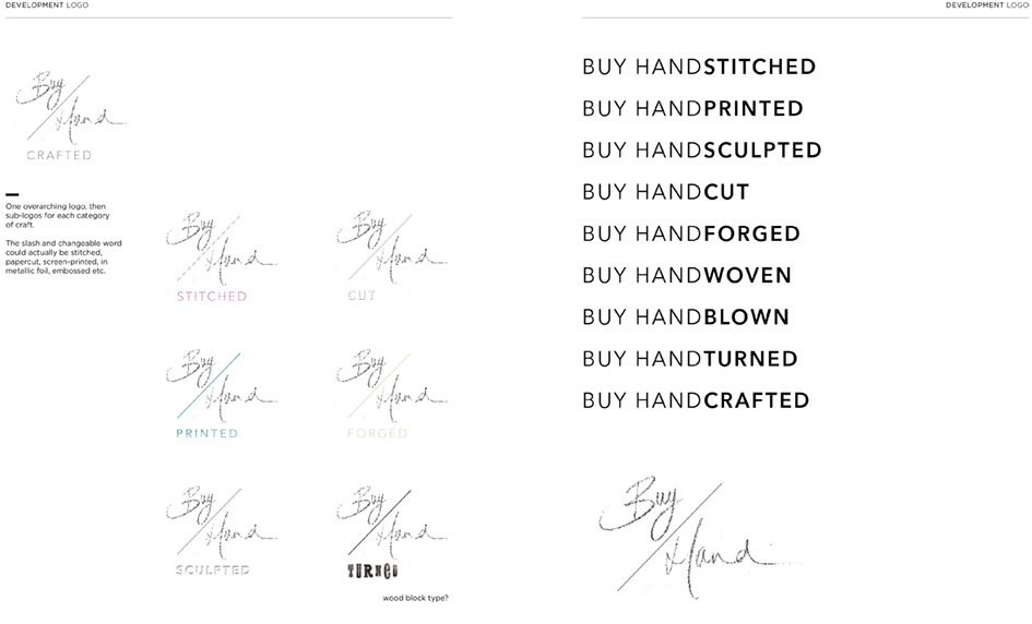
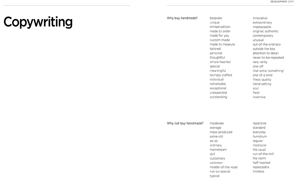
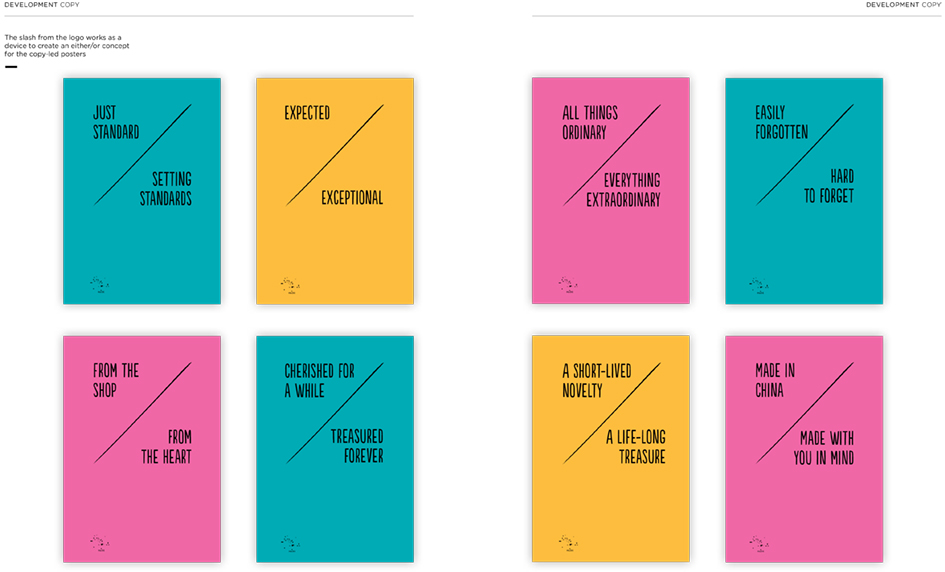
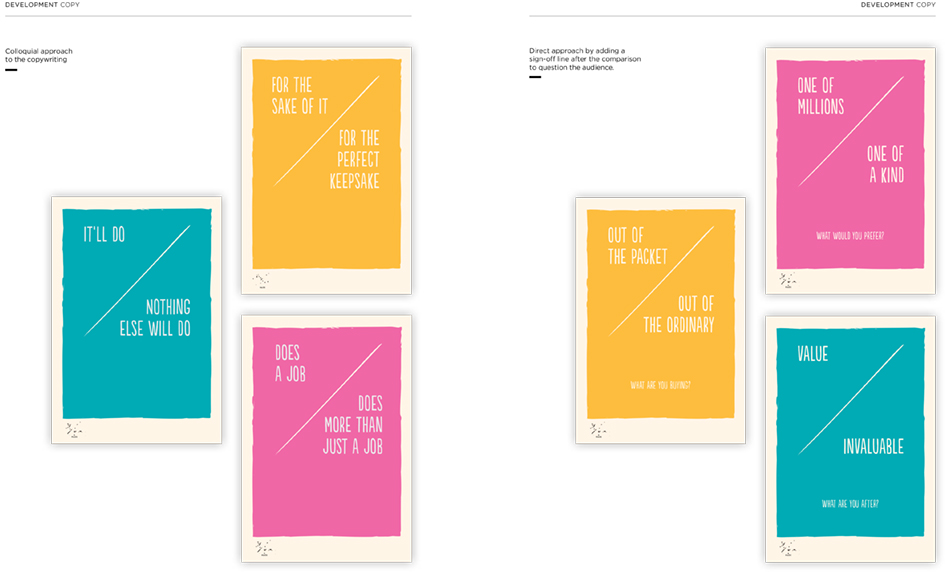
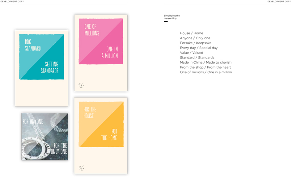
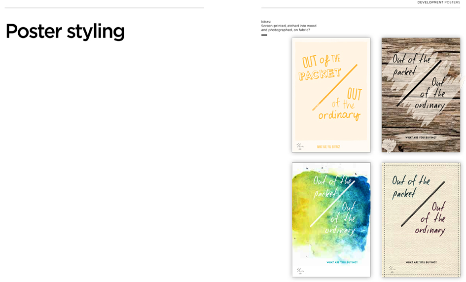
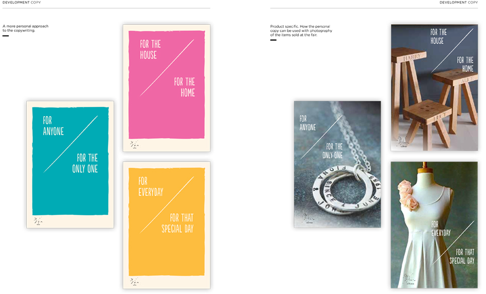
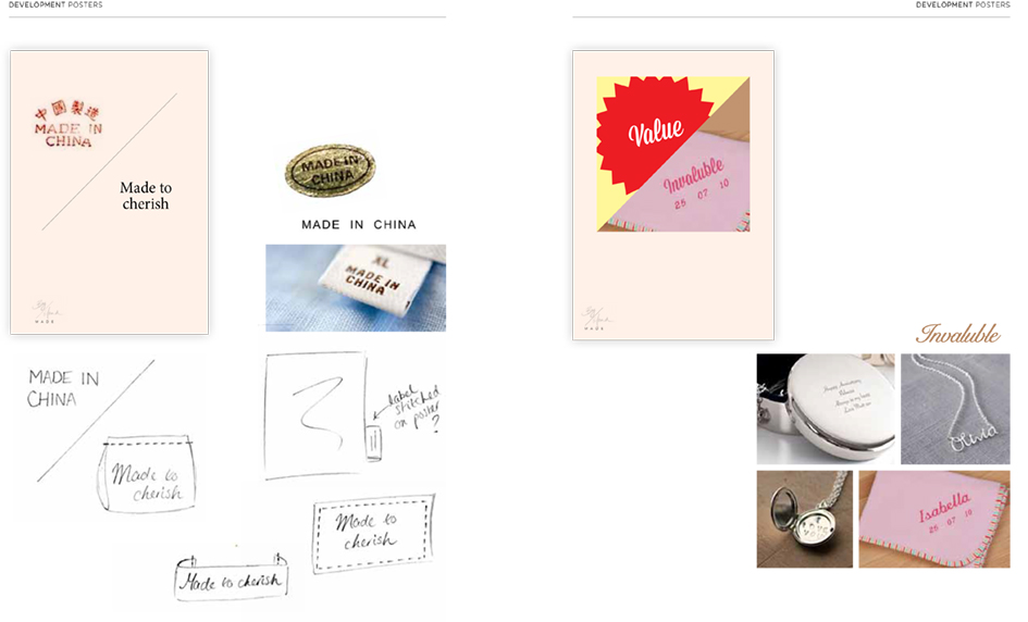
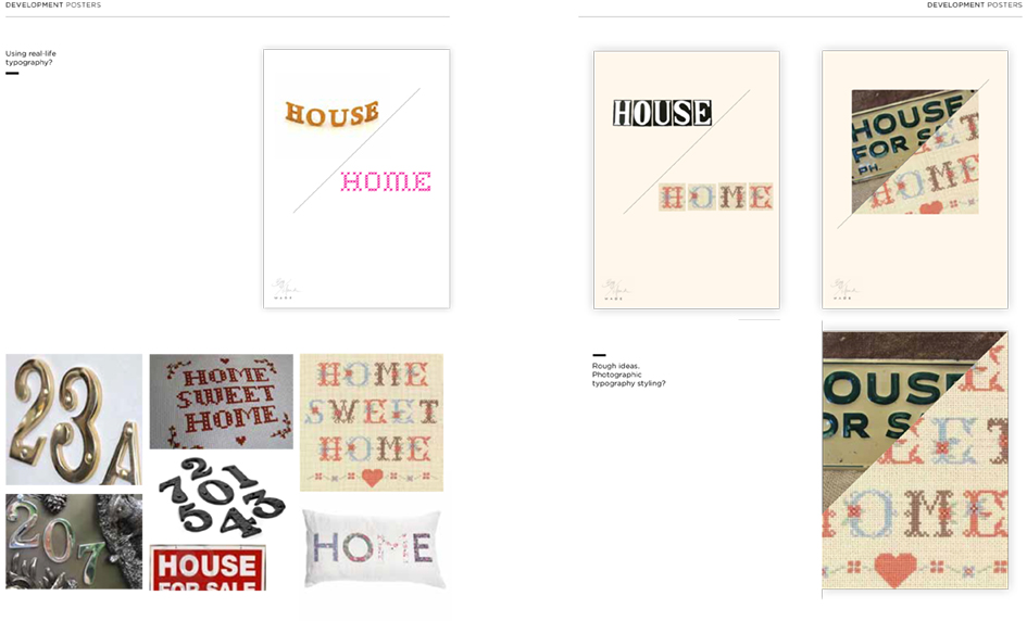
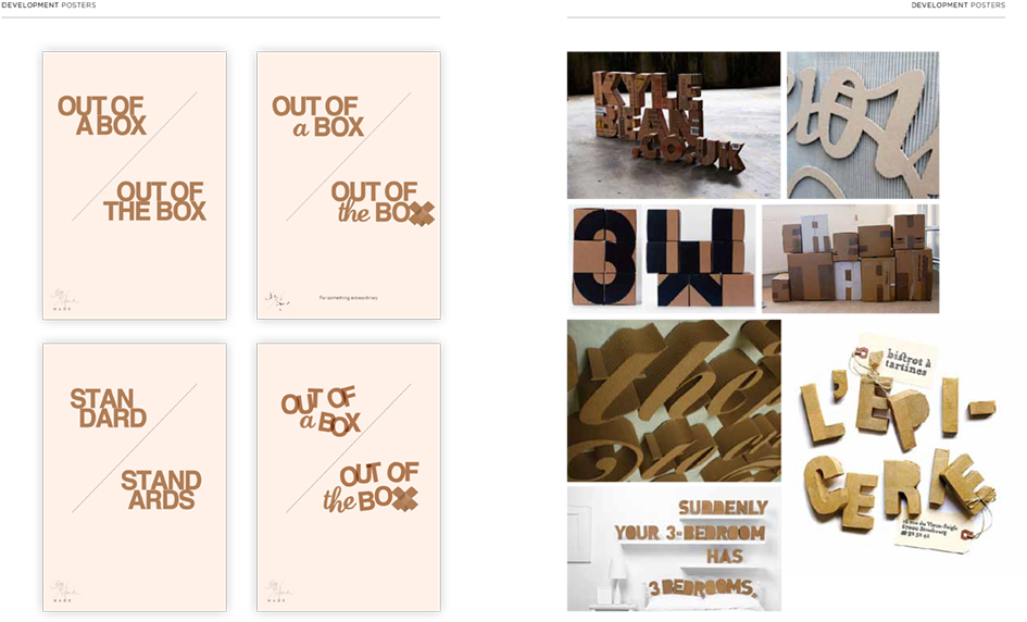
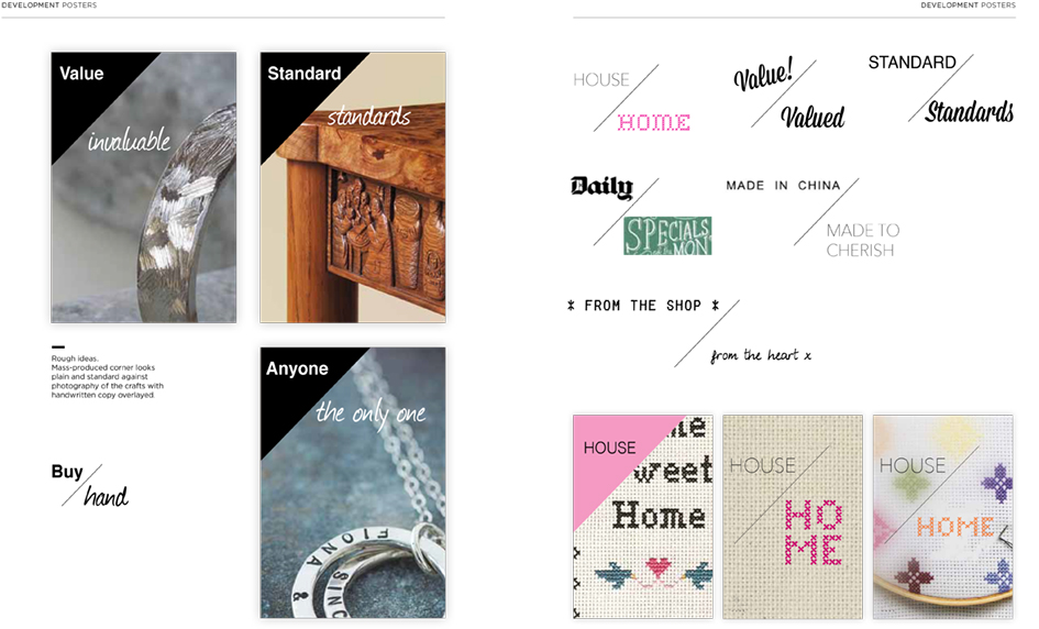
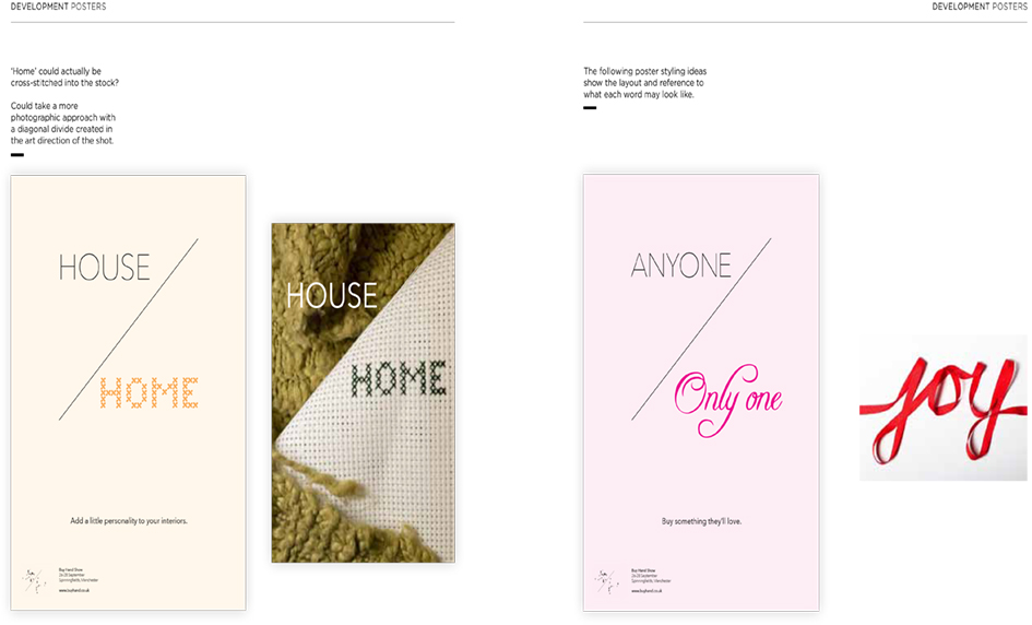
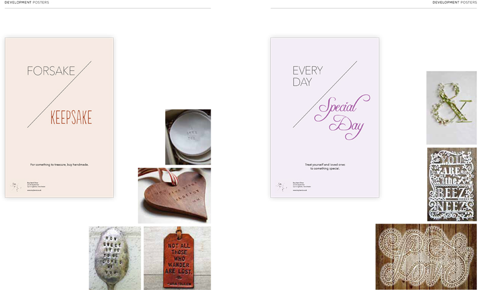
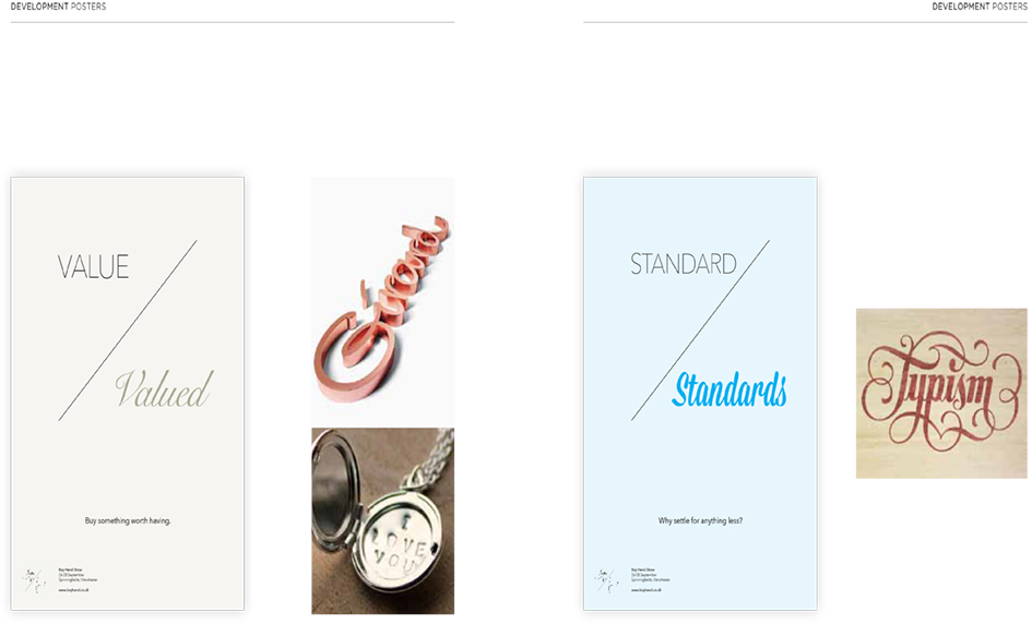
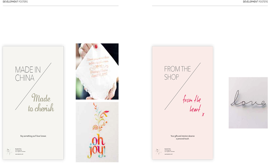
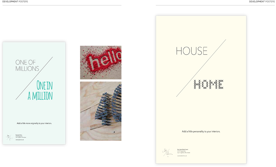
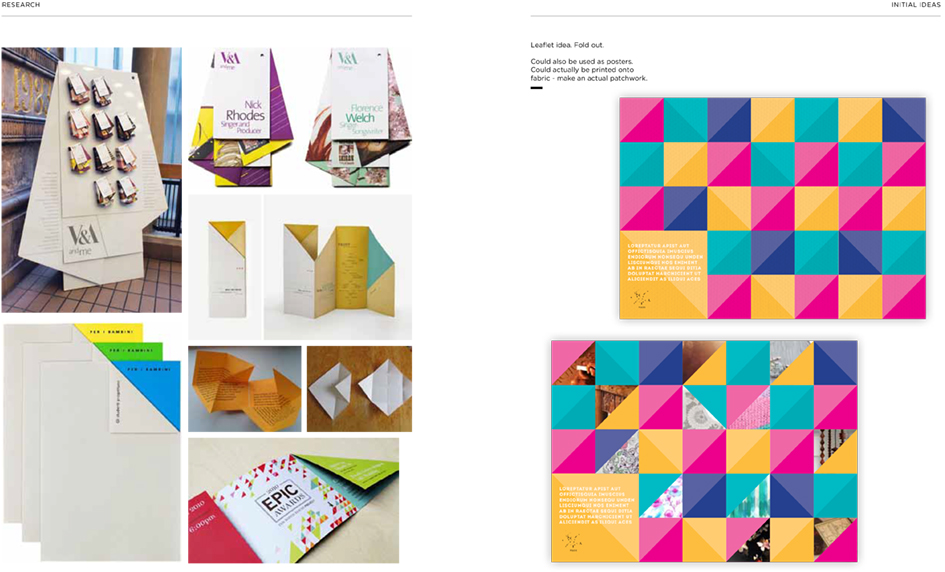
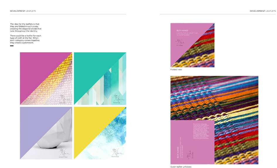
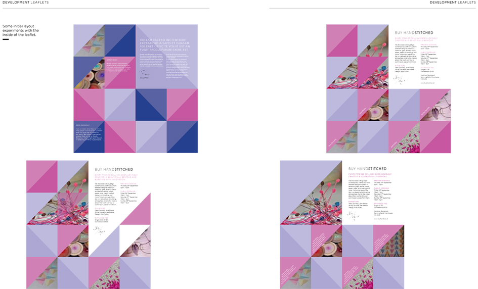
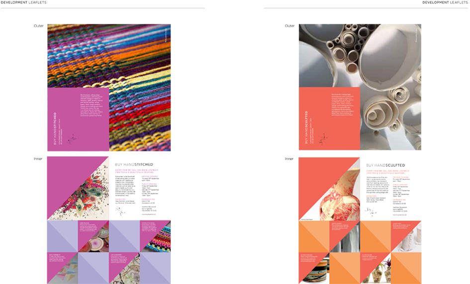
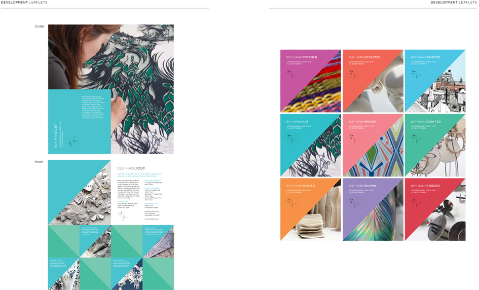
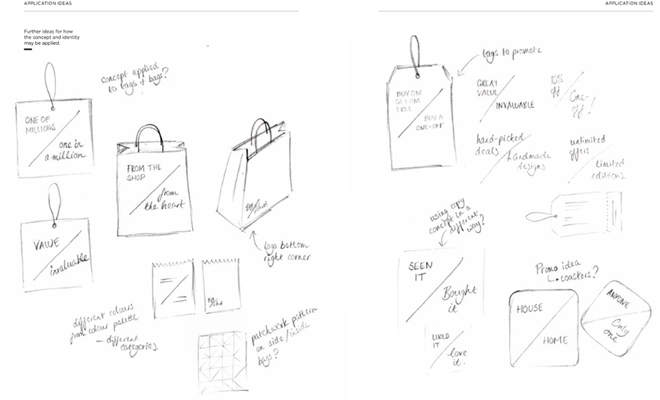
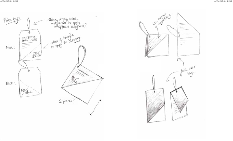
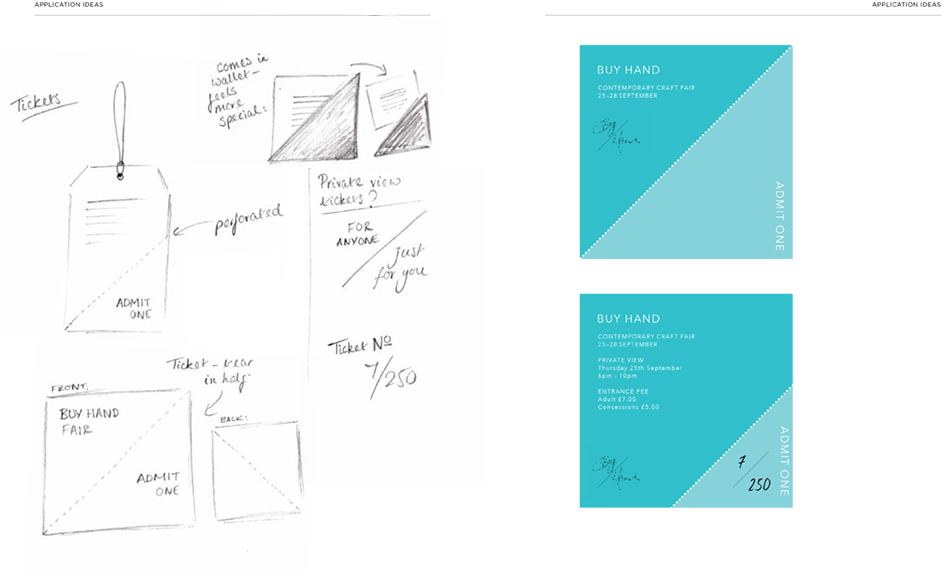
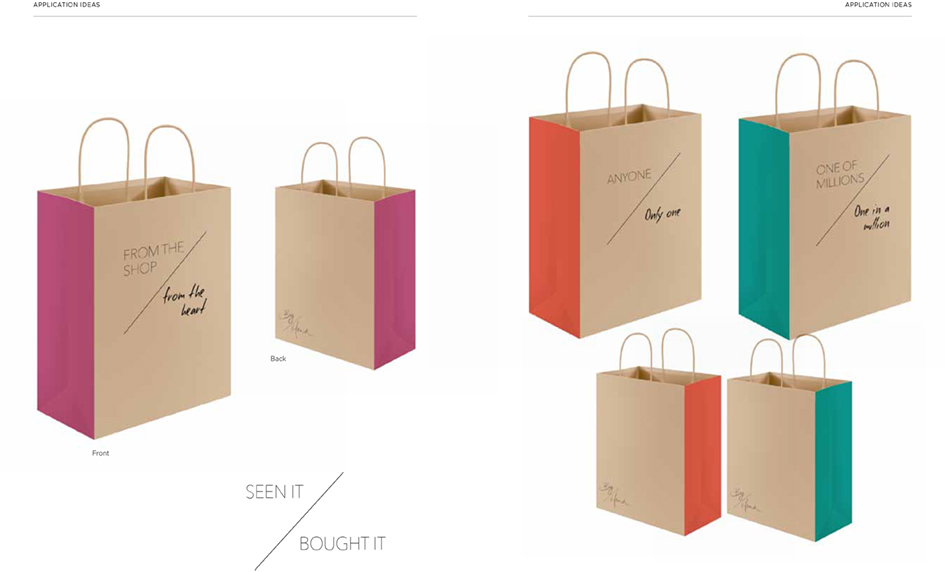
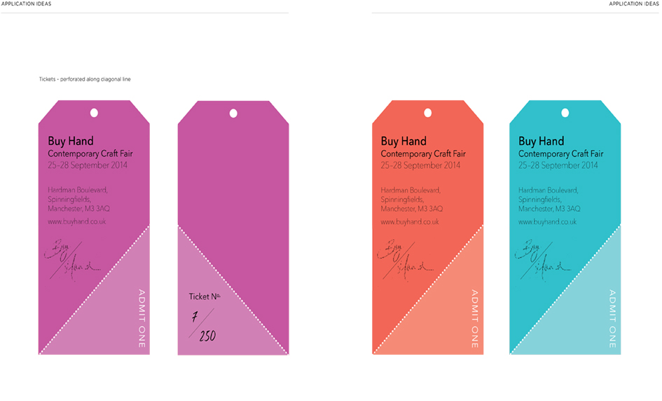
Here we feature Jessie Frogertt’s ‘Hand Made’ project from 2014. The brief was to brand and promote a new contemporary craft fair selling bespoke handcrafted wares.

Limited edition inspired brand mark

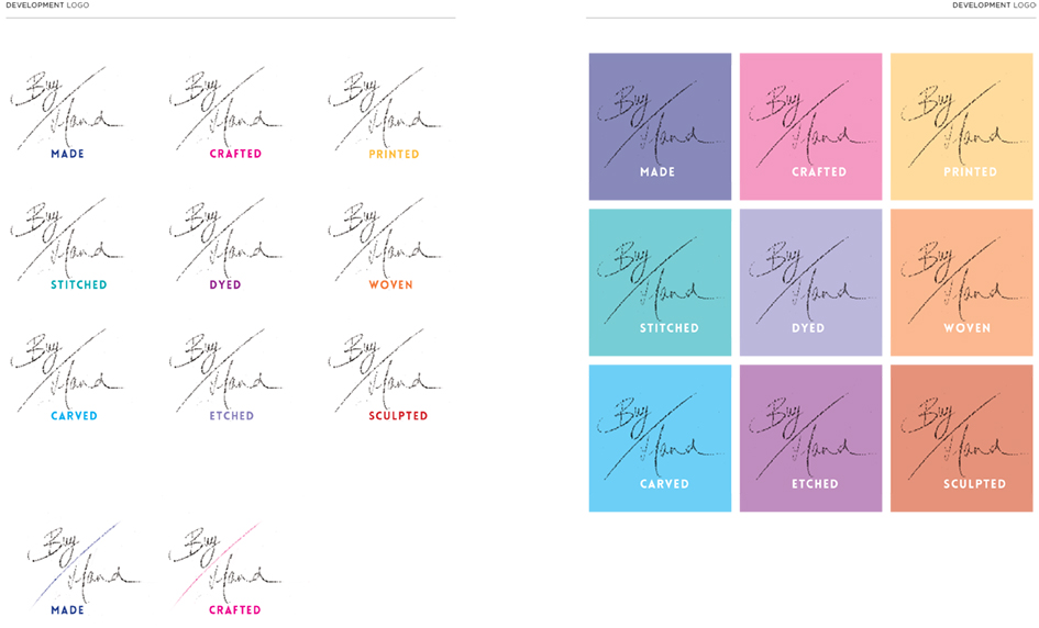
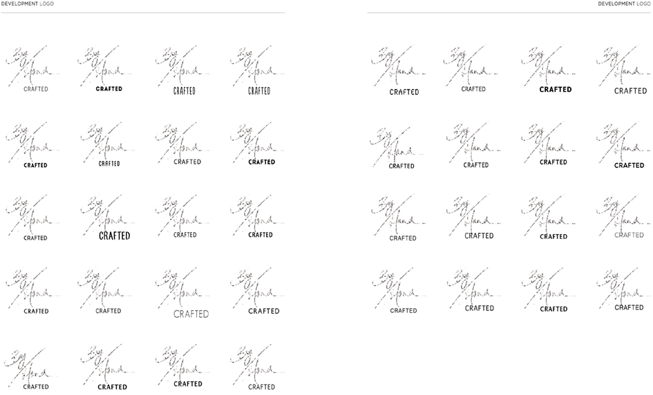
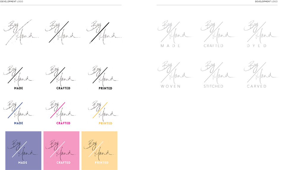
Development sheet 1

Development sheet 2

Diagonally folded leaflets

Leaflets opened out

Poster 1 - Handcut

Posters 2&3 Hand Stitched & Embossed

On screen application

Example 1 - Embroidery page

Example 2 - Ceramics page

Sliding transition concept - 1

Sliding transition concept - 2


Example of mobile applications
Selection of Jessie’s research - Transition 1
Selection of Jessie’s research - Transition 2
Great example of a well thought through branding project. Nice diagonal device, coupled with strong colour palette and stylish photography. All underpinned by excellent research & development.
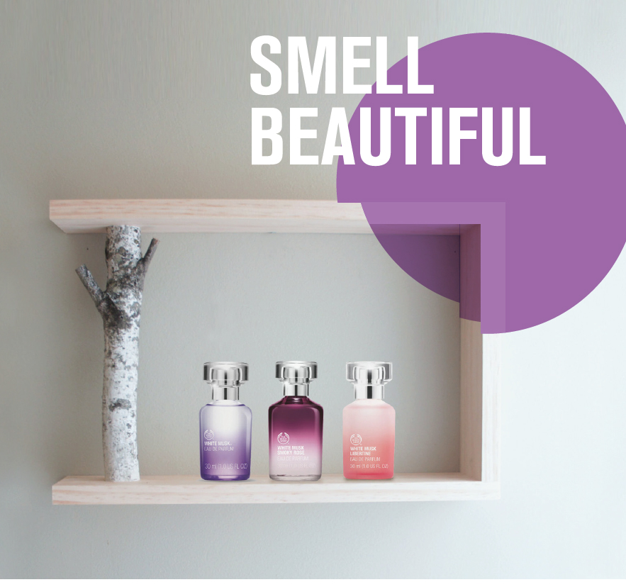
Here we feature the D&AD nominated work of Jessie Forgertt & Sam Wilkinson from 2014. The brief was to reposition the Bodyshop by creating a new visual language. Jessie & Sam’s solution is based around the five senses of look, sound, feel, taste and smell.
Click to play

Poster - Clean cosmetic high quality photographic style

Coupled with a sympathetic colour palette

Consistent typographic style that combines two complimentary type families

Web Navigation - Simple coloured circles denoting the different senses.

Smell

Look

Feel

Mobile - Twitter
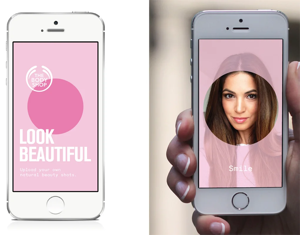
Scanning - Hover your phone over the poster to interact with the different senses
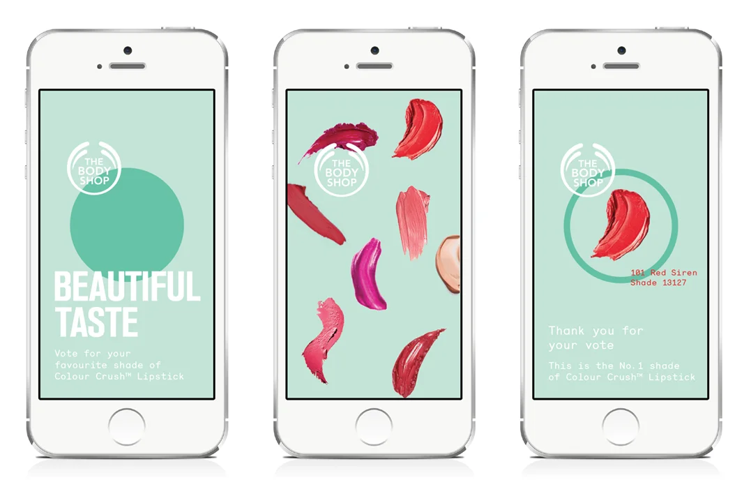
Scan the posters and vote for your favourite lipstick colour.

Ambient - Certain locations will have free sample dispensers

Issues - The sound sense is Body Shop’s voice. Listen to the campaign on gay rights & vice your views by uploading them.

Social campaign on mobile

A range of facial wipes that will be the leading product for the campaign.
In store environment
A great solution and a great example of teamwork. The core concept of the 5 senses is appropriate and well thought through. The styling of the whole re-brand, from the typography and colour selection, through to the photographic treatment is what made this project stand out to the D&AD judges. Also the ethical stance of the Body Shop is echoed cleverly through the sound sense with the Gay rights campaign idea.
Here we feature another of Dan Horsfall’s final year projects from 2016. This project was in response to Glorious Creative’s industry brief: take an existing brand and imagine how it would approach its branding as a sponsor of a professional cycling team.

Carlsberg ELITE - Brand name & mark

The Hop Mark - Extension and rational of existing Carlsberg asset.

Brand guidelines - 1

Bespoke ELITE Typeface

Chevron device

In context
Click to play

The Elite Team Kit - 1

The Elite Team Kit - 2

Web & Social

Advertising

Limited edition ELITE brand packaging

Limited edition ELITE brand packaging

Motivational brand message
Stylish, simple well thought through branding exercise. Comprehensive and motivational brand partnership.
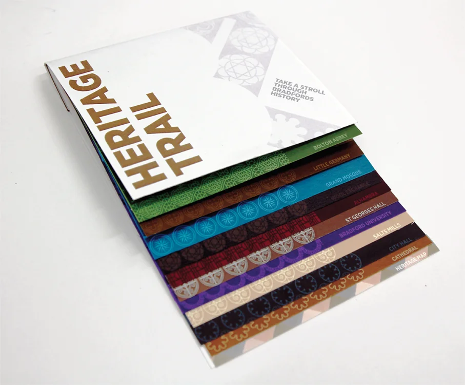
Here we feature Dan Horsfall’s Branding for Bradford. His branding concept was based on Bradford’s cotton industry & heritage.

Brand mark based on abstracted diagonal weave. Warp & weft

Heritage trail way finding concept

Poster signifying Bradfords central location in the UK

In context
How the idea translates to print

Brochure

Lanyards & Stationary

Carrier bag designs

Style Guide - Dynamic photography intertwines with flat graphic weave devise.

In context

Way finding signage system concept

Environment - Light projection concept on local landmarks - 1

Environment - Light projection concept on local landmarks - 2
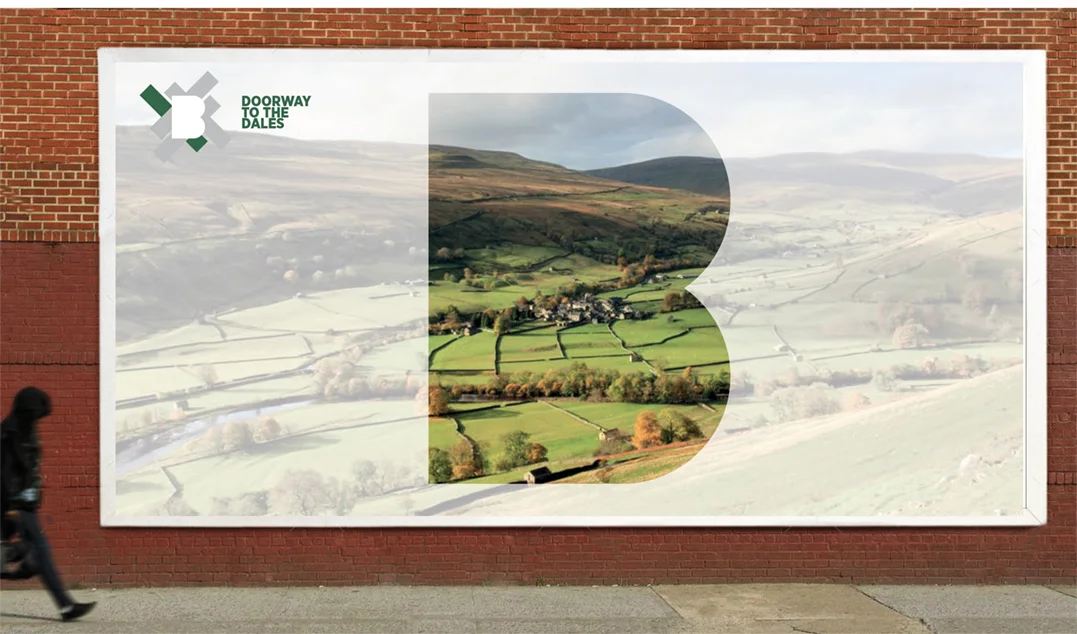
Billboard advertising concept
A good solid example of Branding a location based around one well researched historic connection.


Highlighting the existing examples of gender stereotyping

Teaser Ad campaign
Click to play

Range of core products

Heat sensitive suntan lotion concept

Removable label concept
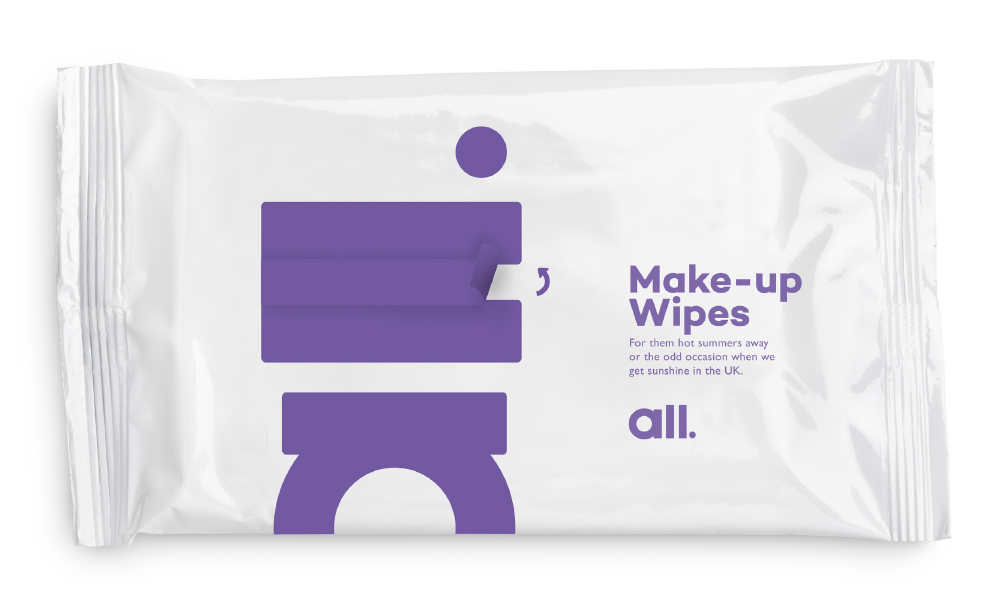
Brand touch point - Wipes

Brand touch point - Gift voucher

brand touch point - Towel tags

Finger swipe navigation & instagram filter concept - ‘capture your moments of equality’

A great piece of work, timeless and a well deserved winner by Harry Burgess & Kristian Shepherd.
Here we feature our second Tribal Ale solution by Heidi Woodhead. Heidi chose New Zealand and Maori culture as her inspiration, creating a strong, bold and distinctive range of craft ales.

Sample research style sheet
Word mark

Printed woodblocks from laser etched designs

Sample of can designs

Coaster designs

Sample front & reverse

Pump handles

Etched glass designs

Stacked can packaging concept

Cardboard multipack concept with die cut windows

Livery designs
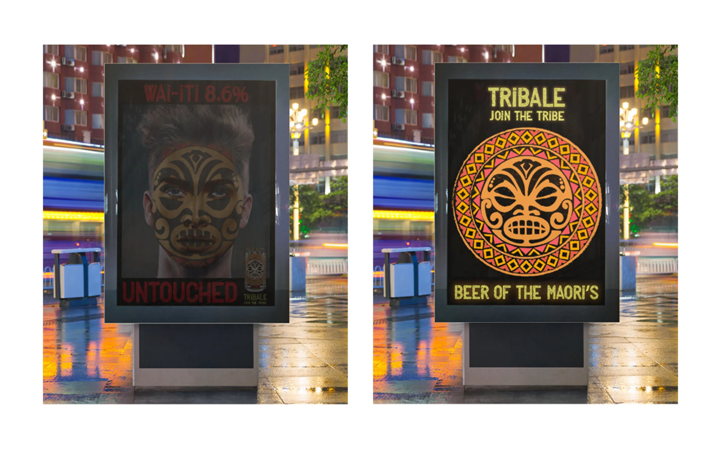
Digital Ad shell concepts

App - Social media concept

Examples of filters
A great example of how to roll out an identity across a broad range of touch points. All based on well crafted and well informed visual research.

The Disciples Of Design are a global collective of design academics, practitioners, artists and students. We have one common thread – University of Lancashire in Preston, UK; and one common aim – the creation of an ever evolving visual hub for the sharing of ideas and thoughts.


