Placement Review – Glorious Creative
/The above extract is from Sarah Gregory’s current placement review as she nears the end of her 2 month stint at Glorious Creative, click here to read the full blog post.

The above extract is from Sarah Gregory’s current placement review as she nears the end of her 2 month stint at Glorious Creative, click here to read the full blog post.
The first years have recently finished their one week image brief, and some of the better solutions are shown below. Overall this has been the least well received of the three briefs. As the projects come thick and fast, and each new one requires slightly more input than the last, the intervening days between the briefing and the workshop offer a chance for students to get ahead.
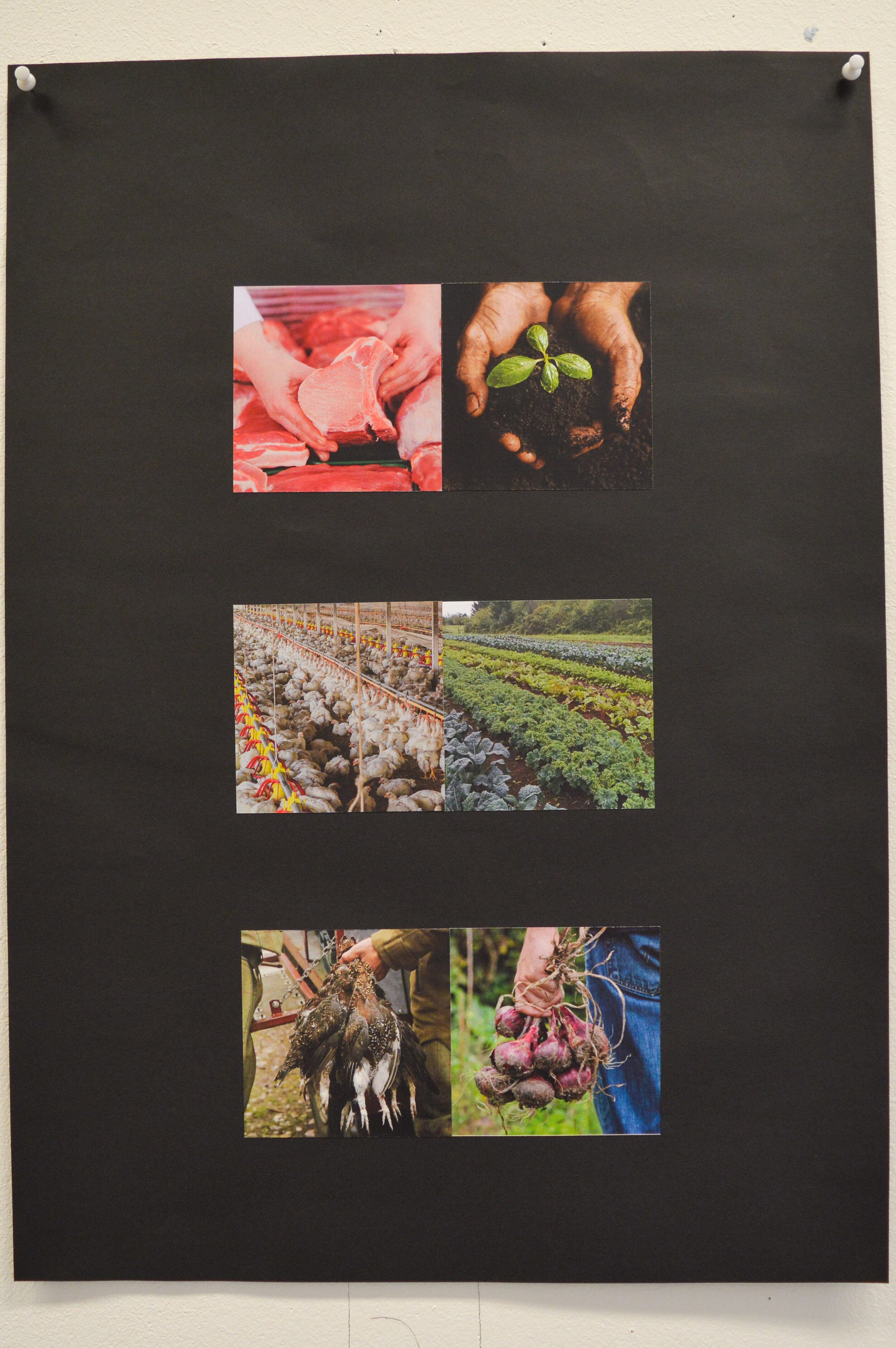
Each student was given a pair of words which they explored through the process of juxtaposing interesting and pertinent images. Not all students managed three pairs, or even two or one of a good standard. The above is a good example though. Note the balance of crops, the interplay between contrasting images where appropriate, and simply the choice of good quality photography.
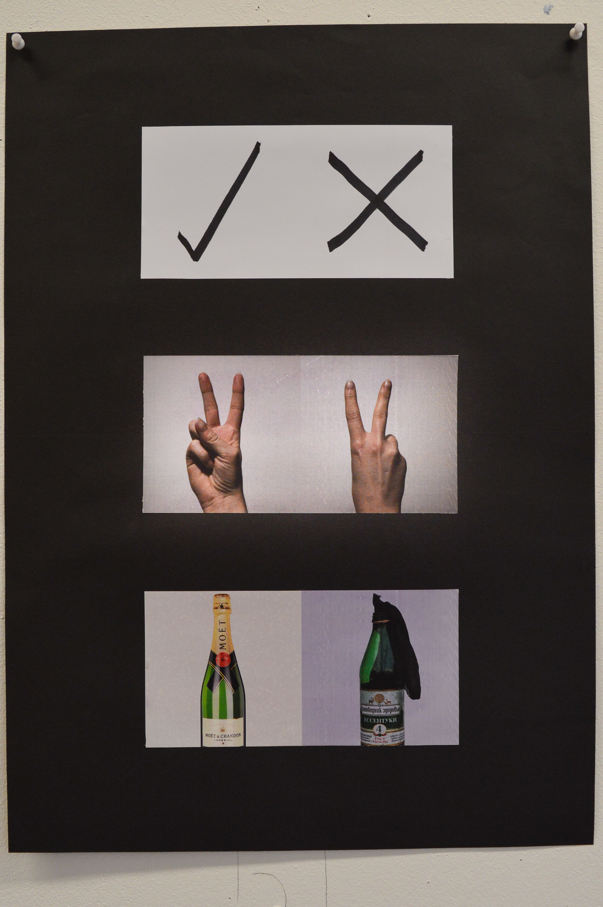
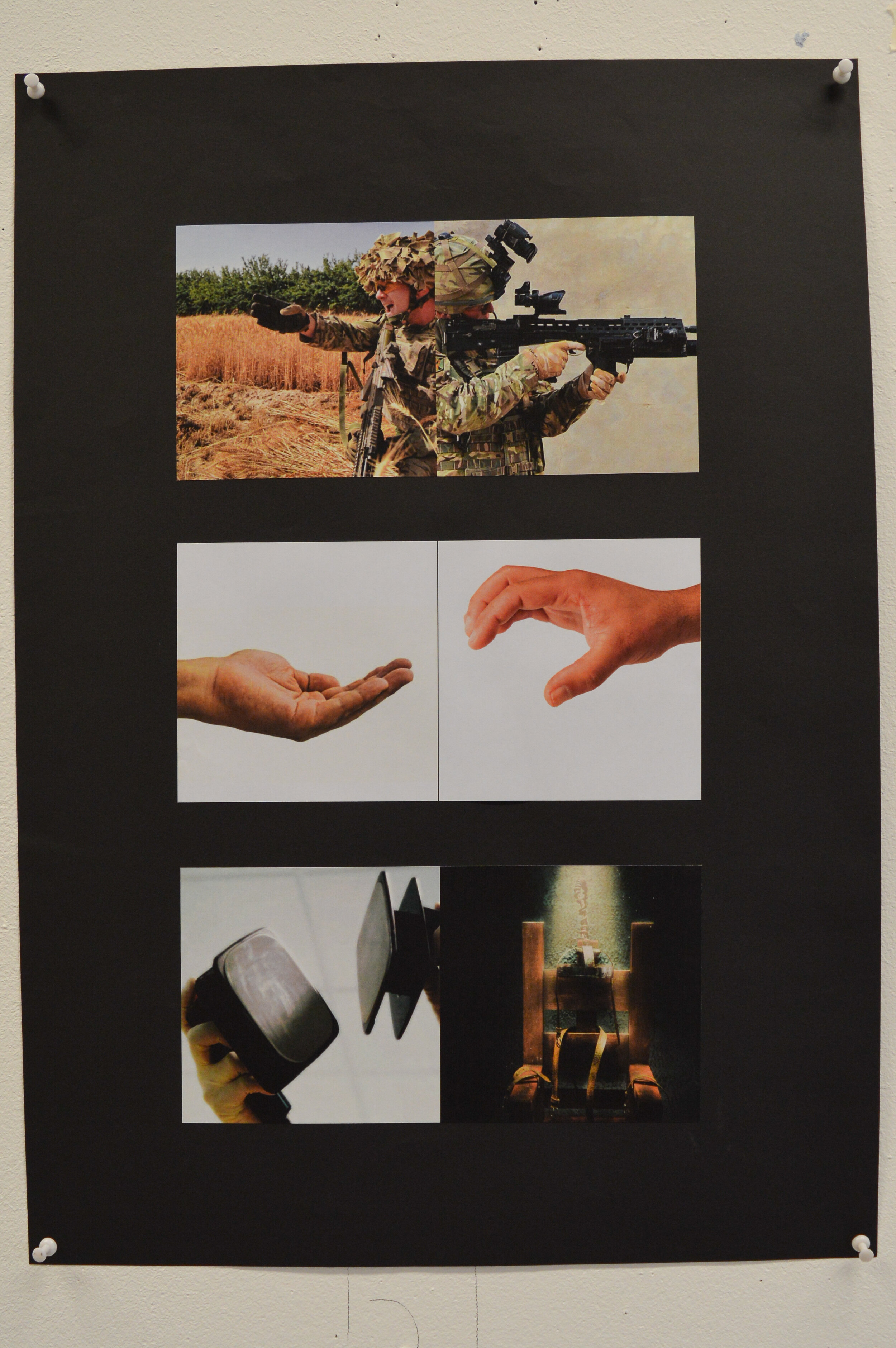
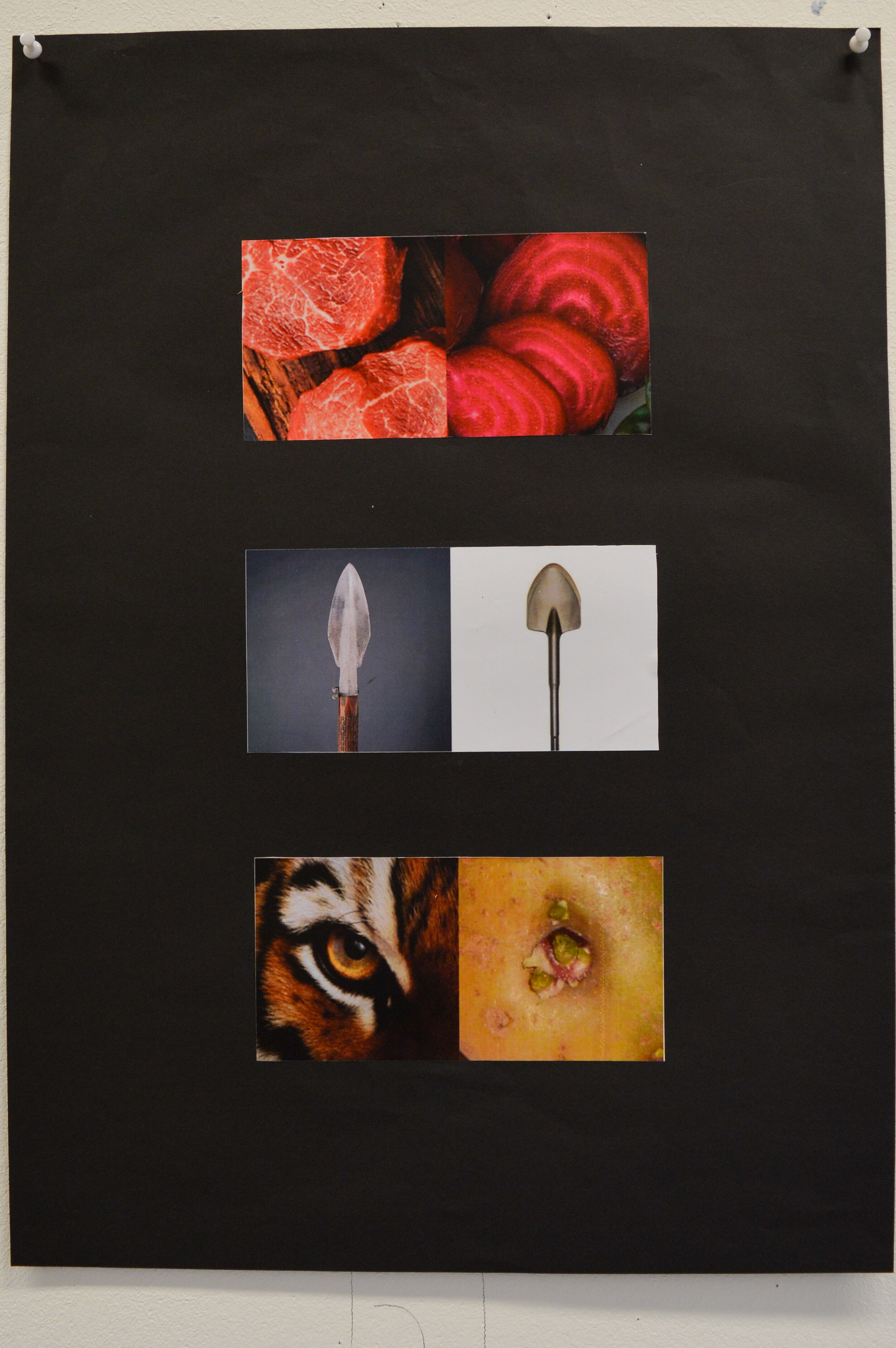
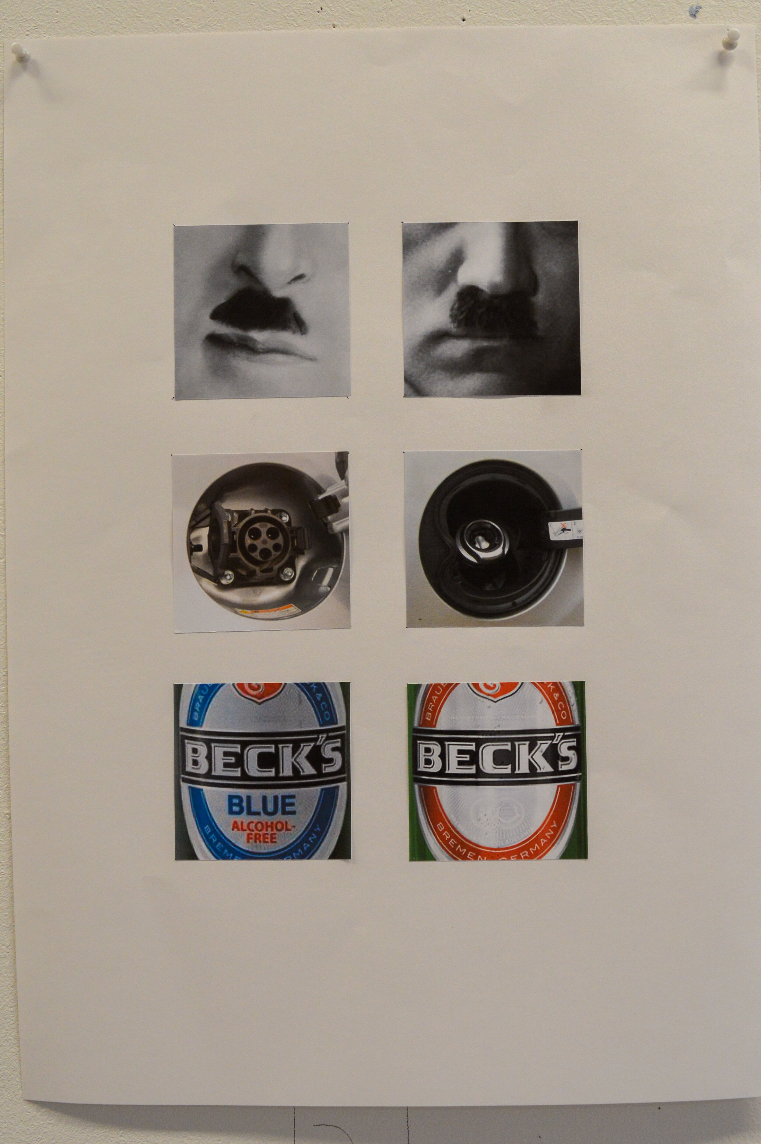
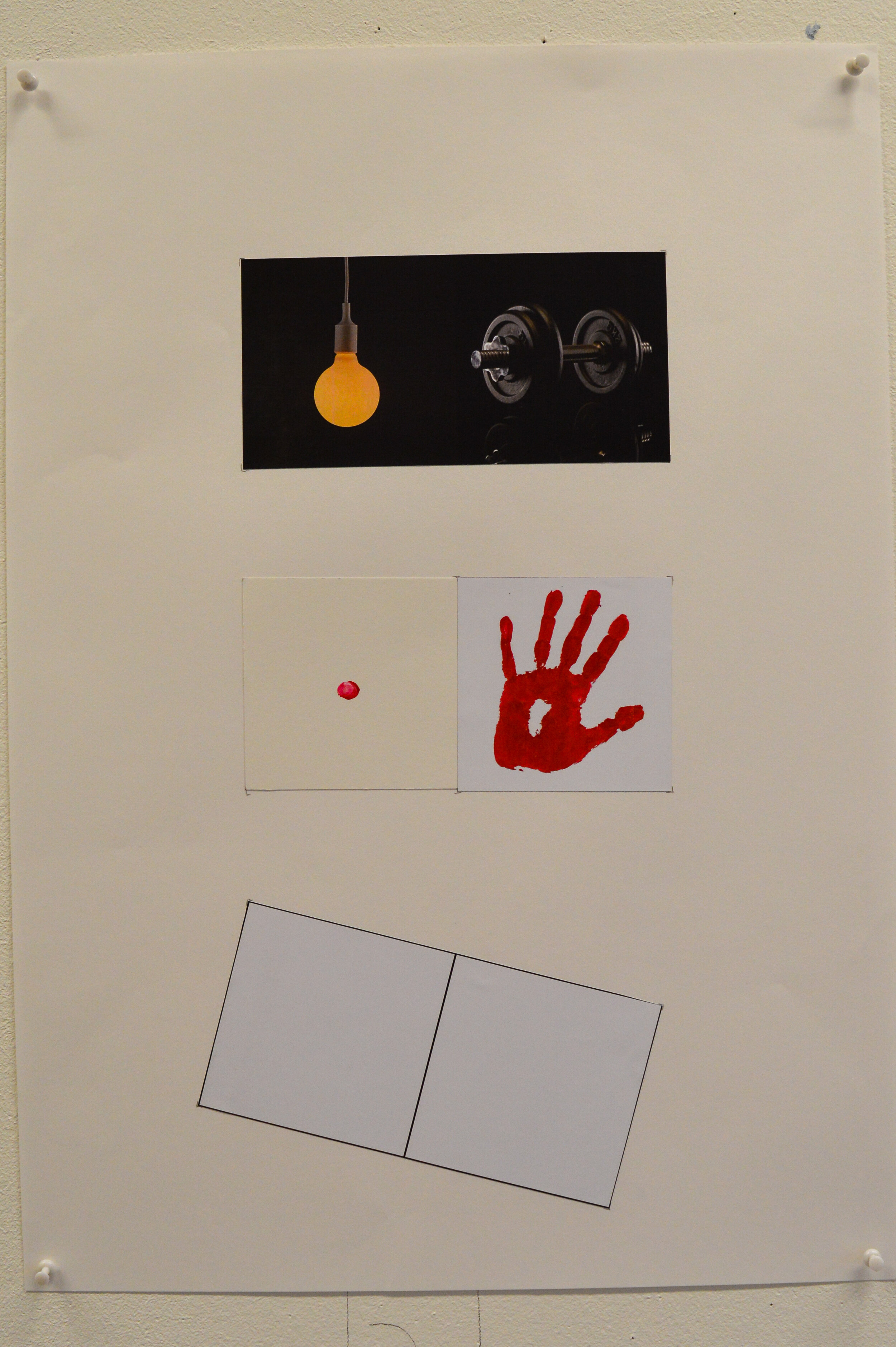
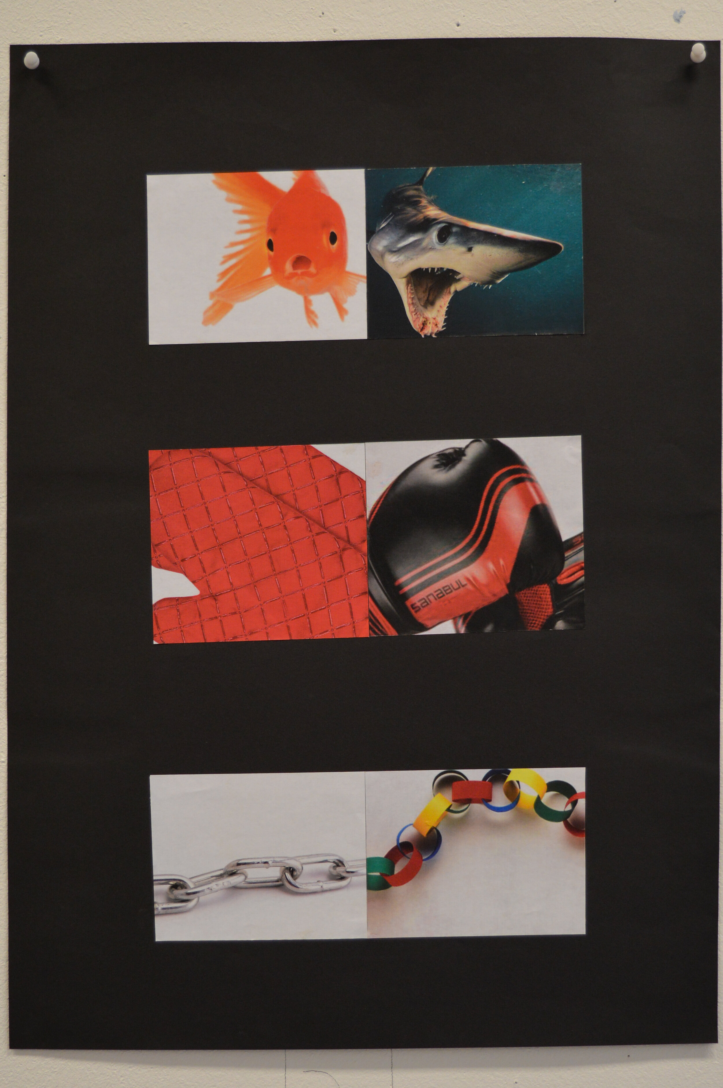
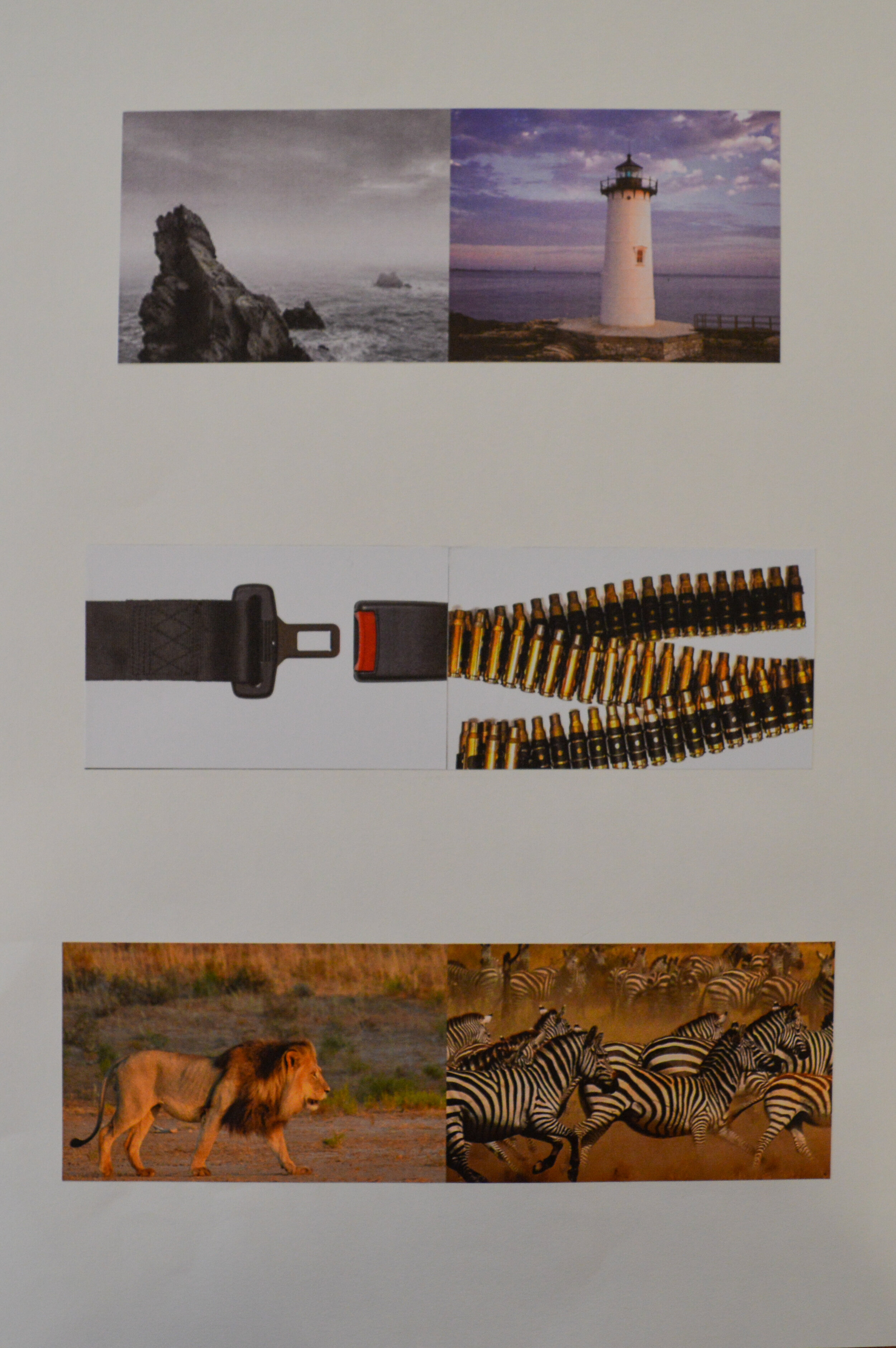
This is not an easy brief, and tutors were agreed that a large proportion of the cohort had not cracked it, yet. Most of the ideas were valid, but unfortunately image selection (and cropping) was not supporting the idea…thus leaving the viewer unmoved.
It was noticeable that a lot of solutions were the direct result of Google images and consequently suffered.
Some of the images presented were not shown as three pairs, but rather six individual crops which made any idea even harder to decipher.
As ever, staff look forward to seeing how these juxtapositions develop for final assessment.
Part 4 of our series on studio skills looks at the seemingly simple art of folding. The first instalment looks at techniques whilst the second video looks at folded examples from Andy’s archive. Both resources will be invaluable for both the 3D and packaging projects.
Upon further inspection of the cutting room floor, we did in fact find the first instalment of Ted & Andy’s Graphic Adventure inspired and starring to Swann & Morton scalpel handle and the 10A blade. Watch and observe, and using the advice within you shall avoid the pitfalls of scalpel and ruler.
Another from the recent archive. The featured PDF is the final year work of Harriet, who graduated in 2017 and is currently working at Pentagram in London.
In no particular order, this portfolio demonstrates brevity (both in visuals and copywriting), ideas and craft all presented with a clear narrative. It provides a fantastic yardstick for any final year design student.

Here we feature some of the solutions to the latest year 1 creative thinking briefs - typographic interpretation.

Each student was given three words to explore and express typographically in black & white.
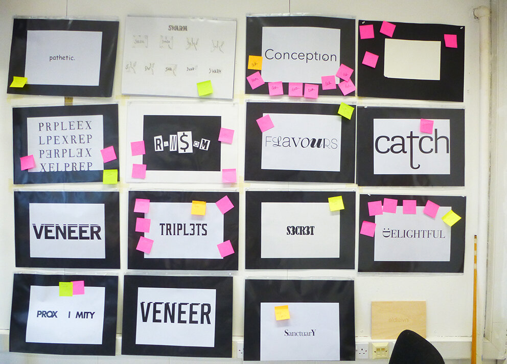
A section of the studio critique wall

This task was all about understanding the meaning and nuance behind the given words. Then it was about how to represent and interpret the word in a simple yet creative way.

Students spent a day tracing and sketching their ideas from type samples.

They were encouraged to really look at typefaces and letterforms as shapes.

Restraint and simplicity were also encouraged in their solutions.
Also they were asked to take the format and page size into consideration. Exploring scale and positioning in their layouts and compositions.


In summary, this exercise appeared at first glance to be quite easy to gain a satisfactory solution…but much harder to get a truly outstanding one. Tutors stressed the importance of tracing from type to have an idea before going to a computer in order to render it.

It was noticeable that a lot of solutions had been rendered on the computer in the intervening period before the crit and in most cases had, in some way, suffered because of this treatment. Some solutions had begun to rely on Photoshop tricks which was a sideways step and in some cases a backward step.
That said, overall the staff thought everyone had a good solid direction, in some cases more than one direction. The advice given to each solution and the overarching points that came up in the crit session has given everyone food for thought.
Staff look forward to seeing how each solution develops over the semester prior to folder hand in at Christmas.
The second season of Disciples’ favourite Abstract has recently been released on Netflix. Amongst the new season it features two must-see episodes. One features artist/designer/genius Olafur Eliasson, and the other episode which we highly recommend to any student of design delves into typography with Jonathan Hoefler.
As a student of typography (at any level), the insights, background and detail in the Jonathan Hoefler episode provide a full foundation into type and letterform; but the episode itself is made with wit, charm as well as craft and detail. There were things I’d forgotten, things I didn't know and things I was just glad to see again.
The Olafur Eliasson episode is fascinating. Whether you are aware of his work or not, the way he is able to talk about creativity, ideas and process is eye opening; for its straightforwardness as much as anything. This is not stuffy or reflective of any art world preconceptions, it is in fact the opposite. He appears as a designer who happens to make art. One key quote I took from the episode will ring true with all the best designers I know:
“I get ideas when I work hard.”
There is no magic button for ideas, and it’s reassuring to know the world’s most revered practitioners are in the same boat as us. Ish.
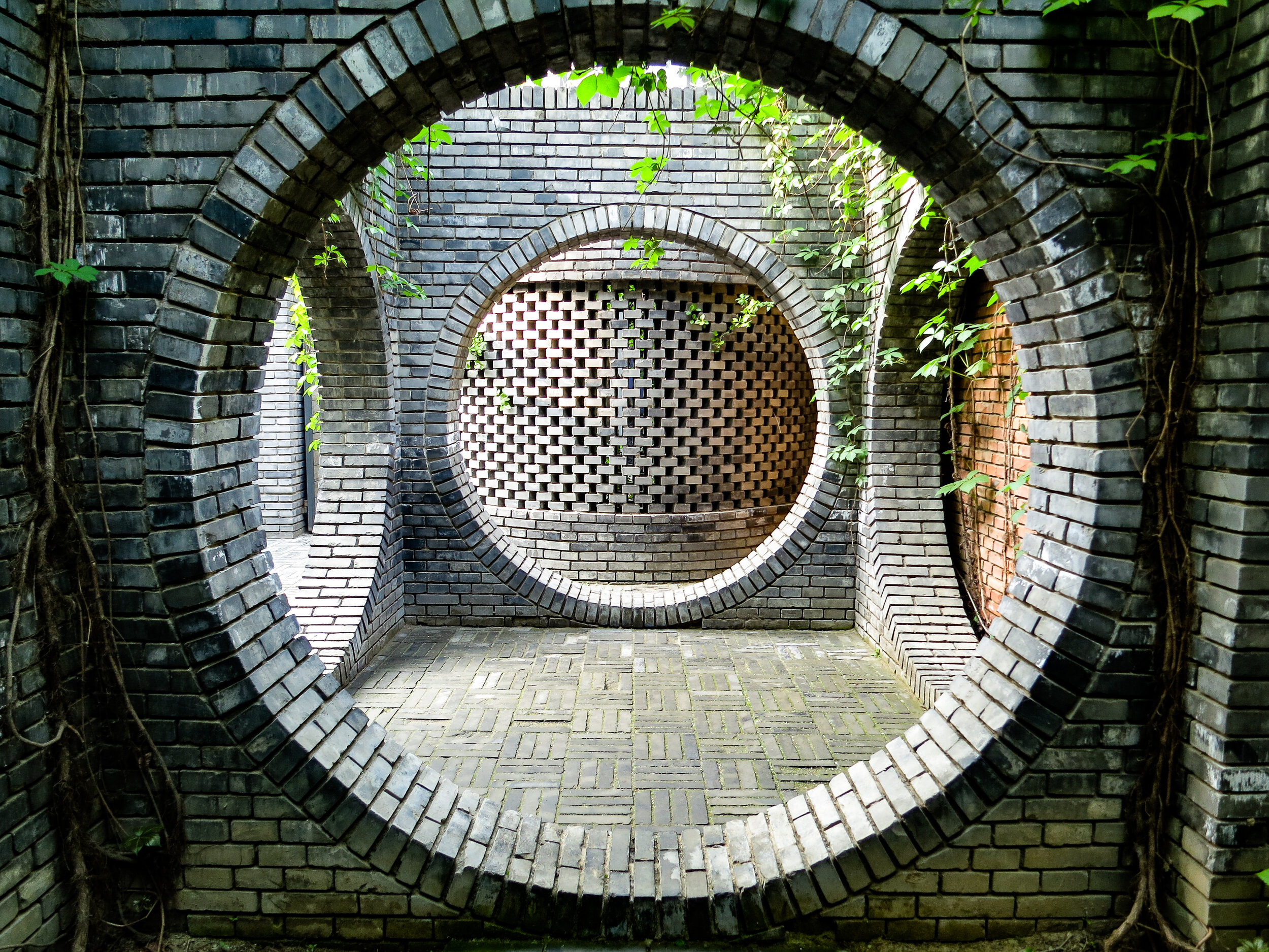
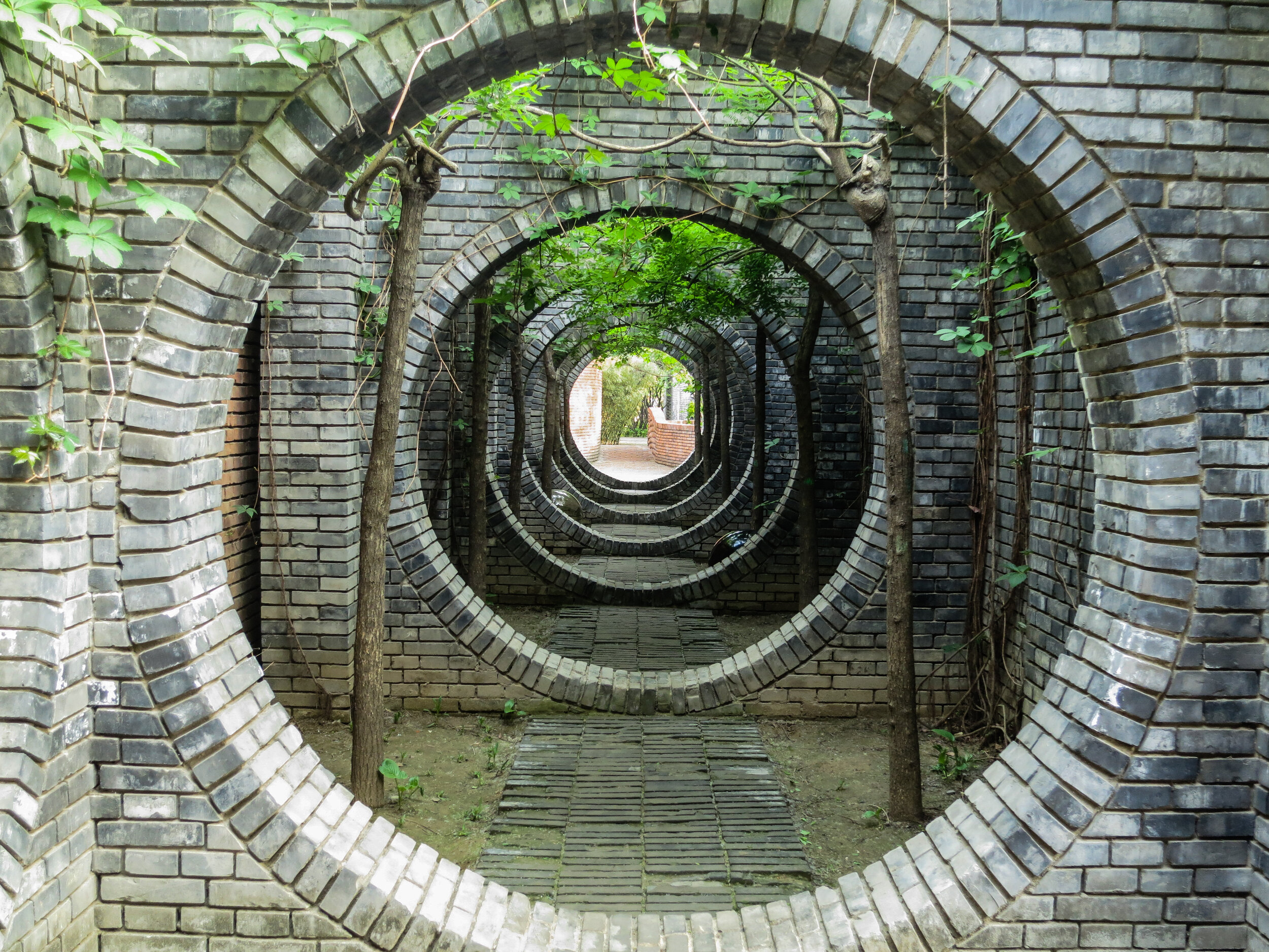
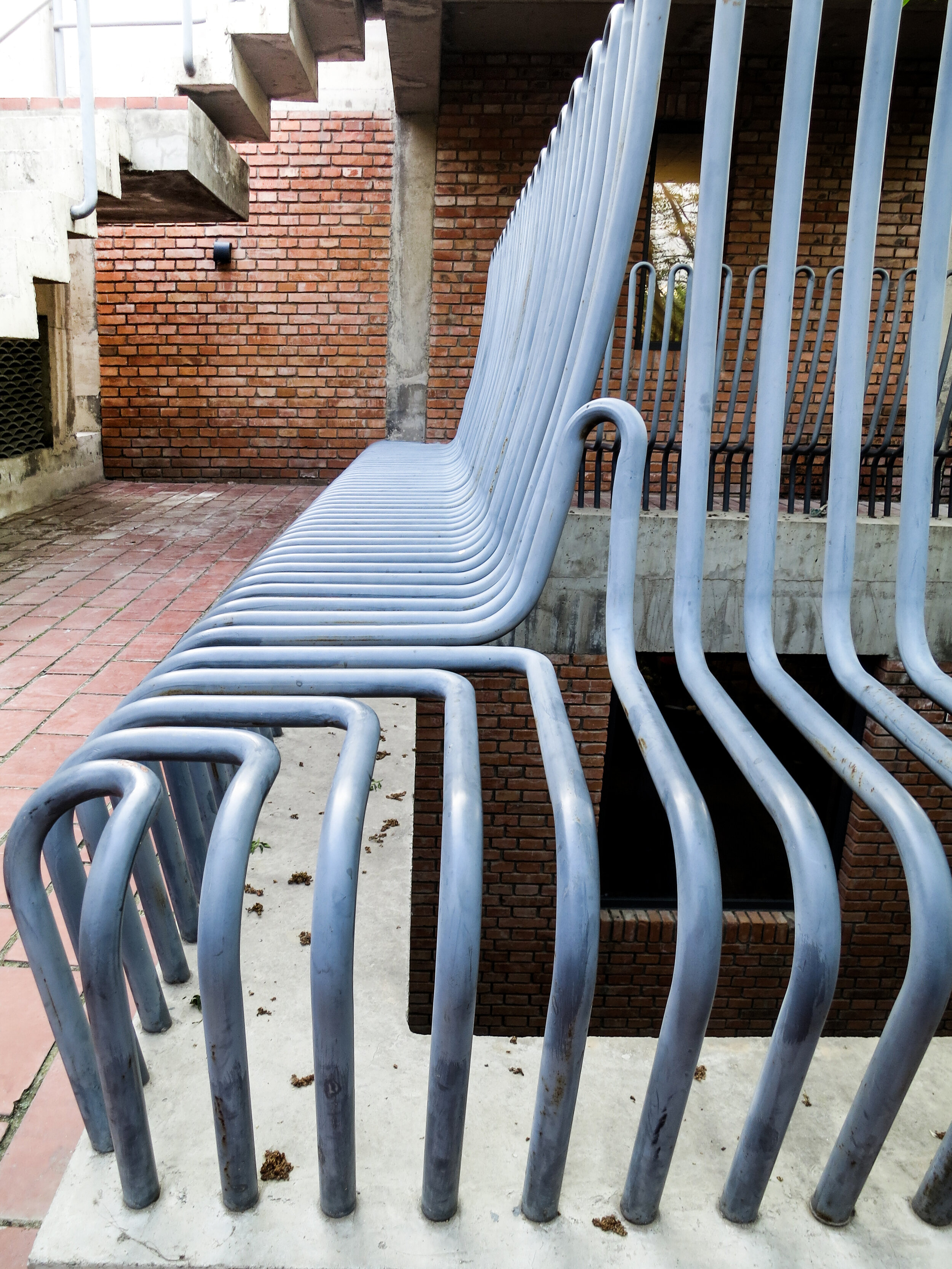
And if you don’t know Eliasson’s work, below are some photographs taken of his exhibition The Unspeakable Openness of Things at the Red Brick Art Museum whilst on a UCLan study trip to Baoding and Beijing in 2017.
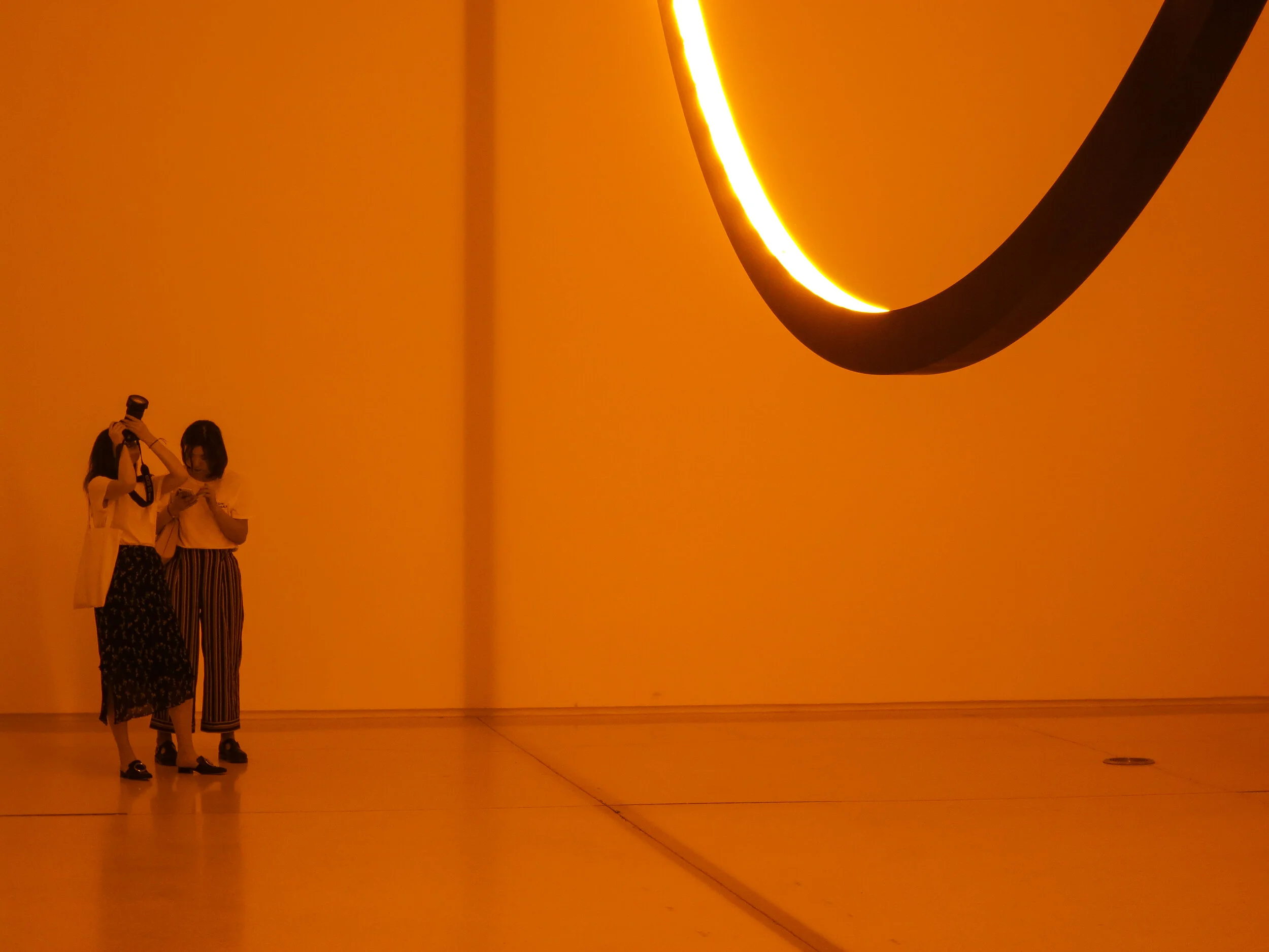
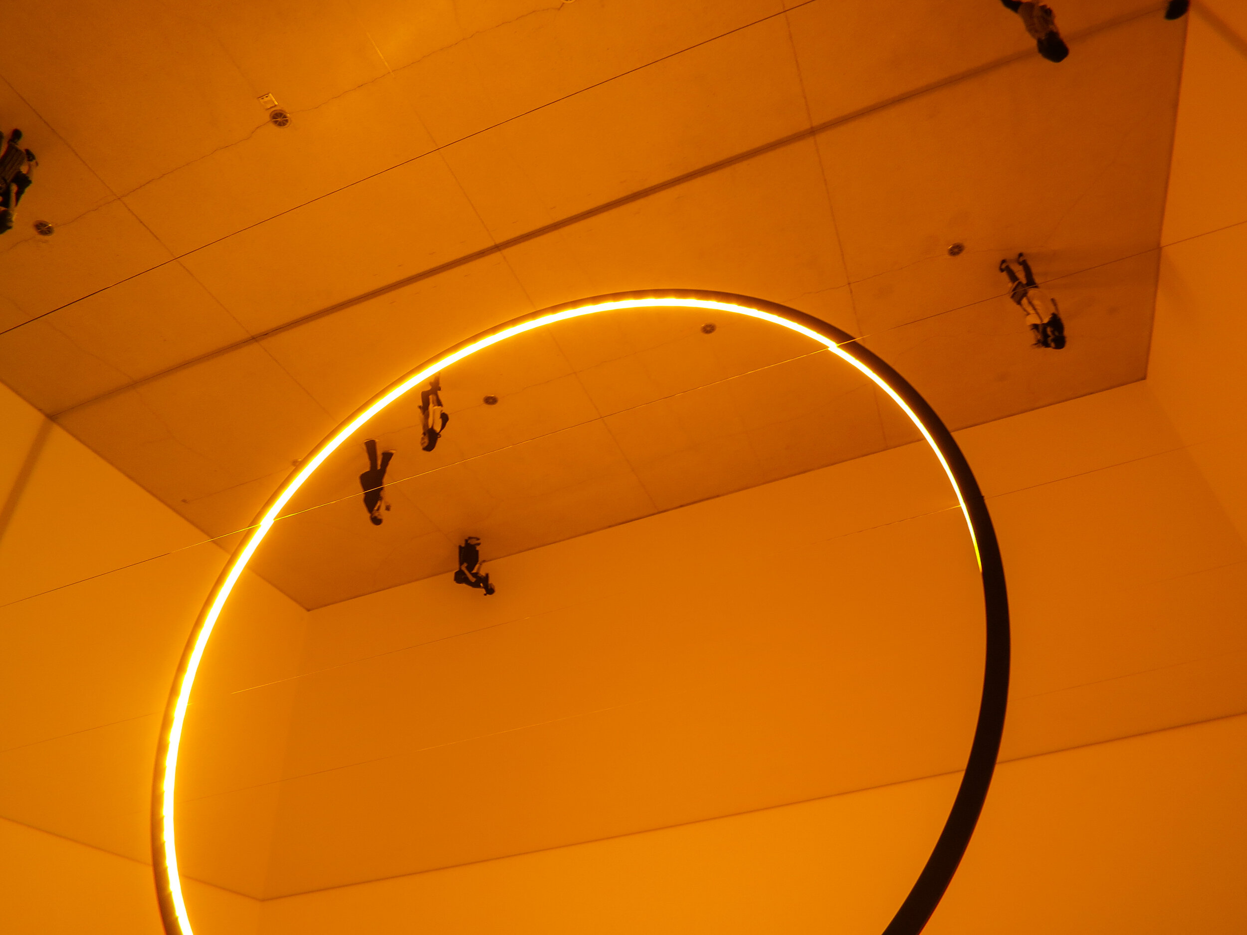
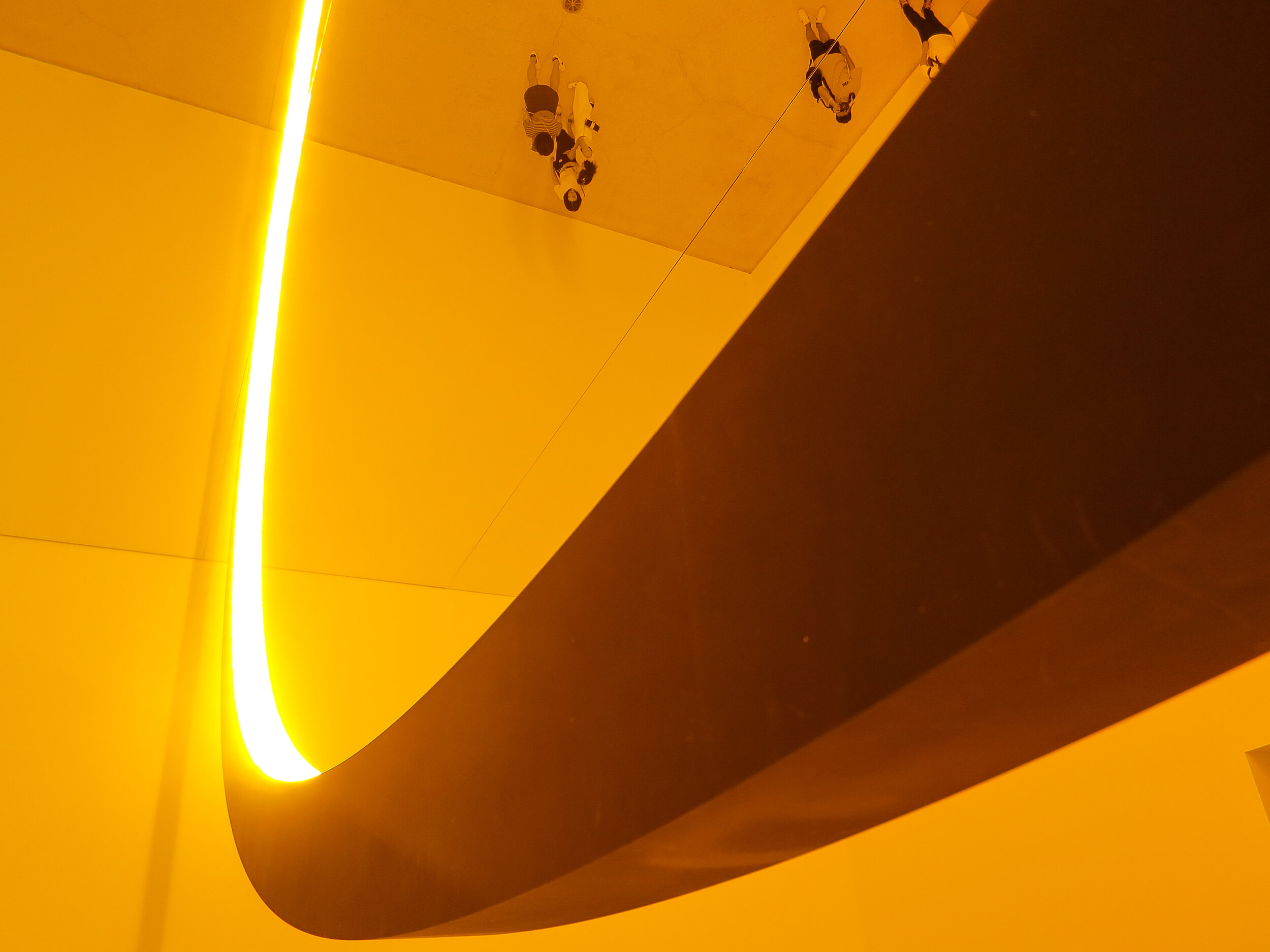
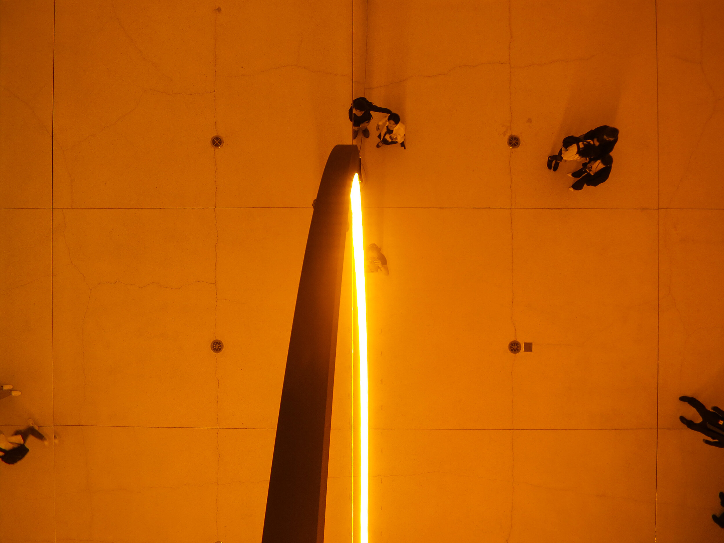
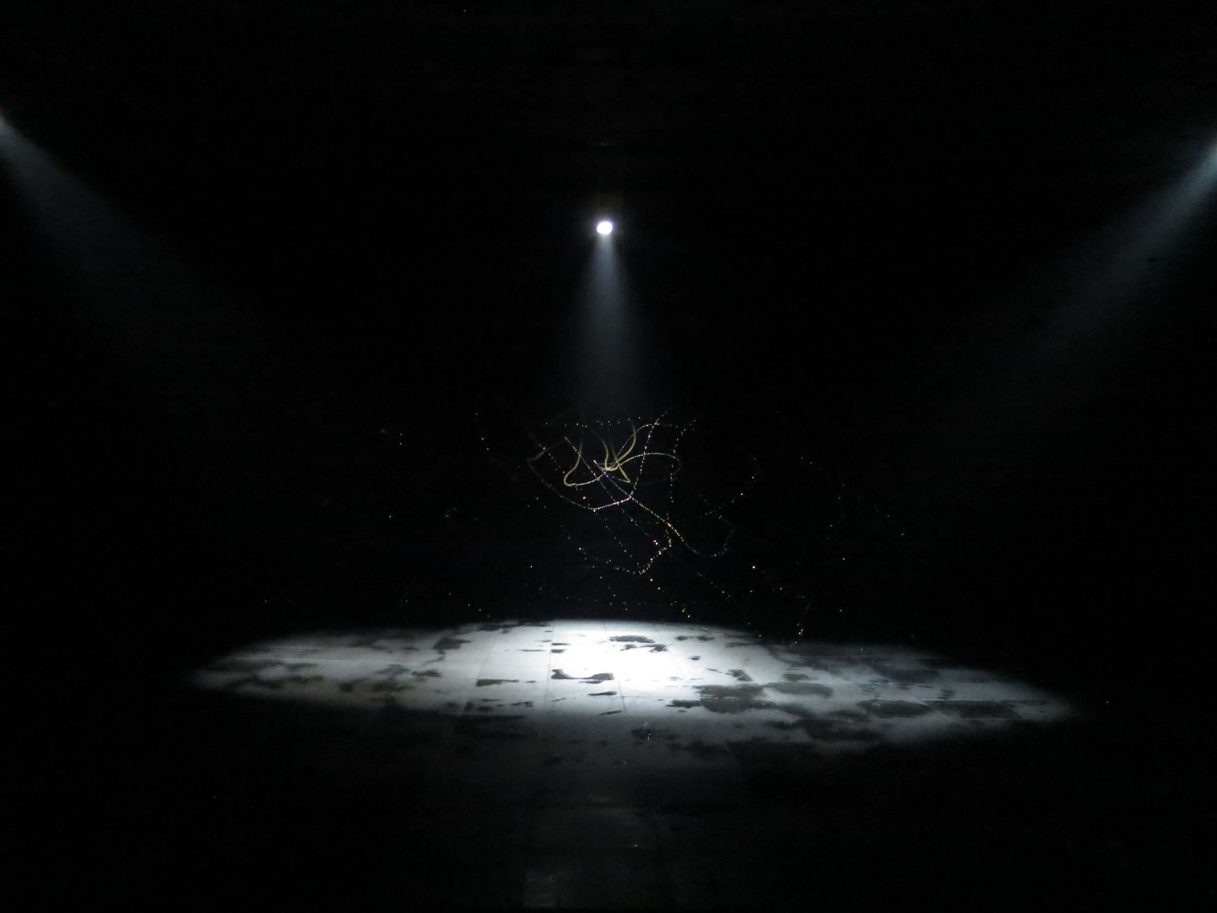
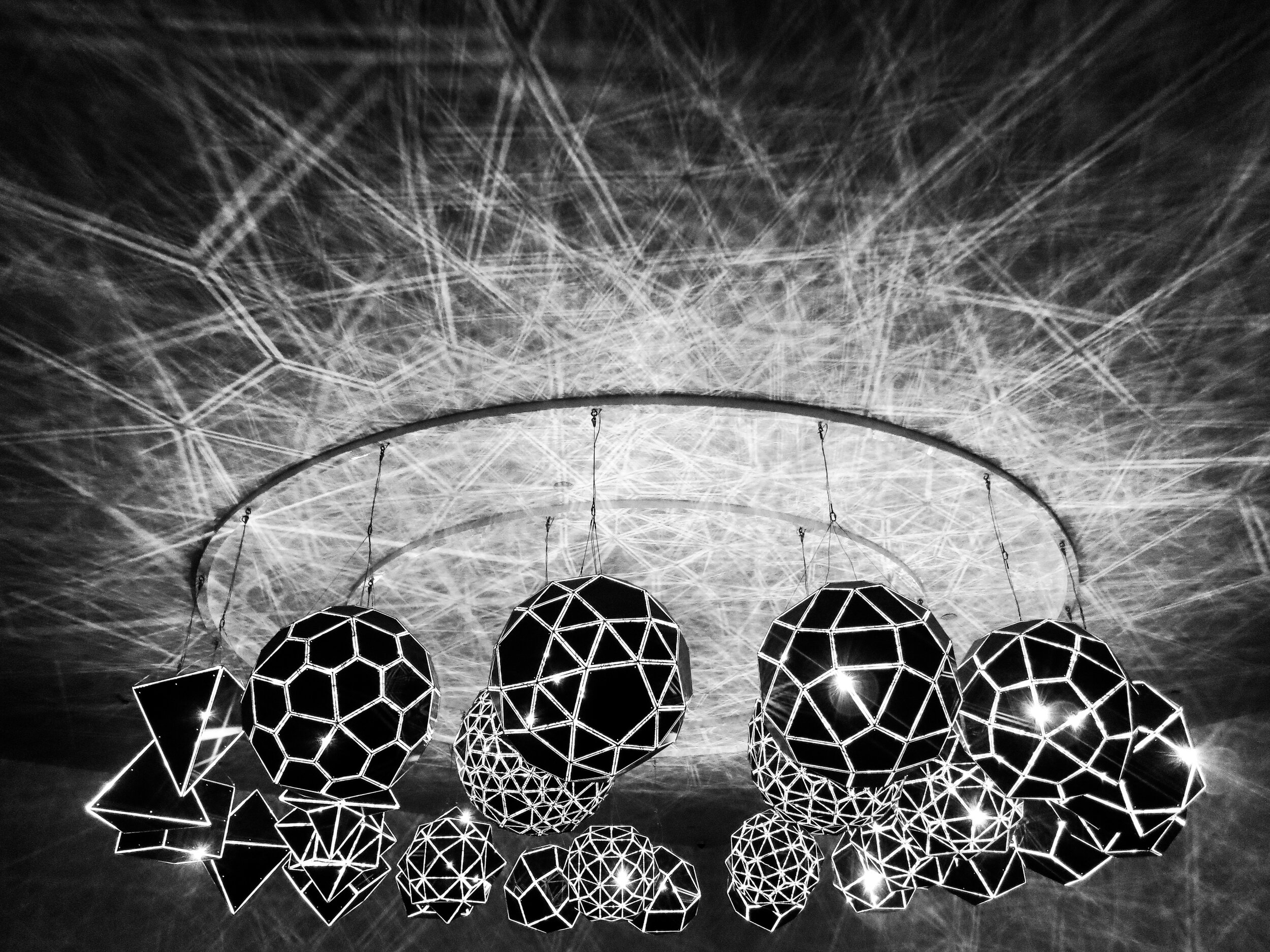

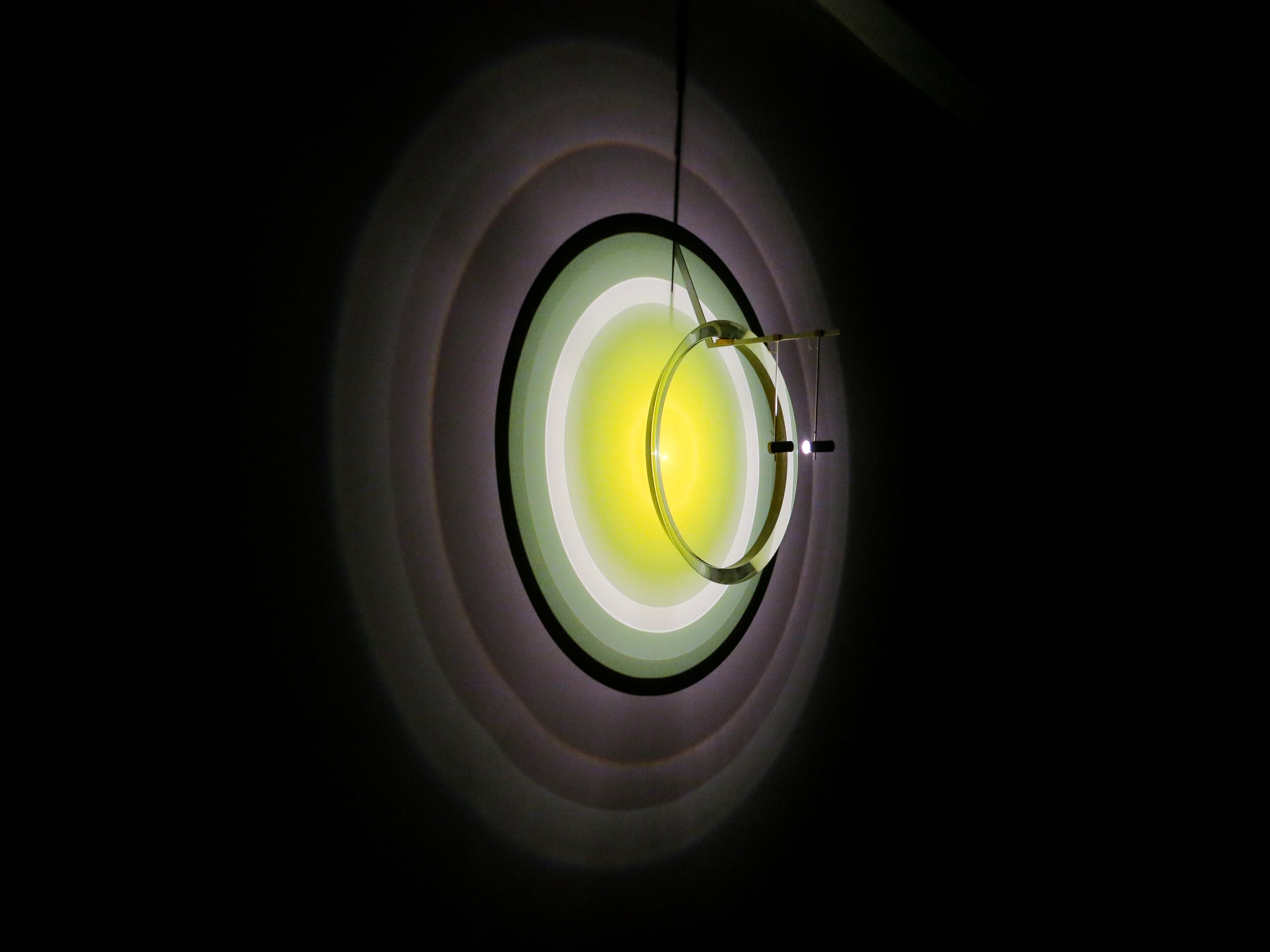
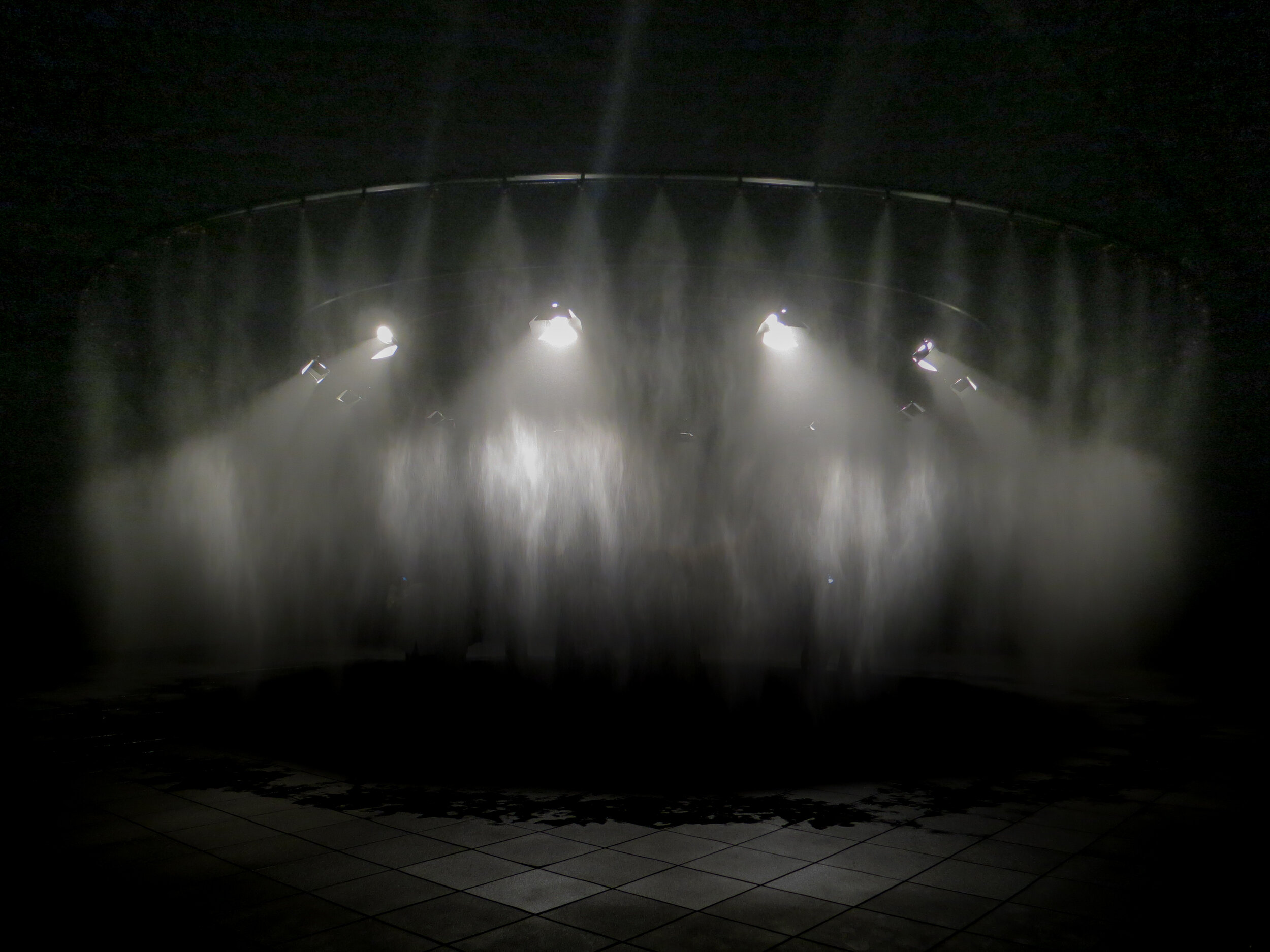
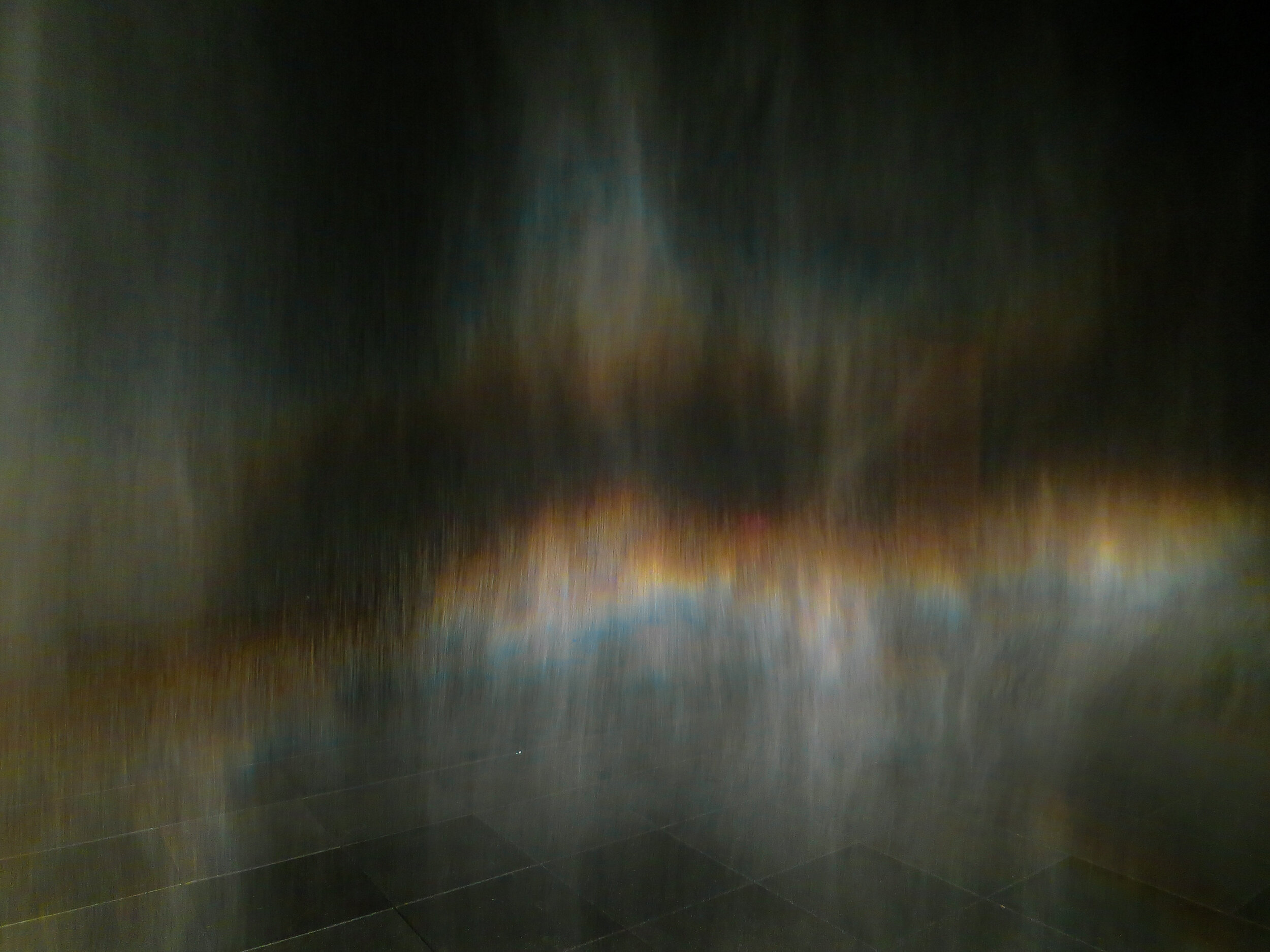
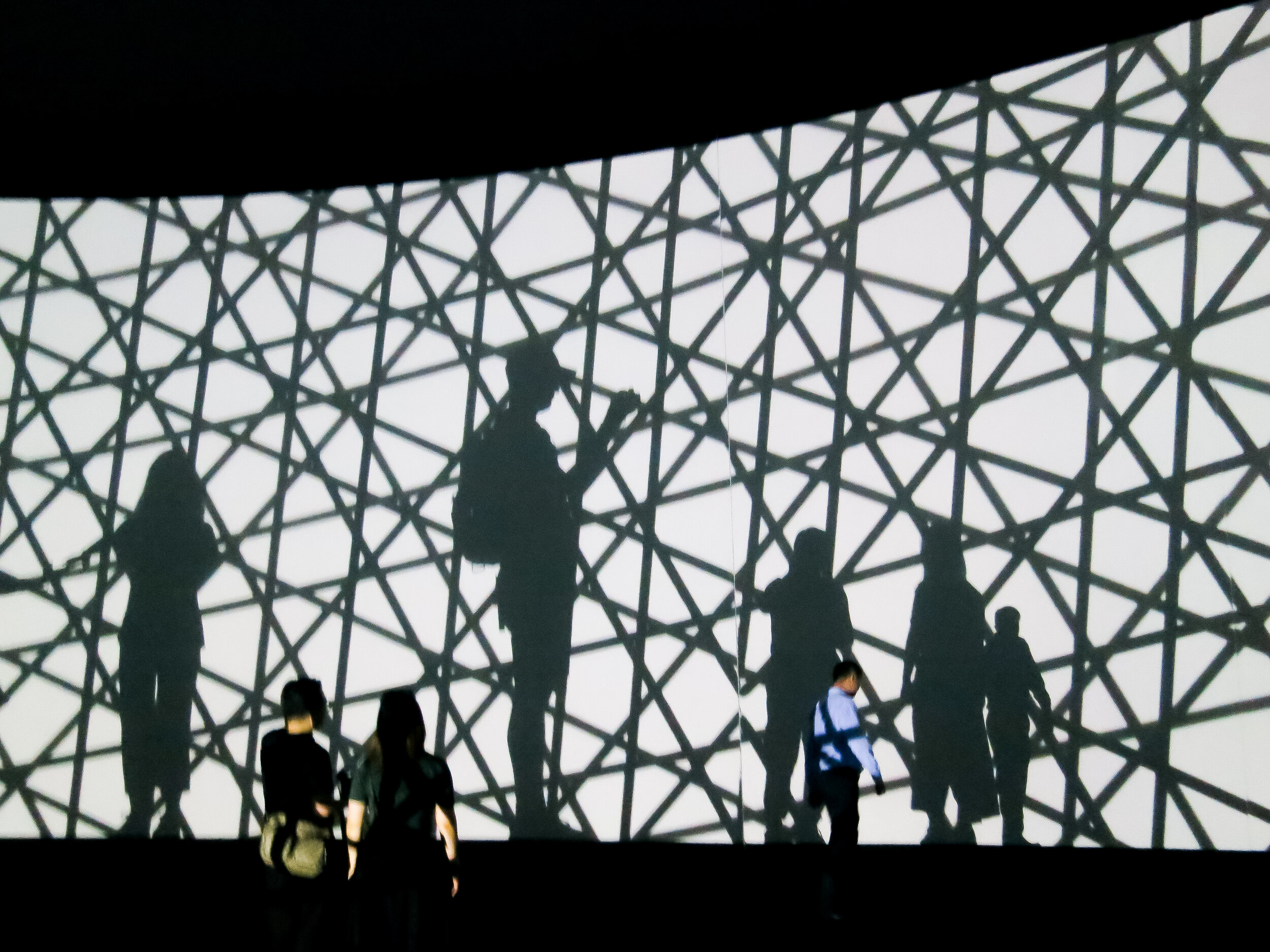
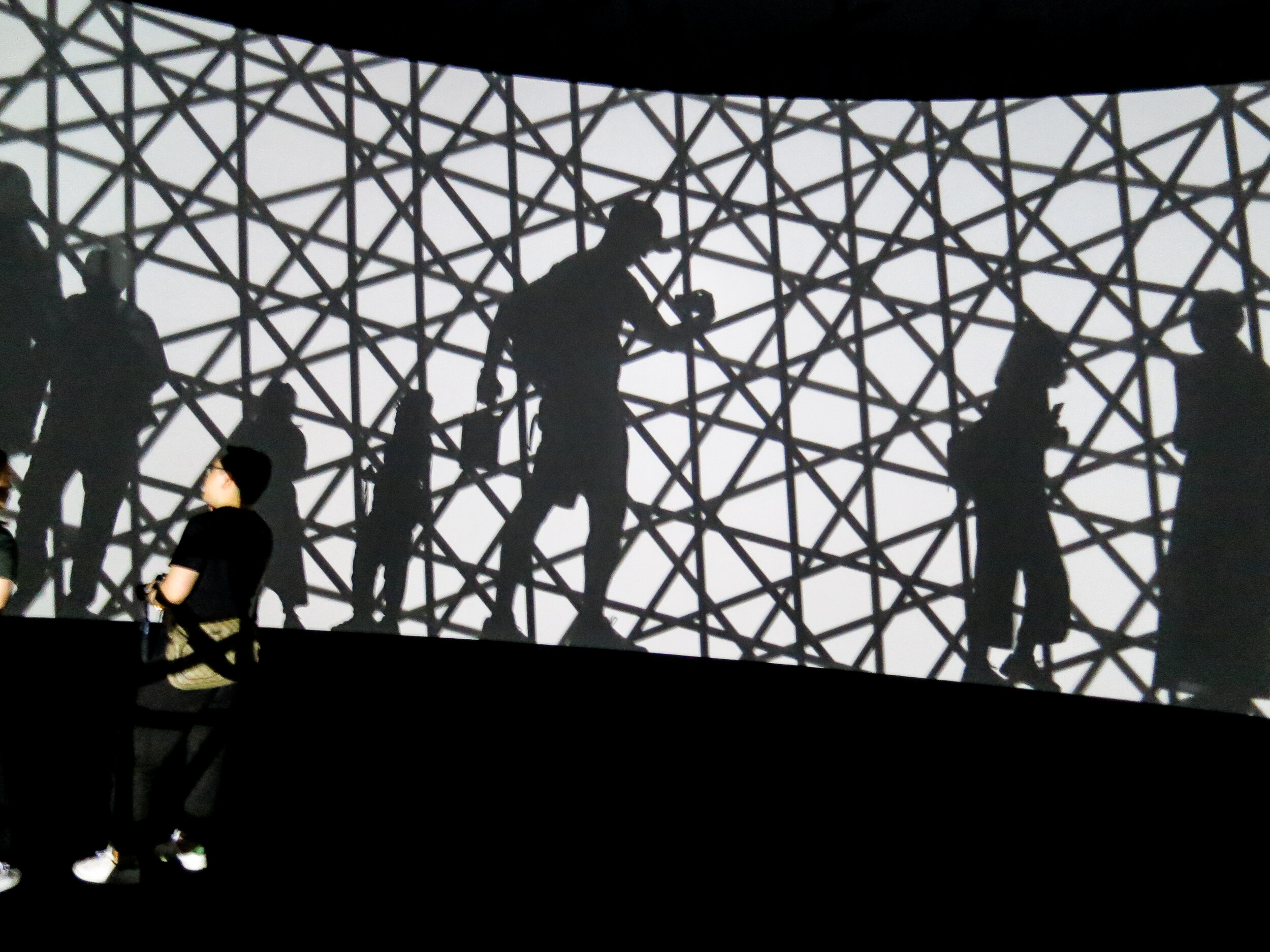

Also, the design of the museum itself was fantastic. Seemingly hundreds of hours of craft were visible at every turn. My favourite installation though was the railings which doubled as a bench. So simple, so obvious. A great idea.
Part 3 in our guide of practical skills covers off the classic art of cropping. It will help those who may be studying the third one week project based on image, but also discusses the fundamental role this technique plays in the designer’s visual communication skillset. Cropping images gives you – the designer – not only control, but also the ability to create intrigue and impact. Please watch in full, as ever. And for those of you who have enquired, we are still on the lookout for Part 1 of this series.
Here we feature a few images and ads from an old one week presentation we came across while trawling The Disciples’ hard drive. We also thought it a timely post as the new year one students will soon tackle their third one week project, which is primarily based around image.


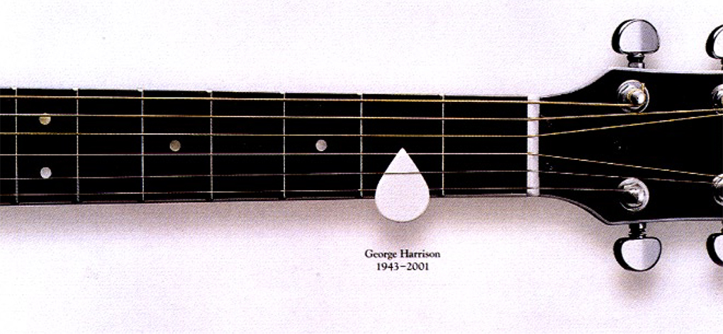


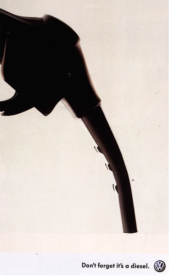
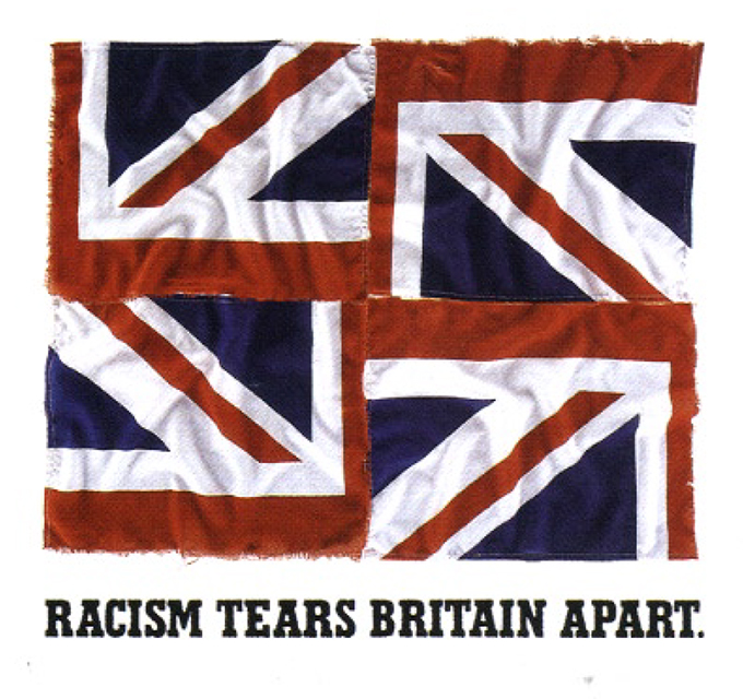
Above are some great examples of both observation and cropping which can be learnt from and hopefully inspire. They look so effortless and simple but have only been achieved by designers who have really looked, observed and made lateral visual connections.
We came across this 2016 D&AD typographic project by Dan Horsefall & Ashley Schofield while trawling the hard drive and thought we’d share it with you.


Please click the image above to play film

The Disciples Of Design are a global collective of design academics, practitioners, artists and students. We have one common thread – UCLan in Preston, UK; and one common aim – the creation of an ever evolving visual hub for the sharing of ideas and thoughts.
