Essential Listening
/Here is a link to Twenty Thousand Hertz, as recommended by advertising tutor, Guy.
As Guy attests: 'Everything you need to know about sound design and effects - Essential listening.’
Enjoy.
Here is a link to Twenty Thousand Hertz, as recommended by advertising tutor, Guy.
As Guy attests: 'Everything you need to know about sound design and effects - Essential listening.’
Enjoy.

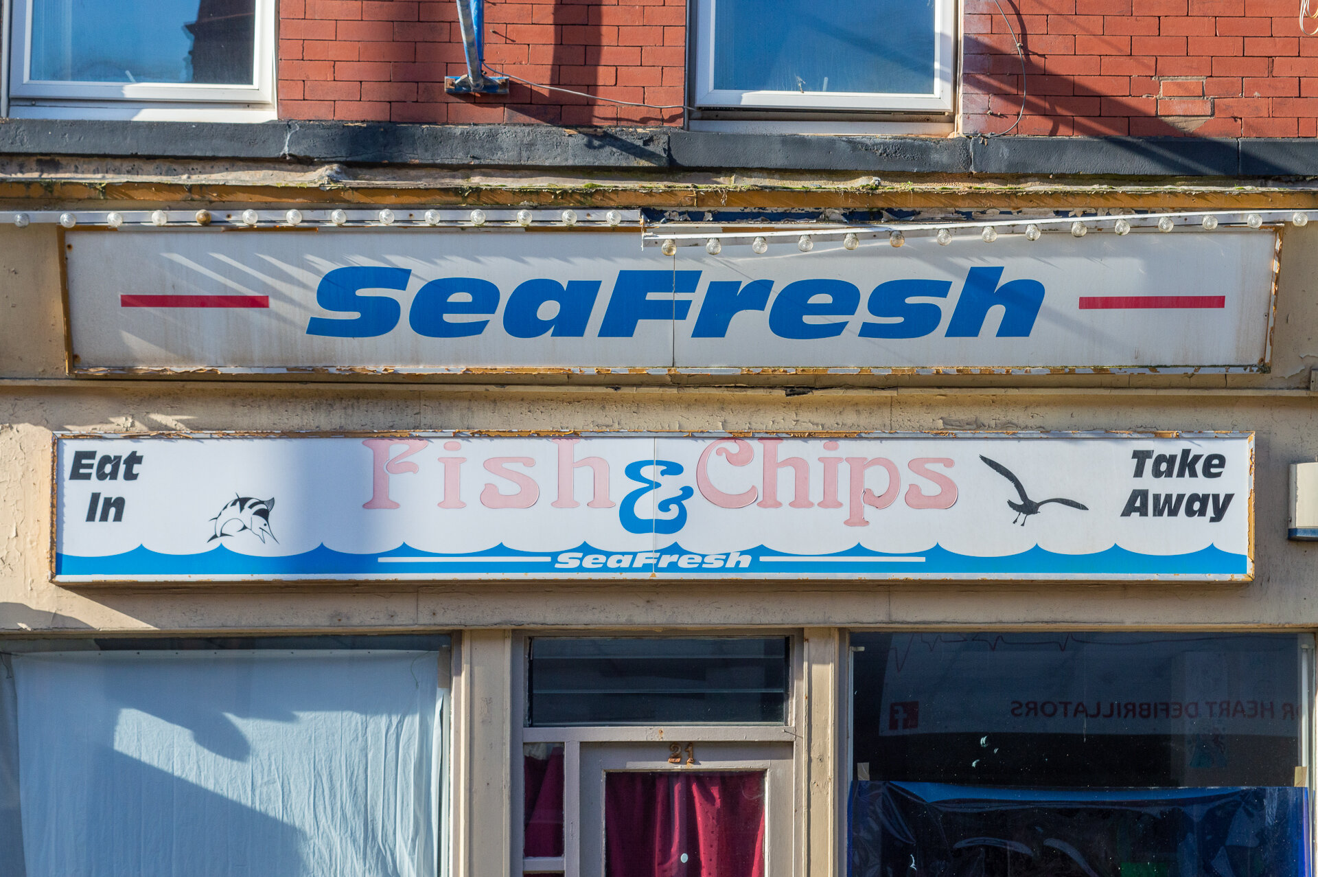
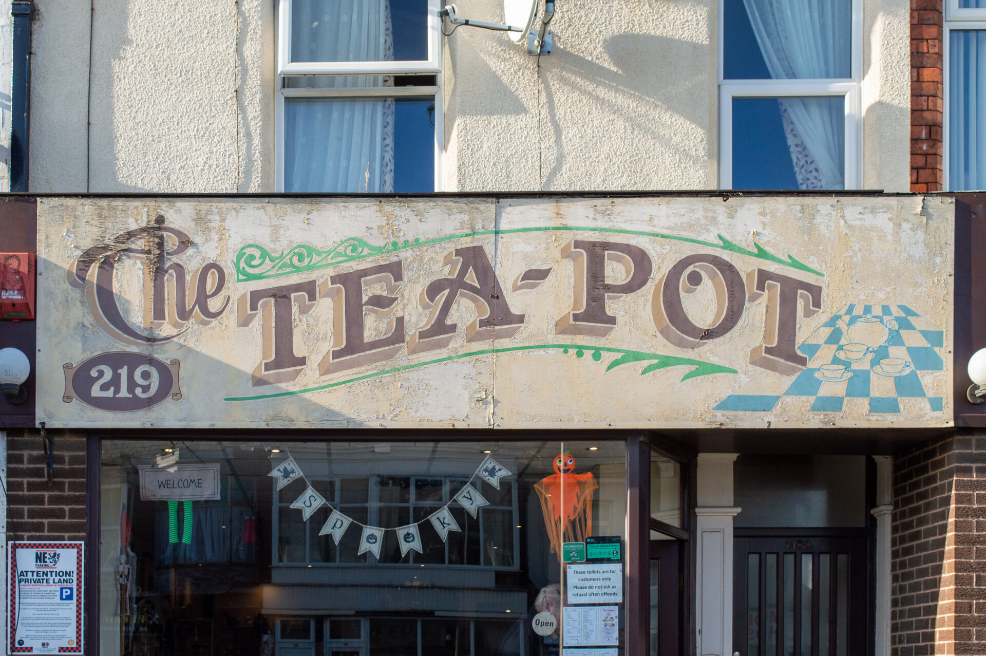
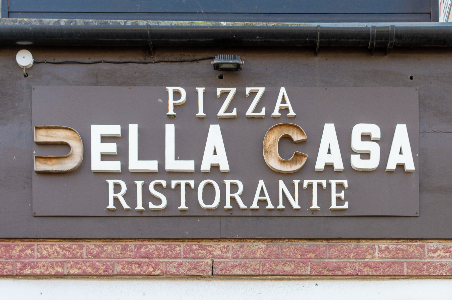
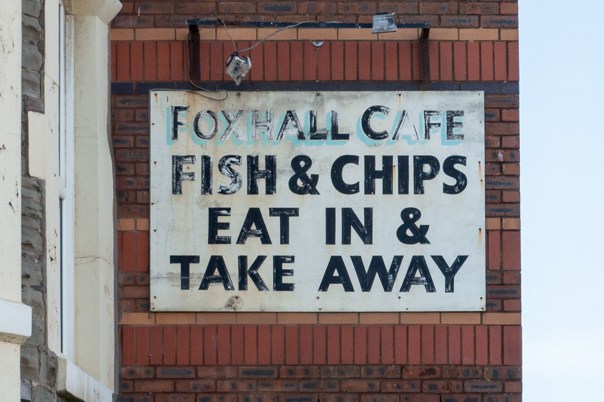
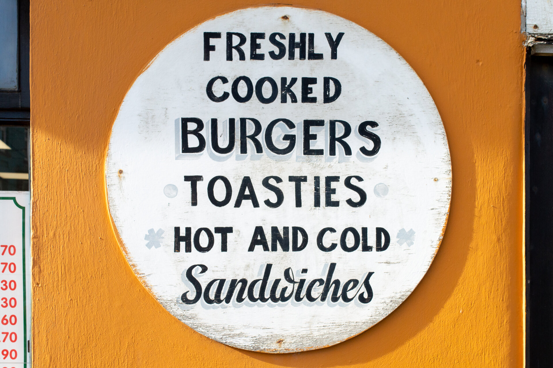
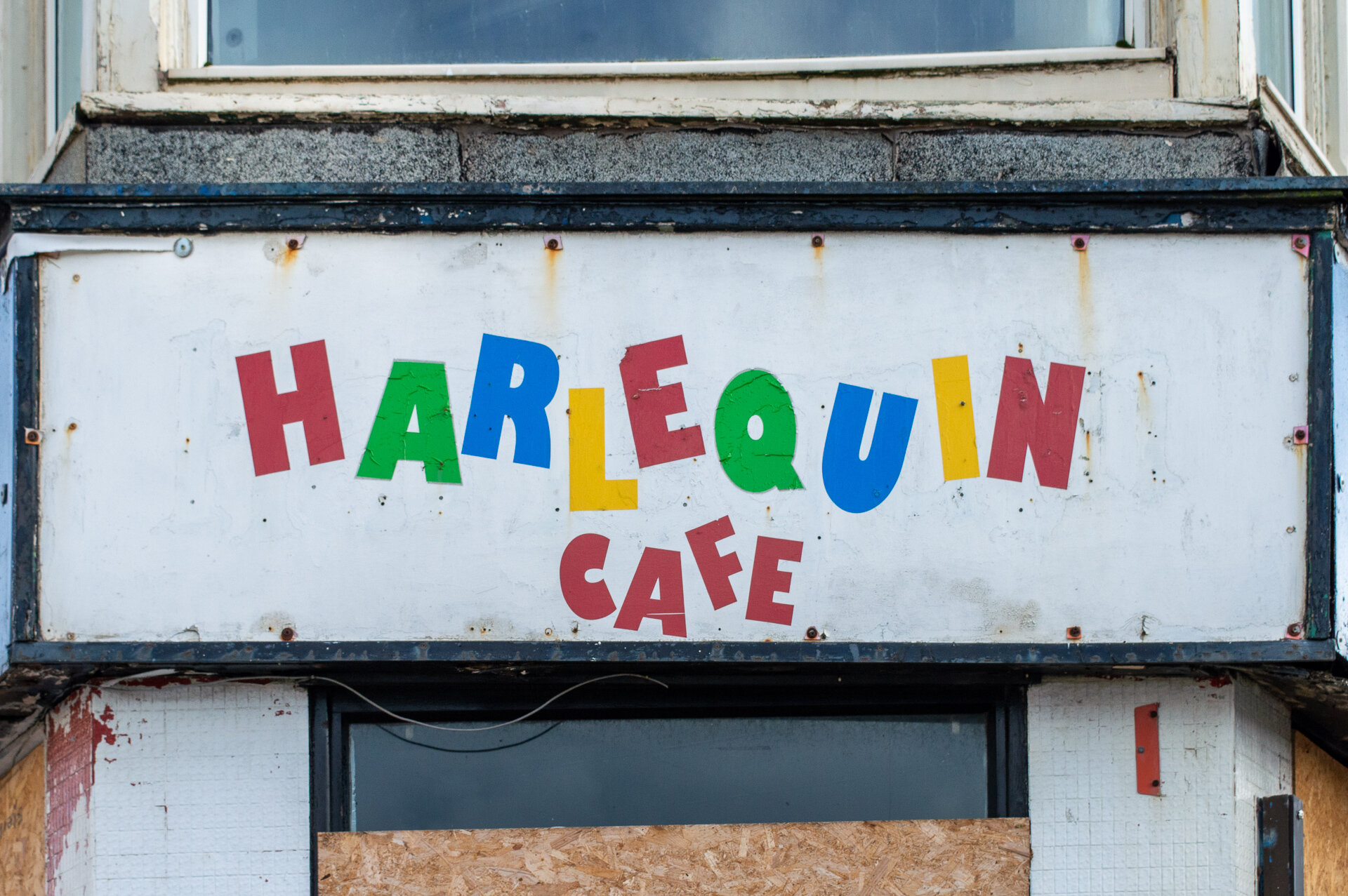
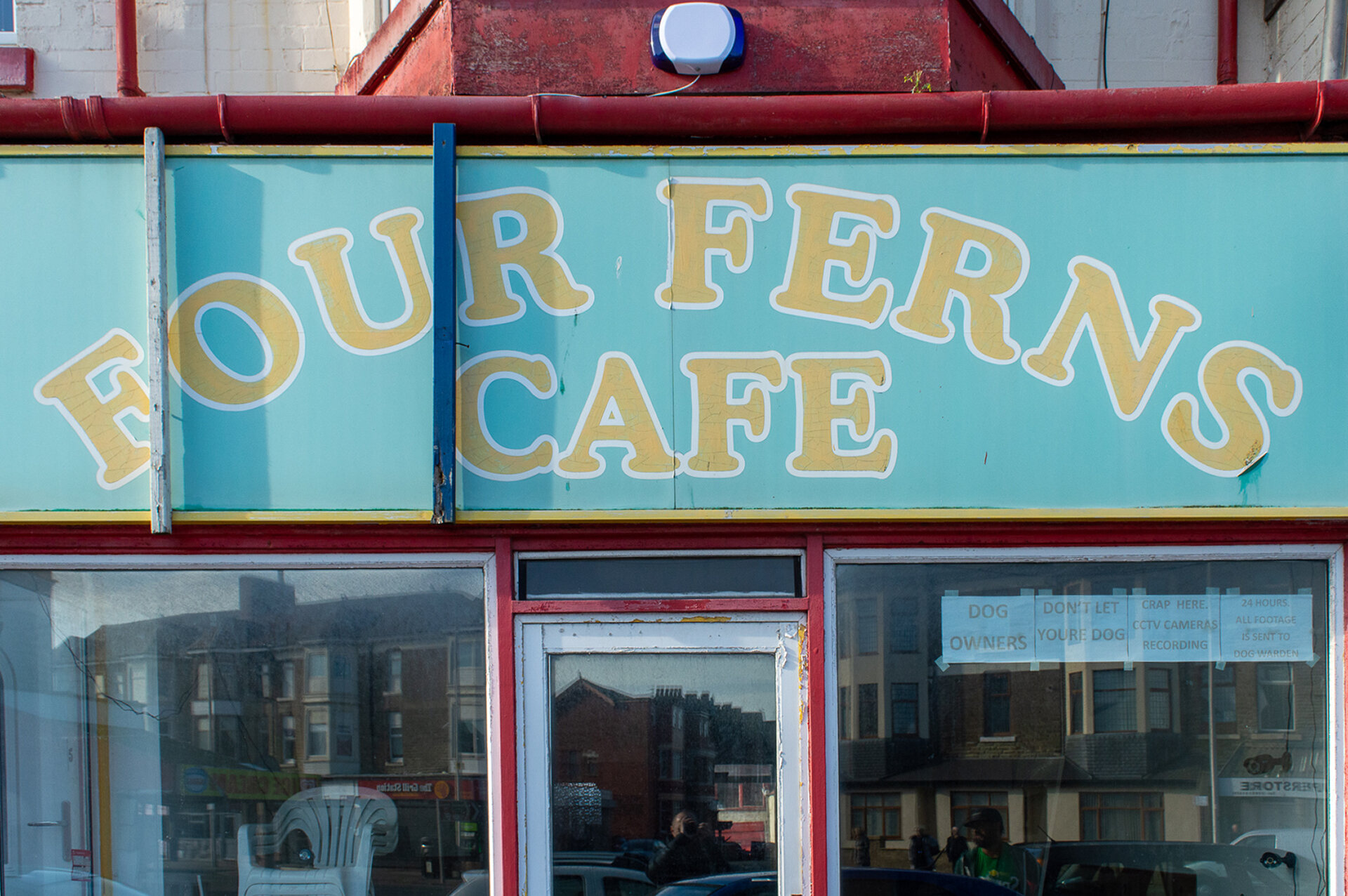
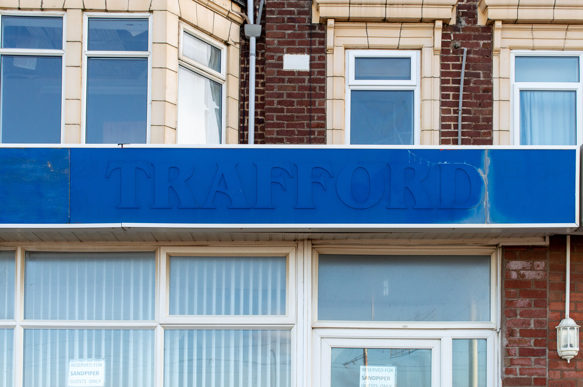
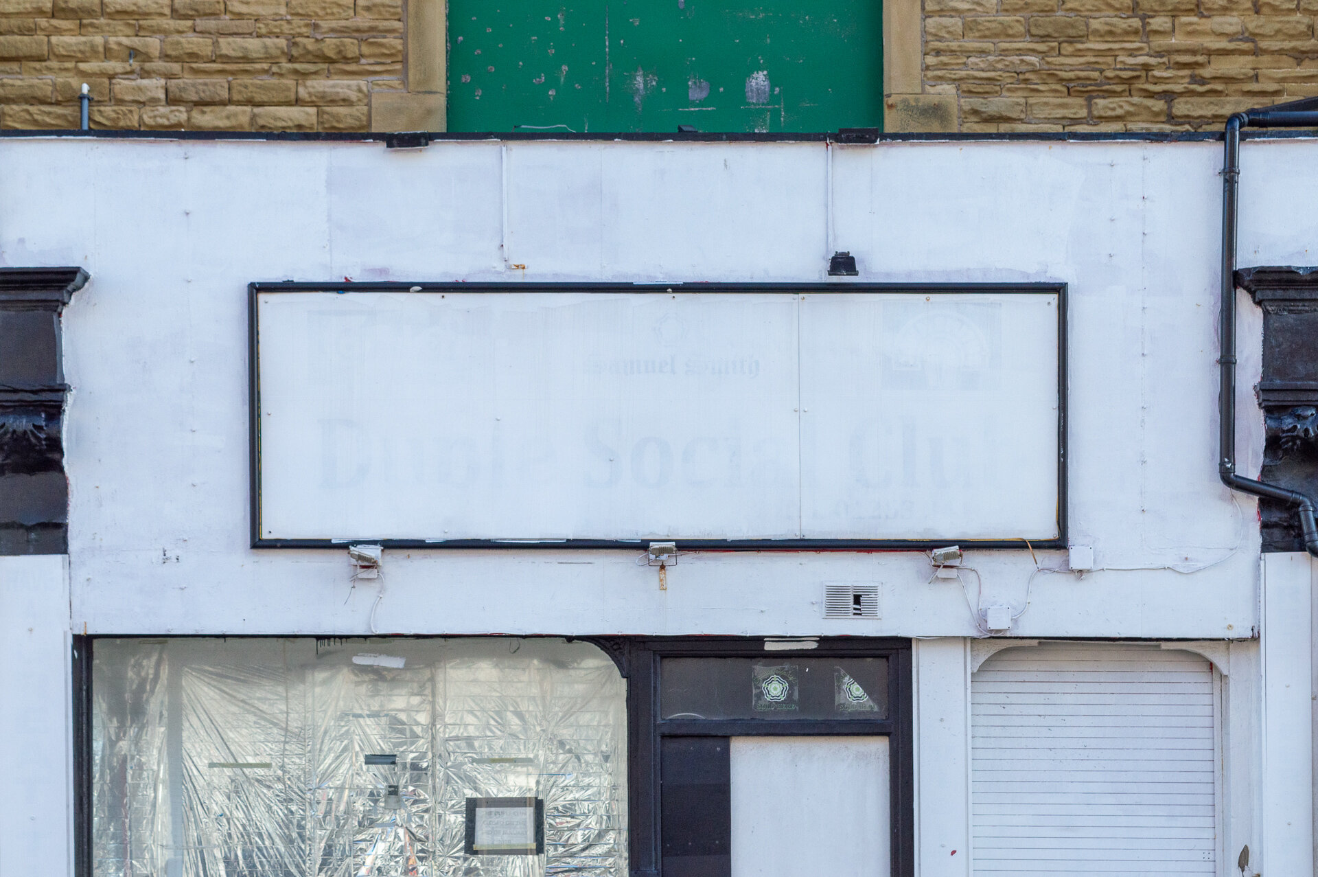
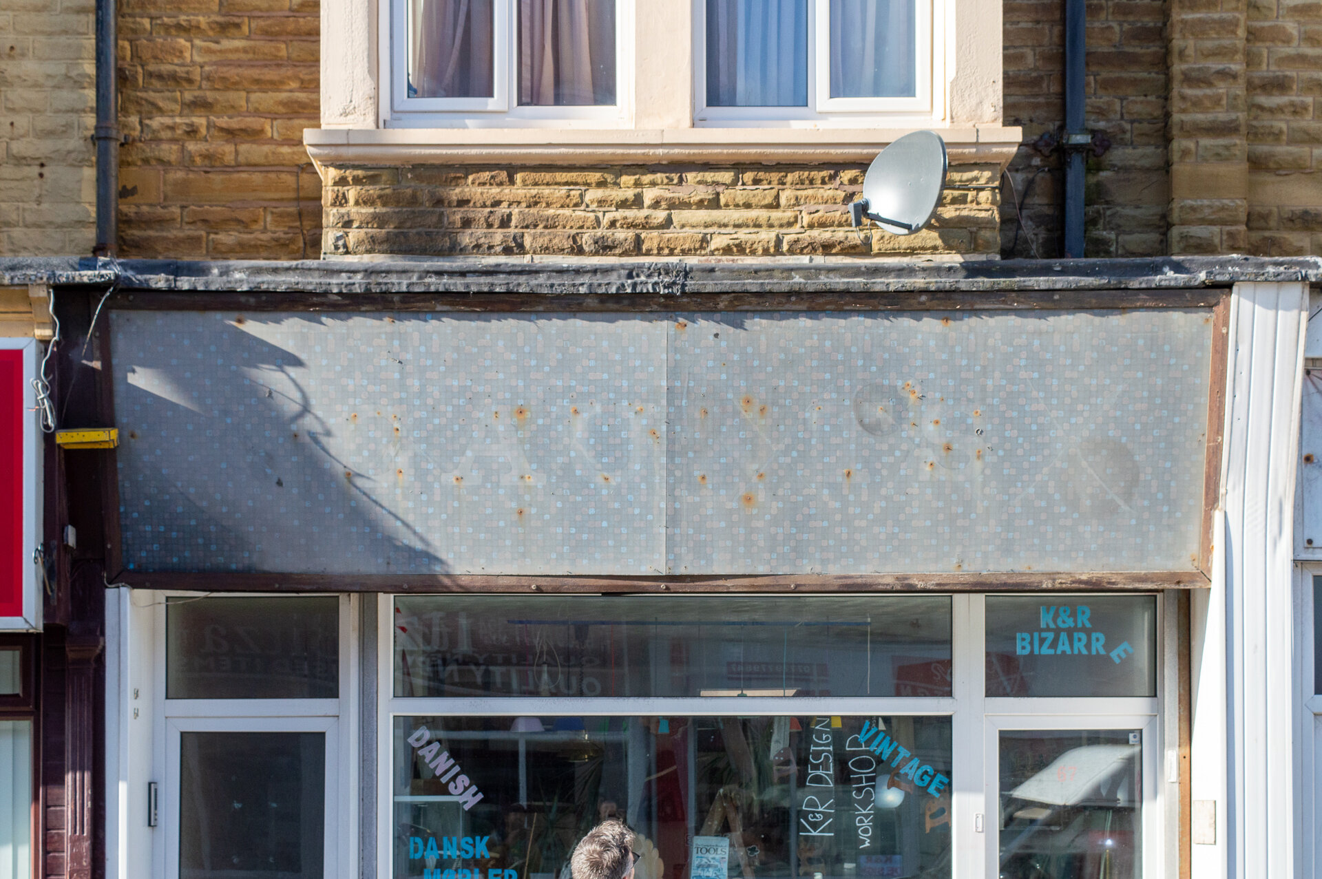
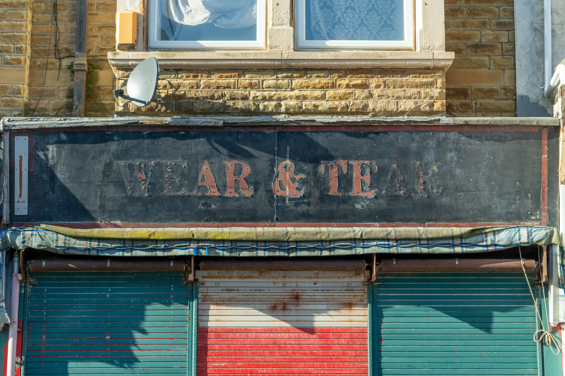
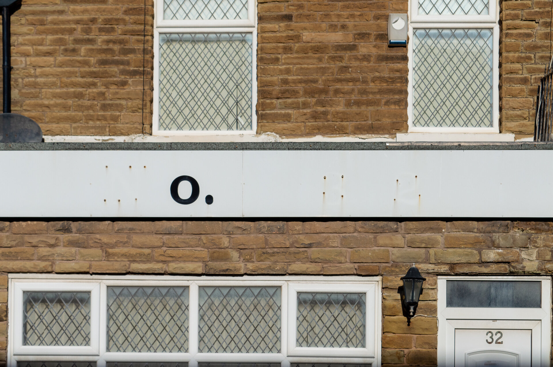
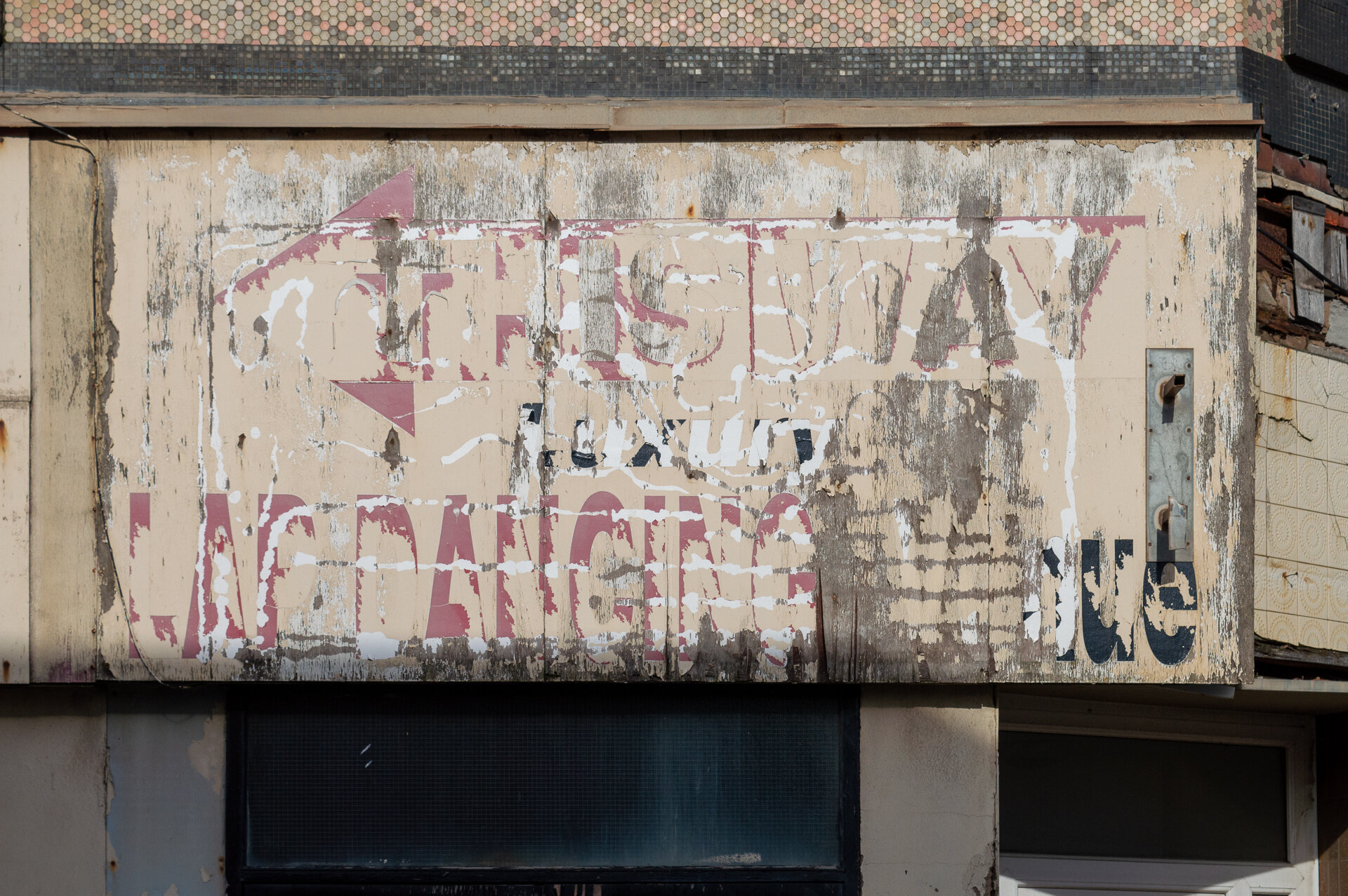
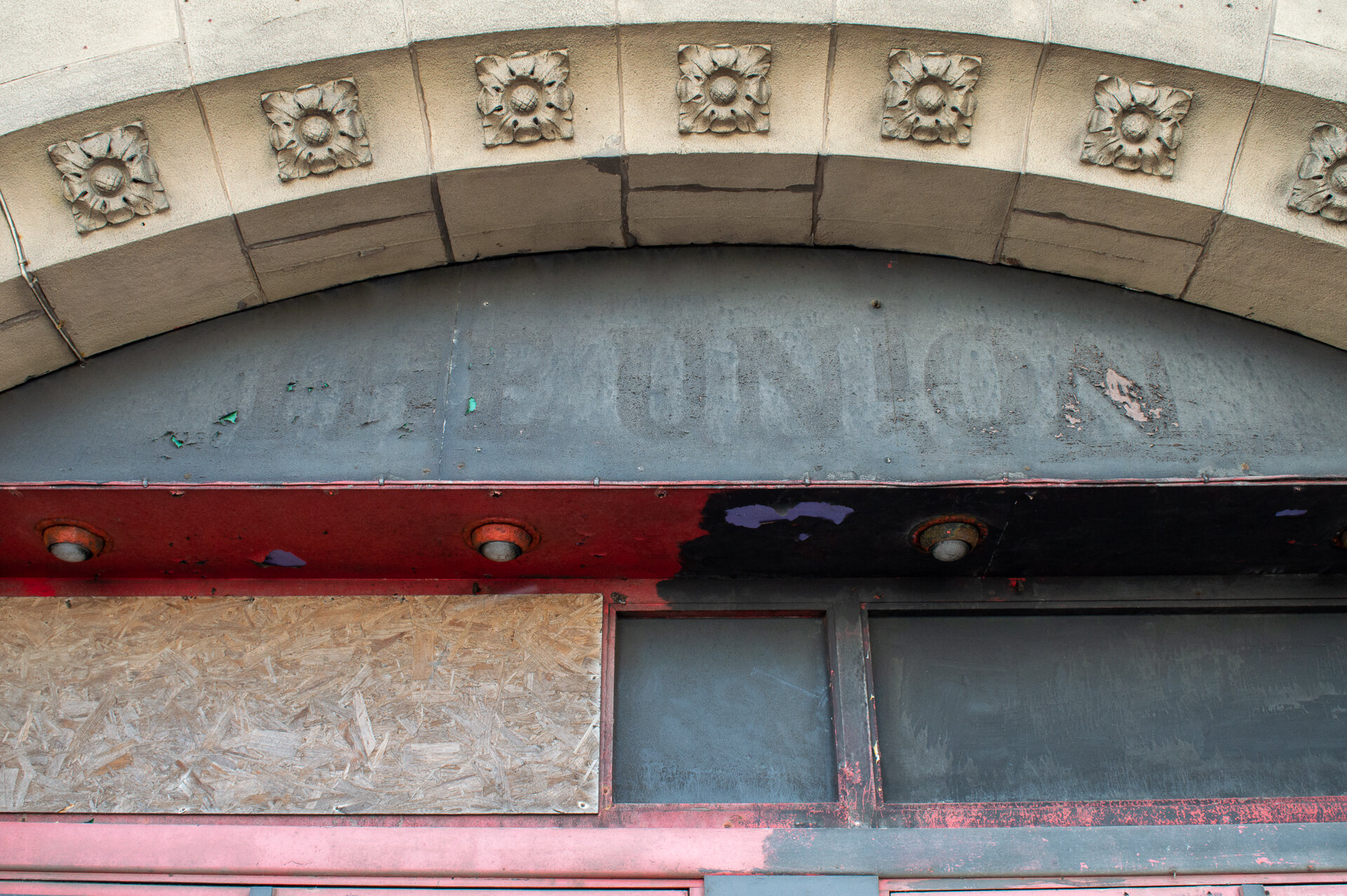
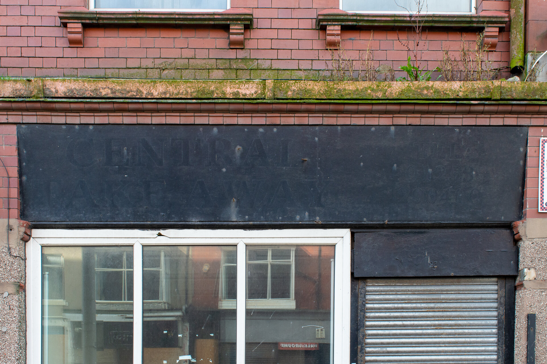
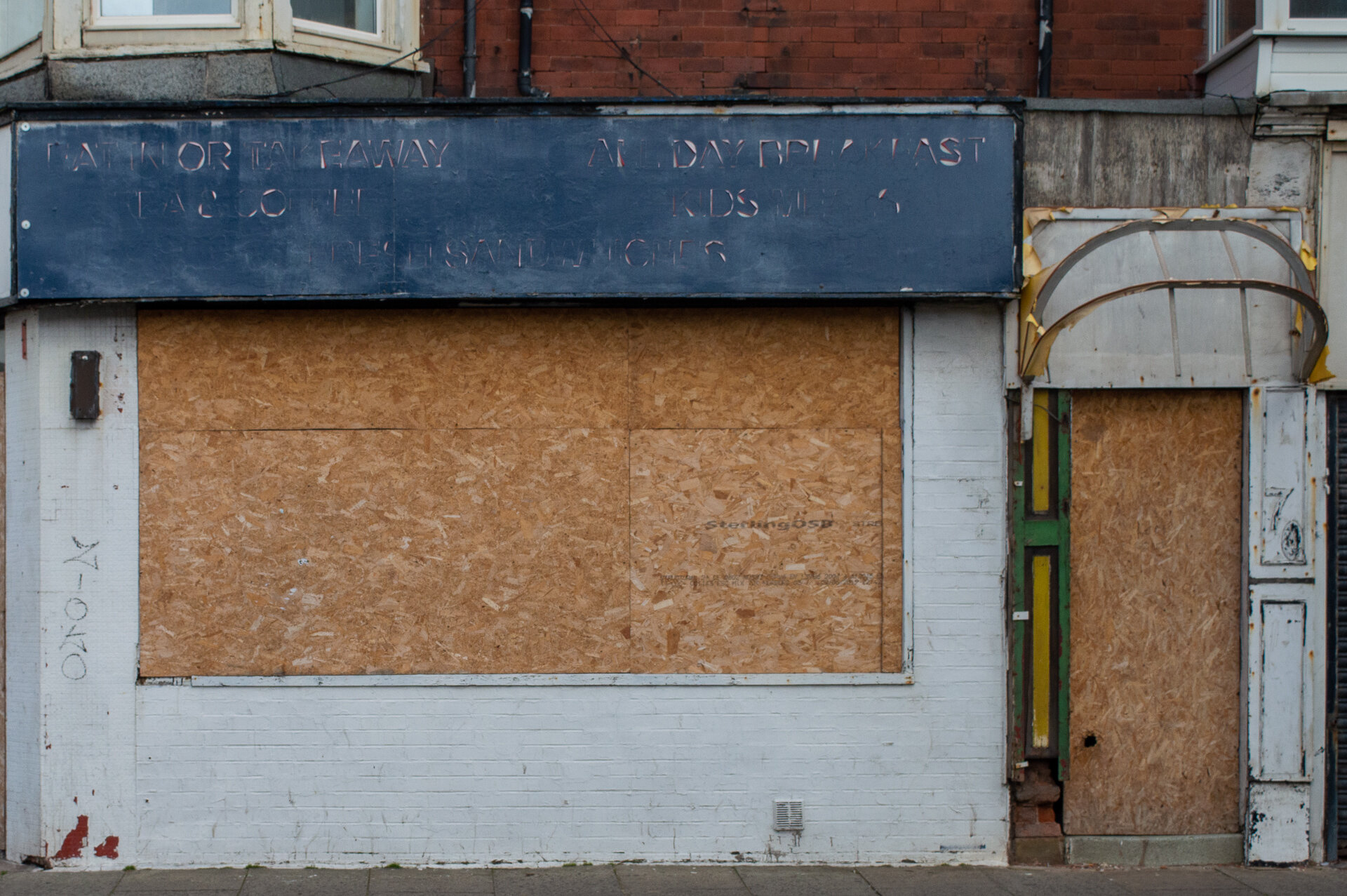
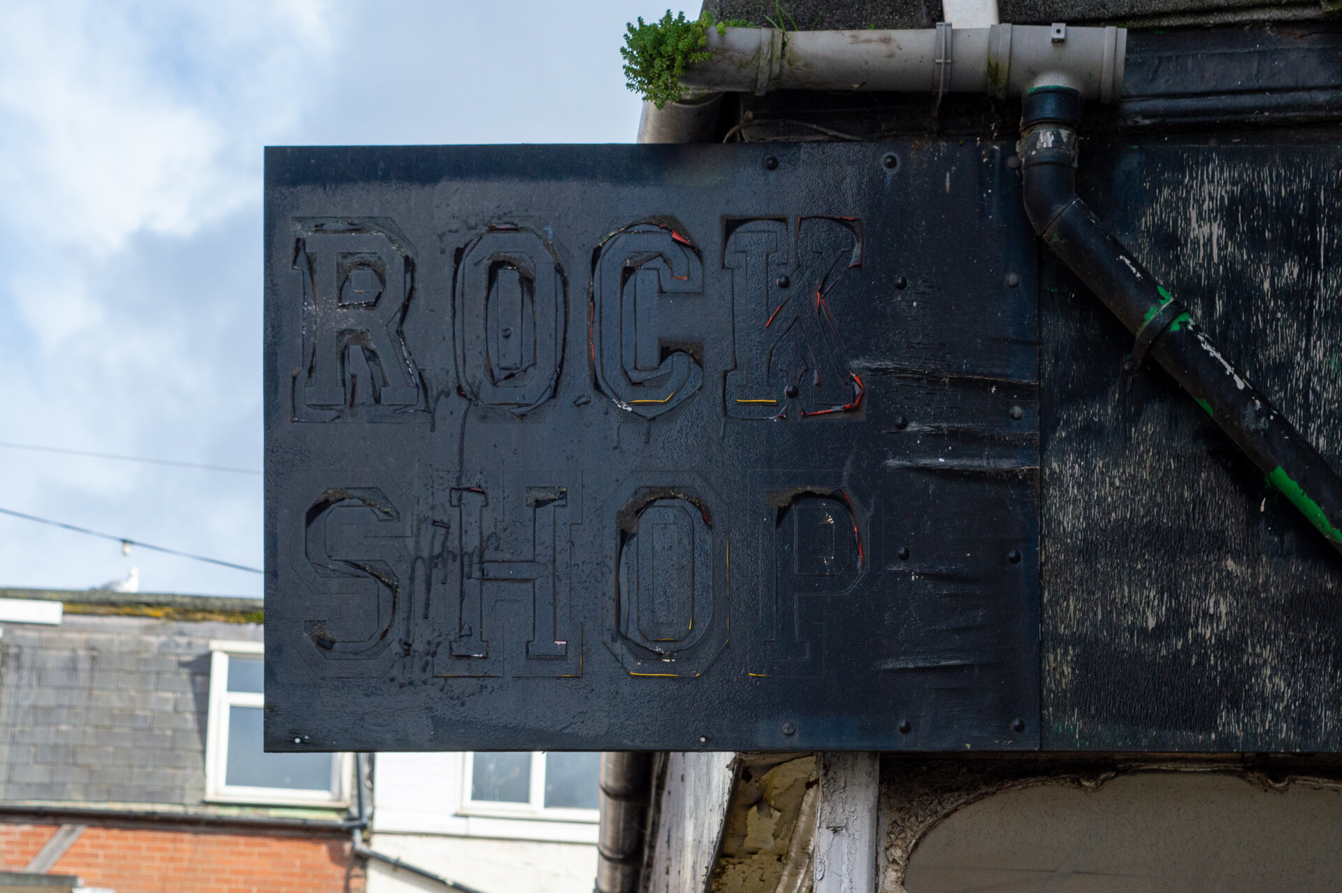
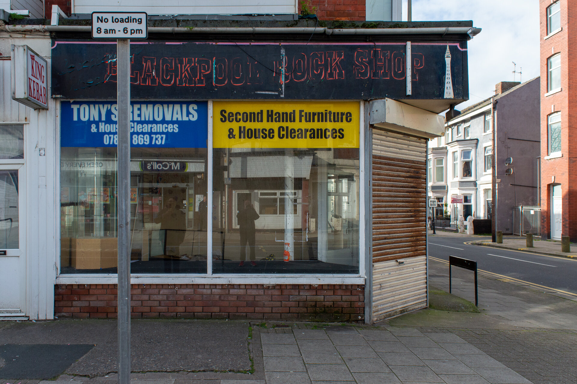
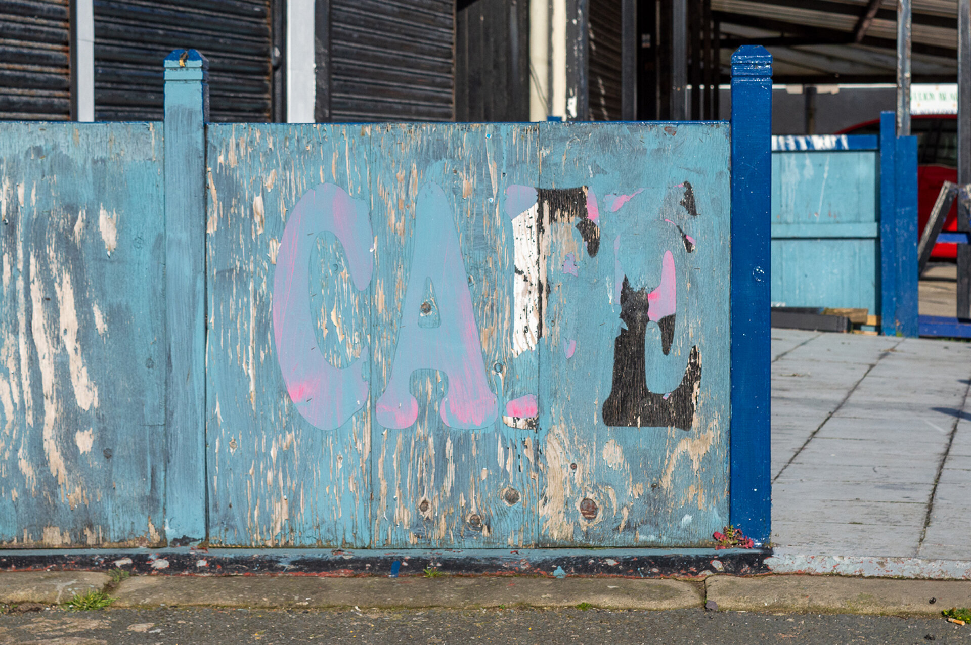
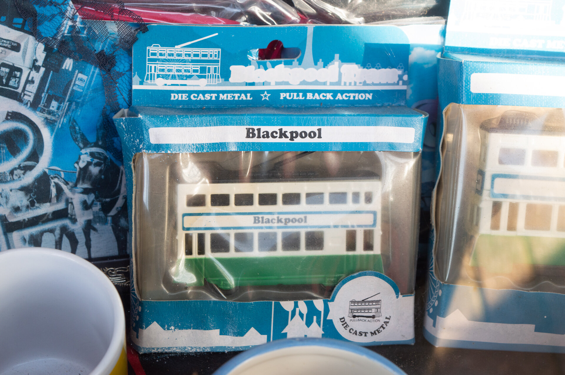
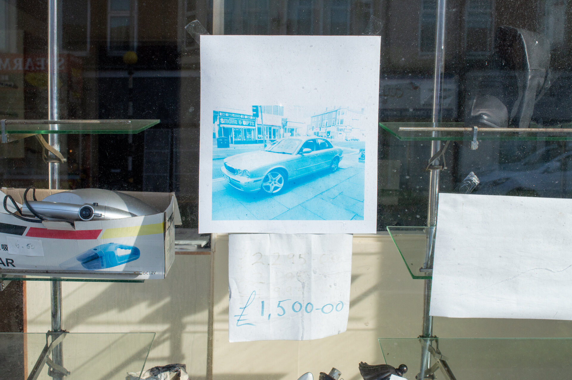
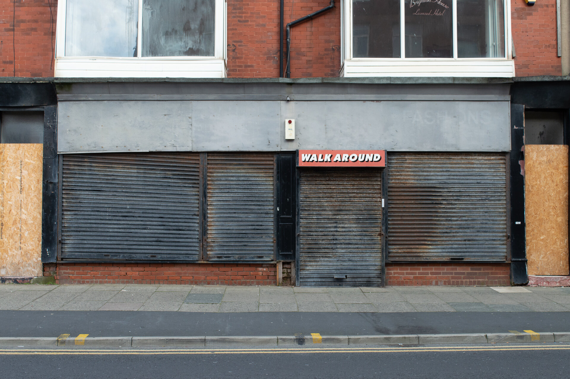
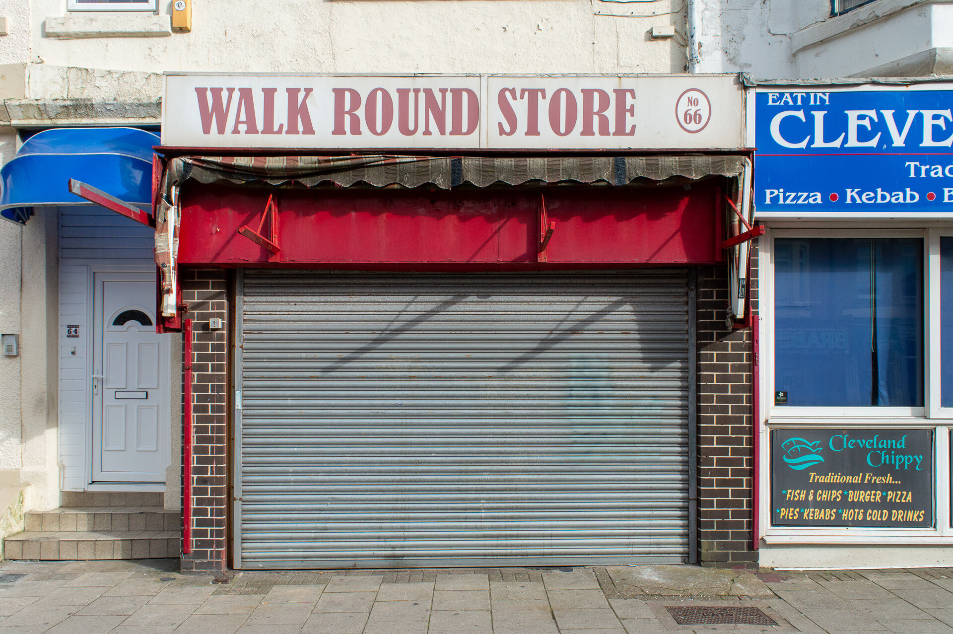
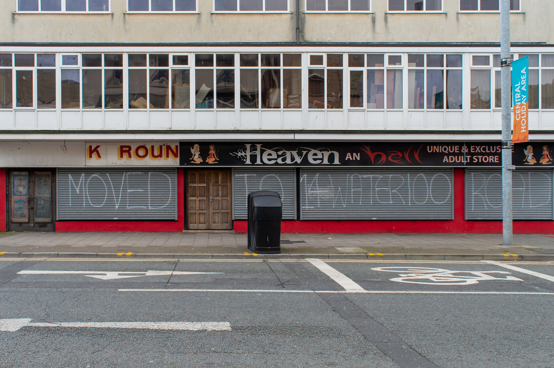
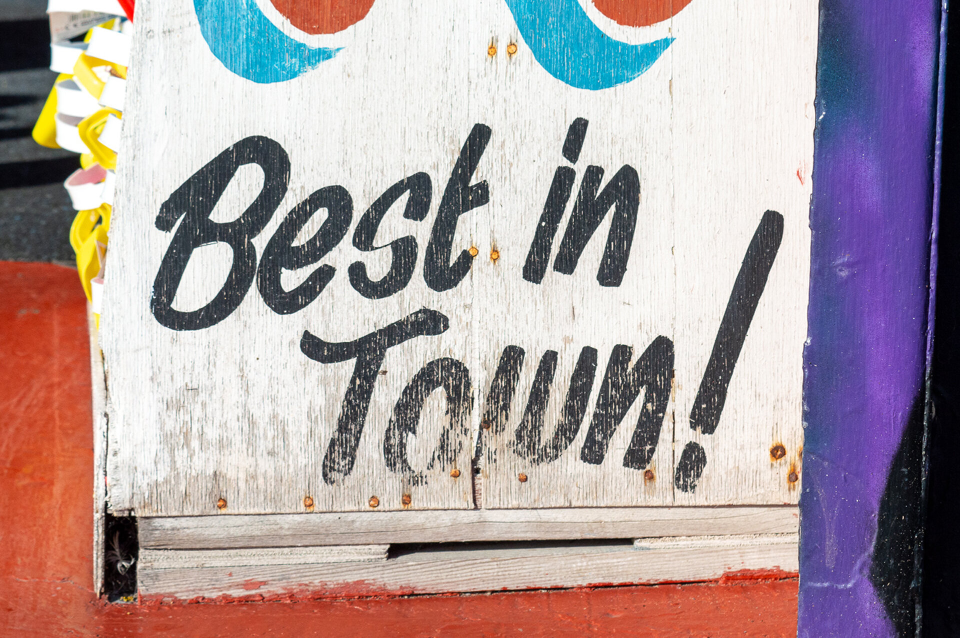
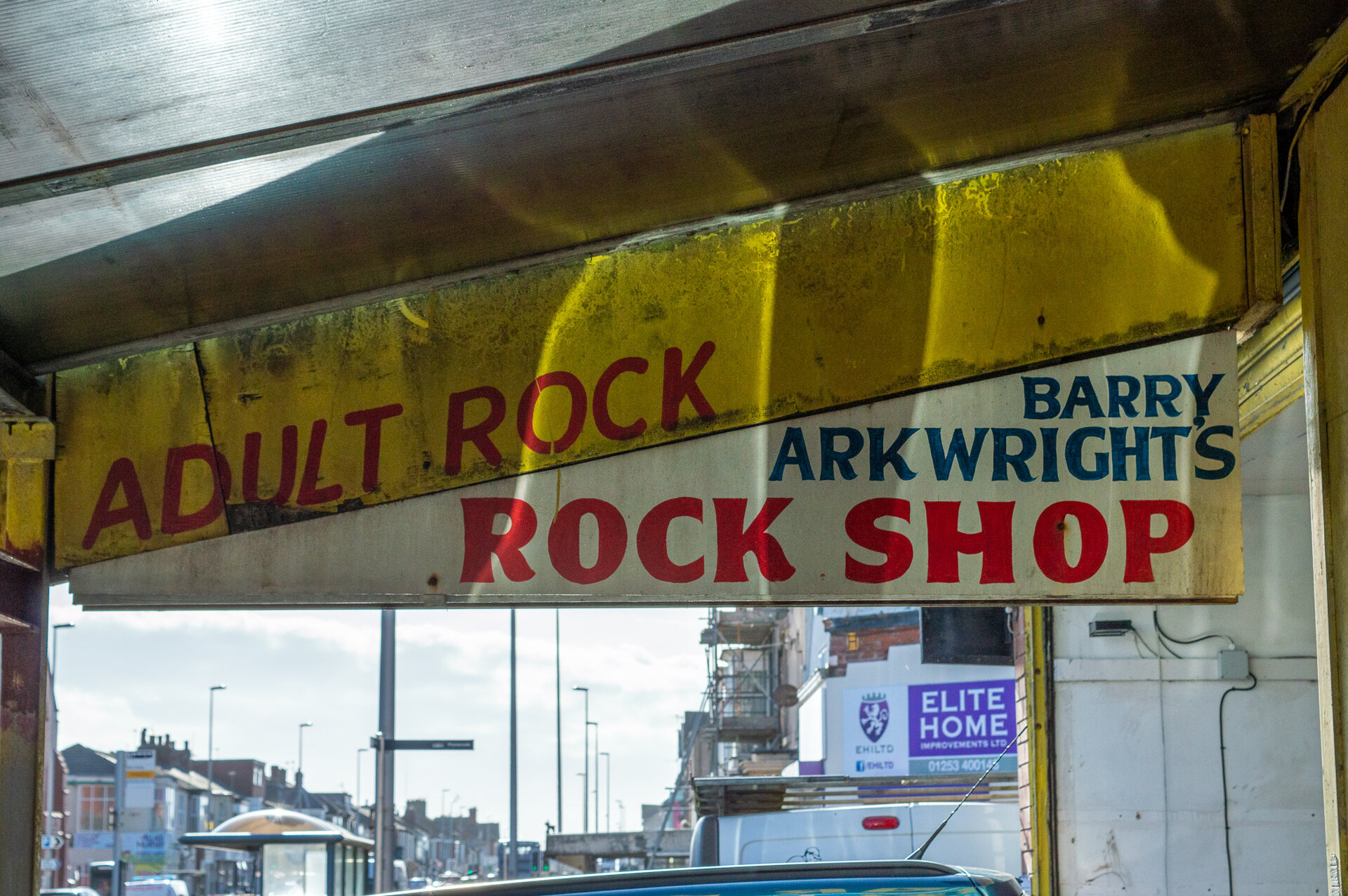
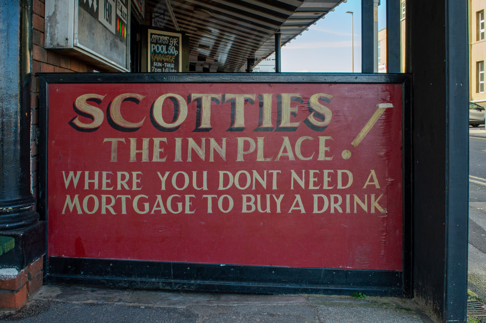
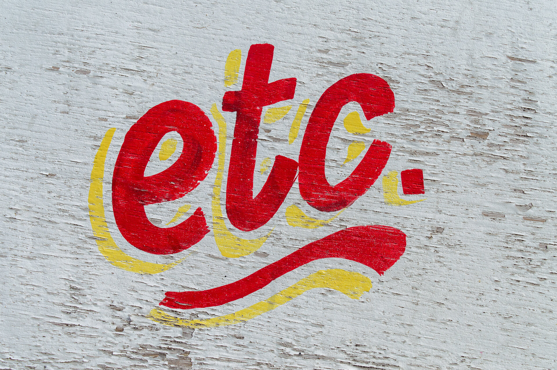
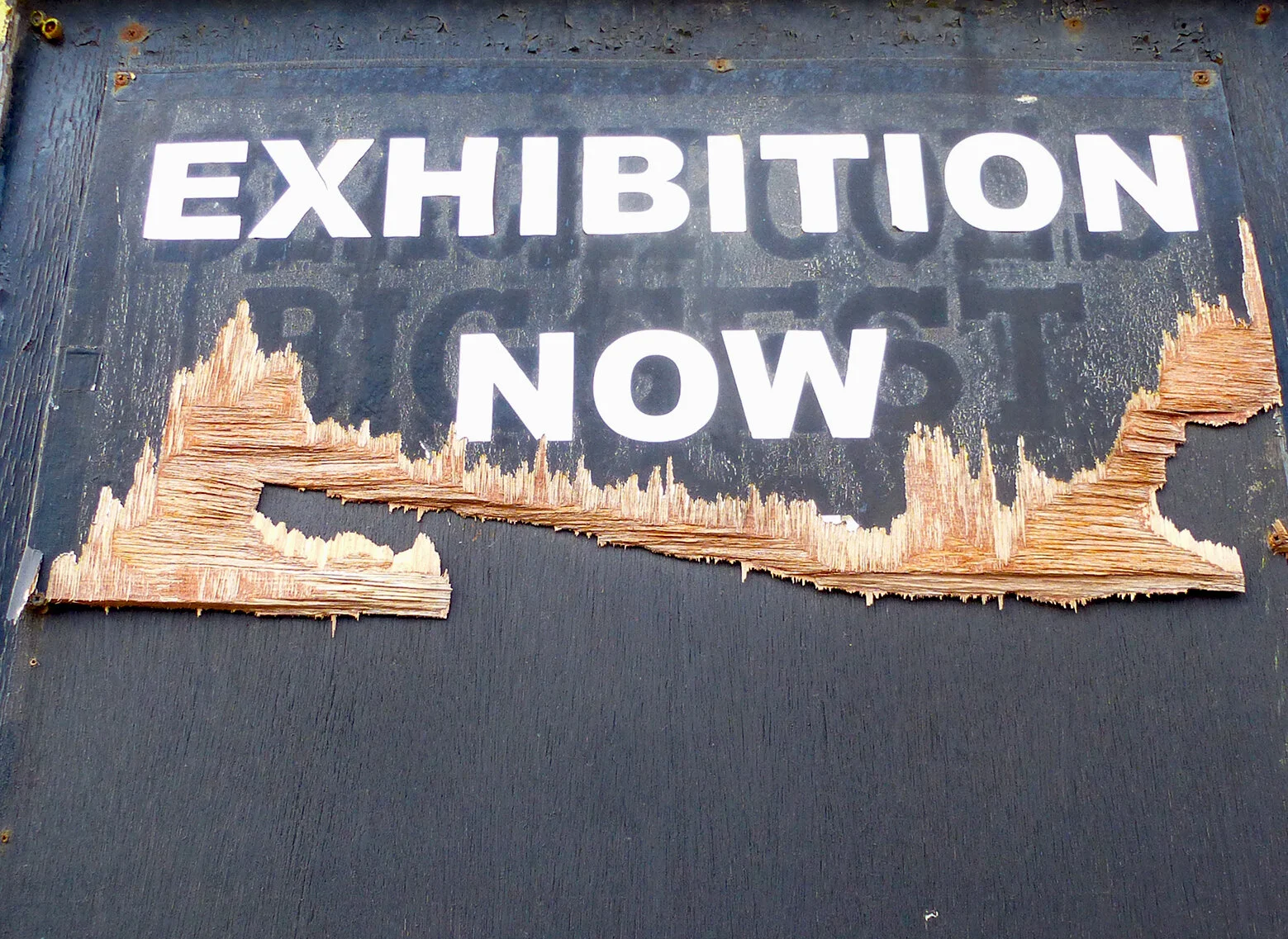
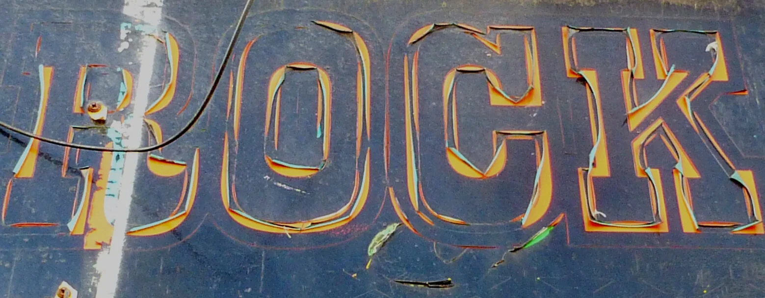
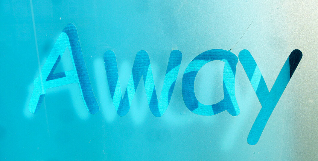
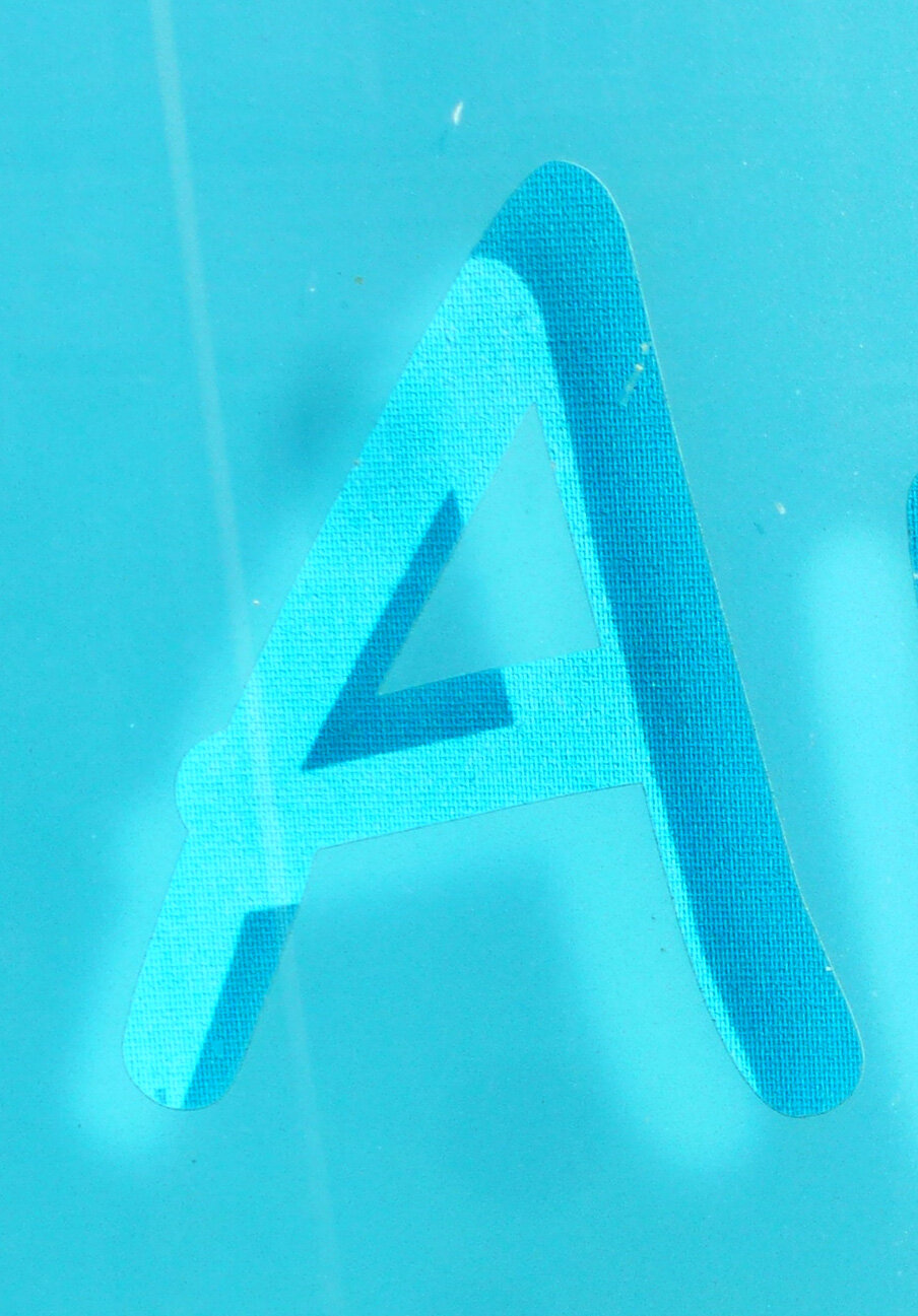
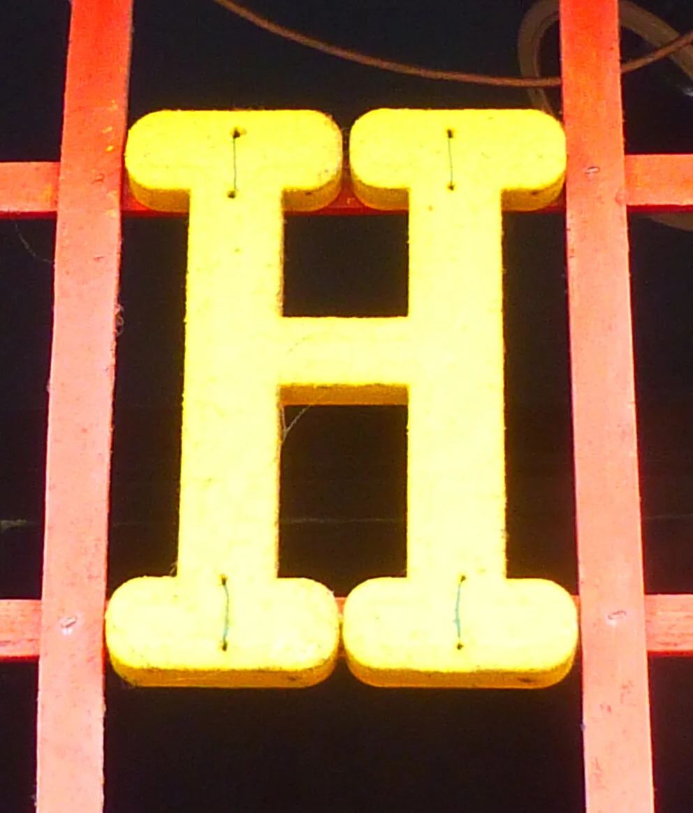
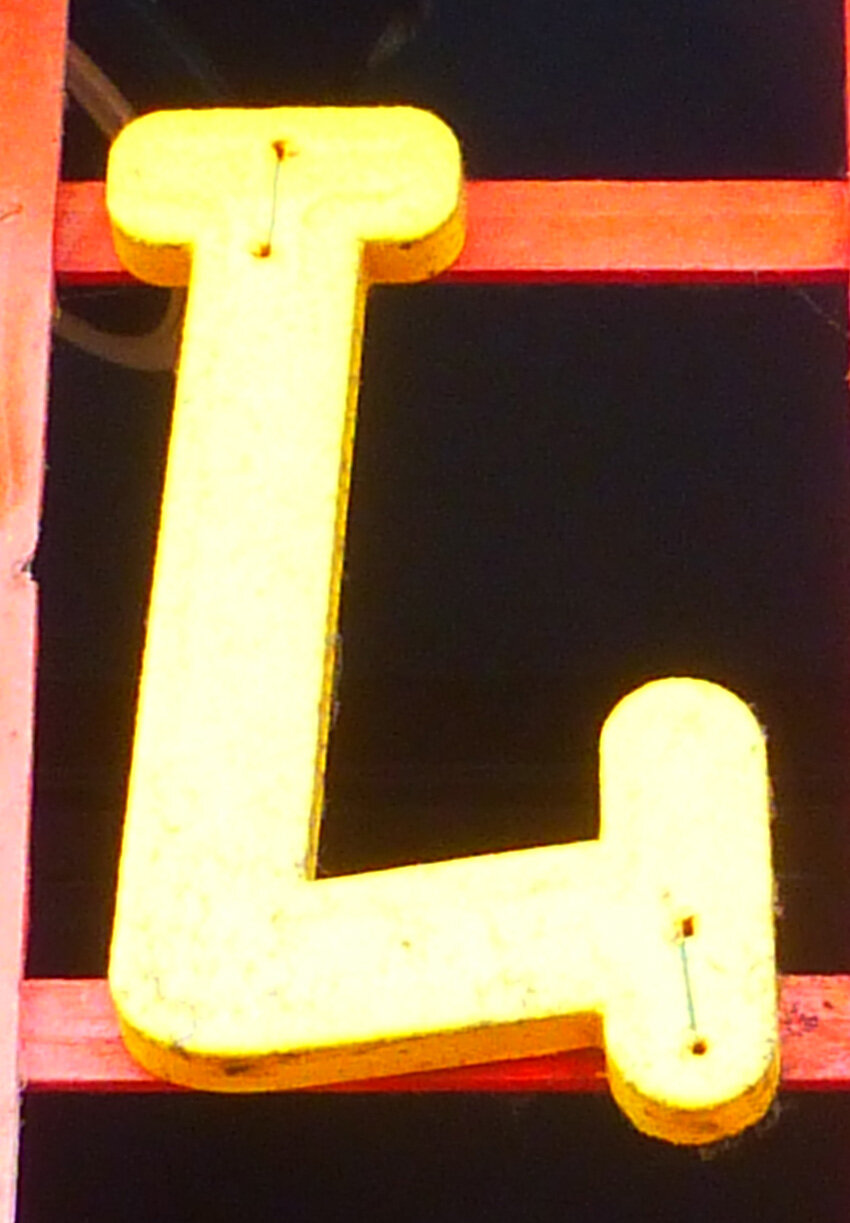
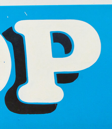
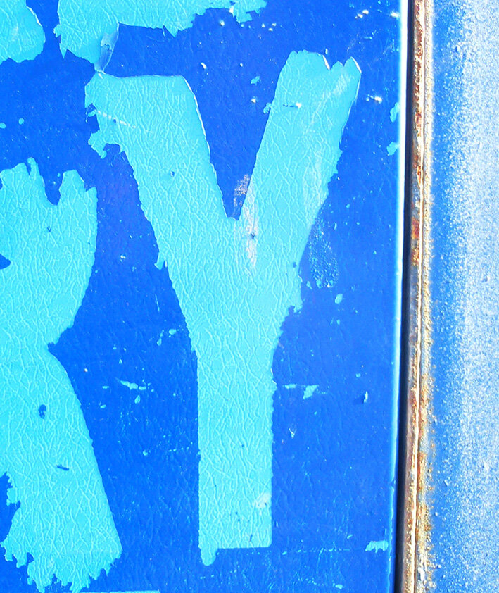
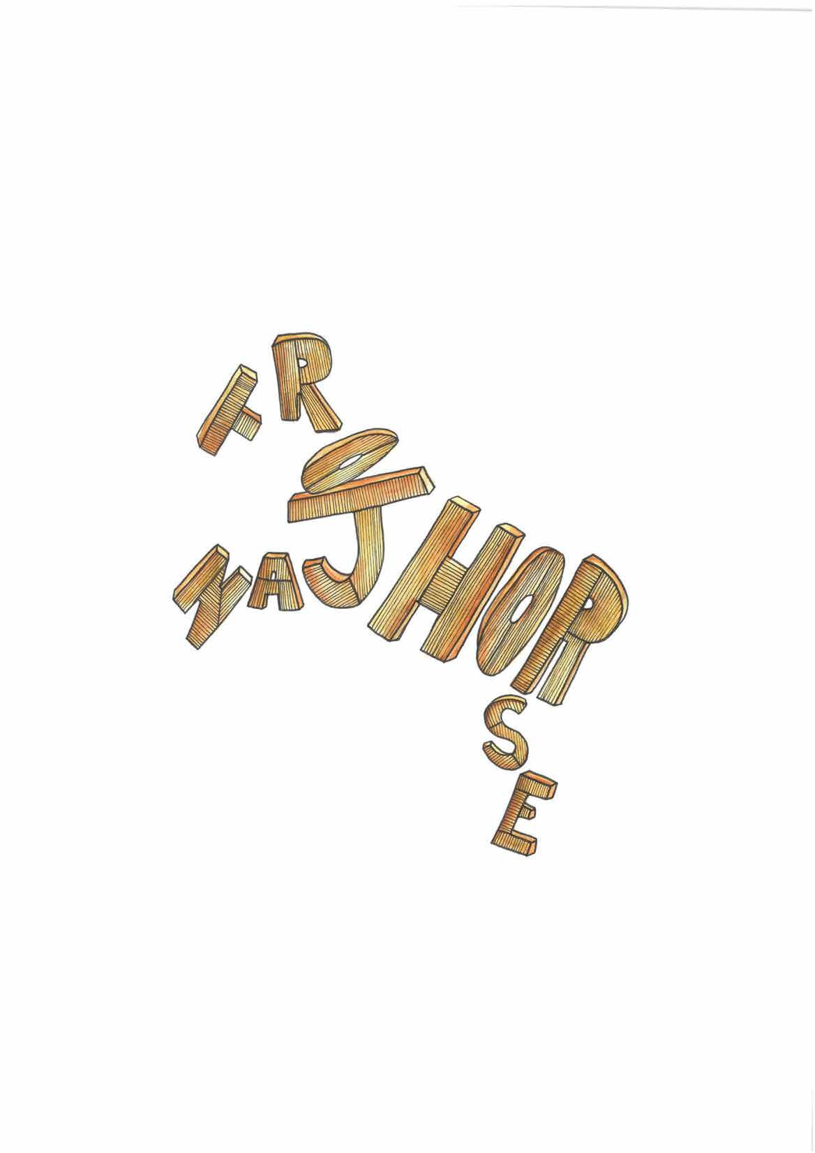
First years have recently taken part in the one week (ish) photography project. As may be apparent, this year we travelled to Blackpool and spent the day photographing typography both old and new, cherished and forgotten, shiny and faded… The idea was for pairs of students to create a Blackpool A-Z between themselves, and then recreate a joke or catchphrase from the comedy carpet in their new font. A few examples of which are below.
Blackpool is a typographical treasure trove, and it is one of a few locations from which you can create a real sense of place. Truly, the type found here will exist nowhere else. There is a further extension to this project, as the tutors wish to tile the new re-imagined quotes together into a new version of the carpet. This is both in homage to the carpet as is, but also to the visual wonder of Blackpool and its type.


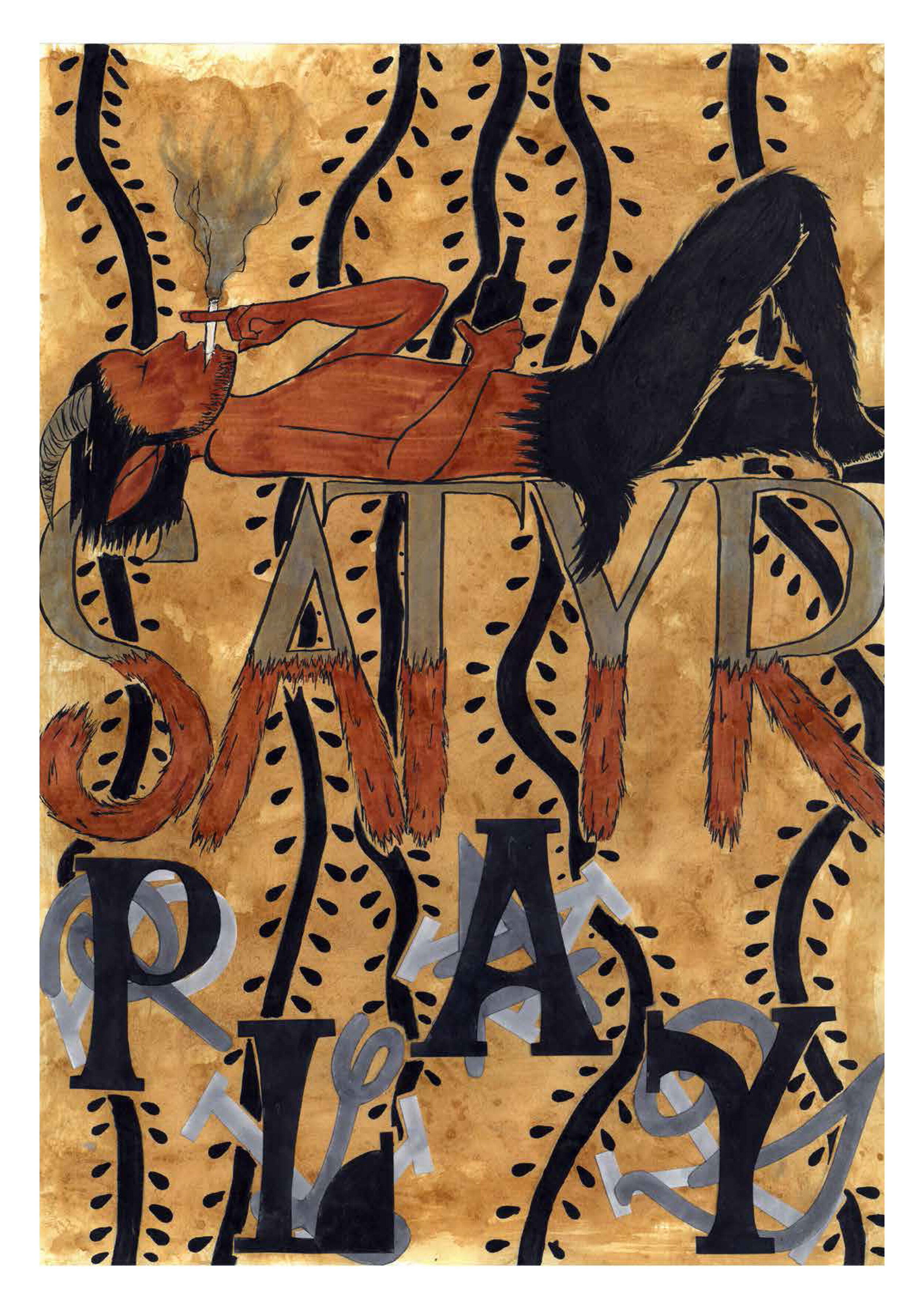
Here we feature a few of the design developments from our 2nd year graphics students who are currently producing a series of posters based on key Bauhaus practitioners. These will then form part of a limited edition box set/coffee table book.
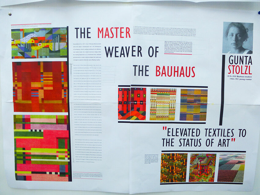
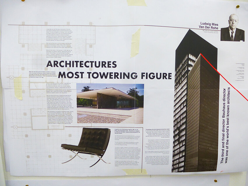
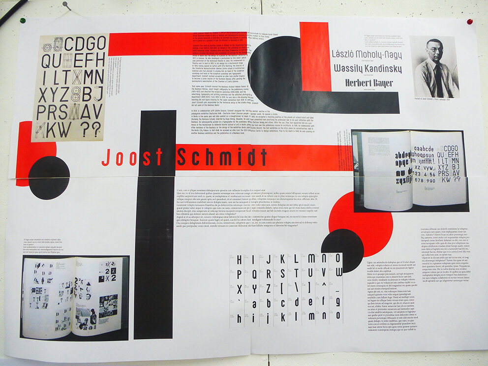
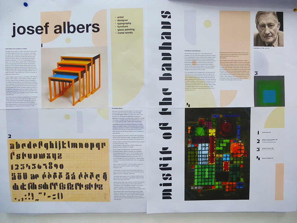
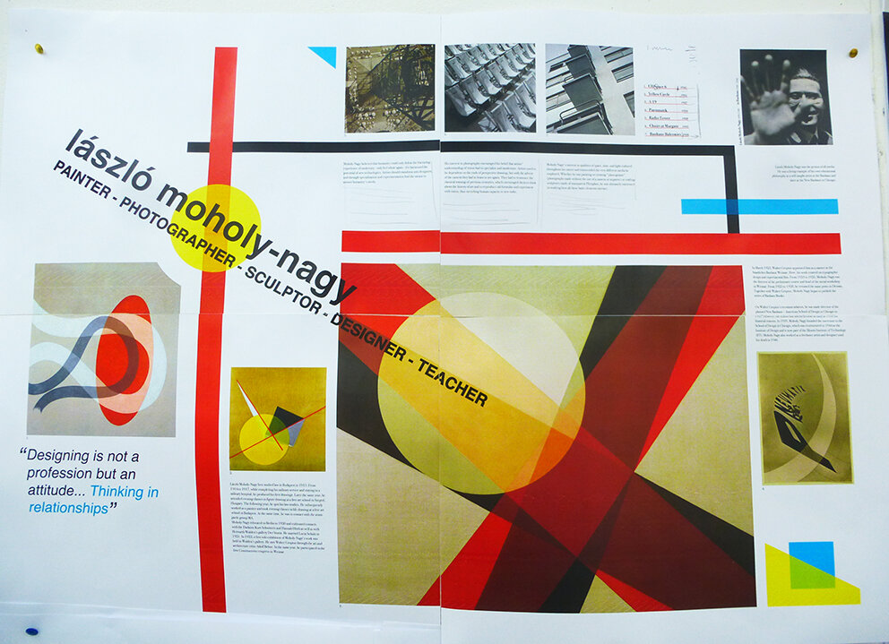
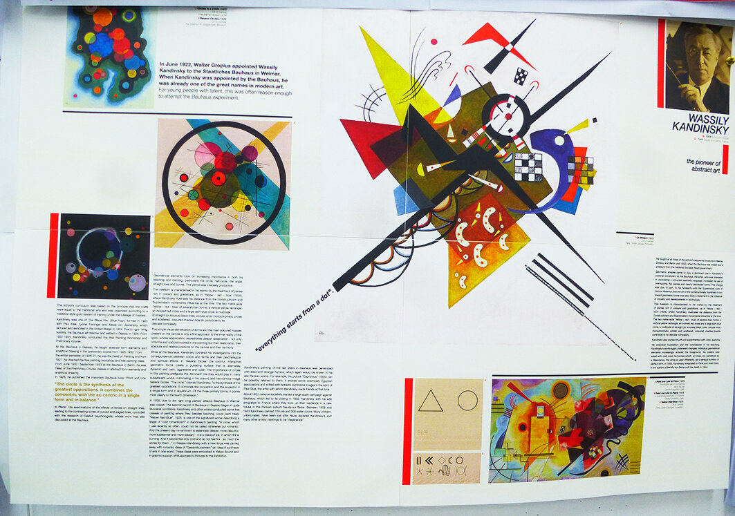
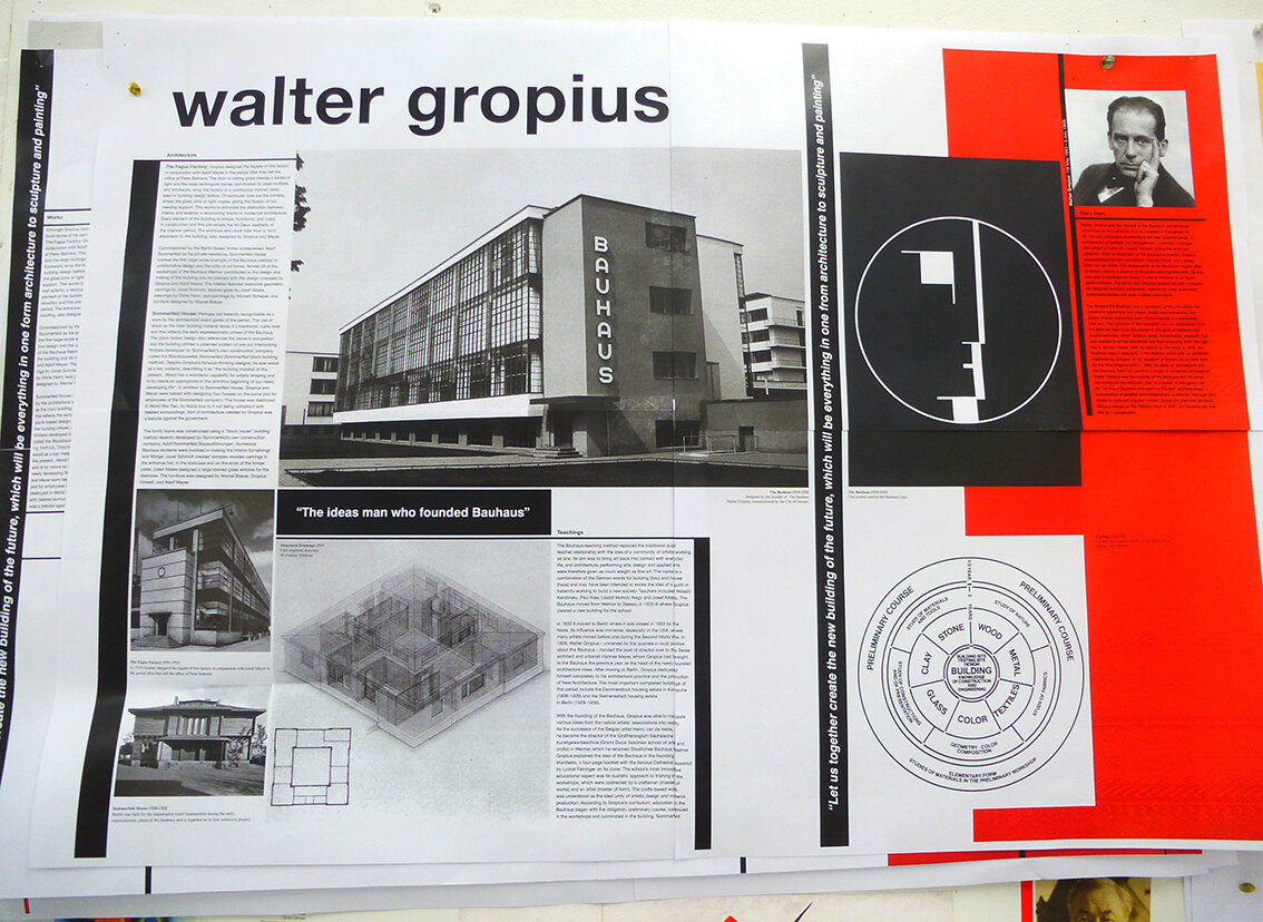
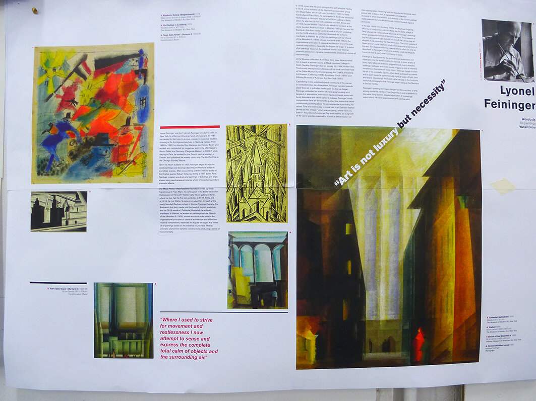
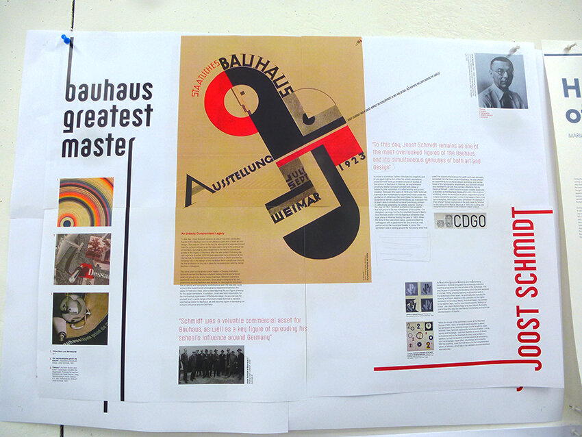
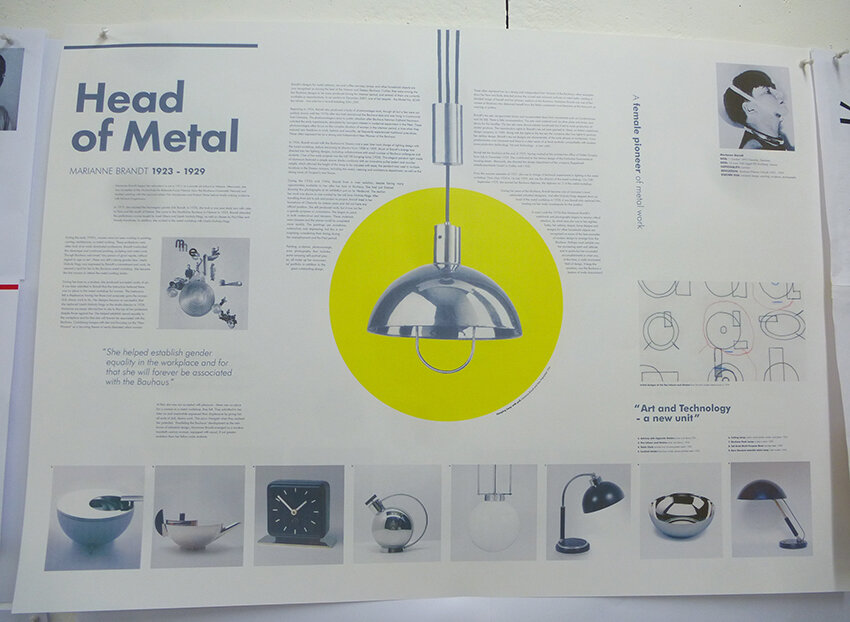
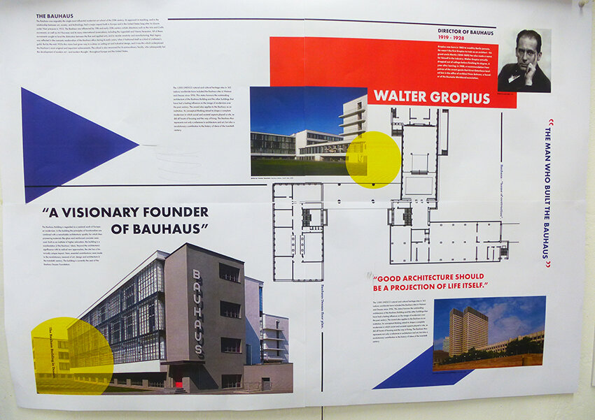
Final crit tomorrow so we will post the finished articles soon after.
Building on last week’s post, here we share some more photography from Blackpool. The aim was simply to capture the essence and sense of the town.
Yesterday the first year graphics students and staff visited Blackpool to capture some of the unique typography that adorns the town’s facades. This post is the first of many that will document the results of what was observed and captured on the day.

























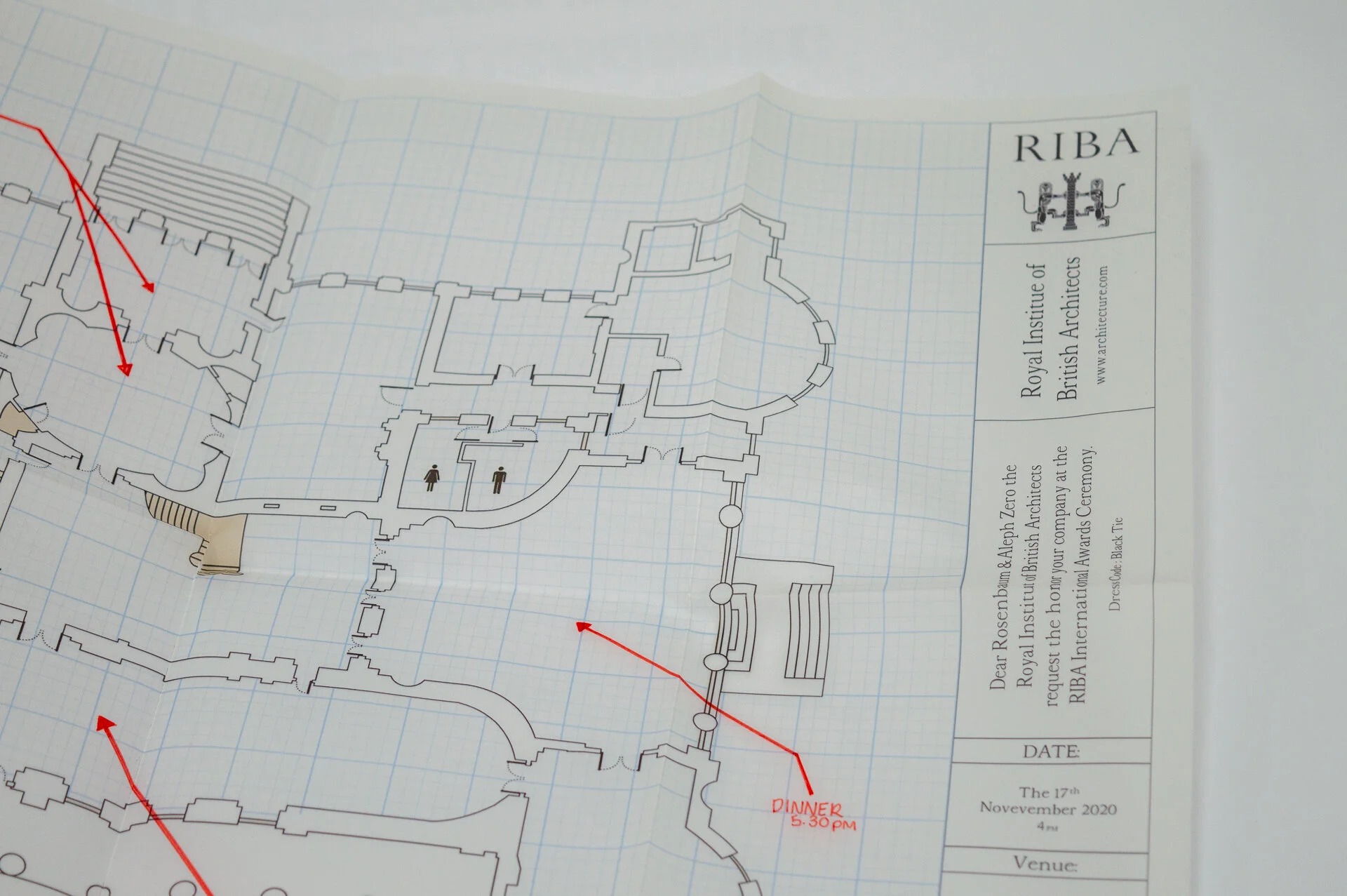
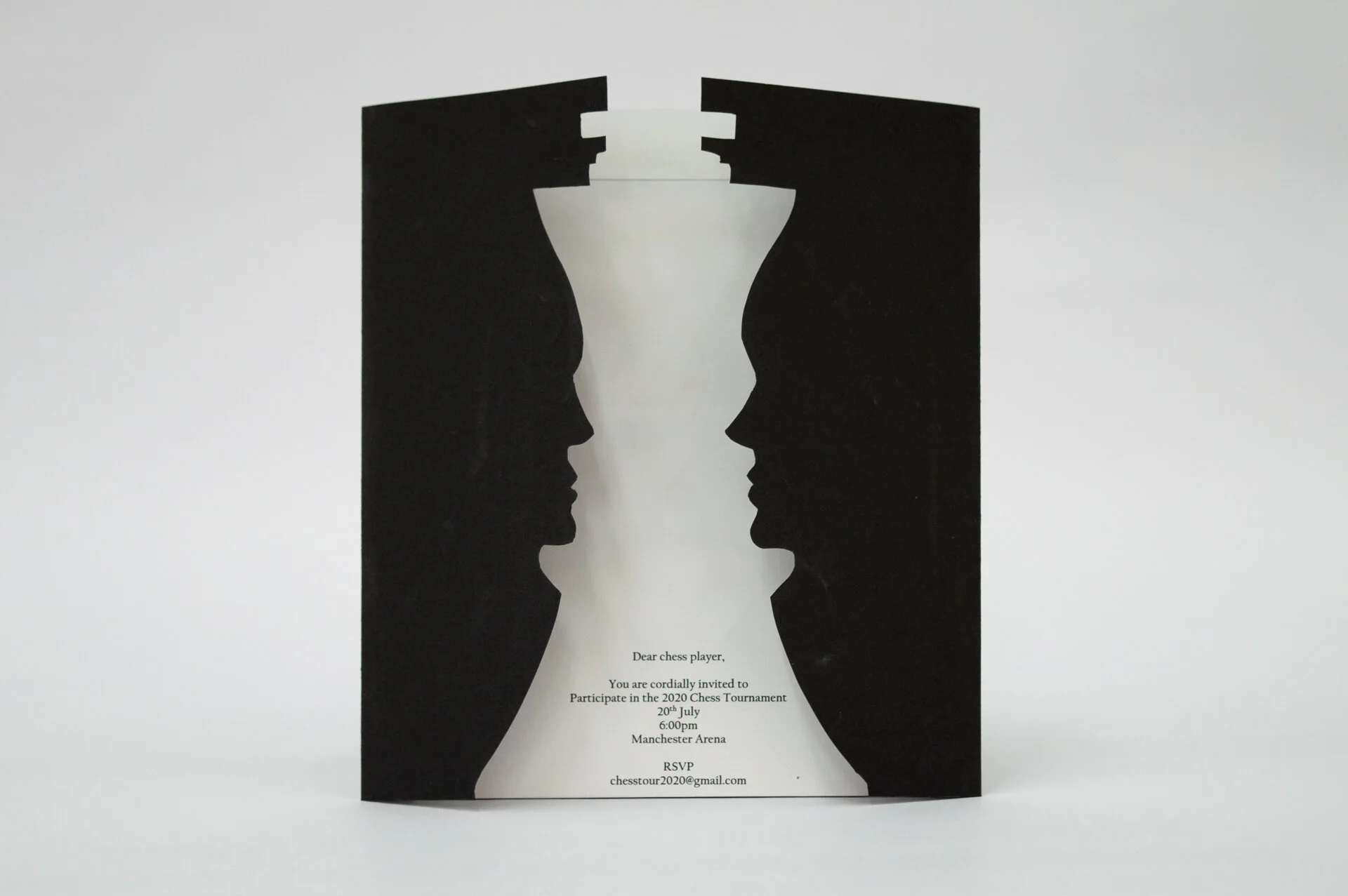
The graphic design first years have recently completed their fourth creative brief roughly halfway through their first semester here at Preston. The latest task was to produce a creative fold in response to a given client in the context of an event or notification of some sort. An awards ceremony, a party or an office move were all potential examples.
Whilst there is plenty of room for crafting, re-crafting and crafting some more; staff were all pleased with the variety of responses and also the appropriateness of the idea in relation to the given client. Also pleasing was the evident consideration given to copywriting and how that interplayed with the fold, or reveal mechanism.
The below examples are shown based on their idea, fold and mechanism. But to reiterate, all will need varying degrees of further applied craft and design.

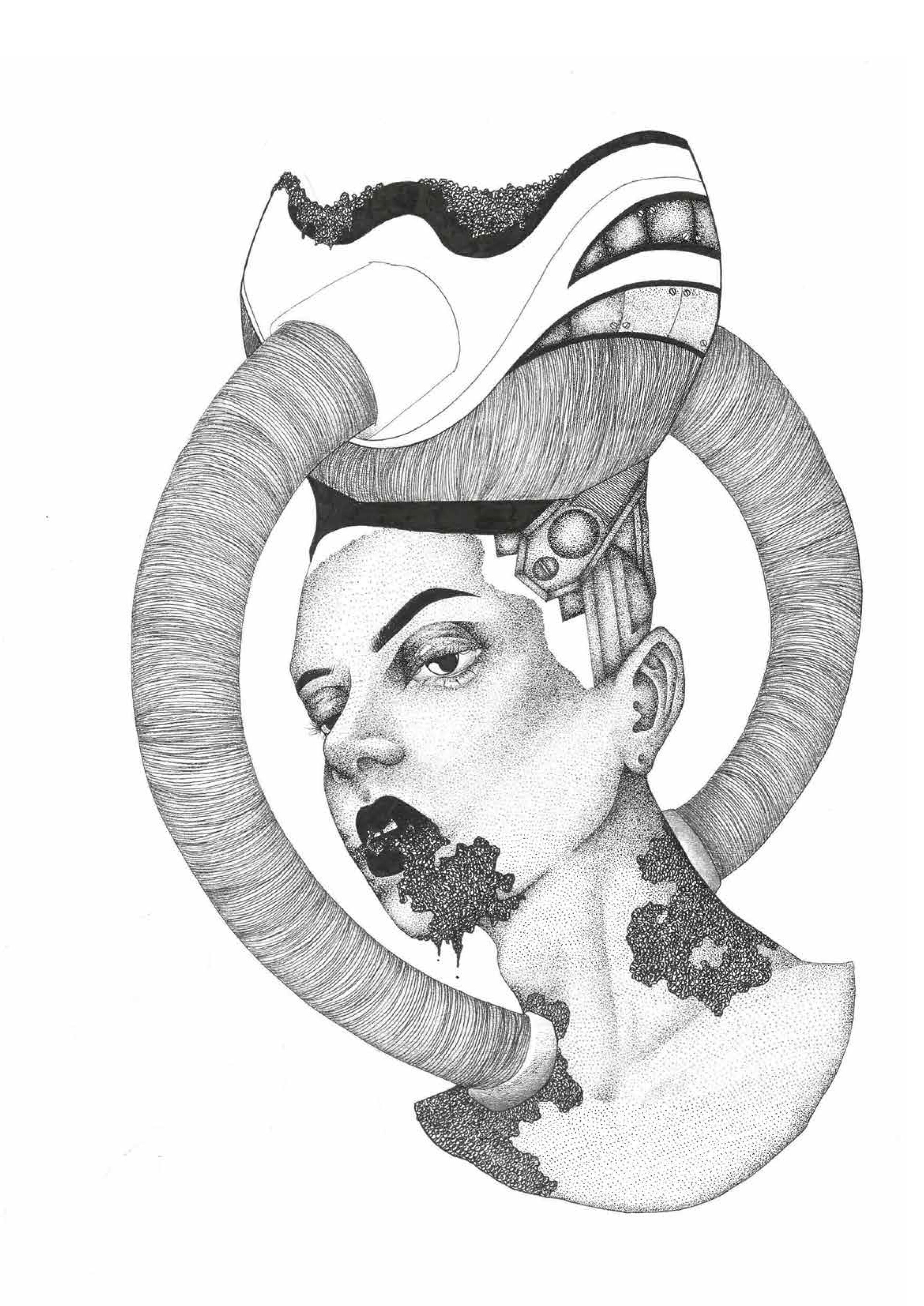
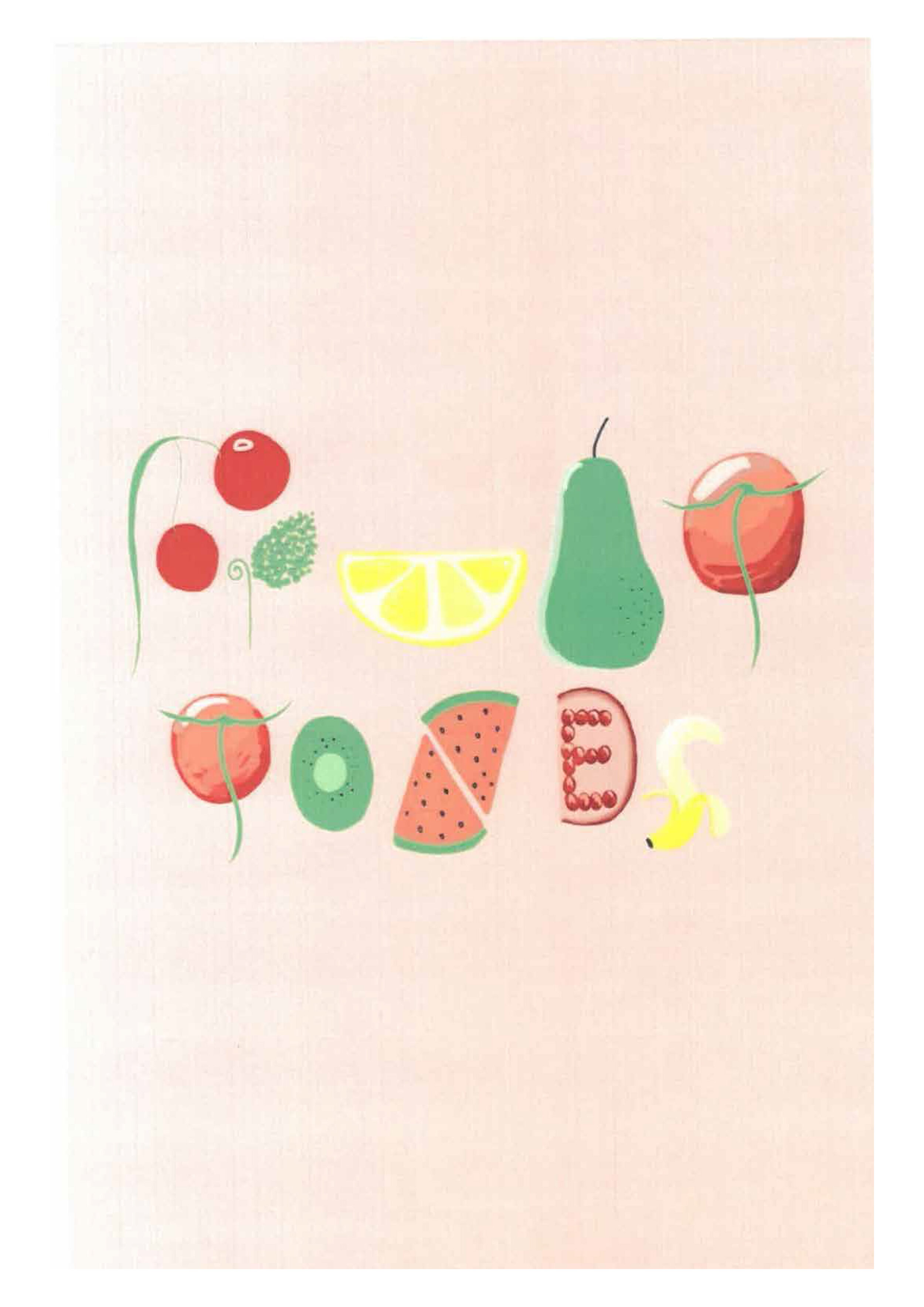
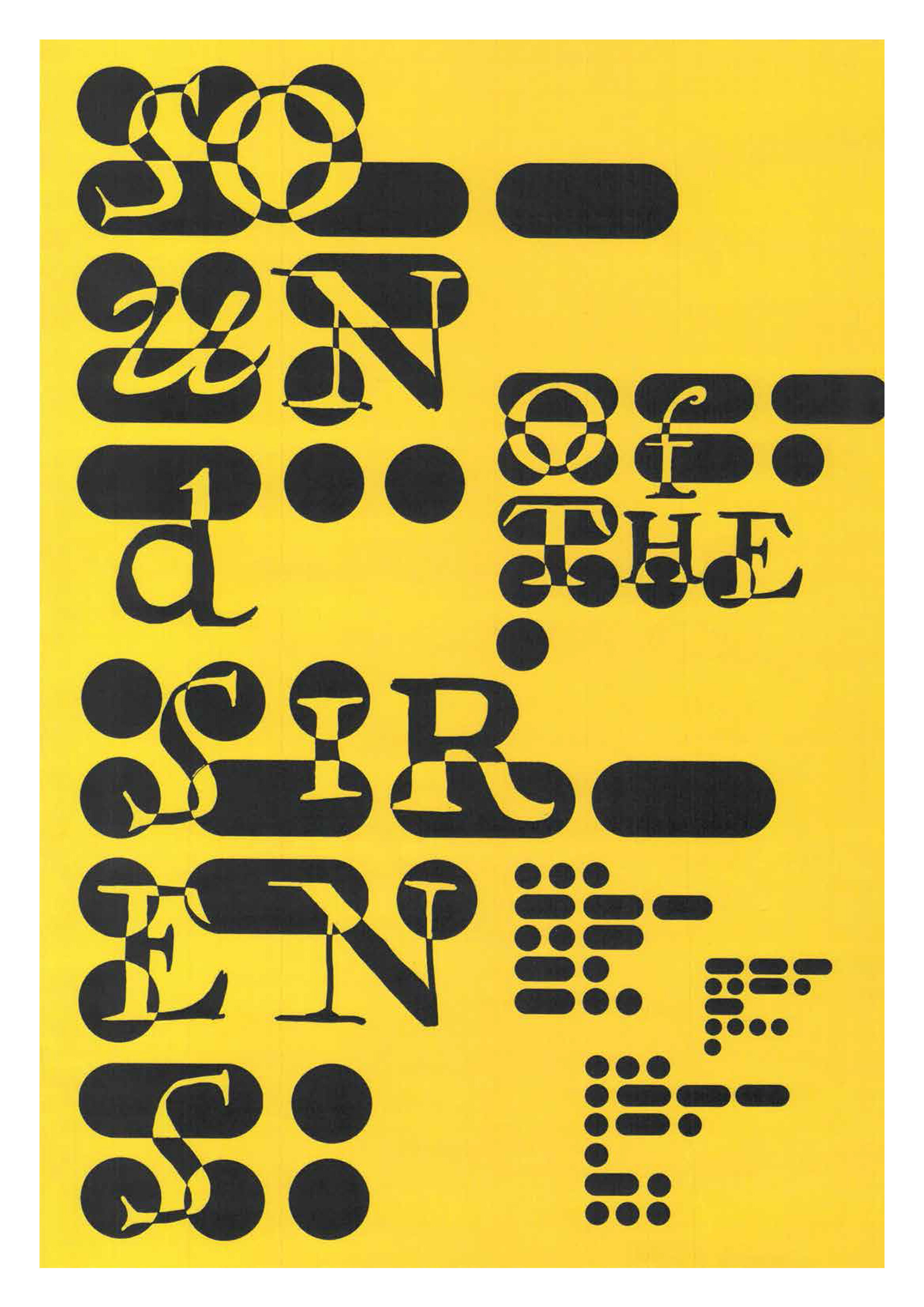
Here we feature some posters created by Year 1 Illustration students. They were each briefed with a band name from upcoming gigs at The Ferret, and asked to design a new poster for them. A range of drawing, techniques and wit on display. Enjoy.





Click the below students to see their presentations created for the first crit of their industry brief module. Bear in mind pertinent research, insights and reference; as well as initial thoughts, ideas and design directions.

The above extract is from Sarah Gregory’s current placement review as she nears the end of her 2 month stint at Glorious Creative, click here to read the full blog post.
The first years have recently finished their one week image brief, and some of the better solutions are shown below. Overall this has been the least well received of the three briefs. As the projects come thick and fast, and each new one requires slightly more input than the last, the intervening days between the briefing and the workshop offer a chance for students to get ahead.
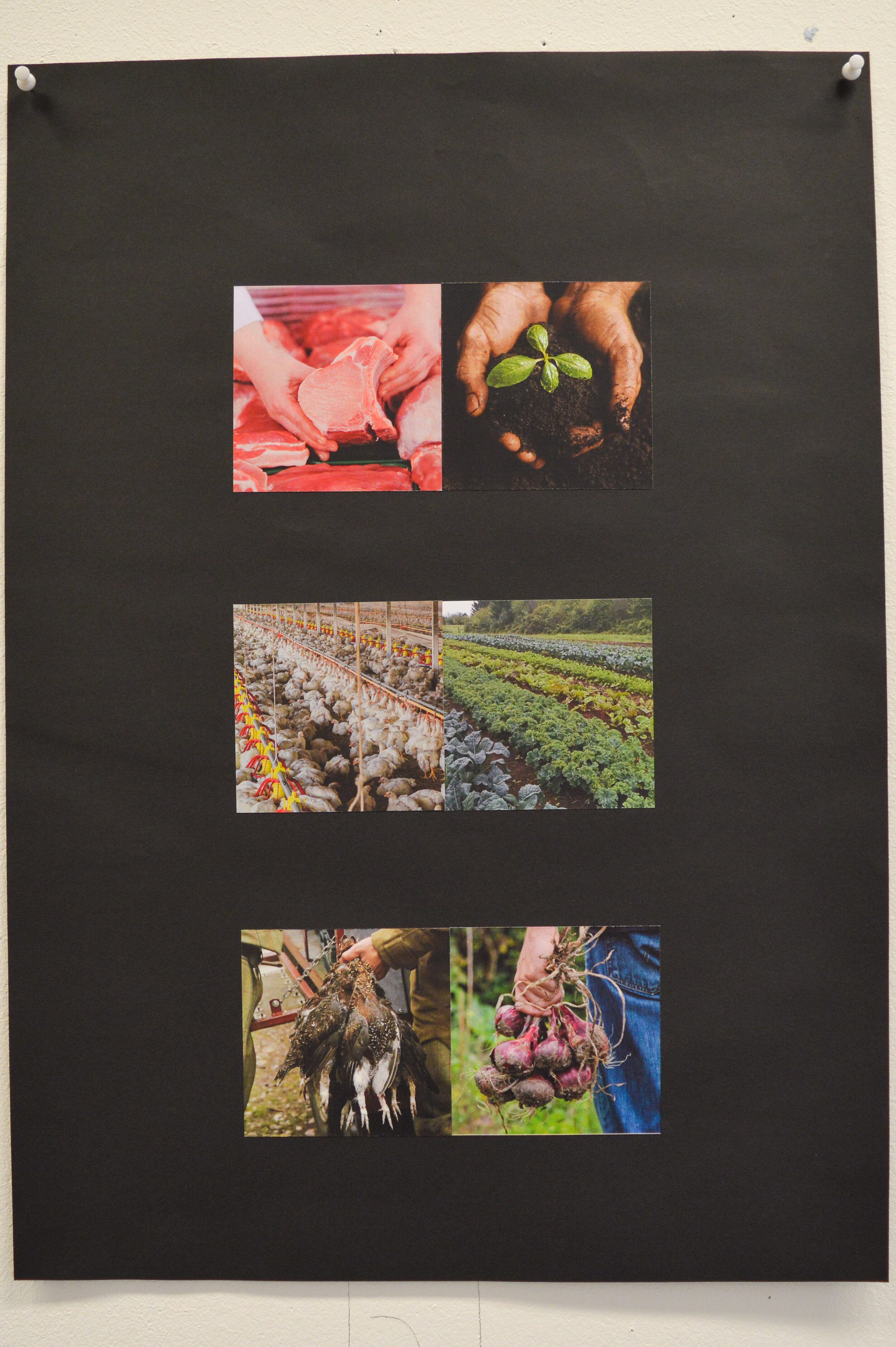
Each student was given a pair of words which they explored through the process of juxtaposing interesting and pertinent images. Not all students managed three pairs, or even two or one of a good standard. The above is a good example though. Note the balance of crops, the interplay between contrasting images where appropriate, and simply the choice of good quality photography.
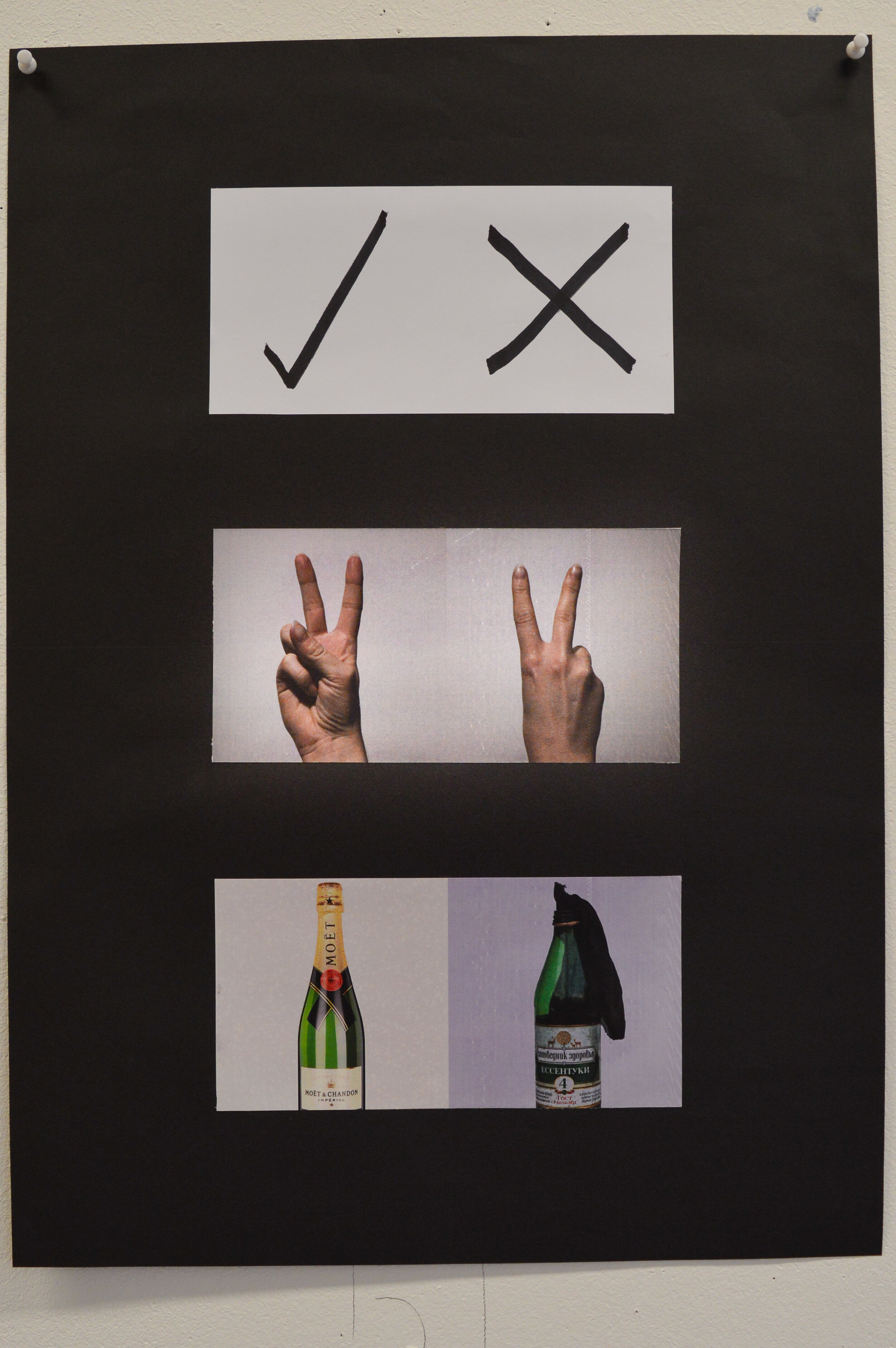
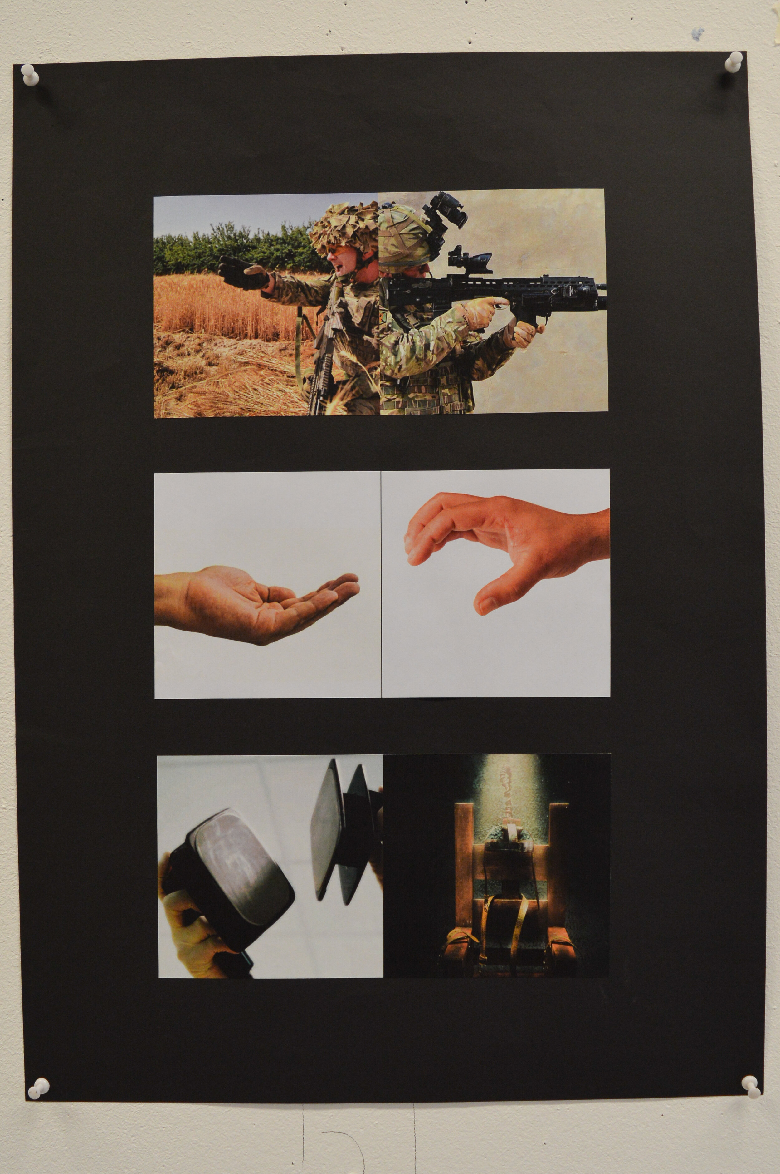
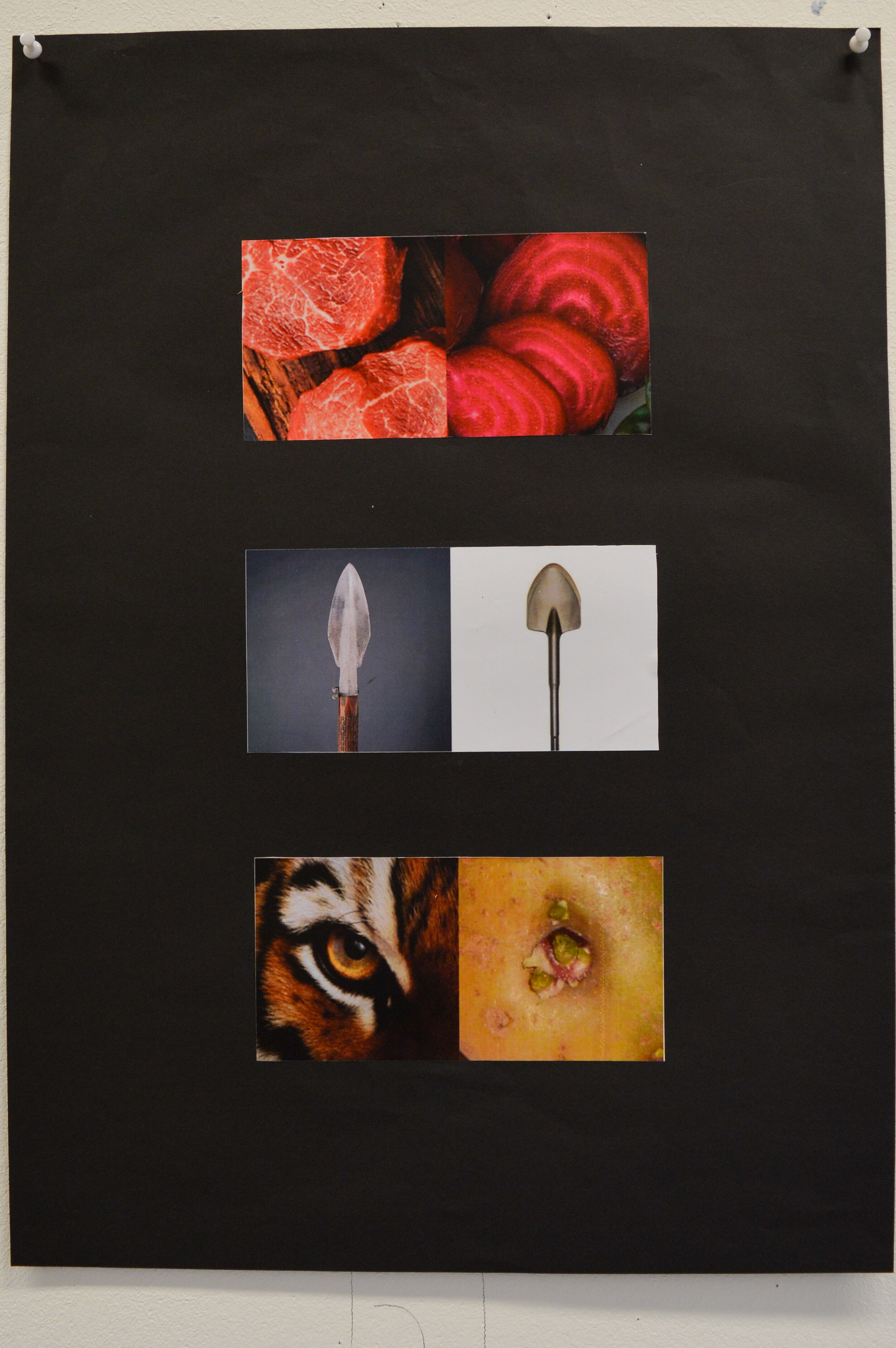
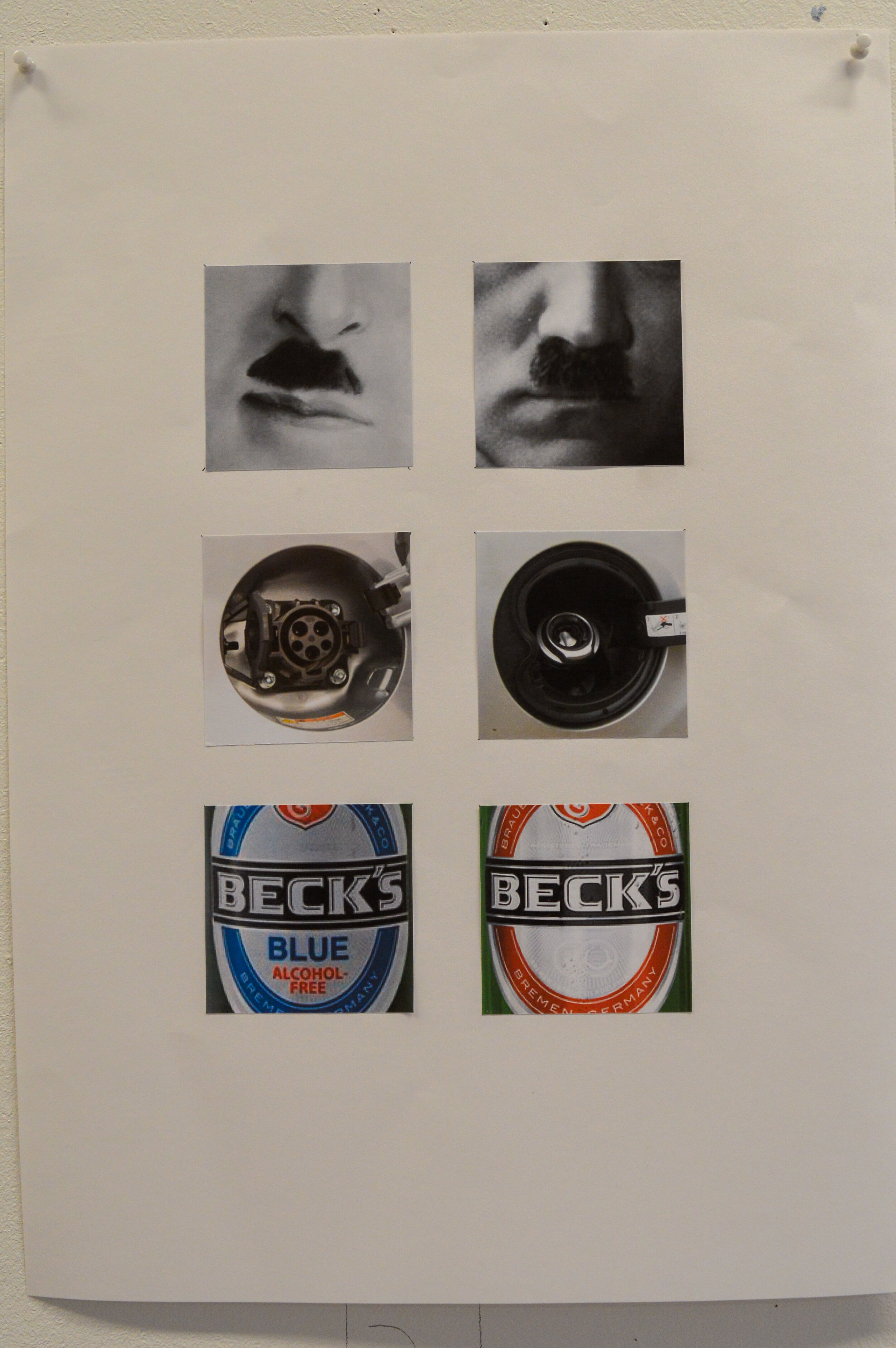
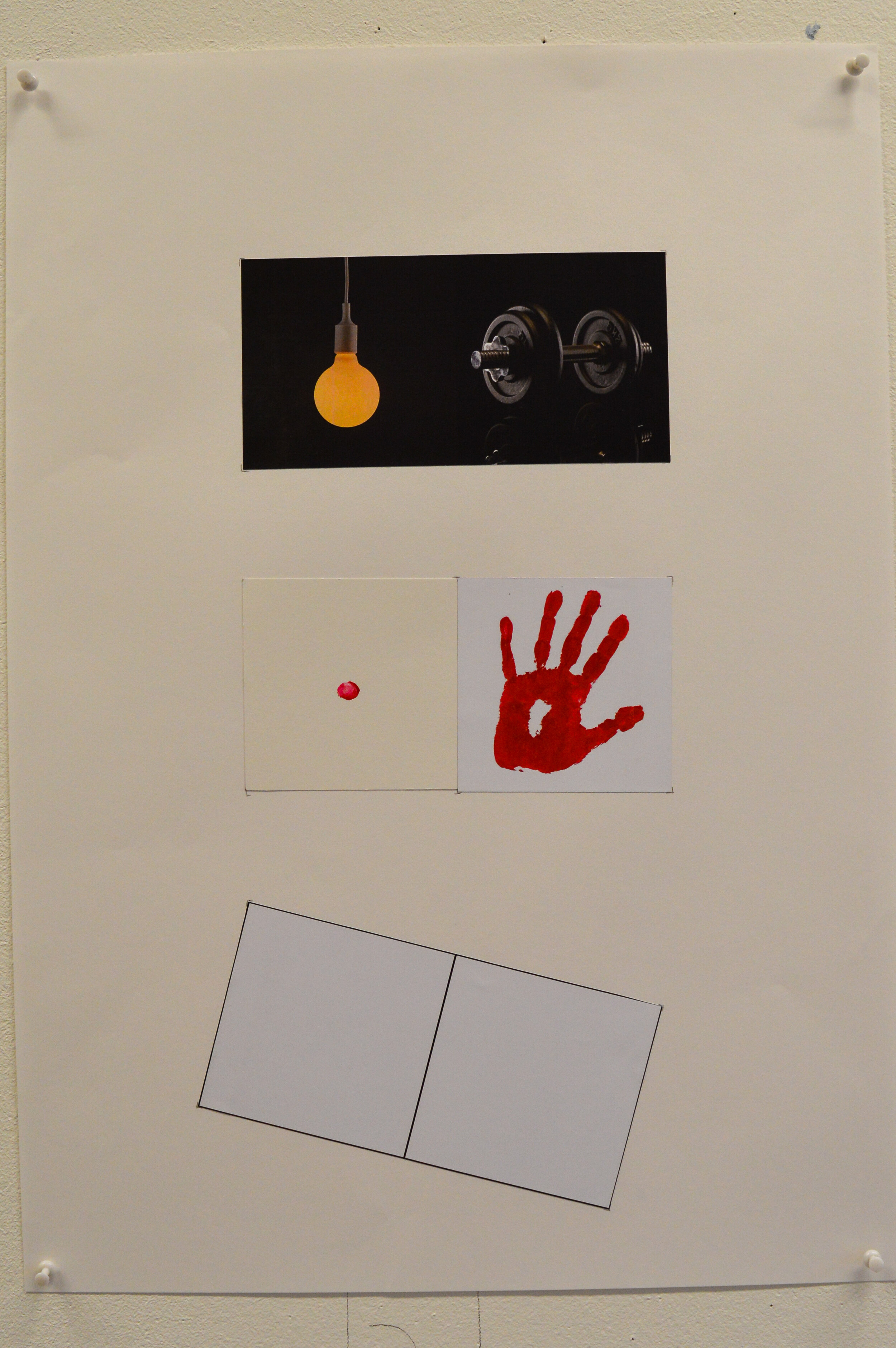
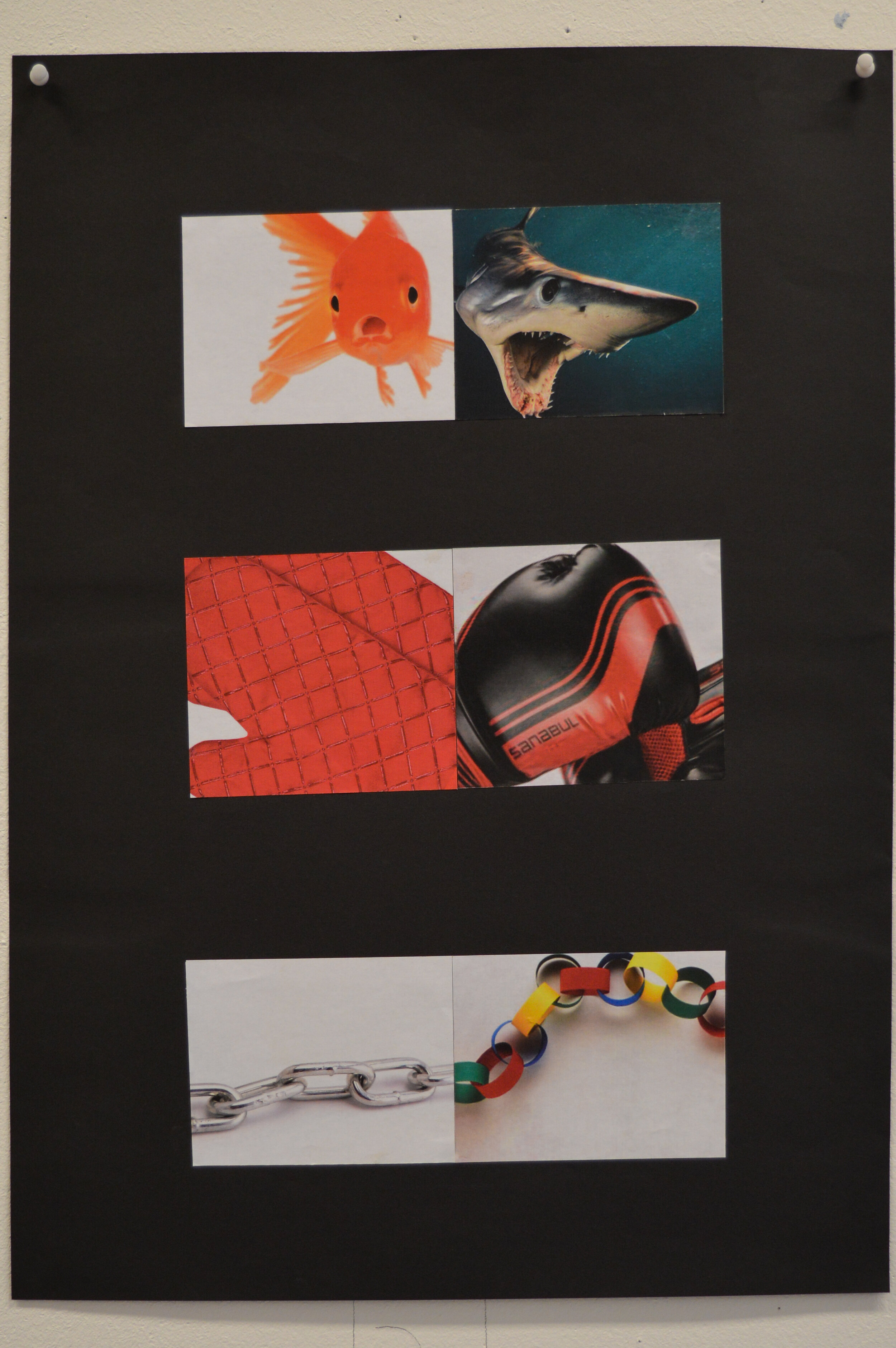
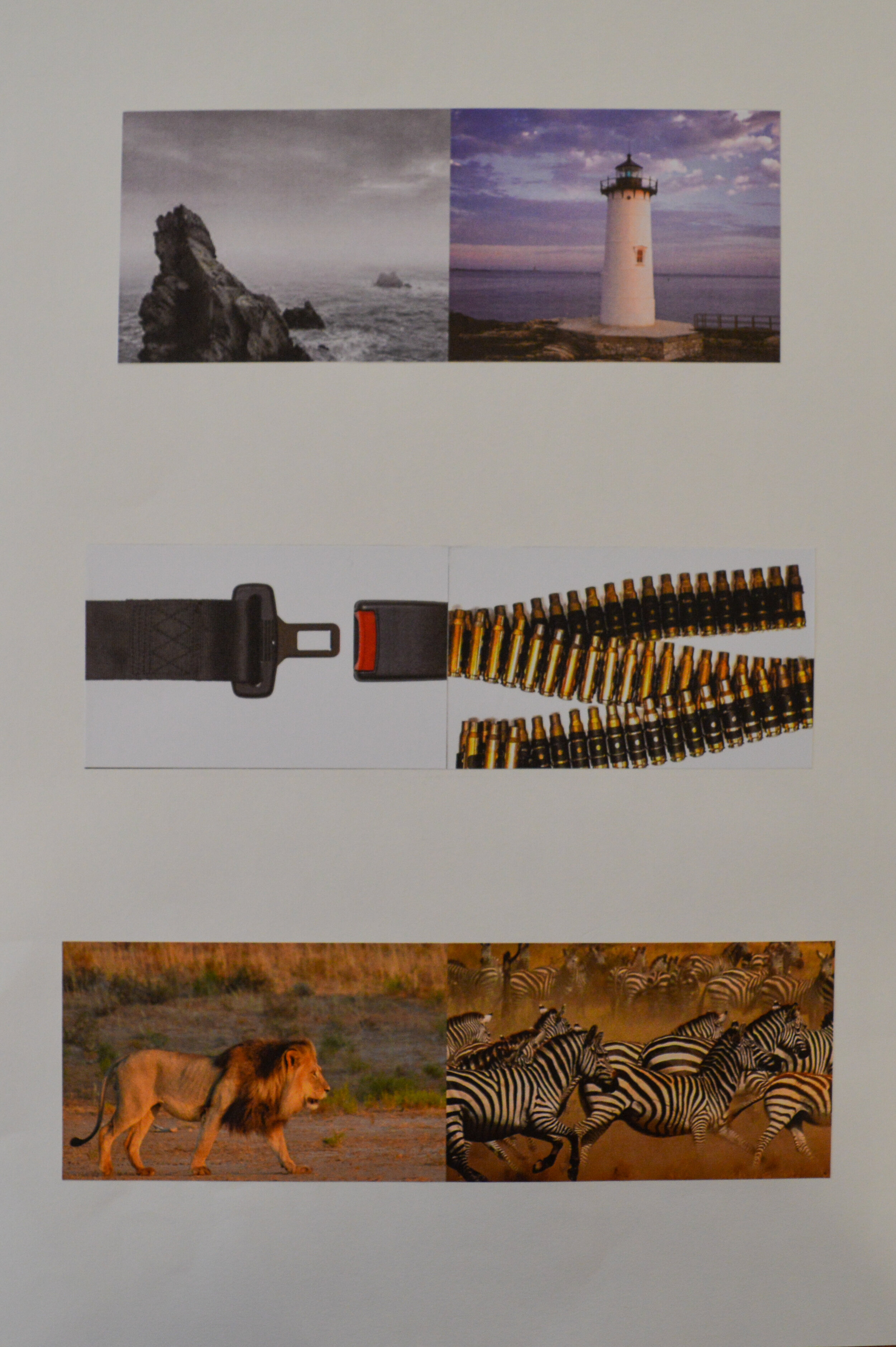
This is not an easy brief, and tutors were agreed that a large proportion of the cohort had not cracked it, yet. Most of the ideas were valid, but unfortunately image selection (and cropping) was not supporting the idea…thus leaving the viewer unmoved.
It was noticeable that a lot of solutions were the direct result of Google images and consequently suffered.
Some of the images presented were not shown as three pairs, but rather six individual crops which made any idea even harder to decipher.
As ever, staff look forward to seeing how these juxtapositions develop for final assessment.

The Disciples Of Design are a global collective of design academics, practitioners, artists and students. We have one common thread – University of Lancashire in Preston, UK; and one common aim – the creation of an ever evolving visual hub for the sharing of ideas and thoughts.