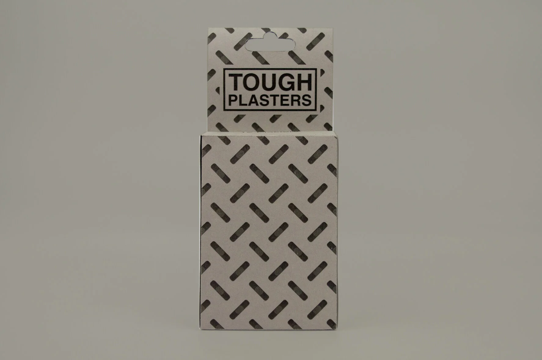
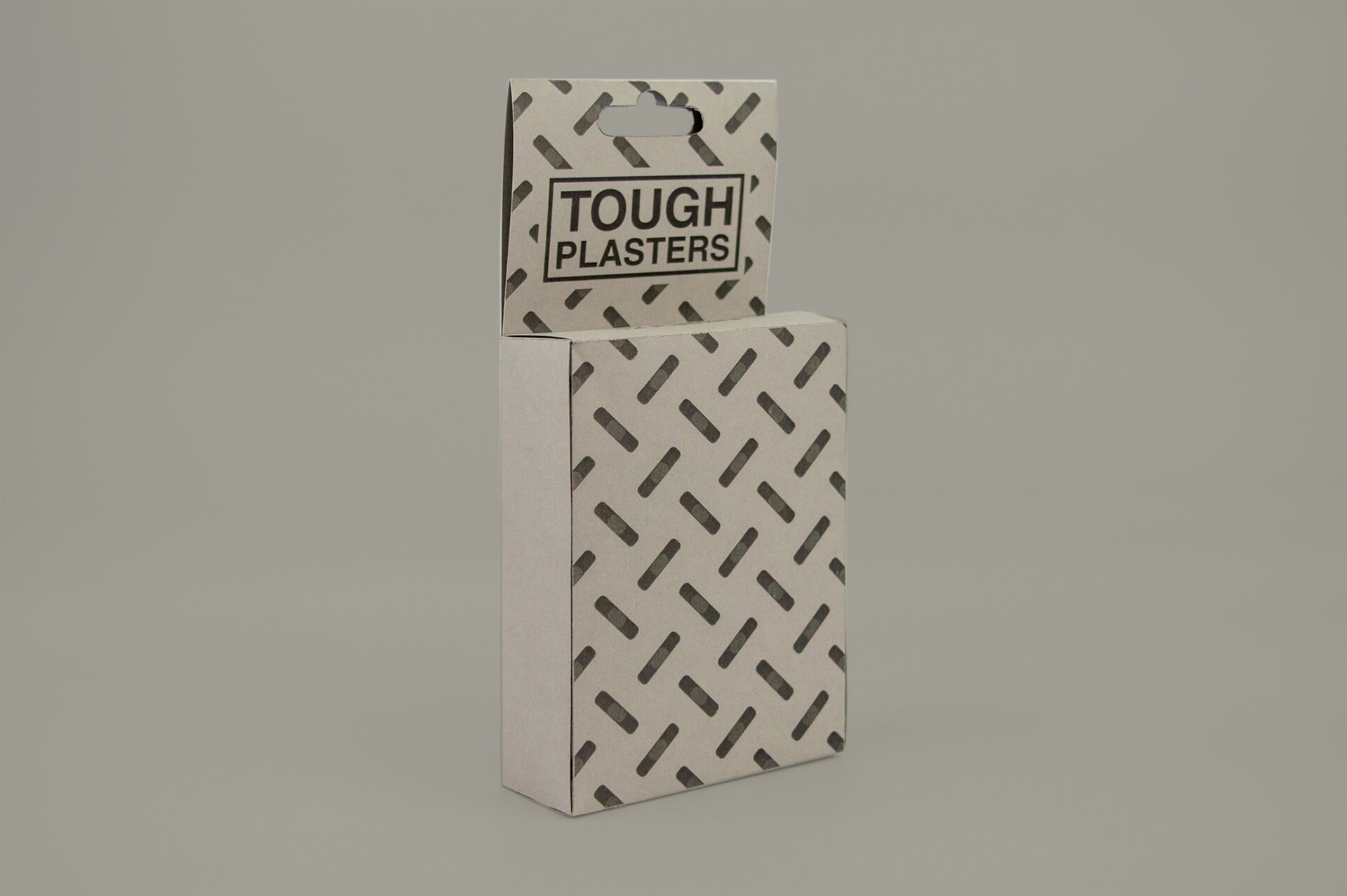
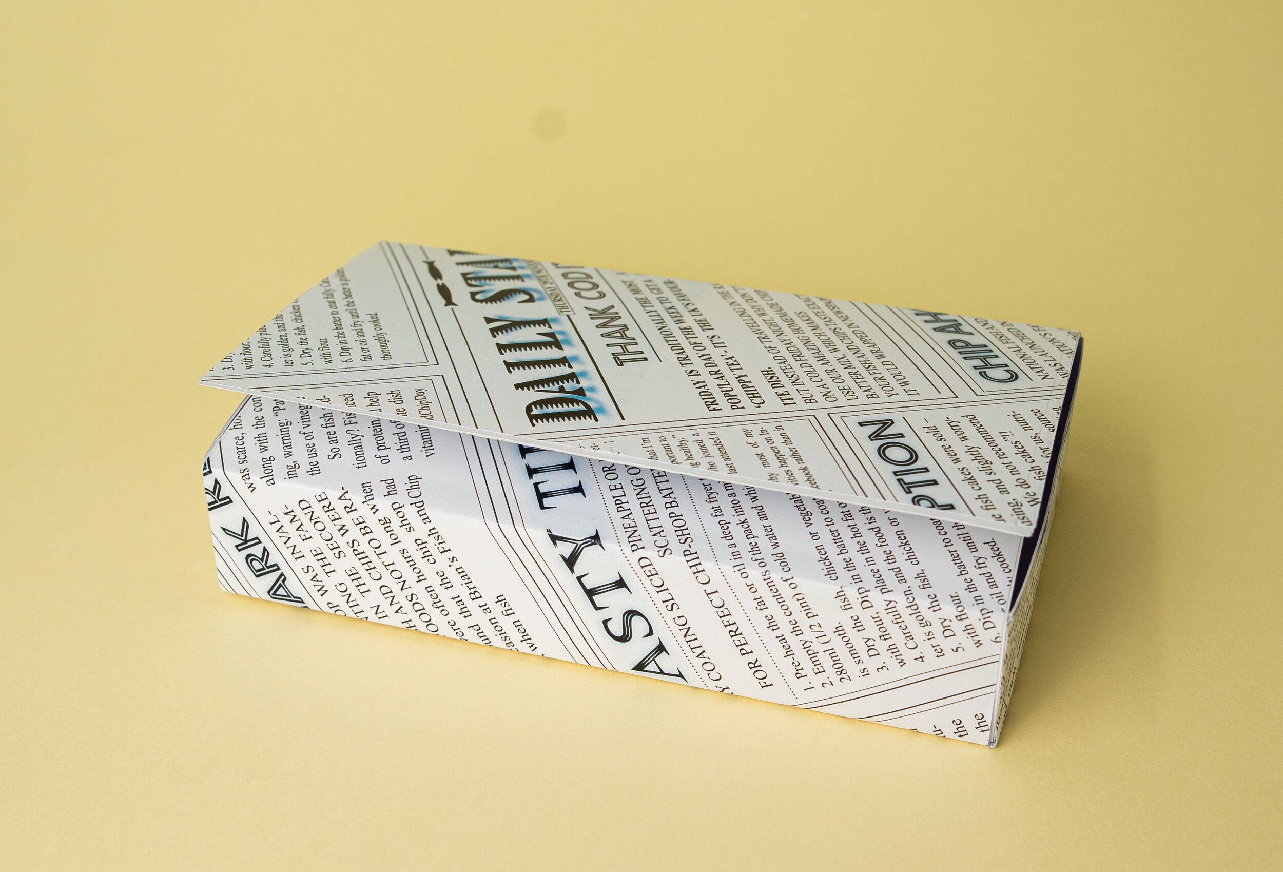
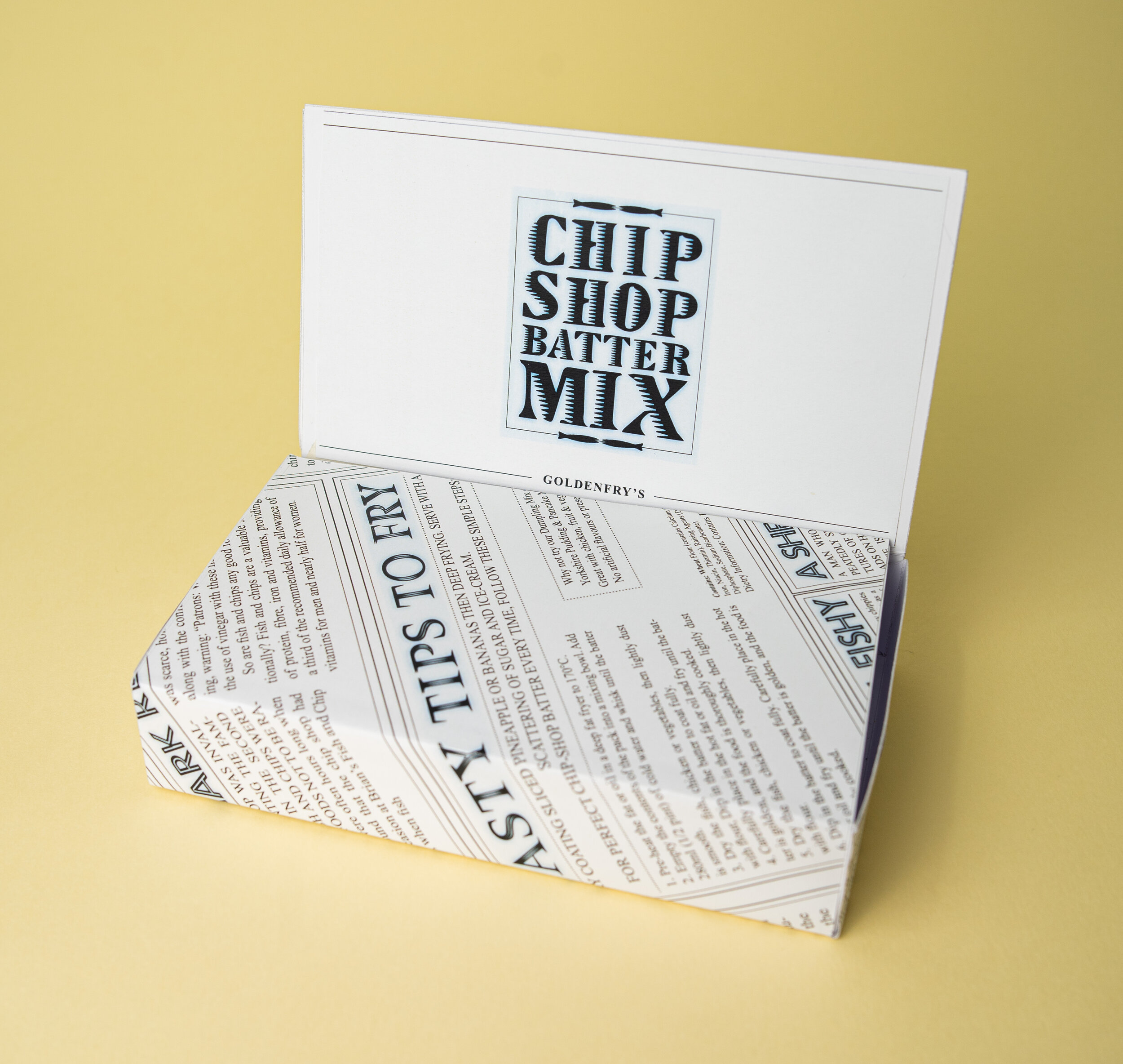
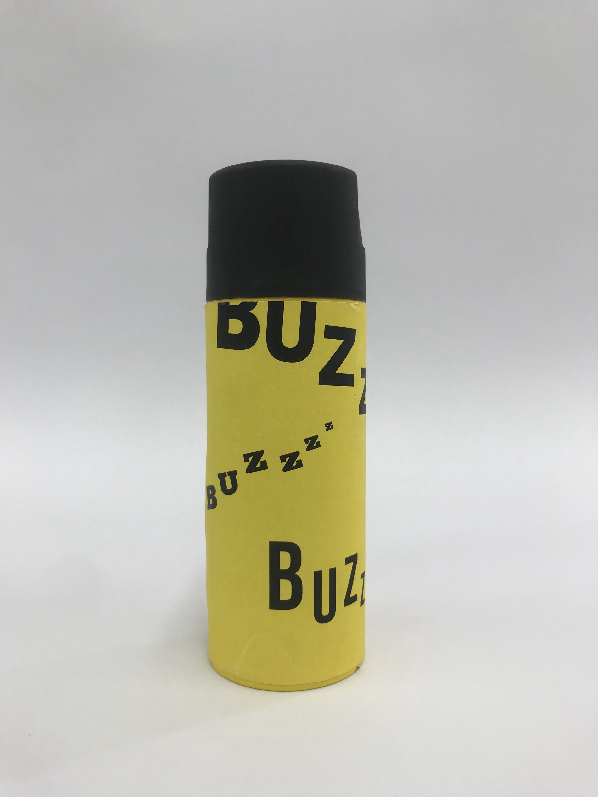
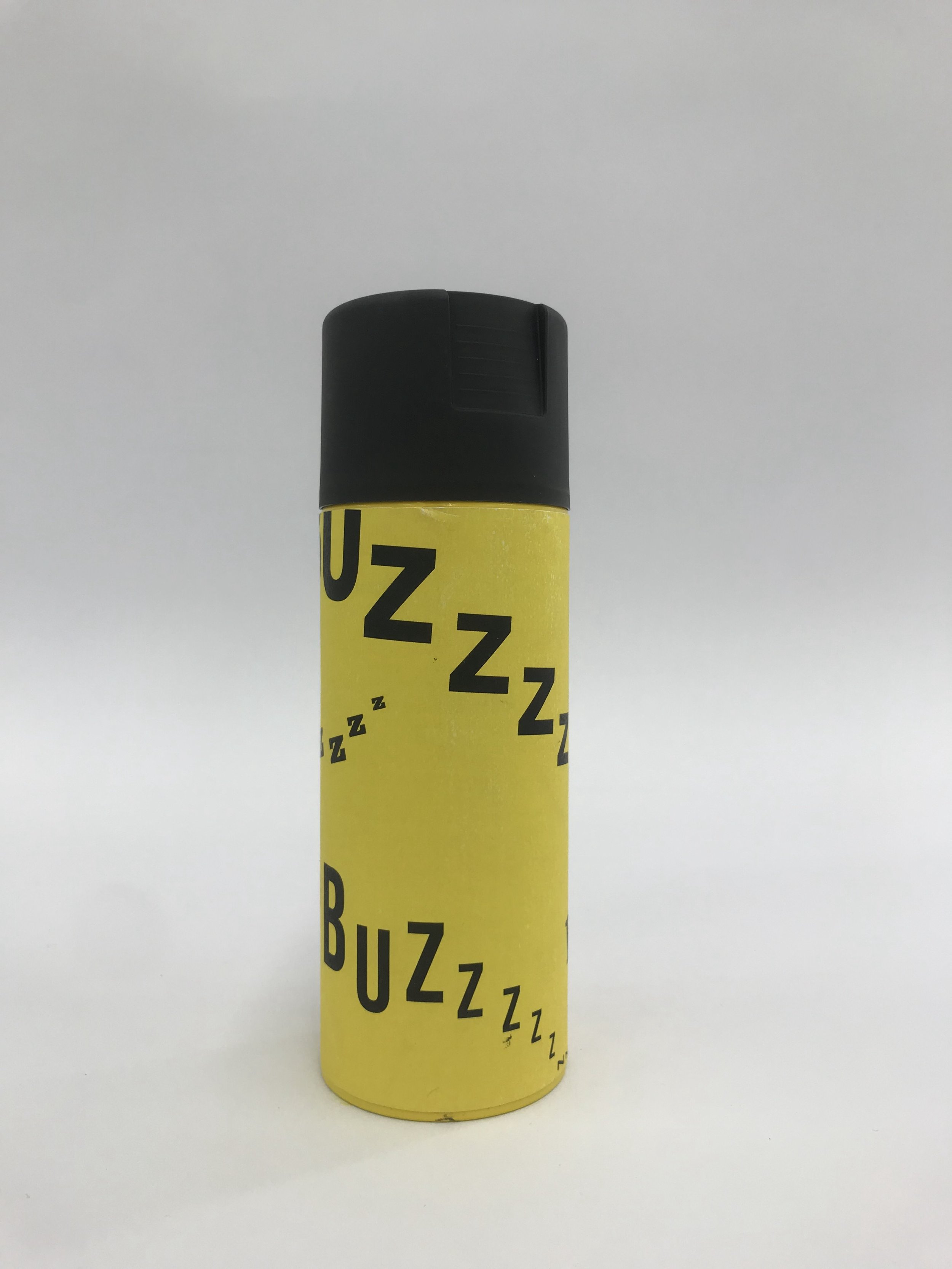
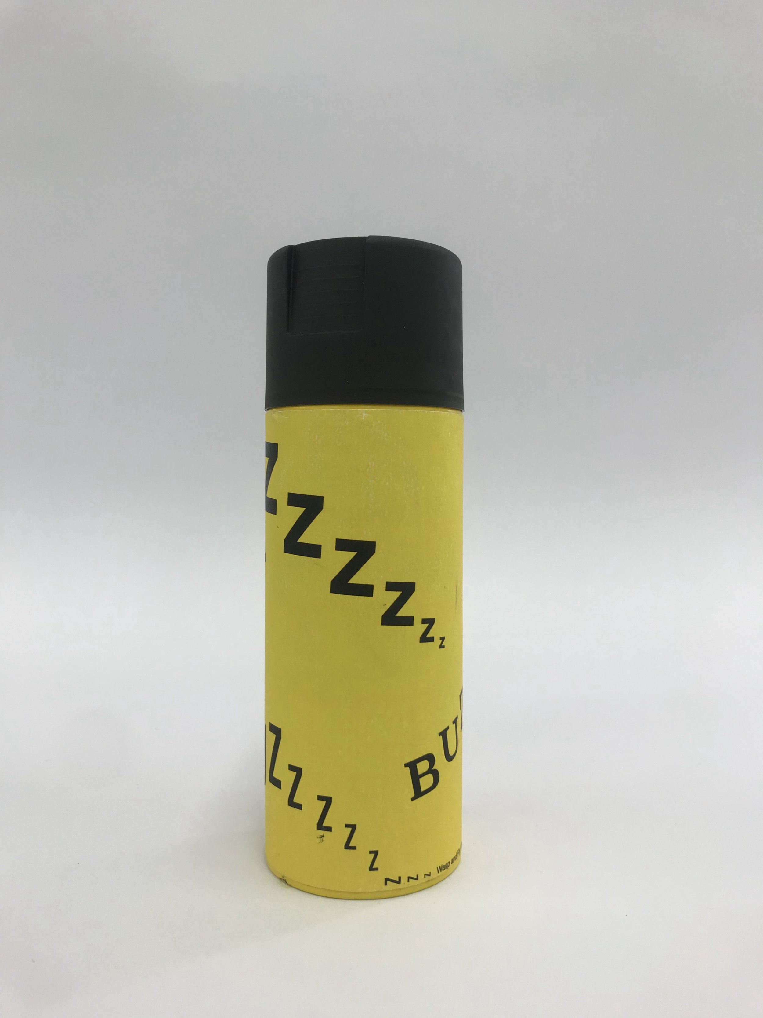
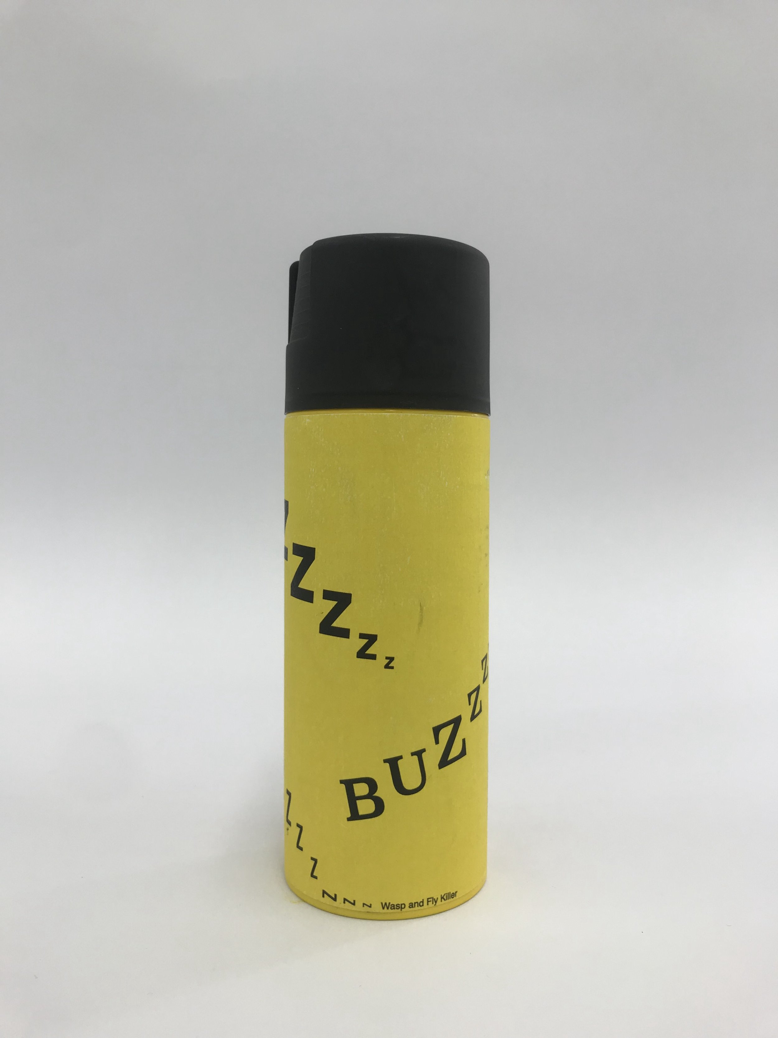
Resource Klaxon: Packaging Nets
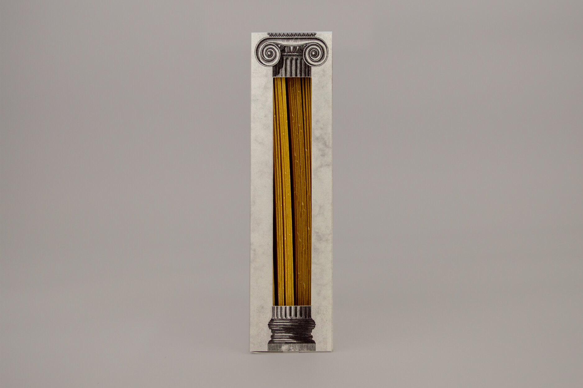
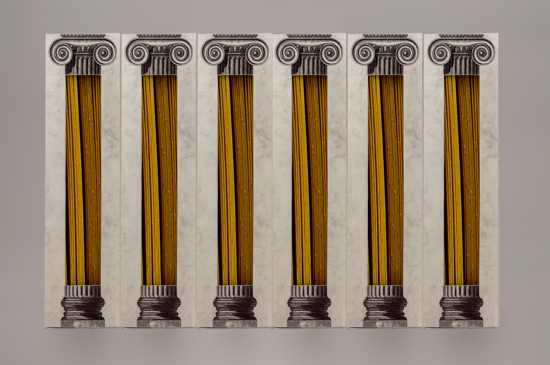
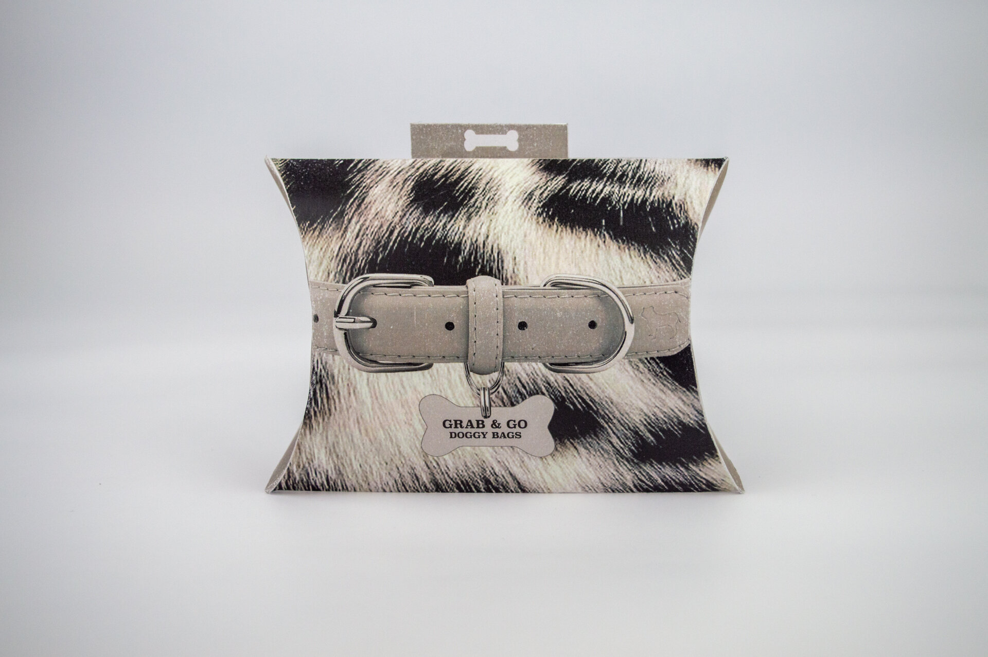
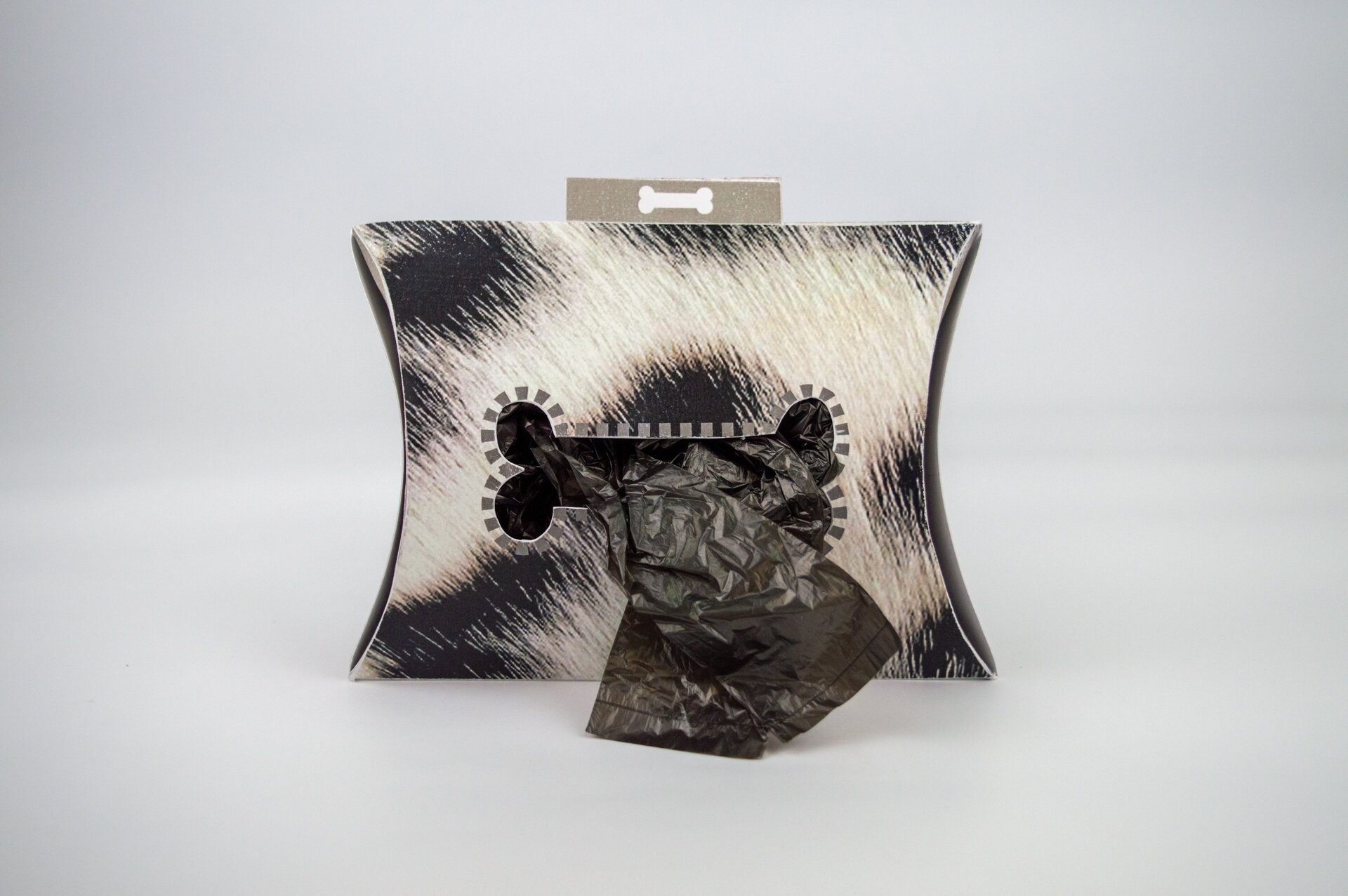
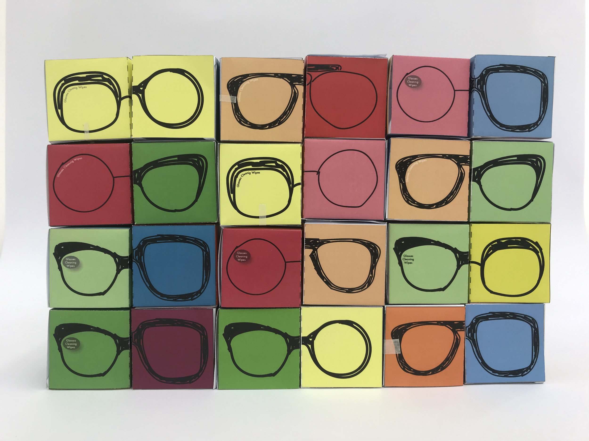
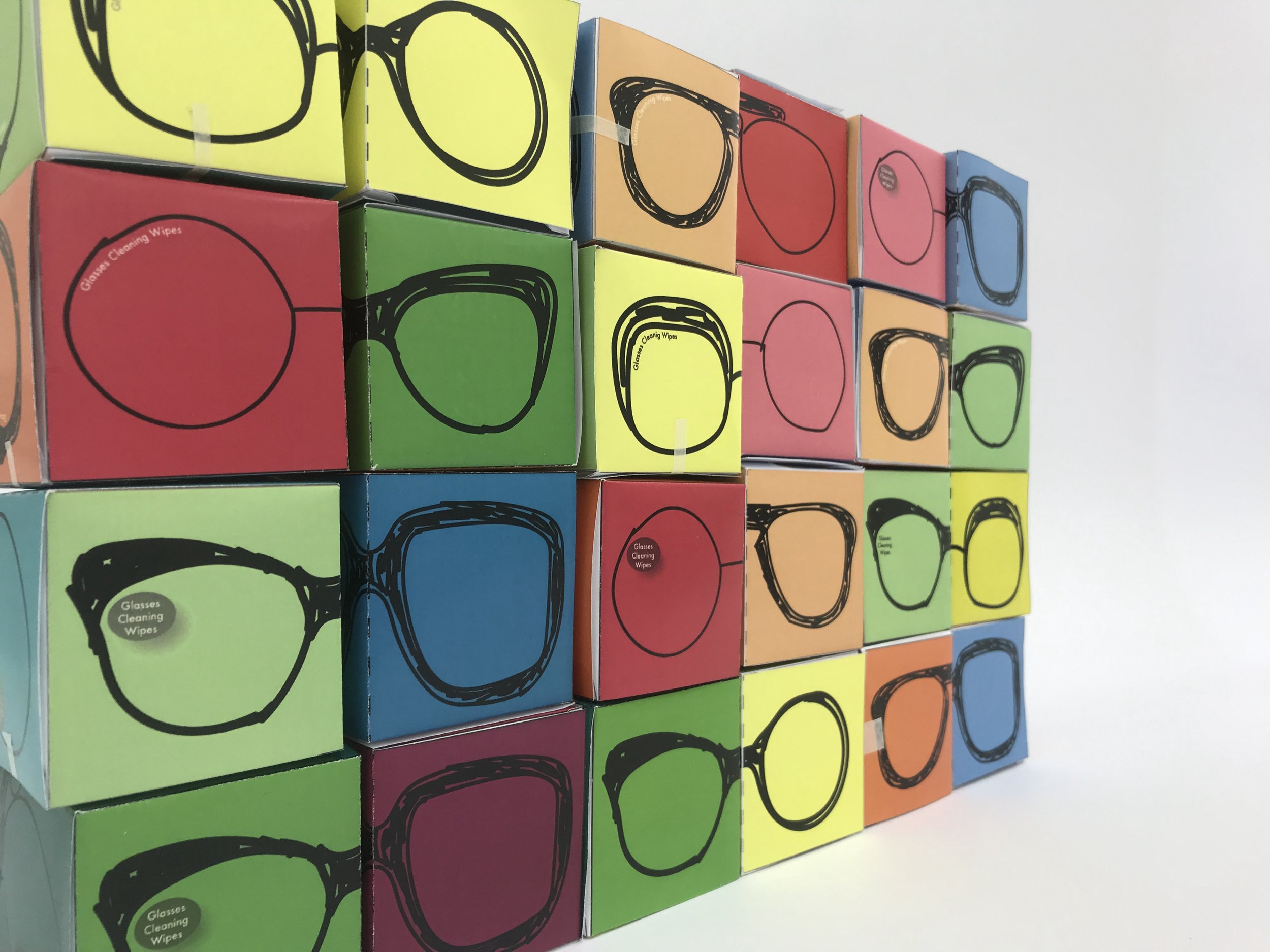
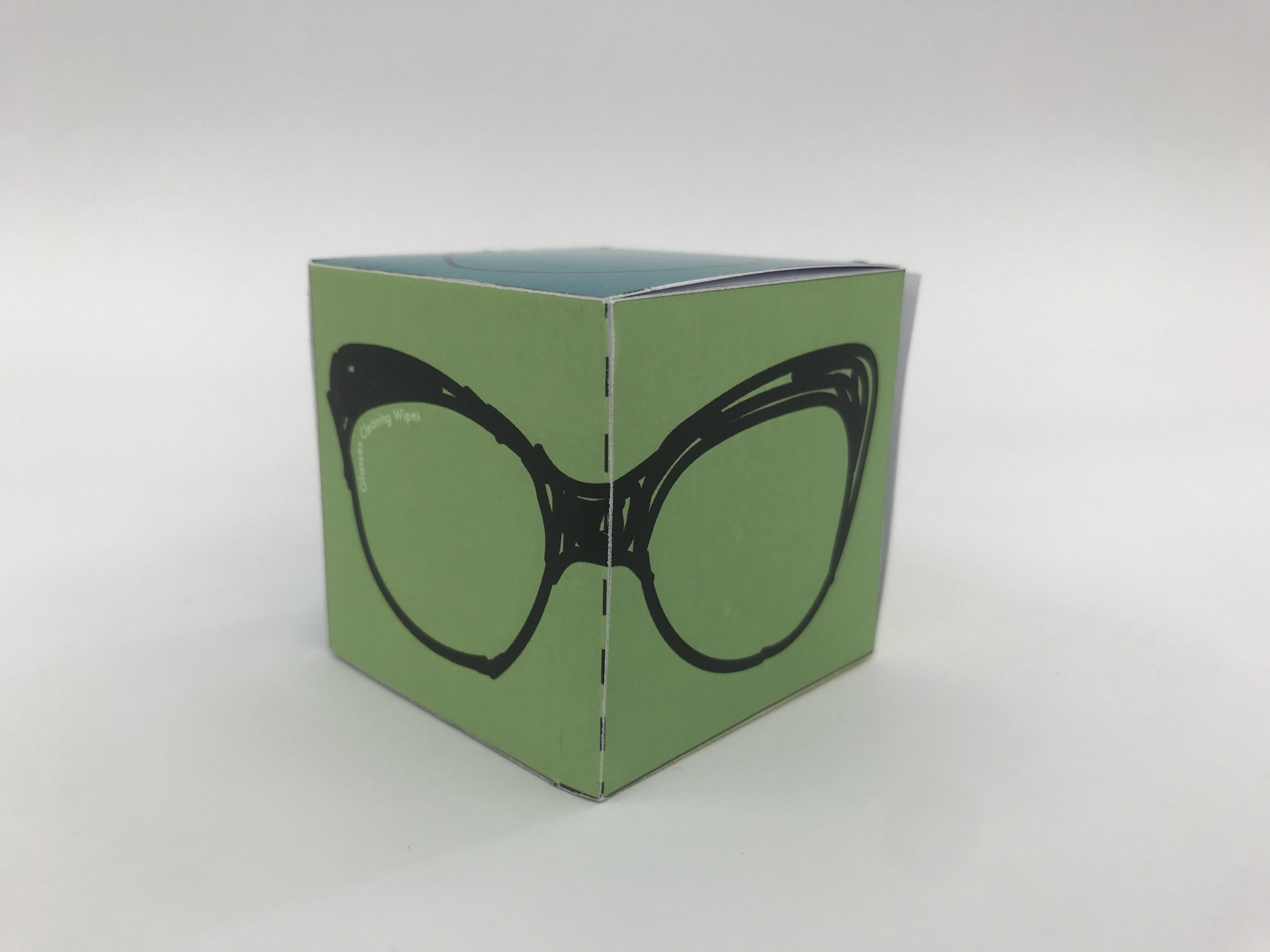
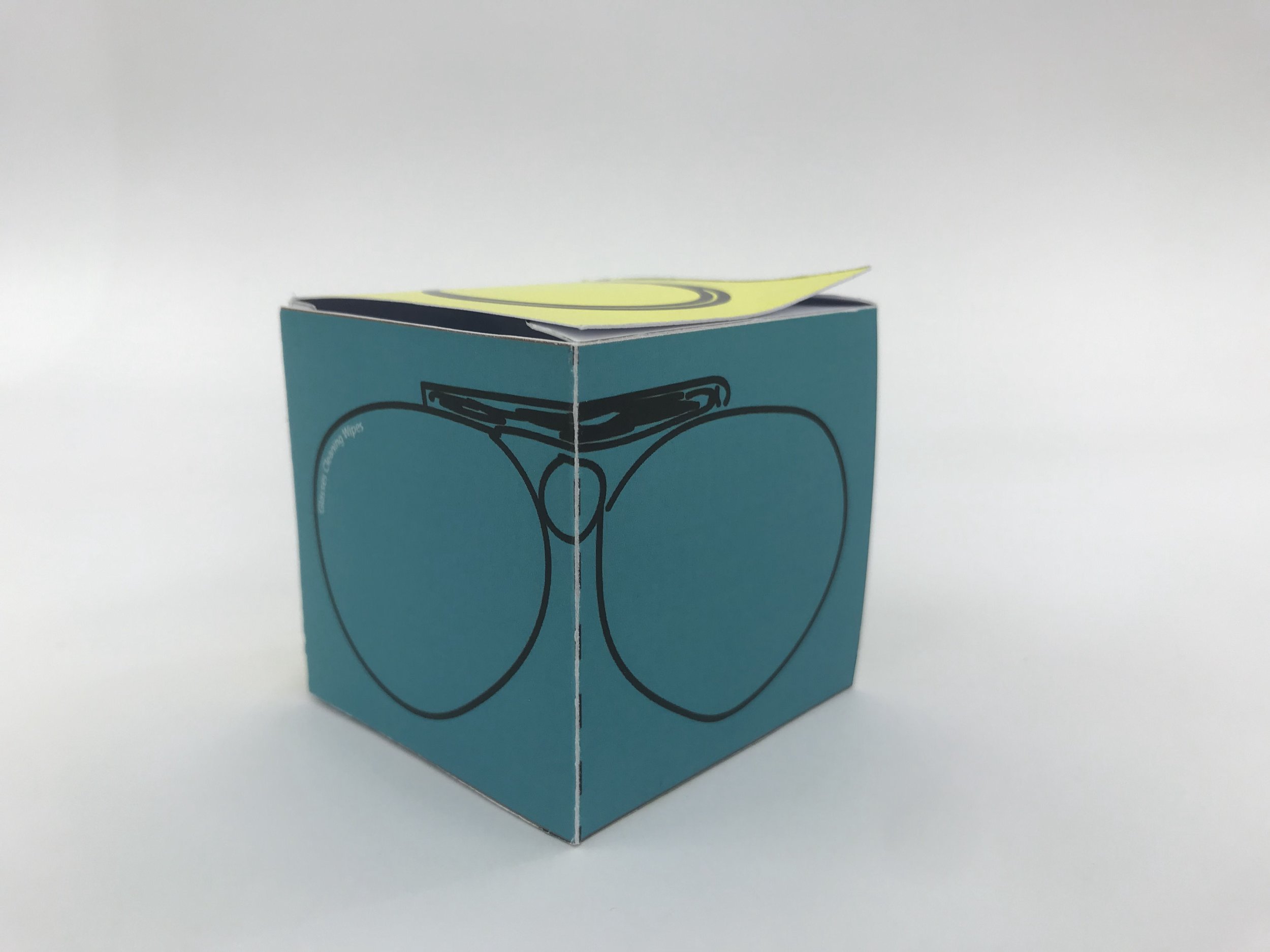
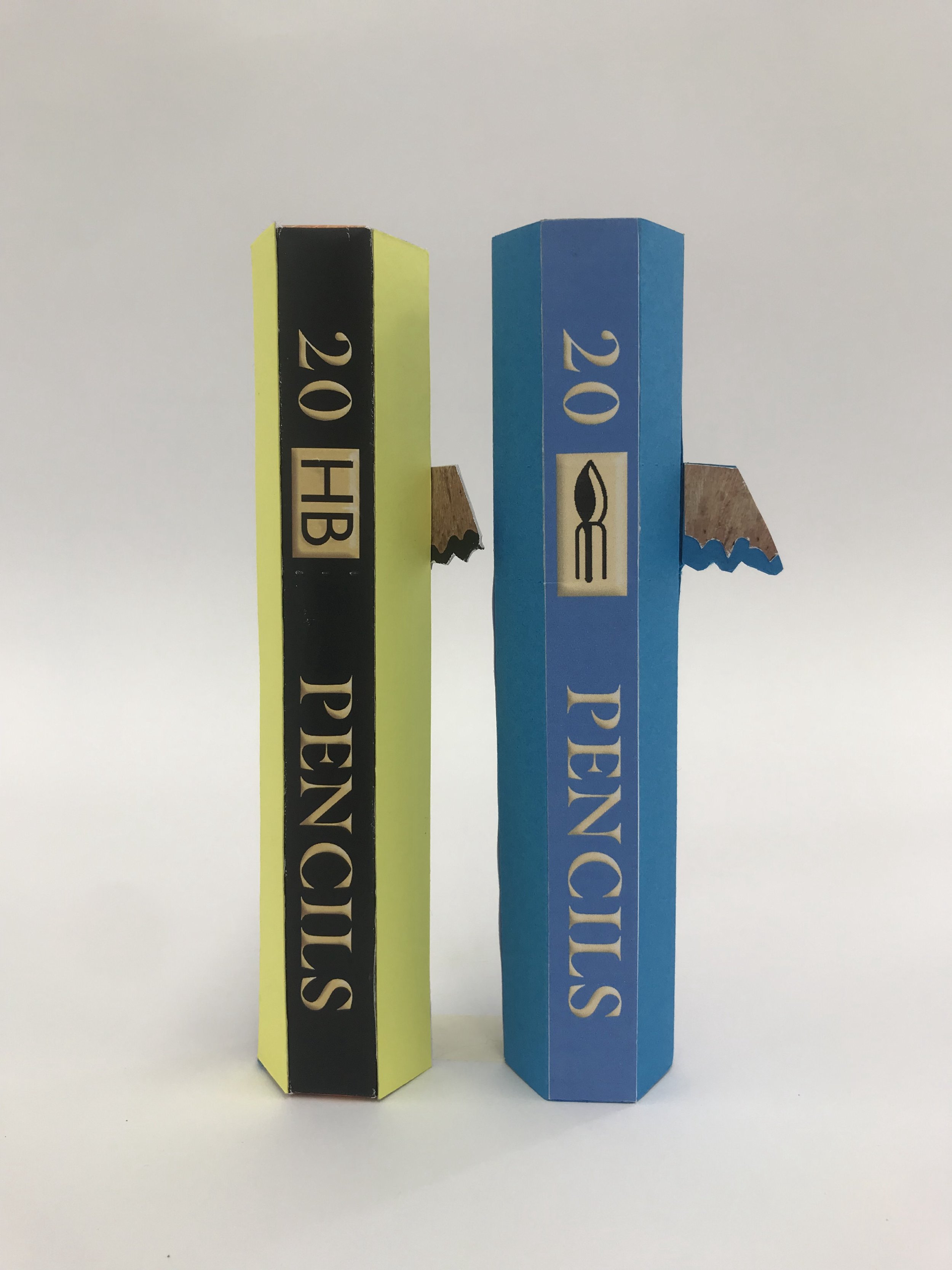
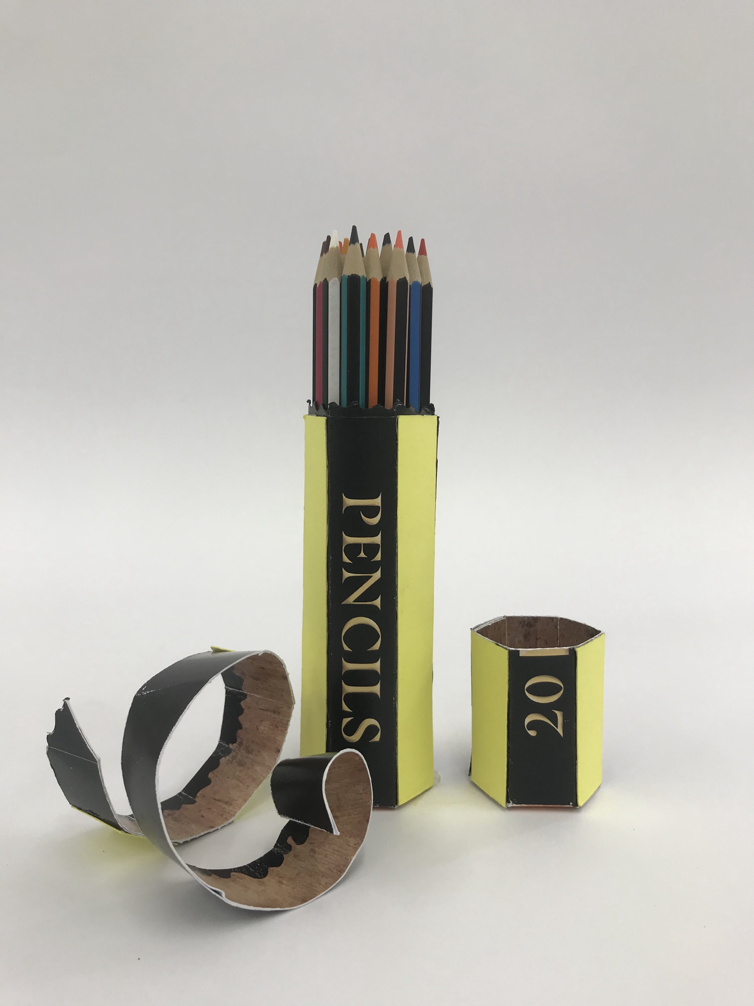
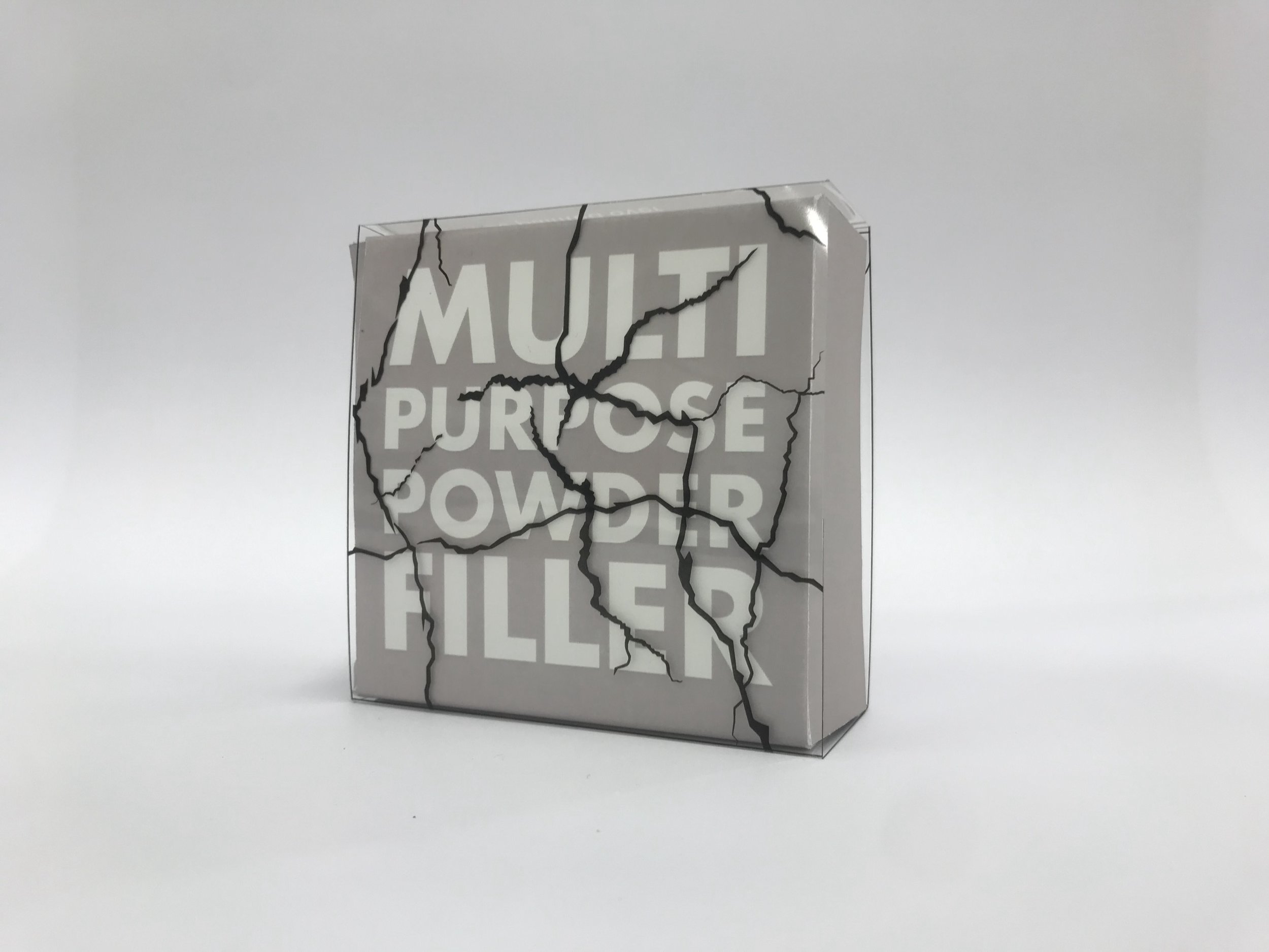
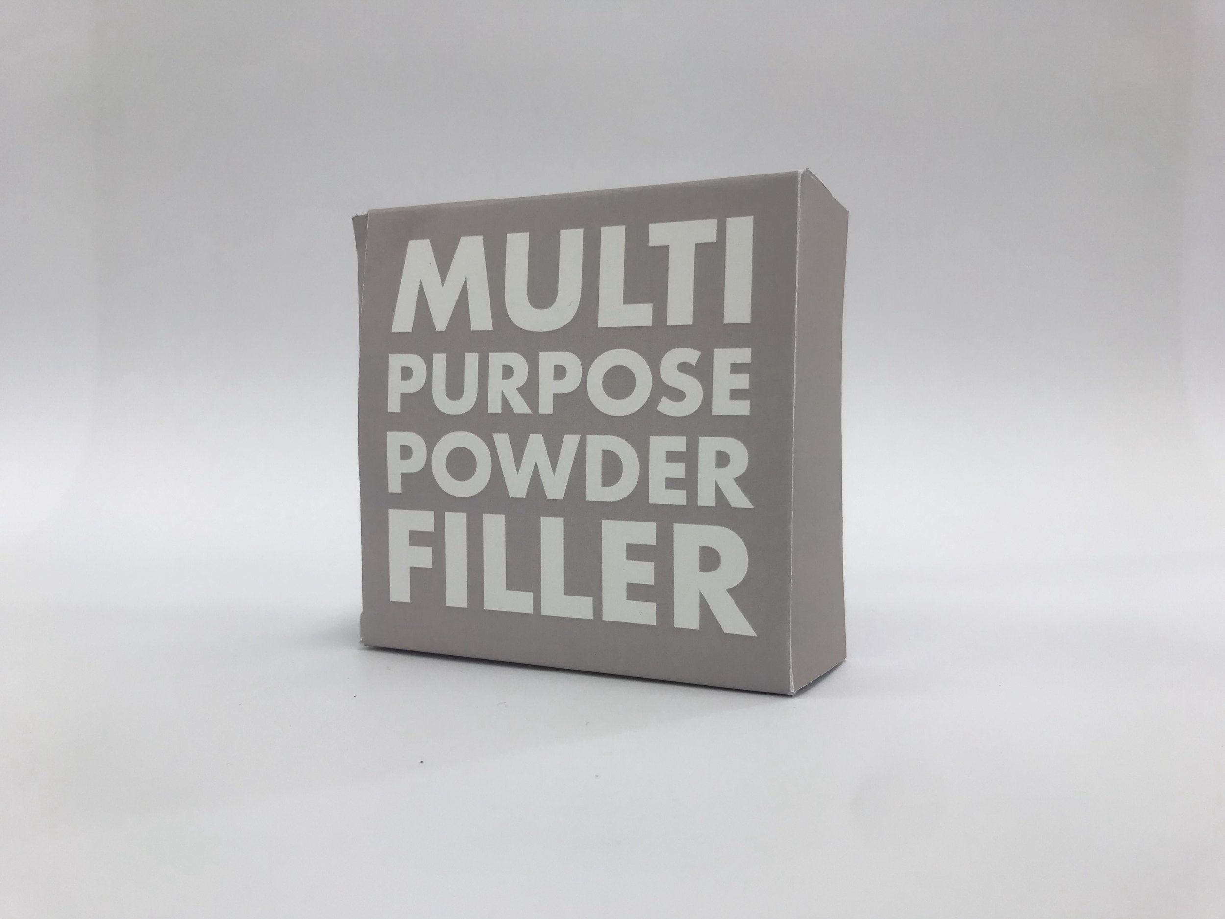
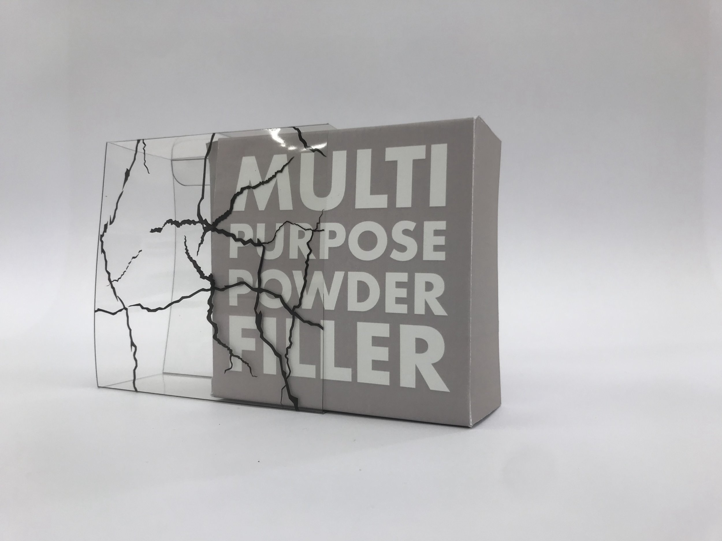
Templatemaker is a really useful site I happened across whilst researching custom packaging for the recently published Words of Wisdom.

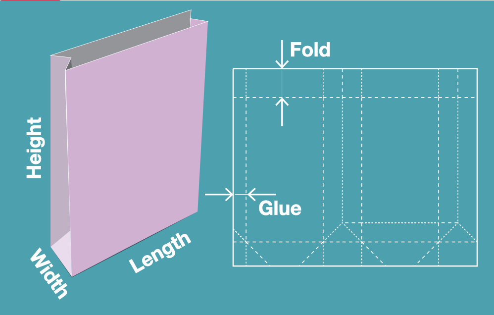
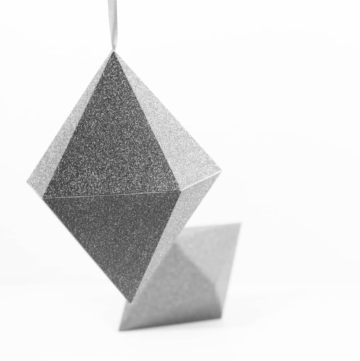
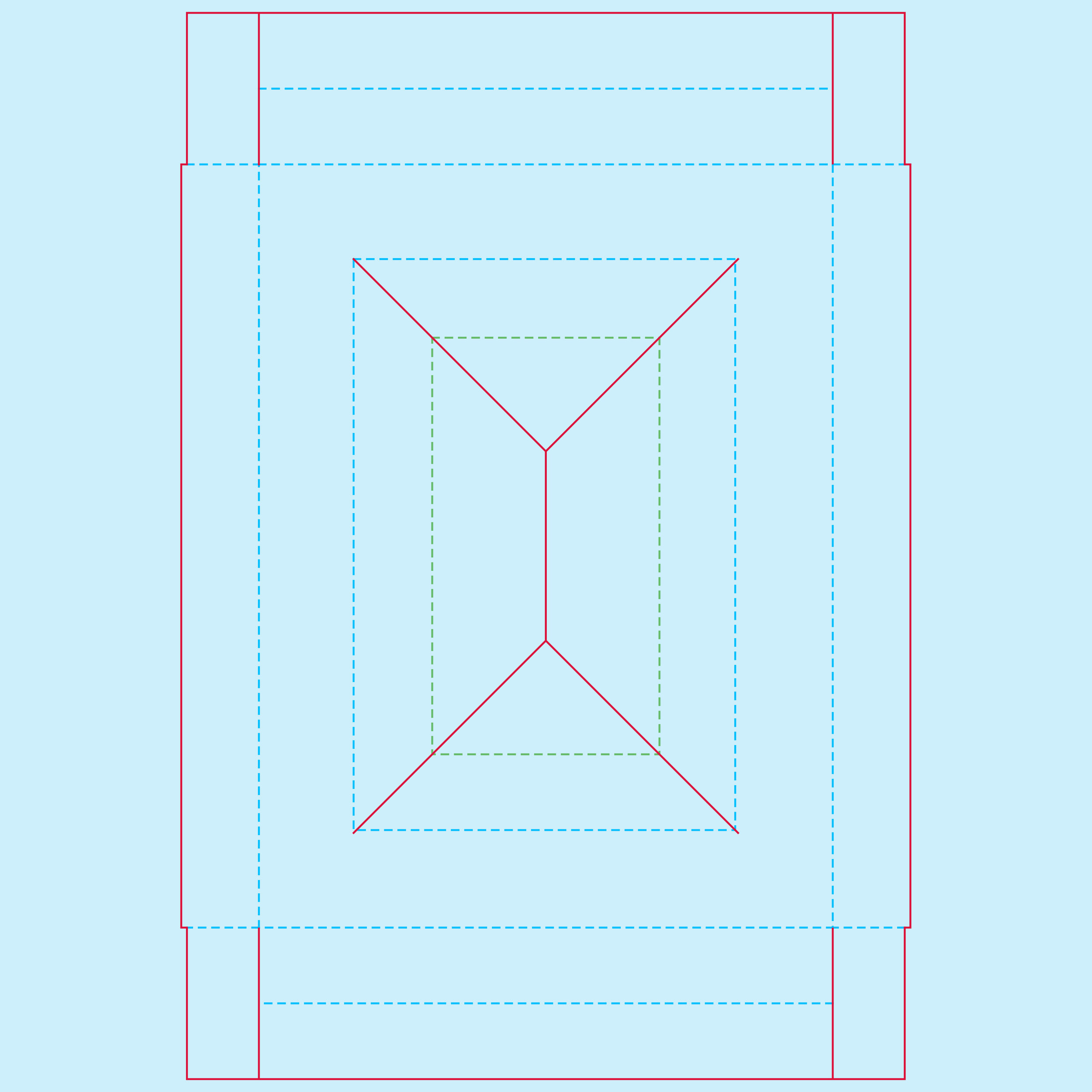
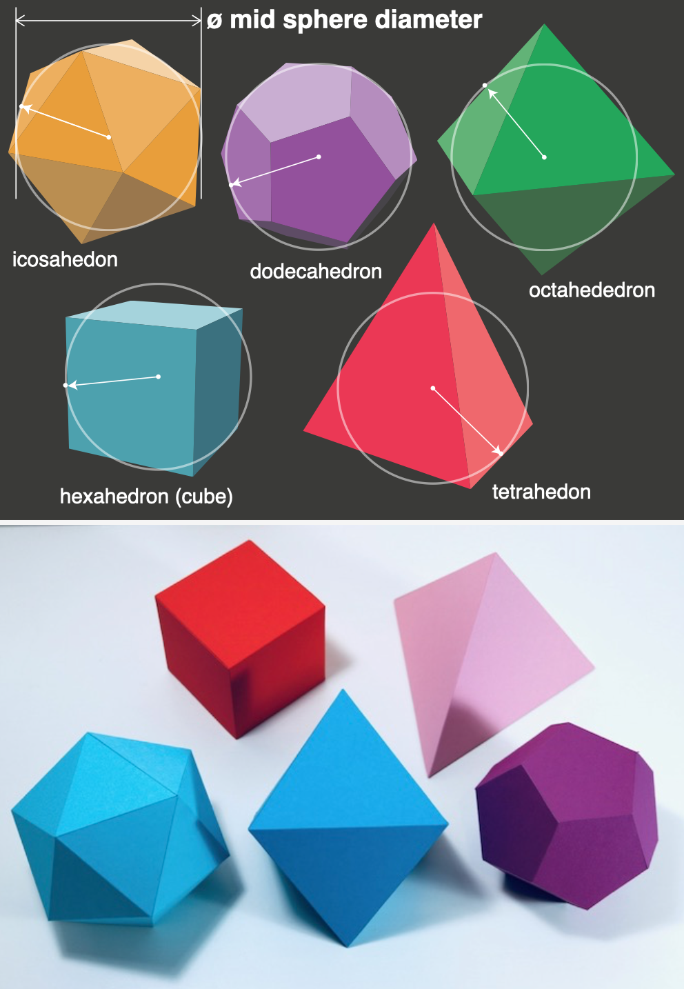
On it are a huge range of templates, from basic stuff like a matchbox, mail box, through to more complex items like spheres and a variety of polyhedra. If free vector nets aren’t enough, the really nice part is that you can input your specific dimensions and it will generate the net bespoke for your needs.

As ever, this kind of resource does not replace an idea. But if you do have an idea, then the template to produce it is more than likely available here.

As a final point the site is run and maintained by one good person in the Netherlands, so acknowledge any help you get and contribute where possible.

Templatemaker

Packaging

The graphic design first years have finished their semester and their final project was the packaging brief. The premise is a simple one: take a low value item and repackage it in order to be sold for a higher price. This can be achieved through three-dimensional design, surface graphics or a combination of both.

The tutors have never run this project so early before, but the final outcomes assuaged any initial fears. It was especially pleasing to see some students consider craft and materials (stocks and printing techniques), and also engage with the technicians thereby bringing another dimension to the brief with the addition of techniques such as laser-cutting and embossing.

extra strong tissues

DSC_0227+copy.jpg

dog poo bags

DSC_0230 copy.jpg

Stain removal bar

DSC_0237 copy.jpg

extra tough plasters


vacuum cleaner bags

DSC_0241 copy.jpg

waterproof plasters

DSC_0242 copy.jpg

chip shop batter

DSC_0244 copy.jpg

extra strong tissues

DSC_0247 copy.jpg

sage & onion stuffing mix

DSC_0251 copy.jpg

organic weedkiller


lasagne sheets


dog poo bags


tough plasters


chip shop batter


holiday plasters

Creative Packaging Examples

Here we feature a few concept examples of creative packaging culled from our recent graduates portfolios. The brief - Take an everyday average item from a supermarket shelf, for no more than a couple of £’s, then apply an idea, re imagine and re package. Place back on the shelf and see who’s prepared to pay a little more for the item.

Pocket Tissues

Pocket Tissues

tiss 2.jpg
Antibacterial

Antibacterial

Heavy Duty

Heavy Duty

Scented

Scented

Ice Cream Cones

Ice Cream Cones

Twist for a new Doo!

Twist for a new Doo!

ice cream 3.jpg
Sleepy Tea

Sleepy Tea

Screen Shot 2019-11-13 at 14.34.16.png
Second Best in Show - No 2’s

Second Best in Show - No 2’s

All the above solutions help raise a smile and go some way to making the world a slightly happier place. “There really is no excuse for bad design…under any circumstances” - Rev Jackson Whitehead

A Guide to Nets

The latest – and epic – instalment of Andy & Ted’s Graphic Adventure takes a turn to the 3D world of nets and cardboard packaging. The first section of the video describes and demonstrates the construction of three different nets which are crucial in understanding the foundations of packaging and making up a good quality mock up. The final section showcases previous student work to demonstrate lateral thinking applied in a 3D context.

A word of warning: viewers may find some scenes upsetting, real life injures are contained within.

Year 2 Brand Extension Solutions

Here we feature a selection of solutions to the second year brand extension brief. Students were presented with a list of well known brands and had to somehow come up with a way of extending them. This was achieved by partnerships, special dates, occasions in the calendar or by finding out an interesting fact from the brand’s history. All the examples shown here made it into their respective students placement folders.

hero 1.jpg
tequila 1.jpg
Mexican flag and skull motif made out of the iconic Tabasco diamond label

Mexican flag and skull motif made out of the iconic Tabasco diamond label

Poster concepts

Poster concepts

Bottle design plus coasters

Bottle design plus coasters

Mexican moustache coaster concept

Mexican moustache coaster concept

Social

Social

poster water 1.jpg

Highland Spring Water brand extension. This concept was based around the highland games and the heritage of the Scottish clans.

The seven clans

The seven clans

Lift the label to reveal each individual clan history

Lift the label to reveal each individual clan history

Individual posters featuring famous clansmen

Individual posters featuring famous clansmen

hero t.jpg

Brand partnership concept between Twinings Tea and the Royal & Ancient Golf Club of St Andrews.

Box designs based on traditional golf attire.

Box designs based on traditional golf attire.

single t.jpg
red t.jpg
History on the reverse

History on the reverse

Screen Shot 2019-08-22 at 18.13.51 copy.jpg

Statistically children consume more sweets at Halloween than at any other time of the year. This design concept for the Colgate toothpaste brand is based around this fact. Fun, engaging and appropriate pack designs that would be timed to be on supermarket shelves for the the Halloween celebrations.

Set of 3 designs: The wolf, The Vampire & The Witch

Set of 3 designs: The wolf, The Vampire & The Witch

Each pack has a short, fun poem on the reverse highlighting the importance of brushing your teeth.

Each pack has a short, fun poem on the reverse highlighting the importance of brushing your teeth.

wolf .jpg
Art directed shot showing the 3 sides

Art directed shot showing the 3 sides

A scarily cool idea!

A scarily cool idea!

title wall.jpg
wall 3.jpg

This brand partnership concept between the Woodland Trust & Graham & Brown Wallpapers utilises a series of appropriate pattern designs on ecofriendly wallpaper. As well as being aesthetically pleasing, the idea also informs the consumer about the work of the Woodland Trust.

wall 6.jpg

Typographic detail from the wallpaper box packaging

wall 5.jpg

Raise & reveal the mission statement on each wallpaper roll pack design

Box and contents shot

Box and contents shot

wall 2.jpg

The 4 seasonal patterns available.

Please click the above image to play the film.

Another Twinings tea brand extension with a visual twist. The core of this brand extension concept stems from research into the birth of the suffrage movement and the fact that much of the direct action was often planned and formulated in the tea rooms of Edwardian England.

Front & Back of the tin packaging

Front & Back of the tin packaging

tea suf 2.jpg

The sides of the tin tell the story of the suffrage movement and its connection to tea.

tea suf 3.jpg
tea suf 5.jpg

Each tea bag is individually wrapped and the packaging has a reproduction of a political cartoon from the time with a short poem about the suffrage movement.

tea suf 4.jpg

A selection of some of the poems and cartoons applied to the teabag packaging.

hero.jpg

This brand extension is based around America’s annual 4th of July Independence Day celebrations. Taking a classic American brand with an explosive flavour, this student produced a limited edition set of fireworks based on American landmarks, inventions and achievements.

group shot.jpg
Copywriting

Copywriting

earth quake.jpg
colt 45.jpg
apollo.jpg
2 fireworks.jpg
mac vites logo.jpg

McVitie’s supplied biscuits to the troops in the trenches during the 1st World War. This fact coupled with the centenary celebrations provided an obvious route to extending the brand. This student created a limited edition tin of biscuits. The design and pattern on the box contained a variety of military motifs…can you spot them all?

lid.jpg

The main label design was based on a medal, with various military insignia providing the background pattern.

tin 1.jpg
sides.jpg
tin 2.jpg
message.jpg

A great selection of solutions that demonstrate not only a high standard of design aesthetic but also some clear thinking and some simple effective ideas based on good solid research. It’s all about making those connections and building on a brand story that is believable.

Packaging

Graphic design first years have recently submitted their most up-to-date prototypes in their packaging project, before final designs are crafted on the correct stocks and printed with the appropriate inks or other processes. There are some lovely thoughts and observations, as ever all designs will benefit from more craft and production time.

Simply, the brief is to take a low value product and add value to it through the design of the three dimensional pack, as well as utilising creative surface graphics. As Andy said in the yesterdays’s crit : “If it used to cost a quid, would I pay two quid for it now it’s been redesigned?”

Have a look below and see what you think…


Cotton buds:

Fire lighters:

Beef jerky:

IMG_6214.jpg

glasses wipes:

weed killer:

fly spray:

yellow dusters:

Children’s tissues:

IMG_6226.jpg

Pack of pencils:

multi purpose filler:

Children’s plasters:

Tribal Ale

Here we feature Tom & Matt Buckley’s response to the Tribal Ale brief set by Oliver Wigglesworth from Music Manchester.

tribal 1.jpg

Above:- The brand Identity

type face.jpg
Regular

Regular

Cold

Cold

Extra Cold

Extra Cold

The set

The set

Flat art work

Flat art work

Multi Pack Designs

Multi Pack Designs

Slip case idea

Slip case idea

Pump Handle & Glass design

Pump Handle & Glass design

pint.jpg
Interactive beer mat concept

Interactive beer mat concept

Self presence

Self presence

Van Livery - Day

Van Livery - Day

Van Livery - Night

Van Livery - Night

Social Media

Social Media

The lot

The lot

A good solid brand development based on well informed research.