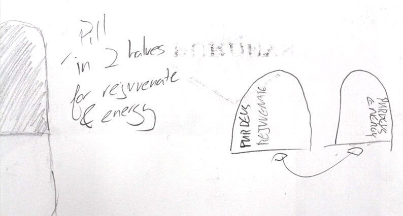
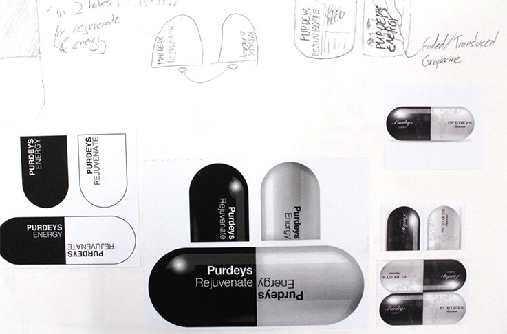
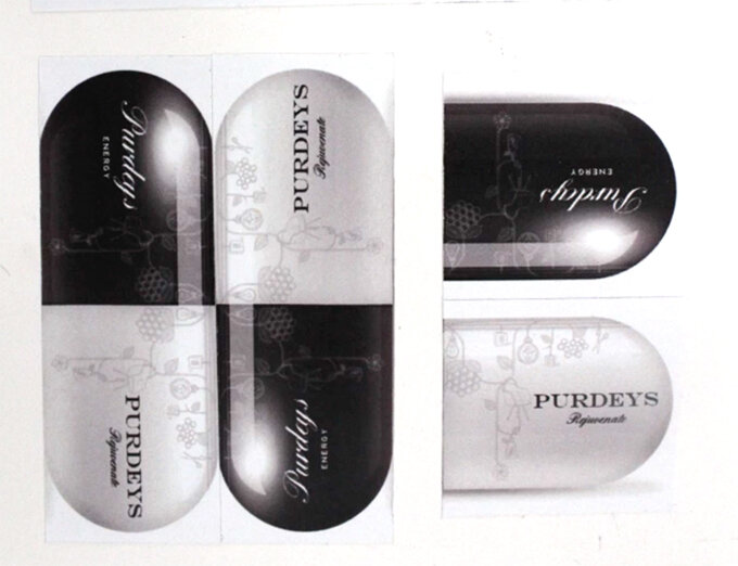
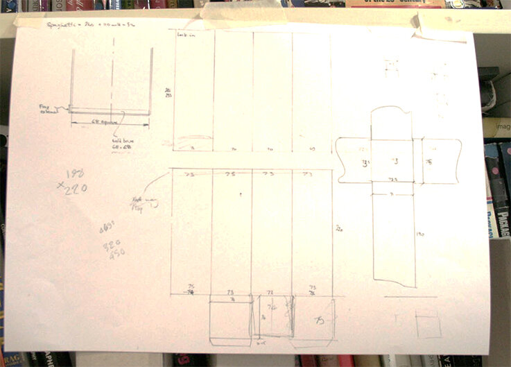
NY Spaghetti Packaging – The directors cut

Here we feature Alex Creamer’s classic NY Spaghetti packaging concept from 2008/09. Now widespread on the net and various packaging related sites this project has attained cult status. So we thought we would show a little more from our archive of the early development work.

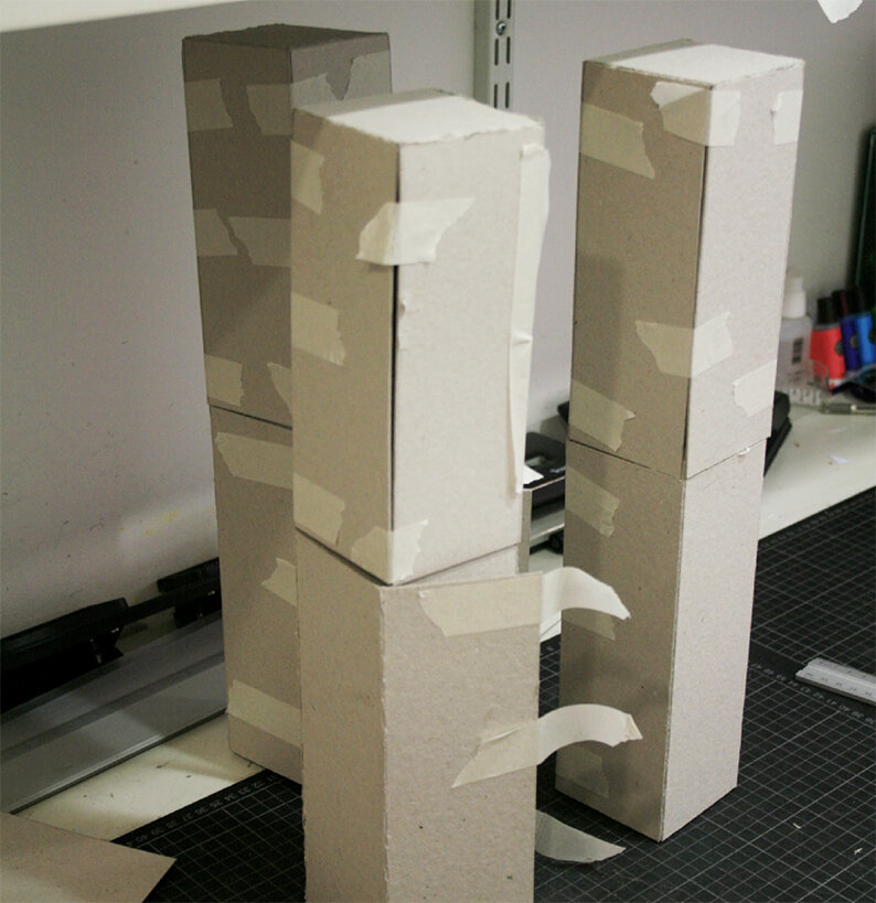
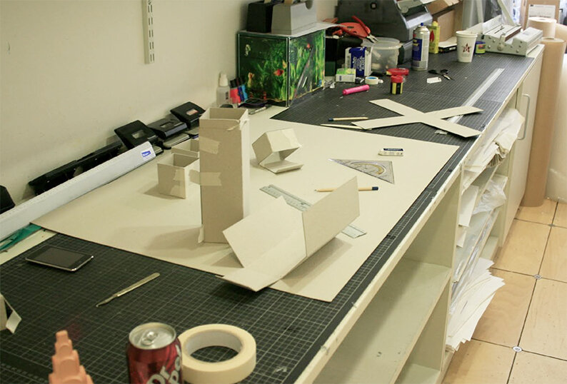
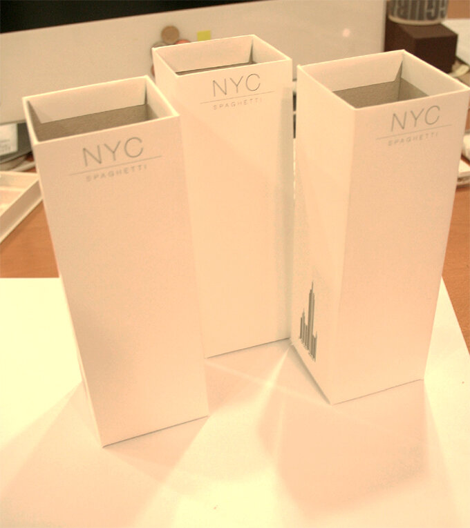
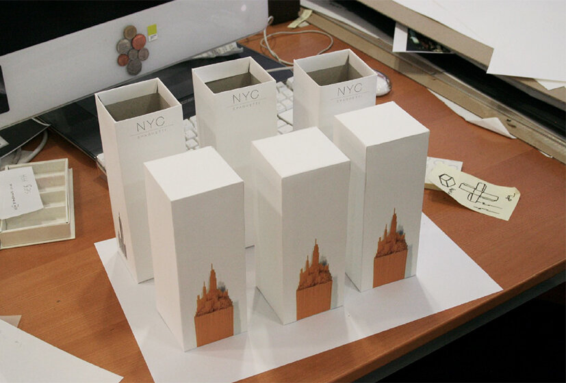
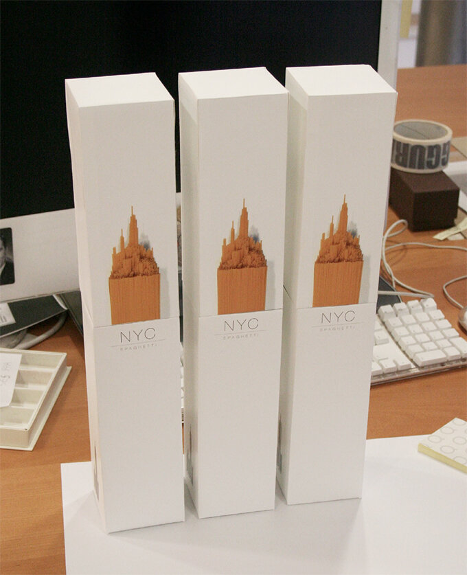
Alex’s solution was initially a response to a 2nd year brief, which was to repackaging a awkward product or item. It became the centre piece of his portfolio and while on placement at Ziggurat Brands in London he was able to develop the design further with their expert help.
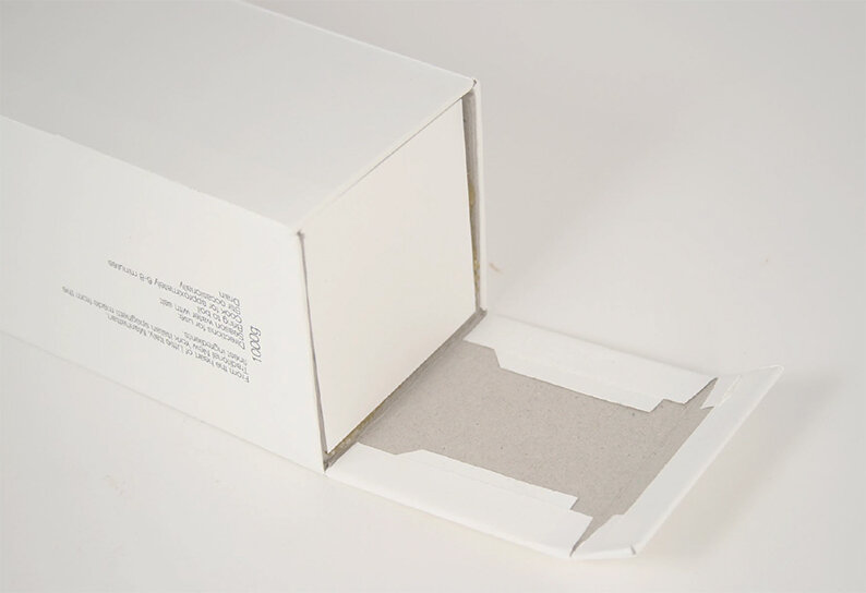
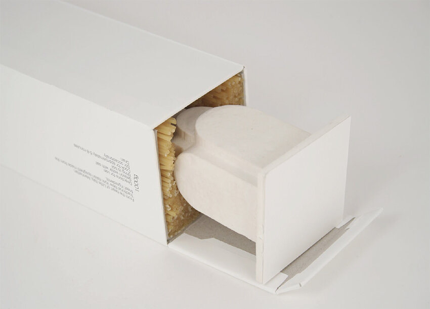
spag 3.jpg
spag 2.jpg
Detail

Detail

hero .jpg

The design eventually made it onto the front cover of the book above, via exposure on the Dieline and all this even before Alex had graduate in 2010. Ten years on and Alex has now moved onto the world of branding and is currently associate Design Director at Interbrand Australia.

Chelsea Flower Show Branding – 2103

Here we feature Gina Chamberlin’s Chelsea Flower show Centenary Identity from the 2013 degree show.

C for Centenary & Chelsea

C for Centenary & Chelsea

Chelsea logo 2.jpg

Click the image above to play clip

Poster 1

Poster 1

Poster 2

Poster 2

Poster 3

Poster 3

Time line stem

Time line stem

time line.jpg

Nicely crafted, appropriate and considered typography. Blooming marvellous and yes, again, a nice idea that will always remain so, year in year out.

Iconically British – D&AD 2013

Here we feature Naeem Mitha’s D&AD entry for the Ted Baker brief from 2013. The brief was to imagine Ted Baker opening a store in a country and capitol of your choice and then create a roll out campaign to advertise the opening. Naeem chose Dubai and here is his creative twist.

Classic British Icons

Classic British Icons

Creatively applied to iconic Arabian Keffiyeh Head Scarf

Creatively applied to iconic Arabian Keffiyeh Head Scarf

Keffiyeh Head Scarf - Detail

Keffiyeh Head Scarf - Detail

Magazine Advertisement

Magazine Advertisement

Concept applied to a Persian Rug to create a Billboard Advertisement

Concept applied to a Persian Rug to create a Billboard Advertisement

Detail 1

Detail 1

Detail 2

Detail 2

In context

In context

Design applied to airport travelator

Design applied to airport travelator

Pattern applied to a range of in store bags

Pattern applied to a range of in store bags

Digital touchpoints

Digital touchpoints

Store frontage - Design concept

Store frontage - Design concept

A great example applied pattern. A great example of a connection made. A great example of crafting to the highest degree and then a great example of how to apply an idea to a series of relevant touch points that bring the concept to life. Unfortunately it was not shortlisted for D&AD…but it deserved more in our humble opinion. A good idea is always a good idea!

Protecting Pubs

Here we feature another D&AD entry to the Monotype typography brief.

Pubs play a pivotal role in local communities, but are increasingly under threat of demolition or being converted to another use by large developers. The protecting pubs campaign designed by Neil Bennison encourages people to take the first step in saving their beloved locals, by nominating them as an asset of community value.

The pub industry has a rich typographic history, so being able to merge it with a worthy cause such as the protection of a national institution is a fantastic challenge. Using the versatility of a beer mat, a custom typeface was created which would underpin all messaging in the campaign.

THE CAMPAIGN

THE APP