Haunted House

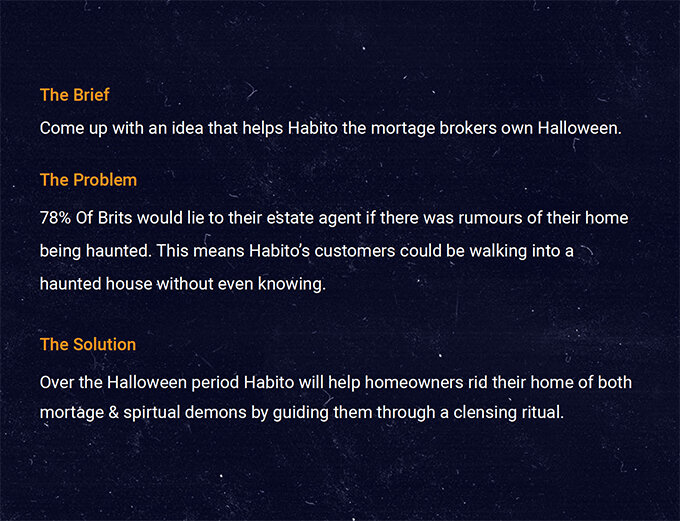
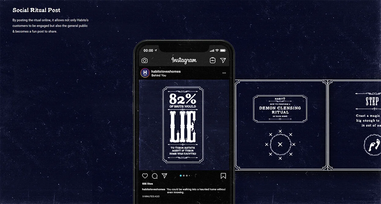
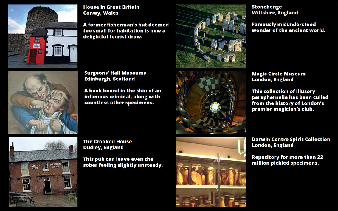
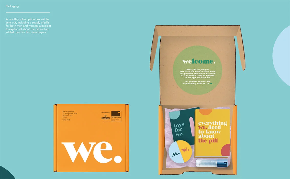
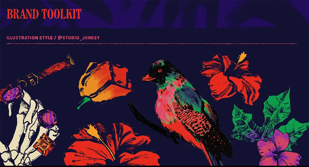
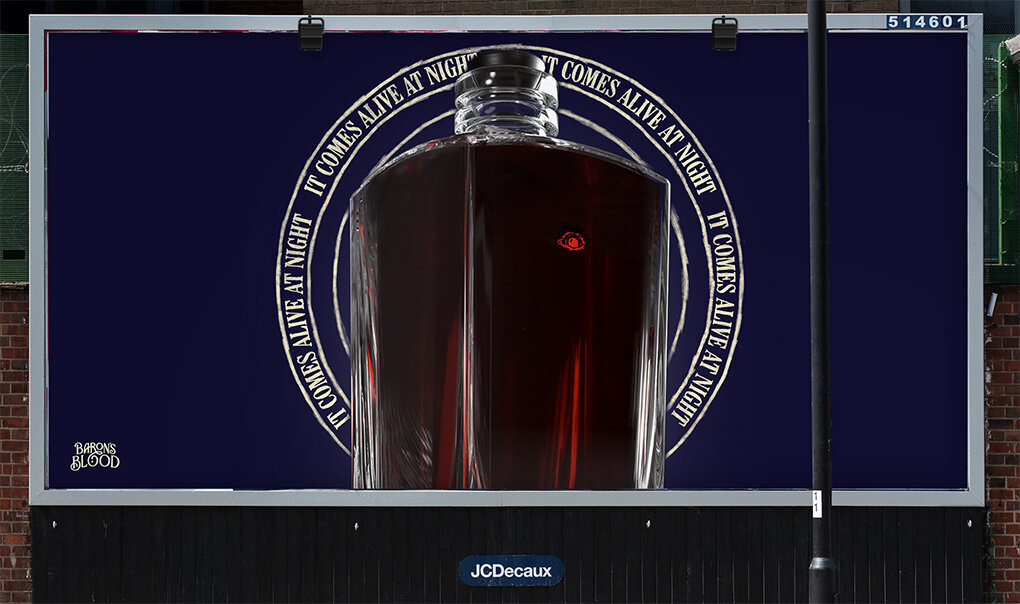
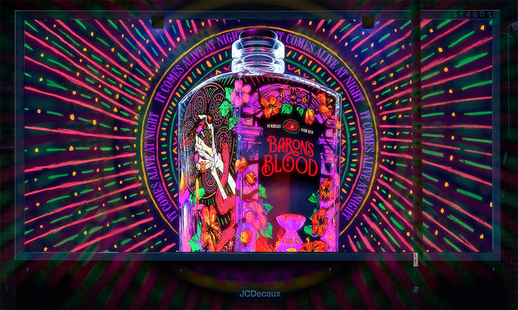
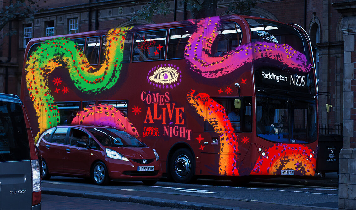
Here we feature recent graduate Dave Shorrock’s Halloween inspired Habito 'Demon Cleansing Ritual' kit feature in The Drum

The concept was created by recent graduate David Shorrock, after he pitched via You Can Now’s network of universities, colleges and art and design schools, as part of Habito’s Halloween challenge.

The brief asked graduates to come up with a creative concept that would be bold, clever and bring Habito’s mission (to save people from mortgage hell) to life.

Inspired by research that showed that 55% of people in the UK would be put off buying a property if they thought it was haunted, Shorrock created Habito’s eight-step home exorcism ritual to banish any ghouls back to the other side this Halloween.

Insight

Insight

Word mark

Word mark

Cleansing Kit

Cleansing Kit

Instructions

Instructions

Detail

Detail

Mailer

Mailer

Ambient - Vue cinema hook up

Ambient - Vue cinema hook up

Nice work Dave, a great fun appropriate idea well crafted!

Edit Brand Studios - Industry Brief - 2020

Here we feature a couple of final year response to recent the industry set brief by Edit Brand studios

no 1.jpg
Wordmark

Wordmark

no 2.jpg
Language

Language

Click on the image above to play film

Typeface & colours

Typeface & colours

Photography style & feel

Photography style & feel

Turn the now over to reveal the here

Turn the now over to reveal the here

Post cards

Post cards

Post card slip case

Post card slip case

no 20.jpg
Stationary & keys

Stationary & keys

Toiletries

Toiletries

Menues

Menues

Editorial Advertisements

Editorial Advertisements

no 25.jpg

Please click on the image above to play the film

Simply Scan

Simply Scan

no 39.jpg

The thinking - Sketch book

odd 1.jpg
The rational

The rational

Words, copy & Language

Words, copy & Language

Type Style reference

Type Style reference

Odd image style reference

Odd image style reference

Preferred type styling

Preferred type styling

The word mark

The word mark

Please click the image above to play the film

Odd outdoor advertising

Tour Guide Lanyards

Tour Guide Lanyards

Merchandise

Merchandise

Mobile

Mobile

The Male Pill - Industry Briefs - 2020

Here we feature Emma Barber’s solution to the recent industry brief set by Chris Mason .

The back story

The back story

we 1.jpg

Please click on the image above to play film

The brand mark

The brand mark

Please click on the image above to play film

The Language & tone of voice

The Language & tone of voice

Copywriting

Copywriting

Alternative copy styling

Alternative copy styling

Assets - Shapes and photography styles

Assets - Shapes and photography styles

The outer packaging & content designs

The outer packaging & content designs

The pill packaging

The pill packaging

Outdoor - Posters

Outdoor - Posters

Print - Brochure

Print - Brochure

Digital - Mobile look & feel

Digital - Mobile look & feel

Please click on the image above to play the film.

App designs

App designs

we 17.jpg

A very strong, well thought through and deceptively simple design solution to what was a sensitive and challenging subject and brief.

A RUM DO! - Industry Briefs - 2020

Here we feature a selection of final year students response to the recent industry brief set by Brandon Manchester. Brief - Create a fresh new rum brand.

Wordmark

Wordmark

Rational

Rational

Packaging

Packaging

Brand Values

Brand Values

Unwrap the Party

Unwrap the Party

b6.jpg
b7.jpg
Instagram - look & feel

Instagram - look & feel

Social Media Stickers

Social Media Stickers

Promotional Domino Set

Promotional Domino Set

Sharing Bar Mats

Sharing Bar Mats

Outdoor - Posters

Outdoor - Posters

Brand Name

Brand Name

Rational

Rational

Target audience

Target audience

Copy

Copy

In the round

In the round

Detail

Detail

Brand Toolkit 1 - Symbols

Brand Toolkit 1 - Symbols

Brand Toolkit 2 - Colour & Typography

Brand Toolkit 2 - Colour & Typography

Brand Toolkit 3 - Illustration

Brand Toolkit 3 - Illustration

Outdoor - Posters

Outdoor - Posters

Splash screen

Splash screen

Please click on image above to play film

Setting the scene

Setting the scene

The Story

The Story

The Mark Explained

The Mark Explained

The Bottle

The Bottle

bo 11.jpg
Posters

Posters

Print

Print

bom 10.jpg
bom 8png.jpg

Please click on the image above to play the film

The Brand Story

The Brand Story

bam 2.jpg
The Seal of Dijiao

The Seal of Dijiao

The Mark

The Mark

The Adaptation

The Adaptation

The Typeface

The Typeface

Bamboo Print

Bamboo Print

Colour ways

Colour ways

Outer Packaging

Outer Packaging

Opening and reveal

Opening and reveal

The Bottles

The Bottles

Hand made paper wrap around

Print Advertisement - Newspaper

Print Advertisement - Newspaper

Instagram Look & Feel

Instagram Look & Feel

Launch event invite concept

Launch event invite concept

Please click on the image above to play the film

The back story

The back story

rum 2.jpg
Symbol Logotype

Symbol Logotype

Wordmark

Wordmark

rum 5 .jpg
Detail

Detail

The reference

The reference

Outer wrap

Outer wrap

The Seal Detail

The Seal Detail

rum 13.jpg

Please click on the image above to play film

Brand Story

Brand Story

mon 2.jpg
mon 3.jpg
mon 4.jpg
mon 5.jpg
mon 10.jpg
mon 8.jpg
Screen mon 12 2021-01-07 at 13.03.34 copy.jpg
beer mats.jpg
mon 11.jpg
mon 18.jpg
mon 19.jpg
Brand wordmark

Brand wordmark

Brand Story & Background

Brand Story & Background

Typeface rational

Typeface rational

Type effect rational

Type effect rational

Bottle design

Bottle design

prus a 7.jpg
Asset - Contour lines

Asset - Contour lines

Contour line tissue wrap

Contour line tissue wrap

Please click on the image above to play film.

Some excellent work and benchmarks for years 1 & 2 to analyse, absorb and ultimately learn from. Nice!

10 Years After

Here we feature a reflective post on the building of the stone circle that adorns the frontage of the Victoria Arts Building on the Preston Campus. Initially conceived and realised just over a decade ago, we thought it timely to post a short filmed retrospective.

Original sketches of the typography that sits on the top of the circle.

Original sketches of the typography that sits on the top of the circle.

Please click on the image above - 30 minute film ‘the making of’


Flow – Martial Arts Festival

As ever, we are constantly reviewing the archives and adding projects.

Matt Kovacs produced the following brand for his Honours project. The brief he set himself was to create a brand for a martial arts festival, and change the public’s perception of what the martial arts really are. Society has a negative opinion of martial arts, believing it is a purely physical pursuit, whereas the mind plays a much bigger role than expected.

Design Classics No.1 in a series of...

Here we feature the first in a series of short tutor lead talks looking at design classics and the thinking behind their conception. This particular short film looks at a typographic solution to an identity and how typography, in the right designer’s hands, can communicate a complex concept in a simple yet sophisticated manor.

Agency - Williams & Phoa - 1988