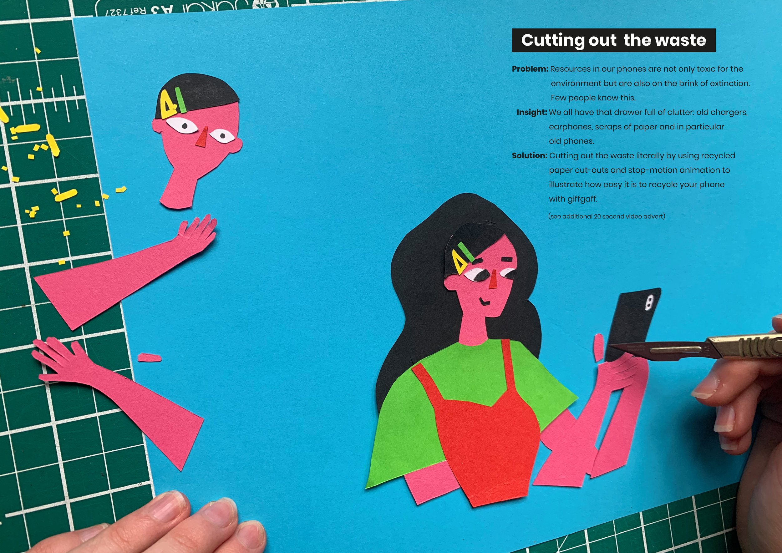
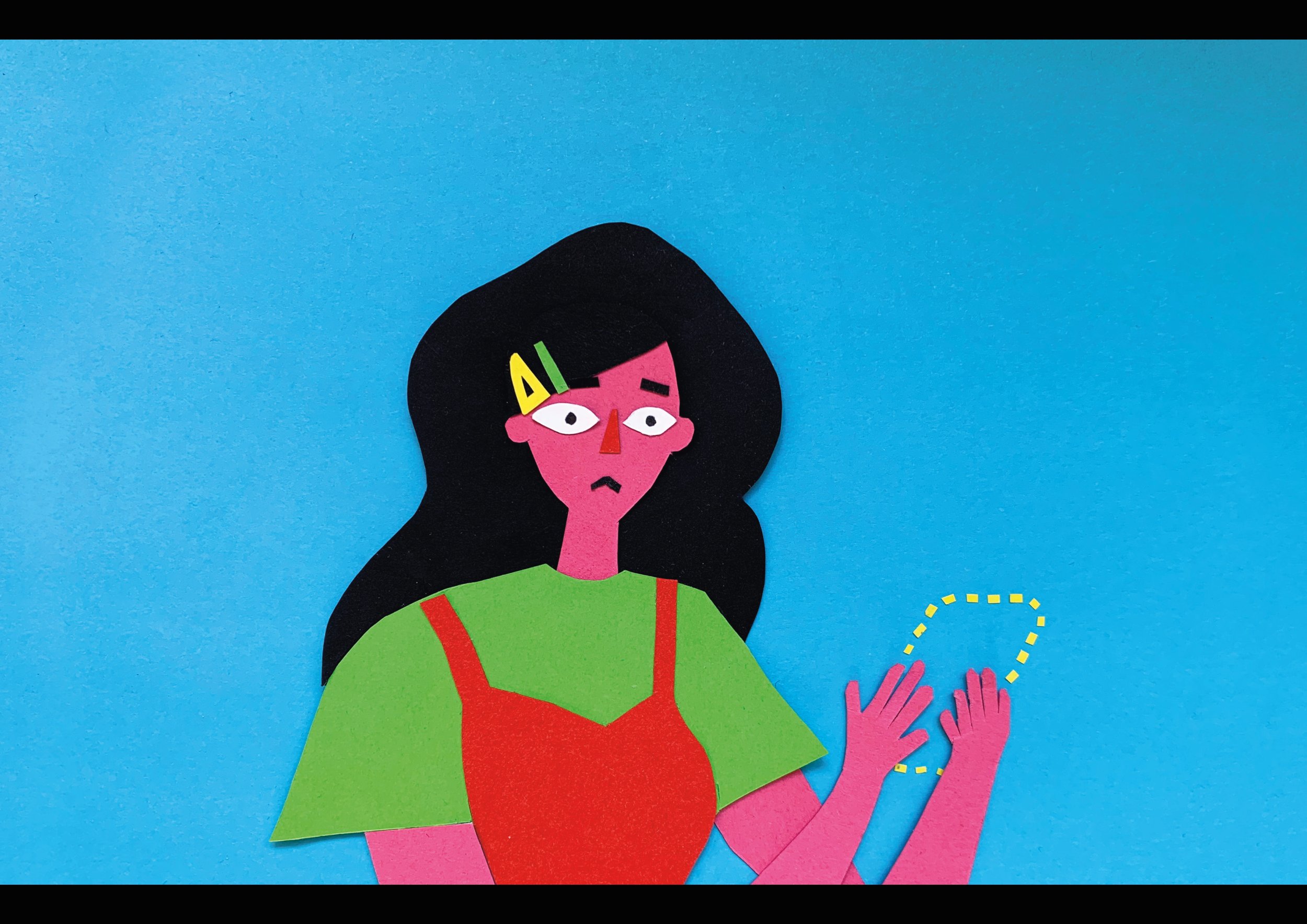
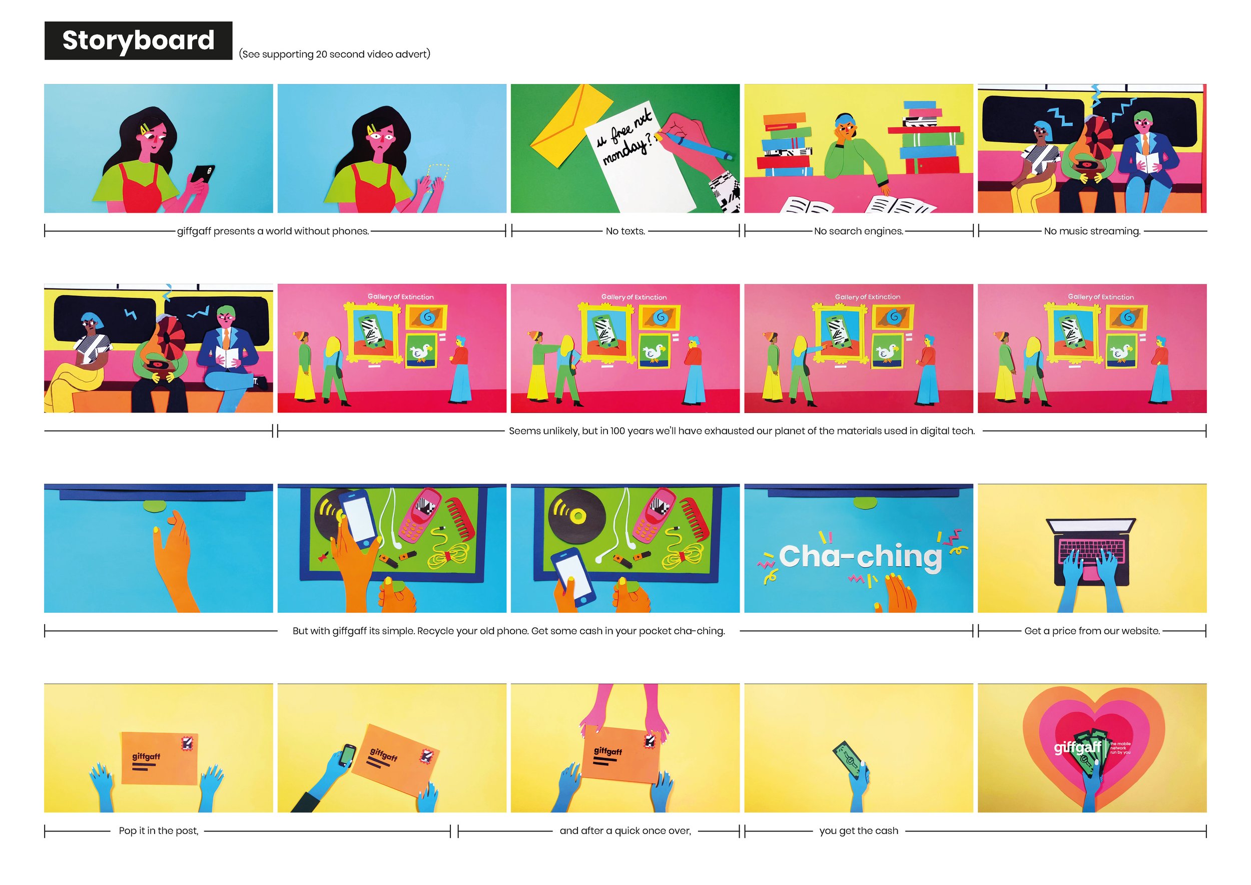
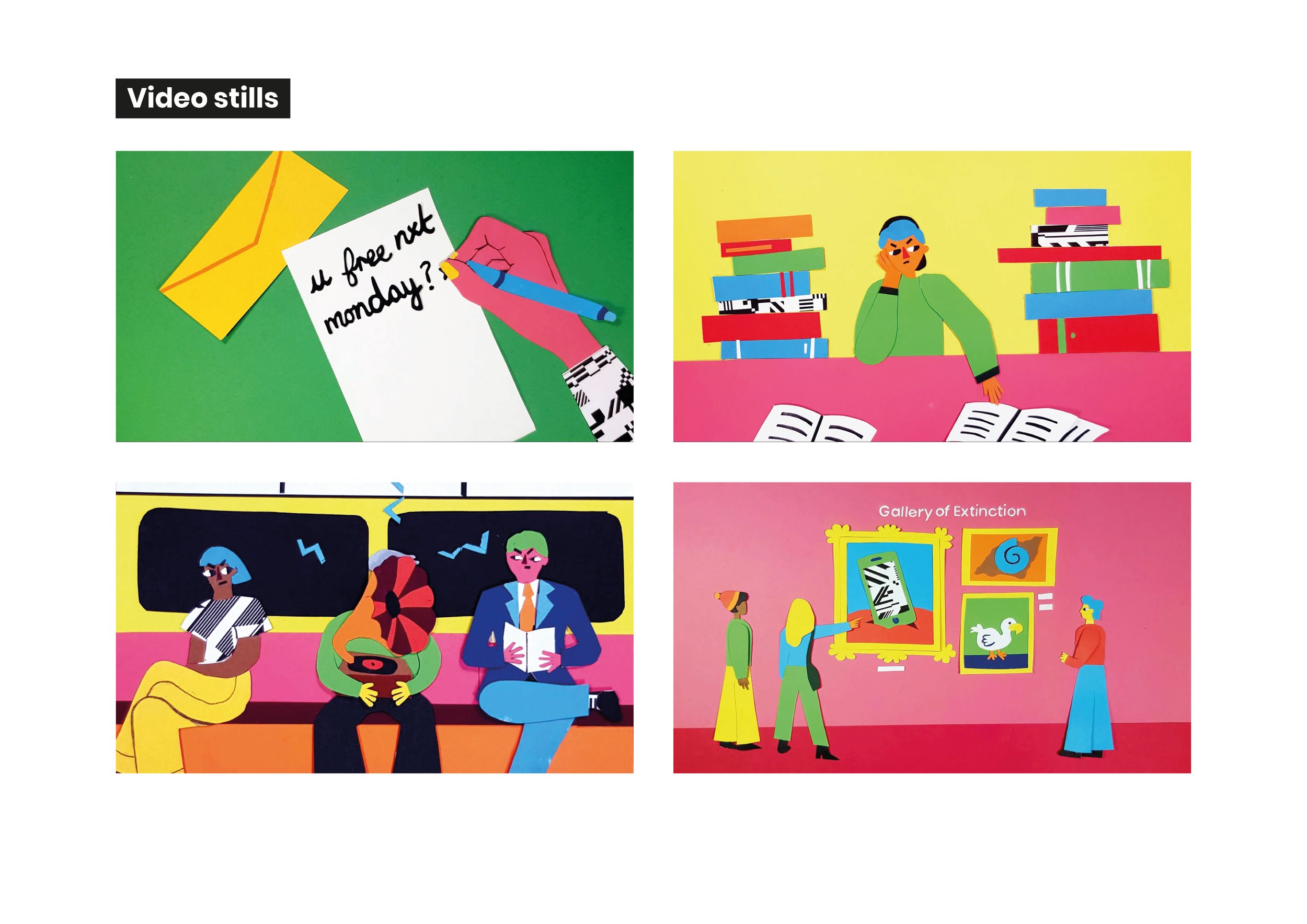
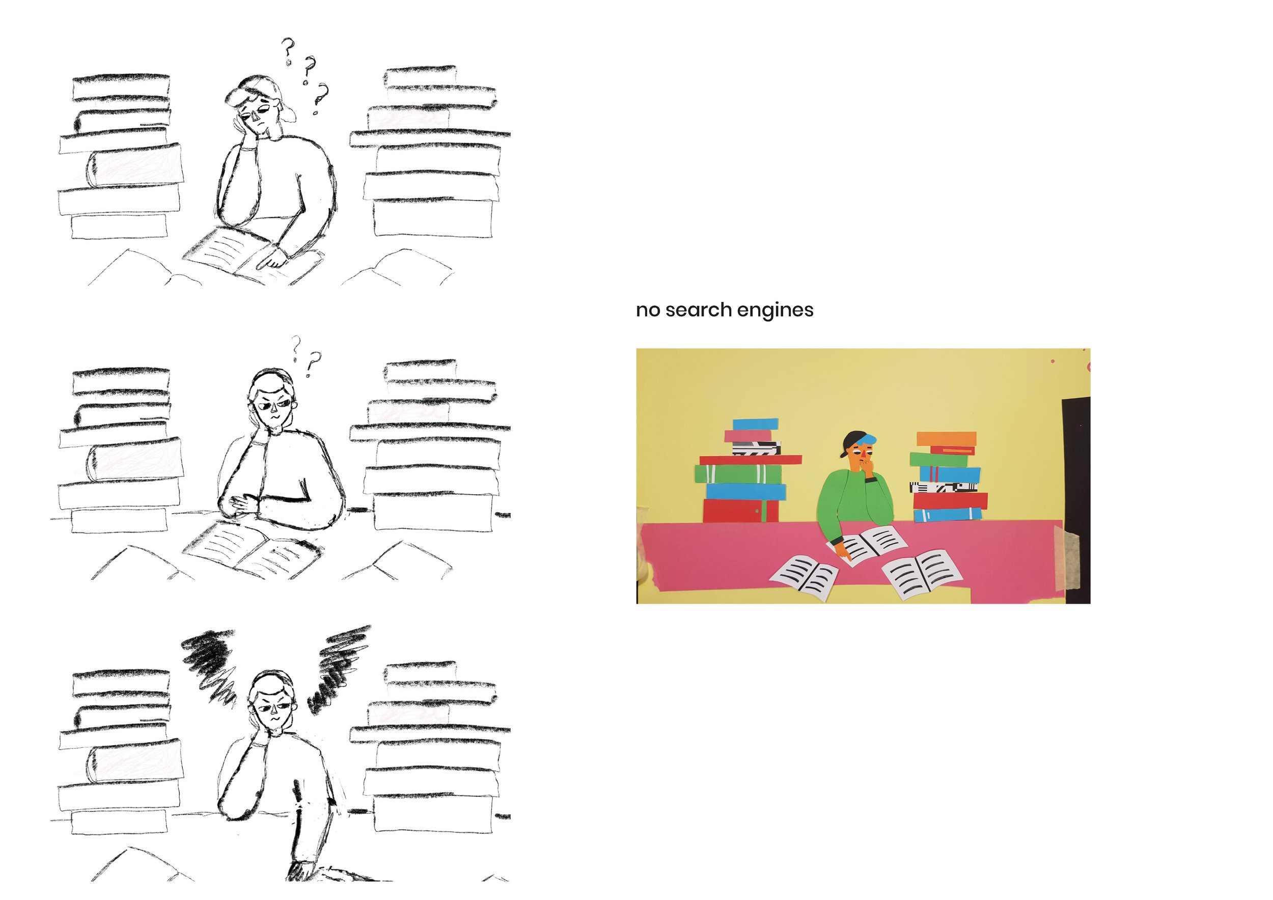
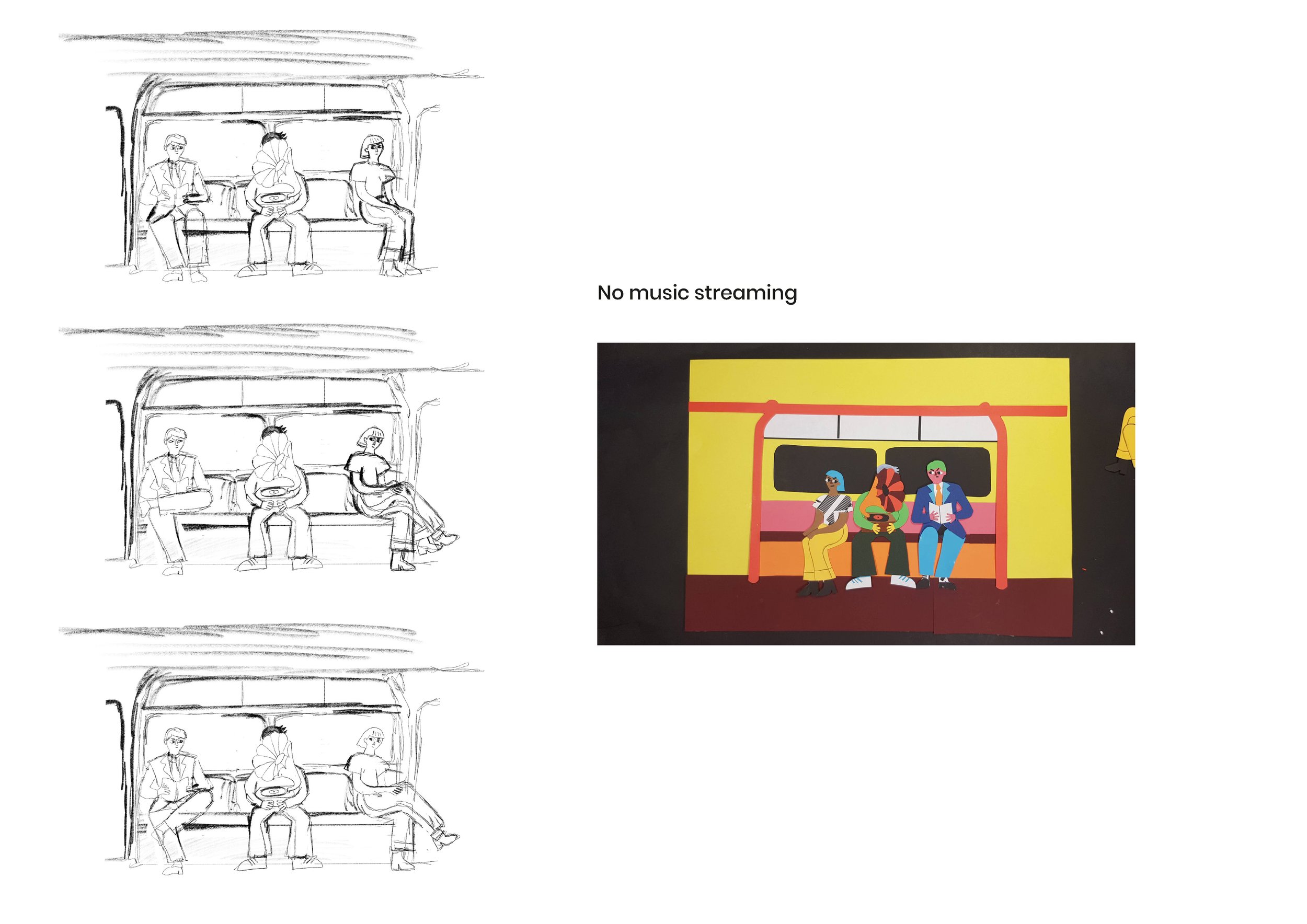
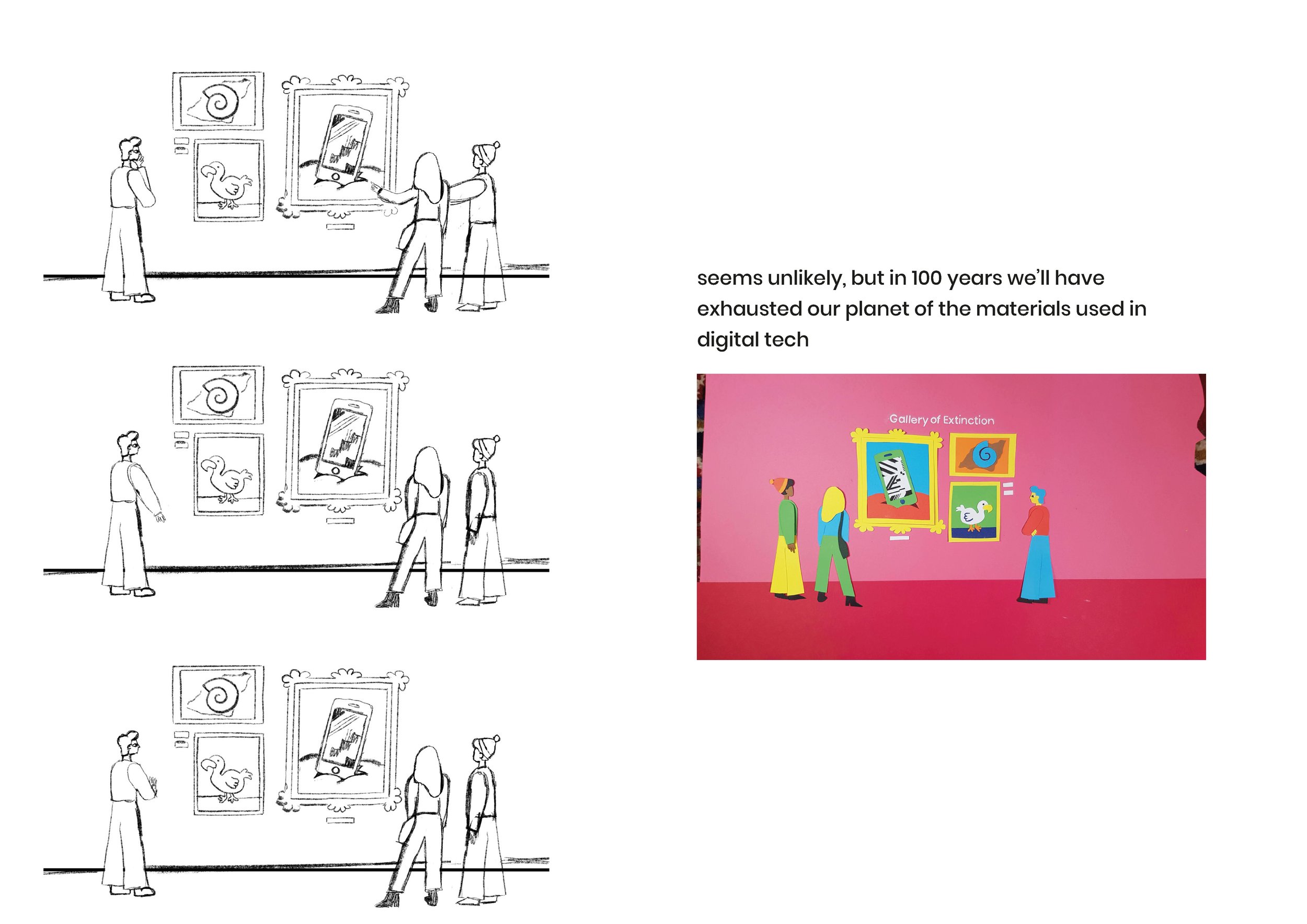
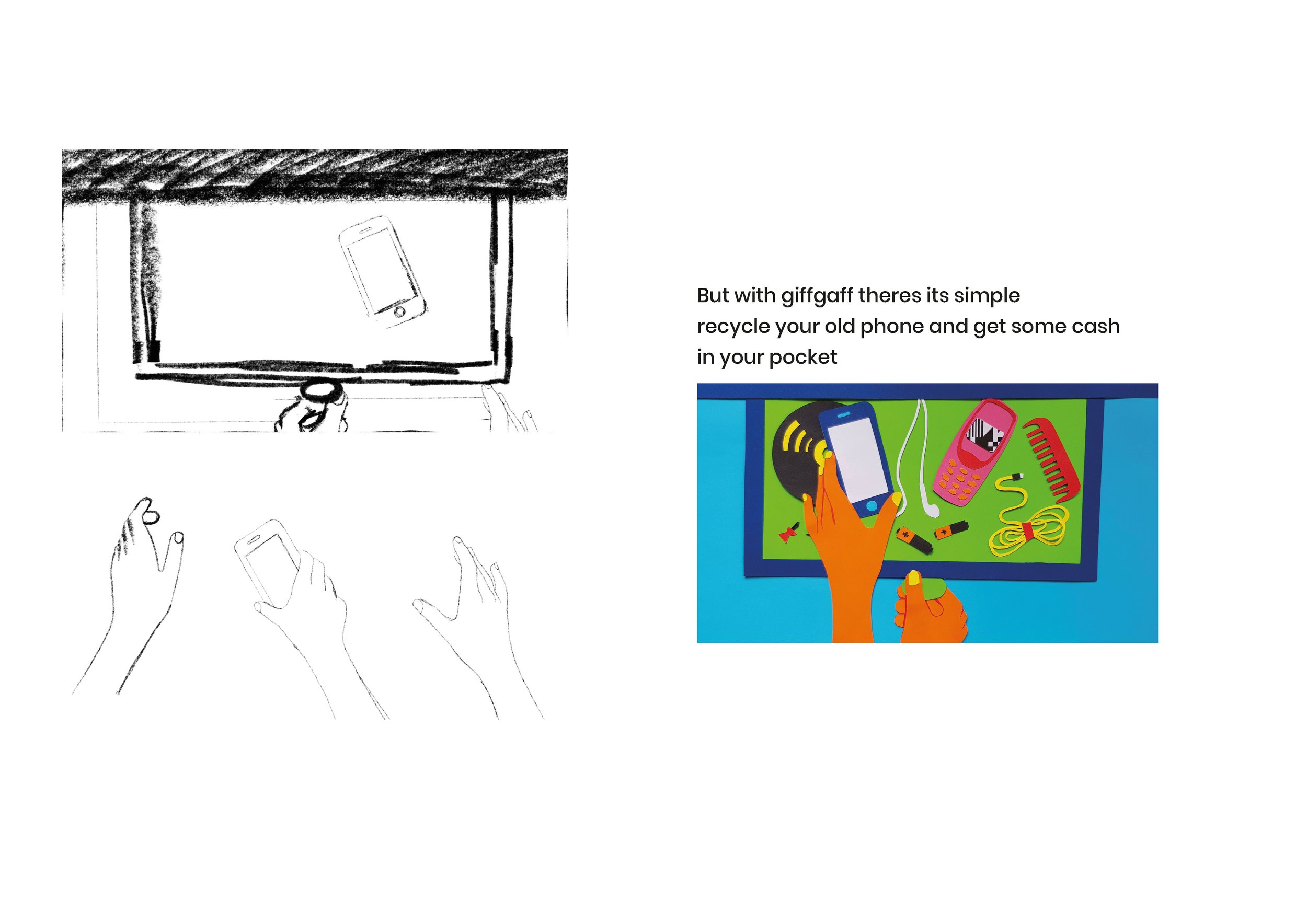
Giffgaff – Cutting out the waste
/Campaign concept to encourage people to recycle their old phone, by Agatha Blazey.
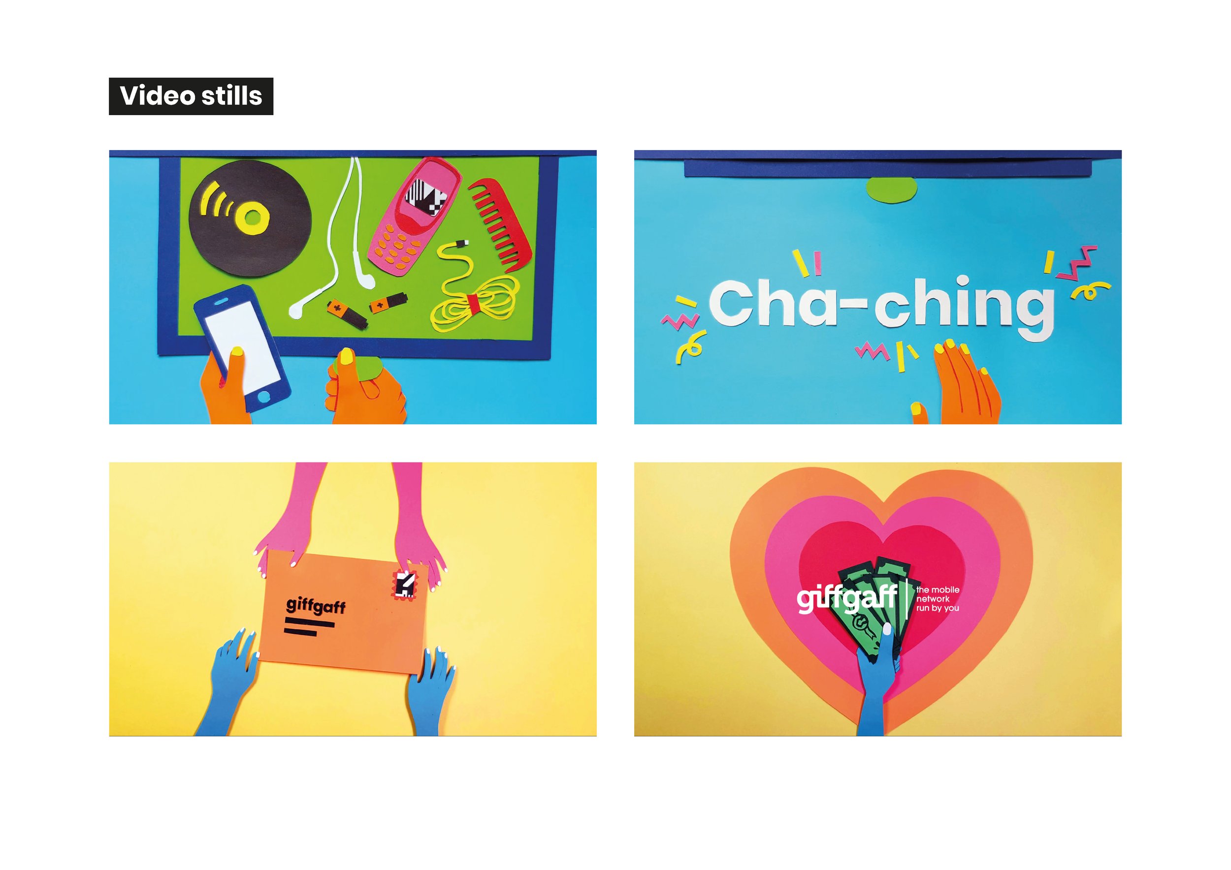
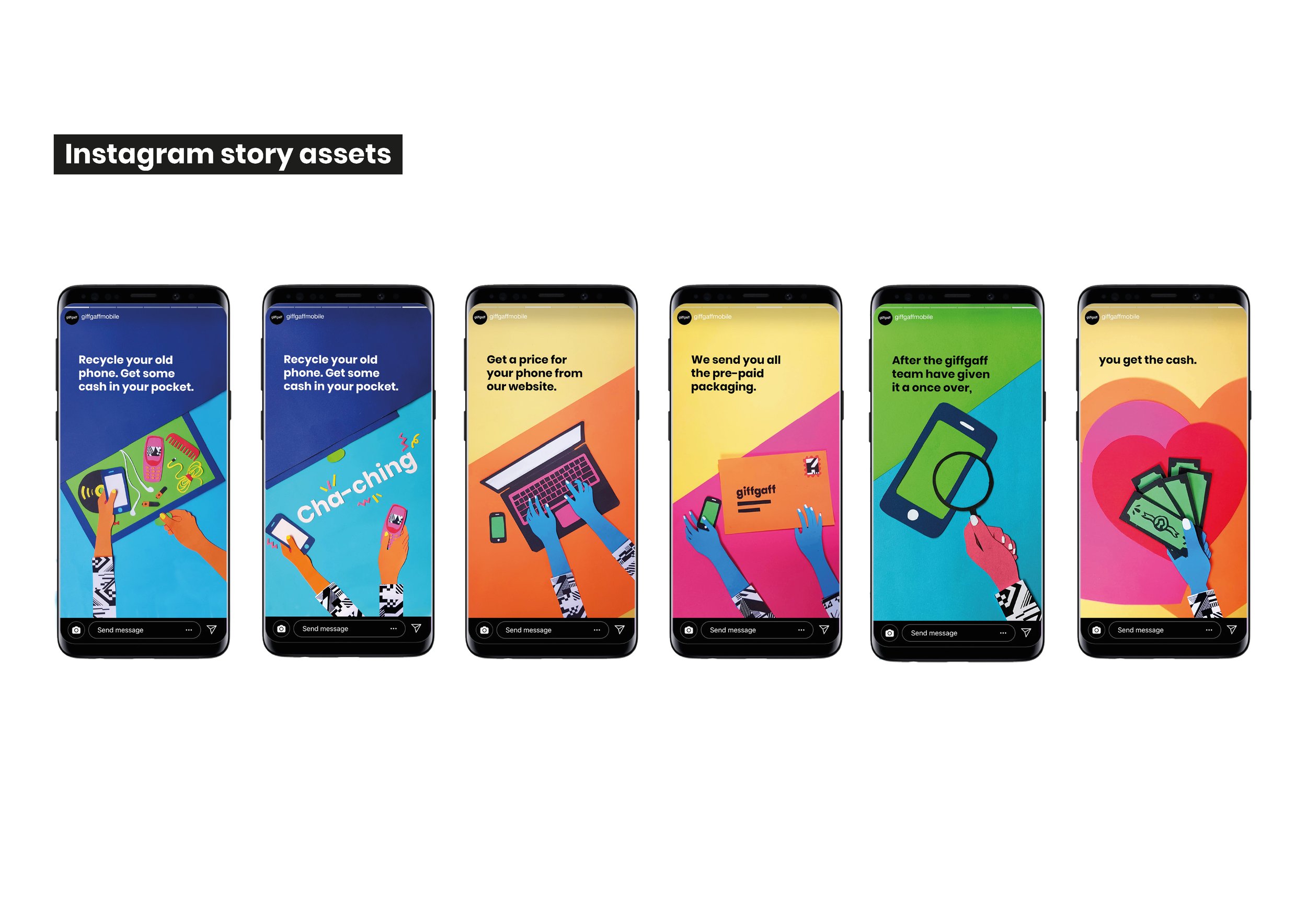
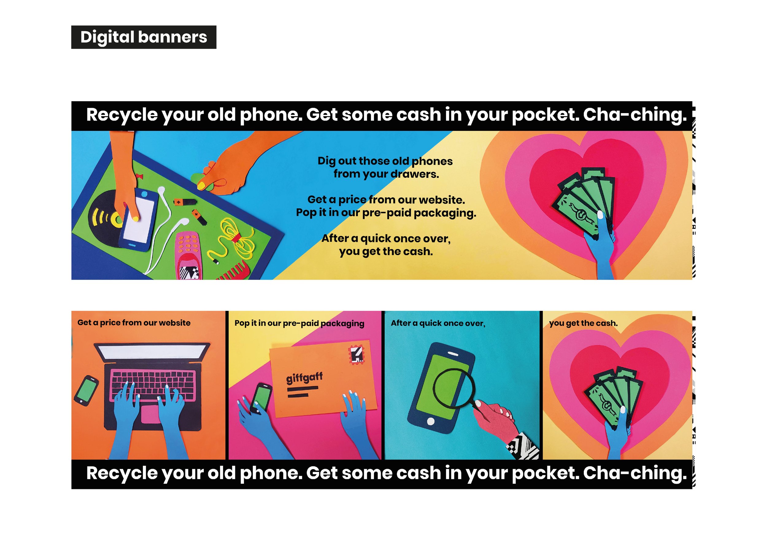
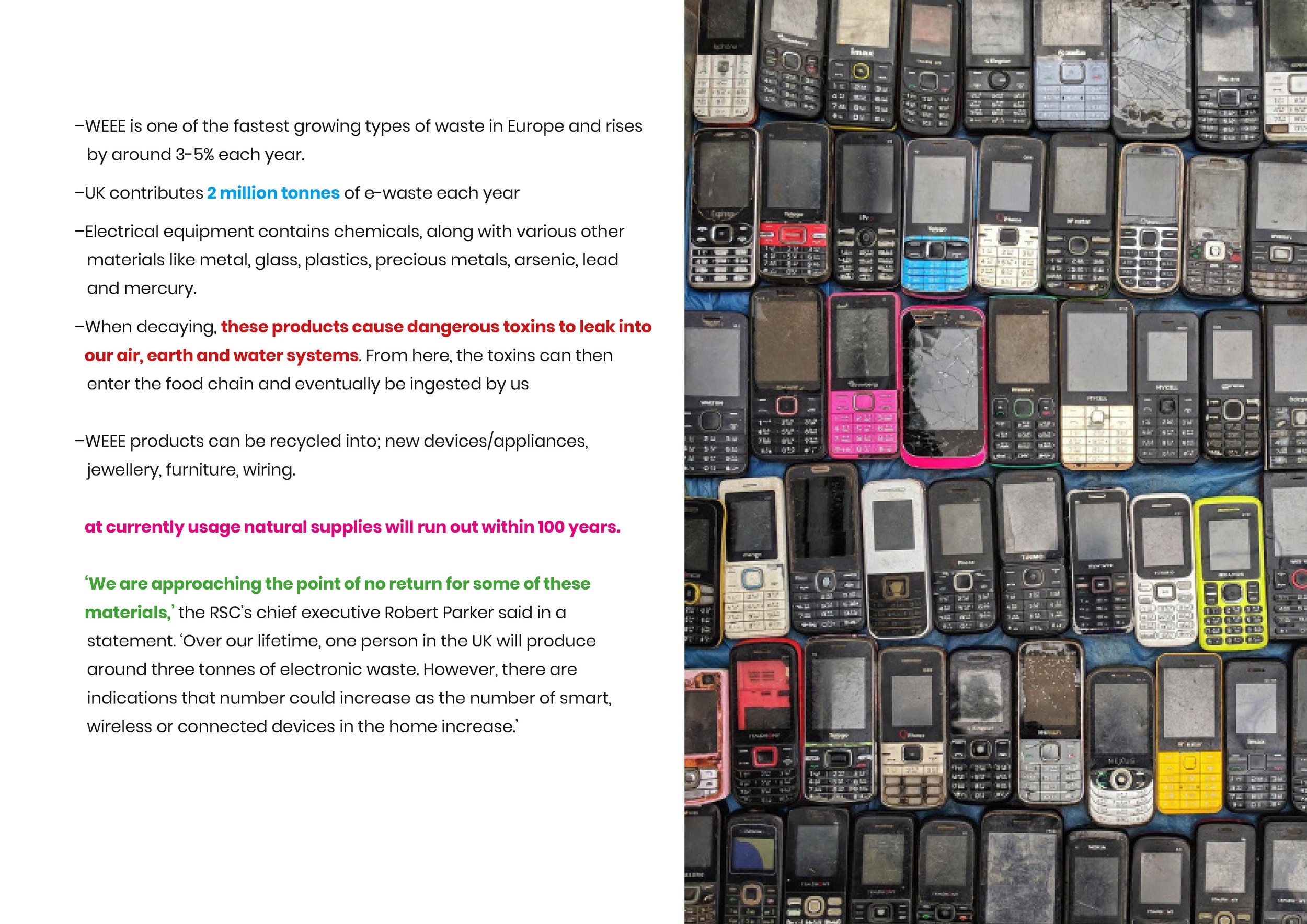
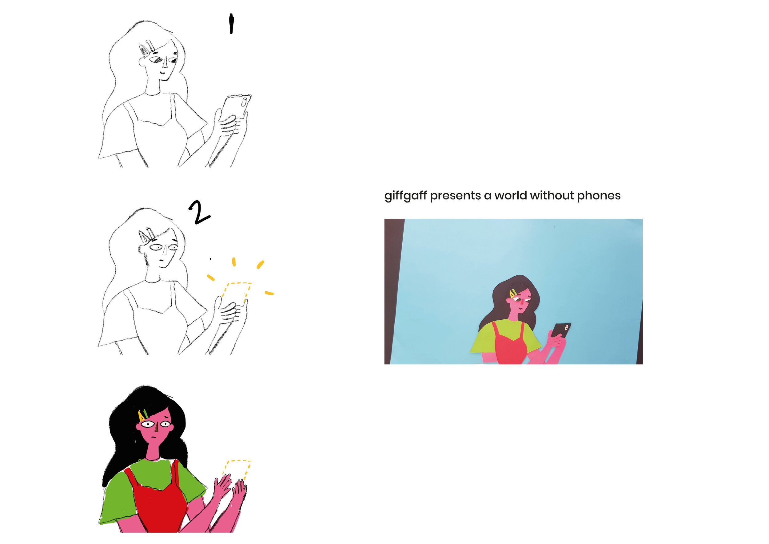
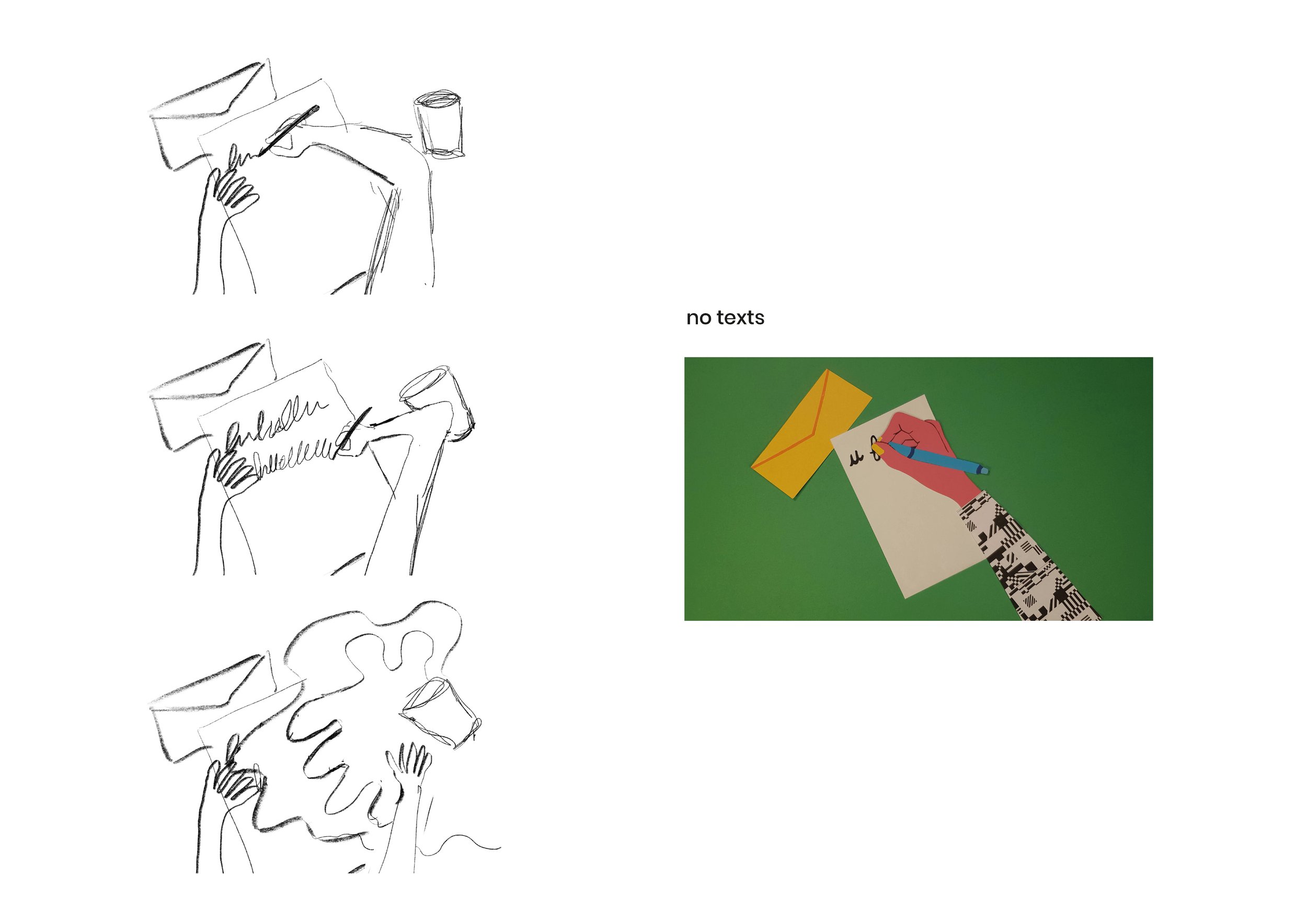
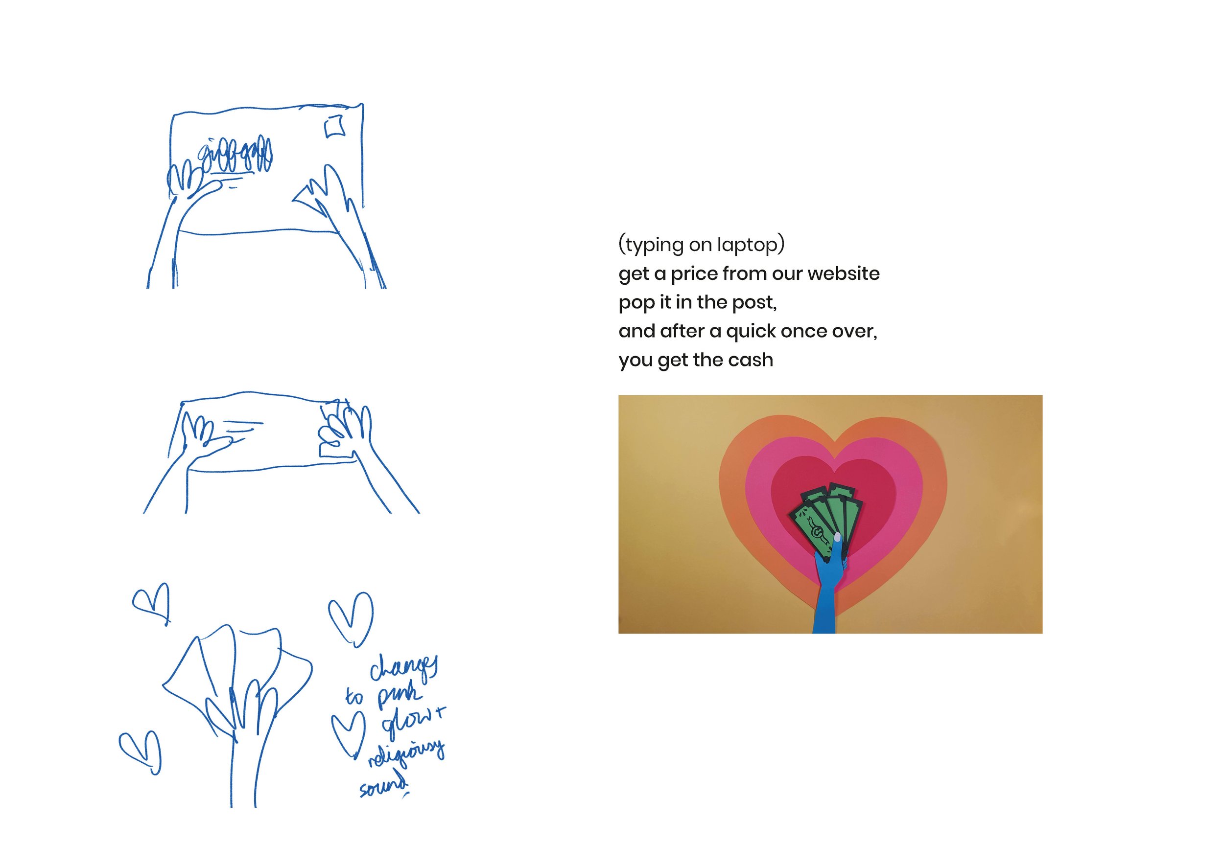
Campaign concept to encourage people to recycle their old phone, by Agatha Blazey.
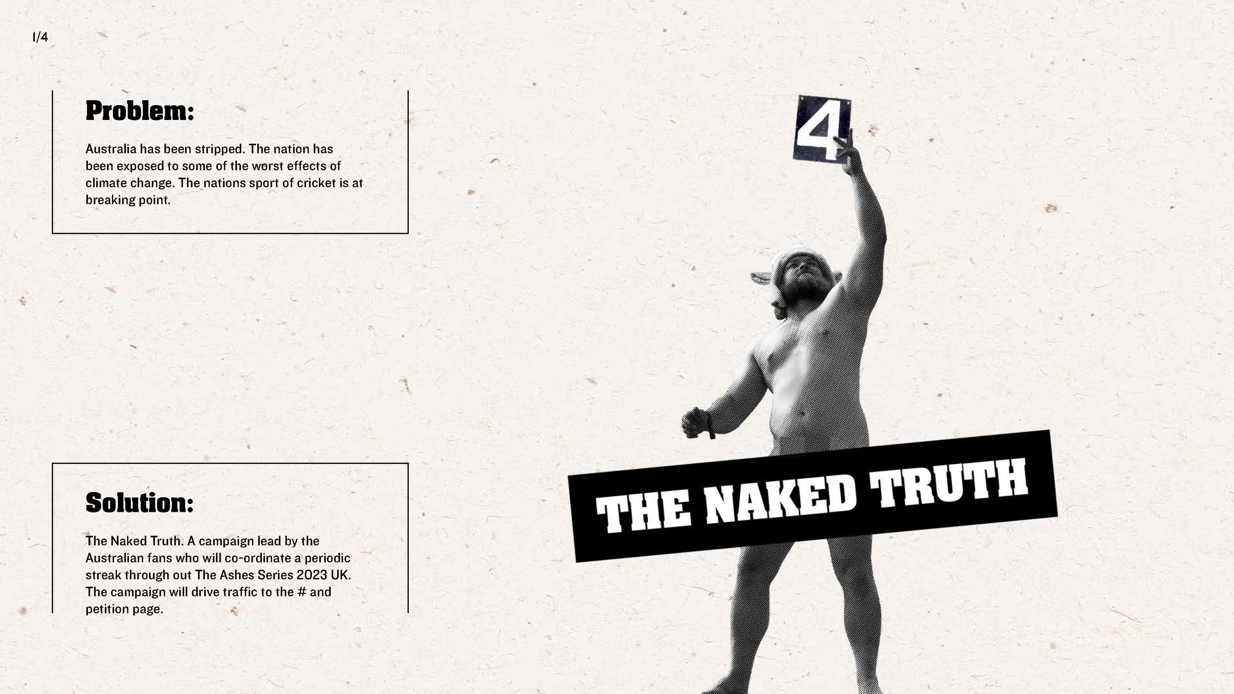
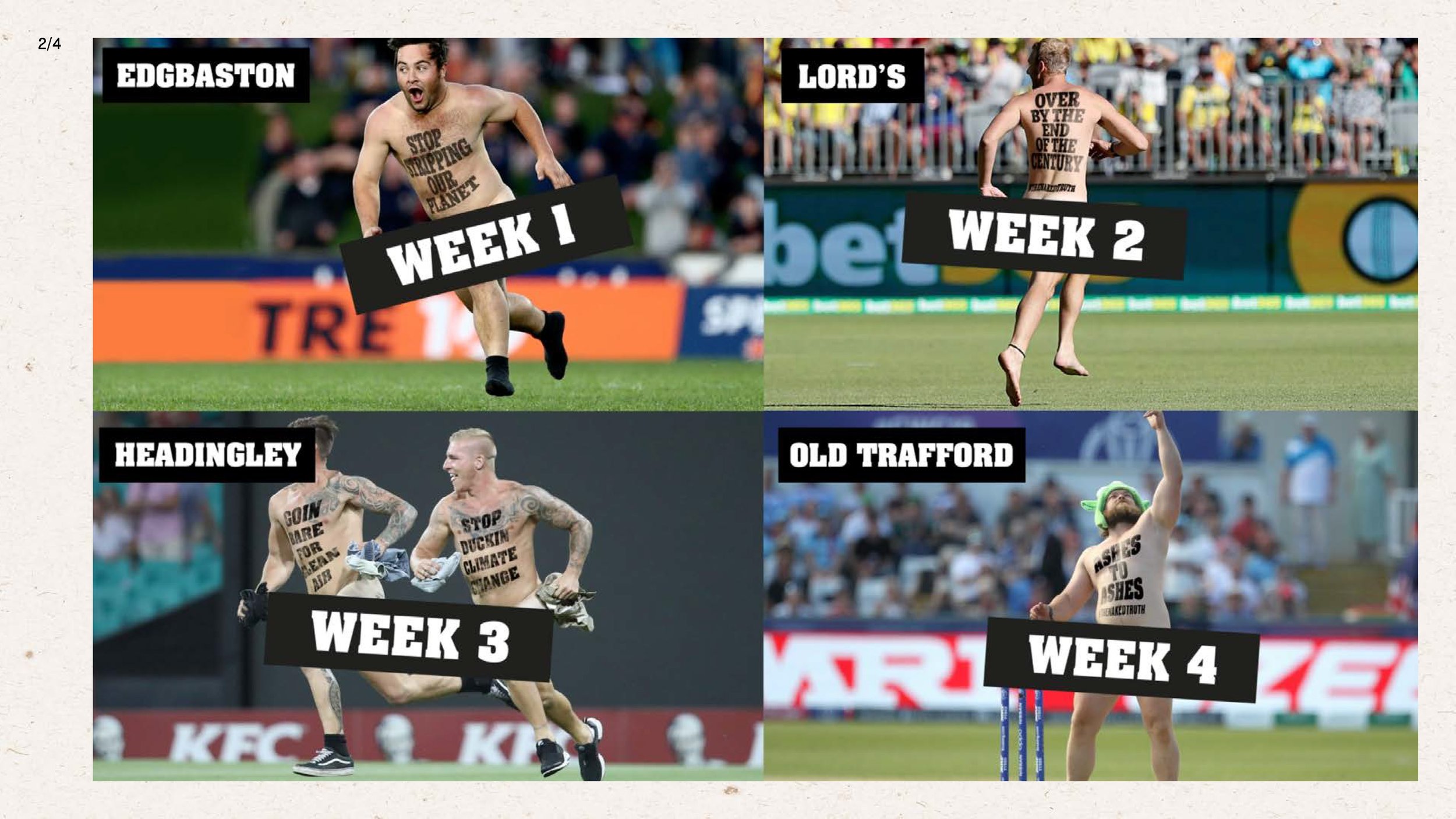
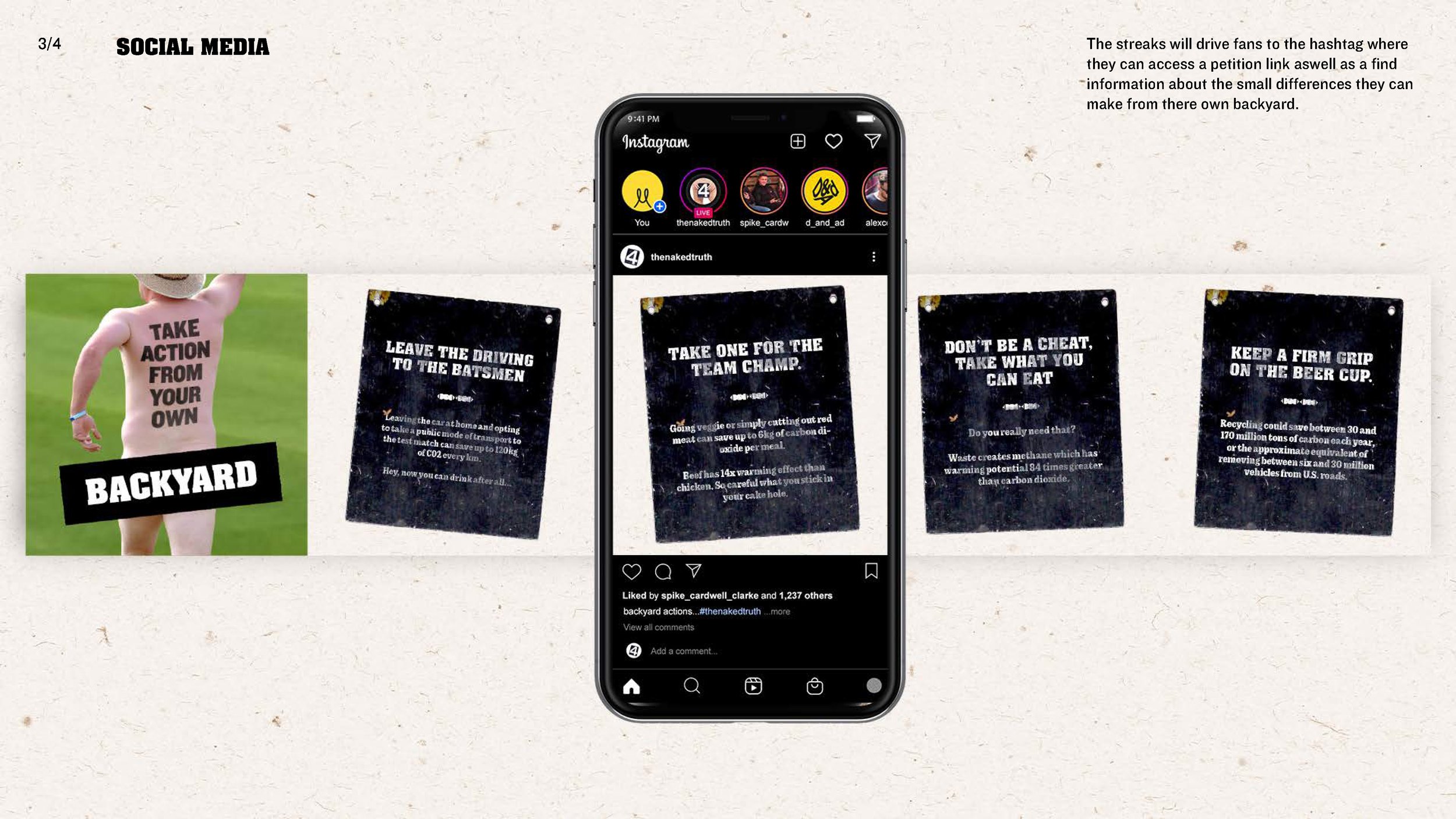
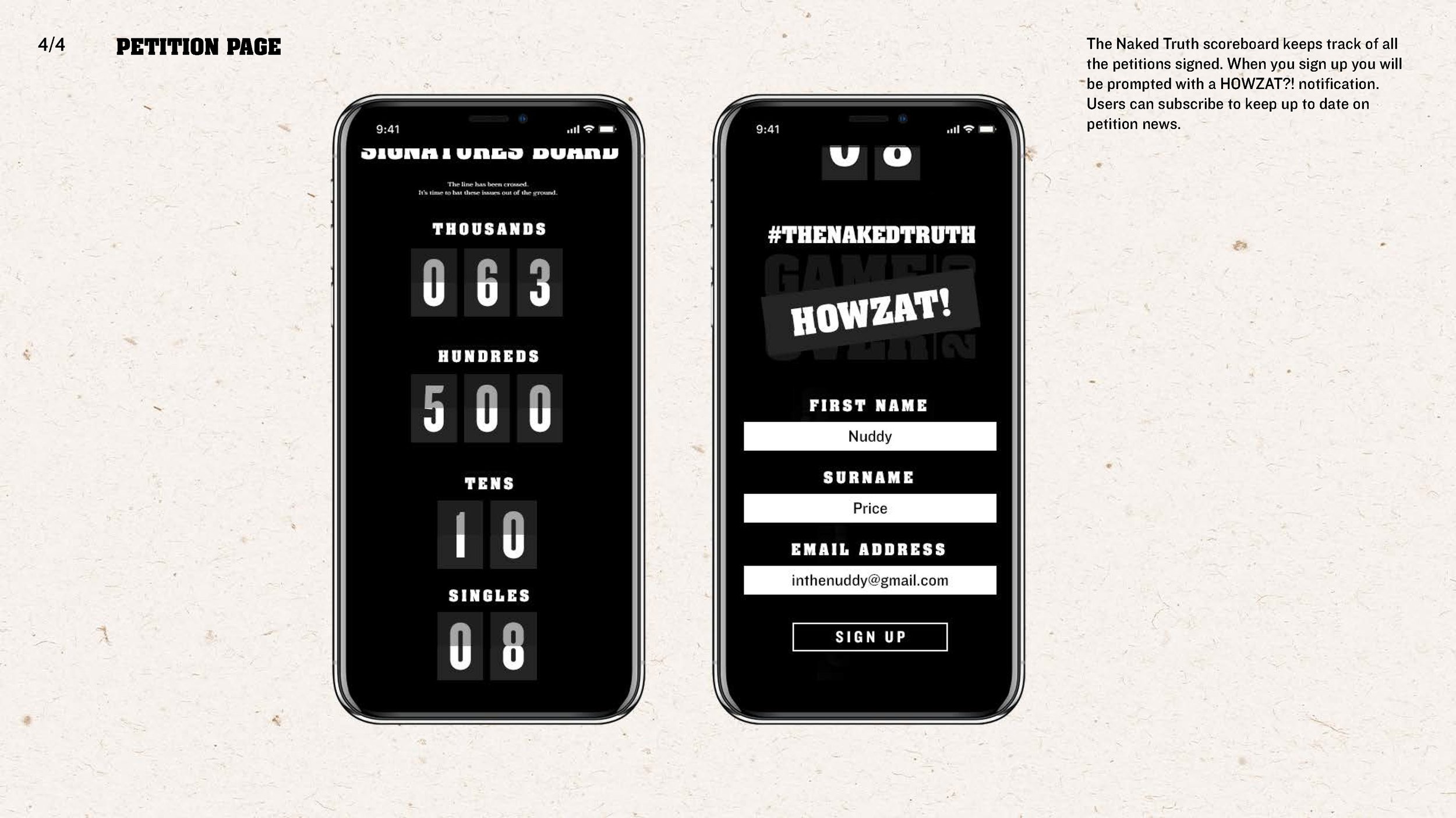
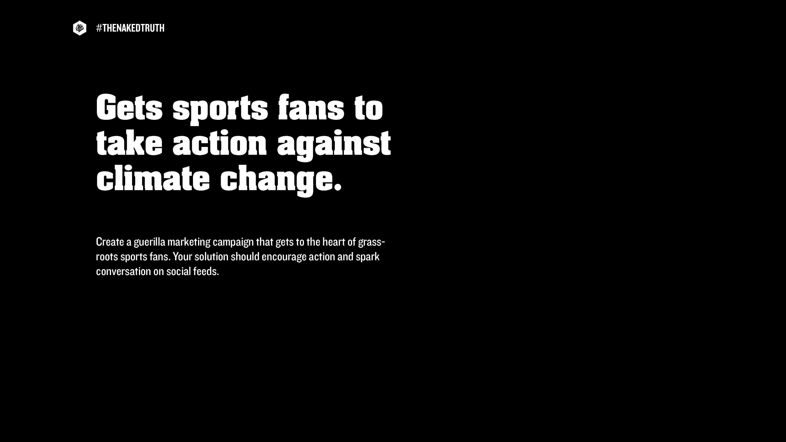
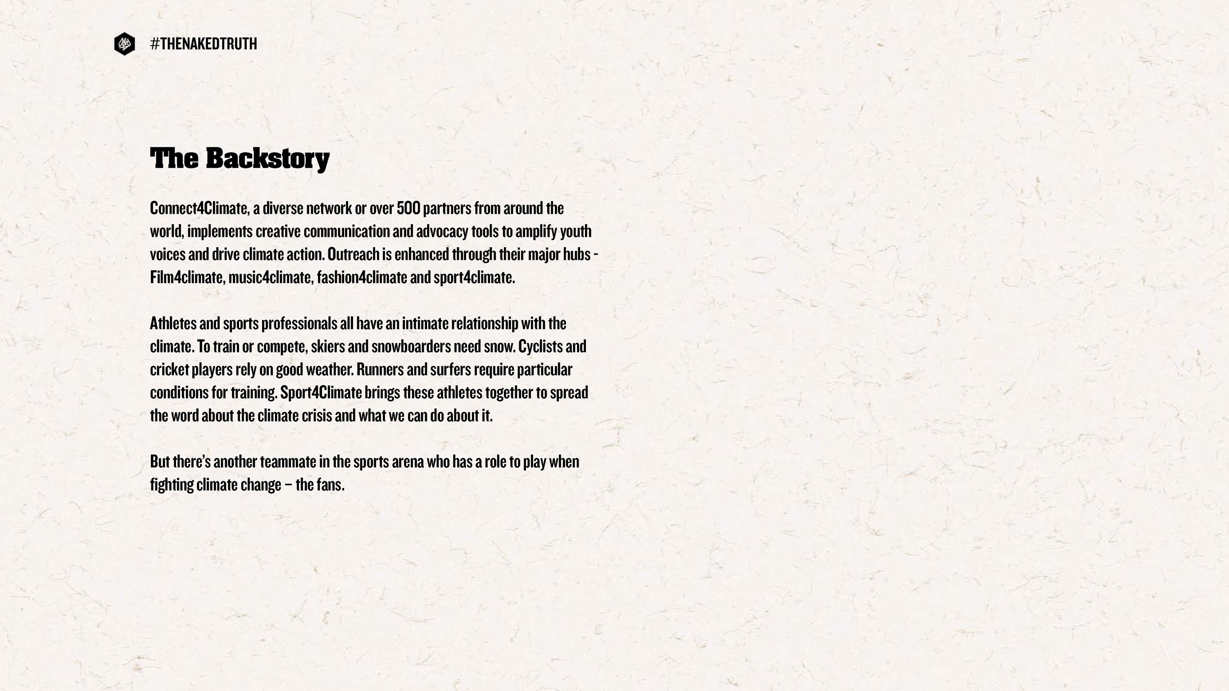
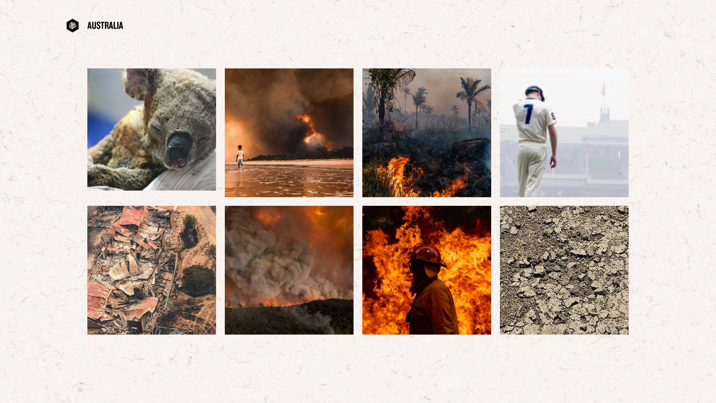
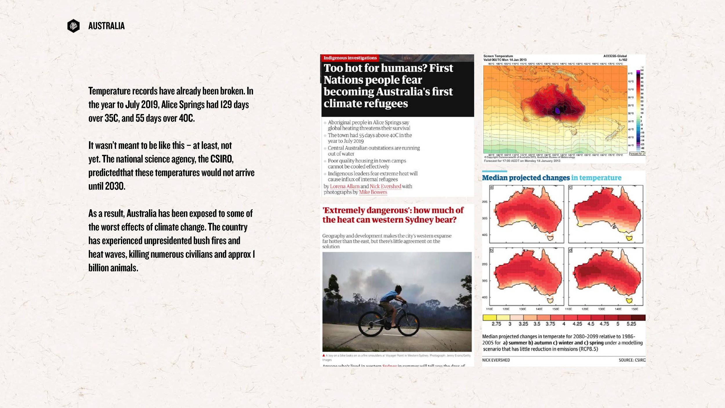
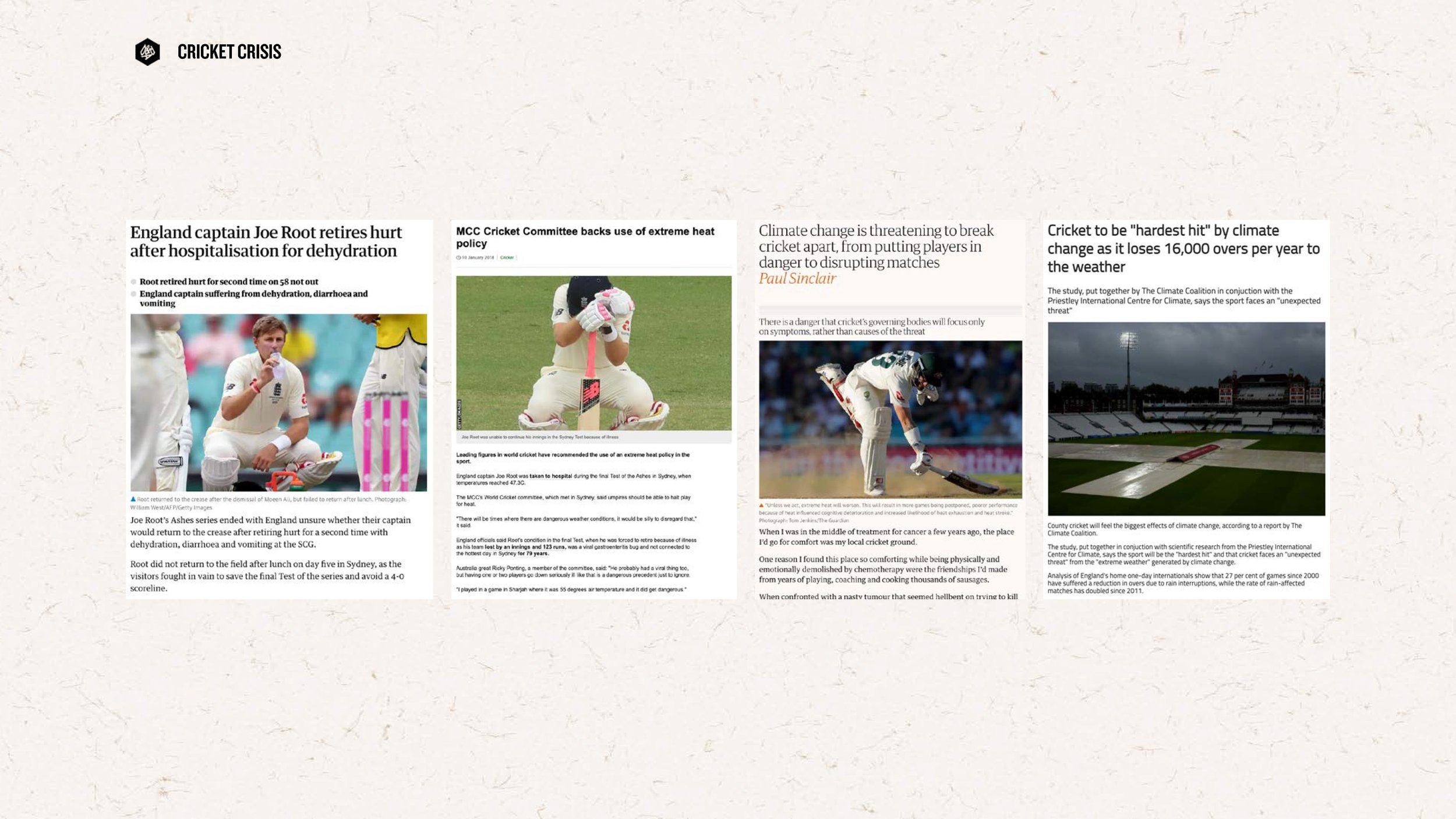
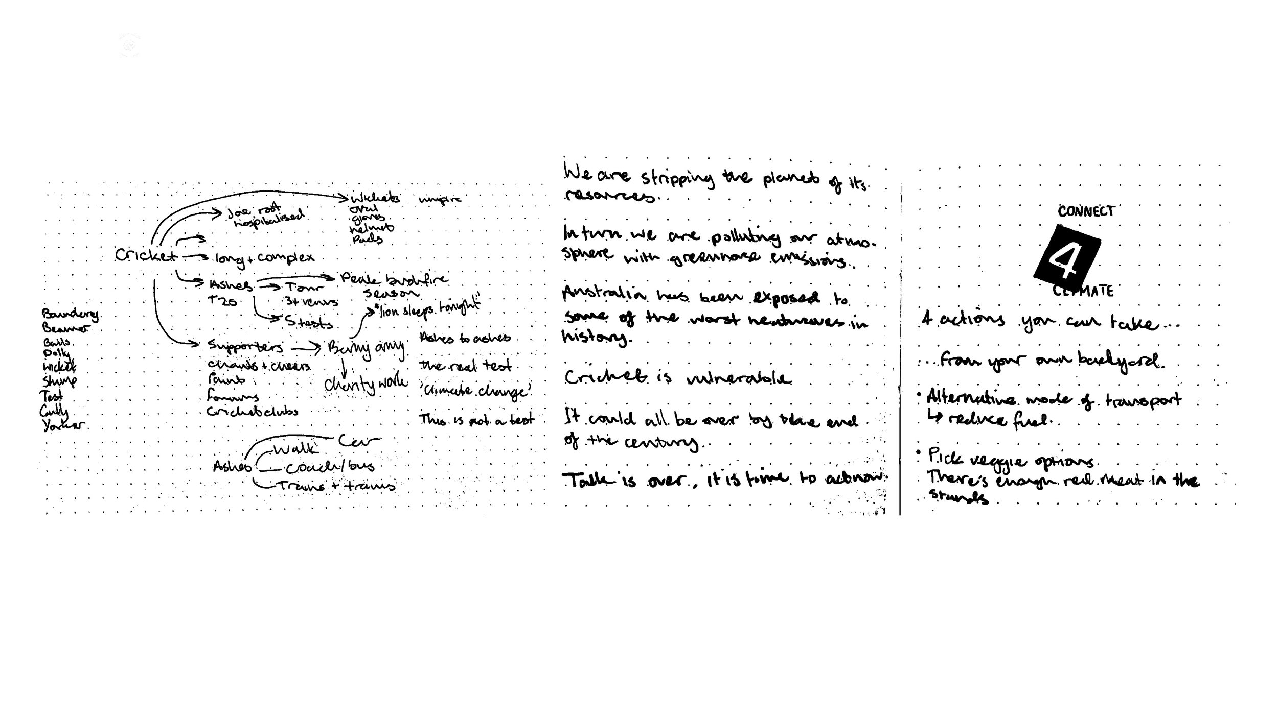
Campaign to get sports fans to take action on climate change, by Michael Cardwell-Clarke.


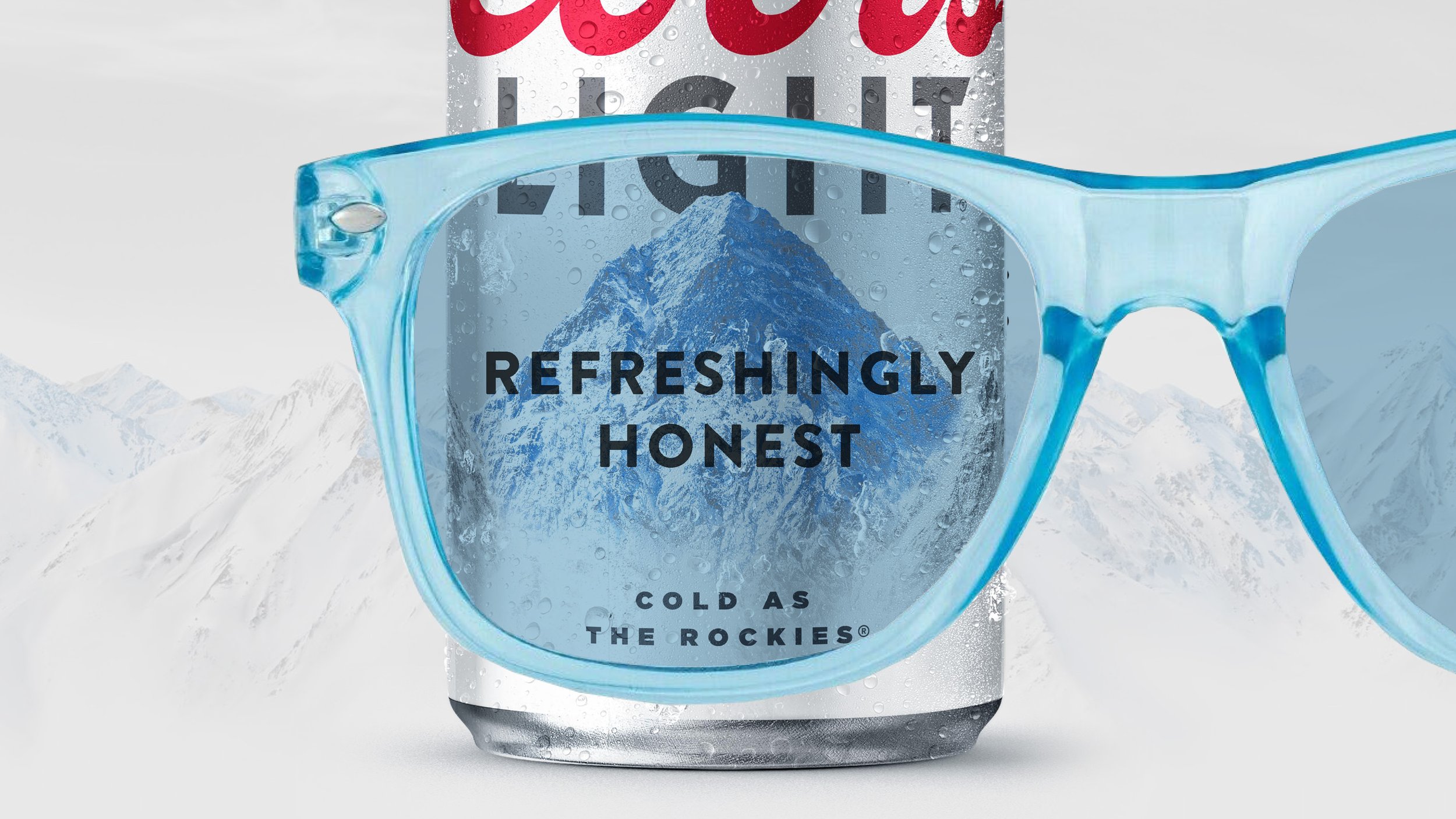
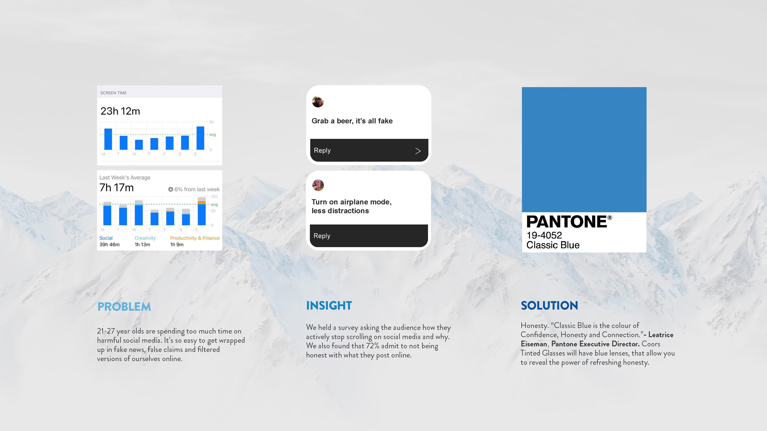
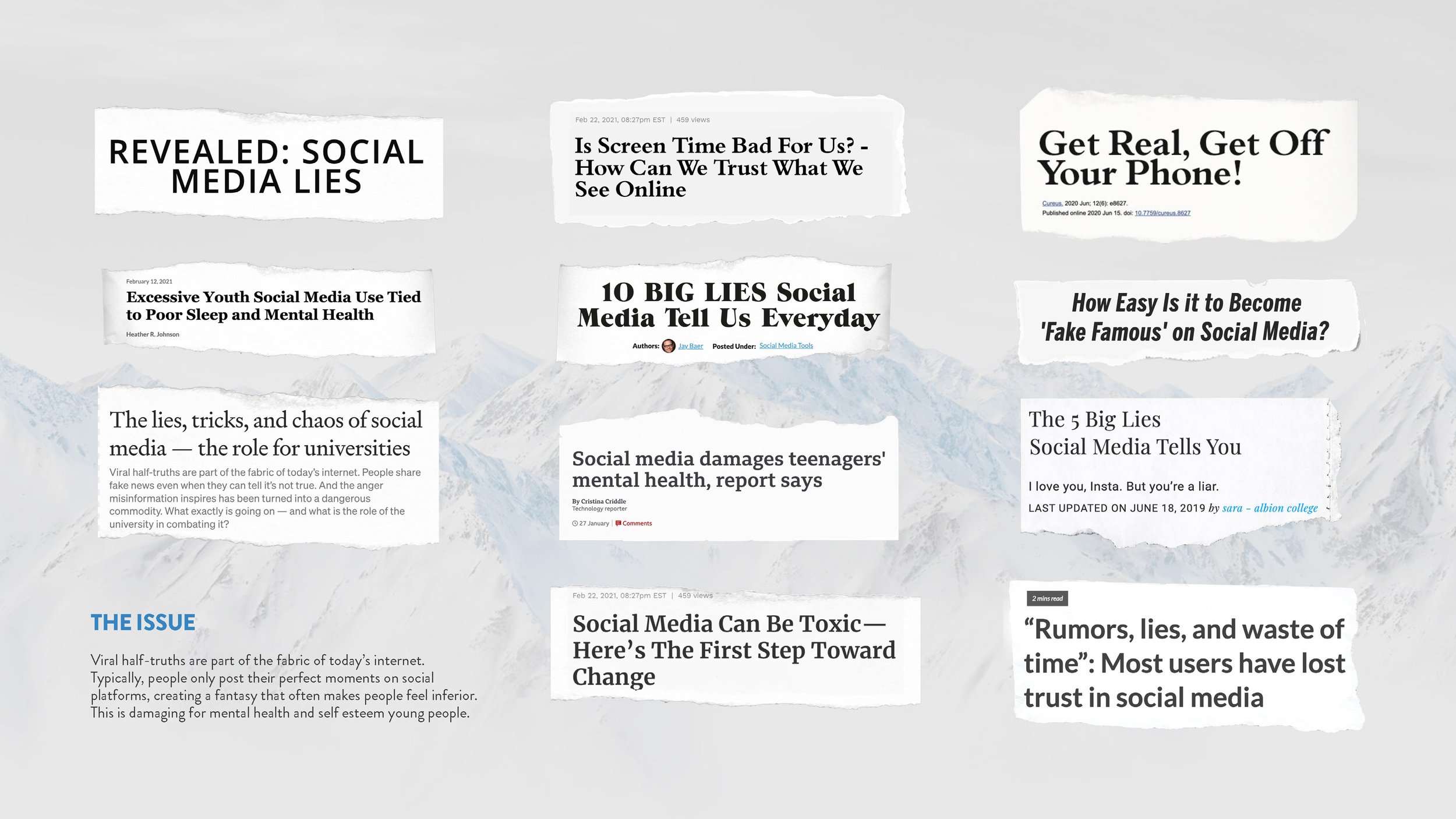
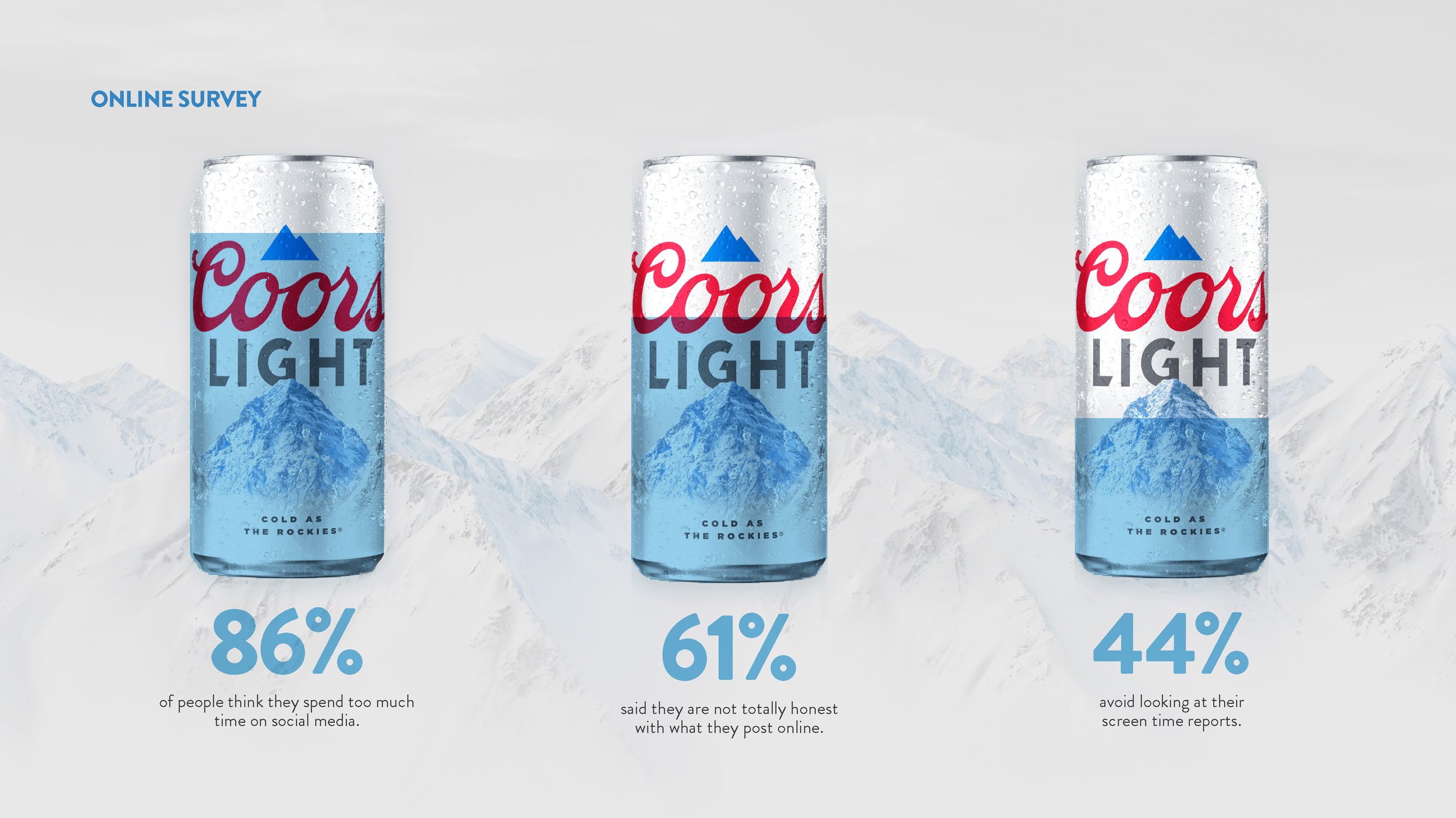
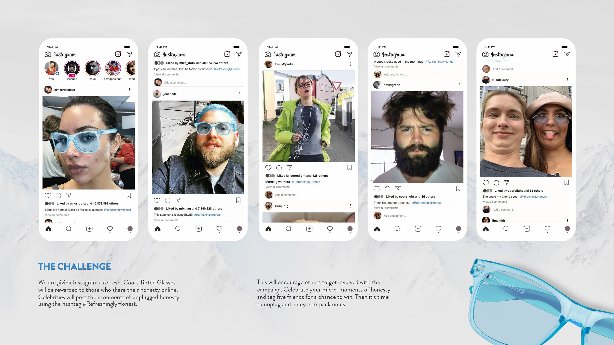
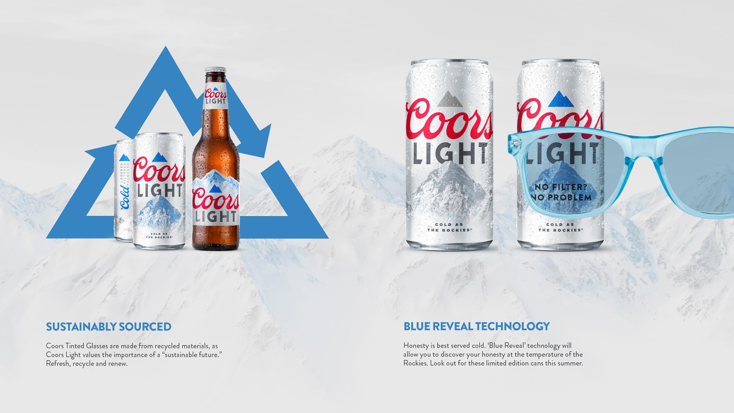
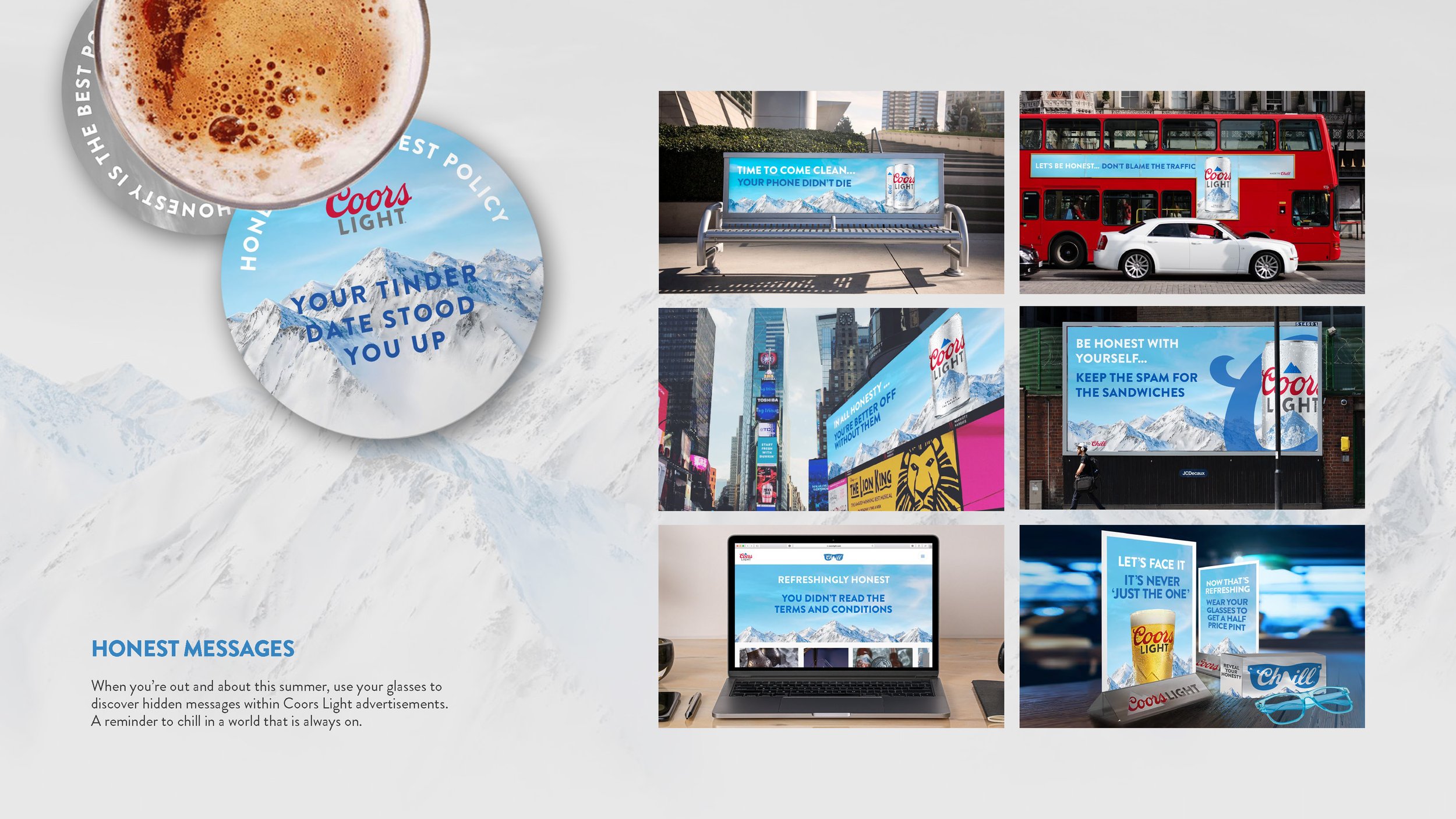
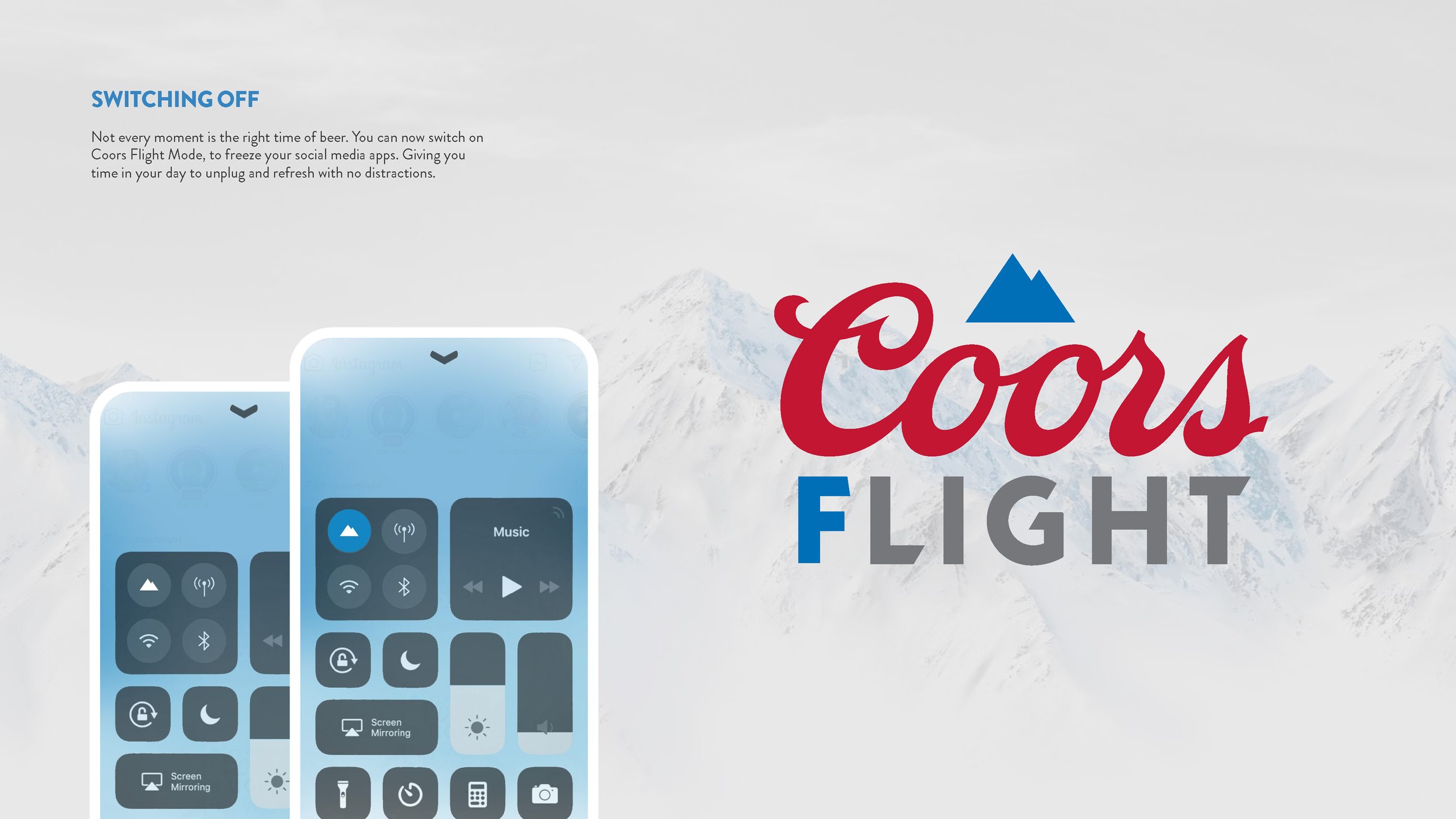
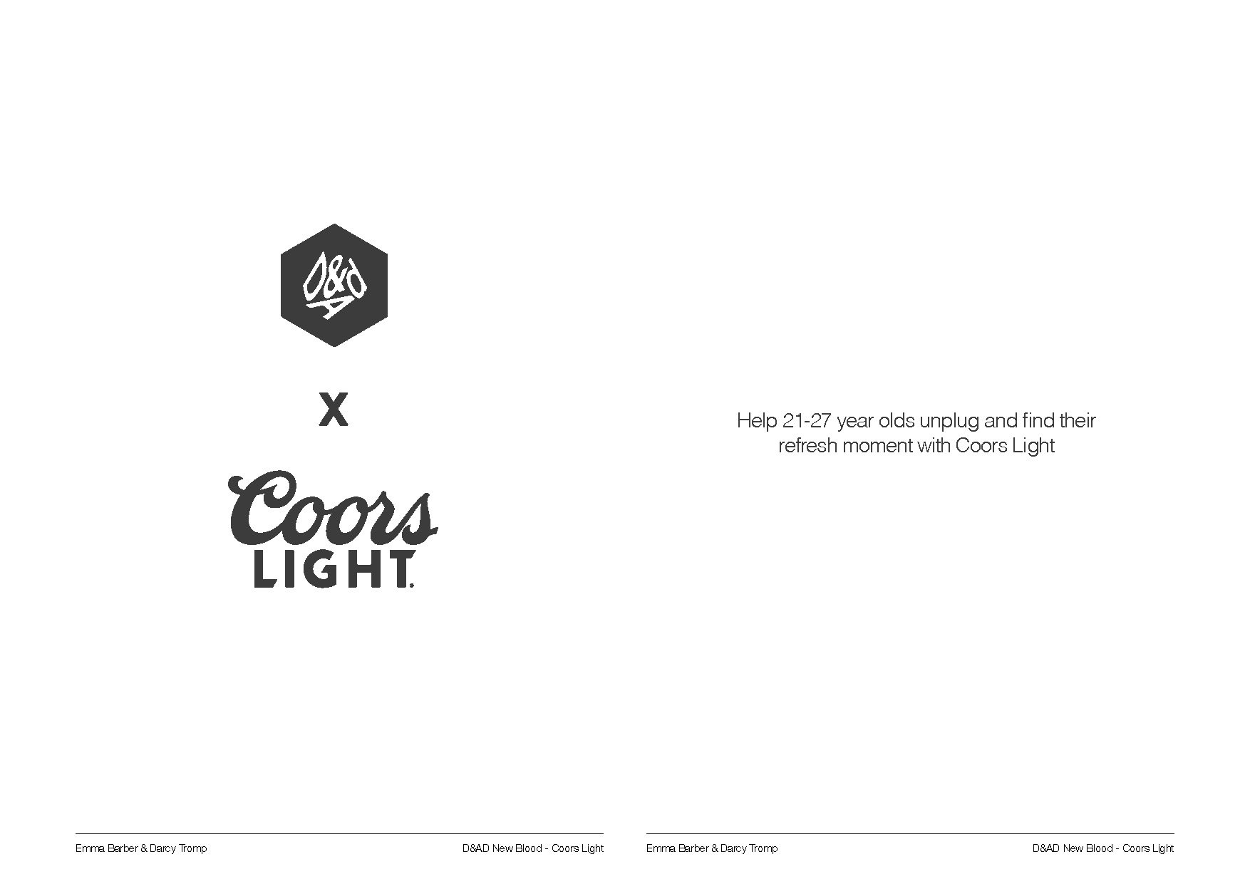
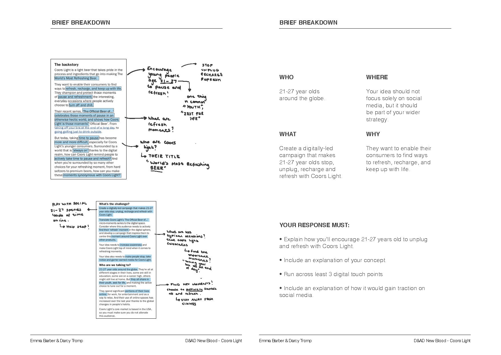
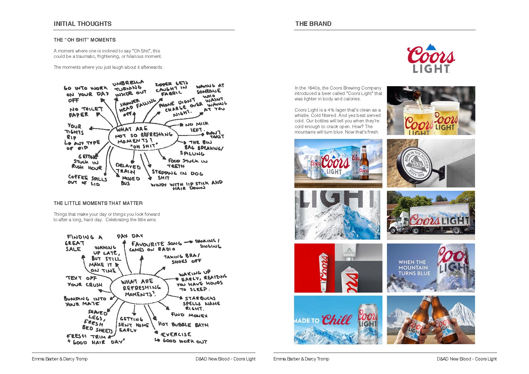
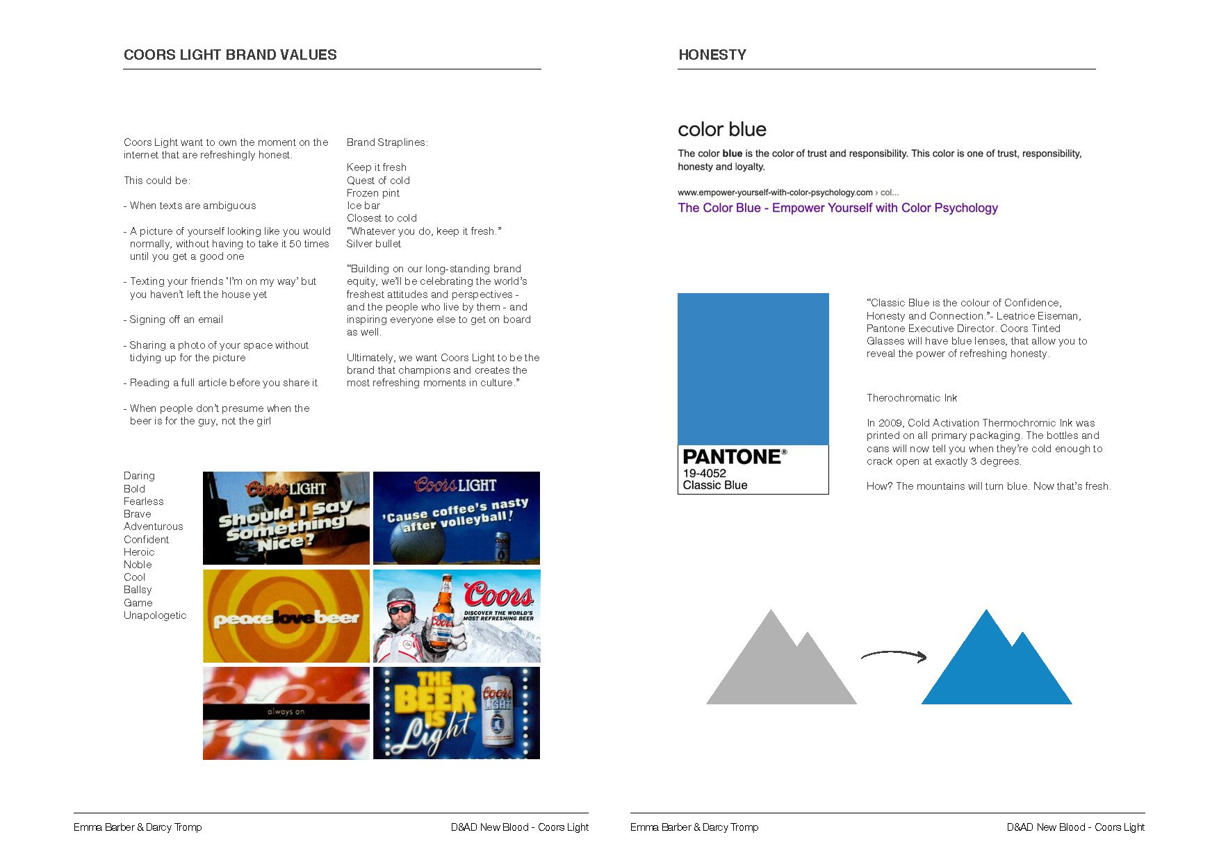
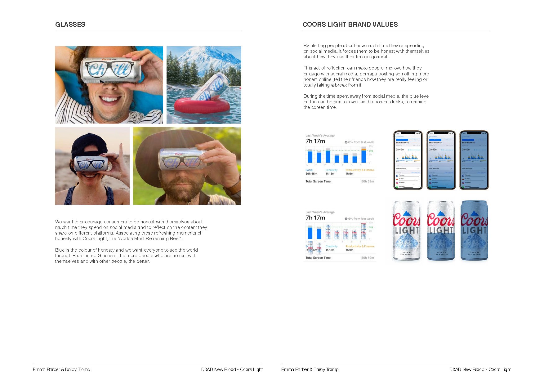
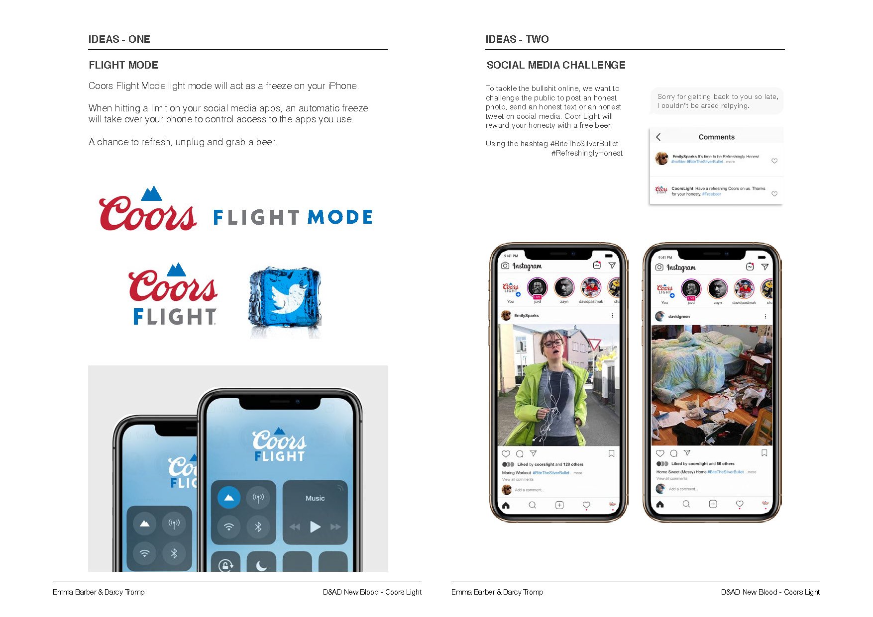
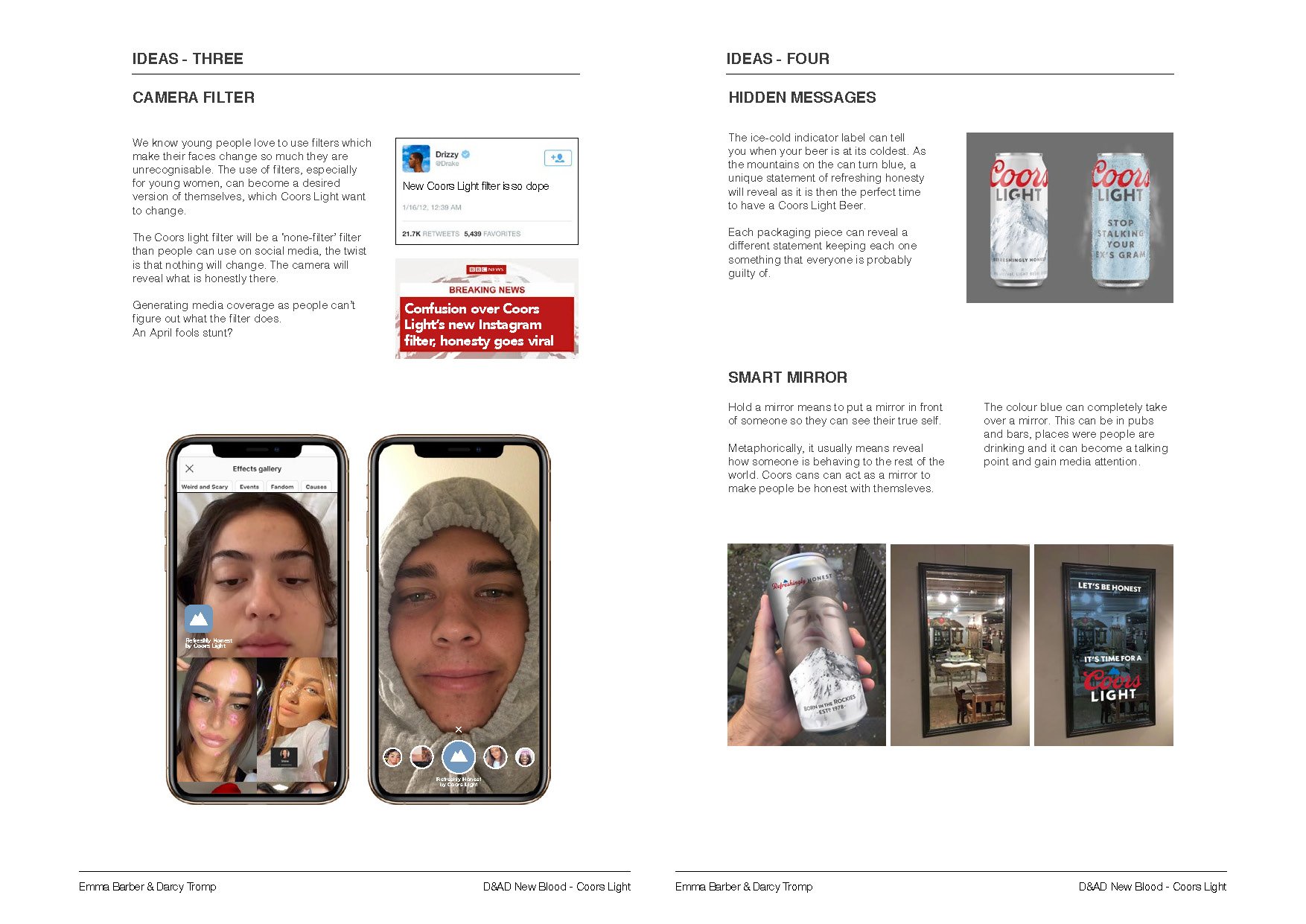
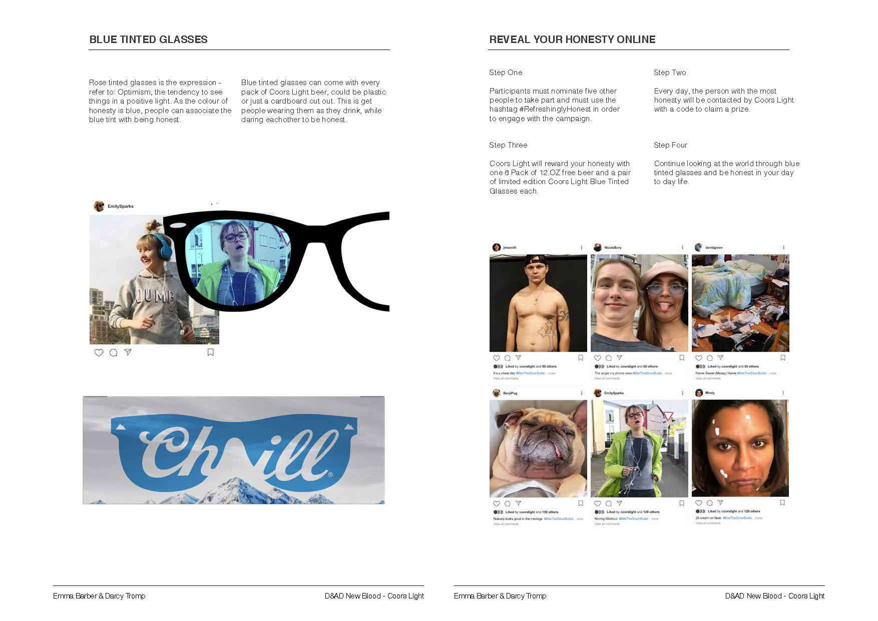
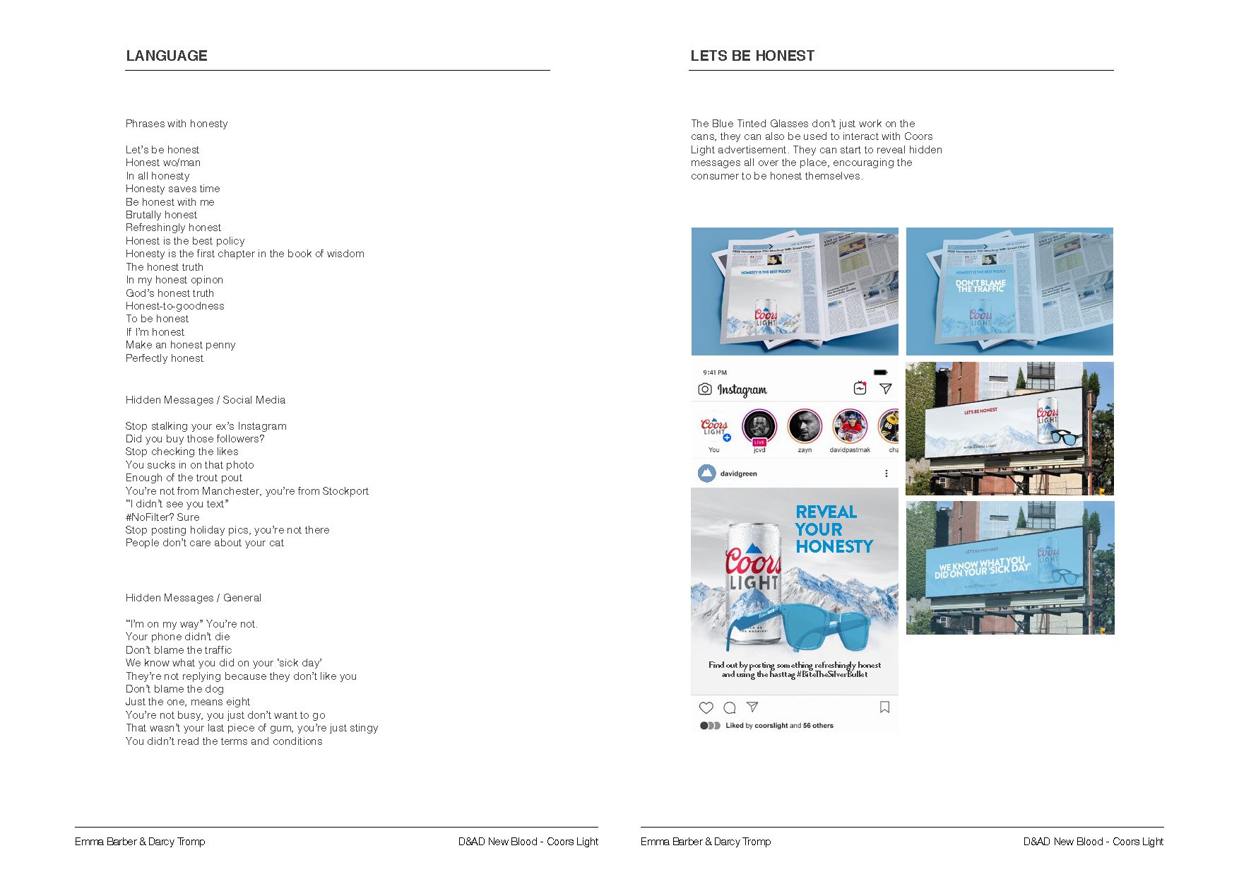
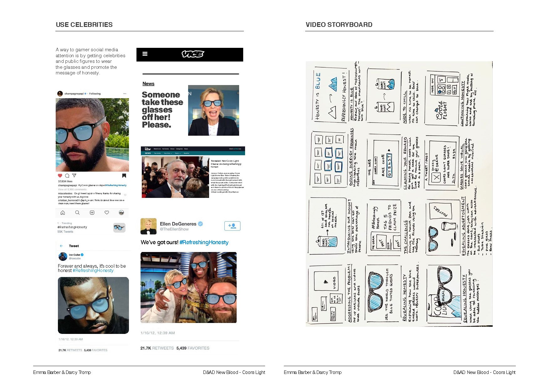
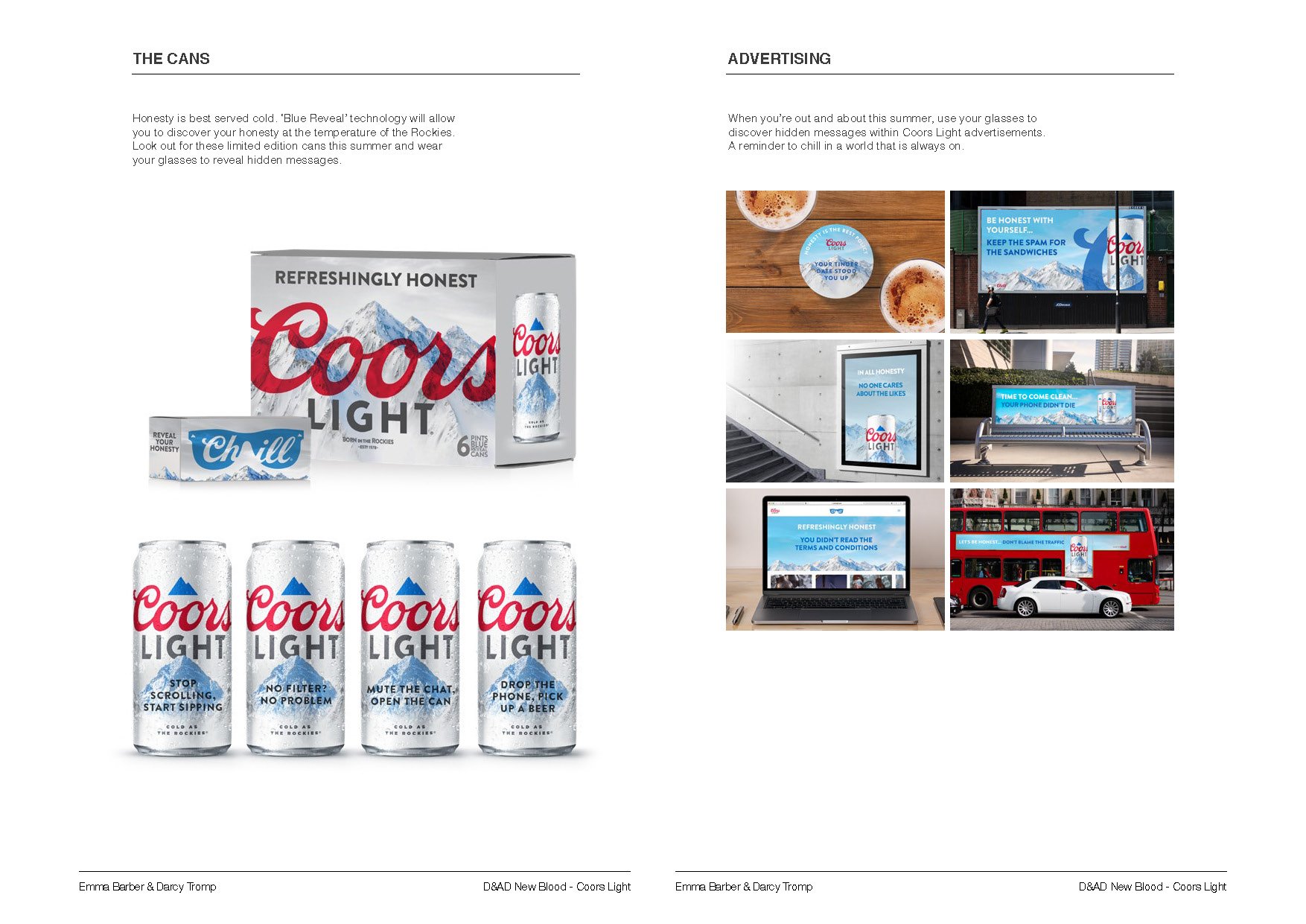
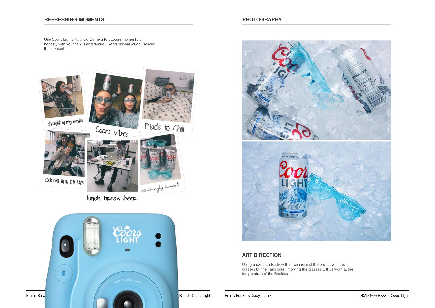
Campaign concept to promote Coors Light, by Darcy Tromp and Emma Barber.


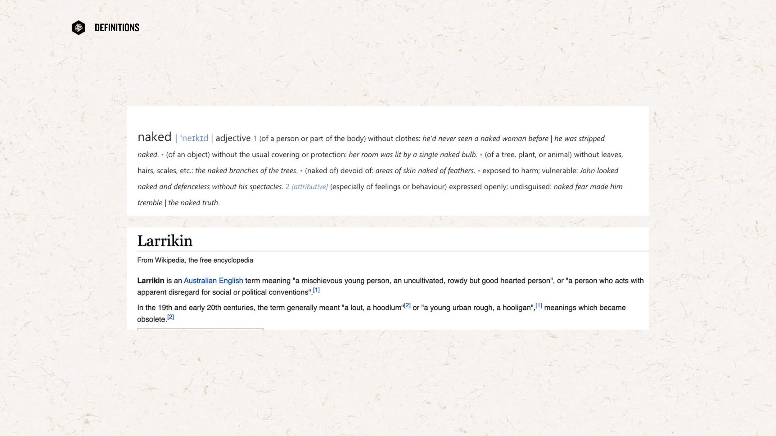
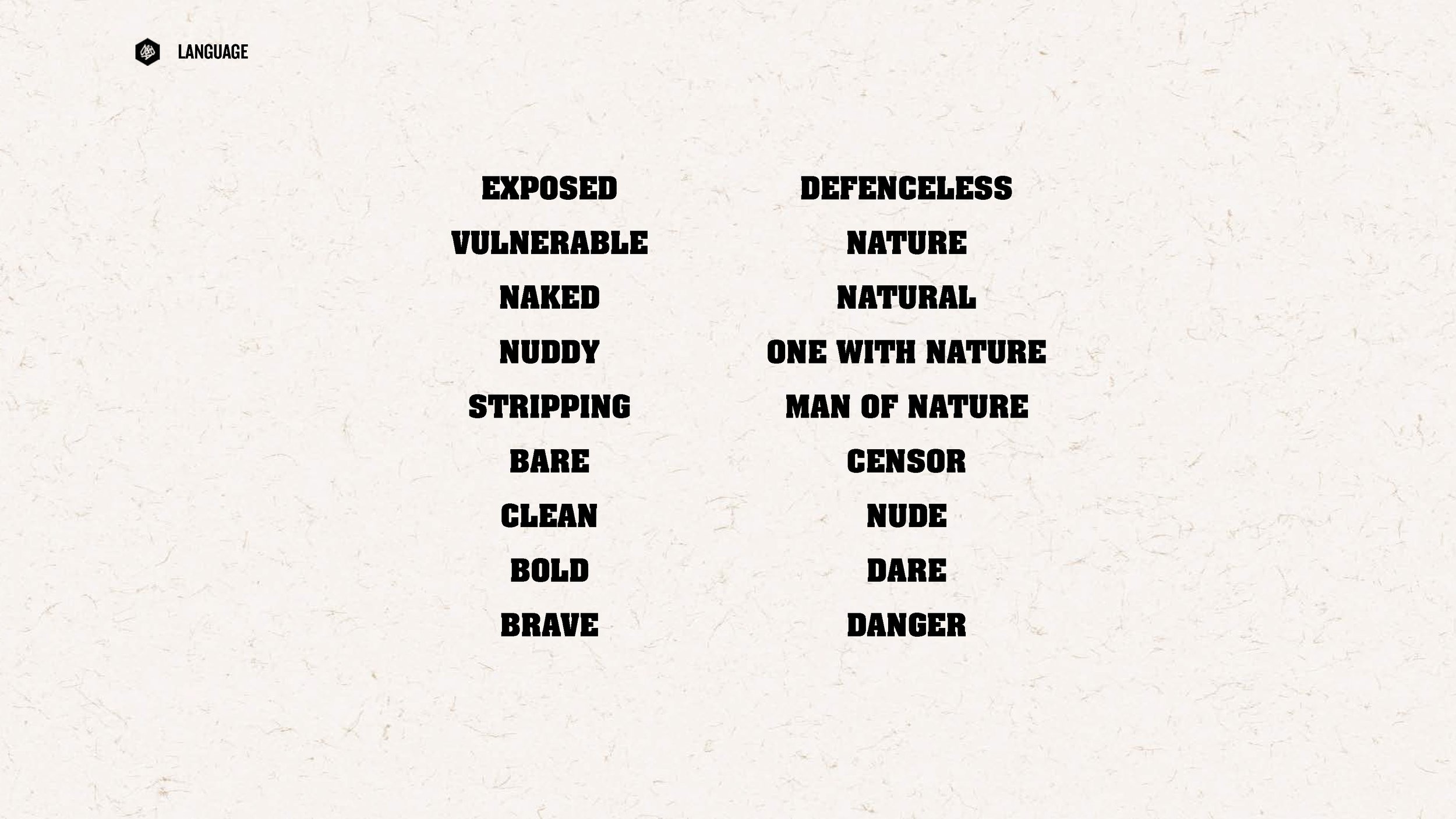
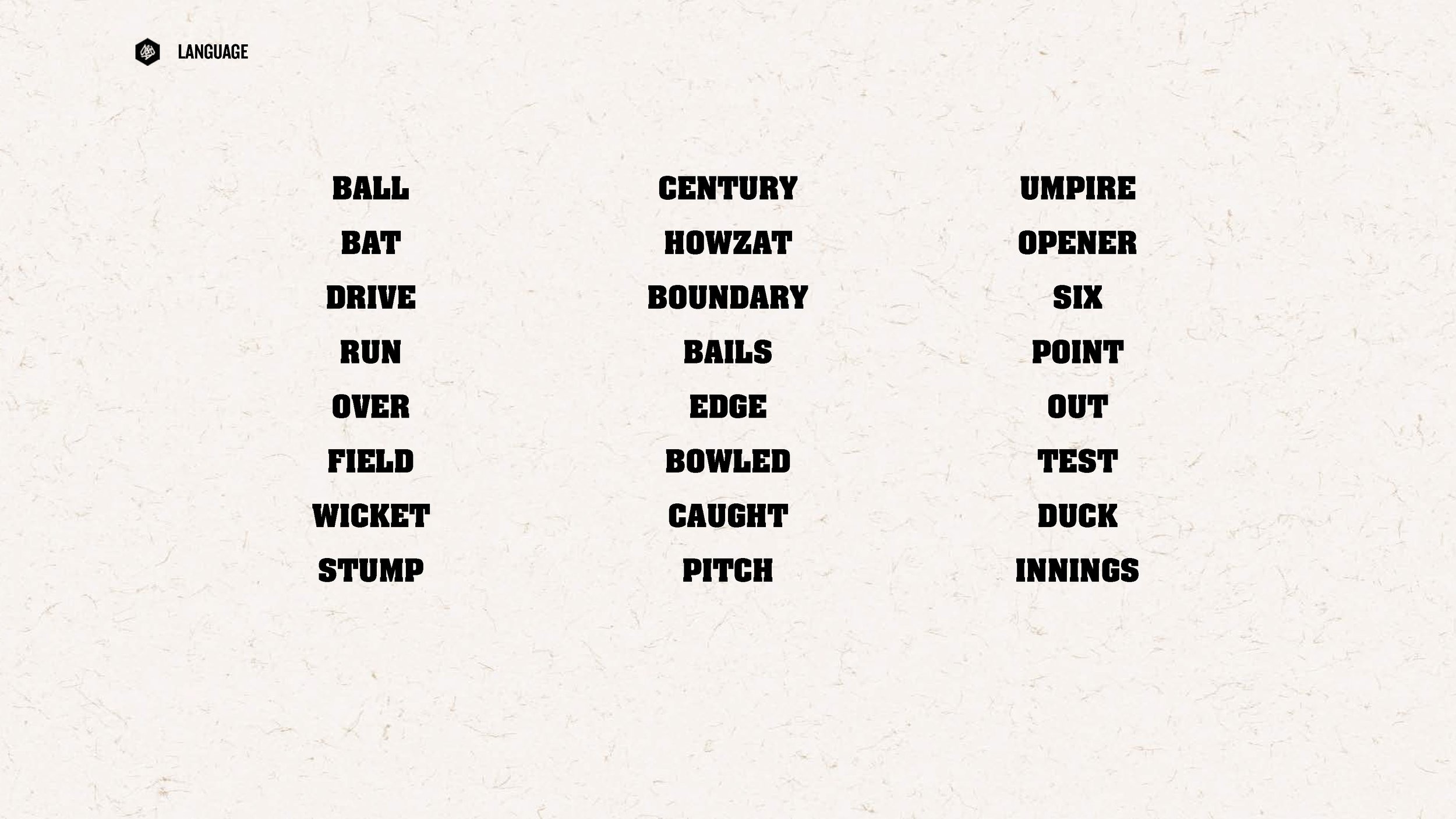
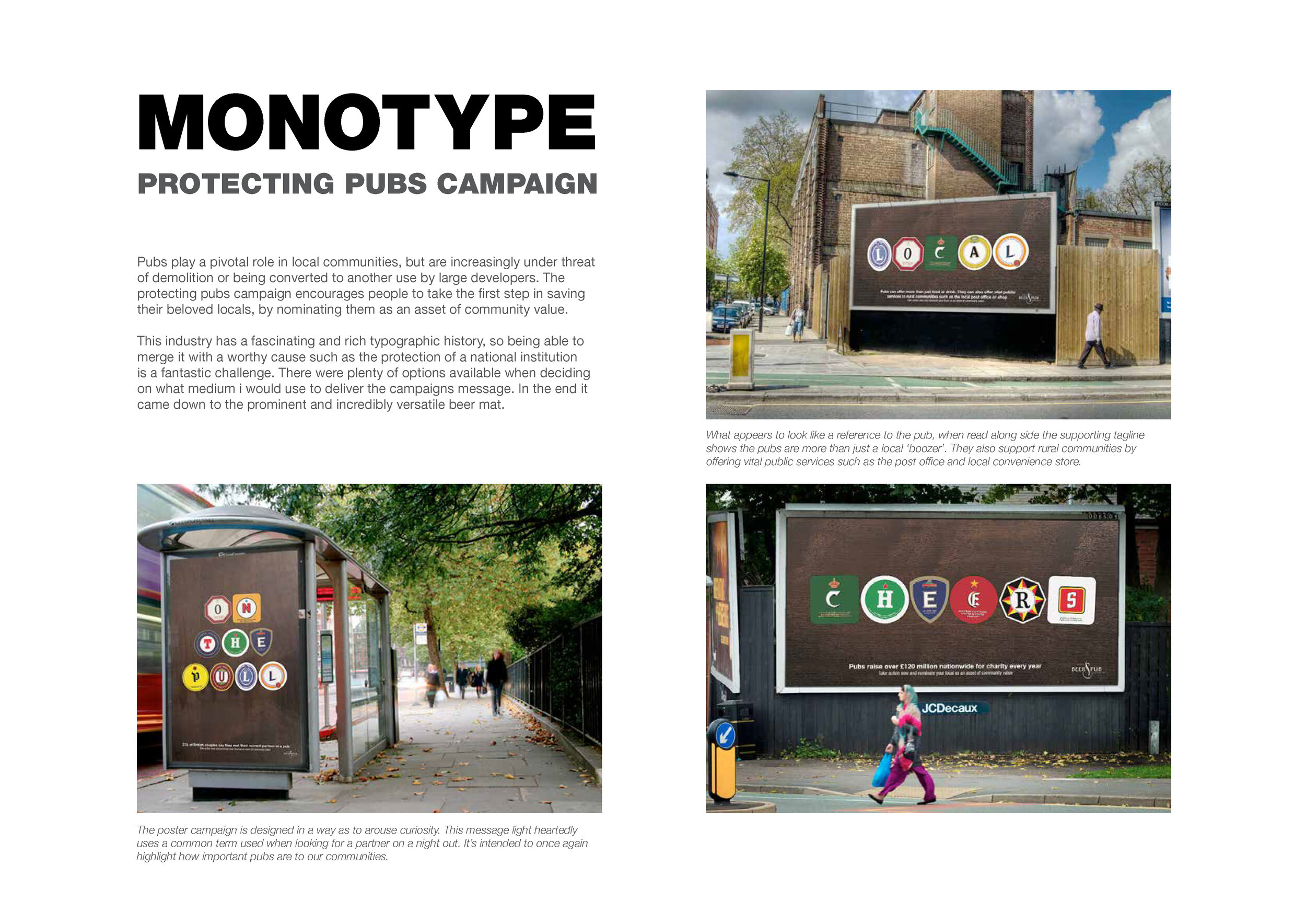
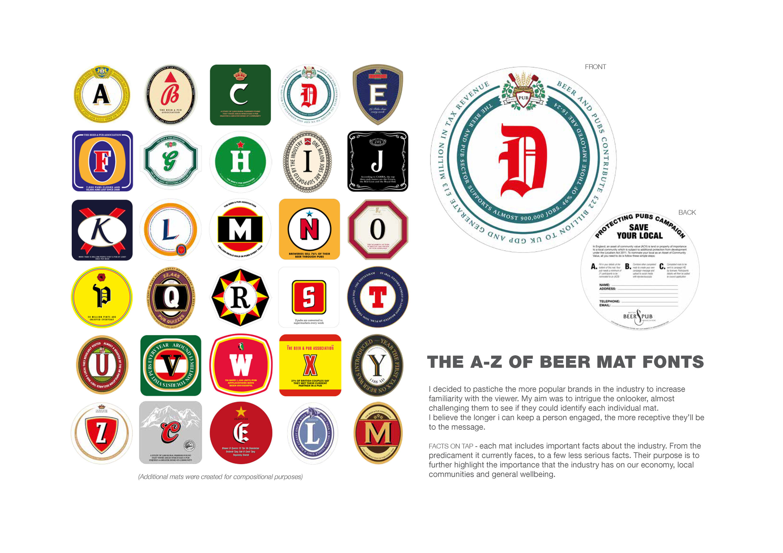
Here we feature another D&AD entry to the Monotype typography brief.
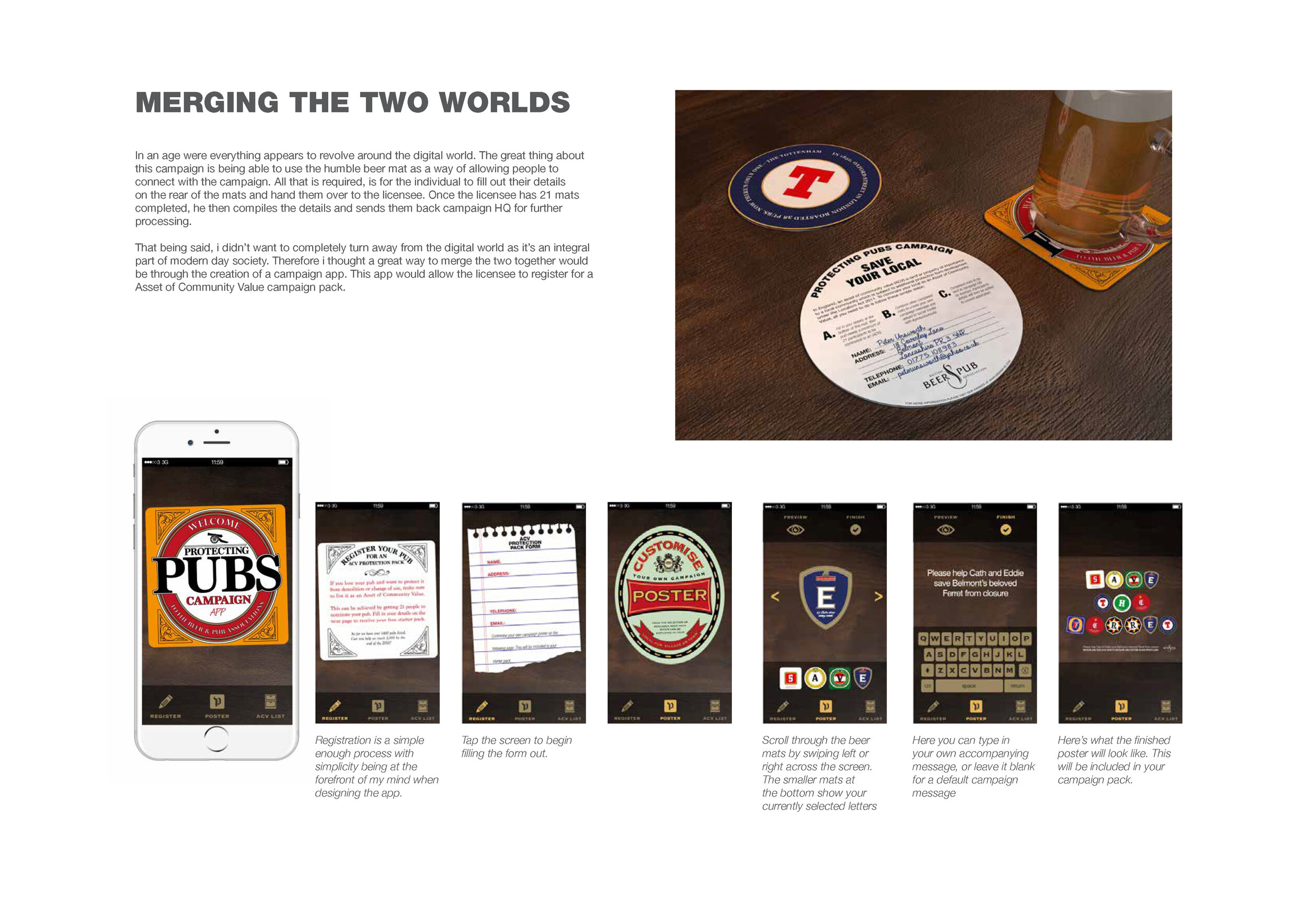
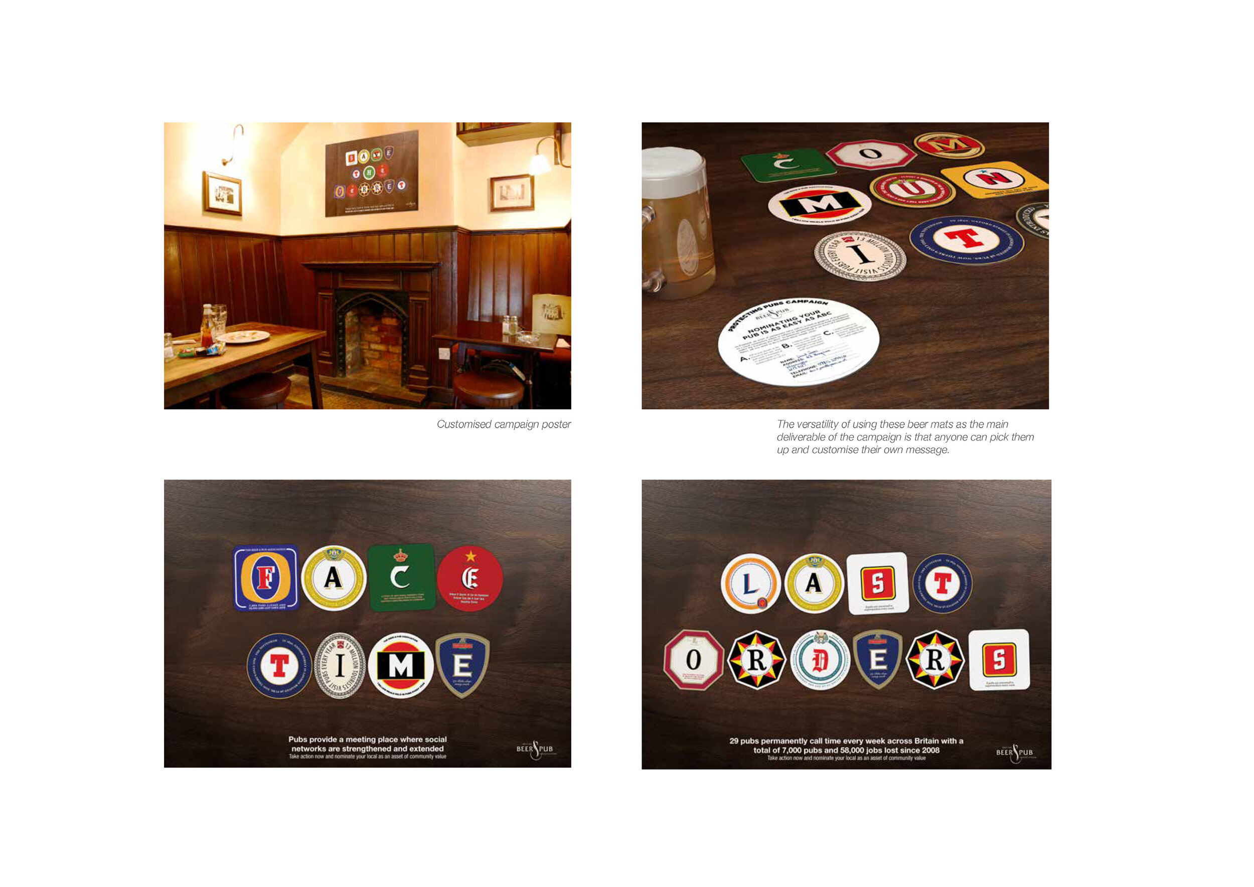
Pubs play a pivotal role in local communities, but are increasingly under threat of demolition or being converted to another use by large developers. The protecting pubs campaign designed by Neil Bennison encourages people to take the first step in saving their beloved locals, by nominating them as an asset of community value.
The pub industry has a rich typographic history, so being able to merge it with a worthy cause such as the protection of a national institution is a fantastic challenge. Using the versatility of a beer mat, a custom typeface was created which would underpin all messaging in the campaign.
THE CAMPAIGN
THE APP
Here we feature Ashton Hoban’s D&AD shortlisted entry from 2017.
Background. The outdoor summer festival scene is growing. There are now more than over 250 festivals taking place every year across the UK, catering for a whole variety of tastes and demographics.

With this in mind John Lewis has decided go beyond its stores and out into the great outdoors by teaming up with one of the UK's leading festivals, Glastonbury. From ponchos to sun cream, come rain or shine 'John Lewis Saves The Day'.

Proposition

Saves the day - John lewis product range

From Sunshine

To rain

Hammocks

Sleeping bags

Torches

Pre-order your last minute essentials via your phone


John Lewis festival locator app

Use your phone to go Glamping

Pre-order a special pamper pack to be delivered on your return home
Click the arrow to play the film.
A well thought through solution with a great proposition and a great example of how to tell a story through appropriate image and text. When it comes to all those festival essentials John lewis ‘Saves the day’.
Here we feature Amy Wooding’s D&AD shortlisted entry from 2017 which was in response to the Amazon Fresh brief. Highly commended.

Basic premise

Landing Page

Examples of wordplay & image

Traditional billboard advertisement

Digital Adshells

Underground advertisements

Delivery vans

Bags

Feedback cards

Amazon cookbook
Click to play film
A very professional well crafted and logical solution demonstrated across a range of touchpoints. A classic example of word & image working effectively to communicate the core offering of Amazon Fresh within the capitol.
Another from the archive. This campaign is by Peggy Soterio promoting Thames Clippers, a London water based taxi. The proposition, to experience London from a different perspective.


Simple and very effective.
Here we feature the D&AD nominated work of Jessie Forgertt & Sam Wilkinson from 2014. The brief was to reposition the Bodyshop by creating a new visual language. Jessie & Sam’s solution is based around the five senses of look, sound, feel, taste and smell.
Click to play

Poster - Clean cosmetic high quality photographic style

Coupled with a sympathetic colour palette

Consistent typographic style that combines two complimentary type families

Web Navigation - Simple coloured circles denoting the different senses.

Smell

Look

Feel

Mobile - Twitter
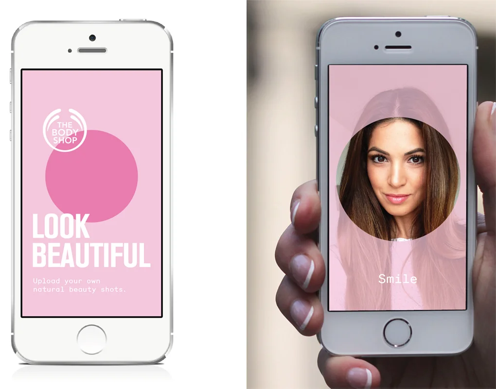
Scanning - Hover your phone over the poster to interact with the different senses
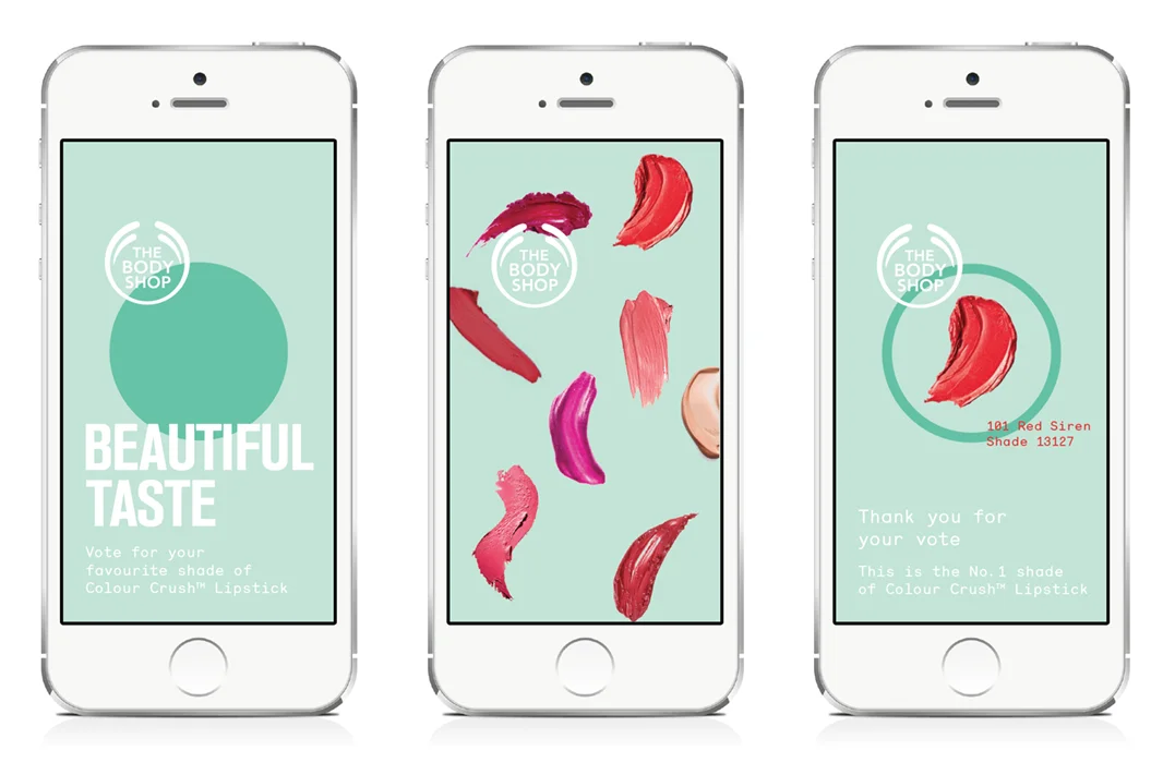
Scan the posters and vote for your favourite lipstick colour.

Ambient - Certain locations will have free sample dispensers

Issues - The sound sense is Body Shop’s voice. Listen to the campaign on gay rights & vice your views by uploading them.

Social campaign on mobile

A range of facial wipes that will be the leading product for the campaign.

In store environment
A great solution and a great example of teamwork. The core concept of the 5 senses is appropriate and well thought through. The styling of the whole re-brand, from the typography and colour selection, through to the photographic treatment is what made this project stand out to the D&AD judges. Also the ethical stance of the Body Shop is echoed cleverly through the sound sense with the Gay rights campaign idea.
Here we feature a Creative Conscience Award winner from 2018 by Andy, Nathan & Troy with their concept of communal energy generation in partnership with Adidas.

Sometimes a word has two meanings
Click to play

The Adidas three strips used as a graphic devise

Black& White photography with a green glowing focus point.

In context - Poster 1

In context - Poster 2

In context - Poster 3

The mechanics

Energy storing wristband concept

App - Personal data recorded, stored & shared

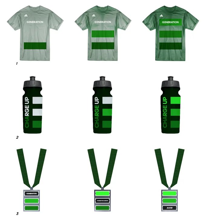
Heat sensitive touch points

Environment - Landmarks around London light up to show support

Environment - Communal sporting facilities powered by electricity generated

An excellent example of a well thought through concept based on a clever word play and backed up with a clear, distinct and appropriate visual look and feel.
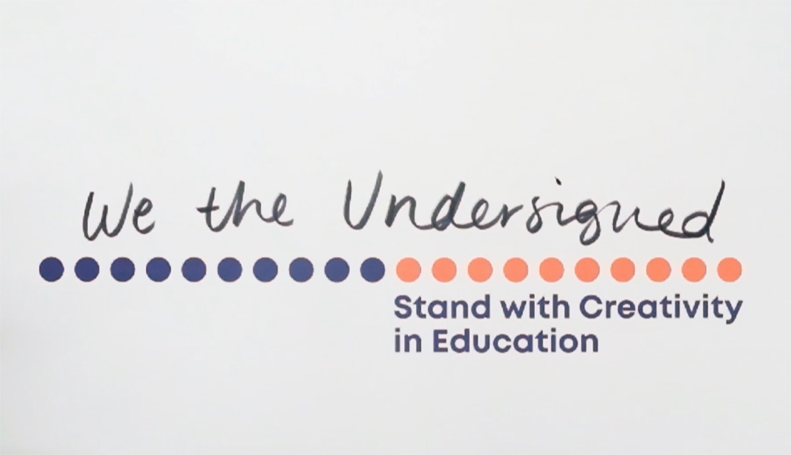
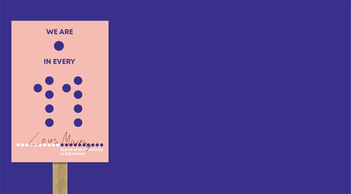
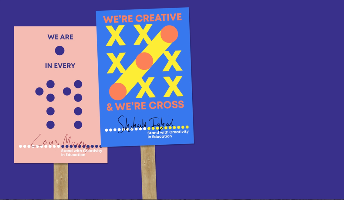
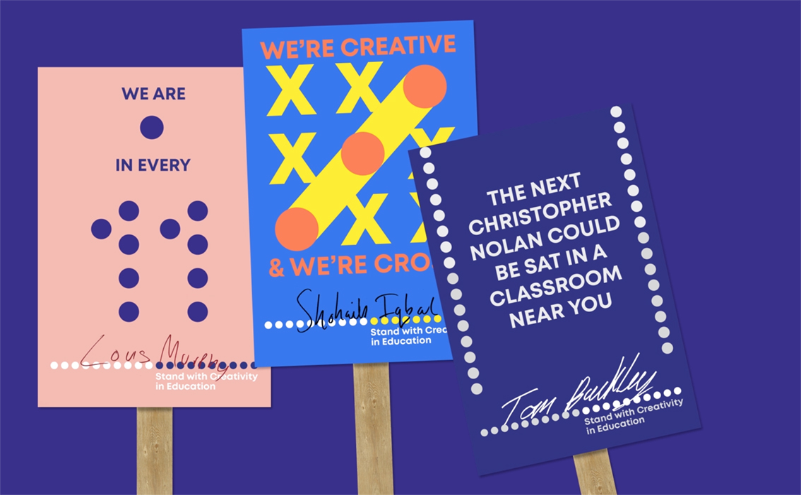
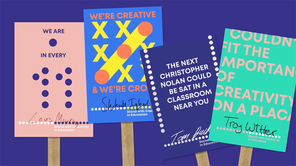
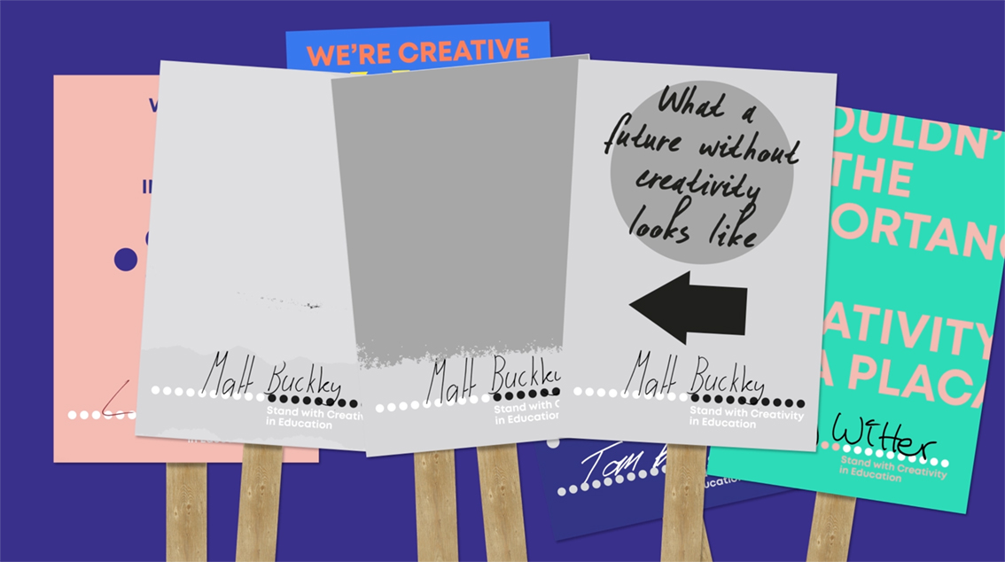
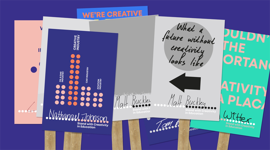
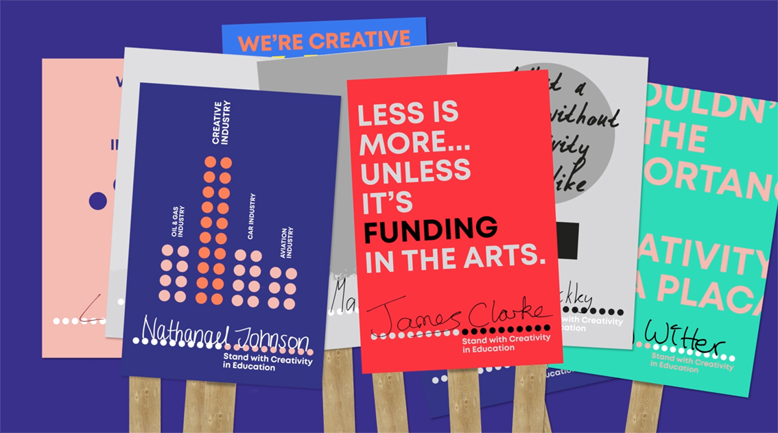
Here we are proud to feature a piece of work created by two of our 4th year students, Louis Murphy-Hancock & James Clarke, that has just won a Creative Conscience Award 2018.

The concept of trying to create a coherent and organised front to tackle the current refusal by those in government to acknowledge the importance of the creative arts in our primary and secondary schools, is timely.
We think the time is right for a clarion call and with several prominent figures in the creative arts already beginning to voice their opinions with respect to this subject, maybe we have found a banner under which we can all march?


The Disciples Of Design are a global collective of design academics, practitioners, artists and students. We have one common thread – University of Lancashire in Preston, UK; and one common aim – the creation of an ever evolving visual hub for the sharing of ideas and thoughts.


