A Pillar of the Community

Here we feature Natalie Utting-Ealand’s Harris Museum icon designs from 2018. Based on The Harris Museum’s 6 main Doric Columns, Natalie created a set of graphic icons that symbolised the cultural focus of the Museums offering to the Preston community – History, Art & Craft, Research, Recreation, Inspiration & Stories.

The Harris Museum frontage

The Harris Museum frontage

Icons in Black & White – History, Art & Craft, Research, Recreation, Inspiration & Stories

Icons in Black & White – History, Art & Craft, Research, Recreation, Inspiration & Stories

Colour Coded – History, Art & Craft, Research, Recreation, Inspiration & Stories

Colour Coded – History, Art & Craft, Research, Recreation, Inspiration & Stories

Typography added

Typography added

A really nice example of a set of well appropriated symbols, well designed, and well crafted icons. A great example for any future student tasked with creating their own icon designs.


Hellmann's D&AD 2018 – Rejuice

Here we feature Tom Buckley’s entry for the Hellmann’s D&AD brief back in 2018. The brief asked for the creation of a Hellmann’s branded device, publication or service that addresses the issue of food wastage.

Please click on image above to play film

Brand Assets

Brand Assets

Word mark

Word mark

Packaging 1

Packaging 1

Packaging 2

Packaging 2

Packaging 3

Packaging 3

Overview

Overview

In store 1

In store 1

In store 2

In store 2

In Store 3

In Store 3

A well thought through concept with a distinct look and feel, from colour to copy and through to tone of voice.

face .jpg

NY Spaghetti Packaging – The directors cut

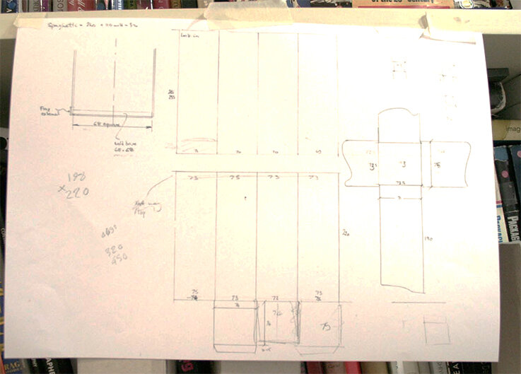
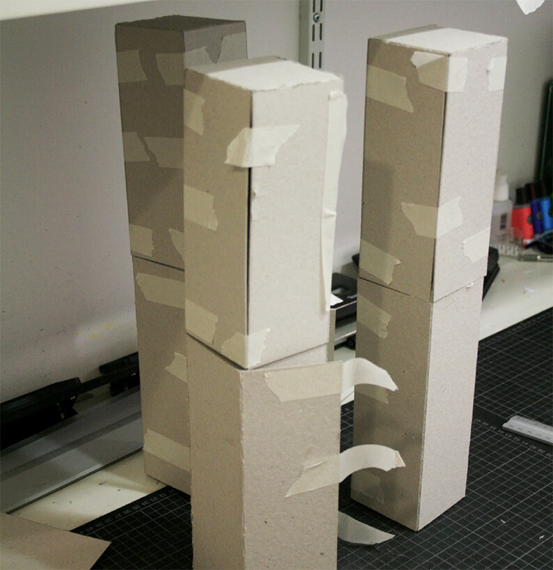
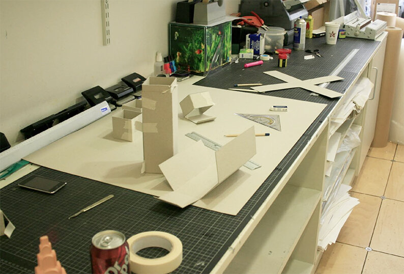
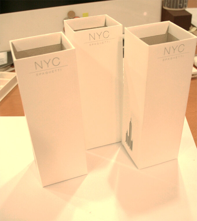
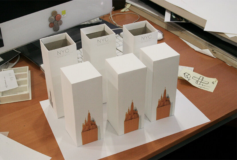
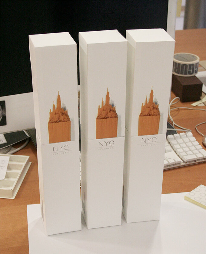
Here we feature Alex Creamer’s classic NY Spaghetti packaging concept from 2008/09. Now widespread on the net and various packaging related sites this project has attained cult status. So we thought we would show a little more from our archive of the early development work.
Alex’s solution was initially a response to a 2nd year brief, which was to repackaging a awkward product or item. It became the centre piece of his portfolio and while on placement at Ziggurat Brands in London he was able to develop the design further with their expert help.

spag 3.jpg
spag 2.jpg
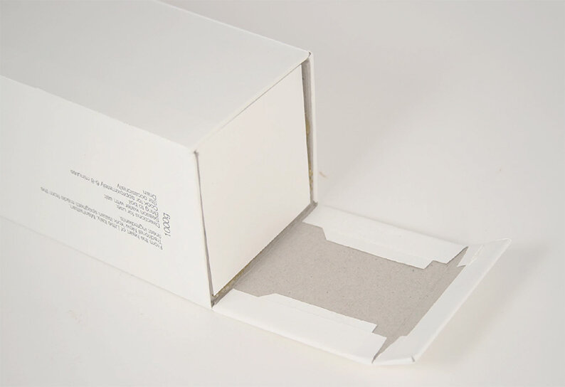
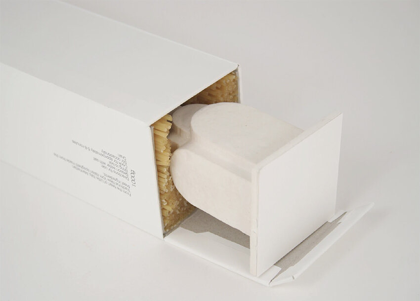
Detail

Detail

hero .jpg

The design eventually made it onto the front cover of the book above, via exposure on the Dieline and all this even before Alex had graduate in 2010. Ten years on and Alex has now moved onto the world of branding and is currently associate Design Director at Interbrand Australia.

Chelsea Flower Show Branding – 2103

Here we feature Gina Chamberlin’s Chelsea Flower show Centenary Identity from the 2013 degree show.

C for Centenary & Chelsea

C for Centenary & Chelsea

Chelsea logo 2.jpg

Click the image above to play clip

Poster 1

Poster 1

Poster 2

Poster 2

Poster 3

Poster 3

Time line stem

Time line stem

time line.jpg

Nicely crafted, appropriate and considered typography. Blooming marvellous and yes, again, a nice idea that will always remain so, year in year out.