Conference Week 9 – Documented
/Here we feature a short film documenting our annual Conference Week 9 event (February 2020) - by first year graphic student - Anas Mohammed.

Here we feature a short film documenting our annual Conference Week 9 event (February 2020) - by first year graphic student - Anas Mohammed.
Here we feature our first informal zoom talk through. The short film is in support of our first year Graphics students summer project.
Please click the image above to play the film.
Here we feature a compendium of short animations culled from various graphics students projects across all 4 years. This post has specifically been designed to support all our current year 1 graphics students summer project assignment. Please click on all images & enlarge to full screen for best effect.
An excellent range of examples to inspire and learn from. All created in aftereffects.
The recording below covers the 5 key areas of the design process and is an aid to improving any budding students day to day working practice.
Here we feature Angus Meikle’s response to the industry brief set by Edit Brand studios.

Please click on the image above to play the film.
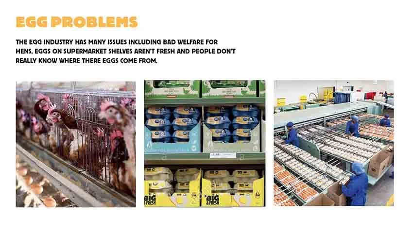
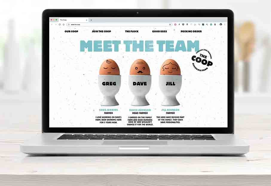
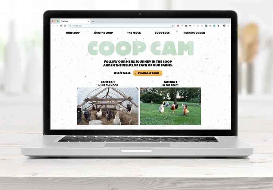
The Problem

The Mission Statement

The Word Mark

The Colour Pallet
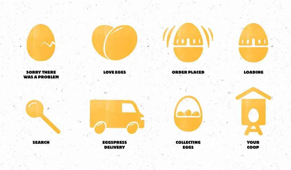
Egg Icon Designs

The System - How it works

How it works in context

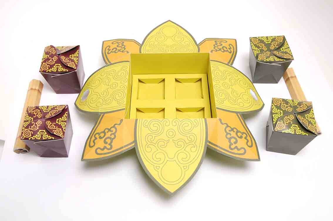
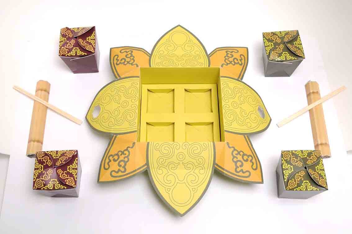
The Outer Packaging Design

Information printed on the inside of the packaging

A Sample of box designs with simple stamped logotype.

Click & Collect option

Cluck & Collect pick up coop’s

Van Livery & Uniform designs
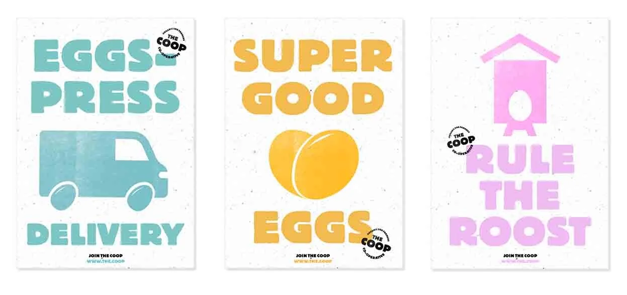
Poster Designs

Direct Mail Concept

Merchandise Designs
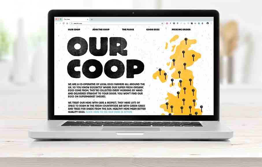

The short slide show above indicates some of the website content.

Instagram Feed

Copywriting
A great example of a thoroughly thought through branding exercise that combines all the basic elements.
An understanding of the problem, a creative overarching idea, demonstrated over an appropriate range of touch points. Considered typography, colour ways, iconography, materials as well as great copy writing all build to tell the story of ‘the coop’ brand and what they do.
This is also a great example for all year 1 students who are getting to grips with a branding exercise and has been specifically posted here in order for you to study, analyse, understand and learn from.
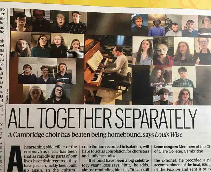
Here we feature a slide show of a series of snap shots from the Sunday Times broadsheet and accompanying supplements, that show just how pervasive and all consuming the current crisis has become.


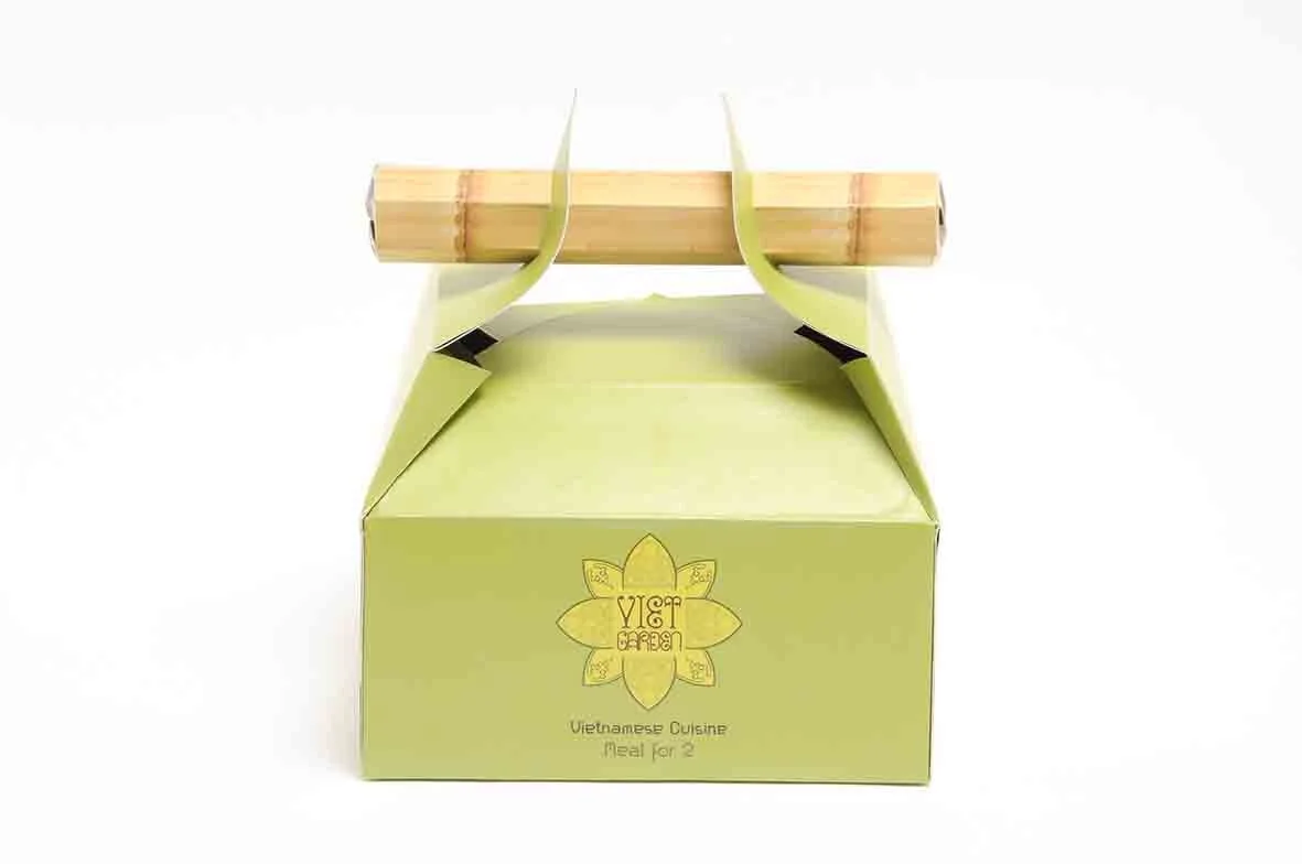
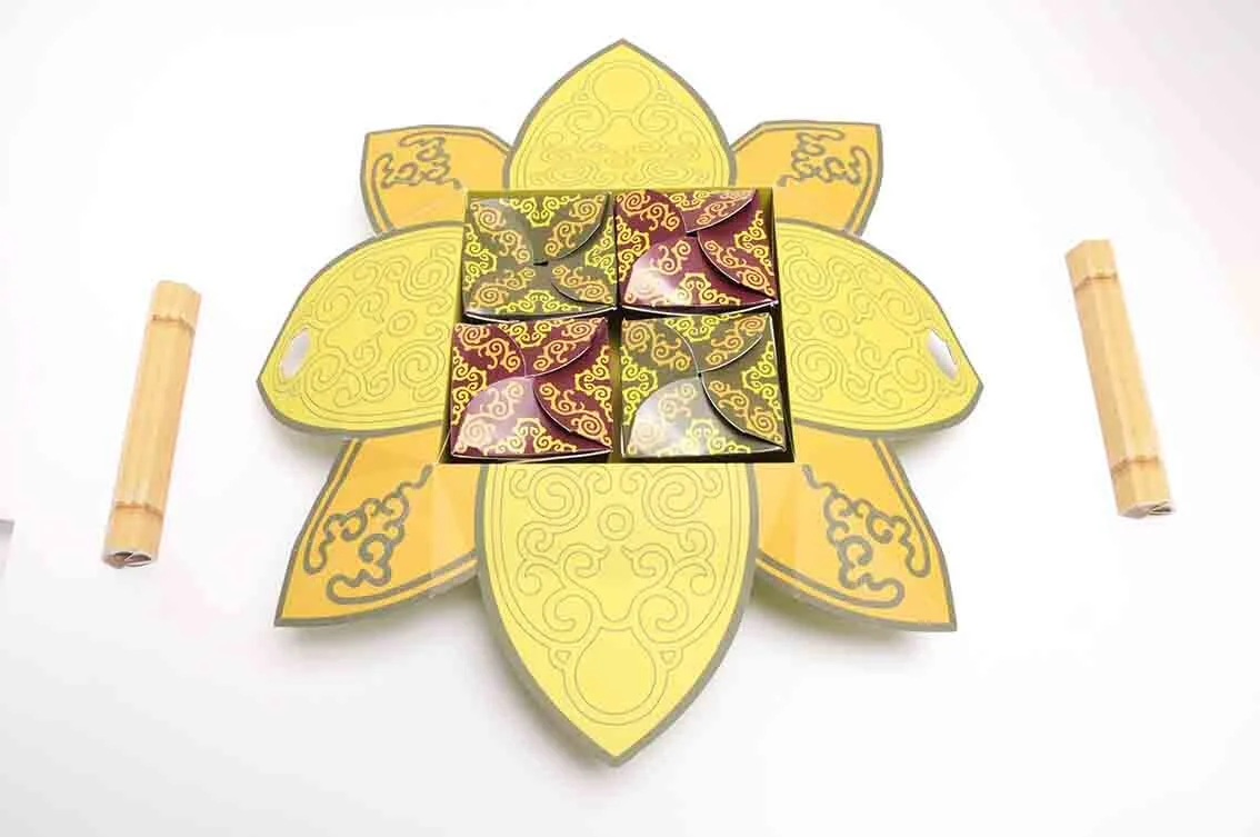
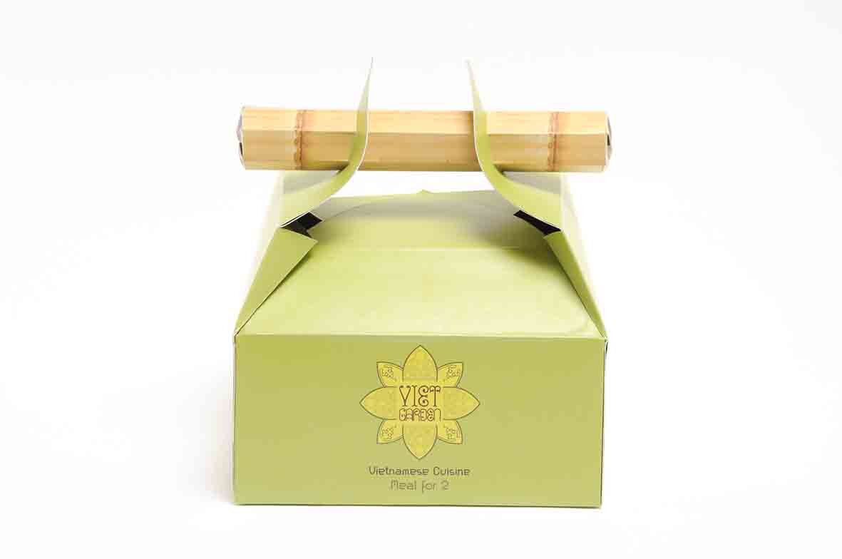
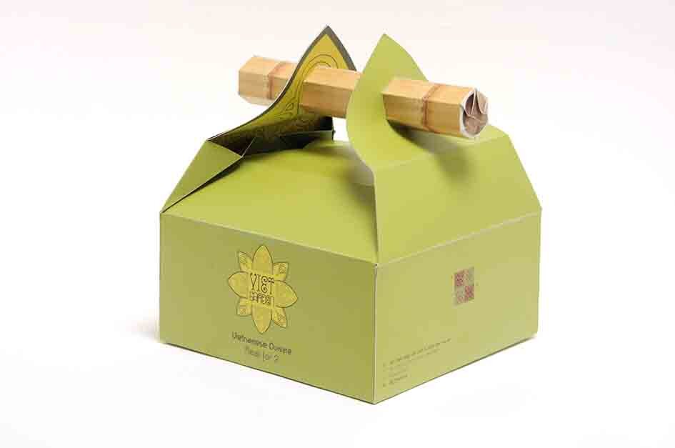
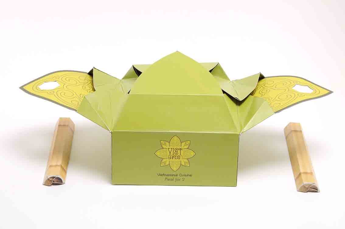
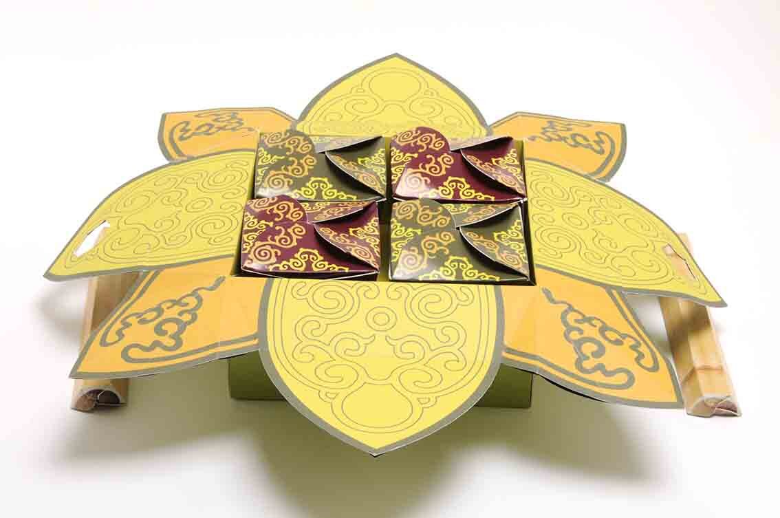
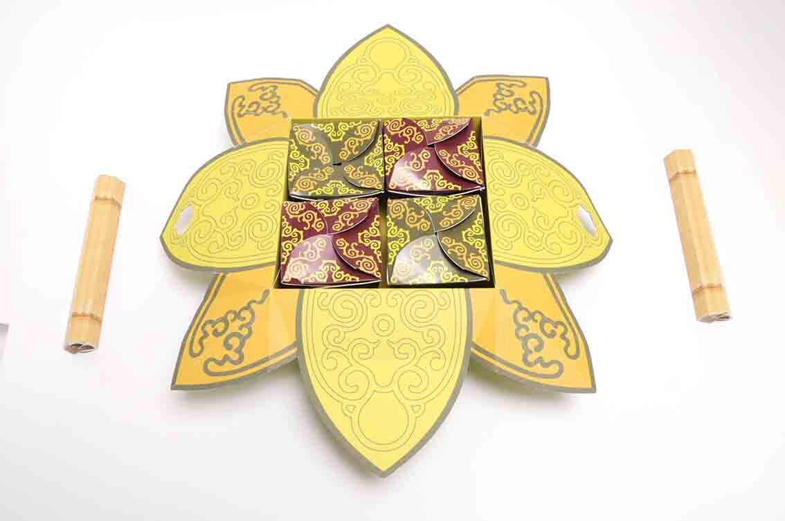
Here we feature a creative packaging concept for a Vietnamese take away meal for two. This project formed part of Mohamed Adam’s final year show back in 2011.


Here we feature a selection of projects that we came across while cleaning out our hard drives. In the main they are snippets of larger projects that span a decade or so, we apologise if we get the year wrong or fail to namecheck everyone’s work. Our filing system and memories are beginning to fail us!
Mike Kirkpatrick’s Museum of the Circus identity from 2014. (Please click image to play film)
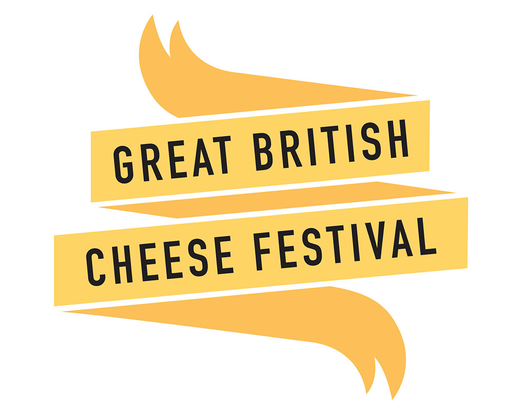
Mark Young’s Cheese festival identity from 2013

D&AD Royal Opera House Brief Nominee - 2008
Mike Selby’s Royal Opera House poster that uses the classic visual cliche the Rorschach test to great effect. Look closely at the gold image and you will begin to see things in things.

UK currency Design concepts
These designs were by Chris McMahon in 2010 and were one of his final year self initiated projects.

Pen Pals Project Identity
This project was by Uzma Padia from 2014…we think. Lovely image of one person made up out of 2 pens.

Identity
This re brand was part of Huzaifia Sidat’s final year show back in 2018
From 2018, this identity was by Mike Barrow and formed part of his 70th celebration of Silverstone project. (Please click on image to play film)

Identity

Bespoke Typeface Design
We are not too sure who produced the above?
Above we feature Ben Bassett’s Blackpool Tramway Identity from his final year show in 2018. (Please click on image to play film)
Here is another snippet from 2108, this identity was created by Hedi Woodhead and was part of a larger project to celebrate Nikon’s 100th Anniversary. (Please click on image to play film)
2019 - Brandon Thomas created this campaign highlight testicular cancer in young males. (Please click on image to play film)
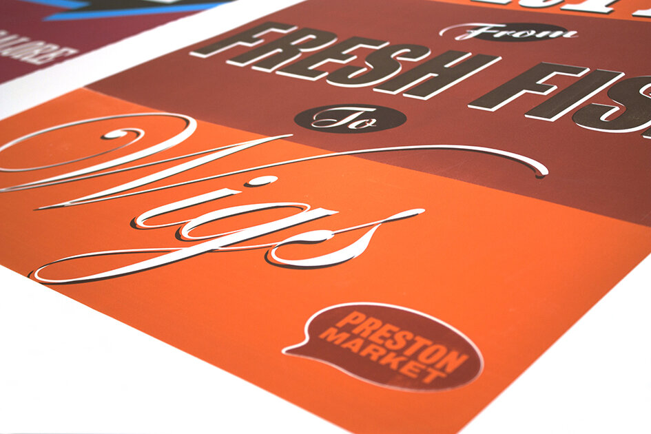
Here we feature Ben Tustin’s colourful silk screened poster promoting Preston Markets, they formed part of his final year show in 2011.

Poster 1

Poster 2

Detail

Poster 3

Detail

Poster 4
Detail
Bold sumptuous colours combined with simple direct copy and minimum design…equals a lush result!
Here we feature Ben Tustin’s innovative Oxo Packaging concept which was nominated for a D&AD in their open category way back in 2011.

Pack shot 1

'Oxo brings a meal together’

‘Oxo brings a meal together ‘
Please click on the image above to view the film.

Pack shot

The Disciples Of Design are a global collective of design academics, practitioners, artists and students. We have one common thread – University of Lancashire in Preston, UK; and one common aim – the creation of an ever evolving visual hub for the sharing of ideas and thoughts.