'Break a Leg'
/Here we feature James Clarke’s final year self initiated project from 2018.

The Brief

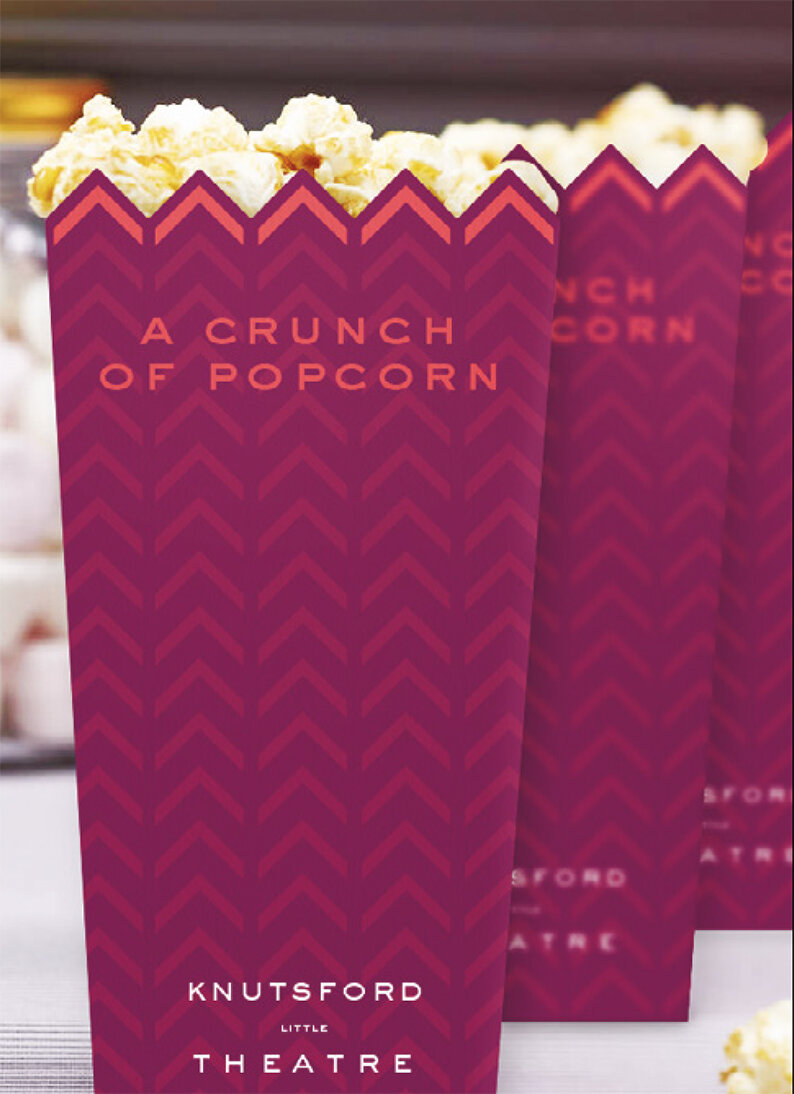
Identifying the distinctive chevron from the apex of the Theatre rooftop

Copywriting plays on the little element of the Theatre.

‘Little things make a big difference’ becomes the point of focus for the copywriting and how it’s applied.

Please click on image to play the film.
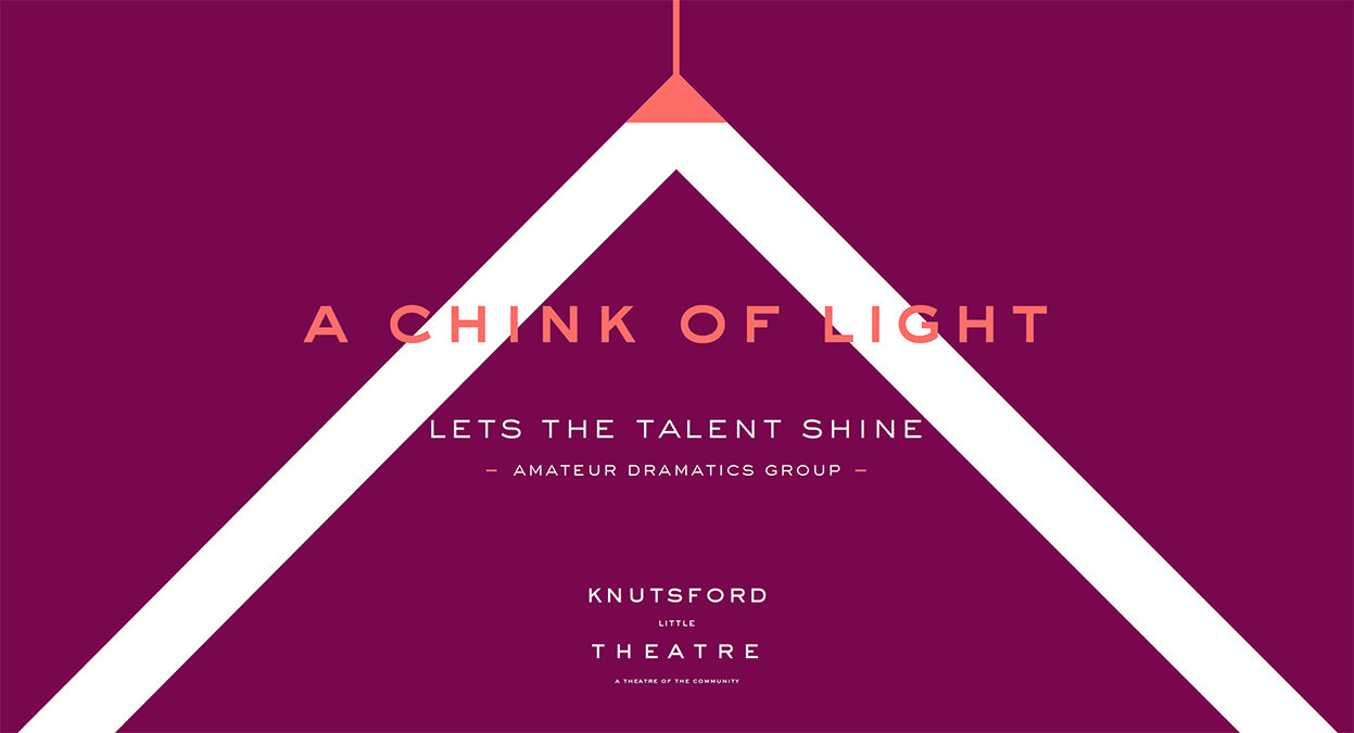
Application 1 - Poster

Application 2 - Poster

Application 3 - Poster

Chevron icons
In theatre application

Calendar of events

Magazine Advertisement
A good example to any year 1 student of how working within the constraints of a limited amount of appropriate assets - good copywriting, a strong graphic element and distinctive colour pallet can create a coherent brand look and feel.