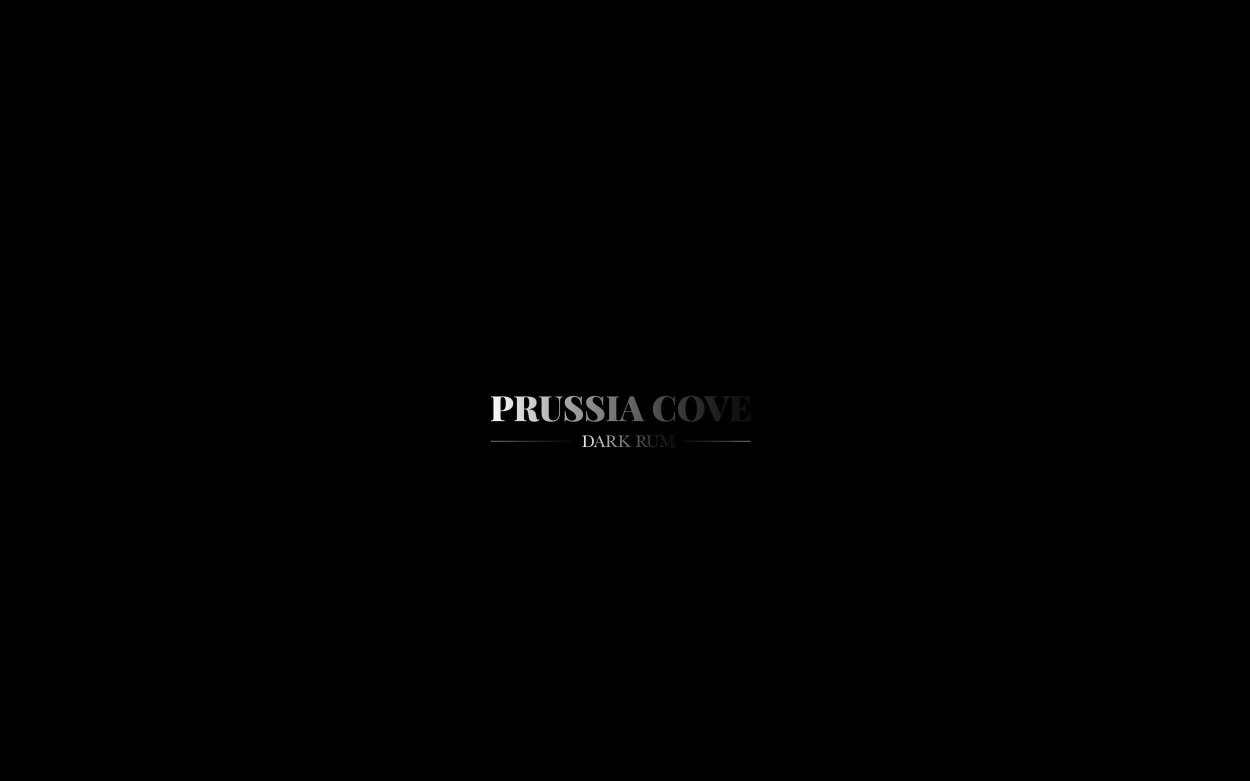
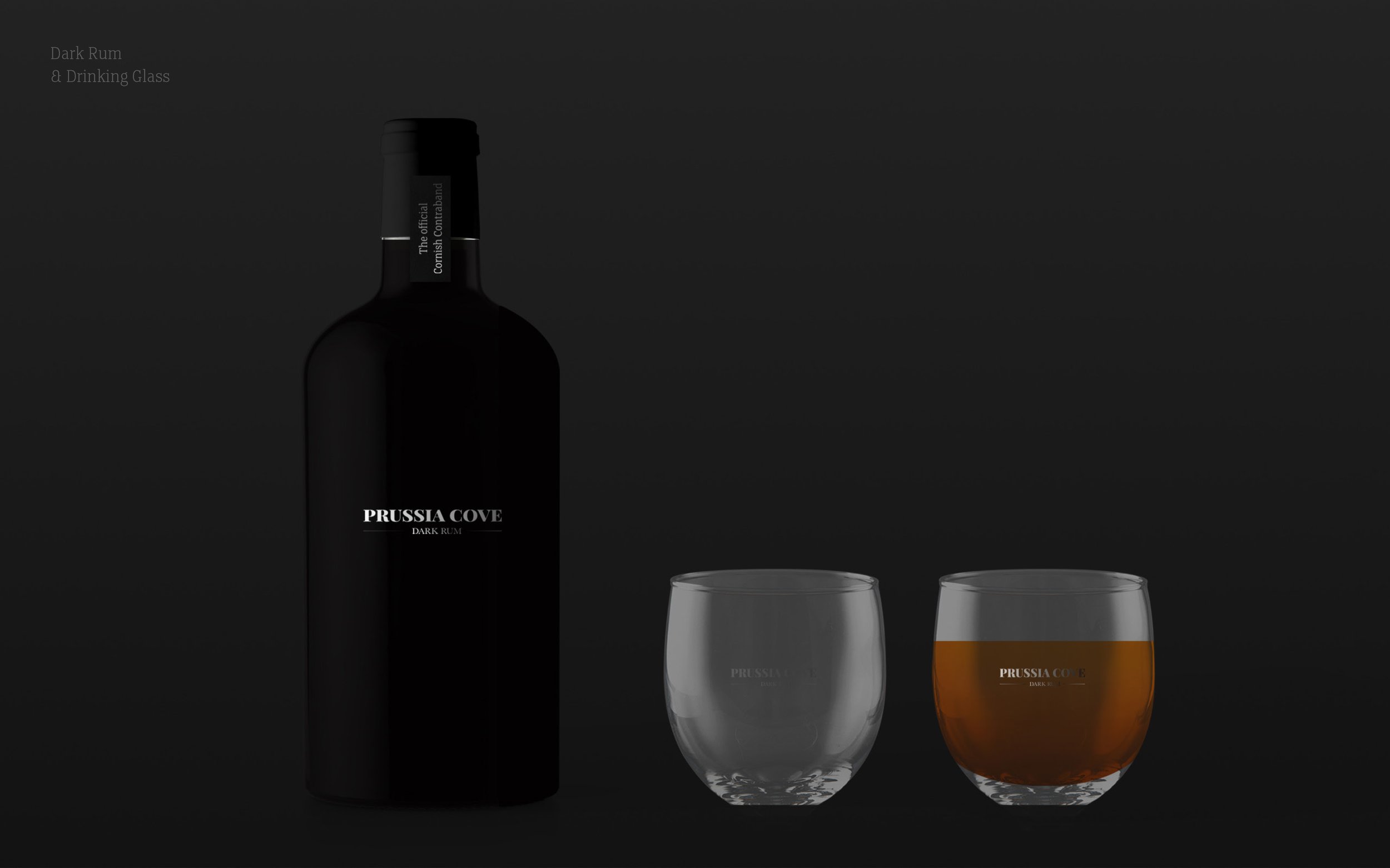
Prussia Cove
/A concept for a new rum by Sam Holcroft.

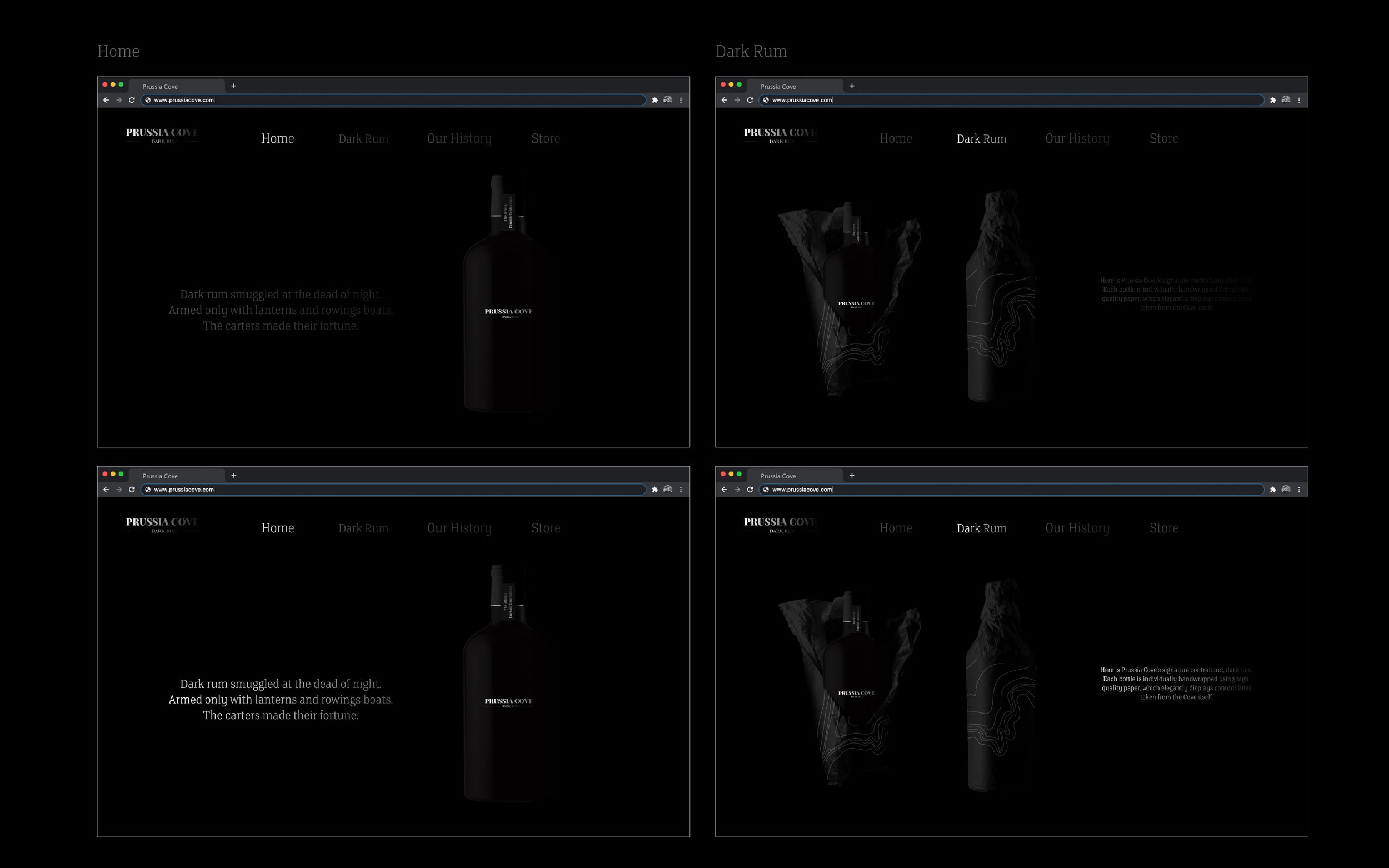
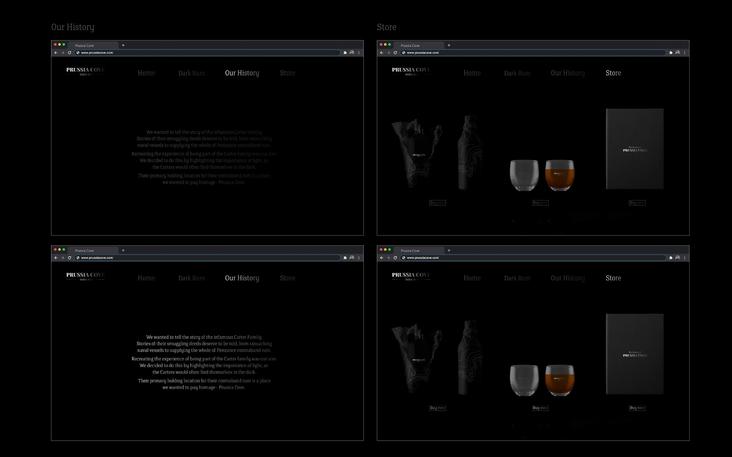

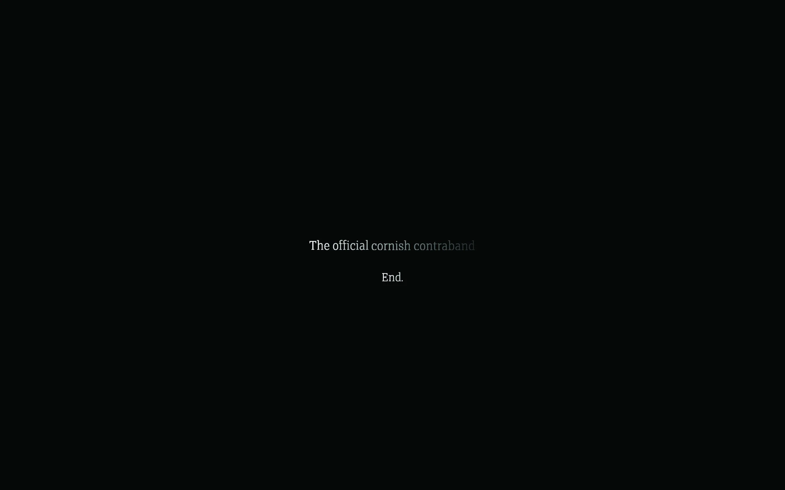
A concept for a new rum by Sam Holcroft.
Here we feature a couple of final year solutions in response to the recent industry brief set by Forepoint.

Background

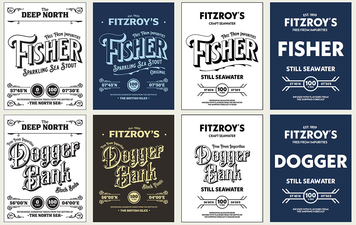
Brand - Wordmark

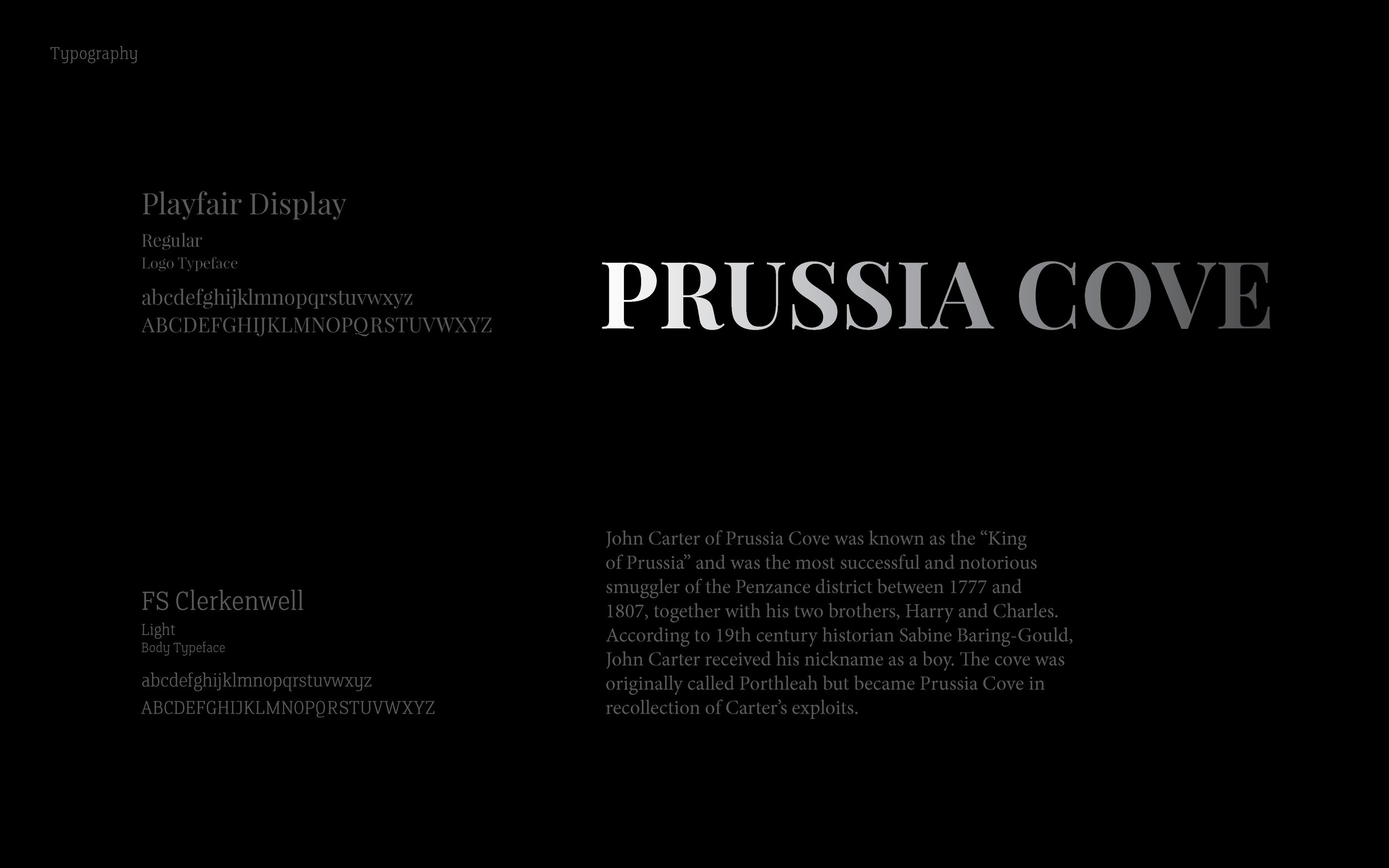
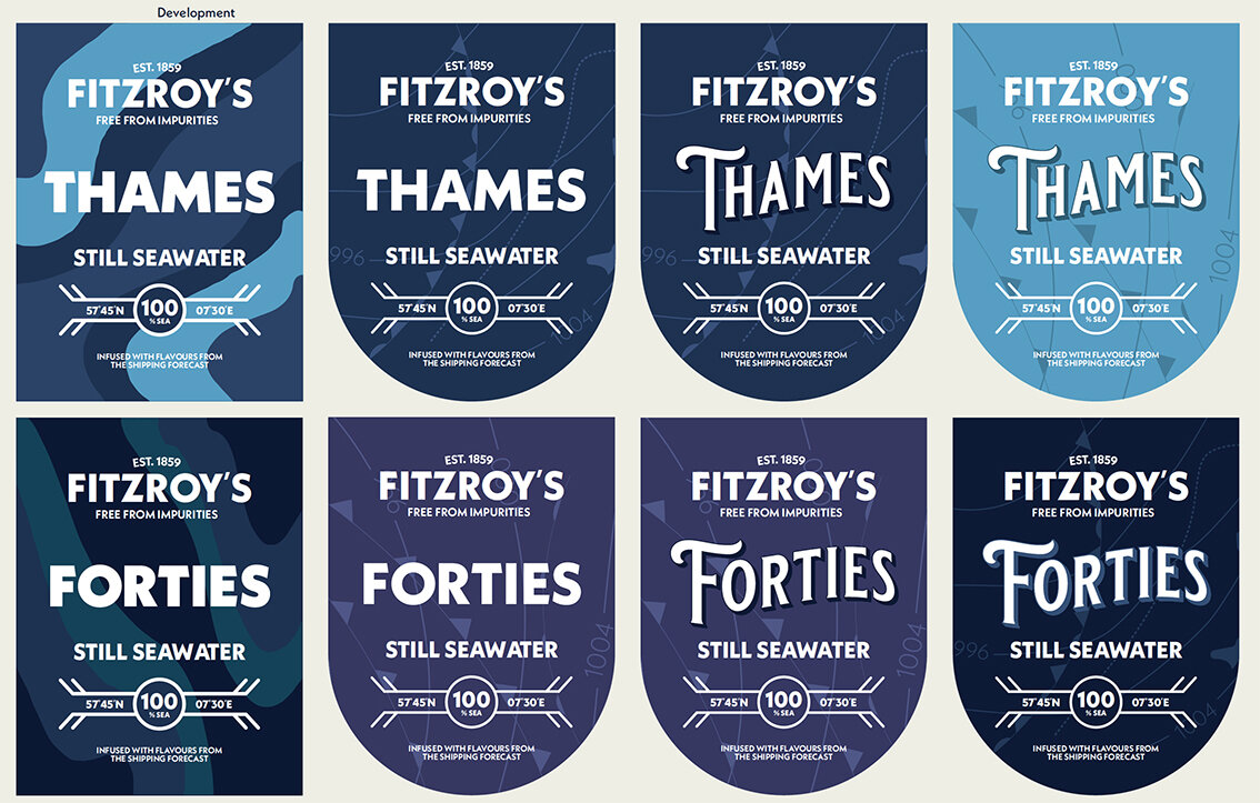
typeface & colour ways

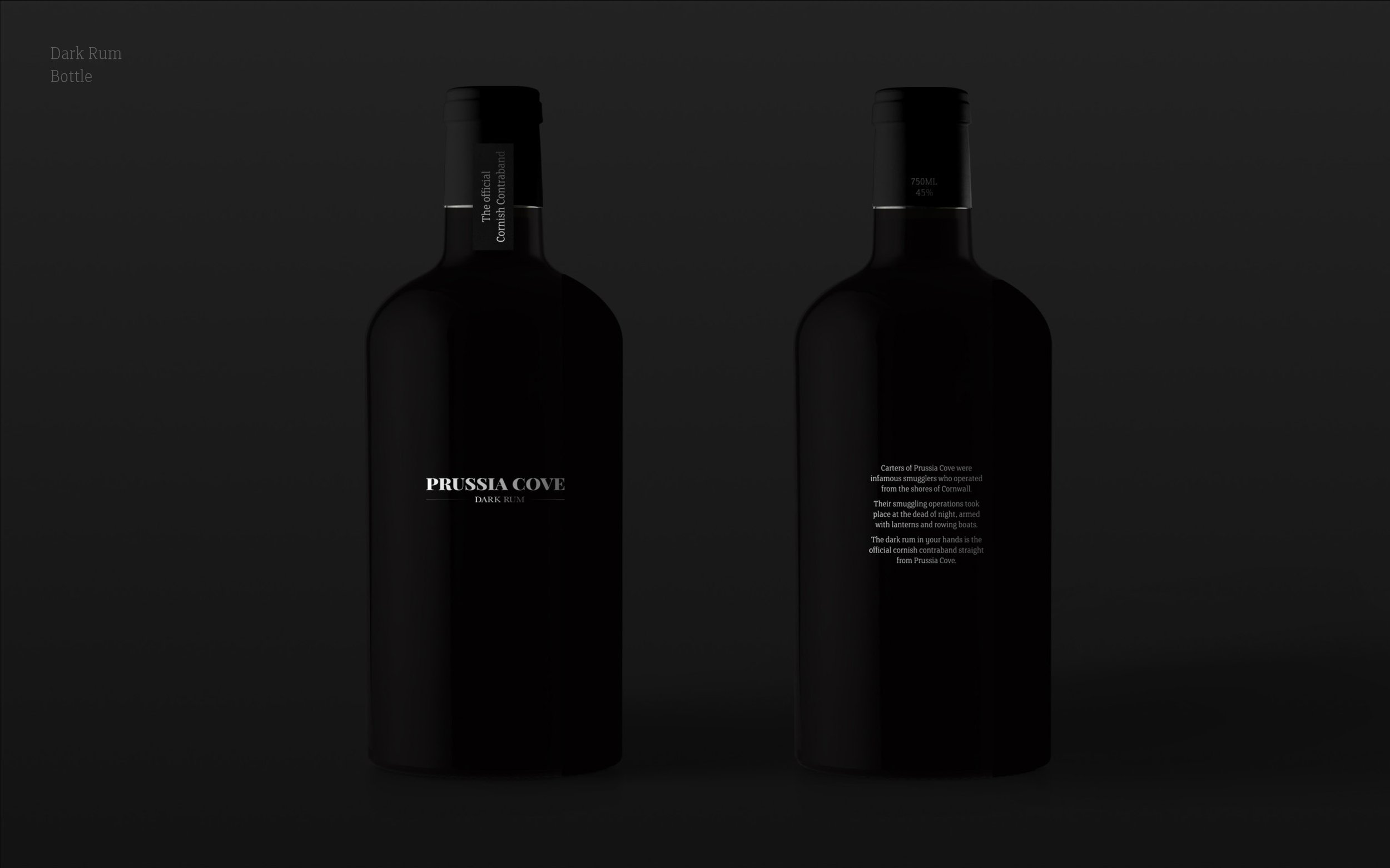
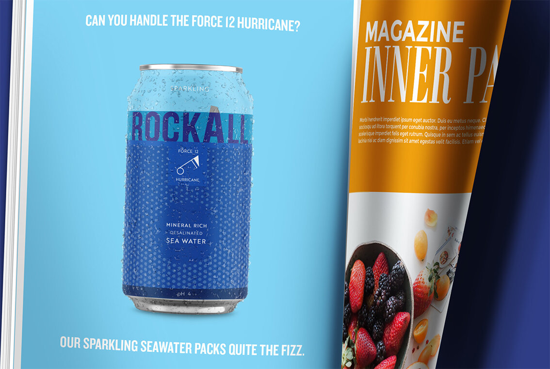
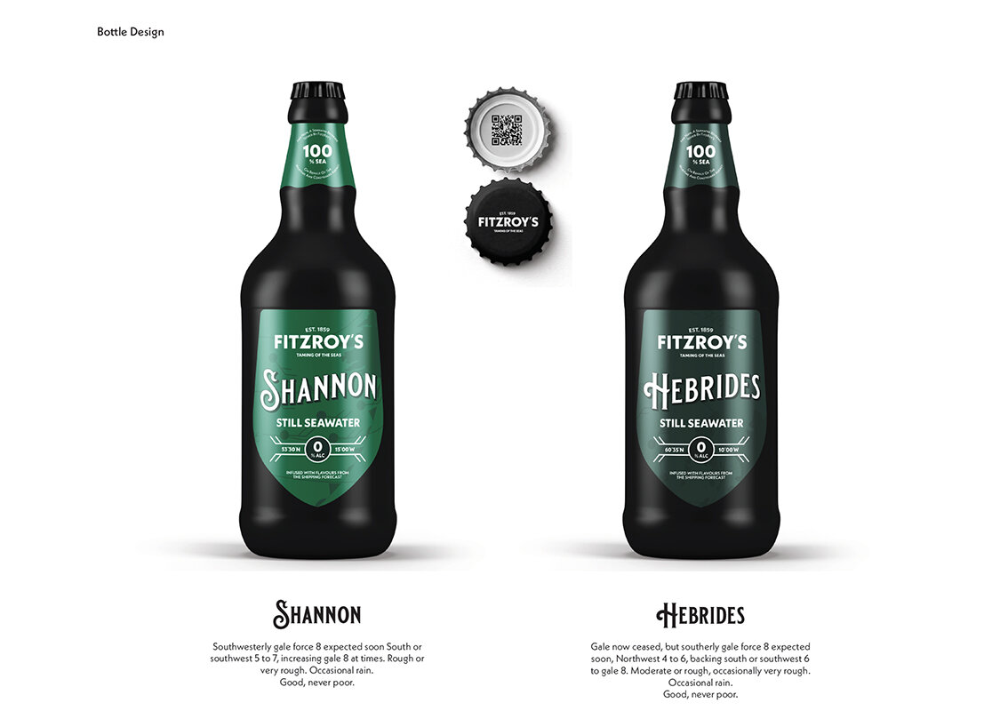
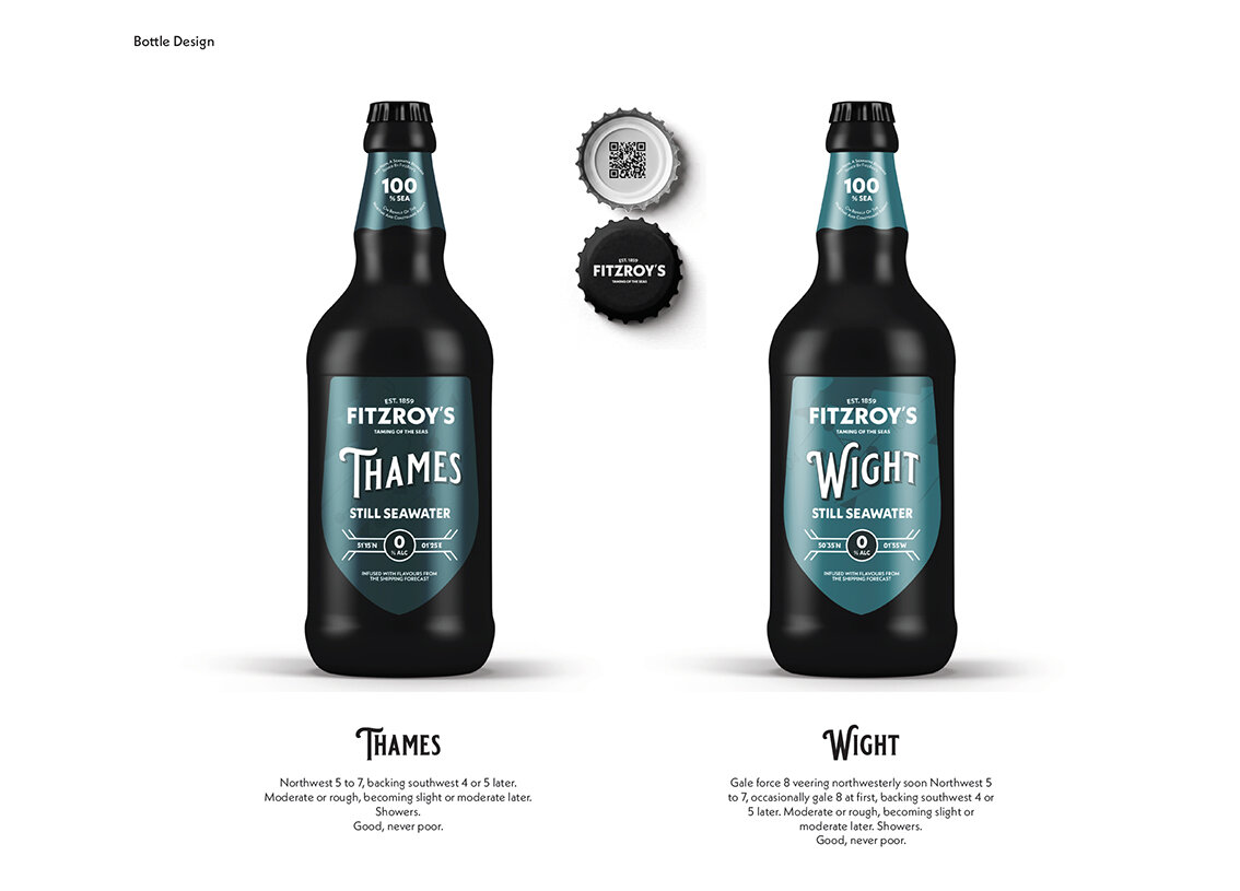
The can

Please click the image above to play film

Point of sale & dispensers


The brand wordmark


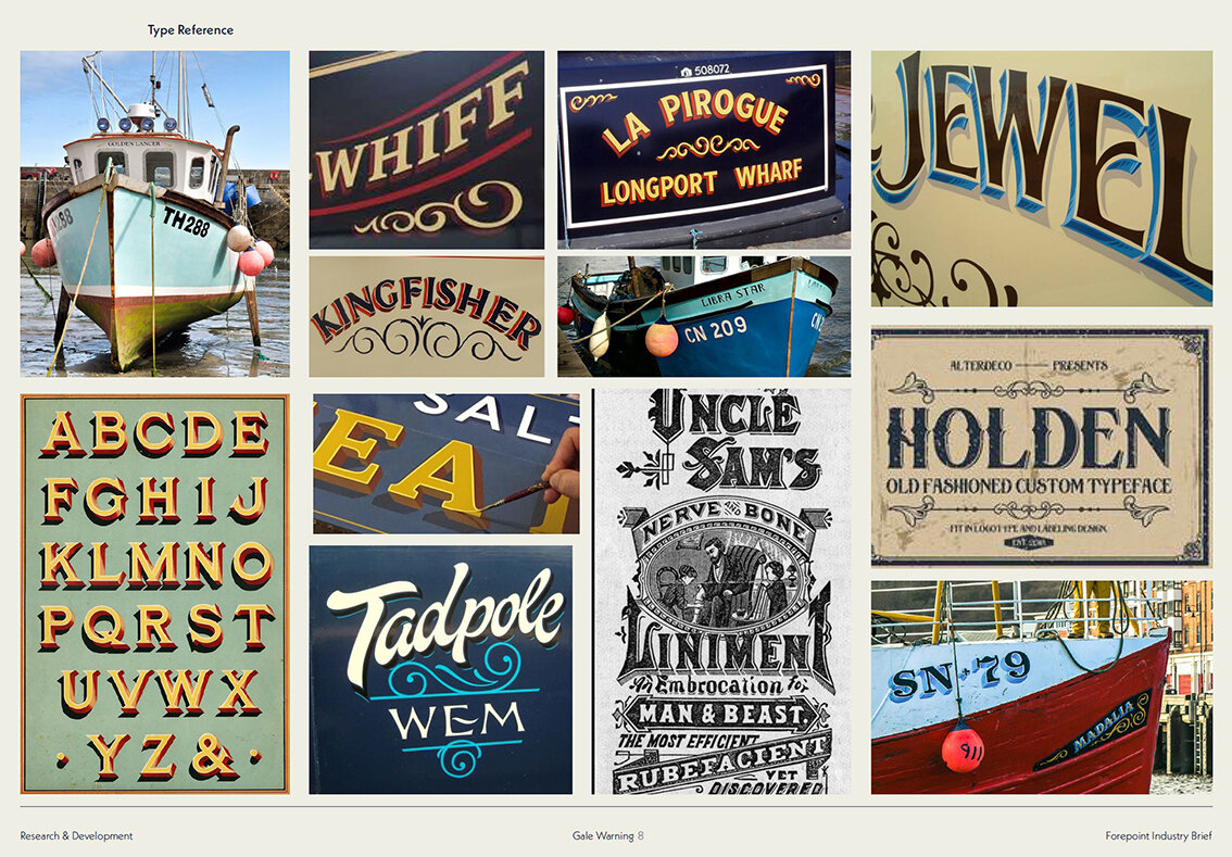
Typefaces

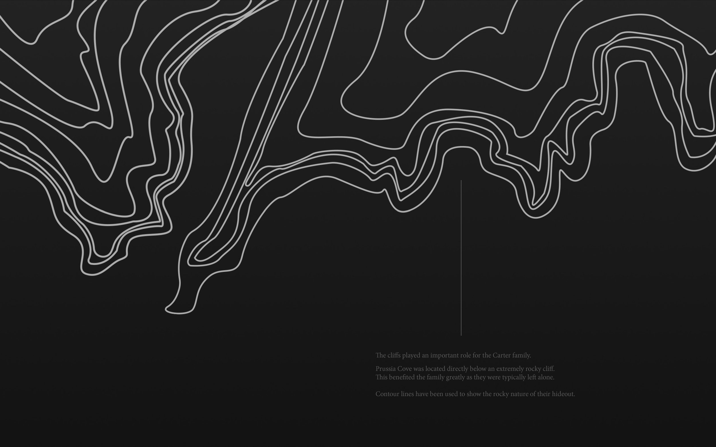
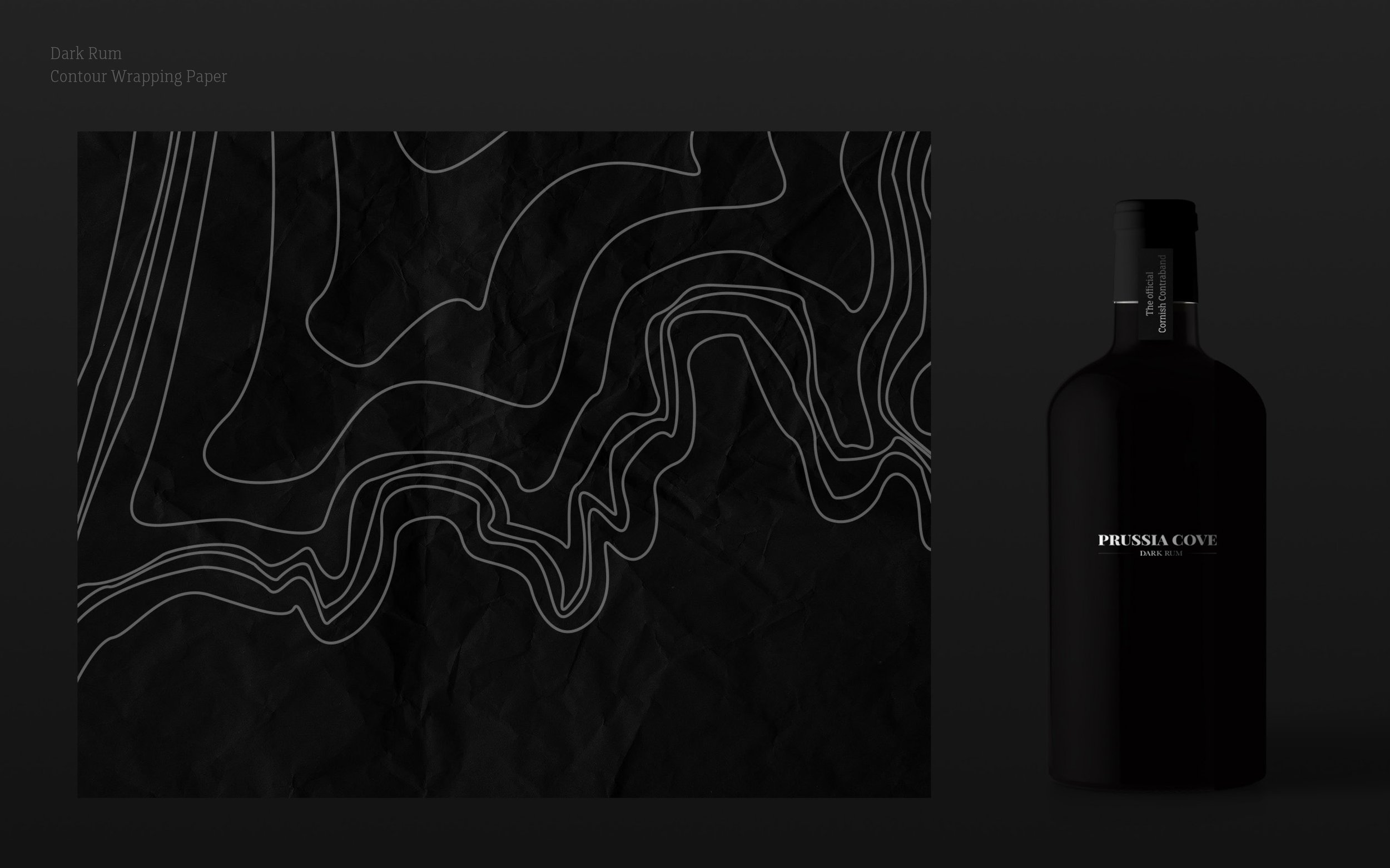
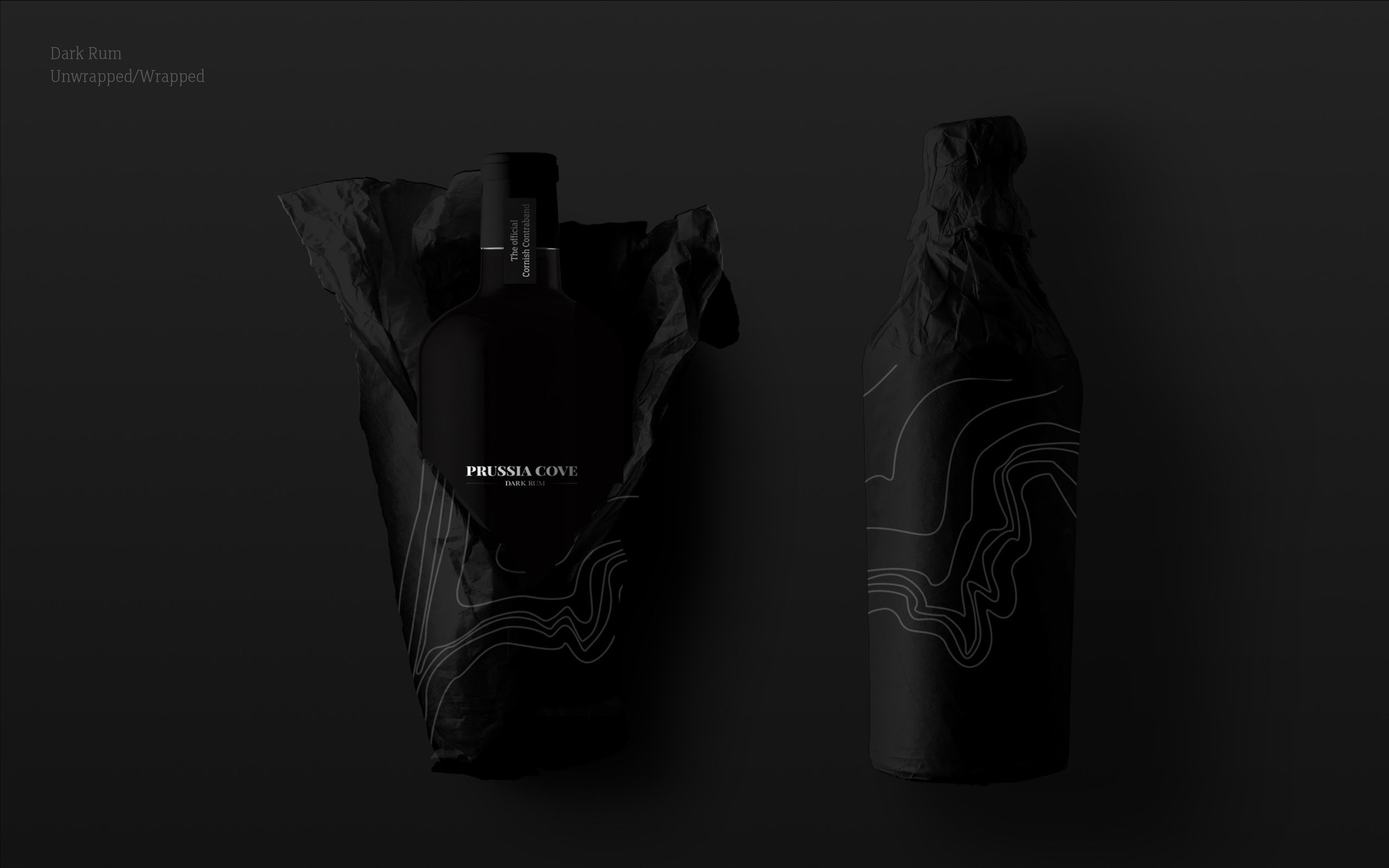
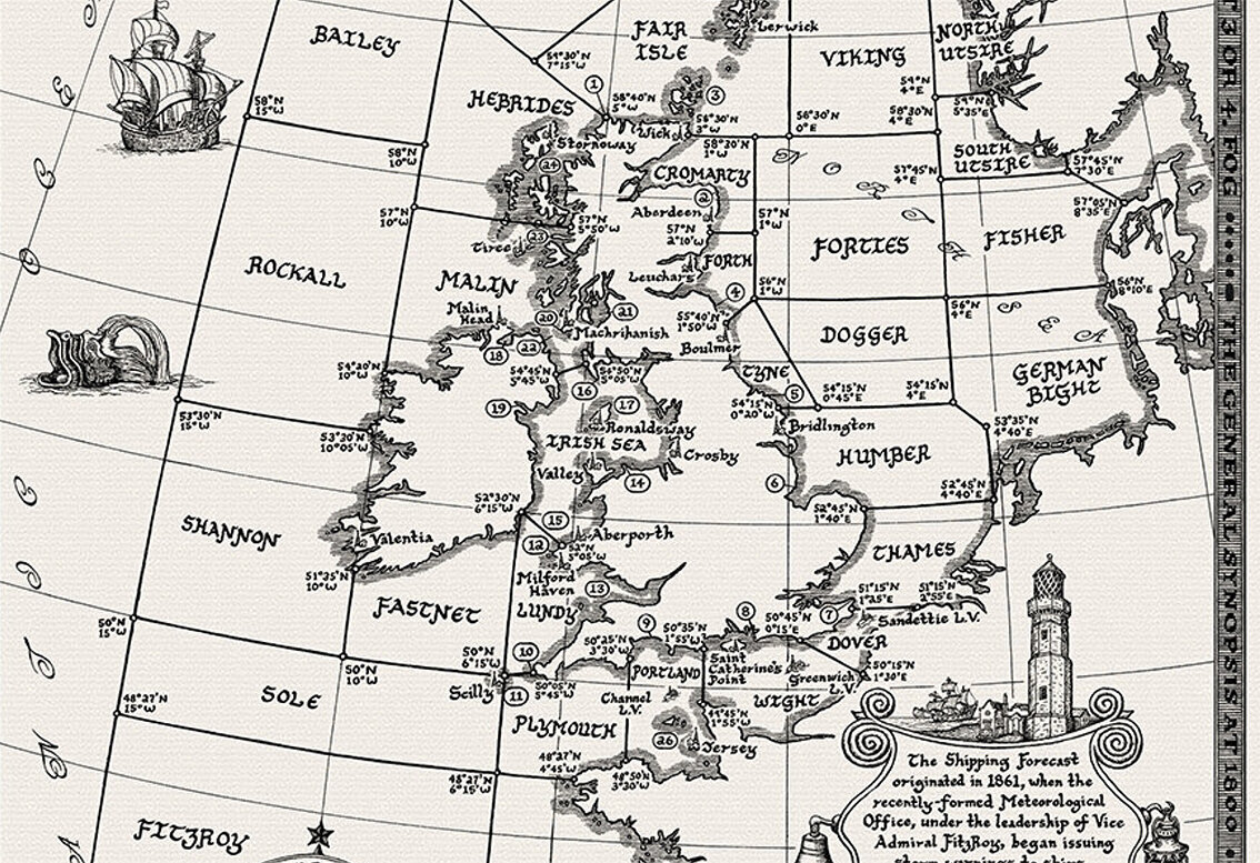
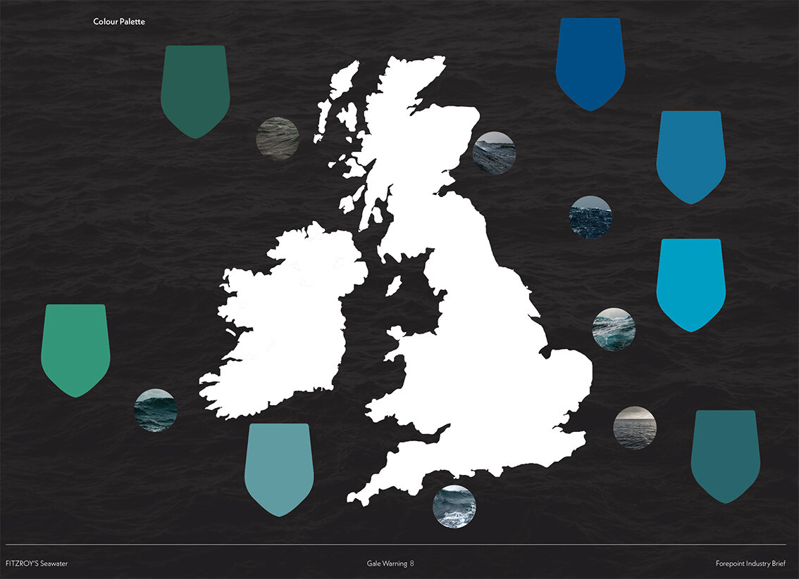
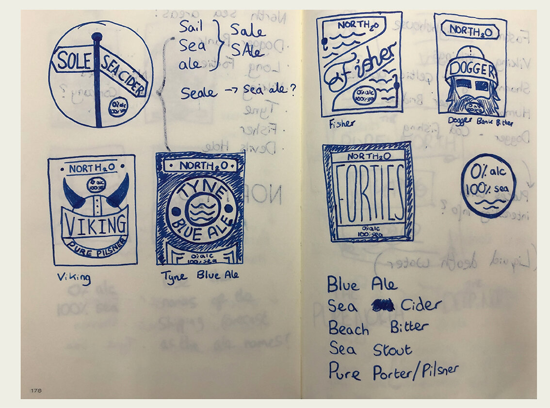
The offshore regions

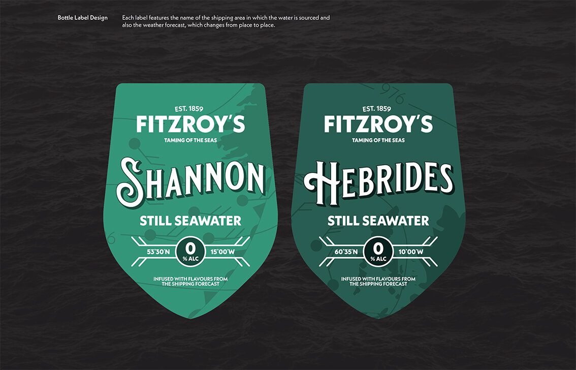
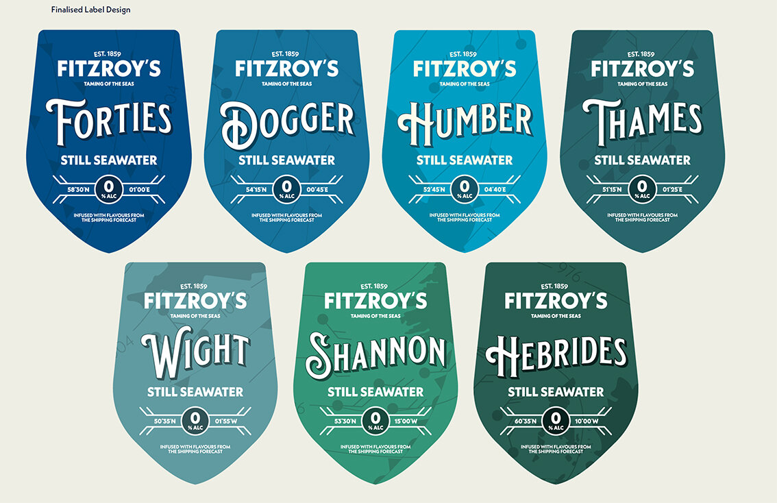
The label designs
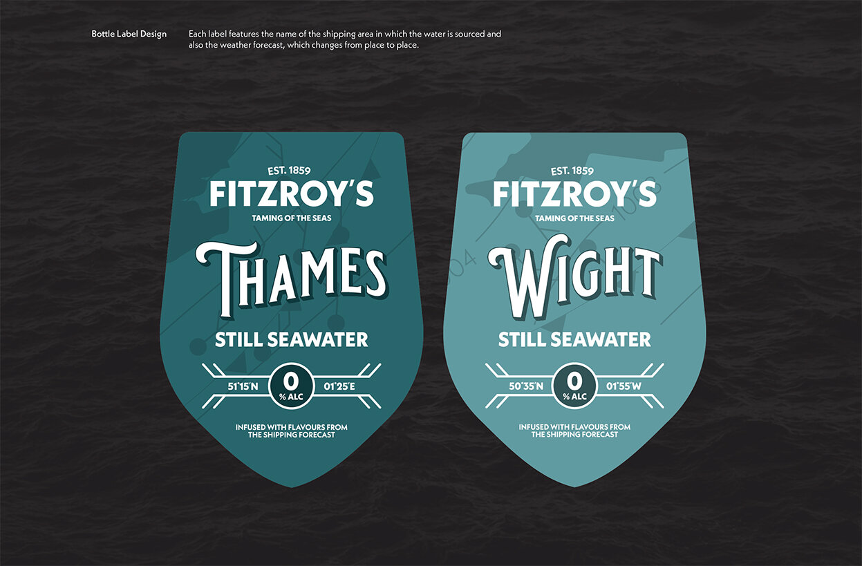

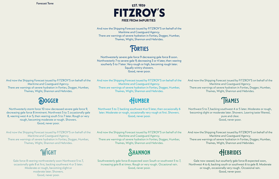
The full forecast

Multipack box


Pump Handles

The bar
Please click on image above to play film.

Here we feature Emma Barber’s solution to the recent industry brief set by Chris Mason .

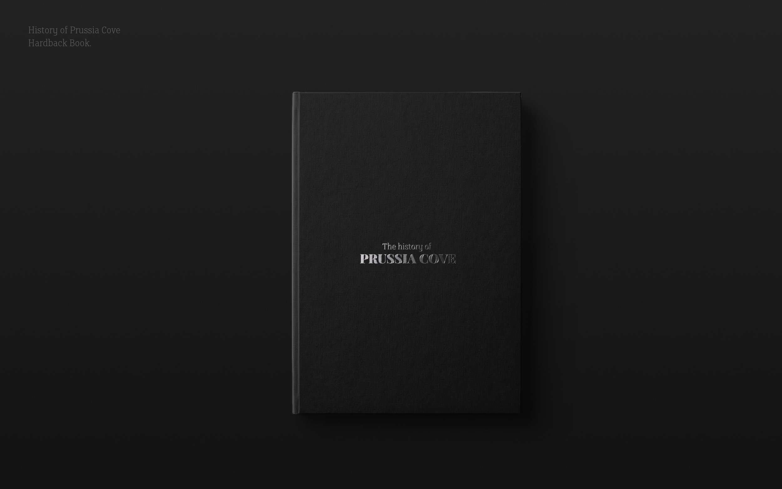
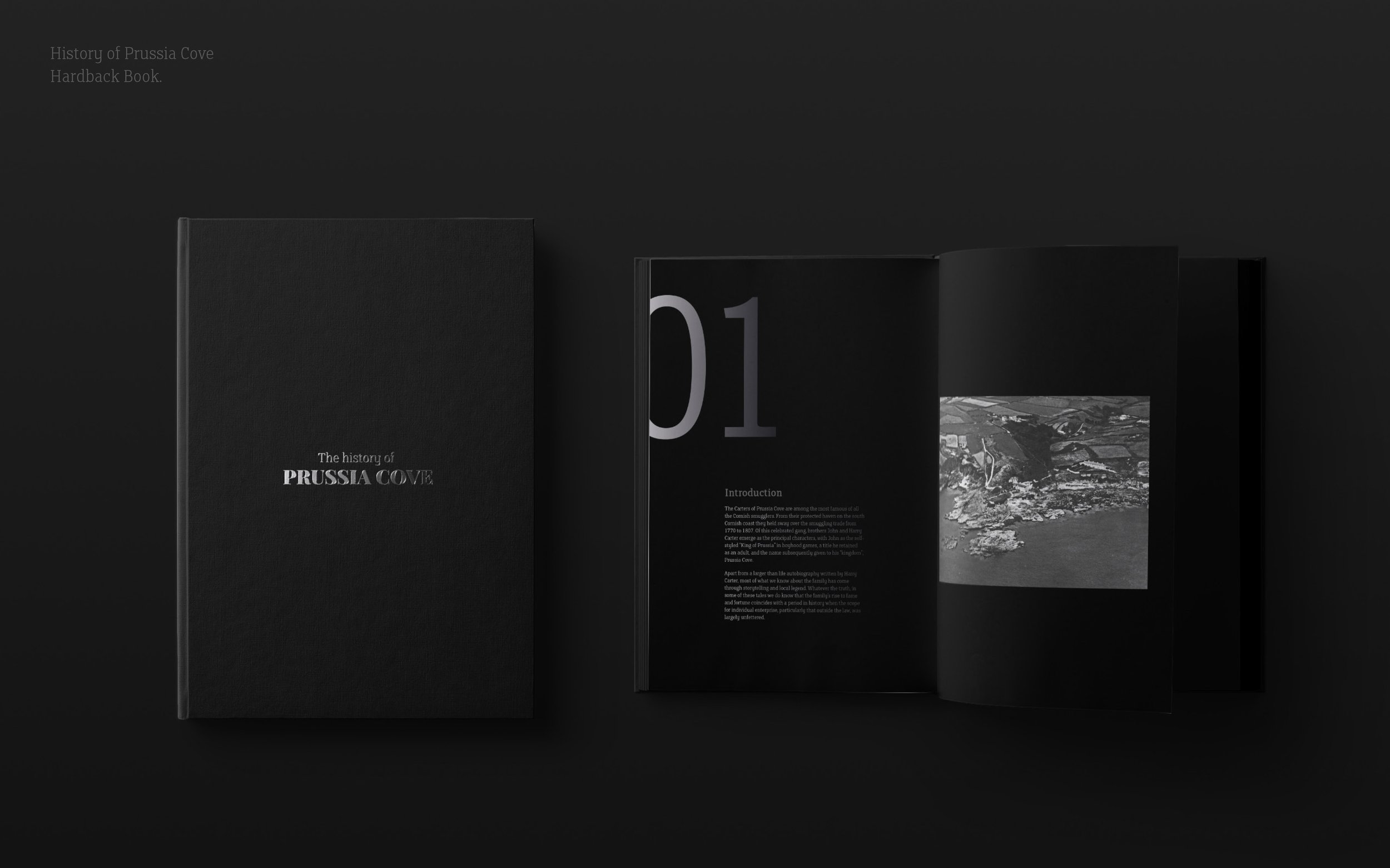
The back story

Please click on the image above to play film

The brand mark
Please click on the image above to play film
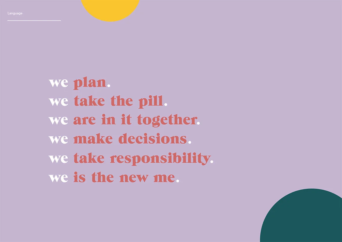
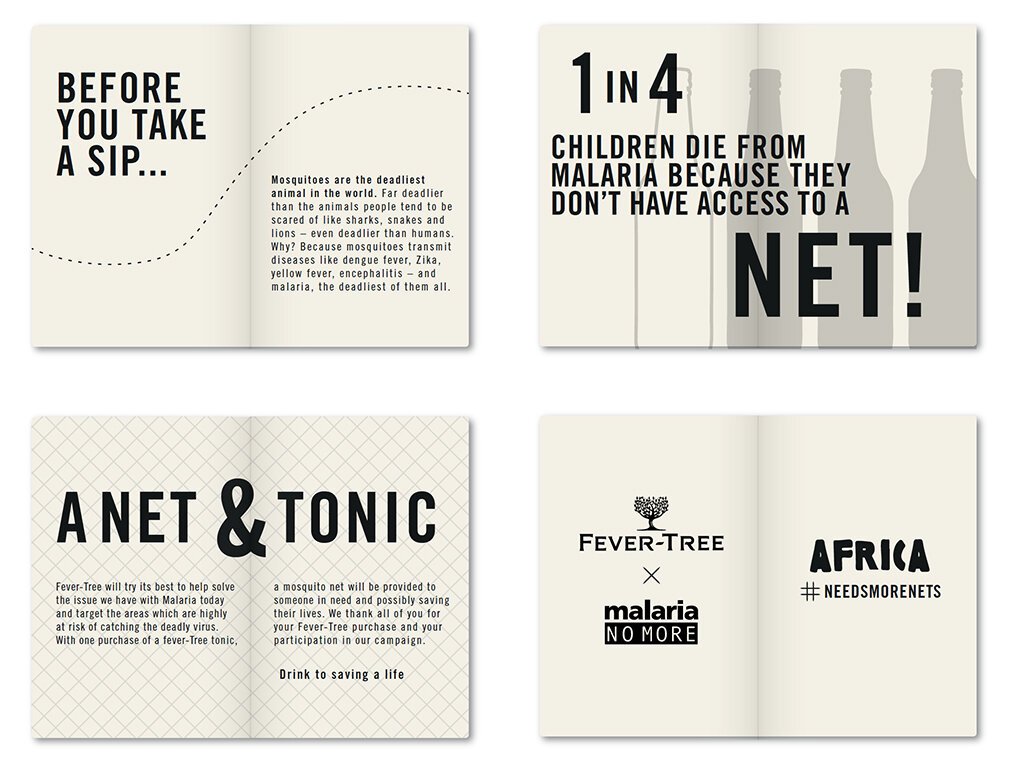
The Language & tone of voice

Copywriting

Alternative copy styling

Assets - Shapes and photography styles
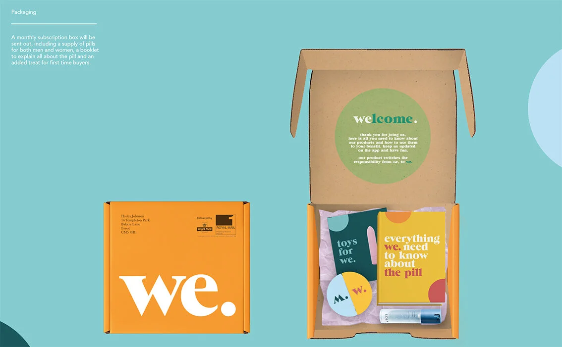
The outer packaging & content designs

The pill packaging

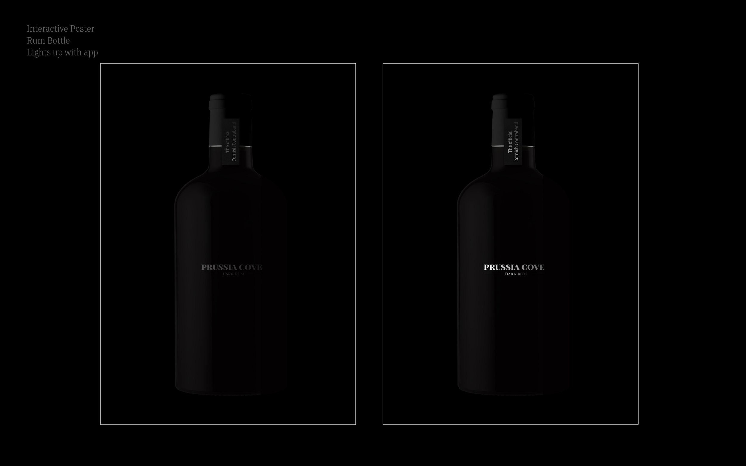
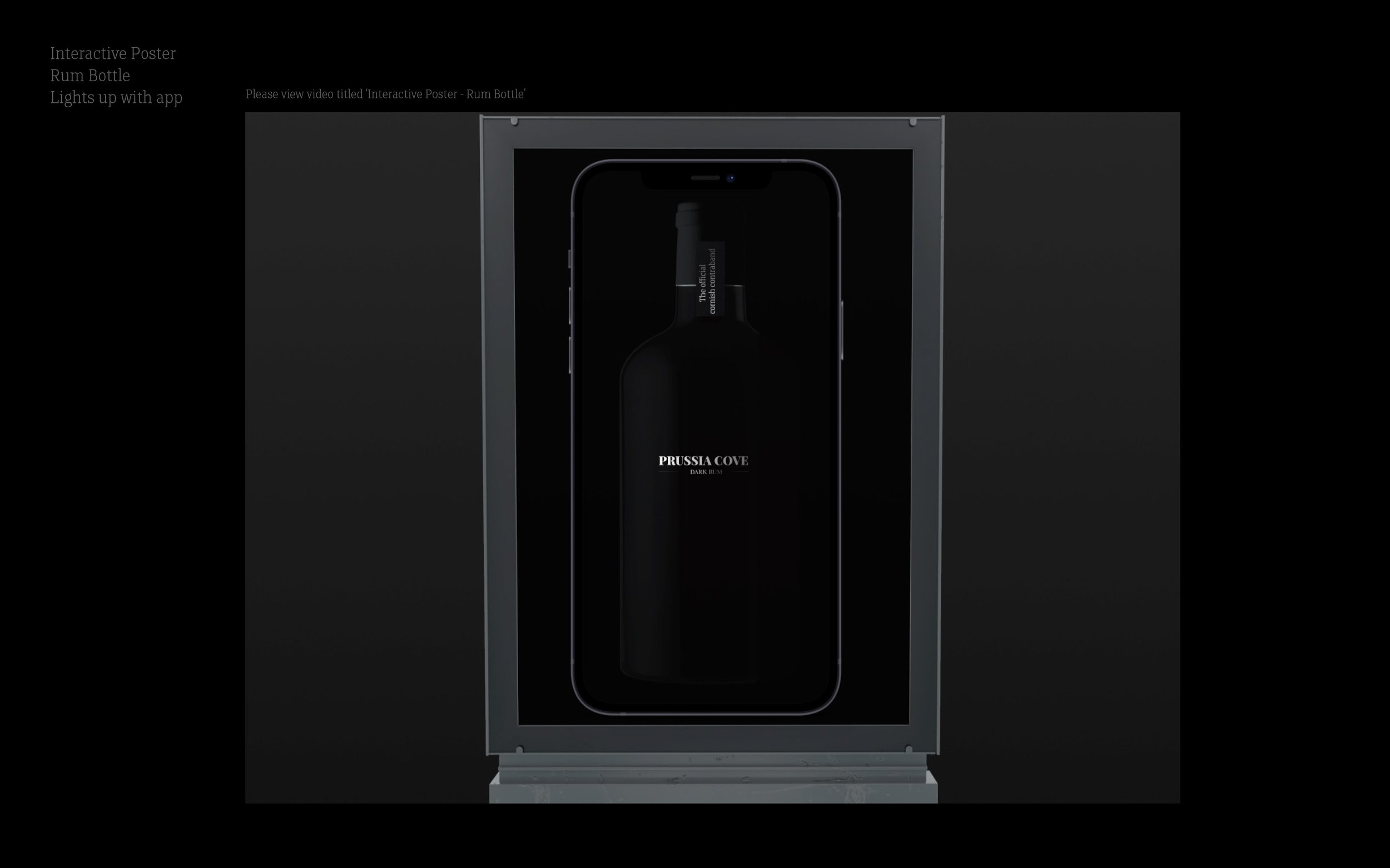
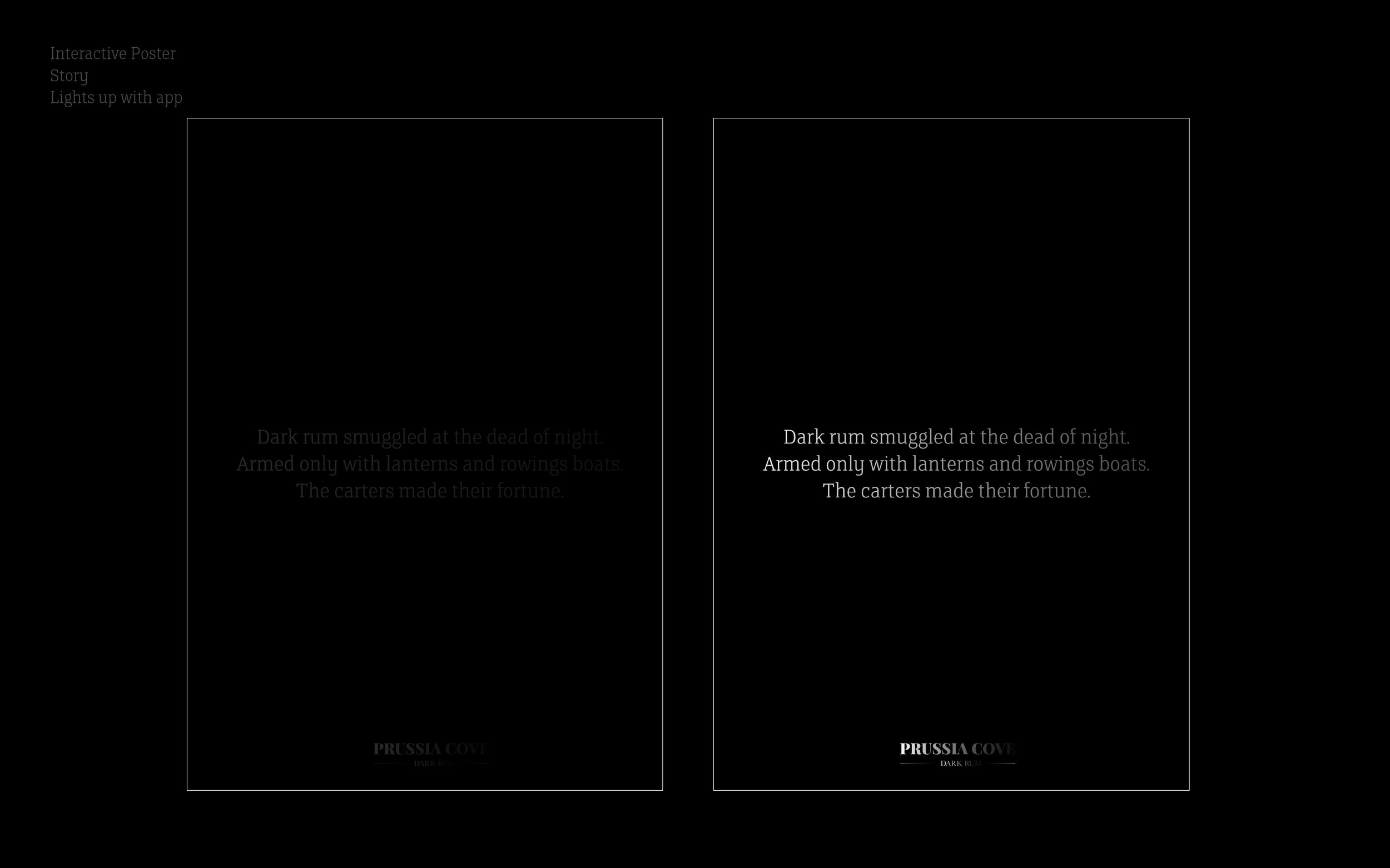
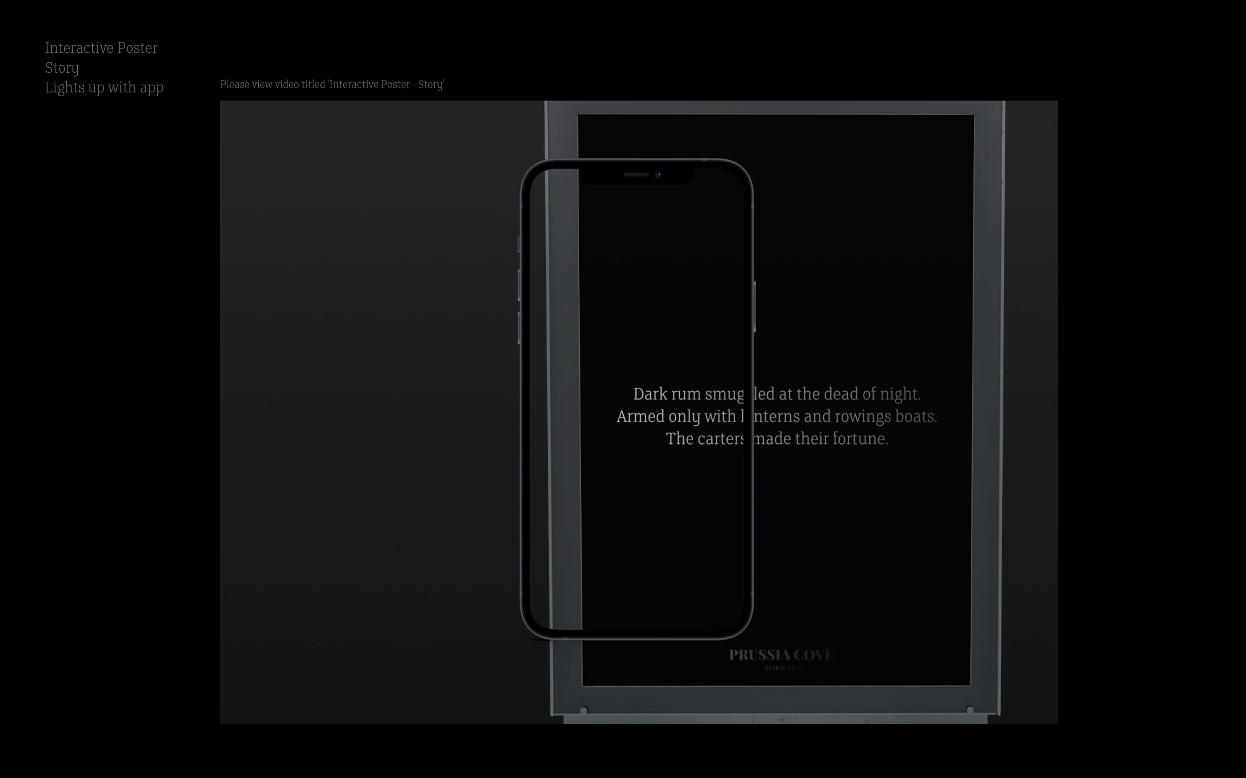
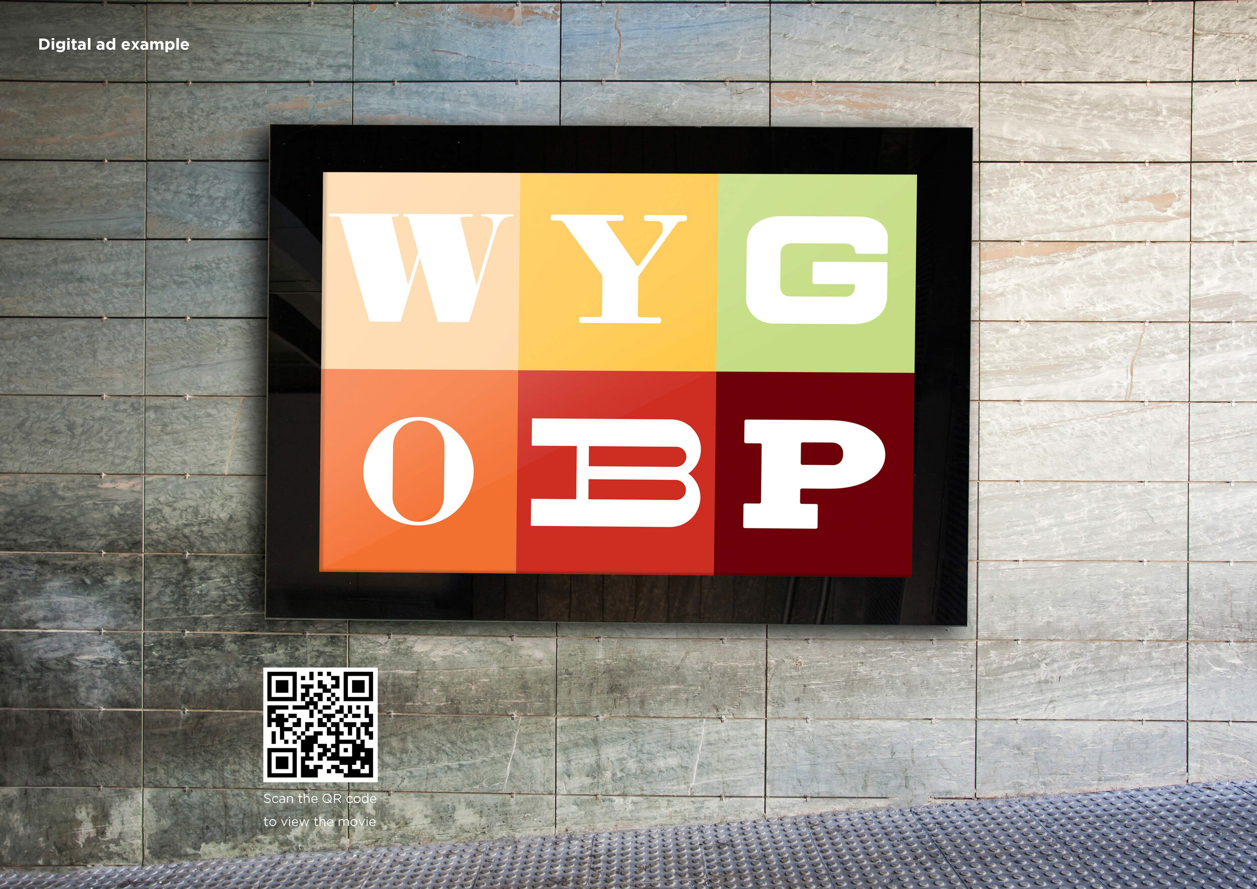
Outdoor - Posters

Print - Brochure

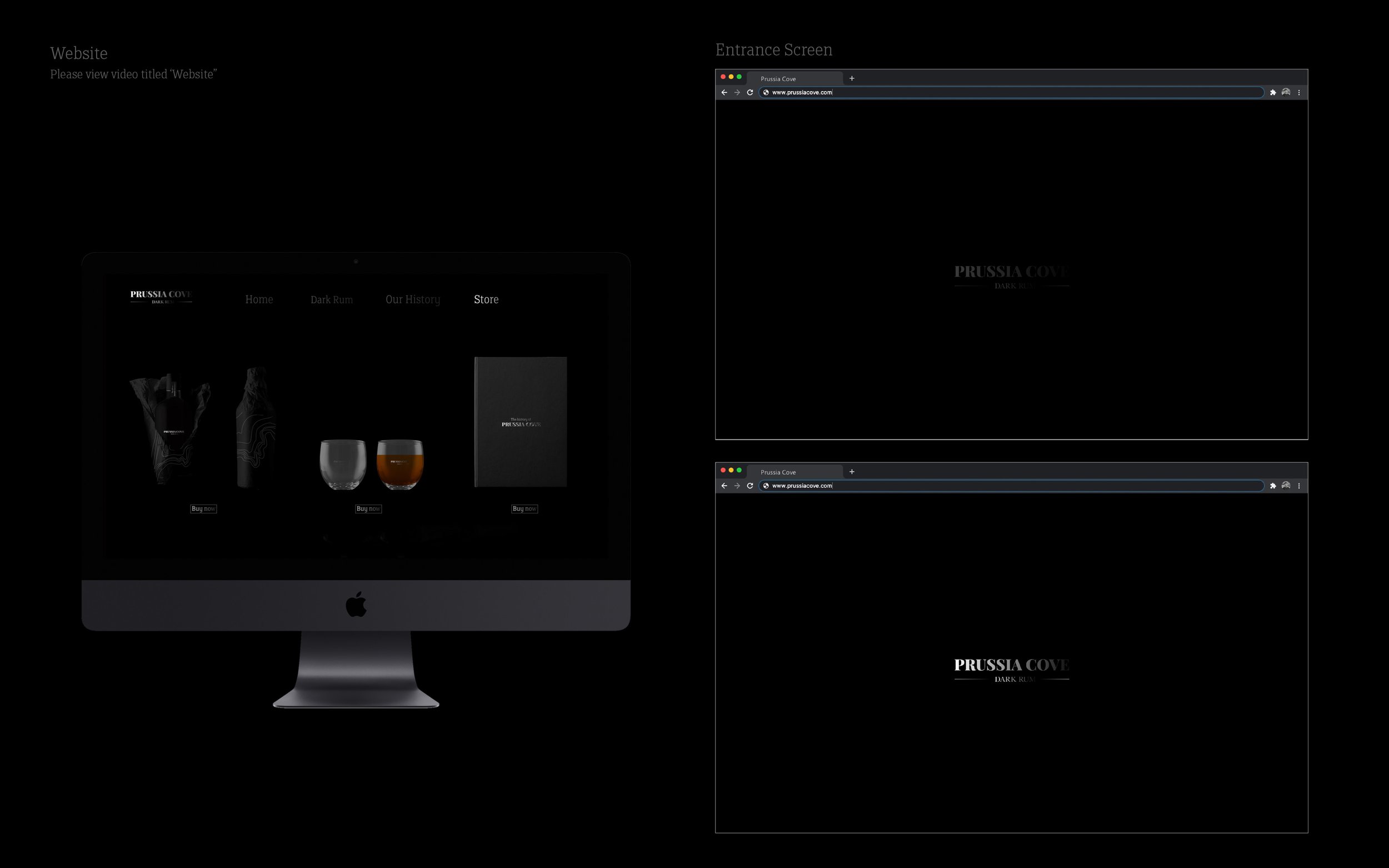
Digital - Mobile look & feel
Please click on the image above to play the film.

App designs

A very strong, well thought through and deceptively simple design solution to what was a sensitive and challenging subject and brief.
Here we feature another Honours project.
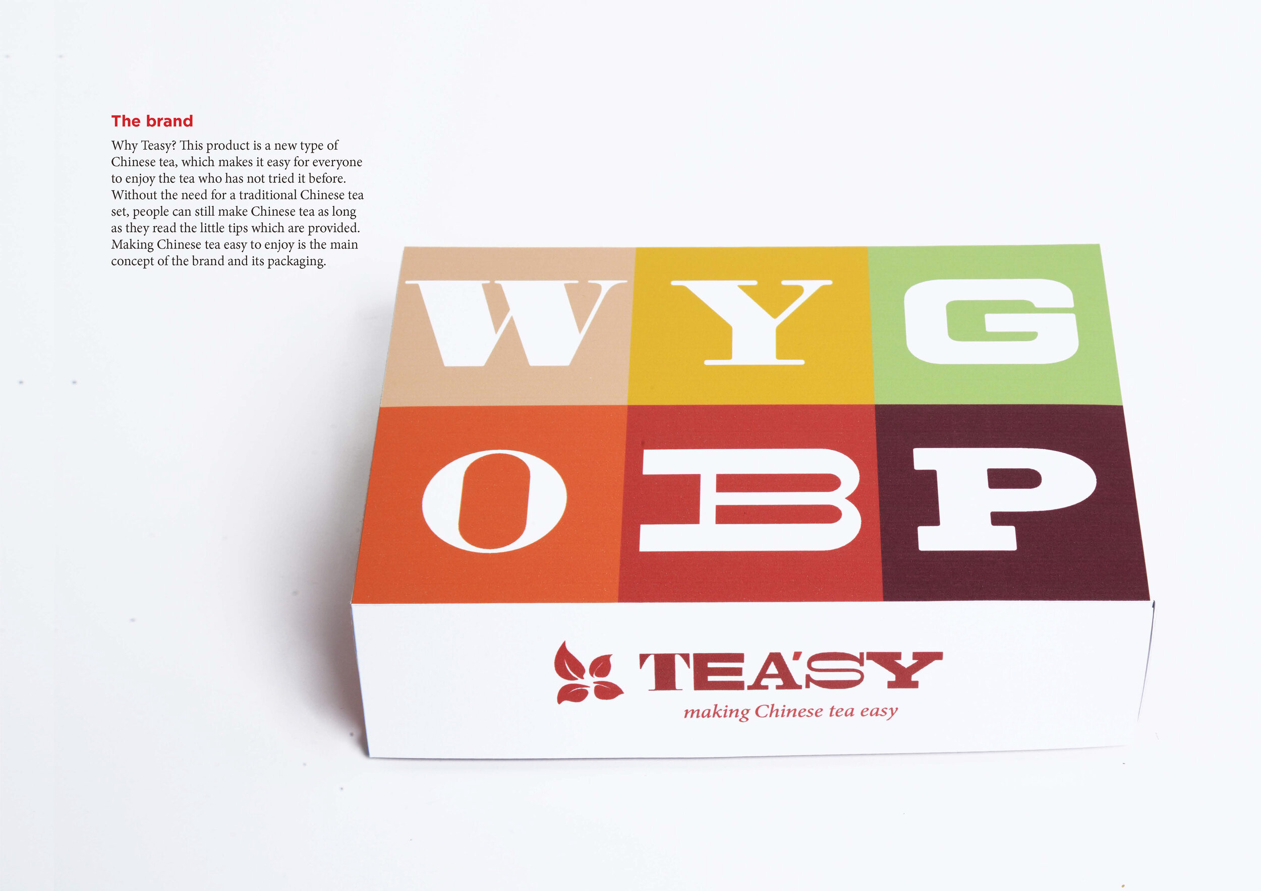
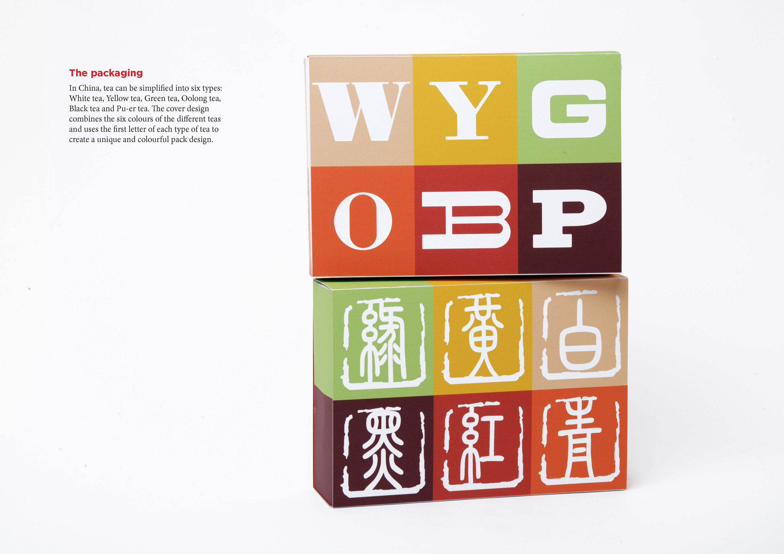
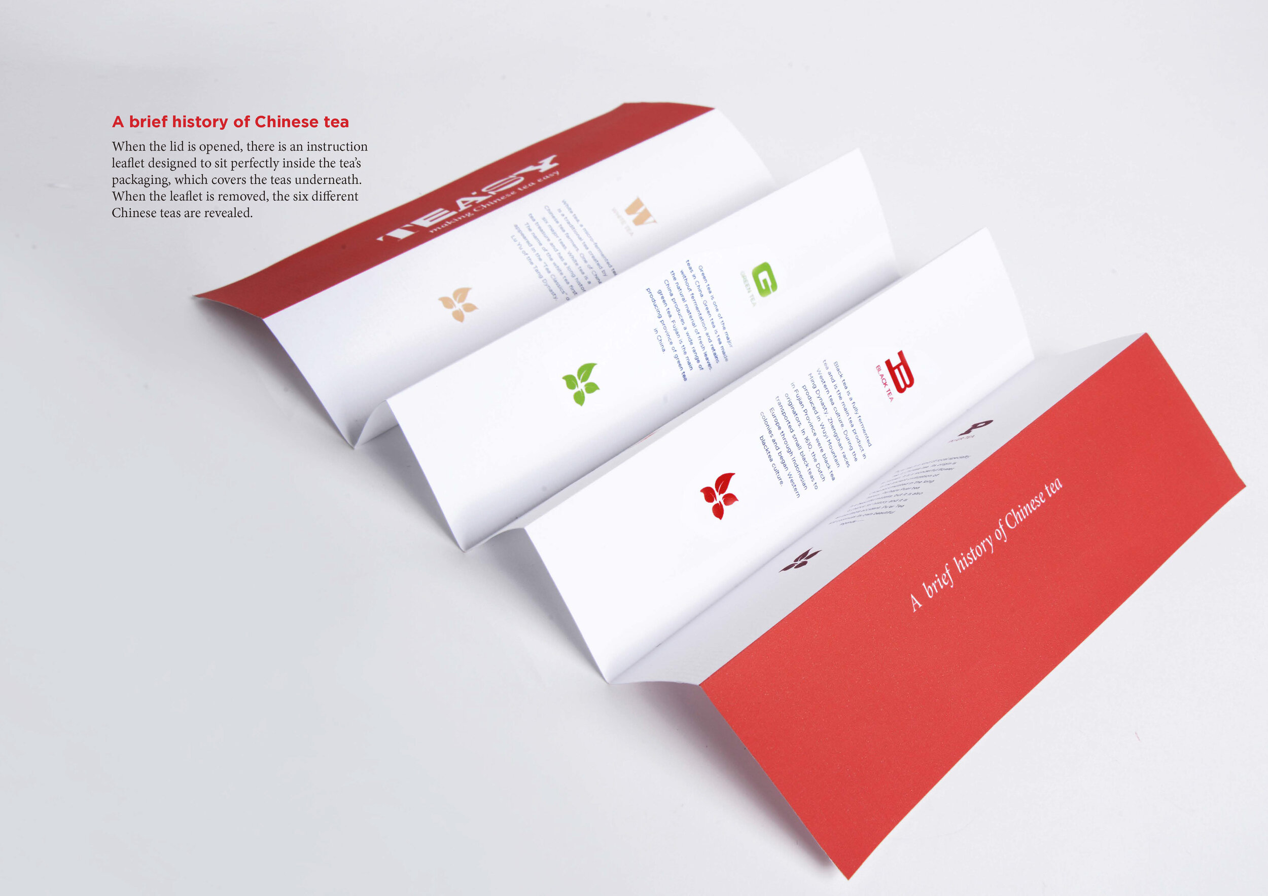
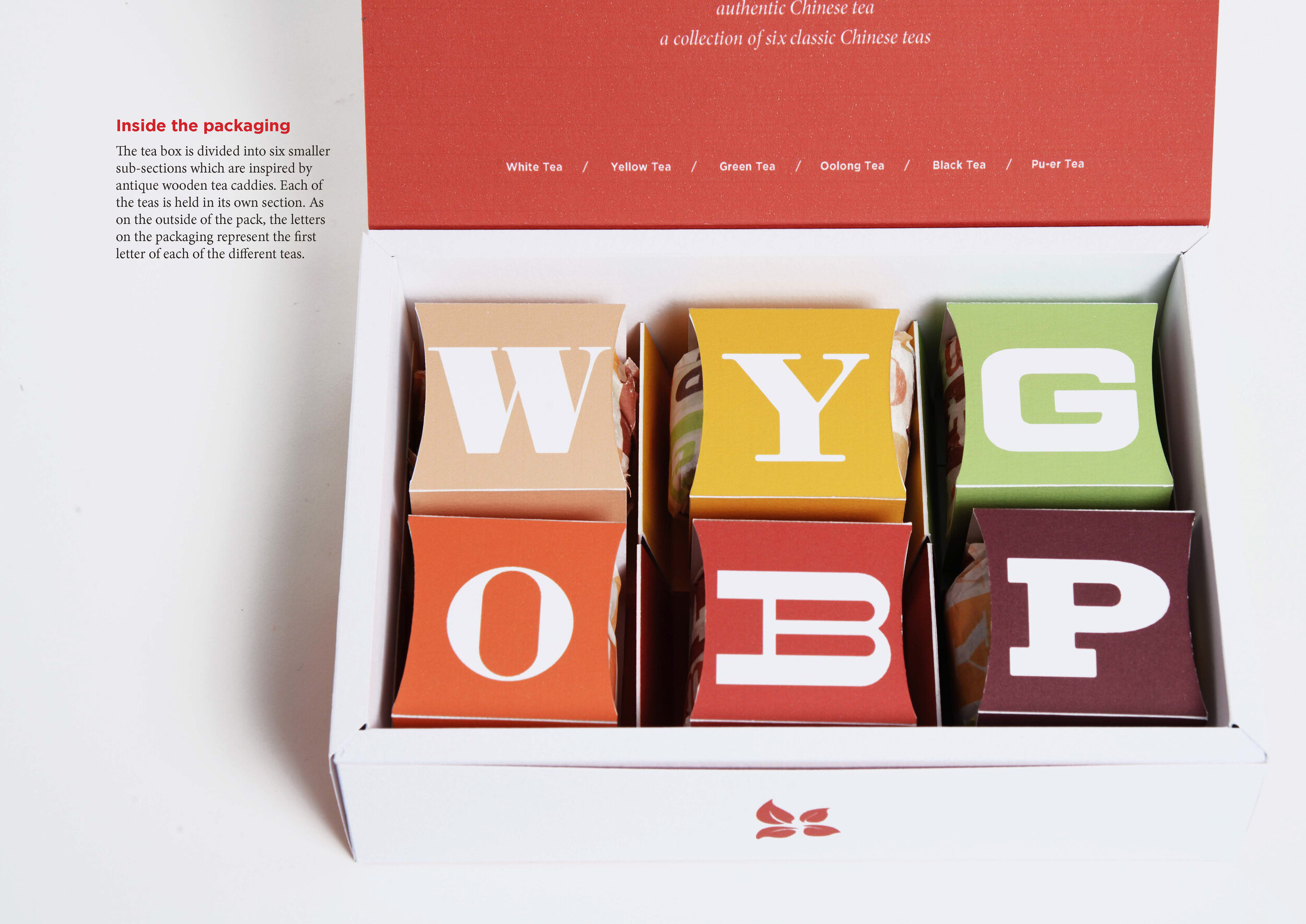
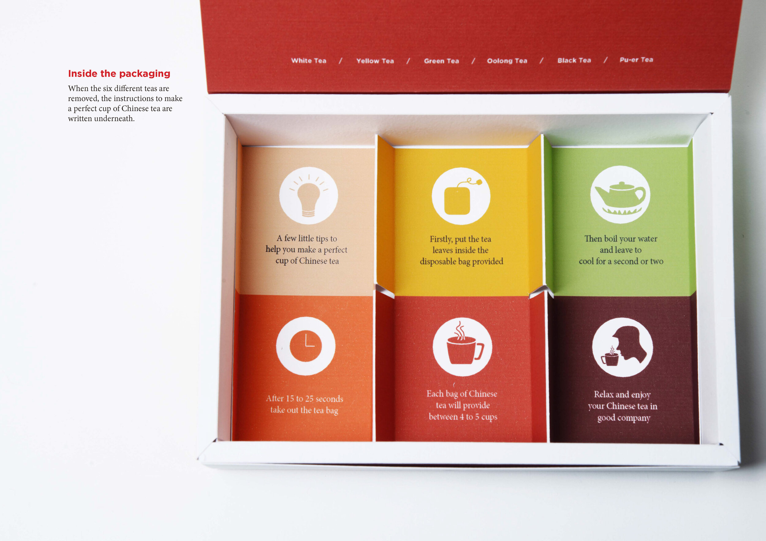
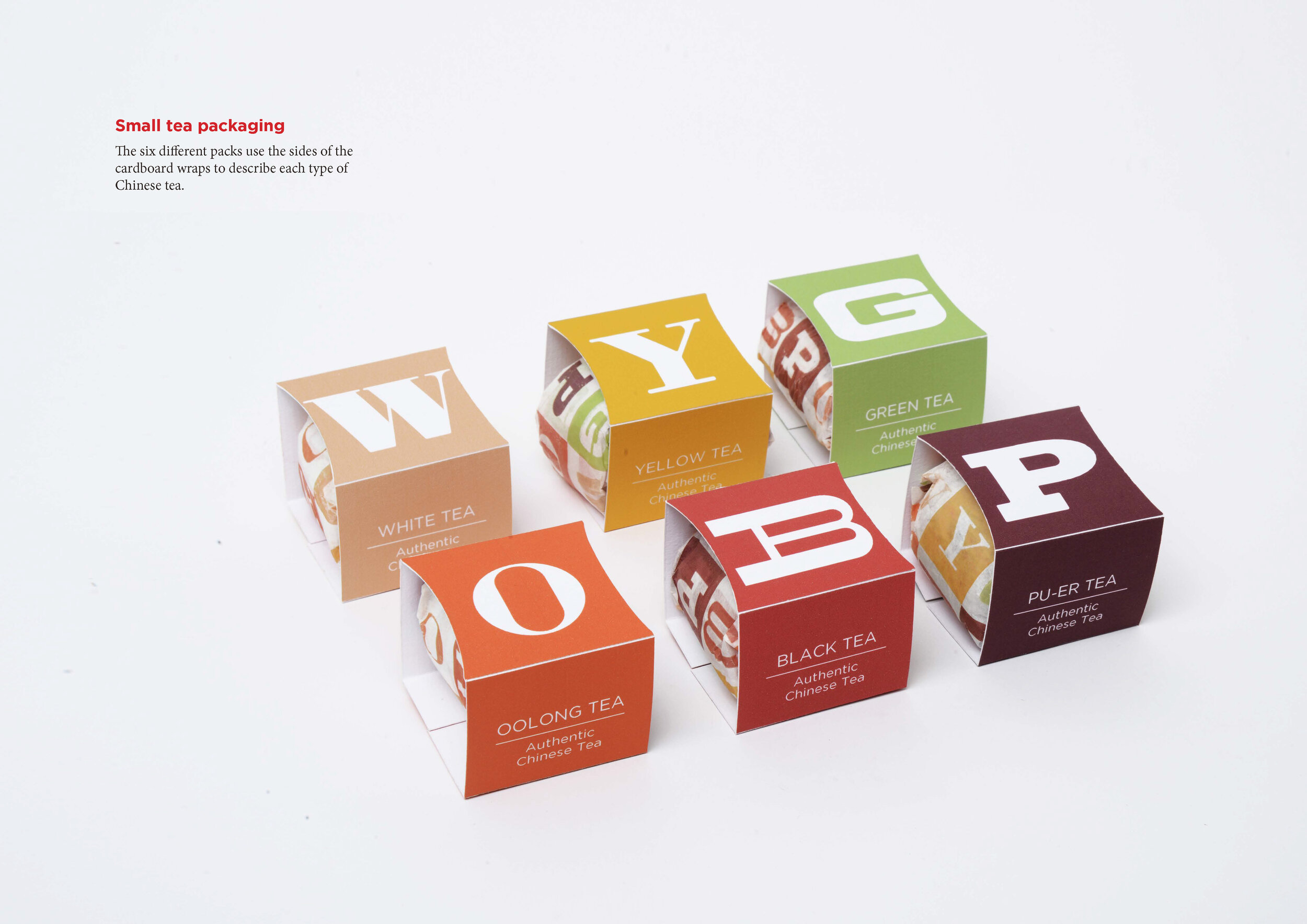
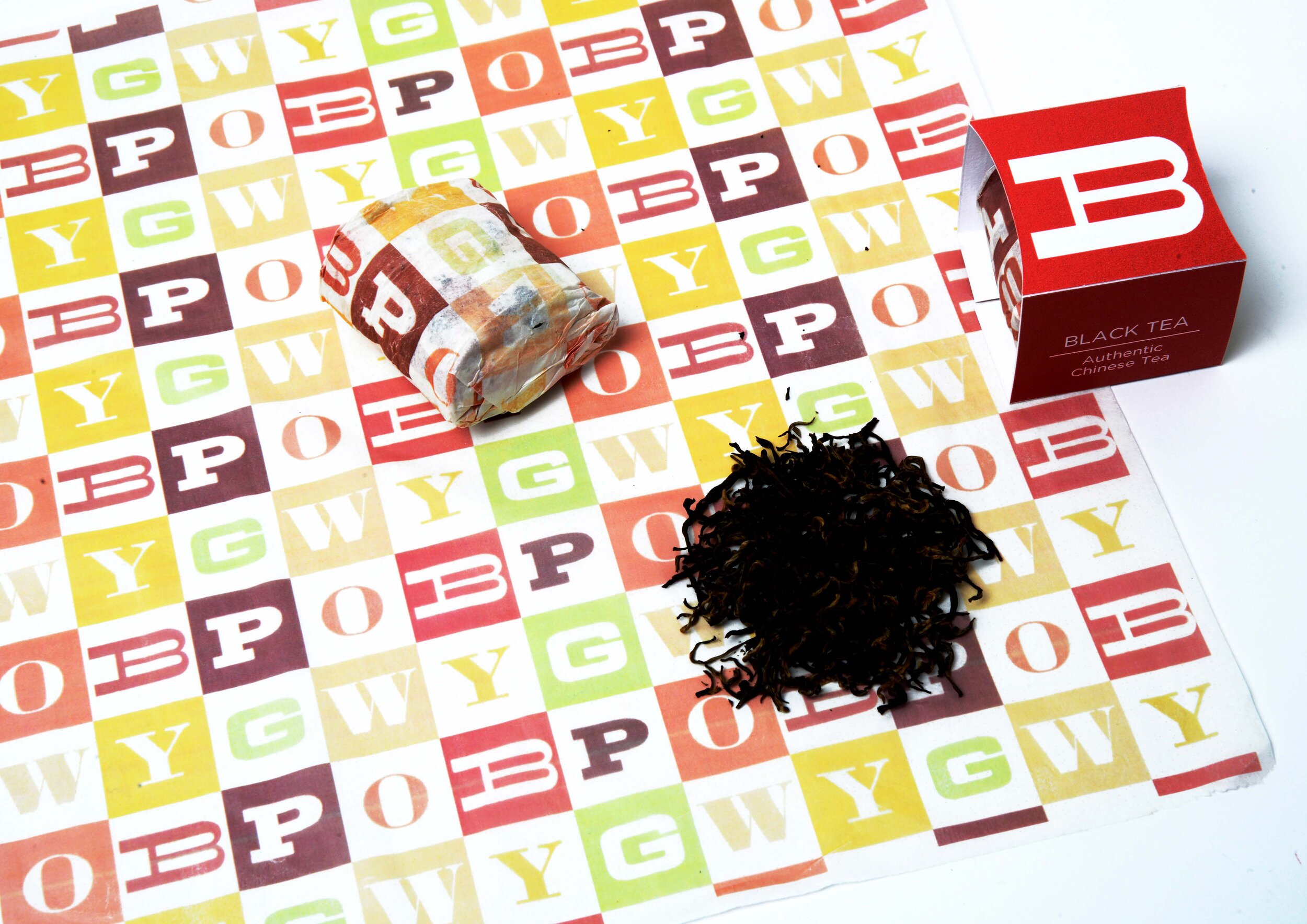
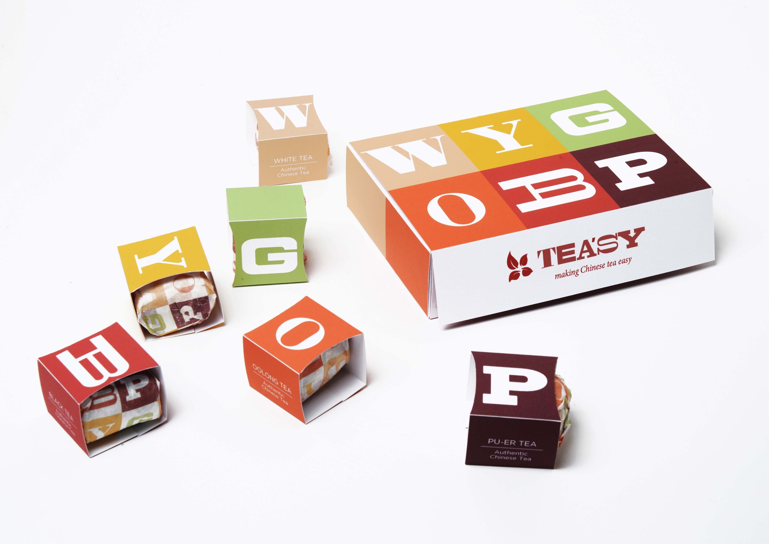
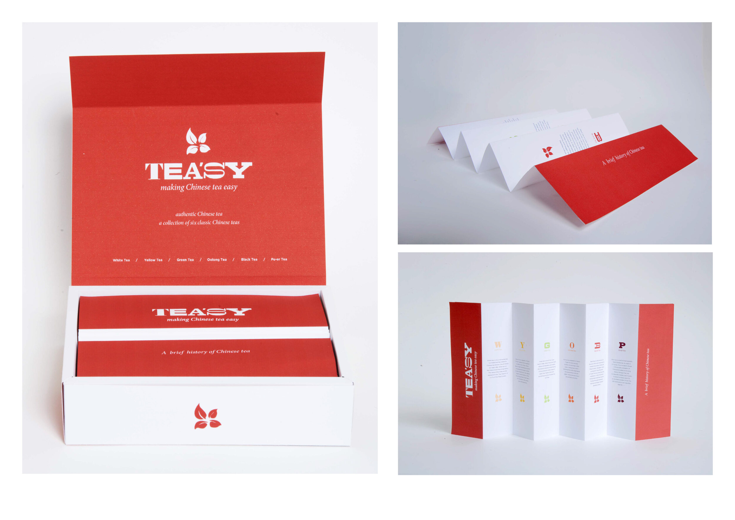
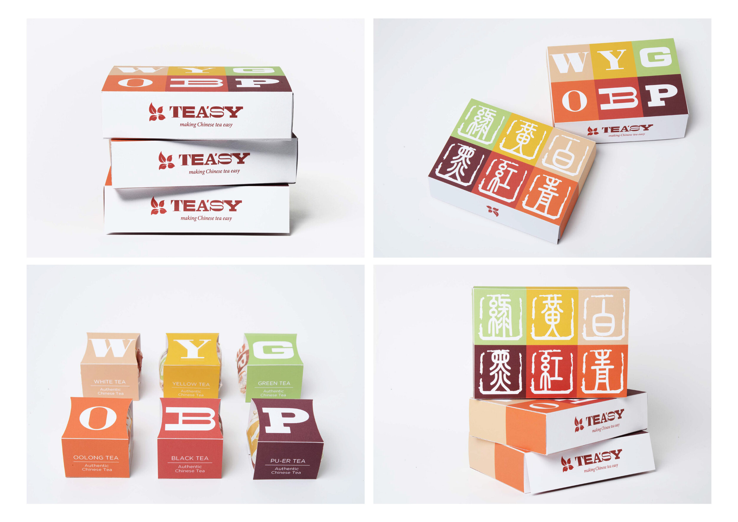
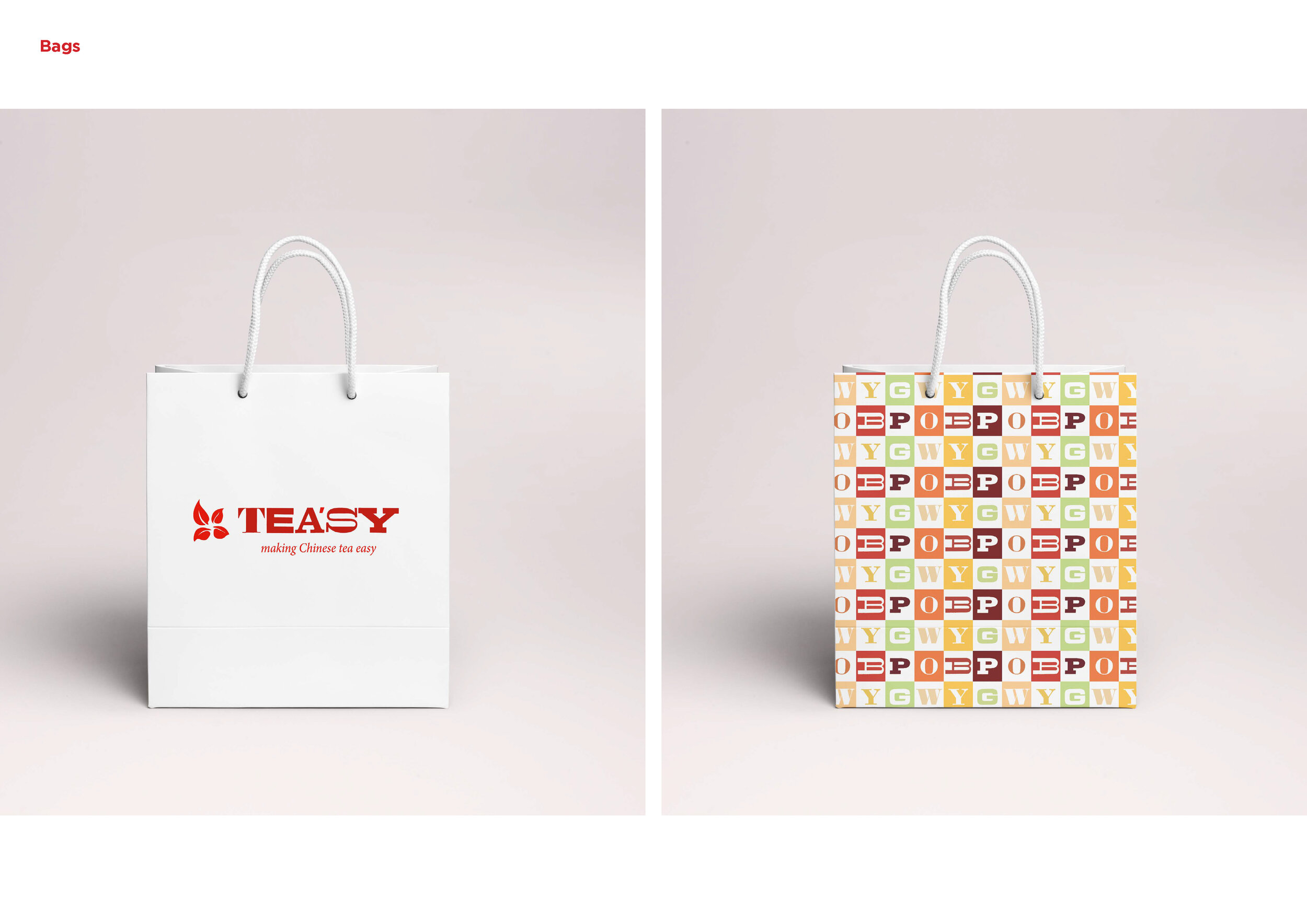
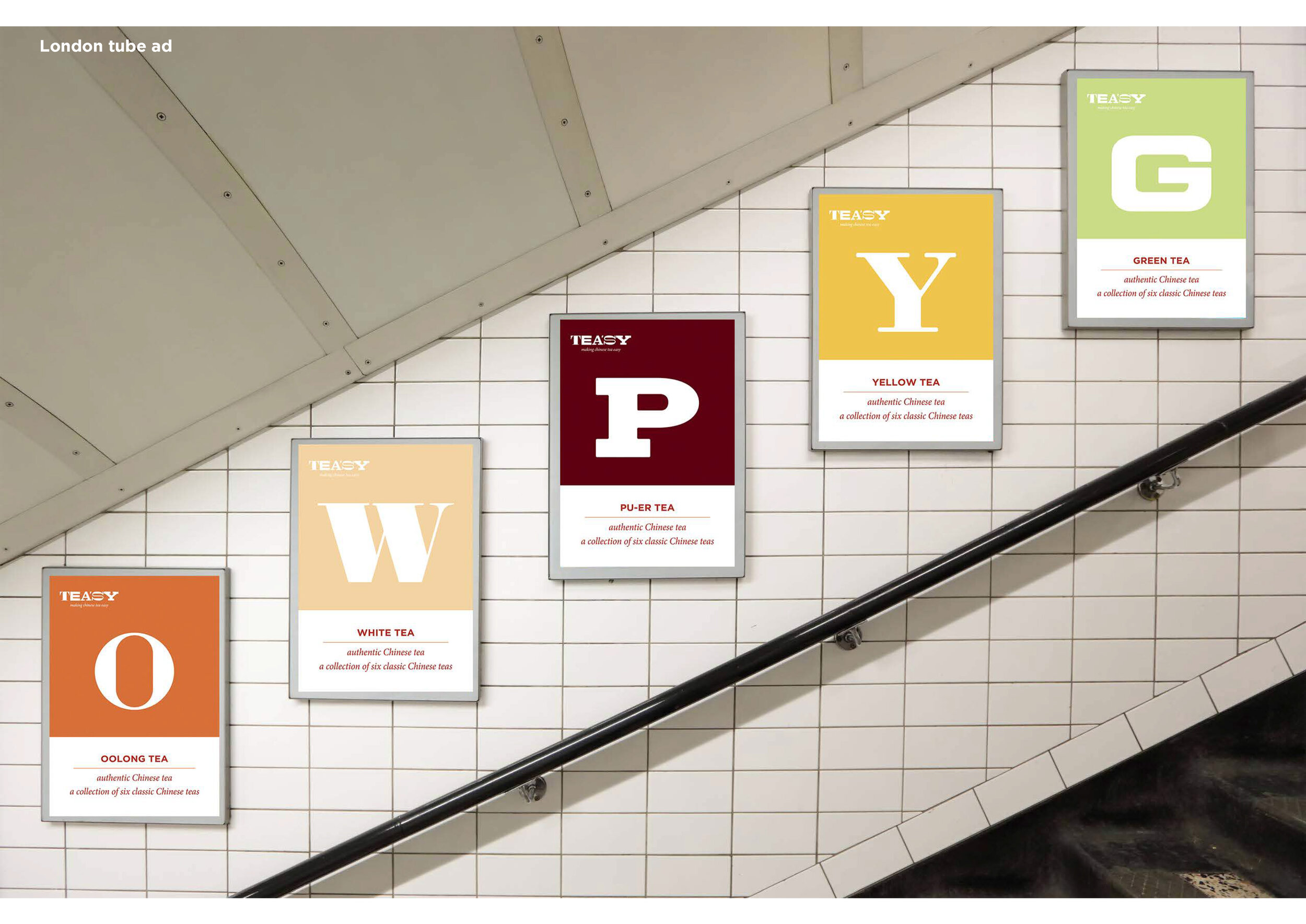
Junxian Wu’s brief was to brand and package six different Chinese teas for a western market. The solution was simple, and aimed to make a complicated ritual easy for a new audience, or perhaps tea’sy.
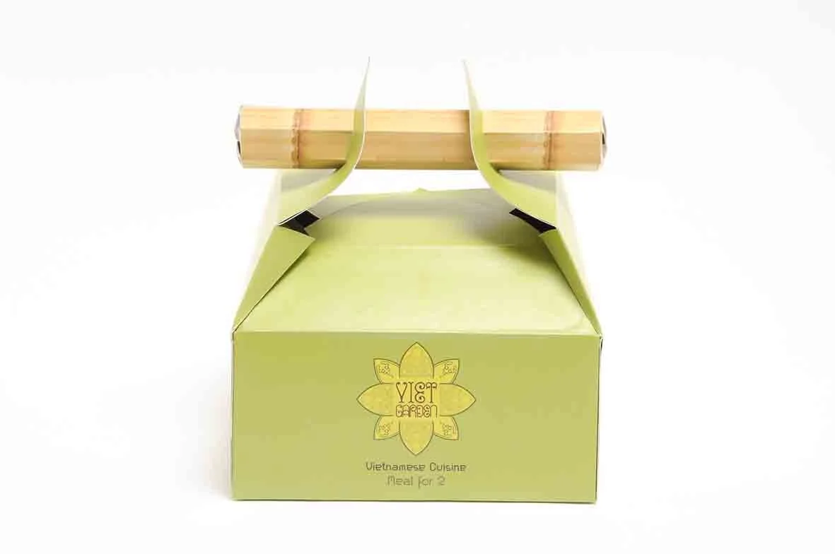
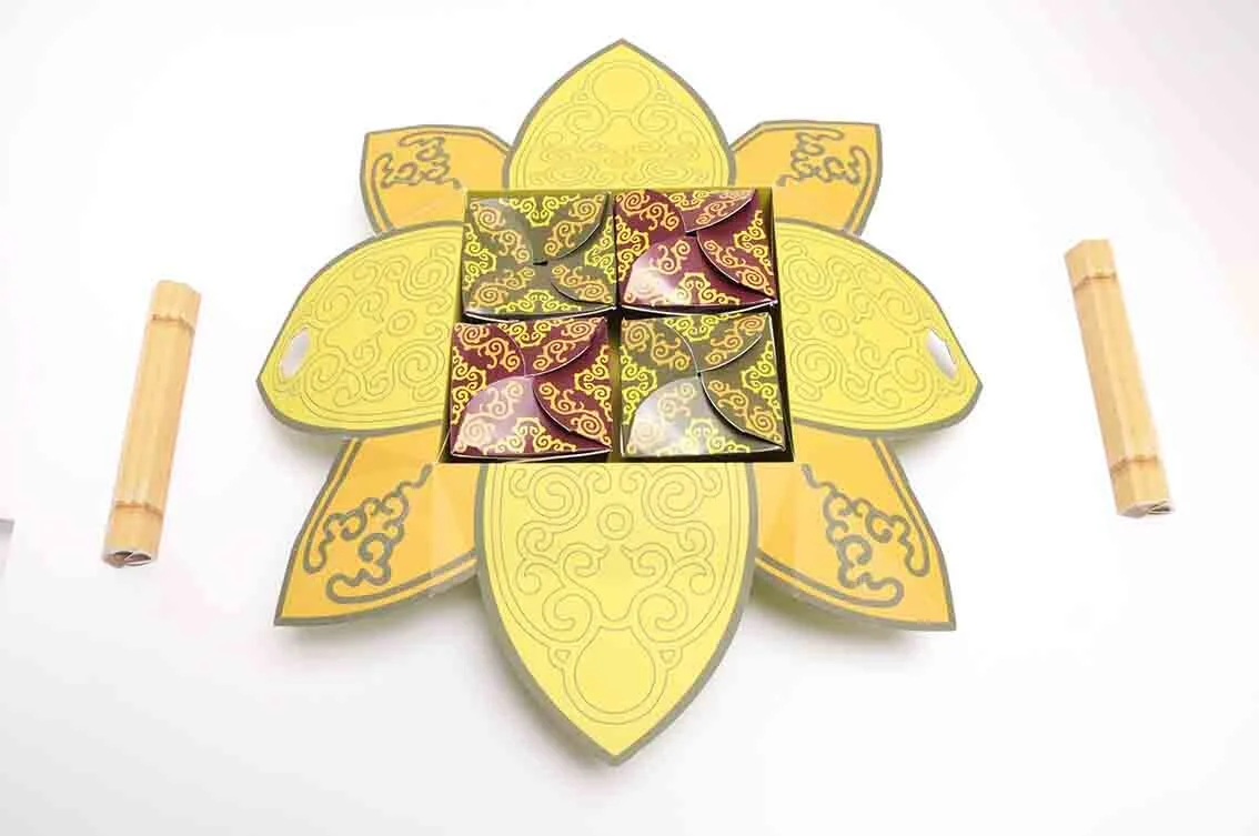
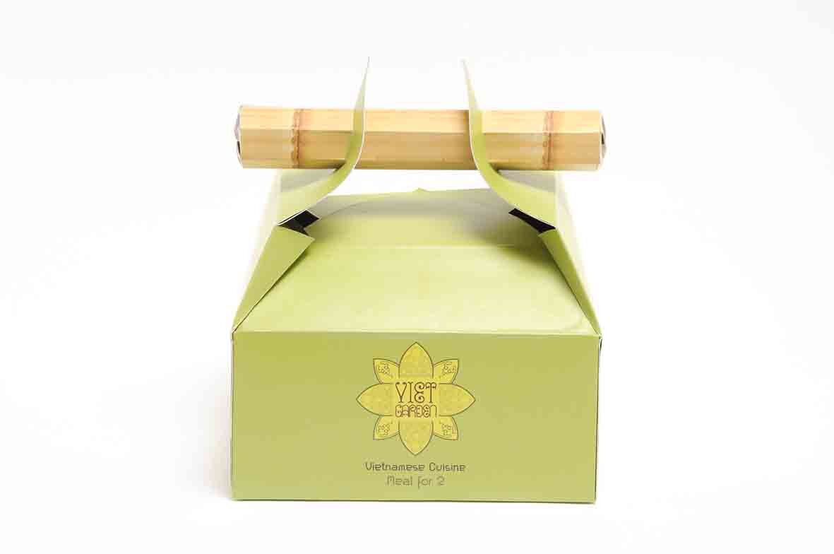
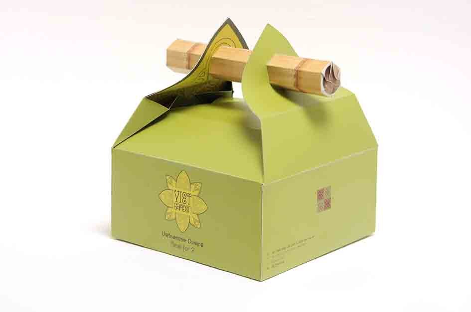
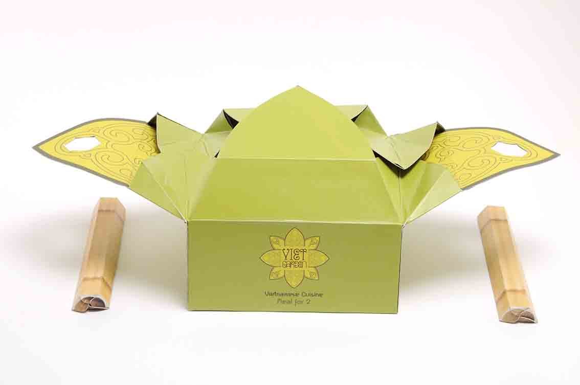
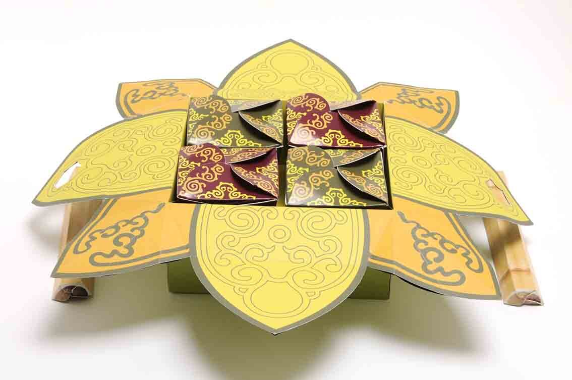
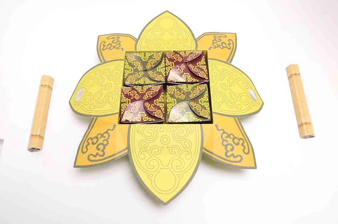
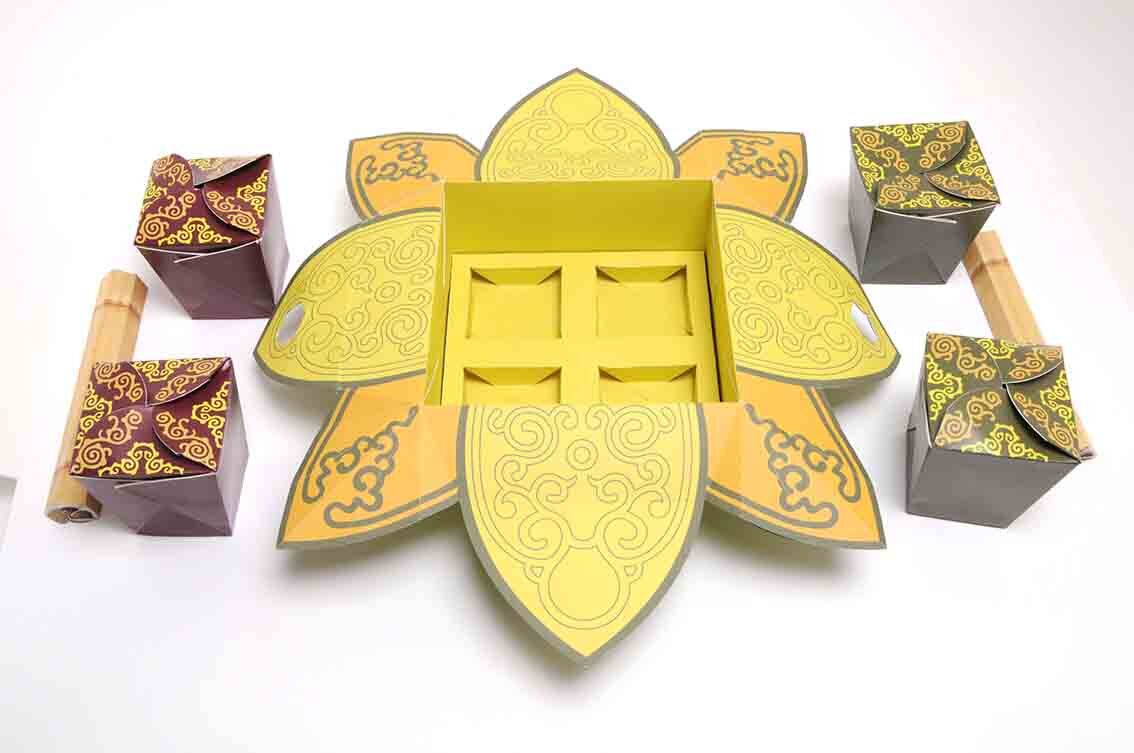
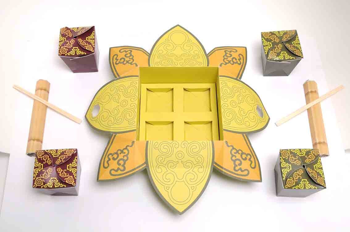
Here we feature a creative packaging concept for a Vietnamese take away meal for two. This project formed part of Mohamed Adam’s final year show back in 2011.


Here we feature Ben Tustin’s innovative Oxo Packaging concept which was nominated for a D&AD in their open category way back in 2011.

Pack shot 1

'Oxo brings a meal together’

‘Oxo brings a meal together ‘
Please click on the image above to view the film.

Pack shot
Here we feature Kristian Shepherd’s winning entry for the Round Creative Network Awards 2016.


Packaging Designs

Neck Label -1
Neck Label Details - 2

Coster & Glass Design Concepts

Adshel Design
A nice clear appropriate connection of protection applied and rolled out across several touch points.
Here we feature Alex Creamer’s classic NY Spaghetti packaging concept from 2008/09. Now widespread on the net and various packaging related sites this project has attained cult status. So we thought we would show a little more from our archive of the early development work.
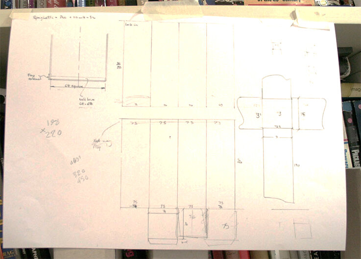
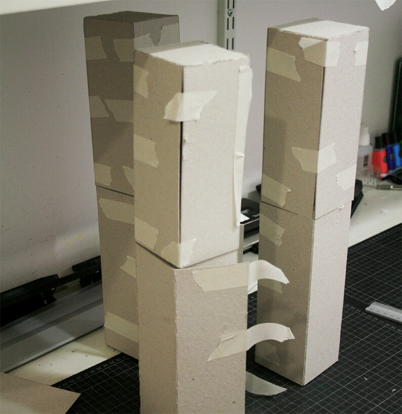
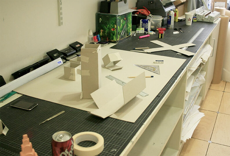
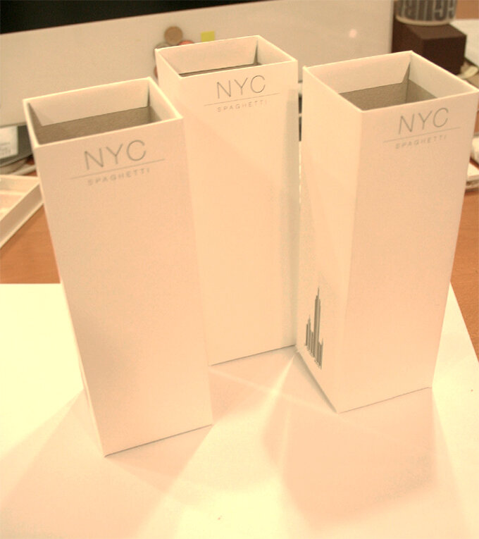
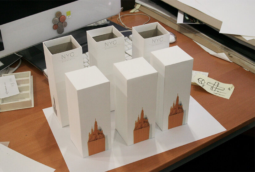
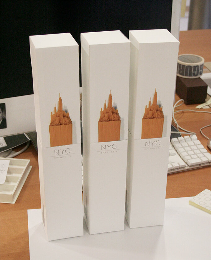
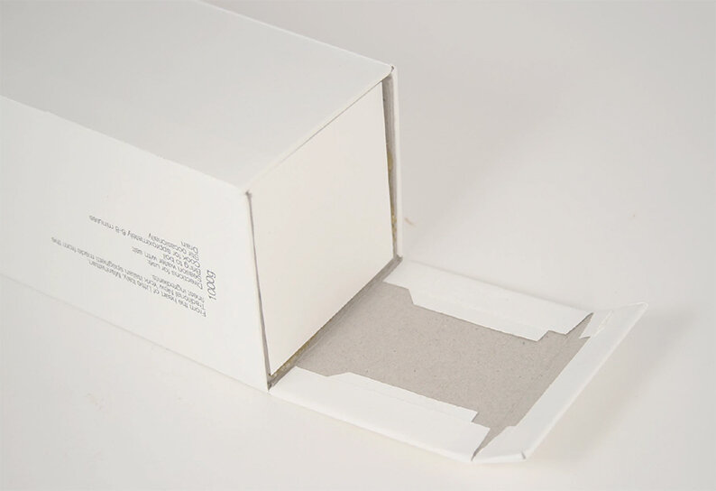
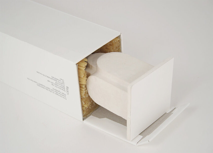
Alex’s solution was initially a response to a 2nd year brief, which was to repackaging a awkward product or item. It became the centre piece of his portfolio and while on placement at Ziggurat Brands in London he was able to develop the design further with their expert help.


Detail

The design eventually made it onto the front cover of the book above, via exposure on the Dieline and all this even before Alex had graduate in 2010. Ten years on and Alex has now moved onto the world of branding and is currently associate Design Director at Interbrand Australia.
Here we feature a final year self initiated project by Andrew Bovaird from way back in 2010.

Brand wordmark

Inside of the label seen through the liquid from the reverse

Poster
Nice idea well executed.
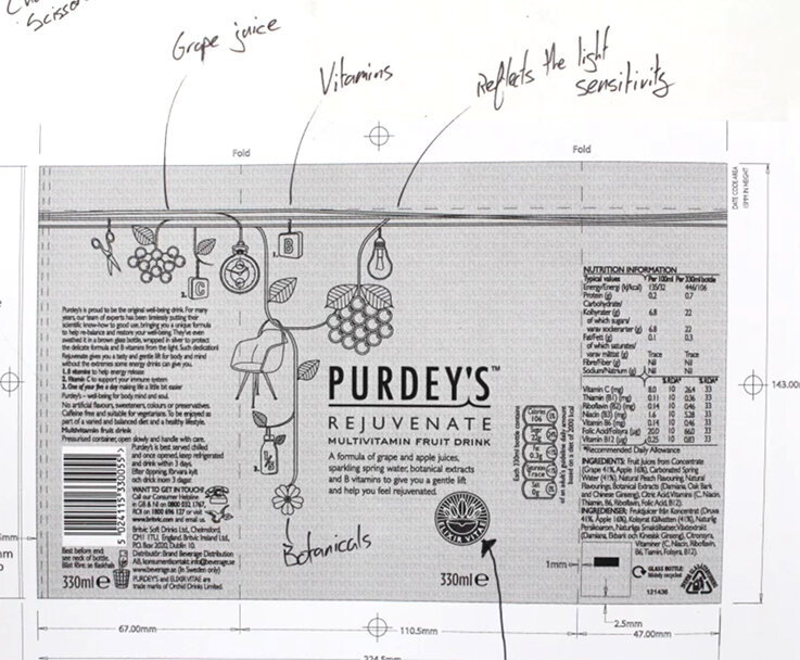
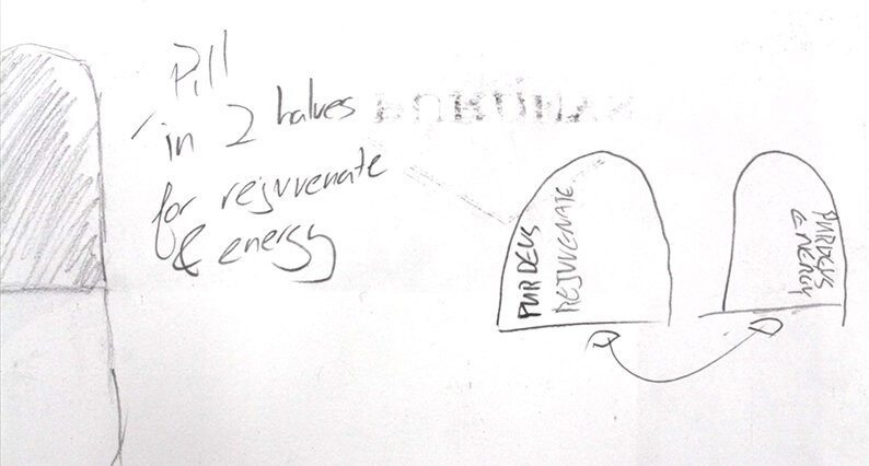
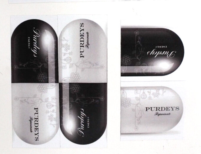
Here we feature George Hill’s Purdy’s Pill packaging idea that was nominated for a D&AD in 2014.
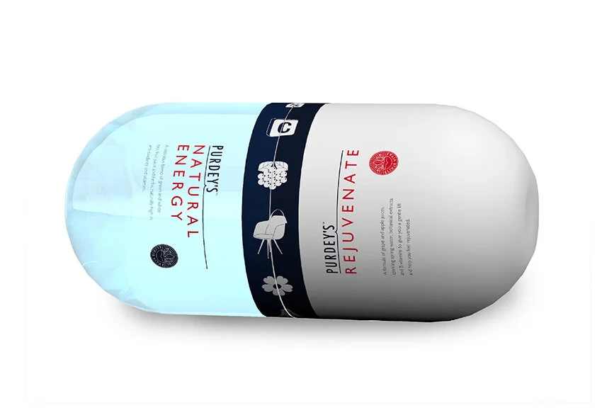
Package shape mimics classic pill lozenge
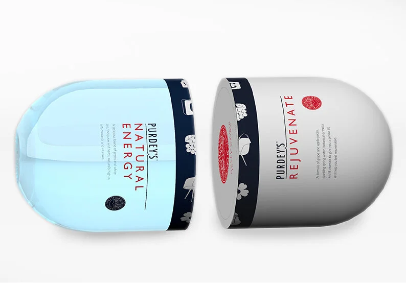
Separating into district halves


Detail
Please click the image above to show film

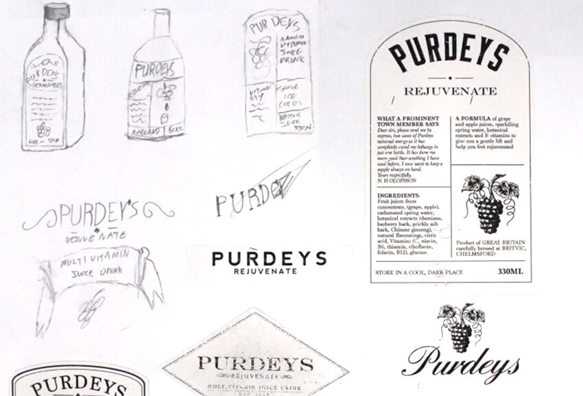

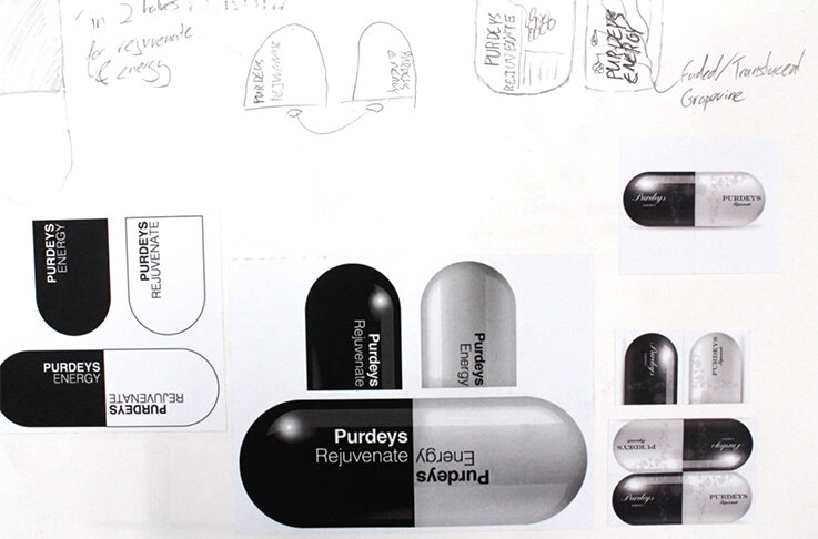
Short mood board transitions of George’s thought process.
Nice idea with an appropriate and creative 3 dimensional rendering.

The Disciples Of Design are a global collective of design academics, practitioners, artists and students. We have one common thread – University of Lancashire in Preston, UK; and one common aim – the creation of an ever evolving visual hub for the sharing of ideas and thoughts.


