Classic
/Newspaper cutting - circa 1998
What can we say?
Newspaper cutting - circa 1998
What can we say?
Here we feature Jessie Frogertt’s ‘Hand Made’ project from 2014. The brief was to brand and promote a new contemporary craft fair selling bespoke handcrafted wares.
Limited edition inspired brand mark
Development sheet 1
Development sheet 2
Diagonally folded leaflets
Leaflets opened out
Poster 1 - Handcut
Posters 2&3 Hand Stitched & Embossed
On screen application
Example 1 - Embroidery page
Example 2 - Ceramics page
Sliding transition concept - 1
Sliding transition concept - 2
Example of mobile applications
Selection of Jessie’s research - Transition 1
Selection of Jessie’s research - Transition 2
Great example of a well thought through branding project. Nice diagonal device, coupled with strong colour palette and stylish photography. All underpinned by excellent research & development.
Here we feature the D&AD nominated work of Jessie Forgertt & Sam Wilkinson from 2014. The brief was to reposition the Bodyshop by creating a new visual language. Jessie & Sam’s solution is based around the five senses of look, sound, feel, taste and smell.
Click to play
Poster - Clean cosmetic high quality photographic style
Coupled with a sympathetic colour palette
Consistent typographic style that combines two complimentary type families
Web Navigation - Simple coloured circles denoting the different senses.
Smell
Look
Feel
Mobile - Twitter
Scanning - Hover your phone over the poster to interact with the different senses
Scan the posters and vote for your favourite lipstick colour.
Ambient - Certain locations will have free sample dispensers
Issues - The sound sense is Body Shop’s voice. Listen to the campaign on gay rights & vice your views by uploading them.
Social campaign on mobile
A range of facial wipes that will be the leading product for the campaign.
In store environment
A great solution and a great example of teamwork. The core concept of the 5 senses is appropriate and well thought through. The styling of the whole re-brand, from the typography and colour selection, through to the photographic treatment is what made this project stand out to the D&AD judges. Also the ethical stance of the Body Shop is echoed cleverly through the sound sense with the Gay rights campaign idea.
Came across this classic on my hard drive
Here we feature a Creative Conscience Award winner from 2018 by Andy, Nathan & Troy with their concept of communal energy generation in partnership with Adidas.
Sometimes a word has two meanings
Click to play
The Adidas three strips used as a graphic devise
Black& White photography with a green glowing focus point.
In context - Poster 1
In context - Poster 2
In context - Poster 3
The mechanics
Energy storing wristband concept
App - Personal data recorded, stored & shared
Heat sensitive touch points
Environment - Landmarks around London light up to show support
Environment - Communal sporting facilities powered by electricity generated
An excellent example of a well thought through concept based on a clever word play and backed up with a clear, distinct and appropriate visual look and feel.
Here we feature another of Dan Horsfall’s final year projects from 2016. This project was in response to Glorious Creative’s industry brief: take an existing brand and imagine how it would approach its branding as a sponsor of a professional cycling team.
Carlsberg ELITE - Brand name & mark
The Hop Mark - Extension and rational of existing Carlsberg asset.
Brand guidelines - 1
Bespoke ELITE Typeface
Chevron device
In context
Click to play
The Elite Team Kit - 1
The Elite Team Kit - 2
Web & Social
Advertising
Limited edition ELITE brand packaging
Motivational brand message
Stylish, simple well thought through branding exercise. Comprehensive and motivational brand partnership.
Here we feature Dan Horsfall’s Branding for Bradford. His branding concept was based on Bradford’s cotton industry & heritage.
Brand mark based on abstracted diagonal weave. Warp & weft
Heritage trail way finding concept
Poster signifying Bradfords central location in the UK
In context
How the idea translates to print
Brochure
Lanyards & Stationary
Carrier bag designs
Style Guide - Dynamic photography intertwines with flat graphic weave devise.
In context
Way finding signage system concept
Environment - Light projection concept on local landmarks - 1
Environment - Light projection concept on local landmarks - 2
Billboard advertising concept
A good solid example of Branding a location based around one well researched historic connection.
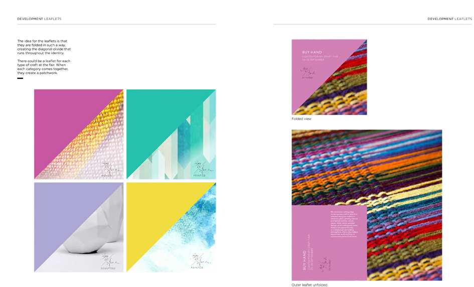
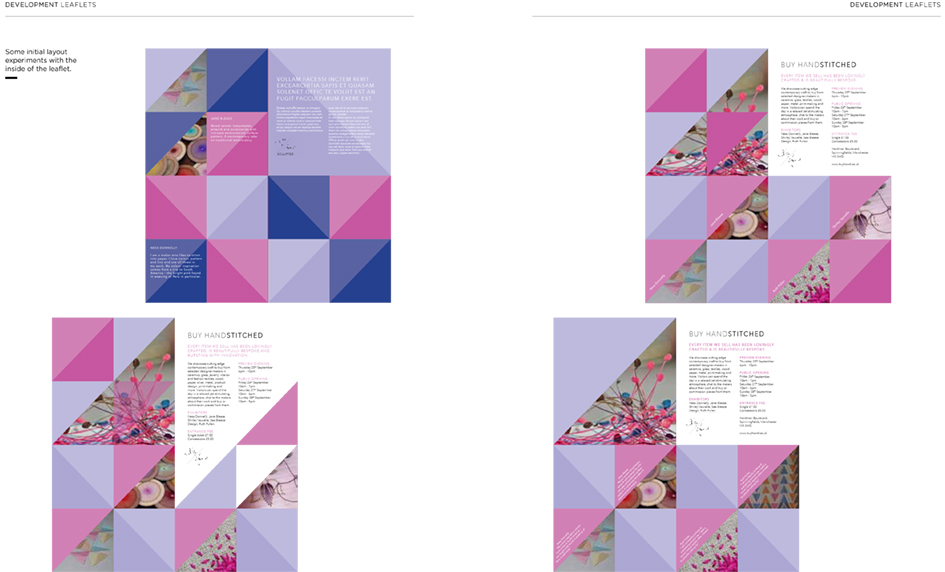
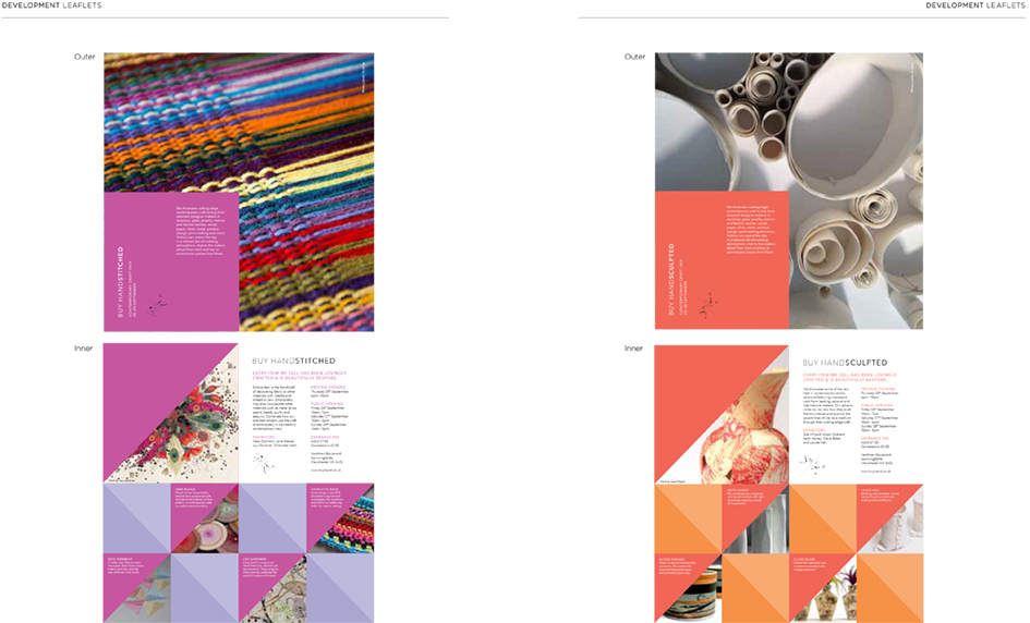
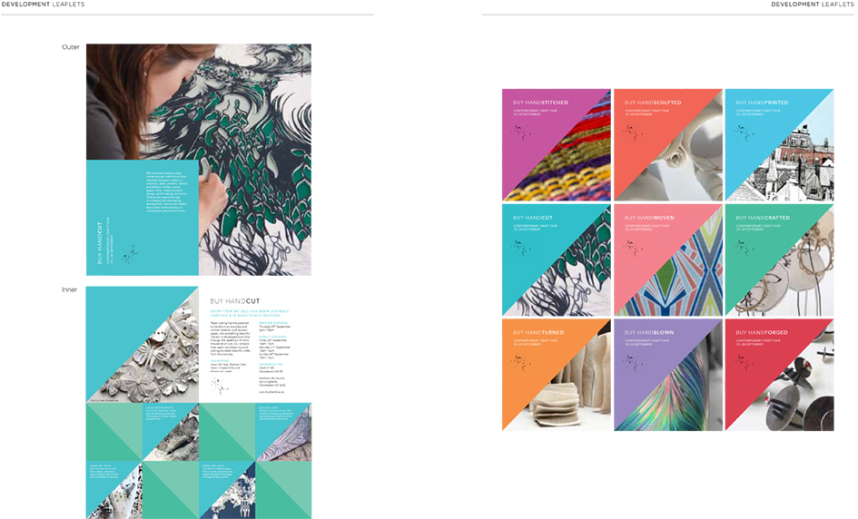
Brain Pickings is a site I’ve recently come across. It requires time and inclination, but it has a depth which is necessary to discuss some topics that are in and around what we do. These include art, writing and illustration but also self-critique, responsibility and beyond. The articles are interesting, accessible and well researched. It’s a great place to go on the internet that is thoughtful, calm and ultimately useful.
My name is Maria Popova. I am a reader and writer, and I write about what I read here on Brain Pickings — my one-woman labor of love. Drawn from my extended marginalia on the search for meaning across literature, science, art, philosophy, and the various other tentacles of human thought is a record of my own becoming as a person — intellectually, creatively, spiritually — and an inquiry into what it means to live a good life.
I have previously thought in words for The New York Times, Wired UK, The Atlantic, and Harvard’s Nieman Reports, among others, and am the author of a very long book titled Figuring.
Founded in 2006 as a weekly email that went out to seven friends and eventually brought online, the site was included in the Library of Congress permanent web archive in 2012. Here are some reflections on my most important learnings from the first decade of Brain Pickings.
The Box - Silk screened black on Grey millboard
The rules, start & question cards, dice & counters - printed black on Grey millboard
The Game. Click to play film
Start card - Detail
Boring question cards - Example
Social - Instagram feed
Boring Tube Advertisement - Example
Pay off slide
Batteries not included gag - Referenced & reinterpreted
Beautifully under designed concept with a consistent down beat look and feel, with zeitgeist overtones. A great example of a project built purely on and around one pertinent word.
The Disciples Of Design are a global collective of design academics, practitioners, artists and students. We have one common thread – UCLan in Preston, UK; and one common aim – the creation of an ever evolving visual hub for the sharing of ideas and thoughts.