Abstract: Season 2

The second season of Disciples’ favourite Abstract has recently been released on Netflix. Amongst the new season it features two must-see episodes. One features artist/designer/genius Olafur Eliasson, and the other episode which we highly recommend to any student of design delves into typography with Jonathan Hoefler.

As a student of typography (at any level), the insights, background and detail in the Jonathan Hoefler episode provide a full foundation into type and letterform; but the episode itself is made with wit, charm as well as craft and detail. There were things I’d forgotten, things I didn't know and things I was just glad to see again.

The Olafur Eliasson episode is fascinating. Whether you are aware of his work or not, the way he is able to talk about creativity, ideas and process is eye opening; for its straightforwardness as much as anything. This is not stuffy or reflective of any art world preconceptions, it is in fact the opposite. He appears as a designer who happens to make art. One key quote I took from the episode will ring true with all the best designers I know:

“I get ideas when I work hard.”

There is no magic button for ideas, and it’s reassuring to know the world’s most revered practitioners are in the same boat as us. Ish.

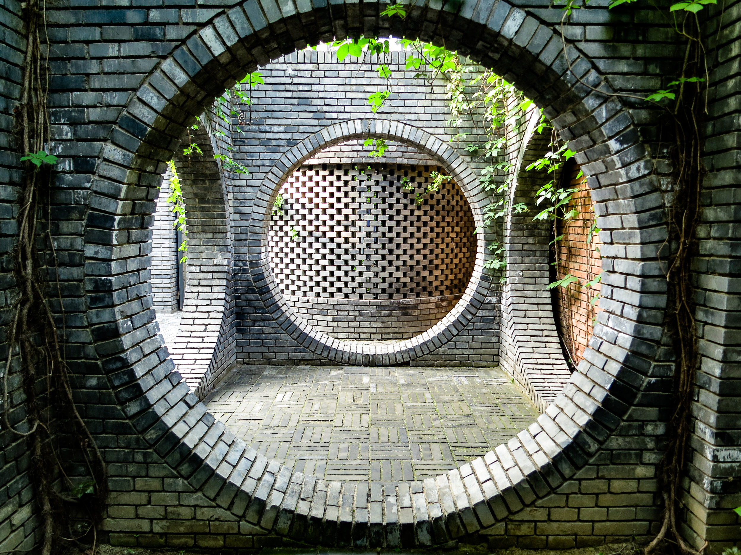
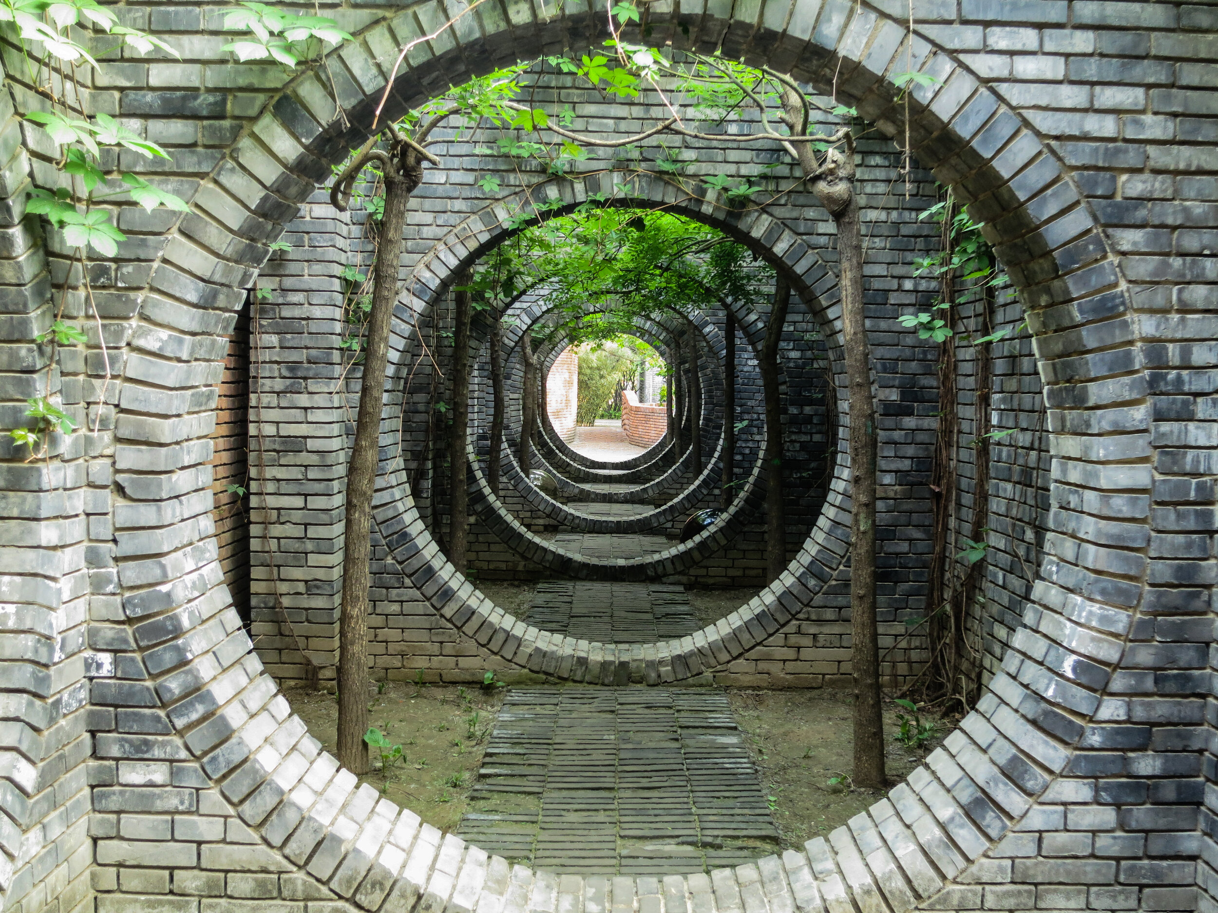
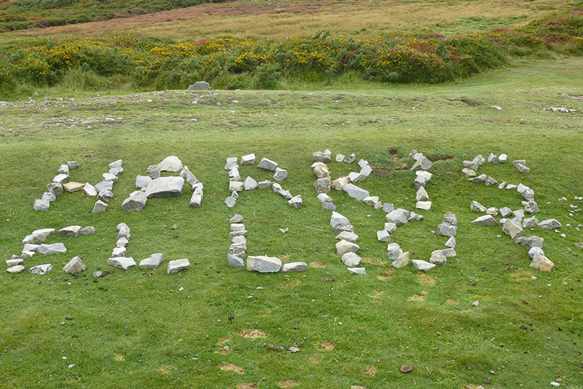
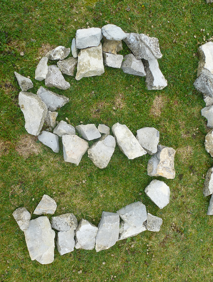
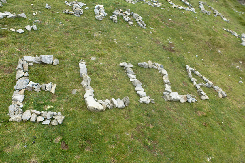
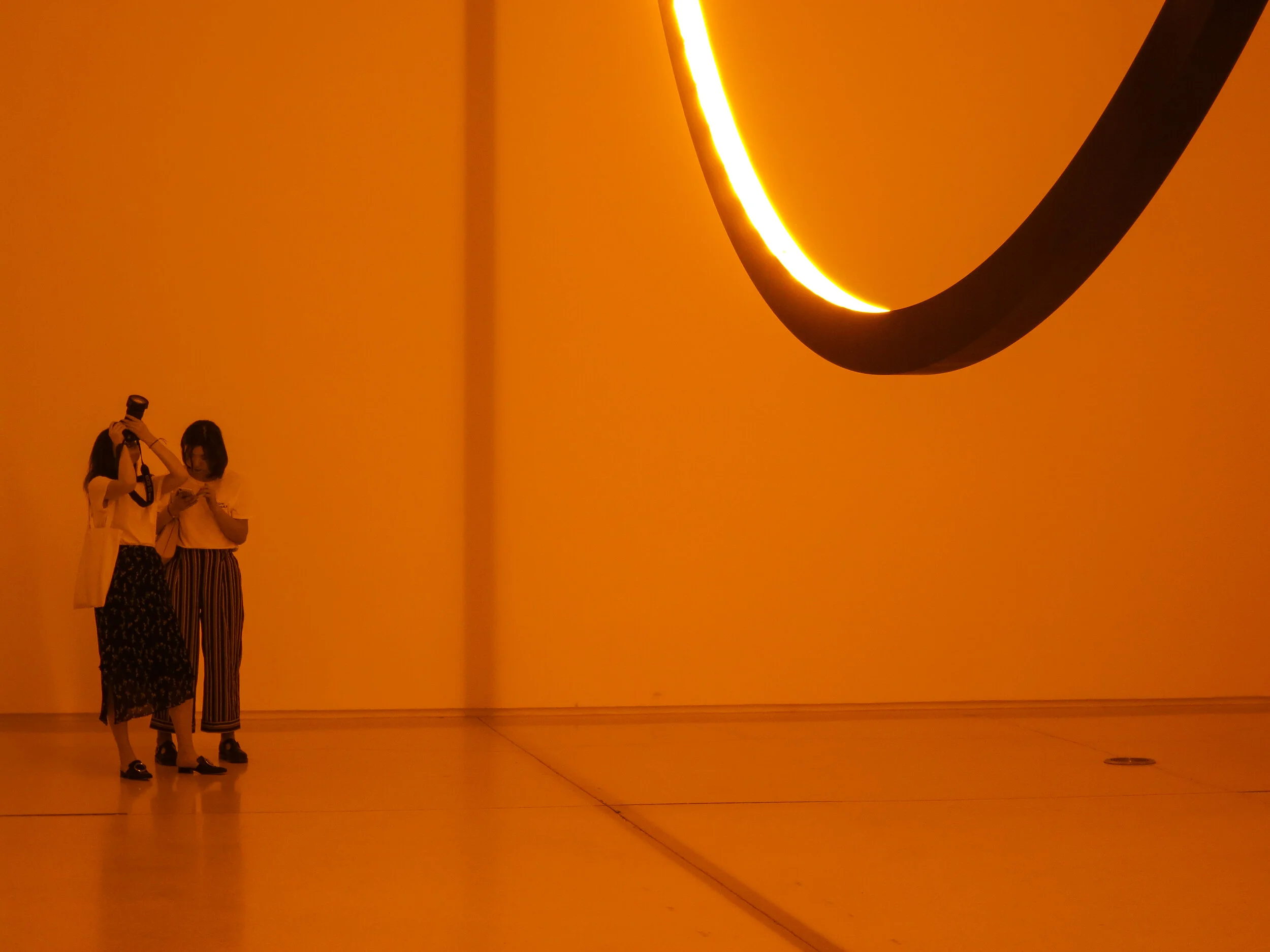
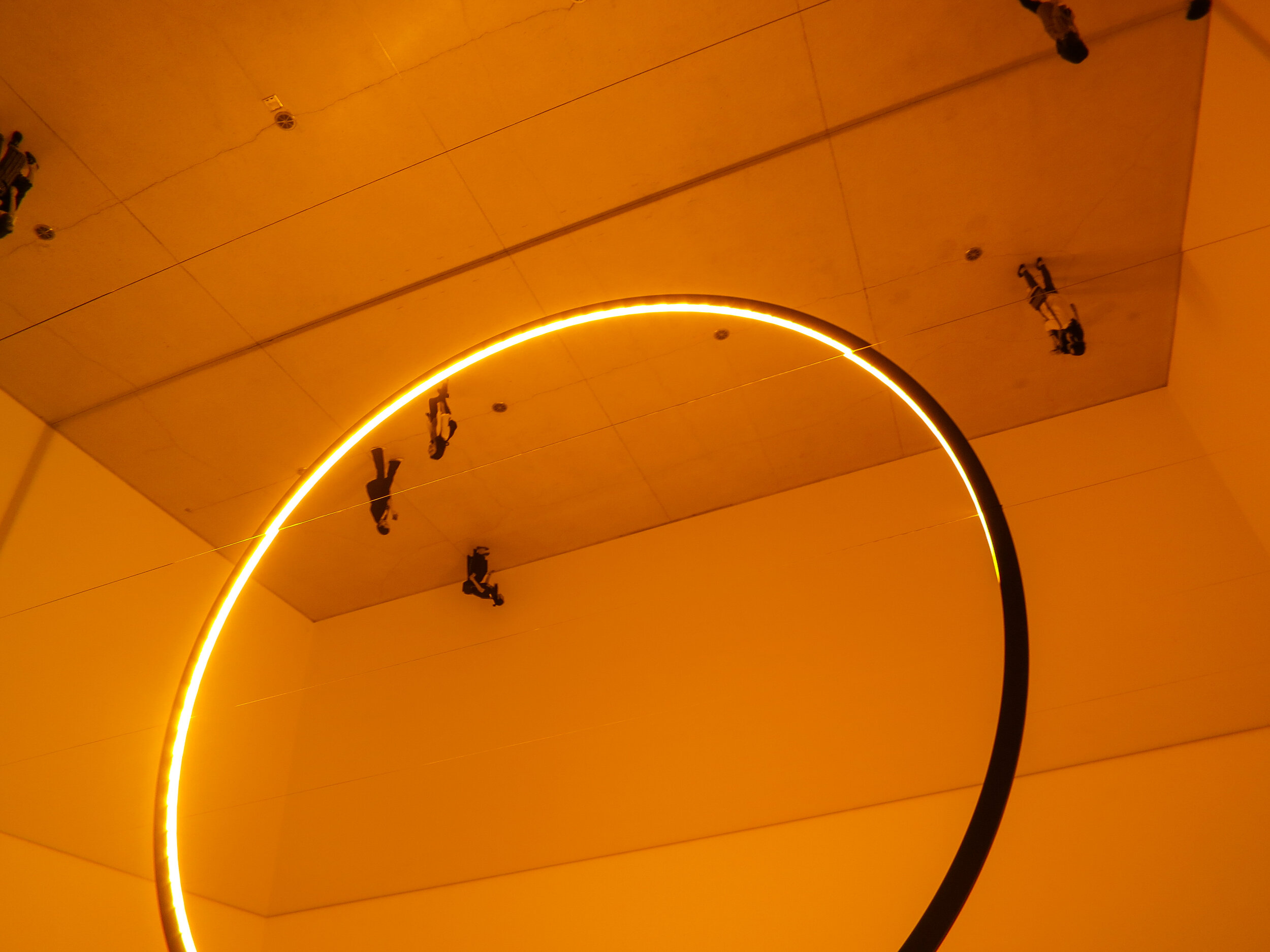
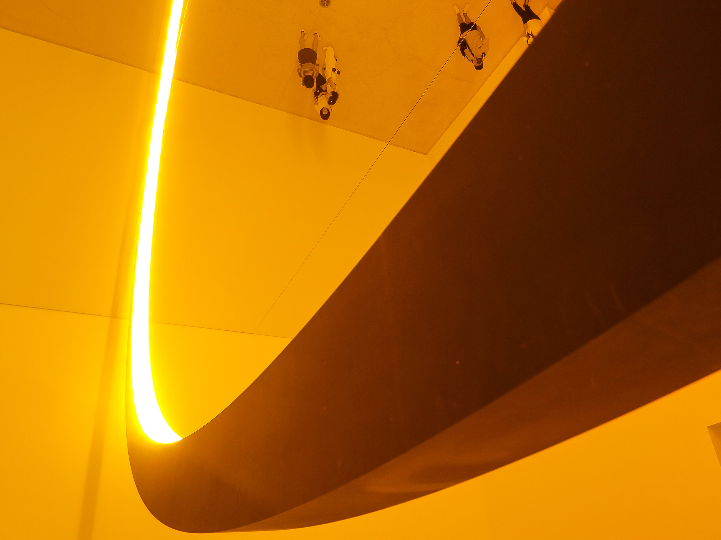
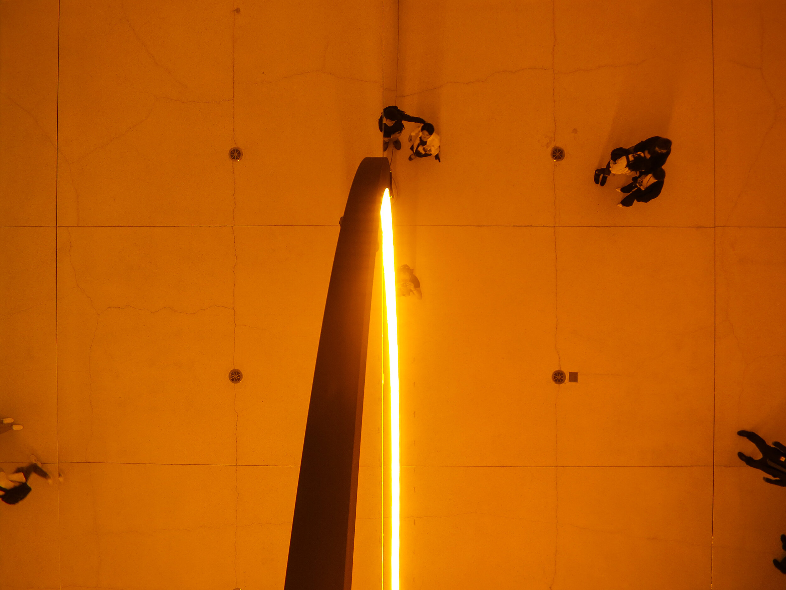
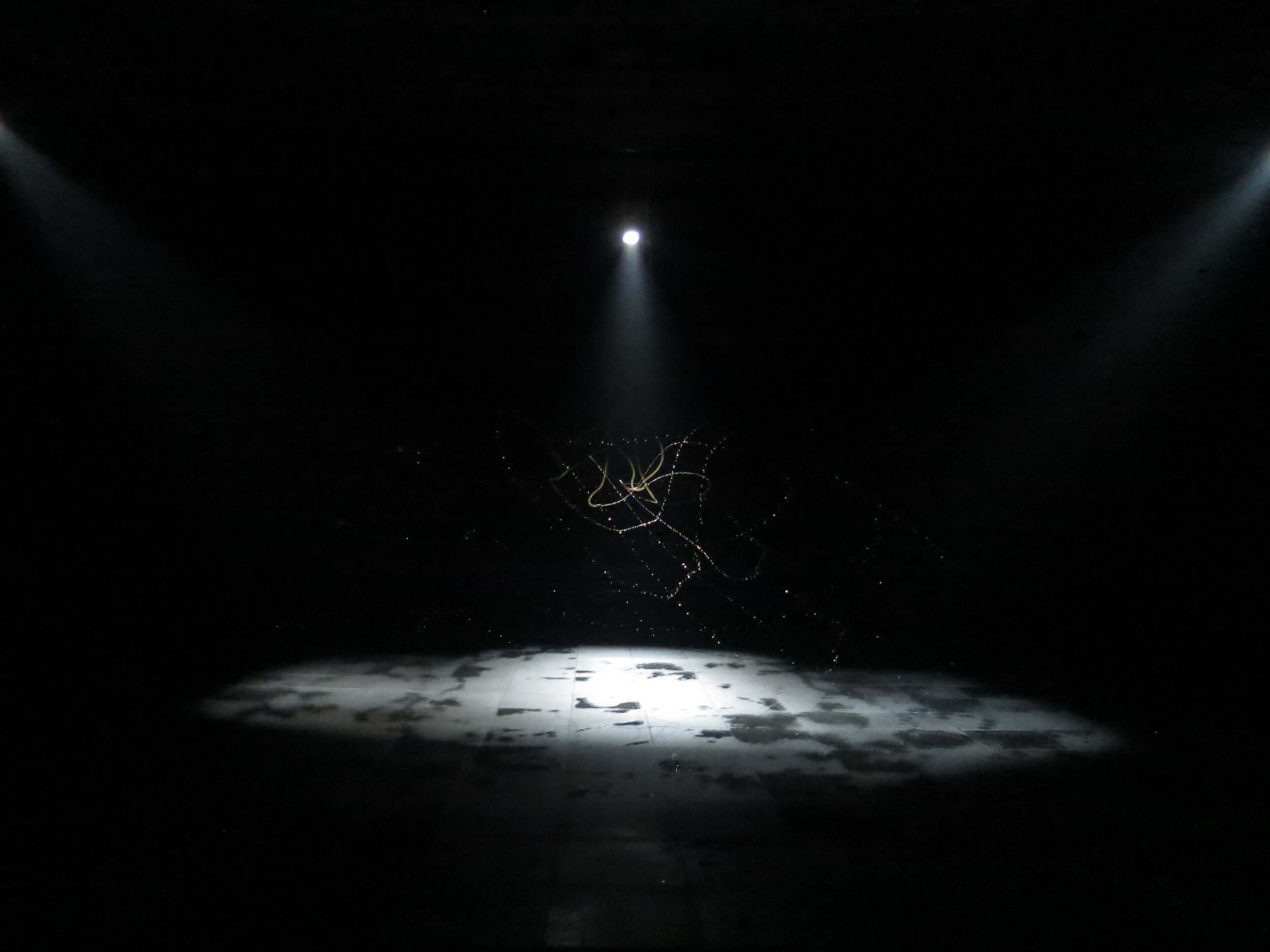
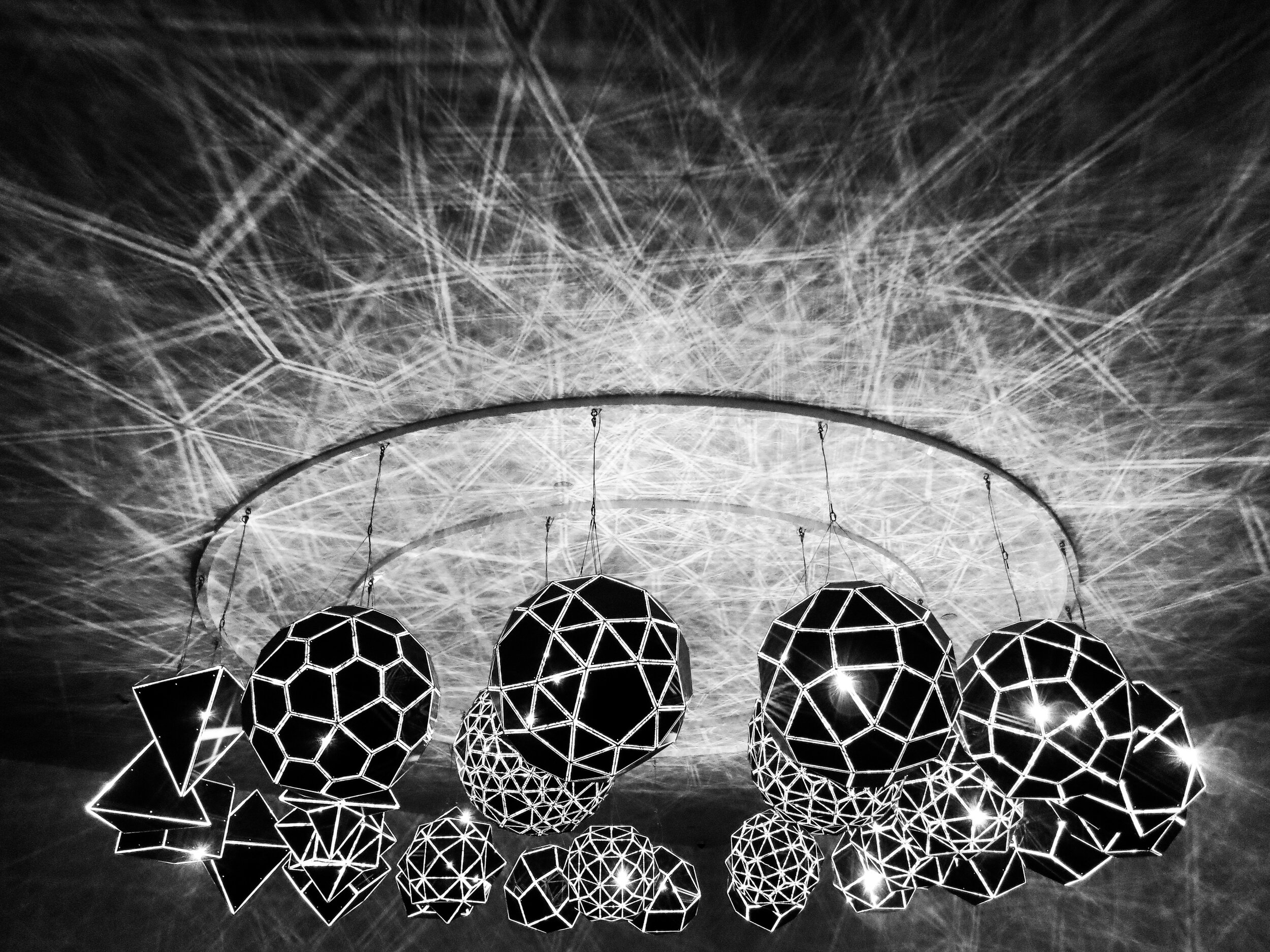
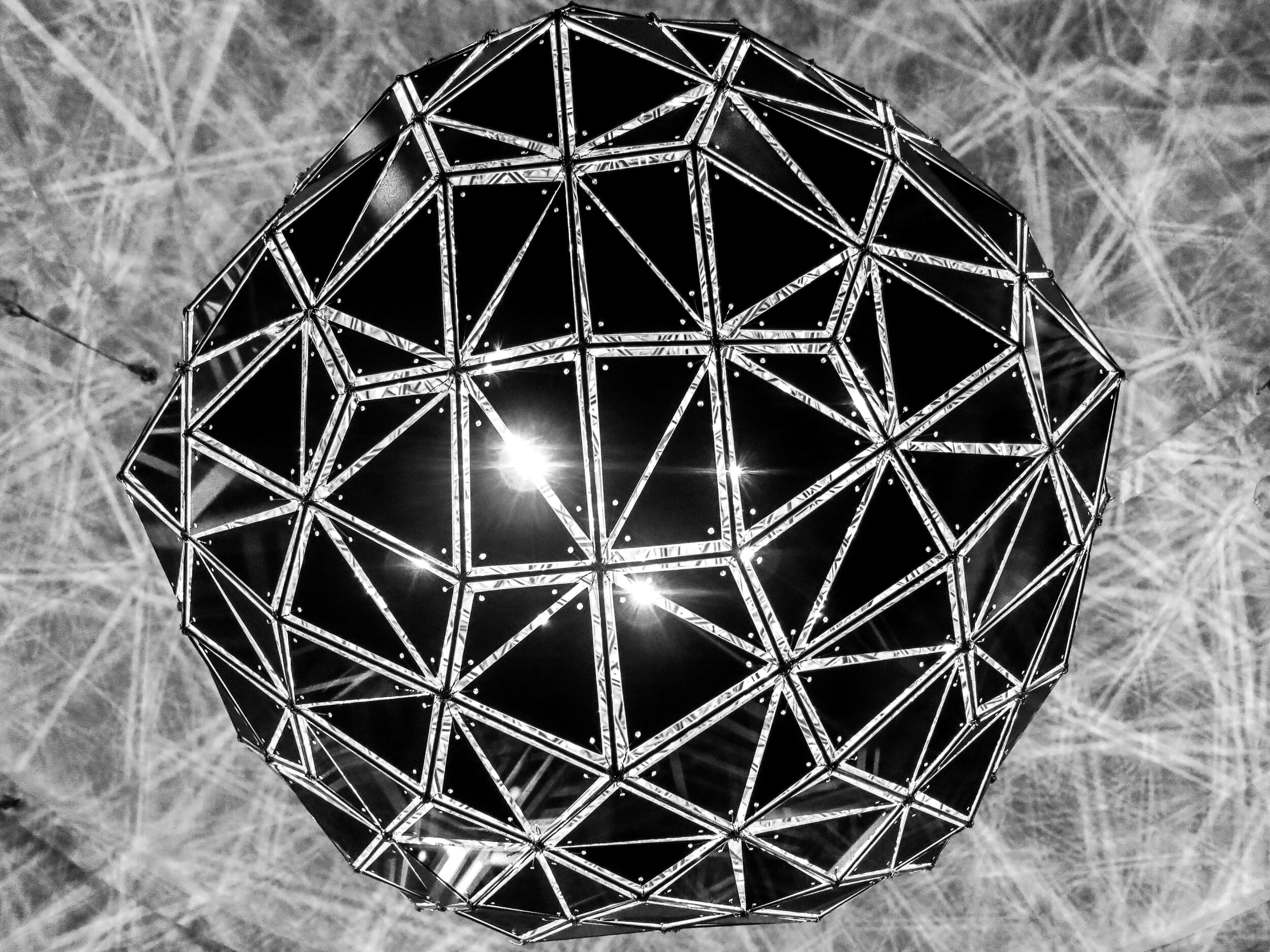
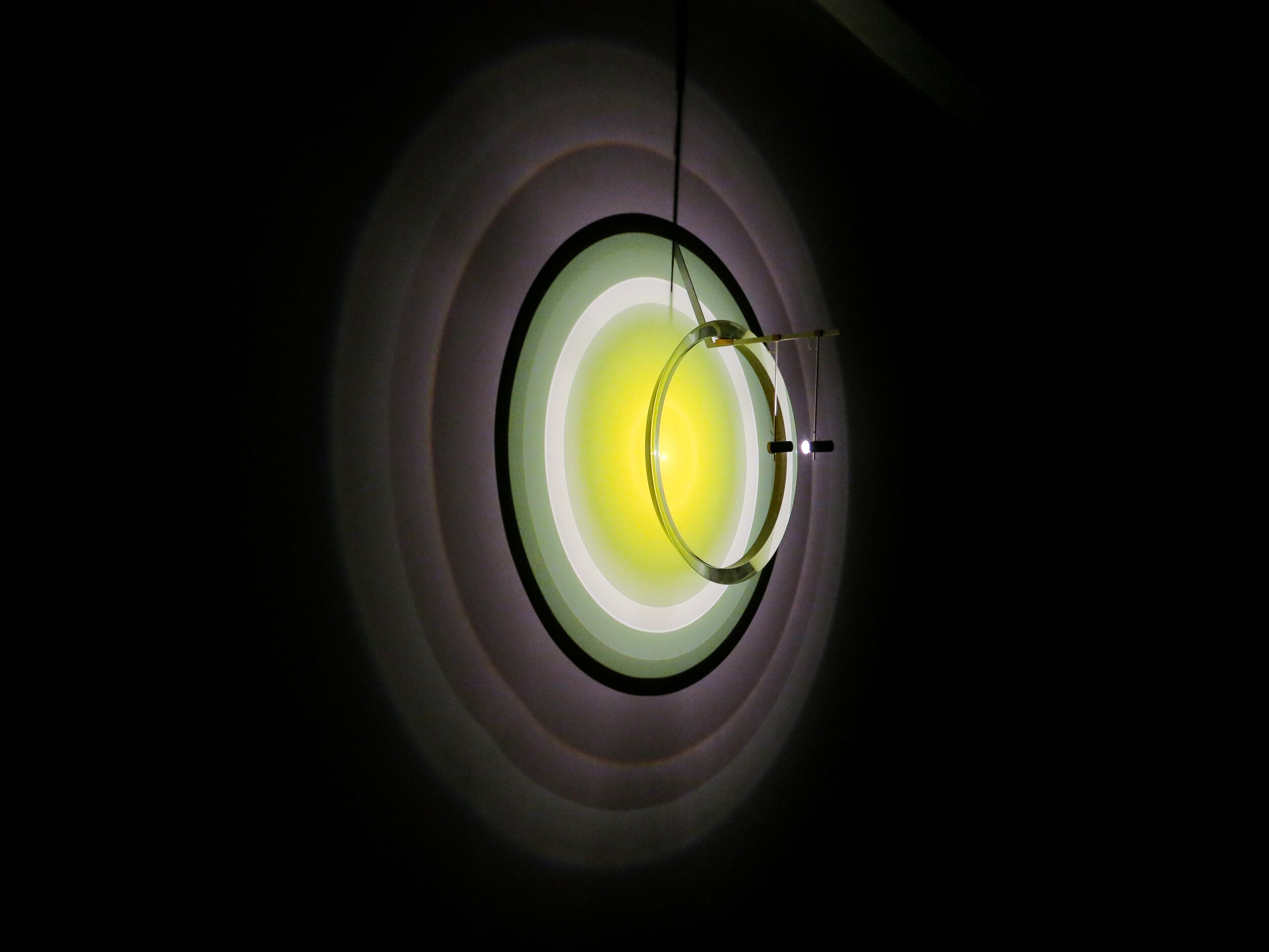
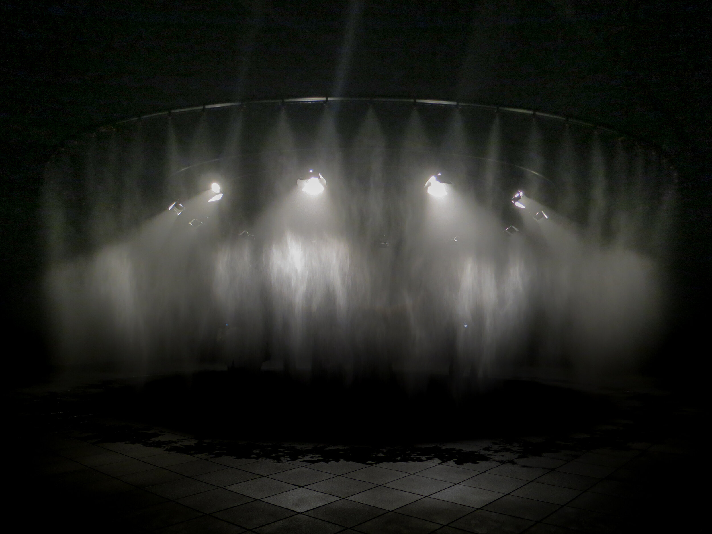
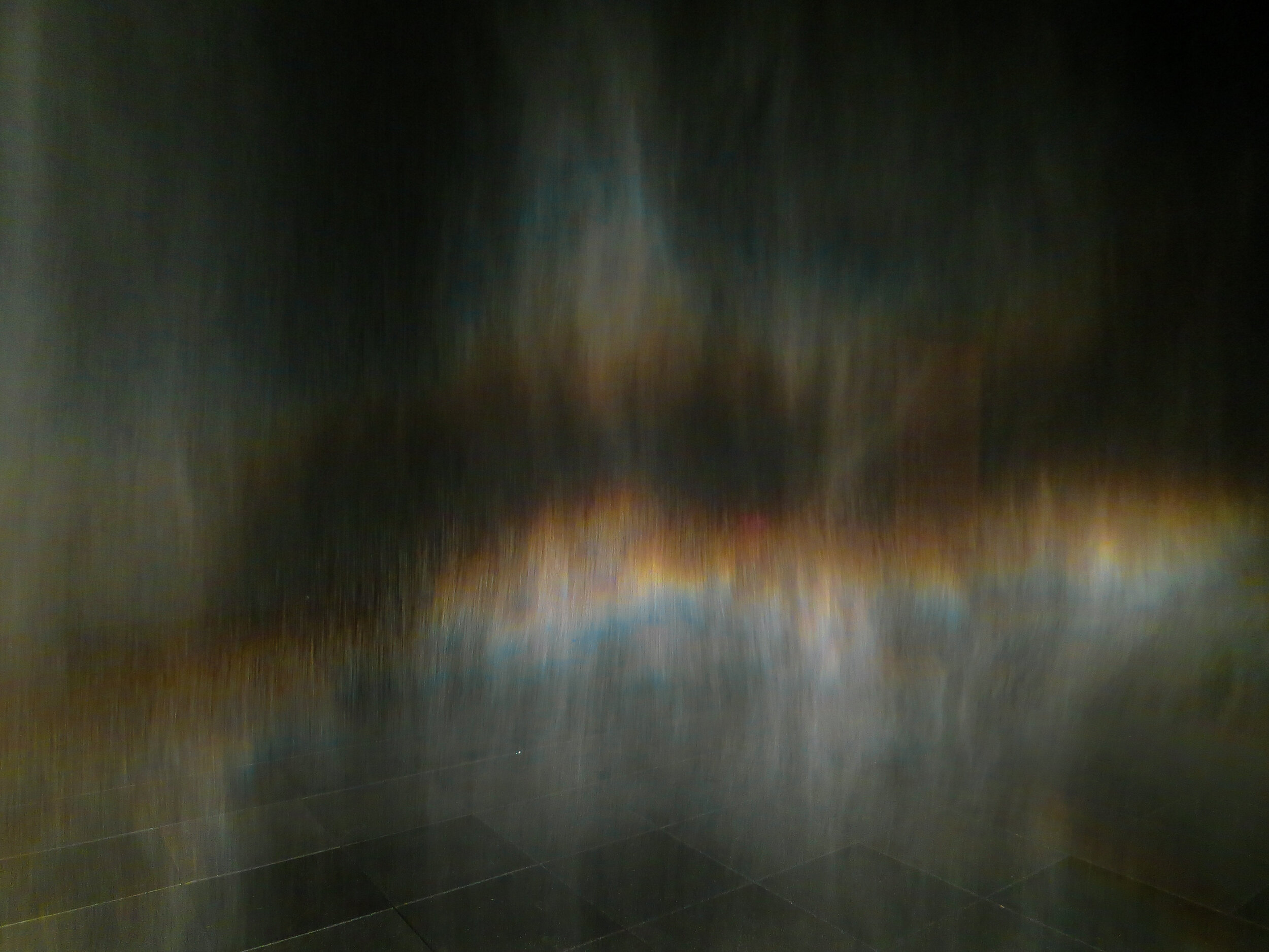
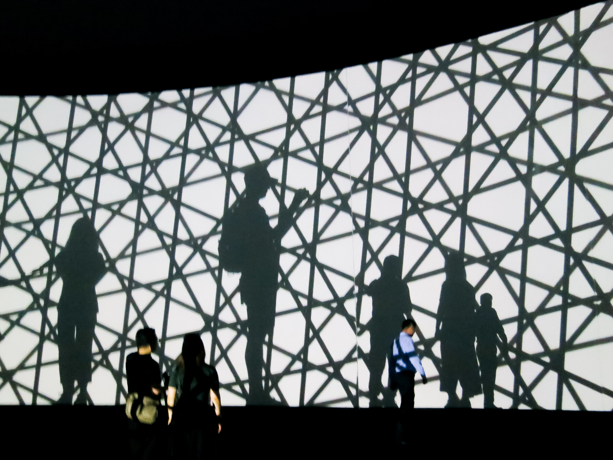
And if you don’t know Eliasson’s work, below are some photographs taken of his exhibition The Unspeakable Openness of Things at the Red Brick Art Museum whilst on a UCLan study trip to Baoding and Beijing in 2017.

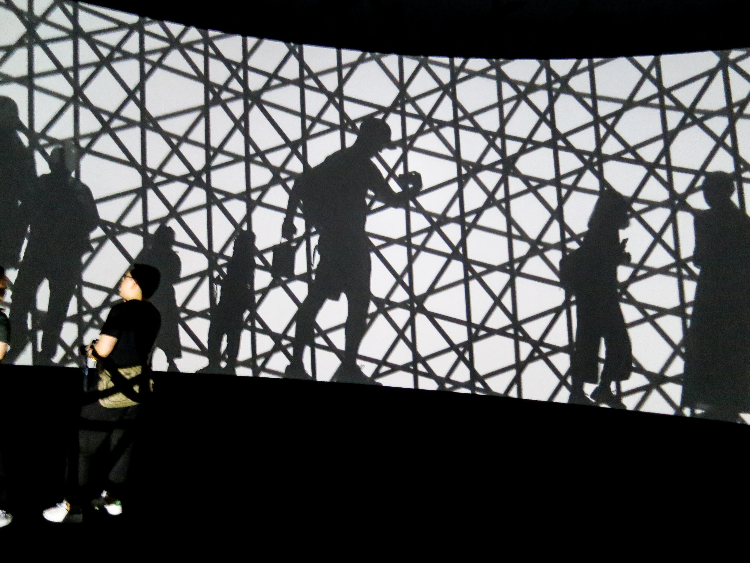
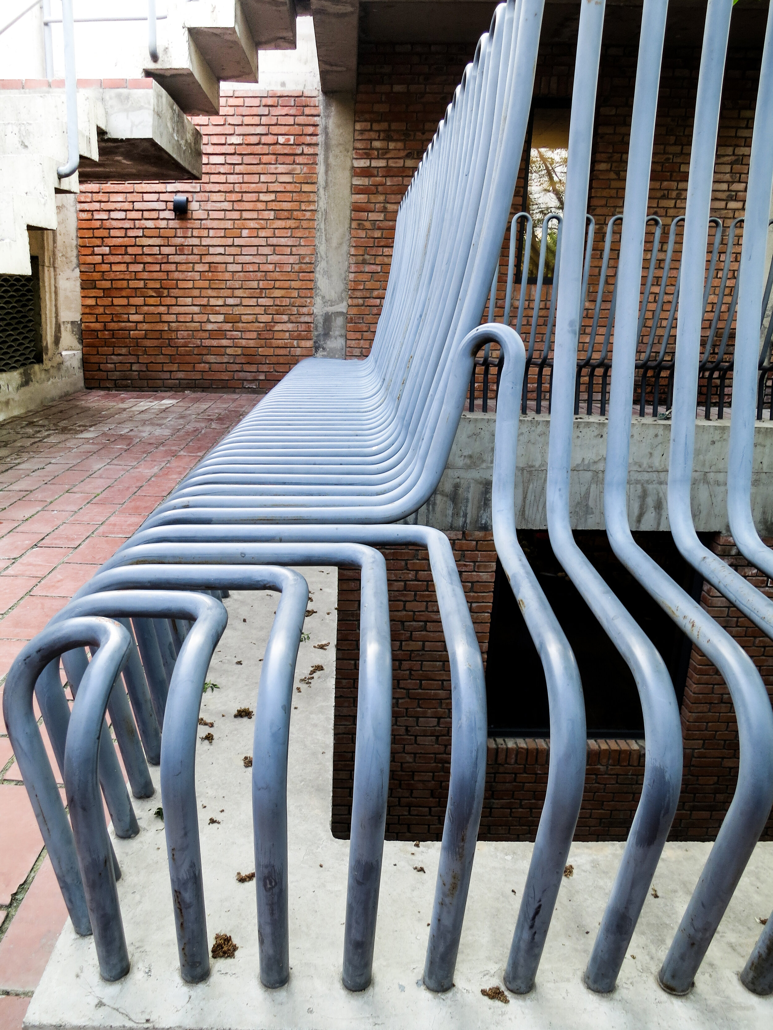
Also, the design of the museum itself was fantastic. Seemingly hundreds of hours of craft were visible at every turn. My favourite installation though was the railings which doubled as a bench. So simple, so obvious. A great idea.

A Guide to Cropping

Part 3 in our guide of practical skills covers off the classic art of cropping. It will help those who may be studying the third one week project based on image, but also discusses the fundamental role this technique plays in the designer’s visual communication skillset. Cropping images gives you – the designer – not only control, but also the ability to create intrigue and impact. Please watch in full, as ever. And for those of you who have enquired, we are still on the lookout for Part 1 of this series.

Economy of Image and Maximum Means

Here we feature a few images and ads from an old one week presentation we came across while trawling The Disciples’ hard drive. We also thought it a timely post as the new year one students will soon tackle their third one week project, which is primarily based around image.

image 7.jpg
omage 4.jpg
image 6.jpg
image 5.jpg
image 2.jpg
image 8.jpg
image 3 Shot 2019-10-01 at 20.18.15 copy.jpg
image 1.jpg

Above are some great examples of both observation and cropping which can be learnt from and hopefully inspire. They look so effortless and simple but have only been achieved by designers who have really looked, observed and made lateral visual connections.

Type in the environment

On a recent weekend visit to Llandudno (North Wales) I came across a range of typographic signatures made out of Limestone. They were located on the summit of the Great Orm headland by tourist, visitors and walkers.

orm 16.jpg
orm 8.jpg

Some of the names had slowly been moved over the years probably due to the sheep that graze on the Orm.

orm 14.jpg

Here is an example that is almost unreadable.

Typographic Poster - A case study

As our second years grapple with their first project back after the long summer break we thought it would be timely to lead by example and help them along with this instructive post.

They have all been given just over 2 weeks to produce an appropriate typographic poster for a range of UK festivals with topics such as cheese, kites and horror to name but a few .

The sketches, development and design concepts below are for the UK Dry Stone Walling Championships.

for post.jpg

This solution focuses mainly on a short bold title ‘The Uk Drystone Walling Championships’ rendered in an appropriate typographic style.

for post2.jpg

Sketches and experiments with a free style interlocking typeface which is designed to reflect the basics of the art of dry stone walling.

for post3.jpg

This project is all about choosing and creating an appropriate typeface and the technique you choose can be the idea. In this case once the style was developed, through a series of drawings and sketches, the finalised render was spray mounted to black paper and carefully cut out by hand with a scalpel. This hands on analogue approach was also a nice reflection of the subject matter itself

cut out.jpg

This was then digitised, re drawn out and refined.

posters web.jpg

Once the composition was finalised in black & white colour could be considered. In this case a pallet of greys was explored to reflect a stone like quality.


posters web2.jpg

Further colour iterations with a small amount of typeset text added, with dates times and location of the event. Plus an appropriate sponsors logotype.

poster 14.jpg
poster 16.jpg

We hope this post helps everyone along a little in their own particular subject areas. So in summary; 1. Keep it simple. 2. Remember to keep the typography appropriate. 3. Sketch and draw your idea down before going to the computer and 4. Understand that the technique can be the idea.

5. Please do not over think and complicate your poster…that is not the aim of this project.

Rev J. Whitehead (Esq)


One week project: Research

Yesterday we had our first crit for Year 1 graphics students, in room VB201 – the pseudo reincarnation of 217 (for our older readers). Having the crit outside of the studio results in a more focused environment, and all the staff were pleased to see the first pin-up go largely without hitch or hiccup.

Below are a couple of examples of the first project, research. Starting with a dictionary definition and then exploring the subject, students presented six images to convey their given word. The visual excerpt below either got us thinking, or were well cropped, or well researched, or a mixture.

vertical

vertical

stripes

stripes

spot (the difference)

spot (the difference)

tree

tree

queen

queen

stripes

stripes

eye

eye

ring

ring

water

water

bridge

bridge

Indignant of Preston!

yes you are!

yes you are!

This week we welcomed our newest cohort of designers and advertisers to Victoria Building. And what an incensed group of irked irascible individuals they are! To get to know each other, we spent the day in the studio creating protest placards of behalf of causes which would easily instigate ire in anyone.

Check out our six protest groups below:

plane stupid

plane stupid

A great day, and it didn’t even rain. A group of firey designers back in VB204 is something we’re very much looking forward to this semester, may the ideas commence!

IMG_6897.jpeg
IMG_6898.jpeg