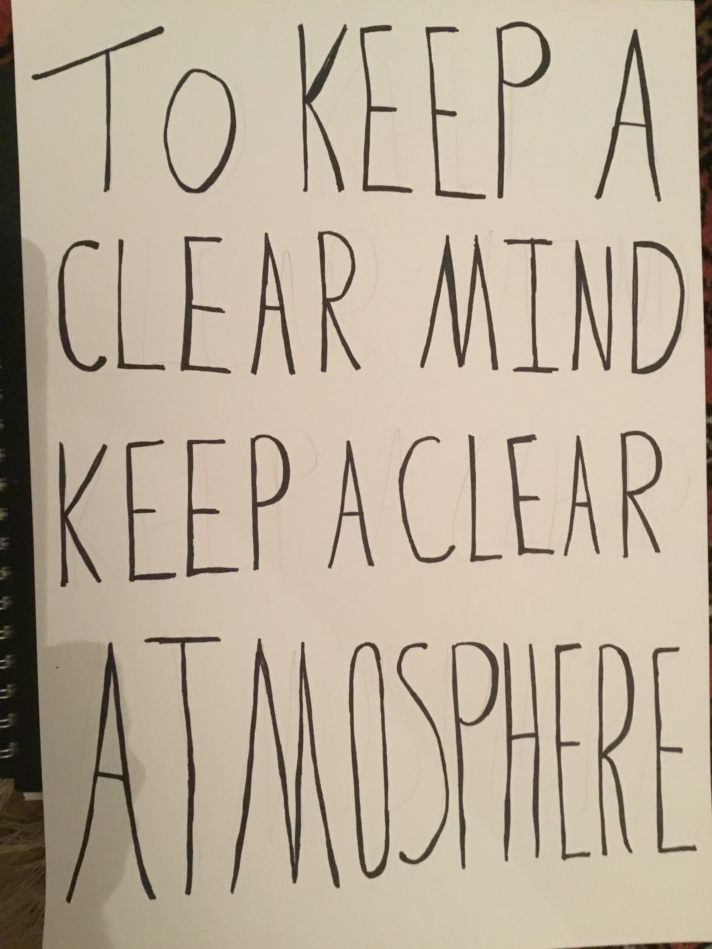
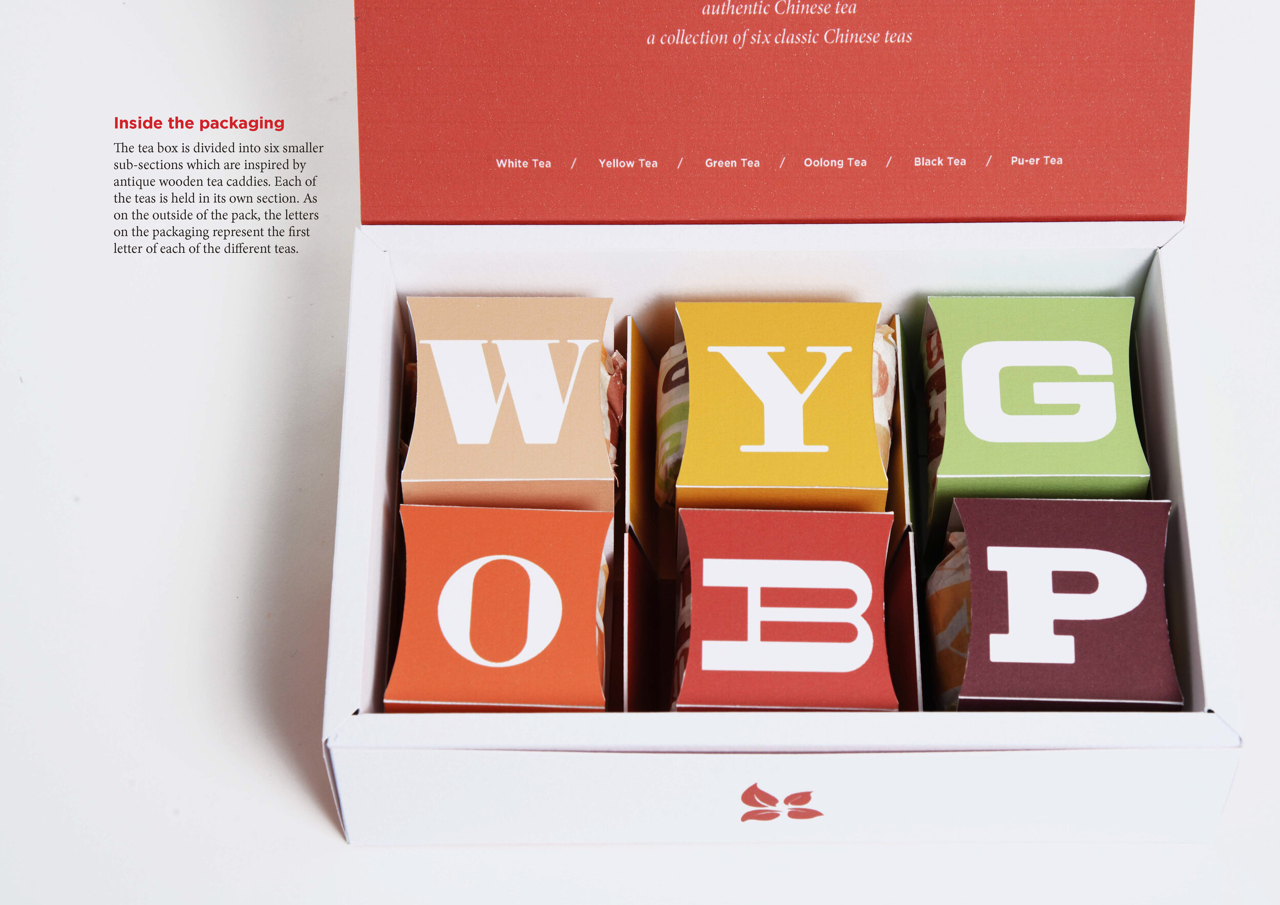
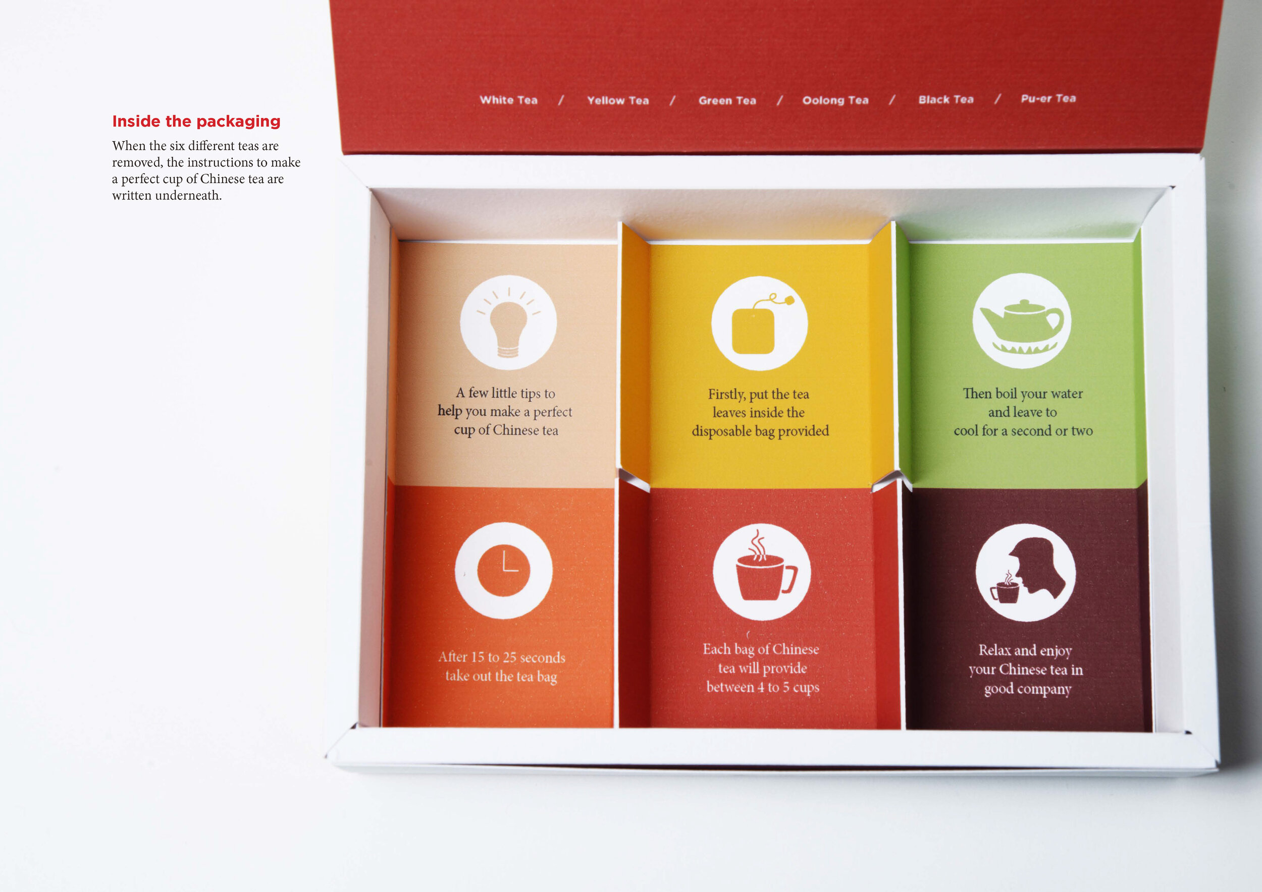
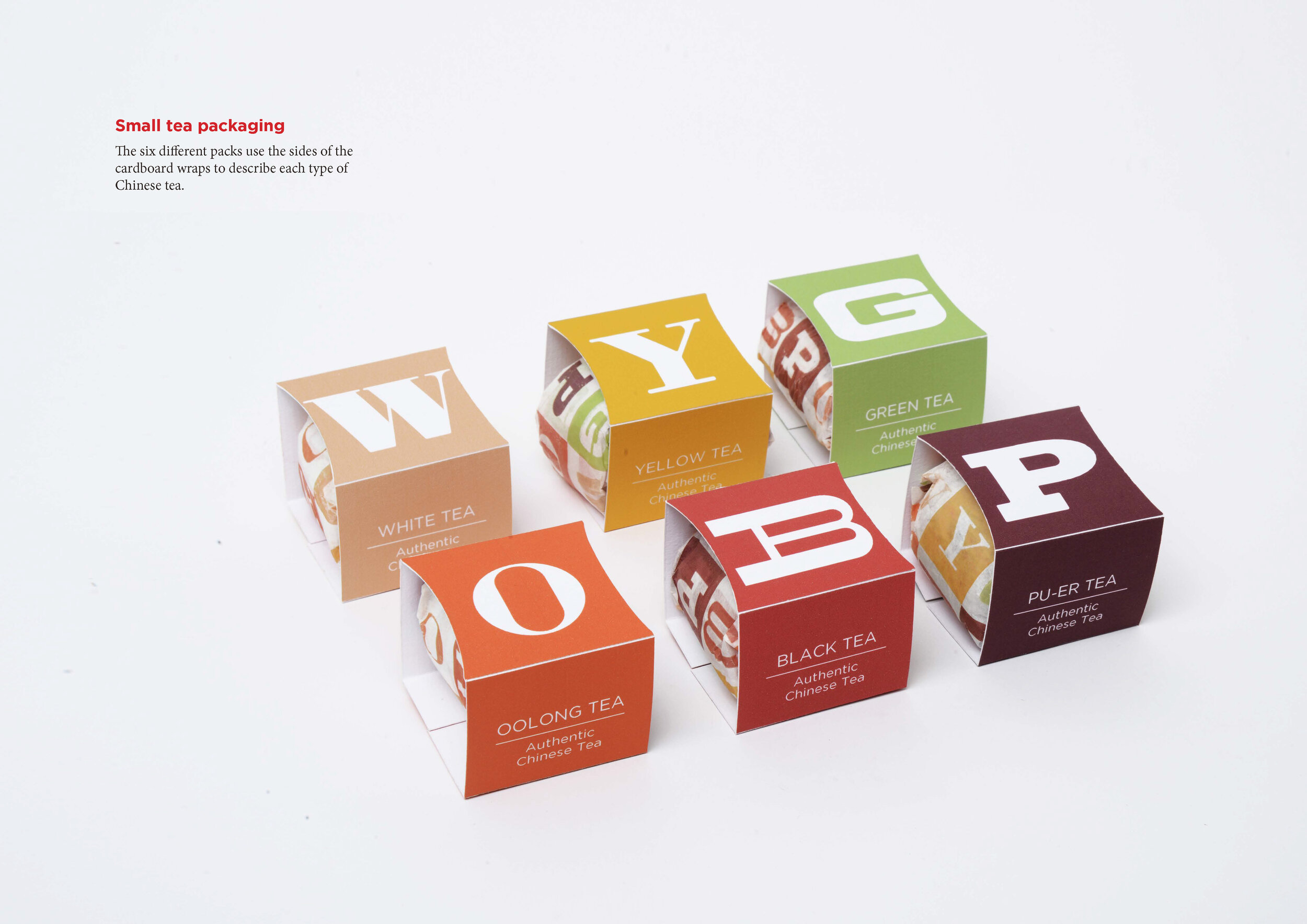
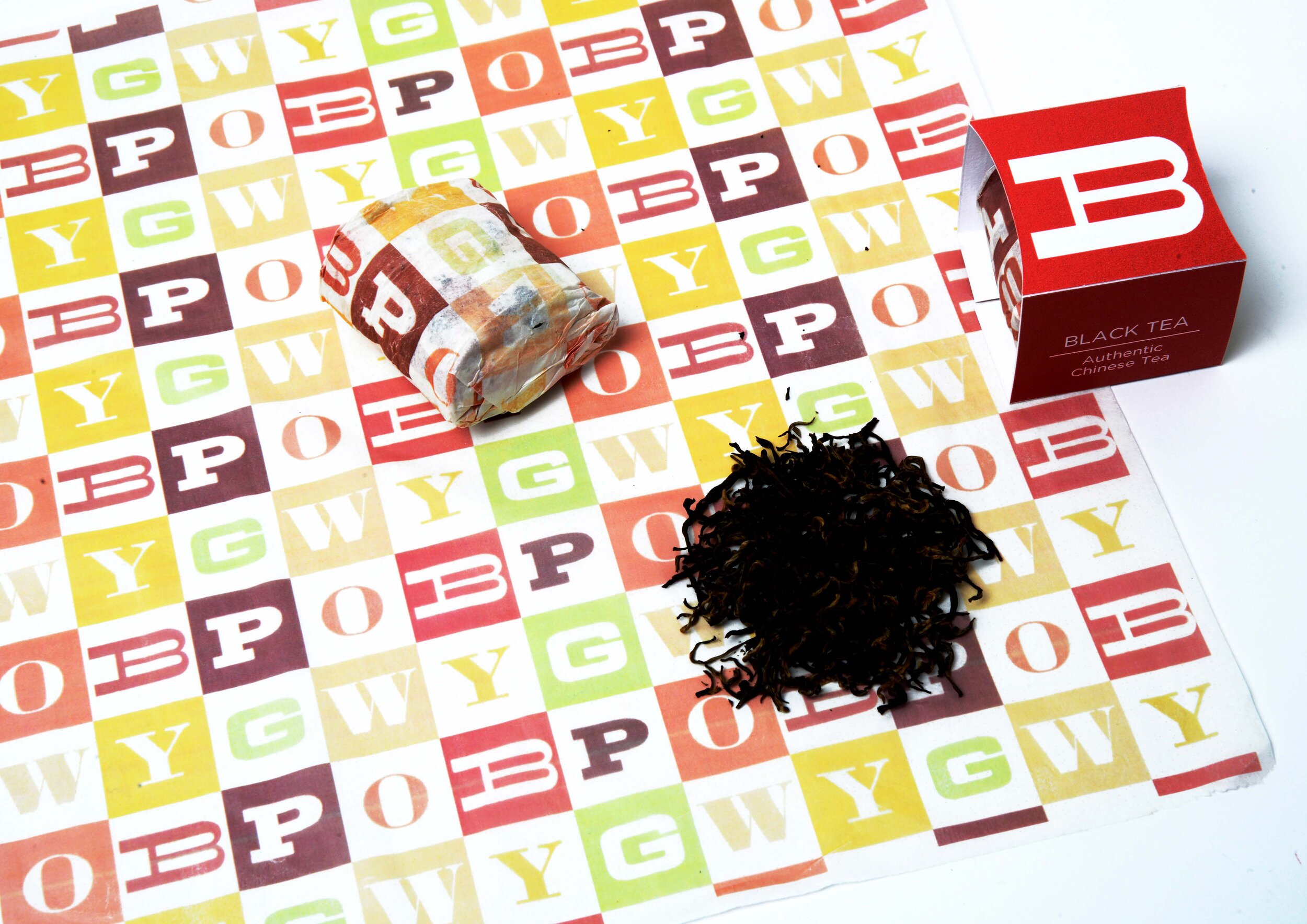
One week project: Symbolism

This semester staff have introduced two new projects to the end of the DD1101 module. These projects have been designed to bridge the gap between lateral thinking exercises, encourage the development of individual process and ultimately be resolved as a formal pieces of graphic design. As such though billed as one week projects, they have been extended to two weeks.

The first of these projects is underpinned by the theory of symbolism, in particular vexillology. The objective was to design a flag on behalf of any place, group or organisation of the student’s choosing. For those seeking some background of flags and vexillology in particular, then we highly recommend this Ted Talk by Roman Mars – host of the excellent design & architecture podcast 99% Invisible.

Like much of the world of design, flags are seemingly simple; but actually represent incredibly complex ideas. With this is mind, the brief required the students to remove all design representations of their chosen subject (and sometimes even more) to reveal an absolute purity of form and concept. The following five criteria outlined by the vexillology society were communicated by staff as a method of pressure-testing any design, and to also offer guidance on how to be self critical of a design.

  1. Keep it simple

  2. Use meaningful symbolism

  3. Use two to three basic colours

  4. No lettering or seals

  5. Be distinctive

But beyond that, and quite simply…does it look like a flag? Can it be seen and understood visually from distance? And can it be made from cotton?

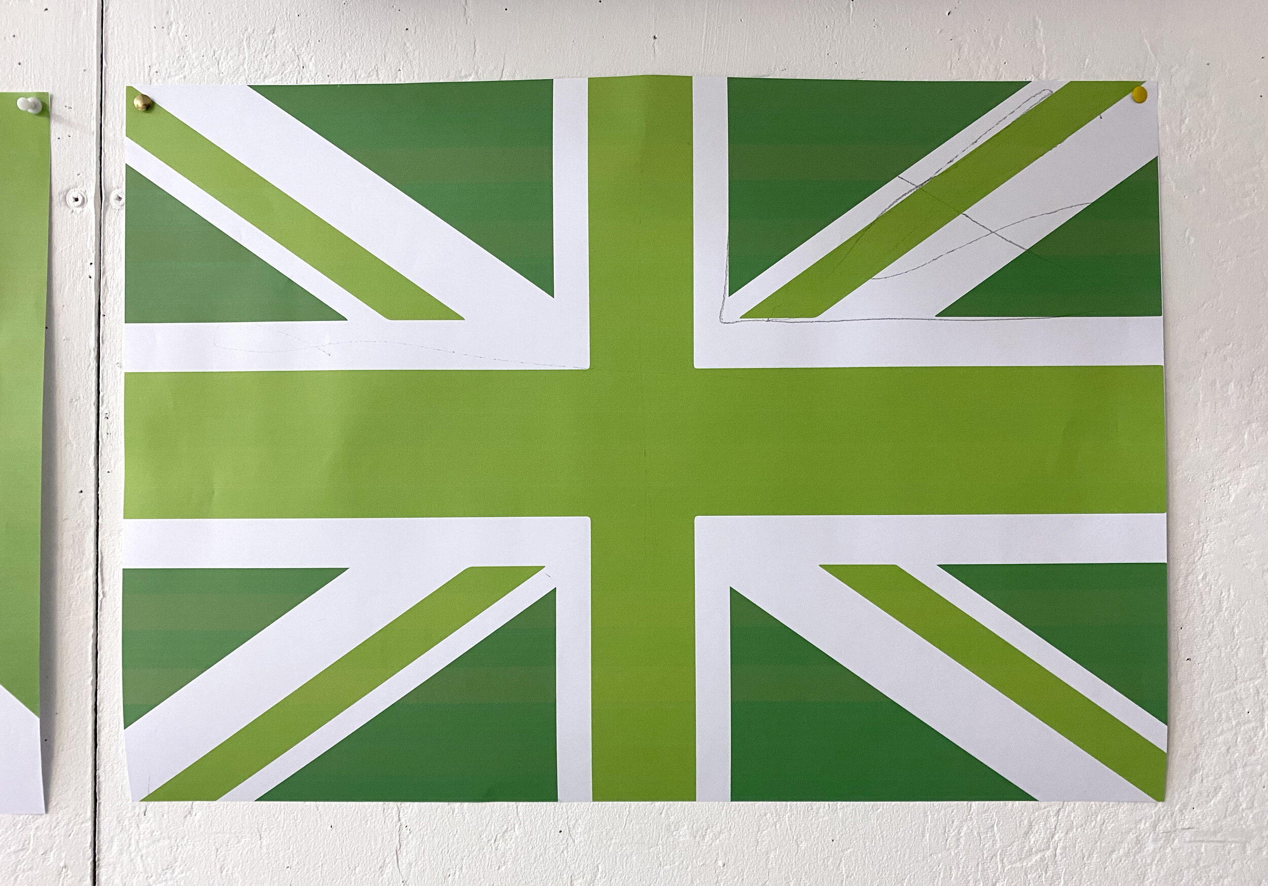
At the final crit all the flags were printed out at A2 and hung in the studio to test impact, message and above all design.
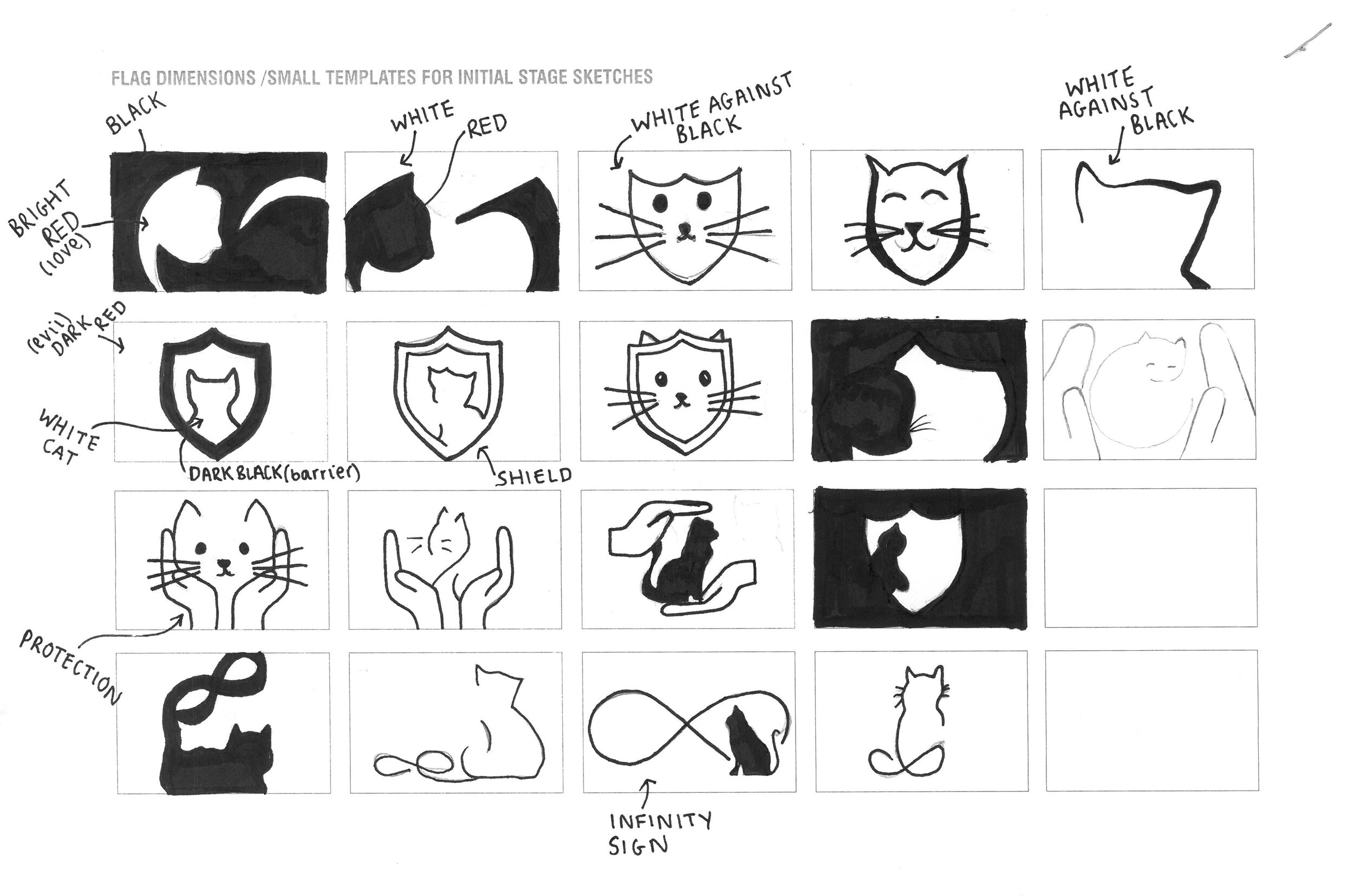
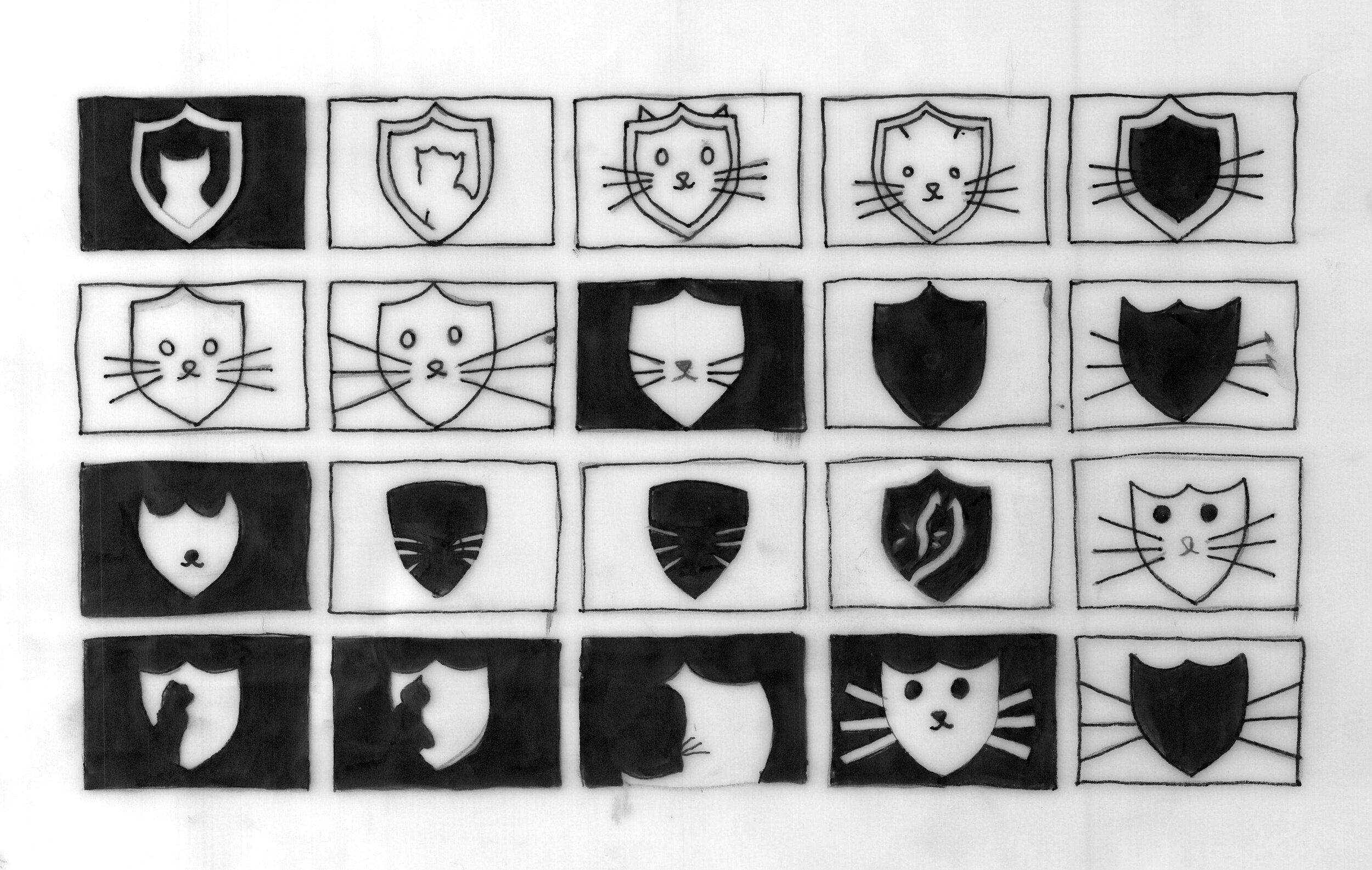

Process

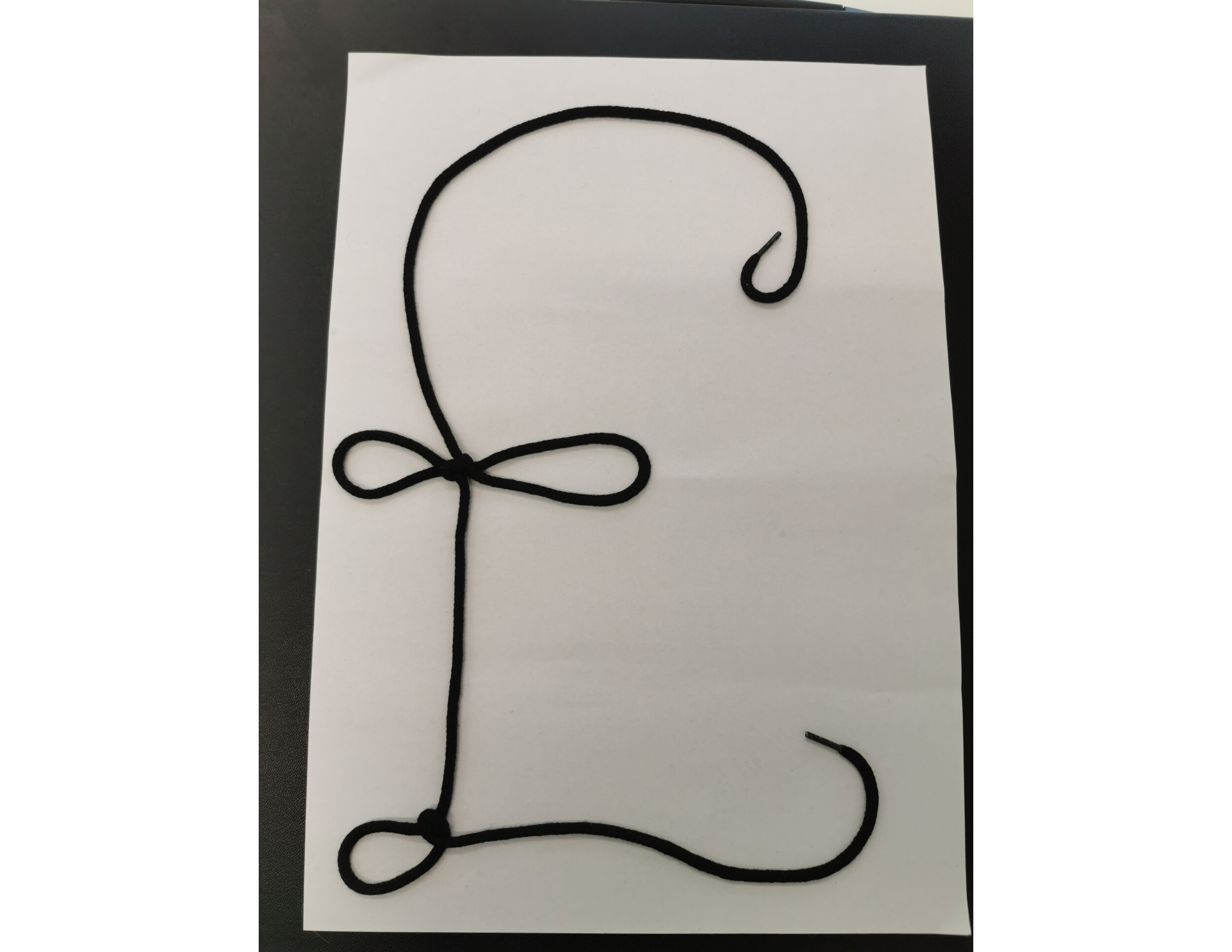
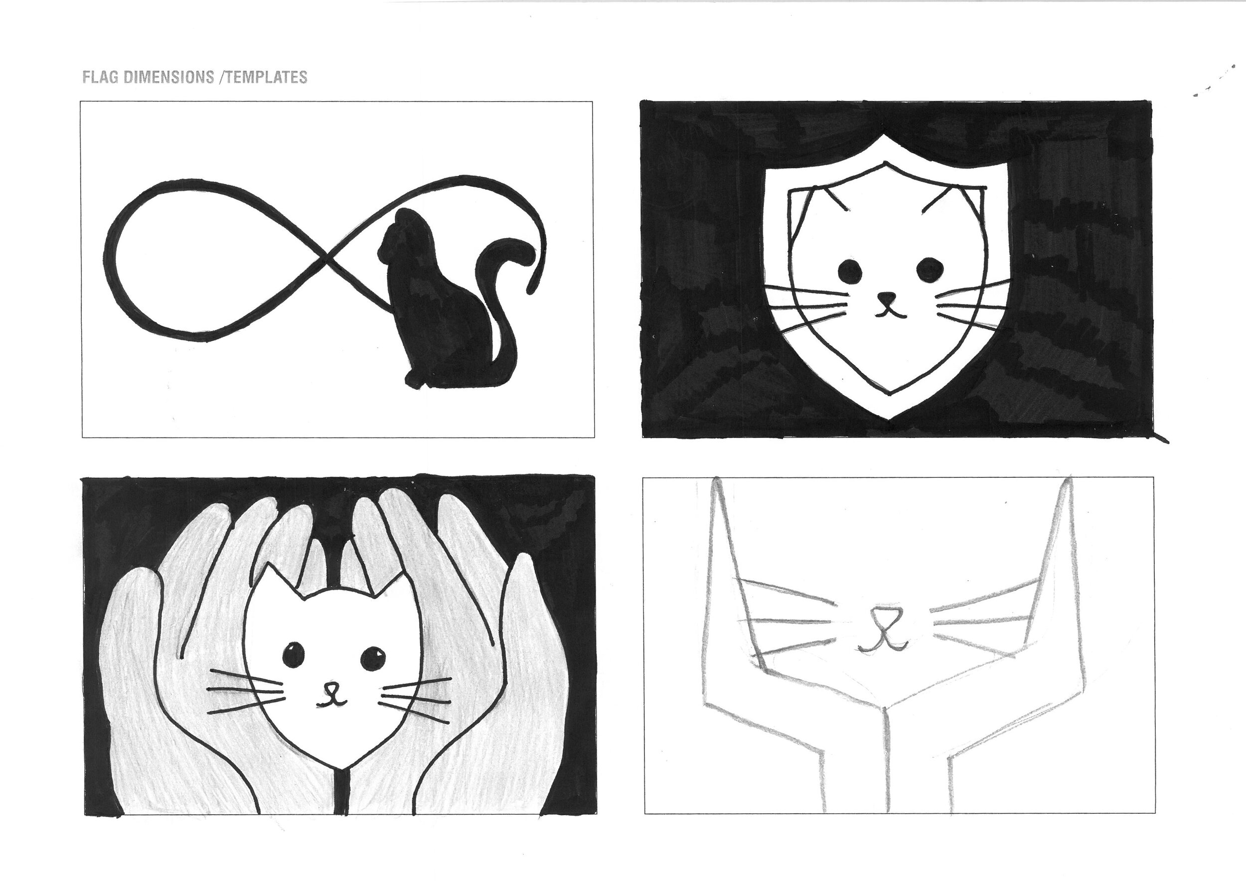
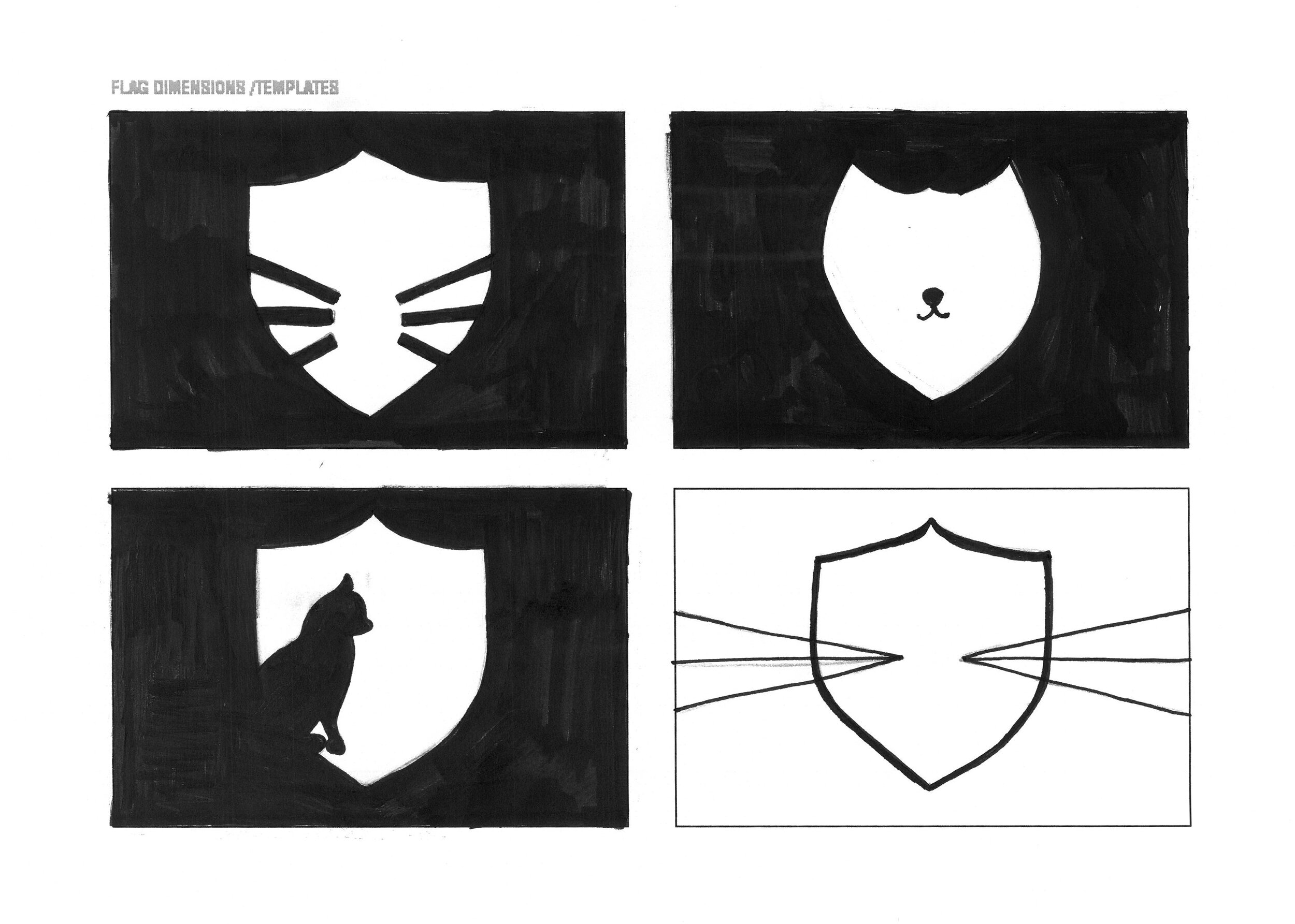
Below is the process undertaken by one student who chose to create a flag on behalf of Cats Protection. All students were required to draw – specifically trace – to get their ideas underway. Also demonstrated in these sketches is a recognition of the symbolism of cats, protection and the task of graphically resolving the two as one design.


Final Crit

Cats Protection

Cats Protection

City of Coconut Creek

City of Coconut Creek

Swim England

Swim England

River Lune Metal Detecting Club

River Lune Metal Detecting Club

Sustainability UK

Sustainability UK

Stanley Park, Blackpool

Stanley Park, Blackpool

Christmas 2020 Delivered

A doodle from October 2019 that has become a little more prescient in the intervening 12 months.

doodles-7.jpg

Thinking about it, as I have been and with Christmas just round the corner, the daily delivery to households nationwide of already pre packed and boxed christmas presents poses an interesting dichotomy. Why unbox them to then re rap them to put under the tree? Doesn’t make sense on inspection and think of all the wrapping paper and hassle it would cut out? You might as well just put the box under the tree as it is? Maybe put a name tag on it, but that’s it, job done. Save the planet and a slackers Christmas to boot! But then you think hold on a minute, why don’t Amazon jazz up their boxes with a variety of Christmas motifs? Then they could be slung under the tree and look reasonably seasonal, bob’s your uncle? Must be possible they can seem to do everything else. I don’t imagine logistically it’s not beyond them in the packing department. They could probably even personalise them to a degree.

If anyones looking for a nice little project then here you go. Brief - What can Amazon put on their brown card board boxes to jazz them up for Christmas and personalise them a little more? Constraints one colour only per box. Also think about packing tape design? Also do the delivery drivers dress up as Santa while we’re at it! GO, GO, GO….HO HO HO!

One week project: Illustration

This semester, the one week illustration project was focused around a famous or well known idiom or saying. As ever, this is a brief seemingly simple from the outset, but it does have its pitfalls. Those pitfalls being in the shape of catchphrase, Mr Chips and a sense of say-what-you-see as way to solve the problem. (It’s not.)

Illustration can use many wide and varied mediums: for example sound and theatre, rather than just image or words on paper. However, there were some really interesting responses to the brief developed over a slightly period due to reading week. Have a look below.

One week project: Copywriting

Recently, the first years were briefed to be angry! Their job was to write a placard on behalf of an organisation they are passionate about. Using wit, humour, straight talk, brevity; their placard had to get the point across and ultimately be memorable.

As we have said before: we write words everyday, but this brief always challenges as it brings a supposedly simple task back into conscious thought. Thinking about what you’re actually writing requires thought, concentration and time. But, the more we write, and the more we read, the better we get.

One week project: Image

First years have recently finished their one week image brief, with the seemingly simple task of juxtaposing two images to communicate a theme of contrast.

This project develops the research phase, then requires making connections first and finding imagery later. Thus: think first, design second. It is not an easy brief, to achieve one good solution is a task but a week offers enough time to do so.

Though given themes vary in depth of meaning, they can only be communicated by the selection of clear, concise imagery which is then appropriately cropped.

Visual layering and complexity is the antithesis of the task. A designer’s job is to communicate clearly and effectively, and use wit to their advantage.

We look forward to seeing how these juxtapositions develop for final assessment.

visible & invisible

visible & invisible

near & far

near & far

work & play

work & play

work & play

work & play

work & play

work & play

work & play

work & play

freedom & restraint

freedom & restraint

sweet & sour

sweet & sour

careless & cautious

careless & cautious

Type Foundries

Among the many behind-the-scenes / below-the-water-line / beneath-the-surface activities undertaken as part of The Disciples; we are continuously adding, editing and refining our links to external resources.

Having been recently contacted by Fontwerk, about the launch of their new type foundry in Berlin; we thought we’d re-share the list of independent type foundries we’ve built up over the years below.

Type specimen of fontwerk’s NIKOLAI

Type specimen of fontwerk’s NIKOLAI

Think of these foundries as the equivalent of the best branding or packaging studios. Absolute masters of their art. They might not all have free trials (who’d work for free?), but you can at least take influence from them and feed it into your own practice. Can you defy Helvetica?

And a final note, Dafont and the like are absolutely not included.

>>> Here’s the list, a veritable rabbit hole of typographic treats <<<


may these screenshots whet your appetite

One week project: Typography

After the stumbling start with Research, the second project for Year 1 centred around typography and yielded stronger (and simpler) solutions. A renewed focus was placed on drawing, analysis of type and placing the idea at the centre; pen on paper communicates just as well as toner proofs.

Students were directed to the fundamental work of Robert Brownjohn for the blueprint of how to extract maximum meaning with minimum means.

Conception (spot the swimmer)

Conception (spot the swimmer)

Innocence

Innocence

Exaggerate…

Exaggerate…

Process

Process

Wrap

Wrap

Awkward

Awkward

Stumbled

Stumbled

Confused

Confused

10 Years After

Here we feature a reflective post on the building of the stone circle that adorns the frontage of the Victoria Arts Building on the Preston Campus. Initially conceived and realised just over a decade ago, we thought it timely to post a short filmed retrospective.

Original sketches of the typography that sits on the top of the circle.

Original sketches of the typography that sits on the top of the circle.

Please click on the image above - 30 minute film ‘the making of’