Final Year Interm Crit Presentations
/Three good examples of presentations from final year graphic design students, branding the British Obscure Olympics as required in the brief set by Forepoint.
Three good examples of presentations from final year graphic design students, branding the British Obscure Olympics as required in the brief set by Forepoint.
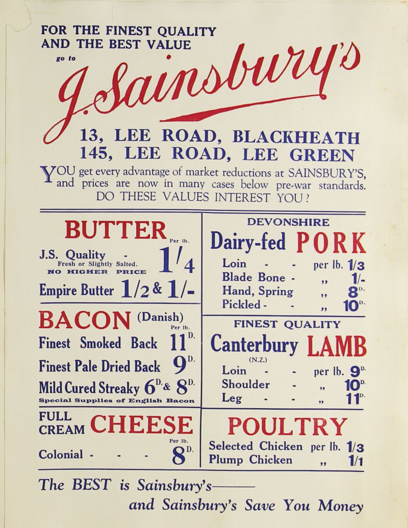
The Sainsbury Archive is an online repository of the supermarket chain’s history containing everything from photographs to examples of advertising from the company’s 100+ years. Particularly fascinating for designers is the wealth of packaging material on here, with hundreds of examples of Sainsbury’s own brand designs.

What we have here is no less than the story of UK consumer communication, where the timeline interface can be used to discover the changing design trends and impact of new production process right through the 20th century. The work of Peter Dixon’s in-house team is particularly fascinating, each 1000’s of new product packaging was introduced or re-designed, each with their own distinct graphic approach. As well as pictures, much of the packaging is shown as flat artwork proofs which will be of interests to students of 3D design. Aside from packaging, the photographs of store fronts, press and poster ads an even old editions of the Sainbury’s in-house packaging allow from the trace the evolution of how one of the countries biggest retail brands have communicated with it’s audience. This is a fantastic resource for research into any design project.


Year 1 Graphics and Advertising students have recently completed their second one-week lateral thinking brief. Tutors and students alike have been impressed with the overall standard on show at the crit.
In fact, and though thought to be clandestine; some second and final year’s hushed conversations have been overheard…and betray the notion that perhaps this year’s crop have faired better than their own. Interesting, indeed.


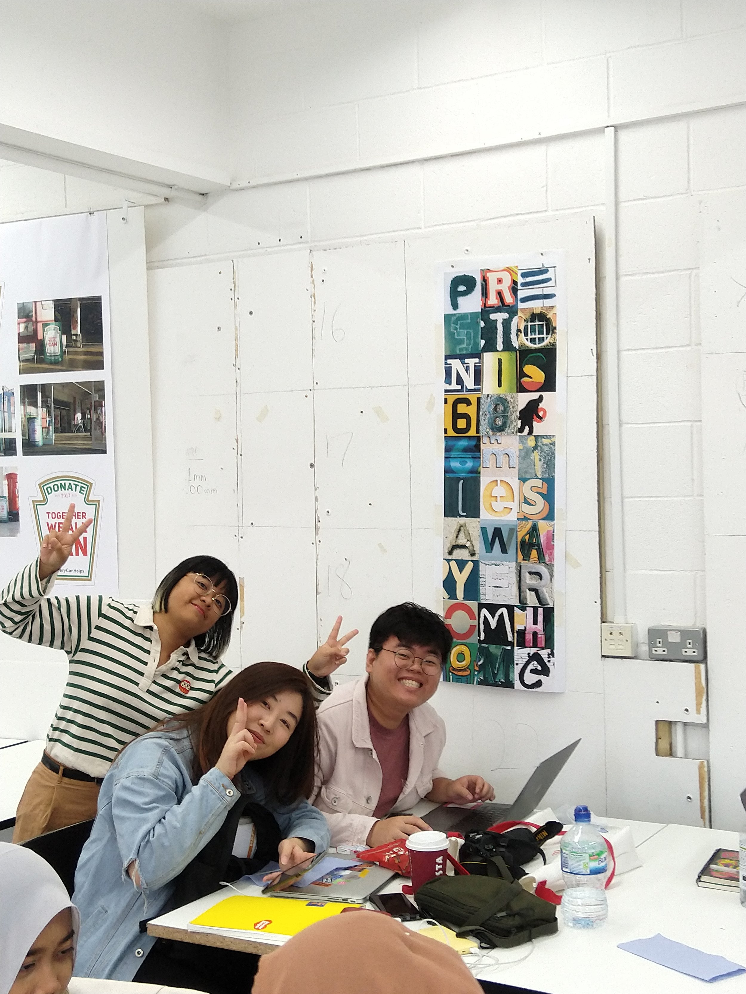
This September, the UCLan graphic design staff welcomed 34 students from Nanyang Acadamy of Fine Arts in Singapore to the Preston campus. A five day itinerary included: sharing graduate work from Preston, a talk from the Reverend Jackson Whitehead aka Andy Bainbridge, a one-day instagram typography project, studio visits to design agencies in Manchester, and finally a cultural walking tour of Preston and its history led by Steve Bennett.
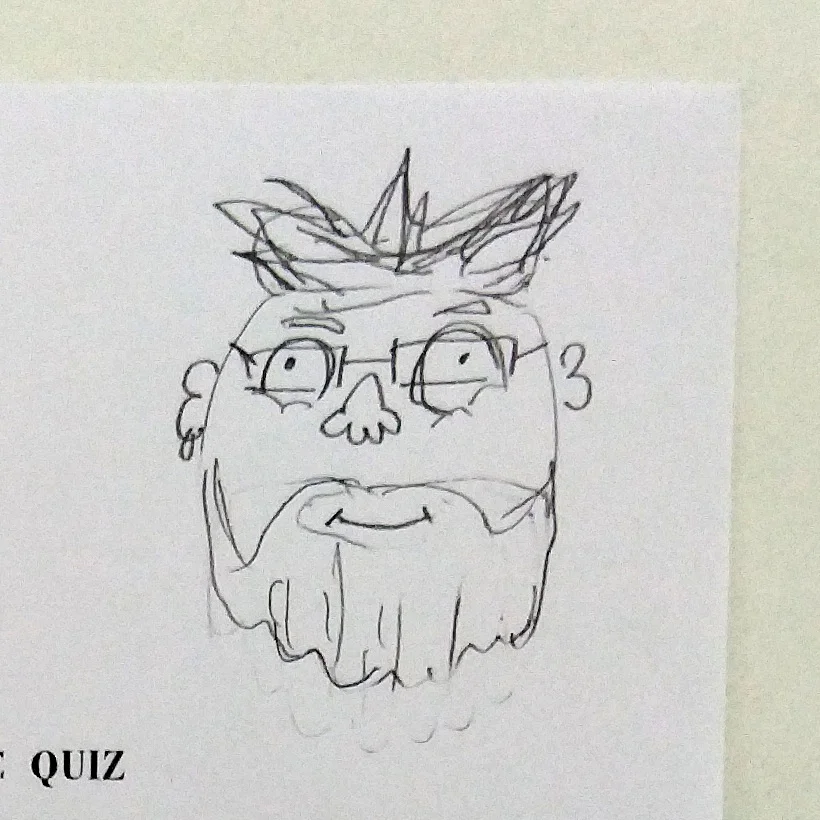
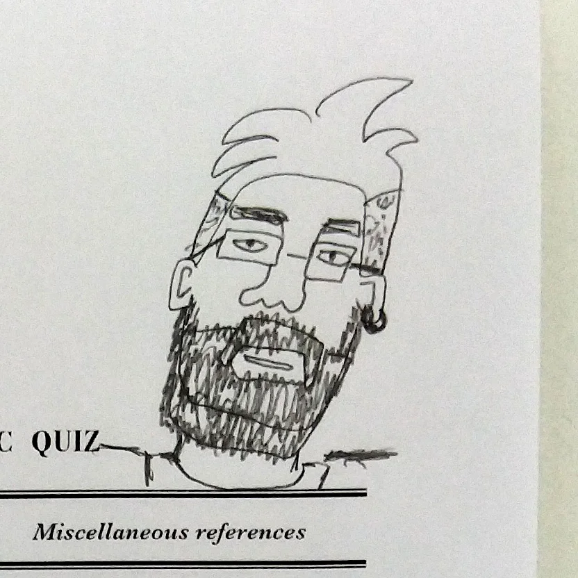
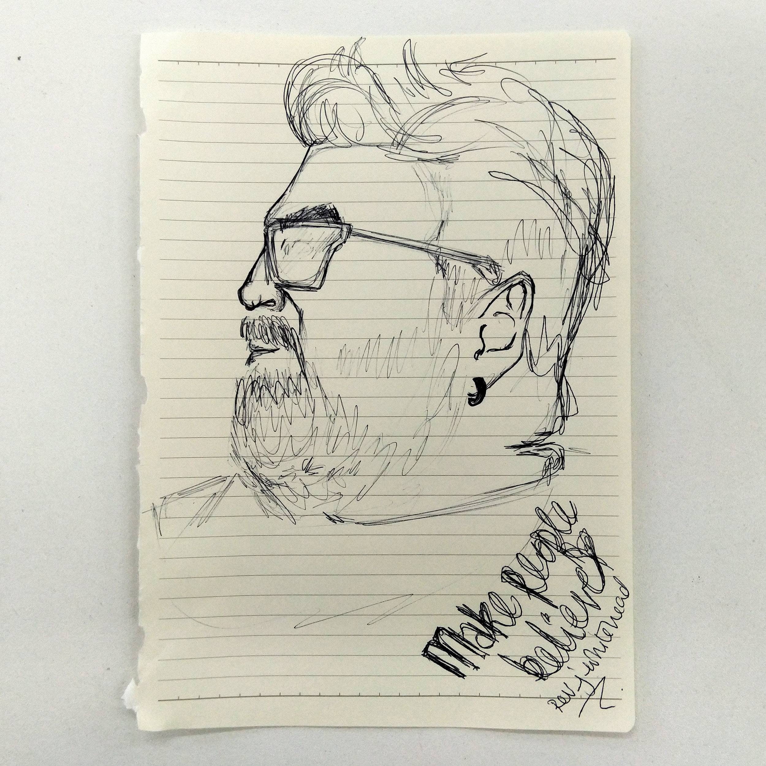
Andy told the story of Typographic Specimens from its beginnings and inspiration, its progression and development of the Reverend’s narrative; and how he finally came to realising the project in print and having his book in the British Library. His talk was of particular interest to some students, who took the time to document Andy’s fizzog. As a side note it was so enjoyable to watch so many students draw freely and regularly.

Andy in human form…

Andy in sketch form…

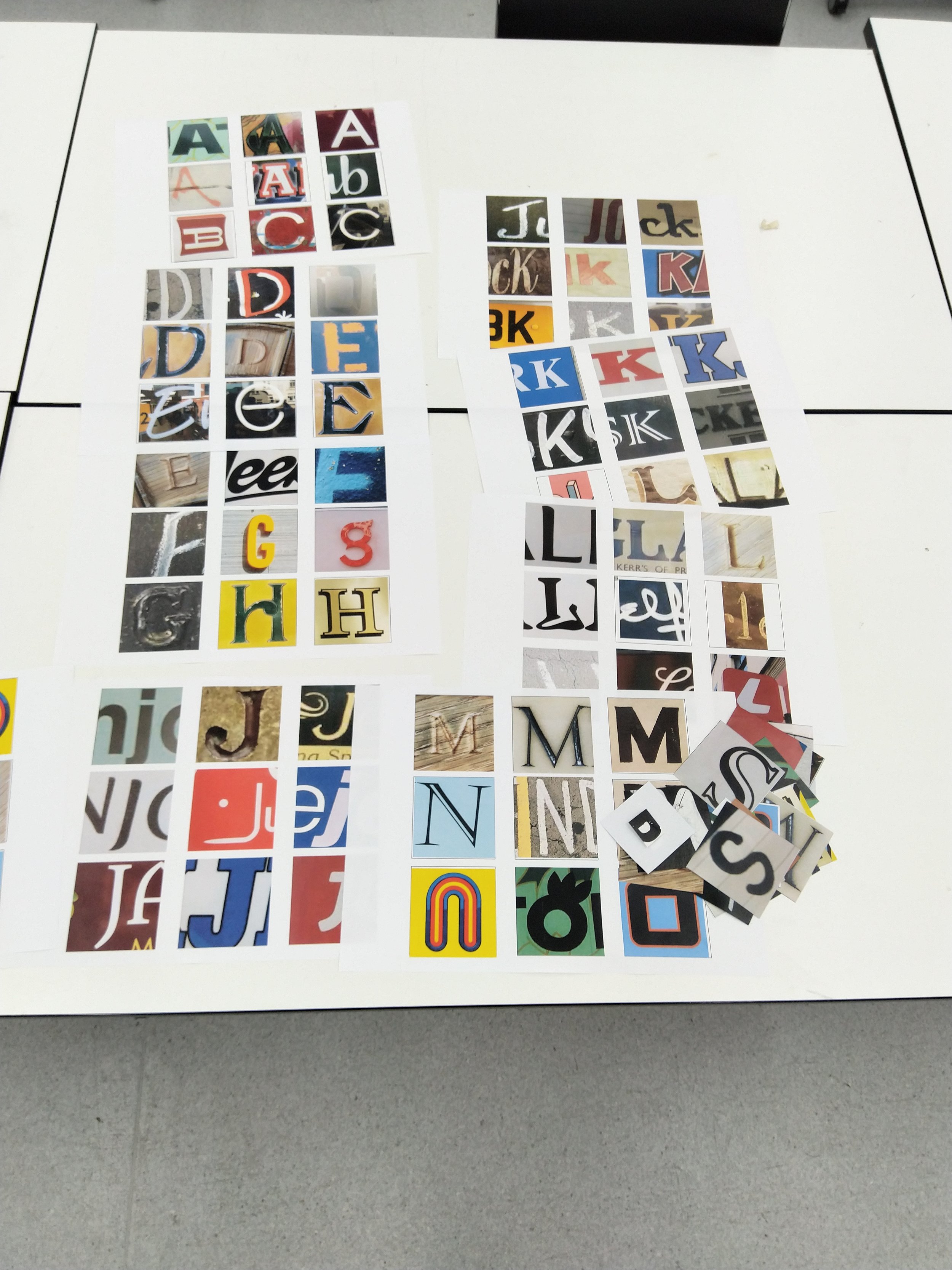
When viewed in its native form, instagram provides a grid of the three columns in infinite rows. It’s a pre-made grid which can be taken advantage of from a number of standpoints. Much like a scrabble board it provides the opportunity to spell out words.
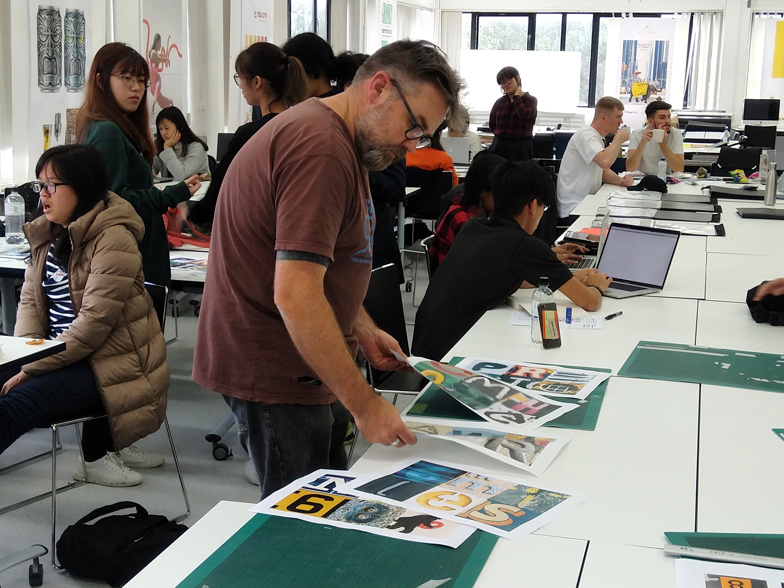
Being from a completely different background (culturally, geographically, aesthetically), we briefed the NAFA students to head out into Preston and photograph any typography they find which interested them for being different. Having collected a variety of imagery from the city, the simple aim of the brief was to use that typography to create a sentence or response to their travels using the instagram grid.
When back in the studio, the student groups compiled their photos, printed them out and began working out potential layouts.

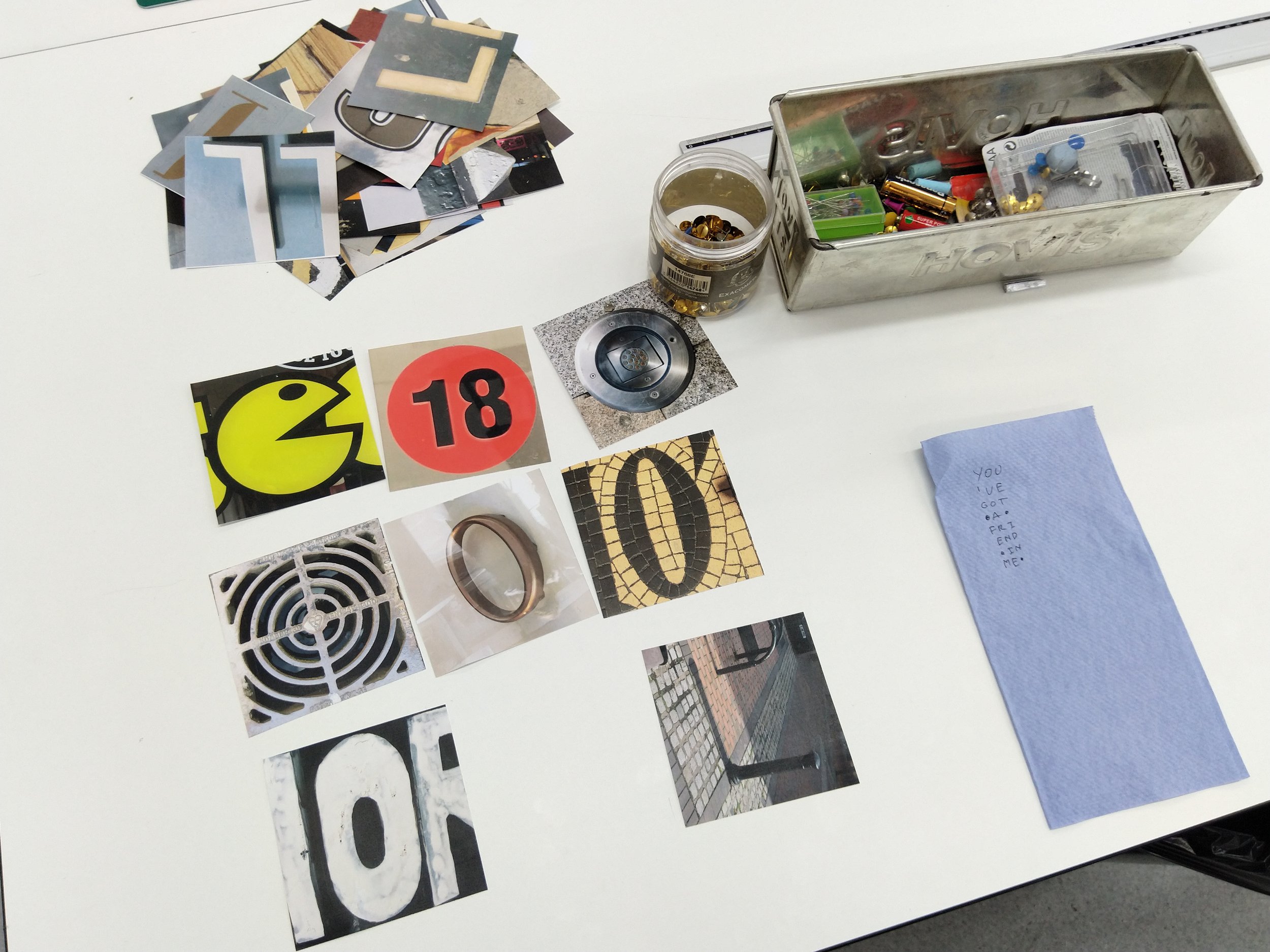
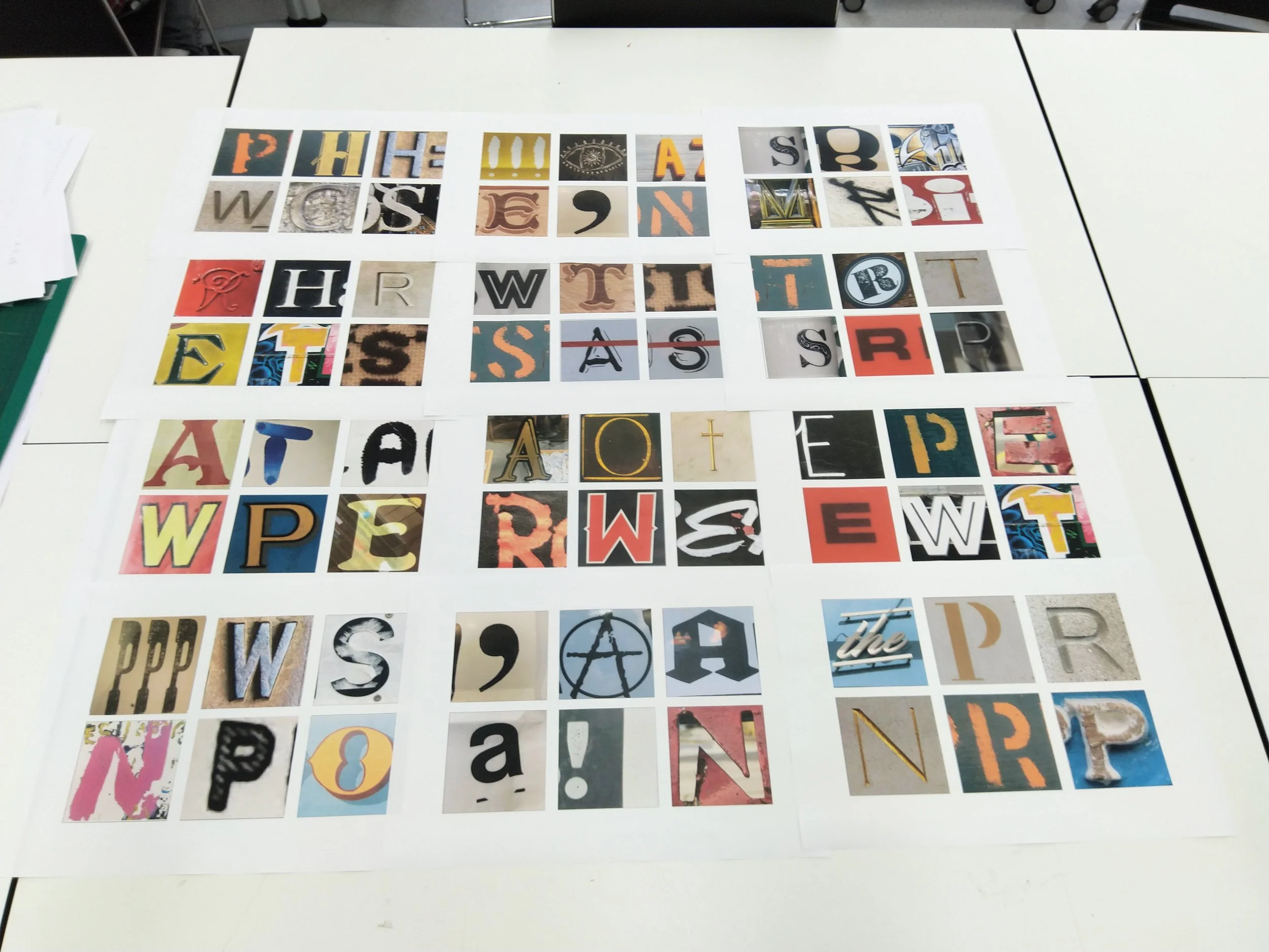
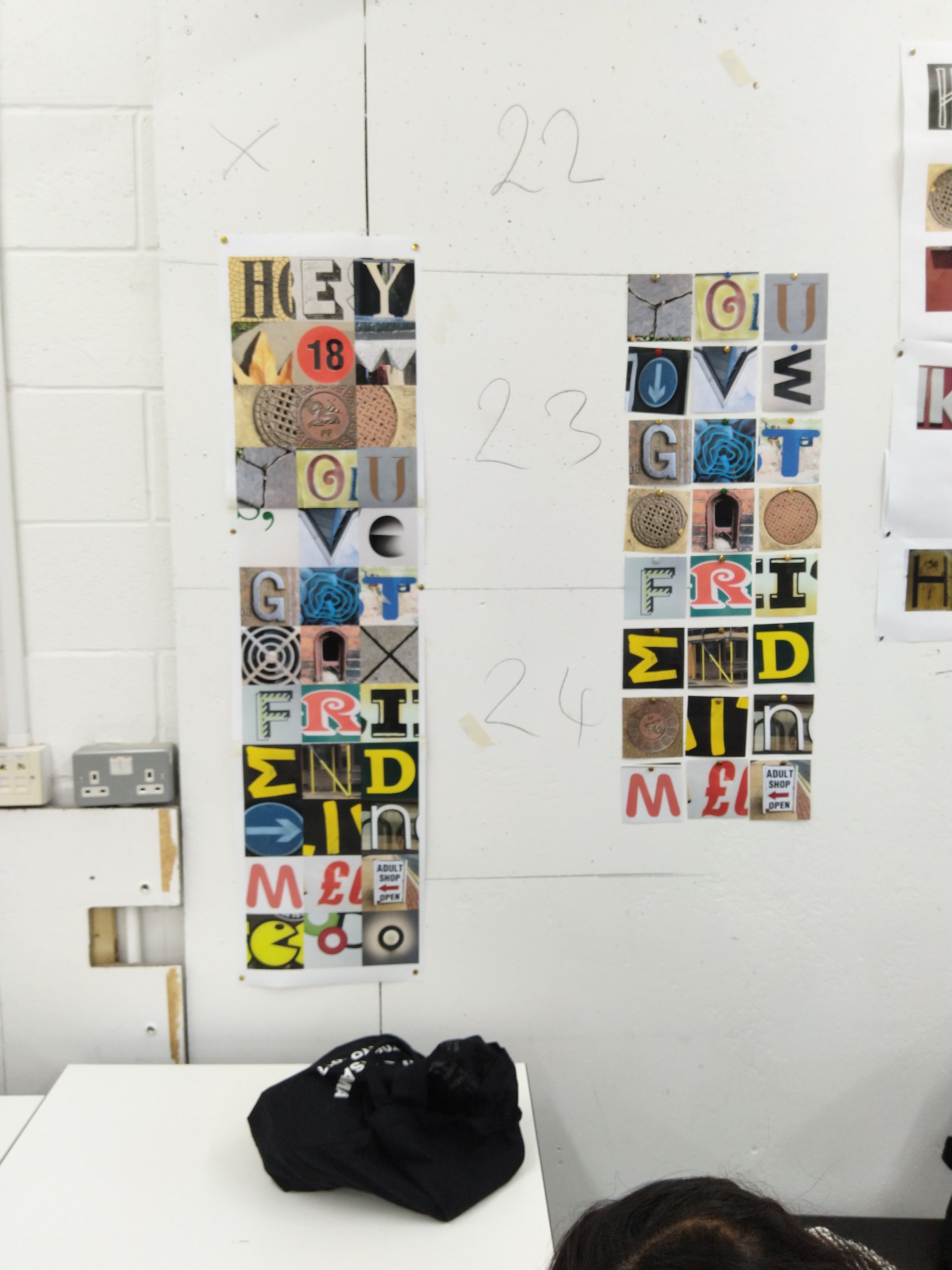

It was a quick, fun project. Have a look at the outcomes on our TDOD instagram account.
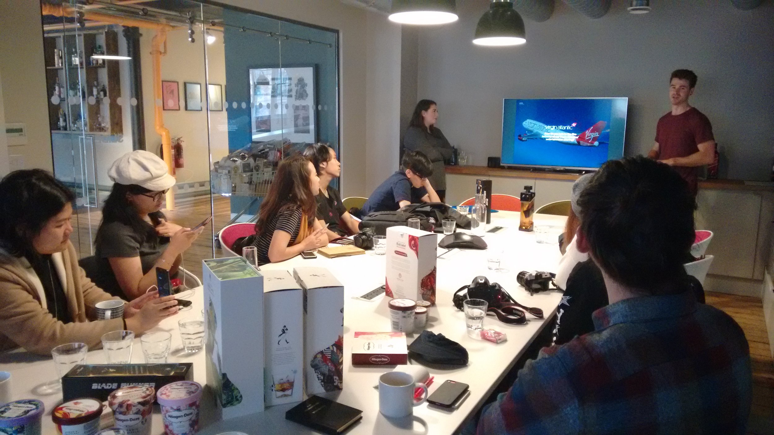
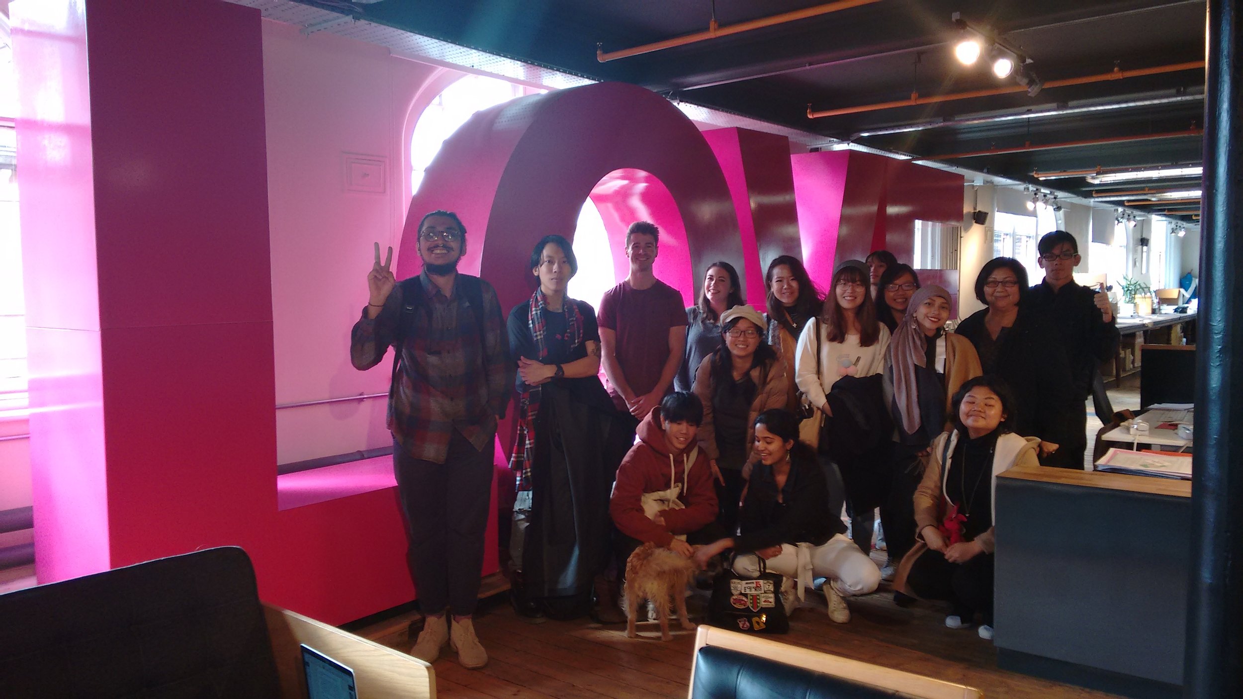
With trips to The Chase, LOVE and True North we had a fantastic day in Manchester. (And also special thanks to those agencies for offering us their time.) The week cumlinated in a rain-soaked tour of Preston, and thankfully a pint in the Black Horse.
Thanks to Miss Peh and all the students from NAFA, we hope you had a fantastic week; and thank you for the sweet treats!

For those of you who know Paul Rand, an exhibition catalogue for an auction sale of some of his work, belongings and prints has been put up online. And for those lucky enough, there's an opportunity to own a piece of design history. Take some time to have a look through the collection, when seen as a whole it's awe inspiring.

If you don't know of Paul Rand then you're a newcomer, but he is one of the absolute masters of design. The auction catalogue features his work, but also things that inspired him. It is so important to remember that we should look to take inspiration from the world outside of design, not just repeat what we already know.
His house is up for sale as well, it also offers an interesting insight into a designer's way of living.

Gareth Southgate, obviously
Cropping a photograph or image is one of the most powerful tools in a designer's skillset. It allows the designer to draw focus to a particular area of the subject in the image, in essence strengthening the communication and creating clarity of meaning for the viewer. The example above from the Guardian shows us Gareth Southgate, without actually showing us Gareth Southgate. But we know who it is, instantly. The designer has recognised the minimum amount of information required from the image for the viewer to process its meaning, and has had the gumption to crop it such a way. It is unusual and unexpected, so therefore visually rewarding.
Further to that very tight crop demonstrated above, a keen eye can enhance balance, contrast, scale, and even the dramatic effect of an image through cropping it in the most effective way.
Cropping can be done on a Mac, but if you have a hard copy of the image it is so much easier (and quicker) to crop it using two pieces of card. This is the best way to learn the art of the crop as it gives you instant feedback in the power of the image as it changes. Make your cropping tool with one sheet of paper.
The further examples below are taken from the Guardian's beautiful World Cup colour chart, which portrays the 2018 World Cup through a rainbow of colour. It is an excellent example of cropping, enjoy.

We have been busy recently putting together a small promotional document about the Graphics course and thought it might be a good idea to show you a little of the work in progress. We have been scouring the hard drives and mining the archives to highlight a few highlights over the past 20 years. Hope you like?


Laughing Stock

Hopefully we will have it printed for the degree shows in June!

Yesterday Secret 7" returned after a year's hiatus, The event, established in 2012 by Kevin King and UCLan alumni Jordan Stokes, takes 7 tracks from 7 of the best-known musicians around and presses each one 100 times to 7” vinyl.
Creatives from around the world are then invited to interpret the tracks in their own style for every 7”. All in all 700 unique sleeves are exhibited before going on sale on a first come first serve basis. The money raised is given to a selected charity, this year the mental health charity Mind.

Since 2012 they have produced 3,500 one-of-a-kind records for 35 different tracks. Raising over £175,000 for great causes.
Whilst open to the general public the event also invites renowned and respected creatives from around the world to participate too. In its five years, the event has attracted renowned and respected creatives such as David Shrigley, Jenny Holzer, Ai Weiwei, Anish Kapoor, Paul Smith, Sam Taylor-Johnson, Gilbert & George, Yoko Ono, Julian Opie and Peter Blake.
The tracks this year are:
Secret 7" is open to anyone. Submit away here.
The deadline is 24 April 2018. Get cracking.

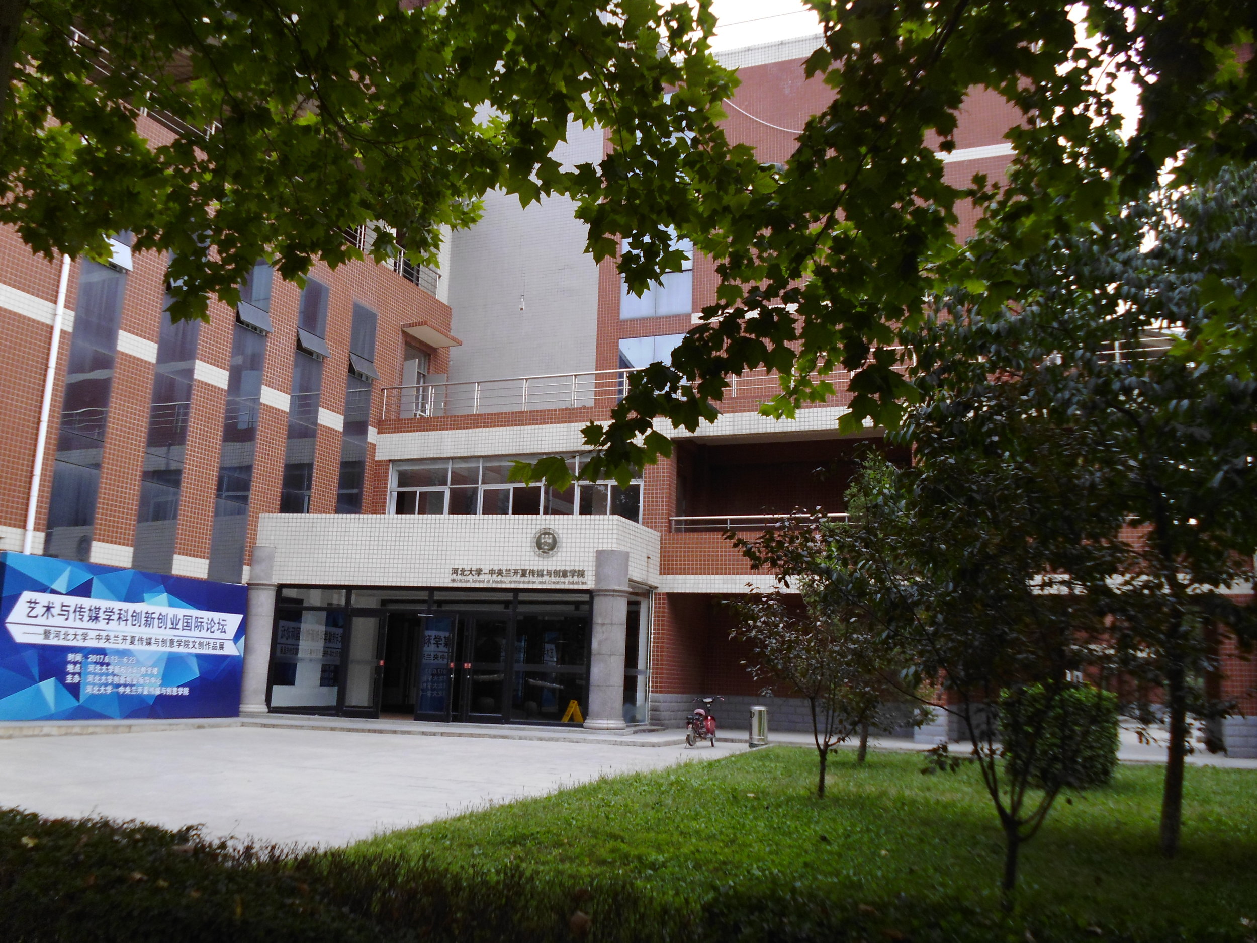
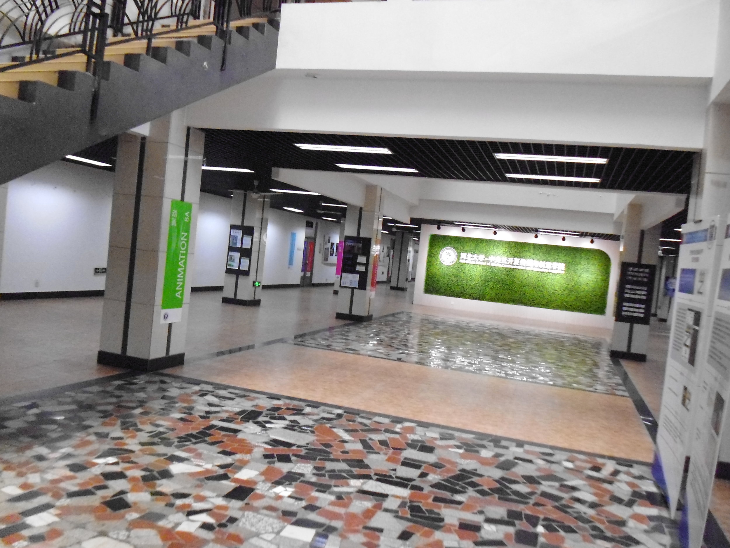
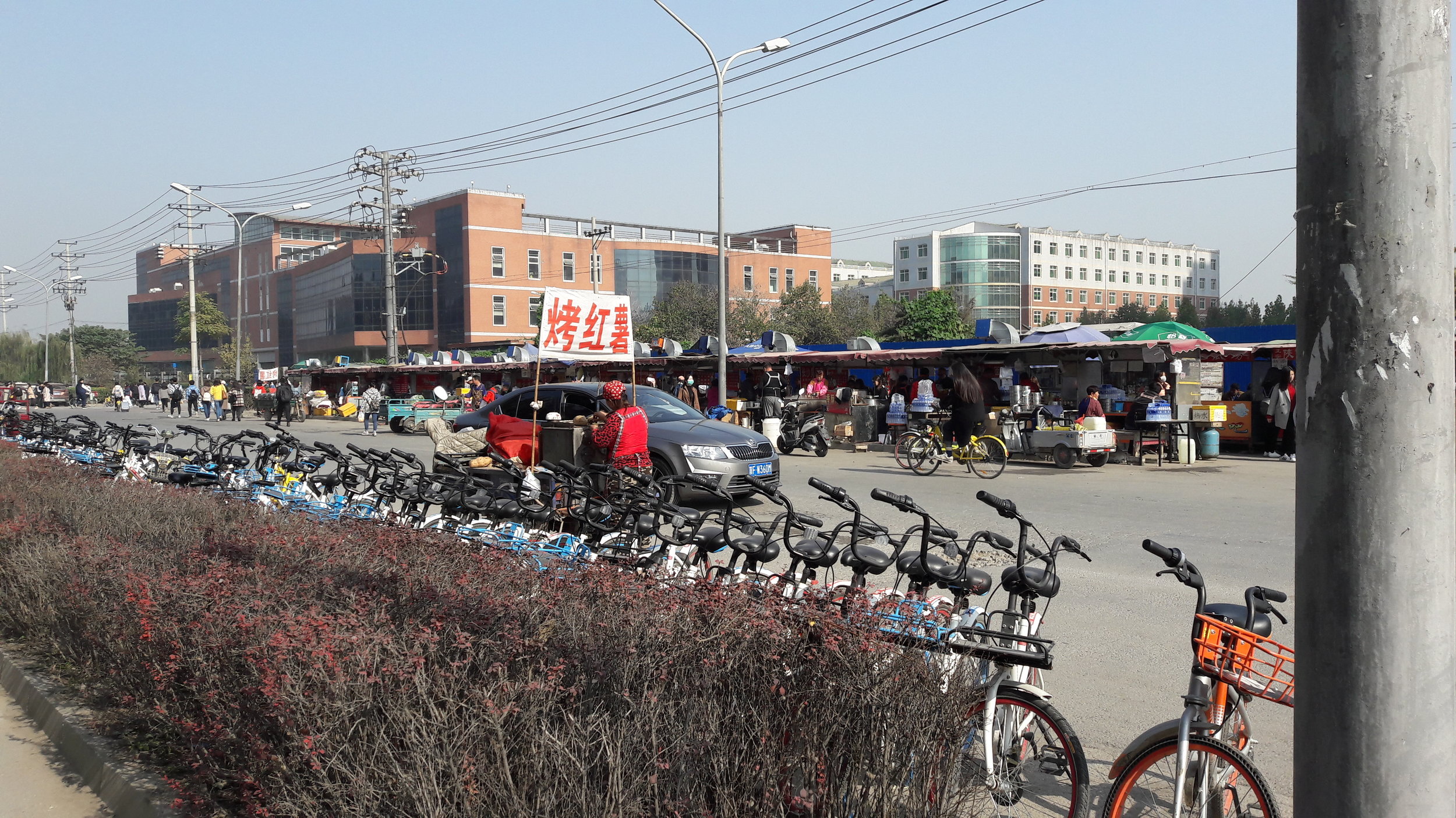
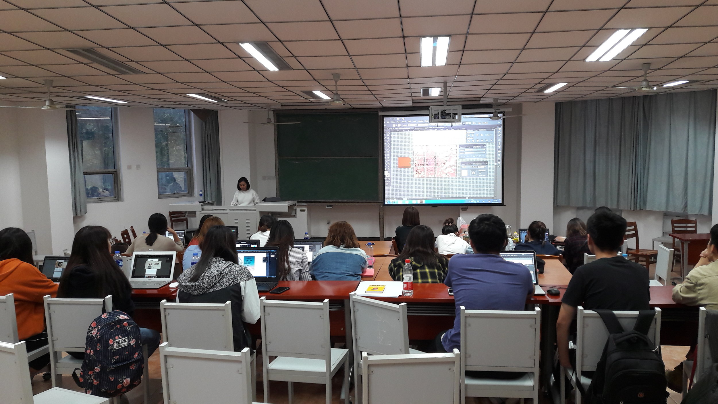
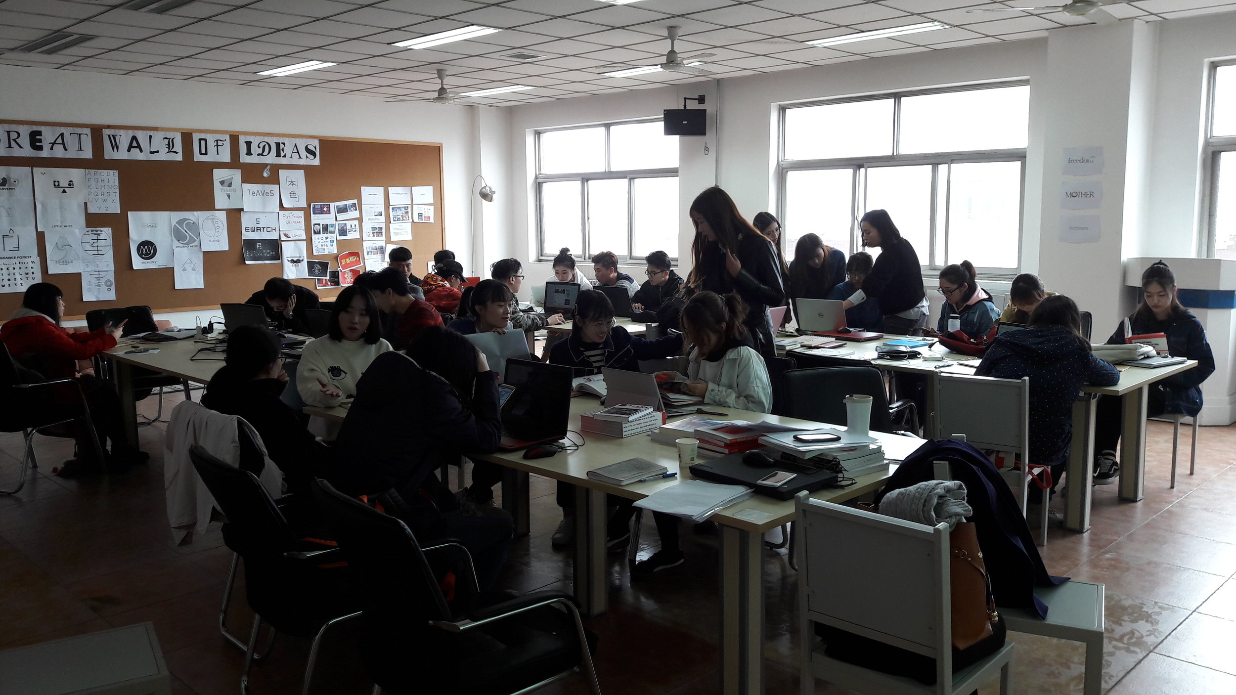
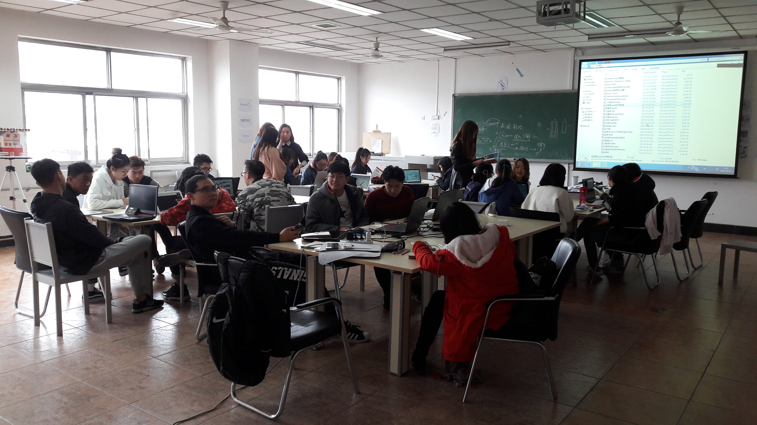
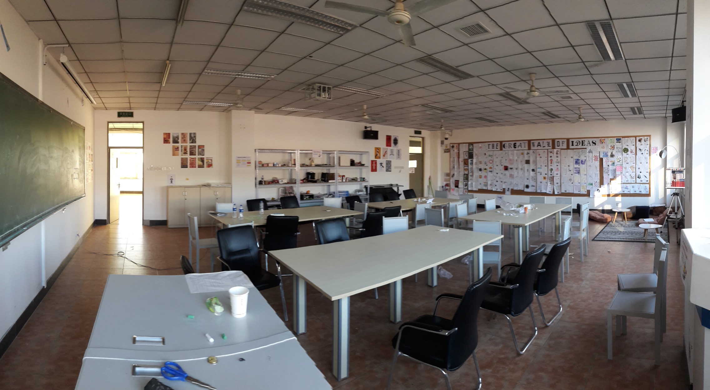
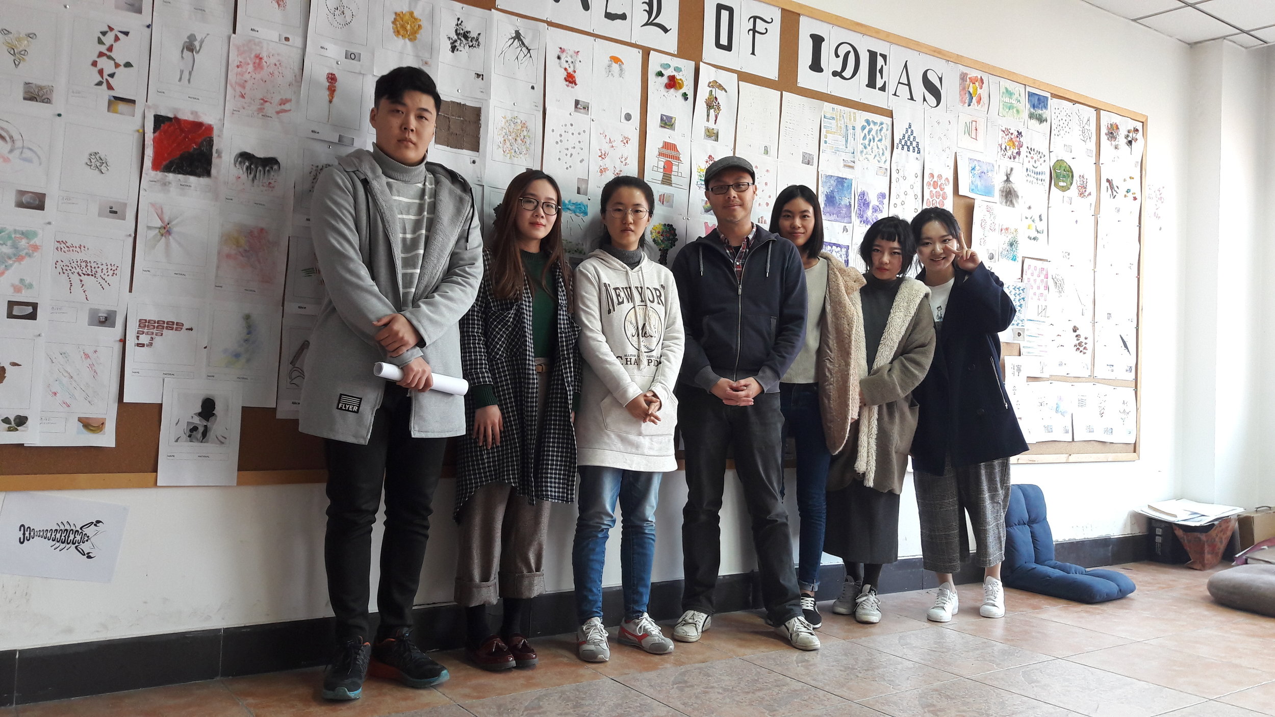
Hebei University in Baoding, China are running the same modules as UCLan across Graphic Design, Advertising, Animation, Interior Design and Film and Media. I’ve been a visiting lecturer for two months delivering Contextual Studies and Graphic Design. This is an exciting year because they will produce the first batch of graduates from the partnership. The Year 4 (3rd years) students are on course with their Honours Project, the Year 3 (2nd years) are showing potential with their branding exercise and Year 2 (1st years) are developing lateral thinking. (Click above image to scroll for more)

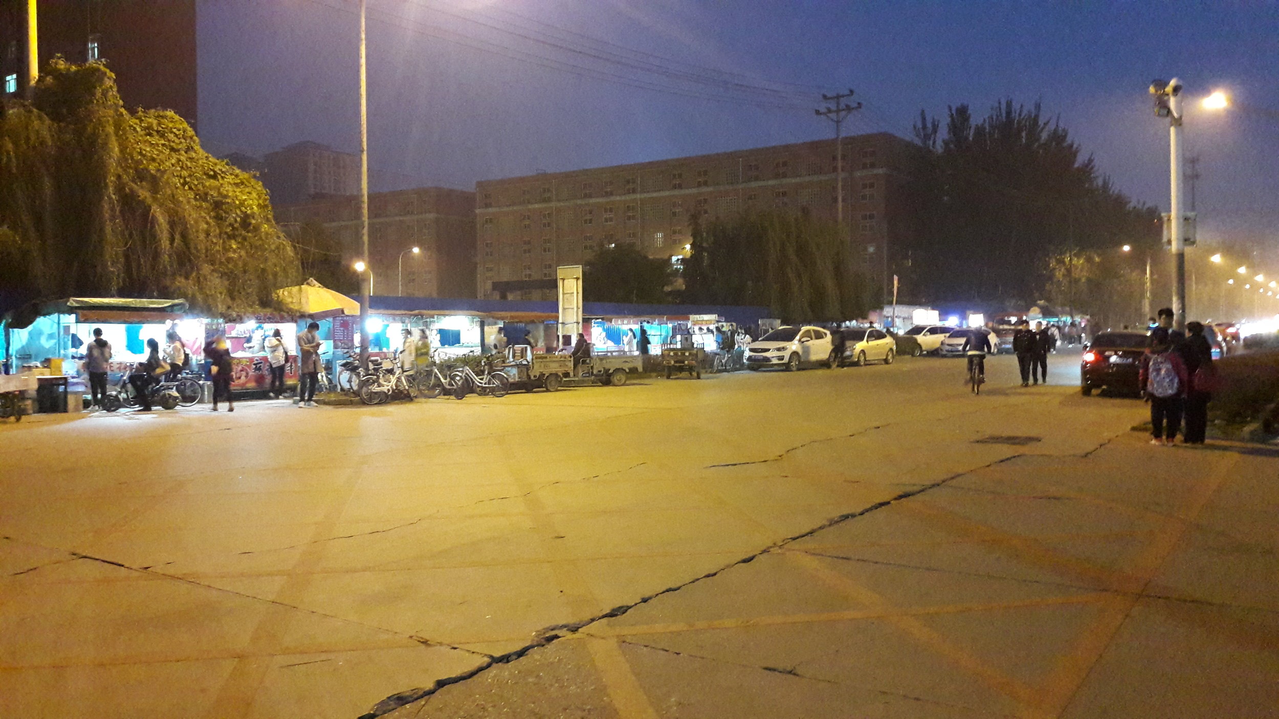
HBU-UCLan School of Media, Communication and Creative Industries located in A1 building on far left of the six blocks.
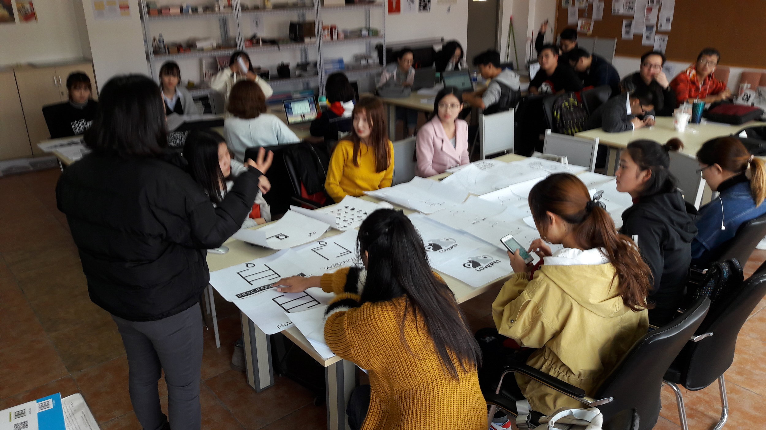
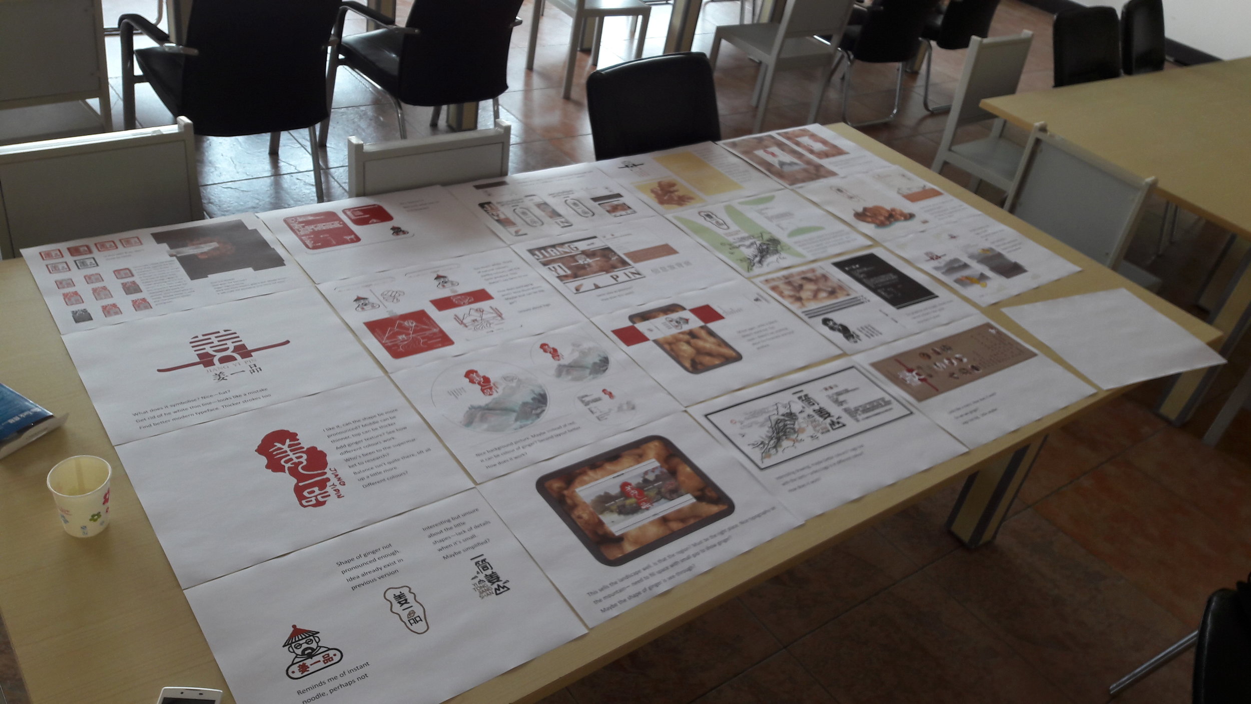
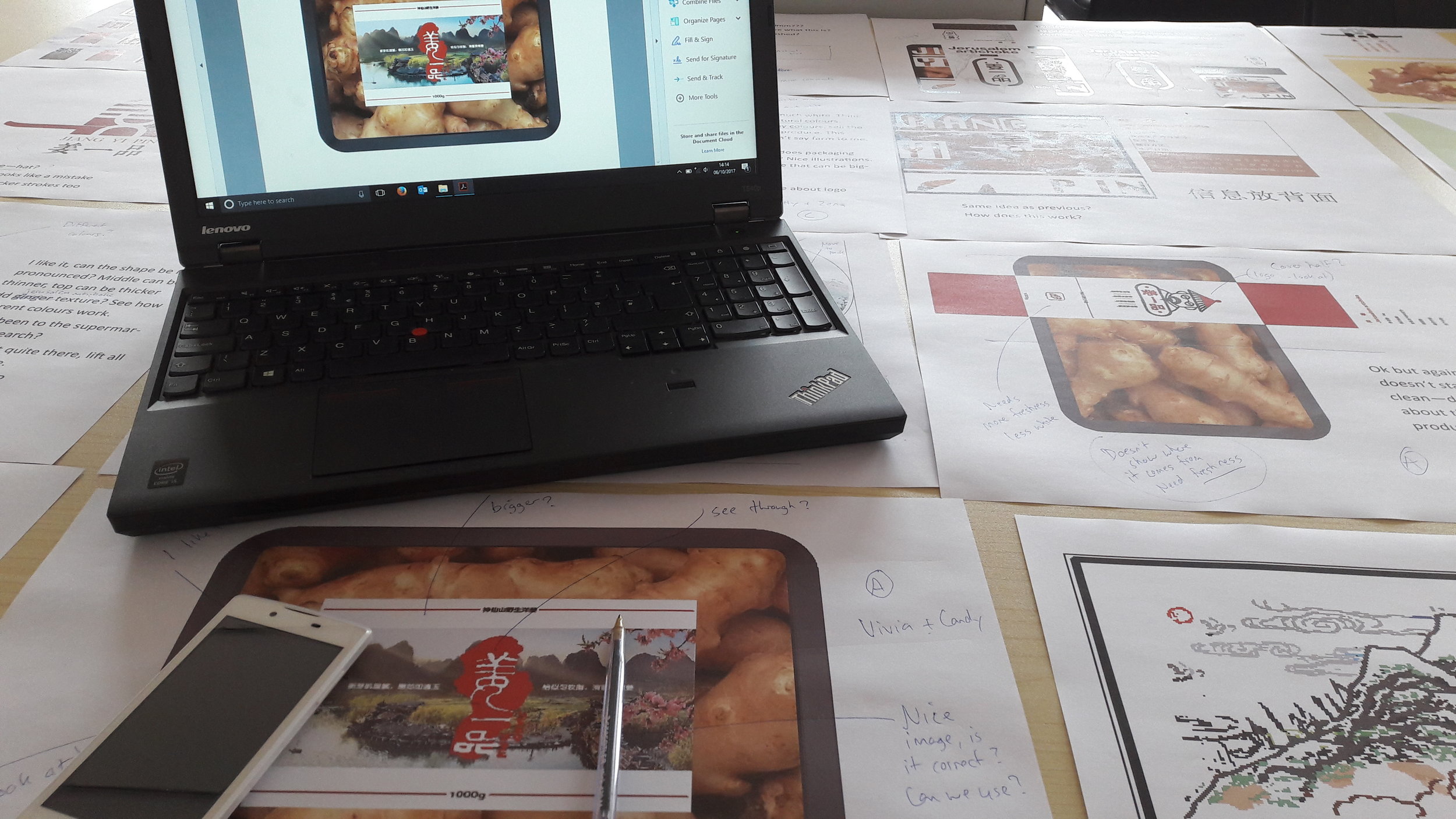
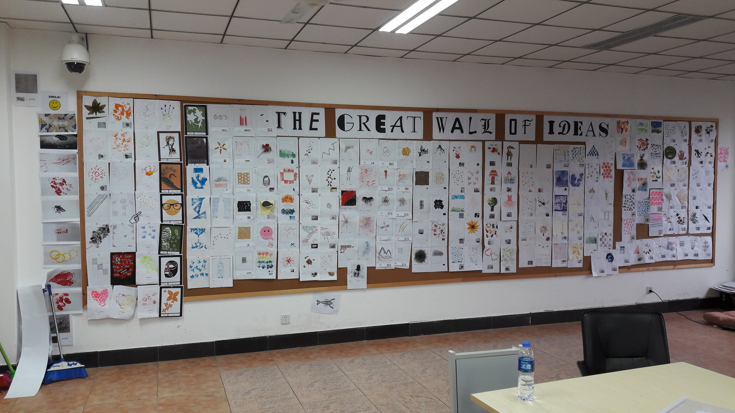
Their cultural input excites me, they are producing ideas of Chinese origin with Western influence. Not surprisingly they can struggle with Typography, but considering there are over 50,000 Chinese characters, our 26 letters are almost dull in comparison. You will find many Chinese design dominated by a single character (a meaning), either incorporating an idea or assembled with other characters to evolve the meaning (like creating a new letter by combination - see below, Honours Project by Ellis, a final Year Graphics student). That is their equivalent of Smile In The Mind wit. I had my preconceived view of what a ‘good idea’ is but that’s based on domestic influence, it’s made clear that universally, a ‘good idea’ must also consider the cultural and societal influence.


There are recurring themes in their conceptual work across all courses. We have to be conscious of the materials they have access to. China exists in an information bubble, what we take for granted are not accessible (Google, Wikipedia, Twitter etc). The population derive information from limited sources and without the freedom we enjoy, they are unfairly portrayed as unimaginative. I was fortunate to work with two brilliant Graphic Design lecturers from Beijing, they enhanced their creative thinking by studying abroad. It’s easy to be dismissive of weak ideas drawn from limitation, but the challenge to think within the limitation can breed creativity. If we collaborate by recognising their challenge and by applying our knowledge, maybe something will blossom.
The Chinese market is vast, the demand for creativity will only increase. However, it isn’t a case of transplanting our methodology over theirs. The future is convergence because we can’t have a conversation in our tone, we have to use a tone their population would understand. I believe a holistic approach can bridge our creative differences, but it will demand patience and a lot of effort. This is why I wholly support the partnership between both Universities, in time we will see the best of both worlds. (Click above image to scroll for more)

Irene, Year 3 - Toy store branding solution first draft

Jim, Year 3 - Branding typeface draft

Year 3 Branding by Polly, Steven and Alysha (Spot the word Iris).
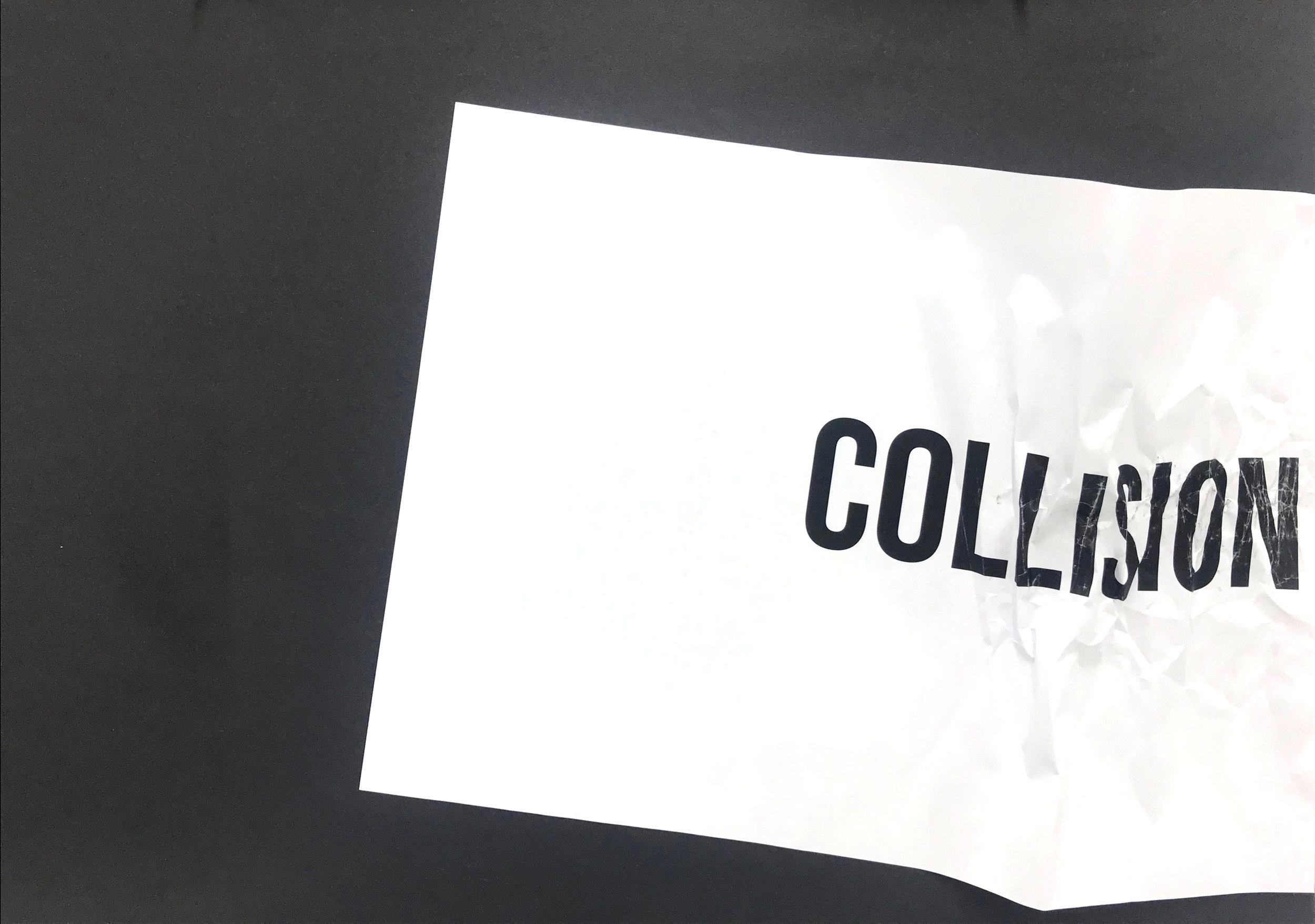
Here we feature 4 solutions to a year 1 lateral thinking exercise from a few years back. The task was to somehow illustrate a famous phrase or saying.

'touch wood'

'third time lucky'

'it takes two to tango'

'jack of all trades & master of none'

The Disciples Of Design are a global collective of design academics, practitioners, artists and students. We have one common thread – UCLan in Preston, UK; and one common aim – the creation of an ever evolving visual hub for the sharing of ideas and thoughts.