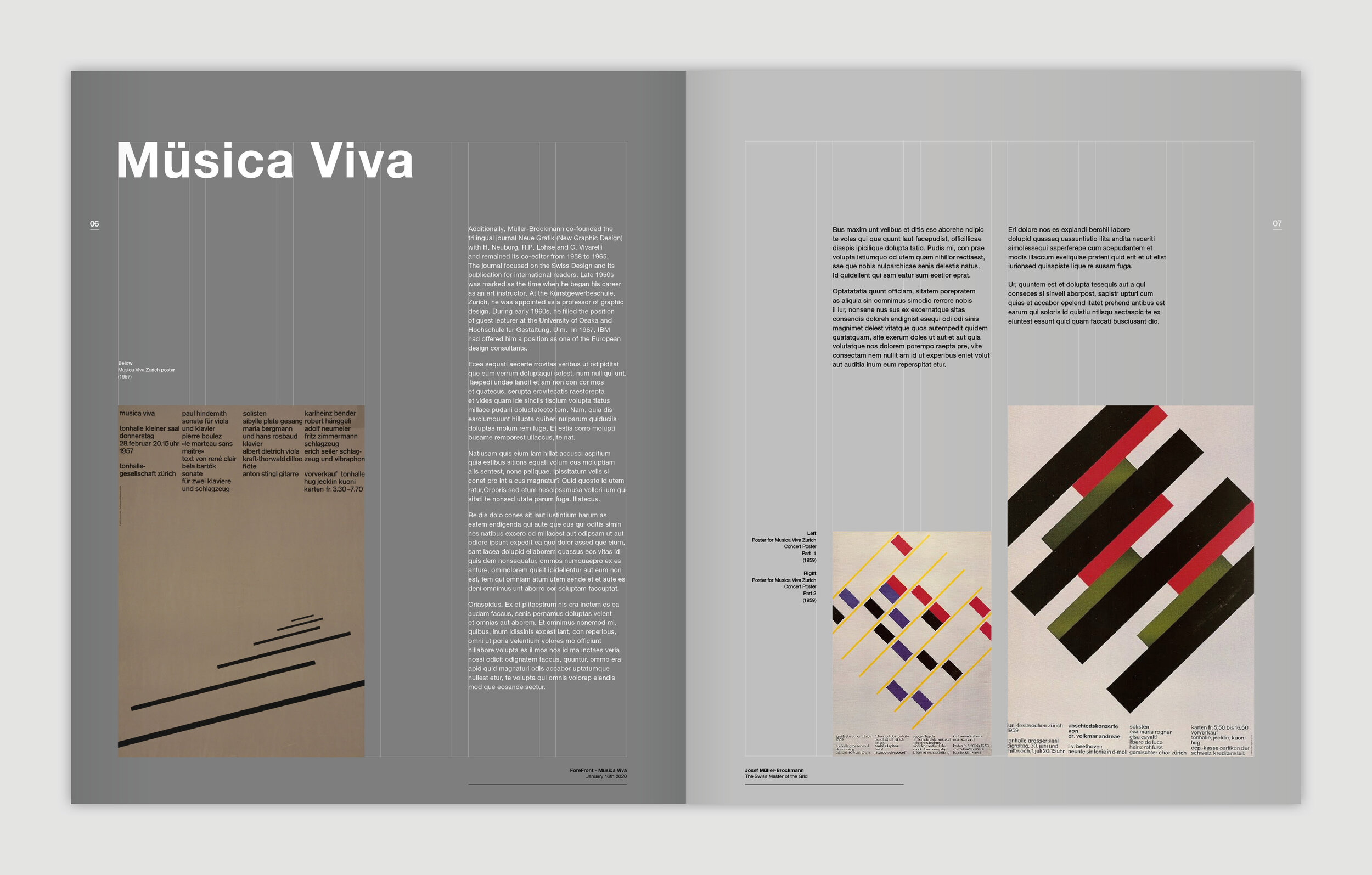
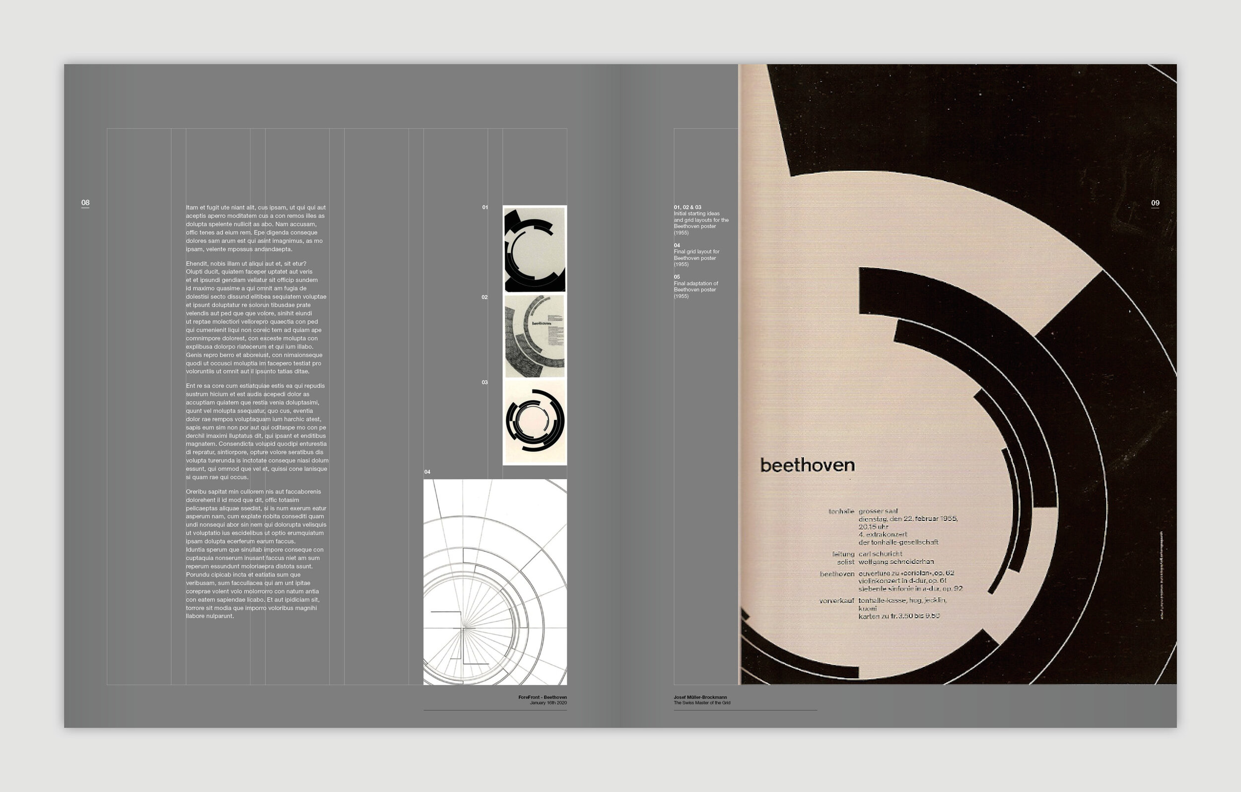
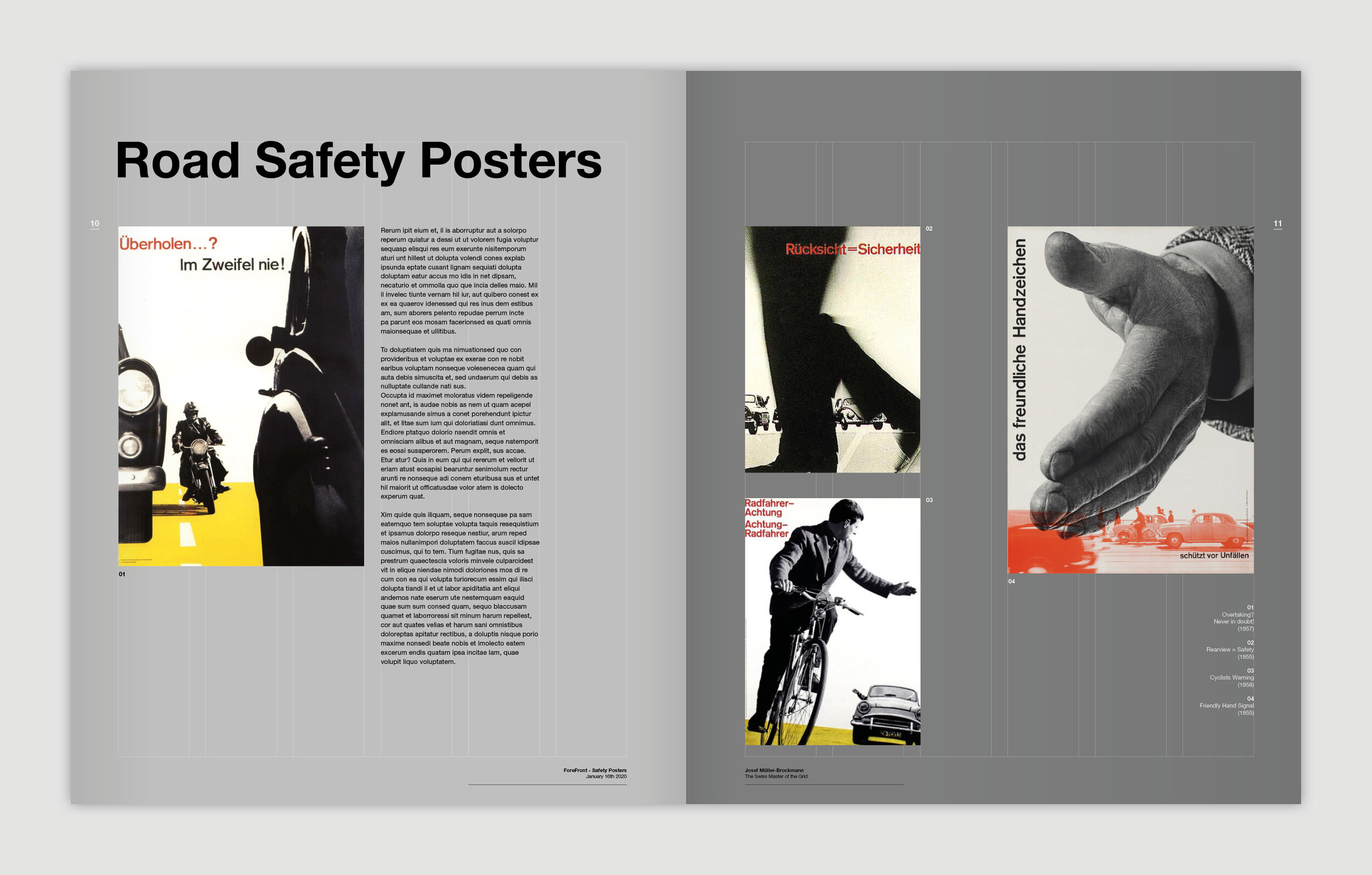
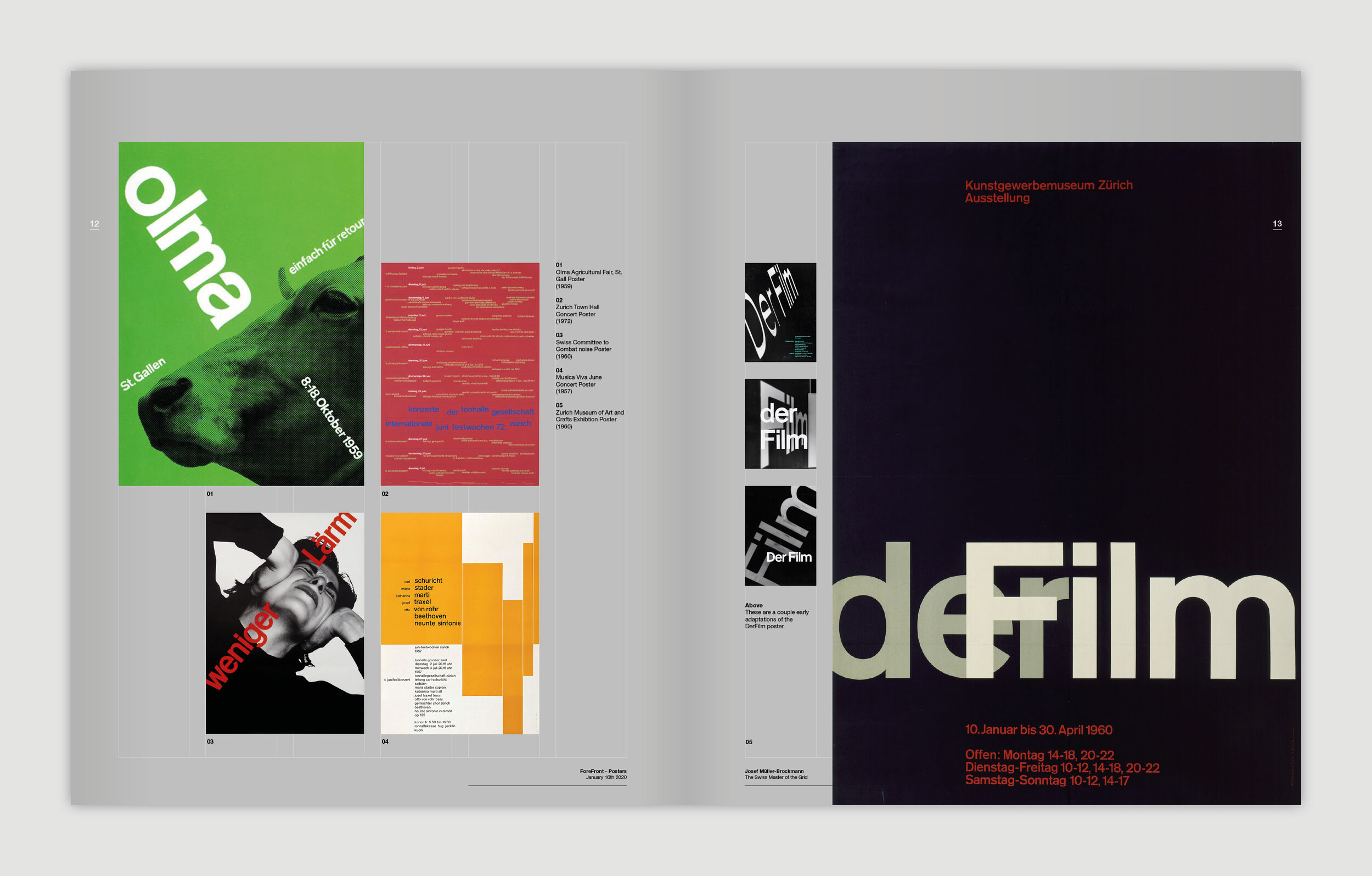
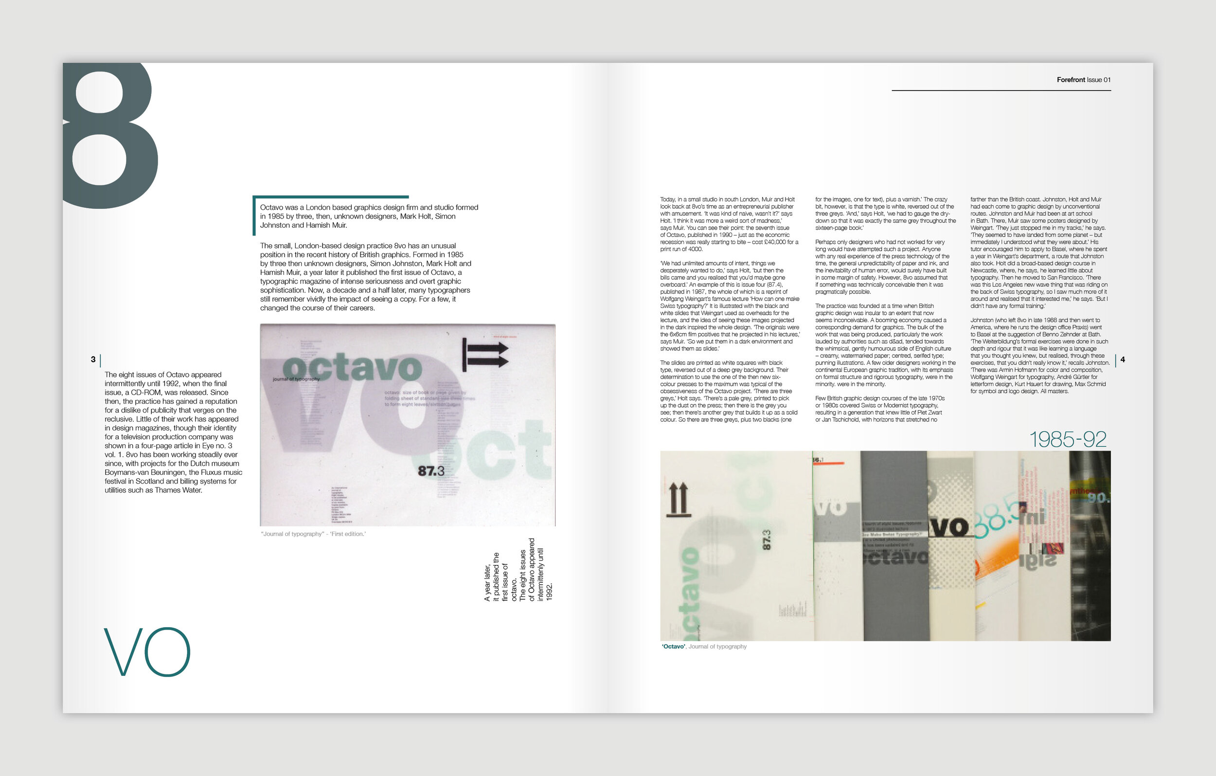
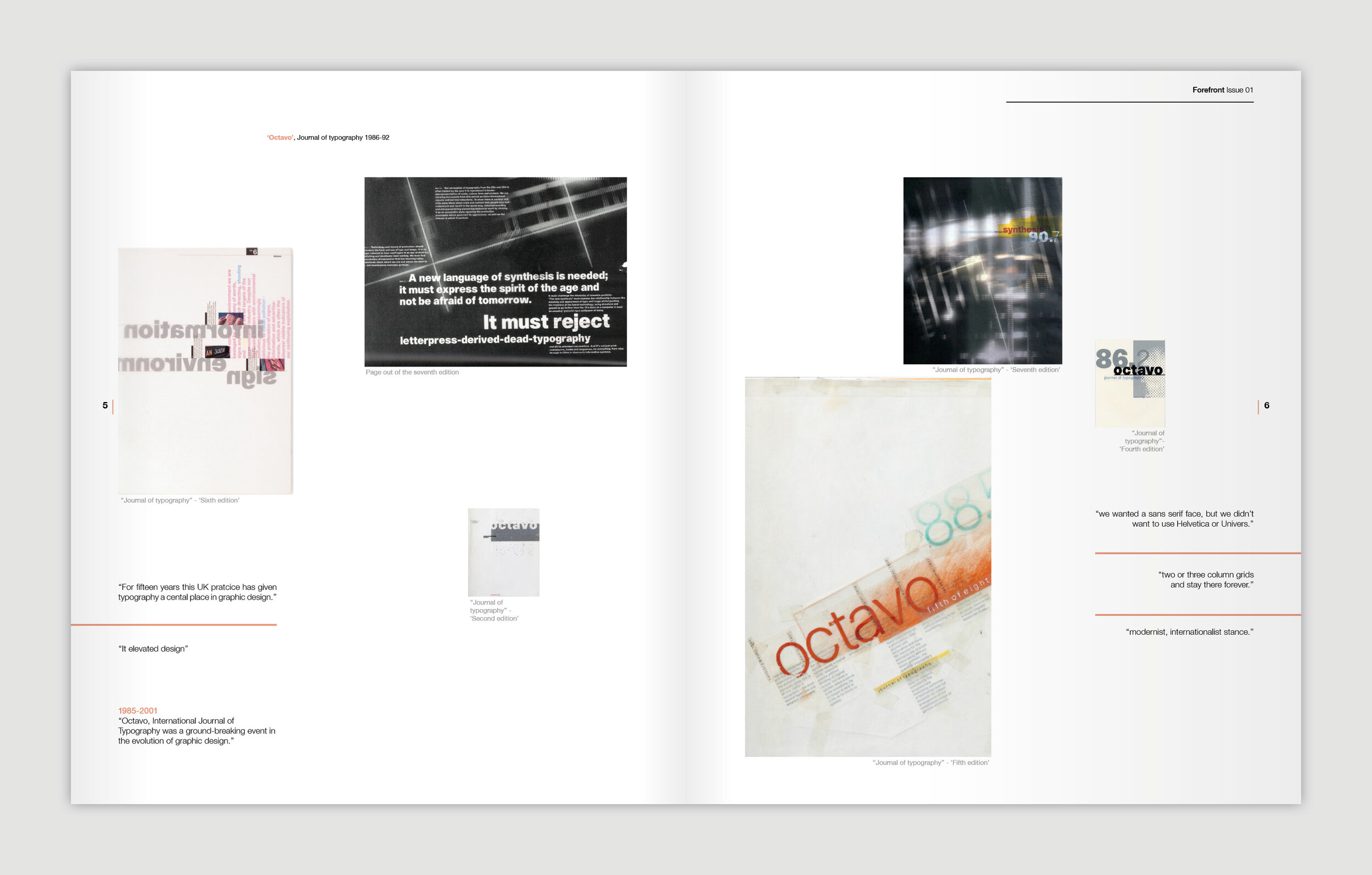
Design Week – Exhibition Posters
/Over the last four weeks graphic design first years have been tackling what staff thought might be a designer's dream brief…
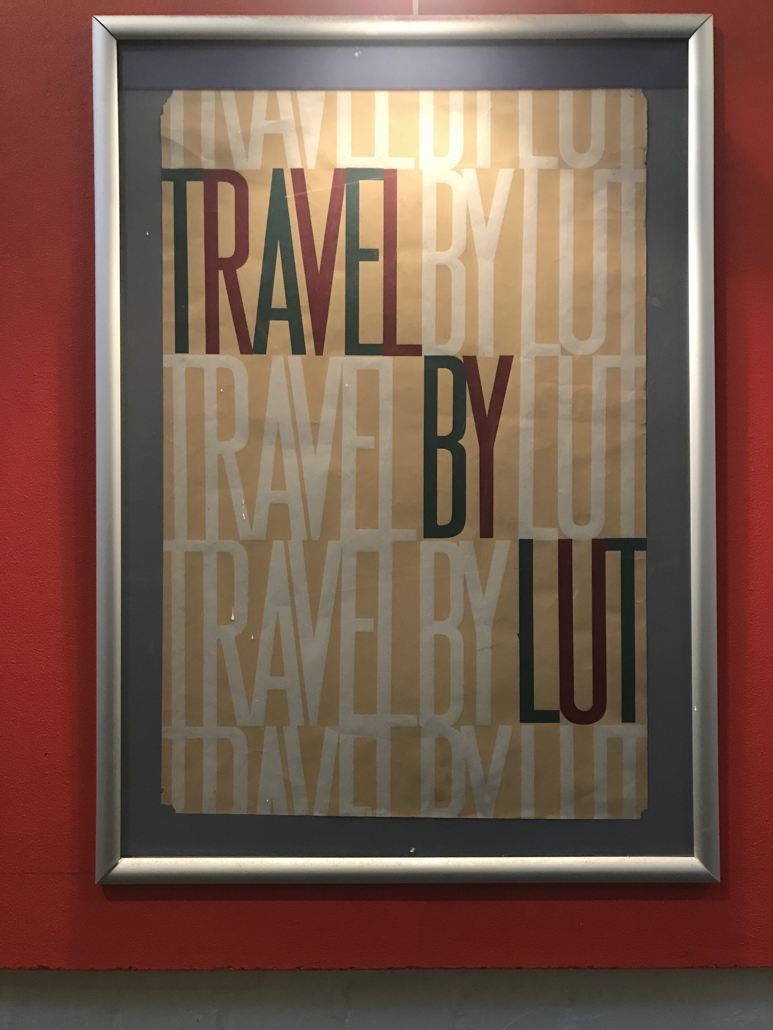
Client: Design Museum
Brief: Name an upcoming exhibition and design the accompanying poster
Production: Two colour screen print only
The students chose a designer from outside the world of graphic design, and researched them through new channels such as Netflix and iPlayer, as well as the traditional channels of books and print. Distilling their gathered knowledge, the first task was based in copywriting and naming the exhibiton. Using the name(s) as a starting point, the second task was to create an image to counterbalance the copywriting and make a creative connection. The restriction of colours amplified the focus on the idea, and consideration to the overall layout and its impact.
Below are example colour proofs from the final crit which are yet to be screen printed, but are built around a strong proposition.
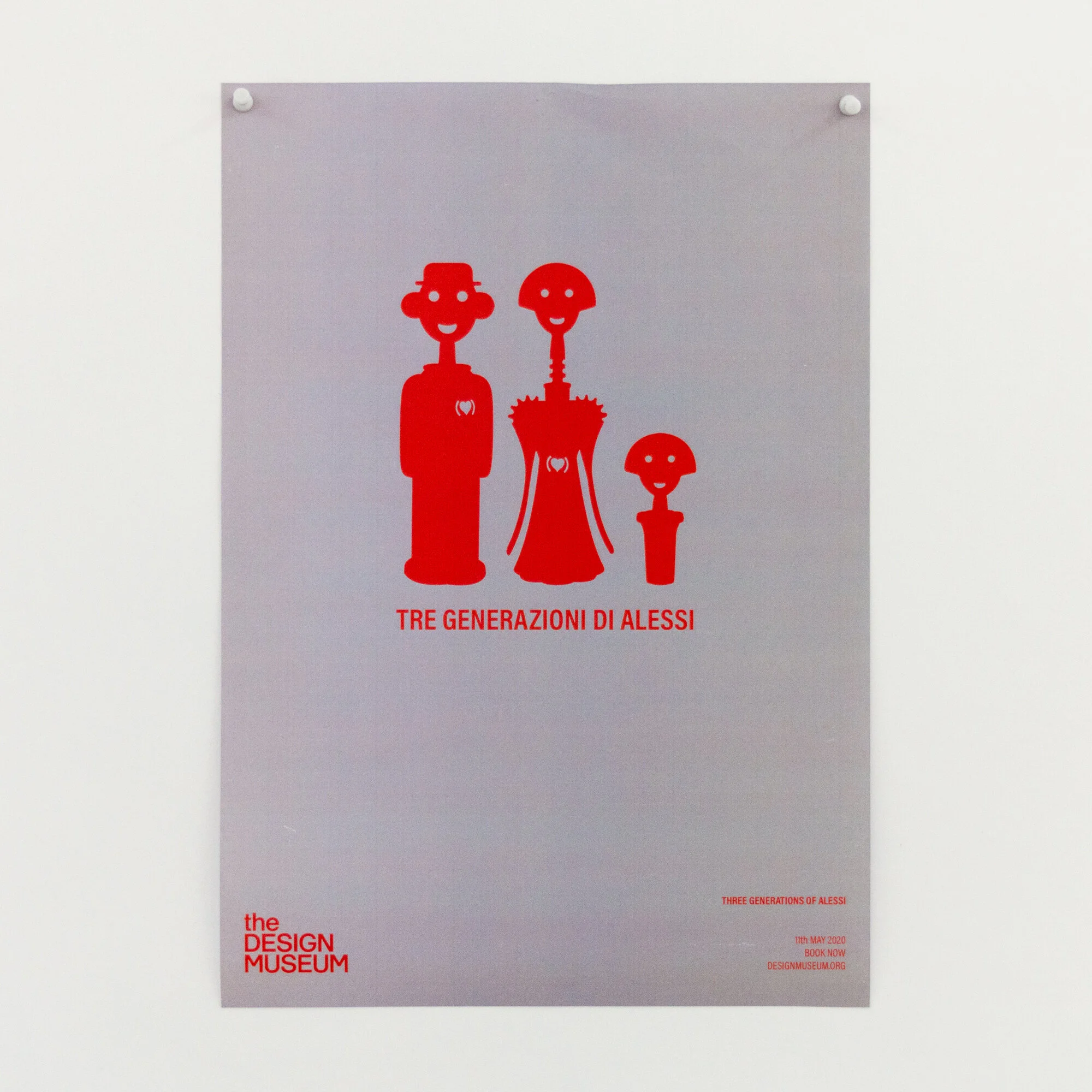
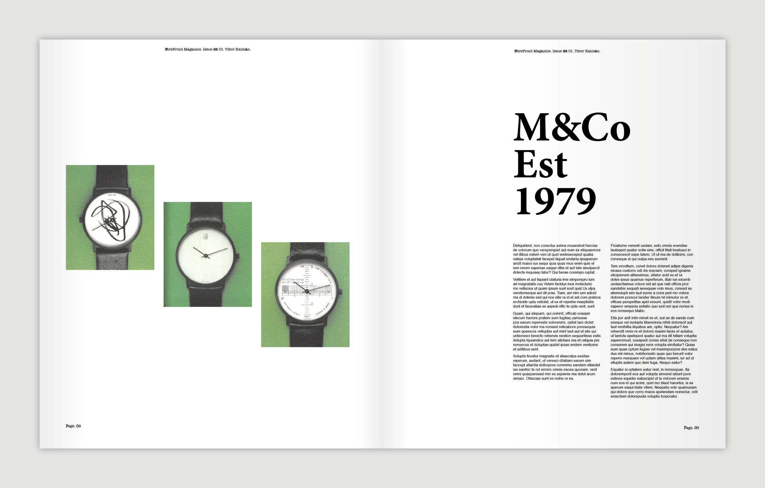
Alessi - Three Generations of Alessi

Robin Day - pioneer of the modern day

Dieter Rams - Less is Better

Ferrari - Rosso Corsa, celebrating the colour of Ferrari

Habitat - Lighting up designer living

Jonathan Ive - iVe

Christian Louboutin - A Closer Look

Paul Smith - One Man Brand
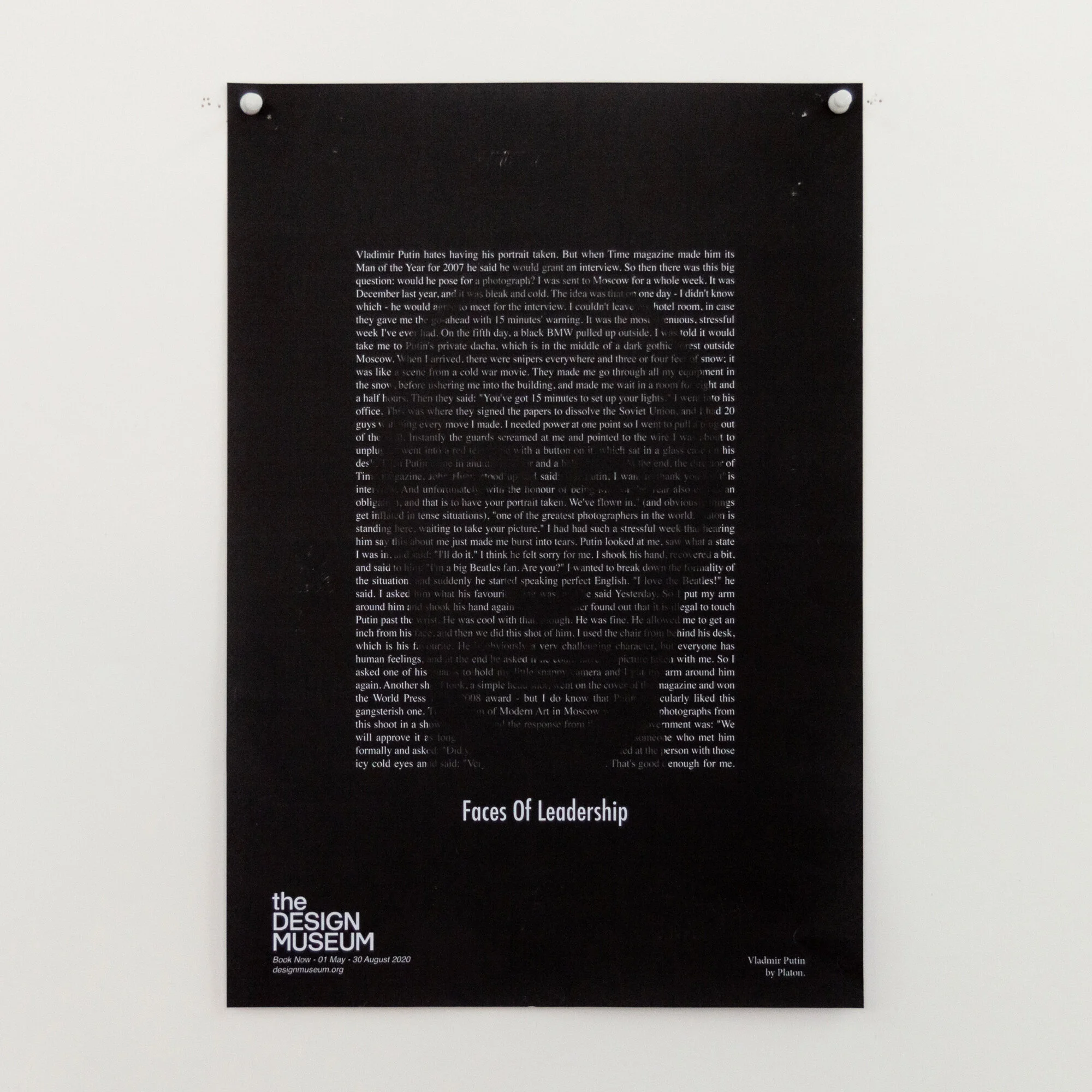
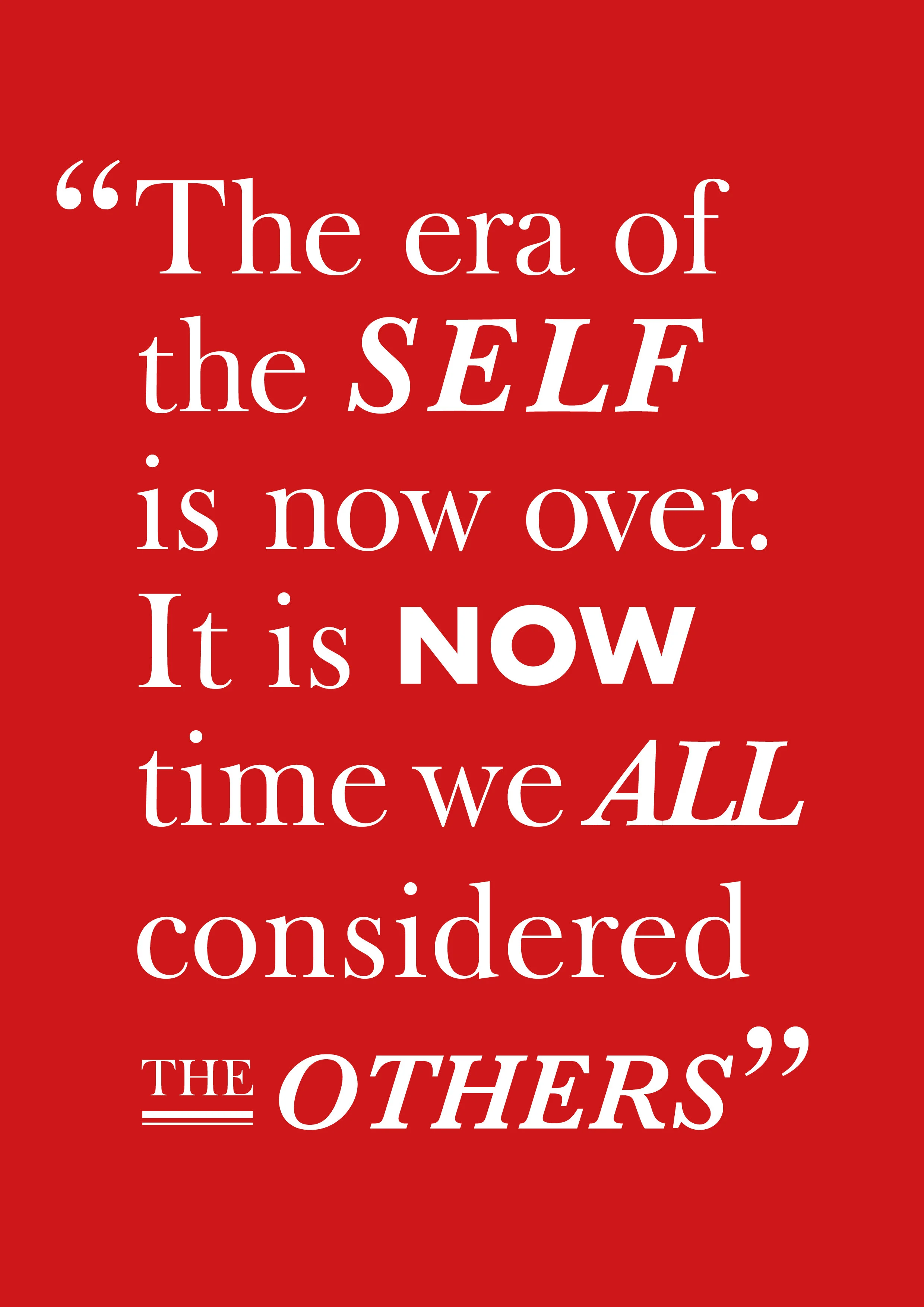
Platon - Faces of Power

Platon - Shot in Black & White
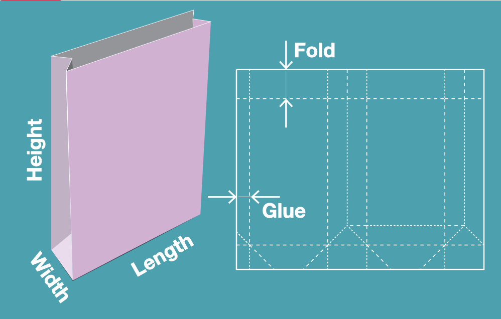
Resource Klaxon: Packaging Nets
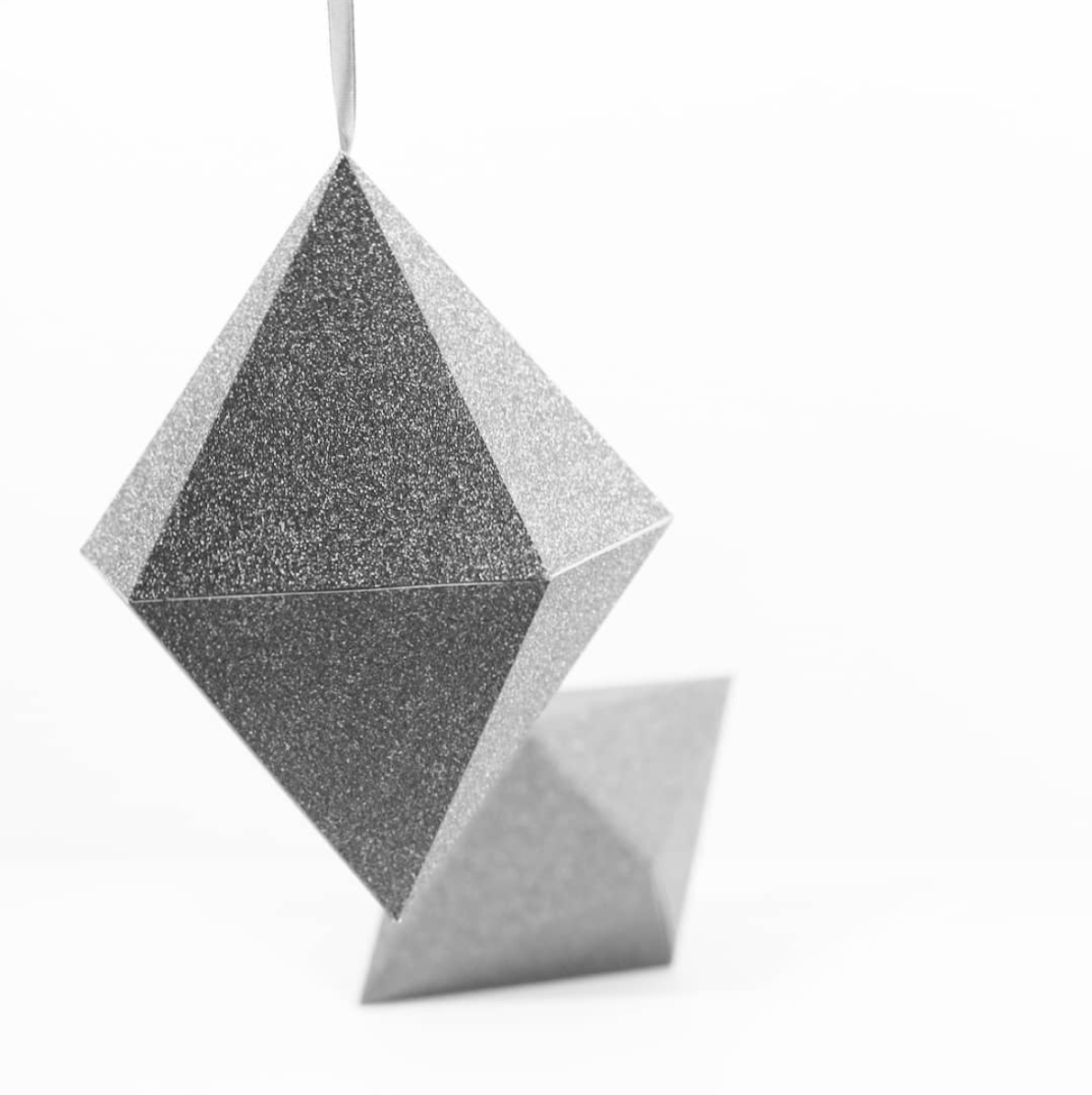
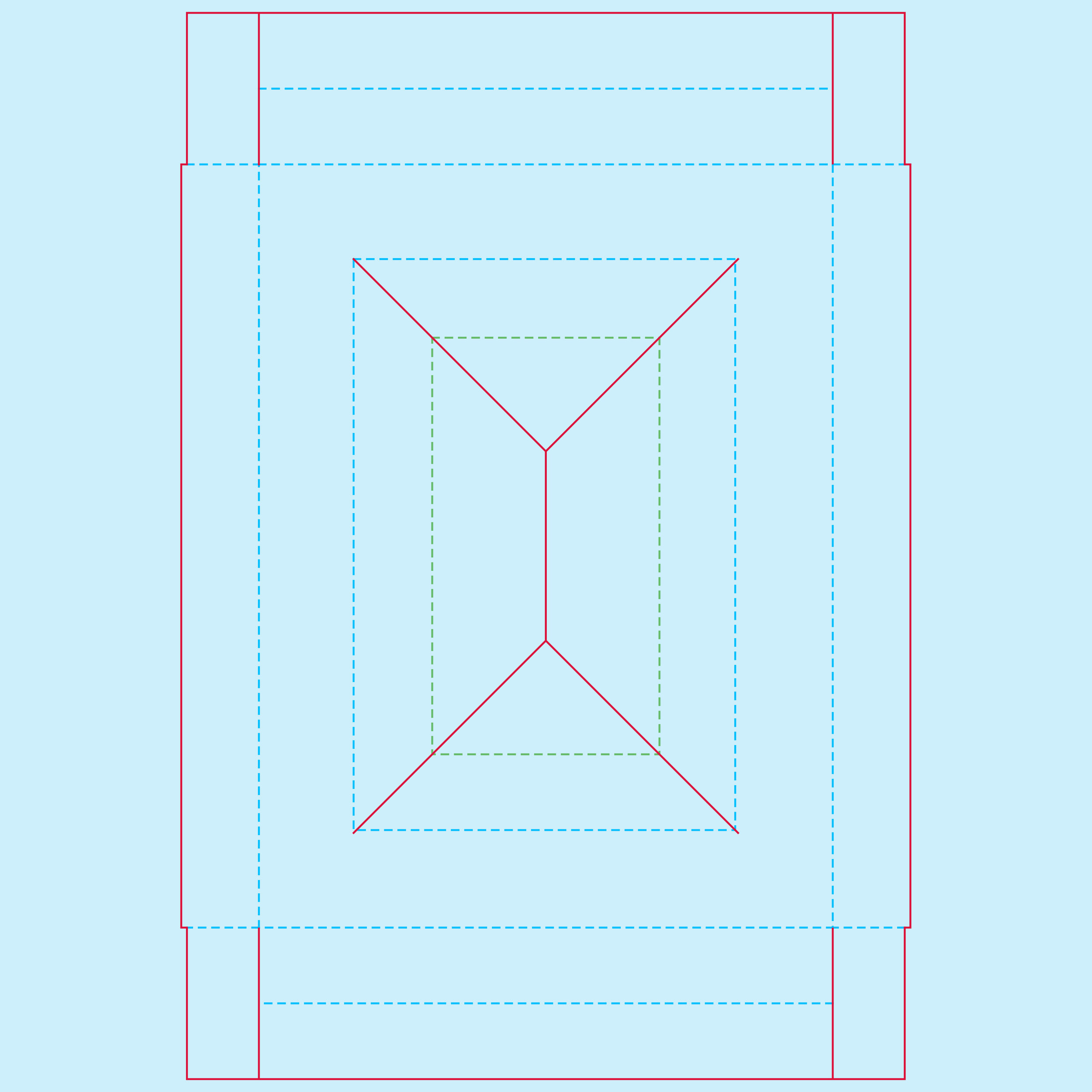
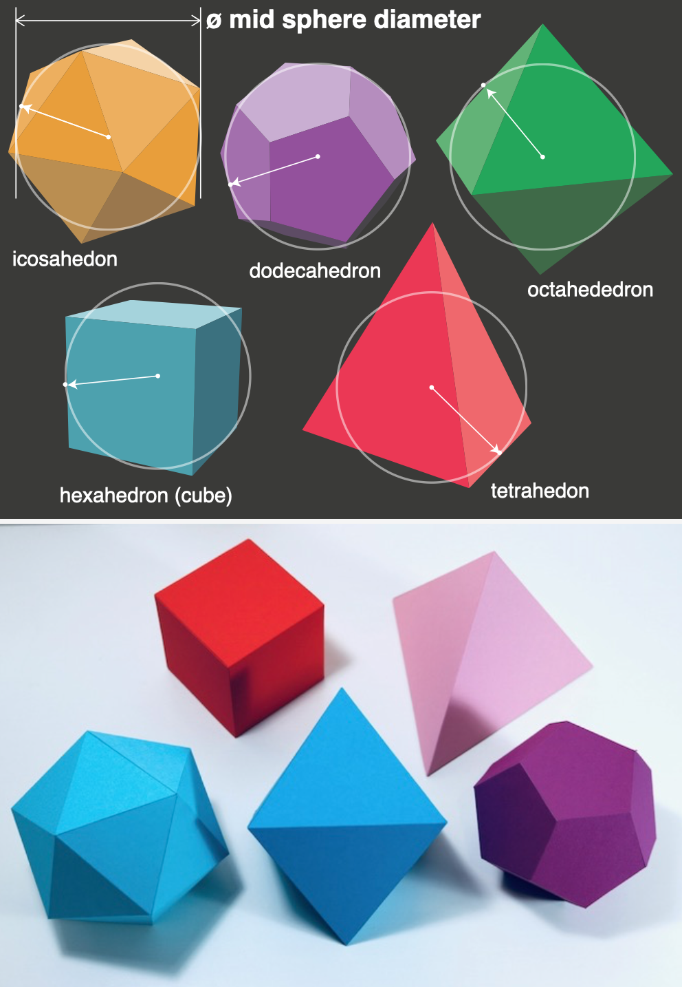
/Templatemaker is a really useful site I happened across whilst researching custom packaging for the recently published Words of Wisdom.
On it are a huge range of templates, from basic stuff like a matchbox, mail box, through to more complex items like spheres and a variety of polyhedra. If free vector nets aren’t enough, the really nice part is that you can input your specific dimensions and it will generate the net bespoke for your needs.
As ever, this kind of resource does not replace an idea. But if you do have an idea, then the template to produce it is more than likely available here.
As a final point the site is run and maintained by one good person in the Netherlands, so acknowledge any help you get and contribute where possible.
487Zero miles from Preston to China
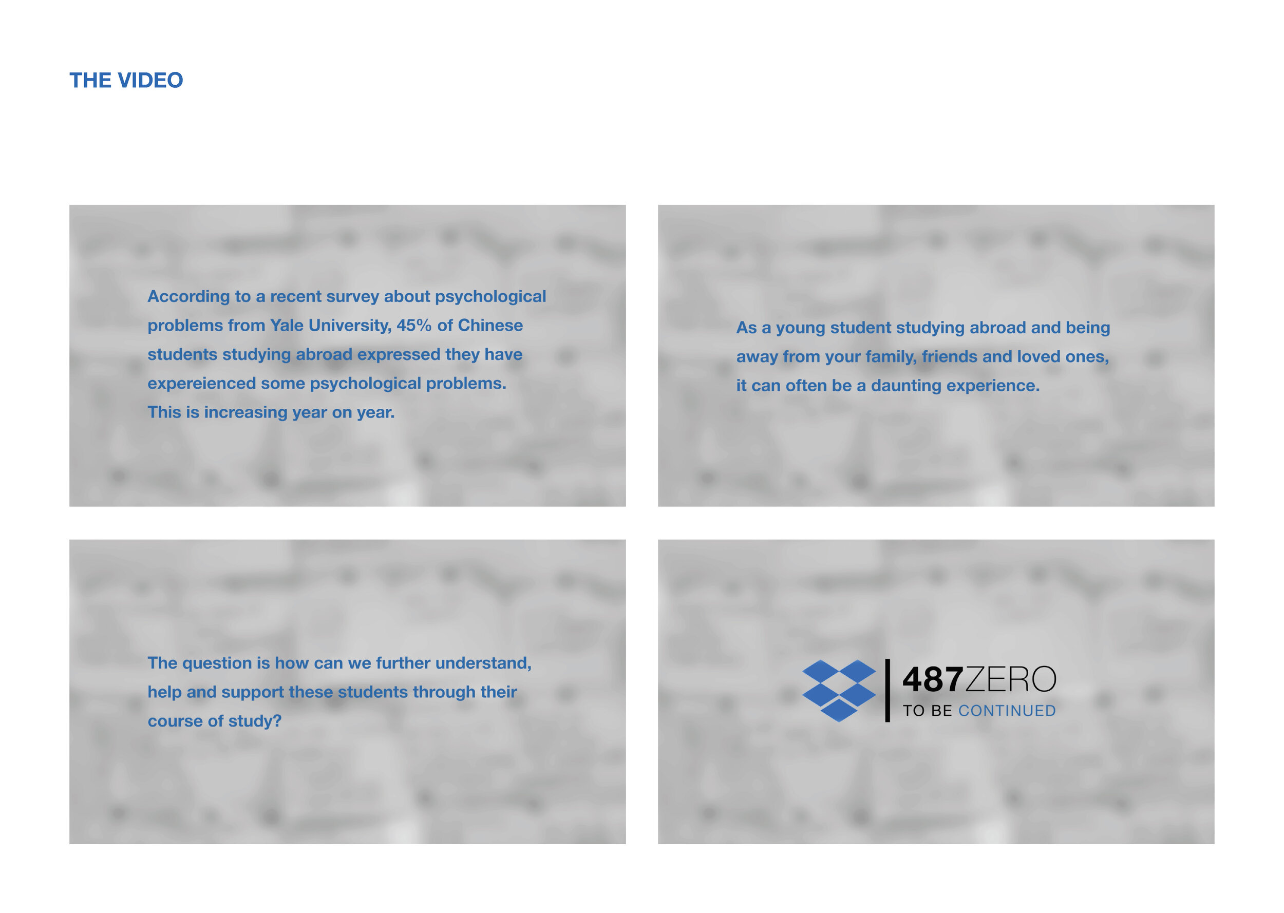
/Here we feature the D&AD pencil winning project, 487Zero miles from Preston to China. Created by Ya Wang in her final year, the project became an exhibition which told the stories of international students studying far from home. Below is the project synopsis, video and presentation slides.
According to the survey about psychological problems from Yale University, 45% of Chinese students studying abroad express they have the psychological problems.
As a young student studying abroad and being away from your family, friends and loved ones, it can often be a daunting experience. Everything you encounter is slightly different and the culture can often seem strange and confusing at times. This is particularly apparent amongst the communities of Chinese students who have travelled 1000s of miles from their homes to study in UK universities.
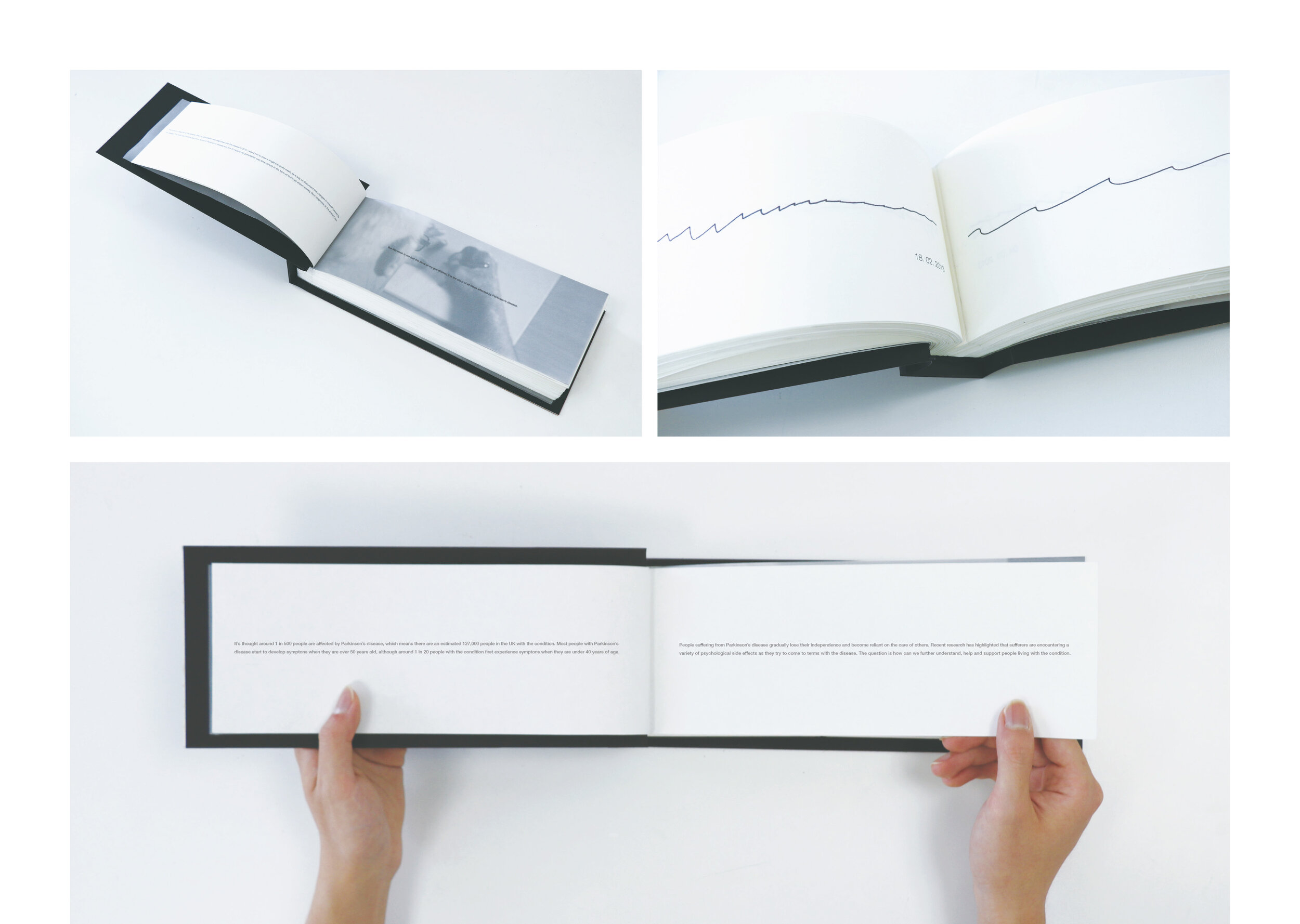
Recent research has highlighted that these students can often suffer from a whole variety of psychological problems and barriers. And it is something that is on the increase year on year. The question is how can we further understand, help and support these students through their course of study?
The 487Zero project is a response to the above problem. We have been asking Chinese students across the UCLan campus, here in Preston, to think about and choose a number of personal possessions, ones that may hold a significant or particular meaning to them.
We then invited these students to collect and document these items through photography, and to share the meanings behind each object. By using the Dropbox Paper digital platform to collate and share them, we were able to create an inclusive community.
The subsequent 487zero exhibition, is the resulting culmination of this project. It is aim to expose the problems, share the experience, and strengthen futu re friendships that currently exist within the Chinese student community across the UCLan Preston campus and hopefully beyond.
This is not the end, but the beginning.


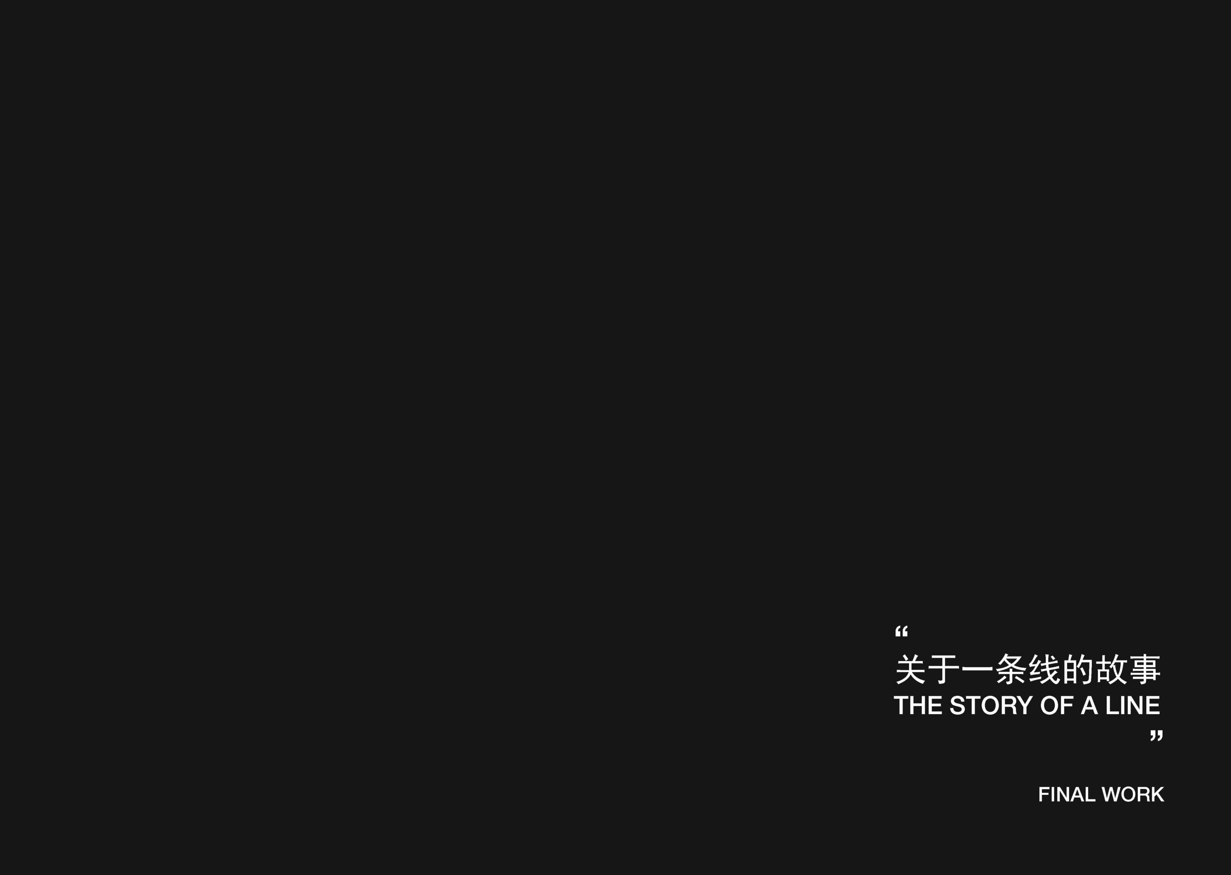
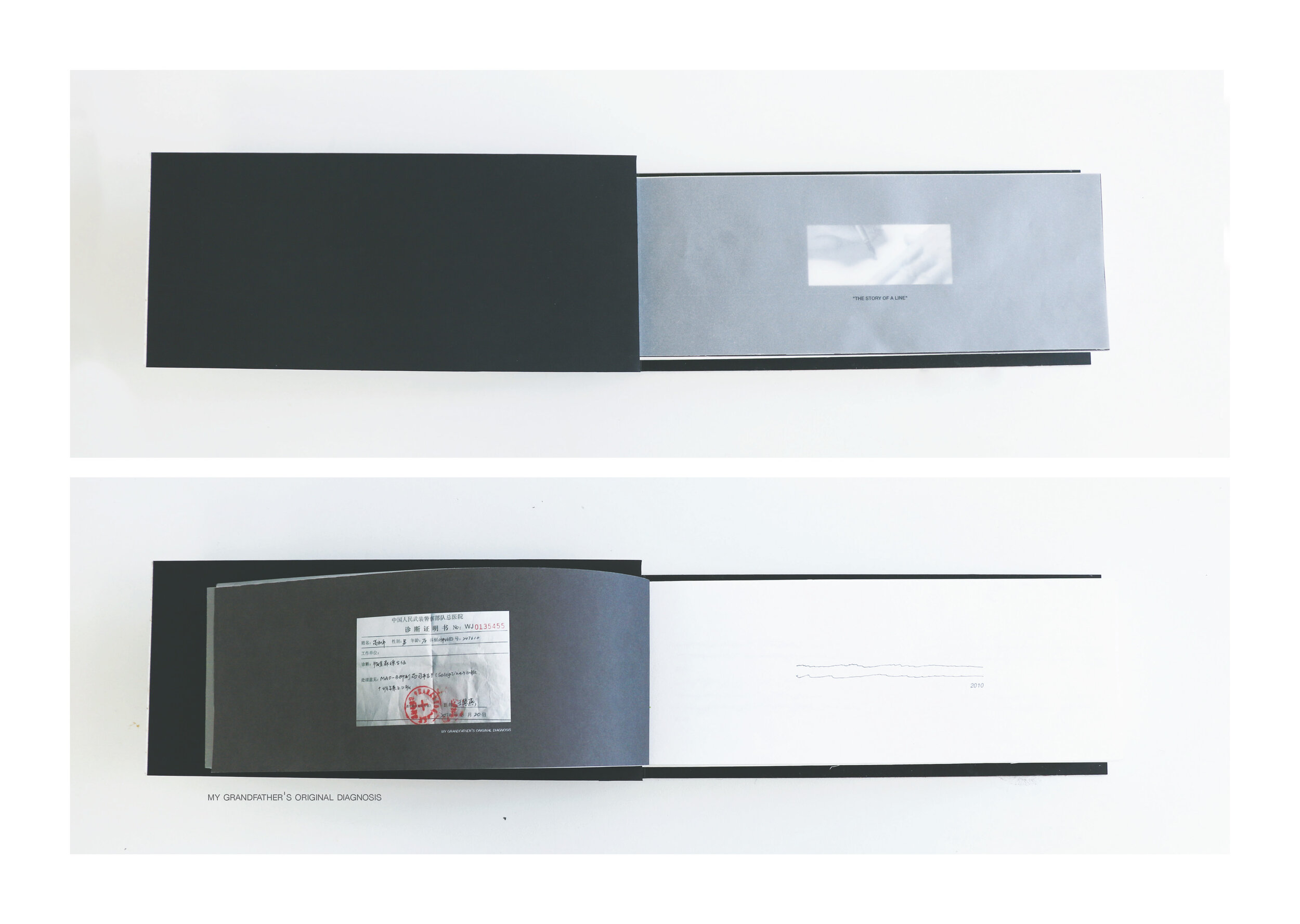
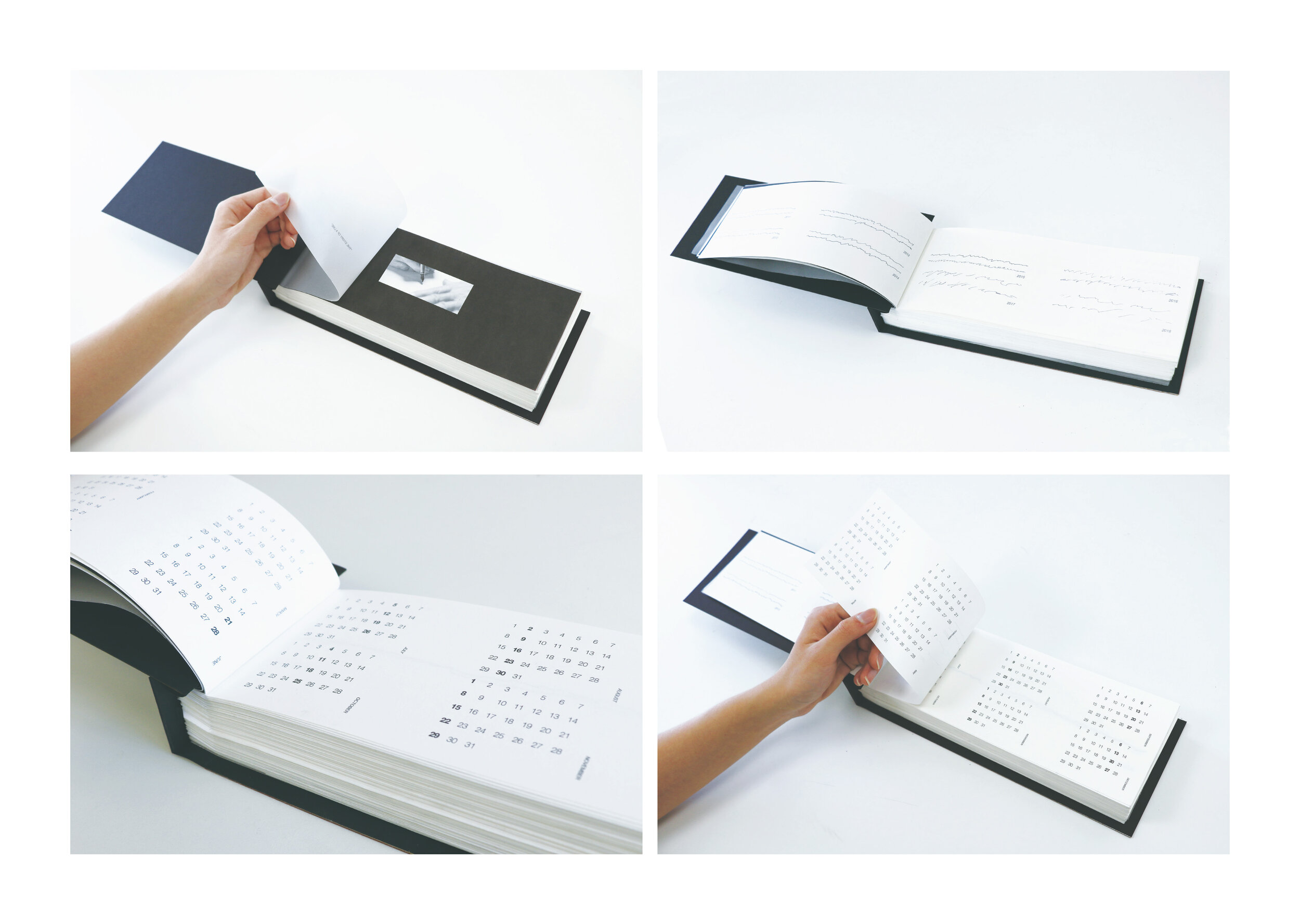
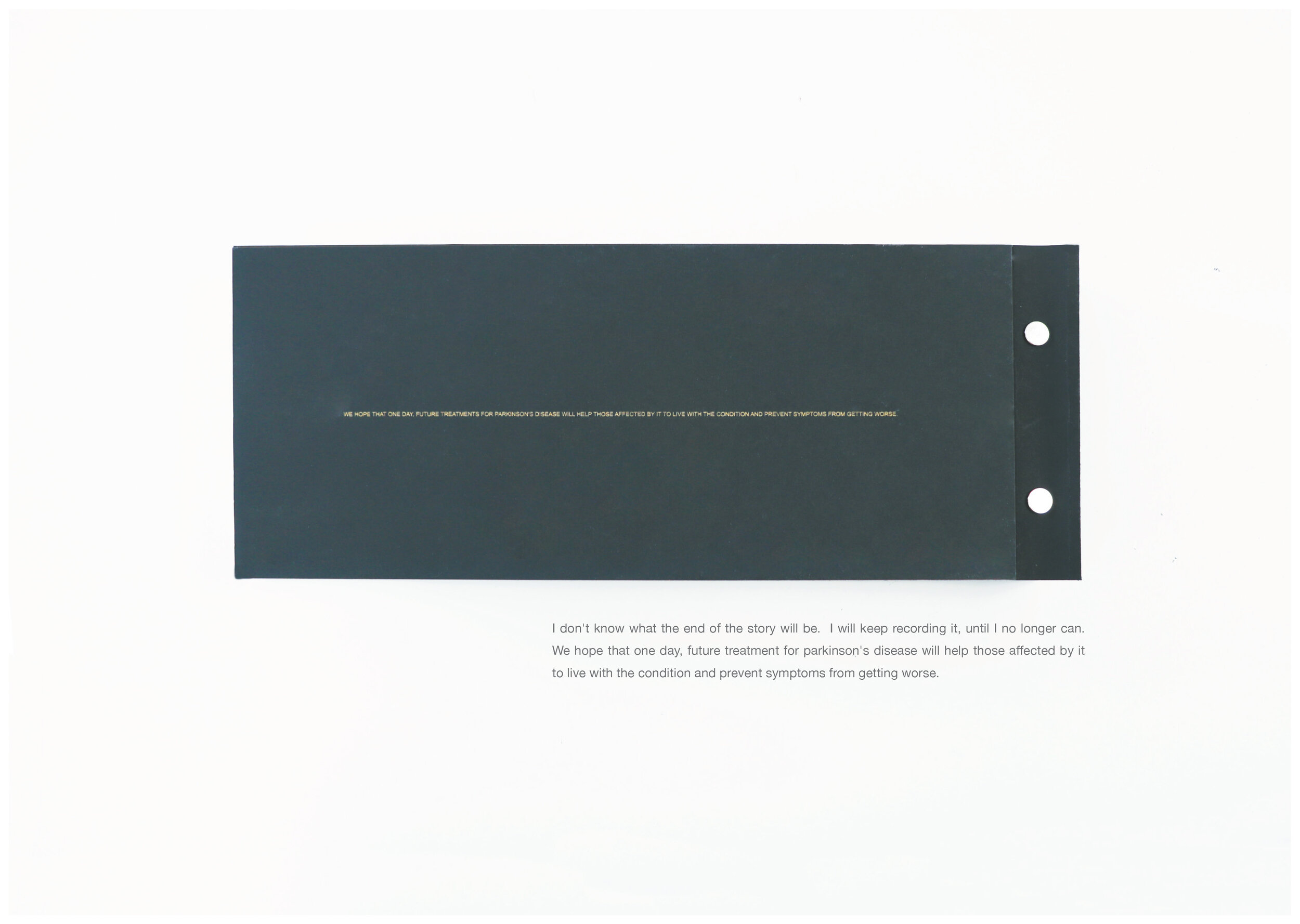
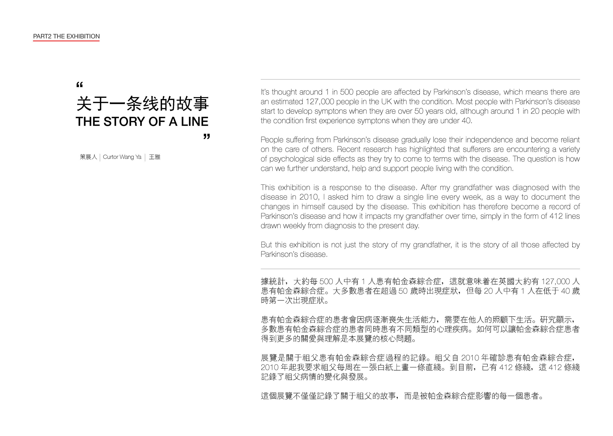
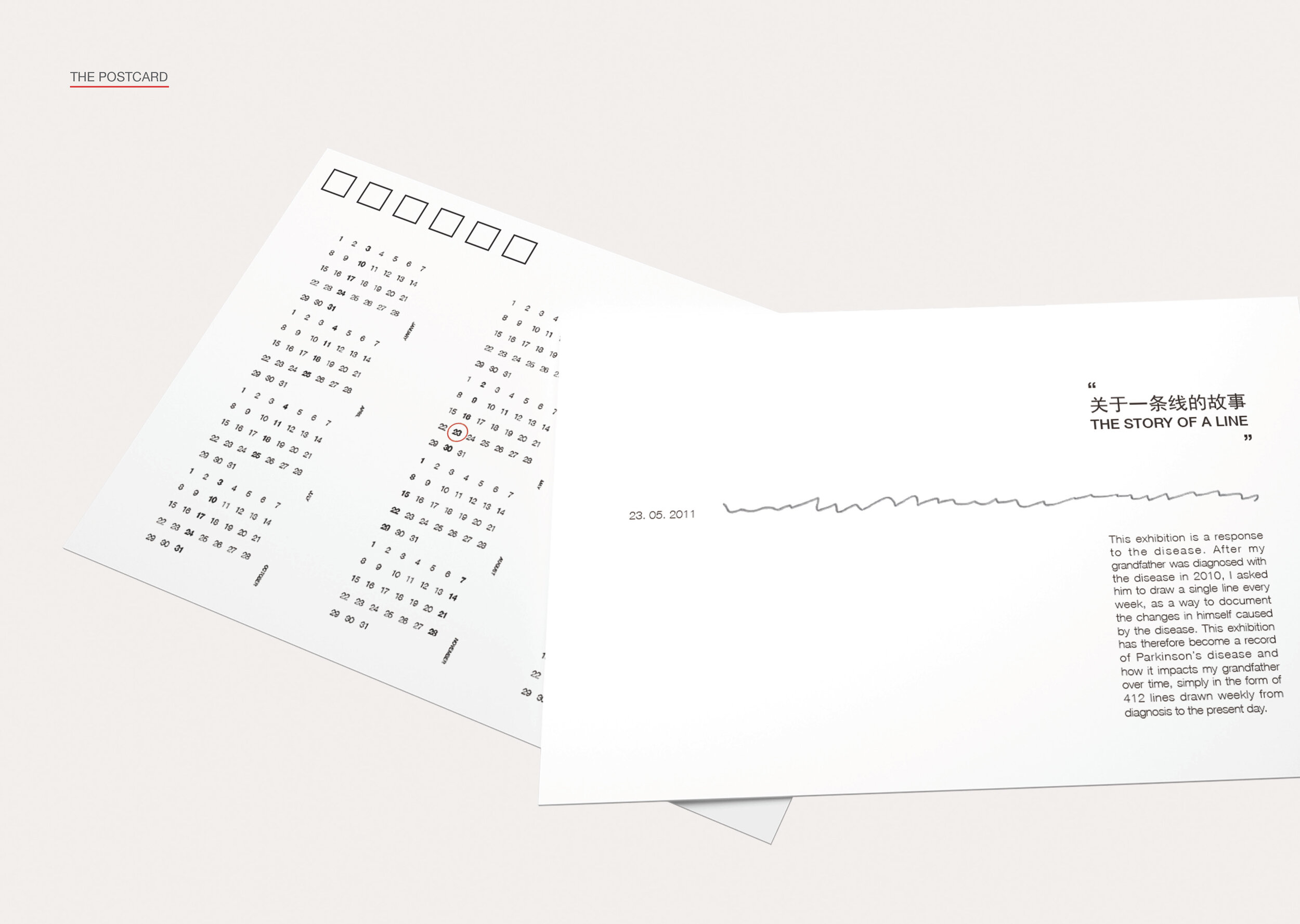
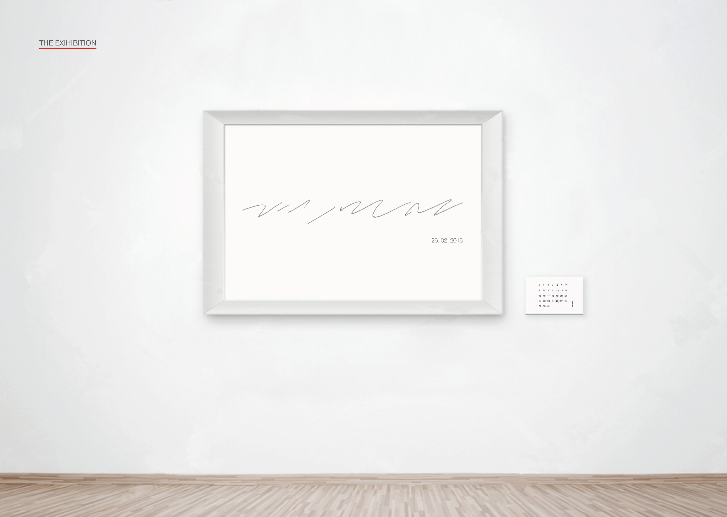
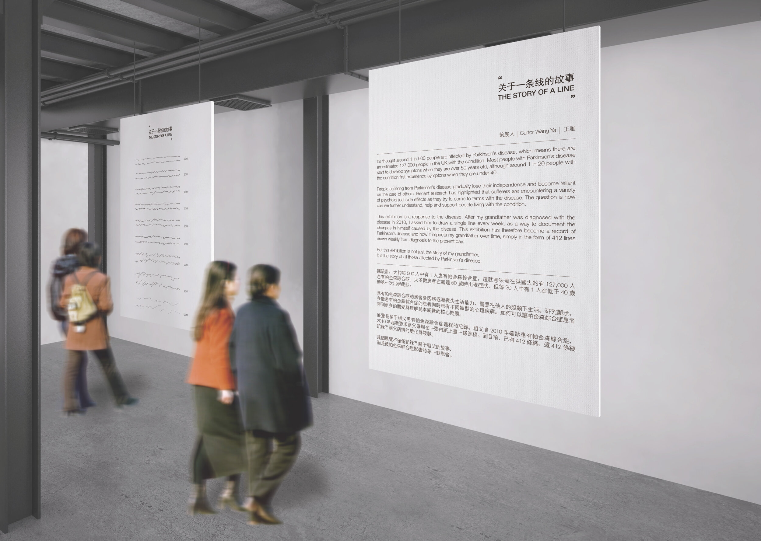
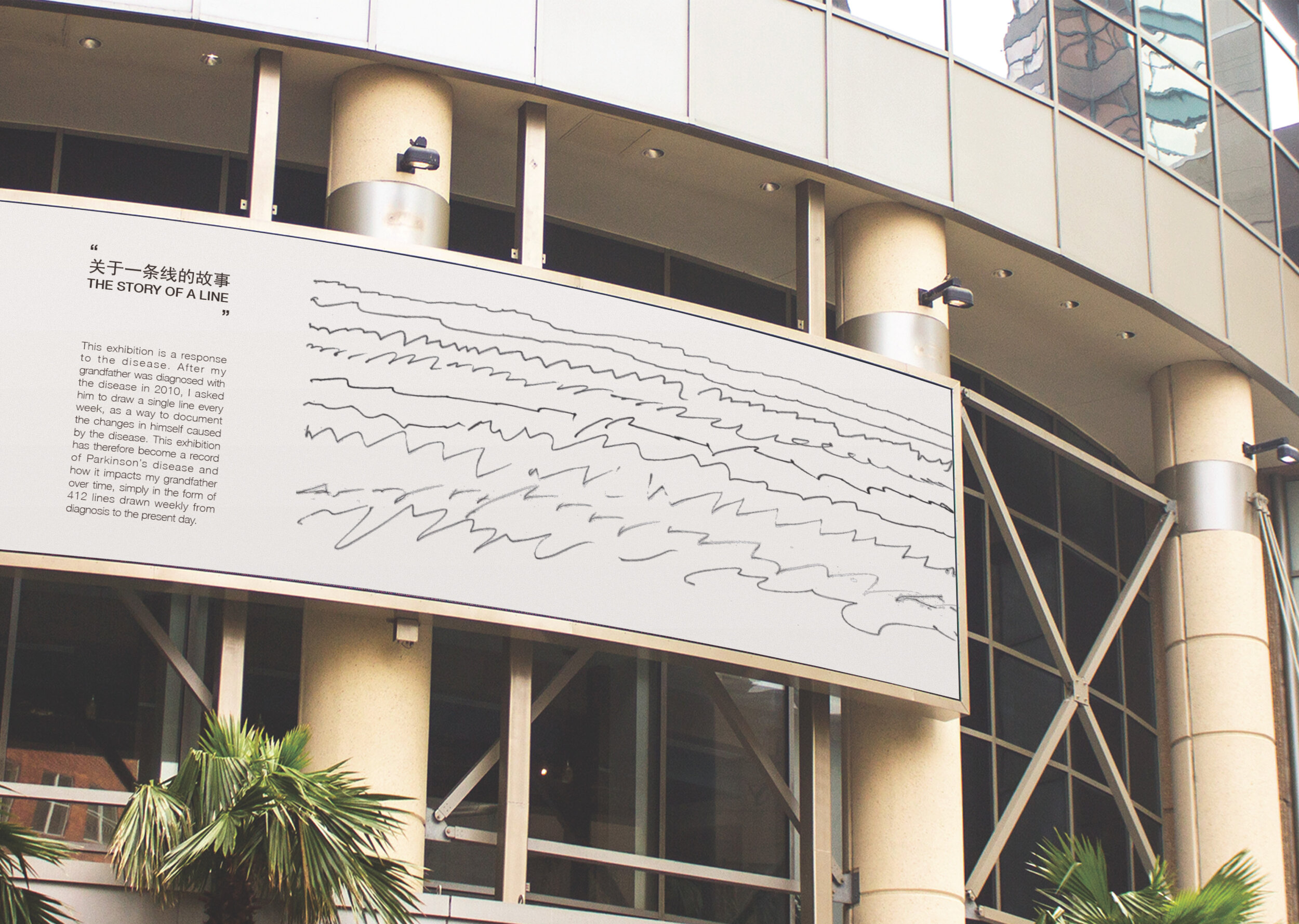
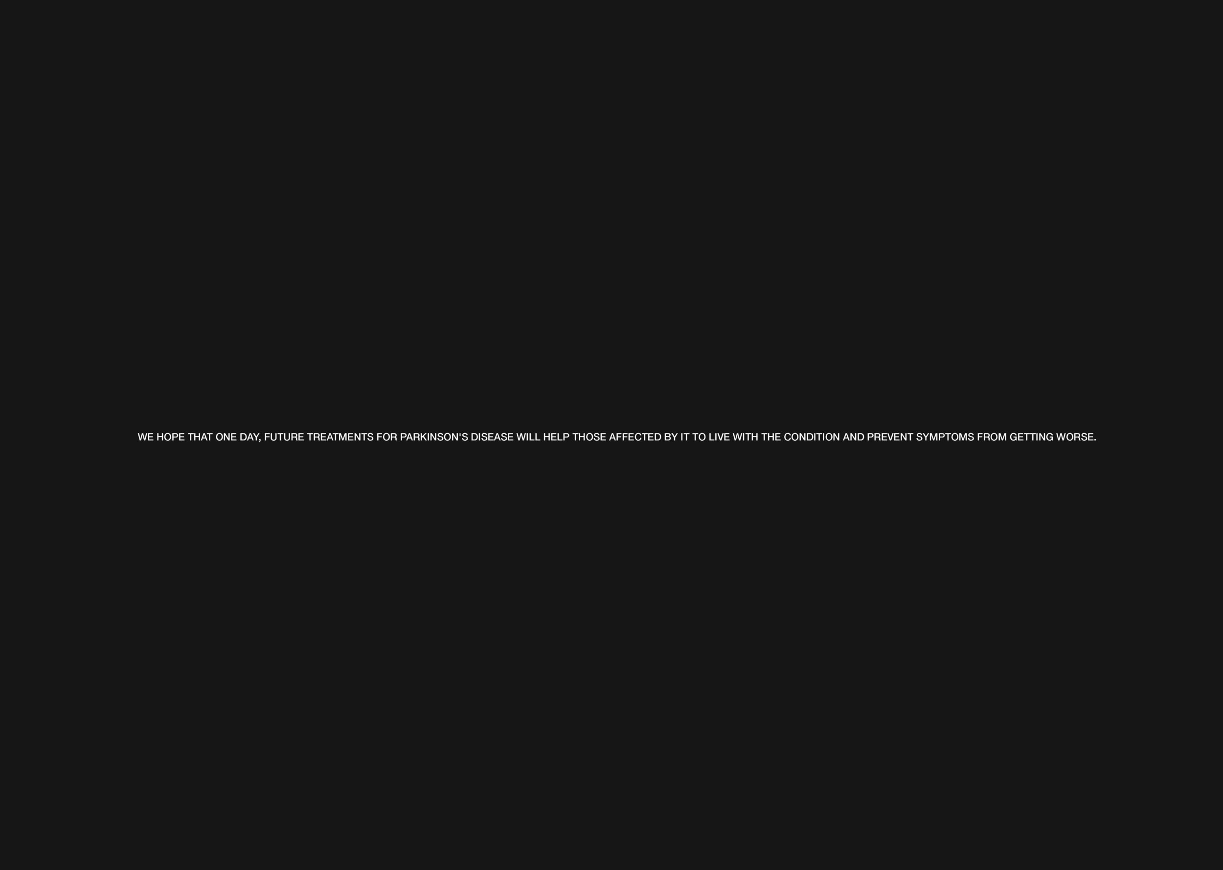
The Story of a Line
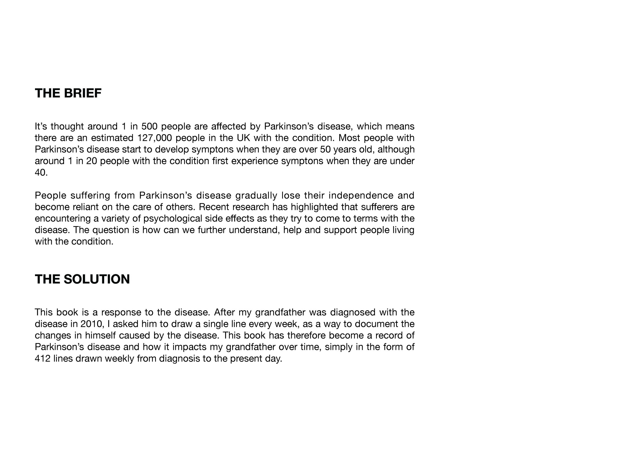
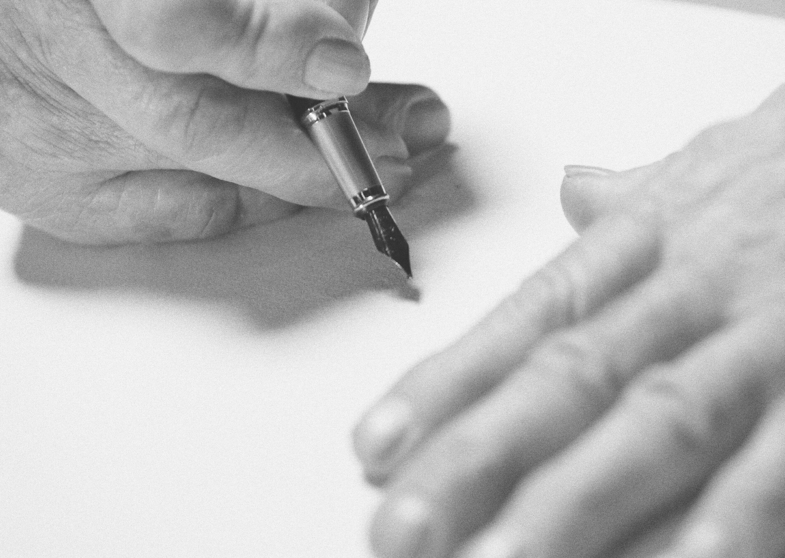
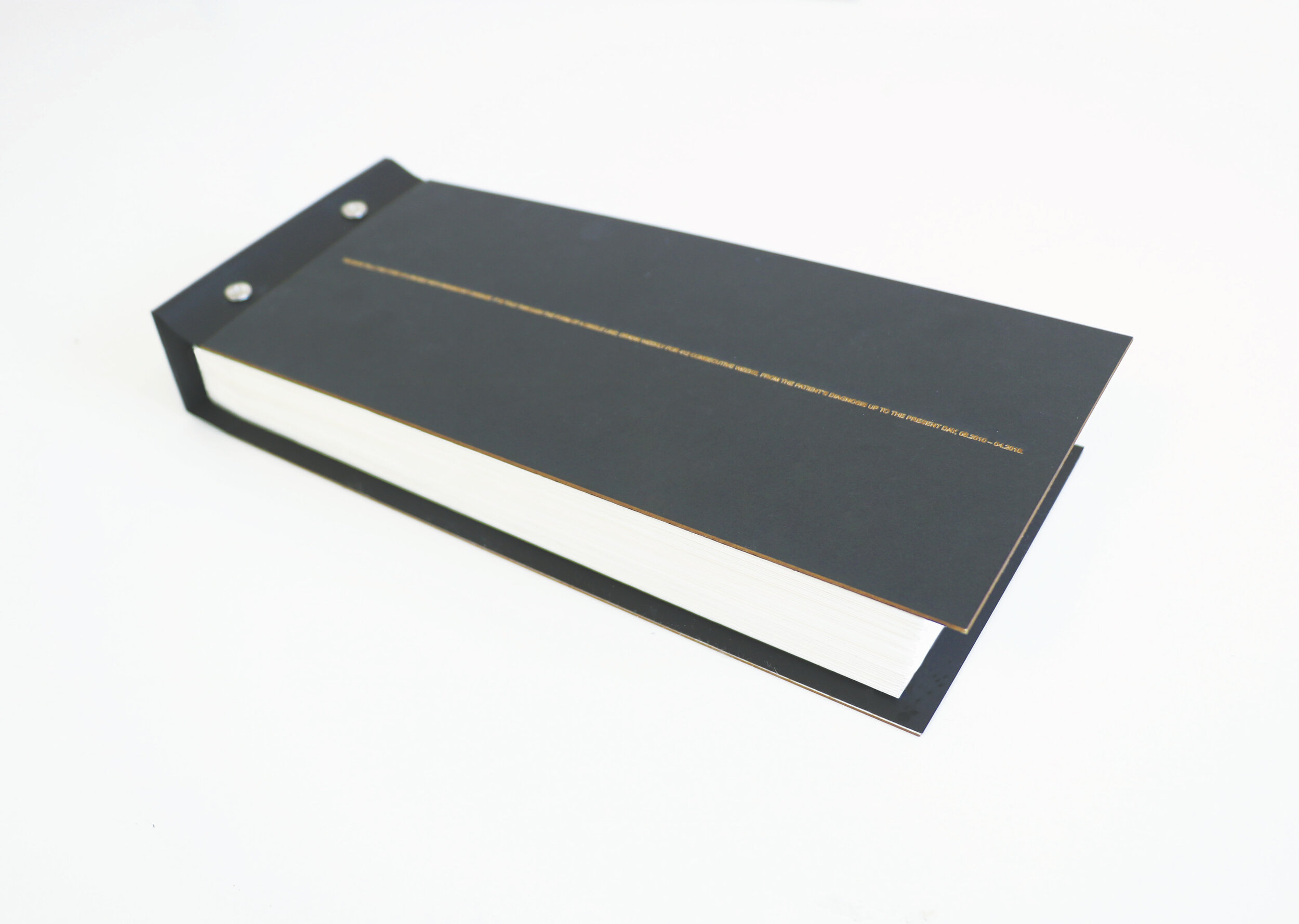
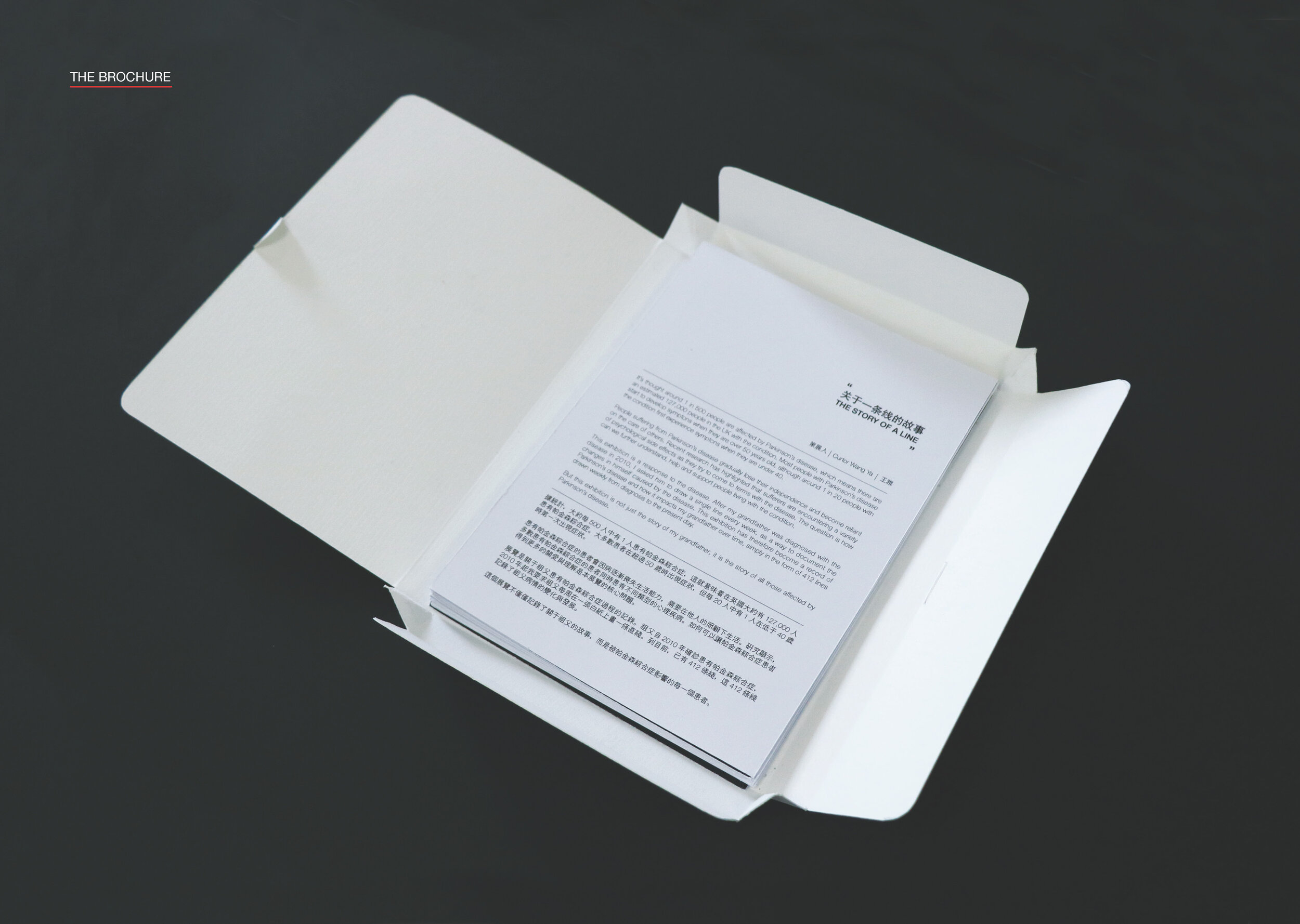
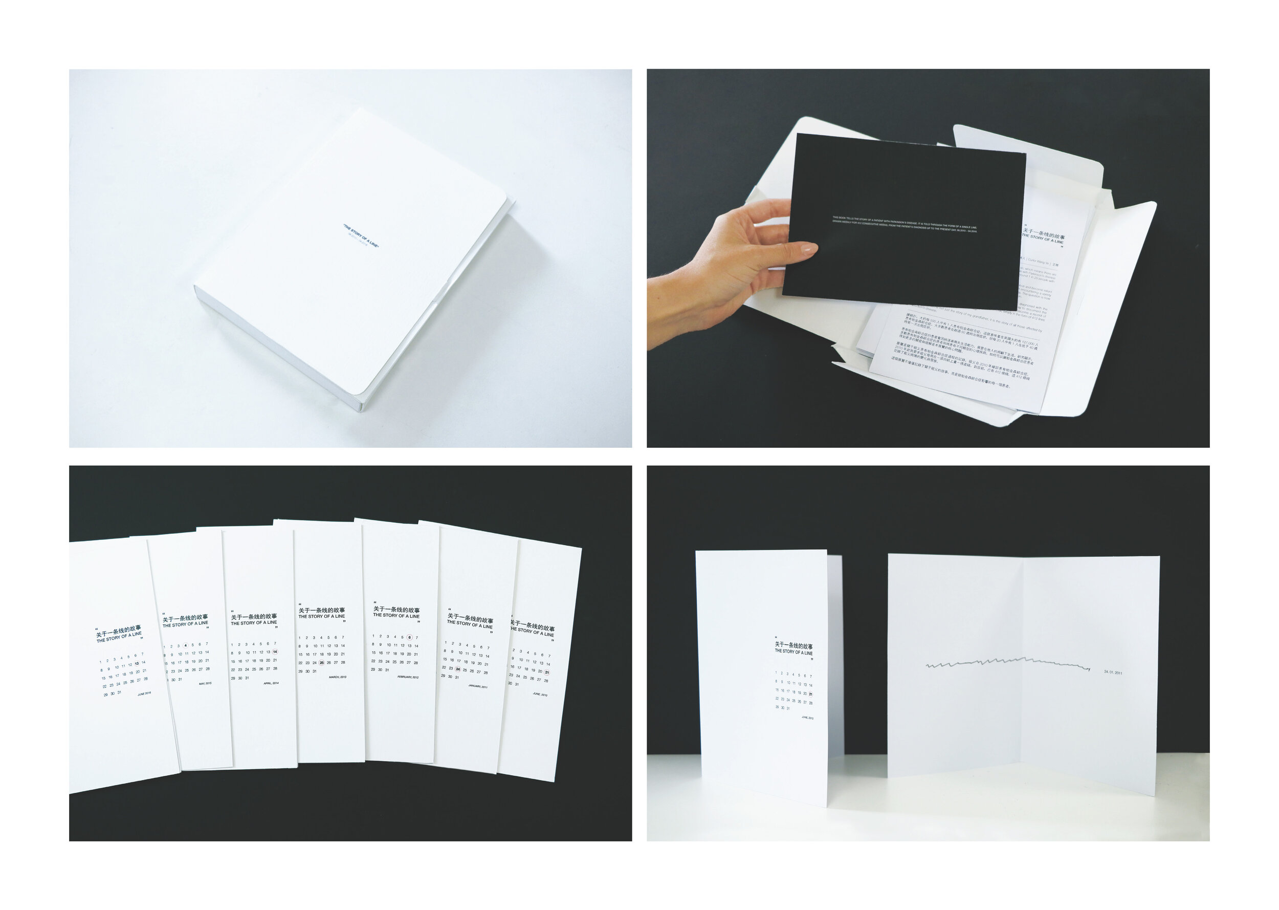
/Here we feature a highly emotive piece of work by Preston graduate Ya Wang (Diana), during her final year on the course. It tells the story of her grandfather who suffers from Parkinson’s Disease and documents the deterioration of his movement and motor skills since his initial diagnosis.
The below slides show the stunning book which was produced as part of the project, binding together the 412 lines Diana’s grandfather had drawn.

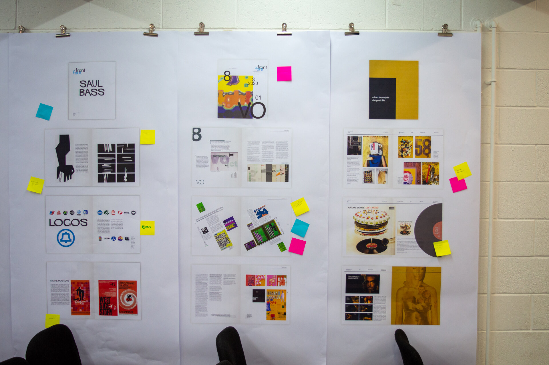
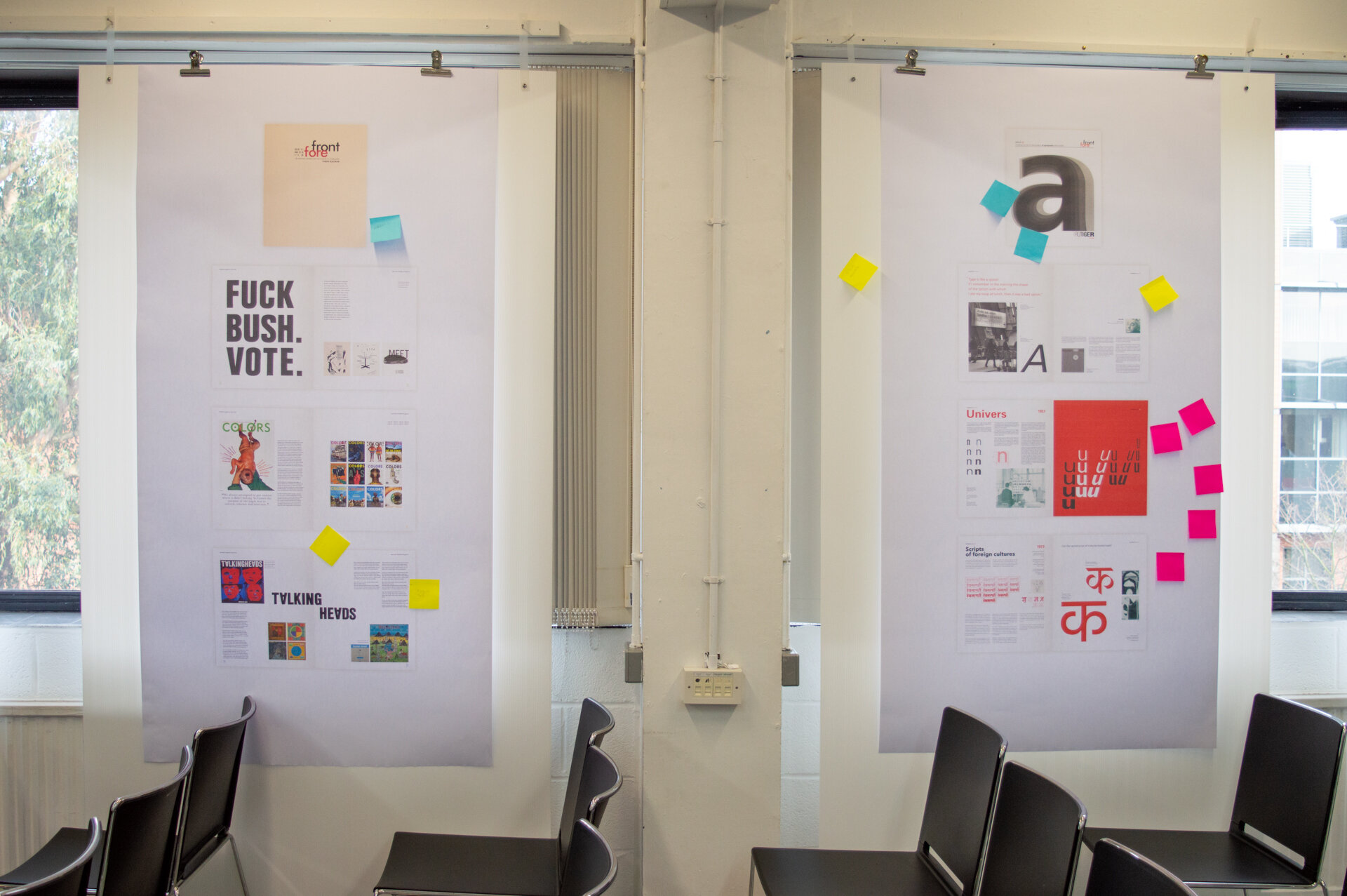
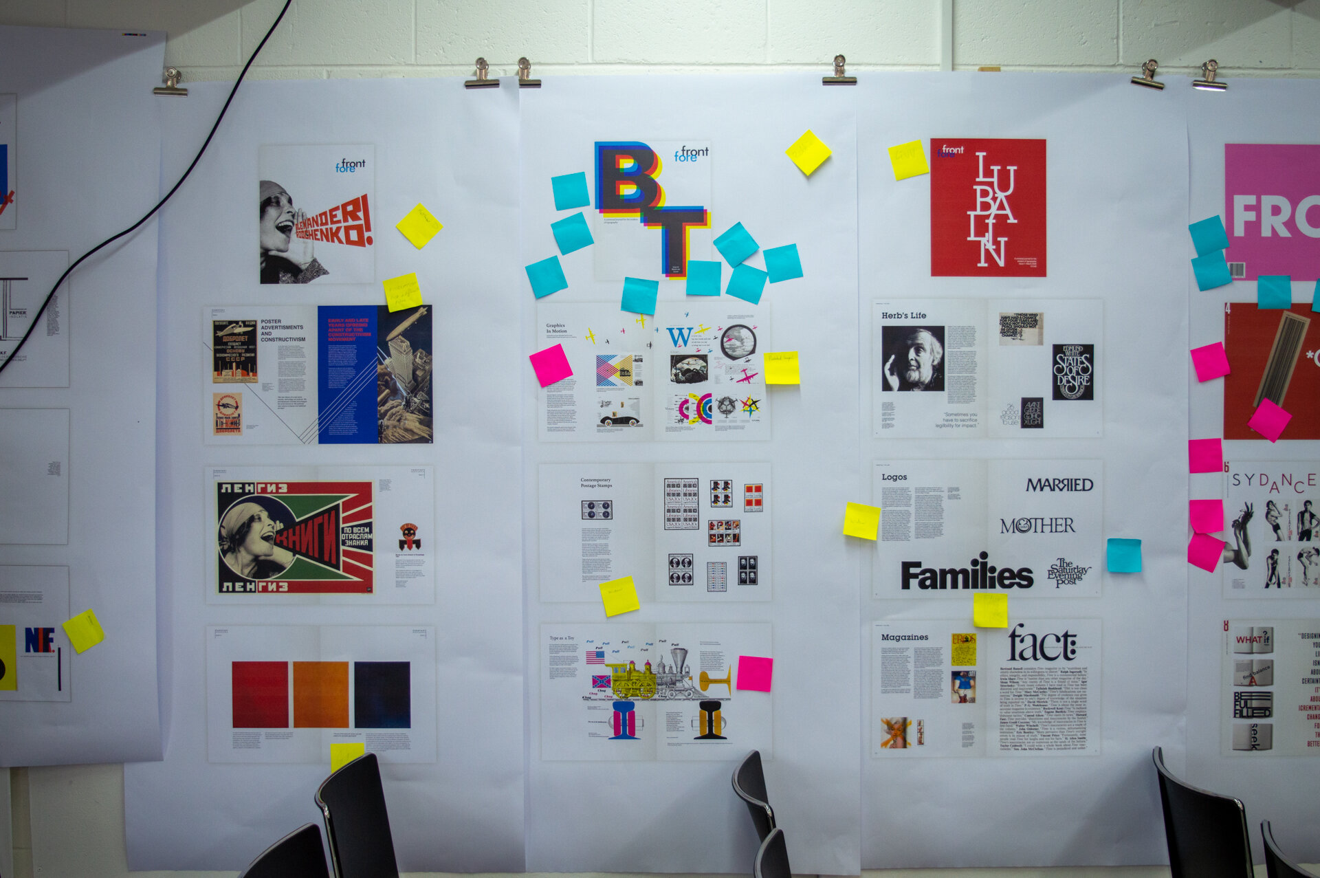
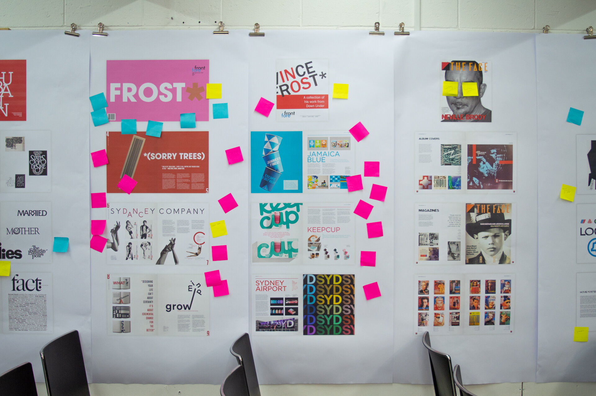
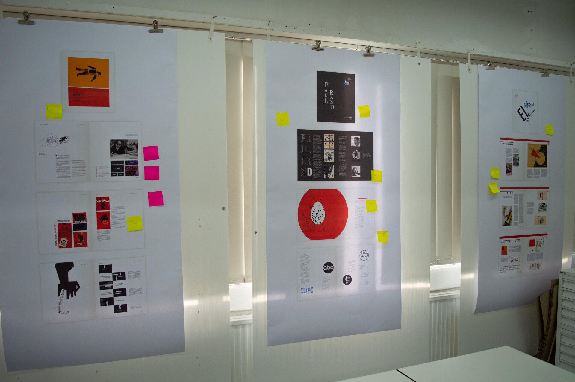
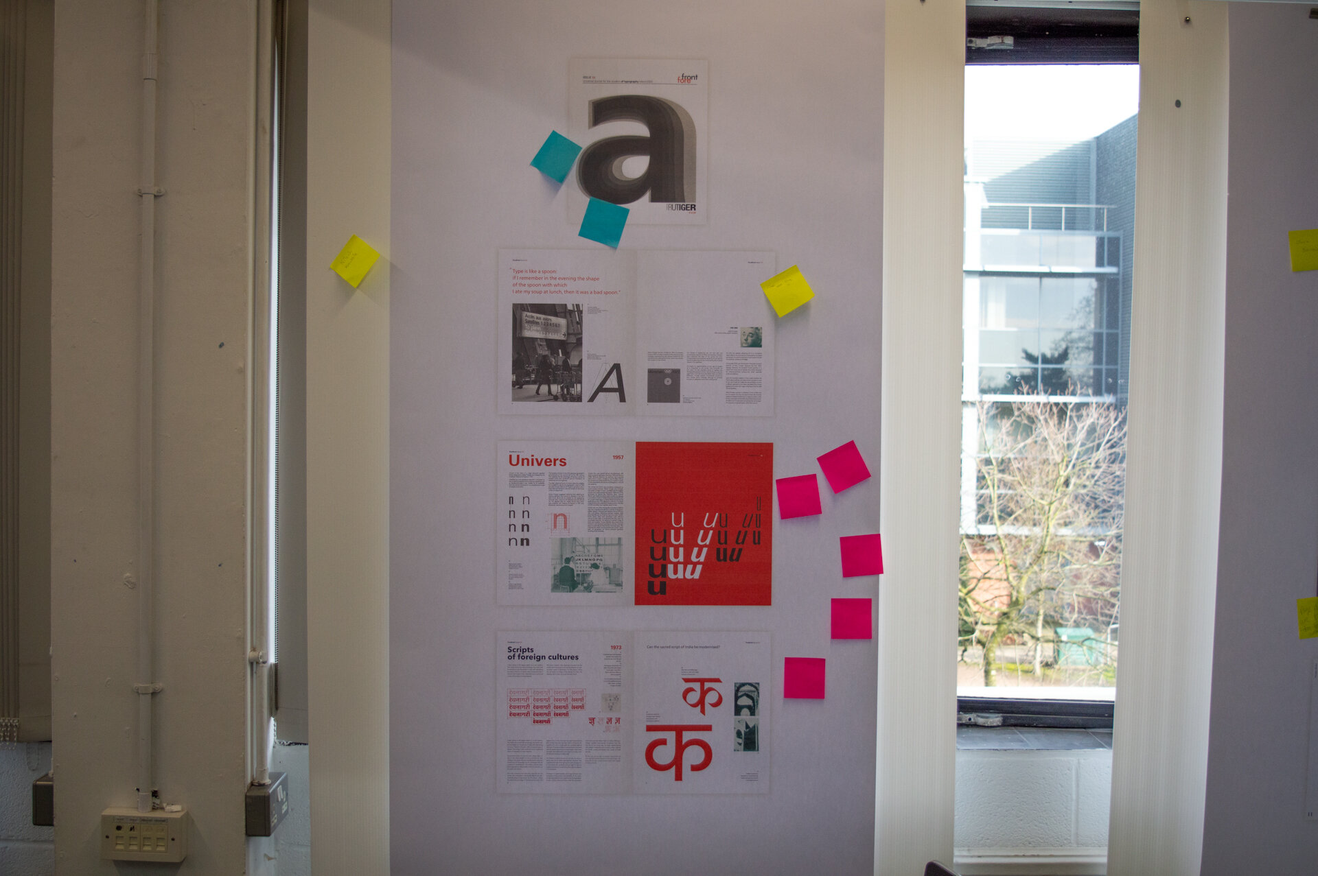
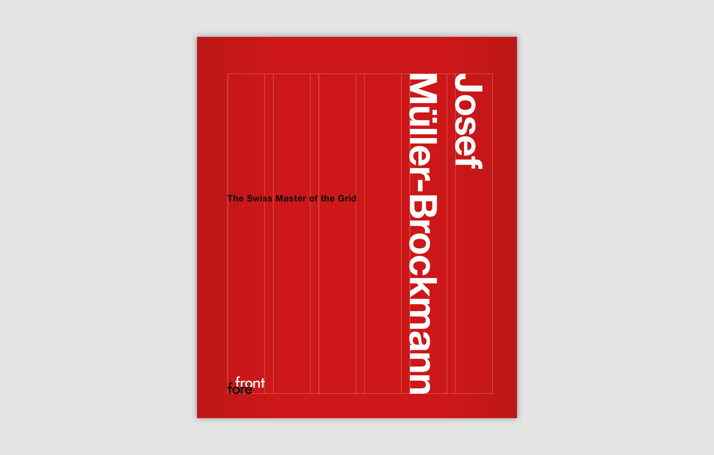
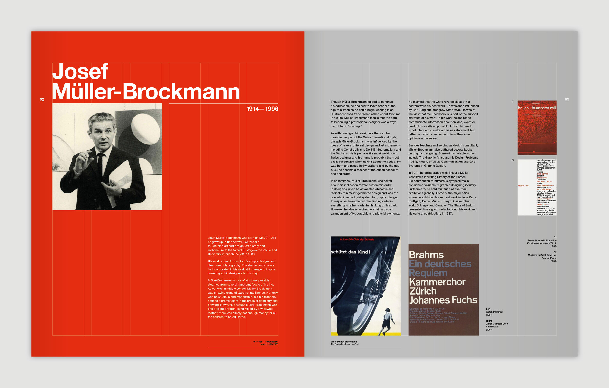
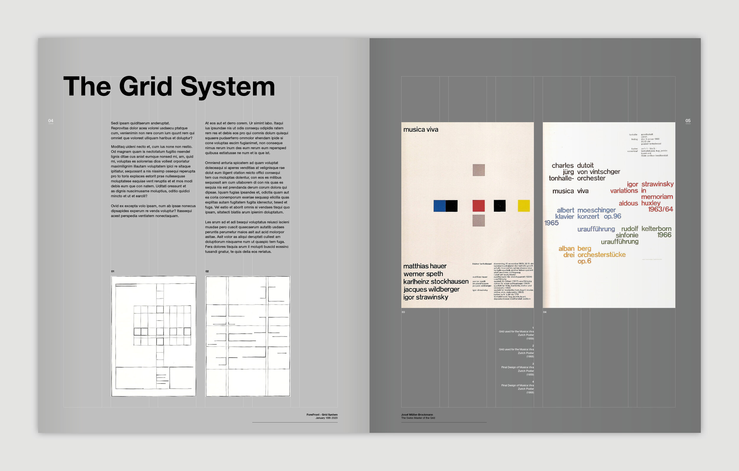
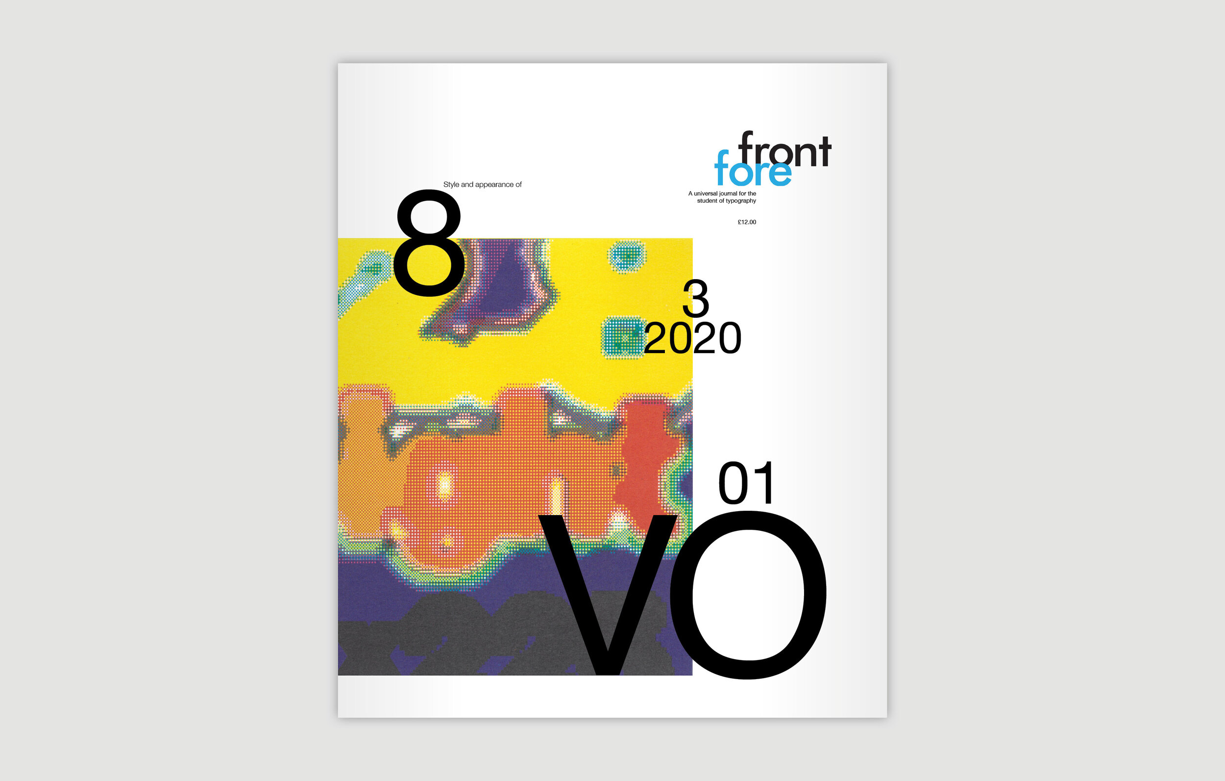
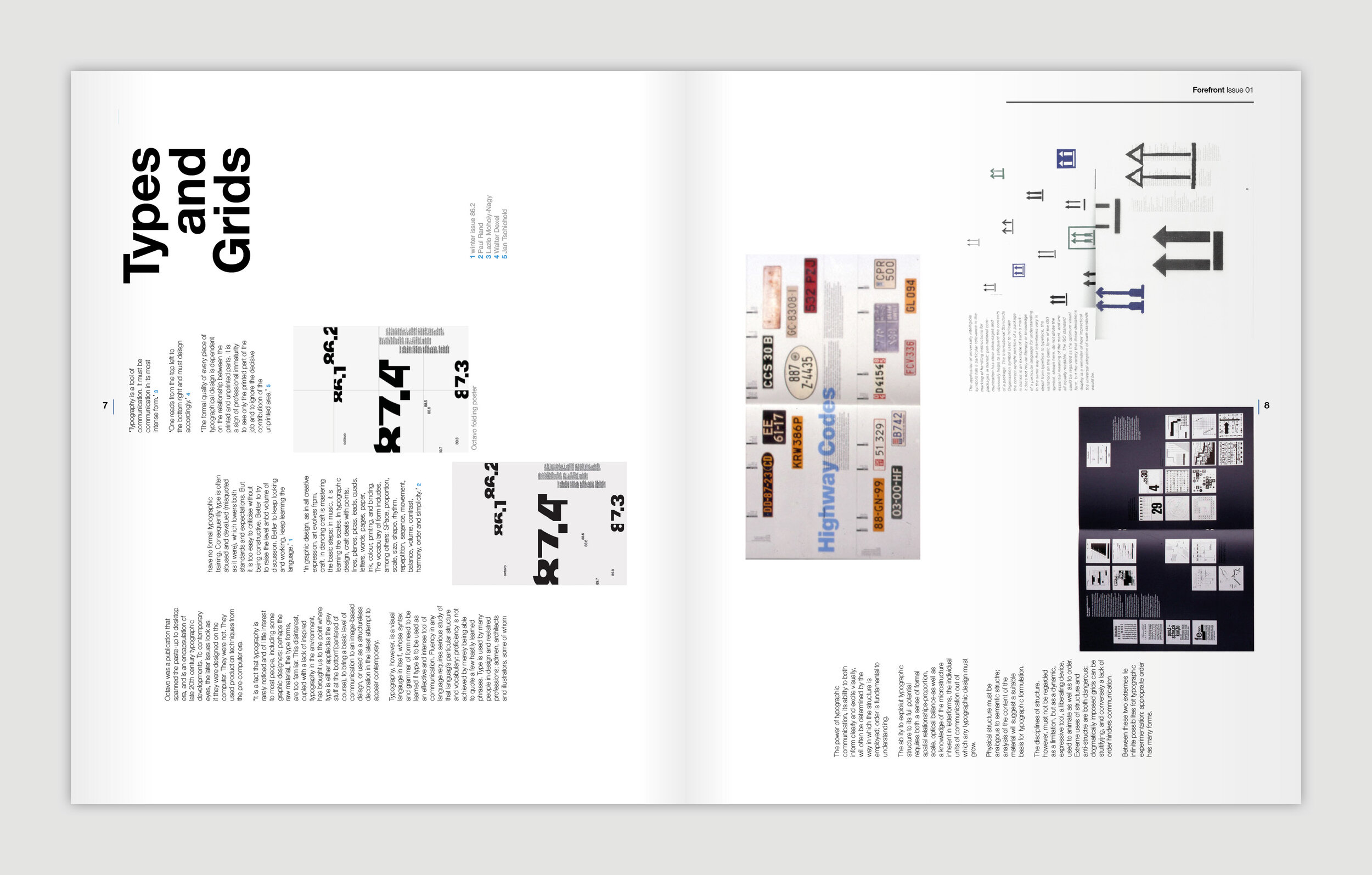
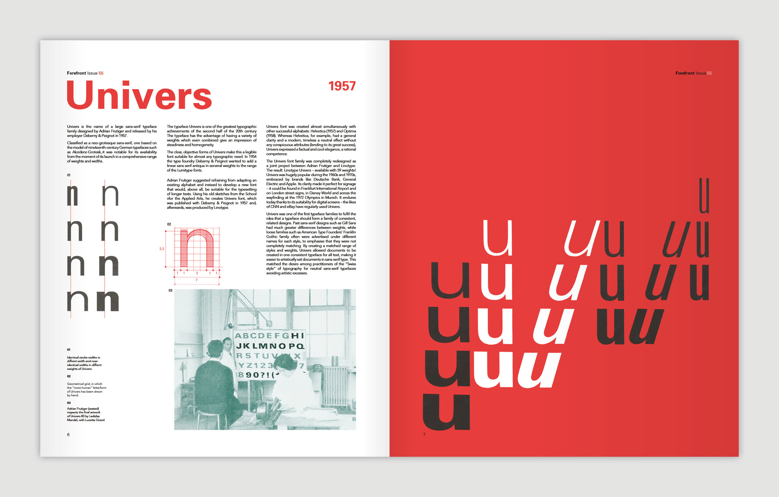
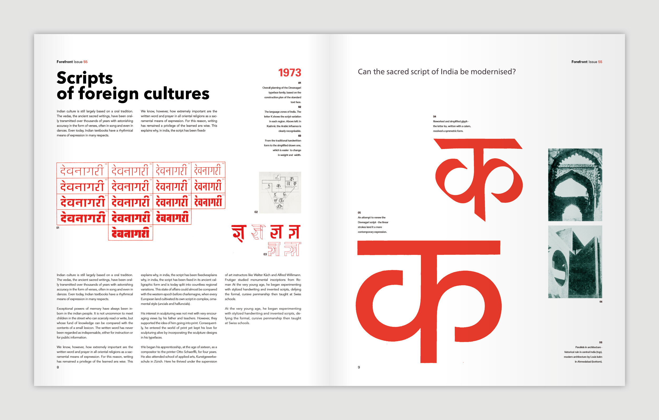
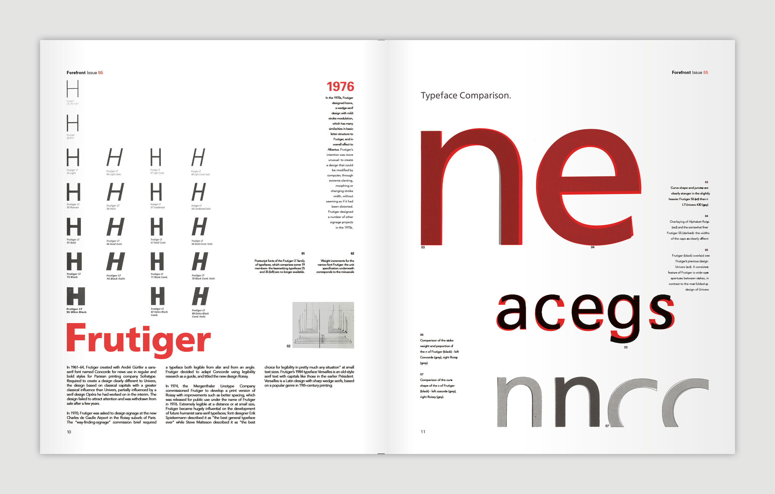
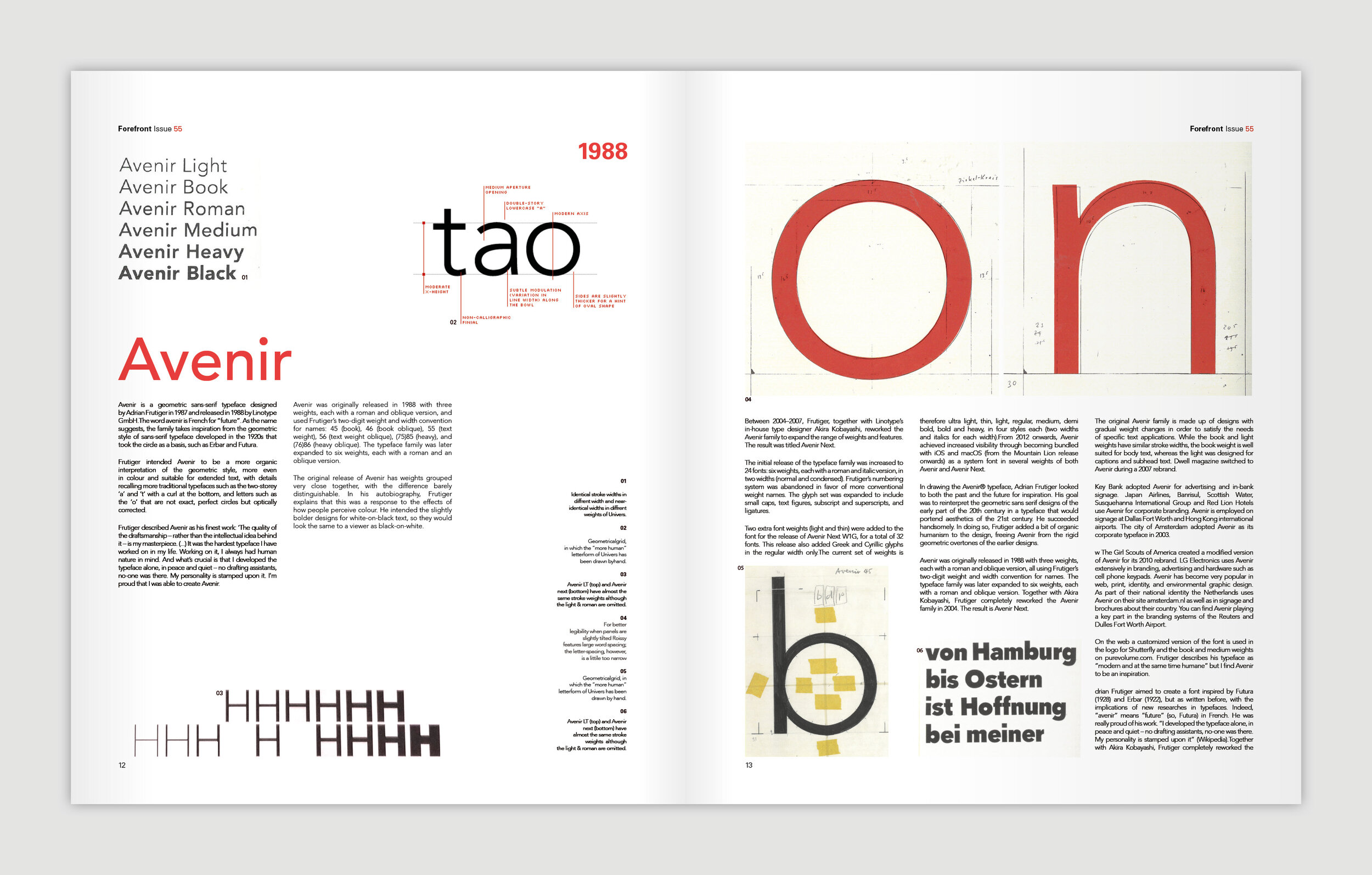
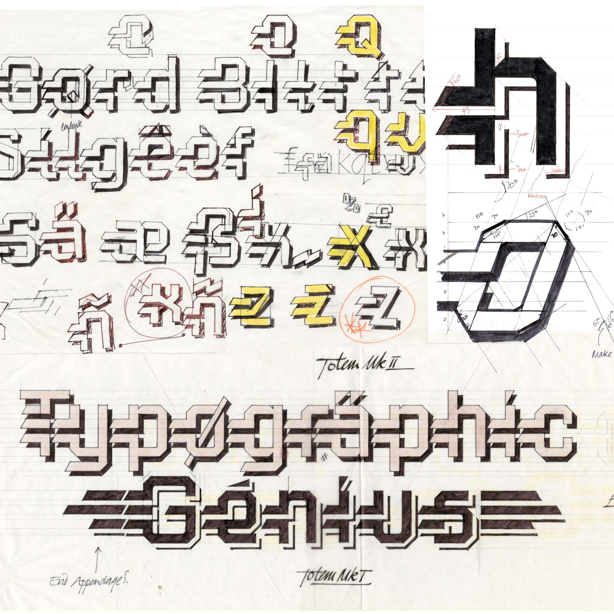
Type & Grids – 2020
/The first year graphic design students have recently completed their primer project in typography and the art of layout, simply known to Preston tutors and alumni as Type & Grids. The project is an opportunity for students to immerse themselves in the work of typographers and designers from the late 1800’s up to present day, and offers a starting point for the young designer to start to comprehend the craft and rigour that typography of the highest order demands.
It is a particularly pleasing project as the leaps in design ability can be registered throughout the timeline of the project and seen visually from the initial pencil sketches to initial layouts to finished artwork. Simply, the innate ability of the young designer could not produce the standard of work at the final crit on day one.
It is also a project of no shortcuts; the main component is time, time taken to understand, collate, design, redesign, redesign, edit and amend.
A final highlight to the project was the introduction to the banner printer and updated presentation format.
final crit:

STUDENT EXAMPLES:


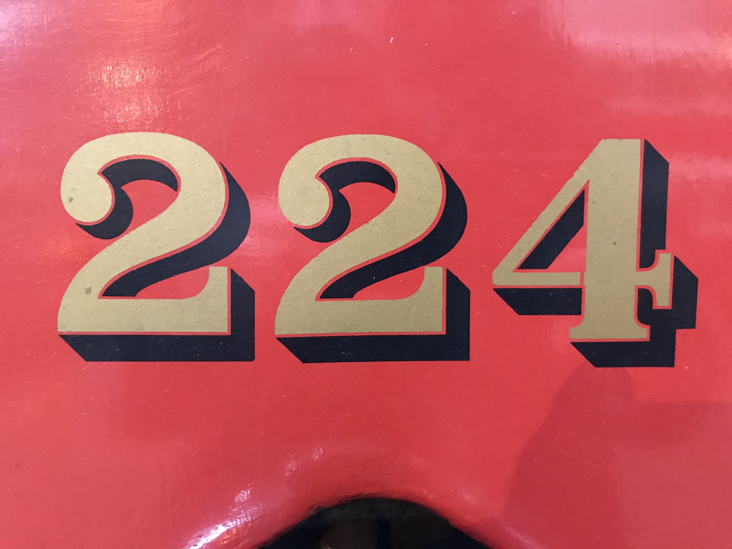
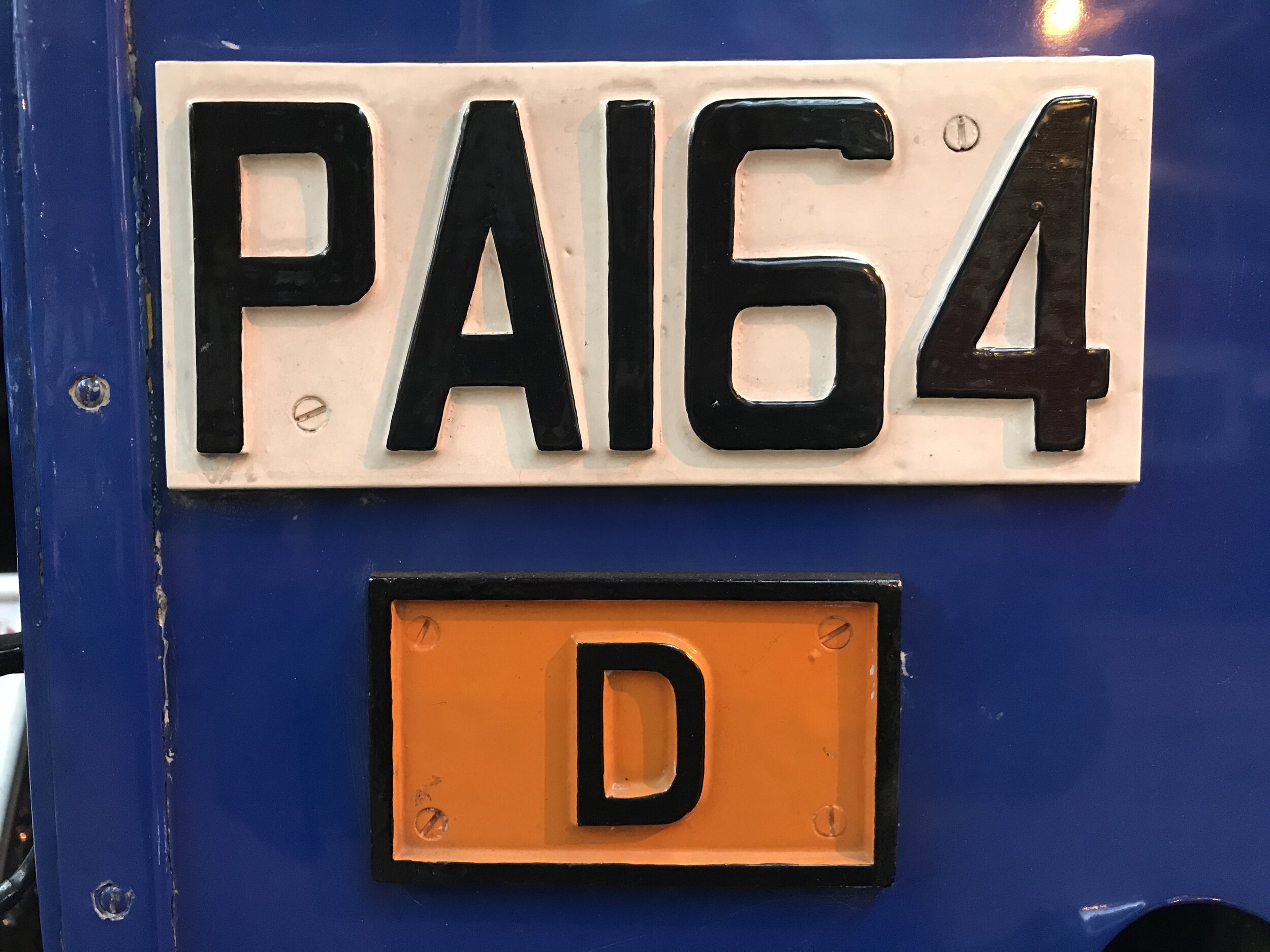
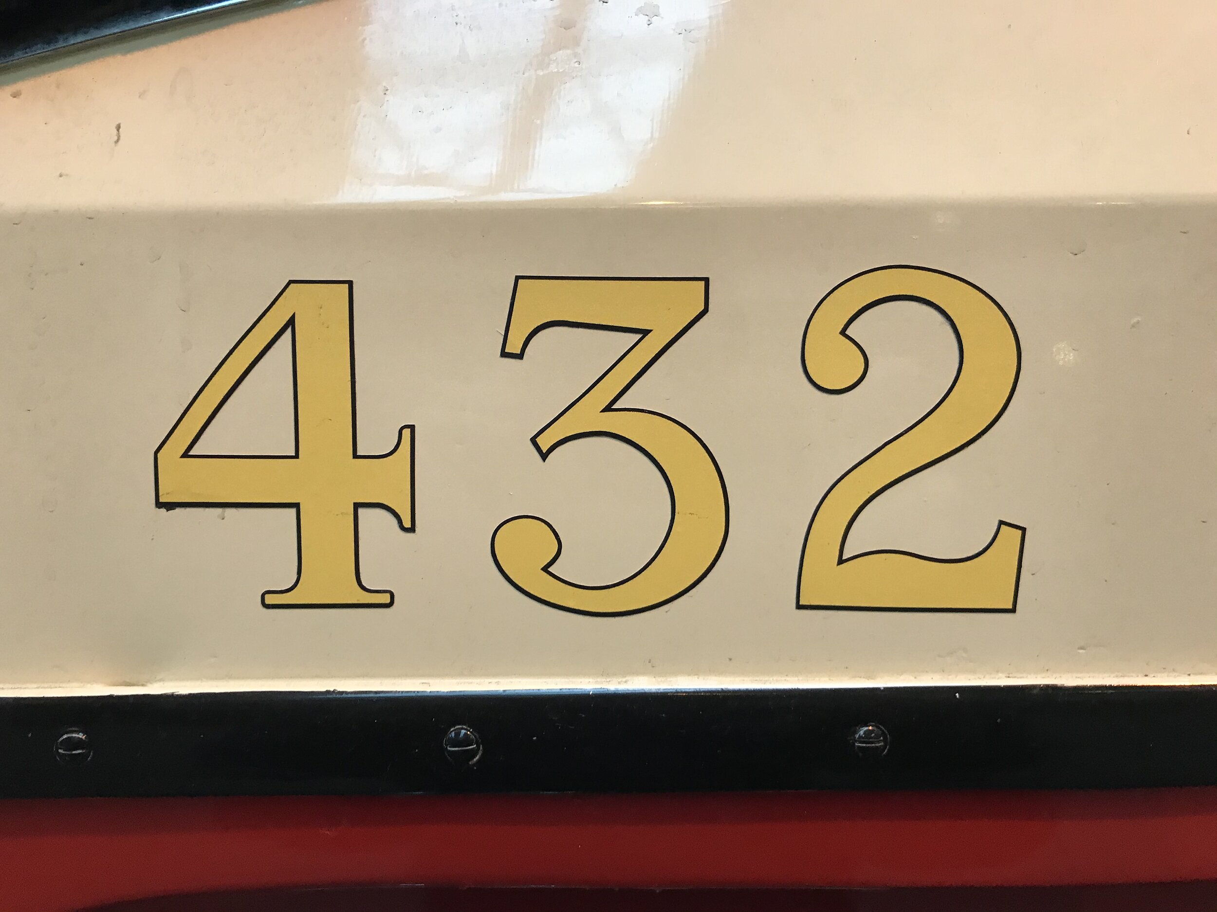
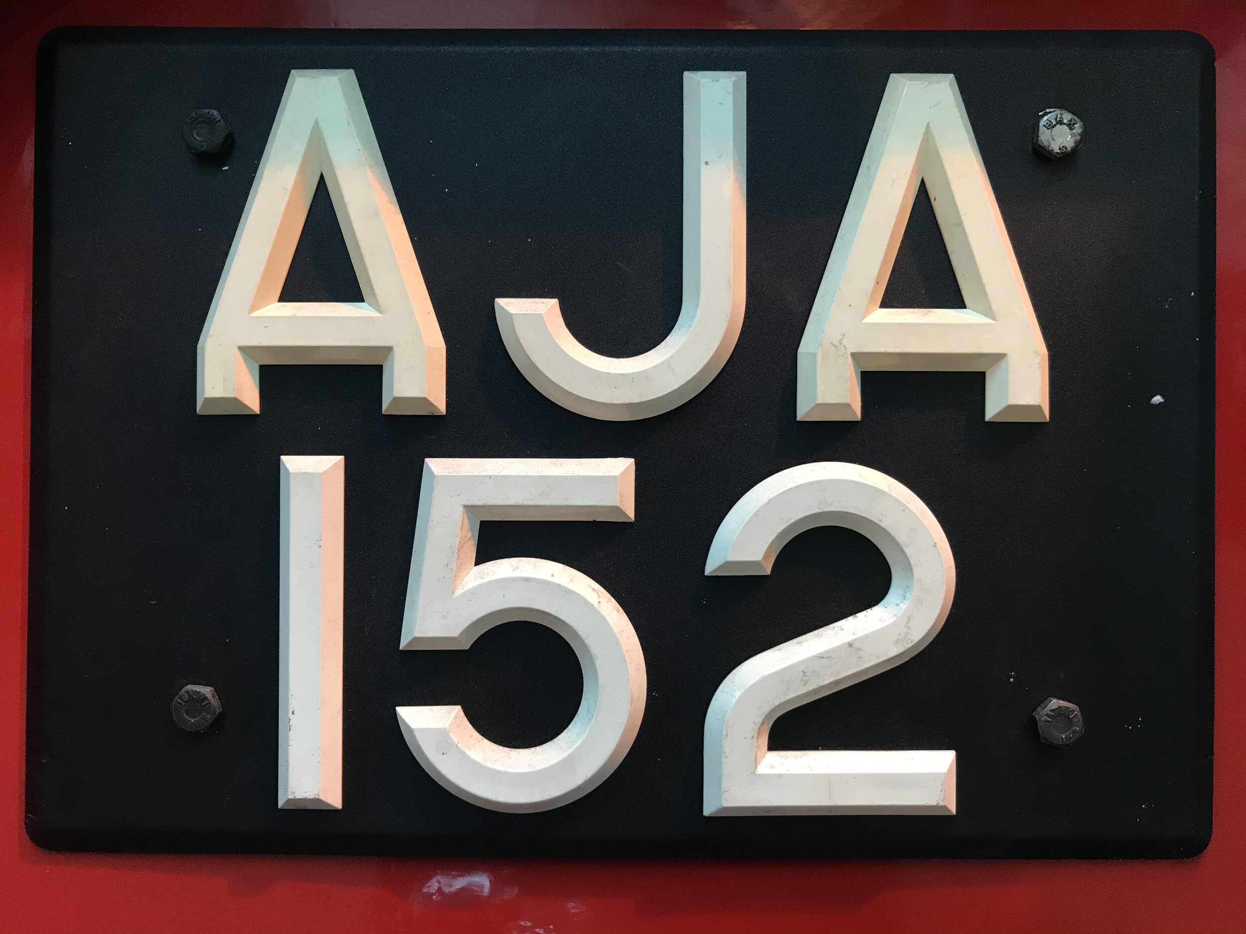
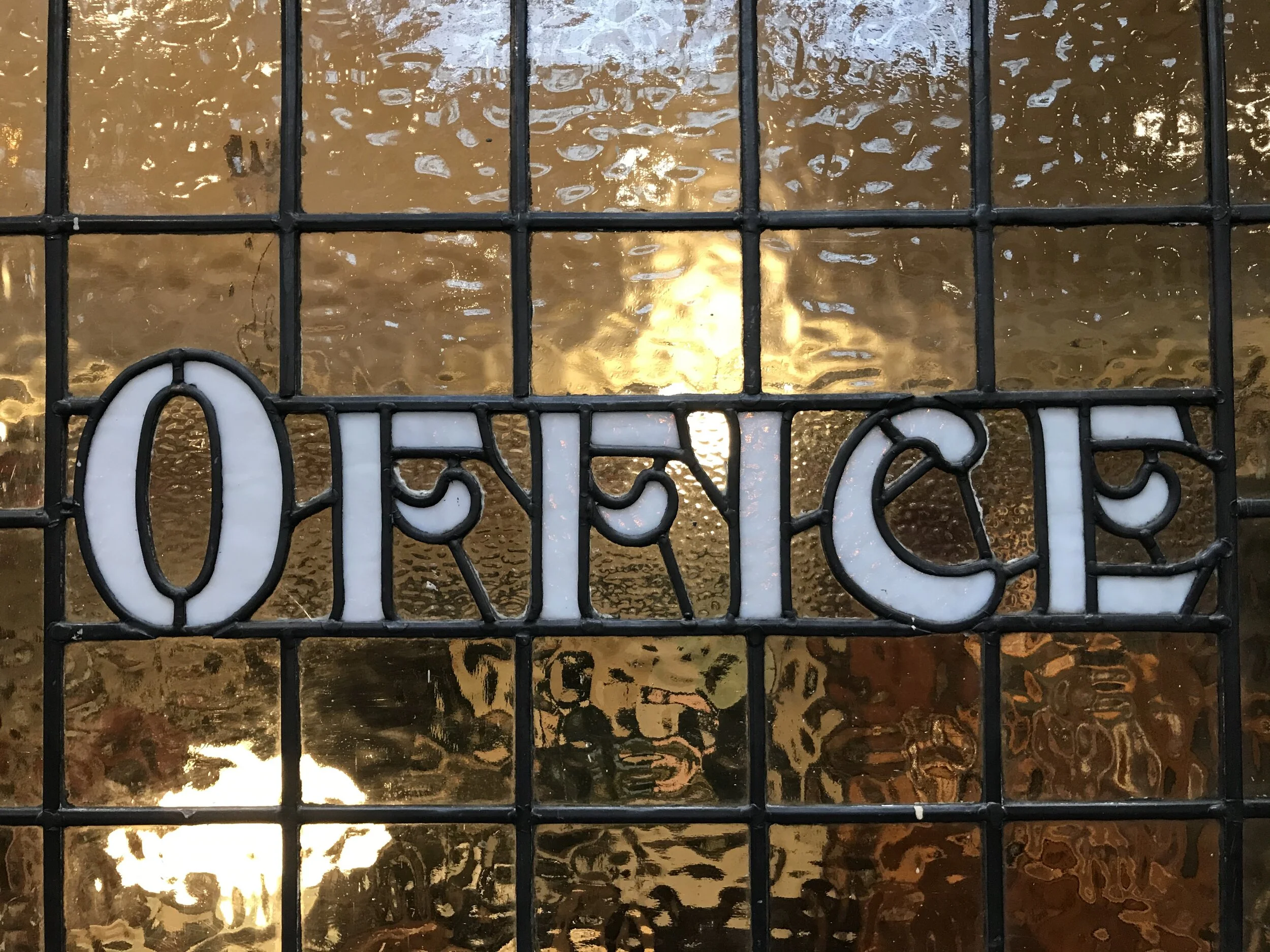
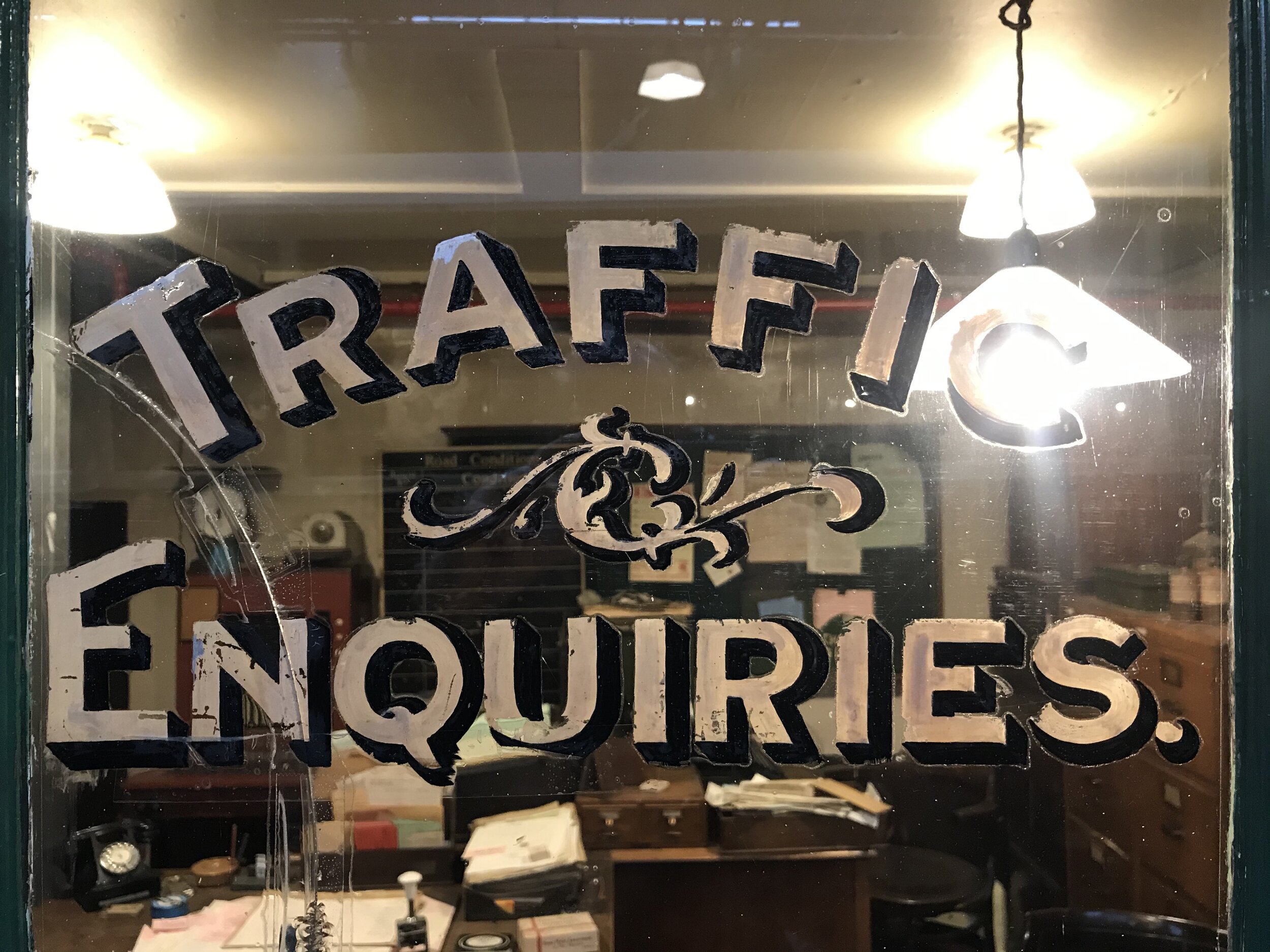
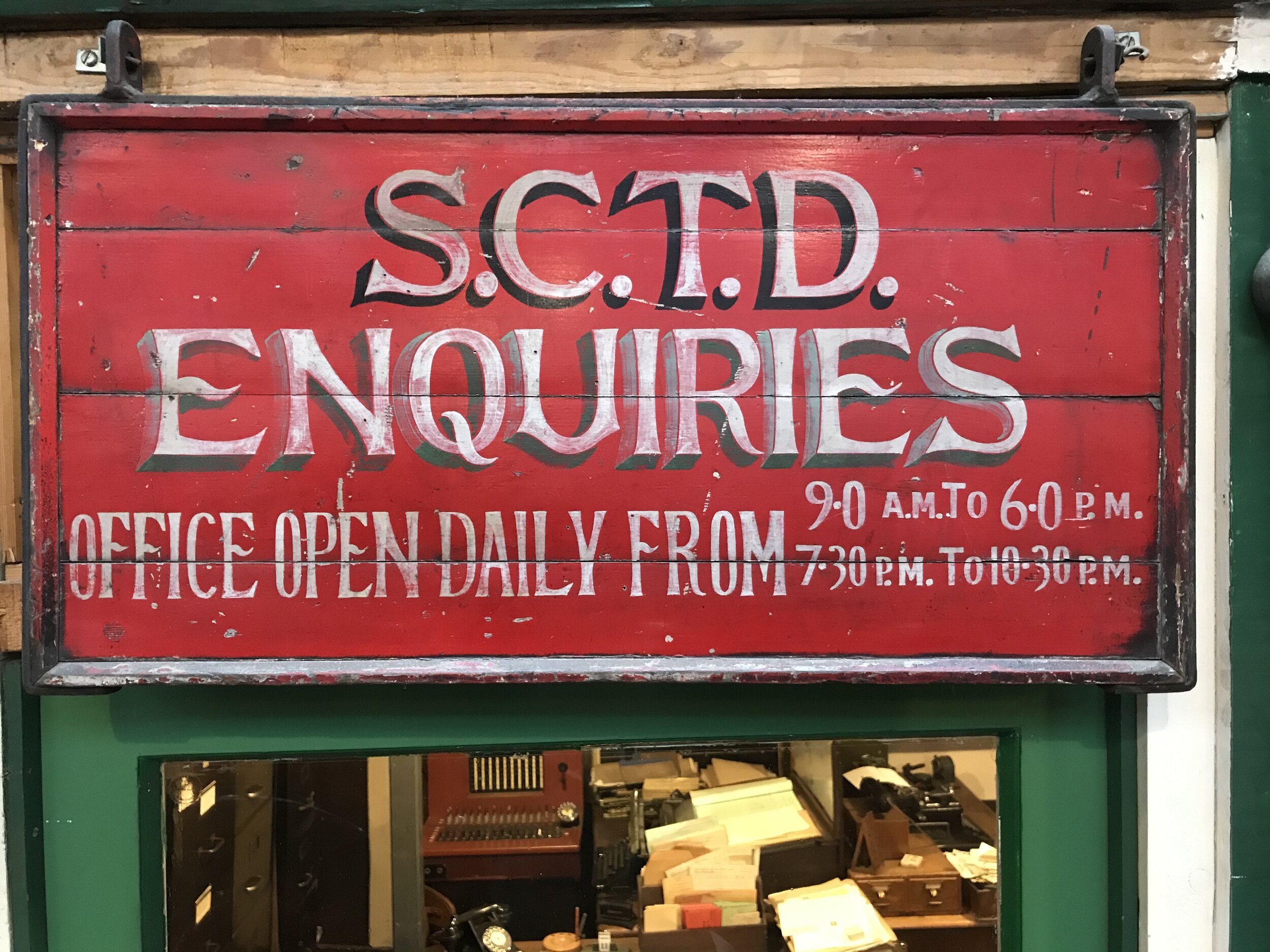
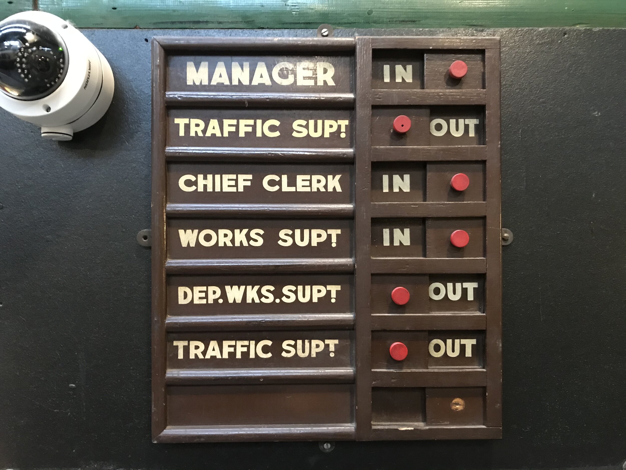
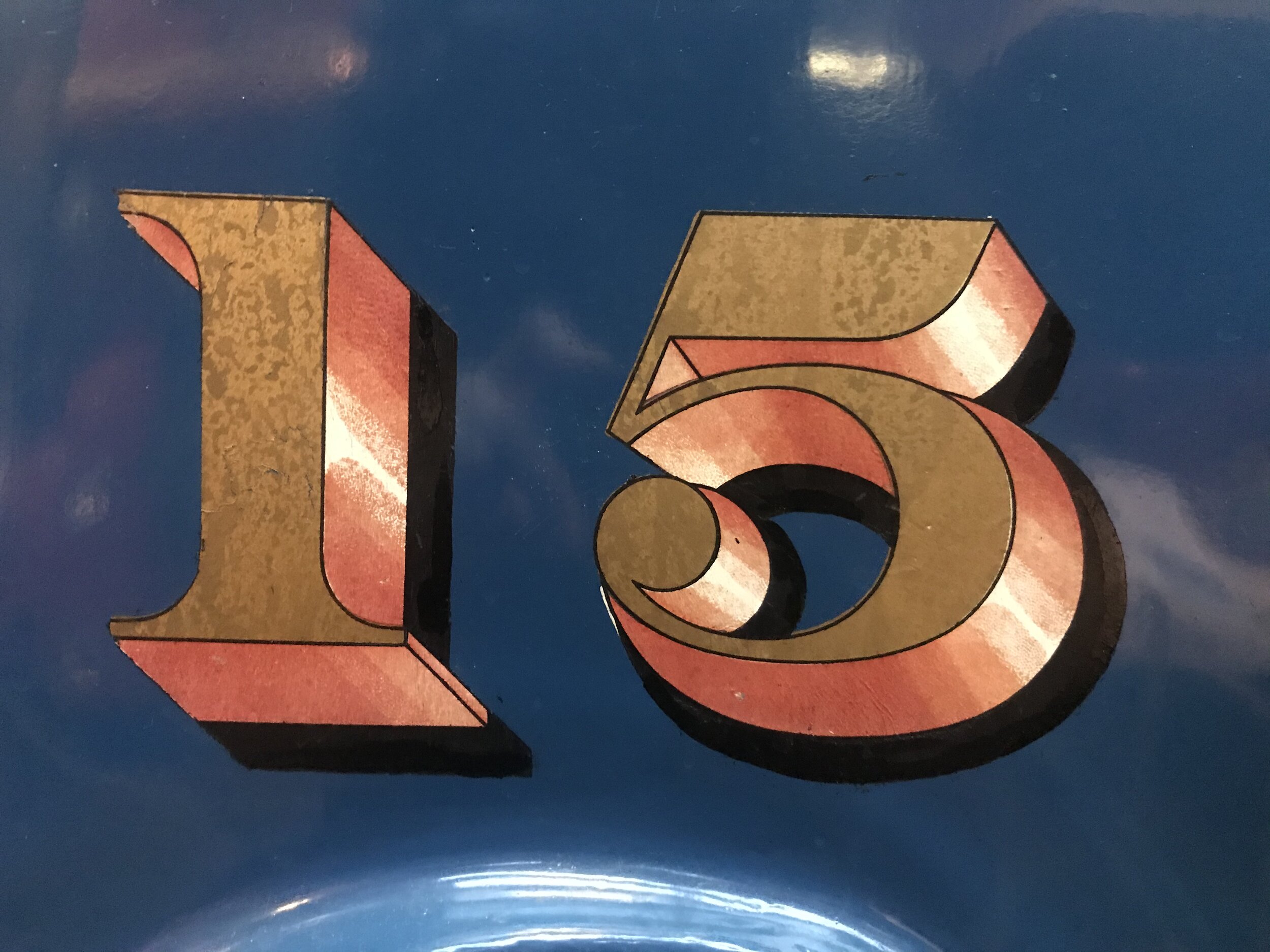
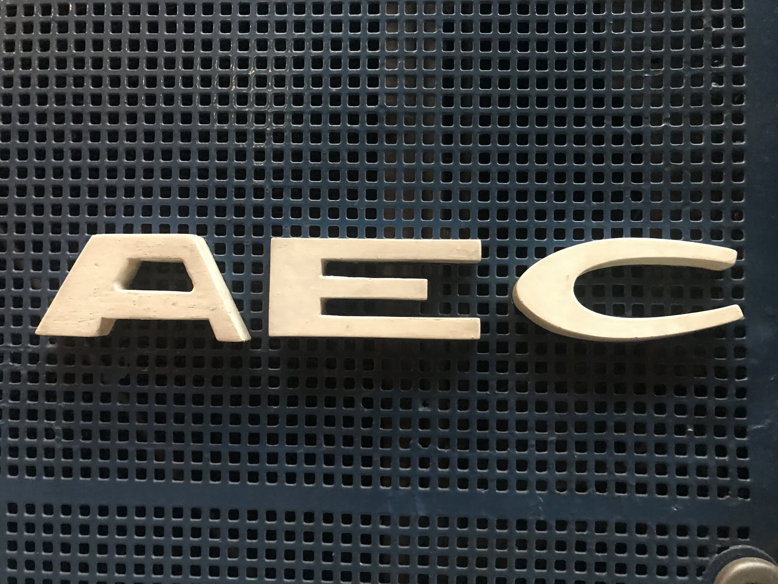
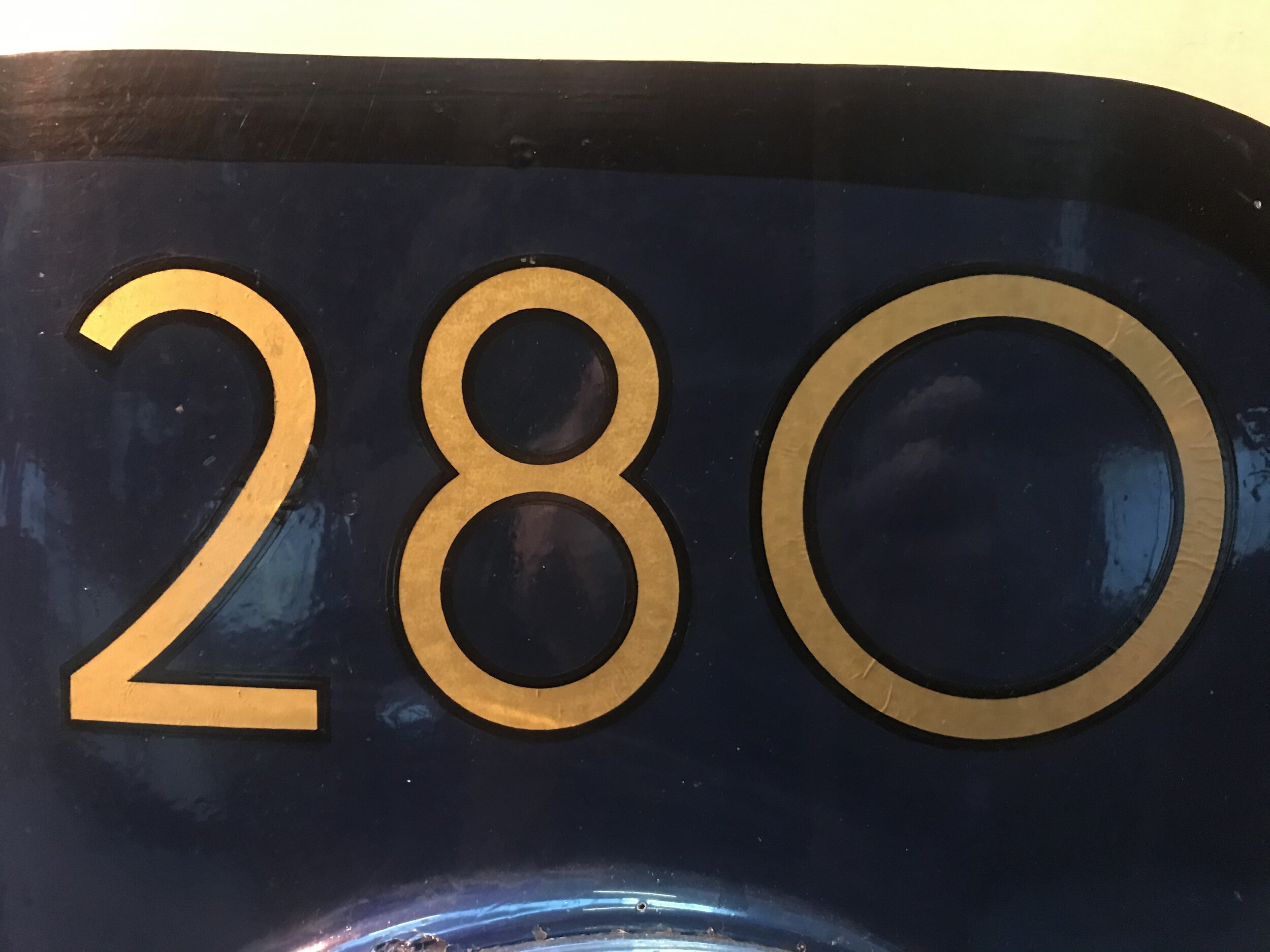
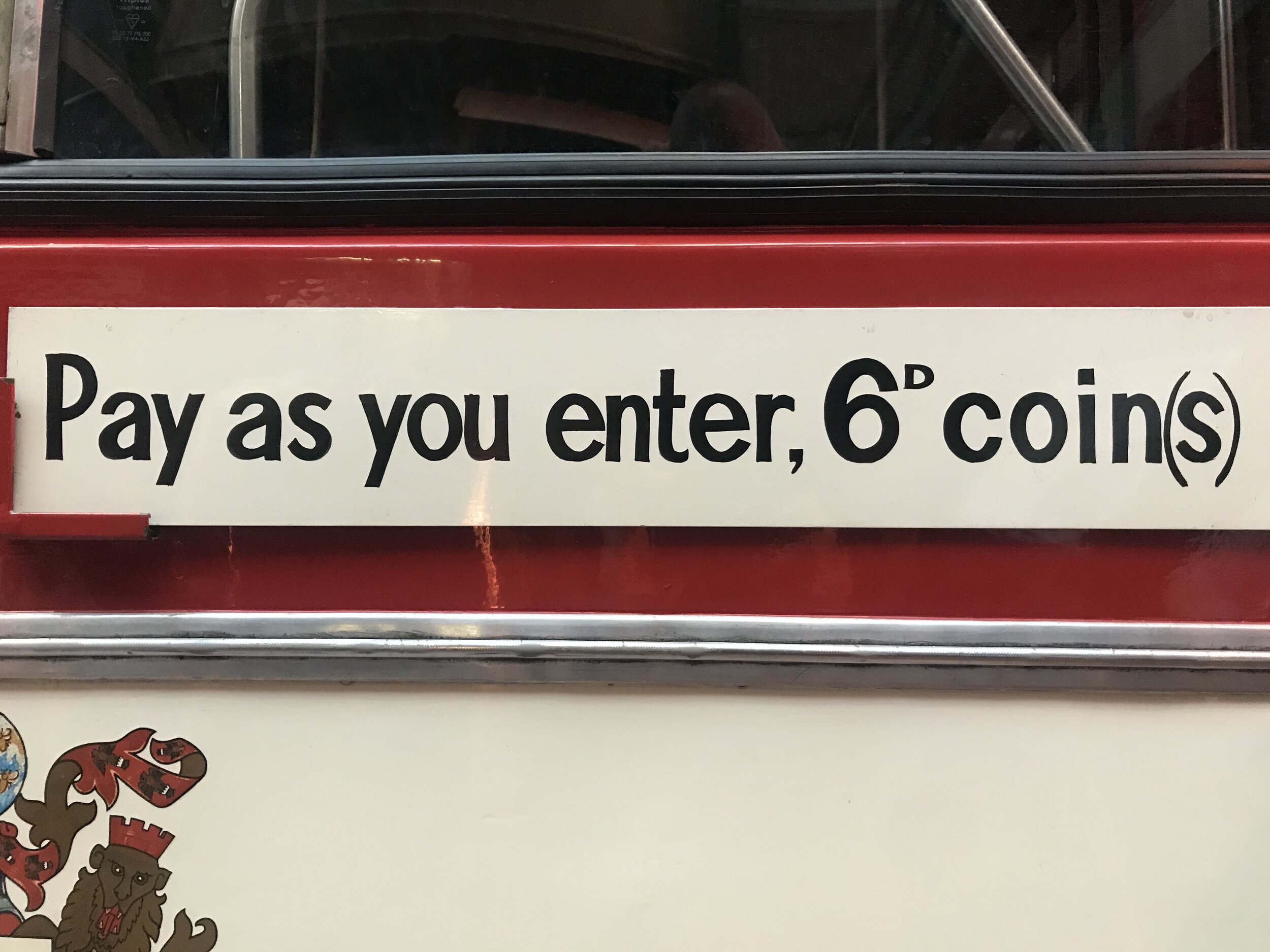
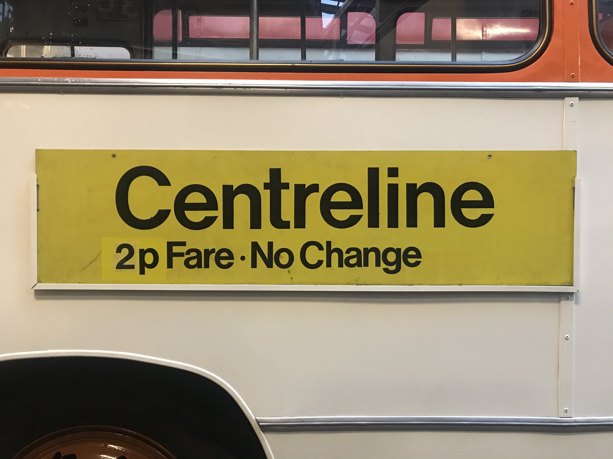
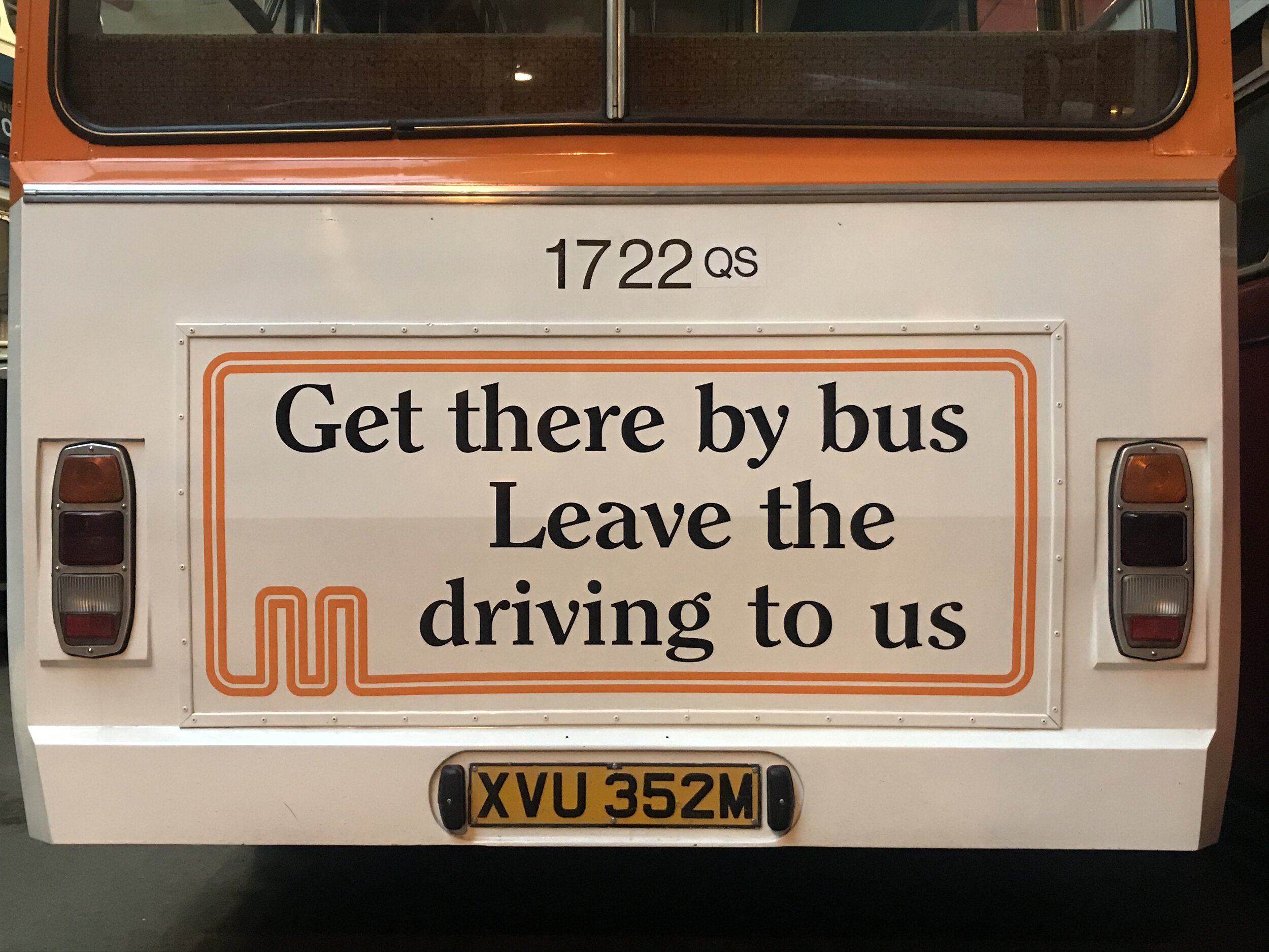
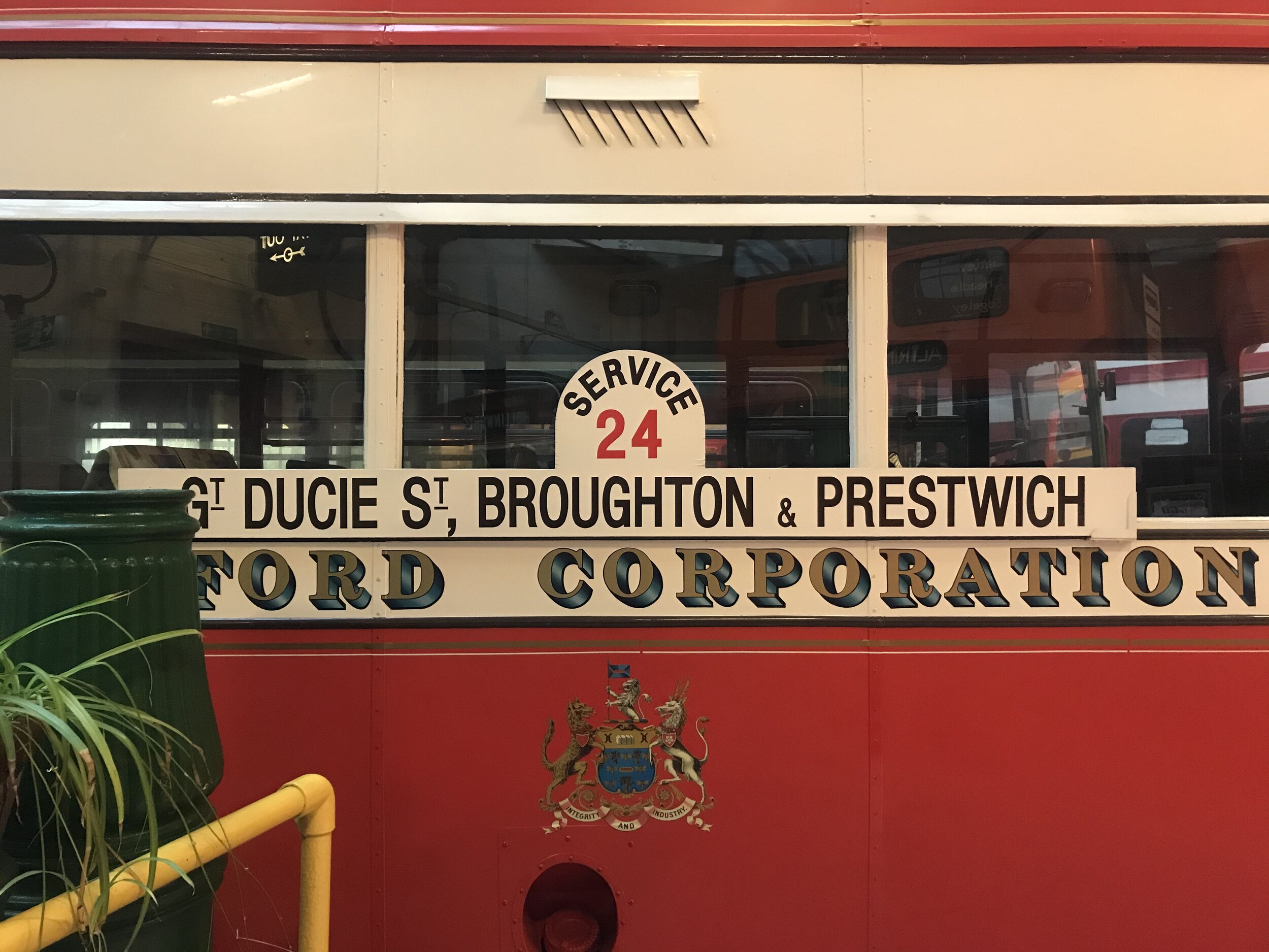
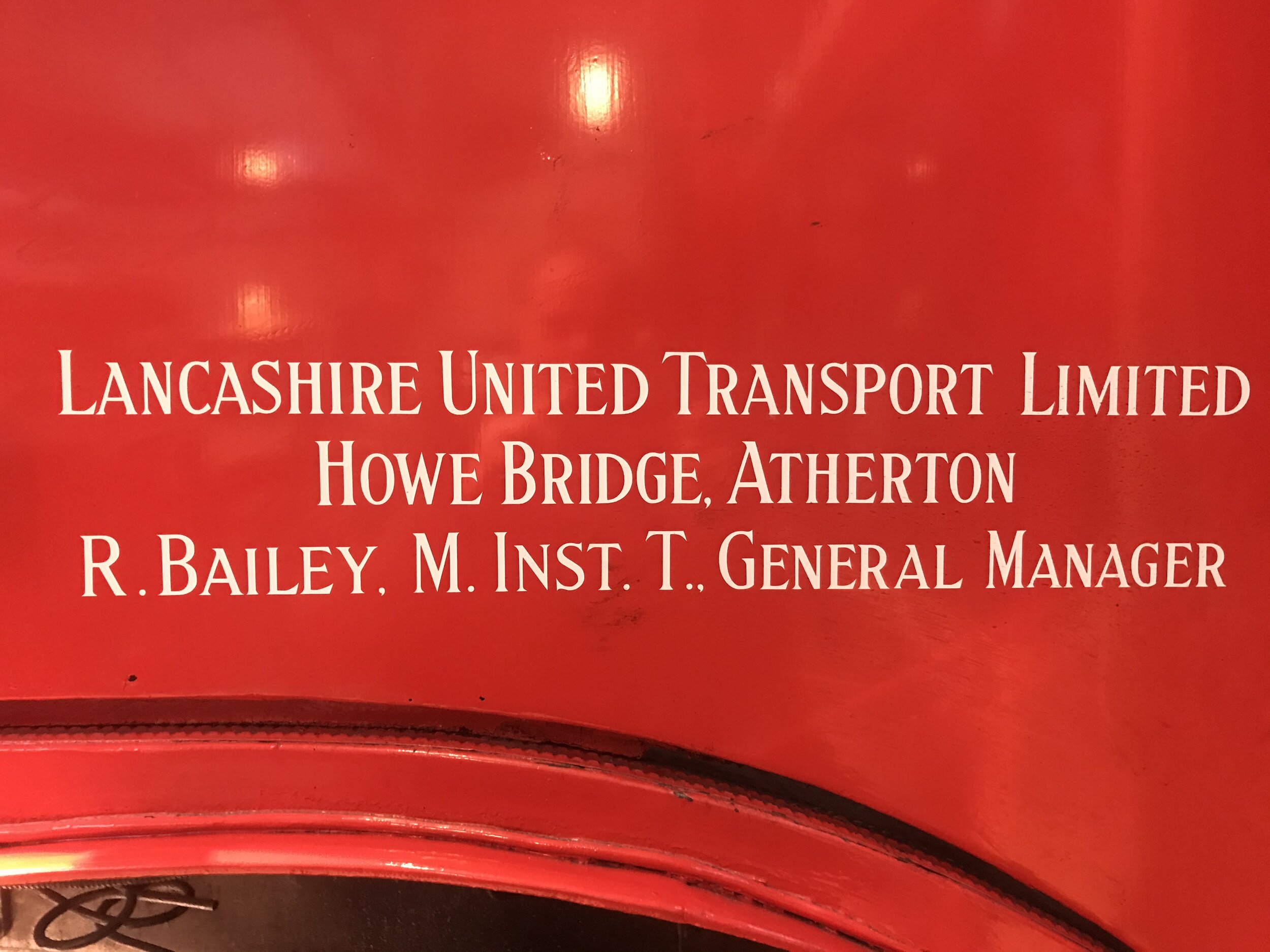
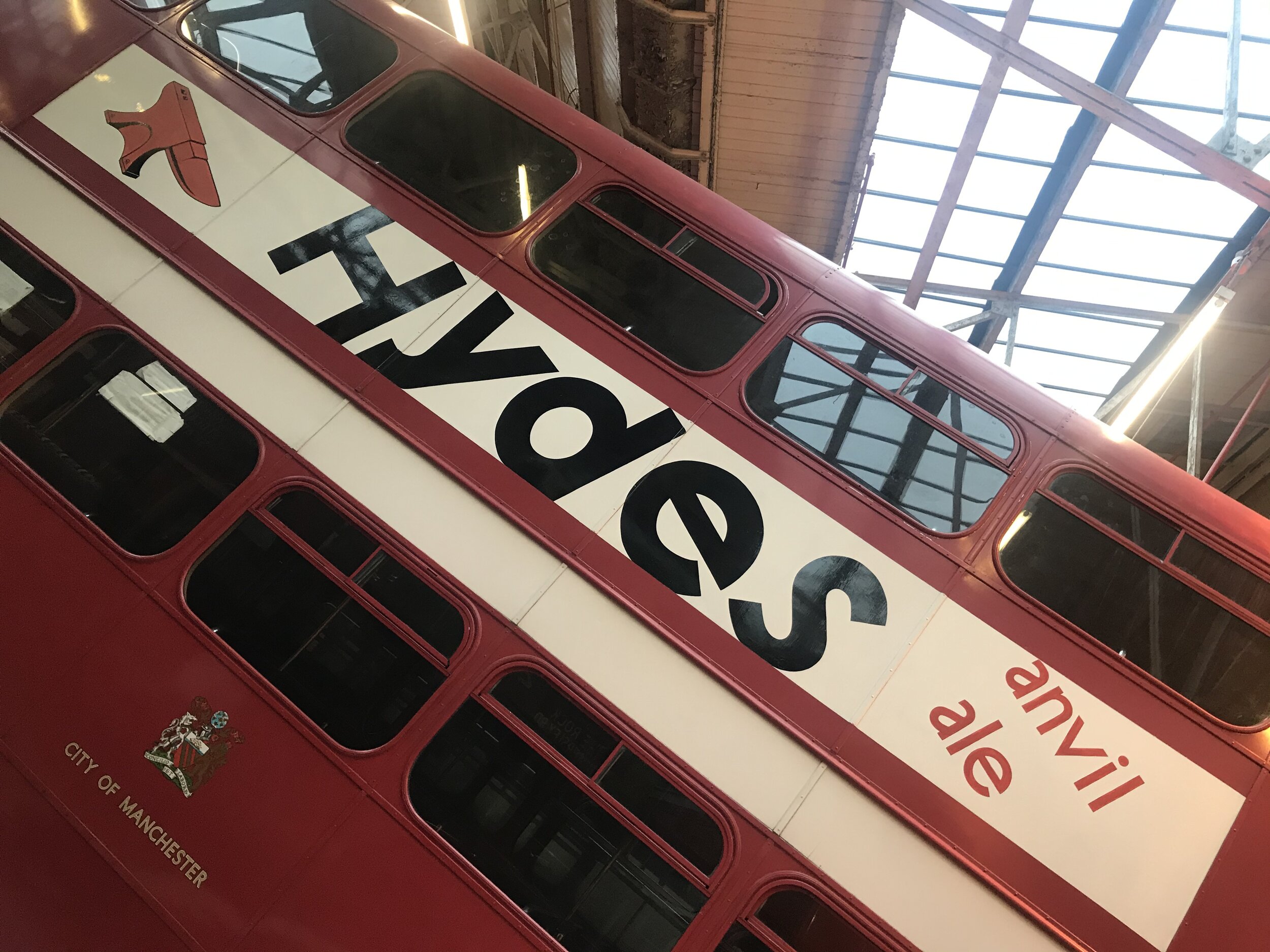
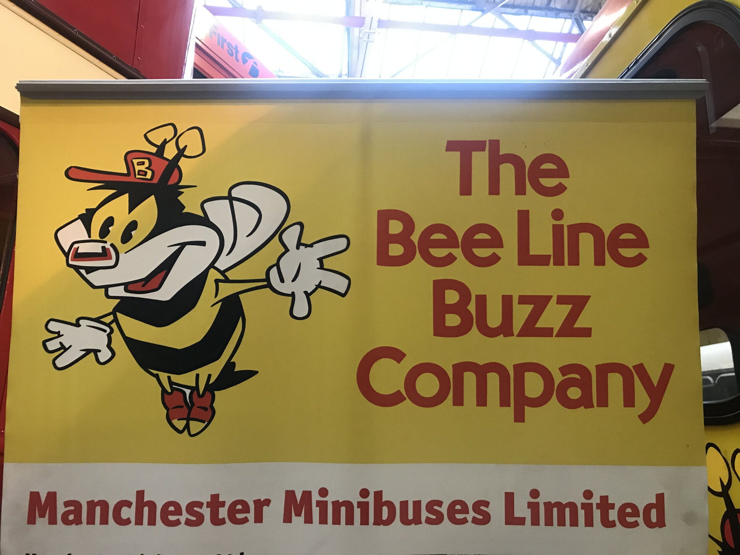
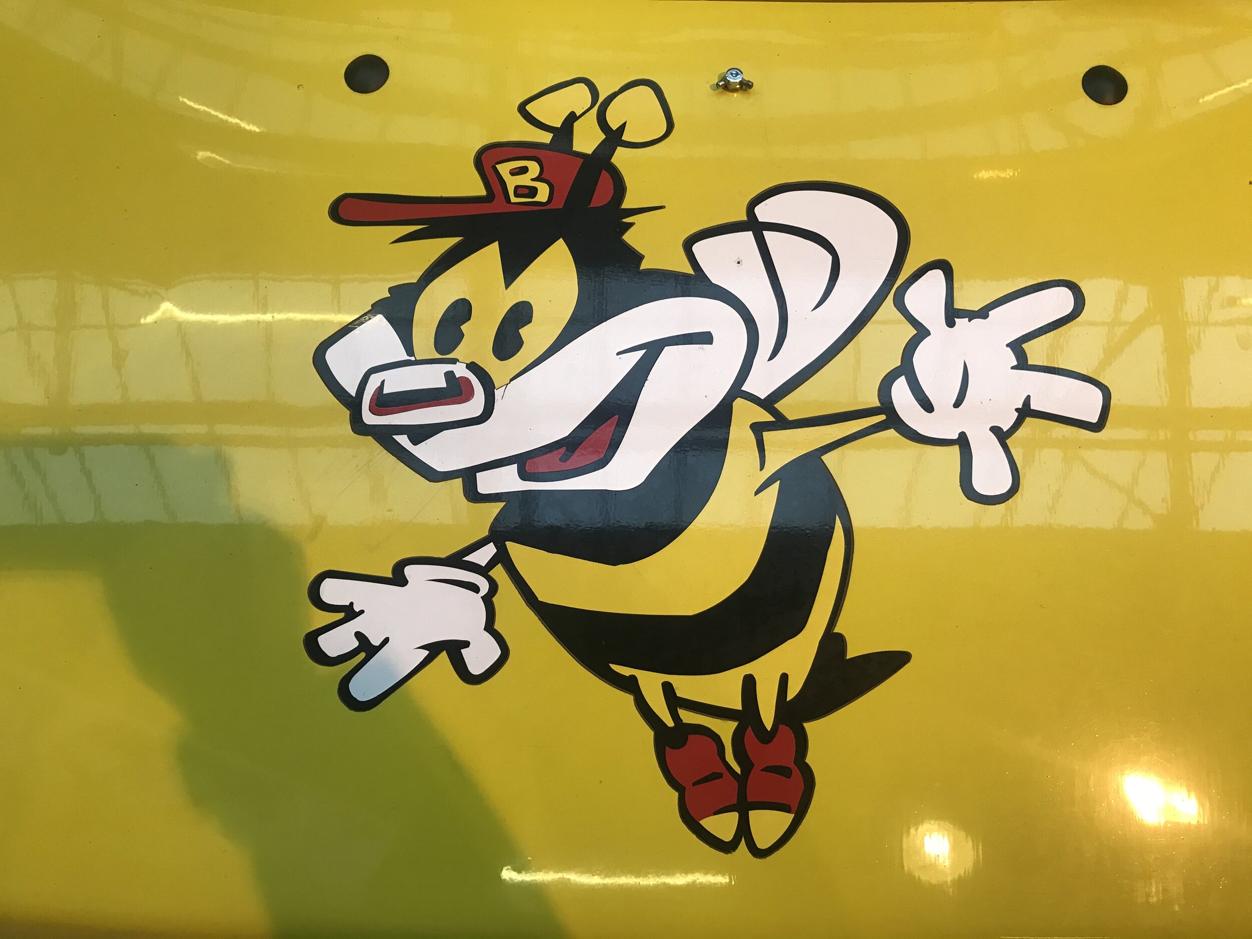
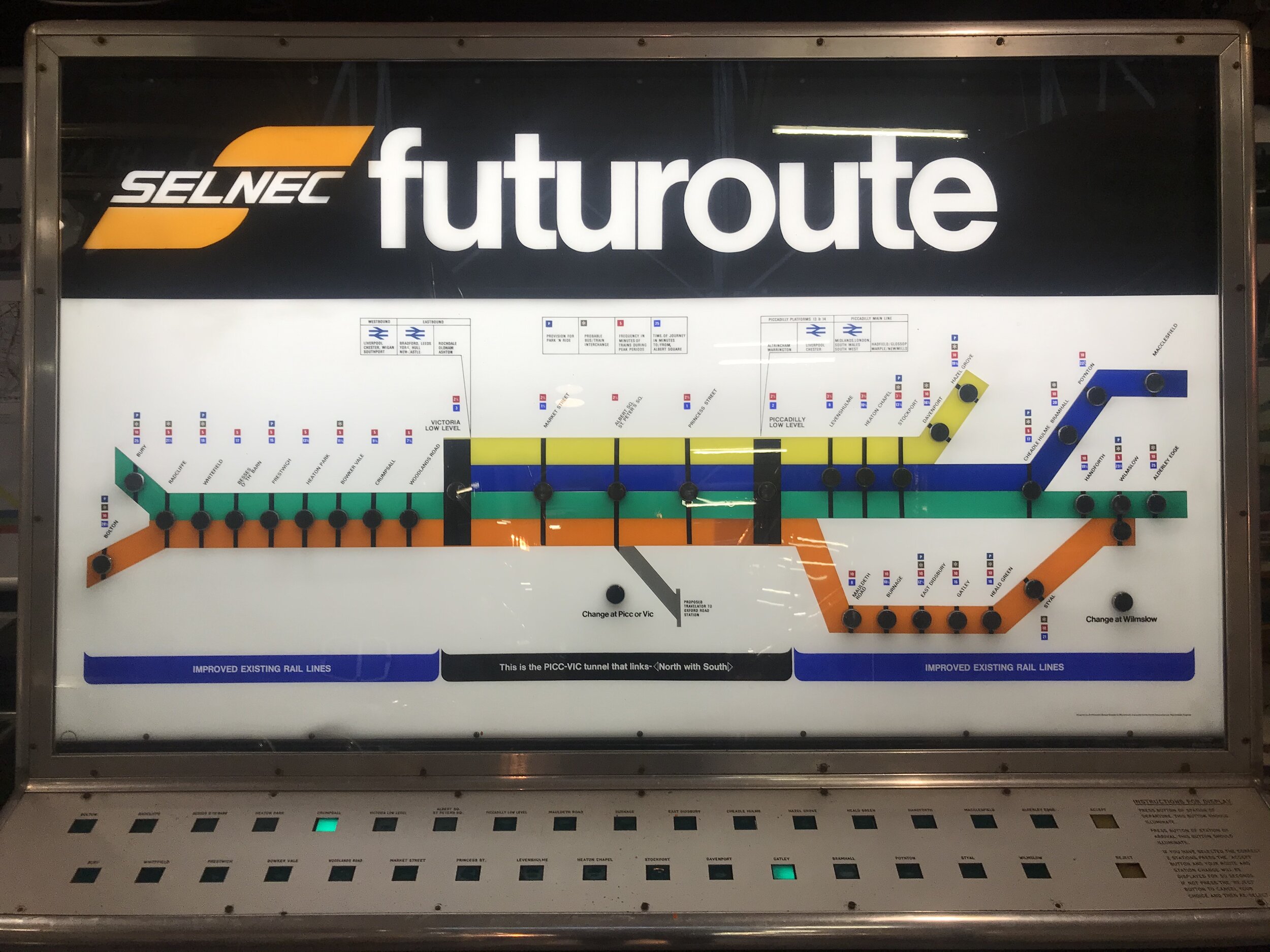
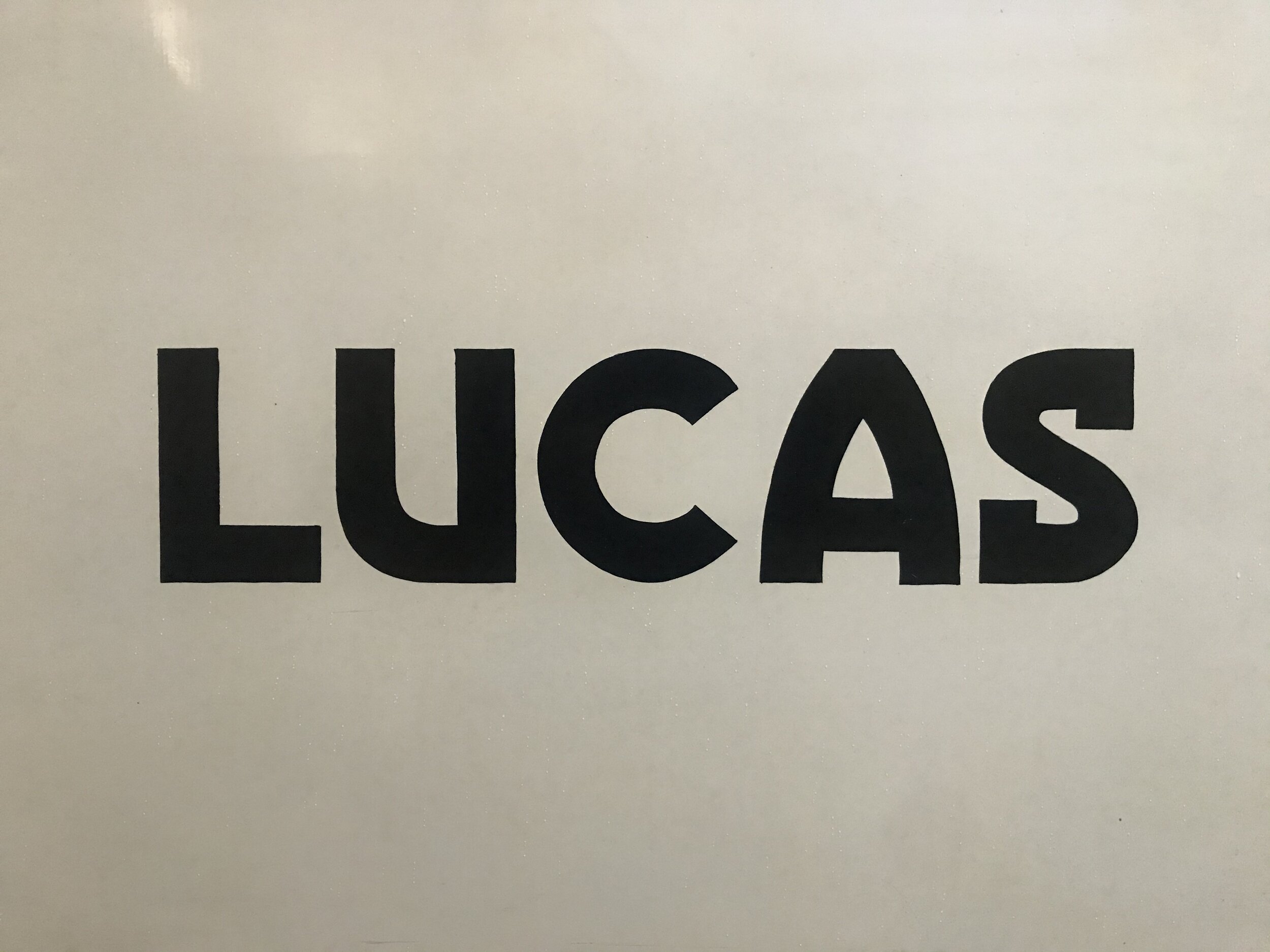
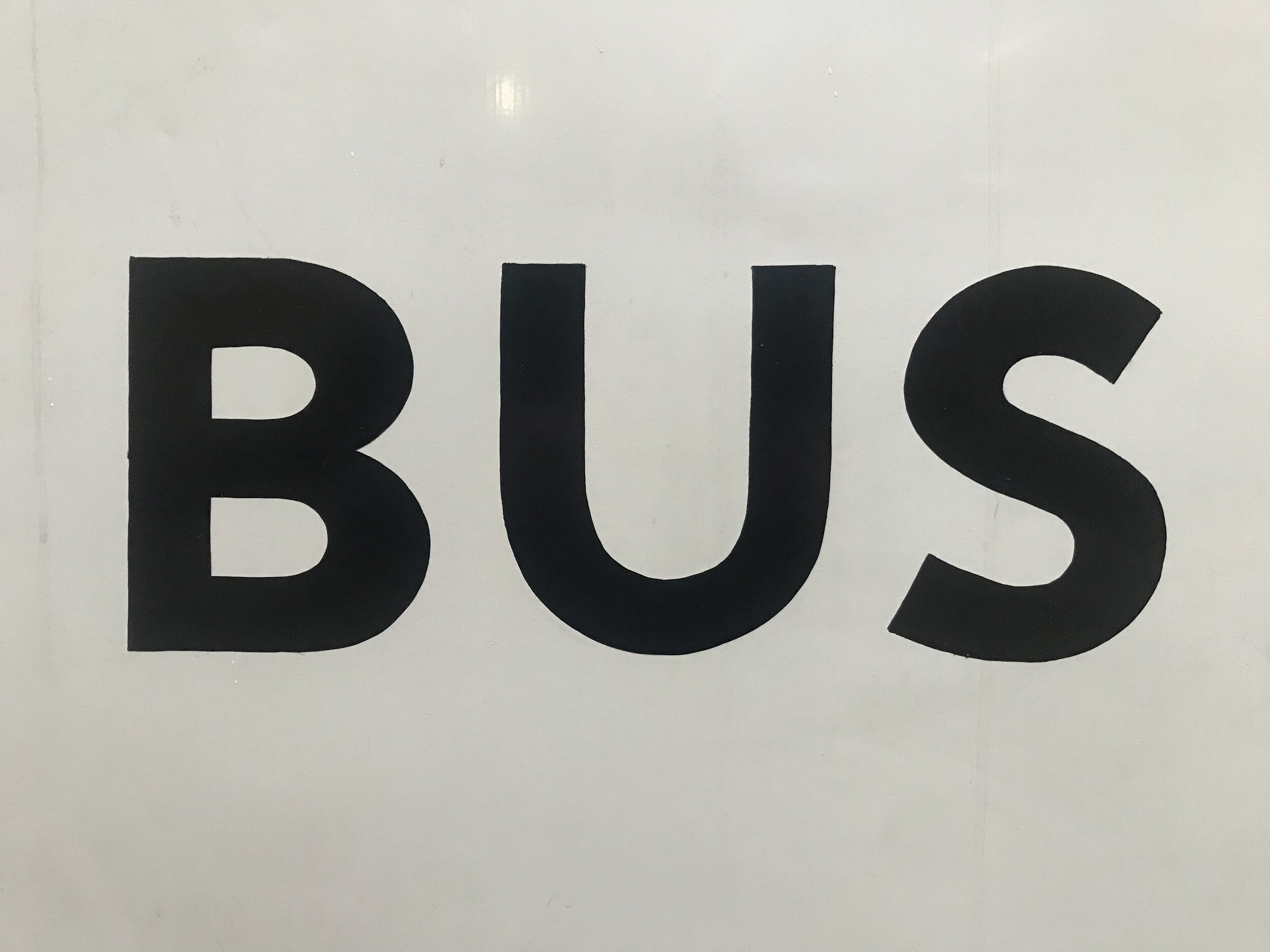
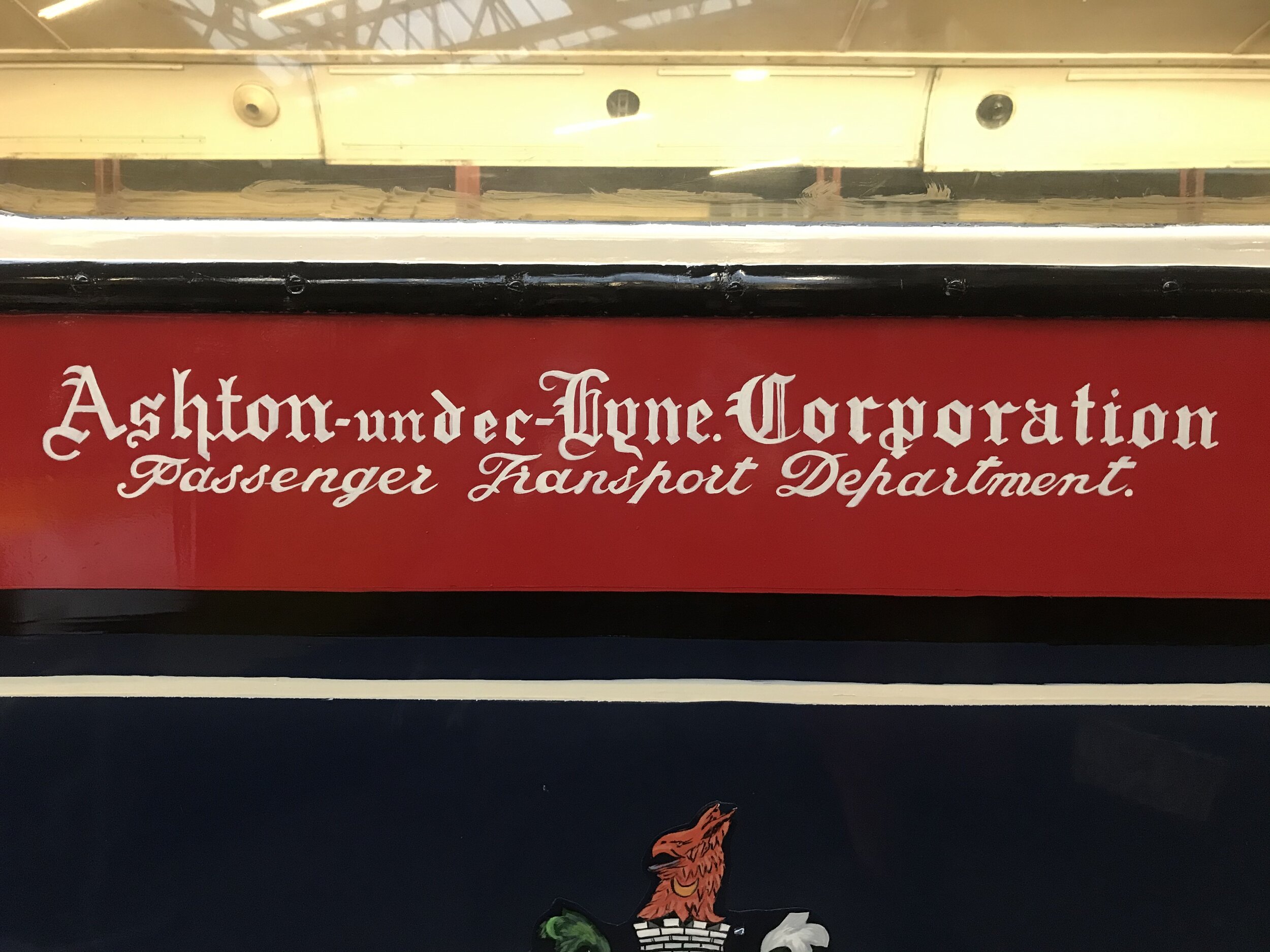
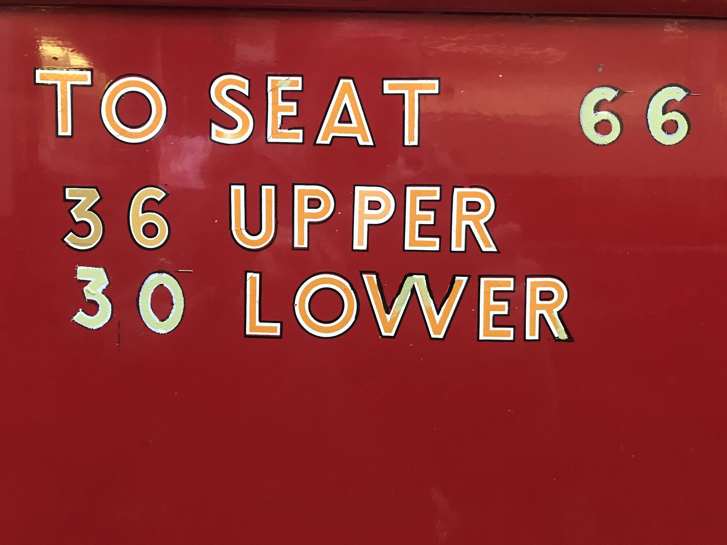
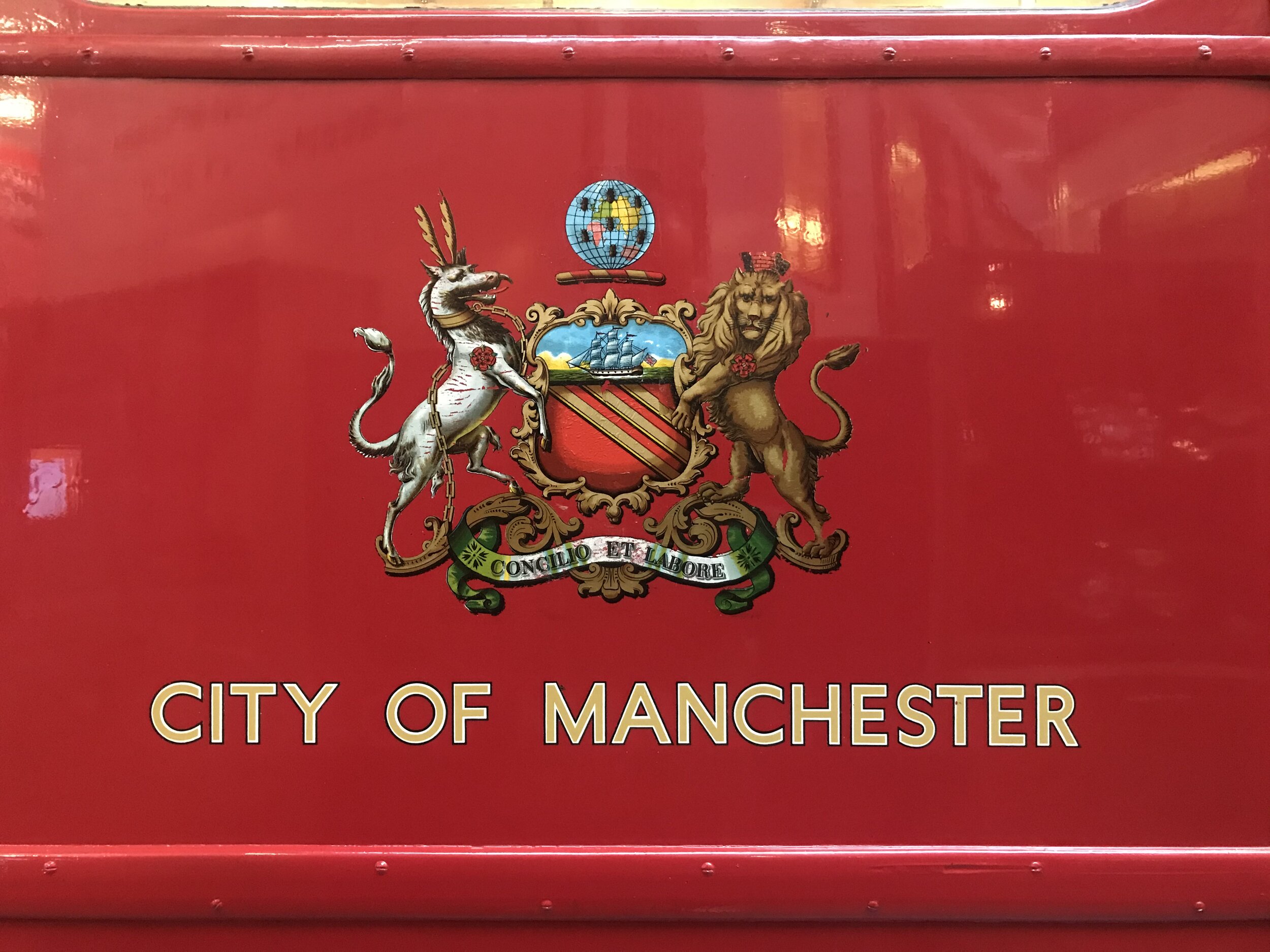
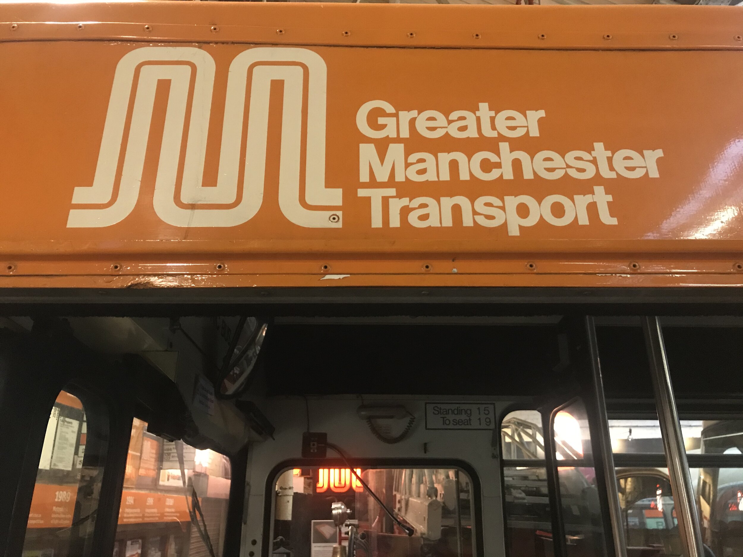
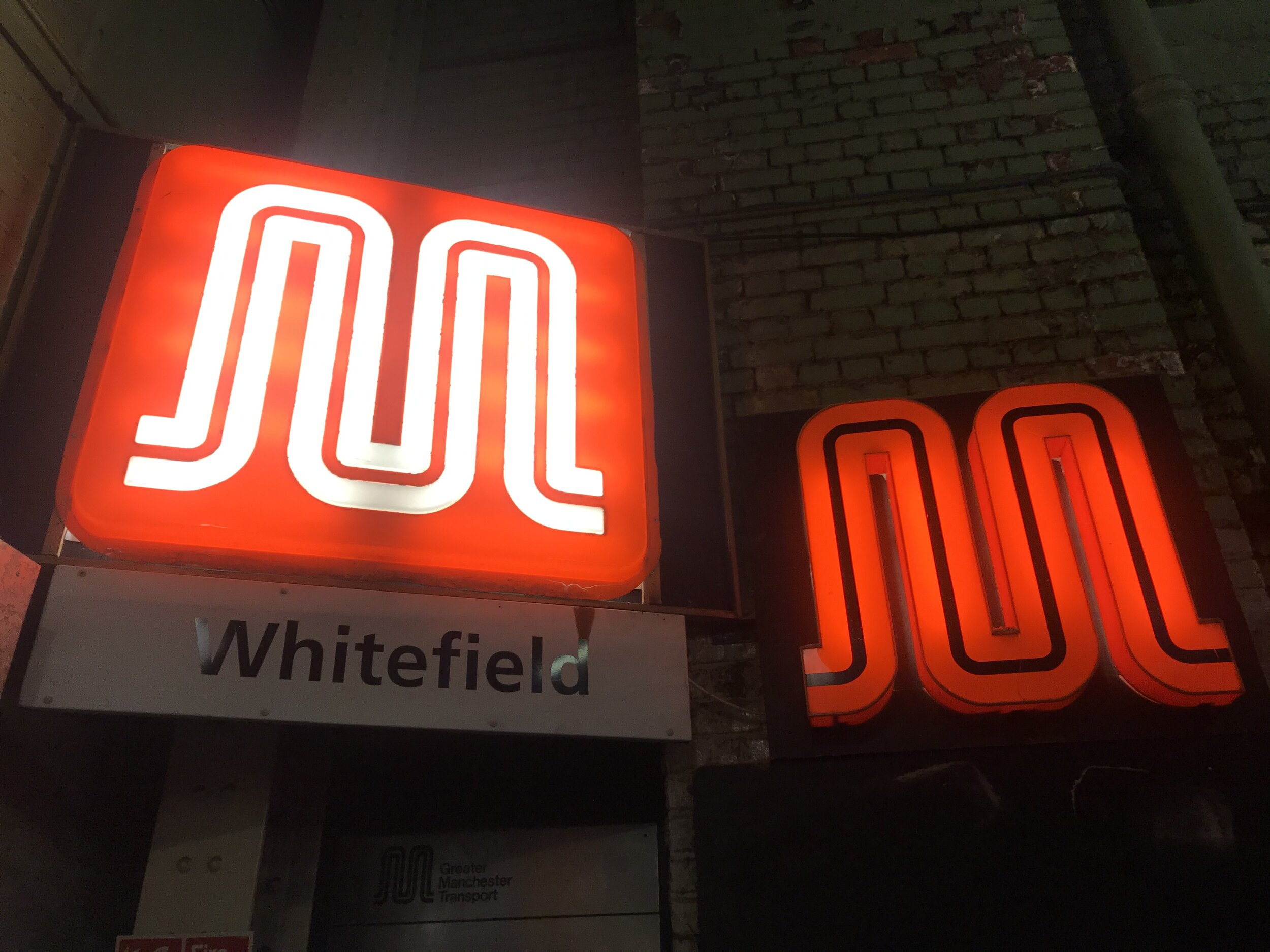
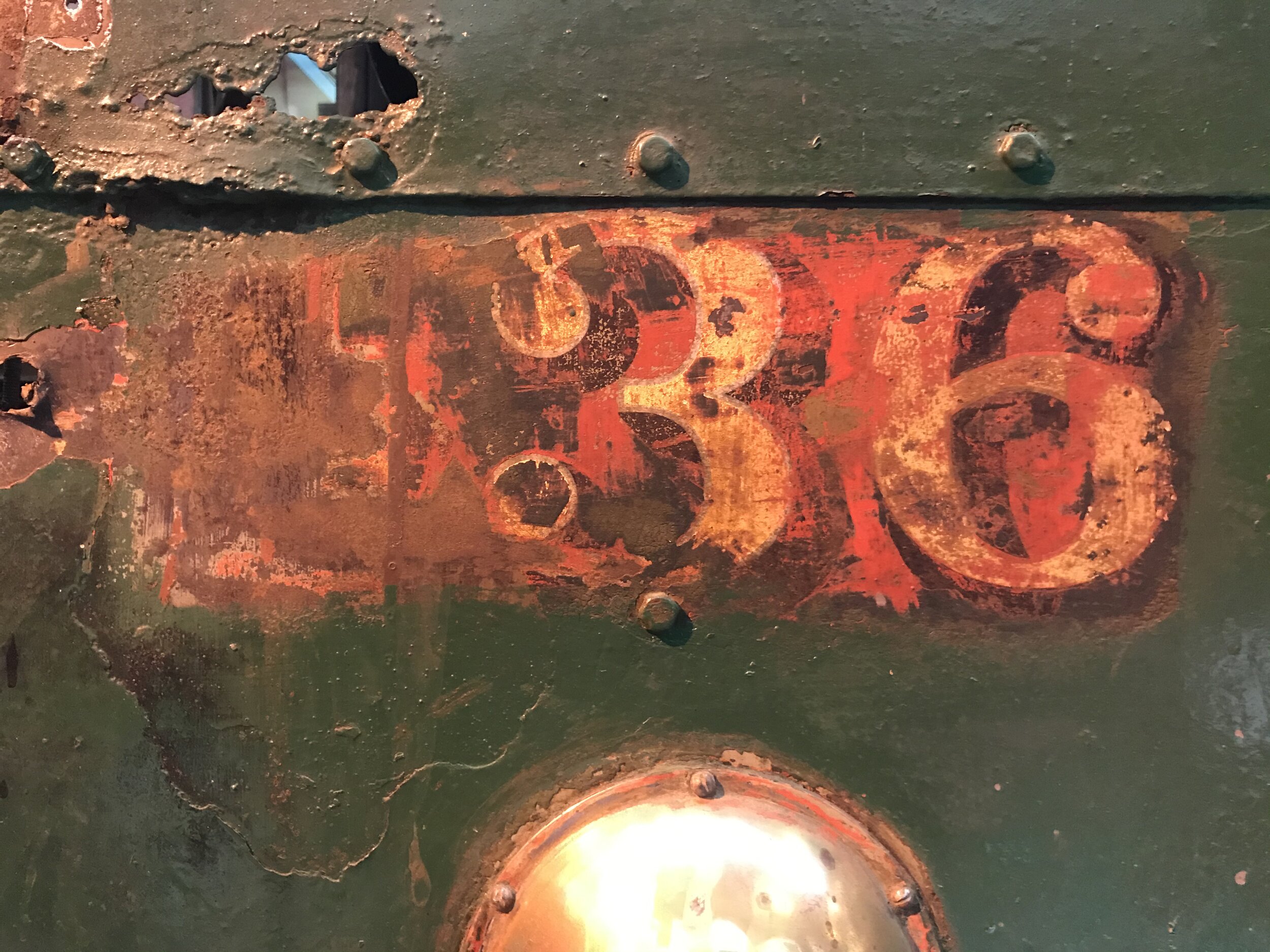
Transport Typography
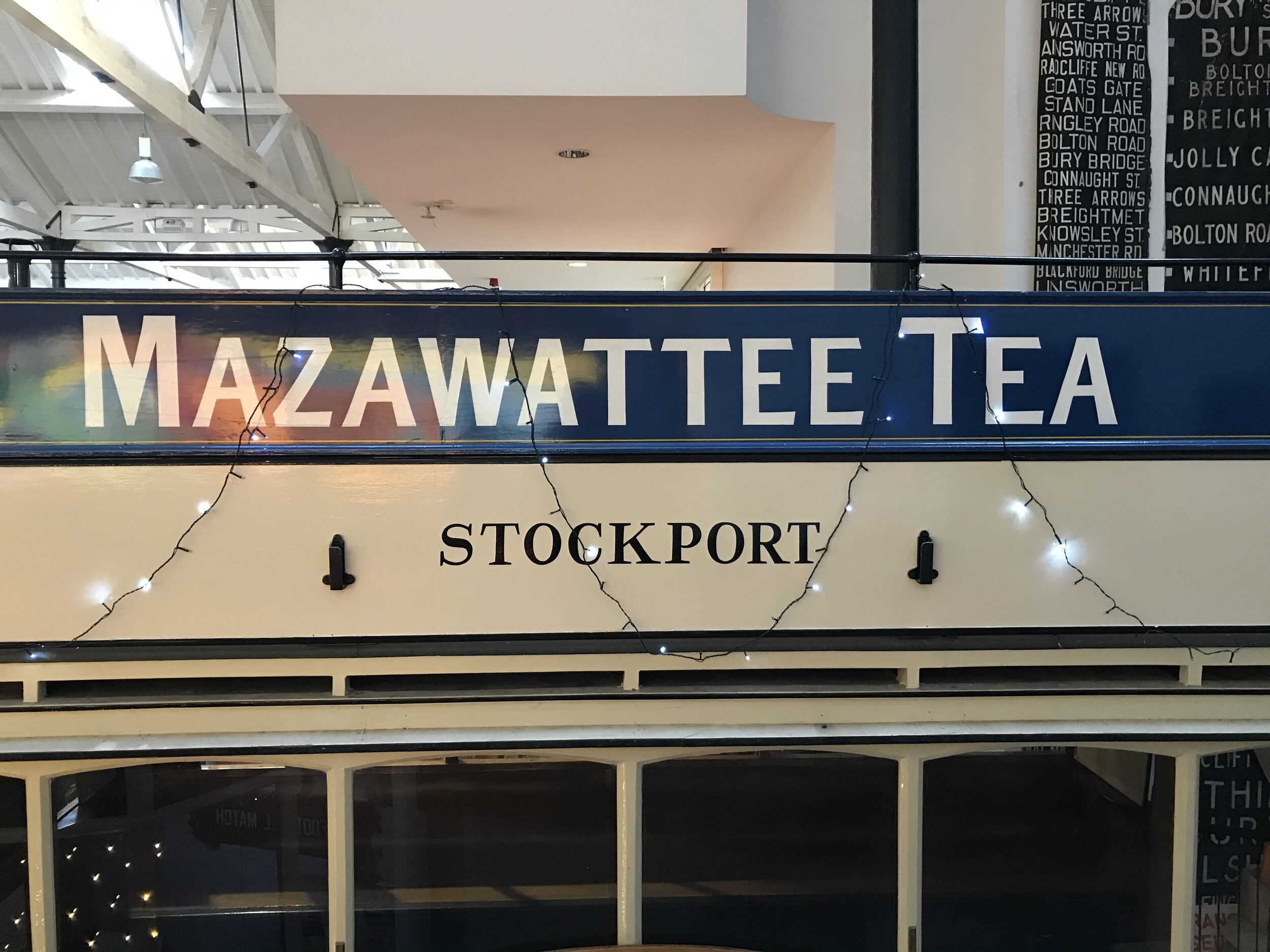
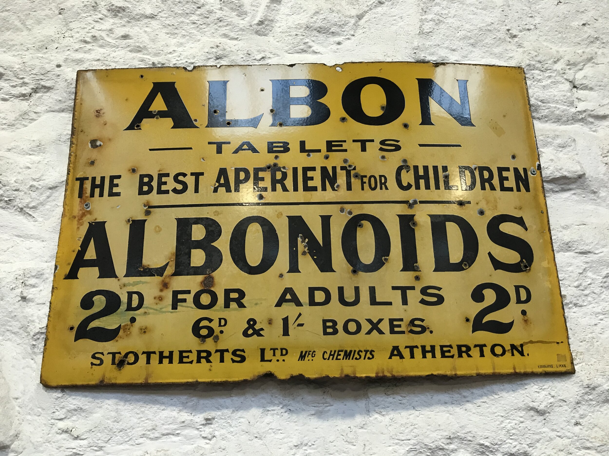
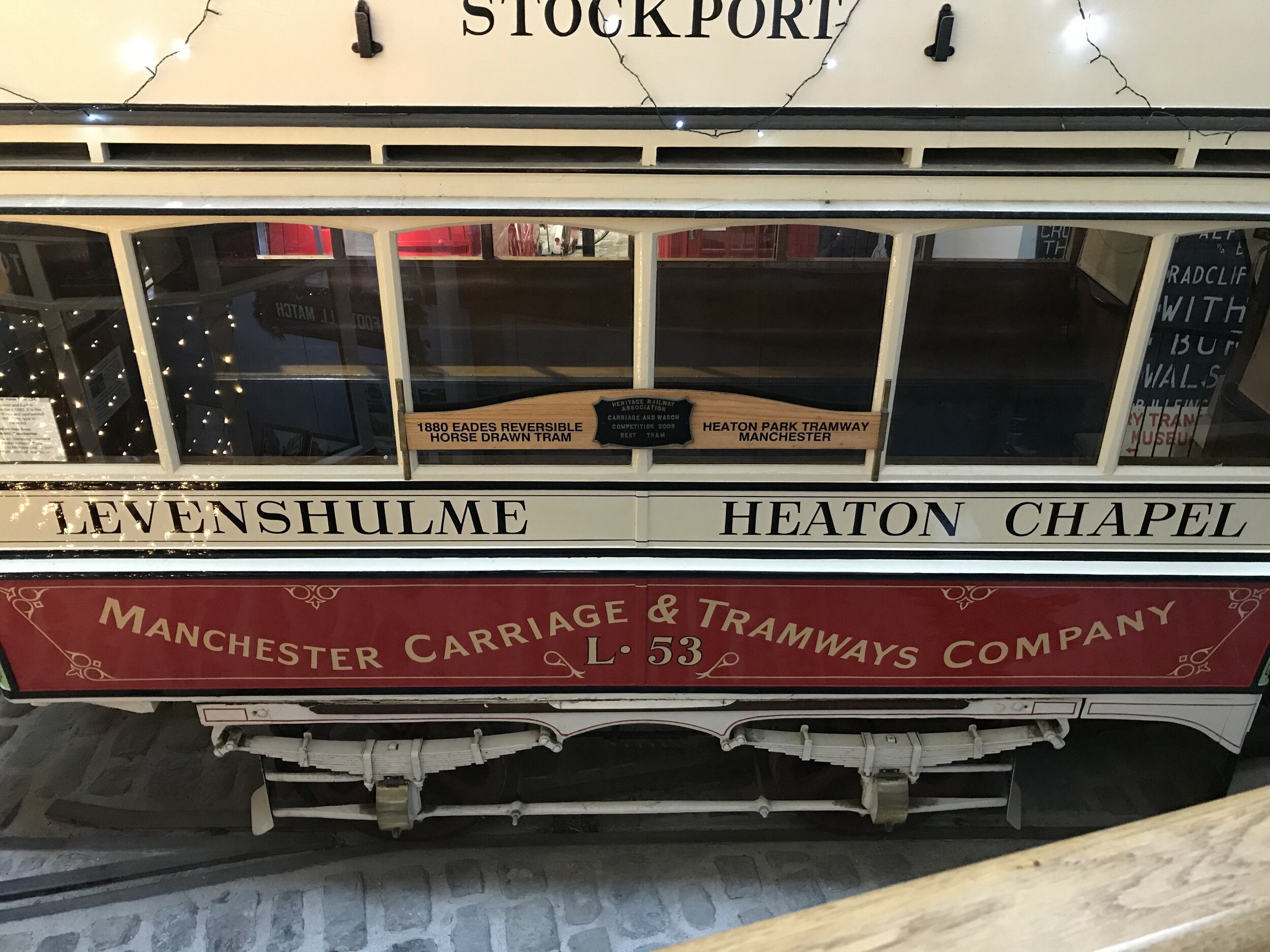
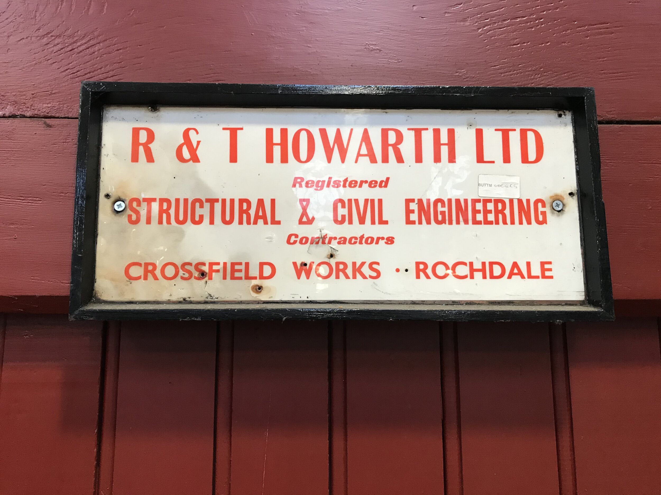
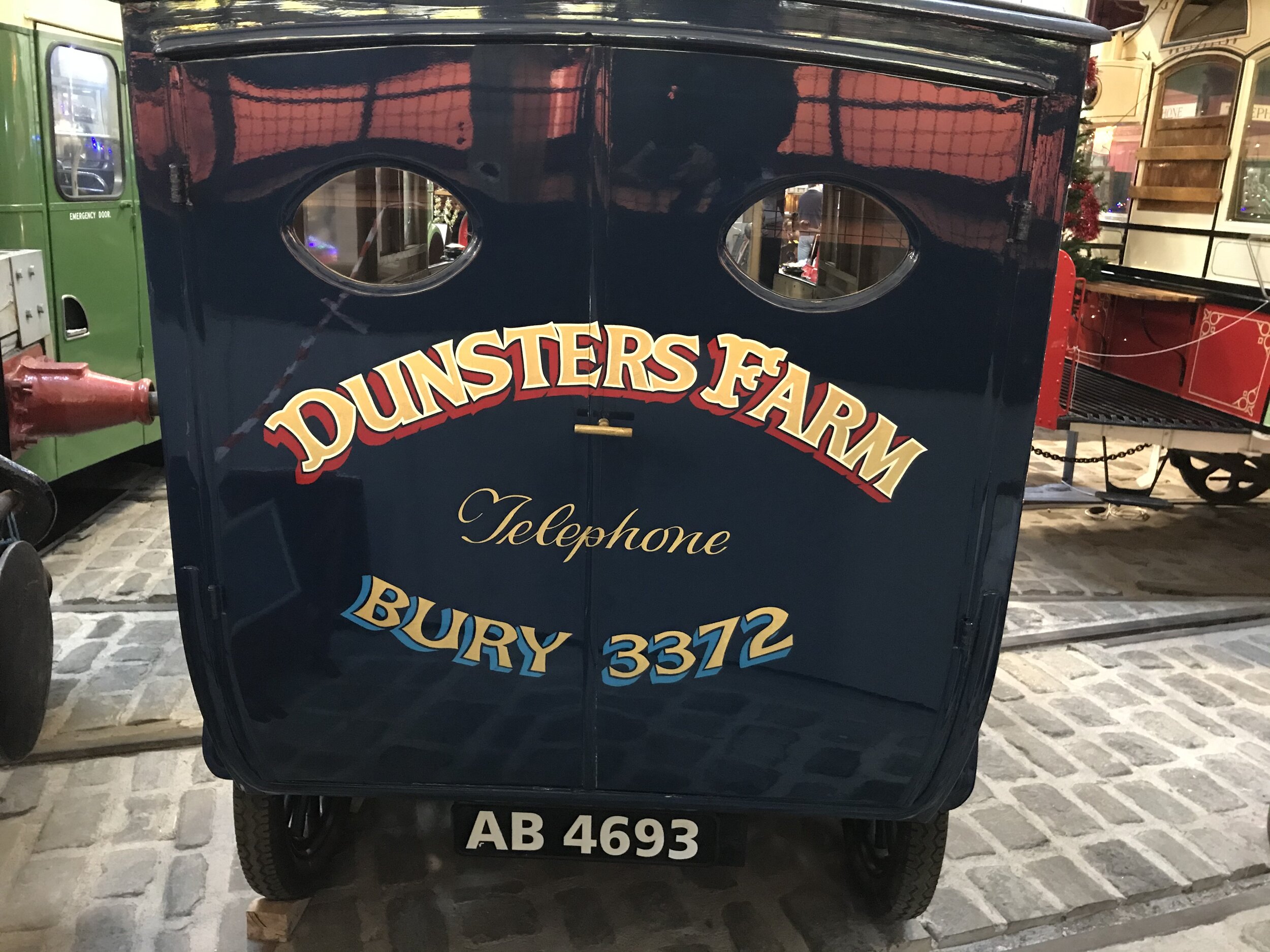
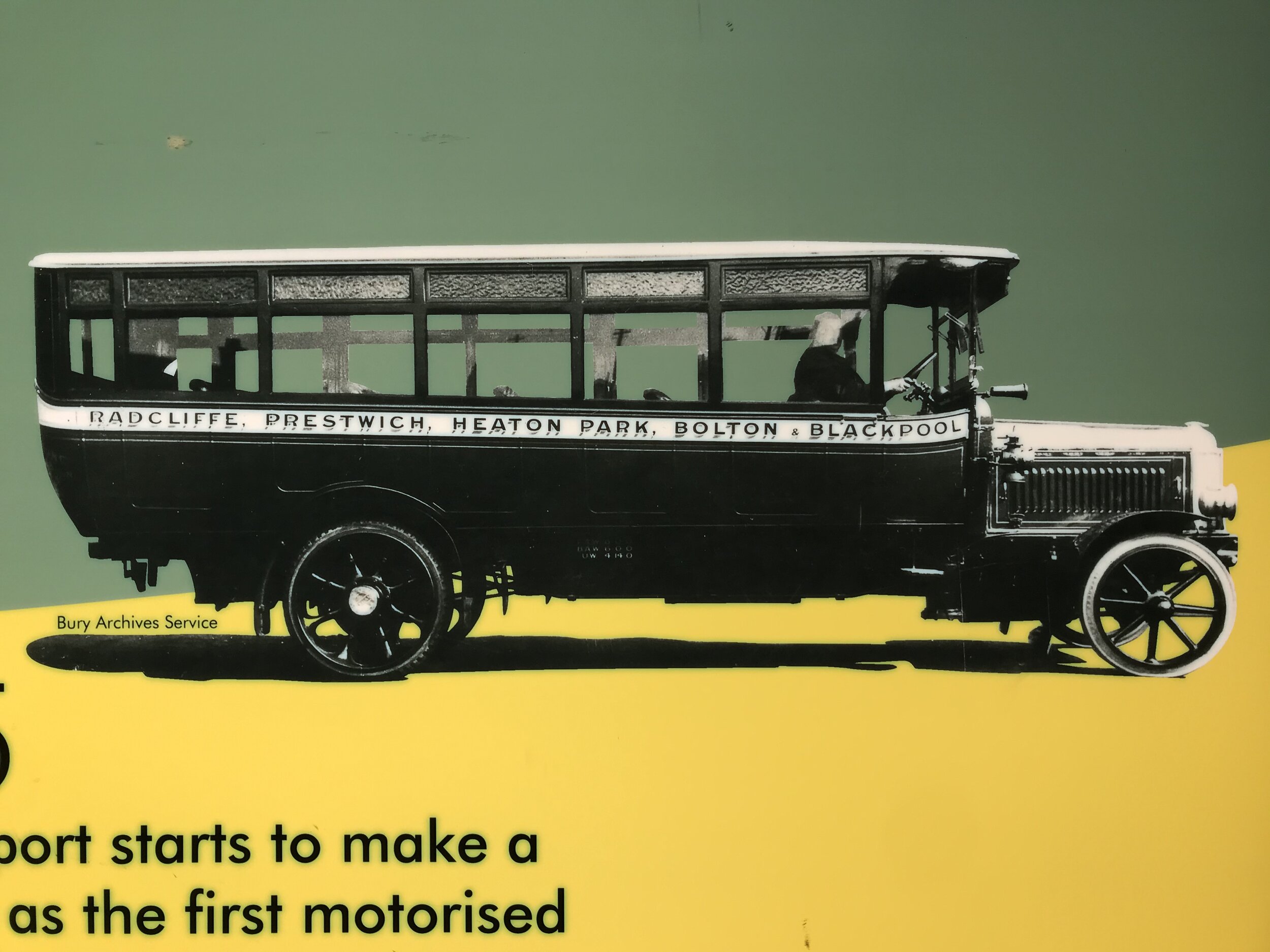
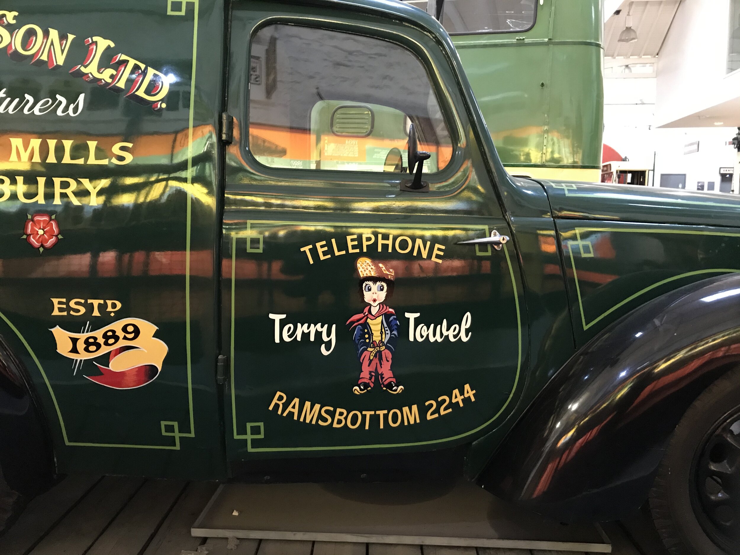
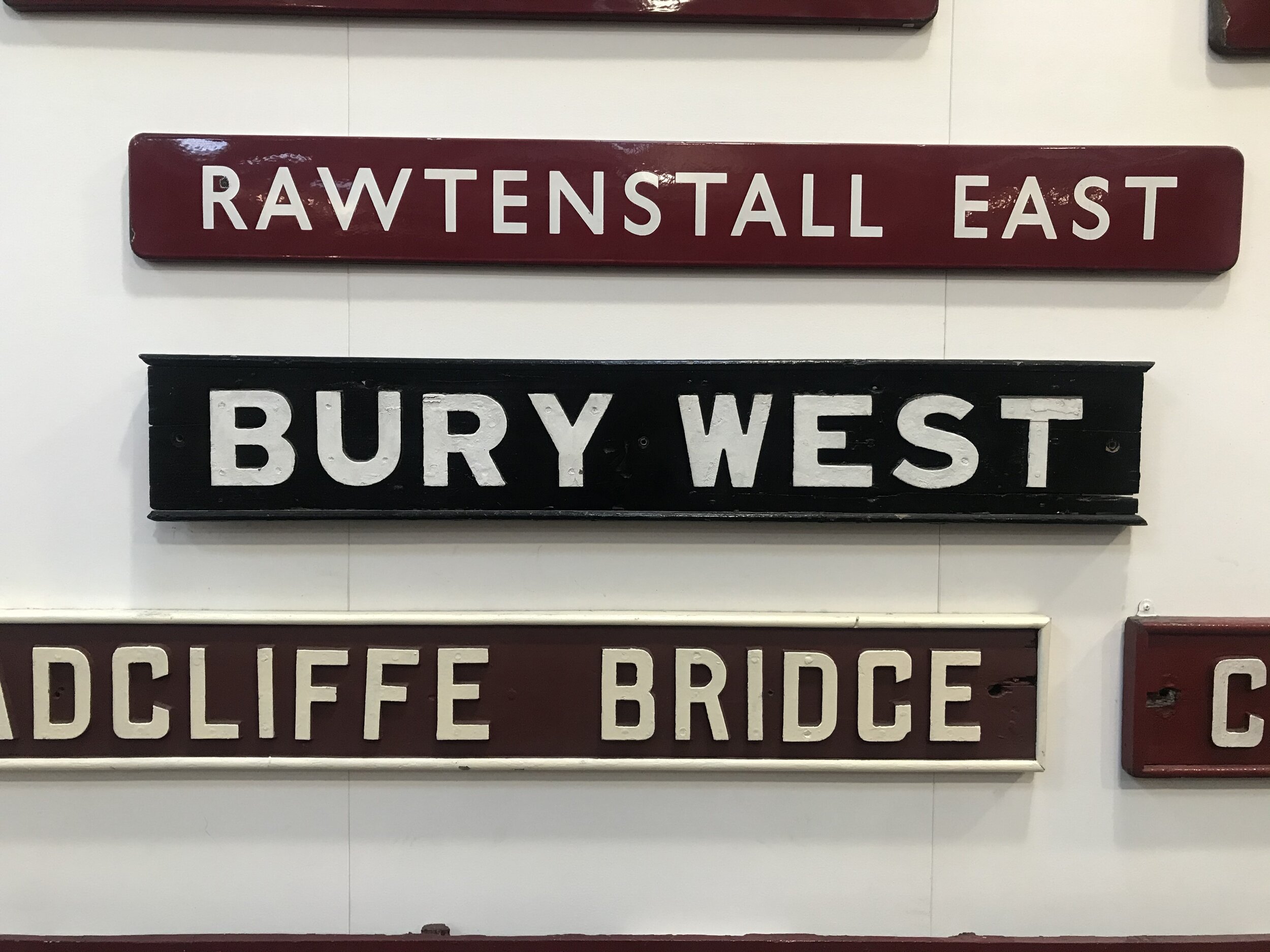
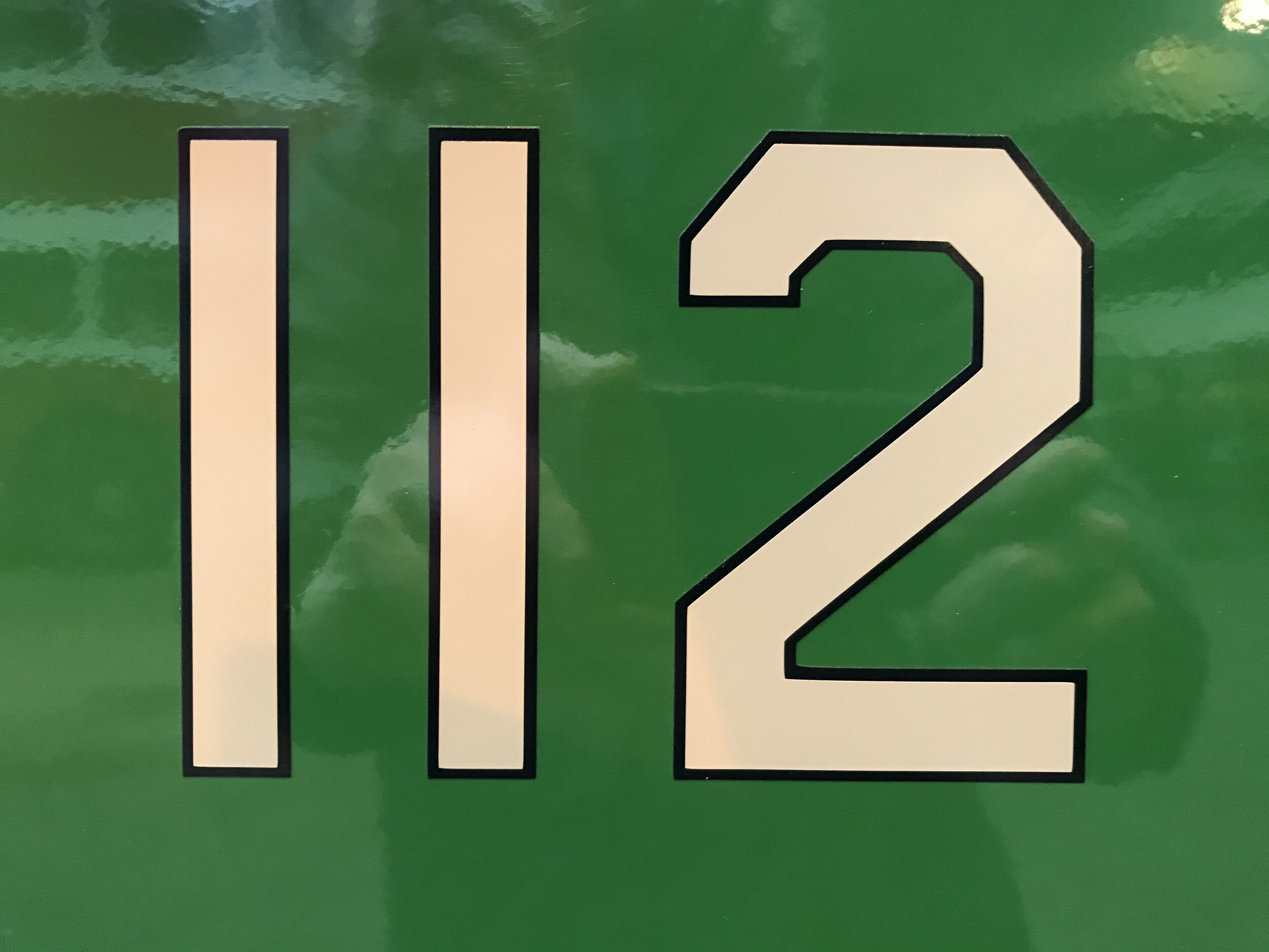
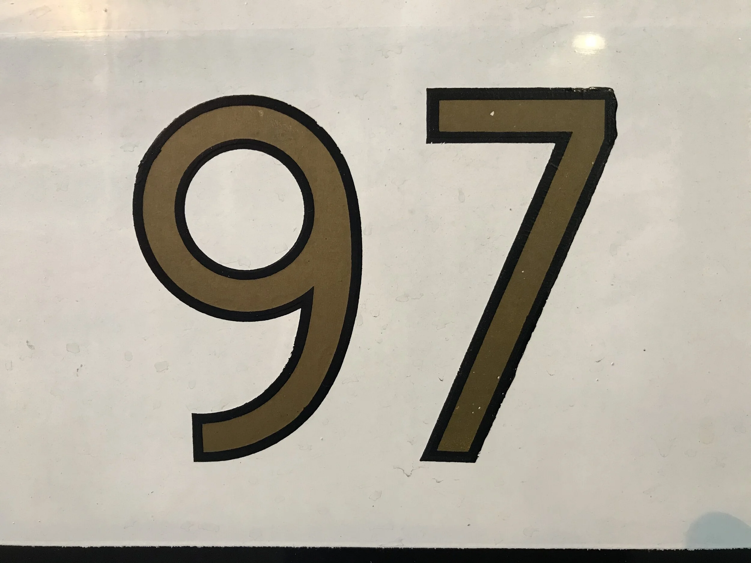
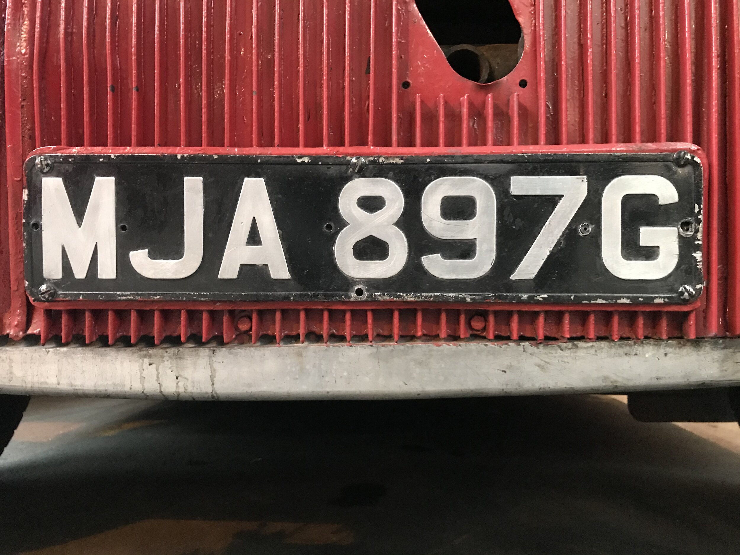
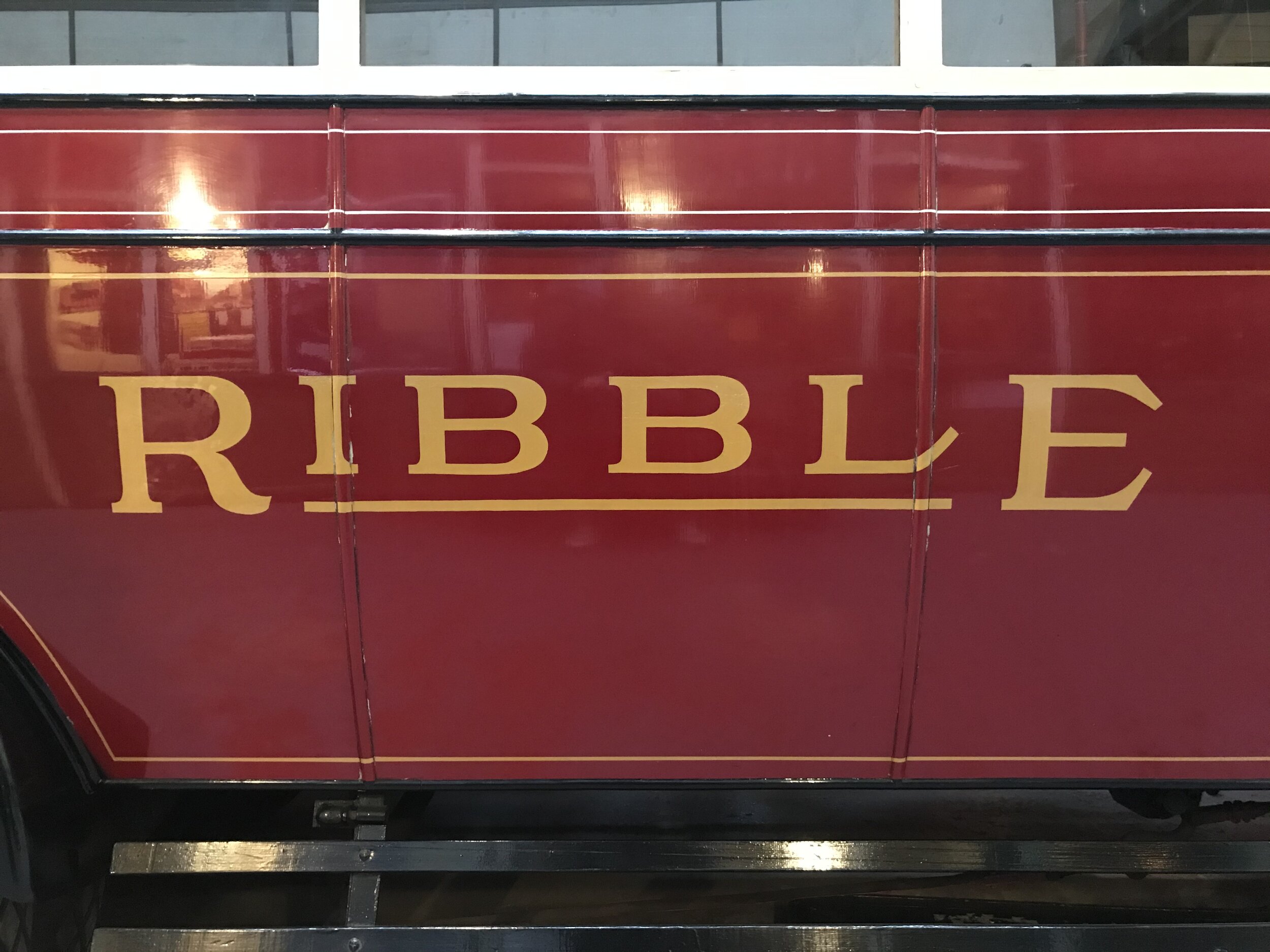
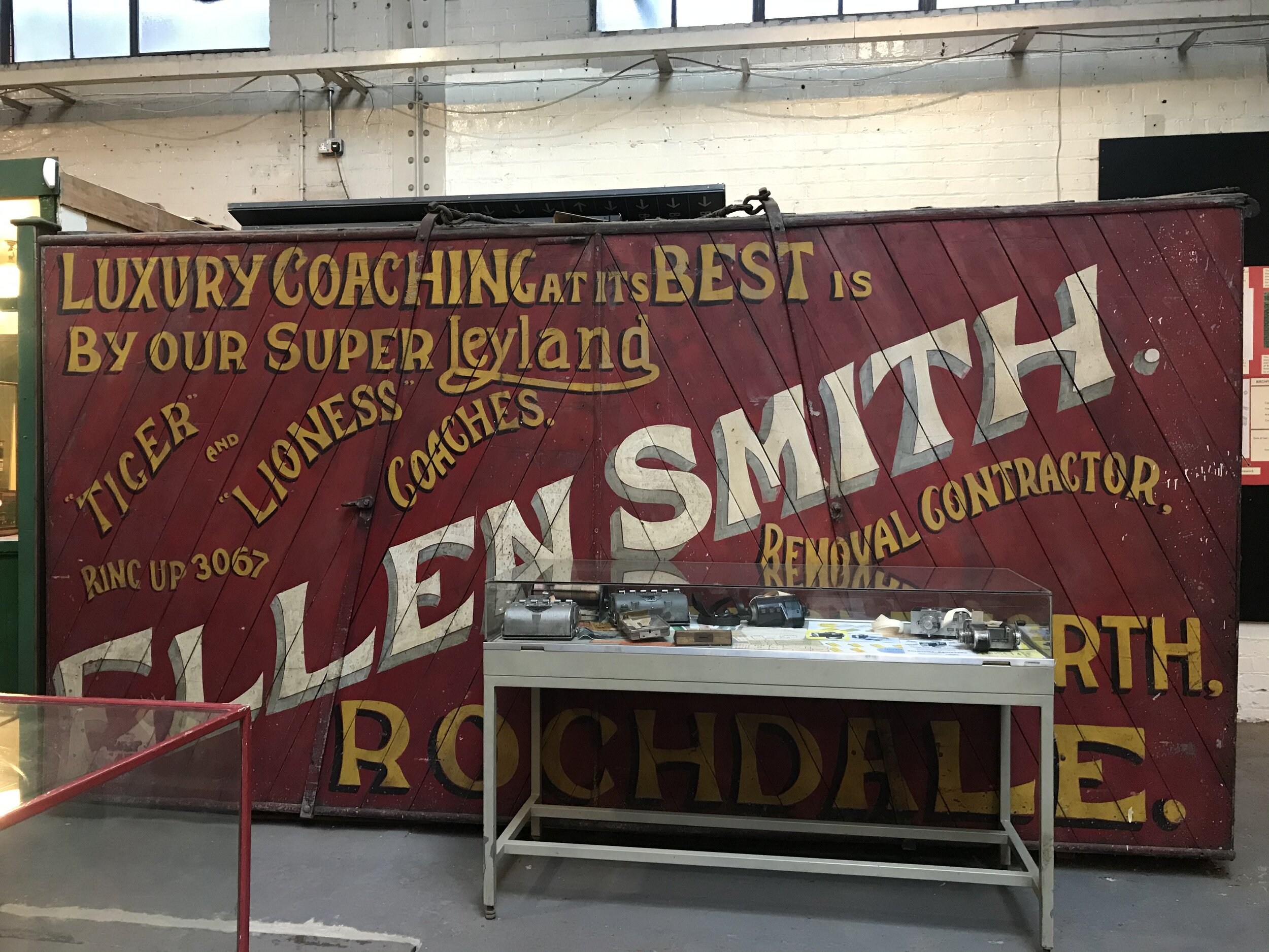
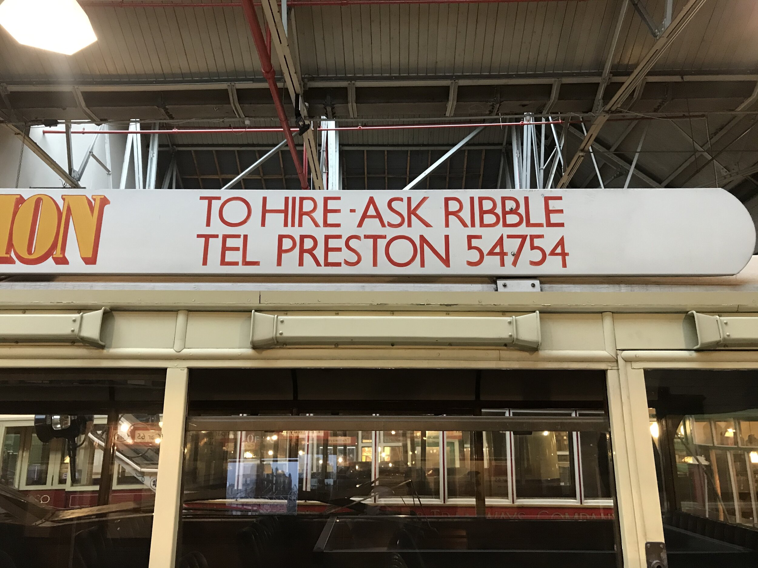
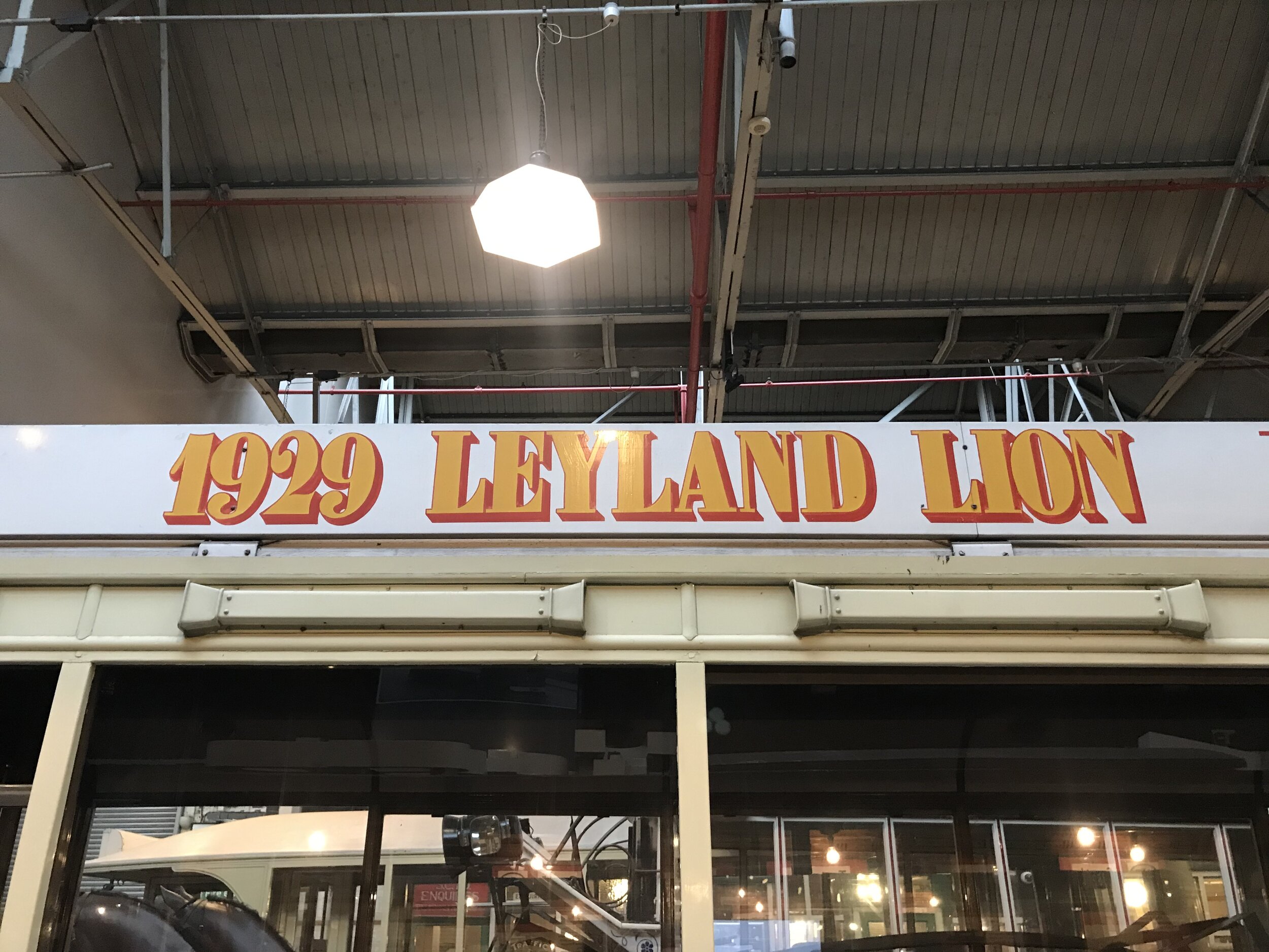
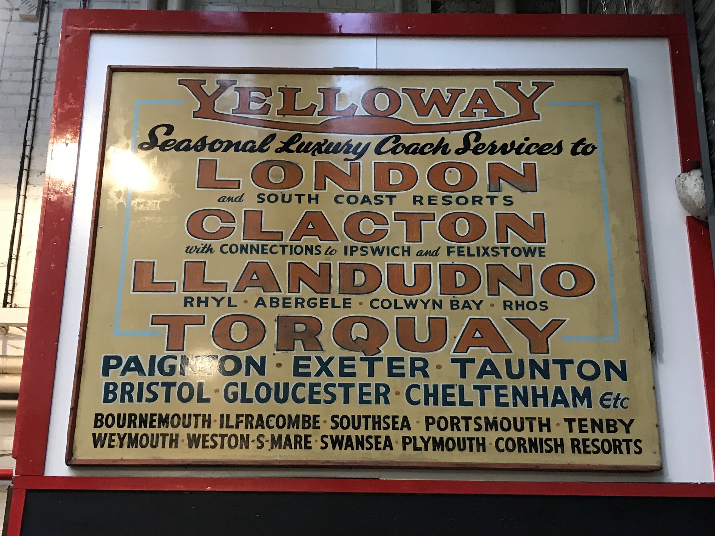
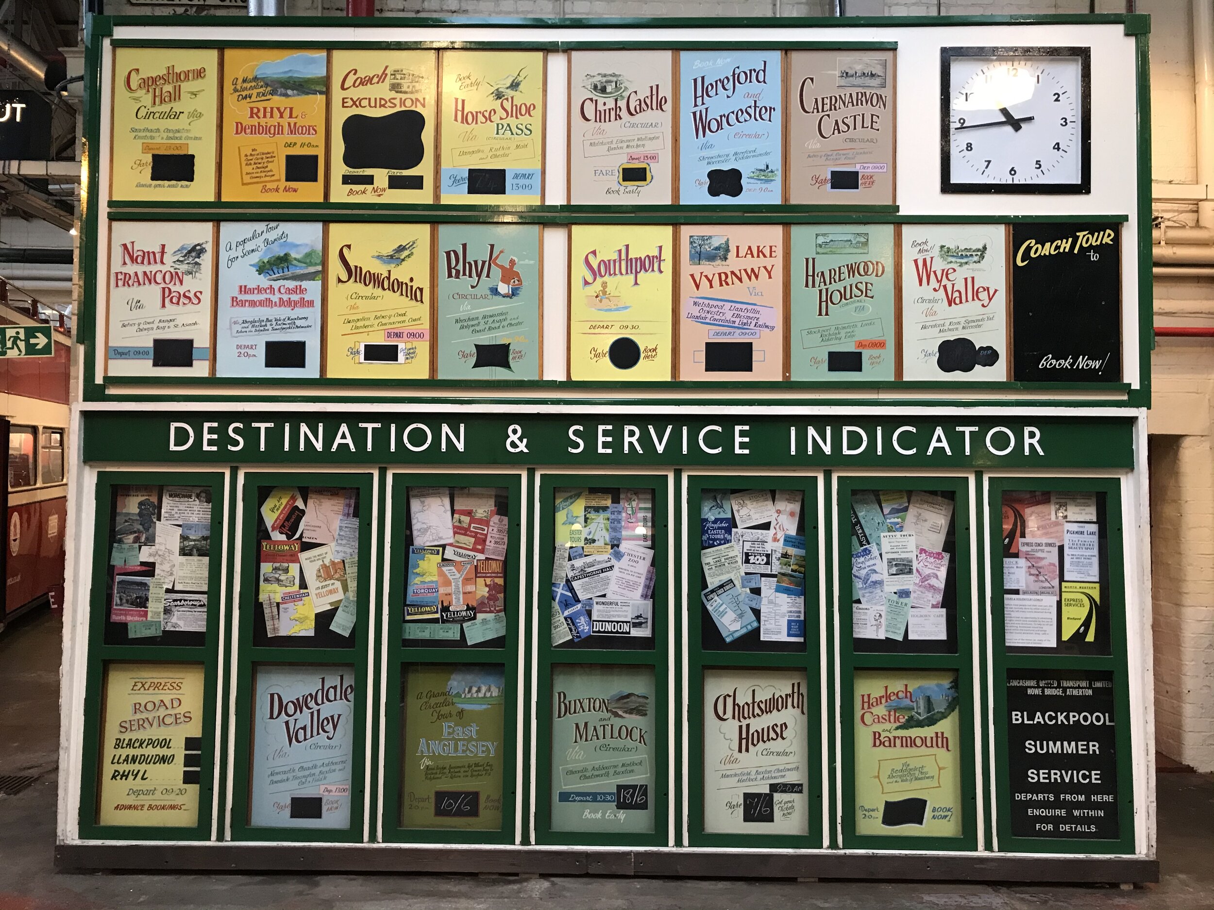
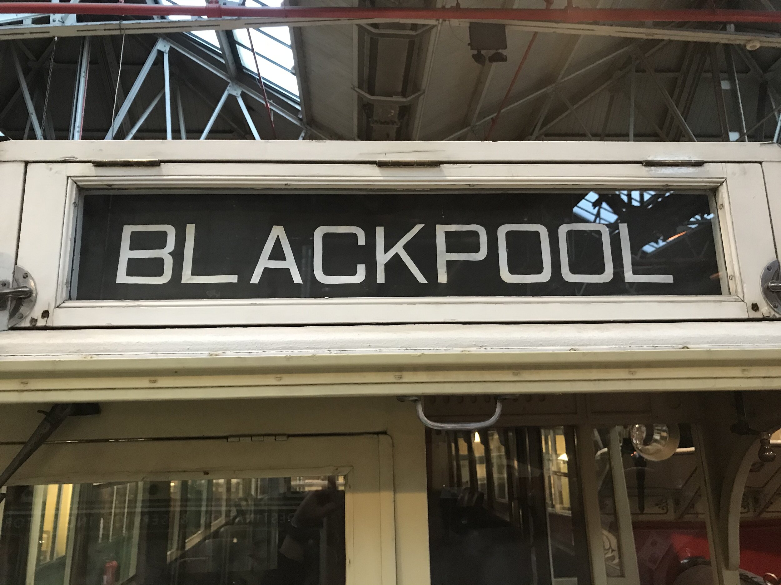
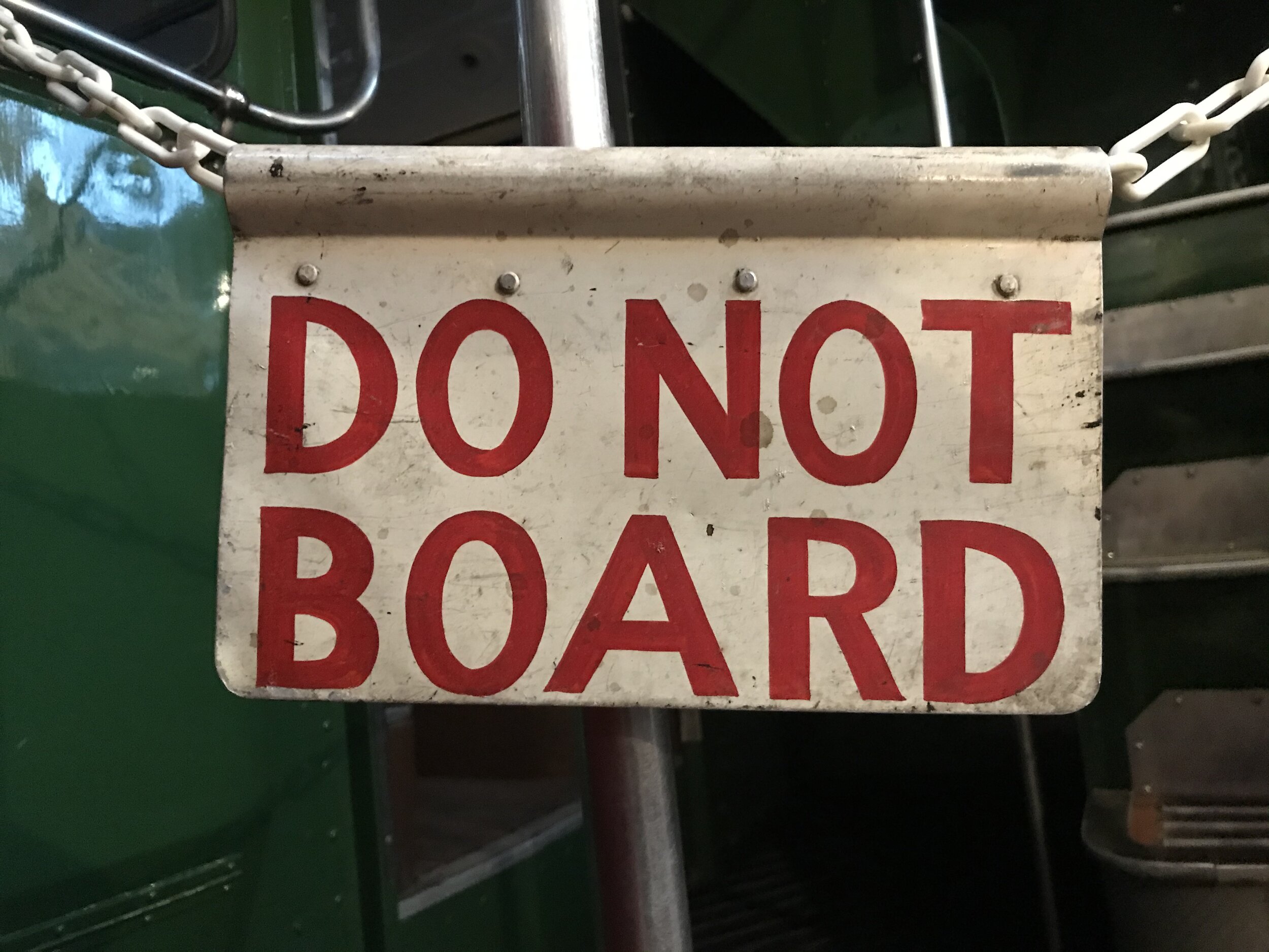
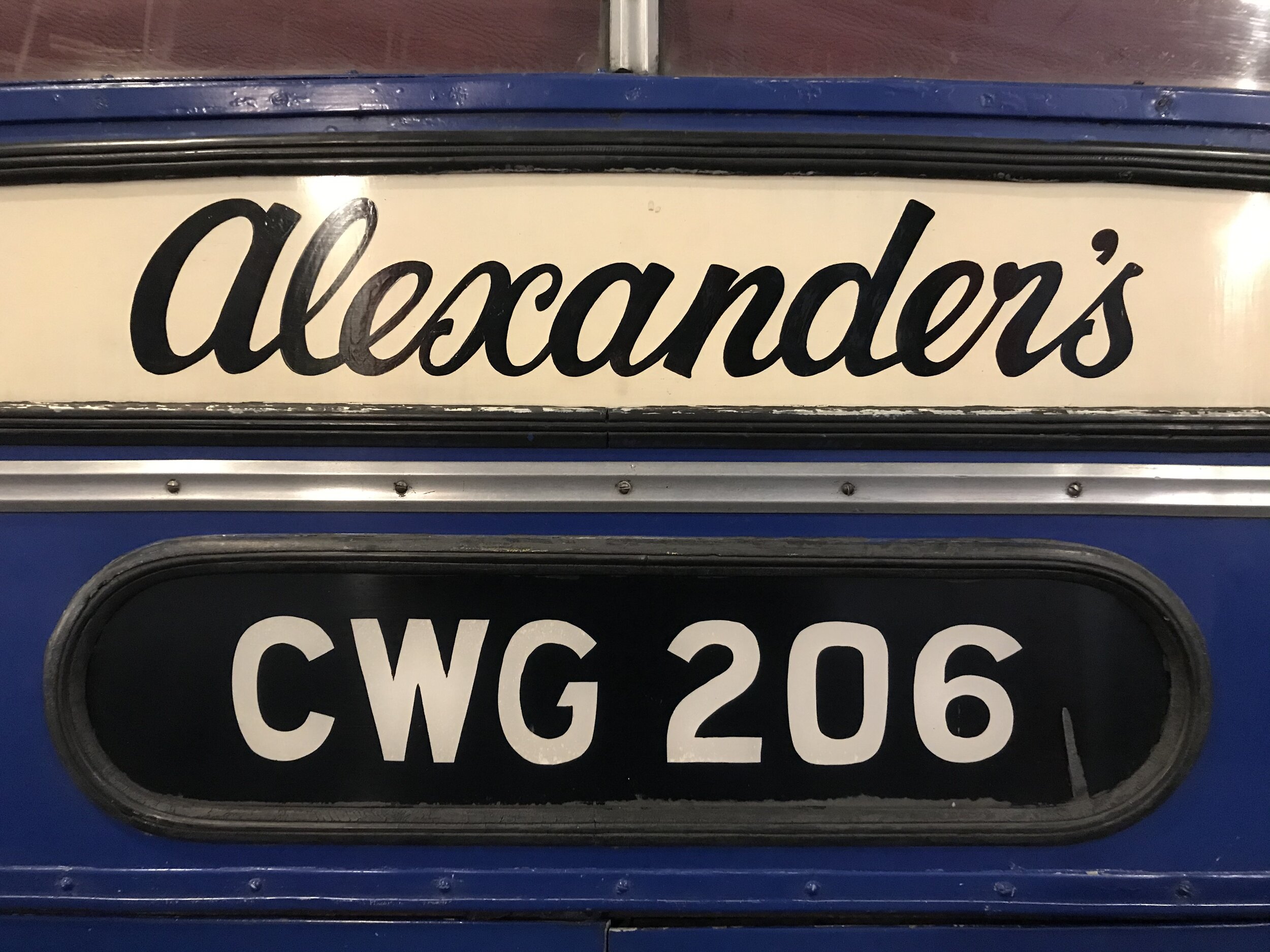
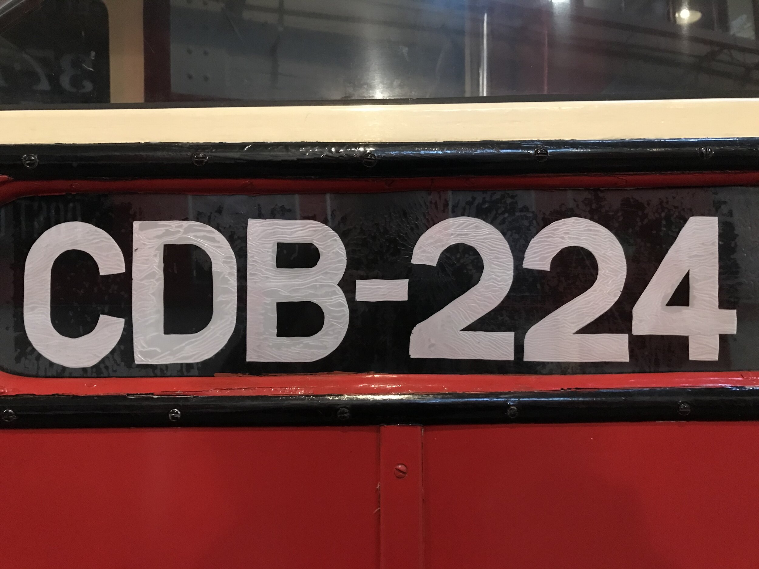
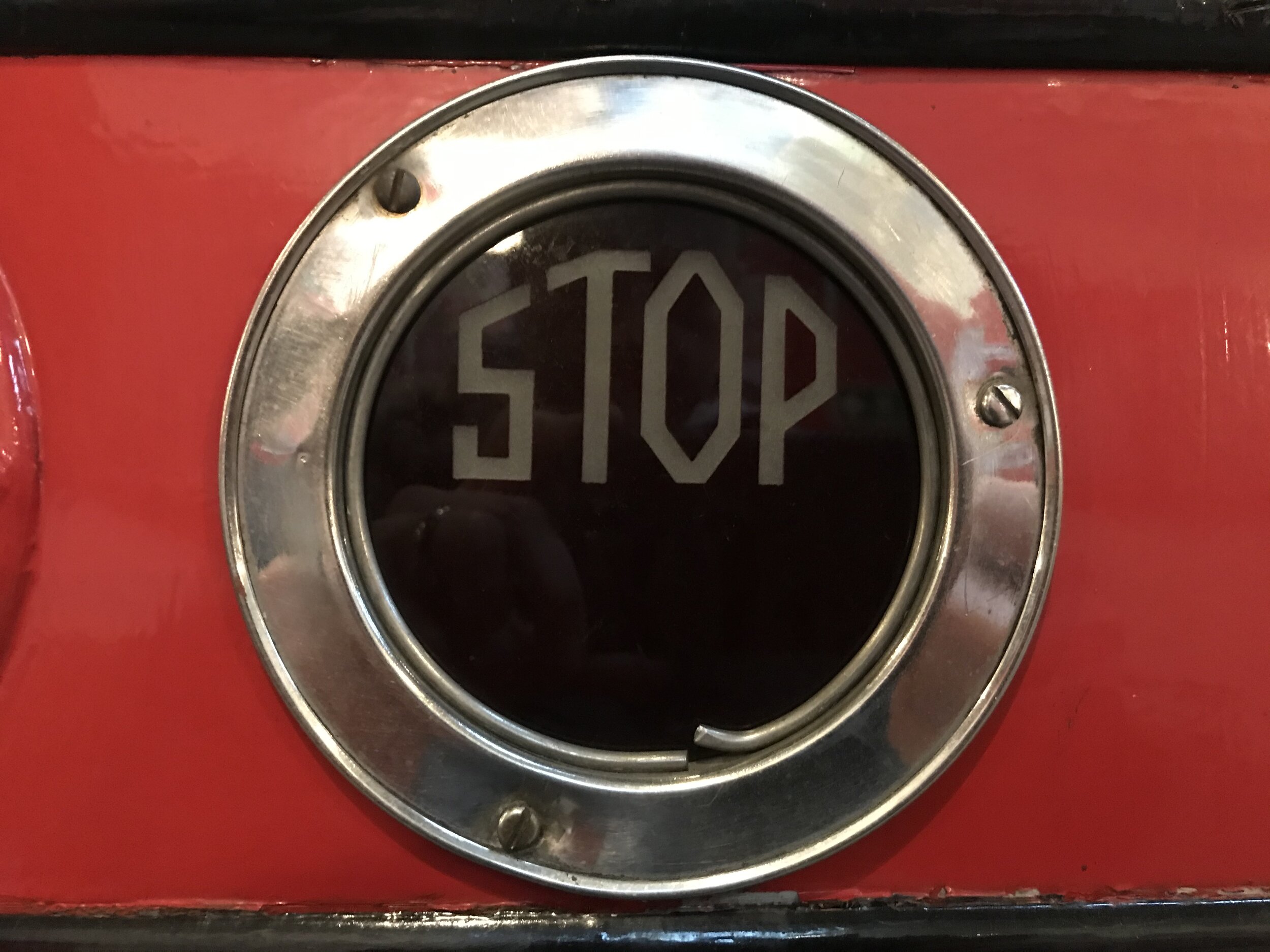
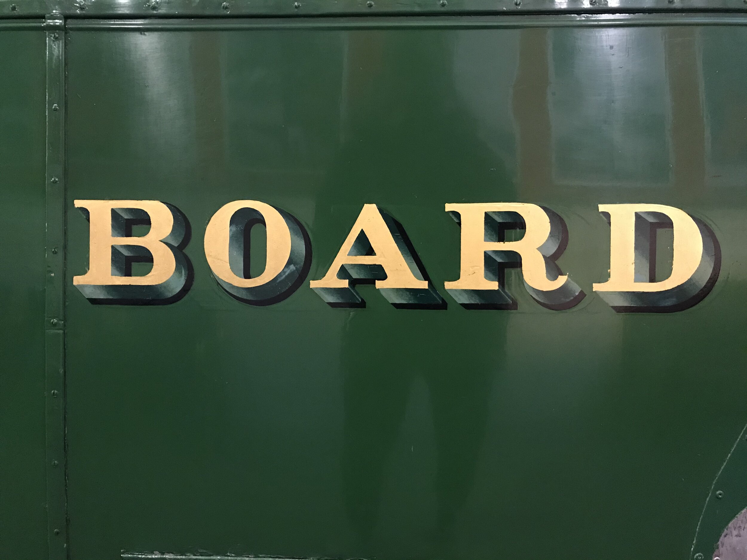
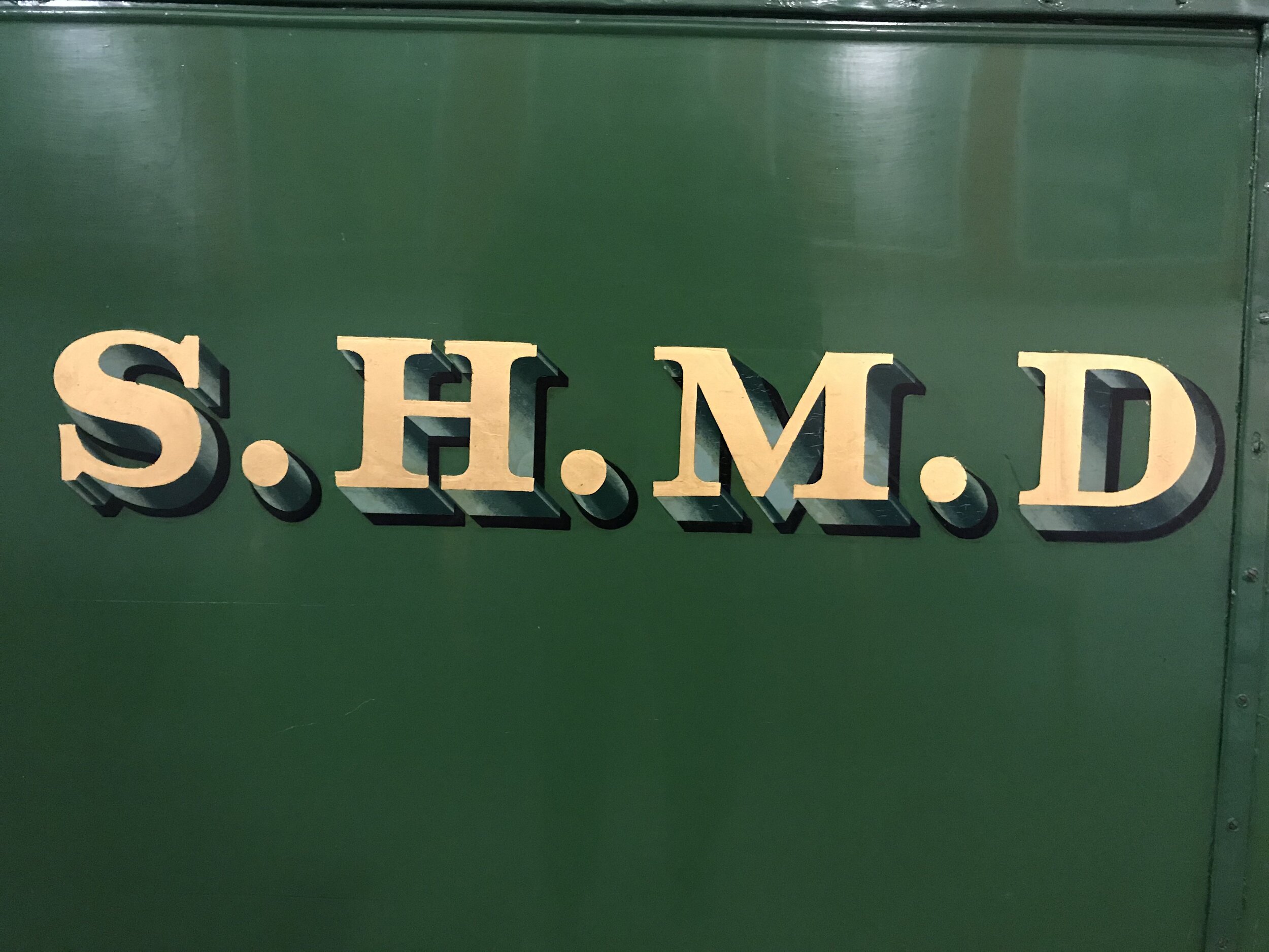
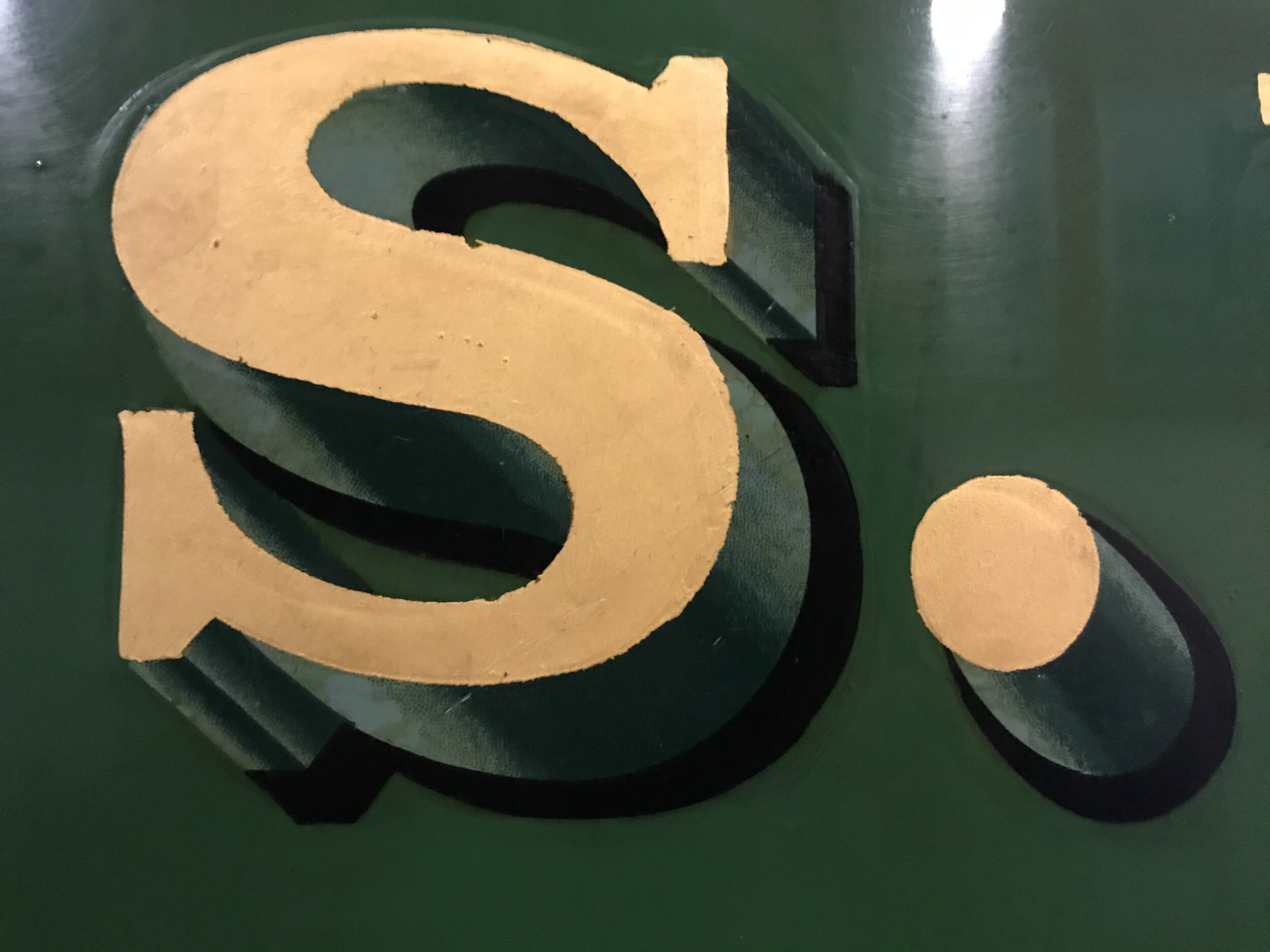
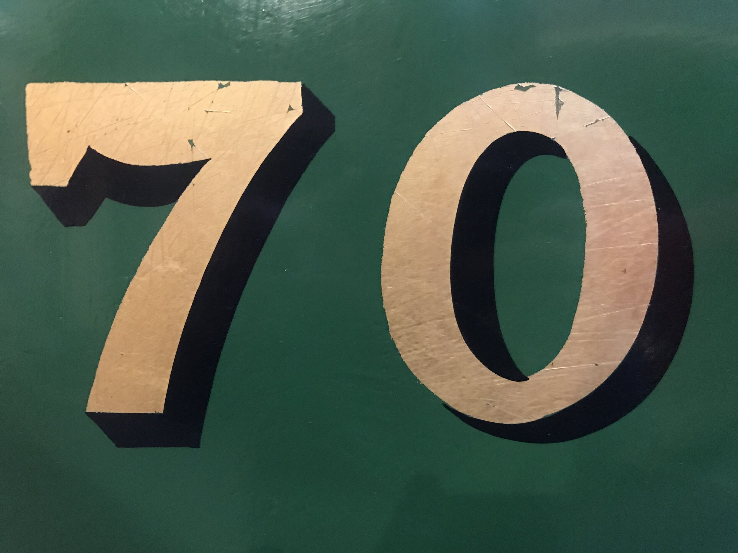
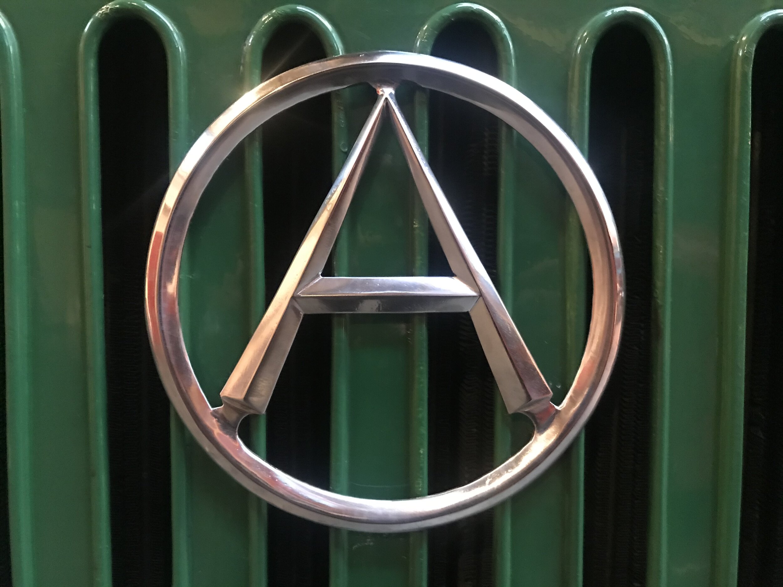
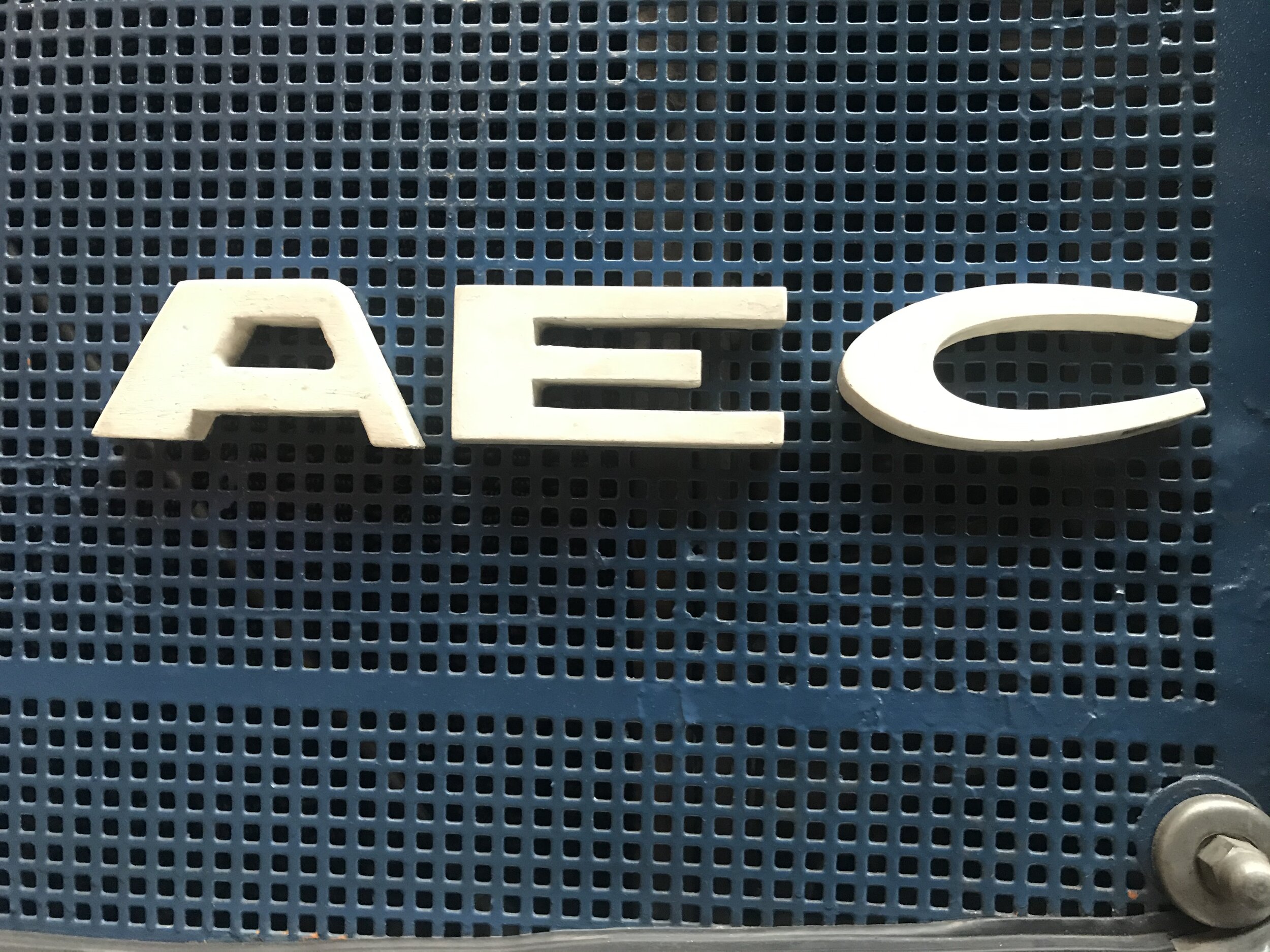
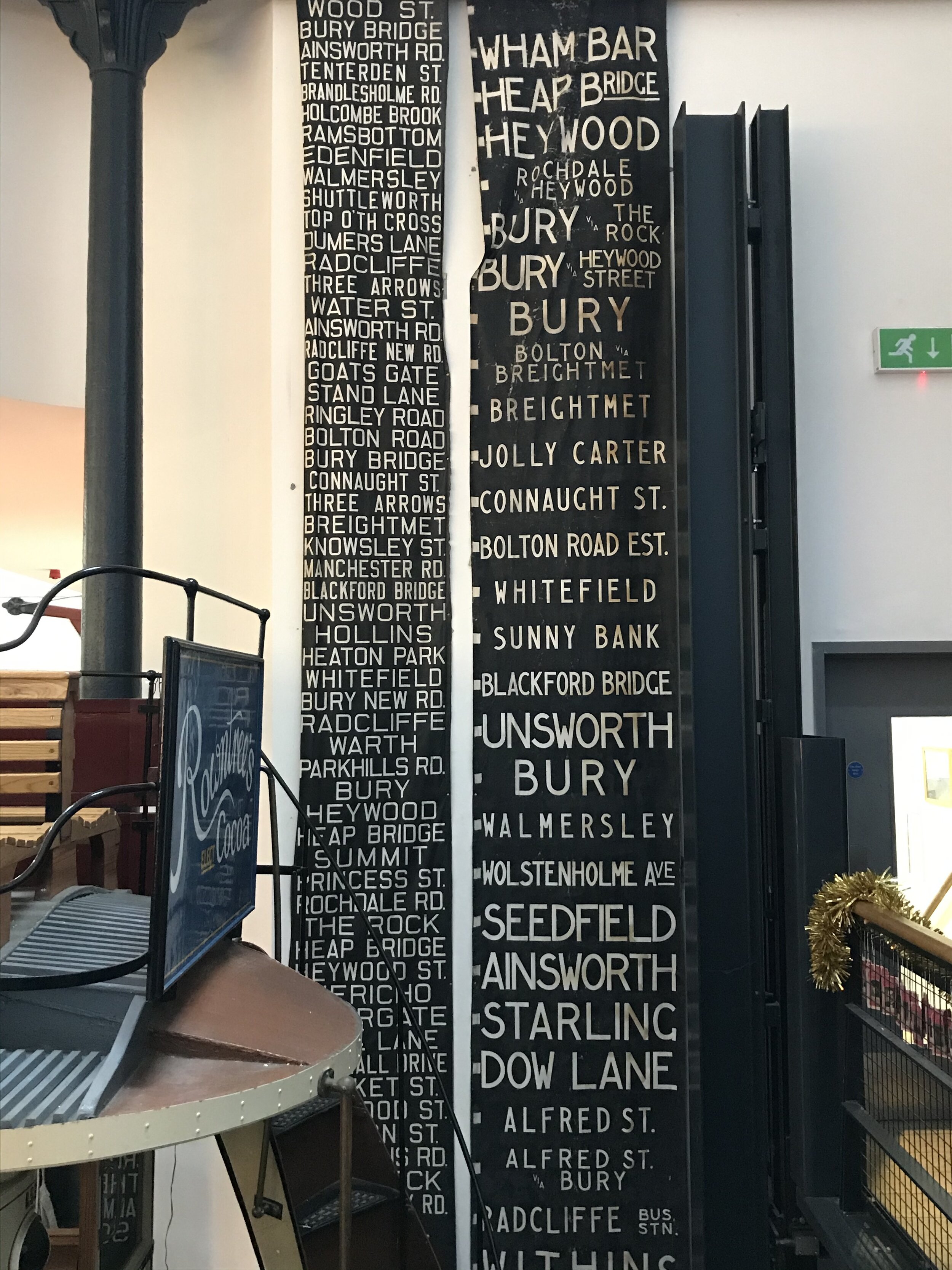
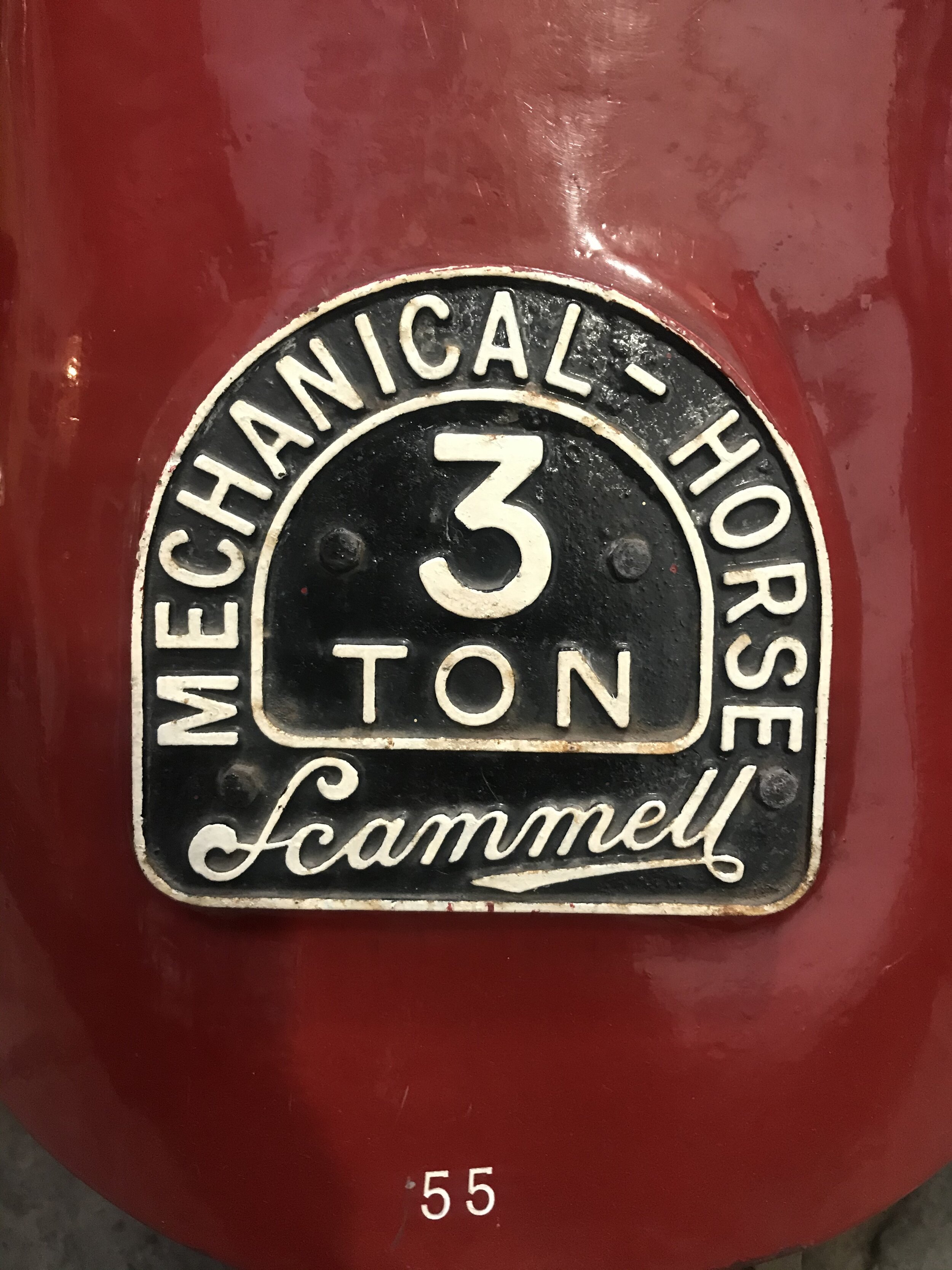
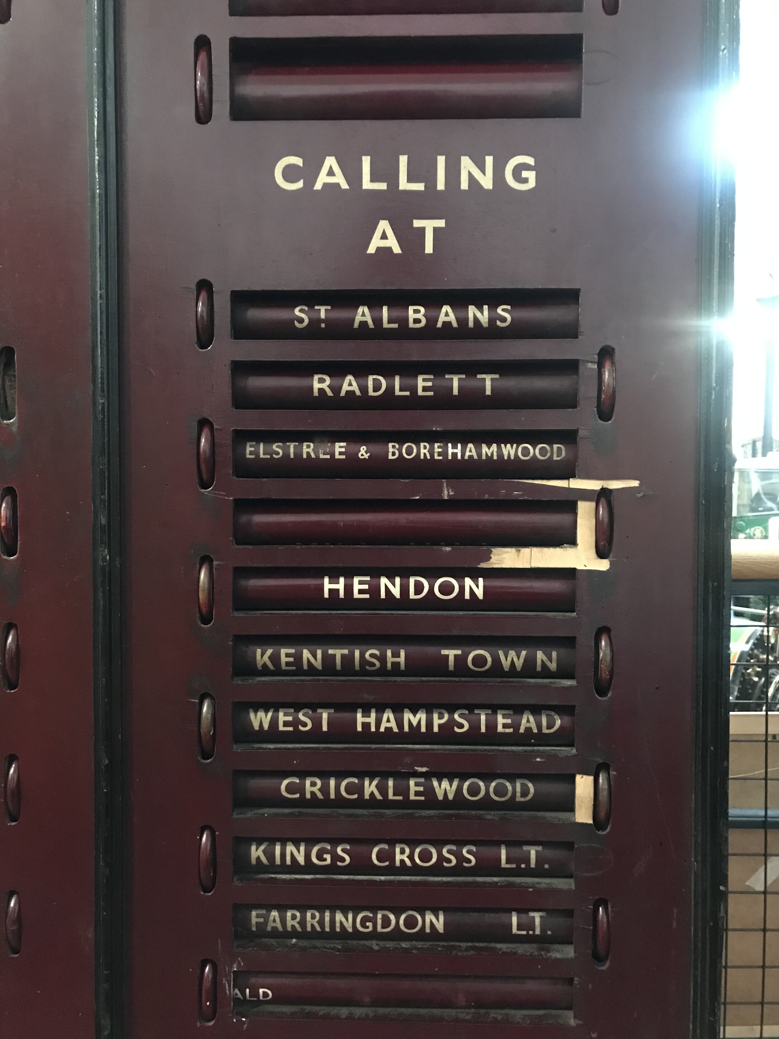
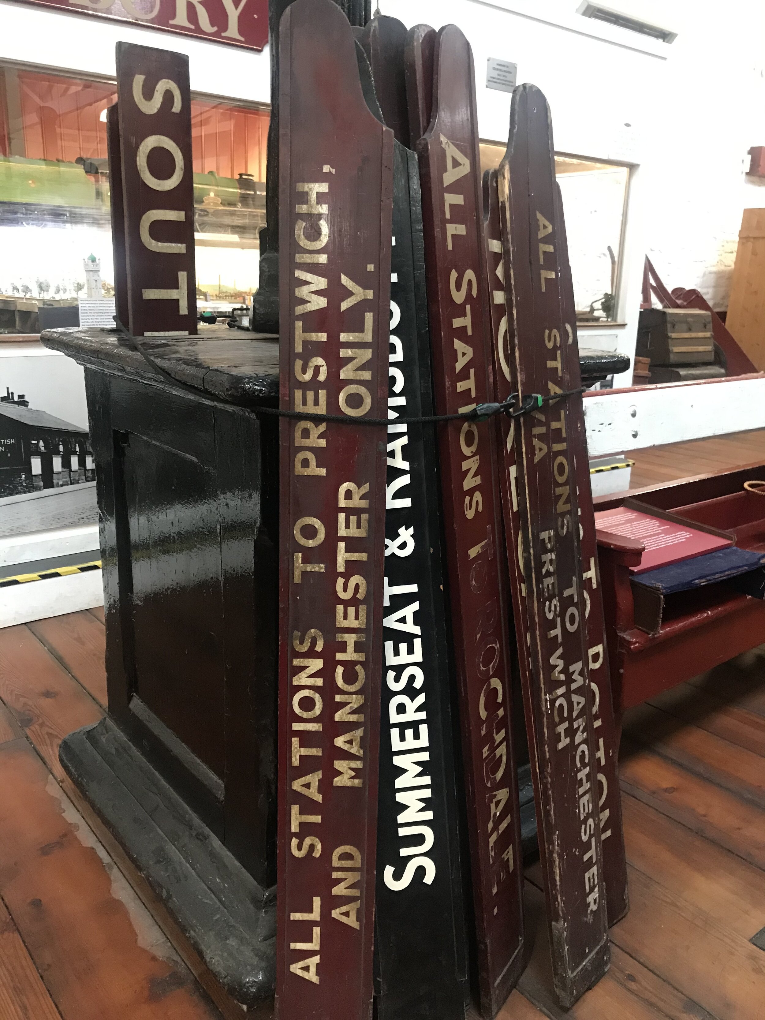
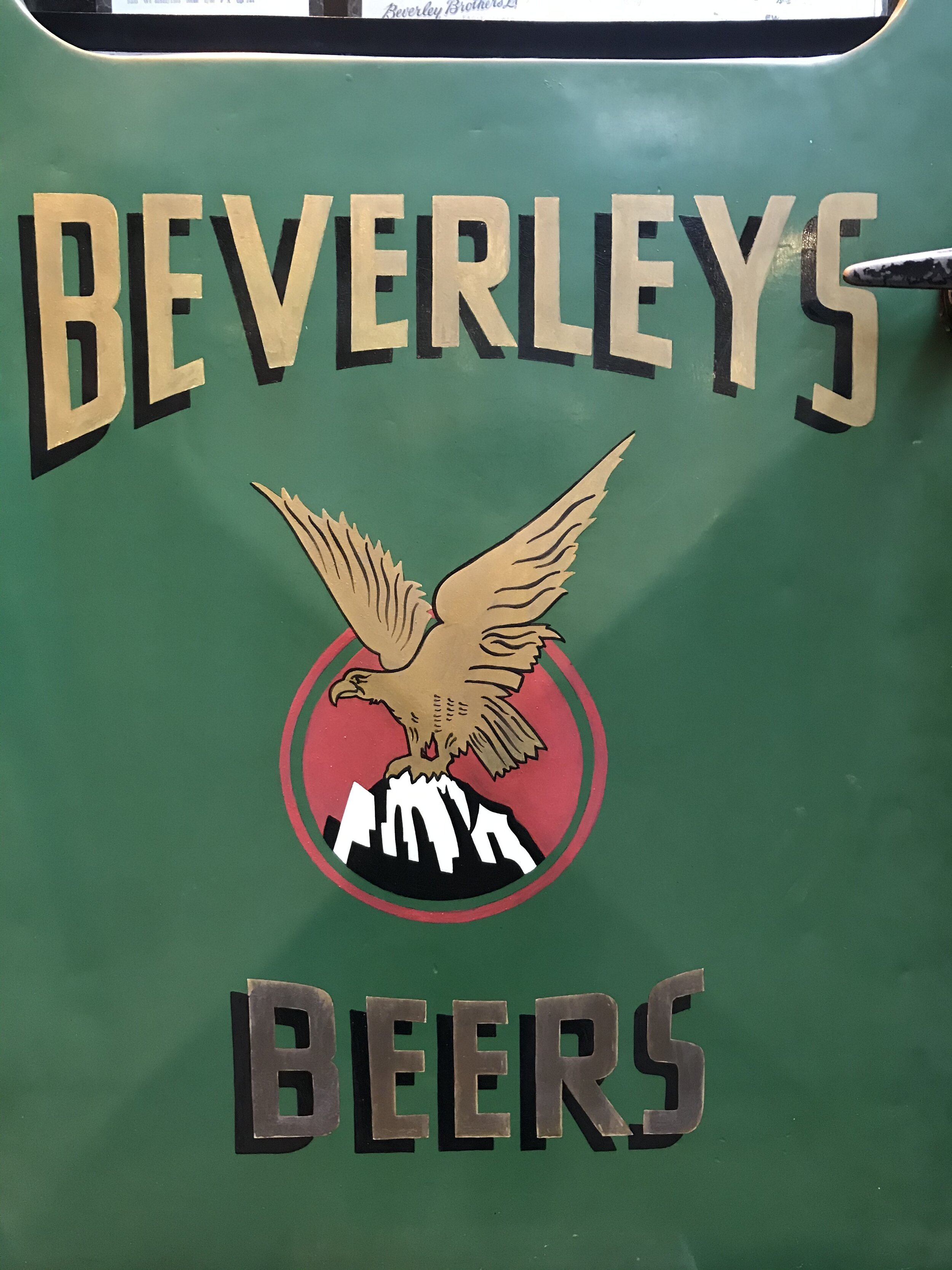
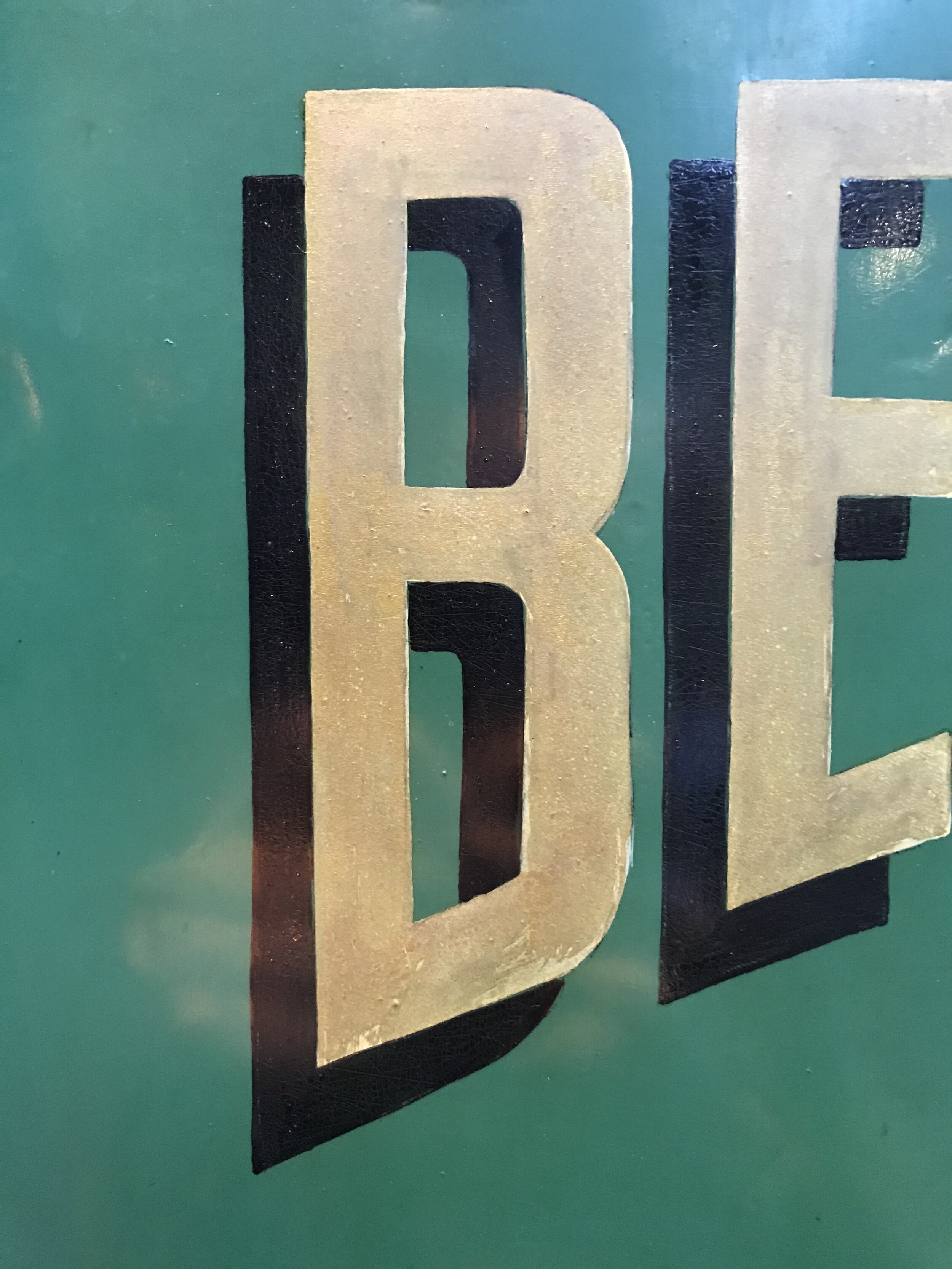
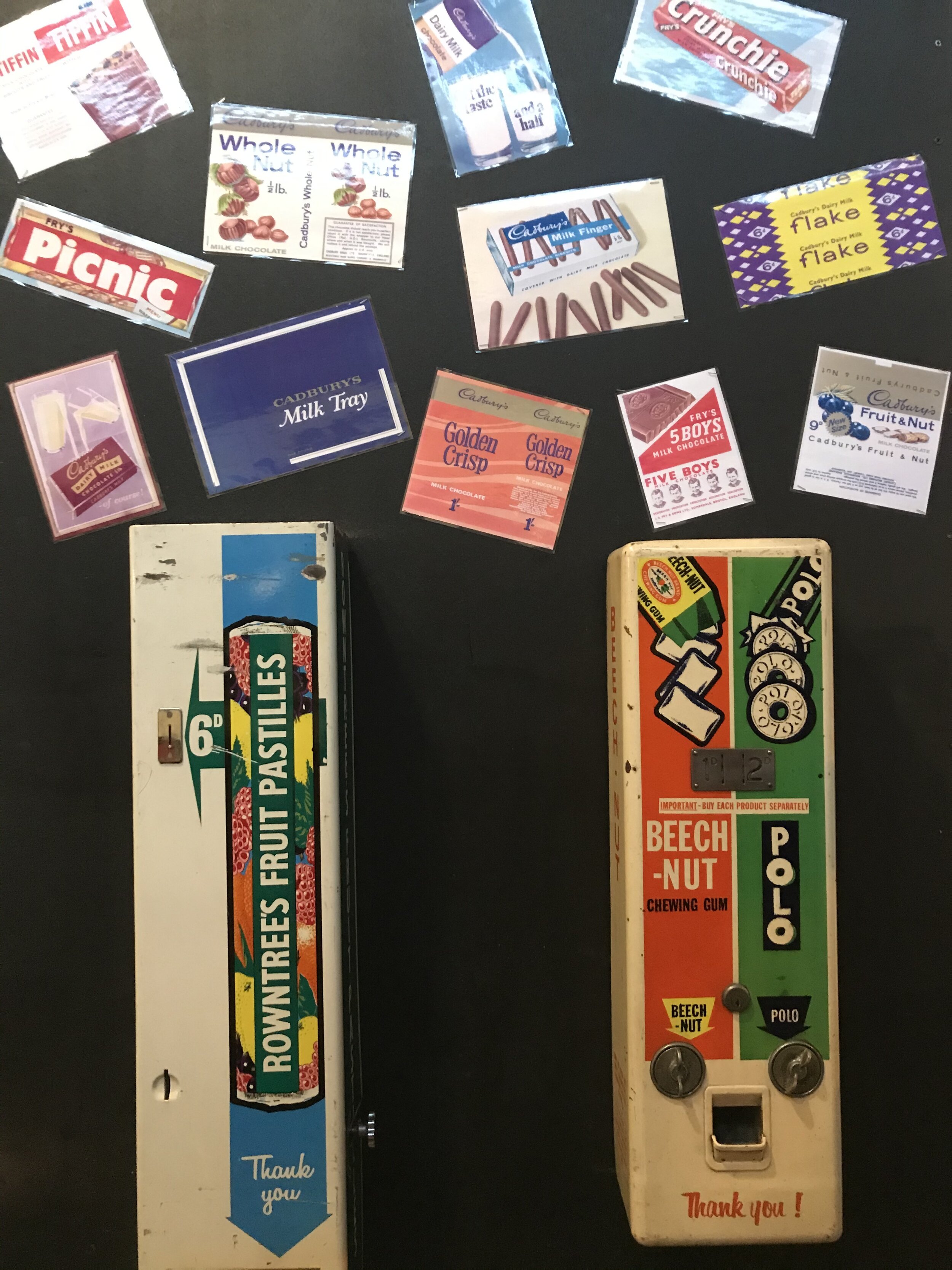
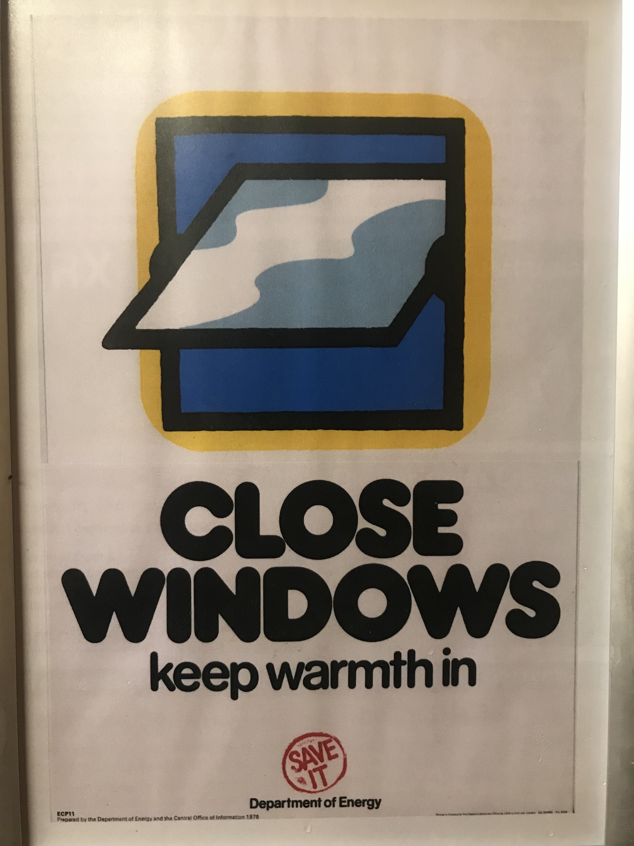
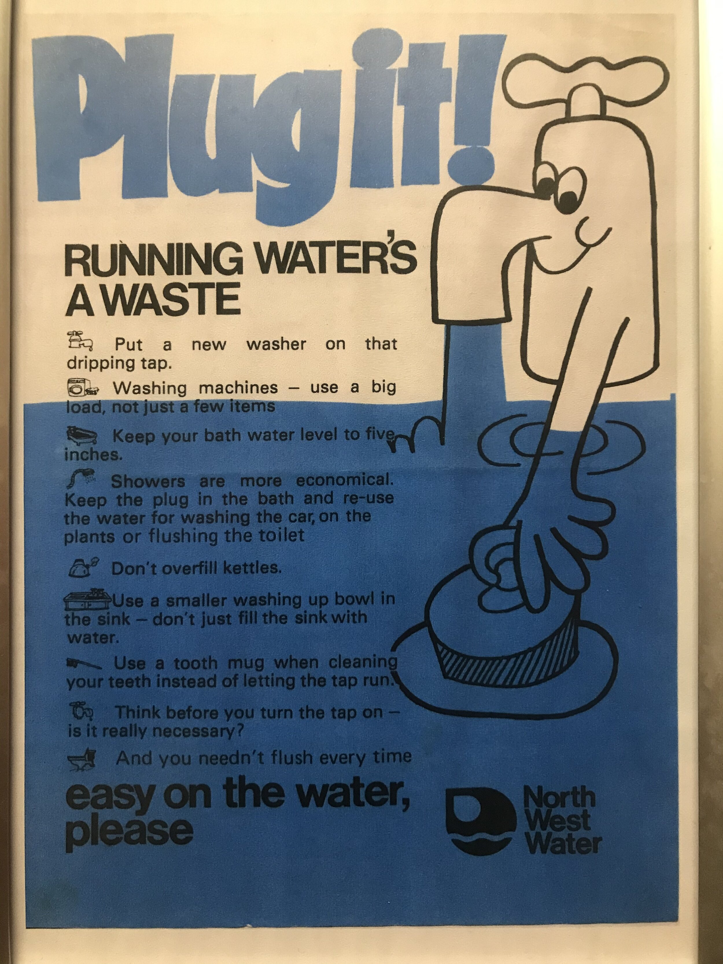
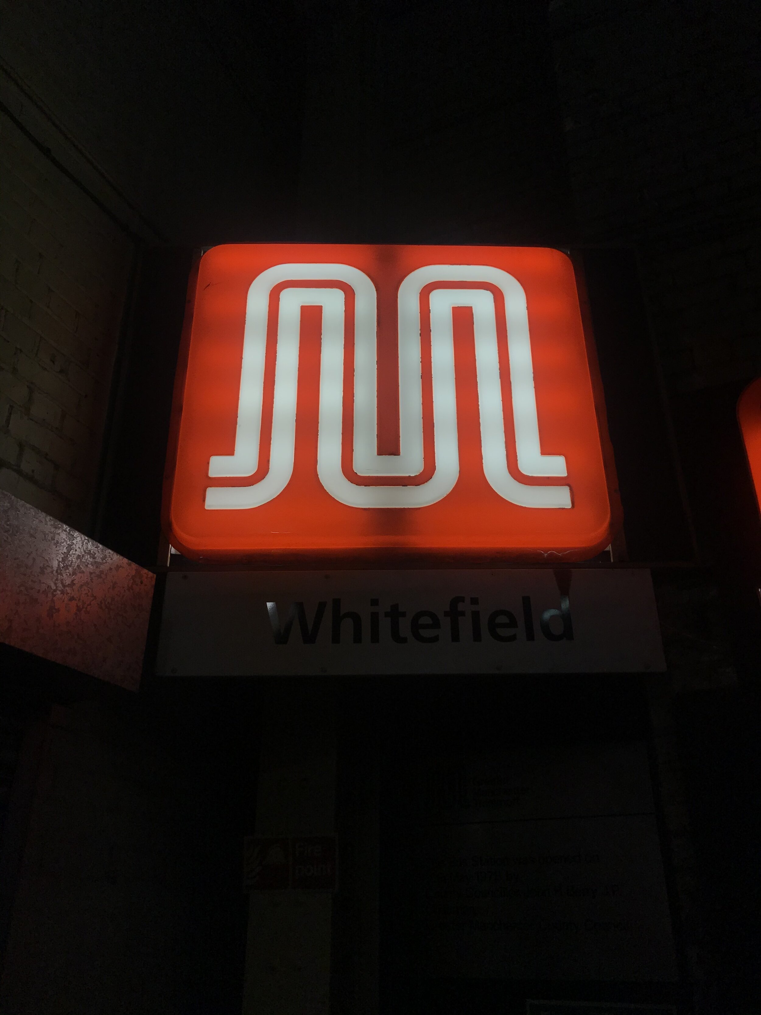
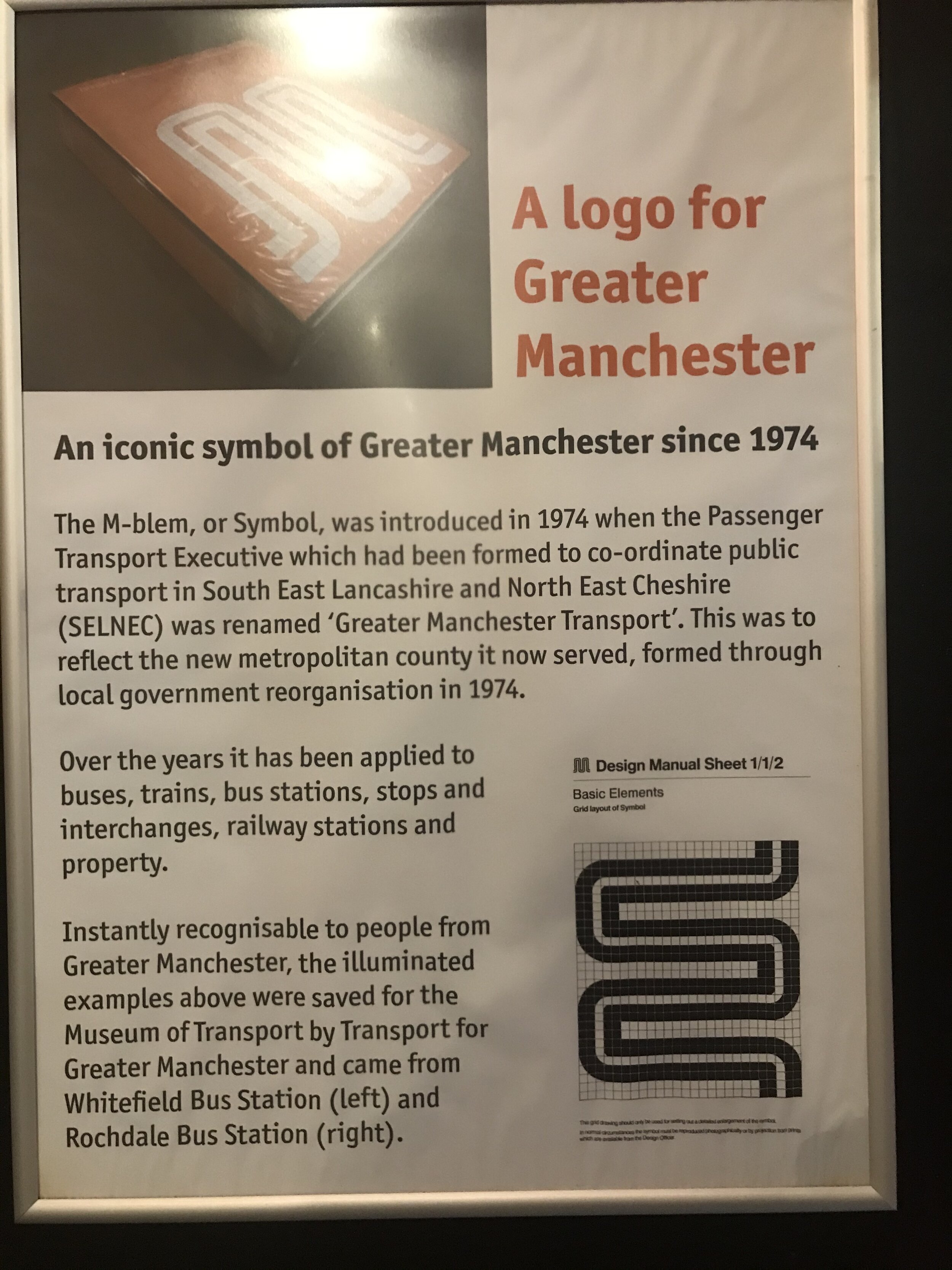
/Recent wet-weekend visits to Bury Transport Museum and Manchester’s Museum of Transport faced off the grim weather with their own deluge, albeit this downpour was one of hand-lettered type.
Both institutions are clearly run by teams of enthusiasts, and the love for the treasures within is clear for all to see. Perhaps though, there is an opportunity for a final year student to take the resources and package them for the next generation.


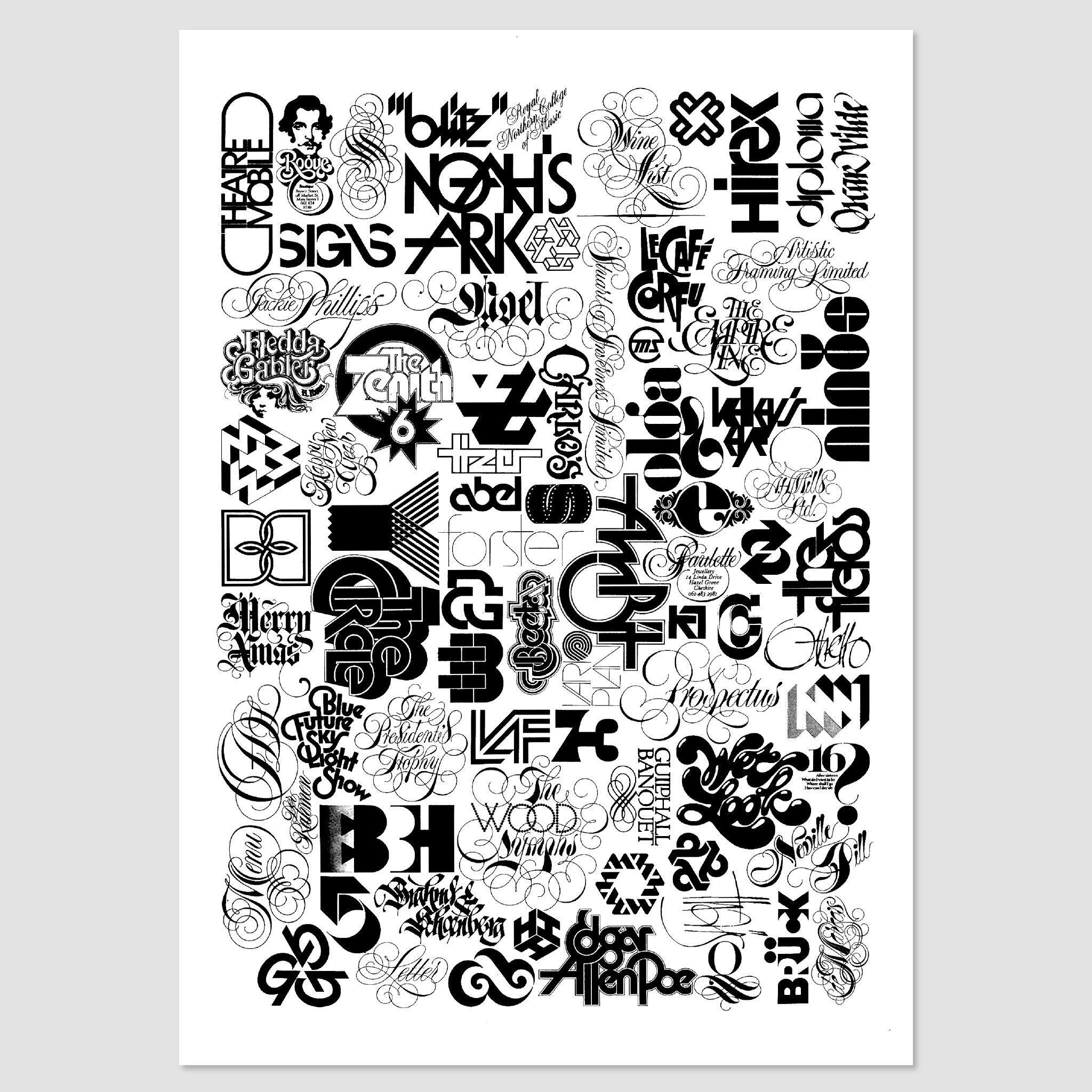
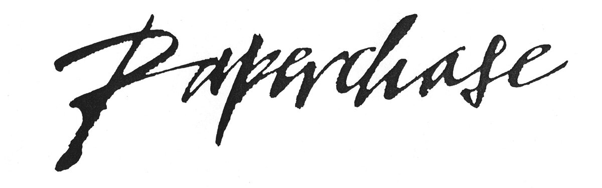
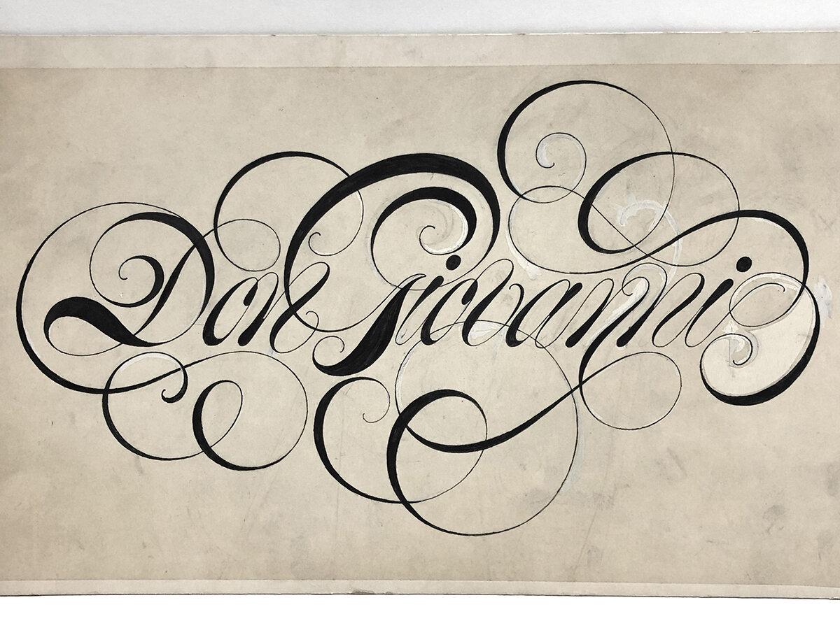
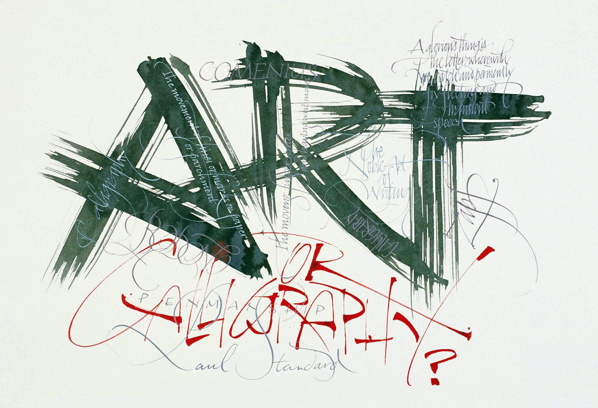
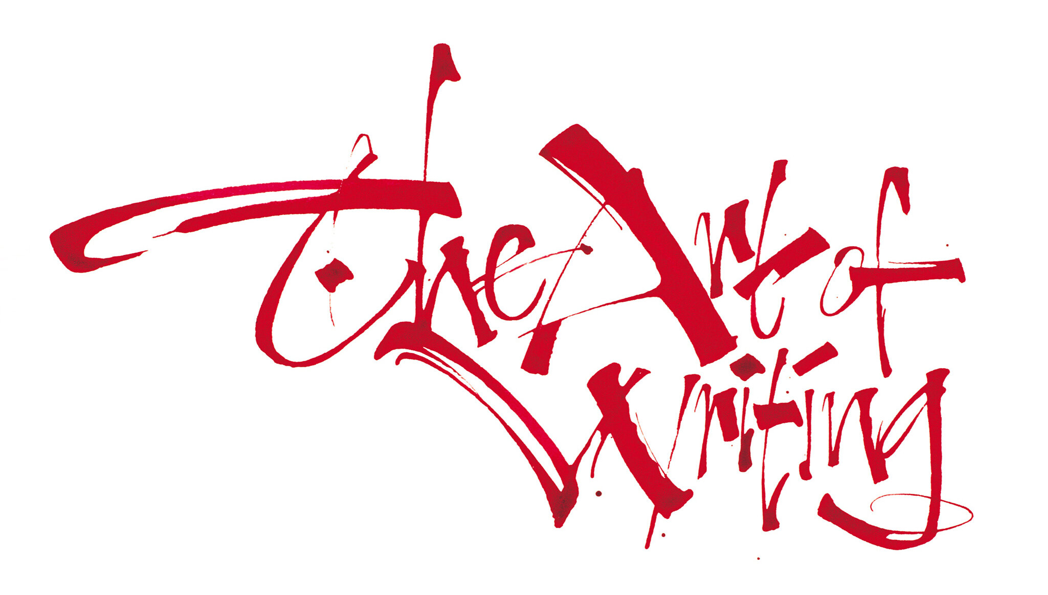
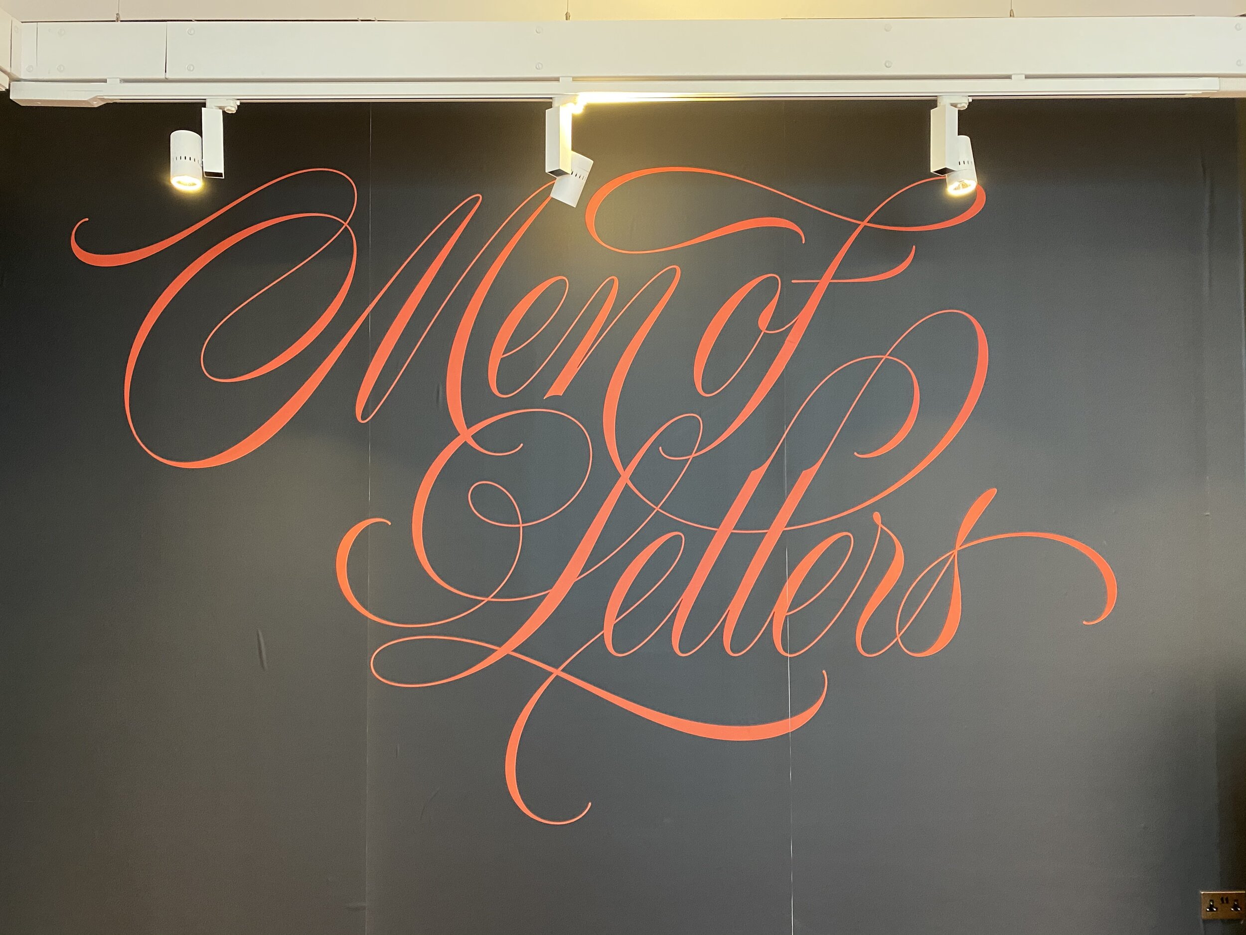
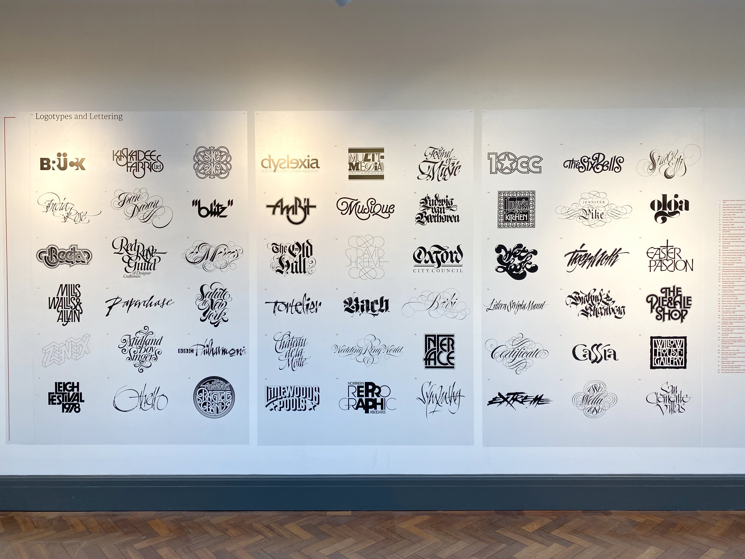
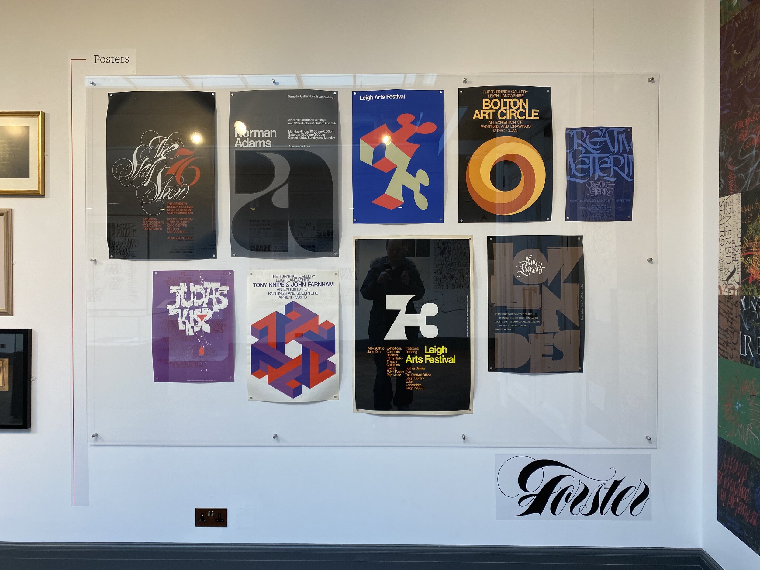
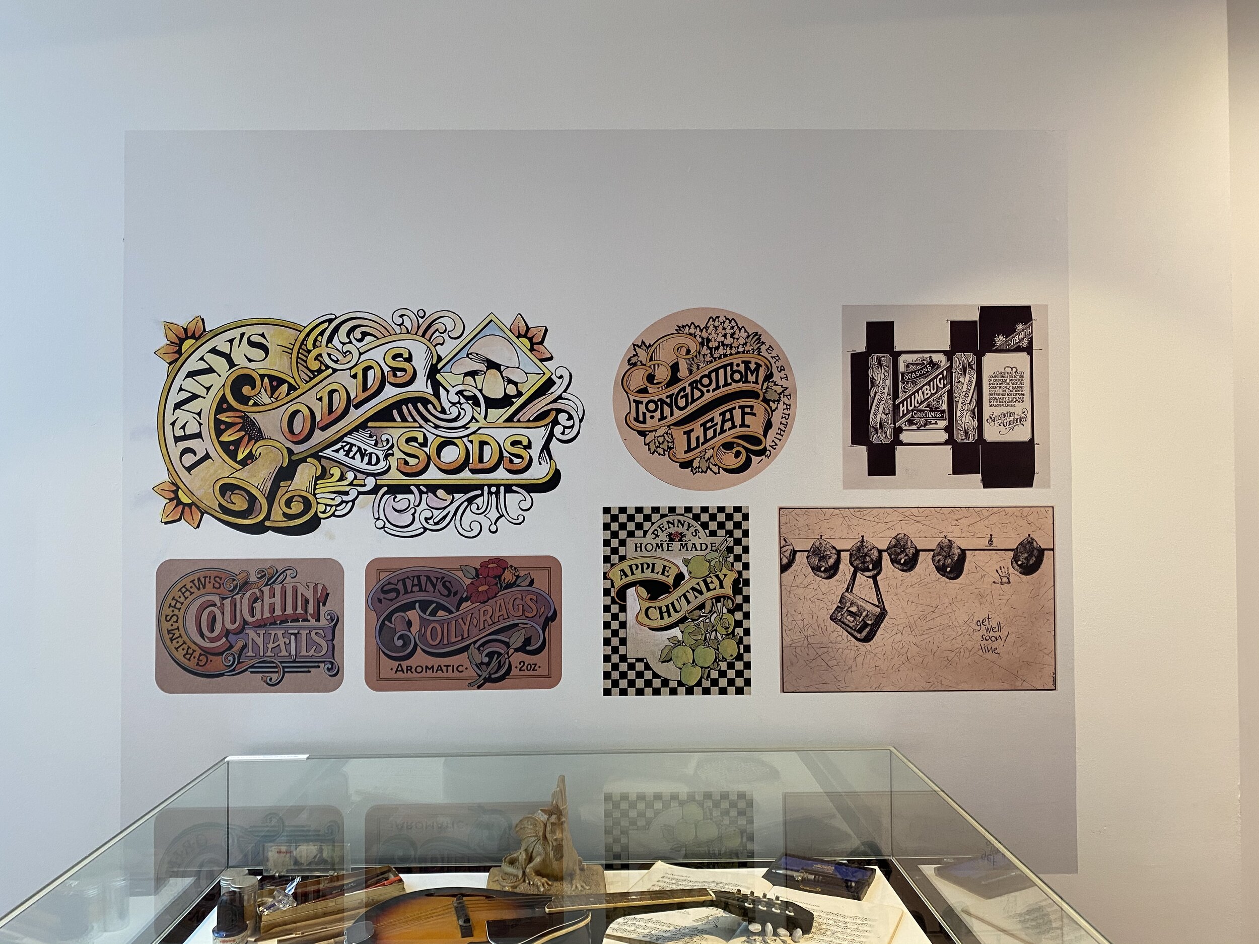
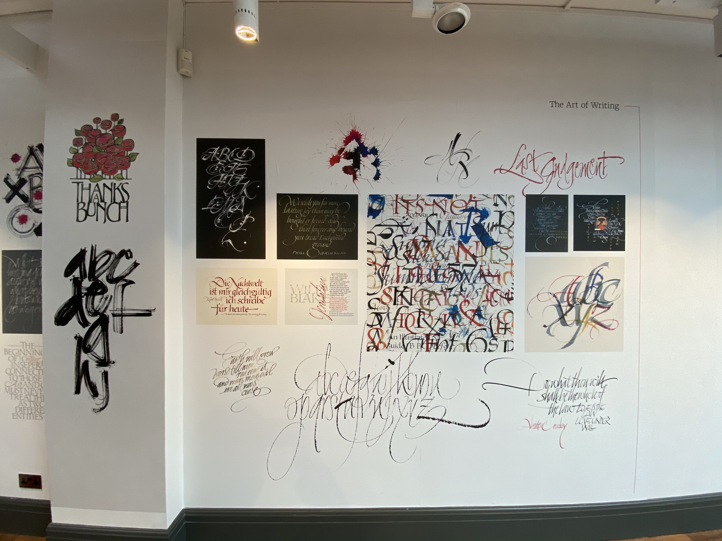
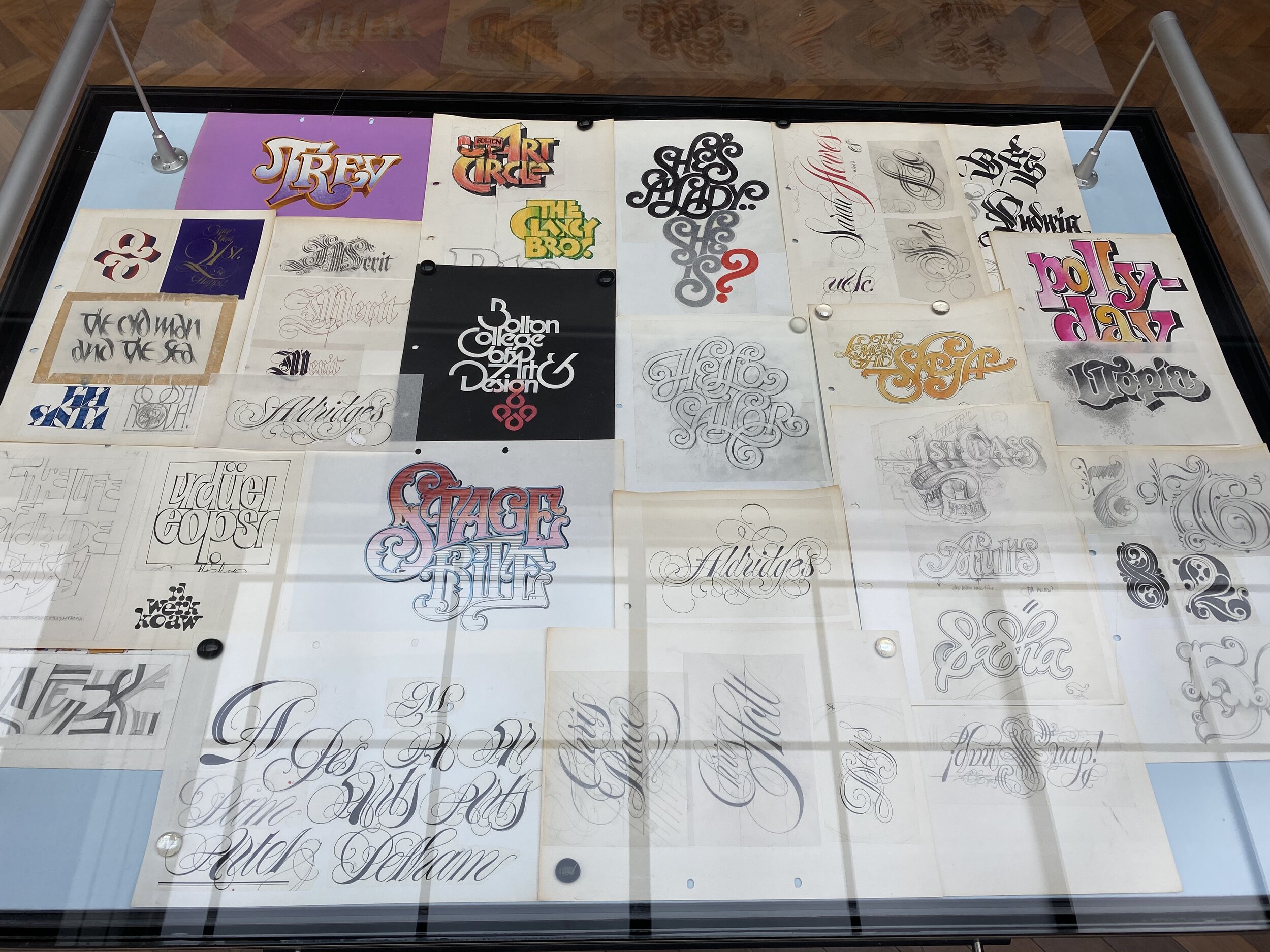
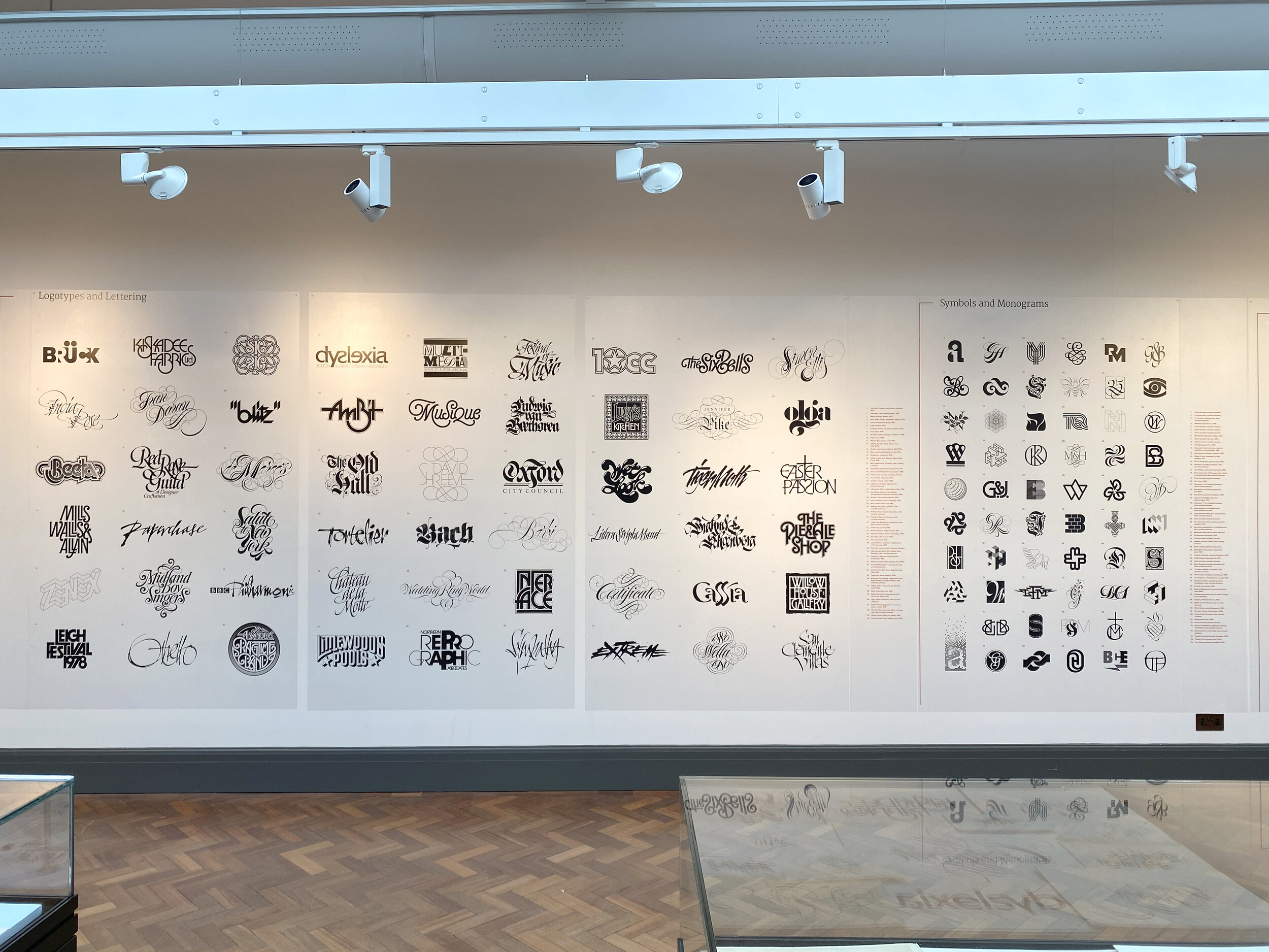
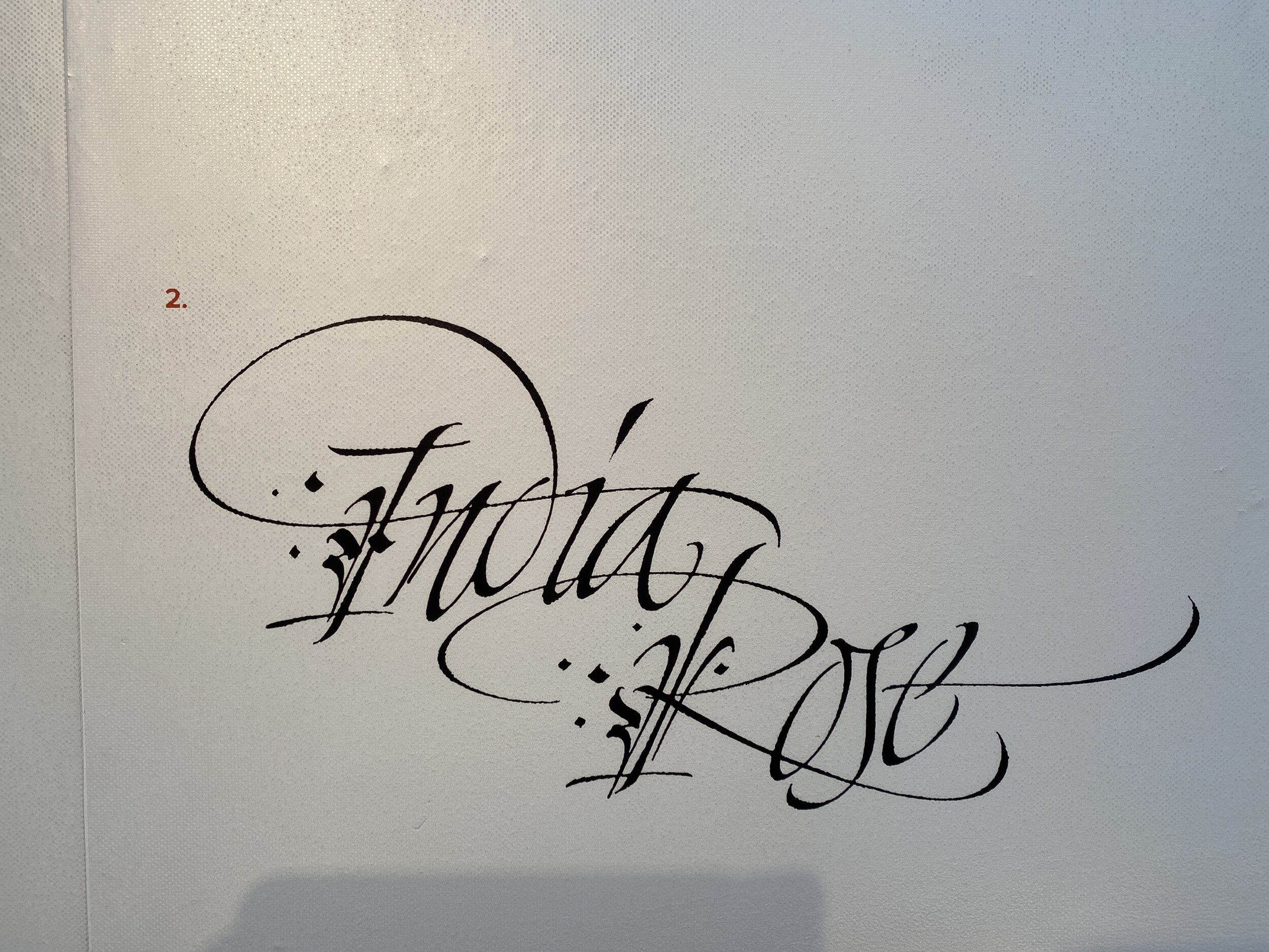
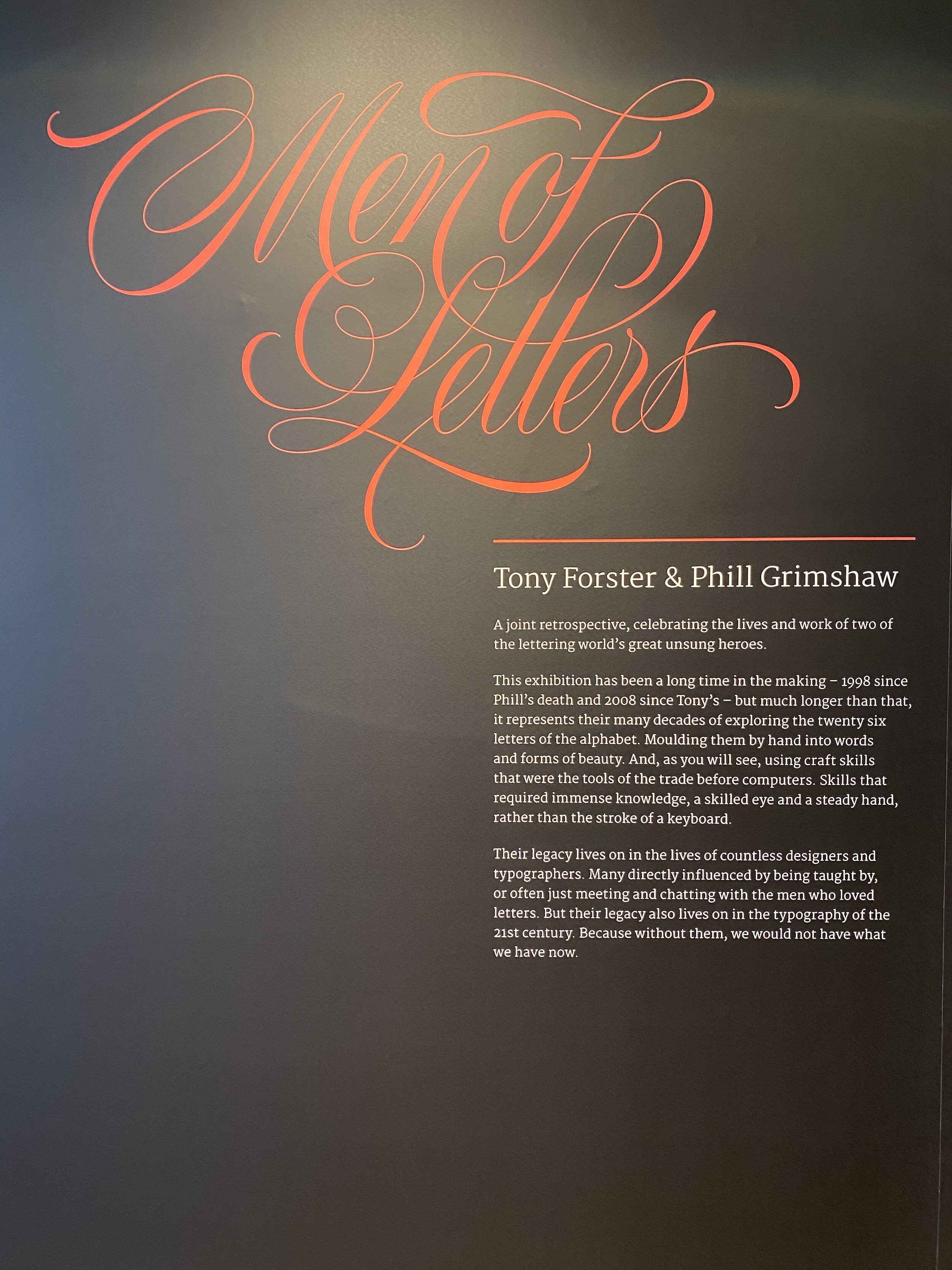
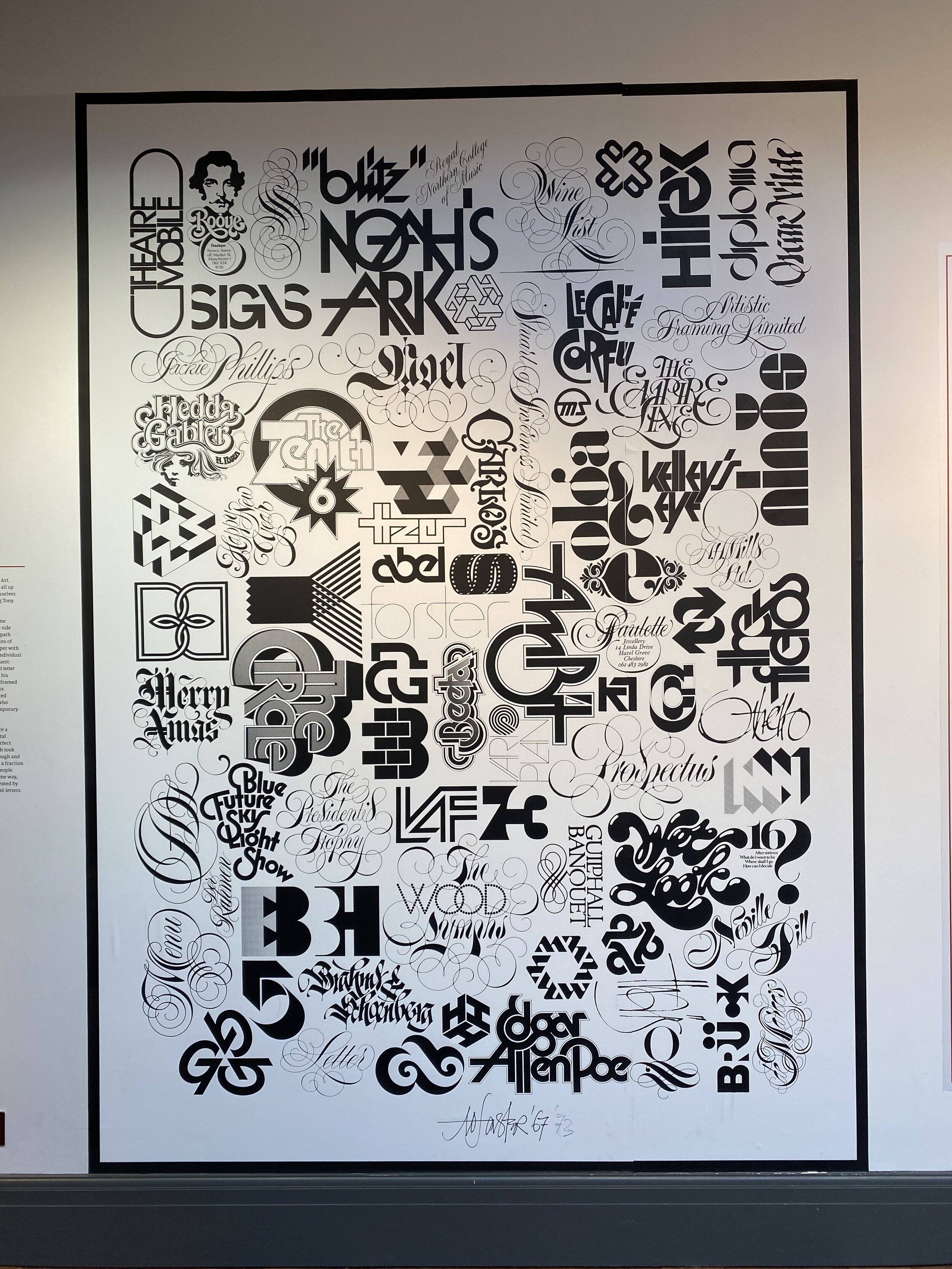
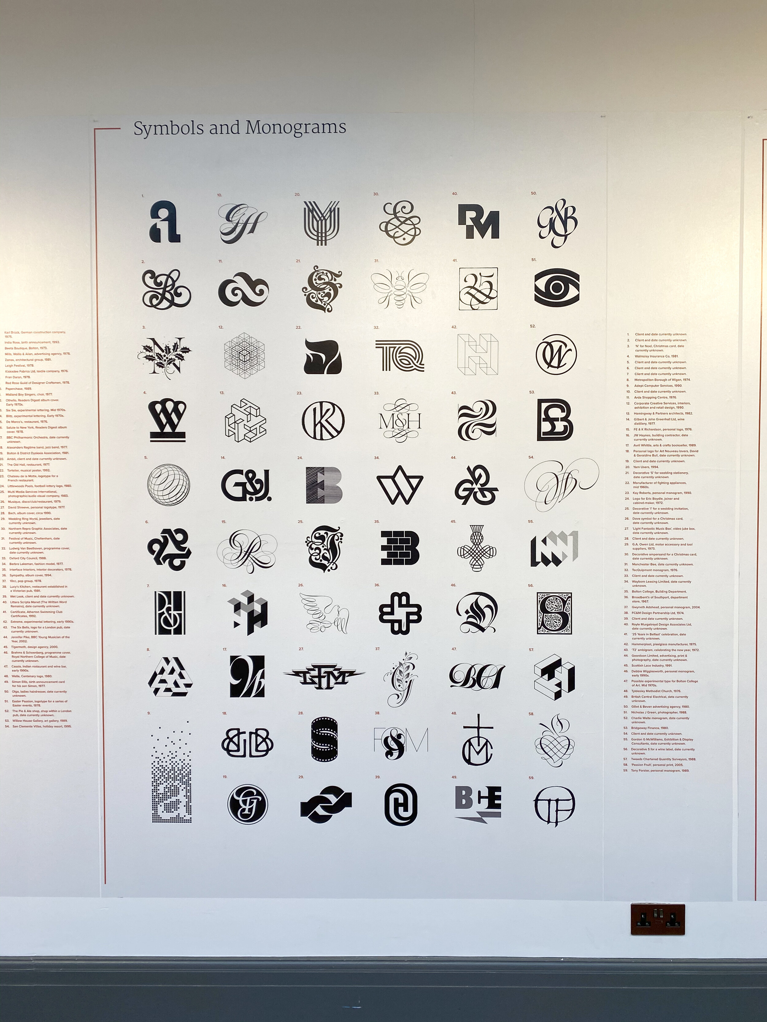
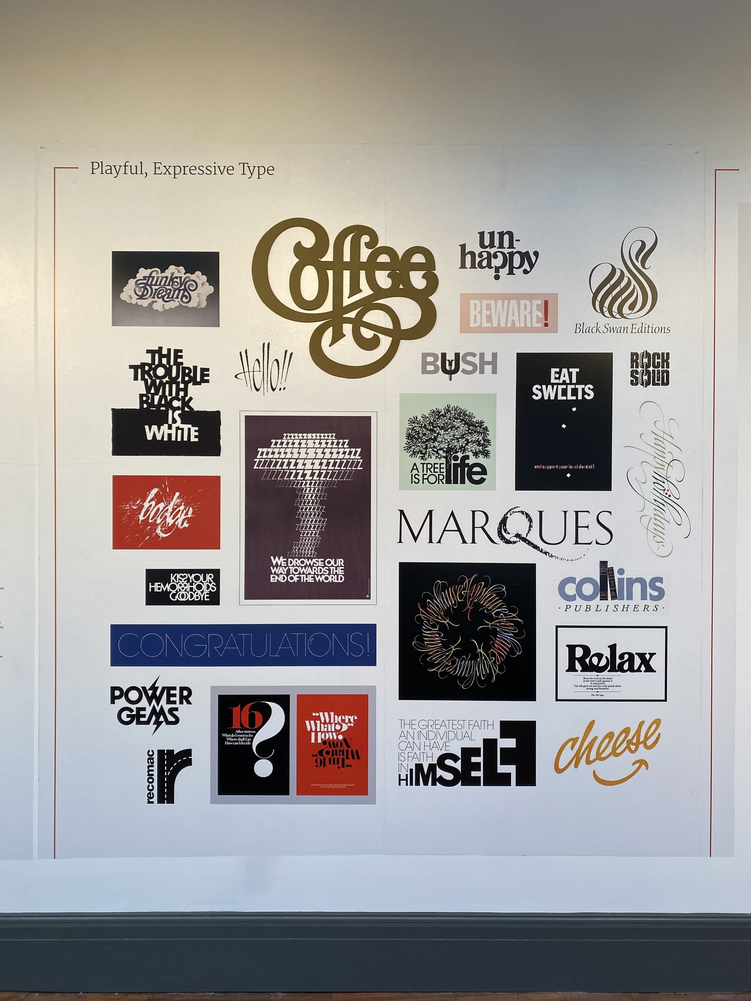
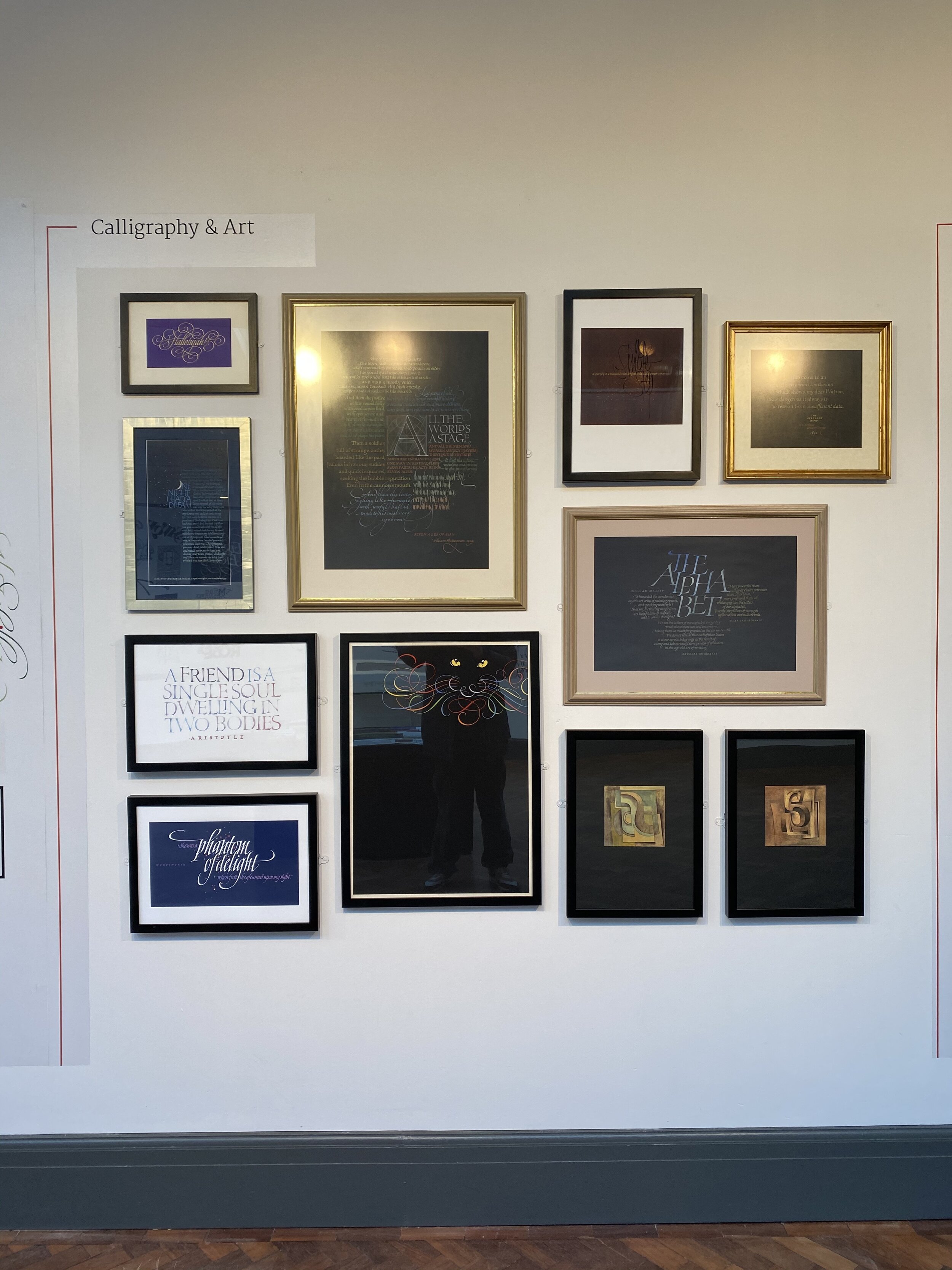
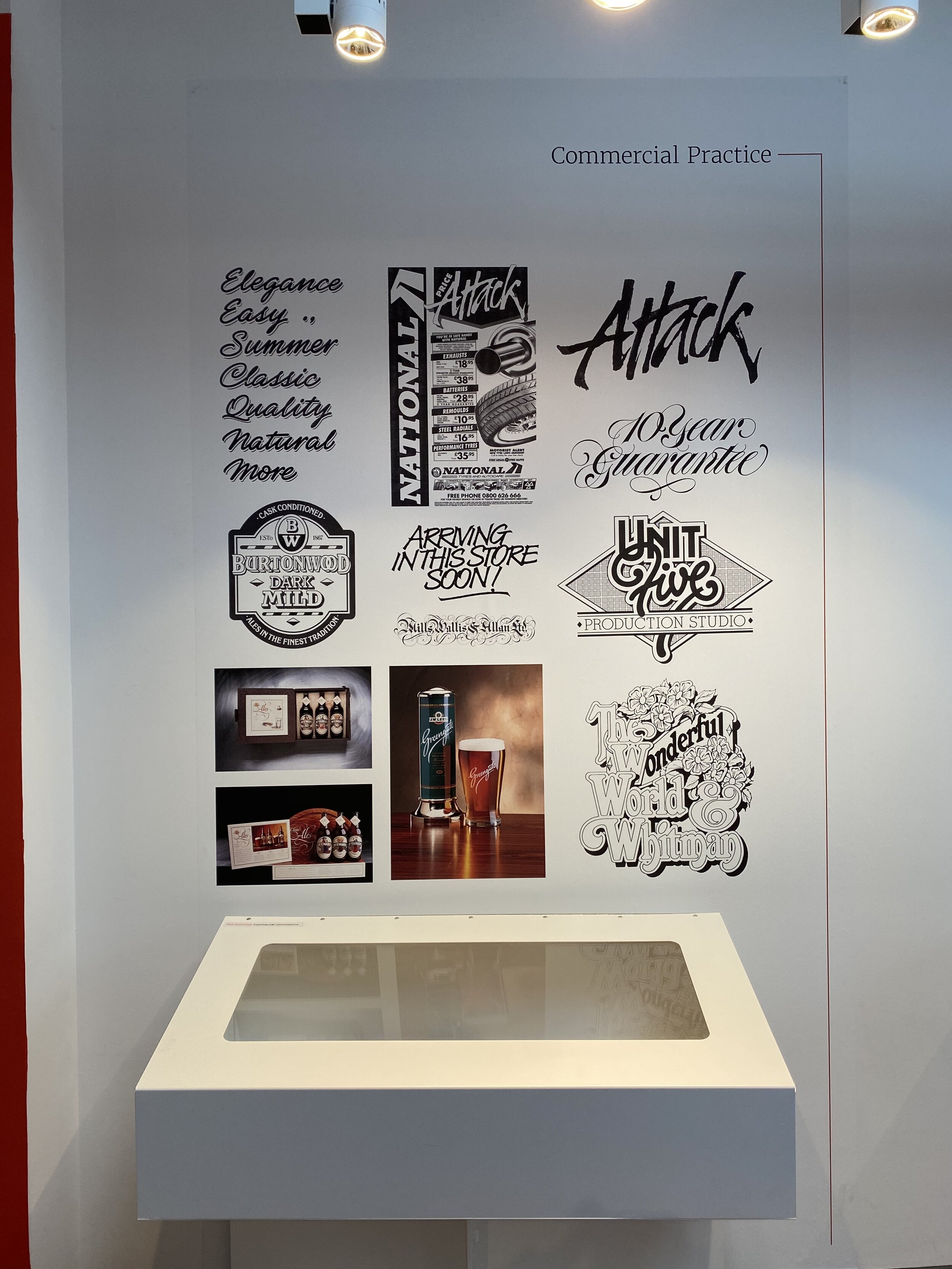
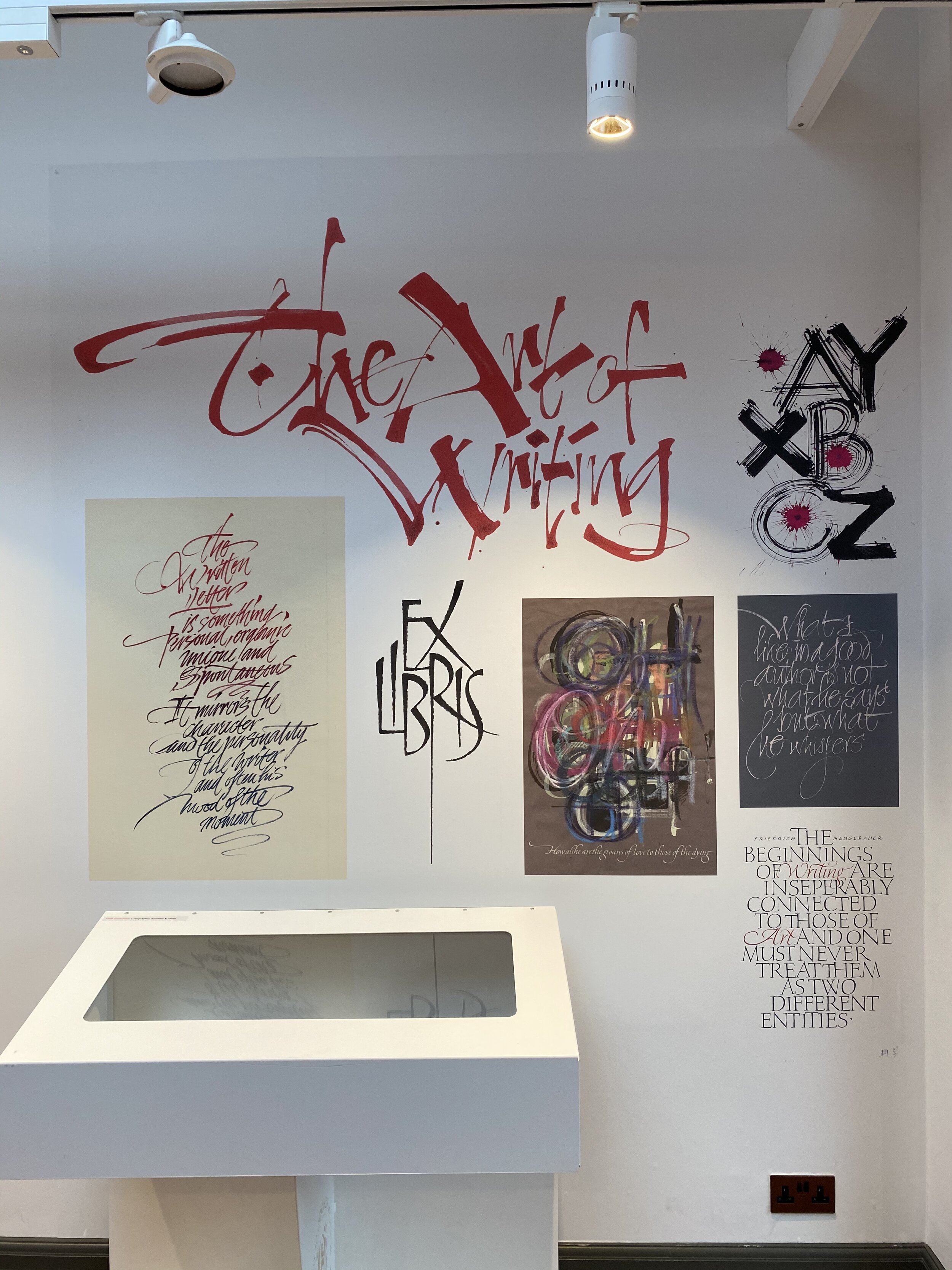
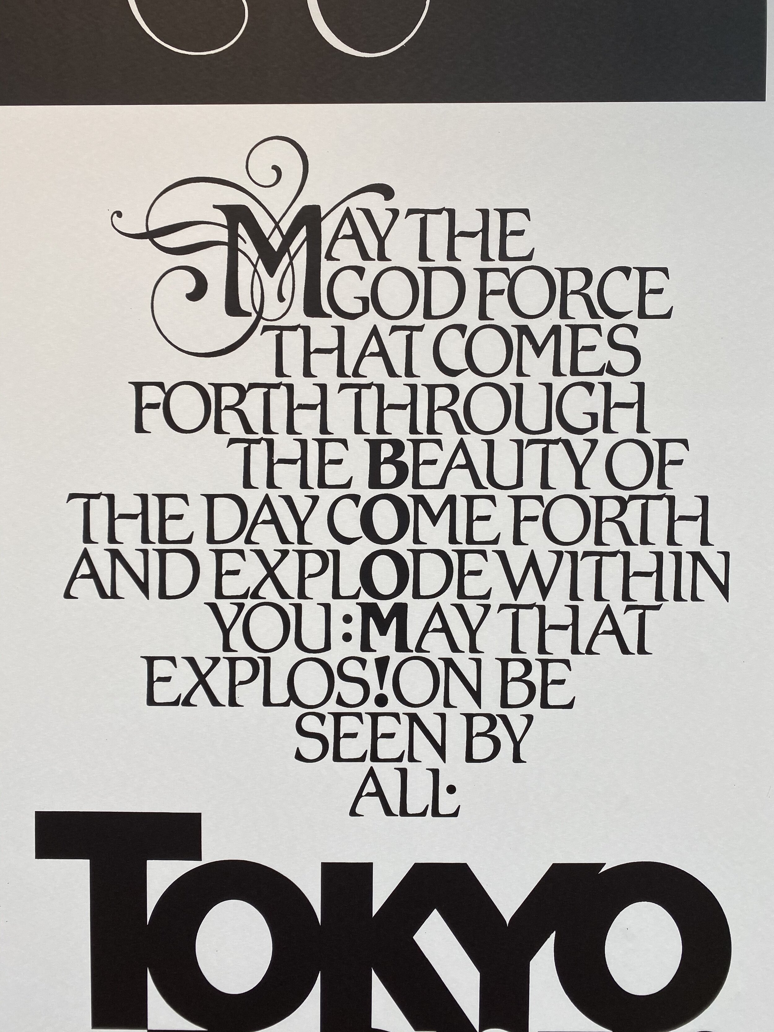
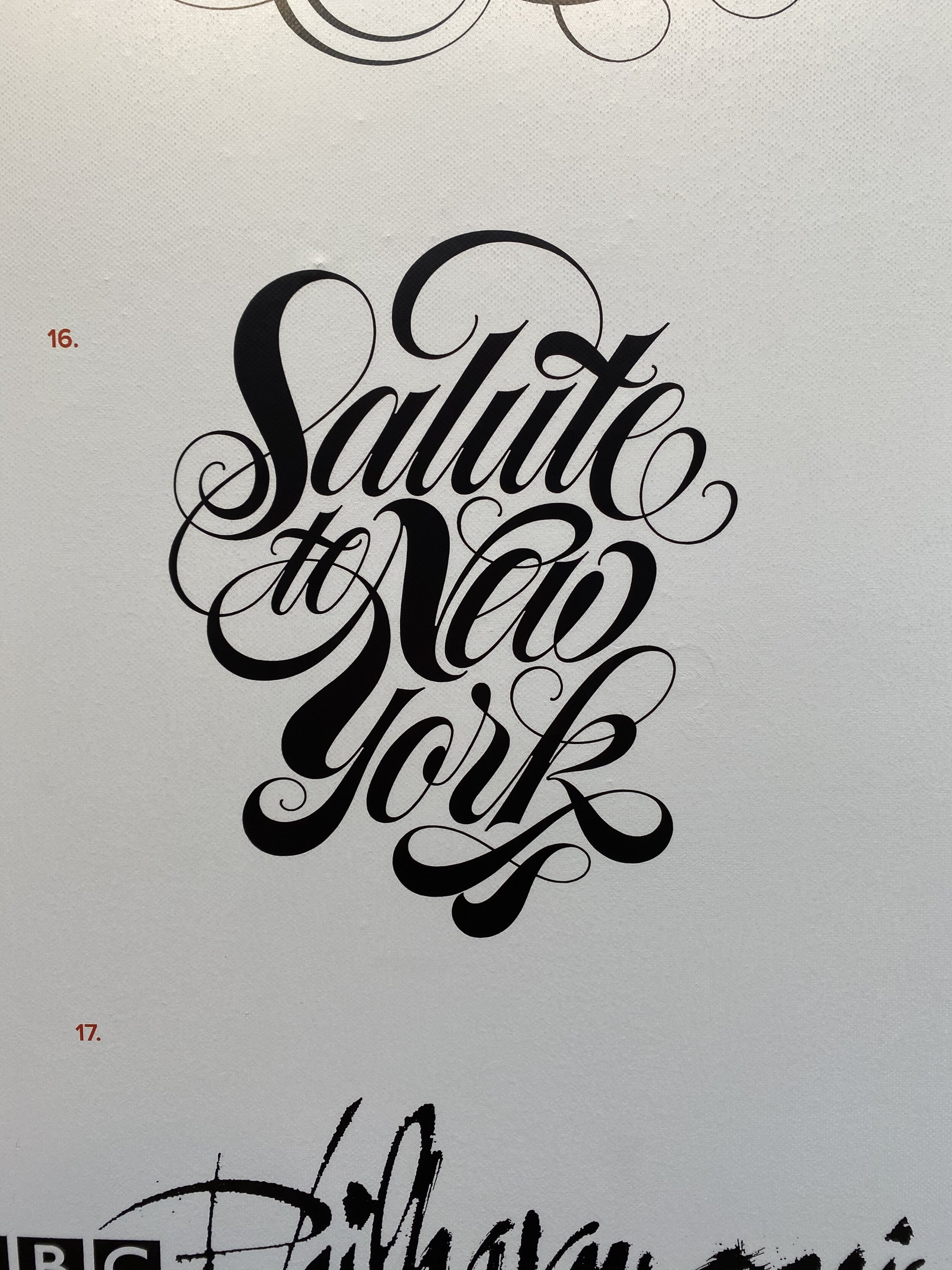
Men of Letters
/
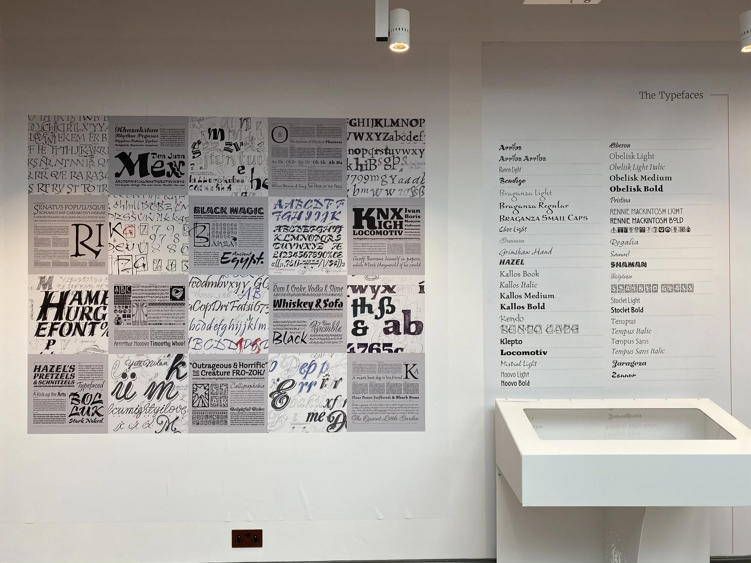
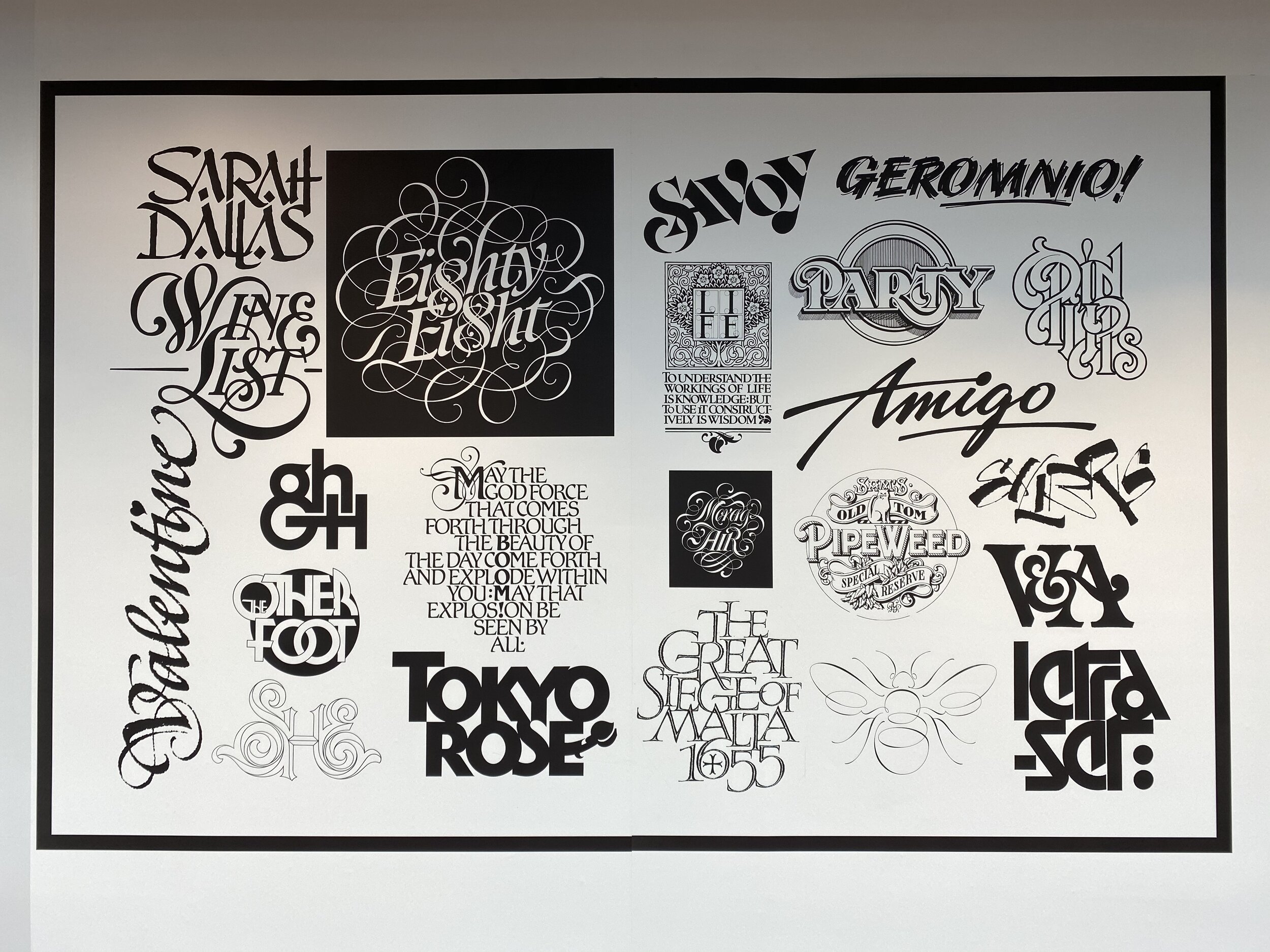
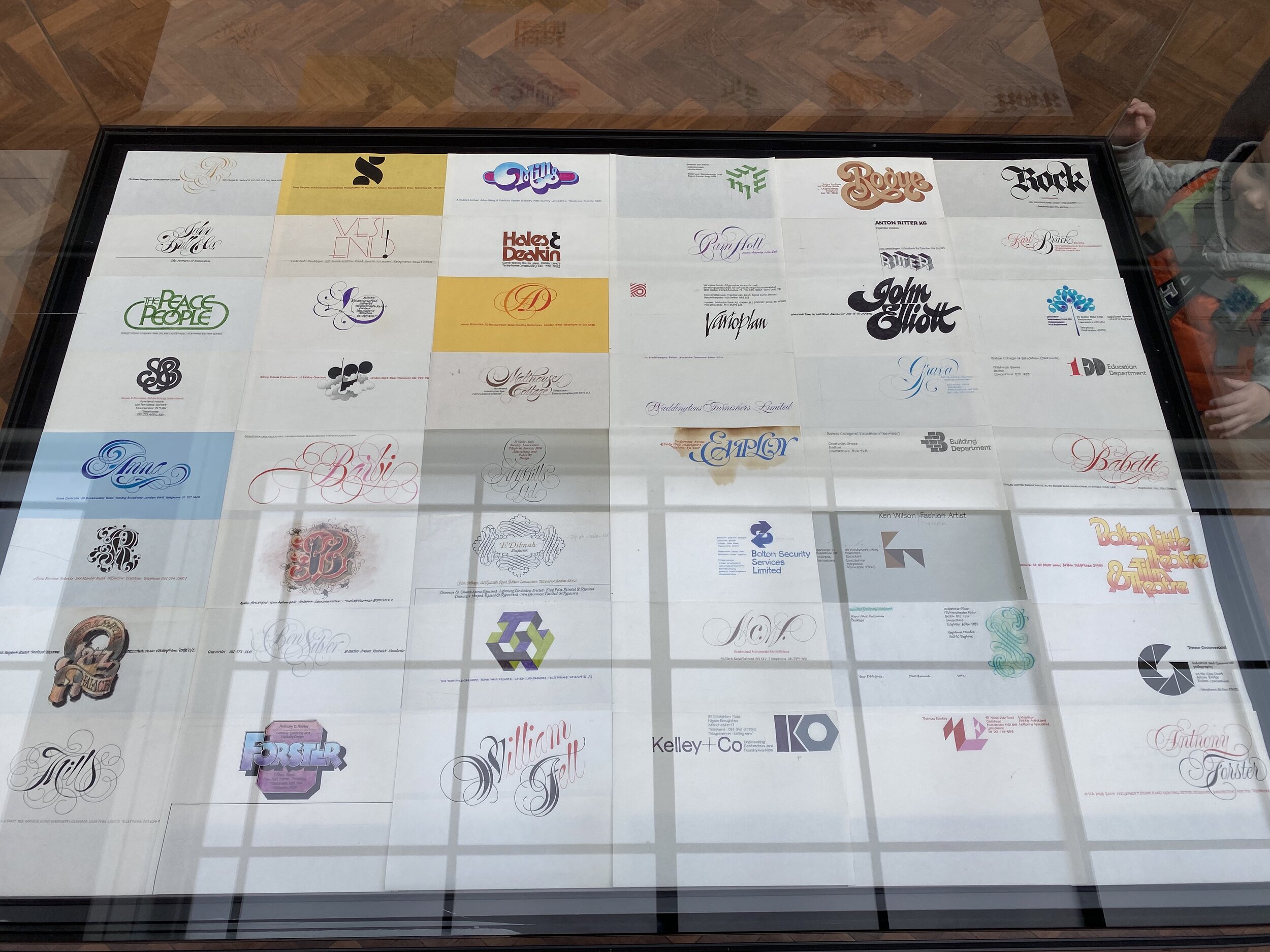
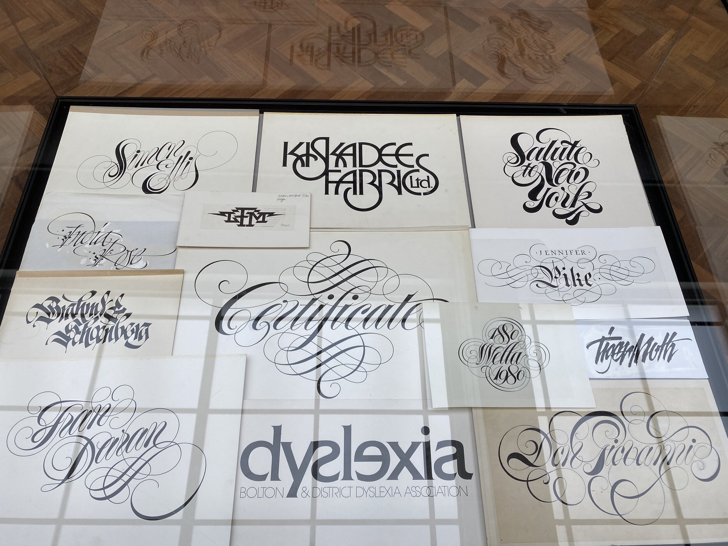
Men of Letters is a joint retrospective celebrating the lives and work of late lettering artists Tony Forster (1941–2008) and Phill Grimshaw (1950–1998).
The show has been organised by lettering artist Dan Forster (Tony's son), presenting "what is possibly the most extensive exhibition of hand lettering and calligraphy ever displayed in the UK," as Forster puts it.
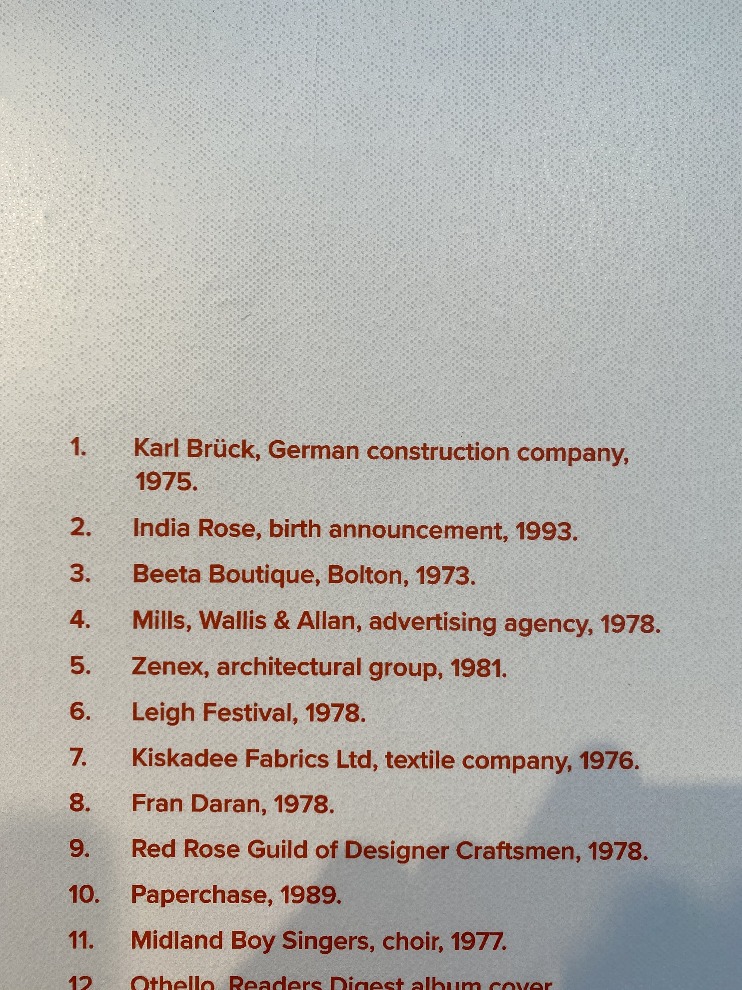
Alongside teaching at Bolton School of the Arts, Tony was a prominent figure in the Manchester design scene from the early 1960s; creating lettering work including the iconic logos for Paperchase, 1970s Rock Band 10cc and the BBC Philharmonic Orchestra.
After his death, designer Tony Di Spigna described Forster as "The Herb Lubalin of England".
A great piece by Richard Morris on Tony can be read here. It includes the fantastic quote:
“It has always fascinated me that we only have 26 letters. Arranged in the right order they can make you laugh or cry, make you happy or sad, angry or elated.”
Grimshaw, (who was taught by Tony) went on to become an internationally renowned typeface designer, creating 44 typefaces for ITC and Letraset. He was described by Colin Brignall – himself a recipient of a Type Directors Club medal – as "One of the best display typeface designers of recent times".
Most of the work displayed in the exhibition has remained mostly unseen. This is because it was not produced digitally, and most of it has remained filed away in plan chest drawers and storage boxes for many years. This exhibition reveals their hand-created sketches, mock-ups, final artworks, original calligraphy pieces, typeface designs and original posters.
The free exhibition runs from 8 February until 8 March 2020 at Bolton Library & Museum.

The forecast for the week ahead
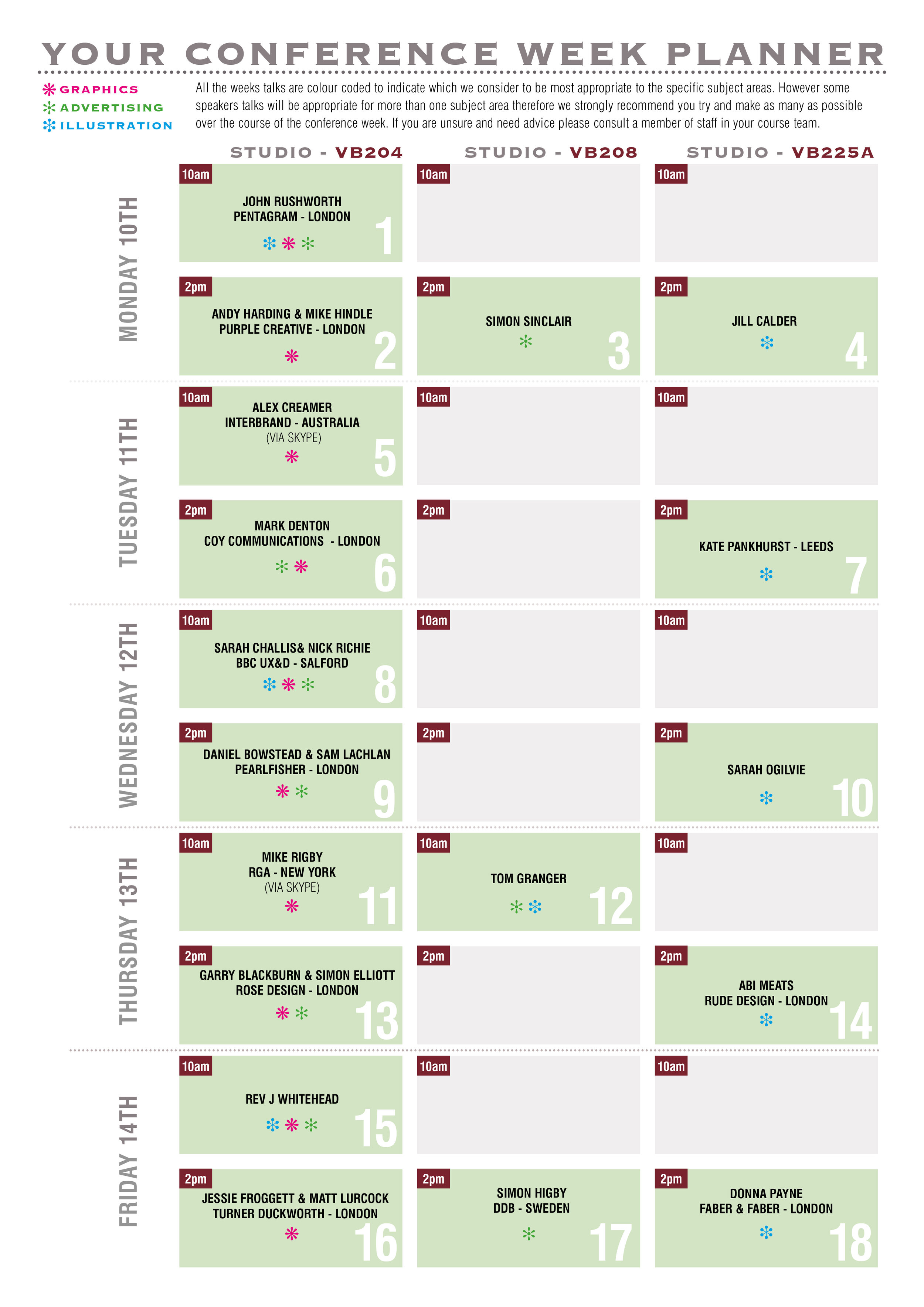
/As conference week nine approaches...the storm clouds of creativity are brewing and we are all anticipating a deluge of advice & ideas, and a precipitation of inspiration...that will converge and culminate in a perfect storm in Preston this coming week.
The week after is expected to be dull in comparison.

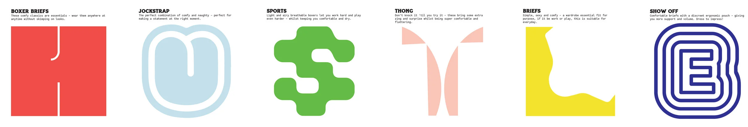
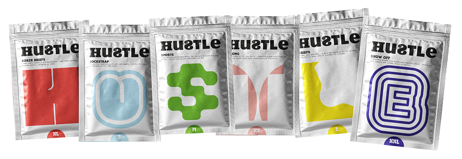
Hustle Underwear
/Congratulations to Year 2 Graphics student Tom Culton who has just won an industry led competition set by Bulletproof Design - London. The brief was titled ‘Fresh Meat’ and students were asked to think outside the box and break away from the expected rules of branding.
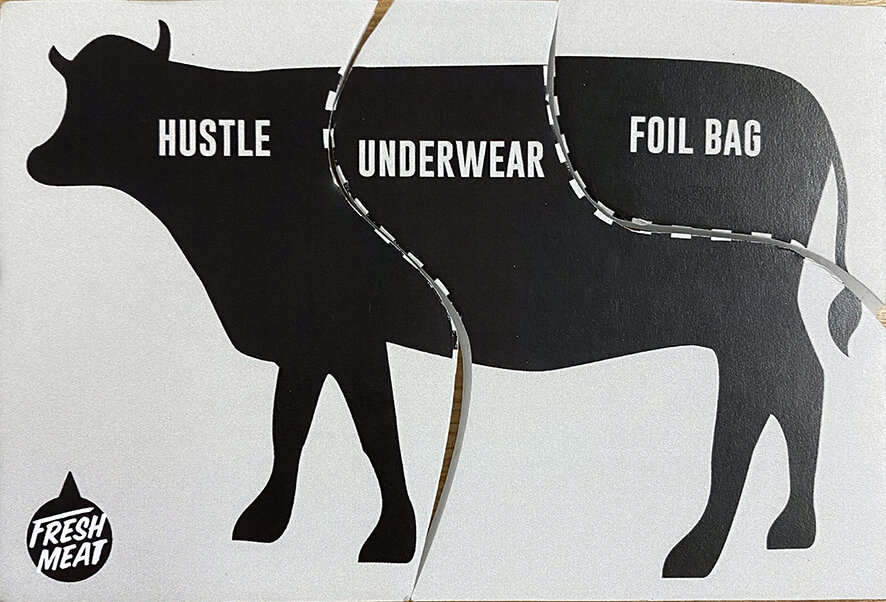
There were 3 parts of a cow representing the brand name, product and format. The students were asked to pick one card for each from lists of options to create a brand identity and a piece of packaging.
Tom got brand name ‘Hustle’, the product being underwear, in a foil bag format.

The proposition was ‘a brand that doesn’t try too hard to be sexy and is instead fun, cheeky and loud - relating to the ‘hustle’ name, celebrating diversity in body image’.
There are 6 styles of underwear in the Hustle range. They have cheeky typographical personalities with a nod to the type of underwear (ie. The ‘H’ resembles boxer shorts) which spell out Hustle when displayed in the shop.

His winning entry has won him a 2-week placement at Bulletproof in London.
