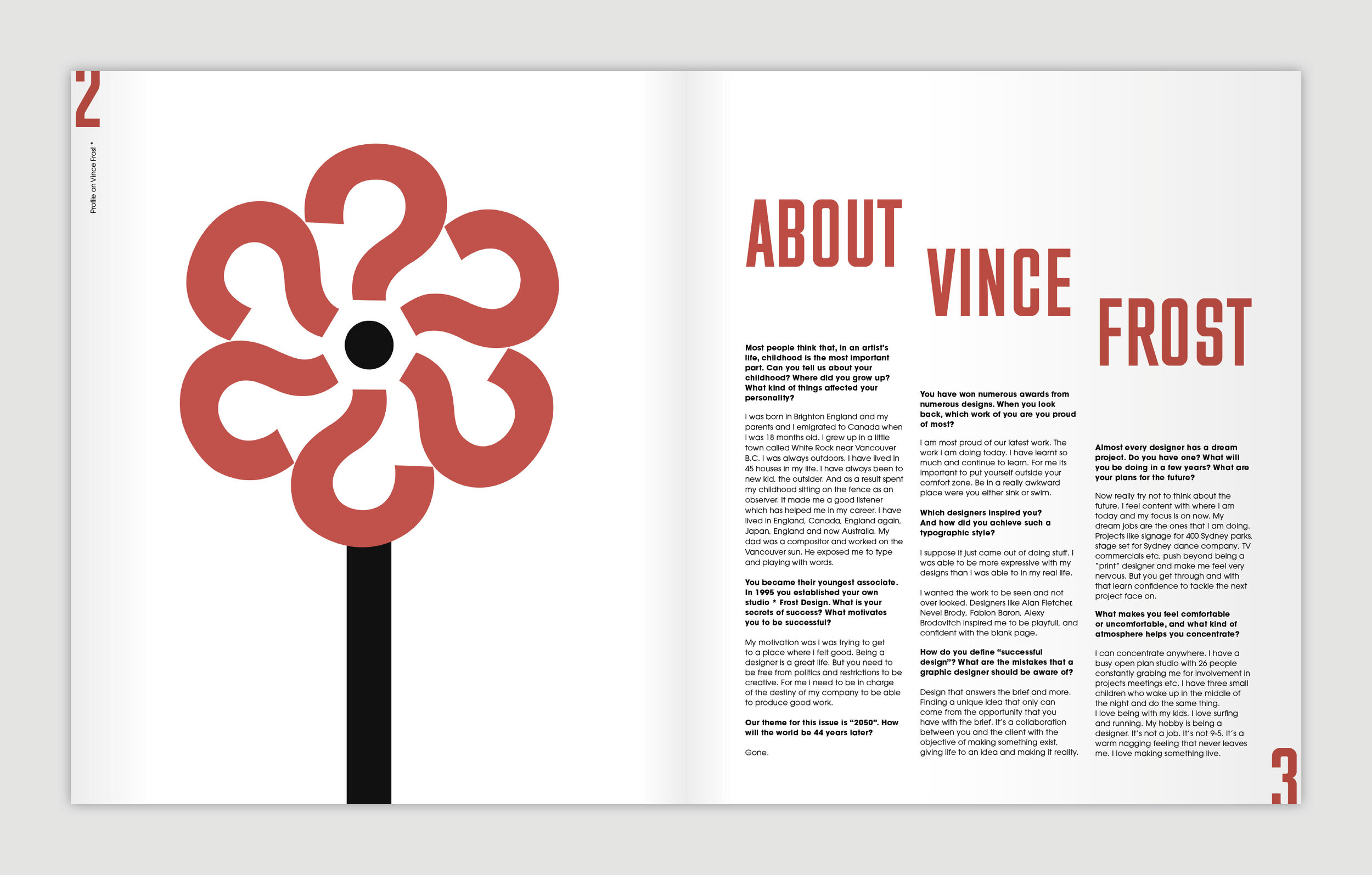
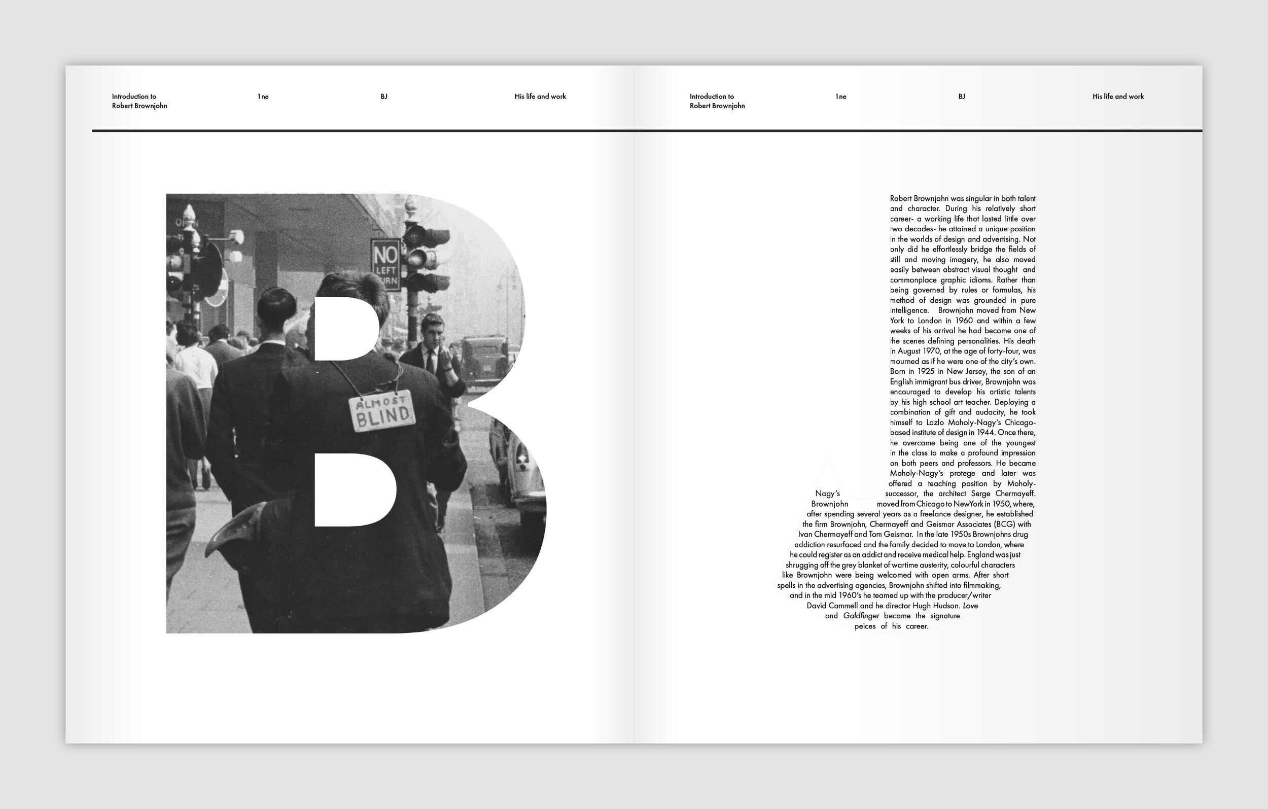
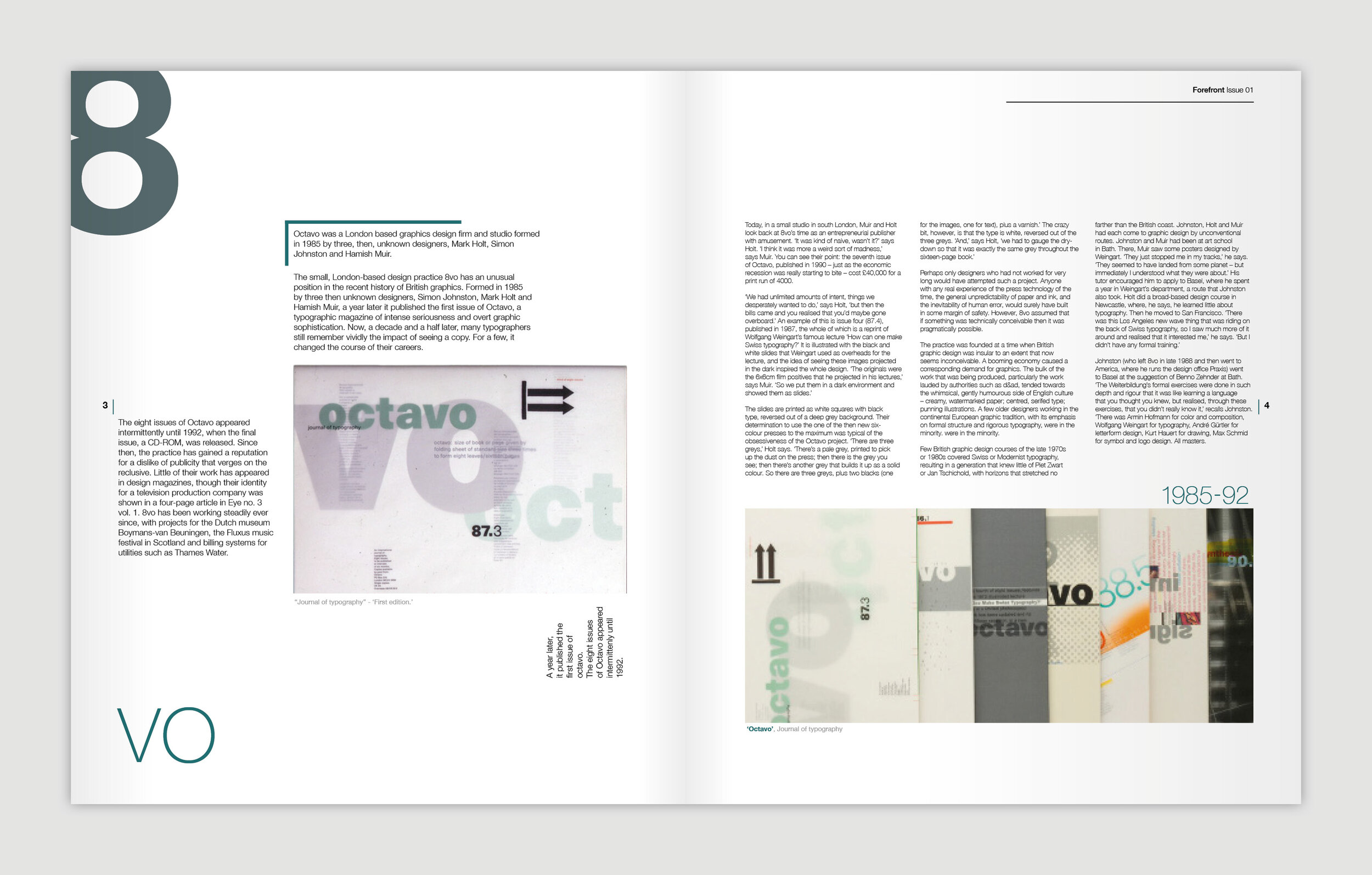
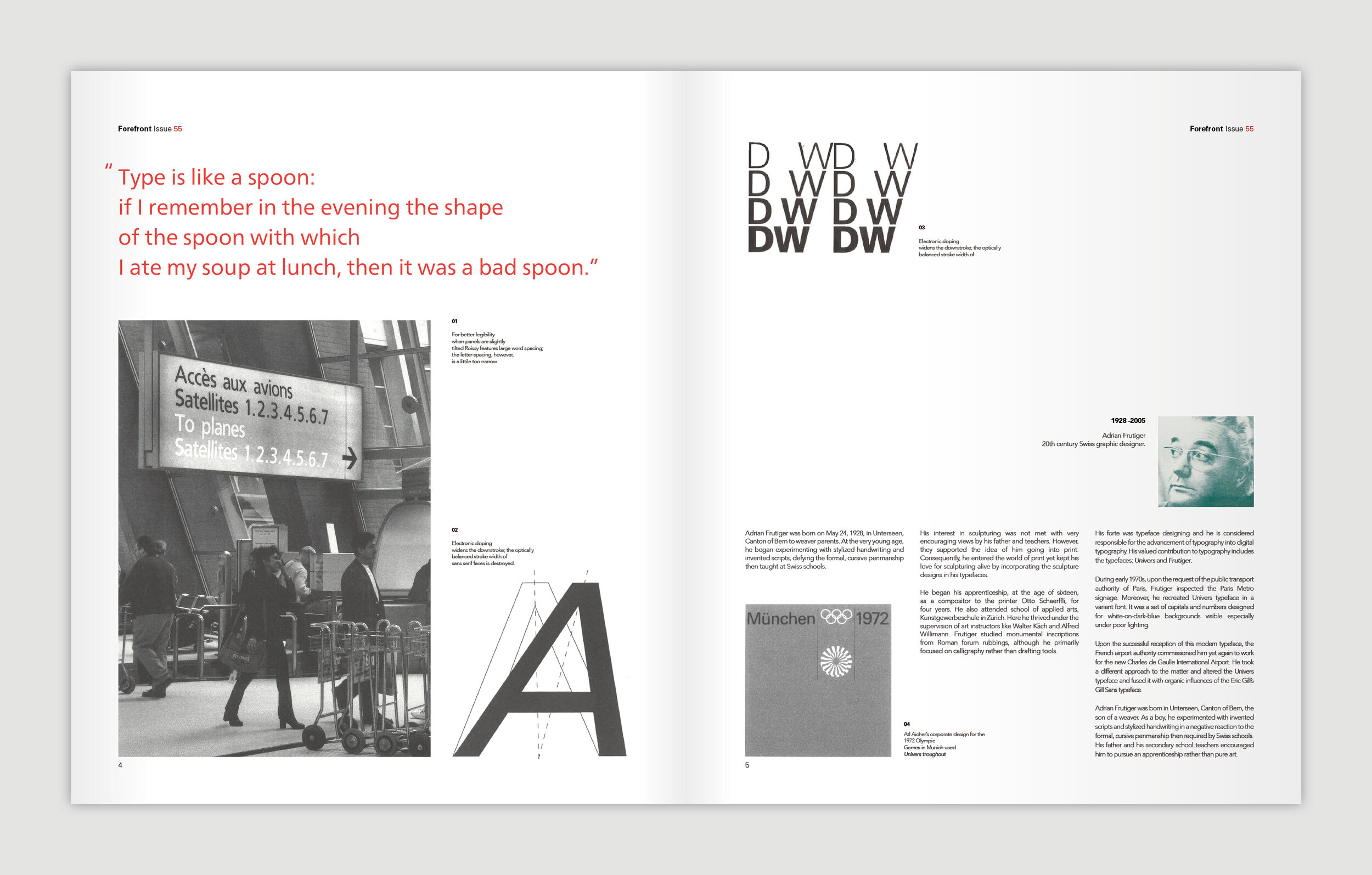
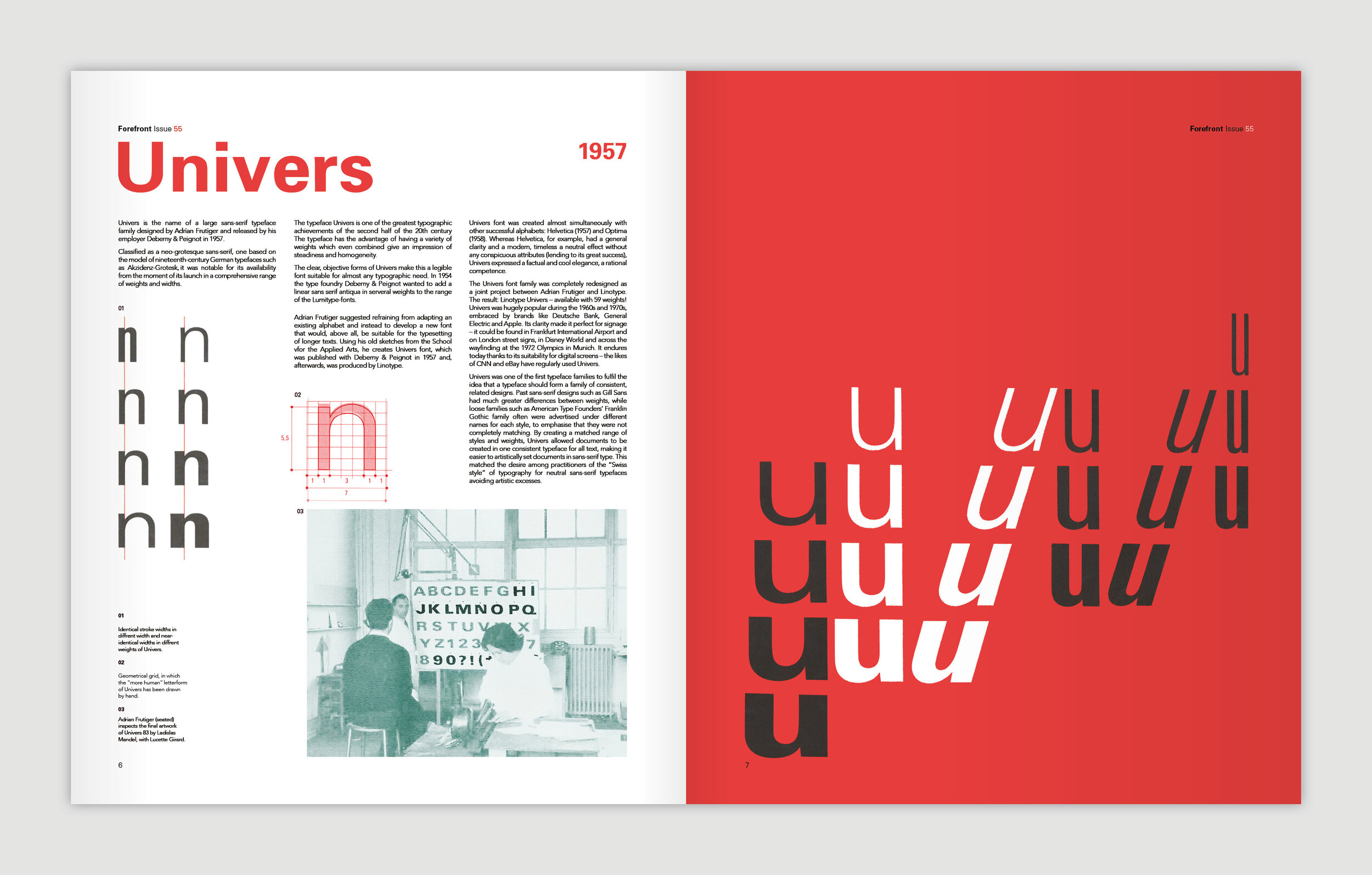
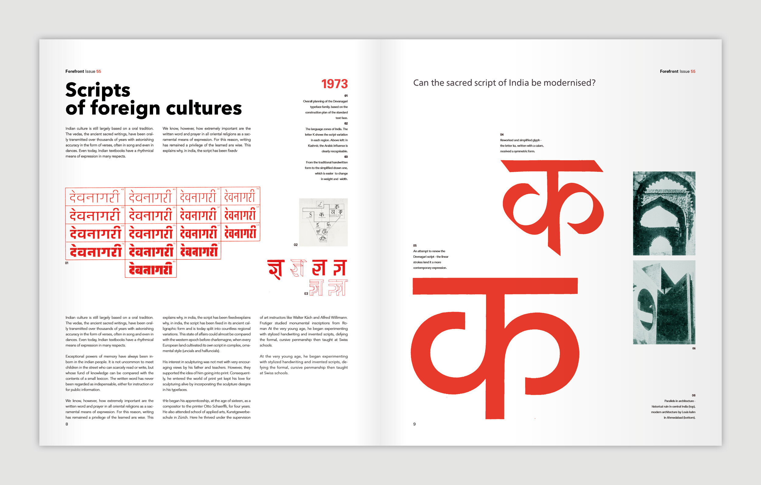
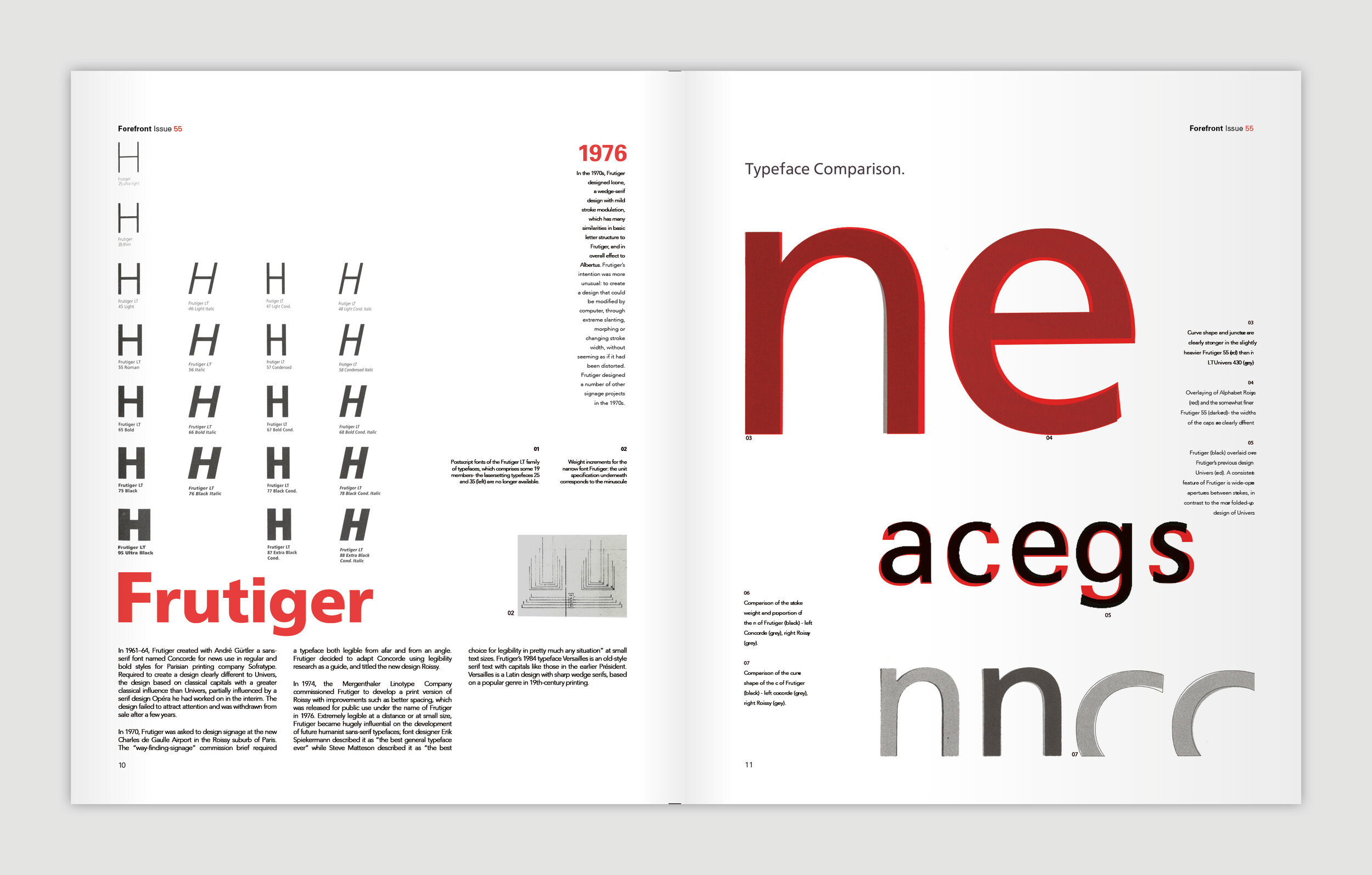
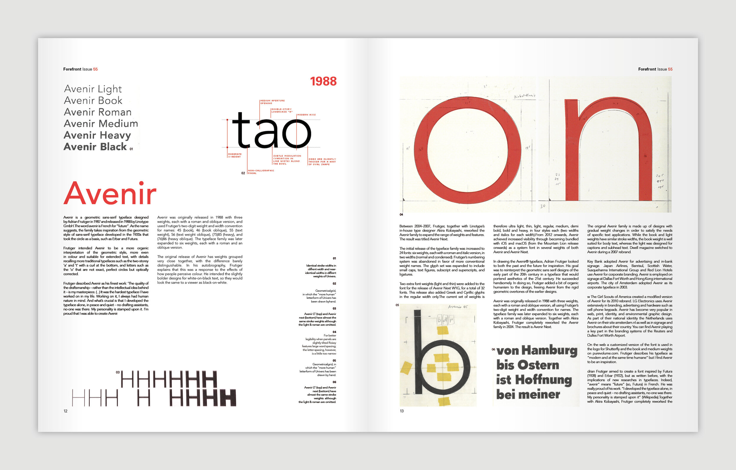
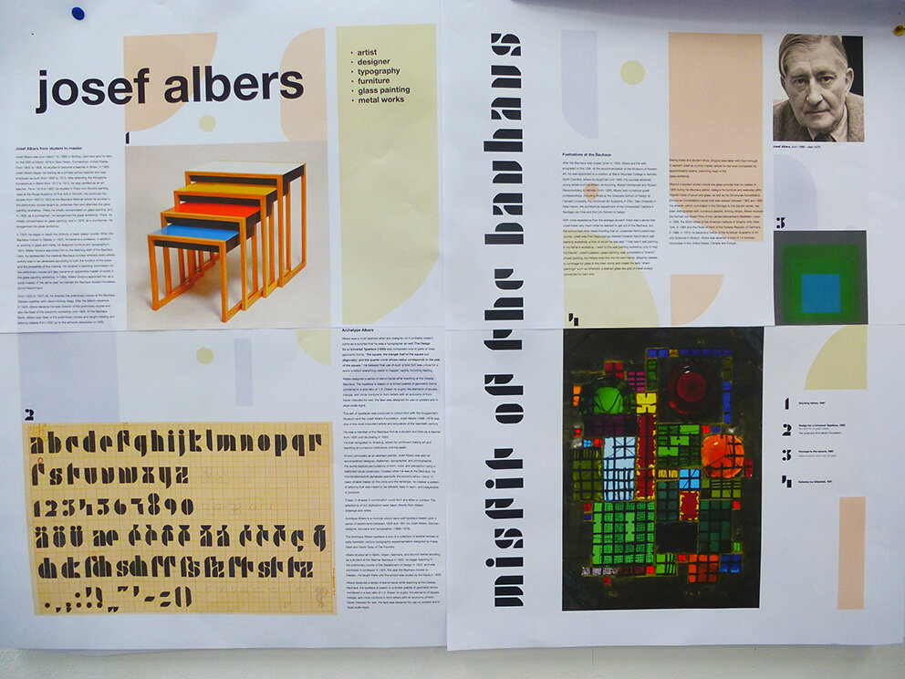
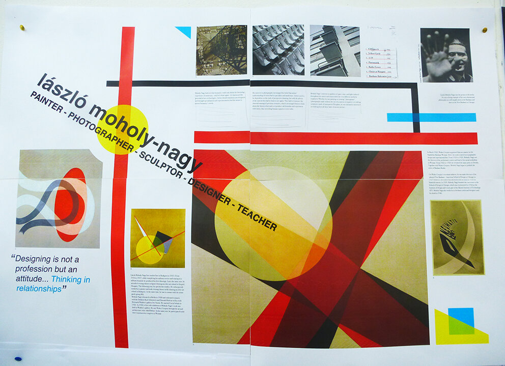
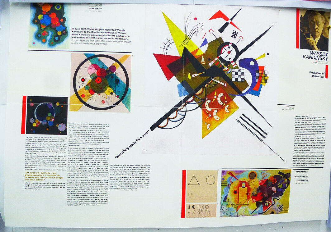
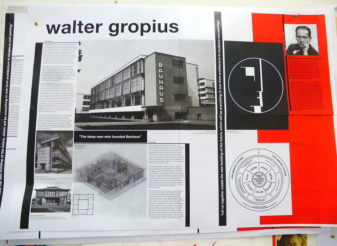
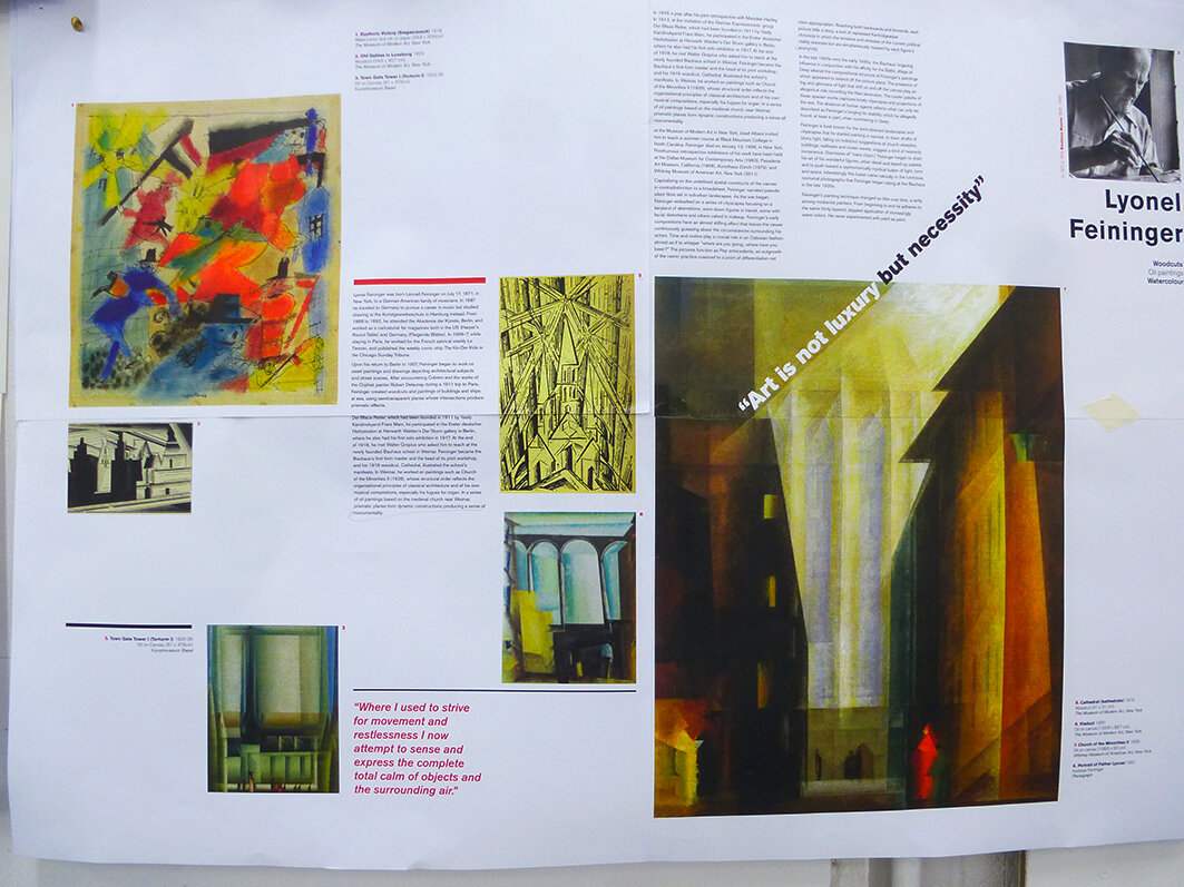
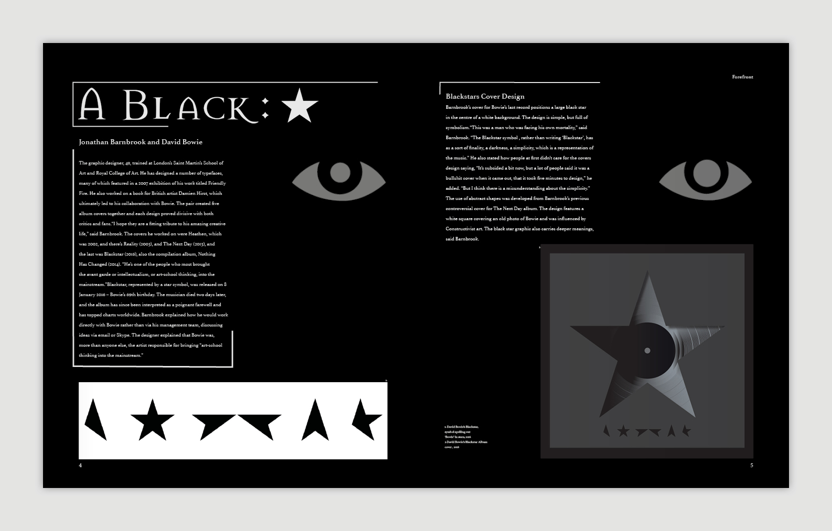
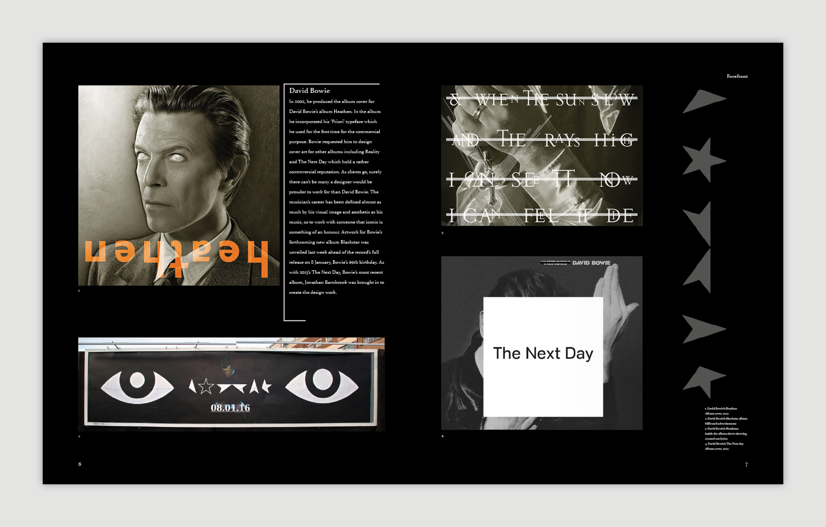
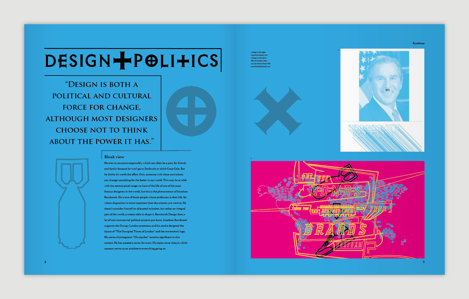
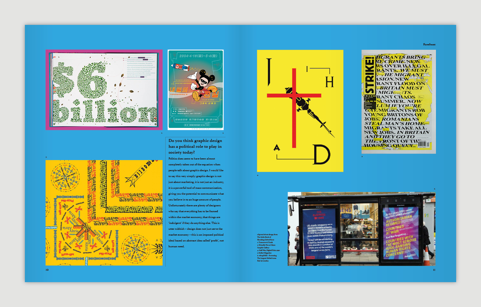
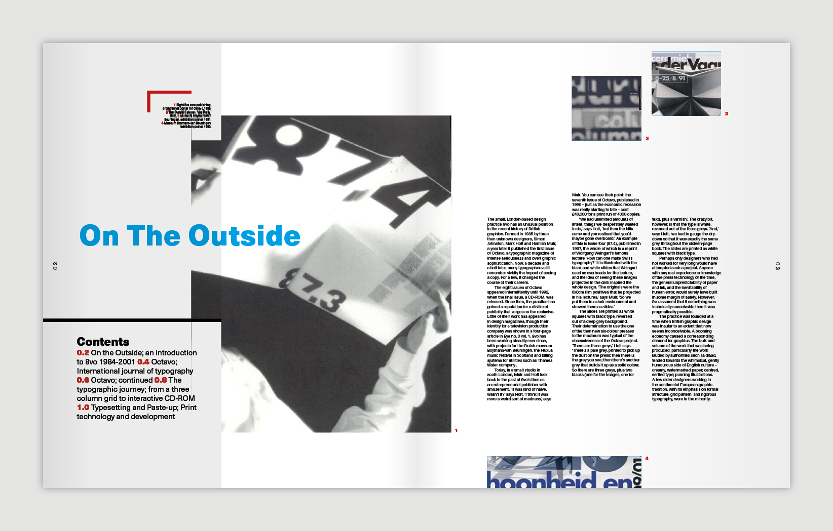
A Pillar of the Community

Here we feature Natalie Utting-Ealand’s Harris Museum icon designs from 2018. Based on The Harris Museum’s 6 main Doric Columns, Natalie created a set of graphic icons that symbolised the cultural focus of the Museums offering to the Preston community – History, Art & Craft, Research, Recreation, Inspiration & Stories.

The Harris Museum frontage

The Harris Museum frontage

Icons in Black & White – History, Art & Craft, Research, Recreation, Inspiration & Stories

Icons in Black & White – History, Art & Craft, Research, Recreation, Inspiration & Stories

Colour Coded – History, Art & Craft, Research, Recreation, Inspiration & Stories

Colour Coded – History, Art & Craft, Research, Recreation, Inspiration & Stories

Typography added

Typography added

A really nice example of a set of well appropriated symbols, well designed, and well crafted icons. A great example for any future student tasked with creating their own icon designs.


NY Spaghetti Packaging – The directors cut

Here we feature Alex Creamer’s classic NY Spaghetti packaging concept from 2008/09. Now widespread on the net and various packaging related sites this project has attained cult status. So we thought we would show a little more from our archive of the early development work.

Alex’s solution was initially a response to a 2nd year brief, which was to repackaging a awkward product or item. It became the centre piece of his portfolio and while on placement at Ziggurat Brands in London he was able to develop the design further with their expert help.

spag 3.jpg
spag 2.jpg
Detail

Detail

hero .jpg

The design eventually made it onto the front cover of the book above, via exposure on the Dieline and all this even before Alex had graduate in 2010. Ten years on and Alex has now moved onto the world of branding and is currently associate Design Director at Interbrand Australia.

Type & Grids – 2020

The first year graphic design students have recently completed their primer project in typography and the art of layout, simply known to Preston tutors and alumni as Type & Grids. The project is an opportunity for students to immerse themselves in the work of typographers and designers from the late 1800’s up to present day, and offers a starting point for the young designer to start to comprehend the craft and rigour that typography of the highest order demands.

It is a particularly pleasing project as the leaps in design ability can be registered throughout the timeline of the project and seen visually from the initial pencil sketches to initial layouts to finished artwork. Simply, the innate ability of the young designer could not produce the standard of work at the final crit on day one.

It is also a project of no shortcuts; the main component is time, time taken to understand, collate, design, redesign, redesign, edit and amend.

A final highlight to the project was the introduction to the banner printer and updated presentation format.


final crit:


STUDENT EXAMPLES:

SENSATIONAL! - YBA Poster Project

Here we feature a selection of posters designed by our second year Graphics students, as part of their type & image brief back in 2018. Each student was given a fine artist from the now infamous 1997 Sensation Exhibition, and had to research and then design a poster based on their work. These posters then became part of a special 30 year coffee table artefact in the form of a limited edition box set of posters. Retailing at £400.

sensation 2.jpg
sensatuion 1.jpg
sensation 3.jpg
sensation 4.jpg
senesation 5.jpg
sensation poster 3.jpg
sensation poster 1.jpg
senstion poster 2.jpg
poster 4.jpg
poster 5.jpg

256 px

The favicon was introduced as a visual shortcut for a brand or organisation’s website in the form of a 256 pixel (16 x 16) icon that could be inserted into the address bar of a web broswer. This trend of proportion then took a foothold with the advent of social media, and each site requiring a circle or square icon to represent each individual user. As a quirk of the digital world, the below screenshot shows how it can throw three different logos together, from three very different organisations. All are equally appropriate, but seen together it indicates the impact of the favicon and how its necessary reductionism has consequently impacted graphic design.

F, F, F.

F, F, F.

Type & Grids

A wall of inspiration

A wall of inspiration

The first year graphic design students have recently completed their primer project in typography and the art of layout, simply known to Preston tutors and alumni as Type & Grids. The project is an opportunity for students to immerse themselves in the work of typographers and designers from the late 1800’s up to present day, and offers a starting point for the young designer to start to comprehend the craft and rigour that typography of the highest order demands.

It is a particularly pleasing project as the leaps in design ability can be registered throughout the timeline of the project and seen visually from the initial pencil sketches to initial layouts to finished artwork. Simply, the innate ability of the young designer could not produce the standard of work at the final crit on day one.

It is also a project of no shortcuts; the main component is time, time taken to understand, collate, design, redesign, redesign, edit and amend. So on and so forth.

All tutors - from graphics and beyond - have commented on how strong the work looks, and how well it has dressed the room for Conference Week 8. All in all a great body of work and start to semester 2.


The first pin up:

INTERIM PIN UP:

FINAL CRIT:


MOCKED UP:


STUDENT EXAMPLES:

Street Angels

Here we feature Fiona Hutching’s St Angels Identity which was a brief set by True North Manchester as part of our final year industry briefings.

Street Angels mission statement

Street Angels mission statement

Spontaneous hand drawn halo placed above the St abbreviation

Spontaneous hand drawn halo placed above the St abbreviation

Stand alone mark - Halo & Street abbreviation

Stand alone mark - Halo & Street abbreviation

Embossed type on all print

Embossed type on all print

Lends the brand an ethereal feel

Lends the brand an ethereal feel

Personal cards

Personal cards

Lanyards allow room for the personal touch

Lanyards allow room for the personal touch

Badge designs re-enforce what they do.

Badge designs re-enforce what they do.

Hi visibility coats

Hi visibility coats

Appropriate touch points re-enforce the brand

Appropriate touch points re-enforce the brand

Ambient media concept for take away food packaging

Ambient media concept for take away food packaging

Fund raising merchandising designs

Fund raising merchandising designs

Digital Ad Shell concepts

Digital Ad Shell concepts

st 4.jpg
The Street Angels

The Street Angels

stay safe.jpg

A well considered brand identity with a classic mark that also speaks with an appropriate tone of voice visually. A great example for our year 1 & 2 students to learn from.

It's Alive!

Here we feature a series of first day cover stamps celebrating the 200th anniversary of Mary Shelly’s classic novel.

Composite Frankenstein’s Monster made up from several classic actors portrayals

Composite Frankenstein’s Monster made up from several classic actors portrayals

This short film demonstrates the concept. Click to play.

First day cover design

First day cover design

Inside designs

Inside designs

A mobile app when placed over the insert brings the story of Frankenstein alive! Click to play.