Abstract: Season 2

The second season of Disciples’ favourite Abstract has recently been released on Netflix. Amongst the new season it features two must-see episodes. One features artist/designer/genius Olafur Eliasson, and the other episode which we highly recommend to any student of design delves into typography with Jonathan Hoefler.

As a student of typography (at any level), the insights, background and detail in the Jonathan Hoefler episode provide a full foundation into type and letterform; but the episode itself is made with wit, charm as well as craft and detail. There were things I’d forgotten, things I didn't know and things I was just glad to see again.

The Olafur Eliasson episode is fascinating. Whether you are aware of his work or not, the way he is able to talk about creativity, ideas and process is eye opening; for its straightforwardness as much as anything. This is not stuffy or reflective of any art world preconceptions, it is in fact the opposite. He appears as a designer who happens to make art. One key quote I took from the episode will ring true with all the best designers I know:

“I get ideas when I work hard.”

There is no magic button for ideas, and it’s reassuring to know the world’s most revered practitioners are in the same boat as us. Ish.

And if you don’t know Eliasson’s work, below are some photographs taken of his exhibition The Unspeakable Openness of Things at the Red Brick Art Museum whilst on a UCLan study trip to Baoding and Beijing in 2017.

Also, the design of the museum itself was fantastic. Seemingly hundreds of hours of craft were visible at every turn. My favourite installation though was the railings which doubled as a bench. So simple, so obvious. A great idea.

A Guide to Cropping

Part 3 in our guide of practical skills covers off the classic art of cropping. It will help those who may be studying the third one week project based on image, but also discusses the fundamental role this technique plays in the designer’s visual communication skillset. Cropping images gives you – the designer – not only control, but also the ability to create intrigue and impact. Please watch in full, as ever. And for those of you who have enquired, we are still on the lookout for Part 1 of this series.

Class of 2019

We’re starting to upload (file size depending!) 2019 final year projects and portfolios. We will continue uploading, but the below links offer great incite into the quality and quantity of work involved in External, Competition and Honours projects for current and future undergraduates.

Clicking the linked images will open a PDF on a new page.

Also, for the time-being, Angus is hosting a portfolio site as well.

Screen Printing

We have fantastic facilities and technicians here at UCLan to help us create designs and artwork which in the outside world would: a) leave us to figure things out alone, and b) cost a truckload of cash. The ability to produce finished, crafted prints cannot be underestimated in a world of portfolios full to the brim with PSD mockups; but lacking in actual, physical print.

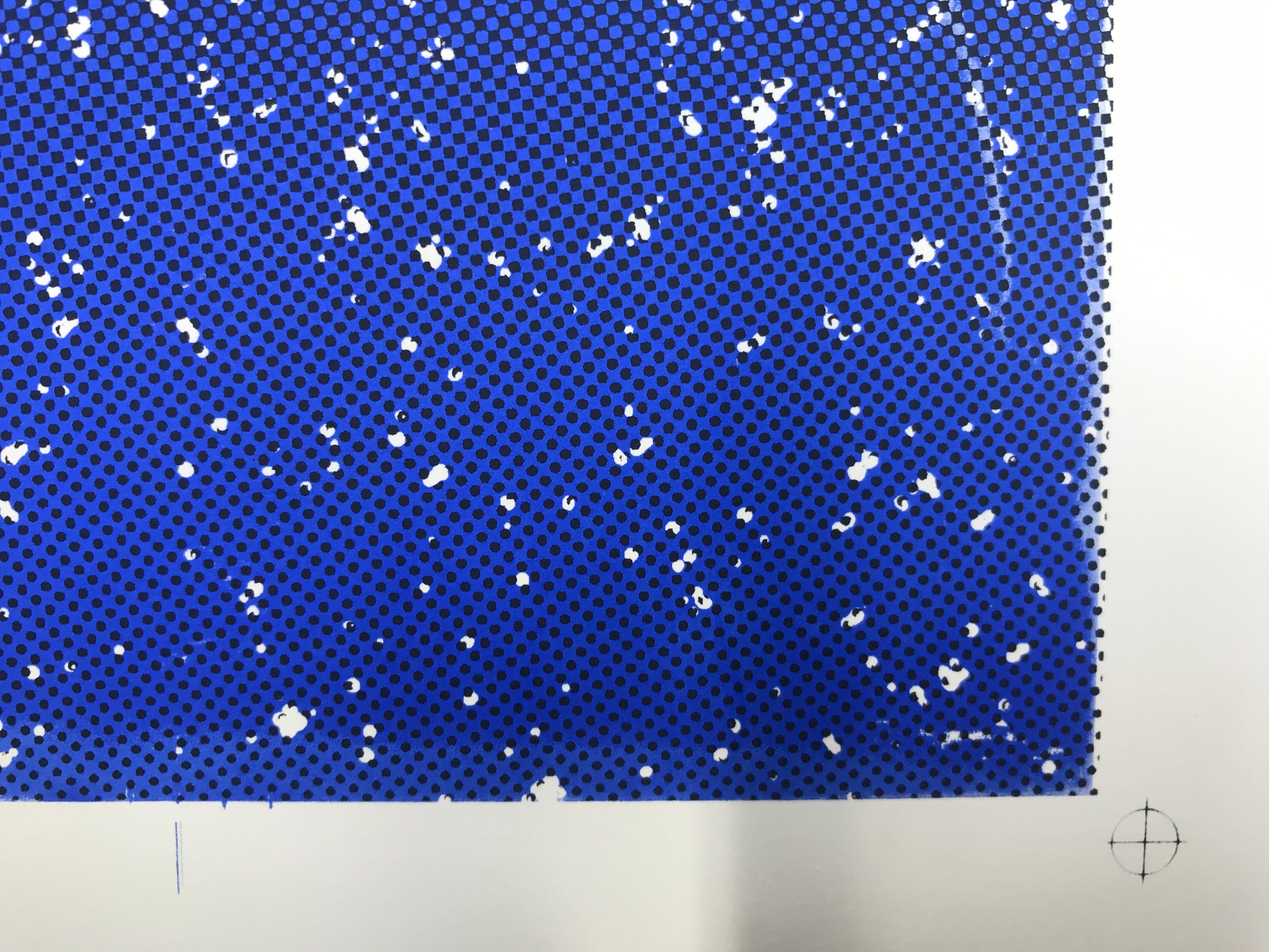
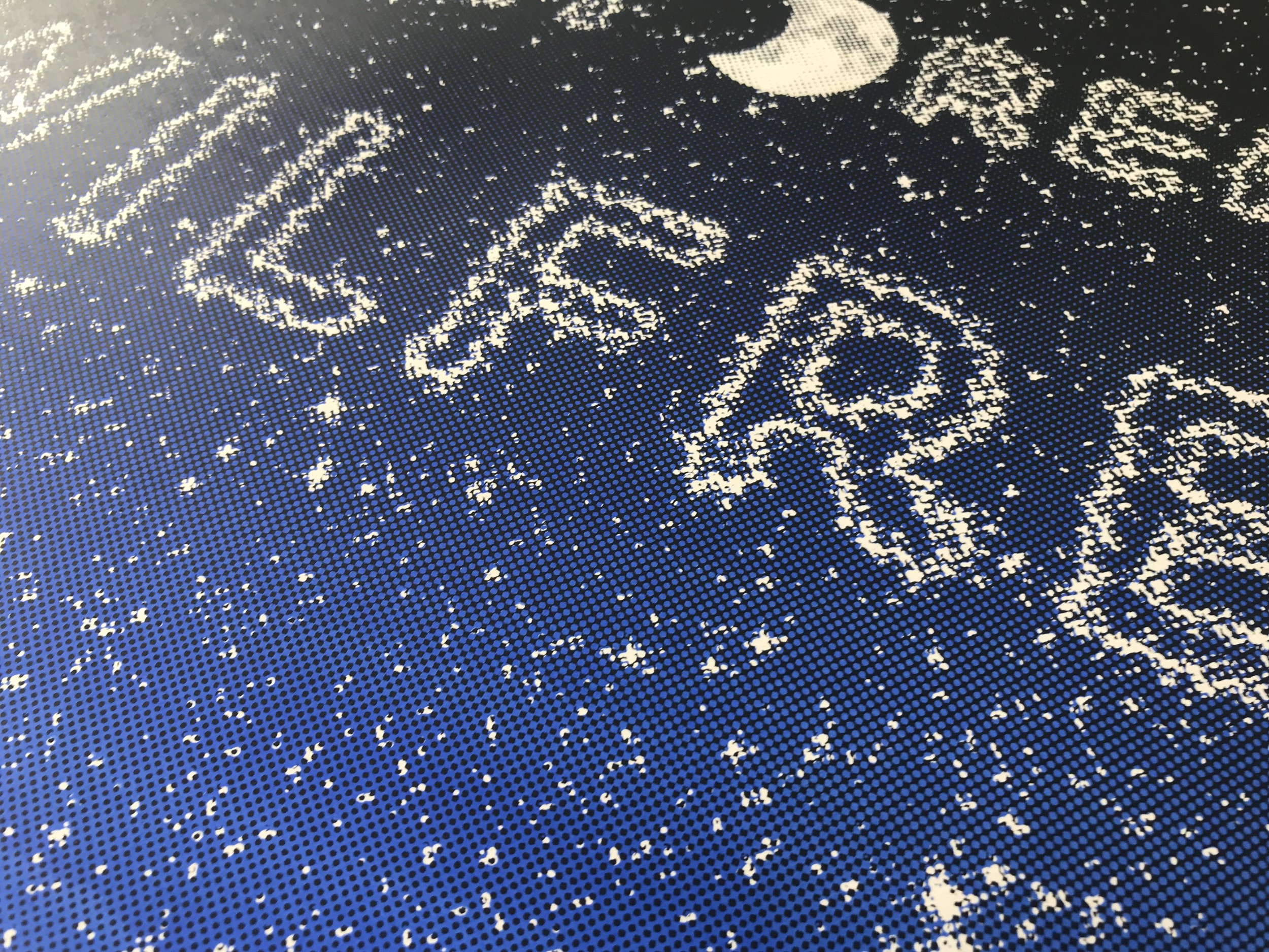
The process of screen printing is a simple one. You create a stencil (in effect) on a silk screen, then push ink through it onto paper, or material, or other substrate (perspex, timber and metal have been done - speak to the technicians to see what's possible). One colour of ink is pushed through at a time, but your design may be more than one colour so you can build up in layers, or you can print in CMYK. In fact, colour is a big part of the process as the vibrancy you can achieve when printing with ink cannot be matched by any laser or inkjet printer.

The Process

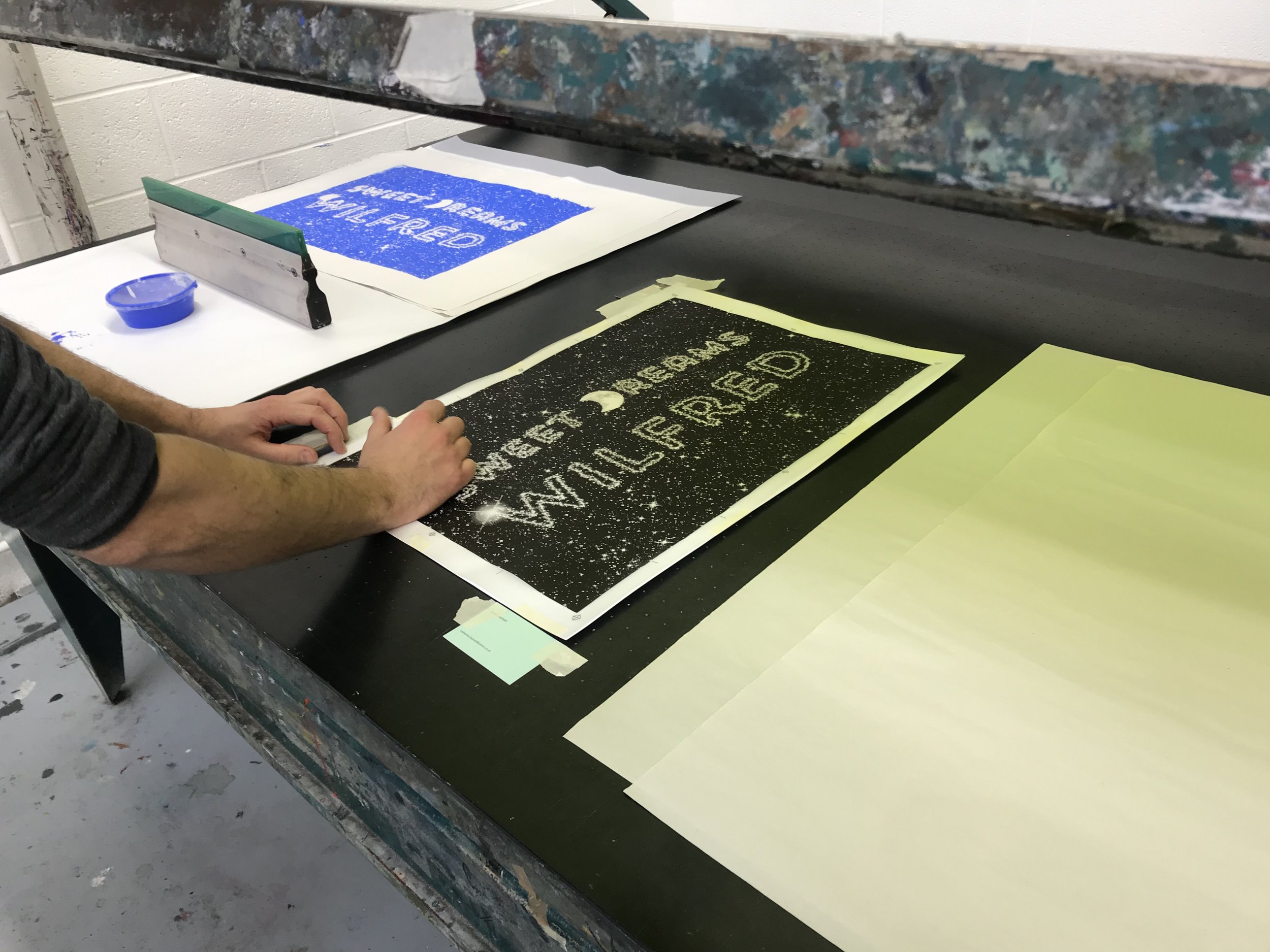
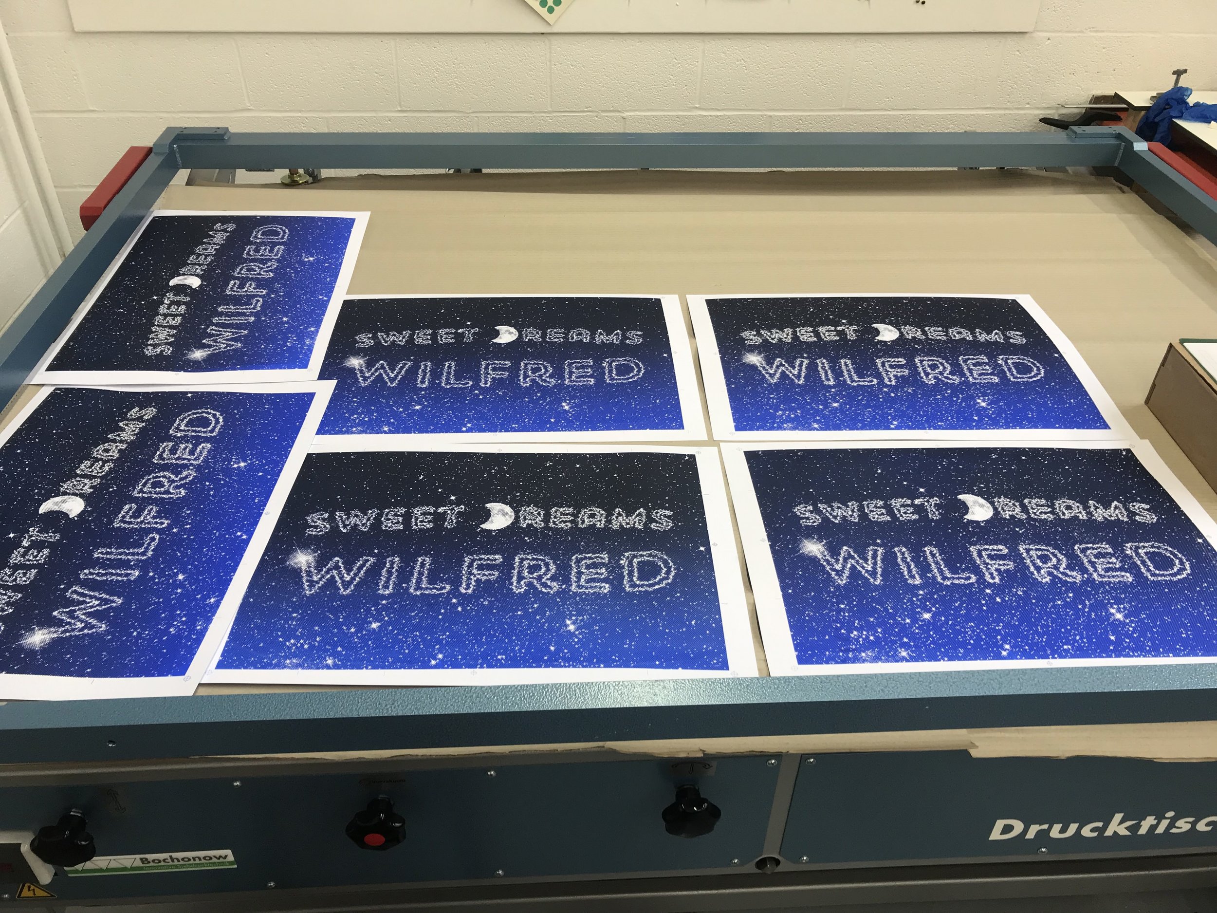
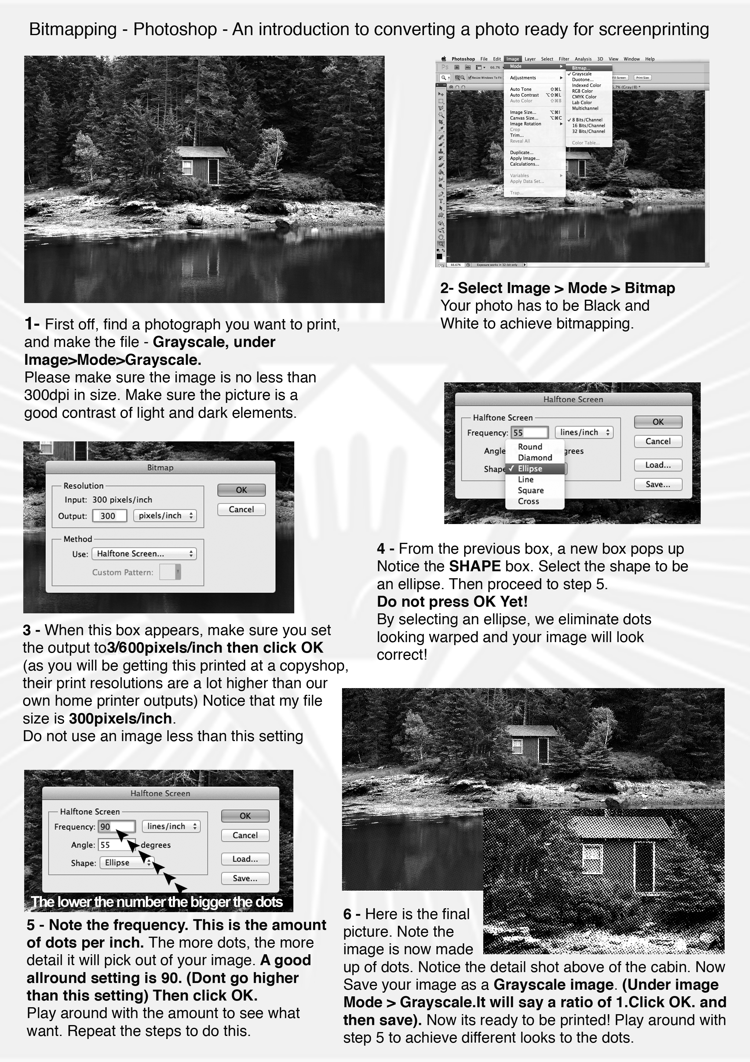
Having not produced a piece of print with my own hands since I was at college 20 years ago, I recently took up the option of an induction into screenprinting. In terms of the process, the first thing to do is create your artwork. For my induction I designed a landscape poster for my son’s wall which used two colours. It’s important to note that you will need registration marks for any design where you want things to line up. Also, as you create your artwork, remember that wherever there is black on your design, this is where the ink will pass through. (I got that the wrong way around on my first attempt.)

Below are the two layers I designed, and finally what I intended the outcome to be.

Light blue layer

Light blue layer

dark blue layer

dark blue layer

the intended outcome

the intended outcome

The designs were created in both Illustrator and Photoshop, before being saved as bitmap .tif files and finally exported as a PDF through InDesign. The designs have to be in black only, because when printed onto acetate or trace, they are used to create the stencil on your screen. This is done by exposing light through your prints onto the silk screen which is coated with photosensitive emulsion. Where the light hits the emulsion it is hardened (so ink will not be able to pass through), and where the light is blocked (the black areas of your design) the emulsion remains soft and can be washed off. This the leaves the clear area where ink will be pressed through the screen.

Rest assured, the technicians can explain this in much more detail.

Once the designs were exposed they looked like the below. Two designs were exposed onto one screen, so you don’t have to make a new screen for every layer. The dark green areas are where the emulsion has hardened onto the screen (i.e. the light has hardened the emulsion), the yellow areas are where the ink will pass through.

The silk screen, ready to print

The silk screen, ready to print

With the screen ready, it was time to print. With multiple designs on one screen, the areas where I didn’t want ink to go (i.e. the second layer) were covered over with brown tape and acetate. Firstly, I registered the card I was printing on by using the black print used to create the screen itself. When registered, the first layer was then printed in cobalt blue.

Registration

Registration

ink, lovely ink

ink, lovely ink

ink, loaded

ink, loaded

ink, printed

ink, printed

With the first layer printed, the screen was then washed down and the first design was then taped up ready for printing the dark blue layer. The dark blue was mixed using roughly half cobalt blue and half black. (Mixing colours is fun.)

dark blue, printed

dark blue, printed

Registration was a bit tricky, but the prints that were slightly out somehow have a bit of charm that a digital process would likely dilute. A few details of this shown below.

out by a whisker

out by a whisker

out by several whiskers

out by several whiskers

Not too far off

Not too far off

The overall effect

The overall effect

And that was that. I only scratched the surface of what’s achievable. Especially when you consider what screen printing might be like when combined with other techniques available, eg laser cutting, letter press, etc. But the most important parts of the process were sharing my thoughts and ideas with the printmaking staff so they could advise me along each step of the way to help me get the result I wanted, which is below. I’m happy, let’s hope Wilfred likes it.

final print

final print

Below is a guide to bitmapping in Photoshop, covering off the process of getting a photo ready for screen printing. Finally, a big thanks to Jane and Nick in printmaking for all their help, go and see them!

Bitmapping instructions

Bitmapping instructions

Below the Surface

Hear ye, the latest from The Disseminator’s fount of knowledge (via Dom via The Partners aka Superunion).

The linked website is an ephemera festival. It features the objects found in the Amstel River in Amsterdam whilst it was being excavated to build a new train line. Everything found has been logged, photographed and grouped into a huge archive.

Amazingly, all the objects have been placed in date order as well. You can peruse the archive and also the images are available to collage and experiment with.

Capture2.PNG

Letterform Archive

A fantastic resource discovered by Pete, Letterform Archive is a nonprofit center for inspiration, education, publishing, and community. Basically, an online archive of type, with a search function as simple (and powerful) as sites we know like designspiration.

search functionality

search functionality

It requires a membership, but priced at $2.50/month for students is well worth it for the vast archives that can be accessed.


We hold physical and digital artifacts in a variety of formats, including books, periodicals, posters, sketches, original art for reproduction, and related ephemera, as well as a robust reference library. Together, these works chronicle the history of written communication, from the invention of writing and medieval manuscripts to modernism, the age of print to the present explosion of digital type. See a sampling.

The Archive doubled its holdings in 2015 by acquiring the typeface specimen collection of the late Dutch publisher Jan Tholenaar. Recently donated archives include Emigre, pioneers of experimental digital design; Ross F. George, author of the Speedball textbooks; and Aaron Marcus, a seminal figure in computer graphics. Also featured prominently in the collection are Rudolf Koch, Jack Stauffacher, Irma Boom, and Piet Zwart.

 
Type books, lots of lovely type books

Type books, lots of lovely type books