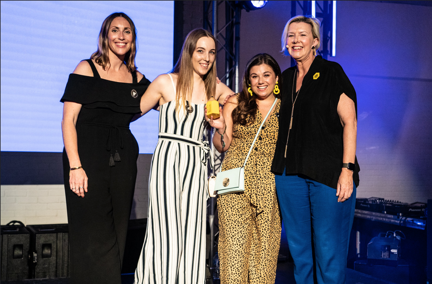
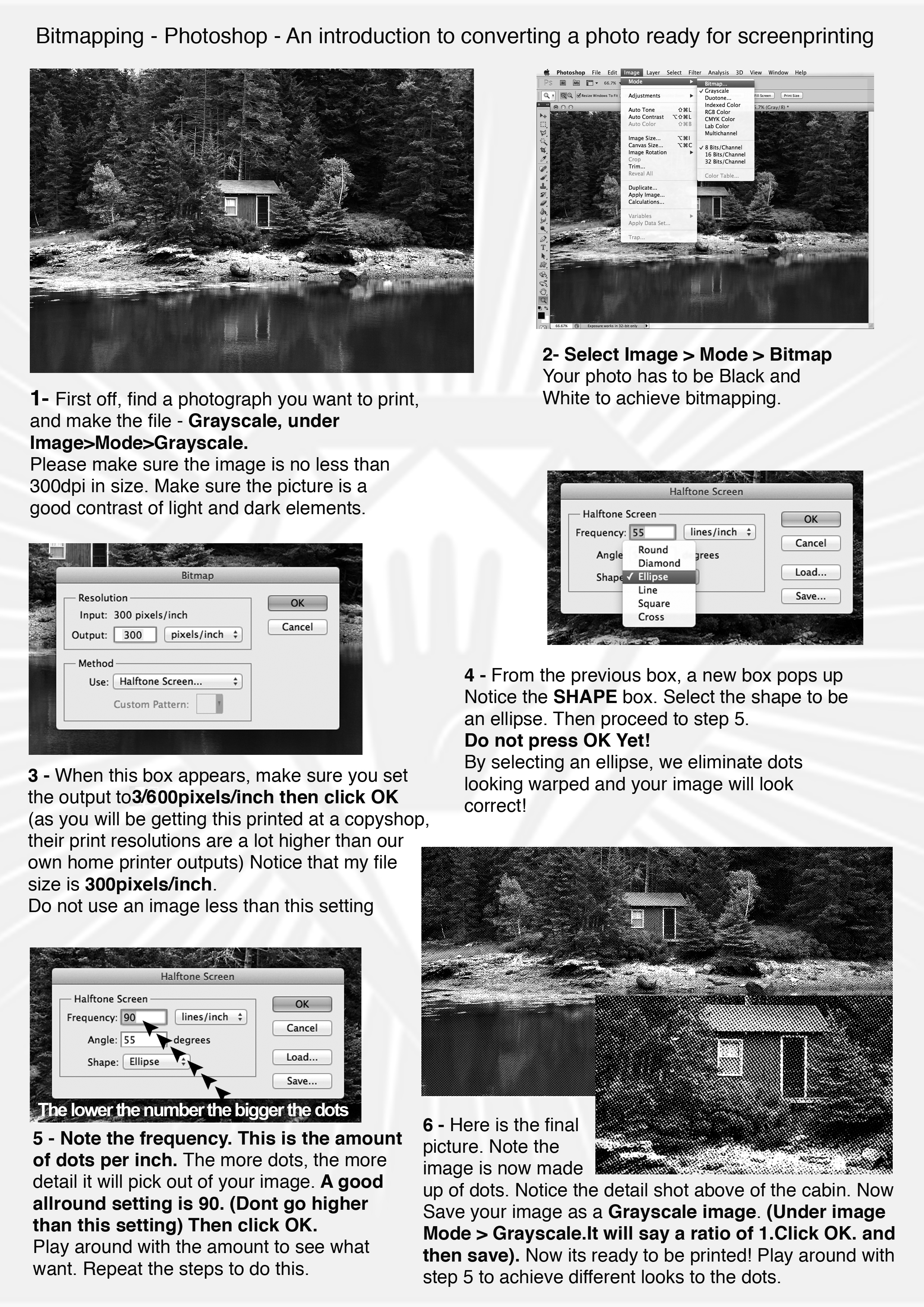
Creative Conscience Awards 2019 - Update
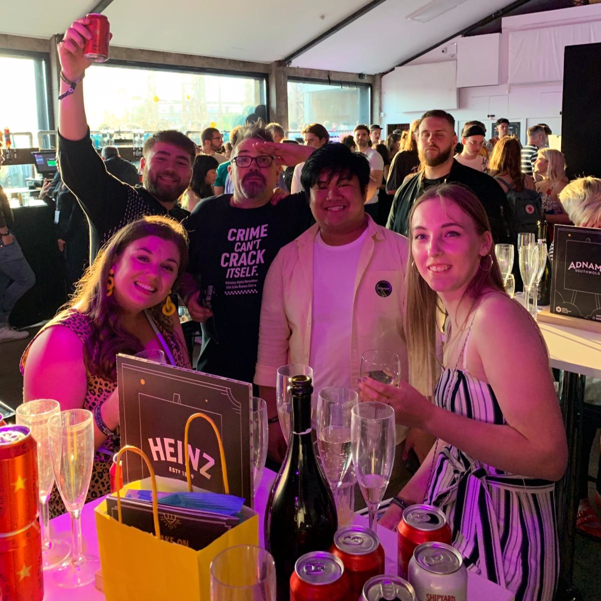
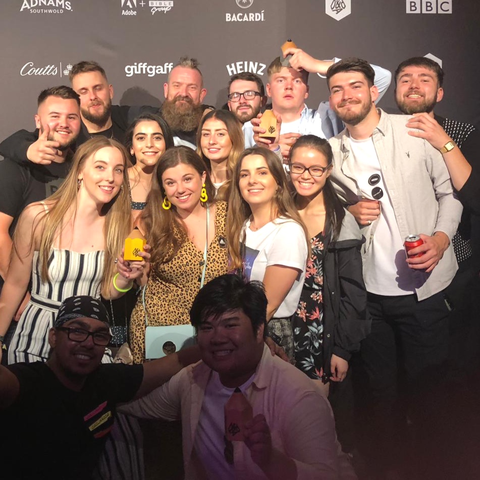
This summer, UCLan students won gold, silver and bronze at the Creative Conscience Awards.

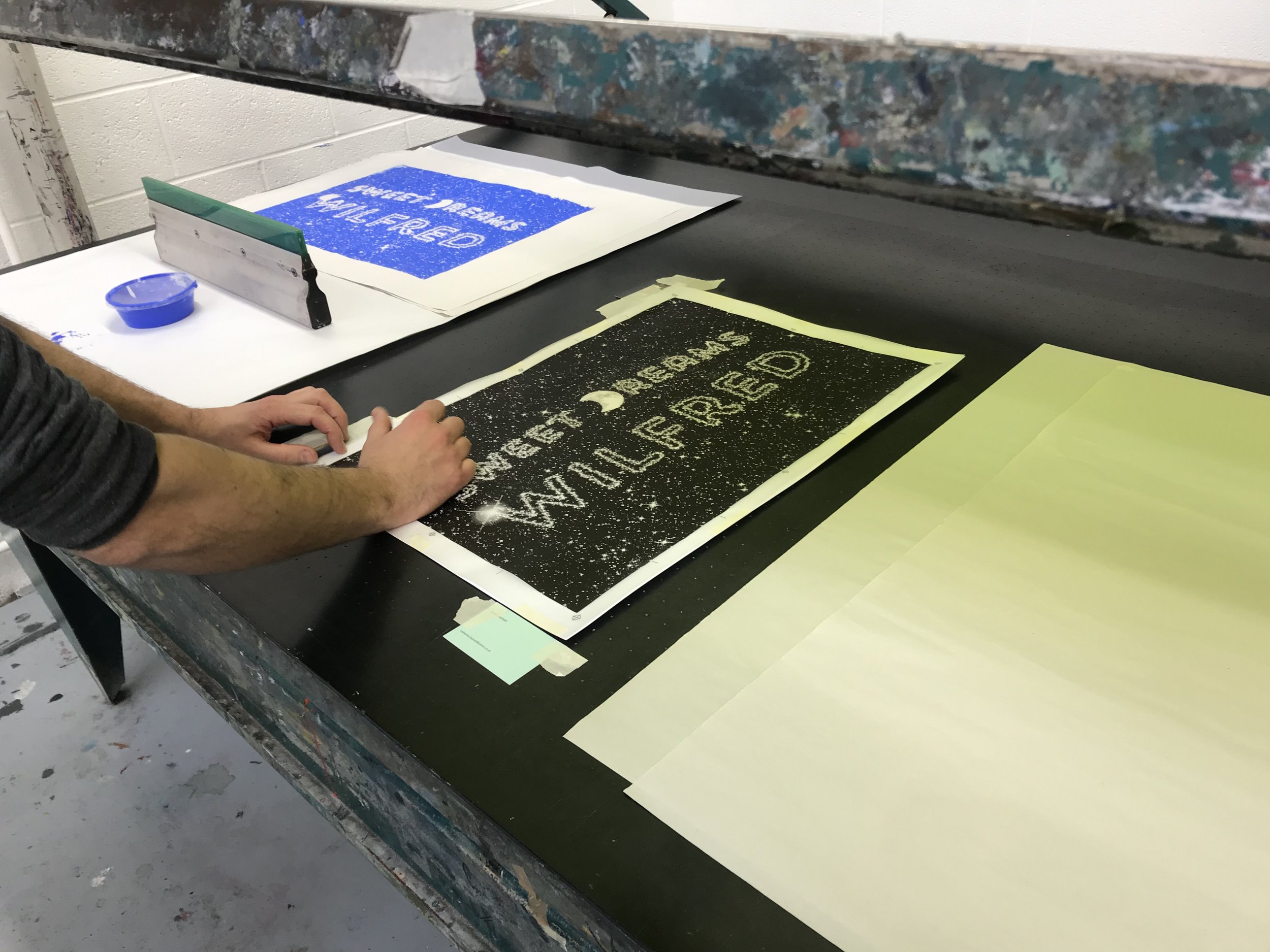
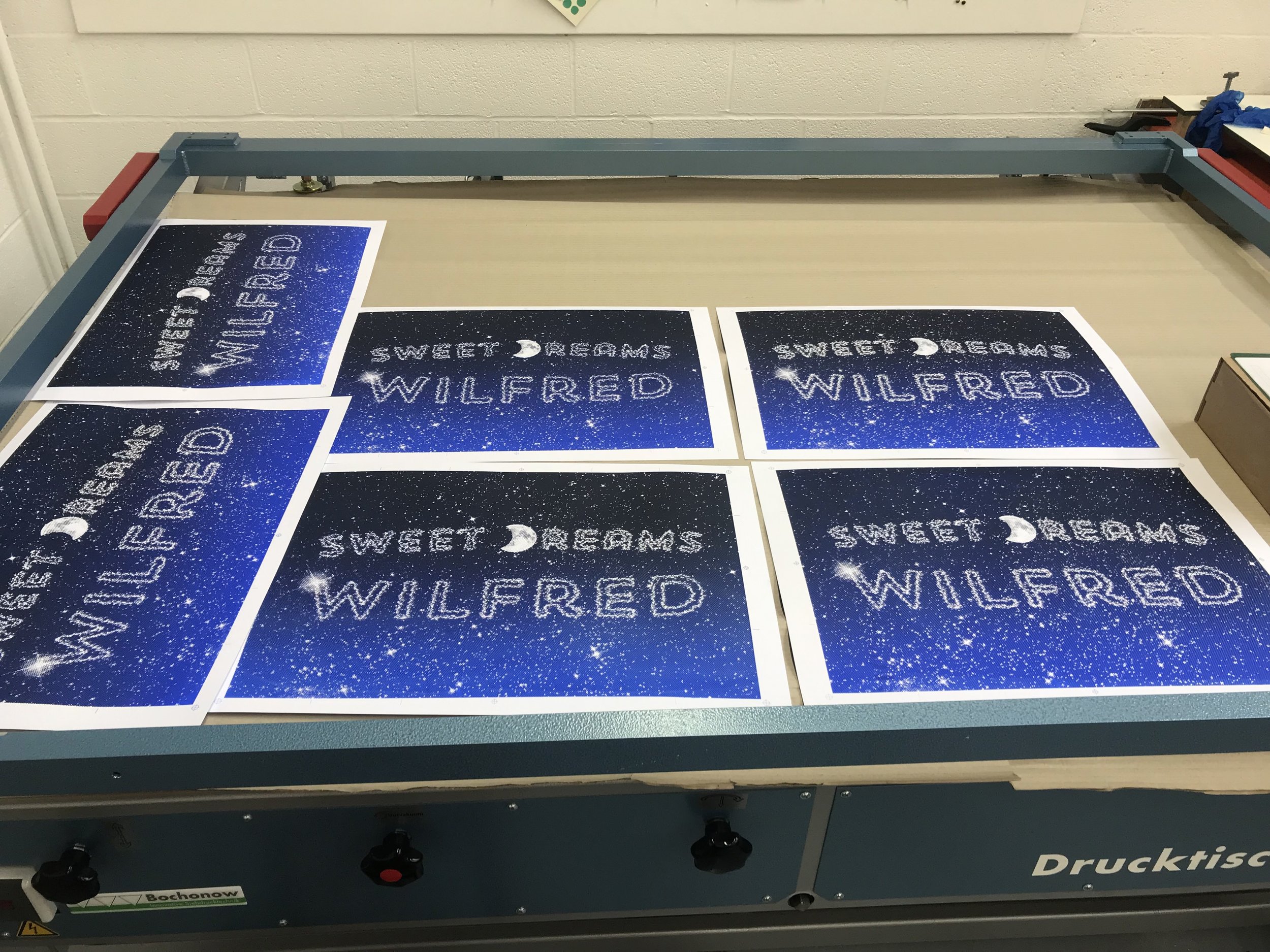
Seven students from our graphic design and advertising courses recieived awards, which celebrate projects that aim to improve local communities and inspire and help change people’s lives through ideas and design.


“There were so many passionate and touching projects submitted this year, all of which championed worthy causes that don’t often get spoken about in public.”


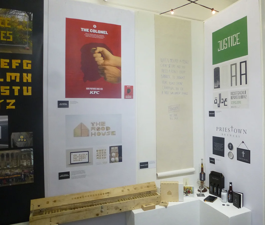
Graphic design student Dom Parsons won gold for a typeface he created for the Grenfell Tower campaigners and community. The design incorporated the structure of the building that tragically caught fire in June 2017 and the typeface was designed to create a unified voice for the two-year anniversary of the disaster.

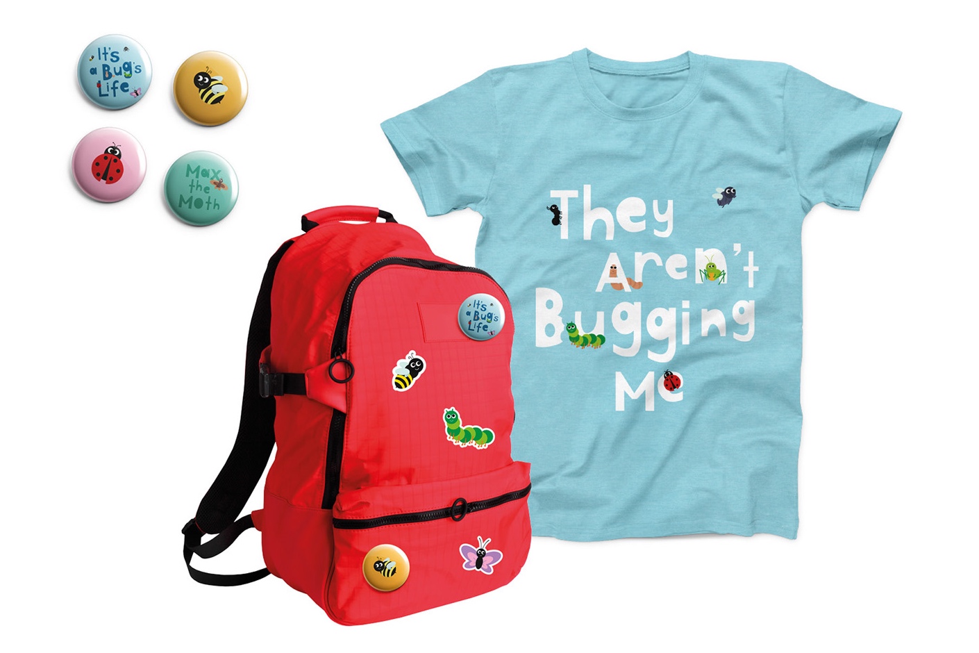
Advertising students Ran Duan and Xuebing Liu won silver for their own touching project focusing on organ donation. They aimed to help start more conversations with children without scaring them. Teaming up with the NHS Organ Donation organisation and the Build a Bear Workshop, they reuse the hearts and eyes from old toy bears and use them for new toys.

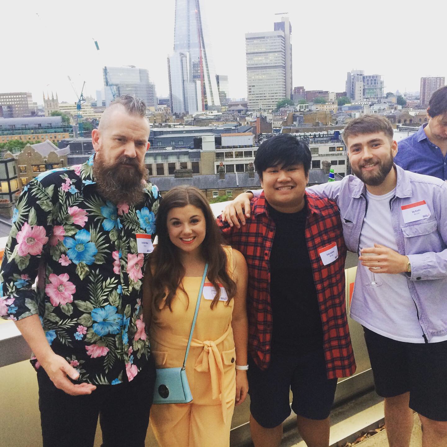
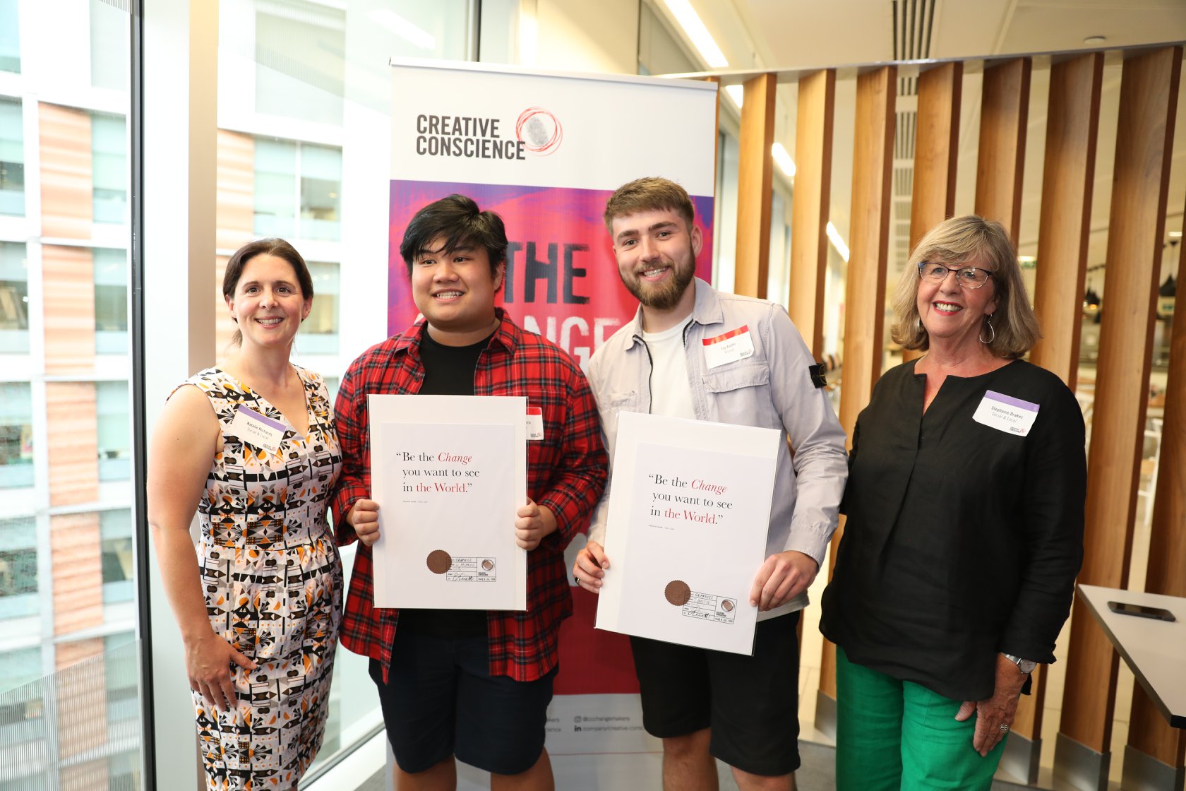
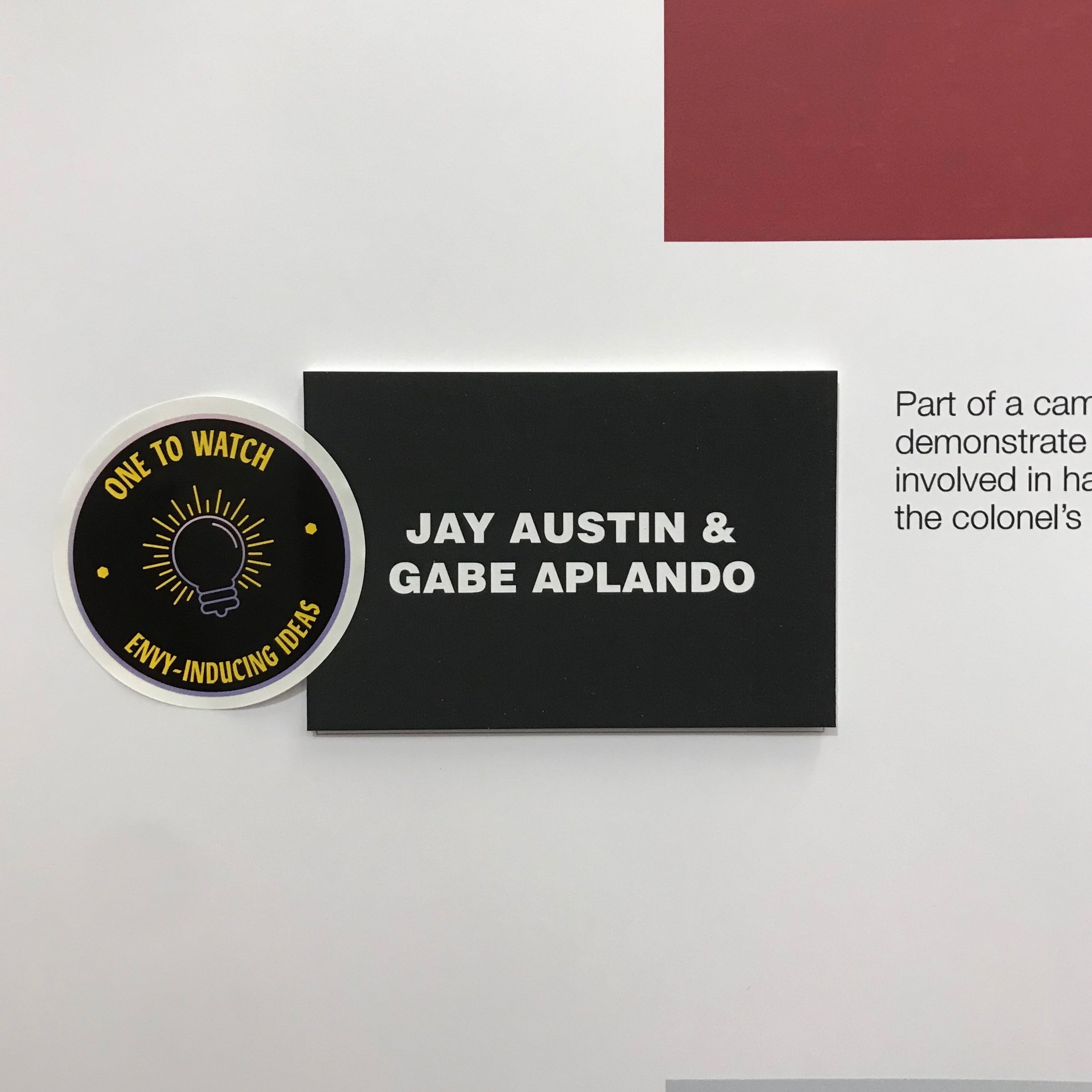
Jay Austin and Gabe Aplando, final year graphic design students, earned their bronze prize for their project ‘Fence Fairies’; a typeface designed to be used on banners, picket signs and newspaper adverts in aid of the protests against fracking.

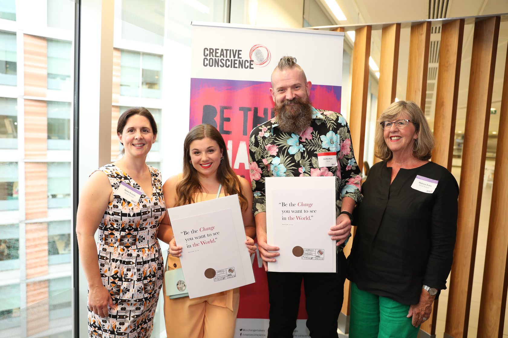
Jonathan Mount and Lucy Child also received bronze for their community project; ‘The Wood House’; a charity that reclaims and repurposes different types of wood whilst supporting vulnerable people. The design makes use of the organisation’s resources as well as aiding delivering their message.

Chrissy Levett, founder of Creative Conscience, said: “There were so many passionate and touching projects submitted this year, all of which championed worthy causes that don’t often get spoken about in public.”

Big thanks to Creative Conscience and we look forward to seeing you again next year.

Class of 2019

We’re starting to upload (file size depending!) 2019 final year projects and portfolios. We will continue uploading, but the below links offer great incite into the quality and quantity of work involved in External, Competition and Honours projects for current and future undergraduates.

Clicking the linked images will open a PDF on a new page.

Also, for the time-being, Angus is hosting a portfolio site as well.

D&AD New Blood Awards 2019 - Update

We’d just like to repeat our congratulations to all this year’s D&AD New Blood entrants and winners. The awards were presented by ex-Preston student Harriet Devoy who will spend this year as D&AD President alongside her role as Creative Director of Design, Marketing Communications at Apple EMEIA (Europe, Middle East, India and Africa).


adidas
2HRS TO 2020
Wood Pencil
- by Yi Zhang & Ariel Austris Tabaks


adidas
Pool
Yellow Pencil
- by Lucy Child & Francesca Hanley


Heinz
Heinz State
Wood Pencil
- by Angus Meikle


Monotype
Fence Fairies
Wood Pencil
- by Gabe Aplando & Jay Austin


The Times
Break the Cycle
Graphite Pencil
- by Brandon Thomas


Virgin
Virgin Favours the Brave
Wood Pencil
- by Angus Meikle & Dom Parsons


Also, congratulations to ex-student Jack Parker who won yellow, white and black pencils for his adidas entry.


Some Photos…

Smoke and Mirrors: The Psychology of Magic

Tutors often recommend the Wellcome Collection to anyone passing through, or more likely waiting at Euston. Just over the road from the station, the Wellcome Collection is a free museum and library that hosts free exhibitions and collections; as well as having a great cafe, shop, reading space and pristine water closets.

After this year’s New Blood, we went to the current exhibition – Smoke and Mirrors – which has a great range of objects on display. A video depicting a staunch defence of seances by Sir Arthur Conan Doyle, the box in which Debbie McGee was regularly cut in half in, a Manchester-made Spirit Horn; but also some beautiful examples of typography. Some hand-rendered, some set in woodtype and some bookplate. But all quite unexpected.

A few snaps that we took are below, but please pop in if you’re passing through.

China Study Trip

By Sara Esat.

Recently second year Graphic Design, Advertising and Interior Design students attended a trip to the Hebei University in Baoding (HBU), China. UCLan students collaborated with their Chinese peers (within the same disciplines) and worked on a project to represent the city of Baoding, using any form of art to create typography.


The Graphic Design students were allocated with eight letters — M to T — and below are the solutions along with how they link to the city of Baoding:

M - Monument

In Baoding there is a famous mountain named Mount Langya, where there is a monument that commemorates five brave heroes who died in battle on the mountain. Using the five stars from the Chinese flag, this logo was made. 

M.png

N - Nature

At the heart of Baoding, there sits a Lotus Garden, where serenity and nature can be observed. This solution uses copywriting to describe what can be seen in those gardens.

N.png

O - Shape of Window

The solution for this idea was a visual one rather than the word itself. There were various different shapes of windows that can be seen all over the historical Chinese buildings, and this octagonal window was one of many that were seen.

P - Philosopher

Kong Zi also known as Confucius is one of the most well known philosophers of all time. On the University campus a statue of him is placed as a symbol of knowledge. This famous saying of his means that, friends with like-mindedness come from afar and we are very happy and honoured.

P.png

Q - Qu-Yang Stone Carving

Qu-Yang Stone Carving is a form of Chinese Folk Carving art. It represents the form of stone carving that was practiced during the Han Dynasty and was also originated from Baoding.

Q.png

R - Reconstruct, Rebuild, Revisit

These three words best represent the Hui Garden’s in Baoding. These gardens are an accurate reconstruction of old Southern China, and help depict what life would have been like hundreds of years ago in China.

S - Soldier

The first Chinese Military school was set up in Baoding and still sits there today. Named HuangPu Military Academy, it is one of the national cultural relics protection units. The calligraphy reads out the name of the academy in Chinese, and is written downwards as was how the traditional language was like.

S.png

T - Traffic

All day, every day there is constant traffic in Baoding. It heavily contrasts the traffic that we have in England that may only be during rush hours. This simple response is a form of moving image thats gives a little insight to the situation of roads in China. 


Conclusion

Apart from the project, we were able to enjoy the city as well as bond with fellow Chinese students. Later we all ventured out to the capital, Beijing, where we absorbed many interesting pieces of art and visited the sites of many famous landmarks. 

PHOTOS COLLAGE.png

Overall the trip was very meaningful as we got to explore a place so far away, and so different to England. The country was beautiful in itself, but the people there made it all the more memorable.

Screen Printing

We have fantastic facilities and technicians here at UCLan to help us create designs and artwork which in the outside world would: a) leave us to figure things out alone, and b) cost a truckload of cash. The ability to produce finished, crafted prints cannot be underestimated in a world of portfolios full to the brim with PSD mockups; but lacking in actual, physical print.

The process of screen printing is a simple one. You create a stencil (in effect) on a silk screen, then push ink through it onto paper, or material, or other substrate (perspex, timber and metal have been done - speak to the technicians to see what's possible). One colour of ink is pushed through at a time, but your design may be more than one colour so you can build up in layers, or you can print in CMYK. In fact, colour is a big part of the process as the vibrancy you can achieve when printing with ink cannot be matched by any laser or inkjet printer.

The Process

Having not produced a piece of print with my own hands since I was at college 20 years ago, I recently took up the option of an induction into screenprinting. In terms of the process, the first thing to do is create your artwork. For my induction I designed a landscape poster for my son’s wall which used two colours. It’s important to note that you will need registration marks for any design where you want things to line up. Also, as you create your artwork, remember that wherever there is black on your design, this is where the ink will pass through. (I got that the wrong way around on my first attempt.)

Below are the two layers I designed, and finally what I intended the outcome to be.

Light blue layer

Light blue layer

dark blue layer

dark blue layer

the intended outcome

the intended outcome

The designs were created in both Illustrator and Photoshop, before being saved as bitmap .tif files and finally exported as a PDF through InDesign. The designs have to be in black only, because when printed onto acetate or trace, they are used to create the stencil on your screen. This is done by exposing light through your prints onto the silk screen which is coated with photosensitive emulsion. Where the light hits the emulsion it is hardened (so ink will not be able to pass through), and where the light is blocked (the black areas of your design) the emulsion remains soft and can be washed off. This the leaves the clear area where ink will be pressed through the screen.

Rest assured, the technicians can explain this in much more detail.

Once the designs were exposed they looked like the below. Two designs were exposed onto one screen, so you don’t have to make a new screen for every layer. The dark green areas are where the emulsion has hardened onto the screen (i.e. the light has hardened the emulsion), the yellow areas are where the ink will pass through.

The silk screen, ready to print

The silk screen, ready to print

With the screen ready, it was time to print. With multiple designs on one screen, the areas where I didn’t want ink to go (i.e. the second layer) were covered over with brown tape and acetate. Firstly, I registered the card I was printing on by using the black print used to create the screen itself. When registered, the first layer was then printed in cobalt blue.

Registration

Registration

ink, lovely ink

ink, lovely ink

ink, loaded

ink, loaded

ink, printed

ink, printed

With the first layer printed, the screen was then washed down and the first design was then taped up ready for printing the dark blue layer. The dark blue was mixed using roughly half cobalt blue and half black. (Mixing colours is fun.)

dark blue, printed

dark blue, printed

Registration was a bit tricky, but the prints that were slightly out somehow have a bit of charm that a digital process would likely dilute. A few details of this shown below.

out by a whisker

out by a whisker

out by several whiskers

out by several whiskers

Not too far off

Not too far off

The overall effect

The overall effect

And that was that. I only scratched the surface of what’s achievable. Especially when you consider what screen printing might be like when combined with other techniques available, eg laser cutting, letter press, etc. But the most important parts of the process were sharing my thoughts and ideas with the printmaking staff so they could advise me along each step of the way to help me get the result I wanted, which is below. I’m happy, let’s hope Wilfred likes it.

final print

final print

Below is a guide to bitmapping in Photoshop, covering off the process of getting a photo ready for screen printing. Finally, a big thanks to Jane and Nick in printmaking for all their help, go and see them!

Bitmapping instructions

Bitmapping instructions

Out Of The Shadows

Here we feature a recent YCN entry for the KFC ‘hand prepared’ brief by Jay Austin & Gabe Aplando. Their idea was based on a fictional hand exercise manual that had been recently discovered by builders who were renovating the UK’s first ever KFC restaurant in Preston, Lancashire.

Front cover

Front cover

Intro spread

Intro spread

Sample spread - 1

Sample spread - 1

Sample spread - 2

Sample spread - 2

Beginners

Beginners

Advanced

Advanced

Expert

Expert

Master

Master

Billboard

Billboard

Cooks kitchen reference chart

Cooks kitchen reference chart

Experts believe the manual was originally created by the Colonel himself in order to keep his cooks hand dexterity at a high level, hence ensuring they could prepare his chicken to the highest degree.